Adobe Analytics, General, google analytics, Technical/Implementation

Fork in the Road: The Big Questions Organizations are Trying to Answer

In a normal year, we’d be long past the point in the calendar where I had written a blog post on all of the exciting things I had seen at Adobe Summit. Unfortunately, nothing about this spring has been normal other than that Summit was in person again this year (yay!), because I was unable to attend. Instead, it was my wife and 3 of my kids that headed to Las Vegas the last week in March; they saw Taylor Swift in concert instead of Run DMC, and I stayed home with the one who had other plans.

And boy, does it sound like I missed a lot. I knew something was up when Adobe announced a new product analytics-based solution to jump into what has already been a pretty competitive battle. Then, another one of our partners, Brian Hawkins, started posting excitedly on Slack that historically Google-dominant vendors were gushing about the power of Analytics Workspace and Customer Journey Analytics (CJA). Needless to say, it felt a bit like three years of pent-up remote conference angst went from a simmer to a boil this year, and I missed all the action. But, in reading up on everyone else’s takes from the event, it sure seems to track with a lot of what we’ve been seeing with our own clients over the past several months as well.

Will digital analytics or product analytics win out?

Product analytics tools have been slowly growing in popularity for years; we’ve seen lots of our clients implement tools like Heap, Mixpanel, or Amplitude on their websites and mobile apps. But it has always been in addition to, not as a replacement for traditional digital analytics tools. 2022 was the year when it looked like that might change, for two main reasons:

  • Amplitude started adding traditional features like marketing channel analysis into its tool that had previously been sorely lacking from the product analytics space;
  • Google gave a swift nudge to its massive user base, saying that, like it or not, it will be sunsetting Universal Analytics, and GA4 will be the next generation of Google Analytics.

These two events have gotten a lot of our clients thinking about what the future of analytics looks like for them. For companies using Google Analytics, does moving to GA4 mean that they have to adopt a more product analytics/event driven approach? Is GA4 the right tool for that switch?

And for Adobe customers, what does all this mean for them? Adobe is currently offering Customer Journey Analytics as a separate product entirely, and many customers are already pretty satisfied with what they have. Do they need to pay for a second tool? Or can they ditch Analytics and switch to CJA without a ton of pain? The most interesting thing to me about CJA is that it offers a bunch of enhancements over Adobe Analytics – no limits on variables, uniques, retroactivity, cross-channel stitching – and yet many companies have not yet decided that the effort necessary to switch is worth it.

Will companies opt for a simple or more customizable model for their analytics platform?

Both GA4 and Amplitude are on the simpler side of tools to implement; you track some events on your website, and you associate some data to those events. But the data model is quite similar between the two (I’m sure this is an overstatement they would both object to, but in terms of the data they accept, it’s true enough). On the other hand, for CJA, you really need to define the data model up front – even if you leverage one of the standard data models Adobe offers. And any data model is quite different from the model used by Omniture SiteCatalyst / Adobe Analytics for the better part of the last 20 years – though it probably makes far more intuitive sense to a developer, engineer, or data scientist.

Will some companies answer to the “GA or Adobe” question be “both?”

One of the more surprising things I heard coming out of Summit was the number of companies considering using both GA4 and CJA to meet their reporting needs. Google has a large number of loyal customers – Universal Analytics is deployed on the vast majority of websites worldwide, and most analysts are familiar with the UI. But GA4 is quite different, and the UI is admittedly still playing catchup to the data collection process itself. 

At this point, a lot of heavy GA4 analysis needs to be done either in Looker Studio or BigQuery, which requires SQL (and some data engineering skills) that many analysts are not yet comfortable with. But as I mentioned above, the GA4 data model is relatively simple, and the process of extracting data from BigQuery and moving it somewhere else is straightforward enough that many companies are looking for ways to keep using GA4 to collect the data, but then use it somewhere else.

To me, this is the most fascinating takeaway from this year’s Adobe Summit – sometimes it can seem as if Adobe and Google pretend that the other doesn’t exist. But all of a sudden, Adobe is actually playing up how CJA can help to close some of the gaps companies are experiencing with GA4.

Let’s say you’re a company that has used Universal Analytics for many years. Your primary source of paid traffic is Google Ads, and you love the integration between the two products. You recently deployed GA4 and started collecting data in anticipation of UA getting cut off later this year. Your analysts are comfortable with the old reporting interface, but they’ve discovered that the new interface for GA4 doesn’t yet allow for the same data manipulations that they’ve been accustomed to. You like the Looker Studio dashboards they’ve built, and you’re also open to getting them some SQL/BigQuery training – but you feel like something should exist between those two extremes. And you’re pretty sure GA4’s interface will eventually catch up to the rest of the product – but you’re not sure you can afford to wait for that to happen.

At this point, you notice that CJA is standing in the corner, waving both hands and trying to capture your attention. Unlike Adobe Analytics, CJA is an open platform – meaning, if you can define a schema for your data, you can send it to CJA and use Analysis Workspace to analyze it. This is great news, because Analysis Workspace is probably the strongest reporting tool out there. So you can keep your Google data if you like it – keep it in Google, leverage all those integrations between Google products – but also send that same data to Adobe and really dig in and find the insights you want.

I had anticipated putting together some screenshots showing how easy this all is – but Adobe already did that for me. Rather than copy their work, I’ll just tell you where to find it:

  • If you want to find out how to pull historical GA4 data into CJA, this is the article for you. It will give you a great overview on the process.
  • If you want to know how to send all the data you’re already sending to GA4 to CJA as well, this is the article you want. There’s already a Launch extension that will do just that.

Now maybe you’re starting to put all of this together, but you’re still stuck asking one or all of these questions:

“This sounds great but I don’t know if we have the right expertise on our team to pull it off.”

“This is awesome. But I don’t have CJA, and I use GTM, not Launch.”

“What’s a schema?”

Well, that’s where we come in. We can walk you through the process and get you where you want to be. And we can help you do it whether you use Launch or GTM or Tealium or some other tag management system. The tools tend to be less important to your success than the people and the plans behind them. So if you’re trying to figure out what all this industry change means for your company, or whether the tools you have are the right ones moving forward, we’re easy to find and we’d love to help you out.

Photo credits: Thumbnail photo is licensed under CC BY-NC 2.0

Adobe Analytics, Featured, google analytics

Switching from Adobe to Google? What you Should Know (Part 2)

Last week, I went into detail on four key differences between Adobe and Google Analytics. This week, I’ll cover four more. This is far from an exhaustive list – but the purpose of these posts is not to cover all the differences between the two tools. There have been numerous articles over the years that go into great detail on many of these differences. Instead, my purpose here is to identify key things that analysts or organizations should be aware of should they decide to switch from one platform to another (specifically switching from Adobe to Google, which is a question I seem to get from one of my clients on a monthly basis). I’m not trying to talk anyone out of such a change, because I honestly feel like the tool is less important than the quality of the implementation and the team that owns it. But there are important differences between them, and far too often, I see companies decide to change to save money, or because they’re unhappy with their implementation of the tool (and not really with the tool itself).

Topic #5: Pathing

Another important difference between Adobe and Google is in path and flow analysis. Adobe Analytics allows you to enable any traffic variable to use pathing – in theory, up to 75 dimensions, and you can do path and next/previous flow on any of them. What’s more, with Analytics Workspace, you can also do flow analysis on any conversion variable – meaning that you can analyze the flow of just about anything.

Google’s Universal Analytics is far more limited. You can do flow analysis on both Pages and Events, but not any custom dimensions. It’s another case where Google’s simple UI gives it a perception advantage. But if you really understand how path and flow analysis work, Adobe’s ability to path on many more dimensions, and across multiple sessions/visits, can be hugely beneficial. However, this is an area Google has identified for improvement, and GA4 is bringing new capabilities that may help bring GA closer to par.

Topic #6: Traffic Sources/Marketing Channels

Both Adobe and Google Analytics offer robust reporting on how your users find your website, but there are subtle differences between them. Adobe offers the ability to define as many channels as you want, and define the rules for those channels you want to use. There are also pre-built rules you can use if you need. So you can accept Adobe’s built-in way of identifying social media traffic, but also make sure your paid social media links are correctly detected. You can also classify your marketing channel data into as many dimensions as you want.

Google also allows you as many channels as you want to use, but its tool is built around 5 key dimensions: source, medium, campaign, keyword, and content. These dimensions are typically populated using a series of query parameters prefixed with “utm_,” though they can also be populated manually. You can use any dimension to set up a series of channel groupings as well, similar to what Adobe offers.

For paid channels, both tools offer more or less the same features and capabilities; Adobe offers far more flexibility in configuring how non-paid channels should be tracked. For example, Adobe allows you to decide that certain channels should not overwrite a previously identified channel. But Google overwrites any old channel (except direct traffic) as soon as a new channel is identified – and, what’s more, immediately starts a new session when this happens (this is one of the quirkiest parts of GA, in my opinion).

Both tools allow you to report on first, last, and multi-touch attribution – though again, Adobe tends to offer more customizability, while Google’s reporting is easier to understand and navigate, GA4 offers some real improvements to make attribution reporting even easier. Google Analytics is also so ubiquitous that most agencies are immediately familiar with and ready to comply with a company’s traffic source reporting standards.

One final note about traffic sources is that Google’s integrations between Analytics and other Google marketing and advertising tools offer real benefits to any company – so much so that I even have clients that don’t want to move away from Adobe Analytics but still purchase GA360 just to leverage the advertising integrations.

Topic #7: Data Import / Classifications

One of the most useful features in Adobe Analytics is Classifications. This feature allows a company to categorize and classify the data captured in a report into additional attributes or metadata. For example, a company might capture the product ID at each step of the purchase process, and then upload a mapping of product IDs to names, categories, and brands. Each of those additional attributes becomes a “free” report in the interface. You don’t need to allocate an additional variable for it, but every attribute becomes its own report. This allows data to be aggregated or viewed in new ways. These classifications are also the only truly retroactive data in the tool – you can upload and overwrite classifications at any time, overwriting the data that was there previously. In addition, Adobe also has a powerful tool allowing you to not just upload your metadata, but also write matching rules (even using regular expressions) and have the classifications applied automatically, updating the classification tables each night.

Google Analytics has a similar feature, called Data Import. On the whole, Data Import is less robust than Classifications – for example, every attribute you want to enable as a new report in GA requires allocating one of your custom dimensions. However, Data Import has one important advantage over Classifications – the possibility to process the metadata in two different ways:

  • Query Time Data Import: Using this approach, the metadata you upload gets mapped to the primary dimension (the product ID in my example above) when you run your report. This is identical to how Adobe handles its classification data.
  • Processing Time Data Import: Using this approach, the metadata you upload gets mapped to the primary dimension at the time of data collection. This means that Google gives you the ability to report on your metadata either retroactively or non-retroactively.

This distinction may not be initially obvious, so here’s an example. Let’s say you capture a unique ID for your products in a GA custom dimension, and then you use data import to upload metadata for both brand name and category. The brand name is unlikely to change; a query time data import will work just fine. However, let’s say that you frequently move products between categories to find the one where they sell best. In this case, a query time data import may not be very useful – if you sold a pair of shoes in the “Shoes” category last month but are now selling it under “Basketball,” when you run a report over both months, that pair of shoes will look like it’s part of the Basketball category the entire time. But if you use a processing time data import, each purchase will be correctly attributed to the category in which it was actually sold.

Topic #8: Raw Data Integrations

A few years ago, I was hired by a client to advise them on whether they’d be better off sticking with what had become a very expensive Adobe Analytics integration or moving to Google Analytics 360. I found that, under normal circumstances, they would have been an ideal candidate to move to Google – the base contract would save them money, and their reporting requirements were fairly common and not reliant on Adobe features like merchandising that are difficult to replicate with Google.

What made the difference in my final recommendation to stick with Adobe was that they had a custom integration in place that moved data from Adobe’s raw data feeds into their own massive data warehouse. A team of data scientists relied heavily on integrations that were already built and working successfully, and these integrations would need to be completely rebuilt if they switched to Google. We estimated that the cost of such an effort would likely more than make up the difference in the size of their contracts (it should be noted that the most expensive part of their Adobe contract was Target, and they were not planning on abandoning that tool even if they abandoned Analytics).

This is not to say that Adobe’s data feeds are superior to Google’s BigQuery product; in fact, because BigQuery runs of Google’s ubiquitous cloud platform, it’s more familiar to most database developers and data scientists. The integration between Universal Analytics and BigQuery is built right into the 360 platform, and it’s well structured and easy to work with if you are familiar with SQL. Adobe’s data feeds are large, flat, and require at least cursory knowledge of the Adobe Analytics infrastructure to consume properly (long, comma-delimited lists of obscure event and variable names cause companies all sorts of problems). But this company had already invested in an integration that worked, and it seemed costly and risky to switch.

The key takeaway for this topic is that both Adobe and Google offer solid methods for accessing their raw data and pulling it into your own proprietary databases. A company can be successful integrating with either product – but there is a heavy switching cost for moving from one to the other.

Here’s a summary of the topics covered in this post:

FeatureGoogle AnalyticsAdobe
PathingAllows pathing and flow analysis only on pages and events, though GA4 will improve on thisAllows pathing and flow analysis on any dimension available in the tool, including across multiple visits
Traffic Sources/Marketing ChannelsPrimarily organized around use of “utm” query parameters and basic referring domain rules, though customization is possible

Strong integrations between Analytics and other Google marketing products


Ability to define and customize channels in any way that you want, including for organic channels

Data Import/ClassificationsData can be categorized either at processing time or at query time (query time only available for 360 customers)

Each attribute/classification requires use of one of your custom dimensions

Data can only be categorized at query time

Unlimited attributes available without use of additional variables

Raw Data IntegrationsStrong integration between GA and BigQuery

Uses SQL (a skillset possessed by most companies)

Data feeds are readily available and can be scheduled by anyone with admin access

Requires processing of a series of complex flat files

In conclusion, Adobe and Google Analytics are the industry leaders in cloud-based digital analytics tools, and both offer a rich set of features that can allow any company to be successful. But there are important differences between them, and too often, companies that decide to switch tools are unprepared for what lies ahead. I hope these eight points have helped you better understand how the tools are different, and what a major undertaking it is to switch from one to the other. You can be successful, but that will depend more on how you plan, prepare, an execute on your implementation of whichever tool you choose. If you’re in a position where you’re considering switching analytics tools – or have already decided to switch but are unsure of how to do it successfully, please reach out to us and we’ll help you get through it.

Photo credits: trustypics is licensed under CC BY-NC 2.0

Adobe Analytics, Featured, google analytics, Uncategorized

Switching from Adobe to Google? What You Should Know (Part 1)

In the past few months, I’ve had the same conversation with at least 5 different clients. After the most recent occurrence, I decided it was time to write a blog post about it. This conversation has involved a client either having made the decision to migrate from Adobe Analytics to Google Analytics 360 – or deciding to invest in both tools simultaneously. This isn’t a conversation that is new to me – I’ve had it at least a few times a year since I started at Demystified. But this year has struck me particularly because of both the frequency and the lack of awareness among some of my clients at what this undertaking actually means to a company as large as those I typically work with. So I wanted to highlight the things I believe anyone considering a shift like this should know before they jump. Before I get into a discussion about the feature set between the tools, I want to note two things that have nothing to do with features and the tools themselves.

  • If you’re making this change because you lack confidence in the data in your current tool, you’re unlikely to feel better after switching. I’ve seen far too many companies that had a broken process for implementing and maintaining analytics tracking hope that switching platforms would magically fix their problems. I have yet to see a company actually experience that magical change. The best way to increase confidence in your data is to audit and fix your implementation, and then to make sure your analysts have adequate training to use whichever tool you’ve implemented. Switching tools will only solve your problem if it is accompanied by those two things.
  • If you’re making this change to save money, do your due diligence to make sure that’s really the case. Google’s pricing is usually much easier to figure out than Adobe’s, but I have seen strange cases where a company pays more for Google 360 than Adobe. You also need to make sure you consider the true cost of switching – how much will it take to start over with a new tool? Have you included the cost of things like rebuilding back-end processes for consuming data feeds, importing data into your internal data warehouse, and recreating integrations with other vendors you work with?

As we take a closer look at actual feature differences between Adobe and Google, I want to start by saying that we have many clients successfully using each tool. I’m a former Adobe employee, and I have more experience with Adobe’s tool’s than Google’s. But I’ve helped enough companies implement both of these tools to know that a company can succeed or fail with either tool, and a company’s processes, structure, and culture will be far more influential in determining success than which tool you choose. Each has strengths and features that the other does not have. But there are a lot of hidden costs in switching that companies often fail to think about beforehand. So if your company is considering a switch, I want you to know things that might influence that decision; and if your management team has made the decision for you, I want you to know what to expect.

A final caveat before diving in…this series of posts will not focus much on GA4 or the Adobe Experience Platform, which represent the future of each company’s strategy. There are similarities between those two platforms, namely that both open allow a company to define its own data schema, as well as more easily incorporate external data sources in the reporting tool (Google’s Analysis tool or Adobe’s Analysis Workspace). I’ll try to call out points where these newer platforms change things, but my own experience has shown me that we’re still a ways out from most companies being ready to fully transition from the old to the new platforms.

Topic #1: Intended Audience

The first area I’d like to consider may be more opinion than fact – but I believe that, while neither company may want to admit it, they have targeted their analytics solutions to different markets. Google Analytics takes a far more democratic approach – it offers a UI that is meant to be relatively easy for even a new analyst to use. While deeper analysis is possible using Data Studio, Advanced Analysis, or BigQuery, the average analyst in GA generally uses the reports that are readily available. They’re fast, easy to run, and offer easily digestible insights.

On the other hand, I frequently tell my clients that Adobe gives its customers enough rope to hang themselves. There tend to be a lot more reports at an analyst’s fingertips in Adobe Analytics, and it’s not always clear what the implications are for mixing different types of dimensions and metrics. That complexity means that you can hop into Analysis Workspace and pretty quickly get into the weeds.

I’ve heard many a complaint from analyst with extensive GA experience that join a company that uses Adobe, usually about how hard it is to find things, how unintuitive the UI is, etc. It’s a valid complaint – and yet, I think Adobe kind of intends for that to be the case. The two tools are different – but they are meant to be that way.

Topic #2: Sampling

Entire books have been written on Google Analytics’ use of sampling, and I don’t want to go into that level of detail here. But sampling tends to be the thing that scares analysts the most when they move from Adobe to Google. For those not familiar with Adobe, this is because Adobe does not have it. Whatever report you run will always include 100% of the data collected for that time period (one exception is that Adobe, like Google, does maintain some cardinality limits on reports, but I consider this to be different from sampling).

The good news is that Google Analytics has dramatically reduced the impact of sampling over the years, to the point where there are many ways to get unsampled data:

  • Any of the default reports in Google’s main navigation menus is unsampled, as long as you don’t add secondary dimensions, metrics, or breakdowns.
  • You always have the option of downloading an unsampled report if you need it.
  • Google 360 customers have the ability to create up to 100 “custom tables” per property. A custom table is a report you build in advance that combines all the dimension and metrics you know you need. When you run reports using a custom table you can apply dimensions, metrics, and segments to the report in any way you choose, without fear of sampling. They can be quite useful, but they must be built ahead of time and cannot be changed after that.
  • You can always get unsampled data from BigQuery, provided that you have analysts that are proficient with SQL.

It’s also important to note that most companies that move from Adobe to Google choose to pay for Google 360, which has much higher sampling thresholds than the free version of Google Analytics. The free version of GA turns on sampling once you exceed 500,000 sessions at the property level for the date range you are using. But GA 360 doesn’t apply sampling until you hit 100,000,000 sessions at the view level, or start pulling intra-day data. So not only is the total number much higher, but you can also structure your views in a way that makes sampling even less of an issue.

Topic #3: Events

Perhaps one of the most difficult adjustments for an analyst moving from Adobe to Google – or vice-versa – is event tracking. The confusion stems from the fact that the word “event” means something totally different in each tool:

  • In Adobe, an event usually refers to a variable used by Adobe Analytics to count things. A company gets up to 1000 “success events” that are used to count either the number of times something occurred (like orders) or a currency amount associated with a particular interaction (like revenue). These events become metrics in the reporting interface. The equivalent would be a goal or custom metric in Google Analytics – but Adobe’s events are far more useful throughout the reporting tools than custom metrics. They can also be serialized (counted only once per visit, or counted once for some unique ID).
  • In Google, an event refers to an interaction a user performs on a website or mobile app. These events become a specific report in the reporting interface, with a series of different dimensions containing data about the event. Each event you track has an associated category, action, label, and value. There really is no equivalent in Adobe Analytics – events are like a combination of 3 props and a corresponding success event, all rolled up into one highly useful report (unlike the custom links, file download, and exit links reports). But that report can often become overloaded or cluttered because it’s used to report on just about every non-page view interaction on the site.

If you’ve used both tools, these descriptions probably sound very unsophisticated. But it can often be difficult for an analyst to shift from one tool to the other, because he or she is used to one reporting framework, and the same terminology means something completely different in the other tool. GA4 users will note here that events have changed again from Universal Analytics – even page and screen views are considered to be events in GA4, so there’s even more to get used to when making that switch.

Topic #4: Conversion and E-commerce Reporting

Some of the most substantial differences between Adobe and Google Analytics are in their approach to conversion and e-commerce reporting. There are dozens of excellent blog posts and articles about the differences between props and eVars, or eVars and custom dimensions, and I don’t really want to hash that out again. But for an Adobe user migrating to Google Analytics, it’s important to remember a few key differences:

  • In Adobe Analytics, you can configure an eVar to expire in multiple ways: after each hit, after a visit/session, to never expire, after any success event occurs, or after any number of days. But in Google Analytics, custom dimensions can only expire after hits, sessions, or never (there is also the “product” option, but I’m going to address that separately).
  • In Adobe Analytics, eVars can be first touch or last touch, but in Google Analytics, all custom dimensions are always last touch.

These are notable differences, but it’s generally possible to work around those limitations when migrating to Google Analytics. However, there is a concept in Adobe that has virtually no equivalent in Google – and as luck would have it, it’s also something that even many Adobe users struggle to understand. Merchandising is the idea that an e-commerce company might want to associate different values of a variable with each product the customer views, adds to cart, or purchases. There are 2 different ways that merchandising can be useful:

  • Method #1: Let’s consider a customer that buys multiple products, and wants to use a variable or dimension to capture the product name, category, or some other common product attribute. Both Adobe and Google offer this type of merchandising, though Google requires each attribute to be passed on each hit where the product ID is captured, while Adobe allows an attribute to be captured once and associated with that product ID until you want it to expire.
  • Method #2: Alternatively, what if the value you want to associate with the product isn’t a consistent product attribute? Let’s say that a customer finds her first product via internal search, and her second by clicking on a cross-sell offer on that first product. You want to report on a dimension called “Product Finding Method.” We’re no longer dealing with a value that will be the same for every customer that buys the product; each customer can find the same product in different ways. This type of merchandising is much easier to accomplish with Adobe than with Google I could write multiple blog posts about how to implement this in Adobe Analytics, so I won’t go into additional detail here. But it’s one of the main things I caution my Adobe clients about when they’re considering switching.

At this point, I want to highlight Google’s suite of reports called “Enhanced E-commerce.” This is a robust suite of reports on all kinds of highly useful aspects of e-commerce reporting: product impressions and clicks, promotional impressions and clicks, each step of the purchase process from seeing a product in a list, to viewing a product detail page, all the way through checkout. It’s built right into the interface in a standardized way, using a standard set of dimensions which yields a et of reports that will be highly useful to anyone familiar with the Google reporting interface. While you can create all the same types of reporting in Adobe, it’s more customized – you pick which eVars you want to use, choose from multiple options for tracking impressions and clicks, and end up with reporting that is every bit of useful but far less user-friendly than in Google’s enhanced e-commerce reporting.

In the first section of this post, I posited that the major difference between these tools is that Adobe focuses on customizability, while Google focuses on standardization. Nowhere is that more apparent than in e-commerce and conversion reporting: Google’s enhanced e-commerce reporting is simple and straightforward. Adobe requires customization to accomplish a lot of the same things, but while layering on complex like merchandising, offers more robust reporting in the process.

One last thing I want to call out in this section is that Adobe’s standard e-commerce reporting allows for easy de-duplication of purchases based on a unique order ID. When you pass Adobe the order ID, it checks to make sure that the order hasn’t been counted before; if it has, it does not count the order a second time. Google, on the other hand, also accepts the order ID as a standard dimension for its reporting – but it doesn’t perform this useful de-duplication on its own. If you want it, you have to build out the functionality as part of your implementation work.

Here’s a quick recap on what we’ve covered so far:

FeatureGoogle AnalyticsAdobe
SamplingStandard: Above 500,000 sessions during the reporting period

360: Above 100,000,000 sessions during the reporting period

Does not exist
CardinalityStandard: 50,000 unique values per report per day, or 100,000 uniques for multi-day tables

360: 1,000,000 unique values per report per day, or 150,000 unique values for multi-day tables

500,000 unique values per report per month (can be increased if needed)
Event TrackingUsed to track interactions, using 3 separate dimensions (category, action, label)Used to track interactions using a single dimension (i.e. the “Custom Links” report)
Custom Metrics/Success Events200 per property

Can track whole numbers, decimals, or currency

Can only be used in custom reports

1,000 per report suite

Can track whole numbers, decimals, or currency

Can be used in any reports

Can be serialized

Custom Dimensions/Variables200 per property

Can be scoped to hit, session, or user

Can only be used in custom reports

Can only handle last-touch attribution

Product scope allows for analysis of product attributes, but nothing like Adobe’s merchandising feature exists

250 per report suite

Can be scoped to hit, visit, visitor, any number of days, or to expire when any success event occurs

Can be used in any report

Can handle first-touch or last-touch attribution

Merchandising allows for complex analysis of any possible dimension, including product attributes

E-Commerce ReportingPre-configured dimensions, metrics, and reports exist for all steps in an e-commerce flow, starting with product impressions and clicks and continuing through purchasePre-configured dimensions and metrics exist all steps in an e-commerce flow, starting with product views and continuing through purchase

Product impressions and clicks can also be tracked using additional success events

This is a good start – but next week, I’ll dive into a few additional topics: pathing, marketing channels, data import/classifications, and raw data integrations. If it feels like there’s a lot to keep track of, it should. Migrating from one analytics tool to another is a big job – and sometimes the people who make a decision like this aren’t totally aware of the burden it will place on their analysts and developers.

Photo credits: trustypics is licensed under CC BY-NC 2.0

Adobe Analytics, Testing and Optimization

Adobe Target and Adobe Analytics Webinar with Adobe

I had the amazing good fortune to be in the testing and optimization space since 2006 when I joined a small company called Offermatica.  In 2008, Offermatica (now Adobe Target) was acquired by Omniture (now Adobe Analytics).  In the twelve years since that acquisition, the two solutions have evolved into a single profile by way of Analytics for Target (A4T).

On Tuesday, October 27th, I will be joining Adobe on a webinar to talk about A4T and dive into:

  • How A4T can provide the mechanisms to align organizationally, scale your optimization program, monitor the program in aggregate, and leverage metric-driven AI
  • Automation with Target and putting  the metrics and audiences from Analytics to work for you
  • Incorporating Automation to advance the journeys of your digital consumers

If you are interested, please join us:

https://www.adobeeventsonline.com/Webinar/2020/PersonalizationScale/invite.html

Adobe Analytics, Featured

Creating Time-Lapse Data via Analysis Workspace

Sometimes, seeing how data changes over time can inform you about trends in your data. One way to do this is to use time-lapse. Who hasn’t been mesmerized by a cool video like this:

Credit: RankingTheWorld – https://www.youtube.com/watch?v=8WVoJ6JNLO8

Wouldn’t it be cool if you could do something similar with Adobe Analytics data? Imagine seeing something like the above time-lapse for your products, product categories, campaign channels! That would be amazing! Unfortunately, I doubt this functionality is on the Adobe Analytics roadmap, but in this post, I am going to show you how you can partially create this using Analysis Workspace and add time-lapse to your analytics presentations.

Step 1 – Isolate Data

To illustrate this concept, let’s start with a simple example. Imagine that you have a site that uses some advanced browser features of Google Chrome. It is important for you to understand which version of Chrome your website visitors are using and how quickly they move from one version to the next. You can easily build a freeform table in Analysis Workspace that isolates visits from a bunch of Google Chrome versions like this:

Here you can see that the table goes back a few years and views Visits by various Chrome versions using a cross-tab with values from the Browser dimension.

Step 2 – Add a Chart Visualization

The next step is to add a chart visualization. I have found that there are only three types of visualizations that work for time-lapse: horizontal bar, treemap and donut. I will illustrate all of these, but to start, simply add a horizontal bar visualization and link it to the table created above:

When you first add this chart visualization, it may look a bit strange since it has so much data, but don’t worry, we will fix it in a minute. Once you add it, be sure to use the gear icon to customize it so it has enough rows to encompass the number of items you have added to your table (I normally choose the maximum of 25):

Step 3 – Create Time-Lapse

The final step is to create the time-lapse. To do this, you have to have some sort of software that will allow you to record. I use a Mac product called GIF Brewery 3, but you can use Snagit, Goto Meeting, Zoom, etc… Once you have selected how you want to record the time-lapse, you have to learn the trick in Analysis Workspace that allows you to cycle through your data by week. The trick is to click on the cell directly to the right of the first time period (week of July 2, 2017 in my example) and then use your left arrow to move one cell to the left. This will allow you to select the entire first row as illustrated here:

Once you have the entire row selected, you can use the down arrow to scroll down one row at a time. Therefore, if you start recording, select the cell to the right of the first time period, select the row and then continue pressing the down arrow, you can stop the recording when you get to the end. Then you just have to clean it up (I cut off a bit at the beginning and end) and save it as a video file. Using GIF Brewery 3, I can turn these recordings into animated GIFs which are easy to embed into Powerpoint, Keynote or Google Slides.

Here is what the time-lapse for the Chrome browser scenario looks like when it is completed:

Another visualization type I mentioned was the treemap. The process is exactly the same, you simply link the treemap to your table and record the same way to produce something like this:

Venn Visualization

As mentioned above, I have found that time-lapse works best with horizontal bar, treemap and donut visualizations. One other one that is cool is the Venn visualization, but this one has to be handled a bit differently than the previous examples. The following are the steps to do a time-lapse with the Venn visualization.

First, choose the segments and metric you want to add to the Venn visualization. as an example, I am going to look at what portion of all Demystified visits view one of my blog posts and also how many people have viewed the page about the Adobe Analytics Expert Council (AAEC). I start this by adding segments to the Venn visualization:

Next, I am going to expose the data table that is populating the Venn visualization:

Then I use a time dimension to breakdown the table. In this case, I will use Week:

From here, you can follow the same steps to record weekly time-lapse to produce this:

Sample Use Cases

This concept can be applied to many other data points found in Adobe Analytics. For example, I recently conducted a webinar with the Decibel, an experience analytics provider, in which we integrated Decibel experience data into Adobe Analytics to view how many visitors were having good and bad website experiences. We were then able to view experience over time using time-lapse. In the following clip, I have highlighted in the time-lapse when key events took place on the website:

If you want to memorialize the time when your customers officially started ordering more products from their mobile phone than the desktop, you can run this device type time-lapse:

Another use case might be blog readership if you are a B2B company. Often times, blogs are used to educate prospects and drive lead generation. Here is an example in which a company wanted to view how a series of blogs were performing over time. Once again, you simply create a table of the various blogs (in this case I used segments since each blog type had several contributors):

In this case, I will use the donut chart I mentioned earlier (though it is dangerously close to a pie chart, which I have been told is officially uncool!):

Here is the same data in the typical horizontal bar chart:

As a bonus tip, if you want to see a cumulative view of your data in a time-lapse, all you need to do is follow the same process, but with a different metric. You can use the Cumulative formula in the calculated metric builder to sum all previous weeks as you go and then do a time-lapse of the sum. In this blog example, here is the new calculated metric that you would build:

Once you add this to your table, it will look like this:

Then you just follow the same steps to record your time-lapse:

Final Thoughts

These are just a few examples of how this concept can be applied. In your case, you might want to view a time-lapse of your top ten pages, campaign codes, etc. It is really up to you to decide how you want to use it. I have heard rumors that Analysis Workspace will soon allow you to add images to projects, so it would be cool if you could add animated GIFs or videos like this right into your project!

Other things to note. When you use the treemap and donut visualizations, Analysis Workspace may switch the placements and colors when one number increases over the other, so watch out for that. Another general “gotcha” I have found with this approach is that you have to pre-select the items you want in your time-lapse. It would be cool if there were a way to have the Adobe Analytics time-lapses be like the first market cap one shown in which new values can appear and disappear based upon data changes, but I have not yet found a way to do that. If you can find a way, let me know!

Adobe Analytics

Quick Tip: Grouping Items in Analysis Workspace

Recently, I was working with a client who needed to group a bunch of dimension items for an analysis. While this would seem like an easy thing to do in Analysis Workspace, it isn’t as easy as you’d think. Therefore, I am going to share a tip I used to help this client in case it helps any of you out there.

Scenario & Options

Let’s imagine that you have a situation in which a dimension (eVar) has thousands of values and you want to see a grouping of say 25 of those values. The 25 could be based upon the text values of the dimension items or it could be completely random. There are several ways to do this in Adobe Analytics:

Option 1 – SAINT Classifications

One option is to have your Adobe Analytics team use SAINT to classify the values you want into one specific value. If you do that, you can then use the classification value in your reports and that one value will encompass all 25 items that you care about. Unfortunately, this may require work to be done by another team and at large organizations, this can take a while or require approvals.

Option 2 – Manually Build Segment

The second option is to manually build a segment that has the 25 values that you need. Once you have a segment, you can easily see metrics for that segment, which serves as an aggregation of the 25 values you desire. This can be done using the operators available in the segment builder like this:

This method works best if you can use text values to narrow down the values you want. For example, you might want all blog posts that “contain” the phrase “workspace” to be included. Unfortunately, the contains function can produce some false-positives that you might not want to be included in the segment. It also doesn’t allow you to easily pick one-offs that you might want to include. Therefore, this option is good, but not perfect.

Option 3 – Fallout

Another option for grouping dimension items is the fallout report. You can create a blank fallout report that looks like this:

Next, you can use the dimension chevron in the left navigation to view the dimension items and search for the items you want:

Unfortunately, you can only do a basic text search here, which is why I don’t love this option. But if you can isolate the items you want, you can multi-select them and drag them as a group onto the fallout report:

Lastly, you can right-click to build a segment from them grouping you just added to the fallout:

Option 4 – Dimension Filtering

The fourth approach is the one that I tend to use most often. There are great filtering capabilities available for dimensions in Freeform tables in Analysis Workspace. This filtering can be leveraged to aggregate the exact values you want. This approach provides the benefits of options #2 & 3, but offers a bit more flexibility.

To demonstrate, let’s continue with the example that I want to pick a bunch of dimension items (in this example, blog post names) and see aggregate numbers for that grouping of items. To start, I can add the dimension to a Freeform table with Occurrences as the metric to see all values:

Next, you can use the filter function in the dimension header to open the advanced filter option:

From here, you can add any criteria that will help narrow down the items. At this step, be sure to err on the side of including too many values so you don’t accidentally exclude dimension items that you might want. In this case, let’s filter for blog posts written by me (Adam) and that contain the words “workspace,” “eVar,” “training” or “campaign:”

This produces a bunch of dimension items:

If I am happy with all of these items, I can select all of them and right-click to build a segment for these specific items:

However, I could have done that with option #2 above in the segment builder. The advantage of this option is that I now have the ability to hand-pick the items that I want to group. In this case, I can manually select the items I want and again right-click to create a new segment:

After clicking, you will be taken to the segment builder with the selected items added to the segment for you:

After saving the segment, you can use it anywhere in Adobe Analytics. For example, you can view any metrics you want for that grouping of dimension items:

You could also use the new segment to create a “derived” calculated metric:

Summary

Above are a few different options for seeing groupings of items in Adobe Analytics Analysis Workspace. You may end up using all three options in different situations, but if SAINT is not an option, consider the two different ways to create segments for groupings of dimension items

Adobe Analytics

Daily Unique Visitors in Analysis Workspace

Recently, one of the members of our Adobe Analytics Expert Council (AAEC) was lamenting that in the [old] Reports interface of Adobe Analytics, there is a Daily Unique Visitors metric, but that this metric is not available in Analysis Workspace. In the Reports interface, you can add Unique Visitors as a metric, which de-duplicates unique visitors for the currently selected date range, but you can also add Daily Unique Visitors which provides a sum of daily unique visitors for all of the dates in the selected timeframe. Unfortunately, in Analysis Workspace, you can only see the former (Unique Visitors) and there may be times that you want to see daily unique visitors for dimension values. As I have demonstrated in the past, I am on a mission to be able to do 100% of what could be done in the Reports interface in Analysis Workspace, so in this post, I will share a workaround that will allow you to add daily unique visitors to your Analysis Workspace projects.

Daily Uniques in Old Interface

To begin, let’s look at how daily unique visitors works in the old interface. Let’s imagine that you want to see unique visitors and daily unique visitors for a dimension (eVar) in your implementation. For example, let’s look at these metrics for my blog posts:

In this report, I am looking at just one day of data, so the two columns of data are exactly the same. But if I change the date range to be the last seven days, these metrics will start to diverge. The amount of divergence will depend on how often your site has return visitors:

In this case, for the week there have been 129 unique visitors who have viewed my UTM Campaign blog post, but that number rises to 135 if you count unique visitors on a daily basis. If you wanted to view this exact report in Analysis Workspace, you would think that it is as simple as clicking the “Try in Workspace” button shown above. But doing this does the following:

As you can see, the daily unique visitor column is stripped out because Analysis Workspace doesn’t have a notion of daily unique visitors.

Creating Daily Unique Visitors in Analysis Workspace

In order to re-create the old interface seven-day report that has both unique visitors and daily unique visitors in Analysis Workspace, we will have to do a bit of calculated metric and segment gymnastics. While the process is a bit manual, the good news is that it can be set up once and re-used with any dimension in the future.

To start, you have to choose a timeframe for which you’d like to view daily unique visitors. To keep things simple, I am going to assume that I want to see daily unique visitors for seven days. To start, I am going to create seven rolling date ranges. Adobe already provides a date range for Yesterday and Two Days Ago, so in this case, I have created the ones for 3-7 days ago.

Each of the new date ranges will be set up as rolling date ranges being X days prior from today and will look similar to this:

Once you have the seven individual date ranges created, you can create a segment for each. Each segment will simply contain the corresponding date range and be constructed like this:

When you are done, you will have these segments:

Once you have the required date range segments, the final step is to create a new calculated metric that includes a sum of all seven days. This calculated metric will use unique visitors as the metric, but will sum a segmented version of unique visitors for each day. Here is what the seven-day formula would look like:

Using Daily Unique Visitors in Analysis Workspace

So now that we have our seven-day daily unique visitors calculated metric, let’s see how we can use it to re-create the reports from the old interface. As a refresher, here is what the report looked like in the old interface when we looked at seven days of data:

Now,  Let’s add our new calculated metric to the same report in Analysis Workspace:

As you can see, we have successfully duplicated the daily unique visitor metric in Analysis Workspace!

Of course, this process is more manual than I’d like. If you want to see daily unique visitors for thirty days, you would have to create thirty rolling date ranges and thirty segments (and a long calculated metric!), but the good news is that once you have done this, you can use the calculated metric in any dimension report. For example, here is a daily unique visitor report for pages for the last seven days from the old interface:

Here is the same report in Analysis Workspace using our new seven-day daily unique visitor calculated metric:

In case it is helpful, here is a video of how I got from the report in the old interface to the one in the new interface:

Adobe Analytics

Path Breakdowns and Breakdown Trends

In my last post, I shared how you could build segments from website paths using the flow visualization in Analysis Workspace. This was done by right-clicking on a specific path and choosing the “segment” option. In this post, I’d like to share another cool thing you can do by right-clicking within flow visualization paths – path breakdowns. Once you have created a flow report, you can pick a specific flow branch and right-click to see a host of options. In this case, we will use the “breakdown” option that is directly below the “segment” option we used in the last post as shown here:

Once you select the breakdown option, it acts like any other breakdown such that you choose if you want to breakdown the path by dimension, metric, segment or time as shown here:

To illustrate this functionality, I will breakdown the path flow of people going from the home page to my blog index page by the type of device they are using as shown here:

This will produce a table that shows the device type breakdown for the specific flow:

This table shows me that most people are viewing this flow from non-mobile devices. Keep in mind that I could have broken down this flow by any dimension, segment, etc. depending upon the business question I was trying to answer.

From here, I might want to see how this particular flow breakdown is trending over time. Is the percentage of desktop vs. mobile phone vs. tablet pretty consistent or does it vary over time? I can view this by visualizing the data in the newly created table by right-clicking again and choosing a chart type:

In this case, I chose the stacked area chart which shows me my path flow by device type trended by month…

Summary

If you have specific path flows that you want to dig deeper into, using path flow breakdowns is an easy way to see how path flows differ by dimension or segment. And if you want to see the path flow breakdowns over time, you can add visualizations to the resulting data…

Adobe Analytics

Segmenting on Paths in Flow Visualization

Recently, Adobe updated the Analysis Workspace Flow visualization to offer more flexibility, especially when it comes to repeat instances. Many Adobe Analytics users have wanted to abandon the pathing reports in the old interface and rely solely on Flow in Analysis Workspace, but were held back by the fact that repeat instances of values passed into Adobe Analytics would appear multiple times consecutively. This made using Flow difficult at times, but now Adobe has changed Flow visualizations so that repeat instances are disabled by default:

This makes Flow much more useful when it comes to pages and any other dimension for which you want to see sequences of values.

Another thing that this change enables is easier segmentation on paths. There may be times when you would like to view a specific path flow visitors are taking and build a segment for that path to learn more about that cohort of visitors in other Adobe Analytics reports. This is possible by simply right-clicking on any path in the Flow visualization. For example, if I wanted to look at how visitors were navigating from the Analytics Demystified home page to our education page (highlighting some of my upcoming training classes), I can build a simple flow report like this:

From here, all I have to do is right-click on the path I want and Adobe will automatically create a sequential segment for me:

Once I am in the segment builder, I can name it and save it. If I want, I can also tweak it a bit. For example, if I want to see visitors who eventually found the education page within the visit, I can change the sequential segment like this:

Once the segment is saved, I can apply it to any other report in Adobe Analytics. For example, if I wanted to see which companies followed that path, I can use my Demandbase eVar to see the specific companies that might be interested in my education classes (hidden here to preserve their privacy!):

As you can see, creating segments on paths is pretty simple, but can be powerful. I suggest that you pick a few of your Adobe Analytics dimensions, add them to a Flow visualization and then try creating some segment paths.

Adobe Analytics

Setting Metric Targets in Analysis Workspace


One of the lesser-known features in the old Adobe Analytics interface was Targets. Targets allowed you to upload numbers that you expected to hit (per metric) so that you could compare your actual results with your target results. While this feature still exists in the old interface, it doesn’t translate to Analysis Workspace.

Therefore, if you want to compare your current data to a target, you have very limited options. One option is to upload your target to a new Success Event via Data Sources, but since Adobe won’t let you upload Data Sources data for future dates (please vote for this idea to change this!), you can only view targets up to the current date and you have to upload a file every day (which doesn’t sound like much fun!). The other option is to use Adobe’s ReportBuilder Excel add-on. Within Excel, you can create a data block that grabs any metric and then you can manually enter your targets in the spreadsheet and compare them in charts and graphs.

But what if you want to view your targets in Analysis Workspace? That is where you are likely spending all of your time. In this post, I will show you one method, albeit a hack, that will allow you to see metric targets in Workspace that might hold you over until Adobe [finally] allows you to upload Data Sources data into the future or provides another way do targets in Analysis Workspace.

Targets in Analysis Workspace

The first step to seeing targets in Workspace is to use Data Sources. For each metric that you want to add a target, you will need to enable a new numeric Success Event in the admin console. In this example, I will set a target for Blog Post Views, so I will create a new Success Event like this:

Next, you will use Data Sources to import your target, but with a twist. Since you cannot upload Data Sources data into the future, you are going to import your target by day for a time period in the past (i.e. one year prior to the current year). For example, if you want to see a target for Blog Post Views for Jan-Feb 2019, you could upload the targets for those months (by day) using the dates 1/1/18 – 2/28/18 (or another year in the past). I know this sounds strange, but I will explain why later. Your Data Sources set up might look like this:

In this case, I want to be able to see targets by Blog Post Author, so I have also added an eVar to the Data Sources upload. Here is what the upload file would look like for 2019 Jan-Feb Blog Post View targets for the author of “Adam Greco:”

Once you have uploaded the target data, you will have the target numbers you need, but they will each be tied to dates in the past, in this case exactly one year prior:

Next, we want to compare 2019 Blog Post Views to this target. To do this, we will create a freeform table that contains Blog Post Views for this year (I will use Jan-Feb) and narrow them down to “Adam Greco” blog posts using a segment, since that is what our target is based upon:

Next, we are going to add our target to this table, but right after we do that, we are going to use the Date Ranges feature to create a date range for our target timeframe (in the past), which in this case includes the dates of Jan-Feb 2018, where we have uploaded our Data Sources data. As you may recall, when you use Date Ranges in Analysis Workspace, they supersede whatever dates are selected in the Analysis Workspace panel, so this will allow us to see our Target data directly next to our actual 2019 data as shown here:

Next, let’s view our data by week instead of day to make it a bit easier to view and then let’s add a chart to compare the data:

Finally, let’s tidy it up a bit by locking the chart, removing some backgrounds and percentages in the table and renaming the legend in the chart:

When you are done, you will have a report that looks like this:

Now you can see how you are doing for your metric against its stated target. Unfortunately, Workspace shows the dates in the column when you use Date Ranges, so some people might get confused about why it has 2018 dates, but that is beyond my control! You can also hide the table itself to avoid this issue.

Once you have this data, you can manipulate it however you’d like. For example, you can view it by month instead of by week:

Cumulative Function

As if that weren’t cool enough, you can also use the Cumulative Function to see your actual vs. target progress over time. This is my favorite view of the data! To do this, you will create two new Metrics. One will be a cumulative count of your actual metric and the other will be a cumulative count of your target. These will use your main Success Event and your Data Sources Success event respectively. The Metric formulas are shown here:

Once you have created these, you can duplicate your table above, add these metrics and then add a chart as shown here:

When you are done, you will have a report that looks like this that shows how you are doing over time against your Target:

Final Thoughts

So that is my “hack” way to add targets to Analysis Workspace. Again, if Adobe would provide the ability to upload Data Sources data into the future, much of this would be unnecessary, but that is the state of things today. While this seems like a lot of work, it is not too bad, especially if you bear in mind that you should only be setting targets for your most important metrics and you only have to do this once a year. However, keep in mind that Data Sources only lets you upload ninety days of data at a time, so you will have to do multiple Data Sources uploads for each metric.

I hope this helps as a temporary solution…

Adobe Analytics

Fallout Funnels With Date Ranges

Recently, I was working with a client to explain how panels work in Analysis Workspace. Panels in Workspace allow you to embed data visualizations and each panel can have its own segments/dimension filters and/or date ranges. I often use different panels when I want to apply different segments or date ranges to groupings of data visualizations.

For example, let’s say that you have a Fallout report that you want to see for two different weeks. Here is a screenshot of two different panels, within one project, viewed side-by-side that contain different date ranges:

In this case, it looks like it is a normal Workspace project, but I have re-sized two distinct panels and put them next to each other so I could use different date ranges for each fallout. While this works, it takes additional time and project real-estate.

Therefore, I want to show an alternative method of seeing the same data within one Workspace project panel. This method involves using custom date ranges. In Workspace, you can create any custom date ranges you need. These date ranges can be fixed or rolling depending upon your analysis needs. In this case, since I want to see two consecutive weeks, I would create two new [fixed] date ranges like this:

Once I have created these date ranges, I can drag them into a fallout report that contains the dates of both date ranges. In this case, the combined date range is April 8 – April 21, 2018. Below you will see me dragging the newly created date ranges into the fallout visualization (using the hidden drop zone!) that has the dates from both weeks:

When this is done, the final fallout report looks like this:

You can see that the fallout percentages are exactly the same as the ones shown in the side-by-side panels above. But this version uses only one visualization and takes up less space. I also think this is a slightly better way to visualize the differences for each fallout step instead of having to compare them side-by-side.

Just a quick tip to streamline your fallout reports when comparing date ranges…

Adobe Analytics

Training on Analysis Workspace (Part 2)

In last week’s post, I shared some of the areas of Analysis Workspace that confused the students of classes I provided on the product. Most of those issues were things that had to do with some larger implications of the product (i.e. having an eVar and an sProp dimension for the same thing). Many of the things I mentioned in the last post would require Adobe to make some key product changes to address, but the goal of that post was really to help you navigate some potentially tricky items if you are doing training.

In this post, I’d like to focus more on the actual user experience of Workspace itself. These are things that, with my limited experience in product design, seem like items that Adobe could address more easily. Again, I will add the caveat that I am the furthest thing there is from a designer and I don’t purport to know of better ways to create user interfaces. But, what I do know is which things in the UX of Workspace my students could not find or figure out, even after having been shown multiple times. If users can’t find features or easily figure out how to use them, that is a problem, and Workspace is notorious for “hiding” some of the coolest aspects of the product. My hunch is that these features are hidden to reduce clutter, but as I will demonstrate below, in some cases, this reduction of clutter results in confusion and lack of feature usage. Again, this is not a critique of the people making Workspace, which I have already stated I think is amazing, but rather just me being a messenger of things that I saw cause confusion during my training classes in case you are training co-workers internally.

The Hidden Easter Eggs That Are Workspace

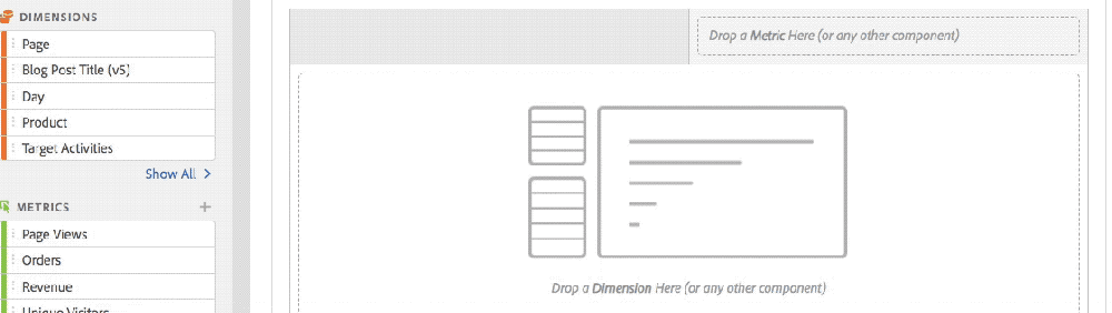
As I mentioned, some of the greatest stuff in Analysis Workspace is hidden or not super obvious to users. In Freeform tables, right-clicking opens up many great options that casual users don’t know about. While the 1980’s gamer in me loves the easter egg aspect of Workspace, especially when I can show someone a new feature they didn’t know about, I can tell you after training new folks on the product, they did not think it was as cool as I did! So the first part of this post will cover all of the “hidden” stuff that frustrated my students.

Hidden chevron in dimensions

A frequent task when using Workspace is going to the left navigation to view your dimensions (eVars and sProps) in order to find the values that have been collected within each dimension. For example, if you want to see a flow from a specific page, you would look for the page dimension in the left navigation to see its values and then drag over the desired page to the flow visualization. However, when doing exercises, most of my students could not figure out how to find the dimension values. Typically, when they looked at the left navigation and saw the dimensions (like Page), they got stuck. I told them that they needed to hover over the dimension and only then they would magically see a chevron which would then allow them to expand and see the resulting values as shown here:

Soon after, they would forget that the chevron was there and I had to keep reminding them of this. Evenutally, I began referring to this as the “hidden chevron” to jog their memory. They didn’t understand why the chevron couldn’t always be there as a reminder that there is more stuff to be found underneath it. I also had many students thinking that they were supposed to double-click on the dimension to expose its underlying values (which did nothing but select and deselect the dimension in the left navigation). So be on the lookout for this potential confusion from your users as well and you may want to just save time and introduce it as the “hidden chevron” from the start…

Hidden items in visualization header

When I began teaching students that they could copy, edit, duplicate and get links to a visualization by right-clicking, they were excited. However, they soon realized that knowing exactly where to right-click in the header of the visualization was hit or miss.

Eventually, they got it, but they often asked me why there wasn’t a gear icon for the visualization since almost every other thing in Workspace had a gear icon!

While on the topic of the visualization header, let’s discuss the “copy to clipboard” option. Many of my students assumed that this would be an easy way for them to copy the visualization and paste it into a PowerPoint slide to show others in a meeting. Unfortunately, here is what happens when you copy and paste using the Copy to Clipboard option:


It might be handy to have a copy visualization image option here in addition to copying the actual data.

Additionally, some super handy things in the header of the chart visualization include the ability to “lock” the chart to table data and/or to show/hide table data. Unfortunately, both of these options are found in a [very] tiny little dot at the top-left of the visualization as shown here:

While they would eventually learn this, I can’t tell you how many times I was asked: “where is the place that I lock data and hide the table?” Again, I am not sure why these options can’t be part of the gear icon that already exists for charts, but I just mention that you may have to tell your students a few times about the stuff hidden in the chart dots.

Hidden items in Freeform table columns

Freeform tables are often the most popular Workspace visualization. Like Excel spreadsheets, they allow you to see data in a tabular format. In Workspace Freeform tables, there is a way to customize the columns by hovering over the column header and clicking the gear icon. This was another “hidden” feature that users saw me demonstrate, but later could not find. They also could not figure out how to close the window that opened when they clicked the gear icon since there is no “X” there, so I had to tell them that they just had to click away from the box somewhere else. You can see both the hidden gear icon and the lack of a way to close the window here:

Similarly, changing the sort column in Freeform tables requires the user to know to hover their mouse in the exact right place (next to column total metric). Most folks thought that clicking the column heading would sort (as in the old “Reports” UI), but instead, they had to learn to hover in the correct spot to sort…

For both of these items (gear and sort), I assume that the icons are hidden to make the table look cleaner. However, I wonder if there might be a way to have an “edit” mode when building a project that displays all of the icons like there was an edit mode for dashboards in the older interface. Perhaps give users the option of which view they prefer and then people can have the best of both worlds?

Hidden drop zones

One of the coolest parts of Analysis Workspace is that you can drag and drop components all kinds of places and tweak your data. For example, you can drag segments or dimension values into Freeform table columns and in other visualizations. Unfortunately, there are some places that you can drop items that are so well hidden that many users don’t discover them or remember after they have been trained.

One example of this is the Fallout visualization. In this visualization, you can drag segment or dimension values to the top of the report and see the same fallout segmented as shown here:

The only problem is that there is nothing telling you that you can drop things there. I am not sure why there aren’t blank segment/dimension drop zone boxes there like there are for other visualizations (i.e. Flow, Cohort, etc.).

Similarly, in the Flow visualization, users need to know that they can drop a dimension value on top of another to replace it, but there isn’t any type of visual cue that this is possible. Also, if a user wants to add a second dimension to the Flow report, they have to know that there is another hidden drop zone to the right of the right-most column. You can see both of these here:

Don’t get me wrong, these are super-cool features, but I dare you to stand in front of a class of novice users and get them to find these and remember where they are two weeks later!

Other UX Items

Renaming Fallout Steps

When you create a fallout report, there are some cases in which the names of each fallout step can be very long. This can be due to long page names or having multiple items in each step. To remedy this, Workspace provides a way to rename each Fallout step. The weird thing here is that you only seem to be able to edit the Fallout steps if you mouse coming in the downward direction. Double-Clicking on the name, as my students tried to do, didn’t work. Here is a video of me trying to double-click and coming at the name from bottom and top:

Maybe I am just bad with my mouse, but I find it very difficult to get to the exact right spot to edit step names and my students did as well. My hunch is that there has to be a better way to let people rename steps…

Laptop Screen

I normally work on a huge monitor (three in fact!) when I am using Workspace. But when I began conducting training classes, I was on my laptop and my students were as well. I was amazed at how much harder some things in Workspace were when you were on a smaller screen. For example, as I began the class and asked my students to create their first project, they could not figure out how to do it. I couldn’t for the life of me figure out why they couldn’t do something so simple. Then I went over to their laptop and realized that the blue button they needed to click on the screen showing the templates was below the fold and they were not seeing it. They had to know to scroll down to see CREATE button they needed to click. You can see this here:

I had never seen that on my large monitor, but suddenly got it and was prepared for that in subsequent classes. I wonder if there should be a blue button at the top of the screen as well?

Another example of this was when I taught students how to use functions in the Calculated Metric builder. Students kept telling me that they didn’t have any of the functions and eventually I realized that they are so low in the left navigation on a laptop, that students weren’t seeing that they were in the left navigation as shown here:

There were more cases like this that popped up during the training and it made me wonder if those designing the Workspace interface were spending as much time using the tool on laptops as they were on large monitors?

Default Options

The last item I want to discuss is the concept of project default options. When you create a lot of Workspace projects, you tend to come up with your own little preferences on how you’d like to set them up. For me, I always begin a project by using Project – Info & Settings to make the project “compact” and whenever I add pathing-related visualizations (i.e. Flow Fallout), I tend to use Visit instead of Visitor. It would be great if I could tell Workspace that when I create a new project, I want these to be the default instead of having to update these each time. I am sure there are other items I’d like to make the default (i.e. color scheme) as well…

Summary

Once again, I’d like to stress that I love Analysis Workspace and am not a designer. My intention for sharing this information is to alert those who may be doing training of things that they might want to know about before they get the same types of questions I did. At some point, students/users have to just learn where things are and memorize it, but the above items might represent opportunities for Adobe to help everyone to more easily find and use the amazing features in the Workspace product.

Adobe Analytics

Training on Analysis Workspace (Part 1)

Analysis Workspace, the dynamic reporting interface for the Adobe Experience Cloud, is truly an amazing piece of technology. Over the past few years, Adobe has made tremendous strides in reporting by miraculously moving the functionality from the Ad-Hoc app to a similar, but web-based experience. You know the technology is good when, given a choice between the old “Reports” interface and the “Workspace” interface, most users voluntarily migrate over to the new one (even though some Ad-Hoc users are still not happy about Ad-Hoc being sunset).

Currently, I am in the midst of training approximately five-hundred people on Analysis Workspace for a client. When you conduct training classes on a product, you gain a new perspective on it. This includes being amazed by its cool parts and frustrated by its bad parts. You never really know a product until you have to stand up in front of thirty people, two times a day, five days a week and try and teach them how to use it. Since I have done a lot of training, when conducting a class, I can easily see in people’s faces when they get something and when they don’t. I also make mental notes of things that generate the most questions on a consistent basis. As a power user myself, there are many things in Workspace I take for granted that are confusing for those newer to the product and those casual users who may only interact with it a few times per week.

Therefore, the following will share things I observed while training people on Workspace in case it helps you when training your team on Workspace. The items that my students found confusing might also confuse your co-workers, so think of this as a way to know where potential land-mines might be so you can anticipate them. This is by no means meant to be critical of Adobe and the Workspace product, but rather simply an accounting of areas my students struggled with.

So what follows is a laundry list of the things that I noticed confused my students most about Workspace. These were the times I was explaining something and I either got questions, saw confused looks on faces, or had students unable to easily complete hands-on exercises. While I don’t have time in this post to document how I explained the items below, what you find below is just meant to highlight things that you may encounter.

Difference between segments and dimension values

There are many cases in Workspace where you can use segments or specific values of a dimension to narrow down the data you are analyzing. For example, you can apply both to the drop zone at the top of a project panel or within columns of a freeform table. Unfortunately, it isn’t easy to explain to novices that using a Segment can narrow down data by Visitors, Visits, or Hits, but that filtering using a dimension value is limited to applying a Hit filter (unless you edit it and turn it into a segment). This is especially true when using dimension values to create cross-tabs or within Venn visualizations.

Difference between using dimension and dimension values

There are some cases where your users may be confused about whether they should drag over the dimension or the dimension values (using the hidden dimension chevron-more on this next week!). For example, when you use a Flow visualization, even though it is labeled in the boxes, I found many users were confused about the fact that they could only drag the dimension to the Entry/Exit box, but could drag either a dimension or a dimension value to the middle box.

It was also confusing to them that dragging over the dimension picks a dimension value for them, which then has to be replaced with the actual dimension value they want by dropping it on top of the focus value of the flow (with no type of indicator letting them know that it was even possible to drop a page value onto the existing page value).

Pathing visualizations with Visit or Visitor radio button

While on the subject of the Flow pathing visualization, I also received numerous questions about whether they should use the Visit or Visitor option (radio button) for Flow and Fallout. If using Visitor, does it matter if the same visitor repeated steps or took slightly different paths in their second/third visit? Why does Workspace default to Visitor? Is there a way to make Visit the default for all new visualizations?

Count Instances

In the Project – Info & Settings, there is an option to count instances or not. This was very confusing to people and it would be good if Adobe could provide more context around this and what it impacts.

I also tried to avoid conversations about “Repeat Instances” in Flow reports for my novice users since I learned early on that this concept was only really understood by more experienced users.

Default Occurrences Metric

If you make a new freeform table in Workspace and start by dragging over dimensions before metrics, the table defaults to the Occurrences metric.

As you can imagine, explaining what an Occurrence is versus a Page View can be tricky for people who only casually use Adobe Analytics. While I use it as a good interview question, everyday users can find this confusing, so it may be better to default new tables to Page Views or Visits. I also recommended that my students always add metrics to tables before dimensions to minimize seeing the Occurrences metric.

Time Dimensions/Components

When I was doing exercises with students, I would often ask them to make freeform tables and show me the data by day, week or month. So, they would use the left navigation to search and see this:

At this point, they would ask me whether they should use the “orange” version of the week or the “purple” version of the week. This led to a discussion about how Time components alter the dates of the project and usually was a downward spiral from there for novice users! One thing you can do is to use Workspace project curation and share a project that has fewer items to limit what novice users will see.

Viewing the same dimension as eVar and sProp

While this is not really a Workspace issue, I often got questions about cases in which doing a search in the left navigation produced multiple versions of a dimension:

Putting aside the awkward conversation about eVar Instances and the Entry/Exit versions of sProps, this forces a conversation about when to use the eVar version and when to use the sProp version that very few novice users will understand. This is why I encourage my customers to remove as many of their sProps as they can to avoid this confusion. In the “Reports” interface, eVars and sProps are segregated, but in Workspace, they can be seen next to each other in many situations. Again, you can use Workspace project curation and share a project that has fewer items to limit what novice users will see.

Filtering & Column Totals

When I explained how users could use the text filter box in the column header of Freeform tables (which they can only see if they hover) to choose the specific values they want to see, users didn’t understand why the column totals didn’t change to reflect the newly filtered values.

They expected that the column totals and the row percentages would change based upon what was filtered. When I explained that this could be done through segmentation versus filtering, I got a lot of head scratches. Perhaps one day, Workspace will add a feature to let users choose if they want to have filter impact column totals and row percentages.

Temporary Segments & Metrics

There are a few places in Workspace where you can quickly create segments or new metrics. The former can be done in the segment area at the top of each panel and the latter can be done by right-clicking on columns. Unfortunately, in both of these cases, the segments/metrics created are “temporary” such that they don’t appear in the left navigation or in other projects (unless you edit them and choose “make public” option). I am sure this feature was added to reduce clutter in the left navigation component area, but as a trainer, it is hard to explain why you should create segments/metrics one way if you want them to be “public” and another way if they are “temporary.” I am not sure of the solution here, but I will tell you that your users may be confused about this as well.

Fallout with Success Events vs. Calculated Metric with Success Events

When doing classes, I often asked students to show me the conversion rate between two Success Events. For example, there might be a Leads Started event and a Leads Completed event and I wanted them to tell me what percent of Leads Started were Completed. To me, this was an exercise to have them show me that they knew how to create a new Calculated Metric. However, I was surprised that on multiple occasions students chose to answer this question by creating a Fallout report that used these two Success Events instead. Unfortunately, the resulting conversion rate metric will not be the same since the Fallout report is a count of Unique Visitors and the Calculated Metric divides the actual Success Event numbers. Sometimes they were close, but I got questions about why the numbers were different. This is just an education thing, but be prepared for it.

Derived Metrics & Cohorts

One of the things I love the most about Adobe Analytics is the ability to create derived metrics. These are Calculated Metrics that have a segment or dimension value associated with them. When I explained Cohort tables to students, they thought they were cool, especially when I showed them how to apply segments to Cohorts. Unfortunately, you cannot use Calculated Metrics (of which derived metrics are a subset) in Cohort reports. Upon learning this, my students astutely pointed out that you can add a metric and a segment to a Cohort table, but you cannot add a derived metric, which is just a metric and a segment combined. They didn’t understand why that would be the case. I am sure there is a valid reason for this, but I just wanted to highlight it as another question you may receive.

Segmentation and Containers

Ever since segmentation was created in Adobe Analytics, it has been something that confused novice users. Since you can add so much to a segment and use so many operators, it can be overwhelming. Teaching segmentation is typically the hardest part of classes on Adobe Analytics and since it is front and center in Workspace, it is unavoidable.

One particularly confusing area is the topic of containers within segments. Most people can [eventually] understand why they need containers when different operators are being used, but what I found in my classes is that understanding that each container can be set to Visitor, Visit, or Hit level can push novice users over the edge! If users add a container, it defaults to a “Hit” container which can produce no data in certain situations like this:

Summary

To summarize, the above items are ones that I found generated the most questions and confusion consistently across many classes with students of varying degrees of experience with Adobe Analytics. When these types of questions arise, you will have to decide if you want to tackle them and, if so, how deep you want to go. For now, I just wanted to share my experience as something to consider before you train your employees on Workspace. In next week’s post, I will outline some of the Workspace UX/Design things that my students struggled with in classes.

Adobe Analytics

Values – First/Last/Exit

One of the concepts in Adobe Analytics that confuses my customers is the notion that each sProp has a normal value, an entry value, and an exit value. When using Analysis Workspace, you might see something like this in the left navigation when filtering:

As you can imagine, this could freak out novice users. More often than not, when I ask users “What do the Entry and Exit version of sProp X represent,” I hear this:

“The Entry version of the sProp is only counted when the sProp is sent a value on the first page of the visit and the Exit version is only counted when the sProp is set on the last page of the visit…”

That seems logical, but unfortunately, it is wrong! In reality, the Entry version of the sProp simply stores the first value that is passed to the sProp in a visit and the Exit version stores the last value that is passed to the sProp in a visit. Instead of Entry and Exit, Adobe should really call these First and Last values of the sProp (but that is probably not high on their list!). If a visit contains only one value, then that value would be the same in the Entry version, the normal version and the Exit version of the sProp. But if the sProp contains several values in the visit, one will be designated as the first (entry) and one will be the last (exit). Here is Adobe’s explanation in the documentation:

However, the larger question is why the heck does Adobe even store all of these extra values? How can you use them? These Entry and Exit values are typically used in pathing-related reports, but in this post, I will share some other ways to take advantage of the confusion that these extra sProp values create.

Example: Internal Search Keyword Analysis

Let’s imagine that you have a site that has a lot of internal searches and keyword activity. You are trying to determine which keywords are doing well and which are not. While you may already be tracking the internal search click-through rates, internal search placement and average internal search position clicked, in this scenario, you want to see how often each internal search keyword used was both the first one searched and the last one searched and what the exit rate was for each keyword. This can all be done using the aforementioned derivatives of the internal search keyword sProp.

To start, let’s create a table that captures the top five internal search keywords (FYI: for an sProp, Occurrences is the same as an Internal Searches success event):

Next, let’s breakdown the top keyword by the Entry version of the sProp to see how often the most popular keyword was also the entry keyword:

Here we can see that 68.5% of the time, the top keyword searched was also the entry (first) keyword. Next, we’d like to isolate the 68.5 % and use it as a metric, so I created a new calculated metric that pulls it into its own column. This is done by dividing Occurrences by the column total using a calculated metric function:

When saved and added to the table, it looks like this:

Next, I am going to create a summary number based upon the cell that contains the 68.5%:

Then I am going to repeat all of these steps for the Exit Search term so I have an additional table that looks like this:

In this case, our most popular internal search keyword was also the last keyword used 87% of the time so I will add that as another summary number (I collapsed the first table so you could see it more easily):

Next, I want to see how often the keyword is used and then visitors exit the site on the search results page (similar to what I described in this old post). I do this by creating a new calculated metric that quantifies how often the search results page is the exit page:

Then I can add this to my table and create another calculated metric to divide Occurrences by Search Page Exits:

Here I can see that the top search keyword is an exit 34.6% of the time. Again, I create a summary number so I have all three at the top of my Workspace project:

Build For Scale

So all of that was pretty cool! In one row, I can see the keyword’s first use, last use, and exit %. However, there is one problem. All of this is hard-coded to my top internal search keyword. That is not very scalable. What if I want to see the same numbers for any internal search keyword?

To make this a bit better, the next step is to pick a bunch of internal search keywords and drag them to the segment area, using the shift key to make them a picklist:

Once you do this, you can pick one of your keywords and all of the tables will focus on that keyword like this:

Even better, now that we are narrowing down to just one keyword, we can lock in the Exit Keyword % Summary Number since it will always be the top-right cell:

Now, we can simply change the drop-down value and all of our numbers should re-adjust as shown here:

This works by default because many times the chosen keyword will also be the first and last keyword, so the highlighting of the top-right % in each table works and updates the summary numbers. However, that will not always be the case. Sometimes, the most popular first/last keyword will not be the same as the chosen keyword itself (Note: You can vote for my idea to make cells references to other cells in Analysis Workspace like you can in Excel!). In that case, you may have to manually select the First and Last keyword to see the correct summary numbers as shown here:

Therefore, I have finished this dashboard by putting a text box explaining this potential warning and need for adjustment:

Summary

As stated at the beginning of this post, understanding the “Entry” and “Exit” versions of sProps can be a bit confusing. But once you understand the concept, you can identify ways to leverage them to do additional analysis. In this post, I covered a way to utilize the First and Last sProp values to quantify the percent of the time the same internal search keyword was used first and last. This concept can be applied to any sProp, not just internal search keywords. Anytime you want to compare values stored in sProps with the first and last entries received, you can try this out.

Adobe Analytics

Page Summary Report in Workspace

While I spend 99% of the time I use Adobe Analytics in Analysis Workspace, there are still a few things that haven’t migrated over from the old interface. One of them is the Page Summary Report. While I can’t believe that I still use a report that was around in version 9.x, at times, it is handy to get an overview of a specific web page. Here is what it looks like:

As you can see, there is a lot of information packed into a small space and it offers links as launching off points for several key reports.

Unfortunately, there is really no equivalent to this report in Analysis Workspace. Therefore, I decided to see if I could re-create it. While I was able to do most of it, it wasn’t as straightforward as I thought it would be (though it did spawn a few Workspace feature requests!). While “the juice may not be worth the squeeze” in this case, in the name of science, the following will show you how I did it…

Creating the Page Summary Report in Workspace

The first step is to create a trended view of the page you want to focus on. To do this, you can create a table that shows Page Views and use Time components to view this month, last month and last year like this:

You will notice that I have six columns of data here instead of three. This is because you can look at the data for the current month or a past month. In this case, I am looking at May 2019 data but I am currently in the month of June. To view last’s month’s page summary data, I highlight the left three columns. If I were still in May, I would highlight the right three columns. Regardless of which month I am interested in, the next step would be to add a chart for the three highlighted columns like this:

Next, you can apply a page filter with a bunch of pages like this (remember to hold down the Shift key!):

Next, you can pick the page you want to focus on from the list and your table and chart will be filtered for that page:

Once you have this, you can hide the table that underlies the chart to save room in your project.

Next, we have to add a Flow visualization to see where people are going before and after the page of interest. Unfortunately, we can’t add a Flow visualization to our existing Workspace panel because that is being filtered for only hits where the Page equals our page of interest (the default nature of filters). Therefore, we need to add a new panel and add the Flow visualization to it and drag over the page we care about as the focus of the Flow visualization. In this case, that page is the Adobe Analytics Expert Council Page:

To view that we are on the right track, we can compare the old Page Summary Report to the Workspace one to see how we are doing so far…Here we can see that our chart looks pretty similar (the old page summary report shifts dates slightly to line up days of the week):

And we can see that our flow looks similar as well:

Next to tackle is a list of detailed metrics that the old Page Summary report provides that looks like this:

To replicate this, we need to make some summary metrics in Workspace, which means that we need a table that has the metrics we need with a filter for the page we are focused upon:

A few things I discovered when doing this include:

  • Page Views and Occurrences are the same, so you can use whichever you prefer
  • Single Page Visits only matches the old page summary report number if repeat instances are on for your Workspace project
  • There is no “Clicks to Page” metric in Workspace, but I found that this is really just Average Page Depth. Therefore, you can use that or do what I have done and created a new Calculated Metric called Clicks to Page that has Average Page Depth as the formula.
  • Workspace shows Time Spent in seconds vs. the minutes version shown on the old page summary report. You can create a new calculated metric to divide by 60 if you’d like as shown above. However, I am finding that the numbers for this metric don’t always match perfectly (but who really cares about time spent right?)

The only metric we are missing from the old page summary report is the percentage of all page views. This one is a bit tricky due to the fact that you cannot divide metrics from different Workspace tables by each other or divide Summary Metrics (please vote for this here!). To view this, we will create a new calculated metric that divides Page Views of our focus page by the total Page Views for the time period. To do this, we create a “derived” metric that looks like this:

This can all be done from within the calculated metric builder like this:

Once we have our new metric, we create a new table that looks like this:

From here we can add some Summary Numbers using the totals of the columns in our two new tables:

You will see that these numbers match what is found on the old Page Summary report:

As you can see, these numbers are spot on with the old page summary report.

Viewing Page Summary for Another Page

Unfortunately, when you want to focus on a different page, this Page Summary Workspace project will not auto-update by simply changing the page name in the top filter area. There are a few changes you need to make due to the fact that you cannot currently link segments/filters in Workspace projects (here is my idea suggestion on how to make this a bit easier). Until then, I have added a text box at the top of the project that explains the instructions for changing to a new page:

While this may seem cumbersome, here is a short video of me changing the entire project to use a new page (in under one minute!):

When this is done, the summary metrics look like this:

And the Page Summary report looks like this:

So other than the time spent metric being a bit off, the rest of the numbers are an exact match!

Finally, when you are finished, you can clean-up the project a bit by hiding data table and curating so the end result looks something like this:

Adobe Analytics

Using Query Strings to Test Adobe Analytics Data

Have you ever wanted to run a specific scenario in Adobe Analytics, but couldn’t find the exact page flow or variable combination in your own data? This happens to me often. I want to view visitors going down a specific path or setting a specific eVar, but even after spending a lot of time building granular segments, I still can’t mock up or test the scenario I want. If I could isolate the right traffic, I could test out specific website paths, test to see if eVars are behaving as I’d expect and so on. While there are a few “techy” ways to do this with JavaScript, if you are not super-technical (like me), this post will show how you can do this yourself with no tagging required.

Query String & Processing Rule

One way you can mock-up or test the data you want is to use query strings and an Adobe Analytics processing rule. Query strings are parameters appended to page URL’s and you can set them to whatever you want. Adobe Analytics processing rules allow you to set Adobe Analytics variables using rules instead of JavaScript code. When you combine the two, you can pick and choose what data you want to capture in Adobe Analytics later on through an easy application of segmentation.

To start, you will want to come up with a query string parameter that you will use for the times you want to make your own data. In this case, I will use the query string of “?qa_test=” in the URL. For example, if I want to count an instance of the Analytics Demystified home page in my data set, I would make the URL look like this:

https://analyticsdemystified.com?qa_test=XXX

Next, you can set up a processing rule that will look for this query string and pass anything found AFTER the equals sign to an Adobe Analytics variable. In this case, I have created a new sProp called QA Test [p11]. Here is what the processing rule using the query string and this new sProp looks like:

Once this processing rule is active, any URL that has a “?qa_test=” query string will pass the value to the sProp which means that I can run as many test scenarios as I want. To demonstrate this, let’s go through an example. Let’s say that I want to view a specific website path. The path I want is one in which a visitor enters on the home page, views a blog post of mine talking about my Sydney Australia class and then exits on the Eventbrite link to register for the class.

To start, I would copy and paste the URL of my home page and append the appropriate query string (“EntryHomePage:AustraliaPost:LinkOutEventbrite” in this case) like this:

Next, I would repeat this for the URL of the Australia blog post, making sure to append the same query string parameter and value:

Lastly, I would click the link to Eventbrite, which would count as an exit link (so it doesn’t need the query string parameter):

In this scenario, we have sent two hits into Adobe Analytics and then had one exit link. Depending upon how you build your segment later (Hit vs. Visit), it doesn’t even matter if you click on other pages in between the ones you care about. If you later use a Visit segment, it will include all hits, but if you use a Hit segment, it will only include the ones you have designated (more on that later). If you want to test that your hits are coming through, you can use the Real-Time reports to view your QA Test sProp values in near real-time (Note: Processing Rule data will not appear in the Experience Cloud Debugger):

Using Your Data

Once you have passed the data you need, the next step is to build a segment that isolates this data. As mentioned above, a Hit segment will show only the pages that had the query string parameter, but a Visit/Visitor segment container will bring back other pages viewed in the same session or by the same browser. In this case, let’s use a Hit container so we only see the specific data we intentionally added. To do this, you simply make a Hit segment with the sProp11 equal to the value you placed in the query string:

Here we can see that there is 1 Unique Visitor, 1 Visit and 2 Page Views for the segment. This looks correct, so we can save it and begin applying it to reports. With the segment applied, we can check out the results. In this case, I will add a Pages and Exit Links table to see if the data looks as I expect (which it does):

Obviously, this is a very simple example, but it still illustrates that you can use a query string and processing rule to isolate whatever traffic you want.

Advanced Uses

If you want to get a bit more sophisticated with this approach and you don’t want to spend your life setting query strings on each page, another way to use this concept is to simply begin a visit with a query string and then use an “entry” segment to include all data taking place after the initial query string. To do this, I suggest that you begin by clearing your cookies or use a private or incognito browser window. Once you have that, paste in the entry page URL with the desired query string like this:

Once you have done this, you can surf the site however you want to generate the traffic you want to see in your reports. Watching the sequence below, you can see that I have chosen to view the Demystified home page,  then a page detailed some training days we are doing in Chicago later this year, then a page about the AAEC, then a page showing when Demystified folks are speaking at events and then back to the home page.

Once you have completed this, you can create a new segment that looks for Visits that began with the chosen query string parameter. This can be done a few ways using a URL variable or using the Entry version of the QA Test sProp as shown here (note that the query string doesn’t have to be the first page of the visit):

When that segment is applied, you will see the pages and paths that took place accordingly:

Test New Flow Instances

This concept can also be used to test out specific Adobe Analytics features. For example, let’s pretend that you don’t trust that Adobe has really addressed the “repeated instances” in Flow visualizations described in this post. To test this, you can use the entry query string concept again to model a specific path. In this case, I am using ?qa_test=EntryPageTest2″ on the first URL of the session and, in the session, I am visiting a few pages on the Demystified website. You will notice in the page sequence below that I am purposely refreshing two pages in my session (Adobe Analytics Expert Council and Adobe Analytics Audit):

Once that session has processed, I can create a new segment that looks for pages where the entry value in my QA Test sProp equals “EntryPageTest2” per the description above. Next, I can apply this segment to a Flow Visualization. In the video below, notice that I am first looking at the path flow where repeat instances are disabled. In that case, I see the pages in the order I viewed them and the page refreshes don’t appear. But once I change the setting to include the repeat instances (as was always the case prior to last week’s ADobe release), I can once again see the same page repeated three times for the AAEC page and two times for the Audit page.


Therefore, using the query string parameter, I can do some very detailed tests and make sure that everything in Adobe Analytics is working as I would expect.

Summary

As you can see, this technique can be used whenever you want to be prescriptive about the data you are viewing in Adobe Analytics. And since it requires no tagging, anyone [who has Admin rights] can do it. I have found this especially useful when I want to test out the differences between Hit, Visit and Visitor segments and testing segments in general. The above has mainly shown how the technique can be applied to pathing/flow sequences, but it can also be used to test out any type of Adobe Analytics tagging.

Adobe Analytics

Once Per Visit Success Events

Recently, while working with a new client, I noticed something that I have seen a few clients do related to Once per Visit Success Events. These clients set a bunch of Success Events with event serialization set to Once Per Visit as seen here in the Admin Console:

In these situations, the client tends to have the same Success Event unserialized in a different variable number. For example, they might have event10 set to Form Completions and then event61 set to Form Completions Once per Visit.

So why would a company do this? In most cases, the company wants to have a count of cases in which at least one instance of the event took place within the session. While there are some good reasons to use Once per Visit event serialization, in most cases, I feel that duplicating a large swath of your Success Events in order to have a Once per Visit version is unnecessary. Doing this adds more data points to your implementation, causing the need for more QA and potentially confusing your end-users. In this post, I will share an alternative method of accomplishing the same goal with less tagging and work in general.

Derived Metrics Alternative

As I have discussed in previous blog posts, it is easy to use the Calculated Metric builder to make brand new “derived” metrics in Adobe Analytics. In many cases, this is done by adding a segment to another metric in a way that makes it a subset of the metric. As such, derived metrics can be used instead of duplicating your Success Events and making a Once per Visit version for each. To illustrate this, I will use an example with my blog.

In this scenario, let’s imagine that I have a need to view a metric that shows how many website visits contained a blog post view. I already have a Success Event that fires whenever a blog post view occurs, so I can see how many blog post views occur each day, but that is not what is desired in this case. Instead, I want to see how many visits contained a blog post, so using the method described above, I could create a second Success Event that fires each time a blog post view occurs and serialize it as Once per Visit. This second Success Event would only count once regardless of how many blog post views take place in the session. If I compare this new Success Event to the raw Blog Post Success Event metric, I might see something like this:

Here you can see that the serialized version is less than the raw version, with the difference representing visitors who viewed multiple blog posts per visit.

But as mentioned earlier, this required creating a second Success Event which I don’t really want to do. I can get the same data without any additional tagging work by leveraging derived metrics in Adobe Analytics. In this example, I will start by building a segment that looks for visits in which a blog post view existed:

Next, I will add this new segment to a new Calculated Metric along with Visits as shown here:

Now I have a new derived metric that counts visits in which a blog post took place. If I add this new metric to the table shown above, I see the following:

As you can see, the new derived metric is exactly the same as the Oncer per Visit Success Event, but any user can create it with no technical tagging or additional QA needed! Sometimes, less is more! You can create as many of these derived metrics as you need and share them with your users as needed.

Caveats

There is one important thing to remember when considering whether to set additional Oncer per Visit Success Events or use derived metrics. Derived metrics are a form of Calculated Metrics and Calculated Metrics cannot be used everywhere within Adobe Analytics. For example, Calculated Metrics cannot be used in segments (i.e. Calculated Metric X is > 50), cohort analyses, histograms, DataWarehouse, etc. Therefore, it is important for you to think about how you will use the metrics before deciding whether to make them actual Success Events or derive them via Calculated Metrics. My advice is to begin with the derived metric approach and see if you run into any limitations and, only then, create new Once per Visit Success Events for metrics that need it.

Adobe Analytics

Analysis Workspace Flow Reports Without Repeating Instances!

Yesterday, Adobe released a new update to the Analysis Workspace Flow visualization that [finally] has the long-awaiting “no repeat instances” feature. This has been something that has prevented many Adobe Analytics users from abandoning the [very] old pathing reports in the old interface. In the old interface pathing reports, if a visitor had a sProp that received the same value multiple times in a row, the path reports would ignore the repeat values and only create a new path branch when a new value was received. When the Analysis Workspace Flow visualization was introduced, it came with the ability to view paths for sProps and eVars, which was super exciting, but when people starting using the new Flow reports they would see the same value over and over again like this:

This was due to the fact that the Flow visualization was based upon persisting values instead of instances. As of yesterday, Flow reports are based upon actual instances of values being passed and the new checkbox gives you the ability to view or not view those repeat instances. Therefore, the initial Flow visualization report was like taking one step forward, but another step back. The duplicative values would appear for a number of reasons:

  1. eVar persistence;
  2. Page refreshes;
  3. Visitors getting an eVar value, then going to another page and then coming back to a page where the same eVar value was set (in the example above, the blog post title is set each time the blog post is viewed);
  4. Visitors having sessions time out and then restarting the session on a page that passes the same value.

This problem was exacerbated if you chose to have your flow based upon “Visitor” instead of “Visit” since the visitor could return the next day and receive the same values. The end result was that people like me would continue to use sProps for pathing to avoid the messiness shown above since it isn’t fun explaining the inner workings of Adobe Analytics “Instances” to business stakeholders!

However, with yesterday’s release, you now have the ability in the settings panel of the Flow visualization to toggle off repeat instances:

When you uncheck the repeat instances setting, the above report will look like this:

In this view, only different values will create new flow branches, like is the case in the old pathing reports. But since you can use the Flow visualization with eVars and sProps, you no longer need to reply on the pathing reports of the old Reports interface.

In case you are curious, I also tested what happens with a sProp. In this case, I store the blog post title in both a sProp and an eVar, so I can easily see the flow visualization for the sProp version. As you can see here, it is identical to the eVar:

The same is true for the version that hides repeat instances:


Use Cases

So how can you take advantage of this new Flow visualization feature? As I stated, the most obvious use case is to cut back on any sProps you were using simply for pathing purposes. As I have mentioned in the past, casual users of Adobe Analytics can easily get confused when there are multiple versions of the same variable since they don’t really understand the differences between an eVar and a sProp (nor should they!). For example, if you are tracking internal search terms in an eVar, but want to see the order in which search terms are used, you can now do both with the eVar instead of having to create a redundant Internal Search Term sProp.

Other use cases might include:

  • Ability to view Marketing Channels used including and not including cases where the same marketing channel was used in succession
  • Ability to see which top navigation links are used including and not including cases where the same nav link was clicked in succession
  • Ability to view clicks on links on the home page including and not including cases where the same link was clicked in succession

Fine Print

There are a few cases called out in the documentation for which it is not possible to use this new “no repeat instances” functionality. Those cases involve variables that have multiple values such as list eVars, list sProps, the Products variable and merchandising eVars:

This makes sense since there is a lot going on with those special variables, but if you use them in the Flow visualization, the new “repeat instances” option will be grayed out indicating that it cannot be used:

BTW, if you try to beat the system and add a multi-valued dimension to an existing flow report, you will get the following warning (Ben, Jen & Trevor think of everything!):

Summary

Overall, this new Flow visualization feature will make a lot of people’s lives easier and I encourage you to check it out. If you want to learn more about it, you can check out Jen Lasser’s YouTube video about it. Enjoy!

Adobe Analytics

Real-Time Campaign Activity

If you work at an organization that does a lot of digital marketing campaigns, there may be occasions in which you or your stakeholders want to see activity in real-time. In this post, I will demonstrate how to do this in Adobe Analytics.

Campaign Tracking – eVar

If you are using digital marketing campaigns, you should already be tracking marketing campaign codes in the Adobe Analytics Campaigns variable. This involves passing some sort of string that represents each different advertising spot down to the most granular level. These codes can be numeric or you can structure them in a way that makes sense to your organization. I use the UTM method that Google has made a common standard.

However, even if you are tracking your campaigns correctly in the Campaigns variable, there is another step you need to take in order to view people accessing the campaign codes in real-time. Adobe Analytics real-time reports work best with Success Events and sProps. The Campaigns variable in Adobe Analytics is an eVar and eVars don’t work super-well with real-time reports because they persist. If you attempt to select the Tracking Code (Campaigns) eVar from within the real-time report configurator, you will see this:

This scary warning is basically telling you that using an eVar might not work. Here is what the real-time report looks like if you ignore the warning:

As you can see, that doesn’t produce the results you want. Therefore, once you have your campaign codes in the Tracking Code (Campaigns) variable, there is one more step you need to take to view them in real-time.

Campaign Tracking – sProp

Since real-time reports work better with sProps, the next step is to copy your campaign tracking code values to a sProp. This can be done via JavaScript, TMS or a processing rule. Here is a simple Processing Rule that I created to copy the values over to a sProp:

To be sure the data is copying over correctly after you have some time for data to collect, you can open the new sProp report and view the data:

Next, you can go back to the real-time report configurator and choose to base your report on this new sProp dimension. Once you save and refresh, you will see your campaign codes stream in as visitors hit your site:


Filtering

One last tip related to using the real-time reports. In this campaign code scenario, you may find cases in which the real-time report contains codes that are from older campaigns that don’t apply to your current analysis. For example, you might want to see how the various “exp-cloud-aud” campaign codes are performing, but there are others appearing as well:

Luckily, there is an easy way to filter the real-time report values to focus on the exact ones you want (assuming you have named them in a way conducive to text filtering). This can be done by adding a text filter in the search box as shown here:

Summary

While I am not often a huge fan of “real-time” data, there may be some cases in which you want to see how different advertising units are performing quickly so you can make some adjustments to hit your conversion targets. This simple method allows you to easily see how campaign codes are being used in real-time. Lastly, if you use processing rules for your marketing channels, you can follow the same approach to see marketing channel usage in real-time as well.

Adobe Analytics

Sharing Experience Cloud Audiences – Part 2

In my last blog post, I showed an example of how you can create a segment in Adobe Analytics, push it to Adobe Target and then use Adobe Target to show personalized content on your website. It was a relatively basic example but showed how you could begin to leverage the power of the Adobe Experience Cloud audience sharing feature. In this post, I will build upon what was done in the last post and show some additional ways you can integrate Adobe Analytics and Adobe Target.

Sharing Converse Segment

In the last blog post, the scenario involved showing a cross-sell promo spot when visitors meet a specific segment criterion, which in that case was viewing two or more “Adam Greco” blog posts. We built a segment looking for those visitors and sent it to Adobe Target as a shared audience and then showed a cross-sell promo to the audience. But what if we wanted to show something different to the visitors that didn’t meet the targeting criteria? In that case, we could have default content or we could use a “converse” (opposite) segment to push something different to visitors who didn’t meet our segment criteria.

To illustrate this, let’s look at the segment we used to identify those who had viewed 2+ of my blog posts, but not viewed my services pages:

Now, if we want to show a different promotion to those who don’t meet this criterion, we can create a “converse” segment that is essentially the opposite of this segment as shown here:

To test that we have our segments setup correctly, we can build a table and make sure that the numbers look correct:

If you create your “converse” segments correctly, you should see the numbers in the right two columns add up to the first column, which they do in this case. Of course, you can create different segments and show different promos to each segment as needed, but in this simple example, I just want to show one promo to people who match the first segment shown above and another promo to those who don’t. Once both segments have been pushed to Adobe Target, the appropriate content can be pushed to the page using the “mbox” shown in my previous post.

In this case, I have decided to push a promo for my cool Adobe Analytics Expert Council (which you should probably apply for if you are reading this!). All those who aren’t targeted to learn about my consulting services will see this as the fallback option.


Track Promo Clicks and Impact

Another way to build upon this scenario is to track the use of internal promotions in Adobe Analytics. For example, when visitors click on one of the new promo spots being served by Adobe Target and shared audiences, you can set a click Success Event and also capture an internal tracking code in an eVar. The Success Event will tell you how many times visitors are engaging with the new targeted promo spots and the internal campaign eVar will tell you which ones were clicked and whether any other website conversion events took place after the internal promo was used.

Here is an example of an internal campaign clicks Success Event:

Here is an example of those internal campaign clicks broken down by internal campaign in the eVar report:

This report allows you to see which of these new promos is getting the most clicks (to see impressions and click-through rates of each promo is more involved and described here). It is relatively easy to see how often each promo leads to website Success Events since their values persist in the eVar. For example, in the screenshot shown above, when visitors click on the AAEC promo, I am setting a Success Event on the click, an internal campaign code in an eVar and if the visitors clicks the “Apply” button on the post, I am setting another Success Event. Therefore, I can view how many clicks the AAEC promo gets and how many AAEC Applications I get as a result:

In this example, we can see that the AAEC promo got twenty-five clicks and that four of them resulted in people beginning the application process (and there was one case of someone applying for the AAEC without using the promo). If I wanted to get more advanced, I could have multiple versions of the AAEC promo, use Adobe Target to randomly show each and use different internal campaign codes to see which version had the best conversion rate.

Summary

As you can see, the combination of Adobe Analytics shared audiences, Adobe Analytics and Adobe Target can be very powerful. There are countless ways to leverage the synergies between the products and these are only a few of Adobe’s suite of products! I recommend that you start experimenting with ways you can combine the Adobe products to improve your website/app conversion.

Adobe Analytics

Sydney Adobe Analytics “Top Gun” Class!

UPDATE: Sydney “Top Gun” class is now sold out!

For several years, I have wanted to get back to Australia. It is one of my favorite places and I haven’t been in a LONG time. I have never offered my advanced Adobe Analytics “Top Gun” class in Australia, but this year is the year! I am conducting my Adobe Analytics “Top Gun” Class on June 26th in Sydney. This is the day before the Adobe 2019 Sydney Symposium held on June 27-28, so people who have to travel can attend both events as part of the same trip! This will probably be the only time I offer this class in the region, so I encourage you to take advantage of it! Seats are limited, so I suggest you register early!

Here is a link to register for the class: https://www.eventbrite.com/e/analytics-demystified-adobe-analytics-top-gun-training-sydney-2019-tickets-54764631487

For those of you unfamiliar with my Adobe Analytics “Top Gun” class, it is a one-day crash course on how Adobe Analytics works behind the scenes based upon my Adobe Analytics book. This class is not meant for daily Adobe Analytics end-users, but rather for those who administer Adobe Analytics at their organization, analysts who do requirements gathering or developers who want to understand why they are being told to implement things in Adobe Analytics. The class goes deep into the Adobe Analytics product, exploring all of its features from variables to merchandising to importing offline metrics. The primary objective of the class is to teach participants how to translate everyday business questions into Adobe Analytics implementation steps. For example, if your boss tells you that they want to track website visitor engagement using Adobe Analytics, would you know how to do that? While the class doesn’t get into all of the coding aspects of Adobe Analytics, it will teach you which product features and functions you can bring to bear to create reports answering any question you may get from business stakeholders. It will also allow you and your developers to have a common language and understanding of the Adobe Analytics product so that you can expedite getting the data you need to answer business questions.

Here are some quotes from recent London class attendees:

Again, here is a link to register for the class: https://www.eventbrite.com/e/analytics-demystified-adobe-analytics-top-gun-training-sydney-2019-tickets-54764631487

Please e-mail me if you have any questions.  Thanks!

Adobe Analytics

Sharing Experience Cloud Audiences

One of the advantages that Adobe Analytics offers over other digital analytics tools is that it is part of a suite of products. Analytics integrates with AEM, Adobe Target, and other Adobe Experience Cloud products. Adobe has been transitioning more and more of its features to the “core” level so users can share things between Adobe Experience Cloud products. One of the most interesting things that can be shared are audiences (segments). However, I have not seen as many of my customers take advantage of these types of integrations. So in this post, I am going to share a simple example of sharing audiences in the Adobe Experience Cloud using Adobe Analytics and Adobe Target that my partner Brian Hawkins and I created as an experiment. While the example we use is very simplistic, it does a good job of demonstrating how easy it is to share audiences/segments between the various Adobe products.

Scenario

Since our Analytics Demystified website doesn’t have much other than blog posts, the best scenario we could come up with was to promote our B2B services through internal promotions. The idea is to find website visitors who have viewed a bunch of our blog posts and see if we can get them to engage with our consulting services. In reality, that isn’t why we write blog posts and we don’t expect people to actually click on the promotion, but this is just a demo scenario. In this scenario, I will be the guinea pig for the integration and look for people who have viewed at least two of my blog posts but never viewed any of the website pages that explain my consulting services. Once I isolate these folks, I want to target them with a promo that advertises my services.

Adobe Analytics

To implement this, you need to start in Adobe Analytics and make sure you have data being collected that will help you isolate the appropriate website visitors. In this case, since I want to identify visitors who have viewed “Adam Greco” blog posts, I need to have a way to identify different blog posts (Blog Post Title) and the author of each blog post (Blog Post Author). I already have these setup as eVars in my implementation, so I am set there. Next, I need a way to identify each page separately, which I do by using the Page sProp.

With all of these elements in place, the next step is to build a segment in Adobe Analytics. The segment I want is one that includes visitors that have viewed “Adam Greco” author blog posts and viewed two or more different blog posts (this uses the new Distinct Count segmentation feature I blogged about last week). I also have an “exclude” portion of the segment to take out visitors who have viewed some pages that promote me and my services. Once I am happy with the segment, I can use the checkbox at the bottom of the segment to make it a shared Experience Cloud audience.

Adobe Target

Once the segment has been shared and propagates to the Experience Cloud (which can take a few hours), it is time to set up the promotional area on the website using Adobe Target. This is done by leveraging our “global mbox” and the URL of the pages where we wish to have the content displayed. We chose the right-rail of all blog pages:

Next, within Adobe Target, you can set up a test and target it to the audience (segment) that was created in Adobe Analytics (Called “Adam Greco Consideration, But No Intent”):

Next, you can set up a goal in Adobe Target to monitor the progress:

Once this test is live, Adobe Analytics will continuously update the segments as visitors traverse the site and Adobe Target will push the promotion as dictated by the segment. For example, if a user has not met the segment criteria (viewed less than two Adam blog posts or has viewed Adam services pages), they would see a normal blog post page like this:


But if the visitor matches the segment, they would be targeted with the right-rail promo as highlighted here:

We are also able to validate that we are in the test using this free Adobe Target Chrome Extension from MiaProva:

Summary

As mentioned above, this is just a silly example of how you can take advantage of Experience Cloud integrations. However, the concept here is the most important part. The better your Adobe Analytics implementation, the more opportunities you have to build cool segments that can be turned into audiences in other Experience Cloud products! I encourage you to look for situations in which you can leverage the synergistic effects offered by using multiple Adobe Experience Cloud products concurrently.

Adobe Analytics

Distinct Count in Segmentation

In last week’s Adobe Analytics release, a new feature was added within the segmentation area. This feature is called Distinct Count and allows you to build a segment based upon how many times an Adobe Analytics dimension value occurs. While the names are similar, this feature is very different from the Approximate Count Distinct function which allows you to add distinct counts to a Calculated Metric. In this post, I will describe the new Distinct Count segmentation feature and some ways that it can be used.

Segmenting on Counts – The Old Way

When doing analysis, there are often scenarios in which you want to build a segment of visitors or visits that have done X a certain number of times. For example, you may want to look at visitors who have viewed more than two products but never added anything to the shopping cart. Or you may want to identify visits in which visitors read more than three articles.

This has been somewhat possible in Adobe Analytics for some time, but building a segment to do this has always relied on using Metrics (Success Events). For example, if you want to build a segment to see how many visitors have viewed more than three blog posts, you might do this:

You could then use this segment as needed:

The key here is that you need to have a Success Event related to the thing that you want to count. This can be limiting because you might need to add extra Success Events to your implementation. But the larger issue with this approach is that a visitor can make it into the segment even if they viewed the same blog post three or more times because it is just a count of all blog post views. Therefore, the segment isn’t really telling you how many visitors viewed three or more distinct blog posts.

At this point, you might think, “well that is what I use the Approximate Count Distinct function for…” but, as I mentioned earlier, that function is only useful for creating Calculated Metrics. As shown below, using the Approximate Count Distinct function tells you how many unique blog posts titles were viewed each day or week and doesn’t help you answer the question at hand (how many visitors viewed three or more blog posts).

Segmenting on Counts – The New Way

So you want to accurately report on how many visitors viewed three or more different blog posts and have realized that segmenting on a metric (Success Event) isn’t super-accurate and that the Approximate Count Distinct function doesn’t help either! Lucky for you, Adobe has now released a new Distinct Count feature within the Segmentation area that allows you to build segments on counts of dimension (eVar/sProp) values. Before last week’s release, when you added a dimension to the segment canvas, you would only see the following operator options:

But now, Adobe has added the following Distinct Count operators that can be used with any dimension:

This means that you can now segment on counts of any eVar/sProp value. In this case, you want to identify visitors that have viewed three or more different blog post titles. This can be done with the following segment:

The Results

Once you have created your segment, you can add it to a freeform table to see how many unique visitors viewed three or more blog posts:

In this case, over the selected time period, there have been about 2,100 visitors that have viewed three or more blog posts on my site and I can see the totals by day or week as shown above.

As a side note, if you did try to answer the question of how many visitors viewed three or more blog posts using the old method of segmenting on the Success Event counts (Blog Post Views >=3), you would see the following results:

Here you can see that the number is 3,610 vs. the correct number of 2,092. The former is counting visitors who viewed more than three blog posts, but not necessarily three or more different blog posts. All of the visitors in the correct table would be included in the incorrect table, but the opposite wouldn’t be true.

Again, this functionality can be done with any dimension, so the possibilities are endless. Here are some potential use cases:

  • View Visitors/Visits that viewed more than one product
  • View Visitors/Visits that used more than three internal search terms
  • Check potential fraud cases in which more than one login ID was used in a visit
  • Identify customers who are having a bad experience by seeing who had multiple different error messages in a session
  • Identify visitors who are coming from multiple marketing campaigns or campaign channels

To learn more about this new feature, check out Jen Lasser’s video release video.

Adobe Analytics, Reporting, Testing and Optimization

Guest Post: Test Confidence – a Calculated Metric for Analysis Workspace

Today I am happy to share a guest post from one of our “Team Demystified” superstars, Melody Walk! Melody has been with us for years and is part of Adam Greco’s Adobe Analytics Experts Council where she will be sharing this metric with other experts. We asked her to share more detail here and if you have questions you can write me directly and I will connect you with Melody.


It’s often helpful to use Adobe Analysis Workspace to analyze A/B test results, whether it’s because you’re using a hard-coded method of online testing or you want to supplement your testing tool results with more complex segmentation. In any case, Analysis Workspace can be a great tool for digging deeper into your test results. While Workspace makes calculating lift in conversion rate easy with the summary change visualization, it can be frustrating to repeatedly plug your data into a confidence calculator to determine if your test has reached statistical significance. The calculated metric I’m sharing in this post should help alleviate some of that frustration, as it will allow you to display statistical confidence within Analysis Workspace just as you would lift. This is extremely helpful if you have business stakeholders relying on your Workspace to regularly check in on the test results throughout the life of the test.

This calculated metric is based on the percent confidence formula for a two-tailed T-Test. Below is the formula, formatted for the Adobe Calculated Metric Builder, and a screen shot of the builder summary.

The metric summary can be difficult to digest, so I’ve also included a screen shot of the metric builder definition at the end of this post. To create your confidence calculated metric you’ll need unique visitor counts and conversion rates for both the control experience (experience A) and the test experience (experience B). Once you’ve built the metric, you can edit it for all future tests by replacing your experience-specific segments and conversion rates, rather than starting from scratch each time. I recommend validating the metric the first several times you use it to confirm it’s working as expected. You can do so by checking your percent confidence against another calculator, such as the Target Complete Confidence Calculator.

Here are some things to keep in mind as you build and use this metric:

  1. Format your confidence calculated metric as a percent (number of decimals is up to you).
  2. You’ll need to create a separate confidence calculated metric for each experience compared to the control and for each success event you wish to measure. For example, if your test has a control and two challenger experiences and you’re measuring success for three different events, you’ll need to create six confidence metrics.
  3. Add your confidence metric(s) to a separate free-form table with a universal dimension, a dimension that is not specific to an individual experience and applies to your entire test period. Then, create summary number visualizations from your confidence metrics per the example below.

  1. This formula only works for calculating confidence with binary metrics. It will not work for calculating confidence with revenue or AOV.

After creating your confidence metrics you’ll be able to cleanly and easily display the results of your A/B test in Analysis Workspace, helping you save time from entering your data in an external calculator and helping your stakeholders quickly view the status of the test. I hope this is as helpful for you as it has been to me!


Calculated Metric Builder Definition

Adobe Analytics, Featured

B2B Conversion Funnels

One of the unique challenges of managing a B2B website is that you often don’t actually sell anything directly. Most B2B websites are there to educate, create awareness and generate sales leads (normally through form completions). Retail sites have a very straightforward conversion funnel: Product Views to Cart Additions to Checkouts to Orders. But B2B sites are not as linear. In fact, there is a ton of research that shows that B2B sales consideration cycles are very long and potential customers only reach out or self-identify towards the end of the process.

So if you work for a B2B organization, how can you see how your website is performing if the conversion funnel isn’t obvious? One thing you can do is to use segmentation to split your visitors into the various stages of the buying process. Some people subscribe to the Awareness – Consideration – Intent – Decision funnel model, but there are many different types of B2B funnel models that you can choose from. Regardless of which model you prefer, you can use digital analytics segmentation to create visitor buckets and see how your visitors progress through the buying process.

To illustrate this, I will use a very basic example using my website. On my website, I write blog posts, which [hopefully] drive visitors to the site to read, which, in turn, gives me an opportunity to describe my consulting services (of course, generating business isn’t my only motivation for writing blog posts, but I do have kids to put through college!). Therefore, if I want to identify which visitors I think are at the “Awareness” stage for my services, I might make a segment that looks like this:

Here I am saying that someone who has been to my website more than once and read more than one of my blog posts is generally “aware” of me. Next, I can create another segment for those that might be a bit more serious about considering me like this:

Here, you can see that I am raising the bar a bit and saying that to be in the “Consideration” bucket, they have to have visited at least 3 times and viewed at least three of my blog posts. Lastly, I will create a third bucket called “Intent” and define it like this:

Here, I am saying that they had to have met the criteria of “Consideration” and viewed at least one of the more detailed pages that describe my consulting services. As I mentioned, this example is super-simplistic, but the general idea is to place visitors into sales funnel buckets based upon what actions they can do on your website that might indicate that they are in one stage or another.

However, these buckets are not mutually exclusive. Therefore, what you can do is place them into a conversion funnel report in your digital analytics tool. This will apply these segments but do so in a progressive manner taking into account sequence. In this case, I am going to use Adobe’s Analysis Workspace fallout visualization to see how my visitors are progressing through the sales process (and I am also applying a few segments to narrow down the data like excluding competitor traffic and some content unrelated to me):

Here is what the fallout report looks like when it is completed:

In this report, I have applied each of the preceding three segments to the Visits metric and created a funnel. I also use the Demandbase product (which attempts to tell me what company anonymous visitors work for), so I segmented my funnel for all visitors and for those where a Demandbase Company exists. Doing this, I can see that for companies that I can identify, 55% of visitors make it to the Awareness stage, 27% make it to the Consideration stage, but only 2% make it to the Intent stage. This allows you to see where your website issues might exist. In my case, I am not very focused on using my content to sell my services and this can be seen in the 25% drop-off between Consideration and Intent. If I want to see this trended over time, I can simply right-click and see the various stages trended:

In addition, I can view each of these stages in a tabular format by simply right-clicking and create a segment from each touchpoint and adding those segments to a freeform table. Keep in mind that these segments will be different from the Awareness, Consideration, Intent segments shown above because these segments take into account the sequence since they come from the fallout report (using sequential segmentation):

Once I have created segments for all funnel steps, I can create a table that looks like this:

This shows me which known companies (via Demanbase) have unique visitors at each stage of the buying process and which companies I might want to reach out to about getting new business. If I want, I can right-click and make a new calculated metric that divides the Intent visitor count by the Awareness visitor count to see who might be the most passionate about working with me:

Summary

So this is one way that you can use the power of segmentation to create B2B sales funnels with your digital analytics data. To read some other posts I have shared related to B2B, you can check out the following, many coming from my time at Salesforce.com:

Adobe Analytics, Featured

New Cohort Analysis Tables – Rolling Calculation

Last week, Adobe released a slew of cool updates to the Cohort Tables in Analysis Workspace. For those of you who suffered through my retention posts of 2017, you will know that this is something I have been looking forward to! In this post, I will share an example of how you can use one of the new updates, a feature called rolling calculation.

A pretty standard use case for cohort tables is looking to see how often a website visitor came to your site, performed an action and then returned to perform another action. The two actions can be the same or different. The most popular example is probably people who ordered something on your site and then came back and ordered again. You are essentially looking for “cohorts” that were the same people doing both actions.

To illustrate this, let’s look at people who come to my blog and read posts. I have a success event for blog post views and I have a segment created that looks for blog posts written by me. I can bring these together to see how often my visitors come back to my blog each week: 

I can also view this by month:

These reports are good at letting me know how many visitors who read a blog post in January of 2018 came back to read a post in February, March, etc… In this case, it looks like my blog posts in July, August & September did better than other months at driving retention.

However, one thing that these reports don’t tell me is whether the same visitors returned every week (or month). Knowing this tells you how loyal your visitors are over time (bearing in mind that cookie deletion will make people look less loyal!). This ability to see the same visitors rolling through all of your cohort reports is what Adobe has added.

Rolling Calculation

To view how often the same people return, you simply have to edit your cohort table and check off the Rolling Calculation box like this:

This will result in a new table that looks like this:

Here you can see that very few people are coming to my blog one week after another. For me, this makes sense, since I don’t always publish new posts weekly. The numbers look similar when viewed by month:

Even though the rolling calculation cohort feature can be a bit humbling, it is a really cool feature that can be used in many different ways. For example, if you are an online retailer, you might want to use the QUARTER granularity option and see what % of visitors who purchase from you at least once every quarter. If you manage a financial services site, you might want to see how often the same visitors return each month to check their online bank statements or make payments.

Segmentation

One last thing to remember is that you still have the ability to right-click on any cohort cell and create a segment. This means that in one click you can build a segment for people who come to your site in one week and return the next week. It is as easy as this:

The resulting segment created will be a bit lolengthy (and a bit intimidating!), but you can name it and tweak it as needed:

Summary

Rolling Calculation cohort analysis is a great new feature for Analysis Workspace. Since no additional implementation is required to use this new feature, I suggest you try it out with some of your popular success events…

Adobe Analytics, Featured

Adam Greco Adobe Analytics Blog Index

Over the years, I have tried to consistently share as much as I can about Adobe Analytics. The only downside of this is that my posts can span a wide range of topics. Therefore, as we start a new year, I have decided to compile an index of my blog posts in case you want a handy way to find them by topic. This index won’t include all of my posts or old ones on the Adobe site, since many of them are now outdated due to new advances in Adobe Analytics. Of course, you can always deep-dive into most Adobe Analytics topic by checking out my book.

Running A Successful Adobe Analytics Implementation

Adobe Analytics Implementation & Features

Analysis Workspace

Virtual Report Suites

Sample Analyses by Topic

Marketing Campaigns

Content

Click-through Rates

Visitor Engagement/Scoring

eCommerce

Lead Generation/Forms

Onsite Search

Adobe Analytics Administration

Adobe Analytics Integrations

Adobe Analytics, Featured

2019 London Adobe Analytics “Top Gun” Class

I will be traveling to London in early February, so I am going to try and throw together an Adobe Analytics “Top Gun” class whilst I am there (Feb 5th). As a special bonus, for the first time ever, I am also going to include some of my brand new class “Managing Adobe Analytics Like A Pro!” in the same training!  I promise it will be a packed day! This will likely be the only class I do in Europe this year, so if you have been wanting to attend this class, I suggest you register. Thanks!

Here is the registration link:

https://www.eventbrite.com/e/analytics-demystified-adobe-analytics-top-gun-training-london-2019-tickets-53403058987

Here is some feedback from class attendees:

Adobe Analytics, Featured

A Product Container for Christmas

Dear Adobe,

For Christmas this year I would like a product container in the segment builder. It is something I’ve wanted for years and if you saw my post on Product Segmentation Gotchas you’ll realize that there are some ways that people may inevitably get bad data when using product-level dimensions with any of the existing containers. Because there can be multiple products per hit, segmentation on product attributes can be tough. Really, any bad data is due to a misuse of how the segment builder currently works. However, if we were to add additional functionality to the segment builder we can expand the uses of the builder. A product container is also interesting because it isn’t necessarily smaller in scope compared to a visit or hit. One product could span all of those. So because of all this I would love a new container for Christmas.

Don’t get me wrong, I love the segment builder. This would be another one of those little features that adds to the overall amazingness of the product. Or, since containers are a pretty fundamental aspect of the segment builder, maybe it’s much more than just a “little feature”? Hmmm, the more I think about in those terms the more I think it would be a feature of epic proportions 🙂

How would this work?

Good question! I have some ideas around that. I imagine a product container working similar to a product line item in a tabular report. In a table visualization everything on that row is limited to what is associated with that product. Usually we just use product-specific metrics in those types of reports, but if you were to pull in a non-product-specific metric it would pull in whatever was the effective values for the hit that the product was on at that time. So really it wouldn’t be too different from how data is generated now. The big change is making it accessible in the segment builder.

Here’s an example of what I mean. Let’s use the first scenario from the  Product Segmentation Gotchas post. We are interested in segmenting for visits that placed an order where product A had a “2_for_1” discount applied. Let’s say that we have a report suite that has only two orders like so:

Order #101 (the one we want)

Product Unit Price Units Net Revenue Discount Code Marketing Channel
A $10 2 $10 2_for_1 PPC
B $6 2 $12 none

Notice that product A has the discount and this visit came from a PPC channel.

Order #102 (the one we don’t want)

Product Unit Price Units Net Revenue Discount Code Marketing Channel
A $10 2 $20 none Email
B $6 2 $6 2_for_1

Notice that product B has the discount now and this visit came from an Email channel.

Here is the resulting report if we were to not use any segments. You’ll notice that everything lines up great in this view and we know exactly which discount applied to which product.

The Bad

Now let’s get on to our question and try to segment for the visits that had the 2_for_1 discount applied to product A. In the last post I already mentioned that this segment is no good:

If you were to use this to get some high-level summary data it would look like this:

Notice that it doesn’t look any different from the All Visits segment. The reason for this is that we just have two orders in our dataset and each of them have product A and a 2_for_1 discount. To answer our question we really need a way to associate the discount specifically with product A.

The Correct Theoretical Segment

Using my theoretical product container, the correct segment would look something like the image below. Here I’m using a visit-level outer container but my inner container is set to the product level (along with a new cute icon, of course). Keep in mind this is fake!

The results of this would be just what we wanted which is “visits where product A had a ‘2_for_1’ discount applied”.

This visit had an order of multiple products so the segment would include more than just product A in the final result. The inner product container would qualify the product and the outer visit container would then qualify the entire visit. This results in the whole order showing up in our list. We are able to answer our question and avoid including the extra order that was unintentionally included with the first segment. 

Even More Specific

Let’s refine this and say that we wanted just the sales from product A in our segment. The correct segment would look like this with my theoretical product scope in the outer container.

And the results would be trimmed down to just the product-specific dimensions and metrics like so:

Notice that this gives us a single row that is just like the line item in the table report! Now you can see that we have great flexibility to get to just what we want when it comes to product-level dimensions.

Summary

Wow, that was amazing! Fake data and mockups are so cooperative! This may be a little boring for just this simple example but when thousands of products are involved the table would be a mess and I’d be pretty grateful for this feature. There are a bunch of other ways that this could be useful in building segments with this feature at different levels like wrapping visit or visitor containers or working with non-product-specific metrics but this post is already well past my attention span limits. Hopefully this is enough to explain the idea. I know that this Christmas is getting pretty close so I’d be glad to accept it as a belated gift on MLK Day instead. Thanks Adobe!

Sincerely,

Kevin Willeitner


PS, for others that might be reading this, if you’d like this feature to be implemented please vote for it here. After some searching I also found that several people have asked for related capability so vote for theirs as well! Those are linked to in the idea post.

Adobe Analytics, Featured

My Favorite Analysis Workspace Right-Clicks – Part 2

In my last blog post, I began sharing some of my favorite hidden right-click actions in Analysis Workspace. In this post, I continue where I left off (since that post was getting way too long!). Most of these items are related to the Fallout visualization since I find that it has so many hidden features!

Freeform Table – Change Attribution Model for Breakdowns

Attribution is always a heated topic. Some companies are into First Touch and others that believe in Last Touch. In many cases, you have to agree as an organization which attribution model to use, especially when it comes to marketing campaigns. However, what if you want to use multiple attribution models? For example, let’s say that as an organization, you decide that the over-arching attribution model is Last Touch, meaning that the campaign source taking place most closely to the success (Order, Blog Post View, etc.) is the one that gets credit. Here is what this looks like for my blog:

However, what if, at the tracking code level, you want to see attribution differently. For example, what if you decide that once the Last Touch model is applied to the campaign source, you want to see the specific tracking codes leading to Blog Posts allocated by First Touch? Multiple allocation models are available in Analysis Workspace, but this feature is hidden. The use of multiple concurrent attribution models is described below.

First, you want to break down your campaign source into tracking codes by right-clicking and choosing your breakdown:

You can see that the breakdown is showing tracking codes by source and that the attribution model is Last Touch | Visitor (highlighted in red above). However, if you hover your mouse over the attribution description of the breakdown header, you can see an “Edit” link like this:

Clicking this link allows you to change the attribution model for the selected metric for the breakdown rows. In this case, you can view tracking codes within the “linkedin-post” source attributed using First Touch Attribution and, just for fun, you can change the tracking code attribution for Twitter to an entirely different attribution model (both shown highlighted in red below):

So with a few clicks, I have changed my freeform table to view campaign source by Last Touch, but then within that, tracking codes from LinkedIn by First Touch and Twitter by J Curve attribution. Here is what the new table looks like side-by-side with the original table that is all based upon Last Touch:

As you can see, the numbers can change significantly! I suggest you try out this hidden tip whenever you want to see different attribution models at different levels…

Fallout – Trend

The next right-click I want to talk about has to do with the Fallout report. The Fallout report in Analysis Workspace is beyond cool! It lets you add pages, metrics and pretty much anything else you want to it to see where users are dropping off your site or app. You can also apply segments to the Fallout report holistically or just to a specific portion of the Fallout report. In this case, I have created a Fallout report that shows how often visitors come to our home page, eventually view one of my blog posts and then eventually view one my consulting services pages:

Now, let’s imagine that I want to see how this fallout is trending over time. To do this, right-click anywhere in the fallout report and choose the Trend all touchpoints option as shown here:

Trending all touchpoints produces a new graph that shows fallout trended over time:

Alternatively, you can select the Trend touchpoint option for a specific fallout touchpoint and see one of the trends. Seeing one fallout trend provides the added benefit of being able to see anomaly detection within the graph:

Fallout – Fall-Through & Fall-Out

The Fallout visualization also allows you to view where people go directly after your fallout touchpoints. Fallthrough reporting can help you understand where they are going if they don’t go directly to the next step in your fallout steps. Of course, there are two possibilities here. Some visitors eventually do make it to the remaining steps in your fallout and others do not. Therefore, Analysis Workspace provides right-clicks that show you where people went in both situations. The Fallthrough scenario covers cases where visitors do eventually make it to the next touchpoint and right-clicking and selecting that option looks like this:

In this case, I want to see where people who have completed the first two steps of my fallout go directly after the second step, but only for cases in which they eventually make it to the third step of my fallout. Here is what the resulting report looks like:

As you can see, there were a few cases in which users went directly to the pages I wanted them to go to (shown in red), but now I can see where they deviated and view the latter in descending order.

The other option is to use the fallout (vs. fallthrough) option. Fallout shows you where visitors went next if they did not eventually make it to the next step in your fallout. You can choose this using the following right-click option:

Breakdown fallout by touchpoint produces a report that looks like this:

Another quick tip related to the fallout visualization that some of my clients miss is the option to make fallout steps immediate instead of eventual. At each step of the fallout, you can change the setting shown here:

Changing the setting to Next Hit, narrows down the scope of your fallout to only include cases in which visitors went directly from one step to the next. Here is what my fallout report looks like before and after this change:

Fallout – Multiple Segments

Another cool feature of the fallout visualization is that you can add segments to it to see fallout for different segments of visitors. You can add multiple segments to the fallout visualization. Unfortunately, this is another “hidden” feature because you need to know that this is done by dragging over a segment and dropping it on the top part of the visualization as shown here:

This shows a fallout that looks like this:

Now I can see how my general population falls out and also how it is different for first-time visits. To demonstrate adding multiple segments, here is the same visualization with an additional “Europe” segment added:

Going back to what I shared earlier, right-clicking to trend touchpoints with multiple segments added requires you to click precisely on the part that you want to see trended. For example, right-clicking on the Europe Visits step two shows a different trend than clicking on the 1st Time Visits bar:

Therefore, clicking on both of the different segment bars displays two different fallout trends:

So there you have it. Two blog posts worth of obscure Analysis Workspace features that you can explore. I am sure there are many more, so if you have any good ones, feel free to leave them as a comment here.

Adobe Analytics, Featured

Product Segmentation Gotchas

If you have used Adobe Analytics segmentation you are likely very familiar with the hierarchy of container. These containers illustrate the scope of the criteria wrapped in the container and are available at the visitor, visit, and hit levels. These containers help you control exactly what happens on each of those levels and your analysis can be heavily impacted by which of these you use. These are extremely useful and handle most use cases.

When doing really detailed analysis related to products, however, the available containers can get confused. This is because there can be multiple products per visitor, visit, or hit. Scenarios like a product list page and checkout pages, when analyzed at a product level, can be especially problematic. Obviously this has a disproportionate impact on retailers but other industries may also be impacted if they use the products variable to facilitate fancy implementations. Any implementation that has a need to collect attributes that have a many-to-many relationship may need to leverage the products variable.

Following are a few cases illustrating where this might happen so be on the lookout.

Product Attributes at Time of Order

Let’s say you want to segment for visits that purchased a product with a discount. Or, rather than a discount, it could be a flag indicating the product should be gift wrapped. It could even be some other attribute that you want passed “per product” on the thank you page. Using the scenario of a discount, if a product-level discount (e.g. 2 for 1 deal) is involved and that same discount can apply to other products, you won’t quite be able to get the right association between the two dimension. You may be tempted to create a segment like this:

However, this segment can disappoint you. Imagine that your order includes two products (product A and product B) and product B is the one that has the “2_for_1” discount applied to it (through a product syntax merchandising eVar). In that case the visit will qualify for our segment because our criteria will be applied at the hit level (note the red arrow). This setting will result in the segment looking for a hit with product A and a code of “2_for_1” but it doesn’t care beyond that. This segment will include the correct results (the right discount associated with the right product), but it will also include undesired results such as right discount associated with the wrong product. This is caused when the correct product just so happened to be purchased at the same time. In the end you are left with a segment you shouldn’t use.

This example is centered around differing per-product attributes at the time of an order but really the event doesn’t matter. This could apply at any time you have a bunch of products collected at once that may each have different values. If multiple products are involved and your implementation is using merchandising evars with product syntax (correctly) then this will be a consideration for you.

Differentiating Test Products

I once had a super-large retailer run a test on a narrow set of a few thousand products. They wanted to know what kind of impact different combinations of alternate images available on the product detail page would have on conversion. This included still images, lifestyle images, 360 views, videos, etc. However, not all products had comparable alternate images available. Because of this they ran the test only across products that did have comparable imagery assets. This resulted in the need to segment very carefully at a product level. Inevitably they came to me with the question “how much revenue was generated by the products that were in the test?” This is a bit tricky because in A/B tests we normally look at visitor-level data for a certain timeframe. If someone in the test made a purchase and the test products were only a fraction of the overall order then the impact of the test could be washed out. So we had to get specific. Unfortunately, through a segment alone we couldn’t get good summary information.

This is rooted in the same reasons as the first example. If you were to only segment for a visitor in the test then your resulting revenue would include all orders for that visitor while in that test. From there you could try to get more specific and segment for the products you are interested in; however,  the closest you’ll get is order-level revenue containing the right products. You’ll still be missing the product-specific revenue for the right products. At least you would be excluding orders placed by test participants that didn’t have the test products at all…but a less-bad segment is still a bad segment 🙂

Changes to Product Attributes

This example involves the fulfillment method of the product. Another client wanted to see how people changed their fulfillment method (ship to home, ship to store, buy online/pickup in store) and was trying to work around a limited implementation. The implementation was set up to answer “what was the fulfillment method changed to?” but what they didn’t have built in was this new question — “of those that start with ship-to-home products in the cart, how often is that then changed to ship to store?” Also important is that each product in the cart could have different fulfillment methods at any given time.

In this case we can segment for visits that start with some product with a ship-to-home method. We can even segment for those that change the fulfillment method. We get stuck, though, when trying to associate the two events together by a specific product. You’re left without historical data and resorting to implementation enhancements.

Other Options

The main point of this post is to emphasize where segmenting on products could go wrong. There are ways to work around the limitations above, though. Here are a few options to consider:

  • In the case of the product test, we could apply a classification to identify which products are in the test. Then you would just have to use a table visualization, add a dimension for your test groups, and break that down by this new classification. This will show you the split of revenue within the test group.
  • Turn to the Adobe Data Feed and do some custom crunching of the numbers in your data warehouse.
  • Enhance your implementation. In the case of the first scenario where persistence isn’t needed you could get away with appending the product to the attribute to provide the uniqueness you need. That may, though, give you some issue with the number of permutations that could create. Depending on how into this you want to get, you could even try some really crazy/fun stuff like rewriting the visitor ID to include the product. This results in some really advanced product-level segmentation. No historical data available, though.
  • Limit your dataset to users that just interacted with or ordered one product to avoid confusion with other products. Blech! Not recommended.

Common Theme

You’ll notice in all of these examples the common thread is where we are leveraging product-specific attributes (merchandising eVars) and trying to tease out specific products from other products based on those attributes. Given that none of the containers perfectly match the same scope of a product you may run into something like the problems described above. Have you come across other segmenting-at-a-product-level problems? If so please comment below!


Adobe Analytics, Featured

My Favorite Analysis Workspace Right-Clicks – Part 1

If you use Adobe Analytics, Analysis Workspace has become the indispensable tool of choice for reporting and analysis. As I mentioned back in 2016, Analysis Workspace is the future and where Adobe is concentrating all of its energy these days. However, many people miss all of the cool things they can do with Analysis Workspace because much of it is hidden in the [in]famous right-click menus. Analysis Workspace gurus have learned “when in doubt, right-click” while using Analysis Workspace. In this post, I will share some of my favorite right-click options in Analysis Workspace in case you have not yet discovered them.

Freeform Table – Compare Attribution Models

If you are an avid reader of my blog, you may recall that I recently shared that a lot of attribution in Adobe Analytics is shifting from eVars to Success Events. Therefore, when you are using a freeform table in Analysis Workspace, there may be times when you want to compare different attribution models for a metric you already have in the table. Instead of forcing you to add the metric again and then modify its attribution model, you can now choose a second attribution model right from within the freeform table. To do this, just right-click on the metric header and select the Compare Attribution Model option:

This will bring up a window asking you which comparison attribution model you want to use that looks like this:

Once you select that, Analysis Workspace will create a new column with the secondary attribution model and also automatically create a third column that compares the two:

My only complaint here is that when you do this, it becomes apparent that you aren’t sure what attribution model was being used for the column you had in the first place. I hope that, in the future,  Adobe will start putting attribution model indicators underneath every metric that is added to freeform tables, since the first metric column above looks a bit confusing and only an administrator would know what its allocation is based upon eVar settings in the admin console. Therefore, my bonus trick is to use the Modify Attribution Model right-click option and set it to the correct model:

In this case, the original column was Last Touch at the Visitor level, so modifying this keeps the data as it was, but now shows the attribution label:

This is just a quick “hack” I figured out to make things clearer for my end-users… But, as you can see, all of this functionality is hidden in the right-click of the Freeform table visualization. Obviously, there are other uses for the Modify Attribution Model feature, such as changing your mind about which model you want to use as you progress through your analysis.

Freeform Table – Compare Date Range

Another handy freeform table right-click is the date comparison. This allows you to pick a date range and compare the same metric for the before and after range and also creates a difference column automatically. To do this, just right-click on the metric column of interest and specify your date range:

This what you will see after you are finished with your selection:

In this case, I am looking at my top blog posts from October 11 – Nov 9 compared to the prior 30 days. This allows me to see how posts are doing in both time periods and see the percent change. In your implementation, you might use this technique to see product changes for Orders and Revenue.

Cohort – Create Segment From Cell

If you have situations on your website or mobile app that require you to see if your audience is coming back over time to perform specific actions, then the Cohort visualization can be convenient. By adding the starting and ending metric to the Cohort visualization, Analysis Workspace will automatically show you how often your audience (“cohorts”) are returning. Here is what my blog Cohort looks like using Blog Post Views as the starting and ending metrics:

While this is interesting, what I like is my next hidden right-click. This is the ability to automatically create a segment from a specific cohort cell. There are many times where you might want to build a segment of people who came to your site, did something and then came back later to do either the same thing or a different thing. Instead of spending a lot of time trying to build a segment for this, you can create a Cohort table and then right-click to create a segment from a cell. For example, let’s imagine that I notice a relatively high return rate the week after September 16th. I can right-click on that cell and use the Create Segment from Cell option:

This will automatically open up the segment builder and pre-populate the segment, which may look like this:

From here you can modify the segment any way you see fit and then save it. Then you can use this segment in any Adobe Analytics report (or even make a Virtual Report Suite from it!). This is a cool, fast way to build cohort segments! Sometimes, I don’t even keep the Cohort table itself. I merely use the Cohort table to make the segment I care about. I am not sure if that is smart or lazy, but either way, it works!

Venn – Create Segment From Cell

As long as we are talking about creating segments from a visualization, I would be remiss if I didn’t mention the Venn visualization. This visualization allows you to add up to three segments and see the overlap between all of them. For example, let’s say that for some crazy reason I need to look at people who view my blog posts, are first-time visitors and are from Europe. I would just drag over all three of these segments and then select the metric I care about (Blog Post Views in this case):

This would produce a Venn diagram that looks like this:

While this is interesting, the really cool part is that I can now right-click on any portion of the Venn diagram to get a segment. For example, if I want a segment for the intersection of all three segments, I just right-click in the region where they all overlap like this:

This will result in a brand new segment builder window that looks like this:

From here, I can modify it, save it and use it any way I’d like in the future.

Venn – Add Additional Metrics

While we are looking at the Venn visualization, I wanted to share another secret tip that I learned from Jen Lasser while we traveled the country performing Adobe Insider Tours. Once you have created a Venn visualization, you can click on the dot next to the visualization name and check the Show Data Source option:

This will expose the underlying data table that is powering the visualization like this:

But the cool part is what comes next. From here, you can add as many metrics as you want to the table by dragging them into the Metrics area. Here is an example of me dragging over the Visits metric and dropping it on top of the Metrics area:

Here is what it looks like after multiple metrics have been added (my implementation is somewhat lame, so I don’t have many metrics!):

But once you have numerous metrics, things get really cool! You can click on any metric, and the Venn visualization associated with the table will dynamically change! Here is a video that shows what this looks like in real life:

This cool technique allows you to see many Venn visualizations for the same segments at once!

Believe it or not, that is only half of my favorite right-clicks in Analysis Workspace! Next week, I will share the other ones, so stay tuned!

Adobe Analytics, Featured

New Adobe Analytics Class – Managing Adobe Analytics Like A Pro!

While training is only a small portion of what I do in my consulting business, it is something I really enjoy. Training allows you to meet with many people and companies and help them truly understand the concepts involved in a product like Adobe Analytics. Blog posts are great for small snippets of information, but training people face-to-face allows you to go so much deeper.

For years, I have provided general Adobe Analytics end-user training for corporate clients and, more recently, Analysis Workspace training. But my most popular class has always been my Adobe Analytics “Top Gun” Class, in which I delve deep into the Adobe Analytics product and teach people how to really get the most out of their investment in Adobe Analytics. I have done this class for many clients privately and also offer public versions of the class periodically (click here to have me come to your city!).

In 2019, I am launching a brand new class related to Adobe Analytics! I call this class:

Having worked with Adobe Analytics for fifteen years now (yeesh!), I have learned a lot about how to run a successful analytics program, especially those using Adobe Analytics. Therefore, I have attempted to put all of my knowledge and best practices into this new class. Some of the things I cover in the class include:

  • How to run an analytics implementation based upon business requirements
  • What does a fully functioning Solution Design Reference look like and how can you use it to track implementation status
  • Why data quality is so important and what steps can you take to minimize data quality issues
  • What are best practices in organizing/managing your Adobe Analytics implementation (naming conventions, admin settings, etc…)
  • What are the best ways to train users on Adobe Analytics
  • What team structures are available for an analytics team which is best for your organization
  • How to create the right perception of your analytics team within the organization
  • How to get executives to “buy-in” to your analytics program

These are just some of the topics covered in this class. About 70% of the class applies to those using any analytics tool (i.e. Adobe, GA, etc…), but there are definitely key portions that are geared towards Adobe Analytics users.

I decided to create this class based on feedback from people attending my “Top Gun” Class over the years. Many of the attendees were excited about knowing more about the Adobe Analytics product, but they expressed concerns about running the overall analytics function at their company. I have always done my best to share ideas, lessons, and anecdotes in my conference talks and training classes, but in this new class, I have really formalized my thinking in hopes that class participants can learn from what I have seen work over the past two decades.

ACCELERATE

This new class will be making its debut at the Analytics Demystified ACCELERATE conference this January in California. You can come to this class and others at our two-day training/conference event, all for under $1,000! In addition to this class and others, you also have access to our full day conference with great speakers from Adobe, Google, Nordstrom, Twitch and many others. I assure you that this two-day conference is the best bang for the buck you can get in our industry! Unfortunately, space is limited, so I encourage you to register as soon as possible.

Adobe Analytics, Featured

Using Builders Visibility in Adobe Analytics

Recently, while working on a client implementation, I came across something I hadn’t seen before in Adobe Analytics. For me, that is quite unusual! While in the administration console, I saw a new option under the success event visibility settings called “Builders” as shown here:

A quick check in the documentation showed this:

Therefore, the new Builders setting for success events is meant for cases in which you want to capture data and use it in components (i.e. Calculated Metrics, Segments, etc.), but not necessarily expose it in the interface. While I am not convinced that this functionality is all that useful, in this post, I will share some uses that I thought of related to the feature.

Using Builders in Calculated Metrics

One example of how you could use the Builders visibility is when you want to create a calculated metric, but don’t necessarily care about one of the elements contained in the calculated metric formula as a standalone metric. To illustrate this, I will reference an old blog post I wrote about calculating the average internal search position clicked. In that post, I suggested that you capture the search result position clicked in a numeric success event, so that it could be divided by the number of search result clicks to calculate the average search position. For example, if a user conducts two searches and clicks on the 4th and 6th results respectively, you would pass the values of 4 and 6 to the numeric success event and divide it by the number of search result clicks (6+4/2=5.0). Once you do that, you will see a report that looks like this:

In this situation, the Search Position column is being used to calculate the Average Search Position, but by itself, the Search Position metric is pretty useless. There aren’t many cases in which someone would want to view the Search Position metric by itself. It is simply a means to an end. Therefore, this may be a situation in which you, as the Adobe Analytics administrator, may choose to use the Builders functionality to hide this metric from the reporting interface and Analysis Workspace, only exposing it when it comes to building calculated metrics and segments. This allows you to remove a bit of the clutter from your implementation and can be done by simply checking the box in the visibility column and using the Builders option as shown here:

As I stated earlier, this feature will not solve world peace, but I guess it can be handy in situations like this.

Using Builders in Segments

In addition to using “Builders” Success Events in calculated metrics, you can also use them when building segments. Continuing the preceding internal search position example, there may be cases in which you want to use the Search Position metric in a segment like the one shown here:

Make Builder Metrics Selectively Visible

One other thing to note with Builders has to do with calculated metrics. If you choose to hide an element from the interface, but one of your advanced users wants to view it, keep in mind that they still can by leveraging calculated metrics. Since the element set to Builders visibility is available in the calculated metrics builder, there is nothing stopping you or your users from creating a calculated metric that is equal to the hidden success event. They can do this by simply dragging over the metric and saving it as a new calculated metric as shown here:

This will be the same as having the success event visible, but by using a calculated metric, your users can determine who they want to share the resulting metric with at the organization.

Adobe Analytics, Featured

Viewing Classifications Only via Virtual Report Suites

I love SAINT Classifications! I evangelize the use of SAINT Classifications anytime I can, especially in my training classes. Too often Adobe customers fail to take full advantage of the power of SAINT Classifications. Adding meta-data to your Adobe Analytics implementation greatly expands the types of analysis you can perform and what data you can use for segmentation. Whether the meta-data is related to campaigns, products or customers, enriching your data via SAINT is really powerful.

However, there are some cases in which, for a variety of reasons, you may choose to put a lot of data into an eVar or sProp with the intention of splitting the data out later using SAINT Classifications. Here are some examples:

  • Companies concatenate a lot of “ugly” campaign data into the Tracking Code eVar which is later split out via SAINT
  • Companies store indecipherable data (like an ID) in an eVar or sProp which only makes sense when you look at the SAINT Classifications
  • Companies have unplanned bad data in the “root” variable that they fix using SANIT Classifications
  • Companies are low on variables, so they concatenate disparate data points into an eVar or sProp to conserve variables

One example of the latter I encountered with a client is shown here:

In this example, the client was low on eVars and instead of wasting many eVars, we concatenated the values and then split out the data using SAINT like this:

Using this method, the company was able to get all of the reports they wanted, but only had to use one eVar. The downside was that users could open up the actual eVar28 report in Adobe Analytics and see the ugly values shown above (yuck!). Because of this, a few years ago I suggested an idea to Adobe that they let users hide an eVar/sProp in the interface, but continue letting users view the SAINT Classifications of the hidden eVar/sProp. Unfortunately, since SAINT Classification reports were always tied directly to the “root” eVar/sProp from which they are based, this wasn’t possible. However, with the advent of Virtual Report Suites, I am pleased to announce that you now can curate your report suite to provide access to SAINT Classification meta-data reports, while at the same time not providing access to the main variable they are based upon. The following will walk you through how to do this.

Curate Your Classifications

The first step is to create a new Virtual Report Suite off of another report suite. At the last step of the process, you will see the option to curate/customize what implementation elements will go over to the new Virtual Report Suite. In this case, I am going to copy over everything except the Tracking Code and Blog Post Title (eVar5) elements as shown here:

As you can see, I am hiding Blog Post Title [v5], but users still have access to the four SAINT Classifications of eVar5. Once the Virtual Report Suite is saved and active, if you go into Analysis Workspace and look at the dimensions in the left nav, you will see the meta-data reports for eVar5, but not the original eVar5 report:

If you drag over one of the SAINT Classification reports, it works just like you would expect it to:

If you try to break this report down by the “root” variable it is based upon, you can’t because it isn’t there:

Therefore, you have successfully hidden the “root” report, but still provided access to the meta-data reports. Similarly, you can view one of the Campaign Tracking Code SAINT Classification reports (like Source shown below), but not have access to the “root” Tracking Code report:

Summary

If you ever have situations in which you want to hide an eVar/sProp that is the “root” of a SAINT Classification, this technique can prove useful. Many of the reasons you might want to do this are shown in the beginning of this post. In addition, you can combine Virtual Report Suite customization and security settings to show different SAINT Classification elements to different people. For example, you might have a few Classifications that are useful to an executive and others that are meant for more junior analysts. There are lots of interesting use cases where you can apply this cool trick!

Adobe Analytics, Featured

Adjusting Time Zones via Virtual Report Suites

When you are doing analysis for an organization that spans multiple time zones, things can get tricky. Each Adobe Analytics report suite is tied to one specific time zone (which makes sense), but this can lead to frustration for your international counterparts. For example, let’s say that Analytics Demystified went international and had resources in the United Kingdom. If they wanted to see when visitors located in the UK viewed blog posts (assume that is one of our KPI’s), here is what they would see in Adobe Analytics:

This report shows a Blog Post Views success event segmented for people located in the UK. While I wish our content was so popular that people were reading blogs from midnight until the early morning hours, I am not sure that is really the case! Obviously, this data is skewed because the time zone of our report suite is on US Pacific time. Therefore, analysts in the UK would have to mentally shift everything eight hours on the fly, which is not ideal and can cause headaches.

So how do you solve this? How do you let the people in the US see data in Pacific time and those in the UK see data in their time zone? Way back in 2011, I wrote a post about shifting time zones using custom time parting variables and SAINT Classifications. This was a major hack and one that I wouldn’t really recommend unless you were desperate (but that was 2011!). Nowadays, using the power of Virtual Report Suites, there is a more elegant solution to the time zone issue (thanks to Trevor Paulsen from Adobe Product Management for the reminder).

Time-Zone Virtual Report Suites

Here are step-by-step instructions on how to solve the time zone paradox. First, you will create a new Virtual Report Suite and assign it a new name and a new time zone:

You can choose whether this Virtual Report Suite has any segments applied and/or contains all of your data or just a subset of your data in the subsequent settings screens.

When you are done, you will have a brand new Virtual Report Suite that has all data shifted to the UK time zone:

Now you are able to view all reports in the UK time zone.  To illustrate this, let’s look at the report above in the regular report suite side by side with the same report in the new Virtual Report Suite:

As you can see, both of these reports are for the same date and have the same UK geo-segmentation segment applied. However, as you can see, the data has been shifted eight hours. For example, Blog Post Views that previously looked like they were viewed by UK residents at 2:00am, now show that they were viewed at 10:00am UK time. This can also be seen by looking at the table view and lining up the rows:

This provides a much more realistic view of the data for your international folks. In theory, you could have a different Virtual Report Suite for all of your major time zones.

So that is all you need to do to show data in different time zones. Just a handy trick if you have a lot of international users.

Adobe Analytics, Featured

Setting After The Fact Metrics in Adobe Analytics

As loyal blog readers will know, I am a big fan of identifying business requirements for Adobe Analytics implementations. I think that working with your stakeholders before your implementation (or re-implementation!) to understand what types of questions they want to answer helps you focus your efforts on the most important items and can reduce unnecessary implementation. However, I am also a realist and acknowledge that there will always be times where you miss stuff. In those cases, you can set a new metric after the fact for the thing you missed, but what about the data from the last few years? It would be ideal if you could create a metric today that would be retroactive such that it shows you data from the past.

This ability to set a metric “after the fact” is very common in other areas of analytics and there are even vendors like Heap, SnowPlow and Mixpanel that allow you to capture virtually everything and then set up metrics/goals afterwards. These tools capture raw data, let you model it as you see fit and change your mind on definitions whenever you want. For example, in Heap you can collect data and then one day decide that something you have been collecting for years should be a KPI and assign it a name. This provides a ton of flexibility. I believe that tools like Heap and SnowPlow are quite a bit different than Adobe Analytics and that each tool has its strengths, but for those who have made a long-term investment in Adobe Analytics, I wanted to share how you can have some of the Heap-like functionality in Adobe Analytics in case you ever need to assign metrics after the fact. This by no means is meant to discount the cool stuff that Heap or SnowpPlow are doing, but rather, just showing how this one cool feature of theirs can be mimicked in Adobe Analytics if needed.

After The Fact Metrics

To illustrate this concept, let’s imagine that I completely forgot to set a success event in Adobe Analytics when visitors hit my main consulting service page. I’d like to have a success event called “Adobe Analytics Service Page Views” when visitors hit this page, but as you can see here, I do not:

To do this, you simply create a new calculated metric that has the following definition:

This metric allows you to see the count of Adobe Analytics Service Page Views based upon the Page Name (or you could use URL) that is associated with that event and can then be used in any Adobe Analytics report:

So that is how simple it is to retroactively create a metric in Adobe Analytics. Obviously, this becomes more difficult if the metric you want is based on actions beyond just a page loading, but if you are tracking those actions in other variables (or ClickMap), you can follow the same process to create a calculated metric off of those actions.

Transitioning To A New Success Event

But what if you want to use the new success event going forward, but also want all of the historical data? This can be done as well with the following steps:

The first step would be to set the new success event going forward via manual tagging, a processing rule or via tag management. To do this, assign the new success event in the Admin Console:

The next step is to pick a date in which you will start setting this new success event and then start populating it.  If you want to have it be a clean break, I recommend doing this one day at midnight.

Next, you want to add the new success event to the preceding calculated metric so that you can have both the historical count and the count going forward:

However, this formula will double-count the event for all dates in which the new success event 12 has been set. Therefore, the last step is to apply two date-based segments to each part of the formula. The first date range contains the historical dates before the new success event was set. The second date range contains the dates after the new success event has been set (you can make the end date some date way into the future). Once both of these segments have been created, you can add them to the corresponding part of the formula so it looks like this:

This combined metric will use the page name for the old timeframe and the new success event for the new timeframe. Eventually, if desired, you can transition to using only the success event instead of this calculated metric when you have enough data in the success event alone.

Summary

To wrap up, this post shows a way that you can create metrics for items that you may have missed in your initial implementation and provides a way to fix your original omission and combine the old and the new. As I stated, this functionality isn’t as robust as what you might get from a Heap, SnowPlow or Mixpanel, but it can be a way to help if you need it in a pinch.

Adobe Analytics, Featured

Shifting Attribution in Adobe Analytics

If you are a veteran Adobe Analytics (or Omniture SiteCatalyst) user, for years the term attribution was defined by whether an eVar was First Touch (Original Value) or Last Touch (Most Recent). eVar attribution was setup in the administration console and each eVar had a setting (and don’t bring up Linear because that is a waste!). If you wanted to see both First and Last Touch campaign code performance, you needed to make two separate eVars that each had different attribution settings. If you wanted to see “Middle Touch” attribution in Adobe Analytics, you were pretty much out of luck unless you used a “hack” JavaScript plug-in called Cross Visit Participation (thanks to Lamont C.).

However, this has changed in recent releases of the Adobe Analytics product. Now you can apply a bunch of pre-set attribution models including J Curve, U Curve, Time Decay, etc… and you can also create your own custom attribution model that assigns some credit to first, some to last and the rest divided among the middle values. These different attribution models can be built into Calculated Metrics or applied on the fly in metric columns in Analysis Workspace (not available for all Adobe Analytics packages). This stuff is really cool! To learn more about this, check out this video by Trevor Paulsen from Adobe.

However, this post is not about the new Adobe Analytics attribution models. Instead, I wanted to take a step back and look at the bigger picture of attribution in Adobe Analytics. This is because I feel that the recently added Attribution IQ functionality is fundamentally changing how I have always thought about where and how Adobe performs attribution. Let me explain. As I mentioned above, for the past decade or more, Adobe Analytics attribution has been tied to eVars. sProps didn’t really even have attribution since their values weren’t persistent and generally didn’t work with Success Events. But what has changed in the past year, is that attribution has shifted to metrics instead of eVars. Today, instead of having a First Touch and Last Touch campaign code eVar, you can have one eVar (or sProp – more on that later) that captures campaign codes and then choose the attribution (First or Last Touch) in whatever metric you care about. For example, if you want to see First Touch Orders vs. Last Touch Orders, instead of breaking down two eVars by each other like this…

…you can use one eVar and create two different Order metric columns with different attribution models to see the differences:

In fact, you could have metric columns for all available attribution models (and even create Calculated Metrics to divide them by each other) as shown here:

In addition, the new attribution models work with sProps as well. Even though sProp values don’t persist, you can use them with Success Events in Analysis Workspace and then apply attribution models to those metrics. This means that the difference between eVars and sProps is narrowing due to the new attribution model functionality.

To prove this, here is an Analysis Workspace table based upon an eVar…

…and here is the same table based upon an sProp:

What Does This Mean?

So, what does this mean for you? I think this changes a few things in significant ways:

  1. Different Paradigm for Attribution – You are going to have to help your Adobe Analytics users understand that attribution (First, Last Touch) is no longer something that is part of the implementation, but rather, something that they are empowered to create. I recommend that you educate your users on how to apply attribution models to metrics and what each model means. You will want to avoid “analysis paralysis” for your users, so you may want to suggest which model you think makes the most sense for each data dimension.
  2. Different Approach to Implementation – The shift in attribution from eVars to metrics means that  you no longer have to use multiple eVars to see different attribution models. Also, the fact that you can see success event attribution for sProps means that you can also use sProps if you are using Analysis Workspace.
  3. sProps Are Not Dead! – While I have been on record saying that outside of Pathing, sProps are just a relic of old Omniture days, but as stated above, the new attribution modeling feature is helping make them useful again! sProps can now be used almost like eVars, which gives you more variables. Plus, they have Pathing that is better than eVars in Flow reports (until the instances bug is fixed!). Eventually, I assume all eVars and sProps will merge and simply be “dimensions,” but for now, you just got about 50 more variables!
  4. Create Popular Metric/Attribution Combinations – I suggest that you identify your most important metrics and create different versions of them for the relevant attribution models and share those out so your users can easily access them.  You may want to use tags as I suggested in this post.
Adobe Analytics, Featured

Ingersoll Rand Case Study

One of my “soapbox” issues is that too few organizations focus on analytics business requirements and KPI definition. This is why I spend so much time working with clients to help them identify their analytics business requirements. I have found that having requirements enables you to make sure that your analytics solution/implementation are aligned with the true needs of the organization. For this reason, I don’t take on consulting engagements unless the customer agrees to spend time defining their business requirements.

A while back, I had the pleasure of working with Ingersoll Rand to help them transform their legacy Adobe Analytics implementation to a more business requirements driven approach. The following is a quick case study that shares more information on the process and the results:

The Demystified Advantage – Ingersoll Rand – September 2018


Adobe Analytics

Page Names with and Without Locale in Adobe Analytics

Have you found yourself in a situation where your pages in Adobe Analytics are specific to a locale but you would like to aggregate them for a global view? It really isn’t uncommon to collect pages with a locale. If your pages names are in a URL format then two localized version of the same page may  look like so:

/us/en/services/security/super-series/

/jp/jp/services/security/super-series/

Or if you are using a custom page name perhaps it looks like this:

techco:us:en:services:security:super-series

techco:jp:jp:services:security:super-series

For this example we’re going to use the URL version of the page name. This could have been put in place to provide the ability to see different locales of the same page next to each other. Or maybe it was just the easiest or most practical approach to generate a page name at the time. Suppose that you just inherited an implementation with this setup but now you are getting questions of a more global nature. Your executives and users are wanting information on a global level. At the same time we still have the need for the locale-specific information. In order to meet their needs, you now need to have a version of the pages combined but still have the flexibility to break out by locale. To do this we’ll keep our original report with pages like “/us/en/services/security/super-series” but create a version that combines those into something like “/services/security/super-series/”. This new value would represent the total across all locales such as /us/en, /jp/jp, or any others we have.

Since we need to do this retroactively, classifications are going to be the best approach here. We’ll set this up so that we have a new version of the pages report without a locale and use the rule builder to automate the classification. Here’s how it would work…

Classification Setup

If you have worked with classifications before then this will be easy. First, go to your report suites under the admin tab, select your report suites, and navigate to the traffic classifications

The page variable should show by default in the dropdown of the Traffic Classifications page. From here select the icon next to Page and click Add Classification. Name your new classification something like “Page w/o Locale” and Save.

Your classification schema should now look something like this:

Classification Automation

Now let’s automate the population of this new classification by using the Rule Builder. To do so, navigate to the Admin tab and then click on Classification Rule Builder. Select the “Add Rule Set” button and configure the rule set like so:

Purple Arrow: this is where you select the report suite and variable where you want the classification applied. In this case we are using the Page variable.

Green Arrow: when this process runs for the first time this is how long it should look back to classify old value. For something like this I would select the maximum lookback. On future runs it will just use a one-month lookback which works great.

Red Arrow: Here is where you set up the logic for how each page should be classified. The order here is important as each rule is applied to each page in sequence. In a case where multiple rules apply to a value the last case will win since it is later in the sequence. We are going to use that to our advantage here with the following two expressions:

  1. (.*) This will simply classify all pages with the original value. I’m doing this because many sites also have non-localized content in addition to the localized URLs. This ensures that all Page values are represented in our new report.
  2. ^\/..\/..(\/.*) This expression actually does something for our localized pages. There are several ways to write this expression but this one tends to be more simple and shorter than others I’ve thought of. This will look for values starting with a slash and two characters, repeated twice (e.g. “/us/en”). It will then extract the following slash and anything after that. That means it would pull out the “/services/security/super-series/” from “/us/en/services/security/super-series/”.


Other considerations

If you have copied your page name into an eVar (hopefully so) then be sure to set up the same classification there.

If the Classification Rule Builder already has a rule set doing something for the page variable then you may need to add these rules to the existing rule set.

If you want to remind users that “Page w/o Locale” has the locale removed you can also prefix the new values with some value that indicates the value was removed. That might be something like “[locale removed]” or “/**/**” or whatever works for you. To do this you would just use “[locale removed]$1” instead of “$1” in the second rule of the rule set.

If you are using a custom page name like “techco:jp:jp:services:security:super-series” then the second rule in the Rule Builder would need to be modified. Instead of the expression I outlined above it would be something like “^([^:]*):..:..(:.*)” and you would set the “To” column to “$1$2”. This will pull out the locale from the middle of the string and give you a final value such as “techco:services:security:super-series”


Adobe Analytics, Featured

Analysis Workspace Drop-downs

Recently, the Adobe Analytics team added a new Analysis Workspace feature called “Drop-downs.” It has always been possible to add Adobe Analytics components like segments, metrics, dimensions and date ranges to the drop zone of Analysis Workspace projects. Adding these components allowed you to create “Hit” segments based upon what was brought over or, in the case of a segment, segment your data accordingly. Now, with the addition of drop-downs, this has been enhanced to allow you to add a set of individual elements to the filter area and then use a drop-down feature to selectively filter data. This functionality is akin to the Microsoft Excel Filter feature that lets you filter rows of a table. In this post, I will share some of the cool things you can do with this new functionality.

Filter on Dimension Values

One easy way to take advantage of this new feature is to drag over a few of your dimension values and see what it is like to filter on each. To do this, you simply find a dimension you care about in the left navigation and then click the right chevron to see its values like this:

Next you can use the control/shift key to pick the values you want (up to 50) and drag them over to the filter bar. Before you drop them, you must hold down the shift key to make it a drop-down:

When this is done, you can see your items in the drop-down like this:


Now you can select any item and all of your Workspace visualizations will be filtered. For example, if I select my name in the blog post author dimension, I will see only blog posts I have authored:

Of course, you can add as many dimensions as you’d like, such as Visit Number and/or Country. For example, if I wanted to narrow my data down to my blog posts viewed in the United States and the first visit, I might choose the following filters:

This approach is likely easier for your end-users to understand than building complex segments.

Other Filters

In addition to dimensions, you can create drop-downs for things like Metrics, Time Ranges and Segments. If you want to narrow your data down to cases in which a specific Metric was present, you can drag over the Metrics you care about and filter like this:

Similarly, you can filter on Data Ranges that you have created in your implementation (note that this will override whatever dates you have selected in the calendar portion of the project):

One of the coolest parts of this new feature is that you can also filter on Segments:

This means that instead of having multiple copies of the same Analysis Workspace project for different segments, you can consolidate down to one version and simply use the Segment drop-down to see the data you care about. This is similar to how you might use the report suite drop-down in the old Reports & Analytics interface. This should also help improve the performance times of your Analysis Workspace projects.

Example Use – Solution Design Project

Over the last few weeks, I have been posting about a concept of adding your business requirements and solution design to an Analysis Workspace project. In the final post of the series (I suggest reading all parts in order), I talked about how you could apply segmentation to the solution design project to see different completion percentages based upon attributes like status or priority (shown here):

Around this time, after reading my blog post, one of my old Omniture cohorts tweeted this teaser message:

At the time, I didn’t know what Brandon was referring to, but as usual, he was absolutely correct that the new drop-down feature would help with my proposed solution design project. Instead of having to constantly drag over different dimension/value combinations, the new drop-down feature allows any user to select the ways they want to filter the solution design project and, once they apply the filters, the overall project percentage completion rate (and all other elements) will dynamically change. Let’s see how this works through an example:

As shown in my previous post, I have a project that is 44.44% complete as shown above. Now I have added a few dimension filters to the project like this:

Now, if I choose to filter by “High” priority items, the percentage changes to 66.67% and only high priority requirements are shown:

Another cool side benefit of this is that the variable panel of the project now only shows variables that are associated with high priority requirements:

If I want to see how I am doing for all of Kevin’s high priority business requirements, I can simply select both high priority and then select Kevin in the requirement owner filter:

This is just a fun way to see how you can apply this new functionality to old Analysis Workspace projects into which you have invested time.

Future Wishlist Items

While this new feature is super-cool, I have already come up with a list of improvements that I’d like to eventually see:

  • Ability to filter on multiple items in the list instead of just one item at a time
  • Ability to clear the entire filter without having to remove each item individually
  • Ability to click a button to turn currently selected items (across all filters) into a new Adobe Analytics Segment
  • Ability to have drop-down list values generated dynamically based upon a search criteria (using the same functionality available when filtering values in a freeform table shown below)

Adobe Analytics, Featured

Bonus Tip: Quantifying Content Creation

Last week and this week, I shared some thoughts on how to quantify content velocity in Adobe Analytics. As part of that post, I showed how to assign a publish date to each piece of content via a SAINT Classification like this:

Once you have this data in Adobe Analytics, you can download your SAINT file and clean it up a bit to see your content by date published in a table like this:

The last three columns split out the Year, the Month and then I added a “1” for each post. Adding these three columns allows you to then build a pivot table to see how often content is published by both Month and Year:

Then you can chart these like you would any other pivot table. Here are blog posts by month:

Here are blog posts by year:

As long as you are going to go through the work of documenting the publish date of your key content, you can use this bonus tip to leverage your SAINT Classifications file to do some cool reporting on your content creation.

Adobe Analytics, Featured

Quantifying Content Velocity in Adobe Analytics – Part 2

Last week, I shared how to quantify content velocity in Adobe Analytics. This involved classifying content with the date it was published and looking at subsequent days to see how fast it is viewed. As part of this exercise, the date published was added via the SAINT classification and dates were grouped by Year and Month & Year. At the same time, it is normal to capture the current Date in an eVar (as I described in this old blog post). This Date eVar can also be classified into Year and Year & Month. The classification file might look like this:

Once you have the Month-Year for both Blog Post Launches and Views, you can use the new cross-tab functionality of Analysis Workspace to do some analysis. To do this, you can create a freeform table and add your main content metric (Blog Post Views in my case) and break it down by the Launch Month-Year:

In this case, I am limiting data to 2018 and showing the percentages only. Next, you can add the Blog Post View Month-Year as cross-tab items by dragging over this dimension from the left navigation:

This will insert five Blog Post View Month-Year values across the top like this:

From here, you can add the missing three months, order them in chronological order and then change column settings like this:

Next, you can change the column percentages so they go by row instead of column, but clicking on the row settings gear icon like this:

After all of this, you will have a cross-tab table that looks like this:

Now you have a cross-tab table that allows you to see how blog posts launched in each month are viewed in subsequent months. In this case, you can see that from January to August, for example, blog posts launched in February had 59% of their views take place in February and the remaining 40% over the next few months.

Of course, the closer you are to the month content was posted, the higher the view percentage will be for the current month and the months that follow. This is due to the fact that over time, more visitors will end up viewing older content. You can see this above by the fact that 100% of content launched in August was viewed in August (duh!). But in September, August will look more like July in the table above when September will steal a percentage of content that was launched in August.

This type of analysis can be used to see how sticky your content is in a way that is similar to the Cohort Analysis visualization. For example, four months after content was launched in March, its view % was 3.5%, whereas, four months after content was released in April, its view % was 5.3%. There are many ways that you can dissect this data and, of course, since this is Analysis Workspace, if you ever want to do a deeper dive on one of the cross-tab table elements, you can simply right-click and build an additional visualization. For example, if I want to see the trend of February content, I can simply right-click on the 59.4% value and add an area visualization like this:

This would produce an additional Analysis Workspace visualization like this:

For a bonus tip related to this concept, click here.

Adobe Analytics, Featured

Quantifying Content Velocity in Adobe Analytics

If publishing content is important to your brand, there may be times when you want to quantify how fast users are viewing your content and how long it takes for excitement to wane. This is especially important for news and other media sites that have content as their main product. In my world, I write a lot of blog posts, so I also am curious about which posts people view and how soon they are viewed. In this post, I will share some techniques for measuring this in Adobe Analytics.

Implementation Setup

The first step to tracking content velocity is to assign a launch date to each piece of content, which is normally the publish date. Using my blog as an example, I have created a SAINT Classification of the Blog Post Title eVar and classified each post with the publish date:

Here is what the SAINT File looks like when completed:

The next setup step is to set a date eVar on every website visit. This is as simple as capturing today’s date in an eVar on every hit, which I blogged about back in 2011. Having the current date will allow you to compare the date the post was viewed with the date it was published. Here is an example on my site:

Reporting in Analysis Workspace

Once the setup is complete, you can move onto reporting. First, I’ll show how to report on the data in Analysis Workspace. In Workspace, you can create a panel and add the content item you care about (blog post in my example) and then break it down by the launch date and the view date. I recommend setting the date range to begin with the publish date:

In this example, you can see that the blog post launched on 8/7/18 and that 36% of total blog post views since then occurred on the launch date. You can also see how many views took place on each date thereafter. As you would expect, most of the views took place around the launch date and then slowed down in subsequent days. If you want to see how this compares to another piece of content, you can create a new panel and view the same report for another post (making sure to adjust the date range in the new panel to start with the new post’s launch date):

By viewing two posts side by side, I can start to see how usage varies. The unfortunate part, is that it is difficult to see which date is “Launch Date,” Launch Date +1,” Launch Date +2, ” etc… Therefore, Analysis Workspace, in this situation, is good for seeing some ad-hoc data (no pun intended!), but using Adobe ReportBuilder might actually prove to be a more scalable solution.

Reporting in Adobe ReportBuilder

When you want to do some more advanced formulas, sometimes Adobe ReportBuilder is the best way to go. In this case, I want to create a data block that pulls in all of my blog posts and the date each post was published like this:

Once I have a list of the content I care about (blog posts in this example), I want to pull in how many views of the content occurred each date after the publish date. To do this, I have created a set of reporting parameters like this:

The items in green are manually entered by setting them equal to the blog post name and publish date I am interested in from the preceding data block. In this case, I am setting the Start Date equal to the sixth cell in the second column and the Blog Post equal to the cell to the left of that. Once I have done that I create a data block that looks like this:

This will produce the following table of data:

Now I have a daily report of content views beginning with the publish date. Next, I created a table that references this table that captures the launch date and the subsequent seven days (you can use more days if you want). This is done by referencing the first eight rows in the preceding table and then creating a sum of all other data to create a table that looks like this:

In this table, I have created a dynamic seven-day distribution and then lumped everything else into the last row. Then I have calculated the percentage and added an incremental percentage formula as well. These extra columns allow me to see the following graphs on content velocity:

The cool part about this process, is that it only takes 30 seconds to produce the same reports/graphs for any other piece of content (blog post in my example). All you have to do is alter the items in green and then refresh the data block. Here is the same reporting for a different blog post:

You can see that this post had much more activity early on, whereas the other post started slow and increased later. You could even duplicate each tab in your Excel worksheet so you have one tab for each key content item and then refresh the entire workbook to update the stats for all content at once.

Check out Part 2 of this post here: https://analyticsdemystified.com/featured/quantifying-content-velocity-in-adobe-analytics-part-2/

Adobe Analytics, Featured

Adobe Analytics Requirements and SDR in Workspace – Part 4

Last week, I shared how to calculate and incorporate your business requirement completion percentage in Analysis Workspace as part of my series of posts on embedding your business requirements and Solution Design in Analysis Workspace (Part 1, Part 2, Part 3). In this post, I will share a few more aspects of the overall SDR in Workspace solution in case you endeavor to try it out.

Updating Business Requirement Status

Over time, your team will add and complete business requirements. In this solution, adding new business requirements is as simple as uploading a few more rows of data via Data Sources as shown in the “Part 2” blog post. In fact, you can re-use the same Data Sources template and FTP info to do this. When uploading, you have two choices. You can upload only new business requirements or you can re-upload all of your business requirements each time, including the new ones. If you upload only the new ones, you can tie them to the same date you originally used or use the current date. Using the current date allows you to see your requirements grow over time, but you have to be mindful to make sure your project date ranges cover the timeframe for all requirements. What I have done is re-uploaded ALL of my business requirements monthly and changed the Data Sources date to the 1st of each month. Doing this allows me to see how many requirements I had in January, Feb, March, etc., simply by changing the date range of my SDR Analysis Workspace project. The only downside of this approach is that you have to be careful not to include multiple months or you will see the same business requirements multiple times.

Once you have all of your requirements in Adobe Analytics and your Analysis Workspace project, you need to update which requirements are complete and which are not. As business requirements are completed, you will update your business requirement SAINT file to change the completion status of business requirements. For example, let’s say that you re-upload the requirements SAINT file and change two requirements to be marked as “Complete” as shown here in red:

Once the SAINT file has processed (normally 1 day), you would see that 4 out of your 9 business requirements are now complete, which is then reflected in the Status table of the SDR project:

Updating Completion Percentage

In addition, as shown in Part 3 of the post series, the overall business requirement completion percentage would be automatically updated as soon as the two business requirements are flagged as complete. This means that the overall completion percentage would move from 22.22% (2/9) to 44.44% (4/9):

Therefore, any time you add new business requirements, the overall completion percentage would decrease, and any time you complete requirements, the percentage would increase.

Using Advanced Segmentation

For those that are true Adobe Analytics geeks, here is an additional cool tip. As mentioned above, the SAINT file for the business requirements variable has several attributes. These attributes can be used in segments just like anything else in Adobe Analytics. For example, here you see the “Priority” SAINT Classification attribute highlighted:

This means that each business requirement has an associated Priority value, in this case, High, Medium or Low, which can be seen in the left navigation of Analysis Workspace:

Therefore, you can drag over items to create temporary segments using these attributes. Highlighted here, you see “Priority = High” added as a temporary segment to the SDR panel:

Doing this, applies the segment to all project data, so only the business requirements that are marked as “High Priority” are included in the dashboard components. After the segment is applied, there are now three business requirements that are marked as high priority, as shown in our SAINT file:

Therefore, since, after the upload described above, two of those three “High Priority” business requirements are complete, the overall implementation completion percentage automatically changes from 44.44% to 66.67% (2 out 3), as shown here (I temporarily unhid the underlying data table in case you want to see the raw data):

As you can see, the power of segmentation is fully at your disposal to make your Requirements/Solution Design project highly dynamic! That could mean segmenting by requirement owner, variable or any other data points represented within the project! For example, once we apply the “High Priority” segment to the project as shown above, viewing the variable portion of the project displays this:

This now shows all variables associated with “High Priority” business requirements.  This can be useful if you have limited time and/or resources for development.

Another example might be creating a segment for all business requirements that are not complete:

This segment can then be applied to the project as shown here to only see the requirements and variables that are yet to be implemented:

As you can see, there are some fun ways that you can use segmentation to to slice and dice your Solution Design! Pretty cool huh?

Adobe Analytics, Featured

Adobe Analytics Requirements and SDR in Workspace – Part 3

Over the past two weeks, I have been posting about how to view your business requirements and solution design in Analysis Workspace. First, I showed how this would look in Workspace and then I explained how I created it. In this post, I am going to share how you can extend this concept to calculate the completion percentage of business requirements directly within Analysis Workspace. Completion percentage is important because Adobe Analytics implementations are never truly done. Most organizations are continuously doing development work and/or adding new business requirements. Therefore, one internal KPI that you may want to monitor and share is the completion percentage of all business requirements.

Calculating Requirement Percentage Complete

As shown in the previous posts, you use Data Sources to upload a list of business requirements and each business requirement has one or more Adobe Analytics variables associated to it:

When this is complete, you can see a report like this:

Unfortunately, this report is really showing you how many total variables are being used, not the number of distinct business requirements (Note: You could divide the “1” in event30 by the number of variables, but that can get confusing!). This can be seen by doing a breakdown by the Variable eVar:

Since your task is to see how many business requirements are complete, you can upload a status for each business requirement via a SAINT file like this:

This allows you to create a new calculated metric that counts how many business requirements have a status of complete (based upon the SAINT Classification attribute) like this:

However, this is tricky, because the SAINT Classification that is applied to the Business Requirement metric doesn’t sum the number of completed business requirements, but rather the number of variables associated with completed requirements. This can be seen here:

What is shown here is that there are five total variables associated with completed business requirements out of twenty-five total variables associated with all business requirements. You could divide these two to show that your implementation is 20% complete (5/25), but that is not really accurate. The reality is that two out of nine business requirements are complete, so your actual completion percentage is 22.22 % (2/9).

So how do you solve this? Luckily, there are some amazing functions included in Adobe Analytics that can be used to do advanced calculations. In this case, what you want to do is count how many business requirements are complete, not how many variables are complete. To do this, you can use an IF function with a GREATER THAN function to set each row equal to either “1” or “0” based upon its completion status using this formula:

This produces the numbers shown in the highlighted column here:

Next, you want to divide the number of rows that have a value of “1” by the total number of rows (which represents the number of requirements). To do this, you simply divide the preceding metric by the ROW COUNT function, which will produce the numbers shown in the highlighted column here:

Unfortunately, this doesn’t help that much, because what you really want is the sum of the rows (22.22%) versus seeing the percentages in each row. However, you can wrap the previous formula in a COLUMN SUM function to sum all of the individual rows. Here is what the final formula would look like:

This would then produce a table like this:

Now you have the correct requirement percentage completion rate. The last step is to create a new summary number visualization using the column heading in the Requirement Completion % column as shown highlighted here:

To be safe, you should use the “lock” feature to make sure that this summary number will always be tied to the top cell in the column like this:

Before finishing, there are a few clean-up items left to do. You can remove any extraneous columns in the preceding table (which I added just to explain the formula) to speed up the overall project so the final table looks like this:

You can also hide the table completely by unchecking the “Show Data Source” box, which will avoid confusing your users) :

Lastly, you can move the completion percentage summary number to the top of the project where it is easily visible to all:

So now you have an easy way to see the overall business requirement completion % right in your Analysis Workspace SDR project!

[Note: The only downside of this overall approach is that the completion status is flagged by a SAINT Classification, which, by definition, is retroactive. This means that the Analysis Workspace project will always show the current completion percentage and will not record the history. If that is important to you, you’d have to import two success events for each business requirement via Data Sources. One for requirements and another for completed requirements and use formulas similar to the ones described above.]

Click here to see Part 4 for even more cool things related to this concept!

Adobe Analytics, Featured

Adobe Analytics Requirements and SDR in Workspace – Part 2

Last week, I wrote about a concept of having your business requirements and SDR inside Analysis Workspace. My theory was that putting business requirements and implementation information as close to users as possible could be a good thing. Afterwards, I had some folks ask me how I implemented this, so in this post I will share the steps I took. However, I will warn you that my approach is definitely a “hack” and it would be cool if, in the future, Adobe provided a much better way to do this natively within Adobe Analytics.

Importing Business Requirements (Data Sources)

The first step in the solution I shared is getting business requirements into Adobe Analytics so they can be viewed in Analysis Workspace. To do this, I used Data Sources and two conversion variables – one for the business requirement number and another for the variables associated with each requirement number. While this can be done with any two conversion variables (eVars), I chose to use the Products variable and another eVar because my site wasn’t using the Products variable (since we don’t sell a physical product). You may choose to use any two available eVars. I also used a Success Event because when you use Data Sources, it is best to have a metric to view data in reports (other than occurrences). Here is what my data sources file looked like:

Doing this allowed me to create a one to many relationship between Req# (Products) and the variables for each (eVar17). The numbers in event 30 are inconsequential, so I just put a “1′ for each. Also note, that you need to associate a date with data being uploaded via Data Sources. The cool thing about this, is that you can change your requirements when needed by re-uploading the entire file again at a later date (keeping in mind that you need to choose your data ranges carefully so you don’t get the same requirement in your report twice!). Another reason I uploaded the requirement number and the variables into conversion variables is that these data points should not change very often, whereas, many of the other attributes will change (as I will show next).

Importing Requirement & Variable Meta-Data (SAINT Classifications)

The next step of the process is adding meta-data to the two conversion variables that were imported. Since the Products variable (in my case) contains data related to business requirements, I added SAINT Classifications for any meta-data that I would want to upload for each business requirement. This included attributes like description, owner, priority, status and source.

Note, these attributes are likely to change over time (i.e. status), so using SAINT allows me to update them by simply uploading an updated SAINT file. Here is the SAINT file I started with:


The next meta-data upload required is related to variables. In my case, I used eVar17 to capture the variable names and then classified it like this:

As you can see, I used classifications and sub-classifications to document all attributes of variables. These attributes include variable types, descriptions and, if desired, all of the admin console attributes associated with variables. Here is what the SAINT file looks like when completed:

[Note: After doing this and thinking about it for a while, in hindsight, I probably should have uploaded Variable # into eVar17 and made variable name a classification in case I want to change variable names in the future, so you may want to do that if you try to replicate this concept.]

Hence, when you bring together the Data Sources import and the classifications for business requirements and variables, you have all of the data you need to view requirements and associated variables natively in Adobe Analytics and Analysis Workspace as shown here:

Project Curation

Lastly, if you want to minimize confusion for your users in this special SDR project, you can use project curation to limit the items that users will see in the project to those relevant to business requirements and the solution design. Here is how I curated my Analysis Workspace project:

This made it so visits only saw these elements by default:

Final Thoughts

This solution has a bit of set-up work, but once you do that, the only ongoing maintenance is uploading new business requirements via Data Sources and updating requirements and variable attributes via SAINT Classifications. Obviously, this was just a quick & dirty thing I was playing around with and, as such, not something for everyone. I know many people are content with keeping this information in spreadsheets, in Jira/Confluence or SharePoint, but I have found that this separation can lead to reduced usage. My hope is that others out there will expand upon this concept and [hopefully] improve it. If you have any additional questions/comments, please leave a comment below.

To see the next post in this series, click here.

Adobe Analytics, Featured

Adobe Analytics Requirements and SDR in Workspace

Those who know me, know that I have a few complaints about Adobe Analytics implementations when it comes to business requirements and solution designs. You can see some of my gripes around business requirements in the slides from my 2017 Adobe Summit session and you can watch me describe why Adobe Analytics Solution Designs are often problematic in this webinar (free registration required). In general, I find that:

  • Too few organizations have defined analytics business requirements
  • Most Solution Designs are simply lists of variables and not tied to business requirements
  • Often times, Solution Designs are outdated/inaccurate

When I start working with new clients, I am shocked at how few have their Adobe Analytics implementation adequately organized and documented. One reason for this, is that requirements documents and solution designs tend to live on a [digital] shelf somewhere, and as you know, out of sight, often means out of mind. For this reason, I have been playing around with something in this area that I wanted to share. To be honest, I am not sure if the concept is the right solution, but my hope is that some of you out there can possibly think about it and help me improve upon it.

Living in Workspace

It has become abundantly clear that the future of Adobe Analytics is Analysis Workspace. If you haven’t already started using Workspace as your default interface for Adobe Analytics, you will be soon. Most people are spending all of their time in Analysis Workspace, since it is so much more flexible and powerful than the older “SiteCatalyst” interface. This got me thinking… “What if there were a way to house all of your Adobe Analytics business requirements and the corresponding Solution Design as a project right within Analysis Workspace?” That would put all of your documentation a few clicks away from you at all times, meaning that there would be no excuse to not know what is in your implementation, which variables answer each business requirement and so on.

Therefore, I created this:

The first Workspace panel is simply a table of contents with hyperlinks to the panels below it. The following will share what is contained within each of the Workspace panels.

The first panel is simply a list of all business requirements in the Adobe Analytics implementation, which for demo purposes is only two:

The second panel shows the same business requirements split out by business priority, in case you want to look at ones that are more important than others:

One of the ways you can help your end-users understand your implementation is to make it clear which Adobe Analytics variables (reports) are associated with each business requirement. Therefore, I thought it would make sense to let users breakdown each business requirement by variable as shown here:

Of course, there will always be occasions where you just want to see a list of all of your Success Events, eVars and sProps, so I created a breakdown by variable type:

Since each business requirement should have a designated owner, the following breakdown allows you to see all business requirements broken down by owner:

Lastly, you may want to track which business requirements have been completed and which are still outstanding. The following breakdown allows you to see requirements by current implementation status:

Maximum Flexibility

As you can see, the preceding Analysis Workspace project, and panels contained within, provide an easy way to understand your Adobe Analytics implementation. But since you can break anything down by anything else in Analysis Workspace, these are just some sample reports of many more that could be created. For example, what if one of my users wanted to drill deep into the first business requirement and see what variables it uses, descriptions of those variables and even the detailed settings of those variables (i.e. serialization, expiration, etc…)? All of these components can be incorporated into this solution such that users can simply choose from a list of curated Analysis Workspace items (left panel) and drop them in as desired like shown here:

Granted, it isn’t as elegant as seeing everything on an Excel spreadsheet, it is convenient to be able to see all of this detail without having to leave the tool! And maybe one day, it will be possible to see multiple items on the same row in Analysis Workspace, which would allow this solution to look more like a spreadsheet. I also wish there were a way to hyper-link right from the variable (report) name to a new project that opens with that report, but maybe that will be possible in the future.

If you want to see the drill-down capabilities in action, here is a link to a video that shows me doing drill-downs live:

Summary

So what do you think? Is this something that your Adobe Analytics users would benefit from? Do you have ideas on how to improve it? Please leave a comment here…Thanks!

P.S. To learn how I created the preceding Analysis Workspace project, check out Part Two of this post.

Adobe Analytics, Featured

Transaction ID – HR Example

The Transaction ID feature in Adobe Analytics is one of the most underrated in the product. Transaction ID allows you to “close the loop,” so to speak, and import offline metrics related to online activity and apply those metrics to pre-existing dimension values.  This means that you can set a unique ID online and then import offline metrics tied to that unique ID and have the offline metrics associated with all eVar values that were present when the online ID was set. For example, if you want to see how many people who complete a lead form end up becoming customers a few weeks later, you can set a Transaction ID and then later import a “1” into a Success Event for each ID that becomes a customer. This will give “1” to every eVar value that was present when the Transaction ID was set, such as campaign code, visit number, etc…. It is almost like you are tricking Adobe Analytics into thinking that the offline event happened online. In the past, I have described how you could use Transaction ID to import recurring revenue and import product returns, but in this post, I will share another example related to Human Resources and recruiting.

Did They Get Hired?

So let’s imagine that you work for an organization that uses Adobe Analytics and hires a lot of folks. It is always a good thing if you can get more groups to use analytics (to justify the cost), so why not have the HR department leverage the tool as well? On your website, you have job postings and visitors can view jobs and then click to apply. You would want to set a success event for “Job Views” and another for “Job Clicks” and store the Job ID # in an eVar. Then if a user submits a job application, you would capture this with a “Job Applications” Success Event. Thus, you would have a report that looks like this:

Let’s assume that your organization is also using marketing campaigns to find potential employees. These campaign codes would be captured in the Campaigns (Tracking Code) eVar and, of course, you can also see all of these job metrics in this and any other eVar reports:

But what if you wanted to see which of these job applicants were actually hired? Moreover, what if you wanted to see which marketing campaigns led to hires vs. just unqualified applicants? All of this can be done with Transaction ID. As long as you have some sort of back-end system that knows the unique “transaction” ID and knows if a hire took place, you can upload the offline metric and close the loop. Here is what the Transaction ID upload file might look like:

Notice that we are setting a new “Job Hires” Success Event success event and tying it to the Transaction ID. This will bind the offline metric to the Job # eVar value, the campaign code and any other eVars. Once this has loaded, you can see a report that looks like this:

Additionally, you can then switch to the Campaigns report to see this:

This allows you to then create Calculated Metrics to see which marketing campaigns are most effective at driving new hires.

Are They Superstars?

If you want to get a bit more advanced with Transaction ID, you can extend this concept to import additional metrics related to employee performance. For example, let’s say that each new hire is evaluated after their first six months on the job and that they are rated on a scale of 1 (bad) to 10 (great). In the future, you can import their performance as another numeric Success Event (just be sure to have your Adobe account manager extend Transaction ID beyond the default 90 days):

Which will allow you to see a report like this:

Then you can create a Calculated Metric that divides the rating by the number of hires. This will allow you to see ratings per hire in any eVar report, like the Campaigns report shown here:

Final Thoughts

This is a creative way to apply the concept of Transaction ID, but as you can imagine, there are many other ways to utilize this functionality. Anytime that you want to tie offline metrics to online metrics, you should consider using Transaction ID.

Adobe Analytics, Uncategorized

Daily Averages in Adobe Analytics

Traditionally it has been a tad awkward to create a metric that gave you a daily average in Adobe Analytics. You either had to create a metric that could only be used with a certain time frame (with a fixed number of days), or create the metric in Report Builder using Excel functions. Thankfully, with today’s modern technology we are better equipped to do basic math ;). This is still a bit awkward, but should be easy for advanced users to create a metric that others can easily pull into their reports.

This approach takes advantage of the Approximate Count Distinct function to count the number of days your metric is seen across. The cool thing about this approach is that you can then use the metric across any time range and your denominator will always be right. Here’s how it would look in the calculated metric builder for a daily average of visits:


The most important part of this is the red section which is the APPROXIMATE COUNT DISTINCT function. This asks for a dimension as the only argument into which you would plug the “Day” dimension.

Now what’s up with the ROUND function in yellow around that? Well, as the name indicates, the distinctness of the count is approximate and doesn’t necessarily return a whole number like you would expect. To help it out a bit I just use the ROUND function to ensure that it is a round number. From what I have seen so far this is good enough to make the calculation accurate. However, if it is off by more than .5 this could cause problems, so keep an eye open for that and let me know if this happens to you.

With this metric created you can now use this in your reporting to show a daily average along with your total values:

Weekday and Weekend Averages

You can also use a variation of this to give you averages for just the weekday or weekend. This can be especially useful if your company experiences dramatic shifts in traffic on the weekend, and you don’t want the usual weekly trend to throw off your comparisons. For example, if I’m looking at a particular Saturday and I want to know how that compares to the average, it may not make sense to compare to the average across all days. If the weekday days are really high then they would push the average up and the Saturday I’m looking at will always seem low. You could also do the same for certain days of the week if you had the need.

To do this we need to add just a smidge bit more to the metric. In this example, notice that the calculation is essentially the same. I have just wrapped it all in a “Weekend Hits” segment. The segment is created using a hits container where the “Weekday/Weekend” dimension is equal to “Weekend”.

Here’s how the segment would look:

And here is the segment at play in the calculated metric:

With the metric created just add it to your report. Now you can have the average weekend visits right next to the daily average and your total. You have now given birth to a beautiful little metric family. Congratulations!

Caution

Keep in mind that this will count the days where you have data. This means your denominator could be deflated if you use this to look at a site, dimension, segment or combination that doesn’t get data every day. For example, let’s say you want to look at the daily average visits to a page that gets a tiny amount of traffic. If over 30 days it just has traffic for 28 of those days then this approach will just give the average over 28 days. The reason for this is that the function is counting the line items in the day dimension for that item. If the day doesn’t have data it isn’t available for counting.

In most cases this will likely help you. I say this mainly because date ranges in AA default to “This Month”. If you are in the middle of the current month, then using the total number of days in your time range would throw the calculations off. With this approach, if you are using “This Month” and you are just on the 10th then this approach will use 10 days in the calculation. Cool, eh?

Adobe Analytics, Featured

Return Frequency % of Total

Recently, a co-worker ran into an issue in Adobe Analytics related to Visit Frequency. The Visit Frequency report in Adobe Analytics is not one that I use all that often, but it looks like this:

This report simply shows a distribution of how long it takes people to come back to your website. In this case, my co-worker was looking to show these visit frequencies as a percentage of all visits. To do this, she created a calculated metric that divided visits by the total number of visits like this:

Then she added it to the report as shown here:

At this point, she realized that something wasn’t right. As you can see here, the total number of Visits is 5,531, but when she opened the Visits metric, she saw this:

Then she realized that the Return Frequency report doesn’t show 1st time visits and even though you might expect the % of Total Visits calculated metric to include ALL visits, it doesn’t. This was proven by applying a 1st Time Visits segment to the Visits report like this:

Now we can see that when subtracting the total visits (27,686) from the 1st time visits (22,155), we are left with 5,531, which is the amount shown in the return frequency report. Hence, it is not as easy as you’d think to see the % of total visits for each return frequency row.

Solution #1 – Adobe ReportBuilder

The easiest way to solve this problem is to use Adobe ReportBuilder. Using ReportBuilder, you can download two data blocks – one for Return Frequency and one for Visits:

Once you have downloaded these data blocks you can create new columns that divide each row by the correct total number of visits to see your % of total:

In this case, I re-created the original percentages shown in the Return Frequency report, but also added the desired % of Total visits in a column next to it so both could be seen.

Solution #2 – Analysis Workspace & Calculated Metrics

Since Analysis Workspace is what all the cool kids are using these days, I wanted to find a way to get this data there as well. To do this, I created a few new Calculated Metrics that used Visits and Return Frequency. Here is one example:

This Calculated Metric divides Visits where Return Frequency was less than 1 day by all Visits. Here is what it looks like when you view Total visits, the segmented version of Visits and the Calculated Metric in a table in Analysis Workspace:

Here you can see that the total visits for June is 27,686, that the less than 1 day visits were 2,276 and that the % of Total Visits is 8.2%. You will see that these figures match exactly what we saw in Adobe ReportBuilder as well (always a good sign!). Here is what it looks like if we add a few more Return Frequencies:

Again, our numbers match what we saw above. In this case, there is a finite number of Return Frequency options, so even though it is a bit of a pain to create a bunch of new Calculated Metrics, once they are created, you won’t have to do them again. I was able to create them quickly by using the SAVE AS feature in the Calculated Metrics builder.

As a bonus, you can also right-click and create an alert for one or more of these new calculated metrics:

Summary

So even though Adobe Analytics can have some quirks from time to time, as shown here, you can usually find multiple ways to get to the data you need if you understand all of the facets of the product. If you know of other or easier ways to do this, please leave a comment here. Thanks!

Adobe Analytics, Tag Management, Technical/Implementation, Testing and Optimization

Adobe Target + Analytics = Better Together

Last week I wrote about an Adobe Launch extension I built to familiarize myself with the extension development process. This extension can be used to integrate Adobe Analytics and Target in the same way that used to be possible prior to the A4T integration. For the first several years after Omniture acquired Offermatica (and Adobe acquired Omniture), the integration between the 2 products was rather simple but quite powerful. By using a built-in list variable called s.tnt (that did not count against the 3 per report suite available to all Adobe customers), Target would pass a list of all activities and experiences in which a visitor was a participant. This enabled reporting in Analytics that would show the performance of each activity, and allow for deep-dive analysis using all the reports available in Analytics (Target offers a powerful but limited number of reports). When Target Standard was released, this integration became more difficult to utilize, because if you choose to use Analytics for Target (A4T) reporting, the plugins required to make it work are invalidated. Luckily, there is a way around it, and I’d like to describe it today.

Changes in Analytics

In order to continue to re-create the old s.tnt integration, you’ll need to use one of your three list variables. Choose the one you want, as well as the delimiter and the expiration (the s.tnt expiration was 2 weeks).

Changes in Target

The changes you need to make in Target are nearly as simple. Log into Target, go to “Setup” in the top menu and then click “Response Tokens” in the left menu. You’ll see a list of tokens, or data elements that exist within Target, that can be exposed on the page. Make sure that activity.id, experience.id, activity.name, and experience.name are all toggled on in the “Status” column. That’s it!

Changes in Your TMS

What we did in Analytics and Target made an integration possible – we now have a list variable ready to store Target experience data, and Target will now expose that data on every mbox call. Now, we need to connect the two tools and get data from Target to Analytics.

Because Target is synchronous, the first block of code we need to execute must also run synchronously – this might cause problems for you if you’re using Signal or GTM, as there aren’t any great options for synchronous loading with those tools. But you could do this in any of the following ways:

  • Use the “All Pages – Blocking (Synchronous)” condition in Ensighten
  • Put the code into the utag.sync.js template in Tealium
  • Use a “Top of Page” (DTM) or “Library Loaded” rule (Launch)

The code we need to add synchronously attaches an event listener that will respond any time Target returns an mbox response. The response tokens are inside this response, so we listen for the mbox response and then write that code somewhere it can be accessed by other tags. Here’s the code:

	if (window.adobe && adobe.target) {
		document.addEventListener(adobe.target.event.REQUEST_SUCCEEDED, function(e) {
			if (e.detail.responseTokens) {
				var tokens = e.detail.responseTokens;
				window.targetExperiences = [];
				for (var i=0; i<tokens.length; i++) {
					var inList = false;
					for (var j=0; j<targetExperiences.length; j++) {
						if (targetExperiences[j].activityId == tokens[i]['activity.id']) {
							inList = true;
							break;
						}
					}
					
					if (!inList) {
						targetExperiences.push({
							activityId: tokens[i]['activity.id'],
							activityName: tokens[i]['activity.name'],
							experienceId: tokens[i]['experience.id'],
							experienceName: tokens[i]['experience.name']
						});
					}
				}
			}
			
			if (window.targetLoaded) {
				// TODO: respond with an event tracking call
			} else {
				// TODO: respond with a page tracking call
			} 
		});
	}
	
	// set failsafe in case Target doesn't load
	setTimeout(function() {
		if (!window.targetLoaded) {
			// TODO: respond with a page tracking call
		}
	}, 5000);

So what does this code do? It starts by adding an event listener that waits for Target to send out an mbox request and get a response back. Because of what we did earlier, that response will now carry at least a few tokens. If any of those tokens indicate the visitor has been placed within an activity, it checks to make sure we haven’t already tracked that activity on the current page (to avoid inflating instances). It then adds activity and experience IDs and names to a global object called “targetExperiences,” though you could push it to your data layer or anywhere else you want. We also set a flag called “targetLoaded” to true that allows us to use logic to fire either a page tracking call or an event tracking call, and avoid inflating page view counts on the page. We also have a failsafe in place, so that if for some reason Target does not load, we can initiate some error handling and avoid delaying tracking.

You’ll notice the word “TODO” in that code snippet a few times, because what you do with this event is really up to you. This is the point where things get a little tricky. Target is synchronous, but the events it registers are not. So there is no guarantee that this event will be triggered before the DOM ready event, when your TMS likely starts firing most tags.. So you have to decide how you want to handle the event. Here are some options:

  • My code above is written in a way that allows you to track a pageview on the very first mbox load, and a custom link/event tracking call on all subsequent mbox updates. You could do this with a utag.view and utag.link call (Tealium), or trigger a Bootstrapper event with Ensighten, or a direct call rule with DTM. If you do this, you’ll need to make sure you configure the TMS to not fire the Adobe server call on DOM ready (if you’re using DTM, this is a huge pain; luckily, it’s much easier with Launch), or you’ll double-count every page.
  • You could just configure the TMS to call a custom link call every time, which will probably increase your server calls dramatically. It may also make it difficult to analyze experiences that begin on page load.

What my Launch extension does is fire one direct call rule on the first mbox call, and a different call for all subsequent mbox calls. You can then configure the Adobe Analytics tag to fire an s.t() call (pageview) for that initial direct call rule, and an s.tl() call for all others. If you’re doing this with Tealium, make sure to configure your implementation to wait for your utag.view() call rather than allowing the automatic one to track on DOM ready. This is the closest behavior to how the original Target-Analytics integration worked.

I’d also recommend not limiting yourself to using response tokens in just this one way. You’ll notice that there are tokens available for geographic data (based on an IP lookup) and many other things. One interesting use case is that geographic data could be extremely useful in achieving GDPR compliance. While the old integration was simple and straightforward, and this new approach is a little more cumbersome, it’s far more powerful and gives you many more options. I’d love to hear what new ways you find to take advantage of response tokens in Adobe Target!

Photo Credit: M Liao (Flickr)

Adobe Analytics, Featured

Measuring Page Load Time With Success Events

One of the things I have noticed lately is how slowly some websites are loading, especially media-related websites. For example, recently I visited wired.com and couldn’t get anything to work. Then I looked at Ghostery and saw that they had 126 tags on their site and a page load time of almost 20 seconds!

I have seen lots of articles showing that fast loading pages can have huge positive impacts on website conversion, but the proliferation of JavaScript tags may be slowly killing websites! Hopefully some of the new GDPR regulations will force companies to re-examine how many tags are on their sites and whether all of them are still needed. In the meantime, I highly recommend that you use a tool like ObservePoint to understand how many tags are lingering on your site now.

As a web analyst, you may want to measure how long it is taking your pages to load. Doing this isn’t trivial, as can be seen in my partner Josh West’s 2015 blog post. In this post, Josh shows some of the ways you can capture page load time in a dimension in Adobe or Google Analytics, though doing so is not going to be completely exact. Regardless, I suggest you check out his post and consider adding this dimension to your analytics implementation.

One thing that Josh alluded to, but did not go into depth on, is the idea of storing page load time as a metric. This is quite different than capturing the load time in a dimension, so I thought I would touch upon how to do this in Adobe Analytics (which can also be done in Google Analytics). If you want to store page load time as a metric in Adobe Analytics, you would pass the actual load time (in seconds or milliseconds) to a Numeric Success Event. This would create an aggregated page load time metric that is increased with every website page view. This new metric can be divided by page views or you can set a separate counter page load denominator success event (if you are not going to track page load time on every page). Here is what you might see if you set the page load time and denominator metrics in the debugger:

You would also want to capture the page name in an eVar so you can easily see the page load time metrics by page. This is what the data might look like in a page name (actual page names hidden here):

In this case, there is a calculated metric that is dividing the aggregated page load time by the denominator to see an average page load time for each page. There are also ways that you can use Visit metrics to see the average page load time per visit. Regardless of which version you use, this type of report can help you identify your problem pages so you can see if there are things you can do to improve conversion. I suggest combing this with a Participation report to see which pages impact your conversion the most, but are loading slowly.

Another cool thing you can do with this data is to trend the average page load time for the website overall. Since you already have created the calculated metric shown below, you can simply open this metric by itself (vs. viewing by page name), to see the overall trend of page load speeds for your site and then set some internal targets or goals to strive for in the future.

Adobe Analytics, Tag Management, Technical/Implementation

My First Crack at Adobe Launch Extension Development

Over the past few months, I’ve been spending more and more time in Adobe Launch. So far, I’m liking what I see – though I’m hoping the publish process gets ironed out a bit in coming months. But that’s not the focus of this post; rather, I wanted to describe my experience working with extensions in Launch. I recently authored my first extension – which offers a few very useful ways to integrate Adobe Target with other tools and extensions in Launch. You can find out more about it here, or ping me with any questions if you decide to add the extension to your Launch configuration. Next week I’ll try and write more about how you might something similar using any of the other major tag management systems. But for now, I’m more interested in how extension development works, and I’d like to share some of the things I learned along the way.

Extension Development is New (and Evolving) Territory for Adobe

The idea that Adobe has so freely opened up its platform to allow developers to share their own code across Adobe’s vast network of customers is admittedly new to me. After all, I can remember the days when Omniture/Adobe didn’t even want to open up its platform to a single customer, much less all of them. Remember the days of usage tokens for its APIs? Or having to pay for a consulting engagement just to get the code to use an advanced plugin like Channel Manager? So the idea that Adobe has opened things up to the point where I can write my own code within Launch, programmatically send it to Adobe, and have it then available for any Adobe customer to use – that’s pretty amazing. And for being so new, the process is actually pretty smooth.

What Works Well

Adobe has put together a pretty solid documentation section for extension developers. All the major topics are covered, and the Getting Started guide should help you get through the tricky parts of your first extension like authentication, access tokens, and uploading your extension package to the integration environment. One thing to note is that just about everything you define in your extension is a “type” of that thing, not the actual thing. For example, my extension exposes data from Adobe Target for use by other extensions. But I didn’t immediately realize that my data element definitions didn’t actually define new data elements for use in Launch; it only created a new “type” of data element in the UI that can then be used to create a data element. The same is true for custom events and actions. That makes sense now, but it took some getting used to.

During the time I spent developing my extension, I also found the Launch product team is working continuously to improve the process for us. When I started, the documentation offered a somewhat clunky process to retrieve an access token, zip my extension, and use a Postman collection to upload it. By the time I was finished, Adobe had released a Node package (npm) to basically do all the hard work. I also found the Launch product team to be incredibly helpful – they responded almost immediately to my questions on their Slack group. They definitely seem eager to build out a community as quickly as possible.

I also found the integration environment to be very helpful in testing out my extension. It’s almost identical to the production environment of Launch; the main difference is that it’s full of extensions in development by people just like me. So you can see what others are working on, and you can get immediate feedback on whether your extension works the way it should. There is even a fair amount of error logging available if you break something – though hopefully this will be expanded in the coming months.

What Could Work Better

Once I finished my extension, I noticed that there isn’t a real natural spot to document how your extension should work. I opted to put mine into the main extension view, even though there was no other configuration needed that would require such a view. While I was working on my extension, it was suggested that I put instructions in my Exchange listing, which doesn’t seem like a very natural place for it, either.

I also hope that, over time, Adobe offers an easier way to style your views to match theirs. For example, if your extension needs to know the name of a data element it should populate, you need a form field to collect this input. Making that form look the same as everything else in Launch would be ideal. I pulled this off by scraping the HTML and JavaScript from one Adobe’s own extensions and re-formatting it. But a “style toolkit” would be a nice addition to keep the user experience the same.

Lastly, while each of the sections in the Getting Started guide had examples, some of the more advanced topics could use some more additional exploration. For example, it took me a few tries to decide whether my extension would work better with a custom event type, or with just some custom code that triggered a direct call rule. And figuring out how to integrate with other extensions – how to access other extensions’ objects and code – wasn’t exactly easy and I still have some unanswered questions because I found a workaround and ended up not needing it.

Perhaps the hardest part of the whole process was getting my Exchange listing approved. The Exchange covers a lot of integrations beyond just Adobe Launch, some of which are likely far more complex than what mine does. A lot of the required images, screenshots, and details seemed like overkill – so a tiered approach to listings would be great, too.

What I’d Like to See Next

Extension development is in its infancy still, but one thing I hope is on the roadmap is the ability to customize an extension to work the way you need it. For a client I recently migrated, they used both Facebook and Pinterest, though the extensions didn’t work for their tag implementation. There were events and data they needed to capture that the extension didn’t support. I hope that in a future iteration, I’ll be able to “check out” an extension from the library and download the package, make it work the way I need and either create my own version of the extension or contribute to an update of someone else’s extension that the whole community can benefit from. The inability to customize tag templates has plagued every paid tag management solution except Tealium (which has supported it from the beginning) for years – in my opinion, it’s what turns tag management from a tool used primarily to deploy custom JavaScript into a powerful digital marketing toolbelt. It’s not something I’d expect so early in the game, but I hope it will be added soon.

In conclusion, my hat goes off to the Launch development team; they’ve come up with a really great way to build a collaborative community that pushes Launch forward. No initial release will ever be perfect, but there’s a lot to work with and a lot of opportunity for all of us in the future to shape the direction Launch takes and have some influence in how it’s adopted. And that’s an exciting place to be.

Photo Credit: Rod Herrea (Flickr)

Adobe Analytics, Featured

Product Ratings/Reviews in Adobe Analytics

Many retailers use product ratings as a way to convince buyers that they should take the next step in conversion, which is usually a cart addition. Showing how often a product has been reviewed and its average product rating helps build product credibility and something consumers have grown used to from popular sites like amazon.com.

Digital analytics tools like Adobe Analytics can be used to determine whether the product ratings on your site/app are having a positive or negative impact on conversion. In this post, I will share some ways you can track product review information to see its impact on your data.

Impact of Having Product Ratings/Reviews

The first thing you should do with product ratings and reviews is to capture the current avg. rating and # of reviews in a product syntax merchandising eVar when visitors view the product detail page. In order to save eVars, I sometimes concatenate these two values with a separator and then use RegEx and the SAINT Classification RuleBuilder to split them out later. In the preceding screenshot, for example, you might pass 4.7|3 to the eVar and then split those values out later via SAINT. Capturing these values at the time of the product detail page view allows you to lock in what the rating and # of reviews was at the time of the product view. Here is what the rating merchandising eVar might look like once split out:

You can also group these items using SAINT to see how ratings between 4.0 – 4.5 perform vs. 4.5 – 5.0, etc… You can also sort this report by your conversion metrics, but if you do so, I would recommend adding a percentile function so you don’t just see rows that have very few product views or orders. The same type of report can be run for # of reviews as well:

Lastly, if you have products that don’t have ratings/reviews at all, the preceding reports will have a “None” row, which will allow you to see the conversion rate when no ratings/reviews exist, which may be useful information to see overall impact of ratings/reviews for your site.

Average Product Rating Calculated Metric

In addition to capturing the average rating and the # of reviews in an eVar, another thing you can do is to capture the same values in numeric success events. As a reminder, a numeric success event is a metric that can be incremented by more than one in each server call. For example, when a visitor views the following product page, the average product rating of 4.67 is being passed to a numeric success event 50. This means that event 50 is being increased for the entire website by 4.67 each time this product is viewed. Since the Products variable is also set, this 4.67 is “bound” (associated) to product H8194. At the same time, we need a denominator to divide this rating by to compute the overall product rating average. In this case, event 51 is set to “1” each time that a rating is present (you cannot use Product Views metric since there may be cases in which no rating is present but there is a product view).  Here is what the tagging might look like when it is complete:

Below is what the data looks like once it is collected:

You can see Product Views, the accumulated star ratings, the number of times ratings were available and a calculated metric to compute the average rating for each product. Given that we already have the average product rating in an eVar, this may not seem important, but the cool part of this is that now the product rating can be trended over time. Simply add a chart visualization and then select a specific product to see how its rating changes over time:

The other cool part of this is that you can leverage your product classifications to group these numeric ratings by product category:

Using both eVars and success events to capture product ratings/reviews on your site allows you to capture what your visitors saw for each product while on your product detail pages. Having this information can be helpful to see if ratings/reviews are important to your site and to be aware of the impact for each product and/or product category.

Adobe Analytics, Featured

Engagement Scoring Using Approx. Count Distinct

Back in 2015, I wrote a post about using Calculated Metrics to create an Engagement Score. In that post, I mentioned that it was possible to pick a series of success events and multiply them by some sort of weighted number to compute an overall website engagement score. This was an alternative to a different method of tracking visitor engagement via numeric success events set via JavaScript (which was also described in the post). However, given that Adobe has added the cool Approximate Count Distinct function to the analytics product, I recently had an idea about a different way to compute website engagement that I thought I would share.

Adding Depth to Website Engagement

In my previous post, website engagement was computed simply by multiplying chosen success events by a weighted multiplier like this:

This approach is workable but lacks a depth component. For example, the first parameter looks at how many Product Views take place but doesn’t account for how many different products are viewed. There may be a situation in which you want to assign more website engagement to visits that get visitors to view multiple products vs. just one. The same concept could apply to Page Views and Page Names, Video Views and Video Names, etc…

Using the Approximate Count Distinct function, it is now possible to add a depth component to the website engagement formula. To see how this might work, let’s go through an example. Imagine that in a very basic website engagement model, you want to look at Blog Post Views and Internal Searches occurring on your website. You have success events for both Blog Post Views and Internal Searches and you also have eVars that capture the Blog Post Titles and Internal Search Keywords.

To start, you can use the Approximate Count Distinct function to calculate how many unique Blog Post Titles exist (for the chosen date range) using this formula:

Next, you can multiply the number of Blog Post Views by the number of unique Blog Post Titles to come up with a Blog Post Engagement score as shown here:

Note that since the Approximate Count Distinct function is not 100% accurate, the numbers will differ slightly from what you would get if you use a calculator, but in general, the function will be at least 95% accurate or greater.

You can repeat this process for Internal Search Keywords. First, you compute the Approximate Count of unique Search Keywords like this:

Then you create a new calculated metric that multiplies the number of Internal Searches by the unique number of Keywords. Here is what a report looks like with all six metrics:

Website Engagement Calculation

Now that you have created the building blocks for your simplistic website engagement score, it is time to put them together and add some weighting. Weighting is important, because it is unlikely that your individual elements will have the same importance to your website. In this case, let’s imagine that a Blog Post View is much more important than an Internal Search, so it is assigned a weight score of 90, whereas a score of 10 is assigned to Internal Searches. If you are creating your own engagement score, you may have more elements and can weight them as you see fit.

In the following formula, you can see that I am adding the Blog Post engagement score to the Internal Search engagement score and adding the 90/10 weighting all in one formula. I am also dividing the entire formula by Visits to normalize it, so my engagement score doesn’t rise or fall based upon differing number of Visits over time:

Here you can see a version of the engagement score as a raw number (multiplied by 90 & 10) and then the final one that is divided by Visits:

Finally, you can plot the engagement score in a trended bar chart. In this case, I am trending both the engagement score and visits in the same chart:

In the end, this engagement score calculation isn’t significantly different than the original one, but adding the Approximate Count Distinct function allows you to add some more depth to the overall calculation If you don’t want to multiply the number of success event instances by ALL of the unique count of values, you could alternatively use an IF function with the GREATER THAN function to cap the number of unique items at a certain amount (i.e. If more than 50 unique Blog Post Titles, use 50, else, use the unique count).

The best part of this approach is that it requires no JavaScript tagging (assuming you already have the success events and eVars you need in the calculation). So you can play around with the formula and its weightings with no fear of negatively impacting your implementation and no IT resources! I suggest that you give it a try and see if this type of engagement score can be used as an overall health gauge of how your website is performing over time.

Adobe Analytics, Featured

100% Stacked Bar Chart in Analysis Workspace

As is often the case with Analysis Workspace (in Adobe Analytics), you stumble upon new features accidentally. Hopefully, by now you have learned the rule of “when in doubt, right-click” when using Analysis Workspace, but for other new features, I recommend reading Adobe’s release notes and subscribing to the Adobe Analytics YouTube Channel. Recently, the ability to use 100% stacked bar charts was added to Analysis Workspace, so I thought I’d give it a spin.

Normal vs. 100% Stacked Bar Charts

Normally, when you use a stacked bar chart, you are comparing raw numbers. For example, here is a sample stacked bar chart that looks at Blog Post Views by Author:

This type of chart allows you to see overall trends in performance over time. In some respects, you can also get a sense of which elements are going up and down over time, but since the data goes up and down each week, it can be tricky to be exact in the percentage changes.

For this reason, Adobe has added a 100% stacked bar visualization. This visualization stretches the elements in your chart to 100% and shifts the graph from raw numbers to percentages (of the items being graphed, not all items necessarily). This allows you to more accurately gauge how each element is changing over time.

To enable this, simply click the gear icon of the visualization and check the 100% stacked box:

Once this is done, your chart will look like this:

In addition, if you hover over one of the elements, it will show you the actual percentage:

The 100% stacked setting can be used in any trended stacked bar visualization. For example, here is a super basic example that shows the breakdown of Blog Post Views by mobile operating system:

For more information on using the 100% stacked bar visualization, here is an Adobe video on this topic: https://www.youtube.com/watch?v=_6hzCR1SCxk&t=1s

Adobe Analytics, Featured

Finding Adobe Analytics Components via Tags

When I am working on a project to audit someone’s Adobe Analytics implementation, one of the things I often notice is a lack of organization that surrounds the implementation. When you use Adobe Analytics, there are a lot of “components” that you can customize for your implementation. These components include Segments, Calculated Metrics, Reports, Dashboards, etc. I have some clients that have hundreds of Segments or Calculated Metrics, to the point that finding the one you are looking for can be like searching for a needle in a haystack! Over time, it is so easy to keep creating more and more Adobe Analytics components instead of re-using the ones that already exist. When new, duplicative components are created, things can get very chaotic because:

  • Different users could use different components in reports/dashboards
  • Changes made to fix a component may only be fixed in some places if there are duplicative components floating out there
  • Multiple components with the same name or definition can confuse novice users

For these reasons, I am a big fan of keeping your Adobe Analytics components under control, which takes some work, but pays dividends in the long run.  A few years ago, I wrote a post about how you can use a “Corporate Login” to help manage key Adobe Analytics components. I still endorse that concept, but today, I will share another technique I have started using to organize components in case you find it helpful.

Searching For Components Doesn’t Work

One reason that components proliferate is because finding the components you are looking for is not foolproof in Adobe Analytics. For example, let’s say that I just implemented some code to track Net Promoter Score in Adobe Analytics. Now, I want to create a Net Promoter Score Calculated Metric so I can trend NPS by day, week or month. To do this, I might go to the Calculated Metrics component screen where I would see all of the Calculated Metrics that exist:

If I have a lot of Calculated Metrics, it could take me a long time to see if this exists, so I might search for the Calculated Metric I want like this:


Unfortunately, my search came up empty, so I would likely go ahead and create a new Net Promoter Score Calculated Metric. What I didn’t know is that one already exists, it was just named “NPS Score” instead of “Net Promoter Score.” And since people are not generally good about using standard naming conventions, this scenario can happen often. So how do we fix this? How do we avoid the creation of duplicative components?

Search By Variable

To solve this problem, I have a few ideas. In general, the way I think about components like Calculated Metrics or Segments is that they are made up of other Adobe Analytics elements, specifically variables. Therefore, if I want to see if a Net Promoter Score Calculated Metric already exists, a good place to start would be to look for all Calculated Metrics that use one of the variables that is used to track Net Promoter Score in my implementation. In this case, success event #20 (called NPS Submissions [e20]) is set when any Net Promoter Score survey occurs. Therefore, if I could filter all Calculated Metrics to see only those that utilize success event #20, I would be able to find all Calculated Metrics that relate to Net Promoter Score. Unfortunately, Adobe Analytics only allows you to filter by the following items:

It would be great if Adobe had a way that you could filter on variables (Success Events, eVars, sProps), but that doesn’t exist today. The next best thing would be the ability to have Adobe Analytics find Calculated Metrics (or other components) by variable when you type the variable name in the search box. For example, it would be great if I could enter this in the search box:

But, alas, this doesn’t work either (though could one day if you vote for my idea in the Adobe Idea Exchange!).

Tagging to the Rescue!

Since there is no good way today to search for components by variable, I have created a workaround that you can use leveraging the tagging feature of Adobe Analytics. What I have started doing, is adding a tag for every variable that is used in a Calculated Metric (or Segment). For example, if I am creating a “Net Promoter Score” Calculated Metric that uses success event# 20 and success event# 21, in addition to any other tags I might want to use, I can tag the Calculated Metric with these variable names as shown here:

Once I do this, I will begin to see variable names appear in the tag list like this:

Next, if I am looking for a specific Calculated Metric, I can simply check one of the variables that I know would be part of the formula…

…and Adobe Analytics will filter the entire list of Calculated Metrics to only show me those that have that variable tag:

This is what I wish Adobe Analytics would do out-of-the-box, but using the tagging feature, you can take matters into your own hands. The only downside is that you need to go through all of your existing components and add these tags, but I would argue that you should be doing that anyway as part of a general clean-up effort and then simply ask people to do this for all new components thereafter.

The same concept can be applied to other Adobe Analytics components that use variables and allow tags. For example, here is a Segment that I have created and tagged based upon variables it contains:

This allows me to filter Segments in the same way:

Therefore, if you want to keep your Adobe Analytics implementation components organized and make them easy for your end-users to find, you can try out this work-around using component tags and maybe even vote for my idea to make this something that isn’t needed in the future. Thanks!

Adobe Analytics, Featured

Adobe Insider Tour!

I am excited to announce that my partner Brian Hawkins and I will be joining the Adobe Insider Tour that is hitting several US cities over the next few months! These 100% free events held by Adobe are great opportunities to learn more about Adobe’s Marketing Cloud products (Adobe Analytics, Adobe Target, Adobe Audience Manager). The half-day sessions will provide product-specific tips & tricks, show future product features being worked on and provide practical education on how to maximize your use of Adobe products.

The Adobe Insider Tour will be held in the following cities and locations:

Atlanta – Friday, June 1
Fox Theatre
660 Peachtree St NE
Atlanta, GA 30308

Los Angeles – Thursday, June 21
iPic Westwood
10840 Wilshire Blvd
Los Angeles, CA 90024

Chicago – Tuesday, September 11
Davis Theater
4614 N Lincoln Ave
Chicago, IL 60625

New York – Thursday, September 13
iPic Theaters at Fulton Market
11 Fulton St
New York, NY 10038

Dallas – Thursday, September 27
Alamo Drafthouse
1005 S Lamar St
Dallas, TX 75215

Adobe Analytics Implementation Improv

As many of my blog readers know, I pride myself on pushing Adobe Analytics to the limit! I love to look at websites and “riff” on what could be implemented to increase analytics capabilities. On the Adobe Insider Tour, I am going to try and take this to the next level with what we are calling Adobe Analytics Implementation Improv. At the beginning of the day, we will pick a few companies in the audience and I will review the site and share some cool, advanced things that I think they should implement in Adobe Analytics. These suggestions will be based upon the hundreds of Adobe Analytics implementations I have done in the past, but this time it will be done live, with no preparation and no rehearsal! But in the process, you will get to see how you can quickly add some real-world, practical new things to your implementation when you get back to the office!

Adobe Analytics “Ask Me Anything” Session

After the “Improv” session, I will have an “Ask Me Anything” session to do my best and answer any questions you may have related to Adobe Analytics. This is your chance to get some free consulting and pick my brain about any Adobe Analytics topic. I will also be available prior to the event at Adobe’s “Genius Bar” providing 1:1 help.

Adobe Analytics Idol

As many of you may know, for the past few years, Adobe has hosted an Adobe Analytics Idol contest. This is an opportunity for you to share something cool that you are doing with Adobe Analytics or some cool tip or trick that has helped you. Over the years this has become very popular and now Adobe is even offering a free pass to the next Adobe Summit for the winner! So if you want to be a candidate for the Adobe Analytics Idol, you can now submit your name and tip and present at your local event. If you are a bit hesitant to submit a tip, this year, Adobe is adding a cool new aspect to the Adobe Analytics Idol. If you have a general idea, but need some help, you can email and either myself or one of the amazing Adobe Analytics product managers will help you formulate your idea and bring it to fruition. So even if you are a bit nervous to be an “Idol” you can get help and increase your chances of winning!

There will also be time at these events for more questions and casual networking, so I encourage you to register now and hope to see you at one of these events!

Adobe Analytics, Featured

Elsevier Case Study

I have been in consulting for a large portion of my professional life, starting right out of school at Arthur Andersen (back when it existed!). Therefore, I have been part of countless consulting engagements over the past twenty-five years. During this time, there are a few projects that stand out. Those that seemed daunting at first, but in the end turned out to make a real difference. Those large, super-difficult projects are the ones that tend to stick with you.

A few years ago, I came across one of these large projects at a company called Elsevier. Elsevier is a massive organization, with thousands of employees and key locations all across Europe and North America. But what differentiates Elsevier the most, is how disparate a lot of their business units can be – from geology to chemistry, etc. When I stumbled upon Elsevier, they were struggling to figure out how to have a unified approach to implementing Adobe Analytics worldwide in a way that helped them see some key top-line metrics, but at the same time offering each business unit its own flexibility where needed. This is something I see a lot of large organizations struggle with when it comes to Adobe Analytics. Since over my career I have worked with some of the largest Adobe Analytics implementations in the world, I was excited to apply what I have learned to tackle this super-complex project. I am also fortunate to have Josh West, one of the best Adobe Analytics implementation folks in the world, as my partner, who was able to work with me and Elsevier to turn our vision into a reality.

While the project took some time and had many bumps along the way, Elsevier heeded our advice and ended up with an Adobe Analytics program that transformed their business. They provided tremendous support form the top (thanks to Darren Person!) and Adobe Analytics became a huge success for the organization.  To learn more about this, I suggest you check out this case study here.

In addition, if you want to hear Darren and I talk about the project while we were still in the midst of it, you can see a presentation we did at the 2016 Adobe Summit (free registration required) by clicking here.

Adobe Analytics, Featured

DB Vista – Bringing the Sexy Back!

OK. It may be a bit of a stretch to say that DB Vista is sexy. But I continue to discover that very few Adobe Analytics clients have used DB Vista or even know what it is. As I wrote in my old blog back in 2008 (minus the images which Adobe seems to have lost!), DB Vista is a method of setting Adobe Analytics variables using a rule that does a database lookup on a table that you upload (via FTP) to Adobe. In my original blog post, I mentioned how you can use DB Vista to import the cost of each product to a currency success event, so you can combine it with revenue to calculate product margin. This is done by uploading your product information (including cost) to the DB Vista table and having a DB Vista rule lookup the value passed to the Products variable and match it to the column in the table that stores the current product cost.  As long as you are diligent about keeping your product cost table updated, DB Vista will do the rest.  The reason I wanted to bring the topic of DB Vista back is that it has come up more and more over the past few weeks. In this post, I will share why and a few reasons why I keep talking about it.

Adobe Summit Presentation

A few weeks ago, while presenting at Adobe Summit, I showed an example where a company was [incorrectly] using SAINT Classifications to classify product ID’s with the product cost like this:

As I described in this post, SAINT Classifications are not ideal for something like Product Cost because the cost of each product will change over time and updating the SAINT file is a retroactive change that will make it look like each product ALWAYS had the most recently uploaded cost.  In the past, this could be mitigated by using date-enabled SAINT Classifications, but those have recently been removed from the product, I presume due to the fact they weren’t used very often and were overly complex.

However, if you want to capture the cost of each product, as mentioned above, you could use DB Vista to pass the cost to a currency success event and/or you could capture the cost in an eVar. Unlike SAINT, using DB Vista to get the cost, means that the data is locked in at the time it is collected.  All that is needed is a mechanism to keep your product cost data updated in the DB Vista table.

Measure Slack

Another case where DB Vista arose recently, was in the #Measure Slack group. There was a discussion around using classifications to group products, but the product group was not available in real-time to be passed to an eVar and the product group could change over time.

The challenge in this situation is that SAINT classifications would not be able keep all of this straight without the use of date-enabled classifications. This is another situation where DB Vista can save the day as long as you are able to keep the product table updated as products move groups.  In this case, all you’d need to do is upload the product group to the DB Vista table and use the DB Vista rule to grab the value and pass it to an eVar whenever the Products variable is set.

Idea Exchange

There are countless other things that you can do with DB Vista. So why don’t people use it more? I think it has to do with the following reasons:

  • Most people don’t understand the inner workings of DB Vista (hint: come to my upcoming  “Top Gun” Training Class!)
  • DB Vista has an additional cost (though it is pretty nominal)
  • DB Vista isn’t something you can do on your own – you need to engage with Adobe Engineering Services

Therefore, I wish that Adobe would consider making DB Vista something that administrators could do on their own through the Admin Console and Processing Rules (or via Launch!). Recently, Data Feeds was made self-service and I think it has been a huge success! More people than ever are using Data Feeds, which used to cost $$ and have to go through Adobe Engineering Services. I think the same would be true for DB Vista. If you agree, please vote for my idea here. Together, we can make DB Vista the sexy feature it deserves to be!

Adobe Analytics, Analytics Strategy, Digital Analytics Community, Industry Analysis

Analytics Demystified Case Study with Elsevier

For ten years at Analytics Demystified we have more or less done marketing the same way: by simply being the best at the work we do and letting people come to us.  That strategy has always worked for us, and to this day  continues to bring us incredible clients and opportunities around the world.  Still, when our client at Elsevier said he would like to do a case study … who were we to say no?

Elsevier, in case you haven’t heard of them, are a multi-billion dollar multinational which has transformed from a traditional publishing company to a modern-day global information analytics business.  They are essentially hundreds of products and companies within a larger organization, and each needs high quality analytics to help shape business decision making.

After searching for help and discovering that companies say they provide “Adobe consulting services” … without actually having any real-world experience with the type of global challenges facing Elsevier, the company’s Senior Vice President of Shared Platforms and Capabilities found our own Adam Greco.  Adam was exactly what they needed … and I will let the case study tell the rest of the story.

Free PDF download: The Demystified Advantage: How Analytics Demystified Helped Elsevier Build a World Class Analytics Organization

Adobe Analytics, Featured

Virtual Report Suites and Data Sources

Lately, I have been seeing more and more Adobe Analytics clients moving to Virtual Report Suites. Virtual Report Suites are data sets that you create from a base Adobe Analytics report suite that differ from the original by either limiting data by a segment or making other changes to it, such as changing the visit length. Virtual Report Suites are handy because they are free, whereas sending data to multiple report suites in Adobe Analytics costs more due to increased server calls. The Virtual Report Suite feature of Adobe Analytics has matured since I originally wrote about it back in 2016. If you are not using them, you probably should be by now.

However, when some of my clients have used Virtual Report Suites, I have noticed that there are some data elements that tend to not transition from the main report suite to the Virtual Report Suite. One of those items is data imported via Data Sources. In last week’s post, I shared an example of how you can import external metrics to your Adobe Analytics implementation via Data Sources, but there are many data points that can be imported, including metrics from 3rd party apps. One of the more common 3rd party apps that my clients integrate into Adobe Analytics are e-mail applications. For example, if your organization uses Responsys to send and report on e-mails sent to customers, you may want to use the established Data Connector that allows you to import your e-mail metrics into Adobe Analytics, such as:

  • Email Total Bounces
  • Email Sent
  • Email Delivered
  • Email Clicked
  • Email Opened
  • Email Unsubscribed

Once you import these metrics into Adobe Analytics, you can see them like any other metrics…

…and combine them with other metrics:

In this case, I am viewing the offline e-mail metrics alongside with the online metric of Orders and also created a new Calculated Metric that combines both offline and online metrics (last column). So far so good!

But watch what happens if I now view the same report in a “UK Only” Virtual Report Suite that is based off of this main report suite:

Uh oh…I just lost all of my data! I see this happen all of the time and usually my clients don’t even realize that they have told their internal users to use a Virtual Report Suite that is missing all Data Source metrics.

So why is the data missing? In this case the Virtual Report Suite is based upon a geographic region segment:

This means that any hits with eVar16 value of “UK” will make it into the Virtual Report Suite. Since all online data has an eVar16 value, it is successfully carried over to the Virtual Report Suite.  However, when the Data Sources metrics were imported (in this case Responsys E-mail Metrics), they did not have an eVar16 value so they are not included. That is why these metrics zeroed out when I ran the report for the Virtual Report Suite. In the next section, I will explain how to fix this so you make sure all of your Data Source metrics are included in the Virtual Report Suite

Long-Term Approach (Data Sources File)

The best long-term way to fix this problem is to change your Data Sources import files to make sure that you add data that will match your Virtual Report Suite segment. In this case, that means making sure each row of data imported has an eVar16 value. If you add a column for eVar16 to the import, any rows that contain “UK” will be included in the Virtual Report Suite. For this e-mail data, it means that your e-mail team would have to know which region each e-mail is associated with, but that shouldn’t be a problem. Unfortunately, it does require a change to your daily import process, but this is the cleanest way to make sure your Data Sources data flows correctly to your Virtual Report Suite.

Short-Term Approach (Segmentation)

If, however, making a change to your daily import process isn’t something that can happen soon (such as data being imported from an internal database that takes time to change), there is an easy workaround that will allow you to get Data Sources data immediately. This approach is also useful if you want to retroactively include Data Sources metrics that was imported before you make the preceding fix.

This short-term solution involves modifying the Segment used to pull data into the Virtual Report Suite. By adding additional criteria to your Segment definition, you can manually select which data appears in the Virtual Report Suite. In this case, the Responsys e-mail metrics don’t have an eVar16 value, but you can add them to the Virtual Report Suite by finding another creative way to include them in the segment. For example, you can add an OR statement that includes hits where the various Responsys metrics exist like this:

Once you save this new segment, your Virtual Report Suite will now include all of the data it had before and the Responsys data so the report will now look like this:

Summary

So this post is just a reminder to make sure that all of your imported Data Source metrics have made it into your shiny new Virtual Report Suites and, if not, how you can get them to show up there. I highly suggest you fix the issue at the source (Data Sources import file), but the segmentation approach will also work and helps you see data retroactively.

Adobe Analytics, Featured

Dimension Penetration %

Last week, I explained how the Approximate Count Distinct function in Adobe Analytics can be used to see how many distinct dimension values occur within a specified timeframe. In that post, I showed how you could see how many different products or campaign codes are viewed without having to count up rows manually and how the function provided by Adobe can then be used in other Calculated Metrics. As a follow-on to that post, in this post, I am going to share a concept that I call “dimension penetration %.” The idea of dimension penetration % is that there may be times in which you want to see what % of all possible dimension values are viewed or have some other action taken. For example, you may want to see what % of all products available on your website were added to the shopping cart this month. The goal here is to identify the maximum number of dimension values (for a time period) and compare that to the number of dimension values that were acted upon (in the same time period). Here are just some of the business questions that you might want to answer with the concept of dimension penetration %:

  • What % of available products are being viewed, added to cart, etc…?
  • What % of available documents are being downloaded?
  • What % of BOPIS products are picked up in store?
  • What % of all campaign codes are being clicked?
  • What % of all content items are viewed?
  • What % of available videos are viewed?
  • What % of all blog posts are viewed?

As you can see, there are many possibilities, depending upon the goals of your digital property. However, Adobe Analytics (and other digital analytics tools), only capture data for items that get “hits” in the date range you select. They are not clairvoyant and able to figure out the total sum of available items. For example, if you wanted to see what % of all campaign tracking codes had at least one click this month, Adobe Analytics can show you how many had at least one click, but it has no way of determining what the denominator should be, which is the total number of campaign codes you have purchased. If there are 1,000 campaign codes that never receive a click in the selected timeframe, as far as Adobe Analytics is concerned, they don’t exist. However, the following will share some ways that you can rectify this problem and calculate the penetration % for any Adobe Analytics dimension.

Calculating Dimension Penetration %

To calculate the dimension penetration %, you need to use the following formula:

For example, if you wanted to see what % of all blog posts available have had at least one view this month, you would calculate this by dividing the unique count of viewed blog posts by the total number of blog posts that could have been viewed. To illustrate this, let’s go through a real scenario. Based upon what was learned in the preceding post, you now know that it is easy to determine the numerator (how many unique blog posts were viewed) as long as you are capturing the blog post title or ID in an Adobe Analytics dimension (eVar or sProp). This can be done using the Approximate Count Distinct function like this:

Once this new Calculated Metric has been created, you can see how many distinct blog posts are viewed each day, week, month, etc…

So far, so good! You now have the numerator of the dimension penetration % formula completed.  Unfortunately, that was the easy part!

Next, you have to figure out a way to get the denominator. This is a bit more difficult and I will share a few different ways to achieve this. Unfortunately, finding out how many dimension values exist (in this scenario, total # of available blog posts), is a manual effort. Whether you are trying to identify the total number of blog posts, videos, campaign codes, etc. you will probably have to work with someone at your company to figure out that number. Once you find that number, there are two ways that you can use it to calculate your dimension penetration %.

Adobe ReportBuilder Method

The first approach is to add the daily total count of the dimension you care about to an Excel spreadsheet and then use Adobe ReportBuilder to import the Approximate Count Distinct Calculated Metric created above by date. By importing the Approximate Count Distinct metric by date and lining it up with your total numbers by date, you can easily divide the two and compute the dimension penetration % as shown here:

In this case the items with a green background were inputted manually and mixed with an Adobe Analytics data block. Then formulas were added to compute the percentages.

However, you have to be careful not to SUM the daily Approximate Count numbers since the sum will be different than the Approximate Count of the entire month. To see an accurate count of unique blog posts viewed in the month of April, for example, you would need to create a separate data block like this:

Data Sources Method

The downside of the Adobe ReportBuilder method is that you have to leave Adobe Analytics proper and cannot take advantage of its web-based features like Dashboards, Analysis Workspace, Alerts, etc. Plus, it is more difficult to share the data with your other users. If you want to keep your users within the Adobe Analytics interface, you can use Data Sources. Shockingly, Data Sources has not changed that much since I blogged about in back in 2009! Data Sources is a mechanism to import metrics that don’t take place online into Adobe Analytics. It can be used to upload any number you want as long as you can tie that number to a date. In this case, you can use Data Sources to import the total number of dimension items that exist on each day.

To do this, you need to use the administration console to create a new Data Source. There is a wizard that walks you through the steps needed, which include creating a new numeric success event that will store your data. The wizard won’t let you complete the process unless you add at least one eVar, but you can remove that from the template later, so just pick any one if you don’t plan to upload numbers with eVar values. In this case, I used Blog Post Author (eVar3) in case I wanted to break out Total Blog Posts by Author. Here is what the wizard should look like when you are done:

Once this is complete, you can download your template and create an FTP folder to which you will upload files. Next, you will create your upload file that has date and the total number of blog posts for each date. Again, you will be responsible for identifying these numbers. Here is what a sample upload file might look like using the template provided by Adobe Analytics:

Next, you upload your data via FTP (you can read how to do this by clicking here). A few important things to note are that you cannot upload more than 90 days of data at one time, so you may have to upload your historical numbers in batches. You also cannot data for dates in the future, so my suggestion would be to upload all of your historical data and then upload one row of data (yesterday’s count) each day in an automated FTP process. When your data has successfully imported, you will see the numbers appear in Adobe Analytics just like any other metrics (see below). This new Count of Blog Posts metric can also be used in Analysis Workspace.

Now that you have the Count of Blog Posts that have been viewed for each day and the count of Total Blog Posts available for each day, you can [finally] create a Calculated Metric that divides these two metrics to see your daily penetration %:

This will produce a report that looks like this:

However, this report will not work if you change it to view the data by something other than day, since the Count of Blog Posts [e8] metric is not meant to be summed (as mentioned in the ReportBuilder method). If you do change it to report by week, you will see this:

This is obviously incorrect. The first column is correct, but the second column is drastically overstating the number of available blog posts! This is something you have to be mindful of in this type of analysis. If you want to see dimension penetration % by week or month, you would have to do some additional work. Let’s look at how you can view this data by week (special thinks to Urs Boller who helped me with this workaround!). One method is to identify how many dimension items existed yesterday and use that as the denominator. Unfortunately, this can be problematic if you are looking at a long timeframe and if there are many additional items added. But if you want to use this approach, you can create this new Calculated Metric to see yesterday’s # of blog posts:

Which produces this report:

As you can see, this approach treats yesterday’s total number as the denominator for all weeks, but if you look above, you will see that the first week only had 1,155 posts, not 1162. You could make this more precise by adding an IF statement to the Calculated Metric and use a weekly number or if you are crazy, add 31 IF statements and grab the exact number for each date.

The other approach you can take is to simply divide the incorrect summed Count of Blog Posts [e8] metric by 7 for week and 30 for month. This will give you an average number of blog posts that existed and will look like this:

This approach has pretty similar penetration % numbers as the other approach and will work best if you use full weeks or full months (in this case, I started with the first full week in January).

Automated Method (Advanced)

If you decide that finding out the total # of items for each dimension is too complicated (or if you are just too busy or lazy to find it!), I will demonstrate an automated approach to find out this information. However, this approach will not be 100% accurate and can only be used for dimension items that will be persistent on your site from the day they are added. For example, you cannot use the following approach to identify the total # of campaign codes, since they come and go regularly.  But you can use the following approach to estimate the total # of values for items that, once added, will probably remain like files, content items or blog posts (as in this example).

Here is the approach. Step one is to create a date range that spans all of your analytics data like this:

You will also want to create another Date Range for the time period you want to see for recent activity. In this case, I created one for the Current Month To Date.

Next, create Segments for both of these Date Ranges (All Dates & Current month to Date):

Next, create a new Calculated Metric that divides the Current Month Approximate Count Distinct of Blog Posts by the All Dates Approximate Count Distinct of Blog Posts:

Lastly, create a report like this in Analysis Workspace:

By doing this, you are letting Adobe Analytics tell you how many dimension items you have (# of total blog posts in this case) by seeing the Approximate Count Distinct over all of your dates. The theory being that over a large timeframe all (or most) of your dimension items will be viewed at least once. In this case, Adobe Analytics has found 1,216 blog posts that have received at least one view since 1/1/16. As I stated earlier, this may not be exact, since there may be dimension items that are never viewed, but this approach allows you to calculate dimension penetration % in a semi-automated manner.

Lastly, if you wanted to adjust this to look at a different time period, you would drag over a different date range container on the first column and then have to make another copy of the 3rd column that uses the same date range as shown in the bottom table:

Adobe Analytics, Featured

Approximate Count Distinct Function – Part 1

In Adobe Analytics, there are many advanced functions that can be used in Calculated Metrics. Most of the clients I work with have only scratched the surface of what can be done with these advanced functions. In this post, I want to spend some time discussing the Approximate Count Distinct function in Adobe Analytics and in my next post, I will build upon this one to show some ways you can take this function to the next level!

There are many times when you want to know how many rows of data exist for an eVar or sProp (dimension) value. Here are a few common examples:

  • How many distinct pages were viewed this month?
  • How many of our products were viewed this month?
  • How many of our blog posts were viewed this month?
  • How many of our campaign tracking codes generated visits this month?

As you can see, the possibilities are boundless. But the overall gist is that you want to see a count of unique values for a specified timeframe. Unfortunately, there has traditionally not been a great way to see this in Adobe Analytics. I am ashamed to admit that my main way to see this has always been to open the dimension report, scroll down to the area that lets you go to page 2,3,4 of the results and enter 50,000 to go to the last page of results and see the bottom row number and write it down on a piece of paper! Not exactly what you’d expect from a world-class analytics tool! It is a bit easier if you use Analysis Workspace, since you can see the total number of rows here:

To address this, Adobe added the Approximate Count Distinct function that allows you to pick a dimension and will calculate the number of unique values for the chosen timeframe. While the function isn’t exact, it is designed to be no more that 5% off, which is good enough for most analyses. To understand this function, let’s look at an example. Let’s imagine that you work for an online retailer and you sell a lot of products. Your team would like to know how many of these products are viewed at least once in the timeframe of your choosing. To do this, you would simply create a new calculated metric in which you drag over the Approximate Count Distinct function and then select the dimension (eVar or sProp) that you are interested in, which in this case is Products:

Once you save this Calculated Metric, it will be like all of your other metrics in Adobe Analytics. You can trend it and use it in combination with other metrics. Here is what it might look like in Analysis Workspace:

Here you can see the number of distinct products visitors viewed by day for the month of April. I have also included a Visits column to show some perspective. I have also added a new Calculated Metric that divides the distinct count of products by Visits and used conditional formatting to help visualize the data. Here is the formula for the third column:

The same process can be used with any dimension you are interested in within your implementation (i.e. blog posts, campaign codes, etc.)

Combining Distinct Counts With Other Dimensions

While the preceding information is useful, there is another way to use Approximate Distinct Count functions that I think is really exciting. Imagine that you are in a meeting and your boss asks you how many different products each of your marketing campaigns has generated? For example, does campaign X get people to view 20 products and campaign Y get people to view 50 products? For each visit from each campaign, how many products are viewed? Which of your campaigns gets people to view the most products? You get the gist…

To see this, what you really want to do is use the newly created Approximate Count of Products metric in your Tracking Code or other campaign reports. The good news is that you can do that in Adobe Analytics. All you need to do is open one of your campaign reports and add the Calculated Metric we created above to the report like this:

Here you can see that I am showing how many click-throughs and visits each campaign code received in the chosen timeframe. Next, I am showing the Approximate Count of Products for each campaign code and also dividing this by Visit. Just for fun, I also added how many Orders each campaign code generated and divided that by the Approximate Count of Products to see what portion of products viewed from each campaign code were purchased.

You can also view this data by any of your SAINT Classifications. In this case, if you have your campaign Tracking Codes classified by Campaign Name, you can create the same report for Campaign Name:

In this case, you can see that, for example, the VanityURL Campaign generated 19,727 Visits and 15,599 unique products viewed.

At this point, if you are like me you are saying to yourself: “Does this really work?  That seems to be impossible…” I was very suspicious myself, so if you don’t really believe that this function works (especially with classifications), here is a method that Jen Lasser from Adobe told me you can use to check things out:

  1. Open up the report of the dimension for which you are getting Approximate Distinct Counts (in this case Products)
  2. Create a segment that isolates visits for one of the rows (in the preceding example, let’s use Campaign Name = VanityURL)
  3. Add this new segment to the report you opened in step 1 (in this case Products) and use the Instances metric (which in this case is Product Views)
  4. Look at the number of rows in Analysis Workspace (as shown earlier in post) or use the report page links at the bottom to go to the last page of results and check the row number (if using old reports) as shown here:

Here you can see that our value in the initial report for “VanityURL” was 15,599 and the largest row number was 15,101, which puts the value in the classification report about 3% off.

Conclusion

As you can see, the use of the Approximate Count Distinct function (link to Adobe help for more info) can add many new possibilities to your analyses in Adobe Analytics. Here, I have shown just a few examples, but depending upon your business and site objectives, there are many ways you can exploit this function to your advantage. In my next post, I will take this one step further and show you how to see how to calculate dimension penetration, or what % of all of your values received at least one view over a specified timeframe.

Adobe Analytics, Featured

Chicago Adobe Analytics “Top Gun” Class – May 24, 2018

I am pleased to announce my next Adobe Analytics “Top Gun” class, which will be held May 24th in Chicago.

For those of you unfamiliar with my Adobe Analytics “Top Gun” class, it is a one day crash course on how Adobe Analytics works behind the scenes based upon my Adobe Analytics book. This class is not meant for daily Adobe Analytics end-users, but rather for those who administer Adobe Analytics at their organization, analysts who do requirements gathering or developers who want to understand why they are being told to implement things in Adobe Analytics. The class goes deep into the Adobe Analytics product, exploring all of its features from variables to merchandising to importing offline metrics. The primary objective of the class is to teach participants how to translate every day business questions into Adobe Analytics implementation steps. For example, if your boss tells you that they want to track website visitor engagement using Adobe Analytics, would you know how to do that? While the class doesn’t get into all of the coding aspects of Adobe Analytics, it will teach you which product features and functions you can bring to bear to create reports answering any question you may get from business stakeholders. It will also allow you and your developers to have a common language and understanding of the Adobe Analytics product so that you can expedite getting the data you need to answer business questions.

Here are some quotes from recent class attendees:

I have purposefully planned this class for a time of year where Chicago often has nice weather in case you want to spend the weekend!  There is also a Cubs day game the following day!

To register for the class, click here. If you have any questions, please e-mail me. I hope to see you there!

Adobe Analytics, Featured, Tag Management, Technical/Implementation

A Coder’s Paradise: Notes from the Tech Track at Adobe Summit 2018

Last week I attended my 11th Adobe Summit – a number that seems hard to believe. At my first Summit back in 2008, the Great Recession was just starting, but companies were already cutting back on expenses like conferences – just as Omniture moved Summit from the Grand America to the Salt Palace (they moved it back in 2009 for a few more years). Now, the event has outgrown Salt Lake City – with over 13,000 attendees last week converging on Las Vegas for an event with a much larger footprint than just the digital analytics industry.

With the sheer size of the event and the wide variety of products now included in Adobe’s Marketing and Experience Clouds, it can be difficult to find the right sessions – but I managed to attend some great labs, and wanted to share some of what I learned. I’ll get to Adobe Launch, which was again under the spotlight – only this year, it’s actually available for customers to use. But I’m going to start with some of the other things that impressed me throughout the week. There’s a technical bent to all of this – so if you’re looking for takeaways more suited for analysts, I’m sure some of my fellow partners at Demystified (as well as lots of others out there) will have thoughts to share. But I’m a developer at heart, so that’s what I’ll be emphasizing.

Adobe Target Standard

Because Brian Hawkins is such an optimization wizard, I don’t spend as much time with Target as I used to, and this was my first chance to do much with Target Standard besides deploy the at.js library and the global mbox. But I attended a lab that worked through deploying it via Launch, then setting up some targeting on a singe-page ReactJS application. My main takeaway is that Target Standard is far better suited to running an optimization program on a single-page application than Classic ever was. I used to have to utilize nested mboxes and all sorts of DOM trickery to delay content from showing until the right moment when things actually took place. But with Launch, you can easily listen for page updates and then trigger mboxes accordingly.

Target Standard and Launch also makes it easier to handle a common issue with frameworks like ReactJS where the data layer is being asynchronously populated with data from API calls – so you can run a campaign on initial page load even if it takes some time for all the relevant targeting data to be available.

Adobe Analytics APIs

The initial version of the Omniture API was perhaps the most challenging API I’ve ever used. It supported SOAP only, and from authentication to query, you had to configure everything absolutely perfectly for it to work. And you had to do it with no API Explorer and virtually no documentation, all while paying very close attention to the number of requests you were making, since you only had 2,000 tokens per month and didn’t want to run out or get charged for more (I’m not aware this ever happened, but the threat at least felt real!).

Adobe adding REST API support a few years later was a career-changing event for me, and there have been several enhancements and improvements since, like adding OAUTH authentication support. But what I saw last week was pretty impressive nonetheless. The approach to querying data is changed significantly in the following ways:

  • The next iteration of Adobe’s APIs will offer a much more REST-ful approach to interacting with the platform.
  • Polling for completed reports is no longer required. It will likely take several more requests to get to the most complicated reports, but each individual request will run much faster.
  • Because Analytics Workspace is built on top of a non-public version of the API, you truly will be able to access any report you can find in the UI.
  • The request format for each report has been simplified, with non-essential parameters either removed or at least made optional.
  • The architecture of a report request is fundamentally different in some ways – especially in the way that breakdowns between reports work.
  • The ability to search or filter on reports is far more robust than in earlier versions of the API.

Launch by Adobe

While Launch has been available for a few months, I’ve found it more challenging than I expected to talk my clients into migrating from DTM to Launch. The “lottery” system made some of my clients wonder if Launch was really ready for prime-time, while the inability to quickly migrate an existing DTM implementation over to Launch has been prohibitive to others. But whatever the case may be, I’ve only started spending a significant amount of time in Launch in the last month or so. For customers who were able to attend labs or demos on Launch at Summit, I suspect that will quickly change – because the feature set is just so much better than with DTM.

How Launch Differs from DTM

My biggest complaint about DTM has always been that it hasn’t matched the rest of the Marketing Cloud in terms of enterprise-class features. From a limited number of integrations available, to the rigid staging/production publishing structure, I’ve repeatedly run into issues where it was hard to make DTM work the way I needed for some of my larger clients. Along the way, Adobe has repeatedly said they understood these limitations and were working to address them. And Launch does that – it seems fairly obvious now that the reason DTM lagged in offering features other systems did is because Adobe has been putting way more resources into Launch over the past few years. It opens up the platform in some really unique ways that DTM never has:

  • You can set up as many environments as you want.
  • Minification of JavaScript files is now standard (it’s still hard to believe this wasn’t the case with DTM).
  • Anyone can write extensions to enhance the functionality and features available.
  • The user(s) in charge of Launch administration for your company have much more granular control over what is eventually pushed to your production website.
  • The Launch platform will eventually offer open APIs to allow you to customize your company’s Launch experience in virtually any way you need.

With Great Power Comes Great Responsibility

Launch offers a pretty amazing amount of control that make for some major considerations to each company that implements it. For example, the publishing workflow is flexible to the point of being a bit confusing. Because it’s set up almost like a version control system like Git, any Launch user can set up his or her own development environment and configure in any number of ways. This means each user has to then choose which version of every single asset to include in a library, promote to staging/production, etc. So you have to be a lot more careful than when you’re publishing with DTM.

I would hope we’ve reached a point in tag management where companies no longer expect a marketer to be able to own tagging and the TMS – it was the sales pitch made from the beginning, but the truth is that it has never been that easy. Even Tealium, which (in my opinion) has the most user-friendly interface and the most marketer-friendly features, needs at least one good developer to tap into the whole power of the tool. Launch will be no different; as the extension library grows and more integrations are offered, marketers will probably feel more comfortable making changes than they were with DTM – but this will likely be the exception and not the rule.

Just One Complaint

If there is one thing that will slow migration from DTM to Launch, it is be the difficulty customers will face in migration. One of the promises Adobe made about Launch at Summit in 2017 was that you would be able to migrate from DTM to Launch without updating the embed code on your site. This is technically true – you can configure Launch to publish your production environment to an old DTM production publishing target. But this can only be done for production, and not any other environment – which means you can migrate without updating your production embed code, but you will need to update all your non-production codes. Alternatively, you can use a tool like DTM Switch or Charles Proxy for your testing – and that will work fine for your initial testing. But most enterprise companies want to accumulate a few weeks of test data for all the traffic on at least one QA site before they are comfortable deploying changes to production.

It’s important to point out that, even if you do choose to migrate by publishing your Launch configuration to your old production DTM publishing target, you still have to migrate everything currently in DTM over to Launch – manually. Later this year, Adobe has said that they will release a true migration tool that will allow customers to pull rules, data elements, and tags from a DTM property into a new Launch property and migrate them without causing errors. Short of such a tool, some customers will have to invest quite a bit to migrate everything they currently have in DTM over to Launch. Until then, my recommendation is to figure out the best migration approach for your company:

  1. If you have at least one rockstar analytics developer with some bandwidth, and a manageable set of rules and tags in DTM, I’d start playing around with migration in one of your development environments, and put together an actual migration plan.
  2. If you don’t have the resources yet, I’d probably wait for the migration tool to be available later in the year – but still start experimenting with Launch on smaller sites or as more resources become available.

Either way, for some of my clients that have let their DTM implementations get pretty unwieldy, moving from DTM to Launch offers a fresh start and a chance to upgrade to Adobe’s latest technology. No matter which of these two situations you’re in, I’d start thinking now (if you haven’t already) about how you’re going to get your DTM properties migrated to Launch. It is superior to DTM in nearly every way, and it is going to get nearly all of the development resources and roadmap attention from Adobe from here on out. You don’t need to start tomorrow – and if you need to wait for a migration tool, you’ll be fine. But if your long-term plan is to stay with DTM, you’re likely going to limit your ability in the future to tap into additional features, integrations and enhancements Adobe makes across its Marketing and Experience Cloud products.

Conclusion

We’ve come a long ways from the first Summits I attended, with only a few labs and very little emphasis on the technology itself. Whether it was new APIs, new product features announcements, or the hands-on labs, there was a wealth of great information shared at Summit 2018 for developers and implementation-minded folks like me – and hopefully you’re as excited as I am to get your hands on some of these great new products and features.

Photo Credit: Roberto Faccenda (Flickr)

Adobe Analytics, Analytics Strategy, Conferences/Community, General

Don’t forget! YouTube Live event on Adobe Data Collection

March is a busy month for all of us and I am sure for most of you … but what a great time to learn from the best about how to get the most out of your analytics and optimization systems! Next week on March 20th at 11 AM Pacific / 2 PM Eastern we will be hosting our first YouTube Live event on Adobe Data Collection. You can read about the event here or drop us a note if you’d like a reminder the day of the event.

Also, a bunch of us will be at the Adobe Summit in Las Vegas later this month.  If you’d like to connect in person and hear firsthand about what we have been up to please email me directly and I will make sure it happens.

Finally, Senior Partner Adam Greco has shared some of the events he will be at this year … just in case you want to hear first-hand how your Adobe Analytics implementation could be improved.


Adobe Analytics, Featured

Where I’ll Be – 2018

Each year, I like to let my blog readers know where they can find me, so here is my current itinerary for 2018:

Adobe Summit – Las Vegas (March 27-28)

Once again, I am honored to be asked to speak at the US Adobe Summit. This will be my 13th Adobe Summit in a row and I have presented at a great many of those. This year, I am doing something new by reviewing a random sample of Adobe Analytics implementations and sharing my thoughts on what they did right and wrong. A while ago, I wrote a blog post asking for volunteer implementations for me to review, and I was overwhelmed by how many I received! I have spent some time reviewing these implementations and will share lots of tips and tricks that will help you improve your Adobe Analytics implementations. To view my presentation from the US Adobe Summit, click here.

Adobe Summit – London (May 3-4)

Based upon the success of my session at the Adobe Summit in Las Vegas, I will be coming back to London to present at the EMEA Adobe Summit.  My session will be AN7 taking place at 1:00 pm on May 4th.

DAA Symposium – New York (May 15)

As a board member of the Digital Analytics Association (DAA), I try to attend as many local Symposia as I can. This year, I will be coming to New York to present at the local symposia being held on May 15th. I will be sharing my favorite tips and tricks for improving your analytics implementation.

Adobe Insider Tour (May & September)

I will be hitting the road with Adobe to visit Atlanta, Los Angeles, Chicago, New York and Dallas over the months of June and September. I will be sharing Adobe Analytics tips and tricks are trying something new called Adobe Analytics implementation improv!  Learn more by clicking here.

Adobe Analytics “Top Gun” Training – Chicago/Austin (May 24, October 17)

Each year I conduct my advanced Adobe Analytics training class privately for my clients, but I also like to do a few public versions for those who don’t have enough people at their organization to justify a private class. This year, I will be doing one class in Chicago and one in Austin. The Chicago class will be at the same venue downtown Chicago as the last two years. The date of the class is May 24th (when the weather is a bit warmer and the Cubs are in town the next day for an afternoon game!). You can register for the Chicago class by clicking here.

In addition, for the first time ever, I will be teaming up with the great folks at DA Hub to offer my Adobe Analytics “Top Gun” class in conjunction with DA Hub! My class will be one of the pre-conference training classes ahead of this great conference. This is also a great option for those in the West Coast who don’t want to make the trek into Chicago. To learn more and register for this class and DA Hub, click here.

Marketing Evolution Experience & Quanties  – Las Vegas (June 5-6)

As you may have heard, the eMetrics conference has “evolved” into the Marketing Evolution Experience. This new conference will be in Las Vegas this summer and will also surround the inaugural DAA Quanties event. I will be in Vegas for both of these events.

ObservePoint Validate Conference – Park City, Utah (October 2-5)

Last year, ObservePoint held its inaugural Validate conference and everyone I know who attended raved about it. So this year, I will be participating in the 2nd ObservePoint Validate conference taking place in Park City, Utah. ObservePoint is one of the vendors I work with the most and they definitely know how to put on awesome events (and provide yellow socks!).

DA Hub – Austin (October 18-19)

In addition to doing the aforementioned training at the DA Hub, I will also be attending the conference itself. It has been a few years since I have been at this conference and I look forward to participating in its unique “discussion” format.


Adobe Analytics, Tag Management, Technical/Implementation

Adobe Data Collection Demystified: Ten Tips in Twenty(ish) Minutes

We are all delighted to announce our first of hopefully many live presentations on the YouTube platform coming up on March 20th at 11 AM Pacific / 2 PM Eastern!  Join Josh West and Kevin Willeitner, Senior Partners at Analytics Demystified and recognized industry leaders on the topic of analytics technology, and learn some practical techniques to help you avoid common pitfalls and improve your Adobe data collection.  Presented live, Josh and Kevin will touch on aspects of the Adobe Analytics collection process from beginning to end with tips that will help your data move through the process more efficiently and give you some know-how to make your job a little easier.

The URL for the presentation is https://www.youtube.com/watch?v=FtJ40TP1y44 and if you’d like a reminder before the event please just let us know.

Again:

Adobe Data Collection Demystified
Tuesday, March 20th at 11 AM Pacific / 2 PM Eastern
https://www.youtube.com/watch?v=FtJ40TP1y44

Also, if you are attending this year’s Adobe Summit in Las Vegas … a bunch of us will be there and would love to meet in person. You can email me directly and I will coordinate with Adam Greco, Brian Hawkins, Josh West, and Kevin Willeitner to make sure we have time to chat.

Adobe Analytics, Featured

Free Adobe Analytics Review @ Adobe Summit

For the past seven years (and many years prior to that while at Omniture!), I have reviewed/audited hundreds of Adobe Analytics implementations. In most cases, I find mistakes that have been made and things that organizations are not doing that they should be. Both of these issues impede the ability of organizations to be successful with Adobe Analytics. Poorly implemented items can lead to bad analysis and missed implementation items represent an opportunity cost for data analysis that could be done, but isn’t. Unfortunately, most organizations “don’t know what they don’t know” about implementing Adobe Analytics, because the people working there have only implemented Adobe Analytics oncee, or possibly two times, versus people like me who do it for a living. In reality, I see a lot of the same common mistakes over and over again and I have found that showing my clients what is incorrect and what can be done instead is a great way for them to learn how to master Adobe Analytics (something I do in my popular Adobe Analytics “Top Gun” Class).

Therefore, at this year’s Adobe Summit in Las Vegas, I am  going to try something I haven’t done in any of my past Summit presentations. This year, I am asking for volunteers to have me review your implementation (for free!) and share with the audience a few things that you either need to fix or net new things you could do to improve your Adobe Analytics implementation. In essence, I am offering to do a free review of your implementation and give you some free consulting! The only catch is that when I share my advice, it will be in front of a live audience so that they can learn along with you. In doing this, here are some things I will make sure of:

  • I will work with my volunteers to make sure that no confidential data is shown and will share my findings prior to the live presentation
  • I will not do anything to embarrass you about your current implementation. In fact, I have found that most of the bad things I find are implementation items that were done by people who are no longer part of the organization, so we can blame it on them 😉
  • I will attempt to review a few different types of websites so multiple industry verticals are represented
  • You do not have to be at Adobe Summit for me to review your implementation

So….If you would like to have me do a free review of your implementation, please send me an e-mail or message me via LinkedIn and I will be in touch.


Adobe Analytics, Reporting, Uncategorized

Report Suite ID for Virtual Report Suites

As I have helped companies evaluate and migrate to using virtual report suites (typically to avoid the cost of secondary server calls or to filter garbage data) there will come a point where you will need to shift your reports to using the new virtual report suite instead of the old report suite. How you make that update varies a bit deepening on what tool is generating the report. In the case of Report Builder reports the migration takes a low level of effort but can be tricky if you don’t know where to look. So here’s some help with that 🙂

If you have used Report Builder you may be familiar with the feature that lets you use an Excel cell containing a report suite ID as an input to your Report Builder request. Behold, the feature:

Now, it is easy to know what this RSID is if you are the one that set up your implementation and you specified the RSID or you know where to find it in the hit being sent from your site. However, for VRSs you don’t get to specify your RSID as directly. Fortunately Adobe provides a list of all your RSIDs on an infrequently-used page in your admin settings. Just go to Admin>Report Suite Access:

There you will see a list of all your report suites including the VRSs. The VRSs start with “vrs_<company name>” and then are followed by a number and something similar to the initial name you gave your VRS (yellow arrow). Note that your normal report suites are in the list as well (orange arrow).

Now use that value to replace the RSID that you once used in your Report Builder report.

Keep in mind, though, that this list is an admin feature so you may also want to make a copy of this list that you share with your non-admin users…or withhold it until they do your bidding. Up to you.


Adobe Analytics, Featured

NPS in Adobe Analytics

Most websites have specific conversion goals they are attempting to achieve. If you manage a retail site, it may be orders and revenue. Conversely, if you don’t sell products, you might use visitor engagement as your primary KPI. Regardless of the purpose of your website (or app), having a good experience and having people like you and your brand is always important. It is normally a good thing when people use your site/product/app and recommend it to others. One method to capture how often people interacting with your site/brand/app have a good experience is to use Net Promoter Score (NPS). I assume that if you are a digital marketer and reading this, you are already familiar with NPS, but in this post, I wanted to share some ways that you can incorporate NPS scoring into Adobe Analytics.

NPS

The easiest way to add NPS to your site or app is to simply add a survey tool that will pop-up a survey to your users and ask them to provide an NPS. My favorite tool for doing this is Hotjar, but there are several tools that can do this.

Once your users have filled out the NPS survey, you can monitor the results in Hotjar or whichever tool you used to conduct the survey.

But, if you also want to integrate this into Adobe Analytics, there is an additional step that you can take. When a visitor is shown the NPS survey, you can to capture the NPS data in Adobe Analytics as well. To start, you would pass the survey identifier to an Adobe Analytics variable (i.e. eVar). This can be done manually or using a tag management system. In this case, let’s assume that you have had two NPS submissions with scores of 7 and 4. Here is what the NPS Survey ID eVar report might look like:

At the same time, you can capture any verbatim responses that users submit with the survey (if you allow them to do this):

This can be done by capturing the text response in another Adobe Analytics variable (i.e. eVar), which allows you to see all NPS comments in Adobe Analytics and, if you want, filter them by specific search keywords (or, if you are low on eVars, you could upload these comments as a SAINT Classification of the NPS Survey ID). Here is what the NPS Comments eVar report might look like when filtered for the phrase “slow:”

Keep in mind that you can also build segments based upon these verbatim comments, which is really cool!

Trending NPS in Adobe Analytics

While capturing NPS Survey ID’s and comments is interesting, you probably want to see the actual NPS scores in Adobe Analytics as well. You can do this by capturing the actual NPS value in a numeric success event in Adobe Analytics when visitors submit the NPS survey. You can also set a counter success event for every NPS survey submission, which allows you to create a calculated metric that shows a trend of your overall NPS.

First, you would setup the success events in the Adobe Analytics administration console:

Let’s look at this using the previously described example. When the first visitor comes to your site and completes an NPS survey with a score of 7, you would set the following upon submission:

s.events="event20=1,event21=7";

When the second visitor completes an NPS survey with a score of 4, you would set the following:

s.events="event20=1,event21=4";

Next, you can build a calculated metric that computes the your overall NPS. Here is the standard formula for computing NPS using a scale of 1-10:

In our scenario, the NPS would be -50, since we had one detractor and no promoters, computed as ((0-1)/2) x 100 = -50.

To create the NPS metric in Adobe Analytics, you first need to create segments to isolate the number of Promotors and Detractors you have in your NPS surveys. This can be done by building a segment for Promoters…

…and a segment for Detractors:

Once these segments have been created, they can be applied to the following calculated metric formula in Adobe Analytics:

Once you have created this calculated metric, you would see a trend report that looks like this (assuming only the two visitors mentioned above):

This report only shows the two scores from one day, so if we pretend that the previous day, two visitors had completed NPS surveys and provided scores of 9 & 10 respectively (a score of 100), the daily trend would look like this:

If we looked at the previous report with just two days (November 3rd & 4th) for a longer duration (i.e. week, month, year), we would see the aggregate NPS Score:

In this case, the aggregate NPS score for the week (which in this case just includes two days) is 25 computed as: ((2 Promoters – 1 Detractor)/4 Responses) x 100 = 25.

If we had data for a longer period of time (i.e. October), the trend might look like this (shown in Analysis Workspace):

And if we looked at the October data set by week, we would see the aggregate NPS (shown in Analysis Workspace):

Here we can see that there is a noticeable dip in NPS around the week of October 22nd. If you break this down by the NPS Comments eVar to see if there may be comments telling us why the scores dipped:

In this case, the comments let us know that the blog portion of the website was having issues, which hurt our overall NPS.

One side note about the overall implementation of this. In the preceding scenario I built the NPS as a calculated metric, but I could have also used the Promoter and Detractor segments to create two distinct calculated metrics (Promoters and Detractors)…

…which would allow me to see a trend of Promoters (or Detractors) over time:

Alternatively, you could also choose to set success events for Promoter Submissions and Detractor Submissions (in real-time) instead of using a segment to create these metrics. Doing this would require using three success events instead of two, but would remove the need for the segments, but the results would be the same.

Summary

As you can see, this is a fair amount of work. So why would you want to do all of this if you already have NPS data in your survey tool (i.e. Hotjar)? For me, having NPS data in Adobe Analytics provides the following potential additional benefits:

  • Build a segment of sessions that had really good or really bad NPS scores and view the specific paths visitors have taken to see if there are any lessons to be learned
  • Build a segment of sessions that had really good or really bad NPS scores and see the differences in cart conversion rates
  • Look at the retention of visitors with varying NPS scores
  • Identify which marketing campaigns are producing visitors with varying NPS scores
  • Easily add NPS trend to an existing Adobe Analytics dashboard
  • Easily correlate other website KPI’s with NPS score to see if there are any interesting relationships (i.e. does revenue correlate to NPS score?)
  • Use NPS score as part of contribution analysis
  • Create alerts for sudden changes in NPS
  • Identify which [Hotjar] sessions (using the captured Survey ID) for which you want to view recordings based upon behavior found in Adobe Analytics

These are just some ideas that I have thought about for incorporating NPS into your Adobe Analytics implementation. If you have any other ideas, feel free to leave a comment here.

Adobe Analytics, Featured

Minneapolis Adobe Analytics “Top Gun” Class – 12/7/17

Due to a special request, I will be doing an unexpected/unplanned Adobe Analytics “Top Gun” class in Minneapolis, MN on December 7th. To register, click here.

For those of you unfamiliar with my Adobe Analytics “Top Gun” class, it is a one day crash course on how Adobe Analytics works behind the scenes based upon my Adobe Analytics book. This class is not meant for daily Adobe Analytics end-users, but rather for those who administer Adobe Analytics at their organization, analysts who do requirements gathering or developers who want to understand why they are being told to implement things in Adobe Analytics. The class goes deep into the Adobe Analytics product, exploring all of its features from variables to merchandising to importing offline metrics. The primary objective of the class is to teach participants how to translate every day business questions into Adobe Analytics implementation steps. For example, if your boss tells you that they want to track website visitor engagement using Adobe Analytics, would you know how to do that? While the class doesn’t get into all of the coding aspects of Adobe Analytics, it will teach you which product features and functions you can bring to bear to create reports answering any question you may get from business stakeholders. It will also allow you and your developers to have a common language and understanding of the Adobe Analytics product so that you can expedite getting the data you need to answer business questions.

Here are some quotes from recent class attendees:

To register for the class, click here. If you have any questions, please e-mail me. I hope to see you there!

Adobe Analytics, Analysis, Featured, google analytics

Did that KPI Move Enough for Me to Care?

This post really… is just the setup for an embedded 6-minute video. But, it actually hits on quite a number of topics.

At the core:

  • Using a statistical method to objectively determine if movement in a KPI looks “real” or, rather, if it’s likely just due to noise
  • Providing a name for said statistical method: Holt-Winters forecasting
  • Illustrating time-series decomposition, which I have yet to find an analyst who, when first exposed to it, doesn’t feel like their mind is blown just a bit
  • Demonstrating that “moving enough to care” is also another way of saying “anomaly detection”
  • Calling out that this is actually what Adobe Analytics uses for anomaly detection and intelligent alerts.
  • (Conceptually, this is also a serviceable approach for pre/post analysis…but that’s not called out explicitly in the video.)

On top of the core, there’s a whole other level of somewhat intriguing aspects of the mechanics and tools that went into the making of the video:

  • It’s real data that was pulled and processed and visualized using R
  • The slides were actually generated with R, too… using RMarkdown
  • The video was generated using an R package called ari (Automated R Instructor)
  • That package, in turn, relies on Amazon Polly, a text-to-speech service from Amazon Web Services (AWS)
  • Thus… rather than my dopey-sounding voice, I used “Brian”… who is British!

Neat, right? Give it a watch!

If you want to see the code behind all of this — and maybe even download it and give it a go with your data — it’s available on Github.

Adobe Analytics, Featured

Cart Persistence and Purchases [Adobe Analytics]

Many years ago, I wrote a post about shopping cart persistence based upon a query from a client. That post showed how to see how long items had been in the cart and a few other things. In this post, I am going to take a different slant and talk about how you can see which items are persisting in the cart and whether visitors are purchasing products they have persisted in the shopping cart.

What’s Persisting In The Cart?

The first step is to identify what items are persisting in the shopping cart when visitors arrive at your site. To do this, you can set a success event on the 1st page of the session (let’s call it Persistent Cart Visits) and then set the Products variable with each product that is in the cart.

s.events=”event95″;
s.products=”;blue polo shirt,;soccer ball”;

This will allow you to easily report upon which products are most often in the cart when visits begin:

This data can also be trended over time to see if there are certain products that are frequently persisting in the cart and you can merge this data with product cost information to see potential missed opportunities for revenue. This data can also be useful for re-marketing efforts, like offering a coupon or discount on items left in the cart. You can also use Date Range segments to see which products added to the cart last week (for example) were viewed as a persistent cart this week.

Compare Cart Persistence to Orders

Once you have the preceding items tagged, you can look to see how often any of the products that were persisting in the cart were purchased. One way to do this is to use the Products report to compare Persistent Cart Visits and Orders. This will allow you to see a ratio of orders per persistent cart visits (by product):

This allows you to see which products are getting purchased and you can break this report down by campaign to see if any of your re-marketing efforts are leading to success.

General Persistent Cart Conversion

Another approach to cart persistence is understanding, in general, how often cart persistence leads to conversion. Using the calculated metric shown above by itself, you can easily see the cart persistence conversion rate over time:

Alternatively, you can use segmentation to isolate visits that had an order AND had items in the cart when the visit began. This can be done by creating a success event using the Orders and Persistent Cart Visits success events:

Once this segment is created, it can be added to a Visits metric or Revenue metric or any other number of items to create some interesting derived calculated metrics.

Of course, you can also create product-specific segments to see how often visitors are purchasing a specific product that they have persisted in the cart by adding the Products variable to the preceding segment like this:

Advanced Cart Persistence

If you like this concept and want to take it to the “Top Gun” level, here is another cool use case you can try out. When visitors come to your site and have an item persisting in their cart, have your developers note which products were in the cart (same list passed to the Products variable above). Next, wait until visitors complete an order on the site and look at the persistent cart product list and if any of the products purchased were in the persistent cart list, track that via a Merchandising eVar (as a flag). At the same time, you can add two new success events (Persistent Cart Orders and Persistent Cart Revenue) in the Products string as well:

 s.events=”purchase,event110.event111″;
s.products=”;blue polo shirt;1;50;event110=1|event111=50;evar90=persistent-cart,;blue purse;1;45″;

In this example, the customer is purchasing two items, but only one was a result of the persistent cart. By setting a flag in the Merchandising eVar and two new success events, we can isolate the specific product that was attributed to the persistent cart and see a count of Orders and Revenue resulting from cart persistence. Once this is done, you can trend Persistent Cart Orders and Revenue and even compare those metrics to total Orders and Revenue to see what % of Orders and Revenue is due to cart persistence.

Another super-cool thing you can do is use the new Analysis Workspace Cohort Analysis visualization to compare Cart Additions and Persistent Cart Orders to see what % of people adding items to the cart come back to order items in the cart.

Unfortunately, since you cannot yet use derived calculated metrics in Cohort Analysis, you may get some extraneous data you don’t want in the Cohort table (i.e. people purchasing multiple items and only some being due to cart persistence), but it should still give you some interesting data (and maybe one day Adobe will allow calculated metrics in Cohort Analysis!).

In summary, there are lots of cool ways you can measure shopping cart persistence. These are just a few of them. If you have any other ways you have done this, feel free to leave a comment here.  Thanks!

Adobe Analytics, Featured, General, google analytics, Technical/Implementation

Can Local Storage Save Your Website From Cookies?

I can’t imagine that anyone who read my last blog post set a calendar reminder to check for the follow-up post I had promised to write, but if you’re so fascinated by cookies and local storage that you are wondering why I didn’t write it, here is what happened: Kevin and I were asked to speak at Observepoint’s inaugural Validate conference last week, and have been scrambling to get ready for that. For anyone interested in data governance, it was a really unique, and great event. And if you’re not interested in data governance, but you like outdoor activities like mountain biking, hiking, fly fishing, etc. – part of what made the event unique was some really great networking time outside of a traditional conference setting. So put it on your list of potential conferences to attend next year.

My last blog post was about some of the common pitfalls that my clients see that are caused by an over-reliance on cookies. Cookies are critical to the success of any digital analytics implementation – but putting too much information in them can even crash a customer’s experience. We talked about why many companies have too many cookies, and how a company’s IT and digital analytics teams can work together to reduce the impact of cookies on a website.

This time around, I’d like to take a look at another technology that is a potential solution to cookie overuse: local storage. Chances are, you’ve at least heard about local storage, but if you’re like a lot of my clients, you might not have a great idea of what it does or why it’s useful. So let’s dive into local storage: what it is, what it can (and can’t) do, and a few great uses cases for local storage in digital analytics.

What is Local Storage?

If you’re having trouble falling asleep, there’s more detail than you could ever hope to want in the specifications document on the W3C website. In fact, the W3C makes an important distinction and calls the actual feature “web storage,” and I’ll describe why in a bit. But most people commonly refer to the feature as “local storage,” so that’s how I’ll be referring to it as well.

The general idea behind local storage is this: it is a browser feature designed to store data in name/value pairs on the client. If this sounds a lot like what cookies are for, you’re not wrong – but there are a few key differences we should highlight:

  • Cookies are sent back and forth between client and server on all requests in which they have scope; but local storage exists solely on the client.
  • Cookies allow the developer to manage expiration in just about any way imaginable – by providing an expiration timestamp, the cookie value will be removed from the client once that timestamp is in the past; and if no timestamp is provided, the cookie expires when the session ends or the browser closes. On the other hand, local storage can support only 2 expirations natively – session-based storage (through a DOM object called sessionStorage), and persistent storage (through a DOM object called localStorage). This is why the commonly used name of “local storage” may be a bit misleading. Any more advanced expiration would need to be written by the developer.
  • The scope of cookies is infinitely more flexible: a cookie could have the scope of a single directory on a domain (like http://www.analyticsdemystified.com/blogs), or that domain (www.analyticsdemystified.com), or even all subdomains on a single top-level domain (including both www.analyticsdemystified.com and blog.analyticsdemystified.com). But local storage always has the scope of only the current subdomain. This means that local storage offers no way to pass data from one subdomain (www.analyticsdemystified.com) to another (blog.analyticsdemystified.com).
  • Data stored in either localStorage or sessionStorage is much more easily accessible than in cookies. Most sites load a cookie-parsing library to handle accessing just the name/value pair you need, or to properly decode and encode cookie data that represents an object and must be stored as JSON. But browsers come pre-equipped to make saving and retrieving storage data quick and easy – both objects come with their own setItem and getItem methods specifically for that purpose.

If you’re curious what’s in local storage on any given site, you can find out by looking in the same place where your browser shows you what cookies it’s currently using. For example, on the “Application” tab in Chrome, you’ll see both “Local Storage” and “Session Storage,” along with “Cookies.”

What Local Storage Can (and Can’t) Do

Hopefully, the points above help clear up some of the key differences between cookies and local storage. So let’s get into the real-world implications they have for how we can use them in our digital analytics efforts.

First, because local storage exists only on the client, it can be a great candidate for digital analytics. Analytics implementations reference cookies all the time – perhaps to capture a session or user ID, or the list of items in a customer’s shopping cart – and many of these cookies are essential both for server- and client-side parts of the website to function correctly. But the cookies that the implementation sets on its own are of limited value to the server. For example, if you’re storing a campaign ID or the number of pages viewed during a visit in a cookie, it’s highly unlikely the server would ever need that information. So local storage would be a great way to get rid of a few of those cookies. The only caveat here is that some of these cookies are often set inside a bit of JavaScript you got from your analytics vendor (like an Adobe Analytics plugin), and it could be challenging to rewrite all of them in a way that leverages local storage instead of cookies.

Another common scenario for cookies might be to pass a session or visitor ID from one subdomain to another. For example, if your website is an e-commerce store that displays all its products on www.mystore.com, and then sends the customer to shop.mystore.com to complete the checkout process, you may use cookies to pass the contents of the customer’s shopping cart from one part of the site to another. Unfortunately, local storage won’t help you much here – because, unlike cookies, local storage offers no way to pass data from one subdomain to another. This is perhaps the greatest limitation of local storage that prevents its more frequent use in digital analytics.

Use Cases for Local Storage

The key takeaway on local storage is that there are 2 primary limitations to its usefulness:

  • If the data to be stored is needed both on the client/browser and the server, local storage does not work – because, unlike cookies, local storage data is not sent to the server on each request.
  • If the data to be stored is needed on multiple subdomains, local storage also does not work – because local storage is subdomain-specific. Cookies, on the other hand, are more flexible in scope – they can be written to work across multiple subdomains (or even all subdomains on the same top-level domain).

Given these considerations, what are some valid use cases when local storage makes sense over cookies? Here are a few I came up with (note that all of these assume that neither limitation above is a problem):

  • Your IT team has discovered that your Adobe Analytics implementation relies heavily on several cookies, several of which are quite large. In particular, you are using the crossVisitParticipation plugin to store a list of each visit’s traffic source. You have a high percentage of return visitors, and each visit adds a value to the list, which Adobe’s plugin code then encodes. You could rewrite this plugin to store the list in the localStorage object. If you’re really feeling ambitious, you could override the cookie read/write utilities used by most Adobe plugins to move all cookies used by Adobe (excluding visitor ID cookies of course) into localStorage.
  • You have a session-based cookie on your website that is incremented by 1 on each page load. You then use this cookie in targeting offers based on engagement, as well as invites to chat and to provide feedback on your site. This cookie can very easily be removed, pushing the data into the sessionStorage object instead.
  • You are reaching the limit to the number of Adobe Analytics server calls or Google Analytics hits before you bump up to the next pricing tier, but you have just updated your top navigation menu and need to measure the impact it’s having on conversion. Using your tag management system and sessionStorage, you could “listen” for all navigation clicks, but instead of tracking them immediately, you could save the click information and then read it on the following page. In this way, the click data can be batched up with the regular page load tracking that will occur on the following page (if you do this, make sure to delete the element after using it, so you can avoid double-tracking on subsequent pages).
  • You have implemented a persistent shopping cart on your site and want to measure the value and contents of a customer’s shopping cart when he or she arrives on your website. Your IT team will not be able to populate this information into your data layer for a few months. However, because they already implemented tracking of each cart addition and removal, you could easily move this data into a localStorage object on each cart interaction to help measure this.

All too often, IT and analytics teams resort to the “just stick it in a cookie” approach. That way, they justify, we’ll have the data saved if it’s ever needed. Given some of the limitations I talked about in my last post, we should all pay close attention to the number, and especially the size, of cookies on our websites. Not doing so can have a very negative impact on user experience, which in turn can have painful implications for your bottom line. While not perfect for every situation, local storage is a valuable tool that can be used to limit the number of cookies used by your website. Hopefully this post has helped you think of a few ways you might be able to use local storage to streamline your own digital analytics implementation.

Photo Credit: Michael Coghlan (Flickr)

Adobe Analytics, Featured

European Adobe Analytics “Top Gun” Master Class – October 19th

A while back I ask folks to fill out a form if they were interested in me doing one of my Adobe Analytics “Top Gun” classes locally. and soon after, I had many European folks fill out the form! Therefore, this October 19th I will be conducting my advanced Adobe Analytics class in London. This will likely be the last time I offer this class in Europe for a while, so if you are interested, I encourage you to register before the spots are gone.

For those of you unfamiliar with my Adobe Analytics “Top Gun” class, it is a one day crash course on how Adobe Analytics works behind the scenes based upon my Adobe Analytics book. This class is not meant for daily Adobe Analytics end-users, but rather for those who administer Adobe Analytics at their organization, analysts who do requirements gathering or developers who want to understand why they are being told to implement things in Adobe Analytics. The class goes deep into the Adobe Analytics product, exploring all of its features from variables to merchandising to importing offline metrics. The primary objective of the class is to teach participants how to translate every day business questions into Adobe Analytics implementation steps. For example, if your boss tells you that they want to track website visitor engagement using Adobe Analytics, would you know how to do that? While the class doesn’t get into all of the coding aspects of Adobe Analytics, it will teach you which product features and functions you can bring to bear to create reports answering any question you may get from business stakeholders. It will also allow you and your developers to have a common language and understanding of the Adobe Analytics product so that you can expedite getting the data you need to answer business questions.

Here are some quotes from recent class attendees:

To register for the class, click here. If you have any questions, please e-mail me. I hope to see you there!


Adobe Analytics, Featured

Content Freshness [Adobe Analytics]

Recently, I had a client ask me about content freshness on their site. In this case, the client wanted to know if the content on their site was going stale after a few days or weeks so they could determine when to pull it off the site. While the best way to use what I will show is on a site that has a LOT of content and new content on a regular basis (like a news site), in this post, I will demonstrate the concept using our blog, which is all I can share publicly.

Step 1 – Set Dates

The first step in seeing how long it takes your users to interact with your content is to capture the number of days between the content publish date and the view date. To do this, you can add an eVar that subtracts the current date from the content publish date. For example, if I look at one of my old blog posts today, I can see in eVar10 the number of days after it was posted that I am viewing it:

In this case, the value of “13” is being passed to the eVar, which tells Adobe Analytics that the post being viewed is 13 days old. Once you have done this, you will see a report like this in Adobe Analytics:

If I break down the “13” row, I will see that it represents the previously shown blog post and if any other posts were published on the same date, they would appear also:

Step 2 – Classify Dates

However, the above report is pretty ugly and way too granular for analysis! Therefore, you can then apply SAINT Classifications to the number of days and make the report a bit more readable. Here is an example of the SAINT file that I used:

Keep in mind that you can pre-classify the number of days ahead of time (I went up to 20,000 to be safe) so that you only have to upload this once.

Next, you can open the classification report and see this, which is much more manageable and can be trended:

Step 3 – Reporting

In this case, I decided to create a data block in Adobe ReportBuilder to see data on a daily/trended basis. Here is what the data block looked like:

This produced a report like this:

Which I then graphed like this:

using Excel pivot tables, you can group the data any way you’d like once you have the data in Excel.

Lastly, you can also use the Cohort Analysis feature of Analysis Workspace to get a different view on how your content is being used:


Adobe Analytics, Featured

Advanced Click-Through Rates in Adobe Analytics – Placement

Last week, I described how to track product and non-product click-through rates in Adobe Analytics. This was done via the Products variable and Merchandising eVars. In this post, I will take it a step further and explain how to view click-through rates by placement location. I suggest you read the last post before this one for continuity sake.

Placement Click-Through Rates

In my preceding post, I showed how to see the click-through rate for products by setting two success events and leveraging the products variable. As an example, I showed a page that listed several products like this:


To see click-through rates, you would set the following code on the page showing the products to get product impressions:

s.events=”event20″;
s.products=”;11345,;11367,;12456,;11426,;11626,;15522,;17881,;18651″;

Then, when visitors click on a product, you would set code like this:

s.events=”event21″;
s.products=”;11345″;

Then you can create a click-through rate calculated metric and produce a report that looks like this:

However, what if you wanted to see the click-through rate of each product based upon its placement location? For example, you can see above that product# 11345 has a click-through rate of 26.97%, but how much does this click-through rate depend upon its location? How much better does it perform if it is in Row 1 – Slot 1 vs. Row 2 – Slot 3? To understand this, you have to add another component to the mix – Placement.

To do this, you can add a new Merchandising eVar that captures the Placement details and set it in the merchandising slot of the Products string like this:

s.events=”event20″;
s.products=”;11345;;;;evar30=Row1-Slot1,;11367;;;;evar30=Row1-Slot2,;12456;;;;evar30=Row1-Slot3,;11426;;;;evar30=Row1-Slot4,;11626;;;;evar30=Row2-Slot1,;15522;;;;evar30=Row2-Slot2,;17881;;;;evar30=Row2-Slot3,;18651;;;;evar30=Row2-Slot4″;

As you can see, the string is the same as before, just with the addition of a new merchandising eVar30 for each product value. This tells Adobe Analytics that each impression (event20) should be tied to both a product and a placement. And since the product and placement are in the same portion of the product string, there is an additional connection made between the specific product (i.e. 11345) and the placement (i.e. Row1-Slot1) for each impression. This allows you to perform a breakdown between product and placement (or vice-versa), which I will demonstrate later.

If a visitor clicks on a product, you would set the click event and capture the product and placement in the Products string:

s.events=”event21″;
s.products=”;11345;;;;evar30=Row1-Slot1″;

In theory, you don’t need to set the merchandising eVar again on the click, since it can persist, but there is no harm in doing so if you’d like to be sure.

Once this is done, you can break down the any product in the preceding report by its placement and use the click-through rate calculated metric to see click-through rates for each product, by placement location. In addition, since each impression and click is also associated with a placement, you can also see impressions, clicks and the click-through rate for each placement by using the merchandising eVar on its own. Here is what the eVar30 report might look like:

This allows you to see placement click-through rates agnostic of what was shown in the placement. Of course, if you want to break this down by product, you can do that to see a report like this:

Lastly, one other cool thing you can do with this is to view click-through rates by placement row and column using SAINT Classifications. In the report above that shows click-through rates by Row & Slot (the one with 8 rows), you can easily classify each of these rows by row and column (slot). For example, the first four rows would all be grouped into “Row 1” and another classification would group rows 1 & 5, 2 & 6, 3 & 7 and 4 & 8 into four column (slot) values. This would allow you to see click-through rate by row and column with no additional tagging.

Another cool thing you can do is to embed a page identifier in the placement string passed to the merchandising eVar. This is helpful if you want to see how click-through rates differ if products are shown on page A vs. Page B. To do this, simply pre-pend a page identifier before the “Row1-Slot1” values, which can then be filtered or classified using SAINT. For example, you might change the value above to “shoe-landing:Row1-Slot1” in the merchandising eVar value. This would break out the Row1-Slot1 values by page and give you additional data for analysis. The only catch here is that you want to be careful about what data you pass during the click portion of the tagging, as you either want to leave the merchandising eVar value blank (to inherit the previous value with the page of the impression) or you want to set it with the value of the previous page so your impressions and clicks are both associated with the same page. If you are tracking impressions and clicks for things other than products (Ferguson example in my previous post), you can either include the placement in the merchandising eVar string or you can set a second merchandising eVar (like shown above) to capture the placement.

Hence, with the addition of one merchandising eVar, you can see click-through rates by placement, product & placement, placement & product, row, column and page.

Adobe Analytics, Featured, google analytics, Technical/Implementation

Don’t Let Cookies Eat Your Site!

A few years ago, I wrote a series of posts on how cookies are used in digital analytics. Over the past few weeks, I’ve gotten the same question from several different clients, and I decided it was time to write a follow-up on cookies and their impact on digital analytics. The question is this: What can we do to reduce the number of cookies on our website? This follow-up will be split into 2 separate posts:

  1. Why it’s a problem to have too many cookies on your website, and how an analytics team can be part of the solution.
  2. When local storage is a viable alternative to cookies.

The question I described in the introduction to this post is usually posed to me like this: An analyst has been approached by someone in IT that says, “Hey, we have too many cookies on our website. It’s stopping the site from working for our customers. And we think the most expendable cookies on the site are those being used by the analytics team. When can you have this fixed?” At this point, the client frantically reaches out to me for help. And while there are a few quick suggestions I can usually offer, it usually helps to dig a little deeper and determine whether the problem is really as dire as it seems. The answer is usually no – and, surprisingly, it is my experience that analytics tools usually contribute surprisingly little to cookie overload.

Let’s take a step back and identify why too many cookies is actually a problem. The answer is that most browsers put a cap on the maximum size of the cookies they are willing to pass back and forth on each network request – somewhere around 4KB of data. Notice that the limit has nothing to do with the number of cookies, or even the maximum size of a single cookie – it is the total size of all cookies sent. This can be compounded by the settings in place on a single web server or ISP, that can restrict this limit even further. Individual browsers might also have limits on the total number of cookies allowed (a common maximum number is 50) as well as the maximum size of any one cookie (usually that same 4KB size).

The way the server or browser responds to this problem varies, but most commonly it’s just to return a request error and not send back the actual page. At this point it becomes easy to see the problem – if your website is unusable to your customers because you’re setting to many cookies that’s a big problem. To help illustrate the point further, I used a Chrome extension called EditThisCookie to find a random cookie on a client’s website, and then add characters to that cookie value until it exceeded the 4KB limit. I then reloaded the page, and what I saw is below. Cookies are passed as a header on the request – so, essentially, this message is saying that the request header for cookies was longer than what the server would allow.

At this point, you might have started a mental catalog of the cookies you know your analytics implementation uses. Here are some common ones:

  • Customer and session IDs
  • Analytics visitor ID
  • Previous page name (this is a big one for Adobe users, but not Google, since GA offers this as a dimension out of the box)
  • Order IDs and other values to prevent double-counting on page reloads (Adobe will only count an order ID once, but GA doesn’t offer this capability out of the box)
  • Traffic source information, sometimes across multiple visits
  • Click data you might store in a cookie to track on the following page, to minimize hits
  • You’ve probably noticed that your analytics tool sets a few other cookies as well – usually just session cookies that don’t do much of anything useful. You can’t eliminate them, but they’re generally small and don’t have much impact on total cookie size.

If your list looks anything like this, you may be wondering why the analytics team gets a bad rap for its use of cookies. And you’d be right – I have yet to have a client ask me the question above that ended up being the biggest offender in terms of cookie usage on the site. Most websites these days are what I might call “Frankensteins” – it becomes such a difficult undertaking to rebuild or update a website that, over time, IT teams tend to just bolt on new functionality and features without ever removing or cleaning up the old. Ask any developer and they’ll tell you they have more tech debt than they can ever hope to clean up (for the non-developers out there, “tech debt” describes all the garbage left in your website’s code base that you never took the time to clean up; because most developers prefer the challenge of new development to the tediousness of cleaning up old messes, and most marketers would rather have developers add new features anyway, most sites have a lot of tech debt).  If you take a closer look at the cookies on your site, you’d probably find all sorts of useless data being stored for no good reason. Things like the last 5 URLs a visitor has seen, URL-encoded twice. Or the URL for the customer’s account avatar being stored in 3 different cookies, all with the same name and data – one each for mysite.com,  www.mysite.com, and store.mysite.com. Because of employee turnover and changing priorities, a lot of the functionality on a website are owned by different development on the same team – or even different teams entirely. It’s easy for one team to not realize that the data it needs already exists in a cookie owned by another team – so a developer just adds a new cookie without any thought of the future problem they’ve just added to.

You may be tempted to push back on your IT team and say something like, “Come talk to me when you solve your own problems.” And you may be justified in thinking this – most of the time, if IT tells the analytics team to solve its cookie problem, it’s a little like getting pulled over for drunk driving and complaining that the officer should have pulled over another driver for speeding instead while failing your sobriety test. But remember 2 things (besides the exaggeration of my analogy – driving while impaired is obviously worse than overusing cookies on your website):

  1. A lot of that tech debt exists because marketing teams are loathe to prioritize fixing bugs when they could be prioritizing new functionality.
  2. It really doesn’t matter whose fault it is – if your customers can’t navigate your site because you are using too many cookies, or your network is constantly weighed down by the back-and-forth of unnecessary cookies being exchanged, there will be an impact to your bottom line.

Everyone needs to share a bit of the blame and a bit of the responsibility in fixing the problem. But it is important to help your IT team understand that analytics is often just the tip of the iceberg when it comes to cookies. It might seem like getting rid of cookies Adobe or Google sets will solve all your problems, but there are likely all kinds of cleanup opportunities lurking right below the surface.

I’d like to finish up this post by offering 3 suggestions that every company should follow to keep its use of cookies under control:

Maintain a cookie inventory

Auditing the use of cookies frequently is something every organization should do – at least annually. When I was at salesforce.com, we had a Google spreadsheet that cataloged our use of cookies across our many websites. We were constantly adding and removing the cookies on that spreadsheet, and following up with the cookie owners to identify what they did and whether they were necessary.

One thing to note when compiling a cookie inventory is that your browser will report a lot of cookies that you actually have no control over. Below is a screenshot from our website. You can see cookies not only from analyticsdemystified.com, but also linkedin.com, google.com, doubleclick.net, and many other domains. Cookies with a different domain than that of your website are third-party, and do not count against the limits we’ve been talking about here (to simplify this example, I removed most of the cookies that our site uses, leaving just one per unique domain). If your site is anything like ours, you can tell why people hate third-party cookies so much – they outnumber regular cookies and the value they offer is much harder to justify. But you should be concerned primarily with first-party cookies on your site.

Periodically dedicate time to cookie cleanup

With a well-documented inventory your site’s use of cookies in place, make sure to invest time each year to getting rid of cookies you no longer need, rather than letting them take up permanent residence on your site. Consider the following actions you might take:

  • If you find that Adobe has productized a feature that you used to use a plugin for, get rid of it (a great example is Marketing Channels, which has essentially removed the need for the old Channel Manager plugin).
  • If you’re using a plugin that uses cookies poorly (by over-encoding values, etc.), invest the time to rewrite it to better suit your needs.
  • If you find the same data actually lives in 2 cookies, get the appropriate teams to work together and consolidate.

Determine whether local storage is a viable alternative

This is the real topic I wanted to discuss – whether local storage can solve the problem of cookie overload, and why (or why not). Local storage is a specification developed by the W3C that all modern browsers have now implemented. In this case, “all” really does mean “all” – and “modern” can be interpreted as loosely as you want, since IE8 died last year and even it offered local storage. Browsers with support for local storage offer developers the ability to store that is required by your website or web applicaiton, in a special location, and without the size and space limitations imposed by cookies. But this data is only available in the browser – it is not sent back to the server. That means it’s a natural consideration for analytics purposes, since most analytics tools are focused on tracking what goes on in the browser.

However, local storage has limitations of its own, and its strengths and weaknesses really deserve their own post – so I’ll be tackling it in more detail next week. I’ll be identifying specific uses cases that local storage is ideal for – and others where it falls short.

Photo Credit: Karsten Thoms

Adobe Analytics, Featured

Click-Through Rates in Adobe Analytics

One of the more advanced things you can do with Adobe Analytics is to track click-through rates of elements on your web pages. Adobe Analytics doesn’t do this out of the box, but if you know how to use the tool, there are some creative ways that you can add click-through rate tracking to your implementation. In this post, I will share a few different ways to track click-throughs for both products and non-product items.

Product Click-Through Rates

If you sell physical products, you may have pages that show a bunch of products and want to see how often each product is viewed, clicked and the click-through rate. In my Adobe Analytics book, I show an example of a product listing page like this:

If you worked for this company, you might want to know how often each product is shown and clicked, keeping in mind that this could be dynamic due to tests you are running or personalization tools. Luckily, this is pretty easy to do in Adobe Analytics because the Products variable allows you to capture multiple products concurrently. In this case, you would simply set a “Product Impressions” success event and then list out all of the products visible on the page via the Products variable like this:

s.events=”event20″;
s.products=”;11345,;11367,;12456,;11426,;11626,;15522,;17881,;18651″;

Then, if a visitor clicks on one of the products, on the next page, you would set a “Product Clicks” success event and capture the specific product that was clicked in the Products variable:

s.events=”event21″;
s.products=”;11345″;

Once this is done, you can open the Products report and view impressions and clicks for each product. In addition, you can create a new calculated metric that divides Product Clicks by Product Impressions to see the click-through rate of each product:

This report allows you to see how each product performs and can also be trended over time. Additionally, once the click-through rate calculated metric has been created, you can use that metric by itself to see the overall product click-through rate like this:

Non-Product Click-Through Rates

There may be times that you want to see click-through rates for things that are not products. Some examples might include internal website promotions, news story links on a home page or any other important links on key pages. In these cases, you could use the previously described Products variable approach, I don’t recommend it. Using the Products variable for these non-product items would result in many (hundreds or thousands) of non-product values being passed to the Products variable, which is not ideal. It is best if you keep your Products variable for products so you don’t confuse your users.

When I ask Adobe Analytics power users in my Adobe Analytics “Top Gun” class how they would track click-through rates, the most frequent response I get (after the Products variable) is to use a List Var. For those unfamiliar, a List Var is an eVar that can collect multiple values when they are passed in with a delimiter, similarly to how the Products variable is used. On the surface, it makes sense that you can follow the same approach outlined above using a List Var, but unfortunately, this is not always the case. To illustrate why, I will use an example from a company that faced this problem and used a creative solution to it. Ferguson is a plumbing supplies company that displays its main product categories on the home page. They wanted to see the click-through rate of each, but this got complicated because once a visitor clicked on one of the categories, they were taken to a page that had product sub-categories and they also wanted to see impressions of those! So, on the first page, they wanted impressions and then on the second page they wanted to capture the click of the item from the first page, but at the same time capture impressions for more items on the second page! This illustrates why the List Var is not always good for tracking click-through rates. If they were to try and use a List Var, we could easily track impressions on the first page, but what would we do on the second page? It isn’t possible to tell the same List var to collect the ID of the item clicked on the first page AND the list of items getting impressions on the second page. If you passed all of items at the same time, the success events you set (Clicks and Impressions) would be attributed to both and all of your data would be wrong! You could use multiple List Vars, but then you’d have to use two different reports to see impressions and clicks, which makes things very difficult and time consuming. You could also fire off extra server calls when things are clicked, but that can get really expensive!

Therefore, my rule of thumb is that if you want to see impressions and clicks of products, use the Products variable and if you want to see impressions and clicks for non-product items, only use a List Var if there are no items on the page visitors get to after clicking that require impressions themselves. But what if you do want impressions on the subsequent page like Ferguson did? This is where you have to be a bit more advanced in your use of Adobe Analytics as I will explain next.

Advanced Click-Through Rate Tracking (Experts Only!)

The following gets a bit complex, so if you aren’t an Adobe Analytics expert, be forewarned that your head might spin a bit!

As mentioned above, you have solved 2/3 of your impression and click tracking problems – products and non-products where there are no impressions on the subsequent page. Now you are left with the situation that Ferguson faced when they had impressions on both pages. To solve this, you have to use the Product Merchandising feature of Adobe Analytics. This is because you need to find a way to assign impression events and click events on the same page, which means you need to set your success events in the product string so you can be very deliberate about which items get impressions and which get clicks. However, as I started earlier, you don’t want to pass hundreds of non-product items to the Products variable, but you cannot use Merchandising without setting products (I warned you this was advanced stuff!).

To solve this dilemma, you can set two “fake” products and use the Product Merchandising feature to document which non-product items are getting impressions and clicks. By using the Merchandising slot of the Products string in combination with the success events slot of the Products string, you can line up impressions and clicks with the correct values. To illustrate this, let’s look at an example from Ferguson’s website. If you use the Adobe Debugger on the home page, you will see the following in the Products variable:

While this looks pretty intimidating, if you break it down into its parts, it isn’t that bad. First, you will see that a “fake” product named “int_cmp_imp” is being passed to the Products variable once for each item that gets an impression. This means that instead of hundreds of products being added, only one is added to the Products report. Next, in the success event slot of the Products string, you will see that event40 is being incremented by 1 for each item receiving an impression. Next you will see that the actual item receiving the impression is captured in a product syntax merchandising eVar18. For example, the first one captured is “mrch_hh_kob_builder” (you can put whatever values you want here). Then the same approach is repeated once for every item receiving an impression on the page. By setting event40 and eVar18 together, each eVar18 value will increase by one impression upon page load (note: that the “fake” product will receive impressions as well, but we probably will just disregard that).

While this may seem like overkill for this type of tracking, this approach will begin to pay dividends when the user clicks on one of the items and reaches the next page. On the next page, you need to set impressions for all of the new items shown on that page AND set a click for the item clicked on the previous page. Here is what it might look like:

Notice here that the beginning of this string is exactly the same as the first page with the “fake” product of “int_cmp_imp” being set for each item as well as the impression event40 and the item description in eVar18. The key difference here is highlighted in red in which a new product is set “int_cmp_clk” and a new click event41 is incremented by 1 at the same time as eVar18 is set to the item that was clicked on the previous page. The beauty of using the Products variable and Product Merchandising is that you can set both impressions and clicks in the same in the same Products string, while at the same time only adding two new products to the overall Products report.

When you look at the data in Adobe Analytics, you can now add your impressions event (event40), your clicks event (event41) and add a calculated metric to see the click-through rate:

Final Thoughts

By using a combination of success events, the Products variable and, in some cases, Product Merchandising, it is possible to see how often specific items receive impressions, clicks and the resulting click-through rate. There may be some cases in which you have a large number of items for which you want to see impressions and clicks and in those cases, I suggest checking with Adobe Client Care on any limitations you may run into and, as always, be cognizant of how tagging can impact page load speeds. But if you have specific items for which you have always wanted to see click-through rates, feel free to try out one of the techniques described above.

Adobe Analytics, Conferences/Community, Featured, Presentation, Testing and Optimization

Get Your Analytics Training On – Down Under!

Analytics Demystified is looking at potentially holding Analytics training in Sydney, in November of this year. We’re looking to gauge interest (given it’s a pretty long trip!)

Proposed sessions:

Adobe Analytics Top Gun with Adam Greco

Adobe Analytics, while being an extremely powerful web analytics tool, can be challenging to master. It is not uncommon for organisations using Adobe Analytics to only take advantage of 30%-40% of its functionality. If you would like your organisation to get the most out its investment in Adobe Analytics, this “Top Gun” training class is for you. Unlike other training classes that cover the basics about how to configure Adobe Analytics, this one-day advanced class digs deeper into features you already know, and also covers many features that you may not have used. (Read more about Top Gun here.)

Cost: $1,200AUD
Date: Mon 6/11/17 (8 hours)

Data Visualisation and Expert Presentation with Michele Kiss

The best digital analysis in the world is ineffective without successful communication of the results. In this half-day workshop, Analytics Demystified Senior Partner Michele Kiss will share her advice for successfully presenting data to all audiences, including communication of numbers, data visualisation, dashboard best practices and effective storytelling and presentation. Want feedback on something you’re working on? Bring it along!

Cost: $600 AUD
Date: Fri 3/11/17 (4 hours)

Adobe Target and Optimization Best Practices with Brian Hawkins

Adobe Target has been going through considerable changes over the last year. A4T, at.js, Auto-Target, Auto-Allocate, and significant changes to Automated Personalisation. This half day session will dive into these concepts, as well as some heavy focus on the power of the Adobe Target profile and how it can be used as a key tool to advance personalisation efforts. Time will also be set aside to dive into proven organisational best practices that have helped organisations democratise test intake, work flow, dissemination of learnings and automating test learnings.

Cost: $600 AUD
Date: Fri 3/11/17 (4 hours)

[MeasureCamp Sydney is being proposed to be held on the Saturday, giving you a great reason to stay and hang out in Sydney over the weekend]

If you plan to attend, we need you to sign up here bit.ly/demystified-downunder so we can understand if there’s sufficient interest.

These trainings have not been (and likely never will come again!) to Australia, so it’s an awesome opportunity to get a great training experience at a way lower cost than that of flying to the US!

This is not confirmed yet so please do not book any travel (or any other non-refundable stuff) until you hear from us. Hope to see you all soon!! (edited)

* I’m allowed to say that, because I was born and raised in Australia (though I may no longer sound like it.) From the booming metropolis of Geelong! 

Adobe Analytics, Featured

Do You Want My Adobe Analytics “Top Gun” Class In Your City?

This past May, I conducted my annual Adobe Analytics “Top Gun” classes to a packed room in Chicago. I always love doing this class because it helps the attendees get more out of Adobe Analytics when they get back to their organizations. I have done this class in Europe several times and usually once a year in the US. The feedback has been tremendous as can be seen by some of the reviews on LinkedIn shown below.

However, I often get requests to do my class in various cities across the US (and the world), but I don’t have the time to orchestrate doing that many trainings per year. To conduct a class, I need a minimum of 15 people and the cost of the class is about $1,250 per person for the full one-day class. I also need to find a free venue to conduct the class, which is often at a company that has a large conference room or a training room.

Since I would like to do more classes, but am time constrained, I am going to try something new this year.  I am going to let anyone out there bring my “Top Gun” class to their city by asking you to help host my class.  If you have a venue where I can conduct my Adobe Analytics “Top Gun” class, and you think you can work with your local Adobe Analytics community to get at least 10 people to commit (I can usually get a bunch once I advertise the class), I am happy to hit the road and come to you and conduct a class. So if you are interested in hosting my “Top Gun” class, please e-mail me and let’s discuss. I also conduct my class privately for companies that have enough people wanting to attend to justify the cost, so feel free to reach out to me about that if interested as well.

To help identify cities that are interested (or if you just want to be notified of my next class), I have created a Google Form where anyone can submit their name, e-mail and City/Region, so if you are interested in having my “Top Gun” class in your city, please submit this form!

In case you need help selling the class to your local folks, more info about the class follows.

Adobe Analytics “Top Gun” Class Description

It is a one day crash course on how Adobe Analytics works behind the scenes based upon my Adobe Analytics book. This class is not meant for daily Adobe Analytics end-users, but rather for those who administer Adobe Analytics at their organization, analysts who do requirements gathering or developers who want to understand why they are being told to implement things in Adobe Analytics. The class goes deep into the Adobe Analytics product, exploring all of its features from variables to merchandising to importing offline metrics. The primary objective of the class is to teach participants how to translate every day business questions into Adobe Analytics implementation steps. For example, if your boss tells you that they want to track website visitor engagement using Adobe Analytics, would you know how to do that? While the class doesn’t get into all of the coding aspects, it will teach you which product features and functions you can bring to bear to create reports answering any question you may get from business stakeholders. It will also allow you and your developers to have a common language and understanding of the Adobe Analytics product so that you can expedite getting the data you need to answer business questions.

Adobe Analytics “Top Gun Class Feedback

To view more feedback, check out the recommendations on my LinkedIn Profile.

Adobe Analytics, Featured

Search Result Page Exit Rates

Recently, I was working with a client who was interested in seeing how often their internal search results page was the exit page. Their goal was to see how effective their search results were and which search terms were leading to high abandonment. Way back in 2010, I wrote a post about how to see which internal search terms get clicks and which do not, but this question is a bit different from that. So in this post, I will share some thoughts on how to quantify your internal search exit rates in Adobe Analytics.

The Basics

Seeing the general exit rate of the search results page on your site is pretty easy to do simply with the Pages report. To start, simply open the pages report and add the Exits metric to the report and use the search box to isolate your search results page:

Next, you can trend this by changing to the trended view:

But to see the Exit Rate, you need to create a new calculated metric that divides these Exits by the Total # of Visits (keep in mind that you need to use the gear icon to change Visits to “Total”). The calculated metric would look like this:

Once you have this metric, you can change your previous trending view to use this calculated metric (still for the Search Results Page) to see this:

Now we have a trend of the Search Results page exit rate and this graph can be added to a dashboard as needed.

More Advanced

As you can see getting our site search results page exit rate is pretty easy. However, the Pages approach is a bit limiting because it is difficult to view these Search Result page exit rates by search term. For example, if I want to see the trend of Search Result Exit Rates for the term “Bench,” I can create a segment defined as “Hit where Internal Search term = Bench” and apply it to see this:

Here you can see that this search term has a much higher than average Search Result page Exit Rate. But if I want to do this for more search terms, I would have to create many keyword-based segments, which would be very time consuming.

Fortunately, there is another way. Instead of using the Pages report, you can create a new Search Result Page Exit Rate calculated metric that is unrelated to the Pages report. To do this, you would first build a segment that looks for Visits where the Exit Page was “Search Results” as shown here:

Next, you would use this new segment in a new “derived” calculated metric and use it to divide Search Page Exit Visits by all Visits like this:


This would produce a trend that is [almost] identical to the report shown above:

Just as before, this trend line can be added to a dashboard as needed. But additionally, this new calculated metric can be added to your Internal Search Term eVar report to see the different Search Result Page Exit Rates for each term:

This allows you to compare terms and look for ones that are doing well and/or poorly. Whereas before, if you wanted to see a trend for any particular phrase, you had to create a new segment, in this report, you can simply trend the Search Result Page Exit Rate and then pick the internal search terms you want to see trended. For example, here is a trend of “Bench” and “storage bench” seen together:

This means that you can see the Search Page Exit Rate for any term without having to build tons of segments (yay!). And, as you can see, the daily trend of Search Page Exit Rates for “Bench” here are the same as the ones shown above for the Pages version of the metric with the one-off “Bench” segment applied.

One More Thing!

As if this weren’t enough, there is one more thing!  If you sort the Search Term Exit Rate (in descending order) in the Internal Search Term eVar report, you can find terms that have 100% (or really high) exit rates!

This can help you figure out where you need more content or might be missing product opportunities. Of course, many of these will be cases in which there are very few internal searches, so you should probably view this with the raw number of searches as shown above.

Adobe Analytics, Featured

Out of Stock Products

For retail/e-commerce websites that sell physical products, one of the worst things that can happen is having your products be out of stock. Imagine that you have done a lot of marketing and campaigns to get people to come to your site, led them to the perfect product, only to find that for some people, you don’t have enough inventory to sell them what they want. Nothing is more frustrating than having customers who want to give you their money but can’t! Often times, inventory is beyond the control of merchandisers, but I have found that monitoring the occurrences of products being out of stock can be beneficial, if for no other reason than, to make sure others at your organization know about it and to apply pressure to avoid inventory shortfalls when possible. In this post, I am going to show you how to monitor instances of products being out of stock and how to quantify the potential financial impact of out of stock products.

Tracking Out of Stock Products

The first step in quantifying the impact of out of stock products is to understand how often each product is out of stock. Doing this is relatively straightforward. When visitors reach a product page on your site, you should already be setting a Product View success event and passing the Product Name or ID to the Products variable. If a visitor reaches a product page for a product that is out of stock, you should set an additional “Out of Stock” success event at the same time as the Product View event. This will be a normal counter success event and should be associated with the product that is out of stock. Once this is done, you can open your Products report and add both Product Views and this new Out of Stock success event and sort by the Out of Stock event to see which products are out of stock the most:

In this example, you can see that the products above are not always out of stock and how often each is out of stock. If you wanted, you could even create an Out of Stock % calculated metric to see the out of stock percent by product using this formula:

This would produce a report that looks like this:

If you have SAINT Classifications that allow you to see products by category or other attributes, you could also see this Out of Stock percent by any of those attributes as well.

Of course, since you have created a new calculated metric, you can also see it by itself (agnostic of product) to see the overall Out of Stock % for the entire website:

In this case, it looks like there are several products that are frequently out of stock, but overall, the total out of stock percent is under two percent.

Tracking Out of Stock Product Amounts

Once you have learned which products tend to be out of stock, you might want to figure out how much money you could be losing due to out of stock products. Since the price of the product is typically available on the product page, you can capture that amount in a currency success event and associate it with each product. For example, if a visitor reaches a product page and the product normally sells for $50, but is out of stock, you could pass $50 to a new “Out of Stock Amount” currency success event. Doing this would produce a report that looks like this:

This shows you the amount of money, by product, that would have been lost if every visitor viewing that product actually wanted to buy it. You can also see this amount in aggregate by looking at the success event independently:

However, these dollar amounts are a bit fake, because it is not ideal to assume a 100% product view to order conversion for these out of stock products and doing so, greatly inflates this metric. Therefore, what is more realistic is to weight this Out of Stock dollar amount by how often products are normally purchased after viewing the product page. This is still not an exact science, but it is much more realistic than assuming 100% conversion.

Fortunately, creating a weighted version of this Out of Stock Amount metric is pretty easy by using calculated metrics. To do this, you simply take the Out of Stock Amount currency success event and divide it by the Order to Product View ratio. This is done by adding a few containers to a new calculated metric as shown here:

Once this metric is created, you can add it to the previous Products report to see this:

In this report, I have added Orders and this new Weighted Out of Stock Amount calculated metric. If you look at row 4, you can see that the total Out of Stock Amount is $348, but that the Weighted Out of Stock Amount is $34. The $34 is calculated by our new metric by dividing the normal product conversion rate (26/268 = 9.70149%) by the total Out of Stock Amount of $348 (348*.0970149=33.76), which means that the $34 amount is much more likely to be the lost value amount for that product. The cool part, is that since each product has different numbers of Orders and Product Views, the discount percent applied to each product is calculated relatively by our new weighted calculated metric! For example, while the Product View to Order conversion ratio for row 4 was 9.7%, the conversion rate for row 10 is only 2.6% (4/154), meaning that only $22 out of the $843 Out of Stock Amount is moved to the Weighted Out of Stock Amount calculated metric. Pretty cool huh?

One Last Problem

Before we go patting ourselves on the back, however, we have one more problem to solve. If you look at the report above, you might have noticed the problem in rows 1,2,3,5,6,8,9. Even though there is a lot of money in the Out of Stock Amount success event, there is no money being applied to the Weighted Out of Stock Amount calculated metric we created. This is due to the fact that there were no Orders for these products, meaning that the conversion rate is zero, which when multiplied by the Out of Stock Amount also results in zero (which hopefully you recall from elementary school). That is not ideal, because now the Weighted Out of Stock Amount is too low and the raw amount in the success event is too high! Unfortunately, our calculated metric above only works when there are Orders during the time range, so we can calculate the average Product View to Order ratio for each product.

Unfortunately, there is no perfect way to solve this without manually downloading a lot of historical data to look for what the Product View to Order ratio was for each product over the past year or two, but the good news is that if you use a large enough timeframe, the cases of zero orders should be relative small. But just in case you do have cases where zero orders exist, I am going to show you an advanced trick that you can use to get the next best thing in your Weighted Out of Stock Amount calculated metric.

My solution for the zero-order issue is to use the average Product View to Order ratio for all cases in which there are zero orders. The idea here is that if the first metric is counting 100% and zero-Order rows are count 0%, why not use the site average for the zero-Order rows? This will not be perfect, but it is far better than using 100% or 0%! To do this, you need to make a slight tweak to the preceding calculated metric. This tweak involves adding an IF statement to first look to see if an Order exists. If it does, the calculated metric should use the formula shown above. But if no Order exists, you will multiply the Out of Stock Amount success event metric by the average (site wide) Order to Product View ratio. This is easy to do by using the TOTAL metrics for Orders and Product Views. While this all sounds complex, here is what the new calculated metric looks like when it is completed:

Next, you simply add this to the previous report to see this:

As you can see, the rows that worked previously are unchanged (rows 4,7,10), but the other rows now have Weighted Out of Stock Amounts. If you divide the total Orders by total Product Views, you can see that the average Order to Product View ratio is 4.21288% (16215/384,891). If you then apply this ratio to any of the Out of Stock Amounts with zero-Orders, you will get the Weighted Out of Stock Amount. For example, row 1 has a value of $286, which is 4.21288% multiplied by $6,786. In this case, you can remove the old calculated metric and just use the new one and as you use longer date ranges, you will have fewer zero order rows and your data will be more accurate.

Of course, since this is a calculated metric, you can always look at it independent of products to see the weighted Out of Stock Amount trended over time:

While this information is interesting by itself, it can also be applied to many other reports you may already have in Adobe Analytics. Here are just some sample scenarios in which knowing how often products are out of stock and a ballpark amount of potential lost revenue could come in handy:

  • How much money are we spending on marketing campaigns to drive visitors to products that are out of stock?
  • Which of our known customers (with a Customer ID in an eVar) wanted products that were out of stock and can we retarget them via e-mail or Adobe Target later when stock is replenished?
  • Which of our stores/geographies have the most out of stock issues and what is the potential lost revenue by store/region

Summary

If your site sells physical products and has instances where products are not in stock, the preceding is one way that you can conduct web analysis on how often this is happening, for which products and how much money you might be losing out on as a result. When this data is mixed with other data you might have in Adobe Analytics (i.e. campaign data, customer ID data, etc.), it can lead to many more analyses that might help to improve site conversion.

Adobe Analytics, Featured

Visitor Retention in Adobe Analytics Workspace

I recently had a client of mine ask me how they could report new and retained visitors for their website. In this particular case, the site had an expectation that the same visitors would return regularly since it is a subscription site. At first, my instinct was to use the Cohort Analysis report in Adobe Analytics Workspace, but that only shows which visitors who came to the site came back, not which visitors are truly new over an extended period of time. In addition, it is not possible to add Unique Visitors to a cohort table, so that rules this option out. What my client really wanted to see is which visitors who came this month, had not been to the site in the past (or at least past 24 Months) and differentiate those visitors from those who had been to the site in the past 24 months. While I explained the inherent limitation of knowing if visitors were truly new due to potential cookie deletion, they said that they still wanted to see this analysis assuming that cookie deletion is a common issue across the board.

While at first, this problem seemed pretty easy, it turned out to be much more complex that I had first thought it would be. The following will show how I approached this in Adobe Analytics Workspace.

Starting With Segments

To take on this challenge, I started by building two basic segments. The first segment I wanted was a count of brand new Visitors to the website in the current month. To do this, I needed to create a segment that had visitors who has been to the site in the current month, but not in the 24 Months prior to the current month. I did this by using the new rolling date feature in Adobe Analytics to include the current month and to exclude the previous 24 months like this:

If you have not yet used the rolling date feature, here is what the Last 24 Months Date Range looked like using the rolling date builder:

As you can see, this date range includes the 24 months preceding the current month (April 2017 in this case), so when this date range is added to the preceding segment, we should only get visitors from the current month who have not been to the site in the preceding 24 months. Next, you can apply this segment to the Unique Visitors metric in Analysis Workspace:

As you can see, this only shows the count of Visitors for the current month and it excludes those who had been to the site in the preceding 24 months. In this case, it looks like we had 1,786 new Visitors this month. We can verify this by creating a new calculated metric that subtracts the “new” Visitors from all Visitors:

When you add this to the Analysis Workspace table, it looks like this:

Next, we can create a retention rate % by creating another calculated metric that divides our retained Visitors by the total Unique Visitors:

This allows us to see the following in the Analysis Workspace table:


[One note about Analysis Workspace. Since our segment spans 25 months, the freeform table will often revert back to the oldest month, so you may have to re-sort in descending order by month when you make changes to the table.]

The Bad News

So far, things look like they are going ok. A bit of work to create date ranges, segments and calculated metrics, but we can see our current month new and retained Visitors. Unfortunately, things take a turn for the worse from here. Since date ranges are tied to the current day/month, I could not find a way to truly roll the data for 24 months (I am hoping there is someone smarter than me out there who can do this in Adobe!). Therefore, to see the same data for Last Month, I had to create two more date ranges and segments called “Last Month Visitors” & “Last Month, But Not 24 Months Prior Visitors” and then apply these to create new calculated metrics. Here are the two new segments I created for Last Month::


When these are applied to the Analysis Workspace table, we see this:

To save space, I have omitted the raw count of Retained Visitors and am just showing the retention rate, which for last month was 7.42% vs. 10.82% for the current month.

Unfortunately, this means that if you want to go back 24 months, you will have to create 24 date ranges, 24 segments and 24 calculated metrics. While this is not ideal, the good news is that once you create them, they will always work for the last rolling 24 months, so it is a one-time task and if you only care about the last 12 months, your work is cut in half. However, a word of caution when you are building the prior 24-month date ranges, you have to really keep track of what is 2 months ago and 3 months ago.  To keep it straight, I created the following cheat sheet in Excel and you can see the formula I used at the top:

Here is what the table might look like after doing this for three months:

And if you have learned how to highlight cells and graph them in Analysis Workspace, you can select only the retention rate percentages and create a graph that looks like this:

Other Cool Applications

While this all may seem like a pain, once you are done, there are some really cool things you can do with it. One of those things is to break these retention rates down by other segments. For example, below, I have added three segments as a breakdown to April 2017. These segments look for specific visits that contain blog posts by author. Once this breakdown is active, it is possible to see the new, retained and retention rate by month and blog author:

Alternatively, if your business was geographically-based, you could look at the data by US State by simply dragging over the State dimension container:

Or, you could see which campaign types have better or worse retention rates:

Summary

To summarize, the new features Adobe has added to Analysis Workspace, including Rolling Dates, open up more opportunities for analysis. To view rolling visitor retention, you may need to create a series of distinct segments/metrics, but in the end, you can find the data you are looking for. If you have any ideas or suggestions on different/easier ways to perform this type of analysis in Adobe Analytics, please leave a comment here.

Adobe Analytics, Featured

Trending Data After Moving Variables

Most of my consulting work involves helping organizations fix and clean-up their Adobe Analytics implementations. Often times, I find that organizations have multiple Adobe Analytics report suites and that they are not setup consistently. As I wrote about in this post, having different variables in different variable slots across different report suites can result in many issues. To see whether you have this problem, you can select multiple report suites in the administration console and then review your variables. Here is an example looking at the Success Events:

As you can see, this organization is in real trouble, because all of their Success Events are different across all of their report suites.  The biggest issue with this is that you cannot aggregate data across the various report suites. For example, if you had one suite with “Internal Searches” in Success Event 1 and another suite with “Lead Forms Completed” in Success Event 1, combining the two in a master [global] report suite would make no sense, since you’d be combining apples and oranges.

Conversely, if you do have the same variable definitions across your Adobe Analytics report suites, you get the following benefits:

  • You can look at a report in one report suite and then with one click see the same report in another report suite;
  • You can re-use bookmarks, dashboards, segments and calculated metrics, since they are all built on the same variable definitions;
  • You can apply SAINT Classifications to the same variable in all suites concurrently via FTP;
  • You can re-use JavaScript code and/or DTM configurations;
  • You can more easily QA your data by building templates in ReportBuilder or other tools that work across all suites;
  • You can re-use implementation documentation and training materials.

To read more about why you should have consistent report suites, click here, but needless to say, it is normally a best practice to have the same variable definitions across most or all of your report suites.

How Do I Re-Align?

So, what happens if you have already messed up and your report suites are not synchronized (like the one shown above)? Unfortunately, there is no magic fix for this. To rectify the situation, you will need to move variables in some of your report suites to align them if you want to get the benefits outlined above. The level of difficulty in doing this is directly correlated to the disparity of your report suites. Normally, I find that there are a bunch of report suites that are set up consistently and then a few outliers or that the desktop website implementation is different from the mobile app implementation. Regardless of the cause of the differences, I recommend that you make the report suite(s) that are most prevalent the new “master” suite and then force the others to move their data to the variable slots found in the new “master.”

Of course, the next logical question I get is always: “What about all of my historical data?” If you move data from variable slot 1 to slot 5, for example, Adobe Analytics cannot easily move all of your historical data. You won’t lose the old data, it just is not easy to transfer historical data to the new variable slot. Old data will be in the old variable slot and new data will be in the new variable slot. This can be annoying for about a year until you have new year over year data in the new variable slot. In general, even though this is annoying for a year, I still advocate making this type of change, since it is much better for the long term when it comes to your Adobe Analytics implementation. It is a matter of short-term pain, for long-term gain and in some way is a penitence for not implementing Adobe Analytics the correct way in the beginning. However, there are ways that you can mitigate the short-term pain associated with making variable slot changes. In the next section, I will share two different ways to mitigate this until you once again have year over year data.

Trending Data After Moving Variables

Adobe ReportBuilder Method

This first method of getting year over year data from two different variable slots is to use Adobe ReportBuilder. ReportBuilder is Adobe’s Microsoft Excel plug-in that allows you to import Adobe Analytics data into Excel data blocks. In this case, you can create two date-based data blocks in Excel and place them right next to each other. The first data block will be the metric (Success Event) or dimension (eVar/sProp) from the old variable slot and it will use the old dates in which data was found in that variable. The second data block will be the new variable slot and will start with the date that data was moved to the new variable slot. For example, let’s imagine that you had a report suite that had “Internal Searches” in Success Event 2, but in order to conform to the new standard, you needed to move “Internal Searches” to Success Event 10 as of June 1st. In this case, you would build a data block in Excel that had all data from Success Event 2 prior to June 1st and then, next to it, another data block that had all data from Success Event 10 starting June 1st. Once you refresh both data blocks, you will have one combined table of data, both of which contain “Internal Searches” over time. Then you can build a graph to see the trend and even show year over year data.

This Excel solution, still takes some work, since you’d have to repeat this for any variables that move locations, but it is one way to see historical data over time and mask for end-users the fact that a change has occurred. Once you have a year’s worth of “Internal Search” data in Success Event 10, you can likely abandon the Excel solution and go back to reporting on “Internal Searches” using the new variable slot (Success Event 10 in this case), which will now show year over year data.

Derived Calculated Metric Method

The downside of the preceding Excel approach is that seeing year over year data requires your end-users to [temporarily for one year] abandon the standard web-based Adobe Analytics interface in order to see trended data. This can be a real disadvantage since most users are already trained on how to use the normal Adobe Analytics interface, including Analysis Workspace. Therefore, the other approach to combining data when variables have to be moved is to use a derived calculated metric. Now that you can apply segments, including dates, to calculated metrics in Adobe Analytics, you can create a combined metric that uses data from two different variables for two different date ranges. This allows you to join the old and new data into one metric that has a historical trend of the data and the same concept can apply to dimensions like eVars and sProps.

Let’s illustrate this with an example. Imagine that you have a metric called “Blog Post Views” that has historically been captured in Success Event 3. In order to conform to a new implementation standard, you need to move this data to Success Event 5 as of April 5th, 2017. You ultimately want to have a metric that shows all Blog Post Views over time, even though behind the scenes the data will be shifting from one variable to another on April 5th. To to this, you would start by creating two new Date Ranges in Adobe Analytics – one for the pre-April 5th time period and one for the post-April 5th period. While you could make a different set of date ranges for each variable slot being moved, the odds are that you will be making multiple changes with each release, so I would suggest making more generic date ranges that can be used for any variables changing in a release like these:

In this case, let’s assume that your historical data started January 1st, 2016, and that you won’t need the combined calculated metric past December 31st, 2019, but you can put whatever dates you’d like. The important part is that one ends on April 4th and the next one begins on April 5th. Once these date ranges have been created, you can create two new segments that leverage them. Below, you can see two basic segments that include hits for each date range:

Once these segments are created, you can begin to create your derived calculated metric. This is done by creating a metric that adds together the two Success Events that represent the same metric (Blog Post Views in this case). To do this, you simply add the old Success Event (Event 3 in this case) and the new Success Event (Event 5 in this case):

But before you save this, you need to apply the date ranges to each of these metrics. For Success Event 3 that is the date range prior to April 5th and for Success Event 5, it is the date range after April 5th. To do this, simply drag over the two new segments you created that are based upon the date ranges like this:

By doing this, you are telling Adobe Analytics that you want Success Event 3 data prior to April 5th to be added to Success Event 5 data after April 5th. Therefore, if your tagging goes as planned, you should be able to see a unified historical view of Blog Post Views from January 1st, 2016 until December 31st, 2019 using this new combined calculated metric. Here is what it would look like (with post-conversion data showing in the red highlight box):


This report is being run on April 8th, shortly after the April 5th conversion and you can see that the data is flowing seamlessly with the historical data.

For you Analysis Workspace junkies, you can see the same data there either by using the new calculated metric or applying the same segments as shown here:

Of course, this still requires some end-user education, since looking at Success Event 3 or Success Event 5 in isolation can cause issues during the transition period. But in reality, most people only look at the last few weeks of data, so the new variable (Success Event 5 in this case) should be fine for most people after a few weeks and the combined metric is only necessary when you need to look at historical or year over year data. In extreme cases, you can hide the raw variable reports (Event 3 & Event 5) and use the Custom Report feature to replace them with this new combined calculated metric in the reporting menu structure (though that won’t help you in Analysis Workspace).

Summary

To summarize, if your organization isn’t consistent in the way it implements, you may lose out on many of the advantages inherent to Adobe Analytics. If you decide that you want to clean house and make your implementations more consistent, you may have to shift data from one variable to another. Doing this can cause some short-term reporting issues, since it is difficult to see historical data spanning across two different variables. However, this can be mitigated by using Adobe Report Builder or a derived calculated metric as shown in this post. Both of these are not perfect, but they can help get your organization over the hump until you have enough historical data that you can disregard the old data prior to your variable conversion.

Adobe Analytics, Featured

2017 Adobe Analytics “Top Gun” Class – May 2017 (Chicago)

Back by popular demand, it is once again time for my annual Adobe Analytics “Top Gun” class! This May 17th (note: originally the date was June 19th, but had to be moved) I will be conducting my advanced Adobe Analytics class downtown Chicago. This will likely be the only time I offer the class publicly (vs. privately for clients), so if you are interested, I encourage you to register before the spots are gone (last year’s class sold out).

For those of you unfamiliar with my class, it is a one day crash course on how Adobe Analytics works behind the scenes based upon my Adobe Analytics book. This class is not meant for daily Adobe Analytics end-users, but rather for those who administer Adobe Analytics at their organization, analysts who do requirements gathering or developers who want to understand why they are being told to implement things in Adobe Analytics. The class goes deep into the Adobe Analytics product, exploring all of its features from variables to merchandising to importing offline metrics. The primary objective of the class is to teach participants how to translate every day business questions into Adobe Analytics implementation steps. For example, if your boss tells you that they want to track website visitor engagement using Adobe Analytics, would you know how to do that? While the class doesn’t get into all of the coding aspects, it will teach you which product features and functions you can bring to bear to create reports answering any question you may get from business stakeholders. It will also allow you and your developers to have a common language and understanding of the Adobe Analytics product so that you can expedite getting the data you need to answer business questions.

Here are some quotes from past class attendees:

Screen Shot 2016-08-18 at 1.29.48 PM

To register for the class, click here. If you have any questions, please e-mail me. I hope to see you there!

Adobe Analytics, Featured

Leveraging Data Anomalies – Prospects & Competitors

A few weeks ago, I shared a new tool called Alarmduck that helps detect data anomalies in Adobe Analytics and posts these to Slack. This data anomaly tool is pretty handy if you want to keep tabs on your data or be notified when something of interest pops-up. Unlike other Slack integrations, Alarmduck doesn’t use the out-of-box Adobe Analytics anomaly detection, but rather, has its own proprietary method for identifying data anomalies. In this post, I will demonstrate a few examples of how I use the Alarmduck tool in my daily Adobe Analytics usage.

Identifying Hot Prospects

As I have demonstrated in the past, I use a great tool called DemandBase to see which companies are visiting my blog. This helps me see which companies might one day be interested in my Adobe Analytics consulting services. Sometimes, I will notice a huge spike in visits from a particular company, which may indicate that I should reach out to them to see if they need my help (“strike while the iron is hot” as they say). However, it is a pain for me to check daily or weekly to see if there are companies that are hitting my blog more than normal, but this is a great use for Alarmduck.

To do this, I would create a new Alarmduck report (see instructions in previous post) that looks for anomalies using the DemandBase eVar which contains the Company Name by selecting the correct eVar in the Dimension drop-down box:

In this case, I am also going to narrow down my data to a rolling 14 days, US companies only and exclude any of my competitors (which I track as a SAINT Classification of the DemandBase Company eVar):


Once I set this up, I will be notified if there are any known companies that hit my blog over a rolling 14-day period that cause a noticeable increase of decrease. This way, I can go about my daily business and know that I will automatically be notified in Slack if something happens that requires my attention. For example, the other day, I sat down to work in the morning and saw this notification in Slack:

It is cool that Alarmduck can show graphs of data right within Slack! However, if I want to dig deeper, I can click on the link above the graph to see the same report in Adobe Analytics and, for example, see which of my blog posts this company was viewing:

Eventually, if I wanted to, I could reach out to the analytics team of this company and see if they need my help.

Competitor Spikes

From time to time, I like to check out what some of my “competitors” (more like others who provide analytics consulting) are reading on our website or my blog. This is something that can also be done using DemandBase. In my case, I have picked a bunch of companies and classified them using SAINT. This allows me to create a “Competitors” segment and see what activity is taking place on our website from these companies. Just as was done above, I can create a new Alarmduck report and use a segment (Competitors in this case) and then choose the Demandbase Company Dimension and select the metrics I want to use (Page Views and Visits in this case):

Once this is created, I will start receiving alerts (and graphs!) in Slack if there are any spikes by my competition like this:

In this case, there were two companies that had unusually high Page Views on our website. If I want to, I can click on the “Link to Web Report” link within Slack to see the report in Adobe Analytics:

Once in Adobe Analytics, I can do any normal type of analysis, like viewing what specific pages on our website this competitor viewed:

In most cases, this is just something I would view out of curiosity, but it is a fun use-case for how to leverage anomaly detection in Adobe Analytics via Alarmduck.

Summary

These are just two simple examples of how you can let bots like Alarmduck do the work for you and use more of your time on more value-added activities, knowing that you will be alerted if there is something you need to take action upon. If you want to try Alarmduck for free with your Adobe Analytics implementation, click here.

Adobe Analytics, Tag Management, Technical/Implementation

Star of the Show: Adobe Announces Launch at Summit 2017

If you attended the Adobe Summit last week and are anything like me, a second year in Las Vegas did nothing to cure the longing I felt last year for more of a focus on digital analytics rather than experience (I still really missed the ski day, too). But seeing how tag management seemed to capture everyone’s attention with the announcement of Adobe Launch, I had to write a blog post anyway. I want to focus on 3 things: what Launch is (or will be), what it means for current users of DTM, and what it means for the rest of the tag management space.

Based on what I saw at Summit, Launch may be the new catchy name, but it looks like the new product may finally be worthy of the name given to the old one (Dynamic Tag Management, or DTM). I’ve never really thought there was much dynamic about DTM – if you ask me, the “D” should have stood for “Developer,” because you can’t really manage any tags with DTM unless you have a pretty sharp developer. I’ve used DTM for years, and it has been a perfectly adequate tool for what I needed. But I’ve always thought more about what it didn’t do than what it did: it didn’t build on the innovative UI of its Satellite forerunner (the DTM interface was a notable step backwards from Satellite); it didn’t make it easier to deploy any tags that weren’t sold by Adobe (especially after Google released enhanced e-commerce), and it didn’t lead to the type of industry innovation I hoped it would when Adobe acquired Satellite in 2013 (if anything, the fact that the biggest name in the industry was giving it away for free really stifled innovation at some – but not all – of its paid competitors). I always felt it was odd that Adobe, as the leading provider of enterprise-class digital analytics, offered a tag management system that seemed so unsuited to the enterprise. I know this assessment sounds harsh – but I wouldn’t write it here if I hadn’t heard similar descriptions of DTM from Adobe’s own product managers while they were showing off Launch last week. They knew they could do tag management better – and it looks like they just might have done it.

How Will Launch Be Different?

How about, “In every way except that they both allow you to deploy third-party tags to your website.” Everything else seems different – and in a good way. Here are the highlights:

  • Launch is 100% API driven: Unlike most software tools, which get built, and then the API is added later, Adobe decided what they wanted Launch to do; then they built the API; and then they built the UI on top of that. So if you don’t like the UI, you can write your own. If you don’t like the workflow, you can write your own. You can customize it any way you want, or write your own scripts to make commonly repeated tasks much faster. That’s a really slick idea.
  • Launch will have a community behind it: Adobe envisions a world where vendors write their own tag integrations (called “extensions”) that customers can then plug into their own Launch implementations. Even if vendors don’t jump at the chance to write their own extensions, I can at least see a world where agencies and implementation specialists do it for them, eager to templatize the work they do every day. I’ve already got a list of extensions I can’t wait to write!
  • Launch will let you “extend” anything: Most tag management solutions offer integrations but not the ability to customize them. If the pre-built integration doesn’t work for you, you get to write your own. That often means taking something simple – like which products a customer purchased from you – and rewriting the same code dozens of times to spit it out in each vendor’s preferred format. But Launch will give the ability to have sharable extensions that do this for you. If you’ve used Tealium, it means something similar to the e-commerce extension will be possible, which is probably my favorite usability/extensibility feature any TMS offers today.
  • Launch will fix DTM’s environment and workflow limitations: Among my clients, one of the most common complaints about DTM is that you get 2 environments – staging and production. If your IT process includes more, well, that’s too bad. But Launch will allow you to create unlimited environments, just like Ensighten and Tealium do today. And it will have improved workflow built in – so that multiple users can work concurrently, with great care built into the tool to make sure they don’t step on each others’ toes and cause problems.

What Does Launch Mean for DTM Customers?

If you’re a current DTM customer, your first thought about Launch is probably, “Wow, this is great! I can’t wait to use it!” Your second thought is more likely to be, “Wait. I’ve already implemented DTM, and now it’s totally changed. It will be a huge pain to switch now.”

The good news is that, so far, Adobe is saying that they don’t anticipate that companies will need to make any major changes when switching from DTM to Launch (you may need to update the base tag on each page if you plan to take advantage of the new environments feature). They are also working on a migration process that will account for custom JavaScript code you have already written. It may make for a bit of initial pain in migrating custom scripts over, but it should be a pretty smooth process that won’t leave you with a ton of JavaScript errors when you do it. Adobe has also communicated for over a year which parts of the core DTM library will continue to work in the future, and which will not. So you can get ready for Launch by making sure all your custom JavaScript is in compliance with what will be supported in the future. And the benefits over the current DTM product are so obvious that it should be well worth a little bit of up-front pain for all the advantages you’ll get from switching (though if you decide you want to stick with DTM, Adobe plans to continue supporting it).

So if you have decided that Launch beats DTM and you want to switch, the next question is, “When?” And the answer to that is…”Soon.” Adobe hasn’t provided an official launch date, and product managers said repeatedly that they won’t release Launch until it’s world-class. That should actually be welcome news – because making this change will be challenging enough without having to worry about whether Adobe is going to get it right the first time.

What Does Launch Mean for Tag Management?

I think this is really the key question – how will Launch impact the tag management space? Because, while Adobe has impressively used DTM as a deployment and activation tool on an awful lot of its customers’ websites, I still have just as many clients that are happily using Ensighten, GTM, Signal, or Tealium. And I hope they continue to do so – because competition is good for everyone. There is no doubt that Ensighten’s initial product launch pushed its competitors to move faster than they had planned; and that Tealium’s friendly UI has pushed everyone to provide a better user experience (for awhile, GTM’s template library even looked suspiciously like Tealium’s). Launch is adding some features that have already existed in other tools, but Adobe is also pushing some creative ideas that will hopefully push the market in new directions.

What I hope does not happen, though, is what happened when Adobe acquired Satellite in 2013 and started giving it away for free. A few of the the tools in the space are still remarkably similar in actual features in 2017 to what they were in 2013. The easy availability of Adobe DTM seemed to depress innovation – and if your tag management system hasn’t done much in the past few years but redo its UI and add support for a few new vendors, you know what I mean (and if you do, you’ve probably already started looking at other tools anyway). I fear that Launch is going to strain those vendors even more, and it wouldn’t surprise me at all if Launch spurs a new round of acquisitions. But my sincere hope is that the tools that have continued to innovate – that have risen to the challenge of competing with a free product and developed complementary products, innovative new features, and expanded their ecosystem of partners and integrations – will use Launch as motivation to come up with new ways of fulfilling the promise of tag management.

Last week’s announcement is definitely exciting for the tag management space. While Launch is still a few months away, we’ve already started talking at Analytics Demystified about which extensions our clients using DTM would benefit from – and how we can use extensions to get involved in the community that will surely emerge around Launch. If you’re thinking about migrating from DTM to Launch and would like some help planning for it, please reach out – we’d love to help you through the process!

Photo Credit: NASA Goddard Space Flight Center

Adobe Analytics, Featured

Alarmduck – The Data Anomaly Slack App for Adobe Analytics

One of the most difficult parts of managing an Adobe Analytics implementation is uncovering data anomalies. For years, Adobe Analytics has offered an Alerts feature to try and address this, but very few companies end up using them. Recently, Adobe improved their Alerts functionality, in particular, allowing you to add segments to Alerts and a few other options. However, I still see very few companies engaging with Adobe Analytics Alerts, despite the fact that few people (or teams) have enough time to check every single Adobe Analytics report, every day to find data anomalies.

Part of the issue with Alerts is the fact that many people don’t go into Adobe Analytics every day, so even if there were Alerts, they wouldn’t see them.Even the really cool data anomaly indicators in Analysis Workspace are only useful if you are in a particular report to see them. While Adobe Analytics Alerts can be sent via e-mail, those tend to get filtered into folders due to all of the noise, especially on weekends! To rectify this, I have even tried to figure out how to get Adobe Analytics Alerts into the place where I spend a lot of my time – Slack. But despite my best efforts, I still wasn’t able to get the right alerting that I needed from Adobe Analytics to the people that needed to see them. I felt like there had to be an easier way…

Introducing Alarmduck

It was around this time that I stumbled upon some folks building a tool called Alarmduck. The idea of Alarmduck was to make it super easy to be notified in Slack when data in your Adobe Analytics implementation has changed significantly. Being a lover of Adobe Analytics and Slack, it was the perfect union of my favorite technologies! Alarmduck uses Adobe Analytics API’s to query your data and look for anomalies and then Slack API’s to post those anomalies into the Slack channel of your choosing.

For example, a few weeks ago, we had a tagging issue on our Demystified website that caused our bounce rate to metric to break. The next day, here is what I saw in my Slack channel:

I was alerted right away, was able to see a graph and the data causing the anomaly and even had a link to the report in Adobe Analytics! In this case, we were able to fix the issue right away and minimize the amount of bad data in our implementation. Best of all, I saw the alert in the normal course of my work day, since it was automatically injected into Slack with all of my other communications.

Going From Good to Great

So, as I started using Alarmduck, I was pleased that my metrics (including Success Events) were automatically notifying me if something had changed significantly, but as you could imagine (being an Adobe Analytics addict), I wanted more! I got in touch with the founders of the company and shared with them all of the other stuff Alarmduck could be doing related to Adobe Analytics such as:

  • Allowing me to get data anomalies for any eVar/sProp and metric combination (i.e. Product anomalies for Orders & Revenue or Tracking Code anomalies for Visits)
  • Allowing me to check multiple Adobe Analytics report suites
  • Allowing me to check Adobe Analytics Virtual Report Suites
  • Allowing me to apply Adobe Analytics segments to data anomaly checks
  • Allowing me to post different types of data anomaly alerts to different Slack channels
  • Allowing me to send data anomalies from different report suites to different Slack channels

As you could imagine, they were a bit overwhelmed, so I agreed to be their Adobe Analytics advisor (and partial investor) so they could tap into my Adobe Analytics expertise. While there were almost 100 companies already testing out the free beta release of the product, I was convinced that power Adobe Analytics users like me would eventually want more functionality and flexibility.

Over the last few months, the Alarmduck team has been hard at work and I am proud to say that all of the preceding features have been added to the product! While there are many additional features I’d still love to see added, the v1.0 version of the product is now available and packs quite a punch for a v1.0 release. Anyone can try the product for free for 30 days and then there are several tiers of payment based upon how many data anomaly reports you need. The following section will demonstrate how easy it is for you to create data anomaly alerts.

Creating Data Anomaly Reports

To get started with Alarmduck, you first have to login using the credentials of your Slack team (like any other Slack integration). When you do this, you will choose your Slack team and then identify the Slack channel into which you’d like to post data anomalies (you can add more of these later). You should make the channel in Slack first so it will appear in the dropdown list shown here:


Next, you will see an Adobe Analytics link in the left navigation and be asked to enter your Adobe Analytics API credentials:

If you are not an administrator of your Adobe Analytics implementation, you can ask the admin to get you your username and secret key, which is part of your Adobe Analytics User ID:

Next, you will add your first Adobe Analytics report suite:

(Keep in mind that in most cases, the preceding steps will only have to be done one time.)

Once you are done with this, Alarmduck will create your first data anomaly report for your first 30 metrics (you can use the pencil icon to customize which metrics you want it to check):

This will send metric alerts to the designated Slack channel once per day.

Beyond Metrics

The preceding metric anomaly alerts will be super useful, but if you want to go deeper, you can add segments, eVars, sProps, etc. To do this, click the “Add Report” button to get this window:

Next, you choose a report suite or a Virtual Report Suite (Exclude Excel Posts in this example). Once you do this, you will have the option to select a segment (if desired):

And then choose a dimension (eVar or sProp) if needed:


Lastly, you can choose the metrics for which you want to see data anomalies:

In this case, you would see data anomalies for a Virtual Report Suite, with an additional segment applied and see when there are data anomalies for Blog Post (eVar5) values for the Blog Post Views (event 3) metric (Note: At this time, Alarmduck checks the top 20 eVar/sProp dimension values over the last 90 days to avoid triggering data anomalies for insignificant dimension values). That shows how granular you can get with the new advanced features of Alarmduck (pretty cool huh?)!

When you are done, you can save and will see your new report in the report list on the Adobe Analytics page:

Here is a video of a similar setup process:

Summary

As you can see, adding reports is pretty easy once you have your Slack team and Adobe Analytics credentials in place. Once setup, you will begin receiving daily alerts in your designated Slack channel unless you edit or remove the report using the screen above. You can create up to 10 reports in the lowest tier package and during your 30-day free trial. After that, you can use a credit card and pay for the number of reports you need:

Since the trial is free and setting up a Slack team (if you don’t already have one) is also free, there is no reason to not try Alarmduck for your Adobe Analytics implementation. If you have any questions, feel free to ping me. Enjoy!

Adobe Analytics, Featured

Catch Me If You Can!

Being a Chicagoan, I tend to hibernate in the winter when it is too cold to go outside, but as Spring arrives, I will be hitting the road and getting back out into the world! If you’d like to hear me speak or chat about analytics, here are some places you can find me:

US Adobe Summit

Next week I will be attending what I believe is my 14th US Adobe Summit (which makes me sound pretty old!). It is in Las Vegas again this year and I am sure will be bigger than ever.

At the conference, I will be doing a session on Adobe Analytics “Worst Practices” in which I highlight some of the things I have seen companies do with Adobe Analytics that you may want to avoid. I have had a great time identifying these and have had the help of many in the Adobe Analytics community. This session is meant for those with a bit of experience in the product, but should make sense to most novices as well. Here is a link to the session in case you want to pre-register (space is limited): https://adobesummit.lanyonevents.com/2017/connect/sessionDetail.ww?SESSION_ID=4340&tclass=popup#.WMbsL2nTGYY.twitter

In addition to this session, I will also be co-presenting with my friends from ObservePoint to share an exciting new product they are launching related to Adobe Analytics. Many of my clients use ObservePoint, which is highly complimentary and this session should be useful to those who focus on implementing Adobe Analytics. Here is a link to that session: https://adobesummit.lanyonevents.com/2017/connect/sessionDetail.ww?SESSION_ID=4320&tclass=popup#.WMbrvEN9wcM.twitter

Last, but not least, I will be stopping by the SweetSpot Intelligence booth (#1046) on Wednesday March 22nd @ 4:00 PST to sign the last hardcopies of my book in existence! As you may have seen in some of my recent tweets, Amazon is no longer producing hardcopies of my Adobe Analytics book. I have 25 of these hardcopies left and am selling the last 10 on Amazon and the remaining 15 will be auctioned off by Sweetspot Intelligence during Adobe Summit and signed by yours truly Wednesday @ 4:00. This is your last chance to get a physical copy of my book and a signed one to boot! So if you want a copy of my book, make sure to stop by their booth on Tuesday and find out how to win a copy.

EMEA Adobe Summit

In addition to the US Adobe Summit, I will also be attending the EMEA Adobe Summit in the UK. I have been to this event a few times and it is a bit smaller than the US version, but just as much fun! I will be presenting there with my friend Jan Exner, who is one of the best Adobe Analytics folks I know, so it should be a great session. We are still working out the details on that session now, but you will not want to miss it!

Chicago Adobe Analytics “Top Gun” Class

On May 17th in Chicago, I will be hosting my annual Adobe Analytics “Top Gun” class for those who want to go really deep into the Adobe Analytics product. You can learn more about that class in this blog post.

A4 Conference – Lima, Peru

The following week, I will be speaking at the A4 Conference in Lima, Peru. This will be my first time to Peru and I am excited to use my Spanish skills once again and to meet marketers from South and Latin America!

eMetrics Chicago

In June, I will be back home and attending the Chicago eMetrics conference where I will be sharing information about the success of the DAA’s Analysis Recipe initiative and enjoying having analysts come visit my hometown when the weather is actually warm!

So that is where I will be! If you happen to be anywhere near these places, I’d love to see you. In addition, you can see all of the places my Demystified Partners will be by clicking here.

Adobe Analytics, Featured

Inter-Site Pathing

Some of my clients have many websites that they track with Adobe Analytics. Normally, this is done by having a different Report Suite for each site and then a Global Report Suite that combines all data. In some of these cases, my clients are interested in seeing how often the same person, in the same visit, views more than one of their websites. In this post, I will share some ways to do this and also show an example of how you can see the converse – how often visitors view only one of the sites instead of multiple.

Multi-Site Pathing

The first step in seeing how often visitors navigate to your various properties, is to capture some sort of site ID or name in an Adobe Analytics variable. Since you want to see navigation, I would suggest using an sProp, though you can now see similar data with an eVar in Analysis Workspace Path reports. If you capture the site identifier on every hit of every site and enable Pathing, in the Global Report Suite, you will be able to see all navigation behavior. For example, here is a Next Flow report showing all site visits after viewing the “Site1” site:


Here we can see that (~42%) remained in the “Site1” site, but if they did navigate to others, it was the “Site2″or “Site3” sites. You can switch which site is your starting point at any time and also see reverse flows to see how visitors got to each site. You can also see which sites are most often Entries and Exits, all through the normal pathing reports.

Single Site Usage

Now let’s imagine that upon seeing a report like the one above, you notice that there is a high exit rate for “Site1,” meaning that most visitors are only viewing “Site1” and not other sites owned by the company. Based upon this, you decide to dig deeper and see which sites do better and worse when it comes to inter-site pathing.

The easiest place to start with this is to go to your Global Report Suite and open the Full Paths report for “site” variable in the Global Report Suite and then pick one of your sites (in this case “Site1”) where shown in red below:

This report shows you all of the paths that include your chosen site (“Site1” in this case). Next, you can add this report to a dashboard so you see a reportlet like this:

You can now do the same for each site and see which ones are “one and done” and which are leading people to other company-owned sites.  For some clients, I add a bunch of these reportlets to a single dashboard to get a bird’s eye view of what is going on with all of the sites.

Trending Data

However, the preceding reports only answer part of the question, since they only show a snapshot in time (the month of February in this case). Another thing you may want to look at is the trend of single site usage. Getting this information takes a bit more work. First, you will want to create a segment for each of your sites in which you look for Visits that view a specific site and no other sites. This can be done by using an include and exclude container in the segment builder. Here is an example in which you are isolating Visits in which “Site1” is viewed and no other sites are viewed:

One you save this segment, you can apply it to the Visits report and see a trend of single site visits for “Site1” over time, as shown here:

You will have to build a different segment for each of your sites, but you can do that easily by using the Save As feature in the segment builder.

Lastly, since all of the cool kids are using Analysis Workspace these days, you can re-use the segments you created above in Analysis Workspace and apply them to the Visits metric and then graph the trends of as many sites as you want. Below I am trending two sites and using raw numbers, but could have just as easily trended the percentages if that is more relevant and added more sites if I wanted. This allows you to visually compare the ups and downs of each sites’ single site usage in one nice view.

Summary

So to conclude, by using a site identifier, Pathing reports and Analysis Workspace, you can begin to understand how often visitors are navigating between your sites or using just one of them. The same concept can be applied to Site Sections within one site as well. To see that, you simply have to pass a Site Section value to the s.channel sProp and repeat the steps above. So if you have multiple sites that you expect visitors to view in the same session, consider trying these reports to conduct your analysis.

Adobe Analytics, Featured

Tracking Every Link

Recently, I gave a presentation in which I posited that tracking every single hyperlink on a web page is not what digital analytics is all about. I argued that looking at every link on a page can create a lot of noise and distract from the big picture KPI’s that need to be analyzed. This led to a debate about the pros and cons of tracking every link, so I thought I would share some of my thoughts here and see if anyone had opinions on the topic.

Why Track Everything?

I have some clients who endeavor to track every link on their site. Most of these pass the hit level data to Hadoop or something similar and feel that the more data the better, since data storage is cheaper every day. For those using Adobe Analytics, these links are usually captured in an sProp and done through a query string parameter on the following page or a Custom Link. In Adobe Analytics, the sheer number of these links often hits the monthly unique value limit (low traffic), so the data is somewhat less useful in the browser-based reporting interface, but is fine in DataWarehouse and when data is fed to back-end databases.

But if you ask yourself what is the business goal of tracking every link on a page, here are the rationalizations I have heard:

  • We want to know how each link impacts conversion/success;
  • We want to see which links we can remove from the page;
  • If multiple links to the same page exist, we want to know which one is used more often;
  • We just want to track everything in case we need it later.

Let’s address these one at a time. For the first item, knowing how each link contributes to success is possible, but since many links will be used prior to conversion, several should get credit for success. In Adobe Analytics, you can assign this contribution using the Participation feature, but this becomes problematic if you have too many links tracked and exceed the monthly unique limit. This forces you to resort to DataWarehouse or other systems, which puts analysis out of the hands of most of your business users but is still possible by a centralized analytics team that is a bit more advanced. Instead of doing this, I would propose that instead of tracking every link, you pick specific areas of the website that you care about and track those links in an sProp (or an eVar). For example, if you have an area on your website that is a loan calculator, you can track all of the discrete links there in a custom variable. You can then turn on Participation and Pathing for that variable and get a good sense of what is and is not being used and not exceed any unique variable limits. I would also argue that once you learn what you have to learn, you can re-use the same variable for a different area of your website in the same way (i.e. loan application form pages). Hence, instead of tracking every link on the website, you are more prescriptive on what you are attempting to learn and can do so with greater accuracy. If you need to track several areas of the site concurrently, you can always use multiple variables.

For the second question – seeing which links can be removed from the page – I have found that very few analyses on links have actually resulted in links being dropped from pages. In general, most people look to see how often Page A leads to Page B or Page C and by the time they get to Page Z, the referral traffic is very low. If you truly want to remove extraneous links, you could start by finding the pages that people rarely go to from Page A and then remove the links to those pages on Page A. Doing this doesn’t require doing granular link tracking.

Next, there is the age-old question of which link, of multiple going to the same place, people use. I am not quite sure why people are so fascinated with these types of questions, but they are! In most cases, I find that even after conducting the analysis, people are loathed to remove the duplicative links for fear of negatively impacting conversion (just in case). Therefore, for cases like this, I would suggest using A/B testing to try out pages that have duplicate links removed. Testing can allow you to see what happens when secondary or tertiary links are removed, but for a subset of your audience. If the removal doesn’t negatively impact the site, then you can push it site-wide after the test is complete.

Lastly, there is the school of thought that believe they should track everything just in case it is ever needed. This has become easier over the years as data storage prices have fallen. I have seen many debates rage about whether time should be spent pre-identifying business requirements and tracking specific items desired by stakeholders or just tag everything and assume you may need it later. Personally, I prefer the former, but I don’t disparage those who believe in the latter. If your organization is super-advanced at data collection, has adequate database expertise and an easy way to analyze massive amounts of data, tracking everything may be the right choice for you. However, in my experience, most analytics teams struggle to do a great job with a handful of business questions asked by stakeholders and the addition of reams of link-level data could easily overwhelm them. For every new thing that you track, you need to provide QA, analysis and so on, so I would advise you to focus on the biggest questions your stakeholders have. If you ever get to the point where you have satisfied those and have processes in place to do so in an efficient manner, then you may want to try out “tracking everything” to see how much incremental value that brings. But I do not advise doing it the other way around.

Focus on KPI’s

The other complaint that I have about tracking every link is that it takes time away from your KPI’s. Most analytics teams are busy and strapped for resources. Therefore, focusing time on the most important metrics and analyses is critical. I have seen many companies get bogged down in detailed link tracking that results in nominal potential ROI increases (is the juice worth the squeeze?). Just outlining all of the links to be tracked can take time away from analysts doing analysis, not to mention the time spent analyzing all of the data. In addition, doing granular link tracking can sometimes require a lot of tagging and quality assurance, which takes developers away from other efforts. Developers’ time is usually at a premium, so you need to make the most of it when you have it.

Consider Other Tools

If you are truly interested in tracking every link, I would suggest that you consider some other analytics tools that may be better suited for this work (vs. Adobe Analytics). One set of tools to consider are heat map and session replay tools. I often find that when analytics customers want to track every link on the site, many times, they really want to understand how people are using the different areas of the site and are not aware that there are better tools suited to this function. While heat map tools are not perfect (after many years, even the Adobe Click Map tool takes extra work to make it functional), they can provide some good insights into which parts of pages visitors are viewing/clicking and answer some of the questions described above. I have even seen some clients use detailed link data in Adobe Analytics to create a “heat map” view of a page manually (usually in PowerPoint), which seems like a colossal waste of time to me! I suggest checking out tools like Crazy Egg and others in the heat mapping area.

Personally, I am a bigger fan of session replay tools like Decibel Insight (full disclosure: I am on the advisory board for Decibel), because these tools allow you to see people using your website. I have found that watching someone use an area of your website can often time be easier that analyzing rows and rows of link click data. Unfortunately, just as in engineering or construction, sometimes using the wrong tool can lead you down a path that is way more complicated than you need versus simply selecting the right tool for the job in the beginning. Most of these tools can also show you heat maps, which is nice as it reduces the number of disparate tools you need to work with and pay for.

Lastly, if tracking every link is absolutely essential, I would check out tools like Heap or Mixpanel, which is pre-built for this type of tracking. But in general, when you are in meetings where link-level tracking is discussed, keep these tools in mind before doing a knee-jerk reaction to use your traditional analytics tool.

Final Thoughts

There you have some of my thoughts on the topic of tracking every link on your site. I know that there will be some folks who insist that it is critical to track all links. On that, I may have to agree to disagree, but I would love to hear arguments in favor of that approach as I certainly don’t profess to know everything! I have just found that doing granular link tracking produces minimal insights, can create a lot of extra work, can detract time from core KPI’s and sometimes can be more effective using different toolsets. What say you?

Adobe Analytics

Trended Fallout with Adobe Report Builder

From the depths of the mail bag comes a question on how to create a trended fallout report in Adobe Report Builder. Here it is:

I am trying to automate a daily fallout funnel using Report Builder; however, the issue is that Report Builder will not allow me to separate the fallout funnel by day, only by aggregate.
 
My question is, what is the best way to automate a daily fallout report using Report Builder?
 
Any help is appreciated, thanks! 

And this person probably needed the answer to this last week for a report that was going to keep him from getting fired. Sorry about that Mr. <name omitted>!

Have you run into this, too? The image below is how building this request typically looks when you are on the first step of the RB request wizard. The orange arrow indicates how you can reach the Page Fallout report and, lo, notice the granularity dropdown (highlighted in red) is now fixed to the “Aggregate” option which just gives you the total for the time period.

Not a problem, though! Here’s a way to work through it that I regularly show in my Report Builder trainings. Basically we’ll just make a ton of side-by-side fallout reports, one for each day. The technique you use for this is especially important, though, since no one likes repeating the same thing over and over. This approach makes it pretty easy!

Step 1: Prepare Your Dates

Place dates in cells so that you have a From and To date spelled out for each unit of granularity that you want in your report. In this case I’m doing daily for the last 30 days. Since it is daily I could just use a single date for the From and To date but separating the two like this tends to be a more flexible setup (in case I want to switch this to a weekly granularity in the future).

Step 2: Insert Your First Fallout Request

Now throw in a request that generates the fallout report for the first day. Use the “Dates From Cell” option on step 1 of the request wizard to select the dates you created.


On step 2 of the request wizard do the normal process of dragging your metric over (red arrow), select the checkpoints to include in the fallout (green arrow), and pick an inset location for the request (orange arrow)


Click finish and once the data is refreshed you should see something like this image which is your fallout for day one:

Step 3: Copy and Modify Request Two

Now we are going to copy the day-one request over in a certain way. Start this by right clicking the first request to make a copy (notice how I have highlighted the request in the background):


…and paste the copy so that the rows line up nicely next to each other.


Here’s how it should look at this point:


Now right click and edit the new request so that it references the second day and hide the page names.

On step 1 is where you modify the dates:

On step 2 is where you hide the names of the pages:


Press finish and you should now have day two next to day one like so:

Step 4: Copy Like a Pro

This is where the magic happens. Copy the second request:


Highlight all remaining columns that you want a fallout report for and paste selecting “Use Relative Input Cell”:

Now this is when your breath is taken away and you maybe cry a little realizing that you didn’t have to create each of those many reports manually. But don’t stop there! Notice that all the data in the cells is a temporary copy of day two. Just refresh your worksheet to get the actual data for each day. With that done you should have something like in the next image which is many days of single-day fallouts:

Step 5: Make it Perdy!

Oh man, now my fingers are tired! I’m going to end this post here but hopefully that gets you past the “give me my freakin’ data” stage. Next steps would include:

  • Calculate the fallout or conversion from step to step for each day.
  • Apply a nice trend visualization for each step and overall. Maybe something like what Tim describes in the “Creating the Visualization” section of this post.
  • Hide everything we just did on a hidden tab or bury it in the backyard somewhere. Because, while awesome, I’d much rather look at the visualizations.

That’s It!

Yep, that’s it. Running into troubles? Are there other reports in RB you are having difficulty creating? Feel free to ask in the comment below!

Adobe Analytics, Featured

Before/After Sequence Segmentation

One of the more difficult types of analyses to conduct in the digital world is an analysis that looks at what visitors did before or after actions on a website or within an app. For example, it’s easy to see what pages visitors view in the same visit that they added a product to the cart, but seeing what pages they viewed before or after they added something to the cart is more difficult. Since Adobe Analytics introduced Sequential Segmentation, it has been slightly easier, but being precise about before or after events or page sequences can still be tricky. Fortunately, Adobe Analytics recently released a product update that will make this much easier and in this post, I’ll explain how it works and provide some examples of how this new functionality can be used.

Why Should You Care?

So why should you care about seeing what visitors did before or after a sequence of events? Website visits and mobile app sessions can be sporadic or chaotic. If you try to follow every page path that visitors undertake, you can get lost in the details. For this reason, fallout reports have always been popular. With a fallout report, you can reduce the noise and view cases in which visitors viewed Page A, then eventually Page B and then eventually Page C. In this case, you don’t necessarily care if they went directly from Page A to Page B and Page C, but rather, that they performed that sequence. This concept of fallout was greatly expanded when Adobe Analytics began allowing you to add Success Events, eVars and segments to fallout reports as I described in this post.

But even with all of these improvements, there will still be times when you want to see what happened before a fallout sequence or after the sequence. For example, you may want to see:

  • What did website visitors do after they viewed a series of videos on your website?
  • What search phrases were used before they add items to the shopping cart?
  • What products are purchased after visitors come from an e-mail campaign and then a social media campaign?
  • What pages do people view before they complete all steps of a credit card application?

This is especially true when you take into account that the sequence can span multiple visits by using a Visitor container instead of a visit container. For example, a bank may want to see how often visitors use calculators in any visit prior to applying for a loan. And once you have the ability to segment analytics data based upon before and after sequences, you can then apply those new segments to all Adobe Analytics reports and increase your analytics opportunities.

Example

To illustrate this functionality, let’s look at an example. Let’s say that on the Demystified website, I want to see what pages visitors view before they view our main services page and then our Adobe Analytics services pages (in either the same visit or subsequent visit). The goal of this would be to see which pages are the most important for us in getting new business leads.

To start, I would create a simple fall-out report that defines the sequence I am interested in. In this case, the sequence is viewing our main services page and then viewing one of our two Adobe Analytics services (can be one or the other or both):

Once I have this fall-out report, I can right-click on the last portion of it and choose the “create segment from touchpoint” option as shown here:

This will open the segment builder and allow me to build the corresponding segment. If I want to limit my segment to people who did both actions in the same visit, I would select “Visit,” but in this case I want the sequence to include multi-session activity, so I have selected the “Visitor” option:

However, the segment above includes all cases in which visitors viewed the services page and then one of the Adobe Analytics services. This means that they could have viewed these pages before or after the sequence that I care about. While that is interesting, in this case, my objective is to only view data that occurred before they completed this sequence. This is where the new Adobe Analytics functionality I described earlier comes into play. While editing the above segment, you can now see a new option that says “Include Everyone” to the left of the gear icon (see above). Clicking on this item, brings up a new menu option shown below that lets you narrow the scope of your segment to behavior that occurred before or after the sequence. In the screenshot below, I am selecting the “before” option, since my goal is to see what visitors did before this fall-out sequence transpired:


Once I select this, I can save my segment as shown here:

Now I have a segment that can be applied to any Adobe Analytics report which limits data to only those cases that took place before visitors viewed the main services page and then viewed one of our Adobe Analytics services pages. This segment can be applied to any report in either the traditional Reports & Analytics interface or Analysis Workspace. If I want to see what pages visitors view before my sequence, I can add the segment to the Pages report in a freeform table as shown here:

In this report, I am comparing overall page views to pages with page views to pages taking place before my fall-out sequence. This shows me which pages on our website visitors are viewing prior to viewing the Adobe Analytics services, so I may want to make sure those pages look good!

If I wanted to take this concept further, I could also view which of my blog posts visitors viewed prior to the fall-out sequence (checking out our services and then our Adobe services). To do this, I can add a new Blog Post Views metric to the freeform table and then use another segment to limit this to “Adam Greco” blog posts like this:

Notice that I have applied the “Before Services & Adobe Services” segment to both Page Views and Blog Post Views, but only the “Adam Blog Posts” segment to the Blog Post Views metric. Lastly, I can sort by the Blog Post Views column to see the top “Adam Blog Posts” viewed before the sequence to see which ones may be helping me get new clients!

Final Thoughts

Hopefully you can see that there are many different use cases for this new functionality. I would recommend that you consider using this new feature anytime you get asked a question about what happens before or after a sequence of events on your website (or mobile app). Keep in mind that you can make your fall-out sequences as granular as you want by adding segments to any node of the fall-out report. This should provide ample flexibility when it comes to reporting what is happening before or after activity on your website.

To learn more about using this feature, check out this short video by Ben Gaines on the Adobe Analytics YouTube channel. There is also some additional documentation you can read about this functionality here.

Adobe Analytics, Analysis, Featured

R and Adobe Analytics: Did the Metric Move Significantly? Part 3 of 3

This is the third post in a three-post series. The earlier posts build up to this one, so you may want to go back and check them out before diving in here if you haven’t been following along:

  • Part 1 of 3: The overall approach, and a visualization of metrics in a heatmap format across two dimensions
  • Part 2 of 3: Recreating — and refining — the use of Adobe’s anomaly detection to get an at-a-glance view of which metrics moved “significantly” recently

The R scripts used for both of these, as well as what’s covered in this post, are posted on Github and available for download and re-use (open source FTW!).

Let’s Mash Parts 1 and 2 Together!

This final episode in the series answers the question:

Which of the metrics changed significantly over the past week within specific combinations of two different dimensions?

The visualization I used to answer this question is this one:

This, clearly, is not a business stakeholder-facing visualization. And, it’s not a color-blind friendly visualization (although the script can easily be updated to use a non-red/green palette).

Hopefully, even without reading the detailed description, the visualization above jumps out as saying, “Wow. Something pretty good looks to have happened for Segment E overall last week, and, specifically, Segment E traffic arriving from Channel #4.” That would be an accurate interpretation.

But, What Does It Really Mean?

If you followed the explanation in the last post, then, hopefully, the explanation is really simple. In the last post, the example I showed was this:

This example had three “good anomalies” (the three dots that are outside — and above — the prediction interval) in the last week. And, it had two “bad anomalies” (the two dots at the beginning of the week that are outside — and below — the prediction interval).

In addition to counting and showing “good” and “bad” anomalies, I can do one more simple calculation to get “net positive anomalies:”

[Good Anomalies] – [Bad Anomalies] = [Net Positive Anomalies]

In the example above, this would be:

[3 Good Anomalies] – [2 Bad Anomalies] = [1 Net Positive Anomaly]

If the script is set to look at the previous week, and if weekends are ignored (which is a configuration within the script), then that means the total possible range for net positive anomalies is -5 to +5. That’s a nice range to provide a spectrum for a heatmap!

A Heatmap, Though?

This is where the first two posts really get mashed together:

  • The heatmap structure lets me visualize results across two different dimensions (plus an overall filter to the data set, if desired)
  • The anomaly detection — the “outside the prediction interval of the forecast of the past” — lets me get a count of how many times in the period a metric looked “not as expected”

The heatmap represents the two dimensions pretty obviously. For each cell — each intersection of a value from each of the two dimensions — there are three pieces of information:

  • The number of good anomalies in the period (the top number)
  • The number of bad anomalies in the period (the bottom number)
  • The number of net positive anomalies (the color of the cell)

You can think of each cell as having a trendline with a forecast and prediction confidence band for the last period, but actually displaying all of those charts would be a lot of charts! With the heatmap shown above, there are 42 different slices represented for each metric (there is then one slide for each metric), and it’s quick to interpret the results once you know what they’re showing.

What Do You Think?

This whole exercise grew out of some very specific questions that I was finding myself asking each time I reviewed a weekly performance measurement dashboard. I realize that “counting anomalies by day,” is somewhat arbitrary. But, by putting some degree of rigor behind identifying anomalies (which, so far, relies heavily on Adobe to do the heavy lifting, but, as covered in the second post, I’ve got a pretty good understanding of how they’re doing that lifting, and it seems fairly replicable to do this directly in R), it seems useful to me. If and when a specific channel, customer segment, or combination of channel/segment takes a big spike or dip in a metric, I should be able to hone in on it with very little manual effort. And, I can then start asking, “Why? And, is this something we can or should act on?”

Almost equally importantly, the building blocks I’ve put in place, I think, provide a foundation that I (or anyone) can springboard off of to extend the capabilities in a number of different directions.

What do you think?

Adobe Analytics, Analysis, Featured

R and Adobe Analytics: Did the Metric Move Significantly? Part 2 of 3

In my last post, I laid out that I had been working on a bit of R code to answer three different questions in a way that was repeatable and extensible. This post covers the second question:

Did any of my key metrics change significantly over the past week (overall)?

One of the banes of the analyst’s existence, I think, is that business users rush to judge (any) “up” as “good” and (any) “down” as “bad.” This ignores the fact that, even in a strictly controlled manufacturing environment, it is an extreme rarity for any metric to stay perfectly flat from day to day or week to week.

So, how do we determine if a metric moved enough to know whether it warrants any deeper investigation as to the “why” it moved (up or down)? In the absence of an actual change to the site or promotions or environmental factors, most of the time (I contend), metrics don’t move enough in a short time period to actually matter. They move due to noise.

But, how do we say with some degree of certainty that, while visits (or any metric) were up over the previous week, they were or were not up enough to matter? If a metric increases 20%, it likely is not from noise. If it’s up 0.1%, it likely is just ordinary fluctuation (it’s essentially flat). But, where between 0.1% and 20% does it actually matter?

This is a question that has bothered me for years, and I’ve come at answering it from many different directions — most of them probably better than not making any attempt at all, but also likely an abomination in the eyes of a statistician.

My latest effort uses an approach that is illustrated in the visualization below:

In this case, something went a bit squirrely with conversion rate, and it warrants digging in farther.

Let’s dive in to the approach and rationale for this visualization as an at-a-glance way to determine whether the metric moved enough to matter.

Anomaly Detection = Forecasting the Past

The chart above uses Adobe’s anomaly detection algorithm. I’m pretty sure I could largely recreate the algorithm directly using R. As a matter of fact, that’s exactly what is outlined on the time-series page on dartistics.com. And, eventually, I’m going to give that a shot, as that would make it more easily repurposable across Google Analytics (and other time-series data platforms). And it will help me plug a couple of small holes in Adobe’s approach (although Adobe may plug those holes on their own, for all I know, if I read between the lines in some of their documentation).

But, let’s back up and talk about what I mean by “forecasting the past.” It’s one of those concepts that made me figuratively fall out of my chair when it clicked and, yet, I’ve struggled to explain it. A picture is worth a thousand words (and is less likely to put you to sleep), so let’s go with the equivalent of 6,000 words.

Typically, we think of forecasting as being “from now to the future:”

But, what if, instead, we’re actually not looking to the future, but are at today and are looking at the past? Let’s say our data looks like this:

Hmmm. My metric dropped in the last period. But, did it drop enough for me to care? It didn’t drop as much as it’s dropped in the past, but it’s definitely down? Is it down enough for me to freak out? Or, was that more likely a simple blip — the stars of “noise” aligning such that we dropped a bit? That’s where “forecasting the past” comes in.

Let’s start by chopping off the most recent data and pretend that the entirety of the data we have stops a few periods before today:

Now, from the last data we have (in this pretend world), let’s forecast what we’d expect to see from that point to now (we’ll get into how we’re doing that forecast in a bit — that’s key!):

This is a forecast, so we know it’s not going to be perfect. So, let’s make sure we calculated a prediction interval, and let’s add upper and lower bounds around that forecast value to represent that prediction interval:

Now, let’s add our actuals back into the chart:

Voila! What does this say? the next-to-last reporting period was below our forecast, but it was still inside our prediction interval. The most recent period, thought, was actually outside the prediction interval, which means it moved “enough” to likely be more than just noise. We should dig further.

Make sense? That’s  what I call “forecasting the past.” There may be a better term for this concept, but I’m not sure what it is! Leave a comment if I’m just being muddle-brained on that front.

Anomaly Detection in Adobe Analytics…Is This

Analysis Workspace has anomaly detection as an option in its visualizations and, given the explanation above, how they’re detecting “anomalies” may start to make more sense:

Now, in the case of Analysis Workspace, the forecast is created for the entire period that is selected, and then any anomalies that are detected are highlighted with a larger circle.

But, if you set up an Intelligent Alert, you’re actually doing the same thing as their Analysis Workspace anomaly visualization, with two tweaks:

  • Intelligent Alerts only look at the most recent time period — this makes sense, as you don’t want to be alerted about changes that occurred weeks or months ago!
  • Intelligent Alerts give you some control over how wide the prediction interval band is — in Analysis Workspace, it’s the 95% prediction interval that is represented; when setting up an alert, though, you can specify whether you want the band to be 90% (narrower), 95%, or 99% (wider)

Are you with me so far? What I’ve built in R is more like an Intelligent Alert than it is like the Analysis Workspace  representation. Or, really, it’s something of a hybrid. We’ll get to that in a bit.

Yeah…But ‘Splain Where the Forecast Came From!

The forecast methodology used is actually what’s called Holt-Winters. Adobe provides a bit more detail in their documentation. I started to get a little excited when I found this, because I’d come across Holt-Winters when working with some Google Analytics data with Mark Edmondson of IIH Nordic. It’s what Mark used in this forecasting example on dartistics.com. When I see the same thing cropping up from multiple different smart sources, I have a tendency to think there’s something there.

But, that doesn’t really explain how Holt-Winters works. At a super-high level, part of what Holt-Winters does is break down a time-series of data into a few components:

  • Seasonality — this can be the weekly cycle of “high during the week, low on the weekends,” monthly seasonality, both, or something else
  • Trend — with seasonality removed, how the data is trending (think rolling average, although that’s a bit of an oversimplification)
  • Base Level — the component that, if you add in the trend and seasonality to it will get you to the actual value

By breaking up the historical data, you get the ability to forecast with much more precision than simply dropping a trendline. This is worth digging into more to get a deeper understanding (IMHO), and it turns out there is a fantastic post by John Foreman that does just that: “Projecting Meth Demand Using Exponential Smoothing.” It’s tongue-in-cheek, but it’s worth downloading the spreadsheet at the beginning of the post and and walking through the forecasting exercise step-by-step. (Hat tip to Jules Stuifbergen for pointing me to that post!)

I don’t think the approach in Foreman’s post is exactly what Adobe has implemented, but it absolutely hits the key pieces. Analysis Workspace anomaly detection also factors in holidays (somehow, and not always very well, but it’s a tall order), which the Adobe Analytics API doesn’t yet do. And, Foreman winds up having Excel do some crunching with Solver to figure out the best weighting, while Adobe applies three different variations of Holt-Winters and then uses the one that fits the historical data the best.

I’m not equipped to pass any sort of judgment as to whether either approach is definitively “better.” Since Foreman’s post was purely pedagogical, and Adobe has some extremely sharp folks focused on digital analytics data, I’m inclined to think that Adobe’s approach is a great one.

Yet…You Still Built Something in R?!

Still reading? Good on ya’!

Yes. I wasn’t getting quite what I wanted from Adobe, so I got a lot from Adobe…but then tweaked it to be exactly what I wanted using R. The limitations I ran into with Analysis Workspace and Intelligent Alerts were:

  • I don’t care about anomalies on weekends (in this case — in my R script, it can be set to include weekends or not)
  • I only care about the most recent week…but I want to use the data up through the prior week for that; as I read Adobe’s documentation, their forecast is always based on the 35 days preceding the reporting period
  • do want to see a historical trend, though; I just want much of that data to be included in the data used to build the forecast
  • I want to extend this anomaly detection to an entirely different type of visualization…which is the third and final part in this series
  • Ultimately, I want to be able to apply this same approach to Google Analytics and other time-series data

Let’s take another look at what the script posted on Github generates:

Given the simplistic explanation provided earlier in this post, is this visual starting to make more sense? The nuances are:

  • The only “forecasted past” is the last week (this can be configured to be any period)
  • The data used to pull that forecast is the 35 days immediately preceding the period of interest — this is done by making two API calls: 1 to pull the period of interest, and another to pull “actuals only” data; the script then stitches the results together to show one continuous line of actuals
  • Anomalies are identified as “good” (above the 95% prediction interval) or “bad” (below the 95% prediction interval)

I had to play around a bit with time periods and metrics to show a period with anomalies, which is good! Most of the time, for most metrics, I wouldn’t expect to see anomalies.

There is an entirely separate weekly report — not shown here — that shows the total for each metric for the week, as well as a weekly line chart, how the metric changed week-over-week, and how it compared to the same week in the prior year. That’s the report that gets broadly disseminated. But, as an analyst, I have this separate report — the one I’ve described in this post — that I can quickly flip through to see if any metrics had anomalies on one or more days for the week.

Currently, the chart takes up a lot of real estate. Once the analysts (myself included) get comfortable with what the anomalies are, I expect to have a streamlined version that only lists the metrics that had an anomaly, and then provides a bit more detail.

Which may start to sound a lot like Adobe Analytics Intelligent Alerts! Except, so far, when Adobe’s alerts are triggered, it’s hard for me to actually get to a deeper view get more context. That may be coming, but, for now, I’ve got a base that I understand and can extend to other data sources and for other uses.

For details on how the script is structured and how to set it up for your own use, see the last post.

In the next post, I’ll take this “anomaly counting” concept and apply it to the heatmap concept that drills down into two dimensions. Sound intriguing? I hope so!

The Rest of the Series

If you’re feeling ambitious and want to go back or ahead and dive into the rest of the series:

Adobe Analytics, Analysis, Featured

R and Adobe Analytics: Two Dimensions, Many Metrics – Part 1 of 3

This is the first of three posts that all use the same base set of configuration to answer three different questions:

  1. How do my key metrics break out across two different dimensions?
  2. Did any of these metrics change significantly over the past week (overall)?
  3. Which of these metrics changed significantly over the past week within specific combinations of those two different dimensions?

Answering the first question looks something like this (one heatmap for each metric):

Answering the second question looks something like this (one chart for each metric):

Answering the third question — which uses the visualization from the first question and the logic from the second question — looks like this:

These were all created using R, and the code that was used to create them is available on Github. It’s one overall code set, but it’s set up so that any of these questions can be answered independently. They just share enough common ground on the configuration front that it made sense to build them in the same project (we’ll get to that in a bit).

This post goes into detail on the first question. The next one goes into detail on the second question. And, I own a T-shirt that says, “There are two types of people in this world: those who know how to extrapolate from incomplete information.” So, I’ll let you guess what the third post will cover.

The remainder of this post is almost certainly TL;DR for many folks. It gets into the details of the what, wherefore, and why of the actual rationale and methods employed. Bail now if you’re not interested!

Key Metrics? Two Dimensions?

Raise your hand if you’ve ever been asked a question like, “How does our traffic break down by channel? Oh…and how does it break down by device type?” That question-that-is-really-two-questions is easy enough to answer, right? But, when I get asked it, I often feel like it’s really one question, and answering it as two questions is actually a missed opportunity.

Recently, while working with a client, a version of this question came up regarding their last touch channels and their customer segments. So, that’s what the examples shown here are built around. But, it could just as easily have been device category and last touch channel, or device category and customer segment, or new/returning and device category, or… you get the idea.

When it comes to which metrics were of interest, it’s an eCommerce site, and revenue is the #1 metric. But, of course, revenue can be decomposed into its component parts:

[Visits] x [Conversion Rate] x [Average Order Value]

Or, since there are multiple lines per order, AOV can actually be broken down:

[Visits] x [Conversion Rate] x [Lines per Order] x [Revenue per Line]

Again, the specific metrics can and should vary based on the business, but I got to a pretty handy list in my example case simply by breaking down revenue into the sub-metrics that, mathematically, drive it.

The Flexibility of Scripting the Answer

Certainly, one way to tackle answering the question would be to use Ad Hoc Analysis or Analysis Workspace. But, the former doesn’t visualize heatmaps at all, and the latter…doesn’t visualize this sort of heatmap all that well. Report Builder was another option, and probably would have been the route I went…except there were other questions I wanted to explore along this two-dimensional construct that are not available through Report Builder.

So, I built “the answer” using R. That means I can continue to extend the basic work as needed:

  • Exploring additional metrics
  • Exploring different dimensions
  • Using the basic approach with other sites (or with specific segments for the current site — such as “just mobile traffic”)
  • Extending the code to do other explorations of the data itself (which I’ll get into with the next two posts)
  • Extending the approach to work with Google Analytics data

Key Aspects of R Put to Use

The first key to doing this work, of course, is to get the data out. This is done using the RSiteCatalyst package.

The second key was to break up the code into a handful of different files. Ultimately, the output was generated using RMarkdown, but I didn’t put all of the code in a single file. Rather, I had one script (.R) that was just for configurations (this is what you will do most of the work in if you download the code and put it to use for your own purposes), one script (.R) that had a few functions that were used in answering multiple questions, and then one actual RMarkdown file (.Rmd) for each question. The .Rmd files use read_chunk() to selectively pull in the configuration settings and functions needed. So, the actual individual files break down something like this:

This probably still isn’t as clean as it could be, but it gave me the flexibility (and, perhaps more importantly, the extensibility) that I was looking for, and it allowed me to universally tweak the style and formatting of the multi-slide presentations that each question generated.

The .Renviron file is a very simple text file with my credentials for Adobe Analytics. It’s handy, in that it only sits on my local machine; it never gets uploaded to Github.

How It Works (How You Can Put It to Use)

There is a moderate level of configuration required to run this, but I’ve done my best to thoroughly document those in the scripts themselves (primarily in config.R). But, summarizing those:

  • Date Range — you need to specify the start and end date. This can be statically defined, or it can be dynamically defined to be “the most recent full week,”  for instance. The one wrinkle on the date range is that I don’t think the script will work well if the start and end date cross a year boundary. The reason is documented in the script comments, so I won’t go into that here.
  • Metrics — for each metric you want to include, you need to include the metric ID (which can be something like “revenue” for the standard metrics or “event32” for events, but can also be something like “cm300000270_56cb944821d4775bd8841bdb” if it’s a calculated metric; you may have to use the GetMetrics() function to get the specific values here. Then, so that the visualization comes out nicely, for each metric, you have to give it a label (a “pretty name”), specify the type of metric it is (simple number, currency, percentage), and how many places after the decimal should be included (visits is a simple number that needs 0 places after the decimal, but, “Lines per Order” may be a simple number where 2 places after the decimal make sense).
  • One or more “master segments” — it seems reasonably common, in my experience, that there are one or two segments that almost always get applied to a site (excluding some ‘bad’ data that crept in, excluding a particular sub-site, etc.), and the script accommodates this. This can also be used to introduce a third layer to the results. If, for instance, you wanted to look at last touch channel and device category just for new visitors, then you can apply a master segment for new visitors, and that will then be applied to the entire report.
  • One Segment for Each Dimension Value — I went back and forth on this and, ultimately, went with the segments approach. In the example above, this was 13 total segments (one each for the seven channels, which included the “All Others” channel, and one each for each of the six customer segments, which was five customer segment values plus one “none specified” customer segment). I could have also simple pulled the “Top X” values for specific dimensions (which would have had me using a different RSiteCatalyst function), but this didn’t give me as much control as I wanted to ensure I was covering all of the traffic and was able to make an “All Others” catch-all for the low-volume noise areas (which I made with an Exclude segment). And, these were very simple segments (in this case, although many use cases would likely be equally simple). Using segments meant that each “cell” in the heatmap was a separate query to the Adobe Analytics API. On the one hand, that meant the script can take a while to run (~20 minutes for this site, which has a pretty high volume of traffic). But, it also means the queries are much less likely to time out. Below is what one of these segments looks like. Very simple, right?

  • Segment Meta Data — each segment needs to have a label (a “pretty name”) specified, just like the metrics. That’s a “feature!” It let me easily obfuscate the data in these examples a bit by renaming the segments “Channel #1,” “Channel #2,” etc. and “Segment A,” “Segment B,” etc. before generating the examples included here!
  • A logo — this isn’t in the configuration, but, rather, just means replacing the logo.png file in the images subdirectory.

Getting the segment IDs is a mild hassle, too, in that you likely will need to use the GetSegments() function to get the specific values.

This may seem like a lot of setup overall, but it’s largely a one-time deal (until you want to go back in and use other segments or other metrics, at which point you’re just doing minor adjustments).

Once this setup is done, the script just:

  • Cycles through each combination of the segments from each of the segment lists and pulls the totals for each of the specified metrics
  • For each [segment 1] + [segment 2] + [metric] combination, adds a row to a data frame. This results in a “tidy” data frame with all of the data needed for all of the heatmaps
  • For each metric, generates a heatmap using ggplot()
  • Generates an ioslides presentation that can then be shared as is or PDF’d for email distribution

Easy as pie, right?

What about Google Analytics?

This code would be fairly straightforward to repurpose to use googleAnalyticsR rather than RSiteCatalyst. That’s not the case when it comes to answering the questions covered in the next two posts (although it’s still absolutely doable for those, too — I just took a pretty big shortcut that I’ll get into in the next two posts). And, I may actually do that next. Leave a comment if you’d find that useful, and I’ll bump it up my list (it may happen anyway based on my client work).

The Rest of the Series

If you’re feeling ambitious and want to go ahead and dive into the rest of the series: