Analysis, Reporting

Adding Funnels in Google’s Looker Studio – NATIVELY!

Back in 2017, I lamented the lack of any option to create funnel visualizations in Data Studio (now known as Looker Studio.) 

So many clients needed a way to visualize their customer’s behavior through key conversion paths on their site, that I found some clever workarounds to bring funnel-like visualizations to life. 

In addition to the methods outlined in my old blog post (and the great posts of others), there were several Community Visualizations available. 

I’m so excited to see that now, funnel visualizations are available natively in Looker Studio! So let’s check them out. 

Under Add a chart, you’ll now see an option for funnel visualizations: 

They are essentially the same three charts (same setup, etc) but just three different ways of viewing it: 

  1. Sloped bar 
  2. Stepped bar
  3. Inverted triangle (note that while this funnel style may be visually appealing, its size doesn’t really tell you about the actual conversion rate, meaning that your users will still need to read and digest the numbers to understand how users convert. Aka… it’s a data visualization, that doesn’t actually visualize the data…) 

My personal favorite is probably the Stepped Bar, so I’ll use that for the following examples. 

The setup is surprisingly simple (certainly, much simpler than the hoops I used to jump through to create these visualizations in 2017!) 

You just need to specify one dimension and one metric

For a dimension, you could use: 

  • Page Path and Query String
  • Event Name 
  • A calculated field that takes some mix of different dimensions (based on a case statement.) 

Obviously if you included every page, or every event, that “funnel” chart would not be terribly useful, as it would include every page/event, and not narrow it down to those that you actually consider to be a part of the funnel: 

You’ll therefore want to use filters to narrow down to just the events or pages that actually form your funnel. For example, you could filter to just the specific events of view_item, add_to_cart, begin_checkout and purchase. 

Another option would be to create a specific dimension for use in your funnels, that uses a combination of events and pages (and/or, collapses various values of a dimension into just those you want included.) 

For example, let’s say you want to analyze a funnel including: 

  • Session on the site (tracked via an event)
  • Viewed a page of your blog (tracked via a page_view event, but might have many different possible values, so we want to collapse them all into one)
  • Submitted a lead form (tracked via an event) 

You could create a CASE statement to combine all of those into one dimension, for easy use in a funnel: 

CASE WHEN Event name="session_start" THEN "session_start"
WHEN REGEXP_CONTAINS(Page path + query string, r"/blog") THEN "blog_view"
WHEN Event name = "generate_lead" THEN "generate_lead"
ELSE NULL END 

(You would then exclude “dimension IS NULL” from your funnel.) 

For your metrics, you could use something like Total Users, Sessions, etc. 

Formatting options: 

  • You can choose to show the dimension value (or not) 
  • You can choose to show the funnel numbers as the raw number, the conversion percentage (from the very first step) or the conversion rate from the previous step. Warning: If you show the conversion rate from the previous step, the funnel visualization still shows the conversion rate from the start of the funnel, so this might be confusing for some users (unless you show both, via two charts.) 

You can choose to “Color by” a single color (my recommendation, because this is garish and awful – I said what I said.) 

Your funnel can include up to 10 steps (which is on par with funnel in Explore, and definitely better than the “create a blended data source” hack we used to use, that only allowed for 5 steps.) 

Have you had a chance to play with the new funnel visualizations in Looker Studio yet? Share what you think in Measure Chat’s Looker Studio channel! 

google analytics, Reporting

Using Multiple Date Selectors in Data Studio

Recently a question came up on Measure Chat asking about using multiple date selectors (or date range controls) in Data Studio. I’ve had a couple of instances in which I found this helpful, so I thought I’d take a few minutes to explain how I use multiple date selectors. 

Date Range Controls in Data Studio can be used to control the timeframe on:

  1. The entire report; 
  2. A single page; or
  3. Specific charts on a page that they are grouped with. 

Sometimes though, it can be surprisingly useful to add more than one date selector, when you want to show multiple charts, showing different time periods. 

For example, this report which includes Last Month, Last Quarter (or you could do Quarter to Date) plus a Yearly trend:

You could manually set the timeframe for each widget (for example, for each scorecard and each chart, you could set the timeframe to Last Month/Quarter/Year, as appropriate.)

However, what if your report users want to engage with your report, or perhaps use it to look at a previous month?

For example, let’s say you send out an email summarizing and sharing December 2019’s report, but your end user realizes they’d like to see November’s report. If you have (essentially) “hard-coded” the date selector in to the charts, to pick another month, your end users would need to:

  1. Be report editors (eek!) to change the timeframe, and
  2. Very manually change the timeframe of individual charts.

This is clunky, cumbersome, and very prone to error (if a user forgets to change the timeframe of one of the charts.)

The solution? Using multiple date selectors, for the different time periods you want to show.

By grouping specific charts with different date selectors, you can set the timeframe for each group of widgets, but in a way that still allows the end user to make changes when they view the report.

In the example report, each chart is set to “Automatic” timeframe, and I actually have three date selectors: One set to Previous Month, that controls the top three scorecard metrics:

A second timeframe, set to “Last Quarter” controls the Quarterly numbers in the second row:

Wait, what about the final date selector? Well, that’s actually hiding off the page!

Why hide it off the page? A couple reasons… 

  1. It’s very clear, from the axis, what time period the line charts are reporting on – so you don’t need the dates to be visible for clarity purposes. 
  2. People are probably going to want to change the active month or quarter you are reporting on, but less likely to go back a full year…
  3. Adding yet another date to the report may end up causing confusion (without adding much value, since we don’t expect people are likely to use it.) 
  4. Your report editors can still change the timeframe back to a prior year, if it’s needed, since they can access the information hidden off the margin of the report. (I do a lot of “hiding stuff off the side of the report” so it’s only viewable to editors! But that’s a topic for another post.) 

The other benefit of using the date selectors in this way? It is very clearly displayed on your report exactly which month you are reporting on: 

This makes your date selector both useful, and informative.

So when I now want to change my report to November 2019, it’s a quick and easy change:

Or perhaps I want to change and view June and Q2:

If you’d like to save a little time,  you can view (and create a copy of) the example report here. It’s using data from the Google Merchandise Store, a publicly available demo GA data set, so nothing secret there!

Questions? Comments? Other useful tips you’ve found?

If you want to be a part of this, and other Data Studio (and other analytics!) discussions, please join the conversion on Measure Chat.

Analysis, Conferences/Community, Featured, google analytics, Reporting

Go From Zero to Analytics Hero using Data Studio

Over the past few years, I’ve had the opportunity to spend a lot of time in Google’s Data Studio product. It has allowed me to build intuitive, easy-to-use reporting, from a wide variety of data sources, that are highly interactive and empower my end-users to easily explore the data themselves… for FREE. (What?!) Needless to say, I’m a fan!

So when I had the chance to partner with the CXL Institute to teach an in-depth course on getting started with Data Studio, I was excited to help others draw the same value from the product that I have.

Perhaps you’re trying to do more with less time… Maybe you’re tearing your hair out with manual analysis work… Perhaps you’re trying to better communicate your data… Or maybe you set yourself a resolution to add a new tool to your analytics “toolbox” for 2020. Whatever your reasons, I hope these resources will get you started!

So without further adieu, check out my free 30 minute webinar with the CXL Institute team here, which will give you a 10-step guide to getting started with Data Studio.

And if you’re ready to really dive in, check out the entire hour online course here:


Adobe Analytics, Reporting, Testing and Optimization

Guest Post: Test Confidence – a Calculated Metric for Analysis Workspace

Today I am happy to share a guest post from one of our “Team Demystified” superstars, Melody Walk! Melody has been with us for years and is part of Adam Greco’s Adobe Analytics Experts Council where she will be sharing this metric with other experts. We asked her to share more detail here and if you have questions you can write me directly and I will connect you with Melody.


It’s often helpful to use Adobe Analysis Workspace to analyze A/B test results, whether it’s because you’re using a hard-coded method of online testing or you want to supplement your testing tool results with more complex segmentation. In any case, Analysis Workspace can be a great tool for digging deeper into your test results. While Workspace makes calculating lift in conversion rate easy with the summary change visualization, it can be frustrating to repeatedly plug your data into a confidence calculator to determine if your test has reached statistical significance. The calculated metric I’m sharing in this post should help alleviate some of that frustration, as it will allow you to display statistical confidence within Analysis Workspace just as you would lift. This is extremely helpful if you have business stakeholders relying on your Workspace to regularly check in on the test results throughout the life of the test.

This calculated metric is based on the percent confidence formula for a two-tailed T-Test. Below is the formula, formatted for the Adobe Calculated Metric Builder, and a screen shot of the builder summary.

The metric summary can be difficult to digest, so I’ve also included a screen shot of the metric builder definition at the end of this post. To create your confidence calculated metric you’ll need unique visitor counts and conversion rates for both the control experience (experience A) and the test experience (experience B). Once you’ve built the metric, you can edit it for all future tests by replacing your experience-specific segments and conversion rates, rather than starting from scratch each time. I recommend validating the metric the first several times you use it to confirm it’s working as expected. You can do so by checking your percent confidence against another calculator, such as the Target Complete Confidence Calculator.

Here are some things to keep in mind as you build and use this metric:

  1. Format your confidence calculated metric as a percent (number of decimals is up to you).
  2. You’ll need to create a separate confidence calculated metric for each experience compared to the control and for each success event you wish to measure. For example, if your test has a control and two challenger experiences and you’re measuring success for three different events, you’ll need to create six confidence metrics.
  3. Add your confidence metric(s) to a separate free-form table with a universal dimension, a dimension that is not specific to an individual experience and applies to your entire test period. Then, create summary number visualizations from your confidence metrics per the example below.

  1. This formula only works for calculating confidence with binary metrics. It will not work for calculating confidence with revenue or AOV.

After creating your confidence metrics you’ll be able to cleanly and easily display the results of your A/B test in Analysis Workspace, helping you save time from entering your data in an external calculator and helping your stakeholders quickly view the status of the test. I hope this is as helpful for you as it has been to me!


Calculated Metric Builder Definition

Featured, google analytics, Reporting

A Scalable Way To Add Annotations of Notable Events To Your Reports in Data Studio

Documenting and sharing important events that affected your business are key to an accurate interpretation of your data.

For example, perhaps your analytics tracking broke for a week last July, or you ran a huge promo in December. Or maybe you doubled paid search spend, or ran a huge A/B test. These events are always top of mind at the time, but memories fade quickly, and turnover happens, so documenting these events is key!

Within Google Analytics itself, there’s an available feature to add “Annotations” to your reports. These annotations show up as little markers on trend charts in all standard reports, and you can expand to read the details of a specific event.

However, there is a major challenge with annotations as they exist today: They essentially live in a silo – they’re not accessible outside the standard GA reports. This means you can’t access these annotations in:

  • Google Analytics flat-table custom reports
  • Google Analytics API data requests
  • Big Query data requests
  • Data Studio reports

While I can’t solve All.The.Things, I do have a handy option to incorporate annotations in to Google Data Studio. Here’s a quick example:

Not too long ago, Data Studio added a new feature that essentially “unified” the idea of a date across multiple data sources. (Previously, a date selector would only affect the data source you had created it for.)

One nifty application of this feature is the ability to pull a list of important events from a Google Spreadsheet in to your Data Studio report, so that you have a very similar feature to Annotations.

To do this:

Prerequisite: Your report should really include a Date filter for this to work well. You don’t want all annotations (for all time) to show, as it may be overwhelming, depending on the timeframe.

Step 1: Create a spreadsheet that contains all of your GA annotations. (Feel free to add any others, while you’re at it. Perhaps yours haven’t been kept very up to date…! You’re not alone.)

I did this simply, by just selecting the entire timeframe of my data set, and copy-pasting from the Annotations table in GA in to a spreadsheet

You’ll want to include these dimensions in your spreadsheet:

  • Date
  • The contents of the annotation itself
  • Who added it (why not, might as well)

You’ll also want to add a “dummy metric”, which I just created as Count, which is 1 for each row. (Technically, I threw a formula in to put a one in that row as long as there’s a comment.)

Step 2: Add this as a Data Source in Data Studio

First, “Create New Data Source”

Then select your spreadsheet:

It should happen automatically, but just confirm that the date dimension is correct:

3. Create a data table

Now you create a data table that includes those annotations.

Here are the settings I used:

Data Settings:

  • Dimensions:
    • Date
    • Comment
    • (You could add the user who added it, or a contact person, if you so choose)
  • Metric:
    • Count (just because you need something there)
  • Rows per Page:
    • 5 (to conserve space)
  • Sort:
    • By Date (descending)
  • Default Date Range:
    • Auto (This is important – this is how the table of annotations will update whenever you use the date selector on the report!)

Style settings:

  • Table Body:
    • Wrap text (so they can read the entire annotation, even if it’s long)
  • Table Footer:
    • Show Pagination, and use Compact (so if there are more than 5 annotations during the timeframe the user is looking at, they can scroll through the rest of them)

Apart from that, a lot of the other choices are stylistic…

  • I chose a lot of things based on the data/pixel ratio:
    • I don’t show row numbers (unnecessary information)
    • I don’t show any lines or borders on the table, or fill/background for the heading row
    • I choose a small font, just since the data itself is the primary information I want the user to focus on

I also did a couple of hack-y things, like just covering over the Count column with a grey filled box. So fancy…!

Finally, I put my new “Notable Events” table at the very bottom of the page, and set it to show on all pages (Arrange > Make Report Level.)

You might choose to place it somewhere else, or display it differently, or only show it on some pages.

And that’s it…!

But, there’s more you could do 

This is a really simple example. You can expand it out to make it even more useful. For example, your spreadsheet could include:

  • Brand: Display (or allow filtering) of notable events by Brand, or for a specific Brand plus Global
  • Site area: To filter based on events affecting the home page vs. product pages vs. checkout (etc)
  • Type of Notable Event: For example, A/B test vs. Marketing Campaign vs. Site Issue vs. Analytics Issue vs. Data System Affected (e.g. GA vs. AdWords)
  • Country… 
  • There are a wide range of possible use cases, depending on your business

Your spreadsheet can be collaborative, so that others in the organization can add their own events.

One other cool thing is that it’s very easy to just copy-paste rows in a spreadsheet. So let’s say you had an issue that started June 1 and ended June 7. You could easily add one row for each of those days in June, so that even if a user pulled say, June 6-10, they’d see the annotation noted for June 6 and June 7. That’s more cumbersome in Google Analytics, where you’d have to add an annotation for every day.

Limitations

It is, of course, a bit more leg work to maintain both this set of annotations, AND the default annotations in Google Analytics. (Assuming, of course, that you choose to maintain both, rather than just using this method.) But unless GA exposes the contents of the annotations in a way that we can pull in to Data Studio, the hack-y solution will need to be it!

Solving The.Other.Things

I won’t go in to it here, but I mentioned the challenge of the default GA annotations and both API data requests and Big Query. This solution doesn’t have to be limited to Data Studio: you could also use this table in Big Query by connecting the spreadsheet, and you could similarly pull this data into a report based on the GA API (for example, by using the spreadsheet as a data source in Tableau.)

Thoughts? 

It’s a pretty small thing, but at least it’s a way to incorporate comments on the data within Data Studio, in a way that the comments are based on the timeframe the user is actually looking at.

Thoughts? Other cool ideas? Please leave them in the comments!

Adobe Analytics, Reporting, Uncategorized

Report Suite ID for Virtual Report Suites

As I have helped companies evaluate and migrate to using virtual report suites (typically to avoid the cost of secondary server calls or to filter garbage data) there will come a point where you will need to shift your reports to using the new virtual report suite instead of the old report suite. How you make that update varies a bit deepening on what tool is generating the report. In the case of Report Builder reports the migration takes a low level of effort but can be tricky if you don’t know where to look. So here’s some help with that 🙂

If you have used Report Builder you may be familiar with the feature that lets you use an Excel cell containing a report suite ID as an input to your Report Builder request. Behold, the feature:

Now, it is easy to know what this RSID is if you are the one that set up your implementation and you specified the RSID or you know where to find it in the hit being sent from your site. However, for VRSs you don’t get to specify your RSID as directly. Fortunately Adobe provides a list of all your RSIDs on an infrequently-used page in your admin settings. Just go to Admin>Report Suite Access:

There you will see a list of all your report suites including the VRSs. The VRSs start with “vrs_<company name>” and then are followed by a number and something similar to the initial name you gave your VRS (yellow arrow). Note that your normal report suites are in the list as well (orange arrow).

Now use that value to replace the RSID that you once used in your Report Builder report.

Keep in mind, though, that this list is an admin feature so you may also want to make a copy of this list that you share with your non-admin users…or withhold it until they do your bidding. Up to you.


Analysis, Conferences/Community, Presentation, Reporting

Ten Tips For Presenting Data from MeasureCamp SF #1

Yesterday I got to attend my first MeasureCamp in San Francisco. The “Unconference” format was a lot of fun, and there were some fantastic presentations and discussions.

For those who requested it, my presentation on Data Visualization is now up on SlideShare. Please leave any questions or comments below! Thanks to those who attended.

Featured, Reporting

How to Build a Brain-Friendly Bar Chart in R

This post was inspired by a post by Lea Pica: How to Build a Brain-Friendly Bar Chart in Domo. In that post, Lea started with the default rendering of a horizontal bar chart in Domo and then walked through, step-by-step, the modifications she would make to improve the visualization.

The default chart started like this:

And, it ended like this:

I thought it would informative to go through the exact same exercise, but to do it with R. Specifically, I used the ggplot2 package in R, which is the de facto standard for visualization with the platform.

I, too, started with the default rendering (with ggplot2)  of the same data set:

Egad!

But, I ultimately got to a final plot that was more similar to Lea’s Domo rendering than it was different:

The body of the bar chart is almost an exact replica (the gray with a blue highlight bar is something Lea showed as a “bonus,” but the title of the chart changed; it added an extra step, but I’m a big fan of this sort of highlighting, so that’s the version I built).

The exercise, as expected, does not wind up claiming either platform is a “better” one for the task. A few takeaways for me were:

  • Both platforms are able to produce a good, quality, data-pixel-ratio-maximized visualization.
  • Domo has some odd quirks: the “small, medium, or large” as the font size choices seems unnecessarily limiting, for instance.
  • R has (more, I suspect) odd quirks: I couldn’t easily place the title all the way left-justified; putting the “large text higlight” would have been doable, but very hacky; The Paid Search data label crowds the top of the bar a bit (oddly), etc.

Ultimately, when developing visualizations with R, it takes very little code to do the core rendering of the visualization. It then — in my experience — takes 2-4X additional code to get the formatting just right. At the same time, though, much of that additional code operates like CSS — it can be centrally sourced and then used (and selectively overridden) by multiple visualizations.

If you’re interested in seeing the step-by-step evolution of the code from the initial plot to the final plot, you can check it out on RPubs (that document was put together as an RMarkdown file, so the code you see is, literally, the code that was then executed to generate the resulting iteration).

As always, I’d love to hear your feedback in the comments, and I’d love to chat about how R fits (or could fit) into your organization’s analytics technology stack!

Featured, google analytics, Reporting

Your Guide to Understanding Conversion Funnels in Google Analytics

TL;DR: Here’s the cheatsheet.

Often I am asked by clients what their options are for understanding conversion through their on-site funnel, using Google Analytics. This approach can be used for any conversion funnel. For example:

  • Lead Form > Lead Submit
  • Blog Post > Whitepaper Download Form > Whitepaper Download Complete
  • Signup Flow Step 1 > Signup Flow Step 2 > Complete
  • Product Page > Add to Cart > Cart > Payment > Complete
  • View Article > Click Share Button > Complete Social Share

Option 1: Goal Funnels

Goals is a fairly old feature in Google Analytics (in fact, it goes back to the Urchin days.) You can configure goals based on two things:*

  1. Page (“Destination” goal.) These can be “real” pages, or virtual pages.
  2. Events

*Technically four, but IMHO, goals based on duration or Pages/Session are a complete waste of time, and a waste of 1 in 20 goal slots.

Only a “Destination” (Page) goal allows you to create a funnel. So, this is an option if every step of your funnel is tracked via pageviews.

To set up a Goal Funnel, simply configure your goal as such:

Pros:

  • Easy to configure.
  • Can point users to the funnel visualization report in Google Analytics main interface.

Cons:

  • Goal data (including the funnel) is not retroactive. These will only start working after you create them.
    • Note: A session-based segment with the exact same criteria as your goal is an easy way to get the historical data, but you would need to stitch them (together outside of GA.)
  • Goal funnels are only available for page data; not for events (and definitely not for Custom Dimensions, since the feature far predates those.) So, let’s say you were tracking the following funnel in the following way:
    • Clicked on the Trial Signup button (event)
    • Trial Signup Form (page)
    • Trial Signup Submit (event)
    • Trial Signup Thank You Page (page)
    • You would not be able to create a goal funnel, since it’s a mix of events and pages. The only funnel you could create would be the Form > Thank You Page, since those are defined by pages.
  • Your funnel data is only available in one place: the “Funnel Visualization” report (Conversions > Goals > Funnel Visualization)
  • Your funnel can not be segmented, so you can’t compare (for example) conversion through the funnel for paid search vs. display.
  • The data for each step of your funnel is not accessible outside of that single Funnel Visualization report. So, you can’t pull in the data for each step via the API, nor in a Custom Report, nor use it for segmentation.
  • The overall goal data (Conversion > Goals > Overview) and related reports ignores your funnel. So, if you have a mandatory first step, this step is only mandatory within the funnel report itself. In general goal reporting, it is essentially ignored. This is important. If you have two goals, with different funnels but an identical final step, the only place you will actually see the difference is in the Funnel Visualization. For example, if you had these two goals:
    • Home Page > Lead Form > Thank You Page
    • Product Page > Lead Form > Thank You Page

The total goal conversions for these goals would be the same in every report, except the Funnel Visualization. Case in point:

Option 2: Goals for Each Step

If you have a linear conversion flow you’re looking to measure, where the only way to get through from one step to the next is in one path, you can overcome some of the challenges of Goal Funnels, and just create a goal for every step. Since users have to go from one step to the next in order, this will work nicely.

For example, instead of creating a single goal for “Lead Thank You Page”, with a funnel of the previous steps, you would create one goal for “Clicked Request a Quote” another for the next step (“Saw Lead Form”), another for “Submitted Lead Form”, “Thank You Page” (etc.)

You can then use these numbers in a simple table format, including with other dimensions to understand the conversion difference. For example:

Or pull this information into a spreadsheet:

Pros:

  • You can create these goals based on a page or an event, and if some of your steps are pages and some are events, it still works
  • You can create calculated metrics based on these goals (for example, conversion from Step 1 to Step 2.) See how in Peter O’Neill’s great post.
  • You can access this data through many different methods:
    • Standard Reports
    • Custom Reports
    • Core Reporting API
    • Create segments

Cons:

  • Goal data is not retroactive. These will only start working after you create them.
    • Note: A session-based segment with the exact same criteria as your goal is an easy way to get the historical data, but you would need to stitch them (together outside of GA.)
  • This method won’t work if your flow is non-linear (e.g. lots of different paths, or orders in which the steps could be seen.)
    • If your flow is non-linear, you could still use the Goal Flow report, however this report is heavily sampled (even in GA360) so it may not be of much benefit if you have a high traffic site.
  • It requires your steps be tracked via events or pages. A custom dimension is not an option here.
  • You are limited to 20 goals per Google Analytics view, and depending on the number of steps (one client of mine has 13!) that might not leave much room for other goals. (Note: You could create an additional view, purely to “house” funnel goals. But, that’s another view that you need to maintain.)

Option 3: Custom Funnels (GA360 only)

Custom Funnels is a relatively new (technically, it’s still in beta) feature, and only available in GA360 (the paid version.) It lives under Customization, and is actually one type of Custom Report.

Custom Funnels actually goes a long way to solving some of the challenges of the “old” goal funnels.

Pros:

  • You can mix not only Pages and Events, but also include Custom Dimensions and Metrics (in fact, any dimension in Google Analytics.)
  • You can get specific – do the steps need to happen immediately one after the other? Or “just eventually”? You can do this for the report as a whole, or at the individual step level.
  • You can segment the custom funnel (YAY!) Now, you can do analysis on how funnel conversion is different by traffic source, by browser, by mobile device, etc.

Cons:

  • You’re limited to five steps. (This may be a big issue, for some companies. If you have a longer flow, you will either need to selectively pick steps, or analyze it in parts. It is my desperate hope that GA allows for more steps in the future!)
  • You’re limited to five conditions with each step. Depending on the complexity of how your steps are defined, this could prove challenging.
    • For example, if you needed to specify a specific event (including Category, Action and Label) on a specific page, for a specific device or browser, that’s all five of your conditions used.
    • But, there are normally creative ways to get around this, such as segmenting by browser, instead of adding it as criteria.
  • Custom Reports (including Custom Funnels) are kind of painful to share
    • There is (currently) no such thing as “Making a Custom Report visible to everyone who has access to that GA View.” Aka, you can’t set it as “standard.”
    • Rather, you need to share a link to the configuration, the user then has to choose the appropriate view, and add it to their own GA account. (If they add it to the wrong view, the data will be wrong or the report won’t work!)
    • Once you do this, it “disconnects” it from your own Custom Report, so if you make changes, you’ll need to go through the sharing process all over again (and users will end up with multiple versions of the same report.)

Option 4: Segmentation

You can mimic Option 1 (Funnels) and Option 2 (Goals for each step) with segmentation.

You could easily create a segment, instead of a goal. You could do this in the simple way, by creating one segment for each step, or you can get more complicated and create multiple segments to reflect the path (using sequential segmentation.) For example:

One segment for each step
Segment 1: A
Segment 2: B
Segment 3: C
Segment 4: D

or

Multiple segments to reflect the path
Sequential Segment 1: A
Sequential Segment 2: A > B
Sequential Segment 3: A > B > C
Sequential Segment 4: A > B > C > D

Pros:

  • Retroactive
  • Allows you to get more complicated than just Pages and Events (e.g. You could take into account other dimensions, including Custom Dimensions)
  • You can set a segment as visible to all users of the view (“Collaborators and I can apply/edit segment in this View”), making it easier for everyone in the organization to use your segments

Cons:

  • You can only use four segments at one time in the UI, so while you aren’t limited to the number of “steps”, you’d only be able to look at four. (You could leverage the Core Reporting API to automate this.)
  • The limit on the number of segments you can create is high (100 for shared segments and 1000 for individual segments) but let’s be honest – it’s pretty tedious to create multiple sequential segments for a lot of steps. So there may be a “practical limit” you’ll hit, out of sheer boredom!
  • If you are using GA Free, you will hit sampling by using segments (which you won’t encounter when using goals.) THIS IS A BIG ISSUE… and may make this method a non-starter for GA Free customers (depending on their traffic.) 
    • Note: The Core Reporting API v3 (even for GA360 customers) currently follows the sampling rate of GA Free. So even 360 customers may experience sampling, if they’re attempting to use the segmentation method (and worse sampling than they see in the UI.)

Option 5: Advanced Analysis (NEW! GA360 only)

Introduced in mid-2018 (as a beta) Advanced Analysis offers one more way for GA360 customers to analyse conversion. Advanced Analysis is a separate analysis tool, which includes a “Funnel” option. You set up your steps, based on any number of criteria, and can even break down your results by another dimension to easily see the same funnel for, say, desktop vs. mobile vs. tablet.

Pros:

  • Retroactive
  • Allows you to get more complicated than just Pages and Events (e.g. You could take into account other dimensions, including Custom Dimensions)
  • Easily sharable – much more easily than a custom report! (just click the little people icon on the right-hand side to set an Advanced Analysis to “shared”, then share the links to others with access to your Google Analytics view.)
  • Up to 10 steps in your funnel
  • You can even use a segment in a funnel step
  • Can add a dimension as a breakdown

Cons:

  • Advanced Analysis funnels are always closed, so users must come through the first step of the funnel to count.
  • Funnels are always user-based; you do not have the option of a session-based funnel.
  • Funnels are always “eventual conversion”; you can not control whether a step is “immediately followed by” the next step, or simply “followed by” the next step (as you can with Sequential Segments and Custom Funnels.)

Option 6: Custom Implementation

The first three options assume you’re using standard GA tracking for pages and events to define each step of your funnel. There is, of course, a fourth option, which is to specifically implement something to capture just your funnel data.

Options:

  • Collect specific event data for the funnel. For example:
    • Event Category: Lead Funnel
    • Event Action: Step 01
    • Event Label: Form View
  • Then use event data to analyze your funnel.
  • Use Custom Dimensions and Metrics.

Pros:

  • You can specify and collect the data exactly how you want it. This may be especially helpful if you are trying to get the data back in a certain way (for example, to integrate into another data set.)

Cons:

  • It’s one more GA call that needs to be set up, and that needs to remain intact and QA’ed during site and/or implementation changes. (Aka, one more thing to break.)
  • For the Custom Dimensions route, it relies on using Custom Reports (which, as mentioned above, are painful to share.)

Personally, my preference is to use the built-in features and reports, unless what I need simply isn’t possible without custom implementation. However, there are definitely situations in which this would be the optimal route to go.

Hey look! A cheat sheet!

Is this too confusing? In the hopes of simplifying, here’s a handy cheat sheet!

Conclusion

So you might be wondering: Which do I use the most? In general, my approach is generally:

  • If I’m doing an ad hoc, investigative analysis, I’ll typically defer to Advanced Analysis. That is, unless I need a session-based funnel, or control over immediate vs. eventual conversion, in which case I’ll use Custom Funnels.
  • If it’s for on-going reporting, I will typically use Goal-based (or BigQuery-based) metrics, with Data Studio layered on top to create the funnel visualisation. (Note: This does require a clean, linear funnel.)

Are there any approaches I missed? What is your preferred method? 

Analysis, Reporting, Team Demystified

Disseminating Digital Data: Why A One Size Fits All Model Doesn’t Work

[Shared by Nancy Koons, Digital Analytics Consultant, Team Demystified …]

One of the things I love about working with the folks at Demystified are the conversations about analytics that often spring up in our Slack group. Whether it’s a discussion around tool capabilities, proper use of metrics, or how to deliver insights effectively, I’m always learning new things and appreciating the many perspectives brought to the table.

Today a discussion unfolded around Data Studio and the sharing of data within organizations. Data Studio is Google’s newest data visualization tool. It has been built to encourage users to interact directly with the dashboards. You can apply filters, manipulate date ranges – all great features designed to facilitate analysis and engage users. Today, the topic of NOT currently being able to save a version of the dashboard as a PDF came up, with some energized discussion around whether or not this is still a needed piece of functionality in today’s world. One perspective was that Google is trying to shift the way organizations consume analytics and drive innovation – which is a very interesting concept. Getting people more engaged and interacting directly with their data is a worthy goal indeed.

For many organizations, however, I think there is still a need to be able to share snapshot “reports” or dashboards as static docs and I am going to outline those reasons in this post:

1) Executive Consumption:  While there are many tools out there that support pulling in multiple, disparate data sources, in a large or complex organization I still see many companies struggle to pull everything together into one, cohesive dashboarding tool or system. If you are able to do this, then (kudos!) and it could be perfectly reasonable to ask an executive to log on to view dashboards. (They probably approved a decent chunk of change to get the system implemented, after all.) My experience with larger, complex organizations is that the C-Suite is often monitoring things like: offline and online sales, cancelled/return merchandise reports, sales team quotas and leads, operations reports, inventory systems, and getting all of that into one system is still more of a dream than a reality. And when that is the case, I think asking an Exec to log into a one system to view one set of reports, and another tool to access other data is not reasonable. In some cases, sure, they may be open to it, but I know a lot of companies where the expectation is that the business units provide reports in the format the exec asks – not the other way around.

2) Technology Norms and Preferences: One of the clients I work with uses Google Analytics for their websites, and could be a good candidate to build out dashboards using Data Studio. Unfortunately, they are more of a Windows/Microsoft organization, where most end-users within the company do not have Google Accounts, so viewing a dashboard in Data Studio would require an extra hurdle in setting up that type of account just to view a report (hat tip to Michele Kiss for pointing that out!). While not necessarily advanced or ideal, analytics reports and insights are typically distributed via email (slides or PDF format). When data is discussed, it tends to be in meetings in conference rooms- where internet speed can sometimes be a challenge- not to mention you may end up relying on your vendor’s ability to refresh/display data at a critical moment. (Something Elizabeth “Smalls” Eckels encountered with a client while we were discussing this very topic!) Some executives or managers may also prefer to catch up on performance reports while traveling, and the ability to connect to the internet on a plane, in an airport or in a hotel can still prove to be a challenge at times.

3) Resource Knowledge: One of my continual concerns with non-analytics people accessing digital analytics data is the ability to pull invalid metrics or data into a report, or interpret the data incorrectly. There are still many non-digital marketing managers who want to understand their digital data, but need help understanding the terminology, what a metric truly represents, and how to take the information from a report or dashboard and make a good decision.

4) Ease of Use and Advancing Analytics Internally: Finally, if you want to elevate the role of analytics within an organization, making it as easy as possible for people to consume the right information goes a long way. Don’t make an executive hop through hoops (and get irritated or frustrated). Don’t set up a non-analyst to struggle. Evaluate the tech savviness, the appetite, and ability for your end user to consume an interactive dashboard before rolling it out to a team of marketers and executives who are not prepared to use it. While I think it should be much, much easier for anyone to work with digital data, it’s my view that digital analytics tools still have work to do to make it easier for your average marketing or non-analyst end user to pull the right info quickly and easily.

Adobe Analytics, Reporting

Sharing Analytics Reports Internally

As a web analyst, one of your job functions is to share reports and data with your internal stakeholders. There are obviously many different ways to do this. Ideally, you are able to meet with stakeholders in person, share your insights (possibly using some of the great techniques espoused in this new podcast!) and make change happen. However, the reality of our profession is that there are always going to be the dreaded “scheduled reports” that either you are sending or maybe receiving on a daily, weekly or monthly basis. I recall when I worked at Salesforce.com, I often looked at the Adobe Analytics logs and saw hundreds of reports being sent to various stakeholders all the time. Unfortunately, most of these reports are sent via e-mail and end up in a virtual black hole of data. If you are like me and receive these scheduled reports, you may use e-mail rules and filters to stick them into a folder/label and never even open them! Randomly sending recurring reports is not a good thing in web analytics and a bad habit to get into.

So how do you avoid this problem? Too much data has the ability to get your users to tune out of stuff all together, which will hurt your analytics program in the long-run. Too little data and your analytics program may lose momentum. While there is no perfect answer, I will share some of the things that I have seen work and some ideas I am contemplating for the future. For these, I will use Adobe Analytics examples, but most should be agnostic of web analytics tool.

Option #1 – Be A Report Traffic Cop

One approach is to manually manage how much information your stakeholders are receiving.  To do this, you would use your analytics tool to see just how many and which reports are actually being sent by your users. In Adobe Analytics, Administrators can see all scheduled reports under the “Components” area as shown here:

Report List

Here we can see that there are a lot of reports being sent (though this is less than many other companies I have seen!). You can also see that many of them have errors, so those may be ones to address immediately. In many cases, report errors will be due to people leaving your company. Some of these issues can be addressed in Adobe by using Publishing Lists, which allow you to easily update e-mail addresses when people leave and new people are hired, without having to manually edit the report-specific distribution list.

Depending upon your relationship with your users, you may now be in a position to talk to the folks sending these reports to verify that that are still needed. I often find that a lot of these can be easily removed, since they were scheduled a long time ago and the area they address is no longer relevant.

Another suggestion is to consider creating a report catalog. I have worked with some companies to create an Excel matrix of who at the company is receiving each  recurring report, which provides a sense on how often your key stakeholders are being bombarded. If you head up the analytics program, you may want to limit how many reports your key stakeholders are getting to those that are more critical so you maximize the time they spend looking at your data. This is similar to how e-mail marketers try to limit how many e-mails the same person receives from the entire organization.

Option #2 – Use Collaboration Tools Instead of E-mail

Unless you have been under a rock lately, you may have heard that intra-company collaboration tools are making a big comeback. While Lotus Notes may have been the Groupware king of the ’90s, tools like Chatter, Yammer, HipChat and Slack are changing the way people communicate within organizations. Instead of receiving silo’d e-mails, more and more organizations are moving to a shared model where information flows into a central repository and you subscribe or are notified when content you are interested in appears. Those of you who read my “thesis” on the Slack product know, I am bullish on that technology in particular (since we use it at Analytics Demystified).

So how can you leverage these newer technologies in the area of web analytics? It is pretty easy actually. Most of these tools have hooks into other applications. This means that you can either directly or indirectly share data and reports with these collaboration tools in a way that is similar to e-mail. Instead of sending a report to Bill, Steve and Jill, you would instead send the report to a central location where Bill, Steve and Jill have access and already go to get information and collaborate with each other. The benefit of doing this is that you avoid long threaded e-mail conversations that waste time and are very linear. The newer collaboration tools are more dynamic and allow folks to jump in and comment and have a more tangible discussion. Instead of reports going to a black hole, they become a temporary focal point for an internal discussion board, which brings with it the possibility (no guarantee) of real collaboration.

Let’s look at how this might work. Let’s assume your organization uses a collaboration tool like Slack. You would begin by creating a new “channel” for analytics reports or you could simply use an existing one that your desired audience is already using. In this example, I will create a new one, just for illustration purposes:

New Channel

Next, you would enable this new channel to receive e-mails into it from external systems. Here is an example of creating an e-mail alias to the above channel:

Alias


Next, instead of sending e-mails to individuals from your analytics tool, you can send them to this shared space using the above e-mail address alias:

Screen Shot 2015-08-27 at 9.40.28 AM

The next time this report is scheduled, it will post to the shared group:

Posted

Now you and your peers can [hopefully] collaborate on the report, add context and take action:

Reaction

Final Thoughts

These are just a few ideas/tips to consider when it comes to sharing recurring/scheduled reports with your internal stakeholders. I am sure there are many other creative best practices out there. At the end of the day, the key is to minimize how often you are overwhelming your constituents with these types of repetitive reports, since the fun part of analytics is when you get to actually interpret the data and provide insights directly.

Analysis, Reporting

I’ve Become Aware that Awareness Is a #measure Bugaboo

A Big Question that social and digital media marketers grapple with constantly, whether they realize it or not:

Is “awareness” a valid objective for marketing activity?

I’ve gotten into more than a few heated debates that, at their core, center around this question. Some of those debates have been with myself (those are the ones where I most need a skilled moderator!).

The Arguments For/Against Awareness

Here’s the absolutist argument against awareness:

“There is no direct business value in driving ‘Awareness.’ It’s a hope and a prayer that increasing awareness of your brand/product will eventually lead to increased sales, but, if you’re not actually making that link with data, then you might as well admit that you’re trying to live in the Mad Men era of Marketing.”

Here’s the absolutist argument for awareness:

“While ‘the funnel’ has been completely blown up by the introduction of digital and the increasingly fragmented consumer experience, it’s impossible for a consumer to make a purchase of a consumer brand without being aware that the brand exists. Logically, then, if and until we know that 100% of our target consumers are aware that we exist (and even what we stand for — awareness is more than just ‘recognize the brand’ and, when I [the absolutist] say ‘awareness’ I mean that consumers have some knowledge of the brand, and that knowledge gives them a favorable impression!). But, between that fragmented experience and the fact that it’s totally reasonable to expect a time delay between achieving ‘awareness’ and a consumer actually making a purchase, we just have to accept that we won’t reasonably be able to tie directly to sales as easily as direct response activity can!”

Obviously, any time an argument gets framed with “absolutist” viewpoints, the blogger thinks the reality is somewhere in between the two extremes.

And I do.

But I’m much closer to the absolutist-for-awareness position. I wouldn’t possibly be considering pre-ordering a WhistleGPS if I wasn’t at least aware that the product exists. At the same time, I am only vaguely aware of when it crept into my consciousness as existing. Now, many of the impressions that led to my awareness are trackable, and, if and when I pre-order, those impressions (the digital ones, at least, but I think all of my exposure has been digital) can be linked to me as a purchaser. But, the conversion lag will be several months at that time — even when trackable, that’s not “real-time” conversion data that could have been used to optimize their sponsored posts or remarketing campaigns. So, whether I’m being included in a media mix model or an attribution management exercise, I’m posing some big challenges.

But That Doesn’t Mean I’m Happy with Awareness

The against-awareness absolutists have a valid point, in that “hope and a prayer” is really not a valid measurement approach. And, neither is “impressions,” which is what marketers often use as their KPI for awareness. Impressions is a readily available and easily understood measure, but it’s a measure of exposure rather than awareness.

IMPRESSIONS = EXPOSURE <> AWARENESS

So, the question for marketers is: “Is your goal to just increase brand exposure, or do you really care about increasing brand awareness?”

“Well, gee, Tim. You have to increase exposure of the brand — impressions! — in order to increase awareness. And, you can’t truly measure ‘awareness,’ can you?”

Oh, how I would kill to actually have that discussion. Because you can measure awareness in many cases. And, that can be extended to be both unaided or aided awareness, as well as brand affinity and even purchase intent!

I’m actually appalled at how often digital media agencies don’t more effectively measure the impact “awareness-driving” campaigns! It’s easy to resort to “impressions.” Is it laziness, or is it that they’re terrified that measuring awareness may be a much less compelling story than a “millions of impressions!!!” story?

Measuring Awareness

There is one more nuance here. We don’t actually want to measure awareness in absolute terms. Rather, we want to measure the increase or lift in awareness resulting from a particular campaign. And that is doable. Even macro-level — quarterly or annual — brand awareness surveys are more interested in if they have increased awareness since the prior study and, if so, by how much.

This is in not an endorsement of a specific product or service, but it would be disingenuous for me to describe one such methodology without crediting where I first saw and learned about it, which was through Vizu (the image below is from their home page):

vizulift

This is for measuring the lift in awareness for a display ad campaign. The concept is fairly simple:

  1. Track which users have been exposed to display ads and which ones haven’t.
  2. Use a small portion of the ad buy to actually serve an in-banner survey to both groups to gauge awareness (or preference or intent or whatever attitudinal data you want).
  3. Compare the “not exposed” group’s responses (your control) to the “exposed” group’s responses. The delta is the lift that the display campaign delivered.

This can — and generally needs to — measure the lift from multiple exposures to an ad. Repetition does matter. But, a technique like this can help you find the sweet spot for when you start reaching diminishing returns for incremental repeated impressions.

And, depending on the size of the media buy, a simple lift study like this can often be included as a value-add service. And it can be used to optimize the creative and placements against something much closer to “business impact” than clickthroughs or viewthroughs.

Vizu is actually part of Nielsen, which has other services for measuring awareness, and Dynamic Logic (part of Millward Brown) also offers solutions for measuring “brand” rather than simply measuring exposure.

My Advice? Be Precise.

At the end of the day, if you’re fine with measuring impressions then be clear that you really care more about exposure than actual awareness, affinity, or purchase intent. If you do care about true brand impact, then do some research and find a tool or service that enables you to measure that impact more appropriately.

Analysis, Reporting

Why I Don’t Put Recommendations on Dashboards

WARNING: Gilligan contrarianism alert! The following post posits a thesis that runs contrary to popular opinion in the analytics community.

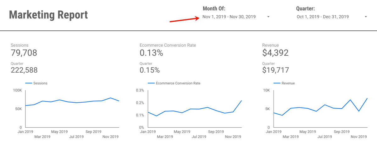
Many companies these days rely on some form of internal dashboard(s). That’s a good thing. Even better is when those companies have actually automated these dashboards – pulling data from multiple data sources, structuring it in a way that directly maps to business objectives, and delivering the information in a clean, easy-to-digest format. That’s nirvana.

dashboard

Reality, often, is that the dashboards can only be partially automated. They wind up being something an analyst needs to at least lightly touch to bridge inevitable API gaps before delivering them on some sort of recurring schedule: through email, through an intranet, or even in person in a regularly scheduled meeting.

So, what is the purpose of these dashboards? Here’s where a lack of clarity — clearly communicated — becomes a slippery slope faster than Miley Cyrus can trigger a TV viewer’s gag reflex. Dashboards are, first and foremost, performance measurement tools. They are a mechanism for quickly (at a glance!) answering a single question:

“Are we achieving the goals we set out to achieve?”

They can provide some minimal context around performance, but everything beyond answering that question is a distant second purpose-wise.

It’s easy enough to wax sophomoric on this. It doesn’t change the fact, though, that one of the top complaints dashboard-delivering analysts hear is: “I get the [weekly/monthly/quarterly] dashboard from the analyst, but it doesn’t have recommendations on it. It’s just data!”

I get it. And, my response? When that complaint is leveled, it’s a failure on the part of the analyst to educate (communicate), and a failure of process — a failure to have mechanisms in place to deliver actionable analytical results in a timely and effective manner.

But…here…I’m just going to lay out the various reasons that dashboards are not the place to expect to deliver recommendations, because, in my experience, analysts hear that complaint and respond by trying to introduce recommendations to their dashboards. Why shouldn’t they? I can give four reasons!

Reason No. 1: Dashboards Can’t Wait

Another complaint analysts often hear is that dashboards aren’t delivered quickly enough at the end of the reporting period. Well, no one, as far as I know, has found a way to stop time. It marches on inexorably, with every second taking exactly one second, every minute having a duration of 60 seconds, and every hour having a duration of 60 minutes (crappy Adam Sandler movies — pardon the adjectival redundancy — notwithstanding).

timeflies
Source: aussiegal

Given that, let’s step back and plot out a timeline for what it takes in an “insights and recommendations delivered with the dashboard” scenario for a dashboard that gets delivered monthly:

  1. Pull data (can’t happen until the end of the previous month)
  2. Consolidate data to get it into the dashboard
  3. Review the data — look at KPIs that missed targets and supporting metrics that moved unexpectedly
  4. Dig in to do analysis to try to figure out why those anomalies appeared
  5. IF the root cause is determined, assess whether this is something that needs “fixing” and posit ways that it might be fixable
  6. Summarize the results — the explanation for why those anomalies appeared and what might be done to remedy them going forward (if the root cause was something that requires a near-term change)
  7. Add the results to the dashboard
  8. Deliver the dashboard
  9. [Recipient] Review the dashboard and the results
  10. [Recipient] Decide whether to take action
  11. [Recipient] If action will be taken, then take the action

Seems like a long list, right? I didn’t write it trying to split out separate steps and make it needlessly long. What’s interesting is that steps 1 and 2 can (and should!) be shortened through automation. Aside from systems that are delayed in making their data available, there is no reason that steps 1 and 2 can’t be done within hours (or a day) of the end of the reporting period.

Steps 3 through 7, though, are time-consuming. And, often, they require conversations and discussion — not to mention time to actually conduct analysis. Despite vendor-perpetuated myths that “the tool” can generate recommendations… tools really suck at doing so (outside of highly operationalized processes).

Here’s the other kicker, though: steps 9 through 11 take time, too! So, realistically, let’s say that steps 1 and 2 take a day, steps 3 through 8 take a week, steps 9 and 10 takes 3 days (because the recipient doesn’t drop everything to review the dashboard when it arrives), and then step 11 takes a week (because “action” actually requires marshalling resources and getting something done). That means — best case — we’re 2.5 weeks into the month before action gets taken.

So, what happens at the end of the month? The process repeats, but there was only 1.5 weeks of the change actually being in place… which could easily get dwarfed by the 2.5 weeks of the status quo!!!

Let’s look at how a “dashboard without insights” process can work:

  1. Pull data (can’t happen until the end of the previous month)
  2. Consolidate data to get it into the dashboard
  3. Deliver the dashboard (possibly calling out any anomalies or missed targets)
  4. [Recipient] Review the dashboard and hones in on anything that looks troubling that she cannot immediately explain (more on that in the next section)
  5. The analyst and the recipient identify what, if any, trouble spots require deeper analysis and jointly develop actionable hypotheses to dig in
  6. The analyst conducts a very focused analysis (or, in some cases, proposes an A/B test) and delivers the results.
  7. [Recipient] If action is warranted, takes action

Time doesn’t stop for this process, either. But, it gets the information into the business’s hand inside of 2 days. The analyst doesn’t waste time discovering root causes that the business owner already knows (see the next section). The analysis that gets conducted is focused and actionable, and the business owner is already primed to take action, because she participated in determining what analyses made the most sense.

Reason No. 2: Analysts Aren’t Omniscient

I alluded to this twice in the prior paragraph. Let’s look at a generic and simplistic (but based on oft-observed real-world experience) example:

  1. The analyst compiles the dashboard and sees that traffic is down
  2. The analyst digs into the traffic sources and sees that paid search traffic is down dramatically
  3. The analyst digs in further and sees that paid search traffic went to zero on the 14th of the month and stayed there
  4. The analyst fires off an urgent email to the business that paid search traffic went to zero mid-month and that something must be wrong with the site’s SEM!
  5. The business responds that SEM was halted mid-month due to budget adjustments, and they’ve been meaning to ask what impact that has had

What’s wrong with this picture? Steps 2 through 4 are largely wasted time and effort! There is very real analysis to be done… but it doesn’t come until step 5, when the business provides some context and is ready for a discussion.

This happens all the time. It’s one of the reasons that it is imperative that analysts build strong relationships with their marketing stakeholders, and one of the reasons that a sign of a strong analytics organization is one where members of the team are embedded – literally or virtually – in the teams they support.

But, even with a strong relationship, co-location with the supported team, regular attendance at the team’s recurring meetings, and a spot on the team’s email distribution list, analysts are seldom aware of every activity that might result in an explainable anomaly in the results delivered in a dashboard.

This gets to a data source that gets ignored all too often: the minds and memories of the marketing team. There is nothing at all wrong with an analyst making the statement: “Something unexpected happened here, and, after I did some cursory digging, I’m not sure why. Do you have any ideas as to what might have caused this?” There are three possible responses from the marketer who is asked this question:

  • “I know exactly what’s going on. It’s almost certainly the result of X.”
  • “I’m not sure what might have caused that, but it’s something that we should get to the bottom of. Can you do some more digging to see if you can figure it out?”
  • “I’m not sure what might have caused that, but I don’t really care, either. It’s not important.”

These are quick answers to an easy question that can direct the analyst’s next steps. And, two of the three possible answers lead to a next step of moving onto a value-adding analysis — not pursuing a root cause that will lead to no action! Powerful stuff!

Reason No. 3: Insights Don’t have a Predictable and Consistent Length

I see it all the time: a standard dashboard format that, appropriately, has a consistent set of KPIs and supporting metrics carefully laid out in a very tightly designed structure. Somewhere in that design is a small box – at the top of the dashboard, at the bottom right of the dashboard, somewhere – that has room for a handful of bullet points or a short paragraph. This  area of the dashboard often has an ambitious heading: “Insights,” “Recommendations,” “Executive Summary.”

The idea – conceived either on a whiteboard with the initial design of the dashboard, or, more likely, added the first time the dashboard was produced – is that this is where the analysts real value will be manifested. THIS is where the analyst will place the Golden Nuggets of Wisdom that have been gleaned from the data.

Here’s the problem: some of these nuggets are a flake of dust, and some are full-on gold bars. Expecting insights to fit into a consistent, finite space week in and week out or month in and month out is naïve. Sometimes, the analyst has half a tweet’s worth of prose-worthy material to include, which makes for a largely empty box, leaving the analyst and the recipient to wonder if the analyst is slacking. At other times, the analyst has a handful of useful nuggets to impart…but then has to figure out how to distill a WordPress-sized set of information into a few tweet-sized statements.

Now, if you buy into my first two reasons as to why recommendations shouldn’t be included with the dashboard in the first place, then this whole section becomes moot. But, if not — if you or your stakeholders still insist that performance measurement include recommendations — then don’t constrain the space to include that information to a fixed box on the dashboard.

Reason No. 4: Insights Can’t Be Scheduled

A scene from The Marketer and the Analyst (it’s a gripping — if entirely fictitious — play):

Marketer: “This monthly dashboard is good. It’s showing me how we’re doing. But, it doesn’t include any insights based on the performance for the month. I need insights to take action!”

Analyst: “Well, what did you do differently this month from previous months?”

Marketer: “What do you mean?”

Analyst: “Did you make any changes to the site?”

Marketer: “Not really.”

Analyst: “Did you change your SEM investment or strategy?”

Marketer: “No.”

Analyst: “Did you launch any new campaigns?”

Marketer: “No.”

Analyst: “Were there any specific questions you were trying to answer about the site this month?”

Marketer: “No.”

Analyst: ???!

Raise your hand if this approximates an exchange you’ve had. It’s symptomatic of a completely ass-backward perception of analytics: that the data is a vast reserve of dirt and rock with various veins of golden insights threaded throughout. And, that the analyst merely needs to find one or more of those veins, tap into it, and then produce a monthly basket of new and valuable ingots from the effort.

The fact is, insights come from analyses, and analyses come from hypotheses. Some analyses are small and quick. Some are large and require gathering data – through an A/B or multivariate test, for instance, or through a new custom question on a site survey. Confusing “regularly scheduled performance measurement” with “hypothesis-driven analysis” has become the norm, and that is a mistake.

While it is absolutely fine to measure the volume and value of analyses completed, it is a recipe for failure to expect a fixed number of insights to be driven from and delivered with a scheduled dashboard.

A Final Word: Dashboards vs. Reports

Throughout this post, I’ve discussed “dashboards.” I’ve steered clear of the word “report,” because it’s a word that has become pretty ambiguous. Should a report include insights? It depends on how you define a report:

  • If the report is the means by which, on a regularly scheduled basis, the performance of a [site/campaign/channel/initiative] is performing, then my answer is: “No.” Reasons 1, 2, and 4 explain why.
  • If the report is the term used to deliver the results of a hypothesis-driven analysis (or set of hypothesis-driven analyses), then my answer is, “Perhaps.” But…why not call it “Analysis Results” to remove the ambiguity in what it is?
  • If the report is intended to be a combination of both of the above, then you will likely be delivering a 25+ deck of rambling slides that — despite your adoration for the content within — is going to struggle to hold your audience’s attention and is going to do a poor job of both measuring performance and of delivering clearly actionable analysis results.

We live in a real-time world. Consumers — all marketers have come to accept — have short attention spans and consume content in bite-sized chunks. An effective analyst delivers information that is super-timely and is easily digestible.

So. Please. Don’t spend 3 weeks developing insights and recommendations to include on a 20-page document labeled “dashboard.”

Analysis, Reporting

Analytics Aphorisms — Gilligan-Style

Last week, I had the pleasure of presenting at a SEER Interactive conference titled “Marketing Analytics: Proving and Improving Online Performance.” The conference was at SEER’s main office, which is an old church (“old” as in “built in 1850” and “church” as in “yes…a church”) in the Northern Liberties part of Philadelphia. The space itself is, possibly, the most unique that I’ve presented in to date (photo courtesy of @mgcandelori — click to view the larger version…that’s real stained glass!):

IMG_0965

As luck would have it, Michele Kiss attended the conference, which meant all of the speakers got a pretty nice set of 140-character notes on the highlights of what they’d said.

Reviewing the stream of tweets afterwards, I realized I’ve developed quite a list of aphorisms that I tend to employ time and again in analytics-oriented conversations. I’m sufficiently self-aware that I’ll often preface them with, “So, this is soapbox #23,” but, perhaps, not self-aware enough to not actually spout them!

The occasion of standing on an actual altar (SEER maintained much of the the space’s original layout) seemed like a good time to put together a partial catalog of my go-to one-liners. Enjoy!

Being data-driven requires People AND Process AND Technology

I beat this drum fairly often. It’s not enough to have a pristine and robust technology stack. Nor is it sufficient to have great data platforms and great analysts. I believe — firmly — that successful companies have to have a solid analytics process, too. Otherwise, those wildly-in-demand analysts sifting through exponentially growing volumes of data don’t have a prayer. Effective analytics has to be efficient analytics, and efficiency comes from a properly managed process for identifying what to test and analyze.

peopleprocesstech

Identifying KPIs is nothing more than answering two question: 1) What are we trying to achieve? and 2) How will we know if we’ve done that?

I’ve got to credit former colleague Matt Coen for the clarity of these. I like to think I’ve done a little more than just brand them “the two magic questions,” but it’s possible that I haven’t! The point here is that business-speak is, possibly, more vile than Newspeak. “Goals” vs. “strategies” vs. “objectives” vs. “tactics” — these are all words that different people define in different ways. I actually have witnessed — on multiple occasions — debates between smart people as to whether something is an “objective” or a “strategy.”

As soon as we use the phrase “key performance indicator,” the acronym “KPI,” or the phrase “success measure,” we’re asking for trouble. So, whether I verbally articulate the two questions above, or whether I simply ask them of myself and try to answer them, I try to avoid business-speak:

  1. What are we trying to achieve? Answer that question without data. It’s nothing more than the elevator pitch for an executive who, while making conversation while traveling from the ground floor to the 8th floor, asks, “What’s the purpose of <insert whatever you’re working on>?”
  2. How will we know if we’ve done that? This question sometimes gets asked…but it skips the first question and invites spouting of a lengthy list of data points. As a plain English follow-on to the first question, though, it invites focus!

The K in KPI stands for “Key” — not for 1,000.

This one is a newer one for me, but I’ll be using it for a lonnnng time. All too often, “KPI” gets treated as a fancy-pants way to say “data” or “metrics” or “measures.” Sure, we feel like we’re business sophisticates when we can use fancy language…but that doesn’t mean that we should be using fancy language poorly! I covered this one in more detail in my last post…but I’m going to repeat the picture I used there, anyway, because it cracks me up:

Barfing Metrics


A KPI is not a KPI if it doesn’t have a target.

“Visits” is not a KPI. Nor is “conversion rate.” Or “customer satisfaction.” A KPI is not a KPI without a target. Setting targets is an inexact science and is often an uncomfortable exercise. But…it’s not as hard as it often gets made out to be.

Human nature is to think, “If I set a target and I miss it…then I will be viewed as having FAILED!” In reality, that’s the wrong view of targets. If you work for a manager, a company, or a client where that is the de facto response…then you need to find a new job.

Targets set up a clear and objective way to: 1) ensure alignment on expectations at the outset of an effort, and 2) objectively determine whether you were able to meet those expectations. If you wildly miss a very-hard-to-set target, then you will have learned a lot more and will be better equipped to set expectations (targets) the next time.

This all leads into another of my favorites…

You’re never more objective about what you *might* accomplish than before you set out to achieve it.

“I have no idea and no expectations!” is almost always an unintentional lie. Somebody decided that time and energy would be spent on the campaign/channel/initiative/project. That means there was some expectation that it would be worthwhile to do so. And “worthwhile” means somethingIt’s really, really hard to, at the end of a 6-month redesign where lots of people pulled lots of long hours to hit the launch date, stand up and say, “This didn’t do as well as we’d hoped.” In the absence of targets, that never happens. The business owner or project manager or analyst automatically starts looking for ways to illustrate to the project team and to the budget owner that the effort paid off.

But, that’s short-sighted. For starters, without a target set up front, just about any reporting of success will carry with it a whiff of disingenuousness (“You’re telling me that’s good…but this is the first I’m hearing that we knew what ‘good’ would look like!”). And, the after-the-fact-looking-for-success means effort is spent looking backwards rather than minimal effort to look backwards so that real effort can go into looking forward: “Based on how we performed against our expectations (targets), what should we do next, and what do we expect to achieve?”

Any meaningful analysis is based on a hypothesis or set of hypotheses.

I’ve had the debate many times over the years as to whether there are cases where “data mining” means “just poking around in the data to see what patterns emerge.” In some cases, the person is truly misguided and believes that, with a sufficiently large data set and sufficiently powerful analytical tools, that is truly all that is needed: data + tools = patterns –> actionable insights. That’s just wrongheaded.

More often, though, the debate is an illustration that a lot of analysts don’t realize that, in reality, they and their stakeholders are actually testing hypotheses. Great analysts may subconsciously be doing that…but it’s happening. The more we recognize that that’s what we’re doing, the more focused and efficient we can be with our analyses!

Actionable hypotheses come from filling in the blanks on two questions: 1) I believe _______, and 2) If I’m right, I will ______.

Having railed against fancy business-speak…it’s really not all that cool of me to be floating the word “hypothesis” now, is it? In day-to-day practice…I don’t! Rather, I try to complete these two statements (in order) before diving into any hypothesis:

  1. I believe [some idea]  — this actually is the hypothesis. A hypothesis is an assumption, an idea, a guess, a hunch, or a belief. Note that this isn’t “I know…” and it’s not even “I strongly believe…” It’s the lowest level of conviction possible, so we should be fine learning (quickly, and with data) when the belief is untrue!
  2. If I am right, I will [take some action] — this isn’t actually part of the hypothesis. Rather, it’s a way to qualify the hypothesis by ensuring that it is sufficiently focused that, if the belief holds up, action could be taken. In my experience, taking one broad belief and breaking it down into multiple focused hypotheses leads to much more efficient and actionable analysis.

Like the two magic questions, I don’t necessarily force my clients to use this terminology. I’ll certainly introduce it when the opportunity arises, but, as an analyst, I always try to put requests into this structure. It helps not only focus the analysis (and, often, promote some probing and clarification before I dig into the time-intensive work of pulling and analyzing the data), but focus the output of the analysis in a way that makes it more actionable.

Do you have favorite analytics aphorisms?

I’d love to grow my list of meaningful analytics one-liners. Do you have any you use or have heard that you really like?

Reporting

The "K" in "KPI" is not for "1,000"

At the core of any effective performance measurement process are key performance indicators, or KPIs.

Did you catch the redundancy in that statement? Performance measurement uses performance indicators. What gets my goat — because it drives report bloat and the scheduled production of an unnecessary sea of data — is how often the “K” in KPI gets ignored. More times than I can count, I’ve been sent a “list of KPIs,” that, rather than being a set of 3-5 measures with targets established, is a barfed out list of metrics and data:

Barfing Metrics

I had a self-humoring epiphany last week that, perhaps, marketers get confused by the acronym and think that “K” stands for “1,000” rather than for “key!” Through that lens, perhaps they’re falling short — lists of 20 or 30 KPIs are still well short of 1,000! My favorite response to my idle ephiphany (shared on Twitter, of course, because that’s what Twitter is for, right?) was from Eric Matisoff:

kkpi_matisoff

Not only did I realize that I’d seen the phrase “key KPIs” used myself…I saw this phrase in writing two days later!

NO, people! No. No. NO!!!

This bothers me (obviously!) — not just when it happens, but the fact that it happens so. So, why does it happen, and what can we do about it?

The History of Digital Analytics Does Not Help

As an industry, we are stuck with a pretty persistent albatross of history. When I started in web analytics, the data we had access to was generated once a month when our web analytics platform (Netgenesis) crunched through the server log files and published several hundred reports as static HTML pages. The analysts needed to know what those reports were so that they could quickly find the ones that would be most useful in answering the business questions at hand. When no such report was in the monthly list of published reports, we would either dive into a cumbersome (hours to run a simple query) ad hoc analysis tool, configure a new report to be added to the monthly list, or both.

We might look at the new report once or twice over the next few months…but the report never went away.

It got to the point where it took the first 10 days of each month for the ever-growing list of monthly reports to be published by the tool. In many cases, data from those reports was getting pulled into other reports with data from other sources. We got to that dreaded point where the report for any given month was often not published until 3 weeks into the following month. Egad!

But, in some ways, it was our only option. We didn’t have quick and efficient access to ad hoc queries of the data that we now have on many front. So, the reports were, really, mini data marts. High latency, expensive, and low value mini data marts, but mini data marts nonetheless. Somehow, though, we often still seem to be stuck with that mindset: a recurring report is the one shot we have to pull all the data we might want to look at. That’s silly. And inefficient. Our monthly (or on-demand) performance measurement reports need to be short (one screen), clear (organized around business goals), and readily intepreted (“at a glance” read of whether goals are being met or not).

KPIs Are Actually Quite Simple (if not Easy) to Identify

KPIs are the core of performance measurement. They’re not there for analysis (although they may be the jumping off point that triggers analysis). They’re not the only data that anyone can ever look at. They’re not even the only data that will go on a dashboard (but they will get much more prominent treatment than other metrics on the dashboard). I use the “two magic questions” to identify KPIs:

  1. What are we trying to achieve?
  2. How will we know if we’re doing that?

The answer to the second question is our list of KPIs, but we have to clearly and concisely articulate what we’re trying to achieve first! And that question gets skipped as often as Lindsey Lohan dons an ankle monitor.

I like to think of the answer to the first question as the conversation I would have with a company executive when we find ourselves riding on an elevator and making idle chit chat. She asks, “What are you working on these days?” I (the marketer) respond:

  • “Rolling out our presence on Twitter.”
  • “Creating a new microsite for our latest campaign.”
  • “Redesigning the home page of the site.”
  • “Expanding our paid media investment to Facebook.”)

She then asks, “What’s that going to do for us?” (This is the first of the two magic questions.) I’m not going to start spouting metrics. I’m going to answer the question succinctly in a way that expresses the value to the business:

  • “With Twitter, we’re working to put our brand and our brand’s personality in the minds of more consumers by engaging with them in a positive, timely, and meaningful way.”
  • “We will be giving consumers who find out about our new product through any channel a place to go to get more detailed information so that they can purchase with confidence.”
  • “We will make visitors to our home page more aware of the services we offer, rather than just the products we sell.”
  • “We will introduce potential customers to our brand efficiently by targeting consumers who have a profile and interests that make them likely targets for our products.”

As marketers, we actually tend to suck at having a ready and repeatable answer to that  question. If we have that, then we’re 75% of the way to identifying a short list of meaningful KPIs, because the KPIs are then viewable through the lens of whether they are actually metrics appropriate for measuring what we’re trying to achieve.

A KPI Without a Target Is Not a KPI

“Visits is one of our KPIs, and we had 225,000 visits to the site last month.”

Is that good? Bad? Who knows? In the absence of an explicitly articulated target, we simply look at how the KPI changed from the prior month and, perhaps, how it compared to the same month in the prior year. That’s fine…if the target established for the KPI was based on one of these historical baselines. All too often, though, there is no agreement and alignment around what the target is.

If we accept that KPIs have to explicitly have targets set (and those targets aren’t necessarily fixed numbers — they can be based on some expected growth percentage or compare), then the list of KPIs automatically gets shorter. Setting targets takes thought and effort, so it’s not practical to set targets for 25 different metrics. If we hone in on 3-5 KPIs, then we can gnash our teeth about the lack of historical baselines or industry benchmarks to use in setting targets…and then set targets anyway! We will roll up our sleeves, get creative, realize that there is a SWAG aspect of setting the target…and then set a target that we will use as an appropriate frame of reference going forward. It’s not an impossible exercise, nor is it one that takes an undue amount of time.

Did I Mention that “K” is for “Key?”

Perhaps it is a quixotic quest, but I’ll take any company I can get in this battle for sanity. Let’s get the “key” back in KPIs! If you’re up for saddling up and tilting at this particular windmill, feel free to snag a copy of my performance measurement planning template as one of your armaments!

donquixotic

Analysis, Reporting

Gilligan's Unified Theory of Analytics (Requests)

The bane of many analysts’ existence is that they find themselves in a world where the majority of their day is spent on the receiving end of a steady flow of vague, unfocused, and misguided requests:

“I don’t know what I don’t know, so can you just analyze the traffic to the site and summarize your insights?”

“Can I get a weekly report showing top pages?”

“I need a report from Google Analytics that tells me the gender breakdown for the site.”

“Can you break down all of our metrics by: new vs. returning visitors, weekend vs. weekday visitors, working hours vs. non-working hours visitors, and affiliate vs. display vs. paid search vs. organic search vs. email visitors? I think there might be something interesting there.”

“Can you do an analysis that tells me why the numbers I looked at were worse this month than last?”

“Can you pull some data to prove that we need to add cross-selling to our cart?”

“We rolled out a new campaign last week. Can you do some analysis to show the ROI we delivered with it?”

“What was traffic last month?”

“I need to get a weekly report with all of the data so I can do an analysis each week to find insights.”

The list goes on and on. And, in various ways, they’re all examples of well-intended requests that lead us down the Nefarious Path to Reporting Monkeydom. It’s not that the requests are inherently bad. The issue is that, while they are simple to state, they often lack context and lack focus as to what value fulfilling the request will deliver. That leads to the analyst spending time on requests that never should have been worked on at all, making risky assumptions as to the underlying need, and over-analyzing in an effort to cover all possible bases.

I’ve given this a lot of thought for a lot of years (I’m not exaggerating — see the first real post I wrote on this blog almost six years ago…and then look at the number of navel-gazing pingbacks to it in the comments). And, I’ve become increasingly convinced that there are two root causes for not-good requests being lobbed to the analytics team:

  • A misperception that “getting the data” is the first step in any analysis — a belief that surprising and actionable insights will pretty much emerge automagically once the raw data is obtained.
  • A lack of clarity on the different types and purposes of analytics requests — this is an education issue (and an education that has to be 80% “show” and 20% “tell”)

I think I’m getting close to some useful ways to address both of these issues in a consistent, process-driven way (meaning analysts spend more time applying their brainpower to delivering business value!).

Before You Say I’m Missing the Point Entirely…

The content in this post is, I hope, what this blog has apparently gotten a reputation for — it’s aimed at articulating ideas and thoughts that are directly applicable in practice. So, I’m not going to touch on any of the truths (which are true!) that are more philosophical than directly actionable:

  • Analysts need to build strong partnerships with their business stakeholders
  • Analysts have to focus on delivering business value rather than just delivering analysis
  • Analysts have to stop “presenting data” and, instead “effectively communicate actionable data-informed stories.”

All of these are 100% true! But, that’s a focus on how the analyst should develop their own skills, and this post is more of a process-oriented one.

With that, I’ll move on to the three types of analytics requests.

Hypothesis Testing: High Value and SEXY!

Hands-down, testing and validation of hypotheses is the sexiest and, if done well, highest value way for an analyst to contribute to their organization. Any analysis — regardless of whether it uses A/B or multivariate testing, web analytics, voice of the customer data, or even secondary research — is most effective when it is framed as an effort to disprove or fail to disprove a specific hypothesis. This is actually a topic I’m going to go into a lot of detail (with templates and tools) on during one of the eMetrics San Francisco sessions I’m presenting in a couple of weeks.

The bitch when it comes to getting really good hypotheses is that “hypothesis” is not a word that marketers jump up and down with excitement over. Here’s how I’m starting to work around that: by asking business users to frame their testing and analysis requests in two parts:

Part 1: “I believe…[some idea]”

Part 2: “If I am right, we will…[take some action]”

This construct does a couple of things:

  • It forces some clarity around the idea or question. Even if the requestor says, “Look. I really have NO IDEA if it’s ‘A’ or ‘B’!” you can respond with, “It doesn’t really matter. Pick one and articulate what you will do if that one is true. If you wouldn’t do anything different if that one is true, then pick the other one.”
  • It forces a little bit of thought on the part of the requestor as to the actionability of the analysis.

And…it does this in plain, non-scary English.

So, great. It’s a hypothesis. But, how do you decide which hypotheses to tackle first? Prioritization is messy. It always is and it always will be. Rather than falling back on the simplistic theory of “effort and expected impact” for the analysis, how about tackling it with a bit more sophistication:

  • What is the best approach to testing this hypothesis (web analytics, social media analysis, A/B testing, site survey data analysis, usability testing, …)? That will inform who in your organization would be best suited to conduct the analysis, and it will inform the level of effort required. 
  • What is the likelihood that the hypothesis will be shown to be true? Frankly, if someone is on a fishing expedition and has a hypothesis that making the background of the home page flash in contrasting colors…common sense would say, “That’s a dumb idea. Maybe we don’t need to prove it if we have hypotheses that our experience says are probably better ones to validate.”
  • What is the likelihood that we actually will take action if we validate the hypothesis? You’ve got a great hypothesis about shortening the length of your registration form…but the registration system is so ancient and fragile that any time a developer even tries to check the code out to work on it, the production code breaks. Or…political winds are blowing such that, even if you prove that always having an intrusive splash page pop up when someone comes to your home page is hurting the site…it’s not going to change.
  • What will be the effort (time and resources) to validate the hypothesis? Now, you damn well better have nailed down a basic approach before answering this. But, if it’s going to take an hour to test the hypothesis, even if it’s a bit of a flier, it may be worth doing. If it’s going to take 40 hours, it might not be.
  • What is the business value if this hypothesis gets validated (and acted upon)? This is the “impact” one, but I like “value” over “impact” because it’s a little looser.

I’ve had good results when taking criteria along these lines and building a simple scoring system — assigning High, Medium, Low, or Unknown for each one, and then plugging in some weighted scores for each value for each criteria. The formula won’t automatically prioritize the hypotheses, but it does give you a list that is sortable in a logical way, It, at least, reveals the “top candidates” and the “stinkers.”

Performance Measurement (think “Reporting”)

Analysts can provide a lot of value by setting up automated (or near-automated) performance measurement dashboards and reports. These are recurring (hypothesis testing is not — once you test a hypothesis, you don’t need to keep retesting it unless you make some change that makes sense to do so).

Any recurring report* should be goal- and KPI-oriented. KPIs and some basic contextual/supporting metrics should go on the dashboard, targets need to be set (and set up such that alerts are triggered when a KPI slips). Figuring out what should go on a well-designed dashboard comes down to answering two questions:

  1. What are we trying to achieve? (What are our business goals for this thing we will be reporting on?)
  2. How will we know that we’re doing that? (What are our KPIs?)

They need to get asked and answered in order, and that’s a messier exercise oftentimes than we’d like it to be. Analysts can play a strong role in getting these questions appropriately answered…but that’s a topic for another time.

Every other recurring report that is requested should be linkable back to a dashboard (“I have KPIs for my paid search performance, so I’d like to always get a list of the keywords and their individual performance so I have that as a quick reference if a KPI changes drastically.”)

Having said that, a lot of tools can be set up to automatically spit out all sorts of data on a recurring basis. I resist the temptation to say, “Hey…if it’s only going to take me 5 minutes to set it up, I shouldn’t waste my time trying to validate its value.” But, it can be hard to not appear obstructionist in those situations, so, sometimes, the fastest route is the best. Even if, deep down, you know you’re delivering something that will get looked at the first 2-3 times it goes out…and will never be viewed again.

Quick Data Requests — Very Risky Territory (but needed)

So, what’s left? That would be requests of the,. “What was traffic to the site last month?” ilk. There’s a gross misperception when it comes to “quick” requests that there is a strong correlation between the amount of time required to make the request and the amount of time required to fulfill the request. Whenever someone tells me they have a “quick question,” I playfully warn them that the length of the question tends to be inversely correlated to the time and effort required to provide an answer.

Here’s something I’ve only loosely tested when it comes to these sorts of requests. But, I’ve got evidence that I’m going to be embarking on a journey to formalize the intake and management of these in the very near future, so I’m going to go ahead and write them down here (please leave a comment with feedback!).

First, there is how the request should be structured — the information I try to grab as the request comes in:

  • The basics — who is making the request and when the data is needed; you can even include a “priority” field…the rest of the request info should help vet out if that priority is accurate.
  • A brief (255 characters or so) articulation of the request — if it can’t be articulated briefly, it probably falls into one of the other two categories above. OR…it’s actually a dozen “quick requests” trying to be lumped together into a single one. (Wag your finger. Say “Tsk, tsk!”
  • An identification of what the request will be used forthere are basically three options, and, behind the scenes, those options are an indication as to the value and priority of the request:
    • General information — Low Value (“I’m curious,” “It would be be interesting — but not necessarily actionable — to know…”)
    • To aid with hypothesis development — Medium Value (“I have an idea about SEO-driven visitors who reach our shopping cart, but I want to know how many visits fall into that segment before I flesh it out.”)
    • To make a specific decision — High Value
  • The timeframe to be included in the data — it’s funny how often requests come in that want some simple metric…but don’t say for when!
  • The actual data details — this can be a longer field; ideally, it would be in “dimensions and metrics” terminology…but that’s a bit much to ask for many requestors to understand.
  • Desired delivery format — a multi-select with several options:
    • Raw data in Excel
    • Visualized summary in Excel
    • Presentation-ready slides
    • Documentation on how to self-service similar data pulls in the future

The more options selected for the delivery format, obviously, the higher the effort required to fulfill the request.

All of this information can be collected with a pretty simple, clean, non-intimidating intake form. The goal isn’t to make it hard to make requests, but there is some value in forcing a little bit of thought rather than the requestor being able to simply dash off a quickly-written email and then wait for the analyst to fill in the many blanks in the request.

But that’s just the first step.

The next step is to actually assess the request. This is the sort of thing, generally, an analyst needs to do, and it covers two main areas:

  • Is the request clear? If not, then some follow-up with the requestor is required (ideally, a system that allows this to happen as comments or a discussion linked to the original request is ideal — Jira, Sharepoint, Lotus Notes, etc.)
  • What will the effort be to pull the data? This can be a simple High/Medium/Low with hours ranges assigned as they make sense to each classification.

At that point, there is still some level of traffic management. SLAs based on the priority and effort, perhaps, and a part of the organization oriented to cranking out those requests as efficiently as possible.

The key here is to be pretty clear that these are not analysis requests. Generally speaking, it’s a request for data for a valid reason, but, in order to conduct an analysis, a hypothesis is required, and that doesn’t fit in this bucket.

So, THEN…Your Analytics Program Investment

If the analytics and optimization organization is framed across these three main types of services, then conscious investment decisions can be made:

  • What is the maximum % of the analytics program cost that should be devoted to Quick Data Requests? Hopefully, not much (20-25%?).
  • How much to performance measurement? Also, hopefully, not much — this may require some investment in automation tools, but once smart analysts are involved in defining and designing the main dashboards and reports, that is work that should be automated. Analysts are too scarce for them to be doing weekly or monthly data exports and formatting.
  • How much investment will be made in hypothesis testing? This is the highest value

With a process in place to capture all three types of efforts in a discrete and trackable way enables reporting back out on the value delivered by the organization:

  • Hypothesis testing — reporting is the number of hypotheses tested and the business value delivered from what was learned
  • Performance measurement — reporting is the level of investment; this needs to be done…and it needs to be done efficiently
  • Quick data requests — reporting is output-based: number of requests received, average turnaround time. In a way, this reporting is highlighting that this work is “just pulling data” — accountability for that data delivering business value really falls to the requestors. Of course, you have to gently communicate that or you won’t look like much of a team player, now, will you?

Over time, shifting an organization to think it terms of actionable and testable hypotheses is the goal — more hypotheses, fewer quick data requests!

And, of course, this approach sets up the potentially to truly close the loop and follow through on any analysis/report/request delivered through a Digital Insight Management program (and, possibly, platform — like Sweetspot, which I haven’t used, personally, but which I love the concept of).

What Do You Think?

Does this make sense? It’s not exactly my opus, but, as I’ve hastily banged it out this evening, I realize that it includes many of the ways that I’ve had the most success in my analytics career, and it includes many of the structures that have helped me head off the many ways I’ve screwed up and had failures in my analytics career.

I’d love your thoughts!


*Of course, there are always valid exceptions.

Adobe Analytics, Reporting, Technical/Implementation

SiteCatalyst Tip: Corporate Logins & Labels

As you use Adobe SiteCatalyst, you will begin creating a vast array of bookmarked reports, dashboards, calculated metrics and so on. The good news is that SiteCatalyst makes it easy for you to publicly share these report bookmarks and dashboards amongst your user base. However, the bad news is that SiteCatalyst makes it easy for you to publicly share these report bookmarks and dashboards amongst your user base! What do I mean by this? It is very easy for your list of shared bookmarks, dashboards, targets and other items to get out of control. Eventually, you may not know which reports you can trust and trust is a huge part of success when it comes to web analytics. Therefore, in this post, I will share some tips on how you can increase trust by putting on your corporate hat…

Using a Corporate Login

One of the easiest ways to make sense of shared SiteCatalyst items at your organization is through the use of what I call a corporate login. I recommend that you create a new SiteCatalyst login that is owned by an administrator and use that login when sharing items that are sanctioned by the company. For example, if I owned SiteCatalyst at Greco, Inc., I might create the following login ID:

Once this new user ID is created, when you have bookmarks, dashboards or targets that are “blessed” by the company, you can create and share them using this ID. For example, here is what users might see when they look at shared bookmarks:

As you can see, in this case, there is a shared bookmark by “Adam Greco” and a shared bookmark by “Greco Inc.” While based upon his supreme prowess with SiteCatalyst, you might assume that Adam Greco’s bookmark is credible, that might not always be the case! Adam may have shared this bookmark a few years ago and it might no longer be valid. But if your administrator shares the second bookmark above while logged in as “Greco Inc.,” it can be used as a way to show users that the “Onsite Search Trend” report is sanctioned at the corporate level.

The same can be done for shared Dashboards:

In this case, Adam and David both have shared dashboards out there, but it is clear that the Key KPI’s dashboard is owned by Greco, Inc. as a whole. You can also apply the same concept to SiteCatalyst Targets:

If you have a large organization, you could even make a case for never letting anyone share bookmarks, dashboards or targets and only having this done via a corporate login. One process I work with clients on, is to have end-users suggest to the web analytics team reports and dashboards that they feel would benefit the entire company. If the corporate web analytics team likes the report/dashboard, they can login with the corporate ID and share it publicly. While this creates a bit of a bottleneck, I have seen that sometimes large organizations using SiteCatalyst require a bit of process to avoid chaos from breaking out!

Using a “CORP” Label

Another related technique that I have used is adjusting the naming of SiteCatalyst elements to communicate that an item is sanctioned by corporate. In the examples above, you may have noticed that I added the phrase “(CORP)” to the name of a Dashboard and a Target. While this may seem like a minor thing, when you are looking at many dashboards, bookmarks or targets, seeing an indicator of which items are approved by the core web analytics team can be invaluable. This can be redundant if you are using a corporate login as described above, but it doesn’t hurt to over communicate.

This concept becomes even more important when it comes to Calculated Metrics. It is not currently possible to manage calculated metrics and the sharing of them in the same manner as you can for bookmarks, dashboards and targets. The sharing of calculated metrics takes place in the Administration Console so there is no way to see which calculated metrics are sanctioned by the company using my corporate login method described above.

To make matters worse, it is possible for end users to create their own calculated metrics and name them anything they want. This can create some real issues. Look at the following screenshot from the Add Metrics window in SiteCatalyst:

In this case, there are two identical calculated metrics and there is no way to determine which one is the corporate version and which is the version the current logged in user had created. If both formulas are identical then there should be no issues, but what if they are not? This can also be very confusing to your end users. However, the simple act of adding a more descriptive name to the corporate metric (like “CORP” at the end of the name) can create a view like this:

This makes things much more clear and is an easy workaround for a shortcoming in the SiteCatalyst product.

Final Thoughts

Using a corporate login and corporate labels is not a significant undertaking, but these tips can save you a lot of time and heartache in the long run if used correctly. You will be amazed at how quickly SiteCatalyst implementations can get out of hand and these techniques will hopefully help you control the madness! If you have similar techniques, feel free to leave them as comments here…

Analysis, Reporting, Social Media

Analysts as Community Managers' Best Friends

I had a great time in Boston last week at eMetrics. The unintentional theme, according to my own general perception and the group messaging backchannel that I was on, was that tag management SOLVES ALL!!!.

My session…had nothing to do with tag management, but it seemed worth sharing nonetheless: “The Community Manager’s Best Friend: You.” The premise of the presentation was twofold:

  • Community managers plates are overly full as it is without them needing to spend extensive time digging into data and tools
  • Analysts have a slew of talents that are complementary to community managers’, and they can apply those talents to make for a fantastic partnership

Due to an unfortunate mishap with the power plug on my mixing board while I was out of town a few month ago, my audio recording options are a bit limited, so the audio quality in the 50-minute video (slides with voiceover) below isn’t great. But, it’s passable (put on some music in the background, and the “from the bottom of a deep well” audio effect in the recording won’t bug you too much):

I’ve also posted the slides on Slideshare, so you can quickly flip through them that way as well, if you’d rather:

As always, I’d love any any and all feedback! With luck, I’ll reprise the session at future conferences, and a reprise without refinement would be a damn shame!

Analytics Strategy, Reporting

Web Site Performance Measurement

It’s funny. Sometimes, we get so focused on the design and content aspects of how a web site performs that we forget about one of the more fundamental aspects of the site: how long it takes to load. That’s a fundamental aspect, but there are a lot of different aspects of “site loading” — both what affects it and how to measure and monitor it.

My most recent article on Practical eCommerce provides an overview of some of the main drivers of site performance, as well as the multiple (complementary) approaches for measuring and monitoring.

Analysis, Reporting, Social Media

Imperfect Options: Social Media Impact for eCommerce Sites

I’m now writing a monthly piece for Practical eCommerce, and the experience has been refreshing. At ACCELERATE in Chicago earlier this year, April Wilson‘s winning Super ACCELERATE session focused on digital analytics for smaller companies. Her point was that a lot of the online conversation about “#measure” (or “#msure”) focuses on multi-billion dollar companies and the challenges they have with their Hadoop clusters, while there are millions of small- to medium-sized businesses who have very little time and very limited budgets who need some love from the digital analytics community. To that end, she proposed an #occupyanalytics movement — the “99%” of business owners who can get real value from digital analytics, but who can’t push work to a team of analysts they employ.

Practical eCommerce aims to provide useful information to small- to medium-sized businesses that have an eCommerce site. It’s refreshing to focus on that analytics for that target group!

My latest piece was an exploration of the different ways that managers of eCommerce sites running Google Analytics can start to get a sense of how much of their business can be linked to social media. It touches on some of the very basics — campaign tracking, referral traffic, and the like — but also dips into some of the new social media-oriented reporting in Google Analytics, as well as some of the basics of multi-channel funnels as they related to social media.And, of course, a nod to the value of voice of the customer data. Interested in more? You can read the full article on the Practical eCommerce site.

Analytics Strategy, General, Reporting

Site Performance and Digital Analytics

One of the issues we focus on in our consulting practice at Analytics Demystified is the relationship between page performance and key site metrics. Increasingly our business stakeholders are cognizant of this relationship and, given that awareness, interested in having clear visibility into the impact of page performance on engagement, conversion, and revenue. Historically speaking tying the two together has been arduous, and, when the integration has been completed, possible outcomes have been complicated by the fact that site performance is usually someone else’s job.

Fortunately both of these challenges are becoming less and less of an issue. Digital analytics providers are increasingly able to accept page performance data, either directly as in the case of Google Analytics “Site Speed” reports, or indirectly via APIs and other feeds from solutions like Keynote, Gomez, Tealeaf, and others allowing the most widely used digital analytics suites to meaningfully segment against this data on a per-visit and per-visitor basis.

Additionally, thanks to Web Performance Optimization and the recent emergence of solutions that allow for multivariate testing of different performance optimization techniques, business stakeholders and analysts are increasingly able to collaborate with IT/Operations to devise highly targeted performance solutions by geography, device, and audience segment. Recently I had the pleasure of working with the team at SiteSpect to describe these solutions in a free white paper titled “Five Tips for Optimizing Site Performance.”

You can download the white paper directly from SiteSpect (registration required) or get the link from our own white papers page here at Analytics Demystified. If you want a quick preview of what the paper covers I’d encourage you to give a listen to the brief webcast we created in support of the document.

If you’re thinking about how you can better measure and manage your site’s performance we’d love to hear from you. Drop us a line and we’ll walk you through how we’re helping clients around the globe get their arms around the issue.

Analysis, Analytics Strategy, Reporting, Social Media

Four Dimensions of Value from Measurement and Analytics

When I describe to someone how and where analytics delivers value, I break it down into four different areas. They’re each distinct, but they are also interrelated. A Venn diagram isn’t the perfect representation, but it’s as close as I can get: Earlier this year, I wrote about the three-legged stool of effective analytics: Plan, Measure, Analyze. The value areas covered in this post can be linked to that process, but this post is about the why, while that post was about the how.

Alignment

Properly conducted measurement adds value long before a single data point is captured. The process of identifying KPIs and targets is a fantastic tool for identifying when the appearance of alignment among the stakeholders hides an actual misalignment beneath the surface. “We are all in agreement that we should be investing in social media,” may be a true statement, but it lacks the specificity and clarity to ensure that the “all” who are in agreement are truly on the same page as to the goals and objectives for that investment. Collaboratively establishing KPIs and targets may require some uncomfortable and difficult discussions, but it’s a worthwhile exercise, because it forces the stakeholders to articulate and agree on quantifiable measures of success. For any of our client engagements, we spend time up front really nailing down what success looks like from a hard data perspective for this very reason. As a team begins to execute an initiative, being able to hold up a concise set of measures and targets helps everyone, regardless of their role, focus their efforts. And, of course, Alignment is a foundation for Performance Measurement.

Performance Measurement

The value of performance measurement is twofold:

  • During the execution of an initiative, it clearly identifies whether the initiative is delivering the intended results or not. It separates the metrics that matter from the metrics that do not (or the metrics that may be needed for deeper analysis, but which are not direct measures of performance). It signifies both when changes must be made to fix a problem, and it complements Optimization efforts by being the judge as to whether a change is delivering improved results.
  • Performance Measurement also quantifies the results and the degree to which an initiative added value to the business. It is a key tool in driving Internal Learning by answering the questions: “Did this work? Should we do something like this again? How well were we able to project the final results before we started the work?”

Performance Measurement is a foundational component of a solid analytics process, but it’s Optimization and Learning that really start to deliver incremental business value.

Optimization

Optimization is all about continuous improvement (when things are going well) and addressing identified issues (when KPIs are not hitting their targets). Obviously, it is linked to Performance Measurement, as described above, but it’s an analytics value area unto itself. Optimization includes A/B and multivariate testing, certainly, but it also includes straight-up analysis of historical data. In the case of social media, where A/B testing is often not possible and historical data may not be sufficiently available, optimization can be driven by focused experimentation. This is a broad area indeed! But, while reporting squirrels can operate with at least some success when it comes to Performance Measurement, they will fail miserably when it comes to delivering Optimization value, as this is an area that requires curiousity, creativity, and rigor rather than rote report repetition. Optimization is a “during the on-going execution of the initiative” value area, which is quite different (but, again, related) to Internal Learning.

Learning

While Optimization is focused on tuning the current process, Internal Learning is about identifying truths (which may change over time), best practices, and, “For the love of Pete, let’s not make the mistake of doing that again!” tactics. It pulls together the value from all three of the other analytics value areas in a more deliberative, forward-looking fashion. This is why it sits at the nexxus of the other three areas in the diagram at the beginning of this post. While, on the one hand, Learning seems like a, “No, duh!” thing to do, it actually can be challenging to do effectively:

  • Every initiative is different, so it can be tricky to tease out information that can be applied going forward from information that would only be useful if Doc Brown appeared with his Delorean
  • Capturing this sort of information is, ideally, managed through some sort of formal knowledge management process or program, and such programs are quite rare (consultancies excluded)
  • Even with a beautifully executed Performance Management process that demonstrates that an initiative had suboptimal results, it is still very tempting to start a subsequent initiative based on the skeleton of a previous one. Meaning, it can be very difficult to break the, “that’s how we’ve always done it” barrier to change (remember how long it took to get us to stop putting insanely long registration forms on our sites?)

Despite these challenges, it is absolutely worth finding ways to ensure that ongoing learning is part of the analytics program:

  • As part of the Performance Measurement post mortem for a project, formally ask (and document), what aspects, specifically, of the initiative’s results contain broader truths that can be carried forward.
  • As part of the Alignment exercise for any new initiative, consciously ask, “What have we done in the past that is relevant, and what did we learn that should be applied here?” (Ideally, this occurs simply by tapping into an exquisite knowledge management platform, but, in the real world, it requires reviewing the results of past projects and even reaching out and talking to people who were involved with those projects)
  • When Optimization work is successfully performed, do more than simply make the appropriate change for the current initiative — capture what change was made and why in a format that can be easily referenced in the future

This is a tough area that is often assumed to be something that just automatically occurs. To a certain extent, it does, but only at an individual level: I’m going to learn from every project I work on, and I will apply that learning to subsequent projects that I work on. But, the experience of “I” has no value to the guy who sits 10′ away if he is currently working on a project where my past experiences could be of use if he doesn’t: 1) know I’ve had those experiences, or 2) have a centralized mechanism or process for leveraging that knowledge.

What Else?

What do you say when someone asks you, “How does analytics add value?” Do you focus on one or more of the areas above, or do you approach the question from an entirely different perspective? I’d love to hear!

Analysis, Analytics Strategy, Reporting

Digital Analytics: From Data to Stories and Communication

This will be a quick little post as I try to pull together what seems to be an emerging theme in the digital analytics space. In a post late last year, I wrote:

I haven’t attended a single conference in the last 18 months where one of the sub-themes of the conference wasn’t, “As analysts, we’ve got to get better at telling stories rather than simply presenting data.

Lately, though, it seems that the emphasis on “stories” has shifted to a more fundamental focus on “communication.” As evidence, I present the following:

A 4-Part Blog Series

Michele Kiss published a 4-part blog series over the course of last week titled “The Most Undervalued Analytics Tool: Communication.” The series covered communication within your analytics teamcommunication across departments, communication with executives and stakeholders, and communication with partners. Whether intentionally or not, the series highlighted how varied and intricate the many facets of “communication” really are (and she makes some excellent tips for addressing those different facets!).

A Data Scientist’s “Day to Day” Advice

Christopher Berry, VP of Marketing Science at Syncapsealso published a post last week that touched on the importance of communication. Paraphrasing (a bit), he advised:

  • Recognize that you’re going to have to repeat yourself — not because the people your communicating with are stupid, but because they’re not as wired to the world of data as you are
  • Communicate to both the visual and auditory senses — different people learn better through different channels (and neuroscience has shown that ideas stick better when they’re received through multiple sensory registers)
  • Use bullet points (be concise)

Christopher is one of those guys who could talk about the intricacies of shoe leather and have an audience spellbound…so his credibility on the communication front comes more from the fact that he’s a great communicator than from his position as a top brain in the world of data scientistry.

Repetition at ACCELERATE

During last Wednesday’s ACCELERATE conference in Chicago, I tweeted the following:

The tweet was mid-afternoon, and it was after a run of sessions — all very good — where the presenters directly spoke to the importance of communication when it come to a range of analytics responsibilities and challenges.

A Chat with Jim Sterne

At the Web Analytics Wednesday that followed the conference, I got my first chance (ever!) to have more than a 2-sentence conversation with Jim Sterne (I’m pretty sure the smile on his face all day was the smile of a man who was attending a conference as a mere attendee than as a host and organizer, and the plethora of attendant stresses of that role!).

During that discussion, Jim asked me the question, “What is it that you are doing now that is moving towards [where you want to be with your career].” We’ll leave the details of the bracketed part of my quote aside and focus on my answer, which I’d never really thought of in such explicit terms. My answer was that, being a digital analyst at an agency that was built over the course of 3 decades on a foundation of great design work and outstanding consumer research (as in: NOT on measurement and analytics), I have to keep honing my communication skills. In many, many ways I have a conversation every day where I am trying to communicate the same basics about digital analytics that I’ve been communicating for the past decade in different environments. But, I’m not just repeating myself. If I look back over my 2.5 years at the agency, I’ve added a new “tool” to my analytics communication toolbox every 2-3 months, be it a new diagram, a new analogy, a new picture, or a new anecdote. I’ve been working really hard (albeit not explicitly or even consciously) to become the most effective communicator I can be on the subject of digital analytics. Not every new tool sticks, and I try to discard them readily when I realize they’re not resonating.

It’s a work in progress. Are you consciously working on how you communicate as an analyst? What’s your best tip?

Analysis, Reporting

3-Legged Stool of Effective Analytics: Plan, Measure, Analyze

Several weeks ago, Stéphane Hamel wrote a post that got me all re-smitten with his thought process. In the post, he postulated that there are three heads of online analytics. He covered three different skillsets needed to effectively conduct online analytics: business acumen, technical (tools) knowledge, and analysis. And, he made the claim that no one person will ever excel at all three, which led to his case for building out teams of “analysts” who have complementary strengths.

I’ve had several unrelated experiences with different clients and internal teams of late that have led me to try to capture, in a similar fashion, the three-legged stool of an online analytics program. Just as others have started tacking on additional components to Stéphane’s three skillsets, I’m sure my three-legged stool will quickly become a traditional chair…then some sort of six-legged oddity. But, I’d be thrilled if I could consistently communicate the basics to my non-analyst co-workers and clients:

I hold to a pretty strict distinction between “measurement and reporting” and “analysis,” and I firmly believe there is value in “reporting,” as long as that reporting is appropriately set up and applied.

Just as I believe that reporting should generally occur either as a one-time event (campaign wrap-up, for instance) or at regular intervals, I firmly believe that testing and analysis should not be forced into a recurring schedule. It’s fine (desirable) to be always conducting analysis, but the world of “present the results of your analysis — and your insights and recommendations therein — once/month on the first Wednesday of the month” is utterly asinine. Yet…it’s a mindset with which a depressing majority of companies operate.

Reporting Done Poorly…Which Is an Unfortunately Ubiquitous Habit

I’ve been client side. I’ve been agency side. I’ve done a decent amount of reading on human nature as it relates to organizational change. My sad conclusion:

The business world has conditioned itself to confuse “cumbersome decks of data” with “reporting done well.”

It happens again and again. And again. And…again! It goes like this:

  1. Someone asks for some data in a report
  2. Someone else pulls the data
  3. The data raises some additional questions, so the first person asks for more data.
  4. The analyst pulls more data
  5. The initial requestor finds this data useful, so he/she requests that the same data be pulled on a recurring schedule
  6. The analyst starts pulling and compiling the data on a regular schedule
  7. The requestor starts sharing the report with colleagues. The colleagues see that the report certainly should be useful, but they’re not quite sure that it’s telling them anything they can act on. They assume that it’s because there is not enough data, so they ask the analyst to add in yet more data to the report
  8. The report begins to grow.
  9. The recipients now have a very large report to flip through, and, frankly, they don’t have time month in and month out to go through it. They assume their colleagues are, though, so they keep their mouths shut so as to not advertise that the report isn’t actually helping them make decisions. Occasionally, they leaf through it until they see something that spikes or dips, and they casually comment on it. It shows that they’re reading the report!
  10. No one tells the analyst that the report has grown too cumbersome, because they all assume that the report must be driving action somewhere. After all, it takes two weeks of every month to produce, and no one else is speaking up that it is too much to manage or act on!
  11. The analyst (now a team of analysts) and the recipients gradually move on to other jobs at other companies. At this point, they’re conditioned that part of their job is to produce or receive cumbersome piles of data on a regular basis. Over time, it actually seems odd to not be receiving a large report. So, if someone steps up and asks the naked emperor question: “How are you using this report to actually make decisions and drive the business?”…well…that’s a threatening question indeed!

In the services industry, there is the concept of a “facilitated good.” If you’re selling brainpower and thought, the theory goes, and you’re billing out smart people at a hefty rate, then you damn well better leave behind a thick binder of something to demonstrate that all of that knowledge and consultation was more than mere ephemera!

And, on the client side, if the last 6 consultancies and agencies that you worked with all diligently delivered 40-slide PowerPoint decks or 80-page reports, then, by golly, you’re going to look askance at the consultant who shows up and aims for actionable concision!

Nonetheless, I will continue my quixotic quest to bring sanity to the world. So, onto the three legs of my analytics stool…

First, Plan (Dammit!!!)

Get a room full of experienced analysts together and ask them where any good analytics program or initiative starts, and you’ll get a unanimous response that it starts: 1) at the beginning of the initiative, and 2) with some form of rigorous planning.

The most critical question to answer during analytics planning is: “How are we going to know if we’re successful?” Of course, you can’t answer that question if you haven’t also answered the question: “What are we trying to accomplish?” Those are the two questions that I wrote about in this Getting to Great KPIs post.

Of course, there are other components of analytics planning:

  • Where will the data come from that we’ll use?
  • What other metrics — beyond the KPIs — will we need to capture?
  • What additional data considerations need to be factored into the effort to ensure that we are positioned for effective analysis and optimization down the road?
  • What (if any) special tagging, tracking, or monitoring do we need to put into place (and who/how will that happen)?
  • What are the known limitations of the data?
  • What are our assumptions about the effort?
  • …and more

In my experience both agency-side and client-side, this step regularly gets skipped like it’s a smooth round, rock in the hand of an adolescent male standing on the shore of a lake on a windless day.

An offshoot of the planning is the actual tagging/tracking/monitoring configuration…but I consider that an extension of the planning, as it may or may not be required, depending on the nature of the initiative.

Next, Measure and Report

Yup. Measurement’s important. That’s how you know if you’re performing at, above, or below your KPIs:

Here’s where I start to get into debates, both inside the analytics industry and outside. I strongly believe that it is perfectly acceptable to deliver reports without accompanying insights and analysis. Ideally, reports are automated. If they’re not automated, they’re produced damn quickly and efficiently.

Dashboards — the most popular form of reports — have a pretty simple purpose: provide an at-a-glance view of what has happened since the last update, and ensure that, at a glance, any anomalies jump out. More often than not, there won’t be anomalies, so there is nothing that needs to be analyzed based on the report! That’s okay!

I was discussing this concept with a co-worker recently, and, in response to my claim that reports should simply get delivered with minimal latency and, at best, a note that says, “Hey, I noticed this apparent anomaly that might be important. I’m going to look into it, but if you (recipient) have any ideas as to what might be going on, I’d love to get your thoughts,” she responded:

I think this makes sense, but wouldn’t we provide some analysis as to the “why” on the monthly reports?

I immediately went to the “dashboard in your car” analogy (I know — it breaks down on a lot of fronts, but it works here) with my response:

You don’t look at your fuel gauge when you get in the car every day and ask, “Why is the needle pointing where it is?” You take a quick look, make sure it’s not pegged on empty, and then go about your day.

That’s measurement. It may spawn analysis, but, often, it does not. And that’s to be expected!

Which Brings Us to Testing and Analysis

Analysis requires (or, at least, is much more likely to yield value in an efficient manner) having conducted some solid planning and having KPI-centric measurement in place. But, the timing of analysis shouldn’t be forced into a fixed schedule.

The bottom part of the figure above gets to the crux of the biscuit when it comes to timing: sometimes, the best way to answer a business question is through analyzing historical data. Sometimes, the best way to answer a question is through go-forward testing. Sometimes, it’s a combination of the two (develop a theory based on the historical data, but then test it by making a change in the future and monitoring the results). Sometimes the analysis can be conducted very quickly. Other times, the analysis requires a large chunk of analyst time and may take days or weeks to complete.

Facilitating the collaboration with the various stakeholders, managing the analysis projects (multiple analyses in flight at once — starting and concluding asynchronously based on each effort’s unique nature), can absolutely fall under the purview of the analyst (again referencing Stéphane’s post, this should be an analyst with a strong “head” for business acumen).

In Conclusion…(I promise!)

There is a fundamental flaw in any approach to using data that attempts to bundle scheduled reporting with analysis. It forces efforts to find “actionable insights” in a context where there may very well be none. And, it perpetuates an assumption that it’s simply a matter of pointing an analyst at data and waiting for him/her to find insights and make recommendations.

I’ve certainly run into business users who flee from any effort to engage directly when it comes to analytics. They hide behind their inboxes lobbing notes like, “You’re the analyst. YOU tell me what my business problem is and make recommendations from your analysis!” I’m sure some of these users had one too many (and one is “too many”) interactions with an analyst who wanted to explain the difference between a page view and a visit, or who wanted to collaboratively sift through a 50-page deck of charts and tables. That’s not good, and that analyst should be flogged (unless he/she is less than two years out of college and can claim to have not known any better). But, using data to effectively inform decisions is a collaborative effort. It needs to start early (planning), it needs to have clear, concise performance measurement (KPI-driven dashboards), and it needs to have flexibility to drive the timing and approach of analyses that deliver meaningful results.

Adobe Analytics, Reporting

v15 Segmentation vs. Multi-Suite Tagging [SiteCatalyst]

With the arrival of SiteCatalyst v15, one of the most intriguing questions is whether or not clients should take advantage of segmentation and replace the historic usage of multi-suite tagging. This is an interesting question so I thought I’d share some of the things to think about…

Multi-Suite Tagging Review

As a quick refresher, if you have multiple websites, it has traditionally been common to send data to more than one SiteCatalyst data set (known as report suites). The benefits of this multi-suite tagging were as follows:

  1. You could have different suites for each data set (i.e. see Spain data separately from Italy data)
  2. If you sent data to many sub-suites and one global (master) report suite, you could see de-duplicated unique visitors from all suites in the global report suite
  3. If you wanted to, you could see Pathing data across multiple sites in the global report suite to see how people navigate from one website to another
  4. You could create one dashboard and easily see the same dashboard for different data sets in SiteCatalyst or in Excel
  5. You want to see metrics at a sub-site level, but also roll them up to see company totals in the global report suite

As you can see, there are quite a few benefits of multi-suite tagging and most large websites tend to do this as a best practice. Of course, where there is value, there is usually a cost! Since you are storing twice as much data in SiteCatalyst, our friends at Omniture (Adobe) have always charged extra for doing this, but normally these “secondary server calls” are charged at a dramatically reduced rate.

Along Comes Instant Segmentation

However, once SiteCatalyst v15 came out, it brought with it the ability to instantly segment your data. Suddenly, you have the capability to narrow down your focus to a specific group of visitors. Therefore, many smart people started asking themselves the following question:

“If I track the website name on every page of every one of my websites, why can’t I just send all data to one global report suite and build a segment for each website instead of paying Omniture extra money to collect my data twice through multi-suite tagging?”

If you look at the list of multi-suite tagging benefits above, you can see that you can accomplish pretty much all of them by simply creating a website segment. For example, if you currently pass data to a global report suite and an Italy report suite, you could simply pass the phrase “Italy” or “it” on every page and build the following Italy segment:

Doing this would narrow the data to just Italy traffic and you don’t have to pay Omniture any extra money! Most clients I have spoken to are very interested in this concept since it will allow them to move some budget to other things they might need (like more analysts or A/B Testing). I think many companies are taking a “wait and see” attitude to this while they get comfortable with SiteCatalyst v15. However, I expect that in the next twelve months, many large enterprises will decide to go this route in order to save a little money and simplify their implementations (one can only dream about not having to keep 50-100 report suites consistent in the Admin Console!). To date, I have not heard Omniture’s stance on this, but I expect that they are not opposed to companies doing this, but will probably not broadcast this concept too loudly since they will lose some recurring revenue as a result.

Any Downsides?

While it is still early days for SiteCatalyst v15, I have tried to think about what, if any, the downsides might be from throwing away multi-suite tagging in favor of an instant segmentation approach. While I hate to rain on the parade of those who want to move forward with this, I have found a few potential downsides that I think you should consider. I don’t think any of these will dissuade you, but I like to present both sides of the story so you can make an informed decision!

The first downside I can see is that moving to one global report suite will make the creation and usage of segments inherently more difficult. For example, let’s say that you create an Italy segment as shown above. That works well if you are in Italy and want to see all Italy traffic. But what if you are in Italy and want to see all first time visitors from a specific list of keywords who have abandoned the shopping cart. That is a semi-complex segment and you have to be careful to include the Italy part of the segment at the same time! Creating segments is tricky enough, but if you use segments to split out countries (or brands), you have to build even more complex segments to take these into account. Should you use an AND clause, an OR clause, combine Visit containers, use a Visitor container, etc? These are tricky questions for everyday end-users, while having a separate report suite (data set) for each country allows you to simplify your segments and just segment within that report suite and not worry about the additional country container. For advanced SiteCatalyst users, this nuance shouldn’t be a showstopper, but it can definitely trip up novice users and is something that should be considered.

Another downside is a lack of security around your data. While you can add security controls to report suites, you cannot do the same when it comes to segments within one master report suite. This means that if you use the one-suite approach, anyone who has access to that suite can see any data within it. You can lock down success events and sProps in the Admin Console, but that is the limit of what you can do. Security remains one of the key reasons why companies continue to use multiple report suites.

Lastly, if you work for a multi-national company, individual report suites allow you to use a different currency type for each suite. This means that a german-based site can use Euros, while a British site can use Pounds. When you send data to a global report suite, these currencies are translated into the one used for the global report suite (i.e. US Dollars). However, if you use only one suite and segmentation, you lose the ability to see data in different currencies. You can use the report settings feature to translate what you see in the interface into your own native currency, but this is much different than seeing the data collected in a native currency. The former simply translates historical data using today’s exchange rate, while the latter uses the currency rates associated with the date that currency was collected. Obviously, the latter is the more accurate approach.

Final Thoughts

So there you have it. Some of my thoughts on this monumental decision that many large SiteCatalyst customers will have to make over the next year. What do you think? Will you take the plunge? Have you thought of any other benefits and/or downsides of making the switch? If so, leave a comment here…

Analysis, Reporting, Social Media

Digital and Social Measurement Based on Causal Models

Working for an agency that does exclusively digital marketing work, with a heavy emphasis on emerging channels such as mobile and social media, I’m constantly trying to figure out the best way to measure the effectiveness of the work we do in a way that is sufficiently meaningful that we can analyze and optimize our efforts.

Fairly regularly, I’m drawn into work where the team has unrealistic expectations of the degree to which I can accurately quantify the impact of their initiatives on their top (or bottom) line. I’ve come at these discussions from a variety of angles:

This post is largely an evolution of the last link above. It’s something I’ve been exploring over the past six months, and which was strongly reinforced when I read John Lovett’s recent book. As I’ve been doing measurement planning (measurement strategy? marketing optimization planning?) with clients, it’s turned out to be quite useful when I have the opportunity to apply it.

Initially, I referred to this approach as developing a “logical model” (that’s even what I called it towards the end of my second post that referenced John’s book), but that was a bit bothersome, since “logical model” has a very specific meaning in the world of database design. Then, a couple of months ago, I stumbled on an old Harvard Business Review paper about using non-financial measures for performance measurement, and that paper introduced the same concept, but referred to it as a “causal model.” I like it!

How It Works

The concept is straightforward, it’s not particularly time-consuming, it’s a great exercise for ensuring everyone involved is aligned on why a particular initiative is being kicked off, it sets up meaningful optimization work as individual tactics and campaigns are implemented, and it positions you to be able to demonstrate a link (correlation) between marketing activities and business results.

This approach acknowledges that there is no existing master model that shows exactly how a brand’s target consumers interact and respond to brand activity. The process starts with more “art” than “science” — knowledge of the brand’s target consumers and their behaviors, knowledge of emerging channels and where they’re most suited (e.g., a QR code on a billboard on a busy highway…not typically a good match), and a hefty dose of strategic thought.

The exact structure of this sort of model varies widely from situation from situation, but I like to have my measurable objectives — what we think we’re going achieve through the initiative or program that we believe has underlying business value — listed on the left side of the page, and then build linkages from that to a more definitive business outcome on the right:

It should fit on a single page, and it requires input from multiple stakeholders. Ultimately, it can be a simple illustration of “why we’re doing this” for anyone to review and critique. If there are some pretty big leaps required, or if there are numerous steps along the way to get to tangible business value, then it begs the question: “Is this really worth doing?” It’s an easy litmus test as to whether an initiative makes sense.

What I’ve found is that this exercise can actually alter the original objectives in the planning stage, which is a much better time and place to alter them than once execution is well under way!

Once the model is agreed to, then you can focus on measuring and optimizing to the outputs from the base objectives — using KPIs that are appropriate for both the objective and the “next step” in the causal model.

And, over time, the performance of those KPIs can be correlated with the downstream components of the causal model to validate (and adjust) the model itself.

This all gets back to the key that measurement and analytics is a combination of art and science. Initially, it’s more art than science — the science is used to refine, validate, and inform the art.

Analysis, Analytics Strategy, Reporting

The Analyst Skills Gap: It's NOT Lack of Stats and Econometrics

I wrote the draft of this post back in August, but I never published it. With the upcoming #ACCELERATE event in San Francisco, and with what I hope is a Super Accelerate presentation by Michael Healy that will cover this topic (see his most recent blog post), it seemed like a good time to dust off the content and publish this. If it gives Michael fodder for a stronger takedown in his presentation, all the better! I’m looking forward to having my perspective challenged (and changed)!

A recent Wall Street Journal article titled Business Schools Plan Leap Into Data covered the recognition by business schools that they are sending their students out into the world ill-equipped to handle the data side of their roles:

Data analytics was once considered the purview of math, science and information-technology specialists. Now barraged with data from the Web and other sources, companies want employees who can both sift through the information and help solve business problems or strategize.

That article spawned a somewhat cranky line of thought. It’s been a standard part of presentations and training I’ve given for years that there is a gap in our business schools when it comes to teaching students how to actually use data. And, the article includes a quote from an administrator at the Fordham business school: “Historically, students go into marketing because they ‘don’t do numbers.'” That’s an accurate observation. But, what is “doing numbers?” In the world of digital analytics, it’s a broad swath of activities:

  • Consulting on the establishment of clear objectives and success measures (…and then developing appropriate dashboards and reports)
  • Providing regular performance measurement (okay, this should be fully automated through integrated dashboards…but that’s easier said than done)
  • Testing hypotheses that drive decisions and action using a range of analysis techniques
  • Building predictive models to enable testing of different potential courses of action to maximize business results
  • Managing on-going testing and optimization of campaigns and channels to maximize business results
  • Selecting/implementing/maintaining/governing data collection platforms and processes (web analytics, social analytics, customer data, etc.)
  • Assisting with the interpretation/explanation of “the data” — supporting well-intended marketers who have found “something interesting” that needs to be vetted

This list is neither comprehensive nor a set of discrete, non-overlapping activities. But, hopefully, it illustrates the point:

The “practice of data analytics” is an almost impossibly broad topic to be covered in a single college course.

What bothered me about the WSJ article are two things:

  • The total conflation of “statistics” with “understanding the numbers”
  • The lack of any recognition of how important it is to actually be planning the collection of the data — it doesn’t just automatically show up in a data warehouse

On the first issue, there is something of an on-going discussion as to what extent statistics and predictive modeling should be a core capability and a constantly applied tool in the analyst’s toolset. Michael Healy made a pretty compelling case on this front in a blog post earlier this year — making a case for statistics, econometrics, and linear algebra as must-have skills for the web analyst. As he put it:

If the most advanced procedure you are regularly using is the CORREL function in Excel, that isn’t enough.

I’ve…never used the CORREL function in Excel. It’s certainly possible that I’m a total, non-value-add reporting squirrel. Obviously, I’m not going to recognize myself as such if that’s the case. I’ve worked with (and had work for me) various analysts who have heavy statistics and modeling skills. And, I relied on those analysts when conditions warranted. Generally, this was when we were sifting through a slew of customer data — profile and behavioral — and looking for patterns that would inform the business. But this work accounted for a very small percentage of all of the work that analysts did.

I’m a performance measurement guy because, time and again, I come across companies and brands that are falling down on that front. They wait until after a new campaign has launched to start thinking about measurement. They expect someone to deliver an ROI formula after the fact that will demonstrate the value they delivered. They don’t have processes in place to monitor the right measures to trigger alarms if their efforts aren’t delivering the intended results.

Without the basics of performance measurement — clear objectives, KPIs, and regular reporting — there cannot be effective testing and optimization. In my experience, companies that have a well-functioning and on-going testing and optimization program in place are the exception rather than the rule. And, companies that lack the fundamentals of performance management that try to jump directly to testing and optimization find themselves bogged down when they realize they’re not entirely clear what it is they’re optimizing to.

Diving into statistics, econometrics, and predictive modeling in the absence of the fundamentals is a dangerous place to be. I get it — part of performance measurement and basic analysis is understanding that just because a number went “up” doesn’t mean that this wasn’t the result of noise in the system. Understanding that correlation is not causation is important — that’s an easy concept to overlook, but it doesn’t require a deep knowledge of statistics to sound an appropriately cautionary note on that front. 9 times out of 10, it simply requires critical thinking.

None of this is to say that these advanced skills aren’t important. They absolutely have their place. And the demand for people with these skills will continue to grow. But, implying that this is the sort of skill that business schools need to be imparting to their students is misguided. Marketers are failing to add value at a much more basic level, and that’s where business schools need to start.

Reporting, Social Media

The New Facebook Insights — One More Analyst's Take

Facebook released its latest version of Facebook Insights last week, and that’s kicked off a slew of chatter and posts about the newly available metrics. Count this as another one of those. It’s partly an effort to visually represent the new metrics (which highlights some of the subtleties that are a little unpleasant, although, in the end, not a big deal), and it’s partly an effort to push back against the holy-shit-Facebook-has-new-metrics-so-I’m-going-to-combine-the-new-ones-and-say-we’ve-now-achieved-measurement-nirvana-without-putting-some-rigorous-thought-into-it posts (not linked to here, because I don’t really want to pick a fight).

Basically…We’re Moving in a Good Direction!

At the core of the release is a shift away from “Likes” and “Impressions” and more to “exposed and engaged people.” There are now a slew of metrics available at both the page level and the individual post level that are “unique people” counts. That…is very fine indeed! It’s progress!

Visually Explaining the New Metrics

As I sifted through the new Facebook Page Insights product guide (kudos to Facebook for upping the quality of their documentation over the past year!) with some co-workers, it occurred to me that a visual representation of some of the new terms might be useful. I settled on a Venn diagram format, with one diagram for the main page-level metrics and one for the main post-level metrics.

Starting with page-level metrics:

Defining the different metrics — heavily cribbed from the Facebook documentation:

  • Page Likes — The number of unique people who have liked the page; this metric is publicly available (and always has been) on any brand’s Facebook page.
  • Total Reach — The number of unique people who have seen any content associated with a brand’s page. They don’t have to like the page for this, as they can see content from the page show up in their ticker or feed because one of their friends “talked about it” (see below).
  • People Talking About This — The number of unique people who have created a story about a page. Creating a story includes any action that generates a News Feed or Ticker post (i.e. shares, comments, Likes, answered questions, tagged the page in a post/photo/video). This number is publicly available (it’s the “unique people who have talked about this page in the last 7 days”) on any brand’s Facebook page.
  • Consumers — The number of unique people who clicked on any of your content without generating a story.

A couple of things to note here that are a little odd (and likely to be largely inconsequential), but which are based on a strict reading of the Facebook documentation:

  • A person can be counted in the Total Reach metric without being counted in the Page Likes metric (this one isn’t actually odd — it’s just important to recognize)
  • A person can be counted as Talking About This without being included in the Reach metric. As I understand it, if I tag a page in a status update or photo, I will be counted as “talking about” the page, and I can do that without being a fan of the page and without having been reached by any of the page’s content. In practice, this is probably pretty rare (or rare enough that it’s noise).
  • Consumers can also be counted as People Talking About This (the documentation is a little murky on this, but I’ve read it a dozen times: “The number of people who clicked on any of your content without generating a story.” Someone could certainly click on content — view a photo, say — and then move on about their business, which would absolutely make them a Consumer who did not Talk About the page. But, a person could also click on a photo and view it…and then like it (or share it, or comment on the page, etc.), in which case it appears they would be both a Consumer and a Person Talking About This.
  • A person cannot be Consumer without also being Reached…but they can be a Consumer without being a Page Like.

Okay, so that’s page-level metrics. Let’s look at a similar diagram for post-level metrics:

It’s a little simpler, because there isn’t the “overall Likes” concept (well…there is…but that’s just a subset of Talking About, so it’s conceptually a very, very different animal than the Page Likes metric).

Let’s run through the definitions:

  • Reach — The number of unique people who have seen the post
  • Talking About — The number of unique people who have created a story about the post by sharing, commenting, or liking it; this is publicly available for any post, as Facebook now shows total comments, total likes, and total shares for each post, and Talking About is simply the sum of those three numbers
  • Engaged Users — The number of unique people who clicked on anything in the post, regardless of whether it was a story-generating click

And, there is a separate metric called Virality which is a simple combination of two of the metrics above:

That’s not a bad metric at all, as it’s a measure of, for all the people who were exposed to the post, what percent of them actively engaged with it to the point that their interaction “generated a story.”

The Reach and Talking About metrics are direct parallels of each other between the page-level metrics and the post-level metrics. However (again, based on a close reading of the limited documentation), Consumers (page-level) and Engaged Users (post-level) are not analogous. At the post-level, Talking About is a subset of Engaged Users. It would have made sense, in my mind, if, at the page-level Talking About was a pure subset of Consumers…but that does not appear to be the case.

KPIs That I Think Will Likely “Matter” for a Brand

There have been several posts that have jumped on the new metrics and proposed that we can now measure “engagement” by dividing People Talking About by Page Likes. The nice thing about that is you can go to all of your competitors’ pages and get a snapshot of that metric, so it’s handy to benchmark against. I don’t think that’s a sufficiently good reason to recommend as an approach (but I’ll get back to it — stick with me to the end of this post!).

Below are what I think are some metrics that should be seriously considered (this is coming out of some internal discussion at my day job, but it isn’t by any means a full, company-approved recommendation at this point).

We’ll start with the easy one:

This is a metric that is directly available from Facebook Insights. It’s a drastic improvement over the old Active Users metric, but, essentially, that’s what it’s replacing. If you want to know how many unique people are receiving any sort of message spawned from your Facebook page, Total Reach is a pretty good crack at it. Oh, and, if you look on page 176 of John Lovett’s Social Media Metrics Secrets book…you’ll see Reach is one of his recommended KPIs for an objective of “gaining exposure” (I don’t quite follow his pseudo-formula for Reach, but maybe he’ll explain it to me one of these days and tell me if I’m putting erroneous words in his mouth by seeing the new Facebook measure as being a good match for his recommended Reach KPI).

Another possible social media objective that John proposes is “fostering dialogue,” and one of his recommended KPIs for that is “Audience Engagement.” Adhering pretty closely to his formula there, we can now get at that measure for a Facebook page:

Now, I’m calling it Page Virality because, if you look up earlier in this post, you’ll see that Facebook has already defined a post-level metric called Virality that is this exact formula using the post-level metrics. The two are tightly, tightly related. If you increase your post Virality starting tomorrow by publishing more “engage-able” posts (posts that people who see it are more like to like, comment, or share), then your Page Virality will increase.

There’s a subtle (but important this time) reason for using Total Reach in the denominator rather than Page Likes. If you have a huge fan base, but you’ve done a poor job of engaging with those fans in the past, your EdgeRank is likely going to be pretty low on new posts in the near term, which means your Reach-to-Likes ratio is going to be low (keep reading…we’ll get to that). To measure the engage-ability of a post, you should only count against the number of people who saw the post (which is why Facebook got the Virality measure right), and the same holds true for the page.

Key Point: Page Virality can be impacted in the short-term; it’s a “speedboat measure” in that it is highly responsive to actions a brand takes with the content they publish

This is all a setup for another measure that I think is likely important (but which doesn’t have a reference in John’s book — it’s a pretty Facebook-centric measure, though, so I’m going to tell myself that’s okay):

I’m not in love with the name for this (feel free to recommend alternatives!). This metric is a measure (or a very, very close approximation — see the messy Venn diagram at the start of this post) of what percent of your “Facebook house list” (the people who like your page) are actually receiving messages from you when you post a status update. If this number is low, you’ve probably been doing a lousy job of providing engaging content in the past, and your EdgeRank is low for new posts.

Key Point: Reach Penetration will change more sluggishly than Page Virality; it’s an “aircraft carrier measure” in that it requires a series of more engaging posts to meaningfully impact it

(I should probably admit here that this is all in theory. It’s going to take some time to really see if things play out this way).

Those are the core metrics I like when it comes to gaining exposure and fostering dialogue. But, there’s one other slick little nuance…

Talking About / Page Likes

Remember Talking About / Page Likes? That’s the metric that is, effectively, publicly available (as a point in time) for any Facebook page. That makes it appealing. Well, two of the metrics I proposed above are, really, just deconstructing that metric:

This is tangentially reminiscent of doing a DuPont Analysis when breaking down a company’s ROE. In theory, two pages could have identical “Talking About / Page Likes” values…with two very fundamentally different drivers going on behind the scenes. One page could be reaching only a small percentage of its total fans (due to poor historical engagement), but has recently started publishing much more engaging content. The other page could have historically engaged pretty well (leading to higher reach penetration), but, of late, has slacked off (low page virality). Cool, huh?

What do you think? Off my rocker, or well-reasoned (if verbose)?

Analysis, Reporting, Social Media

"Demystifying" the Formula for Social Media ROI (there isn't one)

I raved about John Lovett’s new book, Social Media Metrics Secrets in an earlier post, and, while I make my way through Marshall Sponder’s Social Media Analytics book that arrived on bookshelves at almost exactly the same time, I’ve also been working on putting some of Lovett’s ideas into action.

One of the more directly usable sections of the book is in Chapter 5, where Lovett lays out pseudo formulas for KPIs for various possible (probable) social media business objectives. This post started out to be about my experiences drilling down into some of those formulas…but then the content took a turn, and one of Lovett’s partners at Analytics Demystified wrote a provocative blog post…so I’ll save the formula exploration for a subsequent post.

Instead…Social Media ROI

Lovett explicitly notes in his book that there is no secret formula for social media ROI. In my mind, there never will be — just as there will never be unicorns, world peace, or delicious chocolate ice cream that is as healthy as a sprig of raw broccoli, no matter how much little girls and boys, rationale adults, or my waistline wish for them.

Yes, the breadth of social media data available is getting better by the day, but, at best, it’s barely keeping pace with the constant changes in consumer behavior and social media platforms. It’s not really gaining ground.

What Lovett proposes, instead of a universally standard social media ROI calculation, is that marketers be very clear as to what their business objectives are – a level down from “increase revenue,” “lower costs,”and “increase customer satisfaction” – and then work to measure against those business objectives.

The way I’ve described this basic approach over the past few years is using the phrase “logical model,” – as in, “You need to build a logical link from the activity you’re doing all the way to ultimate business benefit, even if you’re not able to track those links all the way along that chain. Then…measure progress on the activity.”

Unfortunately, “logical model” is a tricky term, as it already has a very specific meaning in the world of database design. But, if you squint and tilt you’re head just a bit, that’s okay. Just as a database logical model is a representation of how the data is linked and interrelated from a business perspective (as opposed to the “physical model,” which is how the data actually gets structured under the hood), building a logical model of how you expect your brand’s digital/social activities to ladder up to meaningful business outcomes is a perfectly valid  way to set up effective performance measurement in a messy, messy digital marketing world.

No Wonder These Guys Work Together

Right along the lines of Lovett’s approach comes one of the other partners at Analytics Demystified with, in my mind, highly complementary thinking. Eric Peterson’s post about The Myth of the “Data-Driven Business” postulates that there are pitfalls a-looming if the digital analytics industry continues to espouse “being totally data-driven” as the penultimate goal. He notes:

…I simply have not seen nearly enough evidence that eschewing the type of business acumen, experience, and awareness that is the very heart-and-soul of every successful business in favor of a “by the numbers” approach creates the type of result that the “data-driven” school seems to be evangelizing for.

What I do see in our best clients and those rare, transcendent organizations that truly understand the relationship between people, process, and technology — and are able to leverage that knowledge to inform their overarching business strategy — is a very healthy blend of data and business knowledge, each applied judiciously based on the challenge at hand. Smart business leaders leveraging insights and recommendations made by a trusted analytics organization — not automatons pulling levers based on a hit count, p-value, or conversion rate.

I agree 100% with his post, and he effectively counters the dissenting commenters (partial dissent, generally – no one has chimed in yet fully disagreeing with him). Peterson himself questions whether he is simply making a mountain out of a semantic molehill. He’s not. We’ve painted ourselves into corners semantically before (“web analyst” is too confining a label, anyone…?). The sooner we try to get out of this one, the better — it’s over-promising / over-selling / over-simplifying the realities of what data can do and what it can’t.

Which Gets Back to “Is It Easy?”

Both Lovett’s and Peterson’s ideas ultimately go back to the need for effective analysts to have a healthy blend of data-crunching skills and business acumen. And…storytelling! Let’s not forget that! It means we will have to be communicators and educators — figuring out the sound bites that get at the larger truths about the most effective ways to approach digital and social media measurement and analysis. Here’s my quick list of regularly (in the past…or going forward!) phrases:

  • There is no silver bullet for calculating social media ROI — the increasing fragmentation of the consumer experience and the increasing proliferation of communication channels makes it so
  • We’re talking about measuring people and their behavior and attitudes — not a manufacturing process; people are much, much messier than widgets on a production line in a controlled environment
  • While it’s certainly advisable to use data in business, it’s more about using that data to be “data-informed” rather than aiming to be “data-driven” — experience and smart thinking count!
  • Rather than looking to link each marketing activity all the way to the bottom line, focus on working through a logical model that fits each activity into the larger business context, and then find the measurement and analysis points that balance “nearness to the activity” with “nearness to the ultimate business outcome.”
  • Measurement and analytics really is a mix of art and science, and whether more “art” is required or more “science” is required varies based on the specific analytics problem you’re trying to solve

There’s my list — cobbled from my own experience and from the words of others!

Reporting, Social Media

Have You Picked Up a Copy of "Social Media Metrics Secrets" Yet?

John Lovett’s Social Media Metrics Secrets hit the bookshelves (Kindle-shelves) earlier this month, and it’s a must-read for anyone who is grappling with the world of social media measurement. It’s a hefty tome as business books go, in that Lovett comes at each of the different topics he covers from multiple angles, including excerpting blog posts written by others and recapping conversations and interviews he conducted with a range of experts.

As such, it’s simply not practical to provide an effective recap of the entire book. Rather, I’ll give my take on the general topics the book tackles, and then likely have some subsequent posts diving in deeper as I try to put specific sections into action.

Part I

The first three chapters of the book are foundational material, in that they lay out a lot of the “why you should care about social media,” as well as set expectations for what isn’t possible with social media data (calculating a hard ROI for every activity) as well as what is possible (moving beyond “counting metrics” to “outcome metrics” to enable meaningful and actionable data usage). Early on, Lovett notes:

Analytics solutions and social media monitoring tools are often sold with the promise that “actionable information is just a click away,” a promise that an increasing number of companies have now realized is not usually the case.

That encapsulates, by extension, much of the theme of the first part of the book — that it requires that a range of emerging tools, skills, processes, and organizational structures to come together to make social media investments truly data-driven activities. In addition to the social analytics platforms that Lovett discusses in greater detail later in the book, he makes a case for data visualization as a key way to make reams of social media data comprehensible, and he paints a picture of a “social media virtual network operations center” — a social media command center that harnesses the right streams of near real-time social media data, presents that data in a way that is meaningful, and has the right people in place with effective processes for putting that information to use.

Part II

In Part II of the book, Lovett starts with some basics that will be very familiar to anyone who operates in the world of performance measurement — aligning key metrics to business objectives, using the SMART (Specific, Measurable, Attainable, Relevant, Times) methodology (although Lovett extends this to be “SMARTER” by adding “Evaluate” and “Reevaluate) for establishing meaningful goals and objectives, understanding the difference between accuracy and precision, and so on. This material is presented with a very specific eye towards social media, and then extended to provide a list common/likely business objectives for social media, which each objective drilled into to identify meaningful measures.

These objectives build directly on the work that Lovett did with Jeremiah Owyang of Altimeter Group in the spring of 2010 when they published their Social Marketing Analytics: A New Framework for Measuring Results in Social Media paper. In the book, Lovett substantially extends his thinking on that framework — broadening from four common social media objectives to six, laying out the “outcome measures” that apply for each objective, and then providing pseudo-formulas for getting to those measures (pseudo-formulas only because Lovett emphasizes the need for social media strategies to not be premised on a single channel such as Facebook or Twitter, and he also didn’t want the book to be wholly outdated by the time it was published — the formulas are explicitly not channel-specific, but anyone who is familiar with a given channel will be well-armed with the tools to develop specific formulas that ladder up to appropriate outcome measures). In short, Chapter 5 is one area that warrants a highlighter, a notepad, and multiple reads.

Part III

Part III of the book really covers three very different topics:

  • Actually demonstrating meaningful results — looking at how to get from the ask of “what’s the hard ROI?” to an answer that is satisfactory and useful, if not a “simple formula” that the requestor wishes for; Lovett devotes some time to explaining the now-generally-accepted realization that the classic marketing funnel no longer applies, and then extends that thinking to demonstrate what will/will not work when it comes to calculating social media ROI
  • Social analytics tools — while Lovett makes the point repeatedly that there are hundreds of tools out there, which can be overwhelming, he nonetheless managed to narrow down a list of seven leading platforms (Alterian SM2, Converseon, Cymfony, Lithium, Radian6, Sysomos, and Trendrr) and conducted an extensive evaluation of them. He includes how that evaluation was organized and the results of the analysis in Chapter 8. While the information is sufficiently detailed that a company could simply take his list and choose a platform, the evaluation is set up as an illustration of what should go into a selection process, so it’s a boon to anyone who has been handed the task of “picking the best tool (for our unique situation).”
  • Consumer privacy — this is a very hot topic, and it’s a messy area, so Lovett tries to lay out the different aspects of the situation and what needs to happen to get to some reasonably workable resolution over the next few years. It’s a portion of the book that I’ve already referenced and quoted internally, as it is very easy for marketers and vendors to get caught up in the cool ways they can make content more relevant…without thinking through whether consumers would be okay with those uses of the data

After reading the book once, I’ve already found myself flipping back to certain sections to the point that I’ve got Post Its coming out of it to mark specific pages. Overall, the book is sufficiently modular that individual chapters (and even portions of chapters) stand alone.

Buy it. Buy it now!


Reporting, Social Media

Gamification — One Angle to Consider w/ Social Media Campaigns

At least once a month, something comes up that reminds me of the power of applying the lens of gamification to campaign planning. While slightly off topic for this blog (I’ll touch on measurement towards the end), it’s something that continues to rattle around in my skull, so I might as well work those thoughts out in a post.

The Basics

A fairly succinct explanation of what game mechanics is can be found in a paper published last October by Bunchball, a gamification platform provider:

At its root, gamification applies the mechanics of gaming to nongame activities to change people’s behavior. When used in a business context, gamification is the process of integrating game dynamics (and game mechanics) into a website, business service, online community, content portal, or marketing campaign in order to drive participation and engagement.
:
The overall goal of gamification is to engage with consumers and get them to participate, share and interact in some activity or community. A particularly compelling, dynamic, and sustained gamification experience can be used to accomplish a variety of business goals.

The key here — and this is actually the biggest detriment of the term itself — is that “gamification” is not simply “playing games.” All too often, I have conversations with people who immediately think XBox, Playstation, Kinect, Farmville, or any number of other “traditional games” when the topic of gamification comes up. That’s an entirely appropriate starting point, but it’s by no means the whole story.

Gamification is about using human nature’s inherent interest in being engaged with others, being rewarded, achieving goals, and, yes, having some fun in the process.

A Recent (and Simple) Example

During a #measureX trip to New Orleans, one of the other people on the trip mentioned that she had been doing a lot of travelling lately, and she tries to fly American Airlines, because they have good flights to most of the places she goes, and she is close to reaching the Gold Level of their Frequent Flier Program. Frequent flier programs are an example of gamification applied for the direct benefit of the brand, allowing travelers to earn points towards different levels, at which they are awarded with different perks. These programs don’t directly drive engagement with other consumers, but that’s another key to gamification — it’s not a one-size-fits-all deal.

And an Even More Recent #measure Example

Even the elusive @AnalyticsFTW has indulged in some gamification of late, with an infographic-creating contest to win a pass toeMetrics in NYC, <shamelessplug>where I will be speaking on Twitter analytics </shamelessplug>. It’s simply a matter of offering a prize (a valuable one, in this case), and then letting the #measure community spread the word, with entrants being challenged to come up with something original and amusing. On the one hand, it’s a “simple contest,” but it’s a simple contest that:

  • Forces all potential entrants to actually stop and think about the value of eMetrics
  • Requires an investment of time and energy to illustrate that value in a clever way (which causes them to thinkmore about the value of eMetrics)
  • Generates marketing collateral for the event that others will come and look at (user-generate content, baby! Not a single designer finger on the paid eMetrics team was lifted to generate the material)

It’s brilliant, really.

An Entirely Different (and More Involved) Example

I was tapped/volunteered to teach a “Microsoft Excel Tips & Tricks” brown bag lunch at work a couple of months ago. It was content that I knew attendees would get value out of…but with a title that didn’t exactly have a “Cowboys & Aliens”-type mystique that would be a natural attendance draw (and, while personable enough, I’m not exactly the office equivalent of Daniel Craig or Harrison Ford).

I applied some game mechanics to promote the event by distributing a series of cards around our various offices (physical cards as well as digital versions to our remote locations):

The cards led to a video (PowerPoint with low-fi voiceover) with details as to the “game,” which required participants to do a little searching and a little collaboration with another office before posting “the answer” on the wall of a Facebook group.

Here’s what I hoped to achieve:

  • Engage as many employees as possible just enough with the type of content that I would be presenting that they would have an opportunity to pause and think, “Hmmm… I might actually get something useful out of this”
  • Extend that engagement beyond our main office in Columbus to our satellite offices and remote workers
  • Find out if I could apply game mechanics without consulting a gamification expert and achieve good results

My KPI for the effort was pretty simple: a “healthy turnout” at the brown bag. I had a handful of additional measures in place:

  • Whether or not anyone actually managed to complete the challenge and, if so, how long it took for that to happen
  • The number of clicks on the goo.gl link/QR code link driving to the YouTube video
  • The number of views of the video
  • The number of people who walked by my desk and either chuckled or shook their head

In the end, we had a full room for the brown bag. KPI achieved!

We’re over 300 employees now, and my other measures played out as follows: 159 clicks on the link, 131 video views, and a half-dozen people who chuckled and shook their heads as they walked by my desk. Not bad.

Most surprisingly, though, was how quickly and to what extent people got into the activity. I launched on a Wednesday evening after almost everyone was gone for the day. At 8:29 AM on Thursday morning…9 seconds apart…two people (from two different offices, and they’d both colluded with the same person in a third office) posted the winning answer on the Facebook group’s wall. Considering that I was a little concerned that the whole thing would be a total dud, I certainly didn’t expect to have winners before 8:30 AM on the first day!

Different from “Games”

So, gamification is not simply “playing games.” It’s using the aspects of human nature that make playing games fun and engaging…and then leveraging those to drive interest and engagement around a brand, a product, an event, or something else. It’s an utterly intriguing concept, and it’s not hard to spot examples of marketers putting these ideas to good use.

Another paper/presentation on the subject published late last year by Resource Interactive has some additional good nuggets on the topic:

Game On: Gaming Mechanics

View more presentations from Resource Interactive


Measuring the Results

Any marketing initiative should be measured. Campaigns that rely heavily on game mechanics are easier to measure than a lot of always-on social media activities (a Twitter feed, a Facebook page, etc.). That is, they’re easier to measure if there is a clear objective for the effort, and if that objective is something that gamification is good at supporting: driving engagement and/or driving awareness (and education) through word-of-mouth. Meaningful KPIs may include:

  • The number of people exposed to the campaign
  • The number of people who participated in the game mechanics aspects of the game
  • The number of people who reached a certain level of engagement with the campaign

Now, this sets me up for the criticism, “Well, yeah, but did it drive business results.” In some cases, CTAs can be embedded in the game that can lead to conversions that can be measured as results. But, there is, admittedly, some requirement that the entire campaign has been designed with a logical link to business value. For instance, for a low-awareness brand targeted at a niche audience, then a campaign that grows awareness across a community that represents that niche, and that does so at a relatively low cost will often be a no-brainer when compared with low-engagement paid media.

Benchmarks will seldom be available for these types of campaigns. Get over it! If you’re developing a compelling campaign, it’s going to need some degree of originality, which means there won’t be a sea of comparable campaigns at your fingertips for benchmarking. That makes establishing targets a bit scary. Set a target anyway. Think through what would be acceptable and what would be clearly awesome based on other, more traditional ways you could have chosen to invest those same dollars. More often than not, if it’s a well-designed game-mechanics-applied campaign, you will know whether you are on to a good idea early in the planning, and you will be very pleasantly surprised by the results.

Analysis, Analytics Strategy, Reporting

In Defense of "Web Reporting"

Avinash’s last post attempted to describe The Difference Between Web Reporting and Web Analysis. While I have some quibbles with the core content of the post — the difference between reporting and analysis — I take real issue with the general tone that “reporting = non-value-add data puking.”

I’ve always felt that “web analytics” is a poor label for what most of us who spend a significant amount of our time with web behavioral data do day in and day out. I see three different types of information-providing:

  • Reporting — recurring delivery of the same set of metrics as a critical tool for performance monitoring and performance management
  • Analysis —  hypothesis-driven ad hoc assessment geared towards answering a business question or solving a business problem (testing and optimization falls into this bucket as well)
  • Analytics — the development and application of predictive models in the support of forecasting and planning

My dander gets raised when anyone claims or implies that our goal should be to spend all of our time and effort in only one of these areas.

Reporting <> (Necessarily) Data Puking

I’ll be the first person to decry reporting squirrel-age. I expect to go to my grave in a world where there is still all too much pulling and puking of reams of data. But (or, really, BUT, as this is a biggie), a wise and extremely good-looking man once wrote:

If you don’t have a useful performance measurement report, you have stacked the deck against yourself when it comes to delivering useful analyses.

It bears repeating, and it bears repeating that dashboards are one of the most effective means of reporting. Dashboards done well (and none of the web analytics vendors provide dashboards well enough to use their tools as the dashboarding tool) meet a handful of dos and don’ts:

  • They DO provide an at-a-glance view of the status and trending of key indicators of performance (the so-called “Oh, shit!” metrics)
  • They DO provide that information in the context of overarching business objectives
  • They DO provide some minimal level of contextual data/information as warranted
  • They DON’T exceed a single page (single eyescan) of information
  • They DON’T require the person looking at them to “think” in order to interpret them (no mental math required, no difficult assessment of the areas of circles)
  • They DON’T try to provide “insight” with every updated instance of the dashboard

The last item in this list uses the “i” word (“insight”) and can launch a heated debate. But, it’s true: if you’re looking for your daily, weekly, monthly, or real-time-on-demand dashboard to deliver deep and meaningful insights every time someone looks at it, then either:

  • You’re not clear on the purpose of a dashboard, OR
  • You count, “everything is working as expected” to be a deep insight

Below is a perfectly fine (I’ll pick one nit after the picture) dashboard example. It’s for a microsite whose primary purpose is to drive registrations to an annual user conference for a major manufacturer. It is produced weekly, and it is produced in Excel, using data from Sitecatalyst, Twitalyzer, and Facebook. Is this a case of, as Avinash put it, us being paid “an extra $15 an hour to dump the data into Excel and add a color to the table header?” Well, maybe. But, by using a clunky Sitecatalyst dashboard and a quick glance at Twitalyzer and Facebook, the weekly effort to compile this is: 15 minutes. Is it worth $3.75 per week to get this? The client has said, “Absolutely!”

I said I would pick one nit, and I will. The example above does not do a good job of really calling out the key performance indicators (KPIs). It does, however, focus on the information that matters — how much traffic is coming to the site, how many registrations for the event are occurring, and what the fallout looks like in the registration process. Okay…one more nit — there is no segmentation of the traffic going on here. I’ll accept a slap on the wrist from Avinash or Gary Angel for that — at a minimum, segmenting by new vs. returning visitors would make sense, but that data wasn’t available from the tools and implementation at hand.

An Aside About On-Dashboard Text

I find myself engaged in regular debates as to whether our dashboards should include descriptive text. The “for” argument goes much like Avinash’s implication that “no text” = “limited value.” The main beef I have with any sort of standardized report or dashboard including a text block is that, when baked into a design, it assumes that there is the same basic word count of content to say each time the report is delivered. That isn’t my experience. In some cases, there may be quite a bit of key callouts for a given report…and the text area isn’t large enough to fit it all in. In other cases, in a performance monitoring context, there might not be much to say at all, other than, “All systems are functioning fine.” Invariably, when the latter occurs, in an attempt to fill the space, the analyst is forced to simply describe the information already effectively presented graphically. This doesn’t add value.

If a text-based description is warranted, it can be included as companion material. <forinstance> “Below is this week’s dashboard. If you take a look at it, you will, as I did, say, ‘Oh, shit! we have a problem!’ I am looking into the [apparent calamitous drop] in [KPI] and will provide an update within the next few hours. If you have any hypotheses as to what might be the root cause of [apparent calamitous drop], please let me know” </forinstance> This does two things:

  1. Enables the report to be delivered on a consistent schedule
  2. Engages the recipients in any potential trouble spots the (well-formed) dashboard highlights, and leverages their expertise in understanding the root cause

Which…gets us to…

Analysis

Analysis, by [my] definition, cannot be something that is scheduled/recurring/repeating. Analysis is hypothesis-driven:

  • The dashboard showed an unexpected change in KPIs. “Oh, shit!” occurred, and some root cause work is in order
  • A business question is asked: “How can we drive more Y?” Hypotheses ensue

If you are repeating the same analysis…you’re doing something wrong. By its very nature, analysis is ad hoc and varied from one analysis to another.

When it comes to the delivery of analysis results, the medium and format can vary. But, I try to stick with two key concepts — both of which are violated multiple times over in every example included in Avinash’s post:

  • The principles of effective data visualization (maximize the data-pixel ratio, minimize the use of a rainbow palette, use the best visualization to support the information you’re trying to convey, ensure “the point” really pops, avoid pie charts at all costs, …) still need to be applied
  • Guy Kawasaki’s 10-20-30 rule is widely referenced for a reason — violate it if needed, but do so with extreme bias (aka, slideuments are evil)

While I am extremely wordy on this blog, and my emails sometimes tend in a similar direction, my analyses are not. When it comes to presenting analyses, analysts are well-served to learn from the likes of Garr Reynolds and Nancy Duarte when it comes to how to communicate effectively. It’s sooooo easy to get caught up in our own brilliant writing that we believe that every word we write is being consumed with equal care (you’re on your third reading of this brilliant blog post, are you not? No doubt trying to figure which paragraph most deserves to be immortalized as a tattoo on your forearm, right? You’re not? What?!!!). “Dumb it down” sounds like an insult to the audience, and it’s not. Whittle, hone, remove, repeat. We’re not talking hours and hours of iterations. We’re talking about simplifying the message and breaking it up into bite-sized, consumable, repeatable (to others)  chunks of actionable information.

Analysis Isn’t Reporting

Analysis and reporting are unquestionably two very differing things, but I don’t know that I agree with assertions that analysis requires an entirely different skillset from reporting. Meaningful reporting requires a different mindset and skillset from data puking, for sure. And, reporting and analysis are two different things, but you can’t be successful with the latter without being successful with the former.

Effective reporting requires a laser focus on business needs and business context, and the ability to crisply and effectively determine how to measure and monitor progress towards business objectives. In and of itself, that requires some creativity — there are seldom available metrics that are perfectly and directly aligned with a business objective.

Effective analysis requires creativity as well — developing reasonable hypotheses and approaches for testing them.

Both reporting and analysis require business knowledge, a clear understanding of the objectives for the site/project/campaign/initiative, a better-than-solid understanding of the underlying data being used (and its myriad caveats), and effective presentation of information. These skills make up the core of a good analyst…who will do some reporting and some analysis.

What About Analytics?

I’m a fan of analytics…but see it as pretty far along the data maturity continuum. It’s easy to poo-poo reporting by pointing out that it is “all about looking backwards” or “looking at where you’ve been.” But, hey, those who don’t learn from the past are condemned to repeat it, no? And, “How did that work?” or “How is that working?” are totally normal, human, helpful questions. For instance, say we did a project for a client that, when it came to the results of the campaign from the client’s perspective, was a fantastic success! But, when it came to what it cost us to deliver the campaign, the results were abysmal. Without an appropriate look backwards, we very well might do another project the same way — good for the client, perhaps, but not for us.

In general, I avoid using the term “analytics” in my day-to-day communication. The reason is pretty simple — it’s not something I do in my daily job, and I don’t want to put on airs by applying a fancy word to good, solid reporting and analysis. At a WAW once, I actually heard someone say that they did predictive modeling. When pressed (not by me), it turned out that, to this person, that meant, “putting a trendline on historical data.” That’s not exactly congruent with my use of the term analytics.

Your Thoughts?

Is this a fair breakdown of the work? I scanned through the comments on Avinash’s post as of this writing, and I’m feeling as though I am a bit more contrarian than I would have expected.

Analytics Strategy, Reporting, Social Media

A Framework for Social Media Measurement Tools

Fundamental marketing measurement best practices apply to social media as much as they apply to email marketing and web site analytics. It all begins with clear objectives and well-formed key performance indicators (KPIs). The metrics that are actually available are irrelevant when it comes to establishing clear objectives, but they do come into play when establishing KPIs and other measures.

In a discussion last week, I grabbed a dry erase marker and sketched out a quick diagram on an 8″x8″ square of nearby whiteboard to try to illustrate the landscape of social media measurement tools. A commute’s worth o’ pondering heading home that evening, followed by a similar commute back in the next morning, and I realized I might have actually gotten a reasonable-to-comprehend picture that showed how and wear the myriad social media measurement tools fit.

Here it is (yep — click on the image to view a larger version):

‘Splain Yourself, Lucy

The first key to this diagram is that it makes a distinction between “individual channel performance” and “overall brand results.” Think about the green box as being similar to a publicly traded company’s quarterly filing. It includes an income statement that shows total revenue, total expenses, and net income. Those are important measures, but they’re not directly actionable. If a company’s profitability tanks in any given quarter, the CEO can’t simply say, “We’re going to take action to increase profitability!”  Rather, she will have to articulate actions to be taken in each line of business, within specific product lines, regarding specific types of expenses, etc. to drive an increase profitability. At the same time, by publicly announcing that profitability is important (a key objective) and that it is suffering, line of business managers can assess their own domains (the blue boxes above) and look for ways to increase profitability. In practice, both approaches are needed, but the actions actually occur in the “blue box” area.

When it comes to marketing, and especially when it comes to the fragmented consumer world of social media, things are quite a bit murkier. This means performance measurement should occur at two levels — at the overall ecosystem (the green box above), which is akin to the quarterly financial reporting of a public company, and at the individual channel level, which is akin to the line of business manager evaluating his area’s finances. I use a Mississippi River analogy to try to explain that approach to marketers.

Okay. Got It. Now, What about These “Measurement Instruments?”

Long, long, LONG gone are the days when a “web analyst” simply lived an breathed a web analytics tool and looked within that tool for all answers to all questions. First, we realized that behavioral data needed to be considered along with attitudinal data and backend system data. Then, social media came along introduced a whole other set of wrinkles. Initially, social media was simply “people talking about your brand.” Online listening platforms came onto the scene to help us “listen” (but not necessarily “measure”). Soon, though, social media channels became a platform where brands could have a formally managed presence: a Facebook fan page, a Twitter account, a YouTube channel, etc. Once that happened, performance measurement of specific channels became as important as performance measurement of the brand’s web site.

When it comes to “managing social media,” brand actions occur within a specific channel, and each channel should be managed and measured to ensure it is as effective as possible. Unfortunately, each of the channels is unique when it comes to what can be measured and what should be measured. Facebook, for instance, is an inherently closed environment. No tool can simply “listen” to everything being said in Facebook, because much of users’ content is only available to members of their social graph within the environment, or interactions they have with a public fan page. Twitter, on the other hand, is largely public (with the exception of direct messages and users who have their profile set to “private”). The differing nature of these environments mean that they should be managed differently, that they should be measured differently, and that different measurement instruments are needed to effectively perform that measurement.

Online listening platforms are not a panacea, no matter how much they present themselves as such. Despite what may be implied in their demos and on their sites, both the Physics of Facebook and the Physics of Twitter apply — data access limited by privacy settings in the former and limited by API throttling in the latter. That doesn’t mean these tools don’t have their place, but they are generalist tools and should be seen primarily as generalist measurement platforms.

Your Diagram Is Missing…

I sketched the above diagram in under a minute and then drew it in a formal diagram in under 30 minutes the next morning. It’s not comprehensive by any means — neither with the three “social media channels” (the three channels listed are skewed heavily towards North America and towards consumer brands…because that’s where I spend the bulk of my measurement effort these days) nor with the specific measurement instruments. I’m aware of that. I wasn’t trying to make a totally comprehensive eye chart. Rather, I was trying to illustrate that there are multiple measurement instruments that need to be implemented depending on what and where measurement is occurring.

As one final point, you can actually wipe out the “measurement instrument” boxes and replace those with KPIs at each level. You can swap out the blue boxes with mobile channels (apps, mobile site, SMS/MMS, mobile advertising). I’m (clearly) somewhat tickled with the construct as a communication and planning tool. I’d love to field some critiques so I can evolve it!

Reporting

Campaign Measurement Planning — Columbus WAW Recap Part 1

We tried a new format at last week’s Columbus Web Analytics Wednesday, in that we had three completely unrelated presentations, and we kept the entire presentation period to right at a half hour. Mathematically, that gave us 10 minutes per presentation, and we split the time between formal presenting and Q&A. The event was sponsored by Resource Interactive (population 320-ish and growin’; SA…LUTE! </heehaw>), and it was our first “presentation included” WAW since last November. Apparently, we had some pent-up WAW demand, as we had right around 45 attendees.

The three presentations of the evening were:

Dave’s presentation was the most informal and focussed on the various developments across Facebook/Bing and Google when it comes to incorporating social graph and social profile data into search results. The Google video he showed was pretty interesting, and he illustrated how rapidly the space is evolving. But, overall, I took lousy notes, so I don’t know that I’ll manage to get a full blog post up on the subject.

As for Bryan’s presentation, I had the benefit of previewing the material and, as such, getting to have a mini-Q&A with Bryan via e-mail.

Campaign Measurement Planning

Bryan and I are both pretty passionate about measurement planning. His presentation really nails some key points about the topic and has a fantastic list on slide 8 as to elements to consider including in a measurement plan:

In addition, Bryan provided a (click to download) measurement plan example Word document (it’s an auto insurance company example, so it’s obviously grounded in reality, but he worked it over pretty thoroughly on several fronts in preparation for the presentation, so it is an entirely fictional example).

I asked Bryan a couple of questions offline about his approach prior to the event:

Q: Under “Targets and Benchmarks,” you note, “Don’t be afraid to put ‘TBD’ or ‘No Data’ for some benchmarks.” If that is the case, do you support not setting a target, or should you still try to set a target (even noting that it is a bit of a swag) in the absence of a benchmark?

Bryan’s response: I try to set a target no matter what because it gets people at least thinking about it and TRYING to set up some kind of expectation.  It makes sure that people are at least estimating.  Maybe they don’t know the CPC for the search terms yet, aren’t sure on the demand, and aren’t sure on the completion rates, but it’s at least a start.  We were completely off for one of our last campaigns because we had no idea on all those factors.  It still gave the agency something to report on for their % of goal and it drove an informed discussion mid-campaign.

[I, of course, loved this answer…because I totally agreed with it]

Q: You’re at a company that uses agencies for much of the campaign execution, and, clearly, you have put in a process whereby you develop this sort of plan partly as a tool to drive clarity and alignment with the agencies and their work. As an agency analyst, we are increasingly including “measurement planning” as a non-optional part of the scope of our engagements. In those cases, we (the agency) actually do the discovery and documentation of the measurement plan (which clients provide input to, review, and approve). I actually would love to have clients coming to us with this level of forethought, but, in the absence of that, what are your thoughts on having the accountability for the creation of a measurement plan reside with an agency?

Bryan’s response: I think this varies on the relationship between the agency and company.  For us, we’re very capable, we all know how to do the campaign execution, but we just don’t have the time or bodies to do it.  I’m sure there are many companies that have no clue how to do it, so the agency does both the execution and the strategy, or the execution, strategy, tracking, plus reporting, or whatever else. It really depends on the analytics maturity of the client as to whether it makes more sense for the agency or the client to own the creation of the plan.  If it’s the agency, you’d have to be absolutely be sure to talk to the client in depth about all of it and make sure they’re on board with all the points.  In the end, the outcome should be the same, the only difference really being the author of the document would be the agency instead of the business, and I’m sure some of the reporting responsibilities would change based on that.

Bryan joked during his presentation about how “exciting” the topic of measurement planning is. Obviously, it can seem like a pretty dry topic, but, in both of our experiences, measurement planning can drive some tough and interesting discussions. More importantly, it’s a foundational element of marketing — without it, you wind up looking back after the fact and wondering if what you executed was successful, whether you captured the right data, and whether you learned anything that can be meaningfully applied to the next initiative.

Hey…I also cleaned up my “sharing” options on my blog this weekend. Go ahead. Give it a try! See how easy it is to Like or Tweet (or…er…whether I really got those implemented and functioning correctly). Who knows, maybe Facebook Insights will start giving me some interesting web site data!

Reporting

The Ugly Truth About Benchmarks

Why Do We Want Benchmarks in the First Place?

As Garrison Keillor says every week, in Lake Wobegon, “all the kids are above average.” If we can simply be “above average,” then we know we’re pulling away from mediocrity. And that’s what we want with benchmarks — we want to know what “average” is so that we know the exact height of the measurement bar that, if we clear it, we can claim success (if not necessarily supremacy). It’s something to aim for that must be attainable, because others have attained it.

We’re surrounded with benchmarks in our personal lives, too: doctors tell us how our weight, blood pressure, and cholesterol compare to benchmarks for healthy people of the same age, gender, and height; standardized testing in schools are compared to statewide benchmarks; salary surveys tell us (generally in a flawed way) benchmarks for pay for others in our field. We’re used to benchmarks, and we want to use them to set targets for the key performance indicators (KPIs) for our marketing initiatives.

Benchmark = Target…right?

All too often, I run up against someone who equates a benchmark with a target. That’s dangerous for two reasons:

  • Benchmarks are a reasonable sanity check, but targets should be driven by what success will really look like — where does a particular metric need to be in order to justify the investment required to get there?
  • If targets are solely driven by benchmarks, then it’s an easy (if faulty) deductive leap to believe that, in the absence of a benchmark, no target can be set

So, resolved: benchmarks are not targets.

The Benchmarks We Most Want Are the Ones We Can’t Realistically Have

The easiest, and, in most cases, most relevant and useful benchmarks generally come from your own historical data. If you’re considering an initiative that will improve a certain metric, then your track record with that metrics is a fantastic baseline input into target-setting. Since that data is usually readily available, it gets used. It’s when a totally new initiative is launching — a Facebook page, a mobile app, a community contest — that we get the most anxious about what a “reasonable target” is and, therefore, launch a quest to find benchmarks.

The problem is that these are most often the benchmarks that are least likely to be available. Or, if they are available, there is so much variability inside the data set that it’s hard to put much stock in the data.

Even with something as massively established as email marketing, getting a reasonable benchmark for something as common as open rate has a lot of underlying variables mucking up the data:

  • The type of e-mail — newsletter vs. general promotion vs. targeted promotion vs. something else
  • The target of the e-mail — internal house list vs. rented list, for instance
  • The specific industry and consumer type the emails target
  • The email platform in use and how it captures and calculates open rate
  • The basic deliverability of the emails included in the benchmark, as driven by content, email platform, and user type

If all of these factors are at work with something as established as e-mail, then what does that mean for a relatively knew and evolving medium like social media or mobile? Almost every time we launch a new Facebook page, we get asked what the “benchmark is for new fan growth.” In that case, the single biggest driver of fans — outside of brands that have a massive number of rabidly enthusiastic customers — is the promotion of the page, be it through Facebook advertising, through channels the brand already owns (email database, web site, TV advertising, etc.), or through paid promotion elsewhere. It’s an unsatisfactory reality…but it’s reality nevertheless.

Should We Just Abandon All Hope, Then?

There are some cases where relevant and appropriate benchmarks are available. For instance, Google Analytics provides benchmark data for common web metrics based on sites of “similar size” and in a user-selectable site category/industry. Twitalyzer can be used to gather benchmarks using all of the tracked users who fall into a given “community.” Email marketing platforms often do provide benchmark data by industry, but they can fall short on the critical “e-mail type” front. When benchmarks are available, by all means use them as an input!

In the absence of available benchmarks, meaningful targets can absolutely still be set. It’s just largely a matter of ferreting out stakeholder expectations. Expectations always exist, even if they are claimed to not:

Expectations almost always exist. In the (real) example illustrated above, I pointed out that, if there truly were no expectations, then there would have been no “shock.”

The expectations that exist may not be precise , but, with a little bit of probing, you can generally find a range, below which the initiative will undoubtedly be judged as disappointing, and above which the initiative will certainly be judged a success. Starting with that range and then narrowing down as best you can and getting agreement of this target range from all of the key stakeholders is just smart performance measurement.

Reporting

Pocket Guide to Identifying Great KPIs

Here’s a quick post sharing a printable reference for establishing clean, clear, and appropriate KPIs for a project. This was something that Matt Coen, one of my peers at Resource Interactive, and I developed in response to some internal requests coming out of a measurement class that we teach both internally and for some of our clients. But, we agreed it was worth sharing with the broader measurement community. The goal was to put something in the hands of analysts or marketers that would actually give a practical guide to the questions to ask when heading into a project to ensure the establishment of effective KPIs up front.

I see this as a complement to one of my favorite Avinash Kaushik posts, which I think I’ve been referencing almost since he wrote it…and I now realize that was over three years ago! The meat of the post is his list of “four attributes of a great metric” (they’re Uncomplex, Relevant, Timely, and “Instantly Useful”). I see this guide as a guide to how to ask the right questions such that you wind up with great KPIs (it works for non-KPI measures, too, but the focus is on KPIs specifically). It’s not rocket science by any means, but it’s handy! Click on the image for a larger version, but see below if you want to print it.

Guide to Great KPIs

A small (half-a-page), black-and-white version of the guide is available in this PDF. The PDF actually has the same diagram twice. Print it, cut it in half, and pass the second diagram along to a colleague who might find it handy!

What do you think? What’s missing?

Reporting

How Marketing is Like Homelessness

I’ve officially succumbed to the Blog an Intriguing Title Syndrome (BITS). My payback for that, I suppose, is that I’ve blown the SEO power of my <h2> tags, my <title> tag, and keywords in the URL such that almost certainly no one who would actually be interested in this post will find it via Google or Bing. So it goes.

But, the title isn’t a pure gimmick. It’s the outgrowth of one of those, “I bet I’m the only person sitting in this church hall with 50+ other people at 3:30 AM who is having this thought,” moments. We all have those moments occasionally, right? Right?!

Gilligan, Are You Drunk? WHAT Are You Talking About?

The basic thought: Marketing is like homelessness, in that they face similar challenges when it comes to measurement.

Earlier this week, I participated in an annual homelessness count in downtown Columbus coordinated by the Community Shelter Board (CSB), which is an organization that drives coordination, collaboration, and consistency across the various homeless shelters in the area. It’s been nationally recognized as a model for how communities can efficiently and effectively meet the basic needs of the homeless. As it turns out, they’re also an organization that does a great job of measurement (which, I now realize, I’ve discussed before).

One of the questions that CSB tries to answer for the community is, “Are we reducing the number of people who are homeless over time?” It turns out that that is a pretty tough question to answer. CSB can certainly track how many beds are filled each night in the various shelters they work with, but those shelters tend to pretty much run at capacity and find creative ways to adjust their capacity as needed so they seldom turn people away. And, the weather affects how many people seek shelter on any given night. So, it’s messy to measure the true change in overall homelessness. That’s sort of like measuring marketing.

Whopper of a Disclaimer: I’m going to spend the rest of this post comparing measuring homelessness to measuring marketing. I’m pretty passionate about both, but the latter pays the bills, while the former actually has a degree of Noble Purpose attached to it. I am in no way comparing the the marketing profession to the group of underpaid and overworked people whose careers are dedicated to reducing homelessness. There is simply no contest there.

Marketing and Homelessness, Huh?

The way that we measure marketing at the highest level is often by measuring revenue, profitability, brand awareness, brand affinity, etc. These are all messy to measure in one way or another, and some of them are expensive to measure, too! It turns out, measuring homelessness is the same way.

So, there I was at 3:15 AM in a church hall waiting for all of the volunteers to arrive. Each team in the hall was made up of 5-6 people, and each team was assigned a different area of the city to physically walk around counting the homeless in that area. It’s not that it takes 5-6 people to do the counting, but there is safety in numbers. I was pretty much just one of “the numbers.” My team’s leader was Dave S., who I’ve known for several years, and whose team I explicitly asked to be assigned to. I mean, if your pre-count pep talk includes flashlight under the chin, how can you not be inspired?

Scary Leader Dave

The Outcome Alone Isn’t All That Helpful

So, we headed out and did our counting. For our group, our total homeless count was: zero. Does that mean that we’re solving homelessness in Columbus? Of course not. That might be the case (we certainly hope it is), but we were only providing one input to an overall count that included the other teams, a shelter census, and self-reported “homeless-but-not-somewhere-you-could-count-me” (i.e., a car) data. And, there was a lot of construction under way in our area, which doesn’t make for conducive overnight outdoor stays, so we were not all that surprised with what we found (two of the members of our team had covered the same area last year, and they did count a handful of people).

Marketing Analog: It’s messy to measure overall marketing outcomes, and it’s almost always impossible to draw a meaningful conclusion from a single data set. In the world of digital and social media, we don’t want to go crazy and try to assess an unorganized and overwhelming sea of data, but we do want to deliberately plan and measure using different tools and sources as appropriate to get as clear a picture as possible of a messy world.

Regardless of how the final tally turns out on the homeless count, having a solid annual measure of the key outcome we’re hoping to change is just the frame around a rather intricate and involved picture. Homelessness, like marketing results, are impacted by myriad  underlying factors. The most commonly recognized causes of homelessness are:

  • The economy — when a local economy is down, there is less prosperity, and the “barely keeping our heads above water” populace become the “drowning” populace
  • The availability of jobs with a living wage — related to the economy, but includes issues such as job skills and quality of the local public education system
  • Mental illness — without access to mental health services and medications, it can be impossible for many people to maintain a stable life
  • Drug and alcohol abuse — often, this goes hand in hand with mental illness, but, even when it doesn’t, once an addiction has set in, wheels can rapidly fall off the steady income wagon
  • Personal catastrophe — a health crisis of the individual or a family member often wrecks limited savings and can draw a person away from his/her job, which triggers a spiral that, ultimately, ends on the streets

It’s a daunting challenge to address all of these, and it’s even more daunting to try to disentangle which of these issues are interrelated and to what degree — both for an individual and at a macro level.

Marketing Analog: Trying to tease apart how economic factors, cultural trends, competitor activity, TV advertising, print advertising, radio advertising, web site content, SEO and SEM, Facebook, and Twitter all interact with each other to affect marketing outcomes is daunting and messy. The fact is, we need to effectively use multiple channels, and we need to identify cross-channel effects and measure those as best as we can. But, it’s not easy, and it’s definitely not perfect.

I’m starting to feel a little silly making this comparison, but, having volunteered on a number of “basic needs” (the lower levels of Maslow’s Hierarchy) committees over the years, it’s been interesting to watch how often the question gets asked: “What’s the single root cause that we can address to have the biggest impact?” The answer? There isn’t one. It’s got to be a multi-faceted approach. And, it’s also a fact that no one person or group can address all of the facets at once.

As it happens, one of the other volunteers on my count team was Matt K., who is the United Way of Central Ohio staff member now responsible for the main United Way committee on which I’ve been a member for the past few years. As we walked along the Scioto River early Tuesday morning, we chatted about how hard it was to identify a clean set of “leading indicators” as to whether we were making progress in our assigned community impact area: emergency food, shelter, and financial assistance. I told Matt that he and I were living in similar worlds — we both are supporting people with expectations and desires for easy, accurate, and accessible measures of something that is very complicated and messy!

Planning Is Important

One final point: our assigned area was a mile or two away from the church where we started…and no one had a car that would easily fit six people. Luckily, it was relatively warm (mid-30s), and the back of my truck was relative dry, so four of us piled into the front, while Matt K. and  Joe M. (also of United Way) climbed into the back of my truck:

Matt and Joe Ready to Ride to the Count Area

Now, had I known we would need to transport six people ahead of time, I easily could have swapped vehicles with my wife for the day and brought along a minivan rather than a small truck. But, we didn’t coordinate that up front. We didn’t fully plan for our measurement.

Marketing Analog: Planning does matter. It doesn’t mean that, without planning, you can’t gather some data, but you may not get the data you want, and it may be a little more painful (or at least chilly) to get the data you need.

I guess, as an analyst, I see data challenges all around me. I also have lower expectations for the quality and completeness of data, I’m more comfortable with wildly imperfect proxy measures, and I expect gathering meaningful data to be a messy process.

Whether counting the homeless or counting web site conversions, though, it’s definitely a whole lot more pleasant to do it with fun and interesting people. I’ve been pretty fortunate on that front!

Reporting, Social Media

The Future of Advertising Is Clear — Measurement, not So Much

Fast Company published a lengthy article last November titled The Future of Advertising, and it’s a good read. It traces the evolution of the advertising industry over the past 50 years, and it does a great job of assessing the business model(s) that have worked over time and why. That all serves as a backdrop for how the author posits digital and social media, and the crowdsourced-fragmented-wiki world we now live in is blowing those models up. And, it highlights a number of examples of agencies that are successfully shaking up the ways they operate. It’s a great read.

As I read through the article, I was eager to see what, if anything, came up regarding measurement and analytics. The sole mention turned up on the fourth page of the article (bold/underline added by me):

Every CEO in the [advertising agency] business…wants to be financially rewarded for performance, and thanks to all those new data-analytics tools, for the first time ever, their effectiveness can be measured. Says IPG chairman [Michael] Roth: “We should get higher [compensation] if it works and lower if it doesn’t. That’s how this industry can return to the profitability level.” It’s a nice thought, but those tools aren’t infallible: While Wieden’s innovative Web campaign for P&G’s Old Spice garnered tons of publicity, Ad Age speculated that the boost in sales may well have been due to a coupon.

So much for the silver bullet.

First off, the “every CEO in the business wants” statement is a little odd. Unquestionably, every CFO would love to be able to pay for performance, both the leaders in the company’s own marketing organization, as well as every agency with whom the company works. And, sure, every agency executive would agree that it is fair and reasonable to be paid based on performance. But, I don’t exactly think the advertising industry is flush with agencies wishing they could have performance-based compensation. Sure, agencies want to be able to measure the business impact of their work, but that’s so they can demonstrate their value to their clients, so, in turn, they can retain and grow those clients.

Just as my dander was good and raised, I hit the second sentence that I bolded and underlined above: “It’s a nice thought, but those tools aren’t infallible.” <whew> The voice of reason. But, the “new data-analytics tools” wording implies that there is some whole new class of business impact measurement platforms, and there simply is not. There are scads of emerging tools for measuring new channels like blogs and Facebook and Twitter, and there are lots of really smart people trying to build models that can supplement or supplant the broken reality of marketing mix modeling. But, we’re far, far, far from simply having “tools that aren’t infallible.”

Finally, the snippet above brings up the Old Spice campaign that featured Isaiah Mustafa in an eye-popping number of clever and consumer-engaging videos. No rational marketer would look at that campaign and try to judge it solely based on near-term sales. Word-of-mouth impact, consumers talking positively about the brand, existing customers quietly puffing out their chests because “their” brand is making a splash. How can that not lead to increased awareness of the brand, a positive shift in brand perception, and, I would think, 12-24 months of lingering positive effects? Is all of that worth $100 million or $1 million? I don’t know. But, from a “results based on what the conceivers of the campaign hoped to achieve,” it’s hard to argue that it delivered. But, I’m really not going to continue that debate — just want to point out that “immediate sales impact” is, well, the same sort of old school thinking that the rest of the article takes to task.

I still liked the article, but the brief measurement nod was a bit bizarre.

Analysis, Reporting

Reporting: You Can't Analyze or Optimize without It

Three separate observations from three separate co-workers over the past two weeks all resonated with me when it comes to the fundamentals of effective analytics:

  • As we discussed an internal “Analytics 101” class  — the bulk of the class focusses on the ins and outs of establishing clear objectives and valid KPIs — a senior executive observed: “The class may be mislabeled. The subject is really more about effective client service delivery — the students may see this as ‘something analysts do,’ when it’s really a a key component to doing great work by making sure we are 100% aligned with our clients as to what it is we’re trying to achieve.”
  • A note added by another co-worker to the latest updated to the material for that very course said: “If you don’t set targets for success up front, someone else will set them for you after the fact.”
  • Finally, a third co-worker, while working on a client project and grappling with extremely fuzzy objectives, observed: “If you’ve got really loose objectives, you actually have subjectives, and those are damn tough to measure.”

SEO search engine optimization indiaIt struck me that these comments were three sides to the same coin, and it got me to thinking about how often I find myself talking about performance measurement as a critical fundamental building block for conducting meaningful analysis.

“Reporting” is starting to be a dirty word in our industry, which is unfortunate. Reporting in and of itself is extremely valuable, and even necessary, if it is done right.

Before singing the praises of reporting, let’s review some common reporting approaches that give the practice a bad name:

  • Being a “report monkey” (or “reporting squirrel” if you’re an Avinash devotee) — just taking data requests willy-nilly, pulling the numbers, and returning them to the requestor
  • Providing “all the data” — exercises of listing out every possible permutation/slicing of a data set, and then providing a many-worksheeted spreadsheet to end users so that they can “get any data they want”
  • Believing that, if a report costs nothing to generate, then there is no harm in sending it — automation is a double-edged sword, because it can make it very easy to just set up a bad report and have it hit users’ inboxes again and again without adding value (while destroying the analyst’s credibility as a value-adding member of the organization)

None of these, though, are reasons to simply toss reporting aside altogether. My claim?

If you don’t have a useful performance measurement report, you have stacked the deck against yourself when it comes to delivering useful analyses.

Let’s walk through a logic model:

  1. Optimization and analysis are ways to test, learn, and drive better results in the future than you drove in the past
  2. In order to compare the past to the future (an A/B test is a “past vs. future” because the incumbent test represents the “past” and both the incumbent and the challenger represent “potential futures”), you have to be able to quantify “better results”
  3. Quantifying “better results” mean establishing clear and meaningful measures for those results
  4. In order for measures to be meaningful, they have to be linked to meaningful objectives
  5. If you have meaningful objectives and meaningful measures, then you have established a framework for meaningfully monitoring performance over time
  6. In order for the organization to align and stay aligned, it’s incredibly helpful to actually report performance over time using that framework, quod erat demonstrandum (or, Q.E.D., if you want to use the common abbreviation — how in the hell the actual Latin words, including the correct spelling, were not only something I picked up in high school geometry in Sour Lake, TX, but that has actually stuck with me for over two decades is just one of those mysteries of the brain…)

So, let’s not just bash reporting out of hand, okay? Entirely too many marketing organizations, initiatives, and campaigns lack truly crystallized objectives. Without clear objectives, there really can’t be effective measurement. Without effective measurement, there cannot be meaningful analysis. Effective measurement, at it’s best, is a succinct, well-structured, well visualized report.

Photo: Greymatterindia

Reporting, Social Media

Twitter Performance Measurement with (a Heavy Reliance on) Twitalyzer

My Analyzing Twitter — Practical Analysis post a few weeks ago wound up sparking a handful of fantastic and informative conversations (“conversations” in the new media use of the term: blog comments, e-mails, and Twitter exchanges in addition to one actual telephone discussion). That’s sort of the point of social media, right? The fact that I can now use these discussions as an example of why social media has real value isn’t going to convince people who view it just as a way to tell the world the minutia of your life, because they would point out that gazing at one’s navel to better understand navel-gazing…is still just navel-gazing. So, yeah, if a brand knows that 145 million consumers have signed up for Twitter and knows that they are welcome to leverage it as a marketing channel, but just don’t fundamentally believe that it’s a channel to at least consider using, then neither anecdotes nor good-but-not-perfect data is going to convince them.

Many brands, though, are convinced that Twitter is a channel they should use and are willing to put some level of resources towards it. But, the question still remains: “How do we most effectively measure the results of our investment?” Everything in Twitter occurs at a micro level — 140 characters at a time. A single promotion with a direct response purchase CTA can be measured, certainly, but that’s an overly myopic perspective. So, what is a brand to do? For starters, it’s important to recognize there are (at least) three fundamentally different types of “measurement” of Twitter:

  • Performance measurement — measuring progress towards specific objectives of the Twitter investment
  • Analysis and optimization — identifying opportunities to improve performance in the channel
  • Listening (and responding) — this is an area where social media has really started blurring the line between traditional outbound marketing, PR, consumer research, and even a brand’s web site; with Twitter, there is the opportunity to gather data (tweets) in near real-time and then respond and engage to selected tweets…and whose job is that?

The kicker is that all three of these types of “measurement” can use the same underlying data set and, in many cases, the same basic tools (with traditional web analytics, both performance measurement and analysis often use the same web analytics platform, and plenty of marketers don’t understand the difference between the two…but I’m going to maintain some  self-discipline and avoid pursuing that tangent here!).

This post is devoted to Twitter performance measurement, with a heavy, heavy dose of  Twitalyzer as a recommended key component of that approach. Have I done an exhaustive assessment of all of the self-proclaimed Twitter analytics tools on the market? No. I’ll leave that to Forrester analysts. I’ve gone deep with one online listening platform and have done a cursory survey of a mid-sized list of tools and found them generally lacking in either the flexibility or the specificity I needed (I will touch on at least one other tool in a future post that I think complements Twitalyzer well, but I need to do some more digging there first). Twitalyzer was (and continues to be) designed and developed by a couple of guys with serious web analytics chops — Eric Peterson and Jeff Katz. They’ve built the tool with that mindset — the need for it to have flexibility, to trend data, to track measures against pre-established targets, and to calculate metrics that are reasonably intuitive to understand. They’ve also established a business model where there is “unlimited use” at whichever plan level you sign up for — there is no fixed number of reports that can be run each month, because, generally, you want to see a report’s results and iterate on the setup a few times before you get it tuned to what you really need. So, there’s all of that going for it before you actually dive into the capabilities.

One more time: this is not a comprehensive post of everything you can do with Twitalyzer. That would be like trying to write a post about all the things you can do with Google Analytics, which is more of a book than a post. For a comprehensive Twitalyzer guide, you can read the 55-page Twitalyzer handbook.

Metrics vs Measures

The Twitalyzer documentation makes a clear distinction between “metrics” and “measures,” and the distinction has nothing to do with whether the type of data is useful or not. Measures are simply straight-up data points that you could largely get by simply looking at your account at any point in time — following count, follower count, number of lists the user is included on, number of tweets, number of replies, number of retweets, etc. Metrics, on the other hand, are calculated based on several measures and include things like influence, clout, velocity, and impact. Obviously, metrics have some level of subjectivity in the definition, but there are a number of them available, and everywhere a metric is used, you are one click away from an explanation of what goes into calculating it. The first trick is choosing which measures and metrics tie the most closely to your objectives for being on Twitter (“increase brand awareness” is a a very different objective from “increase customer loyalty by deepening consumer engagement”). The second trick is ensuring that the necessary stakeholders in the Twitter effort buy into them as valid indicators of performance.

For both metrics and measures, Twitalyzer provides trended data…as best they can. Twitalyzer is like most web analytics packages in that historical data is not magically available when you first start using the tool. Now, the reason for that being the case is very different for Twitalyzer than it is for web analytics tools. Basically, Twitter does not allow unlimited queries of unlimited size into unlimited date ranges. So, Twitalyzer doesn’t pull all of its measures and calculate all of the metrics for a user unless someone asks the tool to. The tool can be “asked” in two ways:

  • Someone twitalyzes a username (you get more data if it’s an account that you can log into, but Twitalyzer pulls a decent level of data even for “unauthenticated” accounts)
  • All of the tracked users in a paid account get analyzed at least once a day

When Twitalyzer assesses an account, the tool looks at the last 7 days of data. So, as I understand it, if you’re a paid user, then any “trend” data you look at is, essentially, showing a rolling 7-day average for the account (if you’re not a paid user, you could still go to the site each day and twitalyze your username and get the same result…but if you really want to do that, then suck it up and pay $10/month — it’ll be considerably cheaper if you have even the most basic understanding of the concept of opportunity costs). This makes sense, in that it reasonably smooths out the data.

Useful Measures

There isn’t any real magic to the measures, but the consistent capture of them with a paid account is handy. And, what’s nice about measures is that anyone who is using Twitter sees most of the measures any time they go to their page, so they are clearly understood. Some measures that you should consider (picking and choosing — selectivity is key!) include:

  • Followers — this is an easy one, but it’s the simplest indication as to whether consumers are interested in interacting with your brand through Twitter; and if your follower count ever starts declining, you’ve got a very, very sick canary in your Twitter coal mine — consumers who, at one time, did want to interact with you are actively deciding they no longer want to do so; that’s bad
  • Lists — the number of lists the user is a member of is another measure I like, because each list membership is an occasion where a reasonably sophisticated Twitter user has decided that he/she has stopped to think about his relationship with your brand, has categorized that relationship, AND has the ability to then share that category with other users.
  • Replies/References — if other Twitter users are aware of your presence and are actually referencing it (“@<username>”), that’s generally a good thing (although, clearly, if that upticks dramatically and those references are very negative, then that’s not a good thing)
  • Retweets — people are paying attention to what you’re saying through Twitter, and they’re interested in it enough to pass the information along

Twitalyzer actually measures unique references and unique retweets (e.g., if another user references the tracked account 3 times, that is 3 references but only 1 unique reference — think visits vs. page views in web analytics), but, as best as I can tell, doesn’t make those measures directly available for reporting. Instead, they get used in some of the calculated metrics.

A few other measures to consider that you won’t necessarily get from Twitalyzer include:

  • Referrals to your site — there are two flavors of this, and you should consider both: referrals from twitter.com to your site (are Twitter users sharing links to your site overall?), and clickthroughs on specific links you posted (which you can track through campaign tracking, manually through a URL shortener service like bit.ly or goo.gl, or through Twitalyzer)
  • Conversions from referrals — this is the next step beyond simply referrals to your site and is more the “meaningful conversion” (not necessarily a purchase, but it could be) of those referrals once they arrive on your site
  • Volume and sentiment of discussions about your brand/products — Twitalyzer does this to a certain extent, but it does it best when the brand and the username are the same, and I’m inclined to look to online listening platforms as a more robust way to measure this for now

Calculated Metrics

Now, the calculated metrics are where things really get interesting. Each calculated metric is pretty clearly defined (and, thankfully, there is ‘nary a Greek character in any of the definitions, which makes them, I believe, easier for most marketers to swallow and digest). This isn’t an exhaustive list of the available metrics, but the ones I’m most drawn to as potential performance measurement metrics are:

  • Impact — this combines the number of followers the user has, how often the user tweets, the number of unique references to the user, and the frequency with which the user is uniquely retweeted and uniquely retweets others’ tweets; this metric gets calculated for other Twitter users as well and can really help focus a brand’s listening and responding…but that’s a subject for another post
  • Influence — a measure of the likelihood that a tweet by the user will be referenced or retweeted
  • Engagement — a lot of brands still simply “shout their message” out to the Twitterverse and never (or seldom) reference or reply to other users; Twitalyzer calculates engagement as a ratio of how often the brand references other user compared to how often other users reference the brand; so, this is a performance measure that is highly influenced by the basic approach to Twitter a brand takes, and many brands have an engagement metric value of 0%. It’s an easy metric to change…as long as a brand wants to do so
  • Effective Reach — this combines the user’s influence score and follower count with the influence score and follower count of each user who retweeted the user’s tweet to “determine a likely and realistic representation of any user’s reach in Twitter at any given time.” Very slick.

There are are a number of other calculated metrics, but these are the ones I’m most jazzed about from a performance measurement standpoint. (I’m totally on the fence both with Twitalyzer’s Clout metric and Klout‘s Klout score, which Twitalyzer pulls into their interface — there’s a nice bit of musing on the Klout score in an AdAge article from 30-Sep-2010, but the jury is still out for me.)

Setting Goals

Okay, so the next nifty aspect of Twitalyzer when it comes to performance measurement is that you can set goals for specific metrics:

Once a goal is set, it then gets included on trend charts when viewing a specific metric. “But…what goal should I set for myself? What’s ‘normal?’ What’s ‘good?'” I know those questions will come, and the answer isn’t really any better than it is for people who want to know what the “industry benchmark for an email clickthrough rate” is. It’s a big fat “it depends!” But, assessing what your purpose for using Twitter is, and then translating that into clear objectives, and then determining which metrics make the most sense, it’s pretty easy to identify where you want to “get better.” Set a goal higher than where you are now, and then track progress (Twitalyzer also includes a “recommendations” area that makes specific notes about ways you can alter your Twitter behavior to improve the scores — the metrics are specifically designed so that the way to “game” the metrics…is by being a better Twitter citizen, which means you’re not really gaming the system).

I’d love to have the ability to set goals for any measure in the tool, but, in practice, I don’t expect to do any regular performance reporting directly from Twitalyzer’s interface for several reasons:

  • There are measures that I’ll want to include from other sources
  • The current version of the tool doesn’t have the flexibility I need to put together a single page dashboard with just the measures and metrics I care about for any given account — the interface is one of the cleanest and easiest to use that I’ve seen on any tool, but, as I’ve written about before, I have a high bar for what I’d need the interface to do in order for the tool itself to actually be my ultimate dashboard

Overall, though, goal-setting = good, and I appreciate Eric’s self-admitted attempt to continue to steer the world of marketing performance measurement to a place where marketers not only establish the right metrics, but they set targets for them as well, even if they have to set the targets based on some level of gut instinct. You are never more objective about what it is you can accomplish than you are before you try to accomplish it!

But, Remember, That’s not All!

So, this post has turned into something of a Twitalyzer lovefest. Here’s the kicker: the features covered in this post are the least interesting/exciting aspects of the tool. Hopefully, I’ll manage to knock out another post or two on actually doing analysis with the tool and how I can easily see it being integrated into a daily process for driving a brand’s Twitter investment. Twitalyzer is focussed on Twitter and getting the most relevant information for the channel directly out of the API, unlike online listening platforms that cover all digital/social channels and, in many cases, are based on text mining of massive volumes of data (which, as I understand it, is generally purchased from one of a small handful of web content aggregators). It’s been designed by marketing analysts — not by social media, PR, or market research people.  It’s pretty cool and does a lot considering how young it is (and the 4.0 beta is apparently just around the corner). Like any digital analytics tool, it’s going to have a hard time keeping up with the rapid evolution of the channel itself, but it’s one helluva start!

Analysis, Analytics Strategy, Reporting, Social Media

Analyzing Twitter — Practical Analysis

In my last post, I grabbed tweets with the “#emetrics” hashtag and did some analysis on them. One of the comments on that post asked what social tools I use for analysis — paid and free. Getting a bit more focussed than that, I thought it might be interesting to write up what free tools I use for Twitter analysis. There are lots of posts on “Twitter tools,” and I’ve spent more time than I like to admit sifting through them and trying to find ones that give me information I can really use. This, in some ways, is another one of those posts, except I’m going to provide a short list of tools I actually do use on a regular basis and how and why I use them.

What Kind of Analysis Are We Talking About?

I’m primarily focussed on the measurement and analysis of consumer brands on Twitter rather than on the measurement of one’s personal brand (e.g., @tgwilson). While there is some overlap, there are some things that make these fundamentally different. With that in mind, there are really three different lenses through which Twitter can be viewed, and they’re all important:

  • The brand’s Twitter account(s) — this is analysis of followers, lists, replies, retweets, and overall tweet reach
  • References of the brand or a campaign on Twitter — not necessarily mentions of @<brand>, but references to the brand in tweet content
  • References to specific topics that are relevant to the brand as a way to connect with consumers — at Resource Interactive, we call this a “shared passion,” and the nature of Twitter makes this particularly messy, but, to whatever level it’s feasible, it’s worth doing

While all three of these areas can also be applied in a competitor analysis, this is the only mention (almost) I’m going to make of that  — some of the techniques described here make sense and some don’t when it comes to analyzing the competition.

And, one final note to qualify the rest of this post: this is not about “online listening” in the sense that it’s not really about identifying specific tweets that need a timely response (or a timely retweet). It’s much more about ways to gain visibility into what is going on in Twitter that is relevant to the brand, as well as whether the time spent investing in Twitter is providing meaningful results. Online listening tools can play a part in that…but we’ll cover that later in this post.

Capturing Tweets?

When it comes to Twitter analysis, it’s hard to get too far without having a nice little repository of tweets themselves.  Unfortunately, Twitter has never made an endless history of tweets available for mining (or available for anything, for that matter). And, while the Library of Congress is archiving tweets, as far as I know, they haven’t opened up an API to allow analysts to mine them. On top of that, there are various limits to how often and how much data can be pulled in at one time through the Twitter API. As a consumer, I suppose I have to like that there are these limitations. As a data guy, it gets a little frustrating.

Two options that I’ve at least looked at or heard about on this front…but haven’t really cracked:

  • Twapper Keeper — this is a free service for setting up a tweet archive based on a hashtag, a search, or a specific user. In theory, it’s great. But, when I used it for my eMetrics tweet analysis, I stumbled into some kinks — the file download format is .tar (which just means you have to have a utility that can uncompress that format), and the date format changed throughout the data, so getting all of the tweets’ dates readable took some heavy string manipulation
  • R — this is an open source statistics package, and I talked to a fellow several months ago who had used it to hook into Twitter data and do some pretty intriguing stuff. I downloaded it and poked around in the documentation a bit…but didn’t make it much farther than that

I also looked into just pulling Tweets directly into Excel or Access through a web query. It looks like I was a little late for that — Chandoo documented how to use Excel as a Twitter client, but then reportd that Twitter made a change that means that approach no longer works as of September 2010.

So, for now, the best way I’ve found to reliably capture tweets for analysis is with RSS and Microsoft Outlook:

  1. Perform a search for the twitter username, a keyword, or a hashtag from http://search.twitter.com (or, if you just want to archive tweets for a specific user, just go to the user’s Twitter page)
  2. Copy the URL for the RSS for the search (or the user)
  3. Add a new RSS feed in MS Outlook and paste in the URL

From that point forward, assuming Outlook is updating periodically, the RSS feeds will all be captured.

There’s one more little trick: customize the view to make it more Excel/export-friendly. In Outlook 2007, go to View » Current View » Customize Current View » Fields. I typically remove everything except From, Subject, and Received. Then go to View » Current View » Format Columns and change the Received column format from Best Fit to the dd-Mmm-yy format. Finally, remove the grouping. This gives you a nice, flat view of the data. You can then simply select all the tweets you’re interested in, press <Ctrl>-<C>, and then paste them straight into Excel.

I haven’t tried this with hundreds of thousands of tweets, but it’s worked great for targeted searches where there are several thousand tweets.

Total Tweets, Replies, Retweets

While replies and retweets certainly aren’t enough to give you the ultimate ROI of your Twitter presence, they’re completely valid measures of whether you are engaging your followers (and, potentially, their followers). Setting up an RSS feed as described above based on a search for the Twitter username (without the “@”) will pick up both all tweets by that account as well as all tweets that reference that account.

It’s then a pretty straightforward exercise to add columns to a spreadsheet to classify tweets any number of ways by some use of the IF, ISERROR, and FIND functions. These can be used to quickly flag each tweet  as a reply, a retweet, a tweet by the brand, or any mix of things:

  • Tweet by the brand — the “From” value is the brand’s Twitter username
  • Retweet — tweet contains the string “RT @<username>
  • Reply — tweet is not a retweet and contains the string “@<username>

Depending on how you’re looking at the data, you can add a column to roll up the date — changing the tweet date to be the tweet week (e.g., all tweets from 10/17/2010 to 10/23/2010 get given a date of 10/17/2010) or the tweet month. To convert a date into the appropriate week (assuming you want the week to start on Sunday):

=C1-WEEKDAY(C1)+1

To convert the date to the appropriate month (the first day of the month):

=DATE(YEAR(C1),MONTH(C1),1)

C1, of course, is the cell with the tweet date.

Then, a pivot table or two later, and you have trendable counts for each of these classifications.

This same basic technique can be used with other RSS feeds and altered formulas to track competitor mentions, mentions of the brand (which may not match the brand’s Twitter username exactly), mention of specific products, etc.

Followers and Lists

Like replies and retweets, simply counting the number of followers you have isn’t a direct measure of business impact, but it is a measure of whether consumers are sufficiently engaged with your brand. Unfortunately, there are not exactly great options for tracking net follower growth over time. The “best” two options I’ve used:

  • Twitter Counter — this site provides historical counts of followers…but the changes in that historical data tend to be suspiciously evenly distributed. It’s better than nothing if you don’t have a time machine handy. (See the Twitalyzer note at the end of this post — I may be changing tools for this soon!)
  • Check the account manually — getting into a rhythm of just checking an account’s total followers is the best way I’ve found to accurately track total followers over time; in theory a script could be written and scheduled that would automatically check this on a recurring basis, but that’s not something I’ve tackled

I also like to check lists and keep track of how many lists the Twitter account is included on. This is a measure, in my mind, of whether followers of the account are sufficiently interested in the brand or the content that they want to carve it off into a subset of their total followers so they are less likely to miss those tweets and/or because they see the Twitter stream as being part of a particular “set of experts.” Twitalyzer looks like it trends list membership over time, but, since I just discovered that it now does that, I can’t stand up and say, “I use that!” I may very well start!

Referrals to the Brand’s Site

This doesn’t always apply, but, if the account represents a brand, and the brand has a web site where the consumer can meaningfully engage with the brand in some way, then measuring referrals from Twitter to the site are a measure of whether Twitter is a meaningful traffic driver. There are fundamentally two types of referrals here:

  • Referrals from tweeted links by the brand’s Twitter account that refer back to the site — these can be tracked by a short URL (such as bit.ly), by adding campaign tracking parameters to the URL so the site’s web analytics tool can identify the traffic as a brand-triggered Twitter referral, or both. The campaign tracking is what is key, because it enables measuring more than simply “clicks:” whether the visitors are first-time visitors to the site or returning visitors, how deeply they engaged with the site, and whether they took any meaningful action (conversions) on the site
  • “Organic” referrals — overall referrals to the site from twitter.com. Depending on which web analytics tool you are using on your site, this may or may not include the clickthroughs from links tweeted by the brand.

By looking at referral traffic, you can measure both the volume of traffic to the site and the relative quality of the traffic when compared to other referral sources for the site.

(If the volume of that traffic is sufficiently high to warrant the effort, you may even consider targeting content on the landing page(s) for Twitter referral traffic to try to engage visitors more effectively– you know the visitor is engaged with social media, so why not test some secondary content on the page to see if you can use that knowledge to deliver more relevant content and CTAs?)

Word Clouds with Wordle

While this isn’t a technique for performance management, it’s hard to resist the opportunity to do a qualitative assessment of the tweets to look for any emerging or hot topics that warrant further investigation. Because all of the tweets have been captured, a word cloud can be interesting (see my eMetrics post for an example). Hands-down, Wordle makes the nicest word clouds out there. I just wish it was easier to save and re-use configuration settings.

One note here: you don’t want to just take all of the tweet content and drop it straight into Wordle, as the search criteria you used for the tweets will dwarf all of the other words. If you first drop the tweets into Word, you can then do a series of search and replaces (which you can record as a macro if you’re going to repeat the analysis over time) — replace the search terms, “RT,” and any other terms that you know will be dominant-but-not-interesting with blanks.

Not Exactly the Holy Grail…

Do all of these techniques, when appropriately combined, provide near-perfect measurement of Twitter? Absolutely not. Not even close. But, they’re cheap, they do have meaning, and they beat the tar out of not measuring at all. If I had to pick one tool that I was going to bet on that I’d be using inside of six months for more comprehensive performance measurement of Twitter, it would be Twitalyzer. It sure looks like it’s come a long way in the 6-9 months since I last gave it a look. What it does now that it didn’t do initially:

  • Offers a much larger set of measures — you can pick and choose which measures make sense for your Twitter strategy
  • Provides clear definitions of how each metric is calculated (less obfuscated than the definitions used by Klout)
  • Allows trending of the metrics (including Lists and Followers).

Twitalyzer, like Klout, and Twitter Counter and countless other tools, is centered on the Twitter account itself. As I’ve described here, there is more going on in Twitter that matters to your brand than just direct engagement with your Twitter account and the social graph of your followers. Online listening tools such as Nielsen Buzzmetrics can provide keyword-based monitoring of Twitter for brand mentions and sentiment — this is not online listening per se, really, but it is using online listening tools for measurement.

For the foreseeable future, “measuring Twitter” is going to require a mix of tools. As long as the mix and metrics are grounded in clear objectives and meaningful measures, that’s okay. Isn’t it?

Adobe Analytics, Analytics Strategy, General, Reporting

Presentations from Analytics Demystified

This week is somewhat bittersweet for me because it marks the very first time I have missed an Emetrics in the United States since the conference began. And while I’m certainly bummed to miss the event, knowing that my partner John is there representing the business makes all the difference in the world. If you’re at Emetrics this week, please look for John (or Twitter him at @johnlovett) and say hello.

If you’re like me and not going to the conference perhaps I can interest you in one of the four (!!!) webcasts and live events I am presenting this week:

  • On Tuesday, October 5th I will be presenting my “Web Analytics 201” session to the fine folks at Nonprofit Technology Network (NTEN) who we partner with on The Analysis Exchange. You need to be a NTEN member to sign up but if you are I’d love to talk with you!
  • On Wednesday, October 6th I will be doing a free webcast for all our friends in Europe talking about our “no excuses” approach towards measuring engagement in the online world. Sponsored by Nedstat (now part of comScore) all attendees will get a free copy of our recent white paper on the same topic.
  • Also on Wednesday, October 6th (although at a slightly more normal time for me) I will be presenting our Mobile (and Multi-channel) Measurement Framework with both our sponsor OpinionLab and a little consumer electronics retailer you may have heard of … Best Buy! The webcast is open to everyone and all attendees will also get a copy of our similarly themed white paper.
  • On Thursday, October 7th I will be at the Portland Intensive Social Media workshop presenting with Dean McBeth (of Old Spice fame) and Hallie Janssen from Anvil Media. I will be presenting John and Jeremiah’s Social Marketing Analytics framework and am pretty excited about the event!

All-in-all it promises to be a very busy week presenting content so I hope to hear from some of you on the calls or see you in person on Thursday.

Reporting

Department Store KPIs (an analogy)

A couple of weeks ago, I had a conversation with the newest member of the analytics team at Resource Interactive, Matt Coen. I shared with him my “Measuring digital marketing is like measuring the Mississippi River” analogy, and he, in turn, shared with me his department store analogy. I’m a big fan of using stories and analogies to get across fundamental measurement concepts, so, with his permission, I’m passing along his perspective (and, of course, in the translation from a verbal story to the written word, I’m finding that I’m taking some liberties!).

The story is a great illustration of two things:

  • How key performance indicators (KPIs) generally cannot live in isolation – driving a single KPI to a certain result is easy, but businesses operate on more than one dimension (for instance, total sales can be boosted by dropping the price well below cost…but that kills profitability)
  • Why no company can have a single set of KPIs. The appropriate KPIs depend on what and who is being measured.

Onto the Story

Let’s take a fictional department store. At this store, each department has a department manager who is responsible for all aspects of the department, including the department’s P&L. In addition, all of the departments have a KPI regarding inventory turnover – if any product sits on the shelves for too long, the store loses money. All of the departments have this KPI because, overall, the store has an inventory turnover KPI.

The office supplies department manager is seeing his inventory turnover suffer, and, by digging into the data, he realizes that pens are killing him – no one is buying them, and it’s hurting his turnover rate.

He goes to the store manager and tells him, “I’m having trouble moving pens, and that’s hurting my inventory turnover rate. You may not be seeing it at the overall store level, but it’s got to be negatively impacting that KPI. I need to move pens to the checkout line display.”

The manager scratches his head and agrees to the change – inventory turnover is one of his KPIs, the department manager is being data driven, and he’s even come to the store manager with a proposed solution! Woo-hoo! He promptly instructs his team to remove the candy from the checkout lines and replace them with pens.

Sure enough, pen sales pick up, and the department manager is thrilled.

But, the candy department manager immediately shows up in the store manager’s office and tells him, “My sales are way below target. When I developed my forecast, it was with the assumption that candy would be at the checkout lines. It’s a major impulse buy and that’s where 25% of my department sales occur!”

The store manager really didn’t need this additional headache. He was already seeing a dip in the overall store margin, and he’d realized that he might have acted too hastily when responding to the office supplies department manager’s request, because, not only is candy much more of an impulse buy – so the increase in pen sales didn’t make up for the loss in candy sales – but candy is a higher margin product.

When the store manager agreed to the change, he was making a decision based on how it would impact someone else’s KPIs. And, he focused on a single KPI – inventory turnover – rather than complementary KPIs – inventory turnover and margin.

This analogy can be applied to any number of marketing scenarios. An easy one is a web site, where the owner of a niche site section makes a case for featuring that section very prominently on the home page (the department store checkout line display) in the interest of driving more traffic to his site.

It’s a useful tale!

Analysis, Reporting

Dear Technology Vendor, Your Dashboard Sucks (and it’s not your fault)

Working in measurement and analytics at a digital marketing agency, I find myself working with a seemingly (at times) countless number of of technology platforms – most of them are measurement platforms (web analytics, social media analytics, online listening), but many of them are operational systems that, by their nature, collect data that is needs to be reported and analyzed (email platforms, marketing automation and CRM platforms, gamification systems, social media moderation systems, and so on). And, not only do I get to work with these systems in action, but one of the many fun things about my job is that I constantly get to explore new and emerging platforms as well.

During a recent presentation by one of our technology partners, I had a minor out of body experience where I saw this dopey-voiced Texan turn into something of a crotchety crank. He (I) fairly politely, and with (I hope) a healthy serving of humor poured over the exchange, lit into the CEO. I didn’t know where it came from…except I did (when I pondered the exchange afterwards).

When it comes to reporting, technology vendors fall into the age-old trap of, “When all you have is a hammer, all the world looks like a nail.” The myopia these vendors display varies considerably – some are much more aware of where they fit in the overall marketing ecosystem than others – but they consistently don blinders when it comes to their data and their dashboards.

The most important data to their customers, they assume, is the data within their system. Sure, they know that there are other systems in play that are generating some useful supplemental data, and that’s fantastic! “All” the customer needs to do is use the vendor’s (cumbersome) integration tools to bring the relevant subsets of that data into their system. “Sure, you can bring customer data from your CRM system into our web analytics environment. I’ll just start writing up a statement of work for the professional services you’ll need to do that! What? You want data from our system to be fed into your CRM system, too? I’ll get an SOW rolling for that at the same time! Did I mention that my youngest child just got into an Ivy League school? Up until five minutes ago, I was sweating how we were going to pay for it!”

The vendors – their sales teams – tout their “reporting and analytics” capabilities. They frequently lead off their demos with a view of their “dashboards” and tout how easy and intuitive the dashboard interface is! What they’re really telling their prospective customers, though, is, “You’ll have one more system you’ll have to go to to get the data you need to be an effective marketer.” <groan>

Never mind the fact that these “dashboards” are always data visualization abominations. Never mind the fact that they require new users to climb a steep learning curve. Never mind that they are fundamentally centered around the “unit of analysis” that the stem is built for (a content management system’s dashboard is content-centric, while a CRM system’s dashboard is customer-centric). They only provide access to a fraction of the data that the marketer really cares about most of the time.

Clearly, these platforms need to provide easy access to their data. I’m not really arguing that dashboard and reporting tools shouldn’t be built into these systems. What I am claiming is that vendors need to stop believing (and stop selling) that this is where their customers will glean the bulk of their marketing insights. In most cases, they won’t. Their customers are going to export the data from that system and combine it (or at least look at it side by side) with data from other systems. That’s how they’re going to really get a handle on what is happening.

The CEO with whom I had the out-of-body experience that triggered this post quickly and smartly turned my challenge back on me: “Well, what is it, ideally, that you would want?” I watched myself spout out an answer that, now 24 hours later, still holds up. Here are my requirements, and they apply to any technology vendor who offers a dashboard (including web analytics platforms, which, even though they exist purely as data capture/reporting/analysis systems…still consistently fall short when it comes to providing meaningful dashboards – partly due to lousy flexibility and data visualization, which they can control, and partly due to the lack of integration with all other relevant data sources, which they really can’t):

Within your tool, I want to be able to build a report that I can customize in four ways:

  • Define the specific dimensions in the output
  • Define the specific measures to include in the output
  • Define the time range for the data (including a “user-defined” option – more on that in a minute)
  • Define whether I want detailed data or aggregated data, and, if aggregated, the granularity of the trending of that data over time (daily, weekly, monthly, etc.)

Then, I want that report to give me a URL – an https one, ideally – onto which I can tack login credentials such that that URL will return the data I want any time I refresh it. I want to be able to drop that URL into any standalone reporting environment – my data warehouse ETL process, my MS Access database, or even my MS Excel spreadsheet – to get the data I want returned to me. I’m want to be able to pass a date range in with that request so that I can pull back the range of data I actually need.

Sure, in some situations, I’m going to want to hook into your data more efficiently than through a secure http request – if I’m looking to pull down monstrous data sets on a regular basis – but let’s cross that “API plus professional services” bridge when we get to it, okay?

I’m never going to use your dashboard. I’m going to build my own. And it’s going to have your data and data from multiple other platforms (some of them might even be your competitors), and it’s going to be organized in a way that is meaningful to my business, and it’s going to be useful.

Stop over-hyping your dashboards. You’re just setting yourselves up for frustrated customers.

It’s a fantasy, I realize, but it’s my fantasy.

Reporting, Social Media

Social Media ROI: Forrester Delivers the Voice of Reason and Reality

All sorts of agencies, social media technology companies, and analyst firms have hit on a lead generation gold mine: write a paper, conduct a webinar, or host an event that includes “ROI” and “social media” in any combination with any set of connecting articles and prepositions, and the masses will come! The beauty of B2B marketing is that the title and description of any such content is all that really needs to be compelling to get someone to fill out a registration form — the content itself can totally under-deliver…and it’s too late for the consumers of it to remove themselves as leads when they realize that’s the case!

Of the dozens of webinars I’ve attended, blog posts I’ve read, and white papers I’ve perused that fall into this “social media ROI” bucket, not a single one has actually delivered content about calculating a true return on investment in a valid and realistic way based on social media investments. That’s not to say they don’t have good content, but they all wind up with the same basic position: have clear objectives for your social media efforts, establish a set of relevant KPIs/metrics based on those objectives, and then measure them!

When a paper titled The ROI of Social Media Marketing (available behind a registration form from Crowd Factory — see the first paragraph above!) written by Forrester analyst Augie Ray (and others) came across my inbox by way of eMarketer last week, I had low expectations. I scanned it quickly and honed in on the following tip late in the paper:

Don’t use the term “ROI” unless you are referencing financial returns. ROI has an established and understood meaning — it is a financial measure, not a synonym for the word “results.” Marketers who promise ROI may be setting expectations that cannot be delivered by social measures.

Bingo! But, then, what is up with the title of the paper? Was there intense internal pressure at Forrester to write something about calculating social media ROI? Did Ray protest, but then finally cave and write a spot-on paper with an overpromising title…and then slip in an ironic paragraph to poke a little fun? I don’t know, but I loudly read out the above when I saw it (to the mild chagrin of everyone within 50 feet of my desk; I’m known in the office for periodic rants about the over-hyping of ROI, so I mostly just generated bemused eyerolls).

The idea the paper posits is to take inspiration from the balanced scorecard framework — not taken to any sort of extreme, but pointing out that social media impacts multiple differing facets of a brand’s performance. Ray neither presses to have a full-blown, down-to-the-individual-performer application of balanced scorecard concepts, nor does he stick to the specific four dimensions of a pure balanced scorecard approach. What he does put forth is highly practical, though!

The four dimensions Ray suggests are:

  • Financial perspective (the only dimension that does map directly to a classic balanced scorecard approach) — revenue and cost savings directly attributable to social media
  • Brand perspective — classic brand measures such as awareness, preference, purchase intent, etc.
  • Risk management perspective — “not about creating positive ROI but reducing unforeseen negative ROI in the future” — a social media presence and engaged customers improve a brand’s ability to respond in a crisis; in theory, this has real value that can be estimated
  • Digital perspective — measuring the impact of social media on digital outcomes such as web site traffic, fan page growth, and so on; Ray points out, “In isolation, digital metrics provide a weak assessment of actual business results, but when used in concert with the other perspectives within a balanced marketing scorecard, they become more powerful and relevant.” Right on!!!

The paper is chock full of some fantastic little gems.

Which isn’t to say I agree with everything it says. One specific quibble is that, when discussing the financial perspective, the paper notes that media mix modeling (MMM) is one option for quantifying the financial impact of individual social media channels; while Ray notes that this is an expensive measurement technique, that’s actually an understatement — MMM is breaking down with the explosion of digital and social media…but that’s a subject for a whole other post! [Update: I finally got around to writing that post.]

At the end of the day, social media is complicated. It’s not measurable through a simple formula. It can strengthen a brand and drive long-term results that can’t be measured in a simplistic direct response model. Taking a nuanced look at measuring your social media marketing results through several different perspectives makes sense!

Adobe Analytics, Analytics Strategy, General, Reporting

Our Mobile Measurement Framework is now available

Today I am really excited to announce the publication of our framework for mobile and multi-channel reporting, sponsored by OpinionLab. You can download the report freely from the OpinionLab web site in trade for your name and email address.

This paper builds on our “Truth About Mobile Analytics” paper we published with our friends at Nedstat last year and focuses on both measurement in mobile applications and, more importantly, a cross-channel measurement framework built around interactions, engagement, and consumer-generated feedback.

  • Interactions occur in every channel, digital or not. Online and on mobile sites we call these “visits” (although that is a made up word for interactions); in mobile apps the interaction starts when you click the icon and ends when you click “close”; in SMS it starts when you receive the message; on the phone it starts when you dial, and in stores interactions start when you walk up to an employee.
  • Engagement is simply “more valuable” interactions. Regardless of your particular belief about the definition of engagement, we all know it when we see it. Online it happens after some number of minutes, or clicks, or sessions, or whatever; in mobile apps it happens when you’ve clicked enough buttons; on SMS it happens when you respond to the message; on the phone it starts when you begin a conversation, and the same is true in a physical store.  We say engagement is “more valuable” because without engagement, value is unlikely to manifest.
  • Positive Feedback happens when you do a really, really good job. Measuring feedback is a critical “miss” for far too many organizations. Apples “app store” and the value of the star-rating system has essentially proven that there are massive financial differences associated with positive and negative experiences … but most companies still make the mistake of ignoring qualitative feedback altogether.

These three incredibly simple metrics can be applied to every one of your channels, your sub-channels, and  your sub-sub-channels (if you like.)  When applied you can create an apples to apples comparison between your web, mobile web, mobile apps, video, social, etc. efforts.

Then you can apply cost data, and you’re really in business.

I don’t want to say much more than that but I would really, really encourage you all to download and read this free white paper. When we put something like this out — something we believe has the power to really transform the way everyone thinks about the metrics they use to run their business, and something that has the potential to force dashboards everywhere to be scrapped and started over — we’d really like your collective feedback.

DOWNLOAD  THE WHITE PAPER NOW

Thanks to Mark, Rick, Rand, and the entire team at OpinionLab for sponsoring this work. If you’re the one person reading my blog that hasn’t seen their application in action, head on over to their site and have a look.

Analytics Strategy, Reporting, Social Media

Marketing Measurement and the Mississippi River

At least once a week in my role at Resource Interactive, I get asked some flavor of this basic question: “How do I measure the impact of my digital/social media investment?” It’s a fair question, but the answer (or, in some cases, the impetus for the question) is complicated and, often, is related to the frustration gap — the logical leap that, since digital marketing is the most measurable marketing medium of all time, it enables a near-perfect linkage between marketing investments and financial results.

It’s no fun to be the bearer of Reality Tidings when asked the question, especially when it’s easy to sound like the reason we can’t make a clean linkage is because it’s really hard or we just aren’t smart enough to do so. There are countless sharp, well-funded people in the marketing industry trying to answer this exact question, and, to date, there is a pretty strong consensus when you get a group of these people together:

  1. We all wish we had “the answer”
  2. The evolution of consumers and the growth of social media adoption has made “the answer” more elusive rather than less
  3. “The answer” is not something that is just around the corner — we’re chipping away at the challenge, but the increasing fragmentation of consumer experiences, and the explosion of channels available for marketers to engage with those consumers, is constantly increasing the complexity of “the question”

That’s not an easy message to convey.

So, How’s That Explanation Working Out for Ya’?

It’s a tough row to hoe — not just being a data guy who expends a disproportionate amount of energy, time, and brainpower trying to find a clean way to come at this measurement, but trying to concisely explain the complexity. Of late, I’ve landed on an analogy that seems to hold up pretty well: measuring marketing is like measuring the Mississippi River.

If you are tasked with measuring the Mississippi, you can head to New Orleans, don hip waders, load up a rucksack with instruments, and measure all sorts of things at the river’s mouth: flow volume, fish count, contaminants, etc. That’s analogous to measuring a brand’s overall marketing results: brand awareness, share of voice in the industry, customer satisfaction, revenue, profitability, etc. The explosion of digital and social media actually makes some of this measurement easier and cheaper than ever before through the emergency of various online listening and social media analytics platforms.

While these “mouth of the river” measures are useful information — they are measures of the final outcome that really matters (both in the case of the Mississippi and brand marketing) — how actionable are they, really? As soon as results are reported, the obvious questions come: “But, what’s causing those results?”

What causes the Mississippi River to flow at a certain rate, with a certain number of a fish, with a certain level of a certain contaminant where it empties into the Gulf of Mexico? It’s the combination of all that is happening upstream…and the Mississippi’s headwaters reach from Montana (and even western Canada) all the way to Pennsylvania! The myriad headwaters come together many times over — they interact with each other just as different marketing channels interact with and amplify each other — in thousands of ways over time.

If we’re looking to make the Mississippi cleaner, we could travel to western Kansas and check the cleanliness of the Smoky Hill River. If it’s dirtier than we think it should be, we can work to clean it up. But, will that actually make the Mississippi noticeably cleaner? Logic tells us that it certainly can’t hurt! But, rational thought also tells us that that is just one small piece in an almost incomprehensibly puzzle.

With marketing, we have a comparably complex ecosystem at work. We can measure the growth of our Facebook page’s fans, but how is that interacting with our Twitter feed and our web site and our TV advertising and blog posts that reference us and reviews of our products on retailer sites and our banner ads and our SEO efforts and our affiliate programs and our competitors’ presence in all of these areas and… ugh! At a high level, a marketer’s Mississippi River looks like this:

Not only does each of the “managed tactics” represent dozens or even hundreds of individual activities, but environmental factors can be a Mack truck that dwarfs all of the careful planning and investment:

  • Cultural trends — do you really think that the Silly Bandz explosion was carefully orchestrated and planned by Silly Bandz marketers (the CEO of Silly Bandz certainly thinks so — I’m skeptical that there wasn’t a healthy dose of luck involved)
  • Economic factors — during a global recession, most businesses suffer, and successful marketing is often marketing that manages to simply help keep the company afloat
  • Competition — if you are a major oil producer, and one of the top players in your market inadvertently starts dumping an unfathomable amount of crude into the Gulf of Mexico, your brand begins to look better by comparison (although your industry as a whole suffers on the public perception front)

“It’s complicated” is something of an understatement when trying to accurately measure either the Mississippi River or marketing!

So, We Just Throw Up Our Hands and Give Up?

Just because we cannot practically achieve the Holy Grail of measurement doesn’t mean that we can’t be data driven or that we can’t quantify the impact of our investments — it just means that we have to take a structured, disciplined approach to the effort and accept (and embrace) that marketing measurement is both art and science. In the Mississippi River example, there are really three fundamentally different measurement approaches:

  • Measure the river where it flows into the Gulf of Mexico
  • Measure all (or many) of the tributaries that feed into each other and, ultimately, into the main river
  • Model the whole river system by gathering and crunching a lot of data

The first two approaches are reasonably straightforward. The third gets complex, expensive, and time-consuming.

For marketers — and I’m just going to focus on digital marketing here, as that’s complex enough! — we’ve got an analogous set of options (as it should be…or I wouldn’t be calling this an analogy!):

Measuring the direct and cross-channel effect of each tactic on the overall brand outcomes is nirvana — that’s what we’d like to be able to do in some reasonably reliable and straightforward way. And, we’d like that to be able to factor in offline tactics and even environmental factors. For now, the most promising approach is to use panel-based measurement for this — take a sufficiently large panel of volunteers (we’re talking 10s or 100s of thousands of people here) who voluntarily have their exposure to different media tracked, and then map that exposure to brand results: unaided recall of the brand, purchase intent, and even actual purchases. But, even to do this in an incomplete and crude fashion is currently an expensive proposition. That doesn’t mean it’s not an investment worth making — it just means it’s not practical in many, many situations.

However, we can combine the other two approaches — measurement of tactics (tactics include both always-on channels such as a Facebook page or a web site, as well as campaigns that may or may not cut across multiple channels) and measurement of brand results. The key here is to have clearly defined objectives at the brand level and to align your tactic-level measurement with those same objectives. I’m not going to spend time here expanding on clear definition of objectives, but if you’re looking for some interesting thinking there, take a look at John Lovett and Jeremiah Owyang’s white paper on social marketing analytics. They list four basic objectives that social media can support. At the overall brand level, I think there are basically eight possible objectives that a consumer brand might be tackling (with room for any brand to have one or two niche objectives that aren’t included in that list) — and, realistically, focusing in on about half that many is smart business. But I said I wasn’t going to expand on objectives…

What is important is to apply the same objectives at the brand and the tactic level — each tactic isn’t necessarily intended to drive all of the brand’s objectives, so being clear as to which objectives are not expected to  be supported by a given tactic can help set appropriate expectations.

Just because the objectives should align between the tactic and the brand-level measurement does NOT mean that the measures used to track progress against each objective should be the same. For instance, if one of your objectives is to increase engagement with consumers, at the brand level, this may be measured by the volume and sentiment of conversations occurring online about the brand (online listening platforms enable this measurement in near real-time). For the brand’s Facebook page (a tactic), which shares the objective, the measure may, instead, be the number of comments and likes for content posted on the page.

But…How Does That Really Help?

By using objectives to align the measurement of tactics and the measurement of the brand, you wind up with a powerful performance measurement tool:

As simplistic and extreme examples, consider the situation where all of your tactics are performing swimmingly, but the brand overall is suffering. This might be the result of a Mack truck environmental factor — which, hopefully, you are well aware of because you are a savvy marketer and are paying attention to the environment in which you are operating. If not, then you should consider revisiting your overall strategy — do you have the wrong tactics in place to support the brand outcomes you hope to achieve?

On the other hand, consider a situation where the brand overall is suffering and the tactics as a whole are suffering. In that case, you might have a perfectly fine strategy, but your tactical execution is weak. The first order of business is to get the tactics clicking along as designed and see if the brand results improve (in a sense, this is a preferable situation, as it is generally easier to adjust and improve tactics than it is to overhaul a strategy).

In practice, we’re seldom working in a world where things are as black and white (or as green and red) as this conceptual scenario. But, it can certainly be the case that macro-level measurement of an objective — say, increasing brand awareness — is suffering while the individual tactics are performing fine. Let’s say you heavily invested in your Facebook page as the primary tactic to drive brand awareness. The page has been growing total fans and unique page views at a rapid clip, but your overall brand awareness is not changing. You may realize that you’re starting from a very small number of fans on Facebook, and your expectation that that tactic will heavily drive overall brand awareness is not realistic — you need to introduce additional tactics to really move the brand-level awareness needle.

In the End, It’s Art AND Science

Among marketing measurement practitioners, the phrase “it’s art and science” is oft-invoked. It sounds downright cliché…yet it is true and it’s something that many marketers struggle to come to terms with. Look at marketing strategy development and execution this way:

“The data” is never going to generate a strategy — knowing your customers, your company, your competition, and a bevy of other qualitative factors should all be included in the development or refinement of your strategy. Certainly, data can inform and influence the strategy, but it cannot generate a strategy on its own. Performance measurement, though, is all about science — at its best, it is the quantitative and objective measurement of progress towards a set of objectives through the tracking of pre-defined direct and proxy measures. Dashboards can identify trouble spots and can trigger alerts, but their root causes and remediation may or may not be determined from the data — qualitative knowledge and hypothesizing (“arts”) are often just as valuable as drilling deeper into the data.

It’s a fun world we live in — lots of data that can be very valuable and can drive both the efficiency and effectiveness of marketing investments. It just can’t quite deliver nirvana in an inexpensive, easy-to-use, web-based, real-time dashboard! 🙂

Adobe Analytics, General, Reporting

Site Wide Bounce Rate

In the past, I have written about Bounce Rates, Traffic Source Bounce Rates and Segment Bounce Rates. Hopefully this will be my last post related to Bounce Rates, but I recently found a “hack” to calculate and trend a Site Wide Bounce Rate in SiteCatalyst so I thought I would share it. I define Site Wide Bounce Rate as the total number of Single Access Visits divided by the total number of website Visits. Unfortunately, for some reason, this metric is very difficult to wrestle down in Omniture SiteCatalyst because you cannot view Pathing metrics (i.e. Entries, Single Access) in Calculated Metrics unless you are within an Traffic (sProp) report that has Pathing enabled.

To date, the way I have reported on Site Wide Bounce Rate was by pulling Visits and Single Access data into Excel using the SiteCatalyst ExcelClient. Once there, I could divide the two and if I wanted to see it by day (or week or month), all I needed to do was to pull both metrics by day. It was straightforward, but I could not add this to my SiteCatalyst Dashboards.

The Hack
So let’s say that you want to report a daily/weekly/monthly trend of your Site Wide Bounce Rate and add it to one of your executive dashboards. Here are the steps:

  • First you need to create the required calculated metric. In this case you want to divide Total Single Access by Total Visits (or Total Entries which is the same thing). I would recommend making this a Global Metric so all of your users have access to it going forward:

  • Once this metric is created, open your Pages report, click the Add Metrics link and add the new Site Wide Bounce Rate metric to your list of metrics. It will be under the Calculated Metrics area. Place this new Site Wide Bounce Rate metric so it is the first metric and then add your regular Bounce Rate metric and finally add the Page Views metric and click the small triangle to sort by Page Views. When you are done, it should look like this:

  • When you click OK, you will be able to see a report that shows your most popular pages, the Bounce Rate for each page and the overall Site Wide Bounce Rate. This report is handy for seeing how each page is doing in relation to the Site Wide Bounce Rate.

  • However, our original objective was to see the trend of the Site Wide Bounce Rate and add it to a dashboard, so let;s get back on track. To do this, all you have to do is click the “Trended” link shown in the report above. As is always the case, trending will show you the left-most metric trended over your chosen date range (which is why it was important to put Site Wide Bounce Rate in the first metric slot!). After clicking it, you will see a report that looks like this:

So the resulting graph is your Site Wide Bounce Rate and you can now add this to any SiteCatalyst Dashboard. However, as you recall, I mentioned this is a “hack” so if you look closely you will see a bunch of pages in the data table for this report. What is strange is that the values for each row are the exact same. This is the place where you can see how much of a hack this is. This data is pretty much useless so I recommend just adding the graph to your dashboards and ignoring the data table. Perhaps in the future Omniture will let us add this type of Calculated Metric to the “My Calc Metrics” area so we don’t have to take such a convoluted path to add this trend graph to a dashboard!

Final Thoughts
So there you have it. A quick hack in case you ever need to calculate Site Wide Bounce Rate for your HIPPO’s! Enjoy!

Analytics Strategy, Reporting, Social Media

Monish Datta Learns All about Facebook Measurement

Columbus Web Analytics Wednesday was last week — sponsored by Omniture, an Adobe company, and the topic wound up being “Facebook Measurement” (deck at the end of this post).

For some reason, Monish Datta cropped up — prominently — in half of the pictures I took while floating around the room. In my never-ending quest to dominate SEO for searches for Monish, this was well-timed, as I’m falling in the rankings on that front. You’d think I’d be able to get some sort of cross-link from http://www.monishdatta.com/, but maybe that’s not to be.

Columbus Web Analytics Wednesday -- May 2010

We had another great turnout at the event, AND we had a first for a Columbus WAW: a door prize. Omniture provided a Flip video camera and a copy of Adobe Premier Elements 8 to one lucky winner. WAW co-organizer Dave Culbertson presented the prize to the lucky winner, Matt King of Quest Software:

Columbus Web Analytics Wednesday -- May 2010

Due to an unavoidable last minute schedule change, I wound up pinch-hitting as the speaker and talked about Facebook measurement. It’s been something I’ve spent a good chunk of time exploring and thinking about over the past six months, and it was a topic I was slated to speak on the following night in Toronto at an Omniture user group, so it wound up being a nice dry run in front of a live, but friendly crowd.

I made some subsequent updates to the deck (improvements!), but below is substantially the material I presented:

In June, Columbus Web Analytics Wednesday is actually going to happen in Cincinnati — we’re planning a road trip down and back for the event. We’re hoping for a good showing!

Analysis, Analytics Strategy, Reporting

Answering the "Why doesn't the data match?" Question

Anyone who has been working with web analytics for more than a week or two has inevitably asked or been asked to explain why two different numbers that “should” match don’t:

  • Banner ad clickthroughs reported by the ad server don’t match the clickthroughs reported by the web analytics tool
  • Visits reported by one web analytics tool don’t match visits reported by another web analytics tool running in parallel
  • Site registrations reported by the web analytics tool don’t match the number or registrations reported in the CRM system
  • Ecommerce revenue reported by the web analytics tool doesn’t match that reported from the enterprise data warehouse

In most cases, the “don’t match” means +/- 10% (or maybe +/- 15%). And, seasoned analysts have been rattling off all the reasons the numbers don’t match for years. Industry guru Brian Clifton has written (and kept current) the most comprehensive of white papers on the subject. It’s 19 pages of goodness, and Clifton notes:

If you are an agency with clients asking the same accuracy questions, or an in-house marketer/analyst struggling to reconcile data sources, this accuracy whitepaper will help you move forward. Feel free to distribute to clients/stakeholders.

It can be frustrating and depressing, though, to watch the eyes of the person who insisted on the “match” explanation glaze over as we try to explain the various nuances of capturing data from the internet. After a lengthy and patient explanation, there is a pause, and then the question: “Uh-huh. But…which number is right?” I mentally flip a coin and then respond either, “Both of them” or “Neither of them” depending on how the coin lands in my head. Clifton’s paper should be required reading for any web analyst. It’s important to understand where the data is coming from and why it’s not simple and perfect. But, that level of detail is more than most marketers can (or want to) digest.

After trying to educate clients on the under-the-hood details…I almost wind up at a point where I’m asked the “Well, which number is right?” question. That leads to a two-point explanation:

  • The differences aren’t really material
  • What matters in many, many cases is more the trend and change over time of the measure — not its perfect accuracy (as Webtrends has said for years: “The trends are more important than the actual numbers. Heck, we put ‘trend’ in our company name!”

This discussion, too, can have frustrating results.

I’ve been trying a different tactic entirely of late in these situations. I can’t say it’s been a slam dunk, but it’s had some level of results. The approach is to list out a handful of familiar situations where we get discrepant measures and are not bothered by it at all, and then use those to map back to the data that is being focussed on.

Here’s my list of examples:

  • Compare your watch to your computer clock to the time on your cell phone. Do they match? The pertinent quote, most often attributed to Mark Twain, is as follows: “A man with one watch knows what time it is; a man with two watches is never quite sure.” Even going to the NIST Official U.S. Time Clock will yield results that differ from your satellite-synched cell phone. Two (or more) measures of the time that seldom match up, and with which we’re comfortable with a 5-10 minute discrepancy.

Photo courtesy of alexkerhead

  • Your bathroom scale. You know you can weigh yourself as you get out of the shower first thing in the morning, but, by the time you get dressed, get to the doctor’s office, and step on the scale there, you will have “gained” 5-10 lbs. Your clothes are now on, you’ve eaten breakfast, and it’s a totally different scale, so you accept the difference. You don’t worry about how much of the difference comes from each of the contributing factors you identify. As long as you haven’t had a 20-lb swing since your last visit to the doctor, it’s immaterial.

Photo courtesy of dno1967

  • For accountants…”revenue.” If the person with whom your speaking has a finance or accounting background, there’s a good chance they’ve been asked to provide a revenue number at some point and had to drill down into the details: bookings or billings? GAAP-recognized revenue? And, within revenue, there are scads of nuances that can alter the numbers slightly…but almost always in non-material ways.

Photo courtesy of alancleaver_2000

  • Voting (recounts). In close elections, it’s common to have a recount. If the recount re-affirms the winner from the original count, then the results is accepted and moved on from. There isn’t a grand hullabaloo about why the recount numbers differed slightly from the original account. In really close races, where several recounts occur, the numbers always come back differently. And, no one knows which one is “right.” But, once there is a convergence as to the results, that is what gets accepted.

Photo courtesy of joebeone

    That’s my list. Do you have examples that you use to explain why there’s more value in picking either number and interpreting it rather than obsessing about reconciling disparate numbers. I’m always looking for other analogies, though. Do you have any?

    Adobe Analytics, General, Reporting

    Comparison Reports

    Often times when I used to work with clients and now internally, I am surprised to see how many SiteCatalyst users don’t take advantage of Comparison Reports within the SiteCatalyst interface. In this post I will review these reports so you can decide if they will help you in your daily analysis.

    Comparing Dates
    Hopefully most of you are familiar with this type of Comparison Report. This report type allows you to look at the same report for two different date ranges. To do this, simply open up an sProp or eVar report and click the calendar icon and choose Compare Dates when you see the calendar. In the example shown here, I am going to compare February 2010 with March 2010:

    For this example, I have chosen the Browser report, using Visitors as the metric. After selecting the above dates, my report will look like this:

    As you can see, SiteCatalyst adds a “Change” column where it displays the difference between the two date ranges. This can be handy to spot major differences between the two date ranges. In this case we can see that “Microsoft Internet Explorer 8” had a big increase and that “Mozilla Firefox 3.5” had a decrease (probably due to version 3.6!). You can compare any date ranges you want from one day to one year vs. another year.

    However, when you compare ranges that have different numbers of days, your results can be skewed. For example, in the report above, March had three more days than February so that may account for why the differences between the two are so stark. If this ever becomes an issue, you can take advantage of a little-known feature of Comparison Reports – Normalization. In the report settings, there is a link that allows you to normalize the data. When you normalize the data, SiteCatalyst makes the totals at the bottom of each report match and increases/decreases the values of one column to adjust for the different number of days. I am not 100% sure what specific formula or algorithms are used to do this, but for the amount of times that you will use it, I would go ahead and trust it. Below is an example of the same report with Normalization enabled:

    If you look closely, you will see that the March 2010 column has been normalized when we clicked the “Yes” link shown in the red box above. By doing this, SiteCatalyst has reduced the numbers in the March 2010 column to assume the same number of Visitors as there were in February. If you want to normalize such that February is increased to match March, you simply have to reverse the date ranges so when you select your dates, March is the first column and February is the second column (the second column is always the one that gets adjusted). As you can see, the “Change” column is now dramatically different! In this version, “Microsoft Internet Explorer 8” no longer looks like it has changed much. I find that using this feature allows me to get a more realistic view of date range differences.

    Finally, you may notice a tiny yellow box in the preceding report image (says “6,847”). This is a secret that not many people know about. When you normalize data, Omniture artificially reduces or increases the values in the normalized column. But if you want to see what the real value is (if not normalized), you can hover your mouse over any value and you will see a pop-up with the real number! If you look at the first version of the report (the one before we normalized), you will see the same “6,847” number in the first row of the report… Pretty cool huh?

    Comparing Suites
    This second type of Comparison Report is the one that fewer people are aware of or have used. In this type of comparison, instead of comparing date ranges you compare different report suites. Obviously, this only makes sense if you have more than one report suite, but it also works with ASI slots so don’t assume this isn’t relevant to you if you have just one report suite. Much of the mechanics of this are similar to the steps outlined above. You simply open one report (in this case we will continue to use the Browser report) and then choose the “Compare to Site” link and choose a second report suite or ASI slot. In this case, I am showing an example of the Browser report for two different geographic locations. Since most report suites have different totals, I tend to use Normalization more in these types of comparison reports.

    Final Thoughts
    This covers the basics of Comparison Reports. Hopefully you can use this to start creating these reports and adding them as scheduled reports or even to Dashboards. In my next post, I will take this a step further and demonstrate an advanced technique of using Comparison Reports…

    Analytics Strategy, Reporting, Social Media

    Digital Measurement and the Frustration Gap

    Earlier this week, I attended the Digital Media Measurement and Pricing Summit put on by The Strategy Institute and walked away with some real clarity about some realities of online marketing measurement. The conference, which was relatively small (less than 100 attendees) had a top-notch line-up, with presenters and panelists representing senior leadership at first-rate agencies such as Crispin Porter + Bogusky, and Razorfish, major digital-based consumer services such as Facebook and TiVo, major audience measurement services such as comScore and Nielsen, and major brands such as Alberto Culver and Unilever. Of course, having a couple of vocal and engaged attendees from Resource Interactive really helped make the conference a success as well!

    I’ll be writing a series of posts with my key takeaways from the conference, as there were a number of distinct themes and some very specific “ahas” that are interrelated but would make for an unduly long post for me to write up all at once, much less for you to read!

    The Frustration Gap

    One recurring theme both during the panel sessions and my discussions with other attendees is what I’m going to call The Digital Measurement Frustration Gap. Being at an agency, and especially being at an agency with a lot of consumer packaged goods (CPG) clients, I’m constantly being asked to demonstrate the “ROI of digital” or to “quantify the impact of social media.” We do a lot of measurement, and we do it well, and it drives both the efficient and effective use of our clients’ resources…but it’s seldom what is in the mind’s eye of our clients or our internal client services team when they ask us to “show the ROI.” It falls short.

    This post is about what I think is going on (with some gross oversimplification) which was an observation that was actively confirmed by both panelists and attendees.

    Online Marketing Is Highly Measurable

    When the internet arrived, one of the highly touted benefits to marketers was that it was a medium that is so much more measurable than traditional media such as TV, print, and radio. That’s true. Even the earliest web analytics tools provided much more accurate information about visitors to web sites – how many people came, where they came from, what pages they visited, and so on – than television, print, or radio could offer. On a “measurability” spectrum ranging from “not measurable at all” to “perfectly measurable” (and lumping all offline channels together while also lumping all online channels together for the sake of simplicity), offline versus online marketing looks something like this:

    Online marketing is wildly more measurable than offline marketing. With marketers viewing the world through their lens of experience – all grounded in the history of offline marketing – the promise of improved measurability is exciting. They know and understand the limitations of measuring the impact of offline marketing. There have been decades of research and methodology development to make measurement of offline marketing as good as it possibly can be, which has led to marketing mix modeling (MMM), the acceptance of GRPs and circulation as a good way to measure reach, and so on. These are still relatively blunt instruments, and they require accepting assumptions of scale: using massive investments in certain campaigns and media and then assessing the revenue lift allows the development of models that work on a much smaller scale.

    The High Bar of Expectation

    Online (correctly) promised more. Much more. The problem is that “much more” actually wound up setting an expectation of “close to perfect:”

    This isn’t a realistic expectation. While online marketing is much more measurable, it’s still marketing – it’s the art and science of influencing the behavior of human beings, who are messy, messy machines. While the adage that it requires, on average, seven exposures to a brand or product before a consumer actually makes a purchase decision may or may not be accurate, it is certainly true that it is rare for a single exposure to a single message in a single marketing tactic to move a significant number of consumers from complete unawareness to purchase.

    So, while online marketing is much more measurable than offline marketing, it really shines at measurement of the individual tactic (including tracking of a single consumer across multiple interactions with that tactic, such as a web site). Tracking all of the interactions a consumer has with a brand – both online and offline – that influence their decision to purchase remains very, very difficult. Technically, it’s not really all that complex to do this…if we just go to an Orwellian world where every person’s action is closely tracked and monitored across channels and where that data is provided directly to marketers.

    We, as consumers, are not comfortable with that idea (with good reason!). We’re willing to let you remember our login information and even to drop cookies on our computers (in some cases) because we can see that that makes for a better experience the next time we come to your site. But, we shy away from being tracked – and tracked across channels – just so marketers are better equipped to know which of our buttons to push to most effectively influence our behavior. The internet is more measurable…but it’s also a medium where consumers expect a decent level of anonymity and control.

    The Frustration Gap

    So, compare the expectation of online measurement to the reality, and it’s clear why marketers are frustrated:

    Marketers are used to offline measurement capabilities, and they understand the technical mechanics of how consumers take in offline content, so they expect what they get, for the most part.

    Online, though, there is a lot more complexity as to what bits and bytes get pushed where and when, and how they can be linked together, as well as how they can be linked to offline activity, to truly measure the impact of digital marketing tactics. And, the emergence and evolution of social media has added a slew of new “interactions with or about the brand” that consumers can have in places that are significantly less measurable than traffic to their web sites.

    Consumer packaged goods struggle mightily with this gap. Brad Smallwood, from Facebook, , showed two charts that every digital creative agency and digital media agency gnashes their teeth over on a daily basis:

    • A chart that shows the dramatic growth in the amount of time that consumers are spending online rather than offline
    • A chart that shows how digital marketing remains a relatively small part of marketing’s budget

    Why, oh why, are brands willing to spend millions of dollars on TV advertising (in a world where a substantial and increasing number of consumers are watching TV through a time-shifting medium such as DVR or TiVo) without batting an eye, but they struggle to justify spending a couple hundred thousand dollars on an online campaign. “Prove to us that we’re going to get a higher return if we spend dollars online than if we spend them on this TV ad,” they say. There’s a comfort level with the status quo – TV advertising “works” both because it’s been in use for half a century and because it’s been “proven” to work through MMM and anecdotes.

    So, the frustration gap cuts two ways: traditional marketers are frustrated that online marketing has not delivered the nirvana of perfect ROI calculation, while digital marketers are frustrated that traditional marketers are willing to pour millions of dollars into a medium that everyone agrees is less measureable, while holding online marketing to an impossible standard before loosening the purse strings.

    My prediction: the measurement of online will get better at the same time that traditional marketers lower their expectations, which will slowly close the frustration gap. The gap won’t be closed in 2010, and it won’t even close much in 2011 – it’s going to be a multi-year evolution, and, during those years, the capabilities of online and the ways consumers interact with brands and each other will continue to evolve. That evolution will introduce whole new channels that are “more measurable” than what we have today, but that still are not perfectly measurable. We’ll have a whole new frustration gap!

    Adobe Analytics, Analytics Strategy, General, Reporting

    Integrating Voice of Customer

    In the Web Analytics space, we spend a lot of time recording and analyzing what people do on our website in order to improve revenues and/or user experience. While this implicit data capture is wonderful, you should be supplementing it with data that you collect directly from your website visitors. Voice of Customer (VOC) is the term often used for this and it is simply asking your customers to tell you why your website is good or bad. There are two main ways that I have seen people capture Voice of Customer:

    1. Page-Based Comments – Provide a way for website visitors to comment on pages of your site. This is traditionally used as a mechanism to get direct feedback about a page design, broken links or problems people are having with a specific page. Unfortunately, most of this feedback will be negative so you need to have “thick skin” when analyzing this data!
    2. Website Satisfaction – Provide a way for visitors to rate their overall satisfaction with your website experience (vs. specific pages). This is normally done by presenting visitors with an exit survey where you ask standard questions that can tell you how your website is doing and compares your site against your peers.

    There are numerous vendors in each of these spaces and the goal of this post is not to compare them, but rather discuss how you can integrate Voice of Customer data into your Omniture SiteCatalyst implementation. In this post, I am going to focus on the first of the aforementioned items (Page-Based Comments) and specifically talk about one vendor (OpinionLab) that I happen to have the most direct experience with (their headquarters was a mile from my home!). The same principles that I will discuss here can be applied to all Voice of Customer vendors so don’t get hung up on the specific vendor for the purposes of this post.

    Why Integrate Voice of Customer into SiteCatalyst
    So given that you can see Voice of Customer data from within your chosen VOC tool, why should you endeavor to integrate Voice of Customer and your web analytics solution? I find that integrating the two has the following benefits:

    1. You can more easily share Voice of Customer data with people without forcing them to learn [yet] another tool. People are busy and you are lucky if they end up mastering SiteCatalyst, lest you make them learn how to use OpinionLab, Foresee Results, etc…
    2. Many Voice of Customer tools charge by the user so if you can port their data into SiteCatalyst, you can expose it to an almost unlimited number of users.
    3. You can use Omniture SiteCatalyst’s date and search filters to tailor what Voice of Customer each employee receives.
    4. You can divide Voice of Customer metrics by other Website Traffic/Success Metrics to create new, interesting KPI’s.
    5. You can use Omniture SiteCatalyst Alerts to monitor issues on your site.
    6. You can use Omniture Discover to drill deep into Voice of Customer issues

    I hope to demonstrate many of these benefits in the following sections.

    How to Integrate Voice of Customer into SiteCatalyst
    So how exactly do you integrate Voice of Customer data into SiteCatalyst. For most VOC vendors, the easiest way to do this is by using Omniture Genesis. These Genesis integrations are already pre-wired and make implementation a snap (though there are cases where you may want to do a custom integration or tweak the Genesis integration). You can talk to your Omniture account manager or account exec to learn more about Genesis.

    Regardless of how you decide to do the implementation, here is what I recommend that you implement:

    1. Set three custom Success Events for Positive Page Ratings, Negative Page Ratings and Neutral Page Ratings. These Success Events should be set on the “Thank You” page after the visitor has provided a rating.
    2. Pass the free form text/comment that website visitors enter into an sProp or eVar. If they do not leave a comment pass in something like “NO COMMENT” so you can make sure you are capturing all comments. If you are going to capture the comments in an sProp, I recommend you use a Hierarchy variable since those have longer character lengths vs. normal sProps which can only capture 100 characters.
    3. Pass the actual page rating (usually a number from 1 to 5) into an sProp. I also recommend a SAINT Classification of this variable such that you classify 1 &2 as Negative, 3 as Neutral and 4 & 5 as Positive. This classification should take less than 5 minutes to create…
    4. Use the PreviousValue plug-in to pass the previous page name to an sProp.
    5. Create a 2-item Traffic Data Correlation between the Previous Page (step #4) and Page Rating (step #3). This allows you to see what page the user was on when they submitted each rating.

    All in all, this is not too bad. A few Success Events and a few custom variables and you are good to go. The rest of this post will demonstrate some of the cool reports you can create after the above implementation steps are completed.

    Share Ratings
    As I mentioned previously, you [hopefully] have users that have become familiar with the SiteCatalyst interface. This means that they have Dashboards already created to which you can add a few extra reportlets. In this first example, let’s imagine that you want to graphically represent how your site is doing by day with respect to Positive, Negative and Neutral ratings. To do this, all you have to do is open the Classification version of the Page Rating report (can be an sProp or eVar – your call) and switch to the trended view. You should have only three valid values and I like to use a stack ranked graph type using the percentage to see how I am doing each day as shown here:

    This graph allows me to get a quick sense of how my site is doing over time and can easily be added to any Dashboard.

    You can also mix your newly created Voice of Customer Success Events with other SiteCatalyst metrics. For example, while you could look at a graph/trend of Positive or Negative Comments by opening the respective Success Events, a better way to gauge success is to divide these new metrics by Visits to see if you are doing better or worse on a relative basis. The following graph shows a Calculated Metric for Negative Comments per Visit so we can adjust for traffic spikes:

    Find Problem Pages
    Another benefit of the integration is that you can isolate ratings for specific pages. The first way to do this is to see which pages your visitors tend to rate positively or negatively. In the following report, you can open the Rating variable report (or Classification of it as shown below) and break it down by the Previous Page variable to see the pages that most often had negative ratings:

    This will then result in a report that looks like this:

    Alternatively, if you want to see the spread of ratings for a specific page, all you need to do is find that page in the Previous Page report and break it down by the Rating variable (or its Classification) as shown here:

    Share Comments
    As noted above, if you capture the actual comments that people leave in a variable, you will have a SiteCatalyst report that captures the first 256 characters of the comments visitors enter. This report duplicates scheduled reports from your Voice of Customer vendor in that it allows you to share all of the comments people are leaving with your co-workers. However, by doing this through SiteCatalyst, you gain some additional functionality that some VOC vendors don’t provide:

    1. You can create a Traffic Data Correlation between the Comments variable and the Previous Page variable so you can breakdown comments for a specific page. Therefore, if you have users that “own” specific pages on the website, you can schedule daily/weekly reports that contain comments only for those pages so they don’t have to waste time reading all of the comments left by visitors.
    2. You can use the Search filter functionality of SiteCatalyst to scan through all of the visitor comments looking for specific keywords or phrases that your co-workers may be interested in. In the example below, the user is looking for comments that mention the words “slow” or “latent” to be notified of cases where the visitor perceived a page load speed issue:

    Set Alerts
    Another cool thing you can do with this integration is set automated Alerts in SiteCatalyst so you can be notified when you see a spike in Negative Comments on your site. This allows you to react quickly to broken links or other issues before they affect too many visitors (and help avoid #FAIL posts in Twitter!). Here is an example of setting this up:

    Review Problem Visits using Omniture Discover
    Finally, if you have access to Omniture Discover, after you have implemented the items above, you can use Discover to do some amazing things. First, you can use the unlimited breakdown functionality to zero in on any data attribute of a user that is complaining about your site. For example, if you had visitors complaining about not being able to see videos on your site, you might want to see their version of Flash, Browser, OS, etc… or even isolate when the problem took place as shown here:

    Additionally, you can use Discover to isolate specific comments and watch the exact visit that led to that comment. This is done through a little-known feature of Discover called the “Virtual Focus Group.” This feature allows you to review sessions on your site and see the exact pages people viewed and some general data about their visit (i.e. Browser, GeoLocation, etc…). While not as comprehensive as tools like Clicktale, it is good enough for some basic analysis. Here is how to do this:

    1. Open Discover and find the comment you care about in the custom sProp or eVar report
    2. Right-click on the row and create a Visit segment where that comment exists
    3. Save the segment in a segment folder
    4. Open the Virtual Focus Group (under Pathing in Discover)
    5. Add your new segment to the report by dragging it to the segment area
    6. Click “New Visit” in the Virtual Focus Group
    7. Click on the “Play” button to watch the visit

    Now you can watch how the user entered your site, what pages they went to and see exactly what they had done prior to hitting the Voice of Customer “Thank You” page.

    Final Thoughts
    So there you have it, a quick review of some cool things you can do if you want to integrate your chosen Voice of Customer tool and Omniture SiteCatalyst. If you are interested in this topic, I have written a white paper with OpinionLab that goes into more depth about Voice of Customer Integration (click here to download it). If you have done other cool things, please let me know…

    Reporting, Social Media

    Facebook Measurement: Impressions from Status Updates

    [Update October 2011: Facebook recently released a new version of insights that renders some aspects of this post as moot. My take and explanation regarding this release is available in this post.]

    [Update: It looks like a lot of people are arriving on this page simply looking for the definition of a Facebook impression, so it seemed worth explaining that right up here at the top. It is a damn shame that Facebook doesn’t provide clear and accessible documentation for analysts.]

    As best as I can tell, Facebook defines an impression of a status update as any time the status update was loaded into a browser’s memory, regardless of whether it was displayed on the screen. So:

    • User visits a brand’s Facebook page and the status update is displayed on the Wall (above or below the fold) –> counts as an impression
    • User views his/her News Feed in Facebook and the status update is displayed in the feed (above or below the fold) –> counts as an impression
    • User shares the status update (from the brand’s page or from his/her News Feed) and it is viewed by a friend of the user (either in their News Feed or when viewing the initial user’s Wall) –> counts as an impression
    • In any of the scenarios above, the user refreshes the browser or returns to the same page while the update is still “active” on the Wall/News Feed –> counts as an additional impression
    • User has hidden updates from the brand and then views his/her Wall –> does NOT count as an impression

    I hope that’s clear enough, if that’s what you were looking for when you came to this page. The remainder of this post discusses Interactions and %Feedback.

    [End of Update]

    In my last post, one of the challenges I described was that it was impossible to get a good read on the number of impressions a brand was garnering from their fan page status updates — a status update on a fan page appears in the live feeds of the page’s fan…assuming the fan hasn’t hidden updates from that page and the fan logs in to Facebook and views his/her live feed before there are so many new updates from his/her other friends that the status update has slid down into oblivion.

    A lot has changed since that post! A few days after that post, Nick O’Neill reported that a Facebook staffer had let the cat out of the bag during a presentation in Poland and announced that impression measurement was on the way. And, last Thursday, it became official. IF you have an authenticated Facebook page (at least 10,000 fans and you’ve authenticated the page when prompted), you now get (with some delay), something like this underneath each of your status updates:

    Pretty slick, huh?

    First, Impressions

    I’ll be the first to say that “impressions” is a pretty loose measure — it’s a standard in online advertising, and it became the go-to measure there because print and TV have historically been so eyeball-oriented. It’s not a great measure, but it does have some merit. I’ll even go so far as to claim that a Facebook impression is “heavier” than a typical online display ad (be it on Facebook or some other site), because many online display ads are positioned somewhere on the periphery of the page where we’ve trained ourselves to tune them out. A Facebook impression is in the fan’s feed.

    Of course, the other way to look at it is that it’s only showing up for people who are already fans of your page, which, presumably, are people who already have an affinity for your brand (although, considering that “fan” is short for “fanatic”…methinks the meaning of the term has evolved to be a much lesser state of enthusiasm than it was 20 or 30 years ago). So, it’s not much of a “brand awareness”-driving impression.

    Facebook’s note on the subject gives a pretty clear definition of how impressions are counted:

    …the number of impressions measures the number of times the post has been rendered on user’s [sic] browsers. These impressions can come from a user’s news feed, live feed, directly from the Page, or through the Fan Box widget. This includes instances of the post showing up below the fold.

    Clear enough. This will be really useful information for sifting through past status updates and seeing which ones garner the highest impressions per fan to determine what day (and time of day) is optimal for getting the broadest reach for the update (remember that impressions have nothing to do with the quality of the content — it’s just a measure of how many people had that post rendered in their browser). Juicy stuff. The impression count will (or should…Facebook metrics have a record of being a little shifty) only go up over time. So, to get a good handle on total impressions, you’ll have to let the update be out there for a few days or a week before it really closes in on its top end.

    % Feedback

    So, what about that “% Feedback” measure? This is a good one, too — it’s actually a tighter measure of “post quality” than the Post Quality measure provided through Facebook Insight (Post Quality is vaguely defined by Facebook as being “calculated with an algorithm that takes into account your number of posts, total fan interactions received, number of fans, as well as other factors.” Yeesh!). It’s simple math:

    (Likes + Comments) / Impressions

    What percent of people not only had the status update presented to them, but also reacted to it strongly enough to take an action in response to the post? In the screen cap above: (11 likes + 9 comments) / 31,895 impressions = 0.06% Feedback. Is that good or bad? It’s too early to tell (the same page that I pulled the above from had another status update with a 1.62% Feedback value), but I like the measure as a general idea. And, it’s easy to understand and recreate, so all the better. It is a measure of the quality of the content (although, in theory, a status update could go out that really upset a lot of people, which could drive a high % Feedback score by attracting a lot of negative comments).

    I’m a little bothered by combining Likes and Comments. To me, a Like is a much lower-weighted interaction than a Comment — a like is a “I read it and agree enough to click a link while I move along” reaction, whereas a comment is a “I read it and had a sufficiently strong reaction to form a set of words and take the time to type them in” reaction. But, for the sake of simplicity, I’m good with combining them. And, the calculation is so simple that it would be easy enough to manually calculate a different measure.

    As far as I can tell (so far), Facebook isn’t providing a way to get “overall impressions and % Feedback” measures by day through Facebook Insights. The data is available on a “by update, manually gathered” basis only. But, I don’t want to be difficult — I love the progress!

    Analytics Strategy, Reporting

    How To Tell A Story with Your Data

    A few weeks ago, my business partner Eric and I attended a basketball game in Minnesota. Eric purchased the tickets a few days ahead of time and I really didn’t have any expectations going into the game except to have a great time. Much to my surprise, our seats were incredible! We were sitting immediately behind the announcer’s table in the first row. Now, keep in mind, I’m a Boston sports guy and even when the Celtics were struggling through the 90’s and the early part of this decade, you still couldn’t get a seat behind the announcer’s table or anywhere near the first row without taking out a second mortgage on your house. But, this was Minnesota and the Timberwolves are not necessarily a big market team.

    Anyway, as we enjoyed the game we struck up a conversation with the woman sitting immediately in front of us who was a coordinator for the announcers. Sitting on either side of her were two official NBA scorers recording all the action into their computers and generating reports at nearly ten-minute intervals. These reports were printed and handed to the announcers, which ended up in a big pile on their desks in front of them. After a while our friendly coordinator began handing Eric and I her extra copy of these Official Scorer’s Reports. So, like any good Web Analysts would do we took a look and gave the report a critical review (see the image below).


    We were astounded by how poorly constructed the reports were. Sure, they contained all the critical information on each player like minutes played, field goals, field goal attempts and total points. Yet, there were no indicators of which metrics were moving, who was playing exceptionally well, or even shooting percentages for individual players. The announcers were undoubtedly skilled at their jobs, because these reports did nothing (or at least very little) to inform them of what to say to their television audiences. Clearly the NBA could benefit from some help from @pimpmyreports.

    So, here is where I get to the point about telling a story with your data. Sometime during the middle of the fourth quarter a young aspiring sportscaster came running down to the announcer’s row and handed off a stack of paper that offered some new information. Finally! His 4th-Quarternotes recap was the first written analysis we’d seen that actually placed the statistics and metrics recorded during the game into meaningful context (see image below). The 4th-Quarternotes showed that:

    • A win could bring the T’wolves to 3-3 in their last six games.
    • Al Jefferson was having a good night – approaching a career milestone for rebounds – and posting his 9th double-double of the season.
    • Rookie, Jonny Flynn was about to post his first double-double (which only five rookie players have accomplished), needing only one more assist.
    • Ryan Gomes was once again nearing a 20 point game with a 58.6% field goal percentage in the past five games.


    This method of reporting used all of the same data that was contained within the Official Scorer’s Report but added historical context, which really brought the data to life. This was interesting stuff! Now T’wolves fans and casual observers alike could understand the significance of Jefferson’s 16 points and 28:27 minutes on the floor – or that Jonny Flynn needed just one more assist to achieve a significant feat. After reading this, (even as a Boston sports fan) I was invested in the game and had something to root for – Go Flynn!

    So here’s the moral of the story:

    • If you’re going to produce generic reports with no visual cues – do not show them to anyone because they won’t use them – and make sure you hire some damn good analysts that can interpret these reports and give a play-by-play.
    • If you do want to distribute your reports widely – take the time to format them in a way that highlights important metrics and calls attention to what’s meaningful so that recipients can interpret them on their own.
    • And most importantly – place your data and metrics in context given historical knowledge; significant accomplishments; or some other method to bring the data to life. Give your executives and business stakeholders something to cheer about!

    Finally, if you ever have an opportunity to sit behind the announcer’s table, make sure you befriend the coordinator so you can get a copy of the reports for yourself.

    Reporting

    The Perfect Dashboard: Three Pieces of Information

    I’ve been spending a lot of time lately working on dashboards — different dashboards for different purposes for different clients, with a heavy emphasis on making dashboards that can be efficiently updated. I’m finding that I keep coming back to two key principles:

    • A dashboard, by definition, fits on a single page — this is straight out of Stephen Few’s book Information Dashboard Design: The Effective Visual Communication of Data; I was skeptical that this was really possible when I first read it, but I’ve increasingly become a believer…with the caveat that there is ancillary data that can be provided with a dashboard as backup/easy drilldowns
    • The dashboard must include logic to dynamically highlight the areas that require the most attention.

    The second principle is the focus of this post.

    Actionable Metrics

    It’s become cliché to observe that data must be converted to information that drives action. I’ve got no argument with that, but, all too often, the people who make this statement would also see this statement as blasphemy:

    Most metrics should drive no action most of the time

    Any good performance measurement system is based on a structured set of meaningful metrics. Each of those metrics has a target set, either as a hard number, as a comparison to a prior period, as a comparison to some industry measure, or something else.

    Here’s the key, though: most of those metrics will likely come in within their target range most of the time! That’s a good thing, because it is rare that a business is equipped to chase more than a handful of issues at once.

    A Conceptual (If Not Realistic) Dashboard

    At the end of the day, when your user looks at a dashboard, here’s what they really are hoping to get:

    Conceptual Dashboard

    This is as actionable as it gets:

    • Only the areas that are performing well outside of expectations are shown
    • What’s actually happening is stated in plain English
    • The person viewing the dashboard has a concise list of what he/she needs to start looking into immediately

    Will your users ever tell you this is what they’re looking for? No! And, if asked, the reasons why not would include:

    • “I need to see everything that is going on — not just the stuff that is performing outside targets (…because I’m just not comfortable trusting that we designed a dashboard that is good enough to catch all the things that really matter).”
    • “My boss is likely to ask me about her specific pet metric…so I need to have that information at my fingertips, even if it’s not going to drive me to take new action.”
    • “I need to see all of the data so that I can identify patterns and correlations across different aspects of the marketing program.”

    Arguing any of these points is an exercise in futility. Between the explosion of data that is available, the fact that not a day passes without a Major Marketing Mind talking about how important it is for us to leverage the wealth of data at our fingertips, and the fact that humans are inherently distrustful of automation until they have seen it working successfully for an extended period of time, all mean that a dashboard, in practice, has to include a decent chunk of information that will not drive any new action.

    But the Concept Is Still Useful

    I believe the conceptual dashboard above is a useful guiding vision. At the end of the day, we want to provide, and our users want to receive, information that is clear and concise, which the dashboard above certainly is. if we morph the concept above just a little bit, though, we get a dashboard that is only slightly less impactful but heads off all of the concerns listed earlier:

    Conceptual Dashboard

    Get the idea? The same highlights pop, but additional data is included, and it all still fits on a single page. Obviously, the real dashboard would be one step further diluted from this by presenting actual metrics — numbers, sparklines, etc. But, by working hard to keep all of the on-target data as muted as possible, some clever use of bold and color through conditional formatting can still make what’s important pop.

    Parting Thoughts and Clarifications

    Any dashboard, whether it’s managed through an enterprise BI tool, through Microsoft Excel, or even through PowerPoint, should be designed so that the structure of the dashboard does not change from one reporting period to the next — the same metrics appear in the same place week in and week out. BUT, within that structure, there should be a concerted effort to make sure that the metrics that are the farthest off target (usually the ones that are the farthest off target in a bad way, but if something is off the charts in a good way, that needs to be highlighted as well) are what the user’s eye is drawn to. And, furthermore, those are the metrics that warrant the first pass of drilling down to look for root causes.

    Reporting

    Measurement Strategies: Balancing Outcomes and Outputs

    I’m finding myself in a lot of conversations where I’m explaining the difference between “outputs” and “outcomes.” It’s a distinction that can go a long way when it comes to laying out a measurement strategy. It’s also a distinction that can seem incredibly academic and incredibly boring. To the unenlightened!

    Outputs are simply things that happened as the result of some sort of tactic. For instance, the number of impressions for a banner ad campaign is an output of the campaign. Even the number of clickthroughs is an output — in and of itself, there is no business value of a clickthrough, but it is something that is a direct result of the campaign.

    An outcome is direct business impact. “Revenue” is a classic outcome measure (as is ROI, but this post isn’t going to reiterate my views on that topic), but outcomes don’t have to be directly tied to financial results. Growing brand awareness is an outcome measure, as is growing your database of marketable contacts. Increasing the number of people who are talking about your brand in a positive manner in the blogosphere is an outcome. Visits to your web site is an outcome, although if you wanted to argue with me that it is really just an aggregated output measure — the sum of outputs of all of the tactics that drive traffic to your site — I wouldn’t put up much of a fight.

    Why Does the Distinction Matter?

    The distinction between outputs and outcomes matters for two reasons:

    • At the end of the day, what really matters to a business are outcomes — if you’re only measuring outputs, then you are doing yourself a disservice
    • Measuring outputs and outcomes can help you determine whether your best opportunities for improvement lie with adjusting your strategy or with improving your tactics

    Your CEO, CFO, CMO, COO, and even C-3PO (kidding!) — the people whose tushes are most visibly on the line when it comes to overall company performance — care that their Marketing department is delivering results (outcomes) and is doing so efficiently through the effective execution of tactics (outputs).

    Campaign Success vs. Brand Success

    Avinash Kaushik wrote a post a couple of weeks ago about the myriad ways to measure the results of a “brand campaign.” Avinash’s main point is that “this is a brand campaign, so it can’t be measured” is a cop-out. If you read the post through an “outcomes vs. outputs” lens, you’ll see that measuring “brand” tends to be more outcome-weighted than output-weighted. And (I didn’t realize this until I went back to look at the post as I was writing this one), the entire structure of the post is based on the outcomes you want for your brand — attracting new prospects, sharing your business value proposition more broadly, impressing people about your greatness, driving offline action, etc.

    Avinash’s post focuses on “brand campaigns.” I would argue that all campaigns are brand campaigns — while they may have short-term, tactical goals, they’re ultimately intended to strengthen your overall brand in some fashion. You have a strategy for your brand, and that strategy is put into action through a variety of tactics — direct marketing campaigns, your web site, a Facebook page, press releases, search engine marketing, banner ads, TV advertising, and the like. Many tactics are in play at once, and they all act on your brand in varying degrees:

    Tactics vs. Brand

    And, of course, you also have happenstance working on your brand — a super-celebrity makes a passing comment about how much he/she  likes your product (or, on the other hand, a celebrity who endorses your product checks into rehab), you have to issue a product recall, the economy goes in the tank, or any of these happen to one of your competitors. You get the idea. The picture above doesn’t illustrate the true messiness of managing your brand and all of the other arrows that are acting on it.

    Oh, and did I mention that those arrows are actually fuzzy and squiggly? It’s a messy and fickle world we marketers live in! But, here’s where outcomes and outputs actually come in handy:

    1. In a perfect world, you would measure only outcomes for your tactics…which would mostly mean you would actually measure at some point after the arrows enter the brand box above, but…
    2. You don’t live in a perfect world, so, instead, you find the places where you can measure the brand outcomes of your tactics, but, more often than not, you measure the outputs of your tactics (measuring closer to the left side of the arrows above), which means…
    3. You actually measure a mix of outcomes and outputs, which is okay!

    Tactics are what’s going on on the front lines. Their outputs tend to be easily measurable. For instance, you send an e-mail to 25,000 people in your database. You can measure how many people never received it (output — bouncebacks), how many people opened it (output), how many people clicked through on it (output), and how many people ultimately made a purchase (outcome). Except the outcome…is probably something you wildly under count, because it can be darn tough to actually track all of the people for whom the e-mail played some role in influencing their ultimate decision to buy from your company. The outputs  can also be measured very soon after the tactic is executed (open rate is a highly noisy metric, I realize, but it is still useful, especially if you measure it over time for all of your outbound e-mail marketing), whereas outcomes often take a while to play out.

    At the same time, if you ignored measuring the tactics and, instead, focussed solely on measuring your brand, you would find that you were measuring almost exclusively outcomes (see Avinash’s post and think of typical corporate KPIs like revenue, profitability, customer satisfaction, etc.)…but you would also find that your measurements have limited actionability, because they reflect a complex amalgamation of tactics.

    So, What’s the Point?

    Measure your brand. Measure each of your tactics. Accept that measurement of the tactics is heavily output-biased and measurable on a short cycle, while measurement of your brand is heavily outcome-biased and is a much messier and sluggish beast to affect.

    Watch what happens:

    • If your brand is performing poorly (outcomes), but your tactics are all performing great (outputs), then reconsider your strategy — you chose tactics that are not effective
    • If your brand is performing poorly (outcomes) and your tactics are performing poorly (outputs), then scrutinize your execution
    • If your brand is performing well…cut out early and play some golf! Really, though, if your tactics are performing poorly, then you may still want to scrutinize your strategy, as you’re succeeding in spite of yourself!

    The key is that tactics are short-term, and driving improvement in how they are executed — through process improvements, innovative execution, or just sheer opportunism — is an entirely different exercise (operating on a different — shorter — time horizon) than your strategy for your brand. Measure them both!

    Presentation, Reporting

    Calculating Trend Indicators

    Put this down as one of my more tactical posts, brought on by a fit of lingering annoyance with the use (and by “use” I mean “grotesque misuse”) of trend indicators on reports and dashboards. The trouble is that trends are a trickier business than they seem at first blush, and, at the same time, there are a number of quick and easy ways to calculate them…that are all problematic.

    With the well-warranted increasing use of sparklines, which are inherently trend-y representations of data, I like to be able to put a meaningful trend indicator that complements the sparkline. Throughout this post, I will illustrate trendlines, but I’m really focussed on trend indicators, which are a symbol that indicates whether the trend in the data is upward, downward, or flat. Although there are a few minor tweaks I’d love to make once Excel 2010 is released and allows the customization of icon sets, I’m reasonably happy with their 5-arrow set of trend indicators:

    Trend Icons

    They’re clean and clear, and they work in both color and in black and white. And, with conditional formatting, they can be automatically updated as new data gets added to a dashboard or report. While I won’t show these indicators again in this post, the trendlines I do show are the behind-the-scenes constructs that would manifest themselves as the appropriate indicator next to a sparkline or numerically reported measure.

    I’ll use a simple 12-period data set throughout this post to illustrate some thoughts (not as a sparkline, but the principles all still apply):

    Sample Data

    Trends are slippery beasts for several reasons:

    • Noise, noise, noise — all data is noisy, which means it’s easy to over-read into the data and spot a trend that is not really there
    • The aircraft carrier vs. the speedboat conundrum — the more data points you use, the more stable your trend, but the longer it takes to collect enough data to identify a trend, or, worse, to determine if you’ve truly impacted the trend going forward

    Let’s start this exploration by walking through some of the common ways that “trend” judgments get made and point out why they’re troubling. I will then show an alternative that, while only marginally more complex to implement, works better when it comes to specifying trend-age.

    Trending Approaches of which I’m Leery

    Trending Based on the Change Over the Previous Period

    The most common way I see trends reported is on a “change since the previous period” basis.

    Prior Period

    In this example, the trend would be an “up” because the data went up from the prior period to the current period. The problem with this is that, if you look at the longer pattern of data, you see that the data is pretty noisy, and it’s entirely possible that this “trend” is entirely a case of noise masking the true signal.

    Trending Over an Extended Period

    Another way to trend your data, which Excel makes very simple, is to add a trendline using Excel’s built-in trending capabilities (converting this trendline to an indicator would require some use of a couple of Excel functions that I’ll go into a bit in my recommended approach later in the post).

    Trendline Example

    With this method, the trend would be indicated as “slightly up.” While this may be a valid representation of the overall trend…it seldom seems quite right to use it. The trend gets impacted heavily by any sort of big spikes (or dips) in the data. These keep the same upward or downward trend for a very long period of time. I had a blog post during March Madness one year that wound up driving a big spike in traffic to my site. While it was legitimate for that spike to show an upward trend when I looked at my traffic that week or month, that spike has now wreaked havoc on the macro trend indicator that Google Analytics has shown ever since — for several months that spike kept my overall trend up, and, then, once that spike passed the fulcrum of the tool’s trend calculation, it caused the reporting of a downward trend for severals subsequent months. Through the whole period, I had to mentally discount what the trend indicator showed.

    Year-Over-Year Trending

    Because seasonality wreaks havoc with trendlines, it’s not uncommon to see trend indicators based on year-over-year results — if the current reporting period is a higher number than the same period a year ago, then the trend is up. For trending purposes, this combines the worst of the two prior examples — it takes a very small number of data points (subjecting the assessment to noise) and it uses ancient history data in the equation.

    This isn’t to say that comparisons to the same period in the prior year (or even the same period in the prior quarter, since many companies see an intra-quarter pattern) are bad. But, the question those comparisons answer differs from a trend: a trend should be an indication of “where we are heading of late such that, if we continue on the current course, we can estimate whether we will  be doing better or worse next week/next month,” while a year-over-year comparison is more a measure of “did we move positively from where we were last year at this time?”

    Trending Approaches I Feel Better About

    I’ve spent an embarrassing amount of time thinking about trending over the past four or five years, but I’ve finally settled on an approach that meets all of these criteria:

    • It balances the number of data points available for the trend with the sluggishness/timeliness of the results
    • It’s reasonably intuitive to explain
    • It passes the “sniff test” — while a trend indicator may initially be a little surprising, on closer inspection, the user will realize it’s legit

    The last bullet point is really a combination/result of the first two.

    My Failed Exploration: Single Point Moving Range (mR)

    Because of criteria above, I’ve discarded what I thought was my most promising approach — using the single point moving range (mR). A light bulb went off last spring when I took an intermediate stats class, and, although the professor glossed over the moving range formulas, I thought it was going to be the answer that would allow me to solve my trendline quandary — it would look at the “change over previous period” and determine if that change was sufficiently large to warrant reporting a measurable trend. After noodling with it quite a bit… I don’t think that it works for the purposes of trend indicators. For chuckles, a moving range chart for the example in this post looks like the following:

    Moving Range

    If you want to read more about moving ranges, the best explanation I found was on the Quality Magazine web site. I’ll just stop there, though. We’ve already lost on the “reasonably intuitive” front, and I haven’t even calculated the control limits yet!

    And Another Failed Exploration: the Moving Average

    There’s also the “moving average” approach, which smooths things out quite a bit:

    Moving Average

    I always feel like the moving average is some sort of narcotic applied to the data — it makes things fuzzy by having a single data point factored into multiple points represented on the chart. But, I’ll grudgingly admit that it does have its merits in some cases.

    My Approach to Trending (At Last!!!)

    There are two key elements to my trending approach, and neither is particularly earth-shattering:

    1. Break the data into smaller components than the reporting cycle
    2. Trend only over recent data, rather than over the entire reported timeframe

    Going back to the original example here, let’s say that I update a dashboard once a month, and that the dashboard primarily looks at data for the prior 3 months. In that case, the 12 data points each represent (roughly) one week. IF I simply reported the data on a monthly basis, then the chart would look like this:

    Trending Example

    That shows a clear upward trend, regardless of whether I look at the last month or the last two months of data. It would be hard not to put an upward trend indicator on this plot. But, we’re relying on all of three data points, and we’re going back three full reporting periods to draw that conclusion. Both of these are a bit concerning. Invariably, we’d want to go back farther in time to get more data points to see if this trend was real…and then we’re falling into the aircraft carrier dilemma.

    Instead, though, I can keep the granularity of the reporting at a week, but only trend over the last four periods:

    Trendline Proposed Approach

    I don’t actually plot the trendline shown in the chart above. Rather, I calculate the formula for the line using the SLOPE and INTERCEPT  Excel functions. I then calculate the value of the 4-weeks-ago endpoint of the line and the most-recent-week endpoint of the line and look at the percentage change from one to the other. I actually set some named cells in my workbook to specify how many periods I report over (so I can vary from 4 to 6 or something else universally) as well as what the different thresholds are for a strong up, weak up, no change, weak down, or strong down trend.

    In the example in this post, the change is a 16% drop, which usually would garner a “strong down” trend — very different from all the upward trends in the early examples! And, even somewhat counter-intuitive, as the most recent change was actually an “up.” If the entire range has been trending upward, as shown by the 3-point plot as well as by a close inspection of the raw basic data (think of it as a sparkline), then you already have that information available as the longer term trend, but, of late, the trend seems to be somewhat downward.

    A Note of Caution

    This post has gone through what works for me as a general rule. As I read back over it, I realize I’m setting myself up for a case of, “Yeah, you CAN make the data say whatever you want.”

    I’m less concerned about prescribing a universally-effective approach to trend calculation as I am about putting out a cautionary tone on the various “obvious” ways to calculate a trend. The sniff test is important — does the trend work for your specific situation when you actually apply it? Or, have you adopted a simplistic, formulaic approach that can actually provide a very clear misrepresentation of the data?

    And…a Nod to Efficiency and Automation

    The prospect of introducing SLOPE and INTERCEPT functions may seem a little intimidating from a maintenance and updating perspective, but it really doesn’t need to be. By using built-in Excel functionality, these can be set up once and then dynamically updated as new data comes in. I like to build spreadsheets with a data selector so that the dashboard is a poor man’s BI tool that allows exploring how the data has changed over time. The key is to use some of Excel’s most powerful, yet under-adopted, features:

    • Conditional formatting — especially in Excel 2007 where conditional formatting can make use of customized icon sets
    • Named cells and named ranges — these are handy for establishing constants used throughout the workbook (thresholds, for instance) that you may want to adjust
    • Data validation — using a cell as your “date range selector” that references a named range of the column that lists the dates for which you record the data
    • VLOOKUP — because you used data validation, you can then use VLOOKUP to find the current data based on what is selected by the user
    • Dynamic charts — these actually aren’t a “feature” of Excel so much as the clever combination of several different features; Jon Peltier has an excellent write-up of how to do this

    If set up properly, a little investment up front can make for an easily updated report delivery tool…with meaningful trend indicators!

    Analysis, Analytics Strategy, Reporting, Social Media

    The Most Meaningful Insights Will Not Come from Web Analytics Alone

    Judah Phillips wrote a post last week laying out why the answer to the question, “Is web analytics hard or easy?” is a resounding “it depends.” It depends, he wrote, on what tools are being used, on how the site being analyzed is built, on the company’s requirements/expectations for analytics, on the skillset of the team doing the analytics, and, finally, on the robustness of the data management processes in place.

    One of the comments on the blog came from John Grono of GAP Research, who, while agreeing with the post, pointed out:

    You refer to this as “web analytics”. I also know that this is what the common parlance is, but truth be known it is actually “website analytics”. “web” is a truncation of “world wide web” which is the aggregation of billions of websites. These tools do not analyse the “web”, but merely individual nominated “websites” that collectively make up the “web”. I know this is semantics … but we as an industry should get it right.

    It’s a valid point. Traditionally, “web analytics” has referred to the analysis of activity that occurs on a company’s web site, rather than on the web as a whole. Increasingly, though, companies are realizing that this is an unduly narrow view:

    • Search engine marketers (SEO and SEM) have, for years, used various keyword research tools to try to determine what words their target customers are using explicitly off-site in a search engine (although the goal of this research has been to use that information to bring these potential customers onto the company’s site)
    • Integration with a company’s CRM and/or marketing automation system — to combine information about a customer’s on-site activity with information about their offline interactions with the company — has been kicked around as a must-do for several years; the major web analytics vendors have made substantial headway in this area over the past few years
    • Of late, analysts and vendors have started looking into the impact of social media and how actions that customers and prospects take online, but not on the company’s web site, play a role in the buying process and generate analyzable data in the process

    The “traditional” web analytics vendors (Omniture, Webtrends, and the like) were, I think, a little late realizing that social media monitoring and measurement was going to turn into a big deal. To their credit, they were just getting to the point where their platforms were opening up enough that CRM and data warehouse integration was practical. I don’t have inside information, but my speculation is that they viewed social media monitoring more as an extension of traditional marketing and media research companies that as an adjacency to their core business that they should consider exploring themselves. In some sense, they were right, as Nielsen, J.D. Power and Associates (through acquisition), Dow Jones, and TNS Media Group all rolled out social media monitoring platforms or services fairly early on. But, the door was also opened for a number of upstarts: Biz360, Radian6, Alterian/Techrigy/SM2, Crimson Hexagon, and others whom I’m sure I’ve left off this quick list. The traditional web analytics vendors have since come to the party through partnerships — leveraging the same integration APIs and capabilities that they developed to integrate with their customers’ internal systems to integrate with these so-called listening platforms.

    Somewhat fortuitously, a minor hashtag snafu hit Twitter in late July when #wa, which had settled in as the hashtag of choice for web analytics tweets was overrun by a spate of tweets about Washington state. Eric Peterson started a thread to kick around alternatives, and the community settled on #measure, which Eric documented on his blog. I like the change for two reasons (notwithstanding those five precious characters that were lost in the process):

    1. As Eric pointed out, measurement is the foundation of analysis — I agree!
    2. “Web analytics,” which really means “website analytics,” is too narrow for what analysts need to be doing

    I had a brief chat with a co-worker on the subject last week, and he told me that he has increasingly been thinking of his work as “digital analytics” rather than “web analytics,” which I liked as well.

    It occurred to me that we’re really now facing two fundamental dimensions when it comes to where our customers (and potential customers) are interacting with our brand:

    • Online or offline — our website, our competitors’ websites, Facebook, blogs, and Twitter are all examples of where relevant digital (online) activities occur, while phone calls, tradeshows, user conferences, and peer discussions are all examples of analog (offline) activities
    • On-site or off-site — this is a bit of a misnomer, but I haven’t figured out the right words yet. But, it really means that customers can interact with the company directly, or, they can have interactions with the company’s brand through non-company channels

    Pictorially, it looks something like this:
    Online / Offline vs. Onsite / Offsite

    I’ve filled in the boxes with broad descriptions of what sort of tools/systems actually collect the data from interactions that happen in each space. My claim is that any analyst who is expecting to deliver meaningful insight for his company needs to understand all four of these quadrants and know how to detect relevant signals that are occuring in them.

    What do you think?

    Adobe Analytics, General, Reporting

    Custom Search Success Events

    I know many Omniture clients that spend much of their time using SiteCatalyst for SEO and SEM tracking. If you are one of these clients, the following will show you a fun little trick that you can use to improve your Search reporting by setting custom Search Success Events.

    That Darn Instances Metric!
    As a Search marketer, you tend to spend a lot of your time in the various Paid and Natural Search Engine reports within SiteCatalyst. While in those reports, you would normally use the out-of-the-box “Searches” metric for most of your reporting. If you stay in the Search reports, life is good, as you can use the Searches metric and any other Success Event to see what success takes place after visitors arrive from a particular Search Engine or Search Keyword. For example, here is a report that shows Searches and Form Completions coming from various Search Engines:

    customsearch_1

    However, as I blogged about a while back in my Instances post, the Searches metric is really just a renaming of the dreaded SiteCatalyst “Instances” metric. Why is that bad? It means that if you need to see Searches in any other Conversion Variable (eVars) report, you are out of luck. For example, let’s say that your boss wants to see a report that shows Searches and Form Completes (and possibly a Calculated Metric that divides the two) by Site Locale (each country in which you do business). To do this, you would open the Site Locale eVar report and add Form Completes, but guess what…there is no “Searches” metric to add to the report since it only exists in the Search Engine reports! Rats!

    Let’s say you are an eternal optimist and you say, darn it, I can solve this! After pouring over past blogs, you finally arrive at the perfect answer! I can use Conversion Subrelations to break the Search Engine report down by Site Locale while the Searches metric is in the report! So you go back to the Searches report shown above and realize that all you have to do is use the green magnifying glass icon to and break the report down by the Site Locale eVar (which BTW will only work if Site Locale has Full Subrelations enabled). I’m a genius, you think to yourself! Then you wait for the report to load…brimming with anticipation only to see this…

    customsearch_2

    Yuck! What’s up with all of the “n/a” values? Foiled again by the darn Instances metric!

    Don’t Panic!
    Don’t be so hard on yourself since if you got that far, you are ok in my book! Just consider this a well earned lesson on why you have to be careful around any Instances metric (don’t fall for the same thing with Product Views!). As always, I don’t like to just present problems since the Omni Man is all about solutions! To solve this enigma, we have to find a way to get around the Instances metric. At a high level, the solution is to set custom Success Events when visitors arrive at your site from a Search Engine. I usually set a Natural Search, Paid Search and Paid + Natural Search metrics. This can be done in several ways, but the easiest way is through the Unified Sources Vista Rule or the JavaScript equivalent known as the Channel Manager Plug-in. Regardless of how you implement it, once you have true custom success events set when visitors arrive from a search engine, you can use these success event anywhere within Omniture SiteCatalyst which means that you can now create the report you were looking for above like shown here:

    customsearch_3

    The following are some other advantages of using a custom success events for Searches:

    1. You can use these metrics in Calculated Metrics (i.e. Shopping Cart Additions/External Natural Search) without having to rely upon the ExcelClient
    2. You can create Alerts on Paid or Natural Search metrics
    3. You can add some cool SiteCatalyst Plug-ins or advanced features to the new Custom Search success events that make them even better than the out-of-the-box Searches metric (i.e. Avoid back button duplicate counting by using the getValOnce plug-in or Event Serialization).
    4. You have an easy way to create a metric report for Searches (see below) and add it to a SiteCatalyst Dashboard

    customsearch_4

    The only caveat I will give you is that the new custom Search metrics will probably never tie exactly with the out-of-the-box metrics, but in many cases you can make them more accurate and useful. If SEO/SEM is something that is important to your organization, I suggest you talk to Omniture Consulting and give it a whirl… Let me know if you come up with any other cool uses for this functionality…

    Adobe Analytics, Reporting

    Classifying Out-of-the-Box Reports

    While there are many great out-of-the-box reports in Omniture SiteCatalyst, there is one key limitation to them that can cause problems from time to time. This limitation is that you cannot apply SAINT Classifications to out-of-the-box reports. In this post, I will demonstrate why this can cause issues and how I get around this limitation.

    What’s The Big Deal?
    So you cannot classify some out-of-the-box reports. What’s the dig deal? Let me show you a real-life example of where this limitation comes into play. Let’s imagine that your boss tells you that he needs to see a weekly report of the top 25 Natural Search Keywords leading to Site Registrations. No problem! Simply open the Natural Search keywords report, add the Site Registrations Success Event and schedule the report for delivery (easy enough!). However, the life of a web analyst is never that easy. Next your boss says that he needs to see the same weekly report, but broken out by Branded vs. Non-Branded Natural Search Keywords. Uh oh! Now you have a problem. Your first thought is to use the ExcelClient to download the Natural Search Keywords report and then use a pivot table to group each Keyword into Branded vs. Non-Branded buckets. However, you soon realize that this will soon become a maintenance nightmare as you will have to manually do this each week and there isn’t an easy way to distribute the report to all Omniture users like you can through a SiteCatalyst Dashboard. So next, you recall reading a [brilliant] blog post about Classifications and realize that the easiest thing to do would be to classify the top 200-300 Natural Search Keywords and then add the Branded vs. Non-Branded Classification version of the report to a SiteCatalyst Dashboard. This would only require a one-time work effort and barely any maintenance. Problem solved! However, when you go to the Admin Console to add a Classification to the Natural Search Keywords report, you soon discover, that there is no way to do this (why, Omniture why?). The inability to classify this report can have a real negative impact on end-user adoption, which is why at times, this can be a big deal.

    But this is not the only place where this limitation can haunt you. Another common example, is the Visit Number report. It is pretty cool that you can look at the Visit Number report and add a Success Event metric and see what percentage of success takes place within the first visit, second visit, etc… But if your site has a “long tail” it may take many visits for success to take place. How would you like to present your boss with a report about Internal Searches that looks like this:

    Custom_OOB_VisitNum

    While not the worst thing in the world, this report does not provide an easy way to perform analysis, nor does it “tell a story” at an executive level due to its level of granularity. However, if you could classify the Visit Number report, you could create a more functional report like this:

    Custom_OOB_VisitNum2

    Here we can more easily see that the bulk of Onsite Searches are being conducted by first timers and those who have been on the site many times which can lead to follow-on questions.

    The following are some of the places where I have run into this limitation:

    1. Search Keywords
    2. Search Engines
    3. Visit Number
    4. Referrers/Referring Domains
    5. GeoSegmentation Country, Region, City, etc…

    The Workaround
    So if this limitation has affected you or you could see how it might in the future, how do you get around it? Thankfully, the solution is very easy if you know what you are doing. To get around this problem, all you need to do is to use JavaScript (or in some cases a VISTA Rule)to copy the values stored in these out-of-the-box reports into regular Traffic Variables (sProps) and Conversion Variables (eVars). By duplicating this data into custom variables, which can be classified, you can use the Menu Customizer to steer your users to the custom versions of each report (which contain the Classification) instead of the out-of-the-box versions. I have seen this quick/easy solution help clients turn otherwise unused reports into versions that are popular amongst SiteCatalyst end-users.

    General, Reporting

    My Favorite v14.6 New Features

    A few weeks ago, with the release of SiteCatalyst v14.6, there were a few interface features added that people like me have been requesting for a long time. While there were many new items released, two of the more simple ones can go a long way to making the lives of power users easier. Below is a quick description of these two enhancements and why I like them.

    Send Link
    Have you ever worked hard to create a beautiful report in SiteCatalyst and wanted to share it with others at your company? To do so, you usually have to save it as a Bookmark or to a Dashboard and then share that Bookmark or Dashboard and then tell users how to find it and add it to their list of Bookmarks or Dashboards. Alternatively, you could send it to them in PDF/Excel/CSV format, but then they cannot manipulate it (change the dates, add different metrics, etc…). Well all of that is a thing of the past now since you can now easily send a link to the exact report you are looking at to one of your peers. The only prerequisite is that they have a log-in to SiteCatalyst and have security access to the report suite and variables used in the report. This is a real time-saver and I think will be useful in driving SiteCatalyst adoption by getting people into the tool to explore vs. always looking at reports sent via e-mail.

    To send a link to a report, simply click the new icon found in the toolbar…

    14_6_SendLink

    …and you can copy this link and send it to people at your organization. I was told that these links would be good for a year which should be plenty of time. The way I am excited to use this feature is in PowerPoint presentations where you can put a screen shot of a report and then make the entire screen shot image a hyperlink to the real report so when you are presenting you can easily dive right into the report without having to fumble around to find different reports when you are short on time and/or in front of executives.

    My only complaints/enhancement requests of this new feature are as follows:

    • I would like to be able to have this feature for Dashboards as well
    • It would be cool if you could e-mail the link to SiteCatalyst users be picking names from an address book since they all exist in the Admin Console anyway. Even better if you could set-up some groups for people who you commonly e-mail
    • In the future, it would be interesting if you could send the link to a Publishing List which would show the same report, but for a different report suite to different groups of people (however, this would mean you need to check a box to determine if the link is variable or not like Dashboard reportlets)

    Update Dashboard Reportet
    The second new feature I love is the ability to update Dashboard reportlets. Using this feature, you can now make changes to a Dashboard reportlet much more easily than in the past. Previously, to update a Dashboard reportlet, you would have to:

    1. Open the Dashboard
    2. Launch the reportlet into full view
    3. Make your changes
    4. Click to add the new version back to the Dashboard
    5. Update the reportlet settings
    6. Wait for the Dashboard to open
    7. Delete the old version of the reportlet
    8. Move the new version to the correct space (phew!)

    Now you can accomplish the same thing by doing the following:

    1. Open the Dashboard
    2. Launch the reportlet into full view
    3. Make your changes
    4. Click the new link (shown below) to update the Dashboard reportlet

    14_6_Reportlet

    As you can see, this is much easier and much more intuitive for end-users. In addition, you can even change report suites and view the same reportlet for a different data set and update it and it will be saved back to the Dashboard tied to the new report suite! Very exciting for Omniture guys like me!

    Well those are my two favorite enhancements, but I know there were many more made. Let me know if you agree/disagree that these two items are useful or if there are other feature updates that you have found useful or if you have additional suggestions on how these two can be improved (maybe Omniture Product Management will end up reading these!). Thanks!

    Reporting

    Put-in-Play Percentage: A "Great Metric" for Youth Baseball?

    BB PitchingMy posts have gotten pretty sporadic (…again, sadly), and I’ll once again play the “lotta’ stuff goin’ on” card. Fortunately, it’s mostly fun stuff, but it does mean I’ve got a couple of posts written in my head that haven’t yet gotten digitized and up on the interweb. This post is one of them.

    As I wrote about in my last post, I’ve recently rolled out the first version of a youth baseball scoring system that includes both a scoresheet for at-the-game scoring, as well as a companion spreadsheet that will automatically generate a number of individual and team statistics using the data from the scoresheets. The whole system came about because I’ve been scoring for my 10-year-old’s baseball team, and I was looking for a way to efficiently generate basic baseball statistics for the players and the team over the course of the season.

    The Birth of a New Baseball Statistic

    After sending the coach updated stats after a couple of games mid-season, he posed this question:

    Do we have any offensive stats on putting the ball in play? I’m curious to know which, if any, of the kids are connecting with the ball better than their hit stats would suggest.  That way I can work with them on power hitting.

    How could I resist? I mulled the question over for a bit and then came up with a statistic I dubbed the “Put-in-Play Percentage,” or PIP. The formula is pretty simple:

    Put-In-Play Percentage Formula

    Now, of all the sports that track player stats, baseball is at the top of the list: sabermetrics is a term coined solely to describe the practice of studying baseball statistics,  Moneyball was a best-selling book, and major league baseball itself is fundamentally evolving to increase teams’ focus on statistics (including some pretty crazy ones — I’ve written about that before). So, how on earth could I be coming up with a new metric (and a simple one at that) that could have any value?

    The answer: because this metric is specifically geared towards youth baseball.

    More on that in a bit.

    Blog Reader Timesaver Quiz

    Question: In baseball, if a batter hits the ball, it gets fielded by the second baseman, and he throws the ball to first base and gets the batter out, did the batter get a hit?

    If you answered, “Of course not!” then skip to the next section in this post. Otherwise, read on.

    One of the quirks of baseball — and there are many adults as well as 10-year-olds on my son’s team who don’t understand this — is that a hit is only a hit if:

    1. The player actually reaches first base safely, and
    2. He doesn’t reach first base because a player on the other team screwed up (an error)

    “Batting average” — one of the most sacred baseball statistics — is, basically, seeing what percentage of the time the player gets a hit (there’s more to it than that — if the player is walked, gets hit by a pitch, or sacrifices, the play doesn’t factor into the batting average equation…but this isn’t a post to define the ins and outs of batting average).

    PIP vs. Batting Average

    Batting average is a useful statistic, even with young players. But, as my son’s coach’s question alluded to, at this age, there are fundamentally two types of batters when it comes to a low batting average:

    • Players who struggle to make the split-second decision as to whether a ball is hittable or not — they strike out a lot because they pretty much just guess at when to swing
    • Players who pick good pitches to swing at…but who still lack some of the fundamental mechanics and timing of a good baseball swing — they’ll strike out some, but they’ll also hit a lot of soft grounders just because they don’t make good contact

    (Side note: I’m actually one of the rare breed of people who fall into BOTH categories. That’s why I sit behind home plate and score the game…)

    What the coach was looking for was some objective evidence to try to differentiate between these two types of players so that he could work with them differently. Just from observation, he knew a handful of players that fell heavily into one category or the other, but the question was whether I could provide quantitative evidence to confirm his observations and help him identify other players on the team who were more on the cusp.

    And, that’s what the metric does. Excluding walks, hit by pitches, and sacrifices (just as a batting average calculation does), this statistic credits a player for, basically, not striking out.

    But Is It a Great Metric?

    Due to one of those “lotta’ things goin’ on” projects I referenced at the beginning of this post, I had an occasion to revisit one of my favorite Avinash Kaushik posts last week, in which he listed four attributes of a great metric. How does PIP stand up to them? Let’s see!

    Attribute Summary (Mine) How Does PIP Do?
    Uncomplex The metric needs to be easily understandable — what it is and how it works PIP works pretty well here. While it requires some basic understanding of baseball statistics — and that PIP is a derivation of batting average (as is on-base percentage, for that matter) — it is simply calculated and easy to explain
    Relevant The metric needs to be tailored to the specific strategy and objectives they are serving This is actually why PIP isn’t a major league baseball stat — the coach’s primary objective in youth baseball is (or should be) to teach the players the fundamentals of the game (and to enjoy the game); at the professional level, the coach’s primary objective is to win as many games as possible. PIP is geared towards youth player skill development.
    Timely Metrics need to be provided in a timely fashion so decision-makers can make timely decisions The metric is simple to calculate and can be updated immediately after a game. It takes me ~10 minutes to enter the data from my scorecard into my spreadsheet and generate updated statistics to send to the coach
    “Instantly Useful” The metric must be able to be quickly understood so that insights can be found as soon as it is looked at PIP met this criteria — because it met the three criteria above, the coach was able to put the information to use at the very next practice.

    I’d call it a good metric on that front!

    But…Did It Really Work?

    As it turned out, over the course of the next two games after I first provided the coach with PIP data, 9 of the 11 players improved their season batting average. Clearly, PIP can’t entirely claim credit for that. The two teams we played were on the weaker end of the spectrum, and balls just seemed to drop a little better for us. But, I like to think it helped!

    Reporting

    Perfect Game / Pretty Good Youth Baseball Scoring System

    I’ve had this post half-written for a few days, but it became more timely last night when Mark Buehrle pitched a perfect game for the Chicago White Sox, so it just became a “finish it up over lunch” priority. I’ve got my own little baseball-related accomplishment that I added to my site earlier this week — it seemed worth a blog post to formally announce it.

    I discovered baseball relatively late in life (as in — not as a kid), and there’s been something of a perfect storm that’s made that happen:

    • I had several friends who were interested in Texas Longhorn baseball, and I got hooked on going to their games when I lived in Austin
    • My career evolved towards business data, and there are a lot of parallels between business metrics and baseball statistics — I’ve written on that in the past (and have a new post soon to come on the subject)
    • My oldest son really, really enjoys baseball, and I’m worthless as an assistant coach due to my lack of eye-hand coordination and my lack of “coaching kids” skill; so, the best way I have to be a parent contributor is to be the team scorer…which is really what led to this post

    My son’s coach for the past two seasons ia an ex-college baseball player and current IT executive, so he has a deep understanding of the game and how/why stats can help identify players’ strengths and weaknesses. In other words…he’s become something of an enabler of my enthusiasm. 🙂

    Partly for fun (okay…mostly for fun), I developed a spreadsheet last season that could take my box scores for each game and generate individual and team stats. In between last season and this season, I developed a scoresheet that would integrate well with that spreadsheet. One key aspect is that the scoresheet was designed specifically for youth baseball — typically, there are more frequent defensive position changes and, up through a certain age, all players on the team bat, rather than just the nine players who are playing in the field. This is the case for both Little League and Pony baseball.

    I’ve now added a permanent page on this site with the whole scoring system. It works great for me and for the age group/league in which my son plays. I’m hoping to get some other users of the system who can provide feedback to make it more robust. Check it out!

    Analysis, General, Reporting

    Where BI Is Heading (Must Head) to Stay Relevant

    I stumbled across a post by Don Campbell (CTO of BI and Performance Management at IBM — he was at Cognos when they got acquired) today that really got my gears turning. His 10 Red Hot BI Trends provide a lot of food for thought for a single post (for one thing, the post only lists eight trends…huh?). It’s worth clicking over to the post for a read, as I’m not going to repeat the content here.

    BUT…I can’t help but add in my own drool thoughts on some of his ideas:

    1. Green Computing — not much to add here; this is more about next generation mainframes that run on a less power than the processors of yesteryear
    2. Social Networking — it stands to reason that Web 2.0 has a place in BI, and Campbell starts to explain the wherefore and the why. One gap I’ve never seen a BI tool fill effectively is the ability to embed ad hoc comments and explanations within a report. That’s one of the reasons that Excel sticks around — because an Excel based report has to be “produced” in some fashion, there is an opportunity to review, analyze, and provide an assessment within the report. Enterprise BI tools have a much harder time enabling this — when it’s come up with BI tool vendors, it tends to get treated more as a data problem than a tool problem. In other words, “Sure, if you’ve got data about the reports stored somewhere, you can use our tool to display it.” What Campbell starts to touch on in his post is the potential for incorporating social bookmarking (“this view of this data is interesting and here is why”) and commenting/collaboration to truly start blending BI with knowledge management. The challenge is going to be that reports are becoming increasingly dynamic, and users are getting greater control over what they see and how. With roles-based data access, the data that users see on the same report varies from user to user. That’s going to make it challenging to manage “social” collaboration. Challenging…but something that I hope the enterprise BI vendors are trying to overcome.
    3. Data Visualization — I wouldn’t have a category on this blog dedicated to data visualization if I didn’t think this was important. I can’t help but wonder if Campbell is realizing that Cognos was as guilty as the other major BI players of confusing “demo-y neat” with “effective” when it comes to past BI tool feature development. From his post: “The best visualizations do not necessarily involve the most complex graphics or charts, but rather the best representation of the data.” Amen, brother!!! Effective data visualization is finally starting to get some traction — or, at least, a growing list of vocal advocates (side note: Jon Peltier has started up a Chart Busters category on his blog — worth checking out). What I would like to see: BI vendors taking more responsibility for helping their users present data effectively. Maybe a wizard in report builders that ask questions about the type of data being presented? Maybe a blinking red popup warning (preferably with loud sirens) whenever someone selects the 3D effect for a chart? The challenge with data visualization is that soooooo many analysts: 1) are not inherently wired for effective visualization, and 2) wildly underestimate how important it is.
    4. Mobile — I attended a session on mobile BI almost five years ago at a TDWI conference…and I still don’t see this as being a particularly hot topic. Even Campbell, with his mention of RFIDs, seems to think this is as much about new data sources as it is about reporting and analysis in a handheld environment.
    5. Predictive Analytics — this has been the Holy Grail of BI for years. I don’t have enough exposure to enough companies who have successfully operationalized predictive analytics to speak with too much authority here. But, I’d bet good money that every company that is successful in this area has long since mastered the fundamentals of performance measurement. In other words, predictive analytics is the future, but too many businesses are thinking they can run (predictive analytics) before they crawl (performance measurement / KPIs / effective scorecards).
    6. Composite Applications — this seems like a fancy way to say “user-controlled portals.” This really ties into the social networking (or at least Web 2.0), I think, in that a user’s ability to build a custom home page with “widgets” from different data sources that focus on what he/she truly views as important. Taking this a step farther — measuring the usage of those widgets — which ones are turned on, as well as which ones are drilled into — seems like a good way to assess whether what the corporate party line says is important is what line management is really using. There are some intriguing possibilities there as an extension of the “reports on the usage of reports” that gets bandied about any time a company starts coming to terms with report explosion in their BI (or web analytics) environment.
    7. Cloud Computing — I actually had to go and look up the definition of cloud computing a couple of weeks ago after asking a co-worker who used the term if cloud computing and SaaS were the same thing (answer: SaaS is a subset of cloud computing…but probably the most dominant form). This is a must-have for the future of BI — as our lives become increasingly computerized, the days of a locally installed BI client are numbered. I regularly float between three different computers and two Blackberries…and lose patience when what I need to do is tied to only one machine.
    8. Multitouch — think of the zoom in / zoom out capabilities of an iPhone. This, like mobile computing, doesn’t seem so much “hot” to me as somewhat futuristic. The best example of multitouch data exploration that I can think of is John King’s widely-mocked electoral maps on CNN (never did I miss Tim Russert and his handheld whiteboard more than when watching King on election night!). I get the theoretical possibilities…but we’ve got a long ways to go before there is truly a practical application of multitouch.

    As I started with, there are a lot of exciting possibilities to consider here. I hope all of these topics are considered “hot” by BI vendors and BI practicitioners — making headway on just a few of them would get us off the plateau we’ve been on for the past few years.

    Analysis, Reporting

    What is "Analysis?"

    Stephen Few had a recent post, Can Computers Analyze Data?, that started: “Since ‘business analytics’ has come into vogue, like all newly popular technologies, everyone is talking about it but few are defining what it is.” Few’s post was largely a riff off of an article by Merv Adrian on the BeyeNETWORK: Today’s ‘Analytic Applications’ — Misnamed and Mistargeted. Few takes issue (rightly so), with Adrian’s implied definition of the terms “analysis” and “analytics.” Adrian outlines some fair criticisms of BI tool vendors, but Few’s beef regarding his definitions are justified.

    Few defines data analysis as “what we do to make sense of data.” I actually think that is a bit too broad, but I agree with him that analysis, by definition, requires human beings.

    Fancy NancyWith data “coming into vogue,” it’s hard to walk through a Marketing department without hearing references to “data mining” and “analytics.” Given the marketing departments I tend to walk through, and given what I know of their overall data maturity, this is often analogous to someone filling the ice cube trays in their freezer with water and speaking about it in terms of the third law of thermodynamics.

    I’ve got a 3-year-old daughter, and it’s through her that I’ve discovered the Fancy Nancy series of books, in which the main character likes to be elegant and sophisticated well beyond her single-digit age. She regularly uses a word and then qualifies it as “that’s a fancy way to say…” a simpler word. For instance, she notes that “perplexed” is a fancy word for “mixed up.”

    “Analytics” is a Fancy Nancy word. “Web analytics” is a wild misnomer. Most web analysts will tell you there’s a lot of work to do with just basic web site measurement. And, that work is seldom what I would consider “analytics.” As cliché as it is, you can think about data usage as a pyramid, with metrics forming the foundation and analysis (and analytics) being built on top of them.

    Metrics Analysis Pyramid

    There are two main types of data usage:

    • Metrics / Reporting — this is the foundation of using data effectively; it’s the way you assess whether you are meeting your objectives and achieving meaningful outcomes. Key Performance Indicators (KPIs) live squarely in the world of metrics (KPIs are a fancy way to say “meaningful metrics”). Avinash Kaushik defines KPIs brilliantly: “Measures that help you understand how you are doing against your objectives.” Metrics are backward-looking. They answer the question: “Did I achieve what I set out to do?” They are assessed against targets that were set long before the latest report was pulled. Without metrics, analysis is meaningless.
    • Analysis — analysis is all about hypothesis testing. The key with analysis is that you must have a clear objective, you must have clearly articulated hypotheses, and, unless you are simply looking to throw time and money away, you must validate that the analysis will lead to different future actions based on different possible outcomes. Analysis tends to be backward looking as well — asking questions, “Why did that happen?”…but with the expectation that, once you understand why something happened, you will take different future actions using the knowledge.

    So, what about “analytics?” I asked that question of the manager of a very successful business intelligence department some years back. Her take has always resonated with me: “analytics” are forward-looking and are explicitly intended to be predictive. So, in my pyramid view, analytics is at the top of the structure — it’s “advanced analysis,” in many ways. While analysis may be performed by anyone with a spreadsheet, and hypotheses can be tested using basic charts and graphs, analytics gets into a more rigorous statistical world: more complex analysis that requires more sophisticated techniques, often using larger data sets and looking for results that are much more subtle. AND, using those results, in many cases, to build a predictive model that is truly forward-looking.

    The key is that the foundation of your business (whether it’s the entire company, or just your department, or even just your own individual role) is your vision. From your vision comes your strategy. From your strategy come your objectives and your tactics. If you’re looking to use data, the best place to start is with those objectives — how can you measure whether you are meeting them, and, with the measures you settle on, what is the threshold whereby you would consider that you achieved your objective? Attempting to do any analysis (much less analytics!) before really nailing down a solid foundation of objectives-oriented metrics is like trying to build a pyramid from the top down. It won’t work.

    Analysis, Analytics Strategy, Excel Tips, General, Presentation, Reporting

    The Best Little Book on Data

    How’s that for a book title? Would it pique your interest? Would you download it and read it? Do you have friends or co-workers who would be interested in it?

    Why am I asking?

    Because it doesn’t exist. Yet. Call it a working title for a project I’ve been kicking around in my head for a couple of years. In a lot of ways, this blog has been and continues to be a way for me to jot down and try out ideas to include in the book. This is my first stab at trying to capture a real structure, though.

    The Best Little Book on Data

    In my mind, the book will be a quick, easy read — as entertaining as a greased pig loose at a black-tie political fundraiser — but will really hammer home some key concepts around how to use data effectively. If I’m lucky, I’ll talk a cartoonist into some pen-and-ink, one-panel chucklers to sprinkle throughout it. I’ll come up with some sort of theme that will tie the chapter titles together — “myths” would be good…except that means every title is basically a negative of the subject; “Commandments” could work…but I’m too inherently politically correct to really be comfortable with biblical overtones; an “…In which our hero…” style (the “hero” being the reader, I guess?). Obviously, I need to work that out.

    First cut at the structure:

    • Introduction — who this book is for; in a nutshell, it’s targeted at anyone in business who knows they have a lot of data, who knows they need to be using that data…but who wants some practical tips and concepts as to how to actually go about doing just that.
    • Chapter 1: Start with the Data…If You Want to Guarantee Failure — it’s tempting to think that, to use data effectively, the first thing you should do is go out and query/pull the data that you’re interested in. That’s a great way to get lost in spreadsheets and emerge hours (or days!) later with some charts that are, at best, interesting but not actionable, and, at worst, not even interesting.
    • Chapter 2: Metrics vs. Analysis — providing some real clarity regarding the fundamentally different ways to “use data.” Metrics are for performance measurement and monitoring — they are all about the “what” and are tied to objectives and targets. Analysis is all about the “why” — it’s exploratory and needs to be hypothesis driven. Operational data is a third way, but not really covered in the book, so probably described here just to complete the framework.
    • Chapter 3: Objective Clarity — a deeper dive into setting up metrics/performance measurement, and how to start with being clear as to the objectives for what’s being measured, going from there to identifying metrics (direct measures combined with proxy measures), establishing targets for the metrics (and why, “I can’t set one until I’ve tracked it for a while” is a total copout), and validating the framework
    • Chapter 4: When “The Metric Went Up” Doesn’t Mean a Gosh Darn Thing — another chapter on metrics/performance measuremen. A discussion of the temptation to over-interpret time-based performance metrics. If a key metric is higher this month than last month…it doesn’t necessarily mean things are improving. This includes a high-level discussion of “signal vs. noise,” an illustration of how easy it is to get lulled into believing something is “good” or “bad” when it’s really “inconclusive,” and some techniques for avoiding this pitfall (such as using simple, rudimentary control limits to frame trend data).
    • Chapter 5: Remember the Scientific Method? — a deeper dive on analysis and how it needs to be hypothesis-driven…but with the twist that you should validate that the results will be actionable just by assessing the hypothesis before actually pulling data and conducting the analysis
    • Chapter 6: Data Visualization Matters — largely, a summary/highlights of the stellar work that Stephen Few has done (and, since he built on Tufte’s work, I’m sure there would be some level of homage to him as well). This will include a discussion of how graphic designers tend to not be wired to think about data and analysis, while highly data-oriented people tend to fall short when it comes to visual talent. Yet…to really deliver useful information, these have to come together. And, of course, illustrative before/after examples.
    • Chapter 7: Microsoft Excel…and Why BI Vendors Hate It — the BI industry has tried to equate MS Excel with “spreadmarts” and, by extension, deride any company that is relying heavily on Excel for reporting and/or analysis as being wildly early on the maturity curve when it comes to using data. This chapter will blow some holes in that…while also providing guidance on when/where/how BI tools are needed (I don’t know where data warehousing will fit in — this chapter, a new chapter, or not at all). This chapter would also reference some freely downloadable spreadsheets with examples, macros, and instructions for customizing an Excel implementation to do some of the data visualization work that Excel can do…but doesn’t default to. Hmmm… JT? Miriam? I’m seeing myself snooping for some help from the experts on these!
    • Chapter 8: Your Data is Dirty. Get Over It. — CRM data, ERP data, web analytics data, it doesn’t matter what kind of data. It’s always dirtier than the people who haven’t really drilled down into it assume. It’s really easy to get hung up on this when you start digging into it…and that’s a good way to waste a lot of effort. Which isn’t to say that some understanding of data gaps and shortcomings isn’t important.
    • Chapter 9: Web Analytics — I’m not sure exactly where this fits, but it feels like it would be a mistake to not provide at least a basic overview of web analytics, pitfalls (which really go to not applying the core concepts already covered, but web analytics tools make it easy to forget them), and maybe even providing some thoughts on social media measurement.
    • Chapter 10: A Collection of Data Cliches and Myths — This may actually be more of an appendix, but it’s worth sharing the cliches that are wrong and myths that are worth filing away, I think: “the myth of the step function” (unrealistic expectations), “the myth that people are cows” (might put this in the web analytics section), “if you can’t measure it, don’t do it” (and why that’s just plain silliness)
    • Chapter 11: Bringing It All Together — I assume there will be such a chapter, but I’m going to have to rely on nailing the theme and the overall structure before I know how it will shake out.

    What do you think? What’s missing? Which of these remind you of anecdotes in your own experience (haven’t you always dreamed of being included in the Acknowledgments section of a book? Even if it’s a free eBook?)? What topic(s) are you most interested in? Back to the questions I opened this post with — would you be interested in reading this book, and do you have friends or co-workers who would be interested? Or, am I just imagining that this would fill a gap that many businesses are struggling with?

    Analysis, Reporting

    Performance Measurement vs. Analysis

    I’ve picked up some new terminology over the course of the past few weeks thanks to an intermediate statistics class I’m taking. Specifically — what inspired this post — is the distinction between two types of statistical studies, as defined by one of the fathers of statisical process control, W. Edwards Deming. There’s a Wikipedia entry that actually defines them and the point of making the distinction quite well:

    • Enumerative study: A statistical study in which action will be taken on the material in the frame being studied.
    • Analytic study: A statistical study in which action will be taken on the process or cause-system that produced the frame being studied. The aim being to improve practice in the future.

    …In other words, an enumerative study is a statistical study in which the focus is on judgment of results, and an analytic study is one in which the focus is on improvement of the process or system which created the results being evaluated and which will continue creating results in the future. A statistical study can be enumerative or analytic, but it cannot be both.

    I’ve now been at three different schools in three different states where one of the favorite examples used for processes and process control is a process for producing plastic yogurt cups. I don’t know if Yoplait just pumps an insane amount of funding into academia-based research, or if there is some other reason, but I’ll go ahead and perpetuate it by using the same as an example here:

    • Enumerative study — imagine that the yogurt cup manufacturer is contractually bound to provide shipments where less than 0.1% of the cups are defective. Imagine, also, that to fully test a cup requires destroying it in the process of the test. Using statistics, the manufacturer can pull a sample from each shipment, test those cups, and, if the sampling is set up properly, be able to predict with reasonable confidence the proportion of defective cups in the entire shipment. If the prediction exceeds 0.1%, then the entire shipment can be scrapped rather than risking a contract breach. The same test would be conducted on each shipment.
    • Analytic study — now, suppose the yogurt cup manufacturer finds that he is scrapping one shipment in five based on the process described in the enumerative study. This isn’t a financially viable way to continue. So, he decides to conduct a study to try to determine what factors in his process are causing cups to come out defective. In this case, he may set up a very different study — isolating as many factors in the process as he can to see if can identify where the trouble spots in the process itself are and fix them.

    It’s not an either/or scenario. Even if an analytics study (or series of studies) enables him to improve the process, he will likely still need to continue the enumerative studies to identify bad batches when they do occur.

    In the class, we have talked about how, in marketing, we are much more often faced with analytic situations rather than enumerative ones. I don’t think this is the case. As I’ve mulled it over, it seems like enumerative studies are typically about performance measurement, while analytic studies are about diagnostics and continuous improvement. See if the following table makes sense:

    Enumerative Analytic
    Performance management Analysis for continuous improvement
    How did we do in the past? How can we do better in the future?
    Report Analysis

    Achievement tests administered to schoolchildren are more enumerative than analytic — they are not geared towards determining which teaching techniques work better or worse, or even to provide the student with information about what to focus on and how going forward. They are merely an assessment of the student’s knowledge. In aggregate, they can be used as an assessment of a teacher’s effectiveness, or a school’s, or a school district’s, or even a state’s.

    “But…wait!” you cry! “If an achievement test can be used to identify which teachers are performing better than others, then your so-called ‘process’ can be improved by simply getting rid of the lowest performing teachers, and that’s inherently an analytic outcome!” Maybe so…but I don’t think so. It simply assumes that each teacher is either good, bad, or somewhere in between. Achievement tests do nothing to indicate why a bad teacher is a bad teacher and a good teacher is a good teacher. Now, if the results of the achievement tests are used to identify a sample of good and bad teachers, and then they are observed and studied, then we’re back to an analytic scenario.

    Let’s look at a marketing campaign. All too often, we throw out that we want to “measure the results of the campaign.” My claim is that there are two very distinct purposes for doing so…and both the measurement methods and the type of action to be taken are very different:

    • Enumerative/performance measurement — Did the campaign perform as it was planned? Did we achieve the results we expected? Did the people who planned and executed the campaign deliver on what was expected of them?
    • Analytic/analysis — What aspects of the campaign were the most/least effective? What learnings can we take forward to the next campaign so that we will achieve better results the next time?

    In practice, you will want to do both. And, you will have to do both at the same time. I would argue that you need to think about the two different types and purposes as separate animals, though, rather than expecting to “measure the results” and muddle them together.

    Reporting

    Performance Measurement — Starting in the Middle

    Like a lot of American companies, Nationwide (Nationwide: Car Insurance as well as the various other Nationwide businesses) goes into semi-shutdown mode between Christmas and New Years. I like racking up some serious consecutive days off as much as the next guy…but it’s also awfully enjoyable to head into work for at least a few days during that period. This year, I’m a new employee, so I don’t have a lot of vacation built up, anyway, and, even though the company would let me go into deficit on the vacation front, I just don’t roll that way. As it is, with one day of vacation, I’m getting back-to-back four-day weekends, and the six days I’ve been in the office when most people are out…has been really productive!

    I’m a month-and-a-half into my new job, which means I’m really starting to get my sea legs as to what’s what. And, that means I’m well aware of the tornado of activity that is going to hit when the masses return to work on January 5th. So, in addition to mailbox cleanup, training catch-up, focussed effort on some core projects, and the like, I’ve been working on nailing down the objectives for my area for 2009. In the end, this gets to performance measurement on several levels: of me, of the members of my team, of my manager and his organization, and so on. And that’s where, “Start in the middle” has come into play.

    There are balanced scorecard (and other BPM theoreticians) who argue that the only way to set up a good set of performance measures is to start at the absolute highest levels of the organization — the C-suite — and then drill down deeper and deeper from there with ever-more granular objectives and measures until you get down to each individual employee. Maybe this can work, but I’ve never seen that approach make it more than two steps out of the ivory tower from whence it was proclaimed.

    On the other extreme, I have seen organizations start with the individual performer, or at the team level, and start with what they measure on a regular basis. The risk there — and I’ve definitely run into this — is that performance measures can wind up driven by what’s easy to measure and largely divorced from any real connection to measuring meaningful objectives for the organization.

    Nationwide has a performance measurement structure that, I’m sure, is not all that unique among large companies. But, it’s effective, in that in combines both of the above approaches to get to something meaningful and useful. In my case:

    • There is an element of the performance measurement that is tied to corporate values — values are something that (should be) universal in the company and important to the company’s consistent behavior and decision-making, so that’s a good element to drive from the corporate level
    • Departmental objectives — nailing down high-level objectives for the department, which then get “drilled down” as appropriate and weighted appropriately at the group and individual level; these objectives are almost exclusively outcome-based (see my take on outputs vs. outcomes)
    • Team/individual objectives — a good chunk of these are drilldowns from the departmental objectives. But, they also reflect the tactics of how those objectives will be met and, in my mind, can include output measures in addition to outcome measures. 

    What I’ve been working on is the team objectives. I have a good sense of the main departmental objectives that I’m helping to drive, so that’s good — that’s “the middle” referenced in the title of this post.

    The document I’m working to has six columns:

    • Objectives — the handful of key objectives for my team; I’m at four right now, but I suspect there will be a fifth (and this doesn’t count the values-oriented corporate objective or some of the departmental objectives that I will need to support, but which aren’t core to my daily work)
    • Measures — there is a one-to-many relationship of objectives to measures, and these are simply what I will measure that ties to the objective; the multiple measures are geared towards addressing different facets of the objective (e.g., quality, scope, budget, etc.)
    • Weight — all objectives are not created equal; in my case, for 2009, I’ve got one objective that dominates, a couple of objectives that are fairly important but not dominant, and an objective that is a lower priority, yet is still a valid and necessary objective
    • Targets — these are three columns where, for each measure, we define the range of values for: 1) Does Not Meet Expectations, 2) Achieves Expectations, and 3) Exceeds Expectations

    It’s tempting to try to fill in all the columns for each objective at once. That’s a mistake. The best bet is to fill in each column first, then move to the next column.

    This is also freakishly similar to the process we semi-organically developed when I was at National Instruments working on key metrics for individual groups. Performance measurement maturity-wise, Nationwide is ahead of National Instruments (but it is a much larger and much older company, so that is to be expected), in that these metrics are tied to compensation, and there are systems in place to consistently apply the same basic framework across the enterprise.

    This exercise kills more than one bird with a single slingshot load:

    • Performance measurement for myself and members of my team — the weights assigned are for the entire team; when it comes to individuals (myself included), it’s largely a matter of shifting the weights around; everyone on my team will have all of these objectives, but, in some cases, their role is really to just provide limited support for an objective that someone else is really owning and driving, so the weight of each objective will vary dramatically from person to person
    • Roles and responsibilities for team members — this is tightly related to the above, but is slightly different, in that the performance measurement and objectives are geared towards, “What do you need to achieve,” and it’s useful to think through “…and how are we going to do that?”
    • Alignment with partner groups — my team works closely with IT, as well as with a number of different business areas. This concise set of objectives is a great alignment tool, since achieving most my objectives requires collaboration with other groups; we need to check that their objectives are in line with ours. If they’re not, it’s better to have the discussion now rather than halfway through the coming year when “inexplicable” friction has developed between the teams because they don’t share priorities
    • Identifying the good and the bad — if done correctly (and, frankly, my team’s are AWESOME), then we’ll be able to check up on our progress fairly regularly throughout the year. At the end of 2009, it’s almost a given that we will have “Did not achieve” for some of our measures. By honing in on where we missed, we’ll be able to focus on why that was and how we can correct it going forward.

    It’s a great exercise, and is probably the work that I did in this lull period that will have the impact the farthest into 2009.

    I’ll let you know how things shake out!

    Adobe Analytics, Analytics Strategy, General, Reporting

    Measuring success in Twitter: Influence vs. Participation

    I was reading a post recently outlining a somewhat incomplete attempt to measure something called “Influence” as a measure of success in Twitter. Being a champion for complicated and easily misunderstood metrics based on cognitive and behavioral psychology I was immediately drawn to the article but walked away unsatisfied … that is, until I found Twinfluence.

    Twinfluence is this nifty little Twitter tool that lets you explore a Twitterer’s “influence” based on their reach (size of their network and second-level network), velocity, social capital, and centralization (see the explanation page at Twinfluence for the details behind each.) For example, here are some of the people I follow in Twitter analyzed by Twinfluence rank:

    • Rank #19: Jeremiah Owyang (jowyang) from Forrester Research
    • Rank #660: Bryan Eisenberg (thegrok) from Future Now, Inc.
    • Rank #2,893: Marshall Sponder (webmetricsguru) from Monster.com
    • Rank #3,577: Avinash Kaushik (avinashkaushik) from Google Analytics
    • Rank #6,124: Anil Batra (anilbatra) from ZeroDash1
    • Rank #7,195: Aaron Gray (agray) from WebTrends
    • Rank #7,591: Jim Sterne (jimsterne) from Emetrics
    • Rank #11,209: Omniture (omniture) from, yep, Omniture
    • Rank #11,786: Dennis Mortensen (dennismortensen) from Yahoo! Web Analytics
    • Rank #11,940: Nick Arnett (nick_arnett) a social media blogger

    Whee, what fun! I could Twinfluence my friends and folks I follow all night and day if only client work, my family, and copious powdery snow didn’t get in the way. In case you were interested I have a rank of #5,754 based on my nearly 700 followers who are followed by over 375,000 other people and a very resilient social network.

    However, after a little while I started thinking that measuring someone’s “influence” in Twitter was the wrong way to think about success in social media in general. Especially since people who have been dubbed “influential” and successful in the blogosphere have a tendency to think about their popularity in somewhat ridiculous ways … say perhaps stating publicly that they’re going to charge to re-tweet content because they want to buy expensive stuff?

    Anyway, when I went down this path I immediately thought “Hey, the two things I spend the most time on in Twitter is trying to find great people to follow and trying to share interesting ideas.” To find great people I use Tweetdeck and to a lesser extent MrTweet to find folks who are having a conversation I’m interested in. To share interesting ideas I limit the majority of my updates to the sharing of links on web analytics related topics.

    These combined efforts have helped me find and share ideas with hundreds of folks in Twitter interested in web analytics. So I started thinking “So perhaps the true measure of success in Twitter is being as good a listener as you are a source of information!” Being a balanced participant in your efforts, not just a “social media rock star” who spends all their time talking at people, not to them …

    Of course this line of thinking let me to Dave Donaldson’s Twitter Follower-Friend Ratio (or the Twitter Ratio for short.) The Twitter Ratio is dead simple: the number of followers you have divided by the number of people you follow — the perfect Twitter key performance indicator! Dave even provides benchmarks against which we can be measured:

    • A ratio of less than 1.0 indicates that you are seeking knowledge (and Twitter Friends), but not getting much Twitter Love in return.
    • A ratio of around 1.0 means you are respected among your peers. Either that or you follow your Mom and she follows you.
    • A ratio of 2.0 or above shows that you are a popular person and people want to hear what you have to say. You might be a thought leader in your community.
    • A ratio 10 or higher indicates that you’re either a Rock Star in your field or you are an elitist and you cannot be bothered by Twitter’s mindless chatter. You like to hear yourself talk. Luckily others like to hear you talk, too. You may be an ass.

    (The emphasis on that last sentence is mine … I laughed out loud when I read that!)

    I think Dave’s Twitter Ratio of 10 or higher is the same thing as Perry Belcher’s “Twitter Snob” (funny YouTube video if you have 5 minutes.)  Perry comments that if your Twitter ratio is super high you may not be participating in “social media” but rather “solo media” — perfect!  Perry’s point is why are you even in social media if you don’t have time to listen to the conversation?

    If I apply the Twitter Ratio to all of the fine folks I analyzed still ranked using their Twinfluence score here is what we get:

    • Jeremiah Owyang earns a score of 2.95 indicating that Jeremiah “may be a popular person” and “people want to hear what [Jeremiah] has to say” plus he “may be a thought leader in [his] community.” Sounds pretty much perfect to me, but I like Jeremiah.
    • Bryan Eisenberg earns a score of 1.04 indicating that Bryan is “respected among [his] peers” (or that he follows his Mom and she follows him, but with 1,951 followers we can assume the former is the best explanation)
    • Marshall Sponder earns a score of 2.30 which is pretty similar to Jeremiah’s score against his 851 followers.
    • Avinash Kaushik earns a score of 105.5 indicating that Avinash is “either a Rock Star in [his] field or an elitist [who] cannot be bothered by Twitter’s mindless chatter” who “likes to hear [himself] talk” but “luckily others like to hear [him] talk too.”
    • Anil Batra earns a score of 1.27 putting Anil in the same category with Bryan above although with only 266 followers his reach is somewhat lower than Bryan.
    • Aaron Gray earns a score of 1.49 pushing Aaron more towards Jeremiah Owyang than Bryan Eisenberg, at least on Dave’s scale.
    • Jim Sterne earns a score of 17.48 which is in the same “Rock Star” range as Avinash (although an order of magnitude less rock-starry  than Google’s own analytics evangelist)
    • Omniture earns a score of 1.26 indicating respect among the company’s 247 followers
    • Dennis Mortensen earns a score of 13.85 showing that Dennis, like Jim and Avniash, is a true web analytics rock star!
    • Nick Arnett earns a score of 0.58 which indicates that Nick is trying but alas, “not getting much Twitter love in return.”

    My own score is 3.13 against 697 followers which I’m pretty happy about (especially the part about not “being an ass!”) Incidentally Perry Belcher’s Twitter Ratio is 0.98 … about as balanced as it gets!  If you have 30 seconds you can go to Dave’s site and calculate your own Twitter Ratio.

    What do you think?

    Is “influence” the best measure of success in social media? Or should we pay closer attention to something like the Twitter Ratio as a measure of our likelihood to actively participate in the larger conversation? It’s not hard to imagine the Twitter Ratio combined with a measure of tenure or update velocity or even something like influence to come up with a system to help us better discover which members of Twitter are providing real and substantial value to the community.

    I welcome your thoughts, comments, suggestions, and perhaps more selfishly, recommendations for great and interesting people to follow and tools to help with the discovery process.

    Analysis, Presentation, Reporting

    Techrigy — New Kid on the Social Media Measurement Block

    When Connie Bensen posted that she had formalized a relationship with Techrigy to work on their community, I had to take a look! She gave me a demo of their SM2 product today, and it is very cool. SM2 is pretty clearly competing with radian6, in that their tool is geared around measuring and monitoring a brand/person/company/product’s presence in the world of Web 2.0. I’m not an expert on this space by any means, although I have caught myself describing these sorts of tools as “clip services” for social media. But, hey, I’m not a PR person, either, so I barely know what clip services do!

    I started out by stating how little I know about this area for a reason. It’s because this post is my take on the tool from something of a business intelligence purist perspective. Take it for what it’s worth.

    What I Liked

    The things that impressed me about SM2 — either enough to stick in my head through the rest of the day or because I jotted them down:

    • They brought a community expert (Connie) on board early; on the one hand, Connie is there to help them “build their community,” which, in and of itself, is a pretty brilliant move. But, what they’ve gotten at the same time is someone who is going to use their product heavily to support herself in the role, which means they’ll be eating their own dogfood and getting a lot of great feedback about what does/does not work from a true thought leader in the space. More on what I expect on that on the “Opportunities for Maturity” below…
    • The tool keeps data for all time — it doesn’t truncate after 30 days or, as I understand it, aggregate data over a certain age so that there is less granularity. I’m not entirely sure, but it sort of sounds like the tool is sitting on a Teradata warehouse. If that’s the case, then they’re starting off with some real data storage and retrieval horsepower — it’s likely to scale well
      UPDATE: I got clarification from Techrigy, and it’s not Teradata (too expensive) as the data store. It’s “a massively parallel array of commodity databases/hardware.” That sounds like fun!
    • Users can actually add data and notes in various ways to the tool; a major hurdle for many BI tools is that they are built to allow users to query, report, slice, dice, and, generally pull data…but don’t provide users with a way to annotate the data; I would claim this is one of the reasons that Excel remains so popular — users need to make notes on the data as they’re evaluating it. Some of the ways SM2 allows this sort of thing:
      • On some of there core trending charts, the user can enter “events” — providing color around a spike or dip by noting a particular promotion, related news event, a crisis of some sort, etc. That is cool:
      • The tool allows drilling down all the way to specific blog authors — there is a “Notes” section where the user can actually comment about the author: “tried to contact three times and never heard back,” “is very interested in what we’re doing,” etc. This is by no means a robust workflow, but is seemed like it would have some useful applications
      • The user could override some of the assessments that the tool made — if it included references from “high authority” sources that really weren’t…the user could change the rating of the reference
    • Integration at some level with Technorati, Alexa, and compete.com — it’s great to see third-party data sources included out of the box (although it’s not entirely clear how deep that integration goes); all three of these have their own shortcomings, but they all also have a wealth of data and are good at what they do; SM2 actually has an “SM2 Popularity” calculation that is analogous to Technorati Authority (or Google PageRank, to extend it a bit farther)
    • The overall interface is very clean — much more Google Analytics‘y than WebTrends-y (sorry, WebTrends)

    Overall, the tool looks very promising! But, it’s still got a little growing up to do, from what I could see.

    Opportunities for Maturity

    I need to put in another disclaimer: I got an hour long demo of the tool. I saw it, but haven’t used it.

    With that said, there were a few things that jumped out at me as, “Whoa there, Nellie!” issues. All are fixable and, I suspect, fixable rather easily:

    • I said the interface overall was really clean, and the screen capture above is a good example — Stephen Few would be proud, for the most part. Unfortunately, there are some pretty big no-no’s buried in the application as well from a data visualization perspective:
      • The 3D effect on a bar chart is pointless and evil
      • The tool uses pie charts periodically, which are generally a bad idea; worse, though, is that they frequently represent data where there is a significant “Unknown” percentage — the tool consistently seems to put “Unknown: <number>” under the graph. The problem is that pie charts are deeply rooted in our brains to represent “the whole” — not “the whole…except for the 90% that we’re excluding”

      The good news on this is that, whatever tool SM2 is running under the hood to do the visualization clearly has the flexibility to present the data just about any way they want (see the screen capture earlier in this post; it should be an easy fix

    • The “flexibility” of the tool is currently taken to a bit of an extreme. This is really a bit of an add-on to the prior point — it doesn’t look like any capabilities of the underlying visual display tool have been turned off. There are charting and graphing options that make the data completely nonsensical. This is actually fairly common in technology-driven companies (especially software companies): make the tool infinitely flexible so that the user “can” do anything he wants. The problem? Most of the users are going to simply stick with the defaults…and even more so if clicking on any of the buttons to tweak the defaults brings on a tidal wave of flexibility. Can you say…Microsoft Word?
    • There is some language/labeling inconsistency in the tool, which they’re clearly working to clean up. But, the tool has the concept of “Categories,” which, as far as I could tell, was a flat list of taggability. That meant that a “category” could be “Blogs.” Another category could be “Blogger,” which is a subset of Blogs…presumably. Another category could be “mobile healthcare,” which is really more of a keyword. In some places, these different types of tags/categories were split out, but the “Categories” area, which can be used for filtering and slicing the data, seemed to invite apples-and-oranges comparison. This one, definitely, may just be me not fully understanding the tool

    Overall, Though, I’d Give It a “Strong Buy”

    The company and the product seem to have a really solid foundation — strategy, approach, infrastructure, and so on. There are some little things that jumped out at me as clear areas for improvement…but they’re small and agile, so I suspect they’ll take feedback and incorporate it quickly. And, most of the things I noticed are the same traps that the enterprise BI vendors stumble into release after release after release.

    Mostly, I’m interested to see what Connie comes up with as she gets in and actually road tests the tool for herself and for Techrigy. In one sense, SM2 is “just” an efficiency tool — it’s pulling together and reporting data that is available already through Google Alerts, Twitter Search, Twemes, Technorati, and so on. And, with many of these tools providing information through customized RSS feeds, a little work with Yahoo! Pipes can aggregate that information nicely. The problem is that it takes a lot of digging to get that set up, and the end result is still going to be clunky. SM2 is set up to do a really nice job of knocking out that legwork and presenting the information in a way that is useful and actionable.

    Fun stuff!

    Presentation, Reporting

    Dashboard Design Part 3 of 3: An Iterative Tale

    On Monday, we covered the first chapter of this bedtime tale of dashboard creation: a cutesy approach that made the dashboard into a straight-up reflection of our sales funnel. Last night, we followed that up with the next performance management tracking beast — a scorecard that had lots (too much) detail and too much equality across the various metrics. Tonight’s tale is where we find a happy ending, so snuggle in, kids, and I’ll tell you about…

    Version 3 – Hey…Windows Was a Total POS until 3.1…So I’m Not Feeling Too Bad!

    (What’s “POS?” Um…go ask your mother. But don’t tell her you heard the term from me!)

    As it turned out, versions 1 and 2, combined with some of the process evolution the business had undergone, combined with some data visualization research and experimentation, meant that I was a week’s worth of evenings and a decent chunk of one weekend away from something that actually works:

    Some of the keys that make this work:

    • Heavy focus on Few’s Tufte-derived “data-pixel ratio” –- asking the question for everything on the dashboard: “If it’s not white space, does it have a real purpose for being on the dashboard?” And, only including elements where the answer is, “Yes.”
    • Recognition that all metrics aren’t equal –- I seriously beefed up the most critical, end-of-the-day metrics (almost too much – there’s a plan for the one bar chart to be scaled down in the future once a couple other metrics are available)
    • The exact number of what we did six months ago isn’t important -– I added sparklines (with targets when available) so that the only specific number shown is the month-to-date value for the metric; the sparkline shows how the metric has been trending relative to target
    • Pro-rating the targets -– it made for formulas that were a bit hairier, but each target line now assumes a linear growth over the course of the month; the target on Day 5 of a 30-day month is 1/6 of the total target for the month
    • Simplification of alerts -– instead of red/yellow/green…we went to red/not red; this really makes the trouble spots jump out

    Even as I was developing the dashboard, a couple of things clued me in that I was on a good track:

    • I saw data that was important…but that was out of whack or out of date; this spawned some investigations that yielded good results
    • As I circulated the approach for feedback, I started getting questions about specific peaks/valleys/alerts on the dashboard – people wound up skipping the feedback about the dashboard design itself and jumping right to using the data

    It took a couple of weeks to get all of the details ironed out, and I took the opportunity to start a new Access database. The one I had been building on for the past year still works and I still use it, but I’d inadvertently built in clunkiness and overhead along the way. Starting “from scratch” was essentially a minor re-architecting of the platform…but in a way that was quick, clean and manageable.

    My Takeaways

    Looking back, and telling you this story, has given me a chance to reflect on what the key learnings are from this experience. In some cases, the learning has been a reinforcement what I already knew. In others, they were new (to me) ideas:

    • Don’t Stop after Version 1 — obviously, this is a key takeaway from this story, but it’s worth noting. In college, I studied to be an architect, and a problem that I always had over the course of a semester-long design project was that, while some of my peers (many of whom are now successful practicing architects) wound up with designs in the final review that looked radically different from what they started with, I spent most of the semester simply tweaking and tuning whatever I’d come up with in the first version of my design. At the same time, these peers could demonstrate that their core vision for their projects was apparent in all designs, even if it manifested itself very differently from start to finish. This is a useful analogy for dashboard design — don’t treat the dashboard as “done” just because it’s produced and automated, and don’t consider a “win” simply because it delivered value. It’s got to deliver the value you intended, and deliver it well to truly be finished…and then the business can and will evolve, which will drive further modifications.
    • Democratizing Data Visualization Is a “Punt” — in both of the first two dashboards, I had a single visualization approach and I applied that to all of the data. This meant that the data was shoe-horned into whatever that paradigm was, regardless of whether it was data that mattered more as a trend vs. data that mattered more as a snapshot, whether it was data that was a leading indicator  vs. data that was a direct reflection of this month’s results, or whether the data was a metric that tied directly to the business plan vs. data that was “interesting” but not necessarily core to our planning. The third iteration finally broke out of this framework, and the results were startlingly positive.
    • Be Selective about Detailed Data — especially in the second version of the scorecard, we included too much granularity, which made the report overwhelming. To make it useful, the consumers of the dashboard needed to actually take the data and chart it. One of the worst things a data analyst can do is provide a report that requires additional manipulation to draw any conclusions.
    • Targets Matter(!!!) — I’ve mounted various targets-oriented soapboxes in the past, but this experience did nothing if it didn’t shore up that soapbox. The second and third iterations of the dashboard/scorecard included targets for many of the metrics, and this was useful. In some cases, we missed the targets so badly that we had to go back and re-set them. That’s okay. It forced a discussion about whether our assumptions about our business model were valid. We didn’t simply adjust the targets to make them easier to hit — we revisited the underlying business plan based on the realities of our business. This spawned a number of real and needed initiatives.

    Will There Be Another Book in the Series?

    Even though I am pleased with where the dashboard is today, the story is not finished. Specifically:

    • As I’ve alluded to, there is some missing data here, and there are some process changes in our business that, once completed, will drive some changes to the dashboard; overall, they will make the dashboard more useful
    • As much of a fan as I am of our Excel/Access solution…it has its limitations. I’ve said from the beginning that I was doing functional prototyping. It’s built well enough with Access as a poor man’s operational data store and Excel as the data visualization engine that we can use this for a while…but I also view it as being the basis of requirements for an enterprise BI tool (in this regard, it jibes with a parallel initiative that is client-facing for us). Currently, the dashboard gets updated with current data when either the Director of Finance or I check it out of Sharepoint and click a button. It’s not really a web-based dashboard, it doesn’t allow drilling down to detailed data, and it doesn’t have automated “push” capabilities. These are all improvements that I can’t deliver with the current platform.
    • I don’t know what I don’t know. Do you see any areas of concern or flaws with the iteration described in this post? Have you seen something like this fail…or can you identify why it would fail in your organization?

    I don’t know when this next book will be written, but you’ll read it here first!

    I hope you’ve enjoyed this tale. Or, if nothing else, it’s done that which is critical for any good bedtime story: it’s put you to sleep!  🙂

    Presentation, Reporting

    Dashboard Design Part 2 of 3: An Iterative Tale

    Yesterday, I described my first shot at developing a weekly corporate dashboard for my current company. It was based on the concept of the sales funnel and, while a lot of good came out of the exercise…it was of no use as a corporate performance management tool.

    Tonight’s bedtime story will be chapter 2, where the initial beast was slain and a new beast was created in its place. Gather around, kids, and we’ll explore the new and improved beast…

    Version 2: A Partner in Crime and a Christmas Tree Scorecard

    Several months after the initial dashboard had died an abrupt and appropriate death, we found ourselves backing into looking at monthly trends on a regular basis for a variety of areas of the business. I was involved, as was our Director of Finance. I honestly don’t remember exactly how it happened, but a soft decree hit both of us that we needed to be circulating that data amongst the management team on a weekly basis.

    Now, several very positive things had happened by this point that made the task doable:

    • We’d rolled into a new year, and the budgeting and planning that led up to the new year led to a business plan with more specific targets being set around key areas of the business
    • We had cleaned up our processes — the reality of them rather than simply the theory; they were still far from perfect, but they had moved in the right direction to at least have some level of consistency
    • We had achieved greater agreement/buy-in/understanding that there was underlying and necessary complexity in our business, both our business model and our business processes

    Although I would still say we failed, we at least failed forward.

    As I recall, the Director of Finance took a first cut at the new scorecard, as he was much more in the thick of things when it came to providing the monthly data to the executive team. I then spent a few evenings filling in some holes and doing some formatting and macro work so that we had a one-page scorecard that showed rolling month-to-month results for a number of metrics. These metrics still flowed loosely from the top to the bottom of a marketing and sales funnel:

    Some things we did right:

    • Our IT organization had been very receptive to my “this is a nuisance”-type requests over the preceding months and had taken a number of steps to make much of the data more accessible to me much more efficiently (my “data update” routine dropped from taking my computer over an hour to complete to taking under 5 minutes); “my” data for the scorecard was still pulled from the same underlying Access database, but it was pulled using a whole new set of queries
    • We incorporated a more comprehensive set of metrics -– going beyond simply Sales and Marketing metrics to capture some key Operations data
    • We accepted that we needed to pull some data from the ERP system -– the Director of Finance would handle this and had it down to a 5-minute exercise on his end
    • Because we had targets for many of the metrics, we were able to use conditional formatting to highlight what was on track and what wasn’t. And, we added a macro that would show/hide the targets  to make it easy to reduce the clutter on the scorecard (although it was still cluttered even with the targets hidden)
    • We reported historical data -– the totals for each past month, as well as the color-coding of where that month ended up relative to its target.
    • We allowed a few metrics that did not have targets set -– offending my purist sensibilities, and, honestly, this was the least useful data, but it was appropriate to include in some cases.

    We even included limited “drilldown” capability — hyperlinks next to different rows in the scorecard (not shown in the image above) that, when clicked, jumped to another worksheet that had more granular detail.

    But the scorecard was still a failure.

    We found ourselves updating it once a week and pulling it up for review in a management meeting…and increasingly not discussing it at all. As a matter of fact, just how much of an abstract-but-not-useful picture this weekly exercise became really became clear when we got to version 3…and quickly realized how much of the data we had let lapse when it came to updates.

    So, what was wrong with it? Several things:

    • Too much detailed data –- because we had forsaken graphical elements almost entirely, we were able to cram a lot of data into a tabular grid. We found ourselves including some metrics to make the scorecard “complete” simply because we could – for instance, if we included total leads and, as a separate metric, leads who were entirely new to the company, then, for the sake of symmetry, we included the number of leads for the month who were already in our database: new + existing = total. This was redundant and unnecessary
    • We treated all of the metrics the same -– everything was represented as a monthly total, be it the number of leads generated, the number of opportunities closed, the amount of revenue booked, or the headcount for the company; we didn’t think about what really made sense – we just presented it all equally
    • No pro-rating of the targets –- we had a simple red/yellow/green scheme for the conditional formatting alerts; but, we compared the actuals for each metric to the total targets for the month; this meant that, for the first half of the month, virtually every metric was in the red

    Pretty quickly, I saw that version 2 represented some improvements from version 1, but, somehow, wasn’t really any better at helping us assess the business.

    At that point, we fell into a pretty common trap of data analysts: once a report has stabilized, we find a way to streamline its production and automate it as much as possible simply to remove the tedium of the creation. I’ve got countless examples from my own experience where a BI or web analytics tool has the ability to automate the creation and e-mailing of reports out. Once it’s automated, the cost to produce it each day/week/month goes virtually to zero, so there is no motivation to go back and ask, “Is this of any real value?” Avinash Kaushik calls this being a “reporting squirrel” (see Rule #3 on his post: Six Rules for Creating A Data-Driven Boss) or a “data puke” (see Filter #1 in his post: Consultants, Analysts: Present Impactful Analysis, Insightful Reports), and it’s one of the worst places to find yourself.

    Even though I was semi-aware of what had happened, the truth is that we would likely still be cruising along producing this weekly scorecard save for two things:

    • What was acceptable for internal consumption was not acceptable for the reports we provided to our clients. The other almost-full-time analyst in the company and I had embarked on some aggressive self-education when it came to data visualization best practices; we started trolling The Dashboard Spy site, we read some Stephen Few, we poked around in the new visualization features of Excel 2007, and generally started a vigorous internal effort to overhaul the reporting we were providing to our clients (and to ourselves as our own clients)
    • The weekly meeting where the managers reviewed the scorecard got replaced with an “as-needed” meeting, with the decision that the scorecard would still be prepared and presented weekly…to the entire company

    So, what really happened was that fear of being humiliated internally spurred another hasty revision of the scorecard…and its evolution into more of a dashboard.

    And that, kids, will be the subject of tomorrow’s bedtime tale. But, as you snuggle under your comforter and burrow your head into your pillow, think about the approach I’ve described here. Do you use something similar that actually works? If so, why? What problems do you see with this approach? What do you like?

    Presentation, Reporting

    Dashboard Design Part 1 of 3: An Iterative Tale

    One of my responsibilities when I joined my current company was to institute some level of corporate performance management through the use of KPIs and a scorecard or dashboard. It’s a small company, and it was a fun task. In the end, it took me over a year to get to something that really seems to work. On the one hand, that’s embarrassing. On the other hand, it was a side project that never got a big chunk of my bandwidth. And, like many small companies, we have been fairly dynamic when it comes down to nailing down and articulating the strategies we are using to drive the company.

    Looking back, there have been three very distinct versions of the corporate scorecard/dashboard. What drove them, what worked about them, and what didn’t work about them, makes for an interesting story. So gather around, children, and I will regale you with the tale of this sordid adventure. Actually, we don’t have time to go through the whole story tonight, so we’ll hit one chapter a day for the next three days.

    If you want to click on your flashlight and pull the covers over your head and do a little extra reading after I turn off the light, Avinash Kaushik has a recent post that was timely for me to read as I worked up this bedtime tale: Consultants, Analysts: Present Impactful Analysis, Insightful Reports. The post has the seven “filters” Avinash developed as he judged a WAA competition, and it’s a bit skewed towards web analytics reporting…but, as usual, it’s pretty easy to extrapolate his thoughts to a broader arena. The first iteration of our corporate dashboard would have gotten hammered by most of his filters. Where we are today (which we’ll get to in due time), isn’t perfect, but it’s much, much better when assessed against these filters.

    One key piece of background here is that the technology I’ve had available to me throughout this whole process does not include any of the big “enterprise BI” tools. All three of the iterations were delivered using Excel 2003 and Access 2003, with some hooks into several different backend systems.

    That was fine with me for a couple of reasons:

    • It allowed me to produce and iterate on the design quickly and independently – I didn’t need to pull in IT resources for drawn-out development work
    • It was cheap – I didn’t need to invest in any technology beyond what was already on my computer

    So, let’s dive in, shall we?

    Version 1: The “Clever” Approach As I Learned the Data and the Business

    I rolled out the first iteration of a corporate dashboard within a month of starting the job. I took a lot of what I was told about our strategy and objectives at face value and looked at the exercise as being a way to cut my teeth on the company’s data, as well as a way to show that I could produce.

    The dashboard I came up with was based on the sales funnel paradigm. We had clearly defined and deployed stages (or so I thought) in the progression of a prospect from the point of being simply a lead all the way through being an opportunity and becoming revenue. We believed that what we needed to keep an eye on week to week was pretty simple:

    • How many people were in each stage
    • How many had moved from one stage to another

    We had a well-defined…theoretical…sales funnel. We had Marketing feeding leads into that funnel. Sure, the data in our CRM wasn’t perfect, but by reporting off of it, we would drive improvements in the data integrity by highlighting the occasional wart and inconsistency. Right…?

    I crafted the report below. Simply put, the numbers in each box represented the number of leads/opportunities at that stage of our funnel, and the number in each arrow between a box represented the number who had moved from one box to another over the prior week.

    High fives all around!

    Except…

    It became apparent almost immediately the the report was next to useless when it came to its intended purpose:

    • It turned out, our theoretical funnel really didn’t match reality – our funnel had all sorts of opportunities entering and exiting mid-funnel…and there was generally a reasonable explanation each time that happened.
    • There were no targets for any of these numbers – I’d quietly raised this point up front, but was rebuffed with the even-then familiar refrain: “We can’t set a target until we look at the data for a while.” But…no targets were ever set. Partly because…
    • “Time” was poorly represented – the arrows represented a snapshot of movement over the prior week…but no trending information was available
    • Much of the data didn’t “match” the data in the CRM – while the data was coming from the underlying database tables in the CRM, I had to do some cleanup and massaging to make it truly fit the funnel paradigm. Between that and the fact that I was only refreshing my data once/week, a comparison of a report in the CRM to my weekly report invariably invited questions as to why the numbers were different. I could always explain why, and I was always “right,” and it wasn’t exactly that people didn’t trust my report…but it just made them question the overall point a little bit more.
    • I had access to the data in some of our systems…but not all of them; most importantly, our ERP system was not something that had data that was readily accessible either through scheduled report exports or an ODBC connection; and, at the end of the day…that’s where several of our KPIs (in reality…if not named as such) lived; back to my first point, there were theoretical ways to get financial data out of our CRM…but, in practice, there was often a wide gulf between the two.

    As I labored to address some of these issues, I wound up with several versions of the report that, tactically, did a decent job…but made the report more confusing.

    The sorts of things I tried included:

    • Adding arrows and numbers that would conditionally appear/disappear in light gray that showed non-standard entries/exits from the funnel
    • Adding information within each box to indicate how it compared to the prior week (still not a “trend,” but at least a week-over-week comparison)
    • Adding moving averages for many of the numbers
    • Adding a total for the prior 12 weeks for many of the numbers

    All told, I had five different iterations on this concept — each time taking feedback as to what it was lacking or where it was confusing and trying to address it.

    To no avail.

    Even as I look back on the different iterations now, it’s clear that each iteration introduced as many new issues as it addressed existing ones.

    Still, some real good had come of the exercise:

    • I understood the data and our processes quite well -– tracking down why certain opportunities behaved a certain way gave me a firehose sip of knowledge into our internal sales processes
    • With next to zero out-of-pocket technology investment, I’d built a semi-automated process for aggregating and reporting the data –- I had to run a macro in MS Access that took ~1 hour to run (it was pulling data across the Internet from our SaaS CRM) and then do a “Refresh All” in Excel; I still had a little bit of manual work each week, so it took me ~30 minutes each time I produced the report
    • I’d built some credibility and trust with IT –- as I dove in to try to understand the data and processes, I was quickly asking intelligent questions and, on occasion, uncovering minor system bugs

    Unfortunately, none of these were really the primary intended goal of the dashboard. The report really just wasn’t of much use to anyone. This came to a head one afternoon after I’d been dutifully producing it each week (and scratching my head as to what it was telling me) when the CEO, in a fit of polite but real pique, popped off, “You know…nobody actually looks at this report! It doesn’t tell us anything useful!” To which I replied, “I couldn’t agree more!” And stopped producing it.

    A few months passed, and I focused more of my efforts on helping clean up our processes and doing various ad hoc analyses –- using the knowledge and technology I had picked up through the initial dashboard development, most assuredly…but the idea of a dashboard/scorecard migrated to the back burner.

    Tomorrow, kiddies, as I tuck you in at night, I’ll tell the tale of Version 2 — a scorecard with targets! As you drift off to sleep though, ponder this version. What would you have done differently? What problems with it do you see? Is there anything that looks like it holds promise?

    Reporting, Social Media

    A Great Starting Point for Social Media ROI

    Yesterday, I wrote about my beef with the popular cliché that “ROI for social media is Return on Influence.” This latest take was prompted by Connie Bensen’s ROI of a Community Manager post that has some great thoughts when it comes to measuring the value of social media.

    As I put in my last post, quantifying the results of your social media investment is a worthwhile endeavor. Mapping those results to business value can be tricky, but it’s important to make the effort. As I implied yesterday, a Darwinian Take on Business says that the key decisionmakers are probably pretty sharp about the business they’re helping to run. They’re probably not sitting back and making every decision based on a simplistic ROI calculation. Talk to them about the business when you’re talking about social media.

    Connie’s post has a pretty great point to start with this exercise. And, at the risk of exhibiting excruciatingly poor form blogging-wise, I’m just going to repeat it here. This is Connie’s list of the ways that investing in social media can provide value to the company. The investment can:

    • Humanize the company by providing a voice
    • Nurture the community & encourage growth
    • Communicate directly with the customers
    • Connect customers to appropriate internal departments
    • Ensure that messaging will connect
    • Build brand awareness through word of mouth
    • Lower market research costs
    • Add more points in the purchase cycle
    • Provide support to customers that have fallen thru the cracks
    • More satisfied customers because they’ve been involved with product development
    • Shorten length of product development cycle
    • Build public relations for brand with influentials in the industry
    • Identify strengths & weaknesses of competitors
    • Collaborate & partner with related organizations
    • Provide industry trends to the executive level

    Which of these resonate the most with you as something that your company values highly or that your company is struggling to do effectively? How do you know that? Are there anecdotes that are widely circulated? Are there metrics that get shared regularly to either illustrate how important the area is to the company…or how much of an uphill battle the company is facing?

    Start there. Don’t jump from what you come up with on that front to “…and here’s what we’re going to measure.” Start there and then develop a social media strategy (read more of Connie’s blog…and Jeremiah Owyang’s…and Chris Brogan’s…and others for tips on that). From that strategy, you can then develop your measures — the way you’re going to assess the value of your social media efforts.

    Photo courtesy of cambodia4kidsorg

    Reporting, Social Media

    Social Media ROI: Stop the Insanity!

    I’ve taken a run at this before…but my assertion that the emperor has no clothes didn’t stick. Either that, or the dozens of people who read this blog simply agree with me in principle, but don’t really think it’s worth the effort to raise a stink.

    Regardless, I’m not quite ready to let it go. And I do think this is important. Connie Bensen’s recent post (cross-posted on the Marketing 2.0 blog) on the subject had me cheering…and crying…at the same time!

    Maybe it’s because I’ve had the good fortune to know and work with some incredibly sharp CFO-types in my day. Most notably, for my entire eight years at National Instruments, the CFO (not necessarily his official title the whole time, but that was his role) was Alex Davern — a diminutively statured, prematurely white-haired Irishman who arguably knows the company’s business and market as well or better than anyone else in the company. He is a numbers guy by training…who gets that numbers are a tool, a darn important tool, but not the be-all end-all.

    I had to sit down with — or stand up in front of — Alex on several occasions and pushinitiatives that had a hefty price tag for which I was a champion or at least a key stakeholder — a web content management system, a web analytics tool, and a customer data integration initiative. I never had to pitch a social media initiative to Alex, and I don’t know exactly how I would have done it. But, I seriously doubt that I would have pitched that “ROI is Return on Influence when it comes to social media.” I can feel the pain in my legs as I write this, just imagining myself being taken down at the knees by his Irish brogue.

    Here’s the deal. Let’s back up to ROI as return on investment. Return. On. Investment. It’s a formula:

    Both numbers have the same unit of measure — let’s go with US dollars — so that the end result is a straight-up ratio. Measured as a percentage. This is a bit of an oversimplification, and there are scads of ways to actually calculate ROI. A pretty common one is to use “net income” as the Return, and “book value of assets” as the Investment. With me so far? You acquired the assets along the way, and they have some worth (let’s not go down the path of that you might have spent more…or less…to acquire them than their “book value”). The return is how much money they made for you.

    Now, let’s look at ROI as “Return on Influence” (I’ll skip “Return on Interaction” here — I can get plenty verbose without a repetitive example):

    Hmmm… The construct starts to break down on several fronts. First off, you’re going to have a hard time measuring both of these in like units. That’s sorta’ the point of all of the debate on ROI — “influence” is hard to quantify. But, that’s not actually the main beef I have on this front. At the end of the day, your return is still “what value did we garner from our social media efforts?” Maybe that isn’t measured in direct monetary terms. But, really, is this whole discussion about mapping the level of Influence to some Return, or, rather, is it about assessing the Influence that you garner from some Investment? A more appropriate (conceptual) formula would be:

    But, IOI, as pleasantly symmetrical as it is, really doesn’t get us very far, does it? So, let’s go back to Alex as a proxy for the Finance-oriented decision-makers in your company. You have two options when making your case for social media investment:

    • The Cutesy Option — waltz in with an opening that, frankly, is a bit patronizing: “What you have to understand about ROI when it comes to social media is that ROI is really Return on Influence rather than Return on Investment”
    • The Value Option — know your business (chances are the Finance person does); know your company’s strategy; know the challenges your company is facing; frame your pitch in those terms

    Obviously, I’m a proponent of the second. I don’t really have a problem with starting the discussion with, “Trying to do an ROI calculation on a social media investment is, at best, extremely difficult and, at worst, not possible. But, there is real value to the business, and that’s what I’m going to talk about with you. And, I’ll talk about how we can quantify that value and the results we think we can achieve.”

    Connie’s post has a great list to work from for that case. But…more on that in my next post.

    Oh, yeah. the picture at the beginning of this post. And the title. Susan Powter, people! Stop the insanity!!!

    Analysis, Reporting

    VORP, EqA, FIP and Pure "Data" as the Answer

    I’ve written about baseball before, and I’ll do it again. My local paper, The Columbus Dispatch, had a Sunday Sports cover page two weekends ago titled Going Deeper – Baseball traditionalists make way for a new kind of statistician, one who looks beyond batting averages and homers and praises players’ EqA and VORP. The article caught my eye for several reasons:

    • Lance Berkman was pictured embedded in the article — hey, I’ll always be a Texan no matter where I live, and “The Big Puma” has been one of the real feel-good stories for the Astros for the past few years (I’ll overlook that he played his college ball at Rice, the non-conference arch nemesis of my beloved Longhorns)
    • The graphic above the article featured five stats…of which I only recognized one (OPS)
    • The article is written around the Cleveland Indians, who have one of the worst records in major league baseball this year

    With my wife and kids out of town, I got to head to the local bagel shop and actually read beyond the front page of the paper, and the article was interesting. The kicker remains that the article leads off by talking about two members of the Indians front office: Eric Wedge is a traditional, up-through-the-ranks-as-a-player baseball guy; Keith Woolner has two degrees from MIT, a master’s degree from Stanford, and a ton of experience working for software companies. The article treats these two men as the ying and yang of modern baseball, pointing out that both men have experience and knowledge that’s useful to their boss, Indians GM Mark Shapiro.

    The problem? The Indians stink this year.

    Nonetheless, there’s a great quote in the article from Wedge:

    “What I think people get in trouble with is when they go all feel or all numbers. You have to put it all together and look at everything, then make your best decision. You can’t have an ego about it.”

    The same holds true in business — if your strategy is simply “analyze the data,” you don’t really have a strategy. You’ve got to use your experience, your assessment of where your market is heading as the world changes, some real clarity about what you are and are not good at, an understanding of your competitors (who they are and where they’re stronger than you are), and then lay out your strategy. And stick to it. The data? It’s important! Use it while exploring different strategies to test a hypotheis here and there, and even to model different scenarios and how things will play out depending on different assumptions about the future. But, don’t sit back and wait for the data to set your strategy for you.

    Once you’ve set your strategy, you need to break that down into the tactics that you are going to employ. And the success/failure of those tactics need to be measured so that you are continuosly improving your operations. But don’t get caught up in thinking that the data is the start, the middle, and the end. If it was, we’d all just go out and buy SAS and let the numbers set our course.

    So, what about the goofy acronyms in the title of this post? Well:

    • VORP (Value Over Replacement Player) — a statistic that looks to compare how much more a player is worth than a base-level, attainable big leaguer playing the same position (Berkman had the highest VORP at the time of the article)
    • EqA (Equivalent Average) — think of this as Batting Average 2.0, but it takes into account different leagues and ballparks to try to make the measure as equitable as possible
    • FIP (Fielding Independent Pitching) — this is sort of ERA 2.0, but it tries to assess everything that a pitcher is solely responsible for, rather than simply earned runs

    The fact is, these are good metrics, even if they start to bend the “it has to be easy to understand” rule. In baseball, there have been a lot of people looking at a lot of data over a long period. My guess is that there were many fans and professionals who realized the shortcomings of batting average and ERA, and it was only a matter of time before someone started tuning these metrics and looking for new ones to fill in the gaps.

    At the end of the day, the Indians stink. And it’s a game. And there are countless variables at play that will never be fully captured and analyzable (the same holds true in business). Mark Shapiro will continue to have to make countless decisions based on his instincts, with data as merely one important input. Maybe they won’t stink next season.

    Reporting

    So, You Think Measuring Marketing Performance Is Hard?

    Not a week goes by that I don’t see, hear, read, or preach on the topic of measuring marketing results. From equating Marketing ROI to The Holy Grail, to sticking my tongue in my cheek to the point of meanness when it comes to a “simple” process for establishing corporate metrics, to mulling over Marketing ROI vs. Marketing Accountability, there really is no end to the real-world examples that warrant commentary. The reason? Because it’s hard to figure out how to measure marketing’s impact in a meaningful way. It can be done, and it needs to be done, but it requires having a very clearly defined strategy and objectives to do it well, and, even then, the measurement is not as perfect and precise as we would like it to be.

    So…it’s hard. I agree.

    Try being a non-profit.

    I do some volunteer work with the United Way of Central Ohio. Specifically, I sit on the Meeting Emergency and Short Term Basic Needs Impact Council, as well as the Emergency Food, Shelter, and Financial Assistance Results Committee that reports into that impact council, as well as the Emergency Food, Shelter, and Financial Assistance Performance Measures Ad Hoc Committee, which reports into the results committee. Yeah. A mouthful, to say the least. But, it’s the ad hoc committee that has been doing the most tangible work of late and, lookie there!, it’s a committee geared towards performance measurement. Some of the work of that committee inspired an Outputs vs. Outcomes post earlier this year. I find a lot of parallels between measurement in the non-profit world and measurement in the Marketing world.

    One difference is that, while Marketers (broad generalization alert!) typically view measurement as a necessary evil — they do want to be data-driven, and they understand the conceptual value of doing measurement…but it’s simply not baked into their DNA to truly want to do it — nonprofits increasingly view measurement as a necessity. (At least) two reasons for this:

    • In the nonprofit world, resources are pretty much infinitely scarce — no agency has a real surplus of the services they supply; if they actually get to a point where they’ve got one area reasonably well covered…they expand their offering to meet other needs of their clients
    • Donors want to know that their investment is making a difference — on the surface, this may seem similar to investors in a publicly held company; but, investors look at revenue, profitability and growth — financial measures — much more than they scrutinize “Marketing” results (although the “average tenure of a CMO is 27 months” is a stat that gets bandied around quite a bit, so there is some flow down the chain of command to Marketing for accountability); donors to nonprofits are scrutinizing “results” that need to be tied to the agency’s efforts (their investment) and meaningful in an oftentimes relatively soft context

    As more and more nonprofits are being driven to collaborate to gain efficiency, more of them are working with foundations or some sort of umbrella organizing/coordinating entity. The Community Shelter Board in Columbus is a really good example of this. It’s an organization that, on its own, does not provide any direct services…but most of the homeless shelters in the area receive funding and some level of direction from the organization. And they do some pretty nice quarterly indicator reports — using plain ol’ Excel. They do it right by: 1) choosing metrics that matter and balance each other, 2) setting targets for those metrics and assessing each metric against its target, and 3) providing a contextual analysis of the results for each set of metrics.  Two thumbs up there.

    Right now, the United Way of Central Ohio is trying to do something similar — narrowing its focus, establishing clear strategies in each area, and then honing in on meaningful performance measures for each strategy. It’s a fairly grueling exercise, but well worth undertaking. We constantly find ourselves battling the tendency to broaden the scope of a strategy — it’s hard to find any nonprofit that isn’t doing good work, but trying to support “everything that is good” means not really moving any of the needles in a meaningful way.

    One similarity I’ve seen between the non-profit world and Marketing in the for-profit world has to do with capturing data. I touched on this in my post on being data-oriented vs. process-oriented. When trying to establish good, meaningful metrics, it can be very tempting to envision ways the data you want would be captured through a minor process change: “When the inside sales representative answers the phone, we will have him/her ask the caller where they heard about the company and get that recorded in the system so we’ll be able to tie the caller back to specific (or at least general) Marketing activity” or “In order to verify that our agency referral program is working, we’ll call the client we referred 1-2 weeks after the referral to find out if the referral was appropriate and got them the services they needed.” This is dangerous territory. The reason? In both cases, you’re inserting overhead in a process that is not inherently and immediately valuable to person using the process. Sure, it’s valuable in that you can sit back and assess the data later and determine what is/is not working about the process and use that information to come back and make improvements…but that’s an awfully abstract concept to the person who is answering the telephone day in and day out (in both of the above examples). I’ll take an imperfect proxy metric that adds zero overhead to the process that generates it any day over a more perfect metric that requires adding “jus’ a li’l” complexity to the process. And, you know what? My metric will be more accurate!

    Photo by batega

    Analytics Strategy, Reporting

    Baseball Stats and BI Musings Part II: Data Quality

    In Part I, I took a run at assessing a couple of the most popular baseball statics to see how they measured up as well-formed performance metrics. The other thought that has been running through my mind as I’ve been scoring my son’s baseball games has to do with data management and data quality.

    Scoring a baseball game requires a couple of things:

    • Making judgment calls as to what actually happened
    • Capturing the right information on screwy plays where a lot of stuff happens (this happens a lot more in 9-year-old baseball games than it does in college or professional games)

    The first item is one of the reasons why college and professional games have an “official scorekeeper.” There are some plays that are clearly fielding errors…but there are some that require a subjective assessment. And, even if there is clearly an error, it’s sometimes subjective as to whether it was a bad throw or a bad catch.

    And, things can get a little complicated. For instance, if you look at this picture closely, you’ll be able to tell that my son is churning his 9-year-old legs as fast as he can (admittedly in pants that would fit most 12-year-olds) as he runs towards first base. And, yet, the catcher is standing right at home plate with the baseball, looking like he’s about to make a throw. What’s going on is either totally obvious to you — meaning you played baseball or have followed it with a decent level of interest — or it seems very bizarre. My son had just struck out. The rule in baseball is that, if a player strikes out AND the catcher drops the ball AND EITHER first base is unoccupied OR there are already two outs in the inning, the catcher needs to retrieve the ball and either tag the batter or throw the ball down to first base so the first baseman can tag first base. This is what’s called a “strike him out, throw him out.” You don’t see it very often in the major leagues or college, because catchers don’t drop that many balls. You see it quite a bit when the players are nine and ten years old.

    Either way, my son had an official at bat with a strikeout, even if he made it to first base safely (if, for instance, the catcher overthrew first base). If that had happened (in this case, it didn’t), I would have needed to record a strikeout as well as an error on the catcher.

    Sound complicated? It is, and it isn’t. Baseball has other semi-obscure rules — if a baserunner passes another baserunner, he is out. I didn’t learn that rule until I saw it happen to Baylor in the College World Series several years ago. So, scoring a baseball game correctly requires:

    • Paying close attention to every play throughout the game
    • Knowing the rules well
    • Knowing how to quickly and accurately record both “normal” plays and oddball plays
    • Being able to make the subjective calls quickly and effectively

    I’ve never actually tried to verify this, but I am fairly certain that, if you take three run-of-the-mill scorekeepers and have them score the same game and then compare their results, you will get three slightly different versions of what happened. Yet, we view baseball stats and box scores as being completely black-and-white.

    I worked with a data management guru at National Instruments who had a Mark Twain quote in her e-mail signature that said something to the tune of: “A man with one watch always knows what time it is. A man with two watches is never sure.” (I’ve tried to look up the exact wording and confirm that this indeed originated with Mark Twain in the past, and I didn’t have much luck.) This is an excellent point, and it applies to both baseball and business.

    If we see a number that appears to be precise — 73 pitches, 10,327 visits to a web site, 2,342 leads — we equate precision with accuracy. It doesn’t cross our mind that a scorekeeper might have inadvertently clicked his pitch counter when the pitcher actually made a throw over to first base to try to pick off a runner. We ignore the fact that all data capture methods when it comes to web analytics are inherently noisy. We forget that sometimes our lead management processes break down and load a duplicate lead or miss a lead. We assume that the data that gets entered into our systems by humans gets entered by a robot rather than by a human — no judgment calls, no mental lapses. And that is simply not reality.

    None of this is to say that we should throw out the data. At the end of the day, the ERAs that I calculate for the pitchers on my son’s team are going to be pretty close to the ERAs that another scorekeeper would calculate. Close enough. But, it’s easy to get caught up first in assuming that precise numbers are perfectly accurate, and, then, when something happens where you see a discrepancy, focussing on trying to get the “right” number rather than asking, “Is the difference material?”

    The moral? Well…baseball is a great sport!

    Oh, wait. There’s more. Don’t rely too much on your data. Don’t expect it to be perfect. Don’t focus on making it perfect. Make sure it’s “good enough” and go from there.

    Reporting

    Baseball Stats and BI Musings Part I: Good Metrics?

    It’s late spring, and my 9-year-old’s baseball season is getting rolling. Due to my gross lack of eye-hand coordination, I volunteered to do the scoring for the team.

    There are two basic reasons to score a baseball game:

    • Capture enough information on a single page (two pages, actually) that would allow you to entirely recreate the game, play by play, after the fact
    • Capture information required to compile game/season statistics for individual players — things like batting average on offense, fielding effectiveness on defense, and ERA for pitchers (also technically a defensive thing)

    This means you need to capture a lot of information. Every pitch typically gets recorded in some fashion, and any time a batter finishes at the plate (through a hit, a walk, hit by a pitch, etc.) requires recording additional information. The more detailed the information, the more fun statistics you can pull from the data. But, generally, it’s good to capture a bit more data than you expect to use. For instance, with the system I’m using now, I actually catch the sequence of pitches for any batter: ball, then strike, then strike, then ball, then hit, for instance. That detail, in theory, would allow me to report how a batter fares when he is “behind in the count” (more strikes than balls) vs. “ahead in the count” (more balls than strikes). I’m not going there at all at this point.

    At my son’s age, we really just want to make sure we get the final score right. But, the statistics are awfully alluring, so I’ve been logging the information in a spreadsheet so I can do some crunching and see what it tells me. We’re only four games in, and I’m no baseball sophisticate, so I started with the two most popular stats in baseball: earned run average (ERA) and batting average. I regularly mount my “a metric that isn’t tied to a clear objective is not a good metric” soapbox, and it turns out ERA is a pretty great metric. A pitcher’s objective is pretty clear: allow as few runs to score as possible. But, you can’t simply look at the total runs scored on a pitcher for two reasons:

    1. A great pitcher who has an infield that regularly flubs plays is going to have more runs scored on him than a similar pitcher who has Derek Jeter and Alex Rodriguez shagging grounders
    2. The more innings a pitcher pitches, the more runs he’s going to have scored on him

    The “earned run” part of the ERA addresses the first issue by trying to isolate how many runs would have been scored if the other 8 players on the field played perfectly. The “average” part of ERA addresses the second issue by normalizing the metric to a 9-inning average (or a 6-inning average in my son’s case, as their games are only 6 innings long).

    What about setting a target? The Gospel According to Gilligan clearly states “Thou shalt not consider a metric worthy if it does not have a preset target.” In the majors, an ERA below 3.00 is considered to be pretty darn good. It’s a “benchmark” of sorts. Or, the other way to look at the metric is to say the target is a 0.00, which is unattainable, but a worthy stretch goal.

    So, what about batting average? This seems pretty simple. The batting average is the percent of a player’s at bats where he gets a hit. It’s actually represented as a 3-place fraction rather than a percentage (a .347 batting average means the player gets a hit on 34.7% of his at bats). The stat has been around as long as ERA and has long been considered the metric that is the single best measure of a player’s offensive output. There are a couple of problems with the metric, though. First off, what is a batter’s primary objective? Ultimately, it’s to score runs…but there are too many other factors at play to use that as metric. And, as it turns out, it’s not to get hits as much as it is to get on base. And hits are only one way of doing that. When you peel back the batting average calculation a bit, you find that a walk is not considered an official at bat, so it doesn’t go into the numerator or the denominator of the equation. The reasoning is that the batter got on base because the pitcher screwed up. That’s giving the pitcher a bit too much credit, as a batter who has “plate discipline” is a batter that doesn’t swing at balls — he gets more walks, and when he swings, he’s more likely to be swinging at a hittable ball. (Sacrifices also don’t count as an at bat, but I’m okay with that, as the batter’s objective in that case is to move the baserunner(s) up, so he’s not really trying to get on base himself. A fielder’s choice where the hitter winds up on base doesn’t count as a hit, which makes sense. And, if a batter puts a ball in play and then reaches base on an error, that’s still not considered a hit, because that was more a defensive goof than an offensive success, so it goes into the denominator as an at bat but not in the numerator as a hit. Oh…MAN…can I digress on this subject…!)

    Whether it’s true or not, or whether it’s a gross oversimplification, Billy Beane, the general manager of the Oakland A’s, gets credited with this epiphany. The story of how Billy used data to go against baseball’s conventional wisdom to make the Oakland A’s a consistent contender despite their minuscule payroll (by MLB standards) is the basic premise of Moneyball: The Art of Winning an Unfair Game. One of the metrics that Billy and his number crunching assistant started focussing on was on-base percentage (OBP), which includes walks in the numerator and denominator of the calculation. OBP gets a lot closer to a batter’s objective than batting average does. And, Beane started picking up college players who walked a lot but didn’t have a great batting average. And it worked.

    Theo Epstein, the general manager of the Boston Red Sox, followed in Beane’s footsteps (he actually worked for Beane for all of 12 hours during Beane’s one-day stint as GM of the Red Sox). And the Red Sox finally won another World Series.

    So, as I’ve started tallying the stats for my son’s team, I’ve calculated both batting average and OBP, and, lo’ and behold, we’ve got a couple of kids who are in the lowest third of the team based on batting average…but move up considerably when it comes to OBP. None of this is to be shared with the kids — at this point, they’re having a good time, they’re trying hard, and they’re learning to support each other, so introducing a hierarchy of “who’s better” is wildly counter-productive.

    In the end, I’ve violated my core tenet — I’m looking at metrics that are not, in the end, actionable at all! But I’m having fun, and it’s got me thinking about data in some new ways. This post was about metrics. I’ll explore data quality in the next post. Stay tuned!

    Analytics Strategy, Reporting, Social Media

    Measuring ROI Around Web 2.0…and More Webinars (geesh!)

    Awareness (the company) has a Measuring ROI Around Web 2.0 webinar this Thursday, May 22, at 2:00 PM EDT. That’s heavy on the buzzwords, but it sounds like it might have some interesting information. And, I found out about it thanks to a mention on Twitter from Connie Bensen, who will be leaving her new kayak behind and heading to London and Paris for some R&R, so will be missing the live event herself.

    Unfortunately, it partially conflicts with Kalido’s What’s Behind Your BI? webinar, which starts at 2:30 PM EDT, and it conflicts with Fusing Field Marketing and Sales, which Hoover’s and Bulldog Solutions are putting on at 2:00 PM EDT on Thursday as well.

    It looks like I’ll be doing some on-demand catch-up after the fact.

    Reporting, Social Media

    Social Media Measurement: A Practitioner's Practical Guide

    Connie Bensen has a Social Media Measurement post that is worth a read. While the post is focussed on measuring social media specifically, she hits on some areas that, all too often, are overlooked when it comes to developing metrics and then reporting on them over time.

    The post includes a lot of resources for measuring social media — going well beyond simply web analytics data — as well as a list of examples of things that can be measured. What really struck me, though, was the list at the end of the post of what a community manager’s monthly report should include. First, the fact that it is a monthly report is somewhat refreshing — real-time on-demand reports are way overrated, and really are not practical when it comes to providing the sort of context that Connie describes.

    On to Connie’s list of report elements — the bold text is from her list, and the non-bold description is my own take on the item:

    • Ongoing definition of objectives — the framework of any recurring report should be the objectives that it is attempting to measure, so I love that this is the first bullet on the list. I would qualify it just a bit — it does not seem right to be making the defining of objectives an ongoing exercise; rather, objectives should be established, reiterated on an ongoing basis (so that everyone remembers why we’re tackling this initiative in the first place), and revisited periodically (objectives can and should change).
    • Web analytics — this is the “easy” data to provide on a recurring basis, it’s data that most people are getting comfortable with, and, even though there is a lot of noise in the data, it is still reasonably objective; the key here is to focus on the web analytics data that actually matters, rather than including everything.
    • Interaction – Trends in members, topics, discovery of new communities — this is a somewhat community-specific component, but it’s a good one; the “discovery of new communities” actually implies an objective regarding the role of a community manager; what a great metric, though, to drive behavior within the role.
    • Qualitative Quotes – helpful for feedback & marketing — to broaden this list to beyond reporting for social media, let’s change “Quotes” to “Data;” make the report real by providing tangible, but qualitative, examples of what is going well (or not); reporting on lead generation activity, for instance, can include selected comments that were made by attendees at a webinar — highlighting what resonated with the audience (and what did not).
    • Recommendations – Based on interactions with the customers — recommendations, recommendations, recommendations! What is the point of pulling all of this information together if nothing gets done with it? I sometimes like to include recommendations at the beginning of a report — they’re a great way to engage the report consumer by making statements about a course of action right up front.
    • Benchmark based on previous report — my preference is to use stated targets (where it makes sense) as the benchmark, rather than simply looking for the delta of the data over a prior reporting period. But, sometimes, that is simply not feasible. Including “here’s the measurement…and here’s the direction it is heading” is definitely a good thing. But, it’s also important to not look at a 2-month span and jump to “we have a trend!”

    Having recently relaunched the Bulldog Solutions blog, I’ve got a good opportunity to put Connie’s post into practice. Oh, dear…that’s going to require re-opening the, “What are our objectives for this thing…clearly stated, please?!” Stay tuned…


    Adobe Analytics, Analytics Strategy, Conferences/Community, Reporting

    Web Analytics Wednesday San Francisco Metrics and KPIs

    Web Analytics Wednesday in San Francisco this week was an amazing success by every conceivable measure. But don’t take my word for it, here are the metrics and key performance indicators:

    • Budget for the event: $10,000.00
    • Actual amount spent: $14,500.00
    • Percent over budget: 31%
    • Percent extra expenses graciously covered by ForeSee Results and Tealeaf: 100%
    • Planned number of sponsors: 4
    • Actual number of sponsors: 5
    • Percent sponsors interested in this event: 120%
    • Estimated satisfaction of sponsors based on feedback sample: 100%
    • Projected number of attendees: 200
    • Projected expenditure per attendee: $50.00
    • Actual number of attendees: 400
    • Actual expenditure per attendee: $36.25
    • Percent of actual budget spent on drinks: 50%
    • Estimated number of drinks served: 1,450
    • Estimated number of drinks consumed per attendee: 3.6
    • Number of hours spent serving drinks: 1.5
    • Estimated number of drinks consumed per hour:996
    • Estimated number of drinks consumed per hour per person: 2.4

    I think the key measure of success is really satisfaction but I totally forgot to ask Larry Freed’s folks at ForeSee Results to conduct a survey during the event, we weren’t tagged with Coremetrics tags, and SiteSpect wasn’t able to test due to incredibly cramped conditions so we’ll have to rely on your comments and June’s pictures for the time being to make that determination. Maybe someone will post Tealeaf-esque replay video so we can estimate satisfaction based on qualitative data…

    Speaking of the sponsors, I really want to thank all five sponsors of the event for their participation, willingness to help out, and excellent attitude … especially when the crowd volume prevented them from getting a word in edgewise during their 15 seconds of fame.

    Suffice to say we could not have thrown a party like this without the help of these fine organizations.

    I was also really pleased to see some of our industry thought-leaders out for the event, folks like Gary Angel, Jim Sterne, Larry, Judah Phillips, Brett Crosby, and Avinash Kaushik who has never attended Web Analytics Wednesday as far as I know but who just joined Google full-time, eschewing independent consulting for good old-fashioned job stability — congratulations Avinash and congratulations Google!

    I was even more pleased to see many members of the Web Analytics Board of Directors at the show including Jim, June, Avinash, Bryan Induni, April Wilson, Richard Foley and probably a few more I am forgetting. I think this is great since the WAA has what can only be described as an estranged relationship with Web Analytics Wednesday … hopefully we can get that relationship worked out in 2008 so these two great organizations can work together for the benefit of our entire community!

    Anyway, thanks to June, David Rogers, and all the volunteers and sponsors who made this great event happen. Mr. Sterne hinted that he’d like Web Analytics Wednesday to happen concurrently with every Emetrics conference around the world so hopefully we can work that out and take this great party on the road.

    Analysis, Presentation, Reporting

    The "Action Dashboard" — Avinash Mounts My Favorite Soapbox

    Avinash Kaushik has a great post today titled The “Action Dashboard” (An Alternative to Crappy Dashboards. As usual, Avinash is spot-on with his observations about how to make data truly useful. He provides a pretty interesting 4-quadrant dashboard framework (as a transitional step to an even more powerful dashboard). I’ve gotten red in the face more times than I care to count when it comes to trying to get some of the concepts he presents across. It’s a slow process that requires quite a bit of patience. For a more complete take on my thoughts check out my post over on the Bulldog Solutions blog.

    And, yes, I’m posting here and pointing to another post that I wrote on a completely different blog. We’ve recently re-launched the Bulldog Solutions blog — new platform, and, we hope, with a more focussed purpose and strategy. What I haven’t fully worked out yet is how to determine when to post here and when to post there…and when to post here AND there (like this post).

    It may be that we find out that we’re not quite as ready to be as transparent as we ought to be over on the corporate blog, in which case this blog may get some posts that are more “my fringe opinion” than will fly on the corporate blog. I don’t know. We’ll see. I know I’m not the first person to face the challenge of contributing to multiple blogs (I’ve also got my wife’s and my personal blog…but that one’s pretty easy to carve off).

    Reporting, Social Media

    Death to "Marketing ROI is Return on Influence"…Please!!!

    I realized that my Data Posts from Non-Data Blogs Yahoo! pipe wasn’t working correctly, and when I fixed it, a recent post from Debbie Weil at BlogWrite for CEOs popped up: More on the ROI of Social Media: Return on Influence. Ordinarily, I’m a big fan of Weil’s thoughts, but this one had me wondering if I ought to try to track down some blood pressure medication. Weil by no means invented the phrase (and does not claim to have), “When it comes to social media, ROI really means ‘return on influence,'” but, sadly, she has jumped right on that misguided bandwagon.

    Maybe it’s that I was raised in a house where one parent was an engineer and the other was an English major. Maybe it’s because I’ve got a contrarian bent — a slight one (I like “alternative” music but not “experimental” music). For whatever reason, “ROI is return on influence” has stuck in my craw from the first time I heard it. And it still makes me twitch whenever I stumble across a post where someone waxes eloquently about the genius of the phrase.

    Weil has a couple of “short answers” for why return on influence makes sense. Her first is that it makse sense “because the return is soft. The benefits of incorporating social media strategies into your marketing are real (and can no longer be ignored) but they’re not normally measured in dollars.” I have no argument with any part of that assertion after the word “because.” Weil points out that the return is soft. So, why isn’t the “return” being replaced in this platitude? “Influence from (social media) investment” I get. And that is something that you should try to measure.

    Are you still with me? No one who has picked up this phrase has stopped to think that it doesn’t make sense! If you develop influence in your market, then you will get a return, which may or may not be soft. But, are you trying to measure the return on that influence, or are you trying to measure the influence that you garnered by engaging in social media?

    Marketers really are freaked out by the increasing focus on Marketing ROI. That focus is driven by CEOs and CFOs. In my experience, CFOs are pretty sharp people. They get that Marketing is important. What they want is accountability, efficiency, and effectiveness from Marketing. They want to know that the chunk of the company’s budget that is being invested in Marketing is being well-used. Unfortunately, they communicate that imperative in financial terms: “What’s the ROI?” They’re Finance people, folks! What would you expect?

    Marketers, rather than getting to the heart of delivering business value — driving improvements in efficiency and effectiveness, and demonstrating results — have instead gone nutso with, “I have to show ROI!” Return on Influence is a headless-chicken response to this belief. And, almost comically, it has resulted in a classic marketing response: “Let’s spin and message it! Let’s talk about how, for Marketing in the social media world, ROI really stands for ‘Return On Influence.'”

    Oh, man oh man, what I would pay to sit in the room when a Fortune 1000 CMO proudly rolls out that explanation to the CFO. It completely, utterly, totally, and ridiculously misses the point.

    Accountability and continuous improvement, people: the executives in your company are not stupid (if you think they are, then they either are, or they aren’t but you think they are: in either case, find a new company). Understand what you are trying to accomplish with your social media strategy. Is it to build your brand? Is it to engage with your most avid customers? Is it to position your company as being full of cutting-edge thought leaders? Articulate that. Measure whether you are making headway with your efforts.

    Am I right?

    Analytics Strategy, Reporting

    ROI — the Holy Grail of Marketing (and Roughly as Attainable)

    The topic of “Marketing ROI” has crossed my inbox and feed reeder on several different fronts over the past few weeks. I don’t know if the subject actually has peaks and valleys, or if it’s just that my biorhythms periodically hit a point where the subject seems to bubble up in my consciousness.

    The good news is that the recent material I’ve seen has had a good solid theme of, “Don’t focus too much on truly calculating ROI.” The bad news is that that message has been in response — directly or indirectly — to someone who is trying to do just that.

    One really in-depth post came from — no surprise — My Hero Avinash Kaushik. He did a lengthy post, including five embedded videos, each 4-9 minutes long: Standard Metrics #5: Conversion / ROI Attribution.  What the post does is walk through a series of scenarios  where a Marketer might be trying to calculate the ROI for their search engine marketing (SEM) spend. He starts with the “ideal” scenario: a visitor does a search, clicks on a sponsored link, comes to the site, moves through and makes a purchase. In that case, calculating/attributing ROI is very simple. But, that’s just a setup for the other scenarios…which are wayyyyyy closer to reality. The challenge is that, as Marketers, it’s we all too often ignore our own typical behavior and common sense so that we can assume that most of our potential customers behave in an overly simplistic way. When was the last time you did a search, clicked on a sponsored link, and then, during that visit, made a purchase?

    Unfortunately, very, very, very few Marketing executives would ever actually spend the 45 minutes it would take to truly consume all of Avinash’s post.  And, honestly, that’s not really “the solution.” The smart Marketing executive will find the Avinashes of the world and will hire them and trust them. Avinash (and John Marshall) really make the case that “time on site” is a more useful metric for assessing the effectiveness of your SEM spend — ROI just brings in too many variables and too much complexity.

    In short: Don’t treat ROI as the Holy Grail and try to tie every one of your marketing tactics to “revenue generated.” For one thing, you will head down so many rat holes that you’ll start drooling whenever someone says, “cheese.” For another thing, you will find yourself facing decisions that seem right based on your ROI calculation…but that you just know are wrong.

    Another place where this topic came up was in a thread titled ROI Models – High Level Thinking on the webanalytics Yahoo! group. I responded, but others chimed in as well. Some of those responses, in my mind, are still a bit too accepting of the premise that “I need to calculate a hard ROI.” But, other responses go more to a “back up and don’t look at ROI as the be-all/end-all.”

    And, finally, ROI crossed my inbox last week by way of a CMO Council press release from back in January. I saw this when it came out, but a colleague forwarded it along last week, which prompted me to re-read it. The press release emphasized how much marketers are focussing on accountability when it comes to their marketing investments. One data point that jumped out was “34 percent [of marketers] said they were planning to introduce a formal ROI tracking system.” This is an alarming statistic. Marketers absolutely should be focusing on accountability — finding ways that they can measure and analyze the results of their efforts. But, if they truly are framing this as the need for “a formal ROI tracking system,” then that means 34 percent of marketers are going to be largely chasing their tails rather than driving business value.

    Analytics Strategy, Reporting

    Free white paper on measuring multimedia on the Internet

    This morning the fine folks at Nedstat in Holland published a white paper that Michiel Berger and I co-wrote titled Measuring Multimedia Content in a Web 2.0 World.  This free white paper explores the emerging direct measurement model for multimedia content by examining several common business cases for deploying video and provides a new set of definitions and key performance indicators (KPIs) designed to help companies effectively track their investment in video based content.

    The timing is somewhat ironic because Judah has been writing a fair amount about Video Analytics over in his blog — I guess great minds think alike!

    While video measurement has been around for awhile, the new social media certainly increases the complexity associated with determining the efficacy of video from a business perspective.  The folks at Nedstat are committed to helping their customers resolve these issues, and are generously making our white paper available without registration requirements.

    You can read the press release about the paper’s availability or download your own copy right away.

    Analytics Strategy, General, Reporting

    What is your web analytics communication strategy: Part II

    (Last week I published PART I of this post which you should read first if you haven’t already done so.)

    STEP FOUR: DETERMINE YOUR KEY PERFORMANCE INDICATORS AND CRITICAL REPORTS

    You’re probably thinking “shouldn’t we have done this after we defined our business objectives and activities?” Conventional wisdom would probably say you should, but in my experience if you don’t have a clear process for leveraging those key performance indicators (KPIs) and critical reports, you may end up with one of three things:

    1. A huge report of 40 KPIs distributed across the organization that few people are likely to read and even fewer likely to act upon
    2. No KPIs distributed at all, and the expectation that everyone will simply “log in” and get the information on their own
    3. Well-defined and clearly articulated KPIs distributed hierarchically throughout the organization (because hey maybe you read a great book on the subject at some point)

    The problem is that only the third possibility will deeply benefit your organization. I know that some people talk about hundreds of internal users who really get web analytics and all make superb decisions with the data, but this is very much the exception, not the rule. Remember, in our Analytics Demystified Spring Survey 69 percent of respondents said that they did not believe the majority of people using web analytics data in their organization actually understood that data.

    It is far better for your analytics hub, as mandated by their executive sponsor in agreement with his or her peers throughout the organization, work directly with the individual spokes to ensure that appropriate KPIs are defined and the basis for those measures is clear. The hub then follows-up with appropriate explanation about the measures, including training on the reports and data that forms the basis of the indicators.

    Your critical reports are directly tied to your key performance indicators (which remember are tied directly to your business objectives.) If you belong to the marketing organization than your KPIs will be measures like “Campaign Response Rate”, “Campaign Conversion Rate” and “Campaign Cost per Click”. Obviously as these KPIs change, appropriate tactical resources in the marketing spoke will review campaign response, conversion, and cost reports in your analytics application.

    Your KPIs and critical reports will differ dramatically depending on what department you work for and where in that department you work — remember that the best practice for key performance indicator distribution is to deliver the specifically and hierarchically. Most attempts that I have seen to send “everything to everybody” have failed (often miserably).

    STEP 5: DETERMINE HOW YOU’LL DELIVER ANALYSIS

    Once you know what your KPIs and critical reports will look like, the next step is to determine how you’ll produce and deliver analysis. Let’s assume for a moment that you’ve got a hub-and-spoke model in place and the hub is receiving regular requests for more information, insights, and recommendations. The question then becomes “how will you deliver those insights and recommendations?”

    As I said last week, there is no one “right” way to communicate about web analytics data but there are many, many wrong ways. The central challenge when delivering analysis stems from the fact that so few people really understand what web analytics terms mean, what the limitations of the technology are, and what is possible and impossible to report on. But it’s not like you can just give up and ignore the confusion, so what’s a great analyst to do?

    The answer is “work harder, and think outside the box” (to use an overused term). While reports and raw data are best delivered using the Bottom Line Up Front (BLUF) method, analysis really needs to be more engaging. Remember: when you deliver analysis, what you really need to do is to convince the listeners that they need to take some action. To do this you absolutely have to be engaging.

    Things that have worked for clients of mine in the past include:

    • Well-delivered presentations, given IN PERSON, not just sent via email in hopes that people will review and understand
    • Well-written documents, followed by a meeting to make sure that everyone READ the document and is on the same page
    • Short summary documents, written up like a newsletter or newspaper article, designed to get people to attend a meeting or presentation

    Since we’re in a Web 2.0 world, and since many of you are increasingly comfortable using new technology, a few other things you may want to consider include:

    • An internal analysis Wiki that people can subscribe to and participate in. The Wiki is a good idea because it allows you to capture the conversation in a searchable format
    • A regular analysis podcast, providing an update on past analysis and summarizing the data currently being reviewed
    • A analysis video or vidcast, created with tools like TechSmith Camasis that allow you to easily blend images, live screen capture (useful when showing people live data in your analytics application), and annotation

    The advantage the final two ideas confer is their ability to be downloaded to an MP3 player like the iPod or iPhone. If you have busy executives, you might be better able to reach them if you give them something to watch on the airplane or listen to on the drive home.

    Keep in mind that none of these “Web 2.0” strategies should replace well-written, well-presented analysis, delivered in person whenever possible and making specific recommendations for changes (including a testing plan when possible!)

    STEP 6: PUT IT ALL TOGETHER!

    Assuming you’ve completed the previous five steps, you now have a functional web analytics organization, one capable of delivering relevant reports and producing actionable analysis. Now the challenge is to stop spending all of your time generating reports and start delivering analysis!

    Unfortunately, for many organizations this is really, really difficult. Even when there are dedicated resources — people specifically hired to do web “analytics” (not web “reporting”) — far too many bright folks end us spending all of their time churning out reports. Even worse, these reports often go unread, unused, and unnoticed despite the real and opportunity costs associated with generating them.

    To be really, really successful with web analytics you have to train the organization to stop looking for reports and start asking for analysis, insights, and recommendations. While every situation is different, ask yourself how closely your organization follows these steps:

    1. Automated KPI reports arrive, highlighting a potential problem associated with a core business objective
    2. Line of business analytics resources consult critical reports directly looking for a reasonable explanation
    3. Failing a reasonable explanation, business resources request analysis resources from the analytics hub
    4. Analytics hub double-checks LOB’s cursory analysis, confirming the need for deeper exploration
    5. Analytics hub prioritizes analysis with the business based on pre-agreed criteria
    6. Analysis is delivered back to the business along with recommendations and a testing plan
    7. Recommendations are reviewed by the business, test plan is agreed upon
    8. Tests are run, results are socialized as follow-up to the original analysis
    9. Incremental value of change is recorded to help calculate web analytics return on investment

    Individual departments are still getting their reports, but they’re generating them by themselves. Senior managers have an appropriate view into the metrics, and their own resources to evaluate observed changes. Those resources have a way to get help when help is needed. Help (the hub) isn’t bogged down generating ad hoc reports all the time and is able to focus on high-value priorities. People produce analysis and make recommendations. Recommendations are tested. Optimization happens.

    Kinda brings a tear to your eye, doesn’t it?

    I know there are a hundred other things that come up in the line of business for any of you who are working practitioners, but having a clear communication strategy is the first step towards whittling that list down to something reasonable and, more importantly, valuable to your organization. Defining your business objectives, clarifying ownership and organization structures, establishing KPIs and critical reports, and knowing what your analysis output will actually look like is fundamental.

    Defining your web analytics communication strategy will let the data work for you, not make you work for the data. It will help you move from making purely tactical decisions and start using web analytics strategically as part of your entire business. Over time you’ll find that a clear strategy, no surprise, helps the entire organization better understand web analytics in general and the value your investment can provide. And perhaps most importantly, a clear strategy will cut down on the volume of under-used, unused, and ignored reports traveling across your network.

    If you’re interested in defining a web analytics communication strategy in your organization, I’d love to talk to you. If you don’t need help, I’m still happy to provide encouragement. If I can help you, great. If I can’t help you, I bet I know somebody who can!

    Analysis, Presentation, Reporting

    Depth vs. Breadth, Data Presentation vs. Absorption, Frank and Bernanke

    For anyone who knows me or follows this blog, it will be no surprise that I can get a bit…er…animated when it comes to data visualization. Partly, this may be from my background in Art and Design. I got out of that world as quickly as possible, when I realized that I lacked the underlying wiring to really do visual design well.

    As a professional data practitioner, I also see effective data visualization as being a way to manage the paradox of business data: the world of business is increasingly complex, yet the human brain is only able to comprehend a finite level of complexity. And, while I love to bury myself up to my elbows in complex systems and processes, I’m the first person to admit that my eyes glaze over when I’m presented with a detailed balance sheet (sorry, Andy). A picture is worth a thousand words. A chart is worth a thousand data points. That’s how we interpret data most effectively — by aggregating and summarizing it in a picture.

    So, it’s pretty important that the picture be “drawn” effectively. I had a boss for a year or two who flat-out was much closer to Stephen Hawking-ish than he was to Homer Simpson when it came to raw brainpower. He took over the management of a 50-person group, and promptly called the whole group together and presented slide after slide of data that “clearly showed”…something or other. The presentation has become semi-legendary for those of us who witnessed it. The fellow was facing a room of blank-confused-bored-bewildered gazes by the time he hit his third slide. Now, to his credit, he learned from the experience. He still looks at fairly raw data…but he’s careful as to how and where he shares it.

    All that is a lengthy preamble to a Presentation Zen post I read this evening about Depth vs. Breadth of presentations. It’s a simple concept (meaning I can understand it), with some pretty good, rich examples to back it up. The fundamental point is that none of us spend very much time thinking about what to cut from our presentations. I would extend that to say we don’t spend very much time thinking about what data not to share or show. It’s easy to see this as a case for “make the data support what you want it to,” which it is not. At all! Really, it’s more about focussing on showing the data — and only the data — that directly relates to the objectives you are measuring or the hypotheses that you are testing.

    Then, focus on presenting that data in a way that makes it clear as to what story it is telling. You do the hard work of interpreting the data. Then, highlight what is coming out of that intepretation. If there is ambiguity, highlight that, too. If there is a clear story, and your audience gets it, and you then introduce an anomaly, you’re much more likely to have a fruitful, engaging discussion about it. You will learn, and your audience will retain!

    In the end, this is a riff on a bit of a tangent, I realize. Robert Frank presents some fairly alarming evidence of college professors aiming for broad and deep…and not gaining any better retention than the slide-happy, chart-crazy PowerPoint users provide in the business setting. He goes on to talk about how, in his teaching, he makes a point, repeats it, comes at it from a different angle, makes the students think about it, and then repeats it again. He goes for deep. His students, I’m sure, leave his introductory economics class with a thoroughly embedded (and accurate) understanding of “opportunity cost” (having seen the term mis-applied more than once in my day…and still having to struggle to get to the correct answer…and barely…and barely in time…in his presentation…I applaud that!).

    I’m not arguing for simplicity for simplicity’s sake. I’m arguing for going deep, understanding the complexity, and then distilling it down to a narrative, cleanly presented, that leaves your audience with takeaways that are accurate and absorbed.

    And…on that note, have any of you read The Economic Naturalist? It sounds like it would be right up my alley. It’s just a bonus that, if I ever actually attended something that could be labeled a “cocktail party,” I could talk about how I’d “read some of Bernanke’s work!”

    Analytics Strategy, Reporting

    What is your web analytics communication strategy?

    Judah’s recent post titled “what does your web analytics team look like” reminded me of something that has been on my mind a lot since I presented my Web Analytics: A Day a Month webcast for the American Marketing Association last month. As I travel the world talking about web analytics to companies of all shapes and sizes, one thing I’m struck by is the number of differences in how companies approach sharing web analytic data and information.

    It’s not as if there is any one “right” way to communicate about web analytics, but it is clear that there are many, many wrong ways to do it. But rather than dwell on wrongness, I prefer to focus on rightness so here are a few thoughts on developing a clear strategy for communicating web analytics.

    This post may seem pretty basic to many of you, but if it does I would encourage you to ask yourself these questions:

    • What decisions are web analytics driving in your organization?
    • Are those decisions largely tactical or are they truly strategic?
    • Do you feel like most people in your organization understand web data?
    • Are you producing reports that are going under-used, unused, or are flat out being ignored?

    If you are less than impressed with your responses I would encourage you to read on. I’m not saying you’ll necessarily learn anything new, but maybe you’ll read something that you think your boss should hear.

    STEP ONE: DEFINE YOUR BUSINESS OBJECTIVES

    I know, I know, you’ve heard me say this before. I’ve been saying this since 2002 but I’m going to keep on saying it since it bears repeating. By clearly defining your business objectives you get two things done:

    1. You remind everyone in your organization why you have a web site and why those of you who work online come to work every day.
    2. You build a framework against which you will define the core activities and interactions that are worth measuring and communicating

    The second point is important: You cannot measure everything effectively and efficiently — you have to have some basis for deciding what to measure and what to report. I have seen any number of companies work hard to collect “all possible data” only to realize that few people are actually asking for that data and even fewer are doing anything with it.

    When you define your business objectives and get consensus on what is most important to your online business, the measurable activities that you will be communicating across the organization become clear. Suddenly rather than struggling to measure every aspect of every page across every segment you’re able to focus on critical measures in critical paths in your most important visitor segments.

    I covered all of this in Analytics Demystified what seems like years ago and again in Web Site Measurement Hacks (which you can now purchase direct from my site, had I mentioned that?) but again it is worth repeating. And while it is far less common now that I will ask companies about their business objectives and get conflicting opinions, many companies have still not gone through the process of clearly documenting these objectives and the associated activities to serve as basis for their measurement efforts.

    STEP TWO: DETERMINE WHO OWNS ANALYTICS AT YOUR COMPANY

    One of the biggest problems I see in web analytics today is a lack of clarity regarding ownership of analytics inside the organization. On this point I will be as clear as possible:

    The owner of web analytics in your company NEEDS to be someone senior enough to ensure that analysis is being produced and used!

    I spend an awful lot of time as a consultant talking about ownership and structure in analytics. Your executive sponsor needs to be closely connected to web analytics and have a clear understanding of the value and opportunity measurement provides. If this is not the case, you may spend an awful lot of time producing reports that go unread and analysis that goes unused.

    I suspect that my fellow blogger Daniel Shields can attest to the goodness in this recommendation, working for a great boss at CableOrganizer, but more often than not when I ask the question “Who owns web analytics?” I get responses that talk about budget centers, middle-management who haven’t got budget authority or enough political clout, or worse yet, nothing but uncomfortable laughter.

    Clients almost always ask “Where should web analytics live? Should it live in Finance, I.T., Marketing, or Research?” to which I almost always answer “Who is the most senior, well-connected person in your organization that is likely to really understand what web analytics is good for?” and then give their department as my answer. Here are some additional thoughts:

    • Finance: Analytics living in your finance organization is fine because your CFO understands how to produce detailed analysis and make that analysis valuable internally
    • Marketing: Marketing is great since in many cases marketing has the most to gain (or lose) based on web analytics data and analysis
    • Research: If you have a market research organization this is also a great home since the analysis team in research usually has an excellent understanding of the customer and their (offline) behavior
    • Information Technology: I personally don’t usually recommend that web analytics live in I.T. There is often too much baggage and a disconnect between I.T. and the business for this to work (but I do know of a handful of examples where I.T. ownership of analytics does work)

    At the end of the day the most successful analytics organizations are those where the executive sponsor “gets it” and is able to champion for the cause at a very high level. They will need money, resources, and time from the rest of the company to deeply integrate the necessary web analytics business processes, so seniority is an absolute must.

    STEP THREE: DETERMINE YOUR ANALYTICS ORGANIZATIONAL STRUCTURE

    This is the step I’ve been thinking a lot about lately, how analytics organizations are structured and integrated into medium-to-large-to-very large companies. As I’m sure you know, this piece is far from a no-brainer — whether you subscribe to 10/90, 10/20/70, or some other percentage-wise distribution of effort, I think we can all agree that people are critical to web analytics success.

    But as Judah deftly points out, just hiring someone is only the beginning of the work: The more important piece is determining how those resources are going to actually provide benefit back to the entire organization. You need to have a clear strategy for leveraging these resources to produce the maximum number of insights possible.

    For about four yeas I have been talking about the “hub and spoke” model for web analytics organizations, especially to medium, large, and very large companies. The hub and spoke is basically a centralized/decentralized model for measurement, one that centralizes deep analysis expertise for use across the organization but mandates that each individual department and line of business takes responsibility for their own reporting needs.

    The folks in the analytics hub are directly responsible for things like:

    • Producing analysis, real analysis, to support business decisions
    • Providing training out to the rest of the organization on tools and data
    • Communicating about the goodness (or lack thereof) in the data collected
    • Interfacing with the vendor(s) providing measurement software and services
    • Managing multivariate tests and analyzing their results
    • Working with I.T. to make changes to data collection and integration

    Perhaps most importantly, the hub work directly for the executive sponsor for analytics (see STEP TWO above.) Establishing a real web analytics hub is the first thing you need to do if you want to STOP spending 80 percent of your time generating reports (something a prospect recently referred to as being a “report monkey” which they didn’t seem super-excited about …)

    The folks in the individual departments and LOBs are responsible for things like:

    • Paying careful attention to their key performance indicators and react to observed changes
    • Spend enough time learning the available technology to answer at least basic questions when changes are observed
    • Generating whatever reports are necessary on a regular basis and modifying those as required
    • Interface with the analytics hub to ensure that requests for testing and analysis are clearly communicated
    • Respond to test results and analysis by putting the insights generated to work for the organization

    The best possible news is that the folks in the spokes don’t have to be web analytics experts! Hell, they don’t even need to read the available literature if they don’t want to (but they should.) They really only need to take enough time to learn what their KPIs are telling them and which reports in the analytics application(s) are relevant when things change.

    Thinking about the relationship between the hub and spokes:

    • The hub does analysis, and the spokes do reporting
    • The hub executes multivariate tests, but the spokes recommend them
    • The hub work directly with I.T., the spokes get to continue avoiding I.T.
    • The hub helps to plan, manage, and monitor KPIs, the spokes live and die by them
    • The hub runs something like Omniture Discover or IndexTools Rubix, the spokes use SiteCatalyst or Google Analytics

    This is great news because there are many, many people out there that have a 0.2, a 0.33, or a 0.5 FTE for web analytics — not nearly enough time to really get deep into web analytics but enough to create the expectation that they’ll use the data to make business decisions. The hub and spoke model creates a business process to support partial FTE in their endeavor to use and benefit from web analytics, which those partial FTE seem to truly, truly appreciate!

    In my experience, over time the people who really like this kind of work will pop up and ask great questions, looking to push the boundaries of their understanding of “our little craft.” They’ll read books, blogs, go to conferences, etc. and over time may realize that they really want to work in the field of web analytics full time. Which is great, because without those people flowing into the system, the multitude of recruiters and companies across the globe looking for experience web analytics professionals haven’t got a prayer.

    Since Judah, Daniel, and I have been talking about the length of out posts lately I think I’ll stop here and publish Part II of this post later this week.

    The key takeaways from the thoughts here are:

    1. You have to have a web analytics communication strategy
    2. You have to clearly define your business objectives and supporting activities
    3. You need to define and establish an analytics organization
    4. Your analytics organization needs to report to an appropriately senior person
    5. The hub and spoke model for web analytics has many advantages, especially in large organizations
    6. Web analytics done well has a tendency to make people more, not less, interested in web analytics (which is good!)
    Reporting

    Outputs vs. Outcomes

    I’ve been involved with United Way for the past seven or eight years in Austin and, now, in Columbus. One of the attractions to spending my volunteer energy with United Way is that they are very accountability-focussed. That means that, in their agency funding cycle, they require agencies that are requesting funding to specify measures and targets for the specific programs they describe in their funding requests.

    For the last few months, I’ve been getting involved with the United Way of Central Ohio (side note: if you’ve thought about doing volunteer work and just can’t figure out how to get started, it’s insanely easy; one phone call to any nonprofit organization that piques your interest, and you WILL have the opportunity to get involved). I’m on a couple of standing committees that are focussed on emergency food, shelter, and financial assistance. And, I’m on an ad hoc committee focused on developing performance measures for that overall “impact area.”

    One common distinction I learned when working on agency funding committees with two different United Ways is the distinction between an “outcome” and an “output.” An output is something like “provided 1,000 families in a housing crisis with one-time emergency financial assistance.” An outcome is more like “reduced the number of families who became homeless due to a financial crisis by 15% over the previous reporting period.” Does the distinction make sense? The output is what the nonprofit agency did, whereas the outcome is why they did it — what result they were really trying to achieve at the end of the day.

    In the business world — specifically, in marketing — examples of outputs would be “deployed 20 new pages,” “conducted 3 webinars,” “published 2 white papers.” And, really, some highly tactical measures such as “achieved an open rate of 54%,” “achieved a clickthrough rate of 12%,” and even “drove 450 registrations” are all much more outputs than outcomes.

    The marketing outcome that is wildly in vogue right now is ROI — how much revenue did all of this marketing activity drive? In this sense, Marketing in the for profit world is paralleling the nonprofit world (it’s becoming a cliche in the nonproft arena that nonprofits need to be “run more like for profit businesses”) — both are starting to accept as gospel that measuring outputs is bad, and the only measures that matter are outcome-based.

    This, I fear, is another case of a perfectly valid concept being oversimplified to the point that it is presented as an absolute rule. And it really shouldn’t be. Here’s the problem with throwing out all output measures: the larger the organization and the more complex the business, the more factors there are that influence the ultimate outcome!

    Take the case of a brilliantly executed Marketing campaign — just accept that it was perfect in all possible ways. BUT, during that same measurement period, the Sales organization was in total upheaval: senior leadership turnover, processes in flux, and a grossly understaffed inside sales organization. Marketing — in an effort to be outcome-based — assesses their efforts solely based on the conversion to revenue of the leads they generated and nurtured. The results were abysmal. The CMO loses his job. The CEO steps in temporarily and demands that, whatever Marketing did for the last six months…they need to do the opposite…

    This example is only slightly dramatized. The same potential folly exists for nonprofits. If an agency is focussed on addressing short-term food and shelter crises, their outputs may actually be the best thing for them to measure — are they managing their resources to meet the demands for assistance that they get every day of the year? If they start focussing on longer-term, root causes of the crises, in order to get to the true outcome of food/housing crisis prevention and food/housing stability, then there will be a gap in short-term services. Better, in my book, to allow (and encourage) a focus on outputs when it makes sense. Still with a bias to outcomes, but not to the black-and-white exclusion of outputs.

    I like the “outputs vs. outcomes” distinction. It’s a distinction that Marketers could benefit from making. I don’t like blanket beliefs that one is good and one is bad, or one is right and one is wrong. The world, folks, is just too complicated for that.

    Reporting, Social Media

    Social Media Success Metrics. Or…at Least Objectives.

    Jeremiah Owyang has a post on his Web Strategist blog titled Why Your Social Media Plan should have Success Metrics. Based on the URL of the post, it looks like Owyang initially titled the entry “Why Your Social Media Plan should Indicate What Does Success Look Like.” Admittedly, the original title is a bit clunky. But, in the cleanup, he actually oversimplified the main point of his post, which is that it’s important to have some clear idea of why you’re tackling social media and some idea what you’re hoping to get out of it. He includes some examples:

    A few examples of what success could look like for you:

    • We were able to learn something about customers we’ve never know before
    • We were able to tell our story to customers and they shared it with others
    • A blogging program where there are more customers talking back in comments than posts
    • An online community where customers are self-supporting each other and costs are reduced
    • We learn a lot from this experimental program, and pave the way for future projects, that could still be a success metric
    • We gain experience with a new way of two-way communication
    • We connect with a handful of customers like never before as they talk back and we listen
    • We learned something from customers that we didn’t know before

    One of the commenters correctly pointed out that none of these examples were “metrics” per se. I say, “Cool!” Owyang’s point is spot on — be clear on why you’re tackling social media. And, you know what? If it’s, “Because I don’t understand it and don’t ‘get’ it and figure the best way to learn is to dive in and do it,” then that’s okay! Of course, if that is the only reason you are dipping your phallanges into social media, then you should also set a target date for when you’re going to evaluate whether you are going to continue — with more focussed objectives — or whether you are going to reduce your focus on it.

    The metrics will come. Sometime, they’re not crisp, clean, perfect metrics. That’s okay. I’m a fan of proxy measures, as well as the occasional use of subjective measures. Quantitative measures that aren’t tied to clear objectives, on the other hand, drive me bonkers.

    So, what are my objectives with this part of my personal social media experimenting? Very simply, they’re as follows:

    • See if I can “do” it — post with some level of substance on a sustained basis
    • Give myself an outlet for expressing my opinions and frustrations about data usage (when it’s not appropriate to express them directly to the person who triggered the need for an outlet)
    • Learn about blogging technologies

    The jury is still a bit out on the first objective, but it’s looking like the answer is, “I can.”

    I am clearly hitting the second objective (and will continue to do so).

    I’ve become intimate with both Blogger and WordPress, as well as dabbled with Technorati, Feedburner, Yahoo! Pipes, and any number of social networking and social bookmarking platforms, so I’d say I’m well on my way to the third.

    I’m not feeling the need to reset my objectives just yet.

    Analysis, Analytics Strategy, Reporting, Social Media

    Bounce Rate is not Revenue

    Avinash Kaushik just published a post titled History Is Overrated (Atleast For Us, Atleast ForNow). The point of that post is that, in the world of web analytics, it can be tempting to try to keep years of historical data…usually “for trending purposes.” Unfortunately, this can get costly, as even a moderately trafficked site can generate a lot of web traffic data. And, even with a cost-per-MB for storage of a fraction of a penny, the infrastructure to retain this data in an accessible format can get expensive. Avinash makes a number of good points as to why this really isn’t necessary. I’m not going to reiterate those here.

    The post sparked a related thought in my head, which is the title of this post: bounce rate is not revenue. Obviously, bounce rate (the % of traffic to your site that exits the site before viewing a second page) is not revenue. And, bounce rate doesn’t necessarily correlate to revenue. It might correlate in a parallel universe where there is a natural law that no dependent variable can have more than 2 independent variables. But, here on planet Earth, there are simply too many moving parts between the bounce rate and revenue for this to actually happen.

    But.

    That’s not really my point.

    What jumped out at me from Avinash’s post, as well as some of the follow-up comments, was that, at the end of the day, most companies measure their success on some form of revenue and profitability. Realizing that there is incredible complexity in calculating both of these when it comes to GAAP and financial accounting, what these two measures are trying to get at, and what they mean, are fairly clear intuitively. And, it’s safe to say that these are going to be key measures for most companies 10, 20, or 50 years from now, just as they were key measures for most companies 50 years ago.

    Sales organizations are typically driven by revenue — broken down as sales quotas and results. Manufacturing departments are more focussed on profitability-related measures: COGS, inventory turns, first pass yields, etc.  Over the past 5-10 years, there has been a push to take measurement / data-driven decision-making into Marketing. And, understandably, Marketing departments have balked. Partly, this is a fear of “accountability” (although Marketing ROI is not the same as accountability, it certainly gets treated that way) Partly, this is a fear of figuring out something that can be very, very, very difficult.

    But, many companies are giving this a go. Cost Per Lead (CPL) is a typical “profitability” measure. Lead Conversion is a typical “revenue” measure. That is all well and good, but the internet is adding complexity at a rapid pace. Pockets of the organization are embracing and driving success with new web technologies, as well as new ways to analyze and improve content and processes through web analytics. No one was talking about “bounce rate” 5 years ago and, I’d be shocked if anyone is talking about bounce rate 5 years from now.

    Social media, new media, Web 2.0 — call it what you like. It’s changing. It’s changing fast. Marketing departments are scrambling to keep up. In the end, customers are going to win…and Marketing is going to be a lot more fun. But we’ve got a lonnnnnnnnng period of rapidly changing definitions of “the right metrics to look at” for Marketing.

    While it is easy to get into a mode of too constantly reevaluating what your Marketing KPIs are, it is equally foolish to think that this is a one-time exercise that will not need to revisited for several years.

    Oh, what exciting times we live in!

    Reporting, Social Media

    Is "Marketing ROI" Analogous to "Marketing Accountability?"

    I say, “No.”

    And, actually, it’s not just me. More on that in a minute.

    I’m going to reference some stuff from wayyyyy back in May 2007 here. I totally missed it when it came out (I’ve got a long list of good excuses), but I recently stumbled across it as I was setting up a Yahoo! Pipe on Data Posts from Non-Data (Marketing) Blogs. More on that to come as I continue to refine it and, hopefully, add it as a resource page on this blog.

    What cropped up was a post that I couldn’t possible skip from Brian Carroll titled The Difference Between ROI and Marketing Accountability. Brian Carroll is the author of Lead Generation for the Complex Sale and a really, really sharp mind when it comes to B2B marketing. Turns out, in his post, he was really referencing an exchange that an earlier post had started between he and the Eisenberg brothers, authors of Waiting for Your Cat to Bark. Jeffrey Eisenberg and Brian (Carroll) had an exchange on Brian’s initial post that resulted in a Brian (Eisenberg) article in ClickZ — also titled The Difference Between ROI and Marketing Accountability (I mixed it up a little bit in my title — I’m just a wild and crazy guy that way). That article referenced and linked back to Brian Carroll’s original post, which Jeffrey had commented on: On B2B Demand Generation tools and Lead Generation Dashboards.

    Normally, I wouldn’t go so nutso with the links, but the reality is that all three of these posts/articles make some outstanding points.

    From Brian Carroll’s original post:

    …most sales and marketing professionals recognize that software will not spontaneously generate results, but the allure of easy execution and fast results are difficult to resist. It’s also easy to forget that these systems require a great deal of hands on input and maintenance to be fully appreciated.

    Right on! How many times have I heard: “What do you mean the data doesn’t tell us anything? Didn’t we buy all this software so we’d have good data?” Even working at a company that is focused on using data to drive the business, we are constantly playing catch-up as we adjust our processes and try to force people to keep the CRM up to date. (Aside: If you have to force people to do something, it will fail in the long run — and, thus, the data guy gets embroiled in processes and systems).

    Jeffrey Eisenberg’s comment on that article:

    Measuring the ROI of lead generation isn’t the same thing as full accountability. If marketing is a profitable activity, it still doesn’t mean that what it is communicating to the universe of buyers is building the business. I’ve seen lots of marketers sacrifice early and middle stage buyers because they had to show an immediate ROI on each campaign they ran. Who is accountable for all the potential business they lose by saying the wrong the thing to the right people at the wrong time?

    If this was about half as long, I just might consider getting it as a tattoo! Playing off the old axiom of, “No one gets fired for buying IBM,” I’d say, “No one gets fired for following up with a lead too often and too aggressively.” Hmmmm. I don’t think mine is going to get much traction. The problem, though, is that we chase the siren song of accountability through direct measurement and pretty (or ugly) dashboards. It’s sooooo easy to get sucked into logic that goes something like this:

    1. We need to be accountable
    2. To be accountable, we have to have objective measures
    3. Oh, and those objective measures have to be measurable quickly
    4. Accountability = things we can measure frequently (and easily)

    And so, at the tactical level, we measure open rates, clickthrough rates, registrations, web site visits, bounce rates, and the like.

    Bubble up a little higher in the food chain, and we measure leads and qualified leads. And, we pat ourselves on the back for measuring lead conversion (to an opportunity, to revenue, or both).

    And that’s what we start chasing. We start looking for ways to tweak our messaging, alter our media spend,  sweeten our calls-to-action, and “tune the machine” to drive more revenue now. But, is that what Marketing is all about? Is that what it should be about? Is this the best ROI that Marketing can deliver over the long term?

    I just finished reading Geoff Livingston’s Now Is Gone: A Primer on New Media for Executives and Entrepreneurs. Interestingly, by my count, Livingston only brings up measurement of social media two times in the book, and it’s a vague, passing nod in both cases. Around the time the book came out, though, he tackled the subject with more vigor by starting a meme on the subject. What’s key in his initial thoughts there is that the ROI examples he focusses on are much deeper than short-term lead-to-revenue. They’re examples of companies that have stepped back and, on the one hand, made a little bit of a leap of faith that social media is something they should invest in and, on the other hand, have focussed on measuring things that were unequivocably positives for the company…but not necessarily things that could be tied directly to revenue.

    In short: Measurement is good. Accountability is good. “Marketing ROI” is NOT the magical link between the two.

    Adobe Analytics, Analytics Strategy, Conferences/Community, General, Industry Analysis, Reporting

    My AMA presentation is now online and much more

    For those of you who missed my presentation yesterday, “Web Analytics: A Day a Month”, you can now listen to the re-recorded webcast at WebEx thanks to Tableau and the American Marketing Association. I say “re-recorded” since once again I managed to bring a large enough crowd to the webcast to break WebEx. Web analytics is hot!

    You can listen to the webcast without having to register (still requires name and email) until next week I think by going to:

    amaevents.webex.com

    Here are a few other things I should mention, as long as I’m writing:

    • I’m going to be in Boston next week for Judah’s Web Analytics Wednesday event (rescheduled from last month due to me being a weather-wimp) and if you’re in Boston or nearby I’d love to catch up. Please join us in Cambridge!
    • The next few weeks I will be in Chicago (Jan 25th), Seattle (Jan 30th), San Jose (Jan 31st) and New York (Feb 7th) giving the keynote address at OpinionLab’s client conferences. The nice folks at OpinionLab mentioned that they’re opening up the events to non-customers so if you’d like to hear me talk about how quantitative and qualitative data combined provide a much more actionable view of the online visitor, please join us!
    • The nice folks at the Direct Marketing Association who gave away PDF copies of my book Analytics Demystified in exchange for participation in their web analytics survey (written up by the amazing W. David Rhee) are holding a webinar on the research findings on Januay 23rd. The event is not free but the research is pretty good and if you’re in the DMA you should consider joining the call.
    • The nice folks at the Web Analytics Association are also holding a research call, tomorrow (Jan 17th) in fact, on the future of the web analytics industry. I think this event is free but it might only be free to WAA members (maybe if Richard or Andrea read this they can comment for all to see!) The call is tomorrow morning at 9 AM Pacific, noon Eastern and you can register to attend at the WAA web site.
    • Anil Batra has apparently jumped on the “bounce rate” bandwagon and is having a “bounce rate survey” that he’d like you to participate in. I haven’t had a chance to take it yet but I really enjoyed Anil’s salary research so I’m sure he’ll do a great job with bounce rate too!
    • I’ll be back in San Diego in late February at Aaron Kahlow’s Online Marketing Summit talking about Key Performance Indicators in a Web 2.0 World.  I really enjoyed OMS last year and am looking forward to getting back to Sea World Aaron’s event!
    • I had nothing to do with that movie on web analytics, despite it being filmed here in the Rose City, and have no idea what Ian is talking about.  Ian should spend less time at the movies and more time reading what experienced practitioners are saying about Gatineau.  <grin>

    If I’m forgetting anything please comment below.  I think you’ll really like the webcast — the feedback I got has been excellent so far (despite some people going gossipy about the title of my last post on the subject … cage match indeed!)

    Analytics Strategy, Reporting

    Four simple rules for identifying a good metric

    Avinash Kaushik — the man, the myth, the legend — had another excellent post yesterday. He titled it Web Metrics Demystified, which is a take on Eric Peterson’s Analytics Demystified (book, brand, catchphrase). Avinash has a background in data that extends into the broader world of BI and data warehousing. So, typically, his posts talk about “web” metrics and “web” data…but the “web” can be removed and you’ve got insightful thinking that is much broader than the world of web analytics.

    In this post, Avinash laid out four attributes by which any metric should be judged. The metric must meet all four criteria to be a good metric — no ORs in this evaluation:

    1. Uncomplex (or…um…Simple…but Avinash feels like the term “simple” has a “semantic implication” that he wanted to avoid) — all too often, we head down a road of trying to limit the number of metrics we’re looking at, so we combine multiple metrics into a single metric (I just saw one today: “annualized revenue by role based on current month’s revenue divided by number of people in the role and multiplied by 12″…OUCH!); or, we feel like a metric is too simple and doesn’t sufficiently reflect the nuances of our business…so we add in adjustments and tweaks that, in the end, just make the metric much harder to understand while only getting incrementally closer to an accurate reflection of reality
    2. Relevant — it seems like this would go without saying…but it’s critical; have you ever found yourself or your company reporting on something simply because “we’ve always reported that?” It brings to mind a case at my last company where new functionality had been rolled out on the web site that was expected to offload some of the work that CSRs were doing with repeat customers; a report was established and distributed to a broad group on a weekly basis to monitor the global adoption of that feature; 3 or 4 years later, that feature was pretty much defunct…but I’ll be damned if we didn’t have someone still spending 15 minutes every Monday morning putting together that report and blasting it out to the masses! Relevancy is a slippery slope — it’s easy to think relevant means “directly links to the bottom line,” which it doesn’t necessarily need to do (see my last post).
    3. Timely — Avinash has a great example of a company that had a query that took 3 months to run. That’s an extreme. He is also an anti-“real-time” guy, which I wholeheartedly support. Timeliness is indeed key. Somehow, I’d like to work Frequency in there, too, though. BI vendors often talk about having data that is real-time or near real-time…and then start pitching how you can check your dashboard “every morning.” This is misguided. The reason to have data near-real-time is so that whenever a user looks at it, it is as current as possible. Businesses are like boats — the bigger they get, the more room they need to turn. If you plan your Marketing campaigns on a 2-month horizon, then it doesn’t make a whole heckuva lot of sense to check your results every day! As a matter of fact, if you start making changes before you’ve let your last set of changes play out, you’re headed for a heap of trouble! But, Frequency is more a business usage of the metric than an attribute of the metric itself, so I’ll call this a side note to Timeliness.
    4. Instantly Useful — I love this one as much as Avinash does. The challenge, in my experience, is that, when someone looks at data that is not instantly useful (read: actionable…but I suspect Avinash steered clear of that term due to its overuse), he almost never says, “I guess I shouldn’t be looking at that.” Rather, he says, “It’s not useful now…but it will be if we keep reporting it for the next few months,” or “It’s not useful now, but it’s important for me to see it.” That’s why I’m a major proponent of probing for actionability when establishing the metrics, rather than waiting until after they’ve been delivered and then seeing if they drive action. And, to be clear, “no action” is a valid action in my book, as long as it’s a conscious decision to take no action (as in, “we are hitting our target for this metric, so our ‘action’ is to maintain the status quo).

    Good, good stuff that!

    Reporting

    A Simple Process for Establishing Corporate Metrics

    Boy, are you ever lucky to be reading this post! I’m going to lay out a very simple framework for developing metrics that are actionable from the highest levels of the organization, all the way down to the individual line workers. Why, with this framework and 15-20 minutes of thought, you’ll be ready to purchase a BI tool and give everyone in the organization a dashboard that they can reference every morning to help set their activities for the day!

    It’s really quite simple. First, you have to realize that, the higher up in the organization the dashboard user is, the more inherently strategic he is. Conversely, the farther down the org chart a person is, the more inherently operational he is. Tactics are the bridge between the strategic and the operational, and it’s all one fat, happy continuum that can be neatly placed on top of both your company’s org chart as well as your metrics framework.

    The process for developing metrics is pretty simple:

    1. Figure out what the C-level execs and the board have decided as the strategy for the company and pick the metrics to measure them. It could be top line revenue. It could be bottom line profit. It could be growth. It could be a combination. Just ask ’em…and then measure.
    2. Drill down from those metrics to what each VP is responsible for with regards to driving those metrics. Manufacturing has to keep costs down and quality up. Sales has to bring in the business. You get the idea.
    3. In each of the VP’s areas, drill down further. Sales, for instance, may simply get decomposed into geographic territories.
    4. Keep on drilling down until you are at the individual contributor level. You’ve now got nice metrics for that person that can be traced all the way up to the CEO!!! Isn’t that wonderful?! It’s complete alignment of the whole company at all levels!

    The figure below illustrates this approach in a pictorial form. It’s a pretty picture — with the use of a gradient fill, no less! — so things should now be perfectly clear. As the picture shows, obviously, there are a lot more metrics at the operational level than there are at the highest level. And, you can see how a CEO would be able to simply “drill down” from his level if he comes in and sees an issue with one of his metrics one morning. Why, if profitability slips, he just may be able to drill all the way down to the PCB technician who is getting sloppy with his solder usage!

    Metrics hierarchy framework

    Are you still reading this post? If so, I’d bet it’s for one of two reasons:

    1. You are spitting mad and feel like you need to at least scan the rest of the post before ripping me mercilessly for my naiveté
    2. You think this is brilliant, and you’re just itching to print it out to show it to the CEO of your company

    If you fall in the latter category, then BEGONE! Do NOT press Print. Do NOT collect $200. As a matter of fact, do your company a favor and send yourself to jail!

    Seriously.

    Go away.

    Stop reading this!

    Okay, you’re still with me. And, that little voice in the back of your brain that was whispering, “I think he might have his tongue thoroughly lodged in his cheek, so let’s hear him out before calling him a nincompoop”…was right.

    The above “proposed process” is frighteningly close to what many BI vendors and members of the business community actually believe (the BI vendors simply ought to be ashamed of themselves; business managers who believe this…will learn the folly of their ways eventually).

    I’m not saying that this approach isn’t nirvana. It’s a lofty ideal that, unfortunately, is almost never attainable. Now, a claim can be made that, attainable or not, if this is what we aim for, then we’ll be heading in a positive direction. As a great professor of mine would say: “Maybe so.”

    What’s interesting to me is that I have had two experiences in the last week where sanity and pragmatism have prevailed. One experience was with a high tech client of Bulldog Solutions. The other experience was at a committee meeting for the United Way of Central Ohio. What? A nonprofit?! Actually taking a more viable approach to measurement than many for-profit companies?! Joe! Joe! Say it ain’t so!

    It is so.

    A High Tech Example

    (Understand that I have to speak in generalities here to protect the confidentiality of the client.)

    In the high tech case, the organization recognized that there is a measurement disconnect between end-of-the-day, rubber-hits-the-road business unit results and the tactics that they expect to use to drive those results.

    What they did — and I played this back to the fellow to be sure I heard him right — is dove in and understood their business by being in the business, by bringing in customers and stakeholders and listening to them, and by thinking about what their value add was and the complete value chain for their end users. Then, they developed a couple of high-level strategies that, if they had done their homework right, would drive the revenue/growth results they were shooting for. They converted those strategies into tactics. And, here’s where it got interesting. They then focussed on measuring the effective execution of those tactics. Now, the knee-jerk response is, “Well, that’s not in conflict with your pyramid framework at all, is it?” But, au contraire! The difference was that they were very much not trying to directly link the tactic to a top line goal. They were saying that, if they missed their high-level goals, then one of two things (or a combination) happened:

    • Their strategy was ill-conceived and, consequently, the tactics did not work
    • The strategy was solid, but the tactics were poorly executed

    By focusing on metrics for the tactics that were tied closely to the effective execution, they could determine which of these two root causes were really in play.

    This makes academics and theoreticians uncomfortable, because it acknowledges that, at the end of the day, there is thought, knowledge, experience…and a little bit of instinct and supposition…that goes into setting a strategy. And, sometimes that strategy is a big, fat whiff.

    A good way to increase your chances of swinging for the bleachers and then hearing the thwop! of ball hitting mitt (the catcher’s mitt), is to: 1) spend a of energy and resources trying to link tactical execution results directly to top-line strategic targets, and 2) sitting back and waiting for that linkage to be made rather than driving the business forward in an imperfect world.

    But…A Nonprofit!?

    Nonprofits regularly get dinged for not running their organizations “more like a business.” And, that’s a fair accusation at times. But, nonprofits also have a really tough row to hoe when it comes to performance measurement. In the good ol’ days when process engineering was limited to Manufacturing, measurement was “easy” — what’s my first pass yield? what’s my waste? what’s my throughput? Then, we started to apply process engineering to other areas of the business. Marketing was the last holdout. “Marketing?! Measurement? But…but…but we’re all about awareness and brand. You can’t measure those!” Well, lots of ways of measuring that sort of thing are cropping up. But it’s still damn tough.

    Cut to the nonprofit sector. Do you have any idea how hard it is to count “nots?” For instance, how many homeless people are not staying in shelters? How many people did not become homeless because they received one-time financial assistance to help them out of a tough spot? It’s tough. REAL tough.

    United Way — I’ve worked with one extensively (in Austin), and am just starting to work with another one — has always faced that challenge head-on. Their agencies have to link the outcomes (tactical) that they are trying to achieve to high-level goals (strategic). They have to state up front what outcomes they expect from the programs included in their proposal, and they have to identify 2-3 measures that, if not a direct measure of that outcome, are a resonable proxy. I learned this at the knee of a fellow named Pat Craig, who was the volunteer chair of one of the first committees I ever sat on at the United Way Capital Area. But…it’s a concept that permeates United Way.

    Today, I attended a results committee meeting with the United Way of Central Ohio. The lady who was slated to deliver the “approach to identifying performance measures,” Lynette Cook, was out sick, so the material was ably presented by another staff member. But, the process that Cook developed looks to be solid. My understanding at this point is that United Way of Central Ohio has spent a lot of effort getting more focus around the areas of social services that they are going to try to impact. They’ve divided those up into four high-level areas. Within each area, they have a couple of sub-areas. Those sub-areas, then, are going to work to identify the most pressing issues and the outcomes that are most needed…and then identify performance metrics for measuring progress.

    Again, they are not trying to put a direct, hierarchical measurement link, between these sub-areas and the UWCO overall mission. The metrics simply do not “roll up” like that.

    A Final Word

    These two examples stand out because they are so much the exception rather than the rule. The problem with simple pictures — constructed in 5 minutes in PowerPoint — is that they can support a simple story. And, that story can sure sound good. But, a good story isn’t necessarily reality. All too often, though, we treat reality as simply “details.”

    I am all about having a solid, workable framework for metrics development. But, that needs to be a framework grounded on planet Earth. Business is complicated. It’s getting more complicated every day. Strategy is not reserved for only the highest levels of an organization any more than operational execution is reserved for only the lowest levels. There is a blending across all levels, and that blend varies across departments.

    We can collect and report on more data than we have ever been able to. It is a fallacy, though, to believe that more data means that, despite the complexity of the real world, we can fill in all the boxes in a conceptual pyramid of metrics. That’s just not true. I doubt it will ever be true. Trying to fill in all the boxes — and spending endless cycles explaining why it should be doable (if wishes were horses…) is a good way to deliver data with no insights, metrics with no actionability.

    Adobe Analytics, Analytics Strategy, General, Reporting

    How to measure visitor engagement, redux

    Back in December of last year when I first posted on measuring visitor engagement, I hardly imagined how much interest the topic would generate. Shortly after the first post, I commented that my definition of engagement was as follows:

    Engagement is an estimate of the degree and depth of visitor interaction on the site against a clearly defined set of goals.

    I then went and wrote over a dozen posts, publishing feedback from some incredibly bright people and demonstrating the utility of a well-defined measure for engagement. Since that time, however, some have questioned the value of such a metric and thusly prompted me to update and publish the following calculation for visitor engagement:

    I presented this calculation to a completely full room last week at Emetrics but wanted to provide an update to all my patient readers who were not able to make the event. You can download my entire Emetrics on “Web Analytics 2.0” which includes the slides on measuring visitor engagement from the White Papers and Presentations section of my site.

    I very much believe that engagement is a metric, not an excuse, and that the metric described in this post provides a powerful measurement framework for sites looking for new ways to examine and evaluate visitor interaction. I know that for my own site, the use of simple measures like “bounce rate”, “conversion rate” and “average time spent” is simply insufficient for selling anything other than my books. But I’m now in the business of selling consulting, a complex and sometimes time-consuming sale, and so I’m always on the hunt for any web analytics measure that will give me an edge and help identify truly qualified opportunities.

    I believe this metric is exactly that.

    This post is an extension of the work I did in late 2006 and early 2007 and was written to clarify my position, update my thinking in the context of “Web Analytics 2.0”, and reiterate my desire to have an open and honest conversation with my peers and other interested parties regarding the measurement of visitor engagement. Web analytics is hard but not impossible; the same is true regarding the calculation and use of robust measures of visitor behavior.

    I believe the visitor engagement measurement to be perhaps the most important of all “Web Analytics 2.0” measurements. Given that this model fully supports both quantitative and qualitative data, and given that the model is build as much around the measurement of “events” as much as page views, sessions, and visitors, I (perhaps haughtily) believe this calculation to be prototypical of the types of measurements we will see as we continue to explore the boundaries of “Web Analytics 2.0” (download my presentation from SEMphonic X Change).

    The Analytics Demystified Visitor Engagement Calculation

    The latest version of my visitor engagement metric, with notes about its calculation and use, are as follows. If you’re too busy to read this entire post but would like to learn more about this measure, please write me directly and we can set up a time to discuss it.

    This is a model, not an absolute calculation for all sites. I agree with other analysts and bloggers who insightfully say that there is no single calculation of engagement useful for all sites, but I do believe my model is robust and useful with only slight modification across a wide range of sites. The modification comes in the thresholds for individual indices, the qualitative component, and the measured events (see below); otherwise I believe that any site capable of making this calculation can do so without having to rethink the entire model.

    The calculation needs to be made over the lifetime of visitor sessions to the site and also accommodate different time spans. This means that to calculate “percent of sessions having more than 5 page views” you need to examine all of the visitor’s sessions during the time-frame under examination and determine which had more than five page views. If the calculation is unbounded by time, you would examine all of the visitor’s sessions in the available dataset; if the calculation was bounded by the last 90 days, you would only examine sessions during the past 90 days.

    The individual session-based indices are defined as follows (and these are slightly updated from past posts on the subject):

    • Click-Depth Index (Ci) is the percent of sessions having more than “n” page views divided by all sessions.
    • Recency Index (Ri) is the percent of sessions having more than “n” page views that occurred in the past “n” weeks divided by all sessions. The Recency Index captures recent sessions that were also deep enough to be measured in the Click-Depth Index.
    • Duration Index (Di) is the percent of sessions longer than “n” minutes divided by all sessions.
    • Brand Index (Bi) is the percent of sessions that either begin directly (i.e., have no referring URL) or are initiated by an external search for a “branded” term divided by all sessions (see additional explanation below)
    • Feedback Index (Fi) is the percent of sessions where the visitor gave direct feedback via a Voice of Customer technology like ForeSee Results or OpinionLab divided by all sessions (see additional explanation below)
    • Interaction Index (Ii) is the percent of sessions where the visitor completed one of any specific, tracked events divided by all sessions (see additional explanation below)

    In addition to the session-based indices, I have added two small, binary weighting factors based on visitor behavior:

    • Loyalty Index (Li) is scored as “1” if the visitor has come to the site more than “n” times during the time-frame under examination (and otherwise scored “0”)
    • Subscription Index (Si) is scored as “1” if the visitor is a known content subscriber (i.e., subscribed to my blog) during the time-frame under examination (and otherwise scored “0”)

    You take the value of each of the component indices, sum them, and then divide by “8” (the total number of indices in my model) to get a very clean value between “0” and “1” that is easily converted to a percentage. Given sufficient robust technology, you can then segment against the calculated value, build super-useful KPIs like “percent highly-engaged visitors” and add the engagement metric to the reports you’re already running.

    The Visitor Engagement Calculation in Detail

    The Click-Depth, Recency, and Duration indices are all pretty straight forward and are more-or-less the traditional indicators that most people (incorrectly) call “measures of engagement”. Each of these are very important to the overall calculation, but none of these alone are sufficiently robust to describe “engaged” visitors. I set the “n” values for my site’s calculation based on the average value for each and this seems to work pretty well (meaning my Ci looks for sessions more than “5 page views” in depth, my Ri looks for sessions more than “5 page views” that occurred in the “past three weeks” and my Di is looking for sessions longer than about “5 minutes” in length.)

    Brand Index is a little more complicated. Here I have made a list of all the terms I believe to be “branded” for my site and business, terms like eric t. peterson, web analytics demystified, web site measurement hacks, web analytics wednesday, and the big book of key performance indicators. Whenever a session begins either with no referring domain or comes from a search engine with one of these terms attached, I count this as a “branded session” and score appropriately. While this index perhaps unfairly weights towards search engines, I firmly believe that if you’re starting your session with either my branded URL, my name, or the name of one of my books that you are already engaged.

    Feedback Index is the sole qualitative input to this model but it can easily be expanded if necessary. Here I am simply scoring sessions based on whether visitors are providing qualitative feedback via the OpinionLab “O” present throughout my web site or writing me directly by clicking a “mailto:” link. I’m not looking at whether the feedback is positive or negative, only whether feedback was given, operating under the belief that anyone willing to provide direct feedback is engaged.

    The Feedback Index could easily be expanded by scoring based on the answer to direct questions posed to the visitor, questions like “do you find the content on this site valuable?”, “do you plan on calling Analytics Demystified about consulting?” and “would you described yourself as engaged with this site?” Given a sufficiently robust mechanism for making the calculation, the Feedback Index can provide a tremendously powerful input to the visitor engagement model.

    The Interaction Index captures sessions in which specific “engaged events” occur other than the site’s primary conversion event — events like downloading a white paper, providing an email address, requesting a presentation or PDF, commenting on a blog post, Digging a post, emailing content to a friend, printing a page, etc. The Interaction Index is designed to capture a small weighting from those measurable goals on your site you believe to be indicative of engagement.

    The Interaction Index specifically does not examine commerce transactions and other conversion events of fundamental import to the site. While I have debated this in the past, here is the rationale for recommending the exclusion of primary conversion events:

    1. These events already have their own key performance indicator: conversion. Given that conversion is likely already defined for most transactional sites and tracked in great detail, adding conversion to the visitor engagement calculation is superfluous in my opinion.
    2. The visitor engagement metric is designed to provide information about the large number of visitors who do not convert. Given relatively low conversion rates online, having visitor engagement be decoupled from conversion provides a cleaner measure for use in exploring non-purchaser behavior, including looking for independent correlation between the two measures.
    3. By excluding conversion, the two metrics can be used side-by-side to look for visitor behaviors may not be obvious otherwise. Given the lifetime of possible visitor behaviors, having a way to look for well-engaged visitors who have not completed a transaction online or have completed a transaction outside of the available data set provides a critical view not otherwise readily attained.

    The Loyalty Index is a reflection of my belief that repeat visitation behavior is perhaps the best measure of engagement available. Based on the distribution of visitor loyalty data at Analytics Demystified, I score “1” when visitors have come to the site more than five times in the past 12 months.

    The Subscription Index is a reflection that truly engaged visitors are able to self-identify by subscribing to our blogs or newsletters; if you have taken the time to subscribe to one of the Analytics Demystified blogs I believe you to be engaged. If your site does not have some type of XML-based content subscription you can either drop this index or (perhaps better) look for an opportunity to develop a subscription service, thusly giving your visitors another good engagement point.

    How Does This All Work in Practice?

    Careful readers will likely have already figured out that as visitors come to your site over time, their cumulative “lifetime engagement score” changes as they satisfy the criteria of each individual index. So someone coming from a Google search for “web analytics demystified” who looks at 10 pages over the course of 7 minutes, downloads a white paper and then returns to my site the next day will have a higher visitor engagement value than someone coming from a blog post who looks at 2 pages and leaves 2 minutes later, never to return.

    If you think about it for just a bit, and consider the components in the full calculation, the visitor engagement metric starts to make an awful lot of sense. Consider the following:

    • A visitor can quickly move through a lot of pages, getting exactly what they need, and still be scored usefully through the Click-Depth Index
    • A visitor can slowly and methodically read a few pages and be scored usefully through the Duration Index
    • A visitor can come to the site frequently and do little more than read a single page of content and be usefully scored through the Recency and Loyalty Indices
    • A visitor can come to the site once, subscribe to the blog, return later and download a presentation, and be usefully scored through the Subscription and Interaction Indices
    • A visitor can come to the site, click on dozens of pages but fail to find what they are looking for, then tell me so using my feedback mechanisms and be usefully scored through the Click-Depth and Feedback Indices

    The power of the metric is appreciated when you apply it to the commonly measured dimensions found in web analytics: referring domain/URL, search engine/phrase, campaign/placement/creative, content group and page, browser/operating system, etc. Suddenly instead of looking at simple measures, you’re examining the potential of visitors coming from or going to each element in the dimension. To see the metric in action, I encourage you to read my post on the gradual building of context, at least until I’m able to publish new screenshots later this week.

    Some Parting Thoughts about Measuring Visitor Engagement

    Some folks have complained that this metric is “not immediately useful”, that nobody will understand it, and that it is impossible to calculate. Perhaps, but I would argue that A) no metric is truly immediately useful and B) most people don’t understand web analytics because web analytics is hard. The assumption that a diverse organization is going to be more successful using “bounce rate” because it can be glibly explained by saying “your content sucks” is just wrong — all of this stuff needs to be explained regardless of the complexity of the metrics involved.

    Regarding the metric being impossible to calculate, it fully depends on which application you’re using. If you’re trying to get by using free tools then yes, you’re out of luck. But if you’re using robust tools like the high-end offerings from Unica, IndexTools, Visual Sciences, and WebTrends then you should have little trouble using the metric I describe in this post.

    I personally believe that Web Analytics 2.0 both requires and allows us to be more creative and thoughtful in our use of metrics. Why not use a robust indicator if one is warranted? Especially if you’re not selling anything online, or if you’re selling high-consideration items, my visitor engagement metric can be shown to be an extremely powerful measurement.

    Given the assertion that some consultants are apparently charging $200,000 USD for complex “engagement index” work, and given that someone working for Google is in the process of trying to patent a much simpler version of this equation, I am happy to give my work away to the entire industry in an effort to promote the use of more meaningful metrics to be brought to bear on increasingly complex measurement problems.

    What do you think? Did you see my Emetrics presentation and still have questions? Did you read every word of my series on engagement and still not believe me? Do you need to see engagement in action before you’re willing to say it’s not just an excuse? Or are you chomping at the bit to have a robust measure like this for use on your own site?

    Especially on this subject I relish your feedback, either via comments or via email — your choice! I find the subject fascinating and welcome the opportunity to discuss it you, my (hopefully) engaged readers.

    Adobe Analytics, Analytics Strategy, General, Reporting

    Is engagement an excuse?

    Blogger Avinash Kaushik kicked off a little debate in the blogosphere a few weeks when he declared:

    “Engagement is not a metric that anyone understands and even when used it rarely drives the action / improvement on the website.

    Why?

    Because it is not really a metric, it is an excuse.”

    Suffice to say, some pretty bright folks disagreed with Avinash, openly and vocally. Anil Jasra has a good summary of a panel from WebTrends Engage where Gary Angel, Andy Beal, Manoj Jasra, Jim Novo and Jim Sterne all apparently voiced their opinion that engagement is a metric, not an excuse.

    Perhaps ironically, in an interview with Eric Enge from February of this year, Enge asked Kaushilk about my long series of posts on measuring engagement (emphasis mine)

    Eric Enge: Another thing I read about recently was Eric Peterson’s notion of an engagement metric. Can you comment on that?

    Avinash Kaushik: Sure. You know that Eric is obviously a leader in the industry. We are all following the trail that Eric has blazed. He is just an awesome guy and a really great thinker. And, in terms of the specific post that you are referring for engagement, I think Eric’s initial proposal for the methodology is a very good one, and it does extend the conversation in terms of what it is possible for us to measure, because Eric obviously has access to some pretty good tools that allow for deeper analysis. But my preference is to ask a random sampling of people, or every single person who comes to website, are you engaged, here is my definition of engagement, do you like this site or product, are you going to recommend it, or whatever is the case.

    Now, to be fair, I agree with part of Avinash’s argument — qualitative data is a valuable input into measuring visitor engagement — I just don’t think qualitative data is the only input. Nor do I think that it is “nearly impossible to define engagement”. For over a year I have been calculating visitor engagement on my site using the following equation:

    Looks complicated, huh? It is. But if you’re running a site like mine where the major outcome you’re trying to create is simply not measurable online, wouldn’t you like to have some reasonable proxy that would help you identify where your best leads are coming from, what those leads are looking at, and who your highest quality leads actually are?!

    I know I do.

    Obviously the equation above doesn’t tell you very much. If you want to hear the rest of the story, you have two options:

    1. Come to my Web Analytics 2.0 presentation next Wednesday at 1:30 PM in the Blue Ballroom at Emetrics
    2. Wait until next Thursday and download my updated Web Analytics 2.0 presentation from my web site

    Ironically this little debate prompted me to stick the long-awaited explanation of how to measure and use visitor engagement into my Web Analytics 2.0 presentation. Thanks to Avinash for kicking off a nice (if a bit lopsided) debate!

    See you in Washington!

    Analysis, Reporting

    More Data Is Better

    I had two discussions yesterday that centered around a similar topic. Both were with people who felt that more data is, by definition, better in the CRM space.

    One of the discussions centered on deliverables for a service offering. It’s somewhat a best practice in the services industry to manufacture some sort of hard deliverable so that the customer goes away with something that is tangible, even if the real value they received was a service that did not result in any tangible goods. That makes sense, and it’s why consultants almost always deliver some form of post-engagement report to their clients.

    But, this can get tricky if the “real” deliverable is data of some sort. It is tempting to make the tangible deliverable simply a binder of the all of that data sliced and graphed in enough ways to make a reasonably hefty book. The nice thing about data is that it doesn’t take very much to make a really complex-looking chart, and one small data set can be presented in countless ways.

    The problem is that this is exactly the worst way to go about actually getting value from data. Spewing out charts quasi-randomly is a terrible way to get from data to information, and from information to action.

    I agree that, for many customers of the service, this approach might work in the short term. In their minds, they believe “more data is better,” and it’s hard to argue that a dead tree, thinly sliced, bound, and covered with pretty pictures isn’t “more data.” Some of these customers may actually flip through the charts and ponder each one in succession. More, I would guess, will look at the first couple of pages and then set the whole book aside with the best intentions to sift through it later. In both cases, if asked if the data was useful, they are likely to respond, “Yes. Very.” But let’s not probe deeper and ask, “What actionable insights did you get from the report?” More often than not, this question will result in an awkward silence.

    Think about it, though. It’s human nature to not want to admit, when you were given what you thought you wanted, and maybe even what you expected, asked for, and eagerly awaited, that it’s really not all that useful.

    To build a long-term, lasting relationship with a services customer, isn’t it better to focus on what really will give them long-term value? Spend the time up front helping them articulate their objectives and goals for the service you are delivering. Establish success metrics up front that are meaningful. This may be harder than you think, but, it’s just like project management — the up front work will pay huge dividends. And, by working with the customer to make sure you have clearly articulated their objectives, and then stayed focused on their objectives throughout the process, and then delivered a report that reports on how well those objectives were met, there is a much stronger, longer term relationship in the making.

    As a matter of fact, reporting that some of the objectives were not met, along with analysis and speculation as to why, can be a powerful customer relationship tool. It actually builds trust and shows a high level of integrity: “We did not meet all of your objectives — we met some and exceeded others, but we also missed in one or two areas. We’re not happy about that, and we’ve tried to understand what happened. We’d like to work through that with you so we both can learn and improve going forward.”

    More data is not always better. The right data is best.

    As for the second person, I’ll save that for another blog entry.