Recently a question came up on Measure Chat asking about using multiple date selectors (or date range controls) in Data Studio. I’ve had a couple of instances in which I found this helpful, so I thought I’d take a few minutes to explain how I use multiple date selectors.
Date Range Controls in Data Studio can be used to control the timeframe on:
- The entire report;
- A single page; or
- Specific charts on a page that they are grouped with.
Sometimes though, it can be surprisingly useful to add more than one date selector, when you want to show multiple charts, showing different time periods.
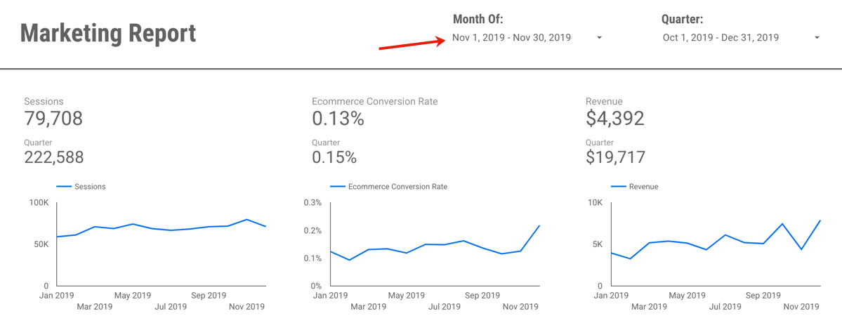
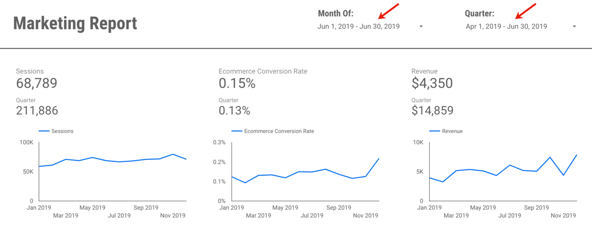
For example, this report which includes Last Month, Last Quarter (or you could do Quarter to Date) plus a Yearly trend:

You could manually set the timeframe for each widget (for example, for each scorecard and each chart, you could set the timeframe to Last Month/Quarter/Year, as appropriate.)

However, what if your report users want to engage with your report, or perhaps use it to look at a previous month?
For example, let’s say you send out an email summarizing and sharing December 2019’s report, but your end user realizes they’d like to see November’s report. If you have (essentially) “hard-coded” the date selector in to the charts, to pick another month, your end users would need to:
- Be report editors (eek!) to change the timeframe, and
- Very manually change the timeframe of individual charts.
This is clunky, cumbersome, and very prone to error (if a user forgets to change the timeframe of one of the charts.)
The solution? Using multiple date selectors, for the different time periods you want to show.
By grouping specific charts with different date selectors, you can set the timeframe for each group of widgets, but in a way that still allows the end user to make changes when they view the report.

In the example report, each chart is set to “Automatic” timeframe, and I actually have three date selectors: One set to Previous Month, that controls the top three scorecard metrics:

A second timeframe, set to “Last Quarter” controls the Quarterly numbers in the second row:

Wait, what about the final date selector? Well, that’s actually hiding off the page!

Why hide it off the page? A couple reasons…
- It’s very clear, from the axis, what time period the line charts are reporting on – so you don’t need the dates to be visible for clarity purposes.
- People are probably going to want to change the active month or quarter you are reporting on, but less likely to go back a full year…
- Adding yet another date to the report may end up causing confusion (without adding much value, since we don’t expect people are likely to use it.)
- Your report editors can still change the timeframe back to a prior year, if it’s needed, since they can access the information hidden off the margin of the report. (I do a lot of “hiding stuff off the side of the report” so it’s only viewable to editors! But that’s a topic for another post.)
The other benefit of using the date selectors in this way? It is very clearly displayed on your report exactly which month you are reporting on:

This makes your date selector both useful, and informative.
So when I now want to change my report to November 2019, it’s a quick and easy change:
Or perhaps I want to change and view June and Q2:
If you’d like to save a little time, you can view (and create a copy of) the example report here. It’s using data from the Google Merchandise Store, a publicly available demo GA data set, so nothing secret there!
Questions? Comments? Other useful tips you’ve found?
If you want to be a part of this, and other Data Studio (and other analytics!) discussions, please join the conversion on Measure Chat.