Analysis Workspace, the dynamic reporting interface for the Adobe Experience Cloud, is truly an amazing piece of technology. Over the past few years, Adobe has made tremendous strides in reporting by miraculously moving the functionality from the Ad-Hoc app to a similar, but web-based experience. You know the technology is good when, given a choice between the old “Reports” interface and the “Workspace” interface, most users voluntarily migrate over to the new one (even though some Ad-Hoc users are still not happy about Ad-Hoc being sunset).
Currently, I am in the midst of training approximately five-hundred people on Analysis Workspace for a client. When you conduct training classes on a product, you gain a new perspective on it. This includes being amazed by its cool parts and frustrated by its bad parts. You never really know a product until you have to stand up in front of thirty people, two times a day, five days a week and try and teach them how to use it. Since I have done a lot of training, when conducting a class, I can easily see in people’s faces when they get something and when they don’t. I also make mental notes of things that generate the most questions on a consistent basis. As a power user myself, there are many things in Workspace I take for granted that are confusing for those newer to the product and those casual users who may only interact with it a few times per week.
Therefore, the following will share things I observed while training people on Workspace in case it helps you when training your team on Workspace. The items that my students found confusing might also confuse your co-workers, so think of this as a way to know where potential land-mines might be so you can anticipate them. This is by no means meant to be critical of Adobe and the Workspace product, but rather simply an accounting of areas my students struggled with.
So what follows is a laundry list of the things that I noticed confused my students most about Workspace. These were the times I was explaining something and I either got questions, saw confused looks on faces, or had students unable to easily complete hands-on exercises. While I don’t have time in this post to document how I explained the items below, what you find below is just meant to highlight things that you may encounter.
Difference between segments and dimension values
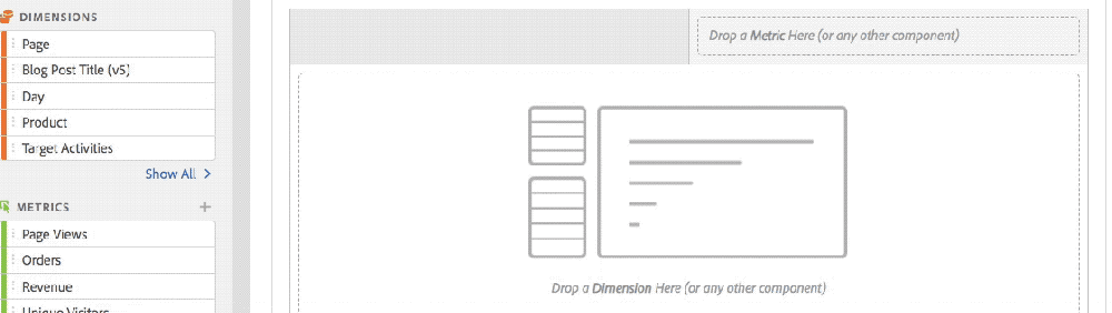
There are many cases in Workspace where you can use segments or specific values of a dimension to narrow down the data you are analyzing. For example, you can apply both to the drop zone at the top of a project panel or within columns of a freeform table. Unfortunately, it isn’t easy to explain to novices that using a Segment can narrow down data by Visitors, Visits, or Hits, but that filtering using a dimension value is limited to applying a Hit filter (unless you edit it and turn it into a segment). This is especially true when using dimension values to create cross-tabs or within Venn visualizations.

Difference between using dimension and dimension values
There are some cases where your users may be confused about whether they should drag over the dimension or the dimension values (using the hidden dimension chevron-more on this next week!). For example, when you use a Flow visualization, even though it is labeled in the boxes, I found many users were confused about the fact that they could only drag the dimension to the Entry/Exit box, but could drag either a dimension or a dimension value to the middle box.

It was also confusing to them that dragging over the dimension picks a dimension value for them, which then has to be replaced with the actual dimension value they want by dropping it on top of the focus value of the flow (with no type of indicator letting them know that it was even possible to drop a page value onto the existing page value).

Pathing visualizations with Visit or Visitor radio button
While on the subject of the Flow pathing visualization, I also received numerous questions about whether they should use the Visit or Visitor option (radio button) for Flow and Fallout. If using Visitor, does it matter if the same visitor repeated steps or took slightly different paths in their second/third visit? Why does Workspace default to Visitor? Is there a way to make Visit the default for all new visualizations?
Count Instances
In the Project – Info & Settings, there is an option to count instances or not. This was very confusing to people and it would be good if Adobe could provide more context around this and what it impacts.

I also tried to avoid conversations about “Repeat Instances” in Flow reports for my novice users since I learned early on that this concept was only really understood by more experienced users.
Default Occurrences Metric
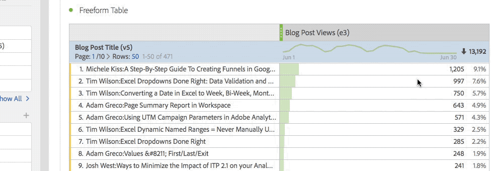
If you make a new freeform table in Workspace and start by dragging over dimensions before metrics, the table defaults to the Occurrences metric.
As you can imagine, explaining what an Occurrence is versus a Page View can be tricky for people who only casually use Adobe Analytics. While I use it as a good interview question, everyday users can find this confusing, so it may be better to default new tables to Page Views or Visits. I also recommended that my students always add metrics to tables before dimensions to minimize seeing the Occurrences metric.
Time Dimensions/Components
When I was doing exercises with students, I would often ask them to make freeform tables and show me the data by day, week or month. So, they would use the left navigation to search and see this:

At this point, they would ask me whether they should use the “orange” version of the week or the “purple” version of the week. This led to a discussion about how Time components alter the dates of the project and usually was a downward spiral from there for novice users! One thing you can do is to use Workspace project curation and share a project that has fewer items to limit what novice users will see.
Viewing the same dimension as eVar and sProp
While this is not really a Workspace issue, I often got questions about cases in which doing a search in the left navigation produced multiple versions of a dimension:

Putting aside the awkward conversation about eVar Instances and the Entry/Exit versions of sProps, this forces a conversation about when to use the eVar version and when to use the sProp version that very few novice users will understand. This is why I encourage my customers to remove as many of their sProps as they can to avoid this confusion. In the “Reports” interface, eVars and sProps are segregated, but in Workspace, they can be seen next to each other in many situations. Again, you can use Workspace project curation and share a project that has fewer items to limit what novice users will see.
Filtering & Column Totals
When I explained how users could use the text filter box in the column header of Freeform tables (which they can only see if they hover) to choose the specific values they want to see, users didn’t understand why the column totals didn’t change to reflect the newly filtered values.
They expected that the column totals and the row percentages would change based upon what was filtered. When I explained that this could be done through segmentation versus filtering, I got a lot of head scratches. Perhaps one day, Workspace will add a feature to let users choose if they want to have filter impact column totals and row percentages.
Temporary Segments & Metrics
There are a few places in Workspace where you can quickly create segments or new metrics. The former can be done in the segment area at the top of each panel and the latter can be done by right-clicking on columns. Unfortunately, in both of these cases, the segments/metrics created are “temporary” such that they don’t appear in the left navigation or in other projects (unless you edit them and choose “make public” option). I am sure this feature was added to reduce clutter in the left navigation component area, but as a trainer, it is hard to explain why you should create segments/metrics one way if you want them to be “public” and another way if they are “temporary.” I am not sure of the solution here, but I will tell you that your users may be confused about this as well.
Fallout with Success Events vs. Calculated Metric with Success Events
When doing classes, I often asked students to show me the conversion rate between two Success Events. For example, there might be a Leads Started event and a Leads Completed event and I wanted them to tell me what percent of Leads Started were Completed. To me, this was an exercise to have them show me that they knew how to create a new Calculated Metric. However, I was surprised that on multiple occasions students chose to answer this question by creating a Fallout report that used these two Success Events instead. Unfortunately, the resulting conversion rate metric will not be the same since the Fallout report is a count of Unique Visitors and the Calculated Metric divides the actual Success Event numbers. Sometimes they were close, but I got questions about why the numbers were different. This is just an education thing, but be prepared for it.
Derived Metrics & Cohorts
One of the things I love the most about Adobe Analytics is the ability to create derived metrics. These are Calculated Metrics that have a segment or dimension value associated with them. When I explained Cohort tables to students, they thought they were cool, especially when I showed them how to apply segments to Cohorts. Unfortunately, you cannot use Calculated Metrics (of which derived metrics are a subset) in Cohort reports. Upon learning this, my students astutely pointed out that you can add a metric and a segment to a Cohort table, but you cannot add a derived metric, which is just a metric and a segment combined. They didn’t understand why that would be the case. I am sure there is a valid reason for this, but I just wanted to highlight it as another question you may receive.
Segmentation and Containers
Ever since segmentation was created in Adobe Analytics, it has been something that confused novice users. Since you can add so much to a segment and use so many operators, it can be overwhelming. Teaching segmentation is typically the hardest part of classes on Adobe Analytics and since it is front and center in Workspace, it is unavoidable.
One particularly confusing area is the topic of containers within segments. Most people can [eventually] understand why they need containers when different operators are being used, but what I found in my classes is that understanding that each container can be set to Visitor, Visit, or Hit level can push novice users over the edge! If users add a container, it defaults to a “Hit” container which can produce no data in certain situations like this:

Summary
To summarize, the above items are ones that I found generated the most questions and confusion consistently across many classes with students of varying degrees of experience with Adobe Analytics. When these types of questions arise, you will have to decide if you want to tackle them and, if so, how deep you want to go. For now, I just wanted to share my experience as something to consider before you train your employees on Workspace. In next week’s post, I will outline some of the Workspace UX/Design things that my students struggled with in classes.