Understanding the effectiveness of marketing efforts is a core use case for Google Analytics. While we may analyze our marketing at the level of an individual site, or ad network, typically we are also looking to understand performance at a higher channel level. (For example, how did my Display ads perform?)
In this post I’ll discuss two ways you can approach this, as well as the gotchas, and even offer a handy little tool you can use for yourself!
Option 1: Channel Groupings in GA
There are two relevant features here:
- Default channel groupings
- Custom channel groupings
Default Channel Groupings
Default channel groupings are defined rules, that apply at the time the data is processed. So, they apply from the time you set them up, onwards. Note also that the rule set execute in order.

The default channel grouping dimension is available throughout Google Analytics, including for use in segments, as a secondary dimensions, in custom reports, Data Studio, Advanced Analysis and the API. (Note: They are not included in Big Query.)
Unfortunately, there are some real frustrations associated with this feature:
- The default channel groupings that come pre-setup aren’t typically applicable. By default, GA provides some default rules. However, in my experience, they rarely map well enough to marketing efforts. Which leads me to…
- You have to customize them. Makes sense – for your data to be useful, it should be customized to your business, right? I always end up editing the default grouping, to take into account the UTM and tracking standards we use. Unfortunately…
- The manual work in customizing them makes kittens cry. Why?
- You have to manually update them for every.single.view. Default Channel Groupings are a view level asset. So if your company has two views (or worse, twenty!) you need to manually set them up over. and over. again.
- (“I know! I’ll outsmart GA! I’ll set up the groupings then copy the view. Nope, sorry.) Unlike goals, any customizations made to your Default Channel Groupings don’t copy over when you copy a view, even if they were created before you copied it. You start from scratch, with the GA default. So you have to create them. Again.
- There is no way to create them programmatically. They can’t be edited or otherwise managed via the Management API.
- Personally, I consider this to be a huge limitation for feature use in an enterprise organization, as it requires an unnecessary level of manual work.
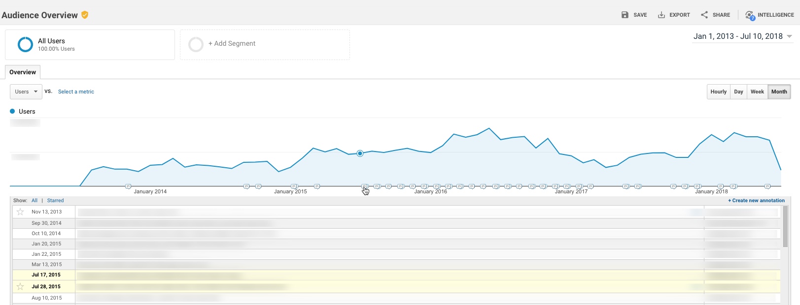
- They are not retroactive. This is a common complaint. Honestly, it’s the least of my issues with them. Yes, retroactive would be nice. But I’d take a solve of the issues in #3 any day.
“Okay… I’ll outsmart GA (again)! Let’s not use the default. Let’s just use the custom groupings!” Unfortunately, custom channel groupings aren’t a great substitute either.
Custom Channel Groupings
Custom Channel Groupings are a very similar feature. However, the custom groupings aren’t processed with the data, they’re a rule set applied on top of the data, after it’s processed.
The good:
The bad:
- The custom grouping created is literally only available in one report. You can not use the dimensions they create in a segment, as a secondary dimension, via the API or Data Studio. So they have exceptionally limited value. (IMHO they’re only useful for checking a grouping before you set it as the default.)
So, as you may have grasped, the channel groupings features in Google Analytics are necessary… but incredibly cumbersome and manual.
<begging>
Dear GA product team,
For channel groupings to be a useful and more scalable enterprise feature, one of the following things needs to happen:
- The Default should be sharable as a configured link, the same way that a segment or a goal works. Create them once, share the link to apply them to other views; or
- The Default should be a shared asset throughout the Account (similar to View filters) allowing you to apply the same Default to multiple views; or
- The Default should be manageable via the Management API; or
- Custom Groupings need to be able to be “promoted” to the default; or
- Custom-created channels need to be accessible like any other dimension, for use in segmentation, reports and via the API and Data Studio.
Pretty please? Just one of them would help…
</begging>
So, what are the alternate options?
Option 2: Define Channels within Data Studio, instead of GA
The launch of Data Studio in 2016 created a new option that didn’t used to exist: use Data Studio to create your groupings, and don’t bother with the Default Channel Groupings at all.
You can use Data Studio’s CASE formula to recreate all the same rules as you would in the GA UI. For example, something like this:
CASE
WHEN REGEXP_MATCH (Medium, 'social') OR REGEXP_MATCH (Source, 'facebook|linkedin|youtube|plus|stack.(exc|ov)|twitter|reddit|quora|google.groups|disqus|slideshare|addthis|(^t.co$)|lnk.in') THEN 'Social'
WHEN REGEXP_MATCH (Medium, 'cpc') THEN 'Paid Search'
WHEN REGEXP_MATCH (Medium, 'display|video|cpm|gdn|doubleclick|streamads') THEN 'Display'
WHEN REGEXP_MATCH (Medium, '^organic
You can then use this newly created “Channel” dimension in Data Studio for your reports (instead of the default.)
Note, however, a few potential downsides:
- This field is only available in Data Studio (so, it is not accessible for segments, via the API, etc.)
- Depending on the complexity of your rules, you could bump up against a character limit for CASE formulas in Data Studio (2048 characters.) Don’t laugh… I have one set of incredibly complex channel rules where the CASE statement was 3438 characters…
Note: If you use BigQuery, you could then use a version of this channel definition in your queries, as well.
And a Toy Surprise!

Let’s say you do choose to use Default Channel Groupings (I do end up using them, I just grumble incessantly during the painful process of setting them up, or amending them.) You might put a lot of thought in to the rules, the order in which they execute, etc. But nonetheless, you’ll still need to check your results after you set them up, to make sure they’re correct.
To do this, I created a little Data Studio report, that you are welcome to copy and use for your own purposes. Basically, after you setup your default groupings and collect at least a (full) day’s data, the report allows you to flip through each channel, and see what Sources, Mediums and Campaigns are falling in to each channel, based on your rules.
mkiss.me/DefaultChannelGroupingCheck
Note: At first it will load with errors, since you don’t have access to my data set. You need to select a data set you have access to, and then the tables will load.

If you see something that seems miscategorized, you can then edit the rules in the GA admin settings. (Keeping in mind that your edits will only apply moving forward.)
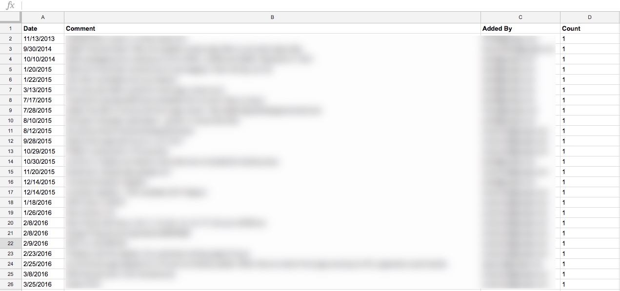
I also recommend you keep documentation of your rules. I use something like this:

I also set up alerts for big increases in the “Other” channel, so that I can catch where the rules might need to be amended.
Thoughts? Comments?
I hope this is helpful! If there are other ways you do this, I would love to hear about it.
) OR REGEXP_MATCH(Source, 'duckduckgo') THEN 'Organic Search'
WHEN REGEXP_MATCH (Medium, '^blog
You can then use this newly created “Channel” dimension in Data Studio for your reports (instead of the default.)
Note, however, a few potential downsides:
- This field is only available in Data Studio (so, it is not accessible for segments, via the API, etc.)
- Depending on the complexity of your rules, you could bump up against a character limit for CASE formulas in Data Studio (2048 characters.) Don’t laugh… I have one set of incredibly complex channel rules where the CASE statement was 3438 characters…
Note: If you use BigQuery, you could then use a version of this channel definition in your queries, as well.
And a Toy Surprise!
Let’s say you do choose to use Default Channel Groupings (I do end up using them, I just grumble incessantly during the painful process of setting them up, or amending them.) You might put a lot of thought in to the rules, the order in which they execute, etc. But nonetheless, you’ll still need to check your results after you set them up, to make sure they’re correct.
To do this, I created a little Data Studio report, that you are welcome to copy and use for your own purposes. Basically, after you setup your default groupings and collect at least a (full) day’s data, the report allows you to flip through each channel, and see what Sources, Mediums and Campaigns are falling in to each channel, based on your rules.
mkiss.me/DefaultChannelGroupingCheck
Note: At first it will load with errors, since you don’t have access to my data set. You need to select a data set you have access to, and then the tables will load.
If you see something that seems miscategorized, you can then edit the rules in the GA admin settings. (Keeping in mind that your edits will only apply moving forward.)
I also recommend you keep documentation of your rules. I use something like this:
I also set up alerts for big increases in the “Other” channel, so that I can catch where the rules might need to be amended.
Thoughts? Comments?
I hope this is helpful! If there are other ways you do this, I would love to hear about it.
) THEN 'Blogs'
WHEN REGEXP_MATCH (Medium, 'email|edm|(^em$)') THEN 'Email'
WHEN REGEXP_MATCH (Medium, '^referral
You can then use this newly created “Channel” dimension in Data Studio for your reports (instead of the default.)
Note, however, a few potential downsides:
- This field is only available in Data Studio (so, it is not accessible for segments, via the API, etc.)
- Depending on the complexity of your rules, you could bump up against a character limit for CASE formulas in Data Studio (2048 characters.) Don’t laugh… I have one set of incredibly complex channel rules where the CASE statement was 3438 characters…
Note: If you use BigQuery, you could then use a version of this channel definition in your queries, as well.
And a Toy Surprise!
Let’s say you do choose to use Default Channel Groupings (I do end up using them, I just grumble incessantly during the painful process of setting them up, or amending them.) You might put a lot of thought in to the rules, the order in which they execute, etc. But nonetheless, you’ll still need to check your results after you set them up, to make sure they’re correct.
To do this, I created a little Data Studio report, that you are welcome to copy and use for your own purposes. Basically, after you setup your default groupings and collect at least a (full) day’s data, the report allows you to flip through each channel, and see what Sources, Mediums and Campaigns are falling in to each channel, based on your rules.
mkiss.me/DefaultChannelGroupingCheck
Note: At first it will load with errors, since you don’t have access to my data set. You need to select a data set you have access to, and then the tables will load.
If you see something that seems miscategorized, you can then edit the rules in the GA admin settings. (Keeping in mind that your edits will only apply moving forward.)
I also recommend you keep documentation of your rules. I use something like this:
I also set up alerts for big increases in the “Other” channel, so that I can catch where the rules might need to be amended.
Thoughts? Comments?
I hope this is helpful! If there are other ways you do this, I would love to hear about it.
) THEN 'Referral'
WHEN REGEXP_MATCH (Source, '(direct)') THEN 'Direct'
ELSE 'Other'
END
You can then use this newly created “Channel” dimension in Data Studio for your reports (instead of the default.)
Note, however, a few potential downsides:
- This field is only available in Data Studio (so, it is not accessible for segments, via the API, etc.)
- Depending on the complexity of your rules, you could bump up against a character limit for CASE formulas in Data Studio (2048 characters.) Don’t laugh… I have one set of incredibly complex channel rules where the CASE statement was 3438 characters…
Note: If you use BigQuery, you could then use a version of this channel definition in your queries, as well.
And a Toy Surprise!
Let’s say you do choose to use Default Channel Groupings (I do end up using them, I just grumble incessantly during the painful process of setting them up, or amending them.) You might put a lot of thought in to the rules, the order in which they execute, etc. But nonetheless, you’ll still need to check your results after you set them up, to make sure they’re correct.
To do this, I created a little Data Studio report, that you are welcome to copy and use for your own purposes. Basically, after you setup your default groupings and collect at least a (full) day’s data, the report allows you to flip through each channel, and see what Sources, Mediums and Campaigns are falling in to each channel, based on your rules.
mkiss.me/DefaultChannelGroupingCheck
Note: At first it will load with errors, since you don’t have access to my data set. You need to select a data set you have access to, and then the tables will load.
If you see something that seems miscategorized, you can then edit the rules in the GA admin settings. (Keeping in mind that your edits will only apply moving forward.)
I also recommend you keep documentation of your rules. I use something like this:
I also set up alerts for big increases in the “Other” channel, so that I can catch where the rules might need to be amended.
Thoughts? Comments?
I hope this is helpful! If there are other ways you do this, I would love to hear about it.


 If you are a veteran Adobe Analytics (or Omniture SiteCatalyst) user, for years the term attribution was defined by whether an eVar was First Touch (Original Value) or Last Touch (Most Recent). eVar attribution was setup in the administration console and each eVar had a setting (and don’t bring up Linear because that is a waste!). If you wanted to see both First and Last Touch campaign code performance, you needed to make two separate eVars that each had different attribution settings. If you wanted to see “Middle Touch” attribution in Adobe Analytics, you were pretty much out of luck unless you used a “hack” JavaScript plug-in called
  However, this has changed in recent releases of the Adobe Analytics product. Now you can apply a bunch of pre-set attribution models including J Curve, U Curve, Time Decay, etc… and you can also create your own custom attribution model that assigns some credit to first, some to last and the rest divided among the middle values. These different attribution models can be built into Calculated Metrics or applied on the fly in metric columns in Analysis Workspace (not available for all Adobe Analytics packages). This stuff is really cool! To learn more about this,


 Back in 2015, the Analytics Demystified team decided to put on a different type of analytics conference we called ACCELERATE. The idea was that we as partners and a few select other industry folks would share as much information as we could in the shortest amount of time possible. We chose a 10 tips in 20 minutes format to force us and our other presenters to only share the “greatest hits” instead of the typical (often boring) 50 minute presentation with only a few minutes worth of good information. The reception of these events (held in San Francisco, Boston, Chicago, Atlanta and Columbus) was amazing. Other than some folks feeling a bit overwhelmed with the sheer amount of information, people loved the concept. We also coupled this one day event with some detailed training classes that attendees could optionally attend. The best part was that our ACCELERATE conference was dramatically less expensive than other industry conferences.


 Analytics Demystified is excited to have opened registration for


 Opening day if you will. The general session followed up by many sessions and labs. This sounds silly but I always come early to have breakfast at the conference. I have had many a great conversation and met so many interesting people by simply joining them at the table. I do this for all the lunches each day as well. We are all pretty much there for similar reasons and have similar interests so it is nice to geek out a bit and network as well.


