Adobe Analytics, Featured

Cart Persistence and Purchases [Adobe Analytics]

Many years ago, I wrote a post about shopping cart persistence based upon a query from a client. That post showed how to see how long items had been in the cart and a few other things. In this post, I am going to take a different slant and talk about how you can see which items are persisting in the cart and whether visitors are purchasing products they have persisted in the shopping cart.

What’s Persisting In The Cart?

The first step is to identify what items are persisting in the shopping cart when visitors arrive at your site. To do this, you can set a success event on the 1st page of the session (let’s call it Persistent Cart Visits) and then set the Products variable with each product that is in the cart.

s.events=”event95″;
s.products=”;blue polo shirt,;soccer ball”;

This will allow you to easily report upon which products are most often in the cart when visits begin:

This data can also be trended over time to see if there are certain products that are frequently persisting in the cart and you can merge this data with product cost information to see potential missed opportunities for revenue. This data can also be useful for re-marketing efforts, like offering a coupon or discount on items left in the cart. You can also use Date Range segments to see which products added to the cart last week (for example) were viewed as a persistent cart this week.

Compare Cart Persistence to Orders

Once you have the preceding items tagged, you can look to see how often any of the products that were persisting in the cart were purchased. One way to do this is to use the Products report to compare Persistent Cart Visits and Orders. This will allow you to see a ratio of orders per persistent cart visits (by product):

This allows you to see which products are getting purchased and you can break this report down by campaign to see if any of your re-marketing efforts are leading to success.

General Persistent Cart Conversion

Another approach to cart persistence is understanding, in general, how often cart persistence leads to conversion. Using the calculated metric shown above by itself, you can easily see the cart persistence conversion rate over time:

Alternatively, you can use segmentation to isolate visits that had an order AND had items in the cart when the visit began. This can be done by creating a success event using the Orders and Persistent Cart Visits success events:

Once this segment is created, it can be added to a Visits metric or Revenue metric or any other number of items to create some interesting derived calculated metrics.

Of course, you can also create product-specific segments to see how often visitors are purchasing a specific product that they have persisted in the cart by adding the Products variable to the preceding segment like this:

Advanced Cart Persistence

If you like this concept and want to take it to the “Top Gun” level, here is another cool use case you can try out. When visitors come to your site and have an item persisting in their cart, have your developers note which products were in the cart (same list passed to the Products variable above). Next, wait until visitors complete an order on the site and look at the persistent cart product list and if any of the products purchased were in the persistent cart list, track that via a Merchandising eVar (as a flag). At the same time, you can add two new success events (Persistent Cart Orders and Persistent Cart Revenue) in the Products string as well:

 s.events=”purchase,event110.event111″;
s.products=”;blue polo shirt;1;50;event110=1|event111=50;evar90=persistent-cart,;blue purse;1;45″;

In this example, the customer is purchasing two items, but only one was a result of the persistent cart. By setting a flag in the Merchandising eVar and two new success events, we can isolate the specific product that was attributed to the persistent cart and see a count of Orders and Revenue resulting from cart persistence. Once this is done, you can trend Persistent Cart Orders and Revenue and even compare those metrics to total Orders and Revenue to see what % of Orders and Revenue is due to cart persistence.

Another super-cool thing you can do is use the new Analysis Workspace Cohort Analysis visualization to compare Cart Additions and Persistent Cart Orders to see what % of people adding items to the cart come back to order items in the cart.

Unfortunately, since you cannot yet use derived calculated metrics in Cohort Analysis, you may get some extraneous data you don’t want in the Cohort table (i.e. people purchasing multiple items and only some being due to cart persistence), but it should still give you some interesting data (and maybe one day Adobe will allow calculated metrics in Cohort Analysis!).

In summary, there are lots of cool ways you can measure shopping cart persistence. These are just a few of them. If you have any other ways you have done this, feel free to leave a comment here.  Thanks!

Adobe Analytics, Featured

European Adobe Analytics “Top Gun” Master Class – October 19th

A while back I ask folks to fill out a form if they were interested in me doing one of my Adobe Analytics “Top Gun” classes locally. and soon after, I had many European folks fill out the form! Therefore, this October 19th I will be conducting my advanced Adobe Analytics class in London. This will likely be the last time I offer this class in Europe for a while, so if you are interested, I encourage you to register before the spots are gone.

For those of you unfamiliar with my Adobe Analytics “Top Gun” class, it is a one day crash course on how Adobe Analytics works behind the scenes based upon my Adobe Analytics book. This class is not meant for daily Adobe Analytics end-users, but rather for those who administer Adobe Analytics at their organization, analysts who do requirements gathering or developers who want to understand why they are being told to implement things in Adobe Analytics. The class goes deep into the Adobe Analytics product, exploring all of its features from variables to merchandising to importing offline metrics. The primary objective of the class is to teach participants how to translate every day business questions into Adobe Analytics implementation steps. For example, if your boss tells you that they want to track website visitor engagement using Adobe Analytics, would you know how to do that? While the class doesn’t get into all of the coding aspects of Adobe Analytics, it will teach you which product features and functions you can bring to bear to create reports answering any question you may get from business stakeholders. It will also allow you and your developers to have a common language and understanding of the Adobe Analytics product so that you can expedite getting the data you need to answer business questions.

Here are some quotes from recent class attendees:

To register for the class, click here. If you have any questions, please e-mail me. I hope to see you there!


Adobe Analytics, Featured

Content Freshness [Adobe Analytics]

Recently, I had a client ask me about content freshness on their site. In this case, the client wanted to know if the content on their site was going stale after a few days or weeks so they could determine when to pull it off the site. While the best way to use what I will show is on a site that has a LOT of content and new content on a regular basis (like a news site), in this post, I will demonstrate the concept using our blog, which is all I can share publicly.

Step 1 – Set Dates

The first step in seeing how long it takes your users to interact with your content is to capture the number of days between the content publish date and the view date. To do this, you can add an eVar that subtracts the current date from the content publish date. For example, if I look at one of my old blog posts today, I can see in eVar10 the number of days after it was posted that I am viewing it:

In this case, the value of “13” is being passed to the eVar, which tells Adobe Analytics that the post being viewed is 13 days old. Once you have done this, you will see a report like this in Adobe Analytics:

If I break down the “13” row, I will see that it represents the previously shown blog post and if any other posts were published on the same date, they would appear also:

Step 2 – Classify Dates

However, the above report is pretty ugly and way too granular for analysis! Therefore, you can then apply SAINT Classifications to the number of days and make the report a bit more readable. Here is an example of the SAINT file that I used:

Keep in mind that you can pre-classify the number of days ahead of time (I went up to 20,000 to be safe) so that you only have to upload this once.

Next, you can open the classification report and see this, which is much more manageable and can be trended:

Step 3 – Reporting

In this case, I decided to create a data block in Adobe ReportBuilder to see data on a daily/trended basis. Here is what the data block looked like:

This produced a report like this:

Which I then graphed like this:

using Excel pivot tables, you can group the data any way you’d like once you have the data in Excel.

Lastly, you can also use the Cohort Analysis feature of Analysis Workspace to get a different view on how your content is being used:


Analytics Strategy, Industry Analysis

A Mobile Analytics Comparative: Insurance Apps – Part 2

Mobile analytics “Events” are the actions that users take when using your mobile apps. These events can be anything from opening the app, to swiping through screens, taking a photo of a fender-bender, or submitting a new claim. Events are the lifeblood of any mobile application and tracking them is essential to any mobile analytics platform.

In Part 1 of this comparative, I looked at the total number of SDK’s within the top 5 insurance apps (based on US Advertising spend) and posted some observations about what I found. Here in Part 2, I will take a closer look at how mobile analytics events are tracked and the specific events tracked by each of these apps.


Out-of-the-box Events for mobile apps. While every analytics tool handles in-app event tracking differently, vendors seem to take one of two approaches when tracking events on mobile apps. The first, which is common among analytics vendors used by our group of insurance apps, is to provide basic default events and offer the ability to track custom events as well. The second method is to track all events by default and allow users to identify which ones are most valuable to them. Both scenarios have distinct advantages, but neither will suffice unless you take the time to understand what goals you’re trying to accomplish with your mobile app and what type of engagement you wish to encourage users to take.

Adobe Analytics

Adobe Analytics’ mobile SDK offers a number of capabilities out-of-the-box and their Lifecycle metrics provide valuable context data to help analysts see what’s going on within their apps. Adobe Analytics collects: launches, crashes, upgrades, and session information by default. Additionally, Lifecycle metrics provide data on engaged users, days since first/last use, hour of day, day of week, and device, carrier, and operating system info as well. Adobe Analytics also offers a number of default dimensions within its mobile SDK that enable analysts to capture location data, lifetime value, and campaign details. To see a full list of Adobe Analytics’ default mobile metrics and dimensions, click here. Adobe also offers the ability to track custom events, which can be configured as variables that will reveal in the traditional Adobe Analytics interface. Also, for Adobe users, the mobile SDK supports other Marketing Cloud solutions like Target, Audience Manager and Visitor ID, making it a great choice for those looking for a single solution.

Google Analytics (Firebase)

Google Analytics and their mobile specific platform, Firebase, offer a number of default metrics as well. First Opens, Sessions Starts, and user Engagement are all provided out-of-the-box. These events, along with in app purchases, app updates/removes, mobile notification info, and dynamic link data are all offered as defaults. To view Google Analytics (Firebase’s) full list of default mobile events, click here. Google also offers the ability to track custom events as well. With Google Firebase, product owners and developers can build and manage apps and configure tracking that can share data to Google Analytics. This enables the opportunity to contain your data in a single location so that your mobile data is viewable along with your traditional web analytics data.   


Auto Event Tracking. There are a few vendors on the app analytics marketplace that take the approach of auto-tracking events and enabling users to identify keys events and label them for analysis within their analytics interfaces.

Mixpanel is one of these solutions and offers Autotrack as a service to capture clicks on links, buttons, and forms as well as other in-app actions. They built a point-and-click editor, which allows product owners to configure tracking by navigating web pages and mobile apps as they would normally. The editor provides valuable contextual data like how many times a button has been viewed and clicked in the past few days, which helps hone in on the most valuable assets. But what’s very cool is that once events are identified in Autotrack, reports will contain historic data on these events back to the time of first implementation of Autotrack. Event data can also be augmented with context data called “properties” that adds additional detail to key events.

Heap Analytics is another solution that automatically captures user actions with its base code. Similar to Mixpanel, Heap Analytics captures clicks, taps, gestures, and form fills through its default tracking. Their Event Visualizer allows Analysts or product owners to configure tracking by navigating apps and interacting with the interface to record, name, and define events. This solution also works retroactively and enables analysis of events within the Heap Analytics interface. Both of these solutions take much of the pain of traditional tagging and configuration away from Analysts and product owners allowing them to get into data analysis and insights quickly.

As with most things in digital analytics, there are multiple ways to get the job done and multiple tools to choose from to accomplish the task of tracking events. I didn’t even mention other popular mobile analytics platforms Flurry and Localytics here mainly for brevity sake, so perhaps I need to another blog post to call out the differences between vendors. Which tool you decide on has a lot to do with ease of use, if you want to see your web and mobile data in a common interface, and the level of complexity you’re willing to endure to get robust mobile tracking.


What the Insurance Apps are tracking

All of the insurance apps that we evaluated in this comparative are using either Adobe Analytics, Google Analytics, or both on their apps. No instances of Mixpanel nor Heap Analytics (nor Flurry, nor Localytics for that matter) and their auto tracking features were detected, indicating that each of these companies elected to go the more traditional route for app analytics tracking. That said, there were some similarities and differences in the way that each company was tracking events within their apps.

Opens

Tracking Opens is arguably the most basic of events that can (and should) be tracked within your mobile apps. Each of the insurance apps I evaluated contained Open event tracking, which is not surprising since it’s offered by default from their vendors. Yet, what companies do with their Open event data is where things get interesting. For this evaluation, I did not look at how any of these firms are using data, so I won’t pass judgement on their utilization of this basic yet informative data point. Instead, I offer some concepts for thinking about how to analyse your data. Opens are the basis for determining active users, which is a highly regarded KPI in the mobile world. Use Open rates, plus other events to determine which users are active within your mobile apps. Also, by using contextual data such as time of day and location, you can learn a great deal about when and where your users are opening their apps. Are they primarily at home? On the highway? In cities? Understanding this data can help to tailor content for users when they need it most. By analyzing Open Event data and the contextual values that are associated with this event, you can learn a lot about how your customers are using your app.  

Authentication

The ability to recognize a user and authenticate based on device or customer ID is a unique advantage in the mobile world. Within our insurance app sample, we found that Progressive was actively tracking logged in users, yet Geico, State Farm and Allstate were, too, with Adobe’s native Marketing Cloud ID. Each of these firms is tapping into one of the great advantages of mobile in its ability to authenticate individual users. The practical applications of authentication include the ability to customize content for known users, target them with offers and promotions, and even to use geolocation to push messages within apps. A recent article about mobile analytics in the auto industry cited an eMarketer study that revealed, “…one of Audi’s retailers recently ran a two-month campaign targeted to mobile-first audiences. The dealership was able to link 40% of total car sales to the targeted mobile audience.” This linkage is unheard of in the web world, but it’s entirely possible in mobile.

Navigation Flows

Navigation flows provide the ability to see how users are navigating your apps to determine usability, utility, and effectiveness. While our short insurance app comparative didn’t dive deep into any of the apps, we did find tracking within the Geico app that indicated navigational elements such as previous page name, page name, and section of their app. Presumably, these metrics are used to help to determine how users are traversing apps which provides a great deal of insight into usability. Navigation flows in these apps are valuable because even in my short script, I attempted to start a new auto insurance quote and was handed off to a responsive website for each of the five insurance providers evaluated. By defining your desired navigational paths and simply knowing how many users encounter your desired flow and how many drop off versus completing an action, like the quote online, provides key insight into the way the app is built and utilized. Knowing abandon rates for key functions might influence some providers to develop more native features and capabilities if they can be justified through navigational flows and analysis.   


What are you tracking?

Throughout this comparative we learned that companies are using relatively similar event tracking, which is for the most part standard offerings from their vendors. However, we expect as apps become more critical in business operations and more users are relying on apps to complete their transactions, that the level of customized tracking will undoubtedly improve. But as with all things in analytics, tracking events and dimensions that support your business goals is the top priority and this is where you should start and/or focus if you’re responsible for tracking your company’s mobile apps.  

If this is your role, it’s important to keep in mind that tracking apps can be a messy process. If your developers and product managers are building apps with the desire of creating immersive experiences, then it’s easy to try and track everything and lose sight of the key goals. Tagging complex or immersive apps can be a technical challenge, which is why you should take the opportunity to identify clear KPIs (such as get a quote), and also ensure that your UX and design teams are outlining the critical paths within your apps so everyone is on the same page about what you’re trying to accomplish and how you expect users to get there. This approach will ultimately lead to readily available insights (whether you were right or wrong), because you set the metrics by which you will measure success ahead of time. This pragmatic approach to mobile measurement is often overlooked yet essential for measuring what’s critically important and determining if your applications are successful. Continue reading

Adobe Analytics, Featured

Advanced Click-Through Rates in Adobe Analytics – Placement

Last week, I described how to track product and non-product click-through rates in Adobe Analytics. This was done via the Products variable and Merchandising eVars. In this post, I will take it a step further and explain how to view click-through rates by placement location. I suggest you read the last post before this one for continuity sake.

Placement Click-Through Rates

In my preceding post, I showed how to see the click-through rate for products by setting two success events and leveraging the products variable. As an example, I showed a page that listed several products like this:


To see click-through rates, you would set the following code on the page showing the products to get product impressions:

s.events=”event20″;
s.products=”;11345,;11367,;12456,;11426,;11626,;15522,;17881,;18651″;

Then, when visitors click on a product, you would set code like this:

s.events=”event21″;
s.products=”;11345″;

Then you can create a click-through rate calculated metric and produce a report that looks like this:

However, what if you wanted to see the click-through rate of each product based upon its placement location? For example, you can see above that product# 11345 has a click-through rate of 26.97%, but how much does this click-through rate depend upon its location? How much better does it perform if it is in Row 1 – Slot 1 vs. Row 2 – Slot 3? To understand this, you have to add another component to the mix – Placement.

To do this, you can add a new Merchandising eVar that captures the Placement details and set it in the merchandising slot of the Products string like this:

s.events=”event20″;
s.products=”;11345;;;;evar30=Row1-Slot1,;11367;;;;evar30=Row1-Slot2,;12456;;;;evar30=Row1-Slot3,;11426;;;;evar30=Row1-Slot4,;11626;;;;evar30=Row2-Slot1,;15522;;;;evar30=Row2-Slot2,;17881;;;;evar30=Row2-Slot3,;18651;;;;evar30=Row2-Slot4″;

As you can see, the string is the same as before, just with the addition of a new merchandising eVar30 for each product value. This tells Adobe Analytics that each impression (event20) should be tied to both a product and a placement. And since the product and placement are in the same portion of the product string, there is an additional connection made between the specific product (i.e. 11345) and the placement (i.e. Row1-Slot1) for each impression. This allows you to perform a breakdown between product and placement (or vice-versa), which I will demonstrate later.

If a visitor clicks on a product, you would set the click event and capture the product and placement in the Products string:

s.events=”event21″;
s.products=”;11345;;;;evar30=Row1-Slot1″;

In theory, you don’t need to set the merchandising eVar again on the click, since it can persist, but there is no harm in doing so if you’d like to be sure.

Once this is done, you can break down the any product in the preceding report by its placement and use the click-through rate calculated metric to see click-through rates for each product, by placement location. In addition, since each impression and click is also associated with a placement, you can also see impressions, clicks and the click-through rate for each placement by using the merchandising eVar on its own. Here is what the eVar30 report might look like:

This allows you to see placement click-through rates agnostic of what was shown in the placement. Of course, if you want to break this down by product, you can do that to see a report like this:

Lastly, one other cool thing you can do with this is to view click-through rates by placement row and column using SAINT Classifications. In the report above that shows click-through rates by Row & Slot (the one with 8 rows), you can easily classify each of these rows by row and column (slot). For example, the first four rows would all be grouped into “Row 1” and another classification would group rows 1 & 5, 2 & 6, 3 & 7 and 4 & 8 into four column (slot) values. This would allow you to see click-through rate by row and column with no additional tagging.

Another cool thing you can do is to embed a page identifier in the placement string passed to the merchandising eVar. This is helpful if you want to see how click-through rates differ if products are shown on page A vs. Page B. To do this, simply pre-pend a page identifier before the “Row1-Slot1” values, which can then be filtered or classified using SAINT. For example, you might change the value above to “shoe-landing:Row1-Slot1” in the merchandising eVar value. This would break out the Row1-Slot1 values by page and give you additional data for analysis. The only catch here is that you want to be careful about what data you pass during the click portion of the tagging, as you either want to leave the merchandising eVar value blank (to inherit the previous value with the page of the impression) or you want to set it with the value of the previous page so your impressions and clicks are both associated with the same page. If you are tracking impressions and clicks for things other than products (Ferguson example in my previous post), you can either include the placement in the merchandising eVar string or you can set a second merchandising eVar (like shown above) to capture the placement.

Hence, with the addition of one merchandising eVar, you can see click-through rates by placement, product & placement, placement & product, row, column and page.

Adobe Analytics, Featured

Click-Through Rates in Adobe Analytics

One of the more advanced things you can do with Adobe Analytics is to track click-through rates of elements on your web pages. Adobe Analytics doesn’t do this out of the box, but if you know how to use the tool, there are some creative ways that you can add click-through rate tracking to your implementation. In this post, I will share a few different ways to track click-throughs for both products and non-product items.

Product Click-Through Rates

If you sell physical products, you may have pages that show a bunch of products and want to see how often each product is viewed, clicked and the click-through rate. In my Adobe Analytics book, I show an example of a product listing page like this:

If you worked for this company, you might want to know how often each product is shown and clicked, keeping in mind that this could be dynamic due to tests you are running or personalization tools. Luckily, this is pretty easy to do in Adobe Analytics because the Products variable allows you to capture multiple products concurrently. In this case, you would simply set a “Product Impressions” success event and then list out all of the products visible on the page via the Products variable like this:

s.events=”event20″;
s.products=”;11345,;11367,;12456,;11426,;11626,;15522,;17881,;18651″;

Then, if a visitor clicks on one of the products, on the next page, you would set a “Product Clicks” success event and capture the specific product that was clicked in the Products variable:

s.events=”event21″;
s.products=”;11345″;

Once this is done, you can open the Products report and view impressions and clicks for each product. In addition, you can create a new calculated metric that divides Product Clicks by Product Impressions to see the click-through rate of each product:

This report allows you to see how each product performs and can also be trended over time. Additionally, once the click-through rate calculated metric has been created, you can use that metric by itself to see the overall product click-through rate like this:

Non-Product Click-Through Rates

There may be times that you want to see click-through rates for things that are not products. Some examples might include internal website promotions, news story links on a home page or any other important links on key pages. In these cases, you could use the previously described Products variable approach, I don’t recommend it. Using the Products variable for these non-product items would result in many (hundreds or thousands) of non-product values being passed to the Products variable, which is not ideal. It is best if you keep your Products variable for products so you don’t confuse your users.

When I ask Adobe Analytics power users in my Adobe Analytics “Top Gun” class how they would track click-through rates, the most frequent response I get (after the Products variable) is to use a List Var. For those unfamiliar, a List Var is an eVar that can collect multiple values when they are passed in with a delimiter, similarly to how the Products variable is used. On the surface, it makes sense that you can follow the same approach outlined above using a List Var, but unfortunately, this is not always the case. To illustrate why, I will use an example from a company that faced this problem and used a creative solution to it. Ferguson is a plumbing supplies company that displays its main product categories on the home page. They wanted to see the click-through rate of each, but this got complicated because once a visitor clicked on one of the categories, they were taken to a page that had product sub-categories and they also wanted to see impressions of those! So, on the first page, they wanted impressions and then on the second page they wanted to capture the click of the item from the first page, but at the same time capture impressions for more items on the second page! This illustrates why the List Var is not always good for tracking click-through rates. If they were to try and use a List Var, we could easily track impressions on the first page, but what would we do on the second page? It isn’t possible to tell the same List var to collect the ID of the item clicked on the first page AND the list of items getting impressions on the second page. If you passed all of items at the same time, the success events you set (Clicks and Impressions) would be attributed to both and all of your data would be wrong! You could use multiple List Vars, but then you’d have to use two different reports to see impressions and clicks, which makes things very difficult and time consuming. You could also fire off extra server calls when things are clicked, but that can get really expensive!

Therefore, my rule of thumb is that if you want to see impressions and clicks of products, use the Products variable and if you want to see impressions and clicks for non-product items, only use a List Var if there are no items on the page visitors get to after clicking that require impressions themselves. But what if you do want impressions on the subsequent page like Ferguson did? This is where you have to be a bit more advanced in your use of Adobe Analytics as I will explain next.

Advanced Click-Through Rate Tracking (Experts Only!)

The following gets a bit complex, so if you aren’t an Adobe Analytics expert, be forewarned that your head might spin a bit!

As mentioned above, you have solved 2/3 of your impression and click tracking problems – products and non-products where there are no impressions on the subsequent page. Now you are left with the situation that Ferguson faced when they had impressions on both pages. To solve this, you have to use the Product Merchandising feature of Adobe Analytics. This is because you need to find a way to assign impression events and click events on the same page, which means you need to set your success events in the product string so you can be very deliberate about which items get impressions and which get clicks. However, as I started earlier, you don’t want to pass hundreds of non-product items to the Products variable, but you cannot use Merchandising without setting products (I warned you this was advanced stuff!).

To solve this dilemma, you can set two “fake” products and use the Product Merchandising feature to document which non-product items are getting impressions and clicks. By using the Merchandising slot of the Products string in combination with the success events slot of the Products string, you can line up impressions and clicks with the correct values. To illustrate this, let’s look at an example from Ferguson’s website. If you use the Adobe Debugger on the home page, you will see the following in the Products variable:

While this looks pretty intimidating, if you break it down into its parts, it isn’t that bad. First, you will see that a “fake” product named “int_cmp_imp” is being passed to the Products variable once for each item that gets an impression. This means that instead of hundreds of products being added, only one is added to the Products report. Next, in the success event slot of the Products string, you will see that event40 is being incremented by 1 for each item receiving an impression. Next you will see that the actual item receiving the impression is captured in a product syntax merchandising eVar18. For example, the first one captured is “mrch_hh_kob_builder” (you can put whatever values you want here). Then the same approach is repeated once for every item receiving an impression on the page. By setting event40 and eVar18 together, each eVar18 value will increase by one impression upon page load (note: that the “fake” product will receive impressions as well, but we probably will just disregard that).

While this may seem like overkill for this type of tracking, this approach will begin to pay dividends when the user clicks on one of the items and reaches the next page. On the next page, you need to set impressions for all of the new items shown on that page AND set a click for the item clicked on the previous page. Here is what it might look like:

Notice here that the beginning of this string is exactly the same as the first page with the “fake” product of “int_cmp_imp” being set for each item as well as the impression event40 and the item description in eVar18. The key difference here is highlighted in red in which a new product is set “int_cmp_clk” and a new click event41 is incremented by 1 at the same time as eVar18 is set to the item that was clicked on the previous page. The beauty of using the Products variable and Product Merchandising is that you can set both impressions and clicks in the same in the same Products string, while at the same time only adding two new products to the overall Products report.

When you look at the data in Adobe Analytics, you can now add your impressions event (event40), your clicks event (event41) and add a calculated metric to see the click-through rate:

Final Thoughts

By using a combination of success events, the Products variable and, in some cases, Product Merchandising, it is possible to see how often specific items receive impressions, clicks and the resulting click-through rate. There may be some cases in which you have a large number of items for which you want to see impressions and clicks and in those cases, I suggest checking with Adobe Client Care on any limitations you may run into and, as always, be cognizant of how tagging can impact page load speeds. But if you have specific items for which you have always wanted to see click-through rates, feel free to try out one of the techniques described above.

Analysis

A Mobile Analytics Comparative: Insurance Apps – Part 1

Throughout this mobile analytics comparative, I was looking for a few specific things to determine data collected by a group of high-profile apps and how their respective analytics tools were architected to facilitate analysis. Part 1 of this blog series focuses on the SDKs installed within each app and Part 2 will dive into the specific events and variables requested by each apps’ analytics tool.

My comparative focuses on insurance companies in the US, because they undoubtedly spend more money battling it out on advertising than any other industry around. I can testify that it’s working because my TV-watching-kids walk around the house humming insurance jingles (and craftily changing the words) on a daily basis.

According to Statista, the Top 5 Big Spenders on advertising include: Geico, State Farm, Progressive, Liberty Mutual, and Allstate (in that order). I was curious to know how these ad spending giants track their mobile apps. So after downloading each app, I ran my iOS device through my computer using manual HTTP proxy settings and observed calls using Charles to determine what data was being collected and passed through each application. Since I don’t have accounts at each of these insurance providers, my assessment involved three steps: 1) launching the app, 2) agreeing to their user acceptance rules, and 3) swiping my way to the auto quote section. Each app eventually made a hand-off to their responsive websites to complete the quote, which is where my simulated scripts ended.

My findings revealed a good deal about each of these organizations just by digging into their apps from the outside. I should mention that none of the companies in this comparative knew they were being evaluated and I have not validated my observed data requests against any of their internal analytics solutions to determine if data is actually populating in their analytics solutions as designed. If you’re reading this and happen to work at one of these firms, I welcome your feedback and please let me know if I’ve missed the mark on anything critical.

Here’s a few of the notable things I uncovered during this study:

Every app evaluated is using one or more analytics tracking tools. Not surprisingly, we found that all of the insurance companies in our evaluation have analytics tracking tools installed on their mobile apps. Either Adobe Analytics and Google Analytics was present in each of these apps, mirroring the industry dominance that these companies have in the web analytics world. Adobe Analytics was present in three out of five iOS applications and in four out of five Android applications. Google Analytics was present in in just two of the iOS apps, but Google Play Analytics and Firebase Analytics (or both) were present in all but one of the Android apps. See the matrix below for more details.   

The average number of SDKs installed within each app is 19. To determine the total number of SDKs installed within each app, I used a free tool offered by SafeDK called the App X-Ray which allows you to scan any Android app to determine the SDKs installed within that app. This clever little tool revealed a whole lot about each app and how 3rd party services are embedded within each one to deliver different services and solutions. If you’re not familiar with the world of SDKs, these “Software Developer Kits” are used to deploy tools and services within apps such as analytics, advertising, payment solutions, location-based services, crash reporting, attribution, and more. According to SafeDK, as of the 2nd Quarter in 2017, the average app has 17.8 SDKs installed. This fits extraordinarily well into our small sample of insurance apps that have on average 18.6 SDKs embedded. I found instances of crash reporting, location, messaging, voice of customer, advertising, payment, and numerous tools installed within the insurance app sample I evaluated. According to SafeDK: analytics, advertising, and social are the three most commonly used SDKs within apps (with payment as a close 4th).


For app developers, SDKs are essential. Whether it’s adding a tool in the rush to market for a new app, or accessing a library that wouldn’t be available otherwise, SDKs are critical to app development. SDKs provide add-on services and functions that save time and money and there are hundreds available. But just because they exist doesn’t mean you have to use them. I’ll let my bias shine and state that you’d be silly not to use analytics SDKs, but during my assessment, I found that four out of five Android insurance apps had SDKs installed, but not in use. For Allstate, they had a total of 31 SDKs installed in their Android app and a whopping 14 were not actually being used. This presents a whole host of considerations about waste, app bloat, and app size that are considerations for mobile developers and product owners.


Messaging and Location SDKs were prevalent. Within my small sample of insurance apps, I found that three out of five used messaging services to (presumably) deliver in-app messaging to customers. Additionally, all but one of the providers used a dedicated location services SDK within their apps, which again makes a lot of sense for the insurance app, where you might find a customer in need of roadside assistance at any given time. Both of these categories are up-and-coming in the world of mobile apps and can tie nicely into your integrated marketing efforts if executed correctly.  


Very little user experience testing is going on within these apps. Whereas messaging and location SDKs were apparent, few of the insurance apps we evaluated offered any testing tools within their apps. For testing here we’re talking about analytics testing similar to the Adobe Target or Optimizely tests that you’d find on a website. Not QA testing. Yet, as with websites, testing often reflects a higher level of maturity among companies using analytics. For this group, Geico was the only company to employ Adobe Target for testing and optimization of its app. One of the things that we do know about mobile is that apps are constantly going through new releases and updates, so there could be new features and functions rolled out with each new release. However, this is no substitute for actual user testing with A/B or multivariate combinations of creative to get your install base using your app and coming back for more.


Tag management tools are still being shoehorned into mobile apps. Each of the five insurance apps we evaluated included calls to Tag Management Solutions which are increasingly common (and indispensable) in traditional web analytics. Yet, as we all know, mobile is an entirely different beast than the web and data collection requires a different methodology. The event-based tracking method of mobile, coupled with conditional execution and in some cases batch uploading create challenges for web-designed Tag Management Solutions. Lee Isensee of #MeasureSlack riffed on this topic a while ago, but his premise still holds true in that for native apps (which most of my examples are) and a large portion of hybrid apps, Tag Management technology simply doesn’t work well. While I’m not chastising any of these insurance providers for embedding TMS within their apps (mainly because I’m not entirely sure how they’re using them without looking from the inside), I caution you to carefully consider how you utilize TMS within your native apps.


Behavioral, Context, and Navigational data collection varies widely across these apps. So far, I’ve spent a lot of time writing about the SDKs installed within each app, but this still tells us very little about what actual data is collected by each of these applications. Since this post is already getting long in the tooth, I will save the nitty gritty details for Part 2, but I can tell you that there are a lot of variances when it comes to behavioral, context, and navigational data collected within each app analytics solution.

Tune into the next post for more details, but in the meantime, write me a comment below or shoot me an email at john@analyticsdemystified.com if you have thoughts, questions or ideas about app analytics.


Adobe Analytics, Conferences/Community, Featured, Presentation, Testing and Optimization

Get Your Analytics Training On – Down Under!

Analytics Demystified is looking at potentially holding Analytics training in Sydney, in November of this year. We’re looking to gauge interest (given it’s a pretty long trip!)

Proposed sessions:

Adobe Analytics Top Gun with Adam Greco

Adobe Analytics, while being an extremely powerful web analytics tool, can be challenging to master. It is not uncommon for organisations using Adobe Analytics to only take advantage of 30%-40% of its functionality. If you would like your organisation to get the most out its investment in Adobe Analytics, this “Top Gun” training class is for you. Unlike other training classes that cover the basics about how to configure Adobe Analytics, this one-day advanced class digs deeper into features you already know, and also covers many features that you may not have used. (Read more about Top Gun here.)

Cost: $1,200AUD
Date: Mon 6/11/17 (8 hours)

Data Visualisation and Expert Presentation with Michele Kiss

The best digital analysis in the world is ineffective without successful communication of the results. In this half-day workshop, Analytics Demystified Senior Partner Michele Kiss will share her advice for successfully presenting data to all audiences, including communication of numbers, data visualisation, dashboard best practices and effective storytelling and presentation. Want feedback on something you’re working on? Bring it along!

Cost: $600 AUD
Date: Fri 3/11/17 (4 hours)

Adobe Target and Optimization Best Practices with Brian Hawkins

Adobe Target has been going through considerable changes over the last year. A4T, at.js, Auto-Target, Auto-Allocate, and significant changes to Automated Personalisation. This half day session will dive into these concepts, as well as some heavy focus on the power of the Adobe Target profile and how it can be used as a key tool to advance personalisation efforts. Time will also be set aside to dive into proven organisational best practices that have helped organisations democratise test intake, work flow, dissemination of learnings and automating test learnings.

Cost: $600 AUD
Date: Fri 3/11/17 (4 hours)

[MeasureCamp Sydney is being proposed to be held on the Saturday, giving you a great reason to stay and hang out in Sydney over the weekend]

If you plan to attend, we need you to sign up here bit.ly/demystified-downunder so we can understand if there’s sufficient interest.

These trainings have not been (and likely never will come again!) to Australia, so it’s an awesome opportunity to get a great training experience at a way lower cost than that of flying to the US!

This is not confirmed yet so please do not book any travel (or any other non-refundable stuff) until you hear from us. Hope to see you all soon!! (edited)

* I’m allowed to say that, because I was born and raised in Australia (though I may no longer sound like it.) From the booming metropolis of Geelong! 

Featured, Reporting

How to Build a Brain-Friendly Bar Chart in R

This post was inspired by a post by Lea Pica: How to Build a Brain-Friendly Bar Chart in Domo. In that post, Lea started with the default rendering of a horizontal bar chart in Domo and then walked through, step-by-step, the modifications she would make to improve the visualization.

The default chart started like this:

And, it ended like this:

I thought it would informative to go through the exact same exercise, but to do it with R. Specifically, I used the ggplot2 package in R, which is the de facto standard for visualization with the platform.

I, too, started with the default rendering (with ggplot2)  of the same data set:

Egad!

But, I ultimately got to a final plot that was more similar to Lea’s Domo rendering than it was different:

The body of the bar chart is almost an exact replica (the gray with a blue highlight bar is something Lea showed as a “bonus,” but the title of the chart changed; it added an extra step, but I’m a big fan of this sort of highlighting, so that’s the version I built).

The exercise, as expected, does not wind up claiming either platform is a “better” one for the task. A few takeaways for me were:

  • Both platforms are able to produce a good, quality, data-pixel-ratio-maximized visualization.
  • Domo has some odd quirks: the “small, medium, or large” as the font size choices seems unnecessarily limiting, for instance.
  • R has (more, I suspect) odd quirks: I couldn’t easily place the title all the way left-justified; putting the “large text higlight” would have been doable, but very hacky; The Paid Search data label crowds the top of the bar a bit (oddly), etc.

Ultimately, when developing visualizations with R, it takes very little code to do the core rendering of the visualization. It then — in my experience — takes 2-4X additional code to get the formatting just right. At the same time, though, much of that additional code operates like CSS — it can be centrally sourced and then used (and selectively overridden) by multiple visualizations.

If you’re interested in seeing the step-by-step evolution of the code from the initial plot to the final plot, you can check it out on RPubs (that document was put together as an RMarkdown file, so the code you see is, literally, the code that was then executed to generate the resulting iteration).

As always, I’d love to hear your feedback in the comments, and I’d love to chat about how R fits (or could fit) into your organization’s analytics technology stack!

Conferences/Community, Industry Analysis

Mobile Analytics Summit Recap

I recently participated in the first ever Mobile Analytics Summit, which was a fantastic event chock full of great information and insights. The virtual format allowed attendees to tune in based on sessions that were most relevant to them. And if you missed it, there’s an opportunity to go back and catch all the sessions because the presentations are archived and available. ObservePoint was a gracious host and organized event sponsor; I was honored to participate in the Summit.

Some of the key trends that I observed from the conference included:


Mobile Strategies Must Be Holistic Strategies

Let’s face it, mobile is HUGE today. According to Krista Seiden of Google, “half of all searches on Google take place on smartphones globally”. And, “More than half of all web traffic (recorded with Google Analytics) comes from smartphones and tablets.” Krista delivered a compelling presentation on her personal journey Moving from a Web to a Mobile World that highlighted many of the nuances and fundamentals of measuring today’s digital environment.

But, mobile is ubiquitous…it’s in your pocket, it’s on your nightstand, and it’s probably not far from you wherever you are these days. So you better be strategic about it. The mobile experience is dominating half of all time online, which means that there’s still another half of the experience that’s happening elsewhere. This means that your mobile experience must connect to your customer’s desktops, to their telephones, and to their in-store experiences as well. Companies that fail to build integrated experiences are alienating their customers. Accept that mobile is part of the stack that includes acquisition drivers, marketing layers, testing solutions, CRM applications, Email and SMS communication tools, and a myriad of other technology solutions that manage customer interactions. So keeping mobile in a silo is a recipe for disaster. If you think about the customer lifecycle for any product or service, there are multiple touch points and inevitably multiple channels, accept that you will capture data and interact with customers and prospects via multiple methods. Whether on the app, website, or in the store, you’re gathering data. You know it and the customer knows it. Yet, their expectation is that you’ll remember them regardless of device. So get strategic about it.


Find Your Framework

Getting strategic requires mobile developers, product managers, strategists and analysts to find a method to their madness. This can be accomplished by using a framework for measurement. This was touched on by a number of us speakers at the Mobile Analytics Summit, but Stephen Blake Morse of mParticle put it into context by stating that a customer journey framework is imperative for aligning your measurement efforts with company KPI’s and business goals. Stephen provided a resource for Designing a Mobile Strategy Microsite; and also gave a nod to Dave McClure’s Pirate Metrics as frameworks to learn from while developing yours. At Analytics Demystified, we help clients do this too. We help by understanding corporate objectives, developing frameworks and socializing them with leadership. Once our frameworks have been established and socialized, we empower clients to execute using a Measurement Plan that aligns specific initiatives with measures of success.

In another great presentation by Tim Trefren of Mixpanel, he advises listeners to Stop Treating Your App Like a Marketing Channel. Tim states that Engagement and Retention are the KEY metrics, and I agree. Acquisition and revenue are relatively clear. Although the tactics are wildly complex, the math is straightforward. Find more customers, make more money. Yet, engagement is vague and retention…well that’s tough. According to TechCrunch, nearly 1 in 4 people abandon mobile apps after one use. Tim referenced Andrew Chen’s research that revealed that losing 80% of mobile users is normal. Most apps have a retention problem. The average app loses 77% of its Daily Active Users within the first 3 days. By 30 days…90% of active users are lost. After 90 days, the average app has lost 95% of active users. This means that it’s not about getting the downloads and installs, it’s about keeping them engaged right from the get go. While a framework can’t necessarily save your failing apps, it can be applied as a means to strategically plan, launch, and manage mobile apps throughout their lifecycle.


Focus on the App

So now that we’ve established that a holistic strategy is a solid one; and that a framework can help organize your strategy…did I mention that it’s all about the app? We already know that more than ½ of all web traffic comes from mobile, but what’s even more interesting, across all these mobile devices, 85% of time is spent within apps. This makes the App the king of mobile.

Not only are Apps dominating the consumer world, they’re also ruling the workplace. According to my research, a study called Accelerate digital transformation with simplified business apps finds that, 69% of employees seek an engaging mobile-first work experience. This experience is enabled through apps! The ability to minimize the number of enterprise systems like CRM, Email, Jira, etc. an enterprise worker must log into every day can be enabled through an app. But what’s more relevant is that these app data streams can be customized or more accurately, curated to meet each user’s personal requirements. This is facilitated via an app. Yet, app deployment in the enterprise still lags consumer applications. The study revealed that 55% of organizations have implemented three mobile apps or fewer – typically email and calendar…but that’s just the tip of the iceberg for enterprise app utilization. Watch for the explosion of a new marketplace of enterprise easy apps in the next 18 to 24 months.


Optimize Your Apps

There are two primary things to consider when working to keep your apps performing in tip-top shape. The 1st) Operational Diagnostics, and 2nd) Testing.

I learned from Stephen Blake Morse that average Mobile App has eighteen 3rd party SDK’s. Eighteen! That’s a lot of data flowing out of each and every app. App bloat is a real thing.

The explosion of growth in data and analytics has led to a bounty of tools and technologies in both analytics and marketing (remember the stack?). As such, apps are getting loaded with data dispersing agents by the dozen. Within any given app, you’re likely to have Acquisition tools, Analytics, Optimization, Automation, and Aggregation solutions. Each of them is collecting and sending data to 3rd party solutions across the farthest reaches of the cloud. But with every potential benefit you receive from yet another integration, comes the potential cost of slowed performance. Additionally, apps that drain battery life, those that make excessive server calls, or those whose libraries rival the size of the Library of Congress can all impact performance and contribute to retention problems. As such, prudent app developers are optimizing apps.  


Test To Be the Best

Several sessions in the Mobile Analytics Summit delved into the testing world. Sun Sneed of ObservePoint articulated that Mobile is Hard and the challenges we face are technical, process oriented, and resource constrained. Sun offered 7 Ways to Win at Testing Your Mobile App Analytics, which called out: device fragmentation, “chatty” apps, testing throughout the dev process, the high cost of defects, and starting with your end goals in mind

Chetan Prasad of Adobe, walked us through his presentation Acquire, Engage, and Optimize to Drive App Addiction, which clearly underscored the themes of using a framework, the retention challenge, and testing everything. Chetan spoke of testing examples that included testing features to achieve 50% more revenue; testing design to increase logins by 10%; and testing content to realize 110% improvement in click-throughs and an 8% lift in redemption of rewards and offers.

Matt Thomas of ObservePoint also shared his thoughts on How Smart Companies Transform Their Mobile Testing Paradigms. Matt takes a pragmatic approach that begins with requirements gathering after first discussing the goals of the app or more simply put: What does success look like for this app? Matt hammered home the theme of defining your strategy first, which is the key factor in actually measuring the success of the app. In similar fashion to my own presentation at the Mobile Analytics Summit, Matt talked about the importance of documentation and developing a Solution Design that will be a guide for developers to use as a roadmap. The pivotal point in Matt’s presentation was that Change is the only constant and automated testing is the means by which you must assure your app validity.


Mobile Experiences are Leading the Digital First Revolution

Many of the presentations touched upon the User Journey is some form or fashion. What I found to be interesting about this theme is that the absolute most important revelation about digital today is understanding customers as they traverse channels. Mobile is almost certainly part of the experience, but it’s not singular. Digital First competitors today must know their customers and they must be able to reach them in real-time.

Moe Kiss of The Iconic shared her analysis in the presentation How Cross Device Analysis Taught Us the Value of Our Mobile Apps that included seven steps to determine the value of their app. First and most important, was stitching visitors. By analyzing the steps leading to critical actions such as using wish lists, Moe learned that apps were driving some conversion events, but not necessarily sales. She found that cross device users spent more time online, they engaged more frequently throughout the day, but while they browsed on their mobile devices, they ultimately purchased on the desktop. So, while the app was critically important, it wasn’t the key to driving success. Their success came from delivering great user experiences. Each device played a different role and not every feature was necessary on every platform. Among Moe’s key findings was that users are transitioning between devices and being open to use the right channel at the right time was the secret to their success.

Chris Slovak of Tealium shared his presentation Identity Resolution is Key to Digital Transformation, which began with Chris setting the stage for experience-driven companies. Uber, Nest, Gatorade, Waze, Venmo, and Amazon are creating customer experiences that are the gold standard of mobile first. Like Moe’s findings, Chris talked about the experiences being more important that the products. Because mobile is measured in events, it carries the potential to humanize the experience and use data to make it personal. Yet, to get there organizations need to connect with their customers via 1:1 relationships across all channels and devices. To do this, companies must operate in real-time. But that can only be effective if you know your customer through harvesting customer ID’s, which Chris claims must be part of your data layer.

Stephen Blake Morse also talks about this in mParticle’s Customer Data Platform. Whether it’s a social handle, email address, subscriber ID, 1st or 3rd party cookies, iPhone IDFA, IoT device ID, or any other personal identifier…you need these identification keys to get relevant to your customers. Chris too talks about a framework incorporating data Capture > Enrichment > Activation as a means to interact with customers in real-time. This ability is the lynch pin for becoming personal with customers who want that and for delivering meaningful experiences.


In closing, I want more…

And you should too. The world of Mobile Measurement is pretty exciting. It’s filled with “micro moments” that don’t mean much as stand-alone actions, but in the context of a greater strategy for measuring success, they are essential for defining and shaping experiences. The trends I mentioned here are observations that I took away from the Mobile Analytics Summit, but there are many many more. I wrote about just a few of my favorite presentations, but I encourage you to check out what’s interesting to you.

And, if we at Analytics Demystified can help in any stage of your mobile measurement pursuits: whether that’s an overarching strategy, requirements, a measurement plan, implementation, or analysis…give us a shout or leave a note in the comments. We look forward to hearing from you!

Featured, google analytics

R You Interested in Auditing Your Google Analytics Data Collection?

One of the benefits of programming with data — with a platform like R — is being able to get a computer to run through mind-numbing and tedious, but useful, tasks. A use case I’ve run into on several occasions has to do with core customizations in Google Analytics:

  • Which custom dimensions, custom metrics, and goals exist, but are not recording any data, or are recording very little data?
  • Are there naming inconsistencies in the values populating the custom dimensions?

While custom metrics and goals are relatively easy to eyeball within the Google Analytics web interface, if you have a lot of custom dimensions, then, to truly assess them, you need to build one custom report for each custom dimension.

And, for all three of these, looking at more than a handful of views can get pretty mind-numbing and tedious.

R to the rescue! I developed a script that, as an input, takes a list of Google Analytics view IDs. The script then cycles through all of the views in the list and returns three things for each view:

  • A list of all of the active custom dimensions in the view, including the top 5 values based on hits
  • A list of all of the active custom metrics in the view and the total for each metric
  • A list of all of the active goals in the view and the number of conversions for the goal

The output is an Excel file:

  • A worksheet that lists all of the views included in the assessment
  • A worksheet that lists all of the values checked — custom dimensions, custom metrics, and goals across all views
  • A worksheet for each included view that lists just the custom dimensions, custom metrics, and goals for that view

The code is posted as an RNotebook and is reasonably well structured and commented (even the inefficiencies in it are pretty clearly called out in the comments). It’s available — along with instructions on how to use it — on github:

I actually developed a similar tool for Adobe Analytics a year ago, but that was still relatively early days for me R-wise. It works… but it’s now due for a pretty big overhaul/rewrite.

Happy scripting!

Analysis, Conferences/Community, Digital Analytics Community

Evolution of the Analysis Exchange

When we created the Analysis Exchange years ago my Partners and I all knew the industry needed better gateways into the field. Being “old school” each of us had more or less found our way to web analytics, and while we all ended up being lucky, we all recognized that the industry wouldn’t be able to grow or scale if that was the only way in. The idea of giving folks interested in the field “hands on” access to data, projects, and guidance was a no-brainer really … but wow did we not see how it would blow up!

In the subsequent years Analysis Exchange has ebbed and flowed, primarily based on our internal ability to focus on finding groups willing to bring projects to the table. The one thing I didn’t really imagine was how difficult it would be to find non-profits that A) had questions that could B) be answered using Google Analytics and C) could spend the time required to participate in a project. And while we had some great partners over time, finding projects ended up being the biggest gateway to the success of the Exchange.

Ironically, since we put Analysis Exchange on the back-burner a year ago … student interest has more or less exploded. We now get an average of 30 new students signing up from around the world every week! This is great and is a really interesting view in how analytics is changing from a global perspective … but what a disappointment for those new students to not have projects to work on.

So we are going to fix that.

For the time being we have taken Analysis Exchange offline and are looking into new ways to scale the effort and serve the needs of nearly 5,000 individuals around the world who want to join the digital analytics industry. We don’t have a timeline for these changes but we are working on them actively and as part of a few other innovative ideas we are planning to roll out. We appreciate your patience while we work.

As always I welcome your comments …

Analysis, Featured

The Trouble (My Troubles) with Statistics

Okay. I admit it. That’s a linkbait-y title. In my defense, though, the only audience that would be successfully baited by it, I think, are digital analysts, statisticians, and data scientists. And, that’s who I’m targeting, albeit for different reasons:

  • Digital analysts — if you’re reading this then, hopefully, it may help you get over an initial hump on the topic that I’ve been struggling mightily to clear myself.
  • Statisticians and data scientists — if you’re reading this, then, hopefully, it will help you understand why you often run into blank stares when trying to explain a t-test to a digital analyst.

If you are comfortably bridging both worlds, then you are a rare bird, and I beg you to weigh in in the comments as to whether what I describe rings true.

The Premise

I took a college-level class in statistics in 2001 and another one in 2010. Neither class was particularly difficult. They both covered similar ground. And, yet, I wasn’t able to apply a lick of content from either one to my work as a web/digital analyst.

Since early last year, as I’ve been learning R, I’ve also been trying to “become more data science-y,” and that’s involved taking another run at the world of statistics. That. Has. Been. HARD!

From many, many discussions with others in the field — on both the digital analytics side of things and the more data science and statistics side of things — I think I’ve started to identify why and where it’s easy to get tripped up. This post is an enumeration of those items!

As an aside, my eldest child, when applying for college, was told that the fact that he “didn’t take any math” his junior year in high school might raise a small red flag in the admissions department of the engineering school he’d applied to. He’d taken statistics that year (because the differential equations class he’d intended to take had fallen through). THAT was the first time I learned that, in most circles, statistics is not considered “math.” See how little I knew?!

Terminology: Dimensions and Metrics? Meet Variables!

Historically, web analysts have lived in a world of dimensions. We combine multiple dimensions (channel + device type, for instance) and then put one or more metrics against those dimensions (visits, page views, orders, revenue, etc.)

Statistical methods, on the other hand, work with “variables.” What is a variable? I’m not being facetious. It turns out it can be a bit a mind-bender if you come at it from a web analytics perspective:

  • Is device type a variable?
  • Or, is the number of visits by device type a variable?
  • OR, is the number of visits from mobile devices a variable?

The answer… is “Yes.” Depending on what question you are asking and what statistical method is being applied, defining what your variable(s) are, well, varies. Statisticians think of variables as having different types of scales: nominal, ordinal, interval, or ratio. And, in a related way, they think of data as being either “metric data” or “nonmetric data.” There’s a good write-up on the different types — with a digital analytics slant — in this post on dartistics.com.

It may seem like semantic navel-gazing, but it really isn’t: different statistical methods work with specific types of variables, so data has to be transformed appropriately before statistical operations are performed. Some day, I’ll write that magical post that provides a perfect link between these two fundamentally different lenses through which we think about our data… but today is not that day.

Atomic Data vs. Aggregated Counts

In R, when using ggplot to create a bar chart that uses underlying data that looks similar to how data would look in Excel, I have to include a parameter that is stat="identity". As it turns out, that is a symptom of the next mental jump required to move from the world of digital analytics to the world of statistics.

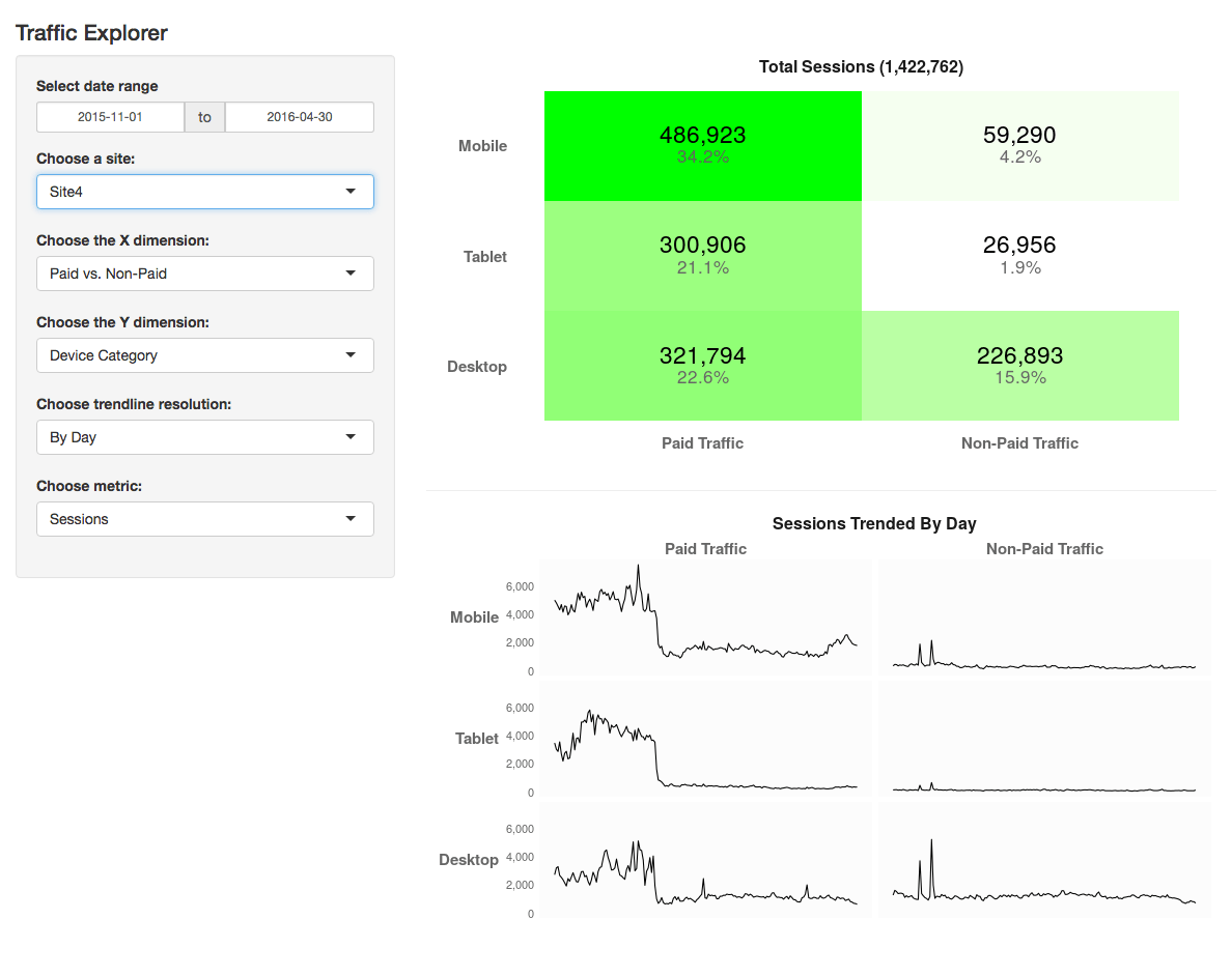
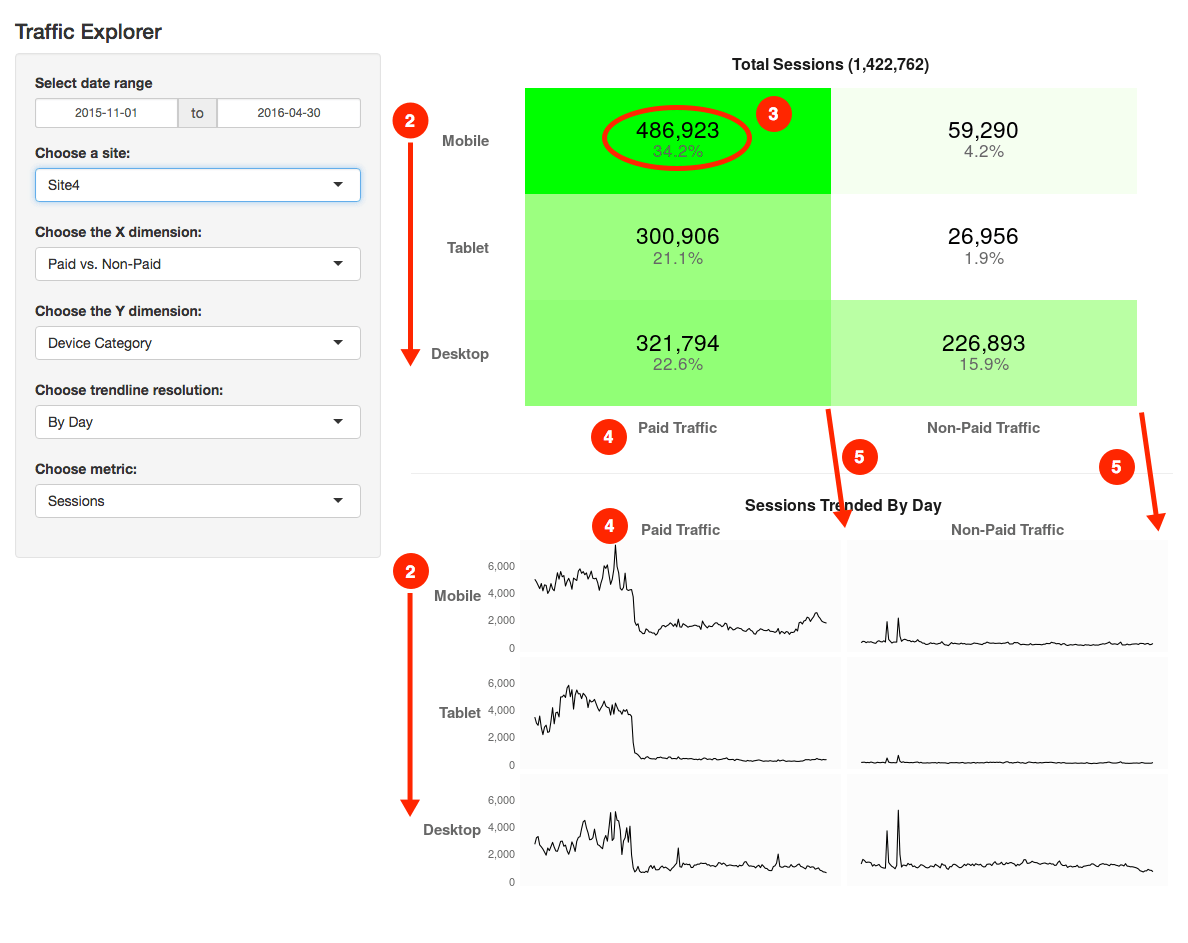
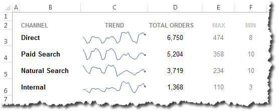
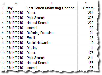
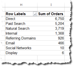
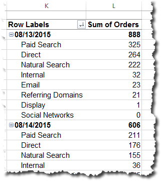
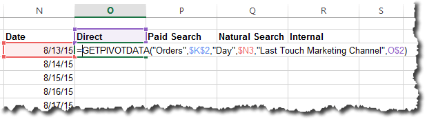
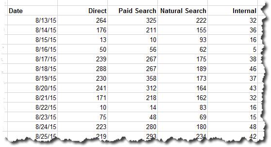
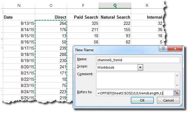
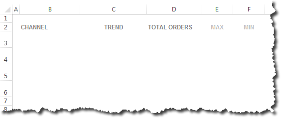
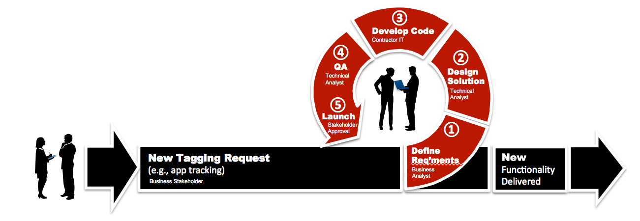
To illustrate, let’s think about how we view traffic by channel:

  • In web analytics, we think: “this is how many (a count) visitors to the site came from each of referring sites, paid search, organic search, etc.”
  • In statistics, typically, the framing would be: “here is a list (row) for each visitor to the site, and each visitor is identified as being visiting from referring sites, paid search, organic search, etc.” (or, possibly, “each visitor is flagged as being yes/no for each of: referring sites, paid search, organic search, etc.”… but that’s back to the discussion of “variables” covered above).

So, in my bar chart example above, R defaults to thinking that it’s making a bar chart out of a sea of data, where it’s aggregating a bunch of atomic observations into a summarized set of bars. The stat="identity" argument has to be included to tell R, “No, no. Not this time. I’ve already counted up the totals for you. I’m telling you the height of each bar with the data I’m sending you!”

When researching statistical methods, this comes up time and time again: statistical techniques often expect a data set to be a collection of atomic observations. Web analysts typically work with aggregated counts. Two things to call out on this front:

  • There are statistical methods (a cross tabulation with a Chi square test for independence is one good example) that work with aggregated counts. I realize that. But, there are many more that actually expect greater fidelity in the data.
  • Both Adobe Analytics (via data feeds, and, to a clunkier extent, Data Warehouse) and Google Analytics (via the GA360 integration with Google BigQuery) offer much more atomic level data than the data they provided historically through their primary interfaces; this is one reason data scientists are starting to dig into digital analytics data more!

The big, “Aha!” for me in this area is that we often want to introduce pseudo-granularity into our data. For instance, if we look at orders by channel for the last quarter, we may have 8-10 rows of data. But, if we pull orders by day for the last quarter, we have a much larger set of data. And, by introducing granularity, we can start looking at the variability of orders within each channel. That is useful! When performing a 1-way ANOVA, for instance, we need to compare the variability within channels to the variability across channels to draw conclusions about where the “real” differences are.

This actually starts to get a bit messy. We can’t just add dimensions to our data willy-nilly to artificially introduce granularity. That can be dangerous! But, in the absence of truly atomic data, some degree of added dimensionality is required to apply some types of statistical methods. <sigh>

Samples vs. Populations

The first definition for “statistics” I get from Google (emphasis added) is:

“the practice or science of collecting and analyzing numerical data in large quantities, especially for the purpose of inferring proportions in a whole from those in a representative sample.”

Web analysts often work with “the whole.” Unless we consider historical data the sample and the “whole” including future web traffic. But, if we view the world that way — by using time to determine our “sample” — then we’re not exactly getting a random (independent) sample!

We’ve also been conditioned to believe that sampling is bad! For years, Adobe/Omniture was able to beat up on Google Analytics because of GA’s “sampled data” conditions. And, Google has made any number of changes and product offerings (GA Premium -> GA 360) to allow their customers to avoid sampling. So, Google, too, has conditioned us to treat the word “sampled” as having a negative connotation.

To be clear: GA’s sampling is an issue. But, it turns out that working with “the entire population” with statistics can be an issue, too. If you’ve ever heard of the dangers of “overfitting the model,” or if you’ve heard, “if you have enough traffic, you’ll always find statistical significance,” then you’re at least vaguely aware of this!

So, on the one hand, we tend to drool over how much data we have (thank you, digital!). But, as web analysts, we’re conditioned to think “always use all the data!” Statisticians, when presented with a sufficiently large data set, like to pull a sample of that data, build a model, and then test the model with another sample of the data. As far as I know, neither Adobe nor Google have an, “Export a sample of the data” option available natively. And, frankly, I have yet to come across a data scientist working with digital analytics data who is doing this, either. But, several people have acknowledged this is something that should be done in some cases.

I think this is going to have to get addressed at some point. Maybe it already has been, and I just haven’t crossed paths with the folks who have done it!

Decision Under Uncertainty

I’ve saved the messiest (I think) for last. Everything on my list to this point has been, to some extent, mechanical. We should be able to just “figure it out” — make a few cheat sheets, draw a few diagrams, reach a conclusion, and be done with it.

But, this one… is different. This is an issue of fundamental understanding — a fundamental perspective on both data and the role of the analyst.

Several statistically-savvy analysts I have chatted with have said something along the lines of, “You know, really, to ‘get’ statistics, you have to start with probability theory.” One published illustration of this stance can be found in The Cartoon Guide to Statistics, which devotes an early chapter to the subject. It actually goes all the way back to the 1600s and an exchange between Blaise Pascal and Pierre de Fermat and proceeds to walk through a dice-throwing example of probability theory. Alas! This is where the book lost me (although I still have it and may give it another go).

Possibly related — although quite different — is something that Matt Gershoff of Conductrics and I have chatted about on multiple occasions across multiple continents. Matt posits that, really, one of the biggest challenges he sees traditional digital analysts facing when they try to dive into a more statistically-oriented mindset is understanding the scope (and limits!) of their role. As he put it to me once in a series of direct messages really boils down to:

  1. It’s about decision-making under uncertainty
  2. It’s about assessing how much uncertainty is reduced with additional data
  3. It must consider, “What is the value in that reduction of uncertainty?”
  4. And it must consider, “Is that value greater than the cost of the data/time/opportunity costs?”

The list looks pretty simple, but I think there is a deeper mindset/mentality-shift that it points to. And, it gets to a related challenge: even if the digital analyst views her role through this lens, do her stakeholders think this way? Methinks…almost certainly not! So, it opens up a whole new world of communication/education/relationship-management between the analyst and stakeholders!

For this area, I’ll just leave it at, “There are some deeper fundamentals that are either critical to understand or something that can be kicked down the road a bit.” I don’t know which it is!

What Do You Think?

It’s taken me over a year to slowly recognize that this list exists. Hopefully, whether you’re a digital analyst dipping your toe more deeply into statistics or a data scientist who is wondering why you garner blank stares from your digital analytics colleagues, there is a point or two in this post that made you think, “Ohhhhh! Yeah. THAT’s where the confusion is.”

If you’ve been trying to bridge this divide in some way yourself, I’d love to hear what of this post resonates, what doesn’t, and, perhaps, what’s missing!

Adobe Analytics, Featured

Do You Want My Adobe Analytics “Top Gun” Class In Your City?

This past May, I conducted my annual Adobe Analytics “Top Gun” classes to a packed room in Chicago. I always love doing this class because it helps the attendees get more out of Adobe Analytics when they get back to their organizations. I have done this class in Europe several times and usually once a year in the US. The feedback has been tremendous as can be seen by some of the reviews on LinkedIn shown below.

However, I often get requests to do my class in various cities across the US (and the world), but I don’t have the time to orchestrate doing that many trainings per year. To conduct a class, I need a minimum of 15 people and the cost of the class is about $1,250 per person for the full one-day class. I also need to find a free venue to conduct the class, which is often at a company that has a large conference room or a training room.

Since I would like to do more classes, but am time constrained, I am going to try something new this year.  I am going to let anyone out there bring my “Top Gun” class to their city by asking you to help host my class.  If you have a venue where I can conduct my Adobe Analytics “Top Gun” class, and you think you can work with your local Adobe Analytics community to get at least 10 people to commit (I can usually get a bunch once I advertise the class), I am happy to hit the road and come to you and conduct a class. So if you are interested in hosting my “Top Gun” class, please e-mail me and let’s discuss. I also conduct my class privately for companies that have enough people wanting to attend to justify the cost, so feel free to reach out to me about that if interested as well.

To help identify cities that are interested (or if you just want to be notified of my next class), I have created a Google Form where anyone can submit their name, e-mail and City/Region, so if you are interested in having my “Top Gun” class in your city, please submit this form!

In case you need help selling the class to your local folks, more info about the class follows.

Adobe Analytics “Top Gun” Class Description

It is a one day crash course on how Adobe Analytics works behind the scenes based upon my Adobe Analytics book. This class is not meant for daily Adobe Analytics end-users, but rather for those who administer Adobe Analytics at their organization, analysts who do requirements gathering or developers who want to understand why they are being told to implement things in Adobe Analytics. The class goes deep into the Adobe Analytics product, exploring all of its features from variables to merchandising to importing offline metrics. The primary objective of the class is to teach participants how to translate every day business questions into Adobe Analytics implementation steps. For example, if your boss tells you that they want to track website visitor engagement using Adobe Analytics, would you know how to do that? While the class doesn’t get into all of the coding aspects, it will teach you which product features and functions you can bring to bear to create reports answering any question you may get from business stakeholders. It will also allow you and your developers to have a common language and understanding of the Adobe Analytics product so that you can expedite getting the data you need to answer business questions.

Adobe Analytics “Top Gun Class Feedback

To view more feedback, check out the recommendations on my LinkedIn Profile.

Adobe Analytics, Featured

Search Result Page Exit Rates

Recently, I was working with a client who was interested in seeing how often their internal search results page was the exit page. Their goal was to see how effective their search results were and which search terms were leading to high abandonment. Way back in 2010, I wrote a post about how to see which internal search terms get clicks and which do not, but this question is a bit different from that. So in this post, I will share some thoughts on how to quantify your internal search exit rates in Adobe Analytics.

The Basics

Seeing the general exit rate of the search results page on your site is pretty easy to do simply with the Pages report. To start, simply open the pages report and add the Exits metric to the report and use the search box to isolate your search results page:

Next, you can trend this by changing to the trended view:

But to see the Exit Rate, you need to create a new calculated metric that divides these Exits by the Total # of Visits (keep in mind that you need to use the gear icon to change Visits to “Total”). The calculated metric would look like this:

Once you have this metric, you can change your previous trending view to use this calculated metric (still for the Search Results Page) to see this:

Now we have a trend of the Search Results page exit rate and this graph can be added to a dashboard as needed.

More Advanced

As you can see getting our site search results page exit rate is pretty easy. However, the Pages approach is a bit limiting because it is difficult to view these Search Result page exit rates by search term. For example, if I want to see the trend of Search Result Exit Rates for the term “Bench,” I can create a segment defined as “Hit where Internal Search term = Bench” and apply it to see this:

Here you can see that this search term has a much higher than average Search Result page Exit Rate. But if I want to do this for more search terms, I would have to create many keyword-based segments, which would be very time consuming.

Fortunately, there is another way. Instead of using the Pages report, you can create a new Search Result Page Exit Rate calculated metric that is unrelated to the Pages report. To do this, you would first build a segment that looks for Visits where the Exit Page was “Search Results” as shown here:

Next, you would use this new segment in a new “derived” calculated metric and use it to divide Search Page Exit Visits by all Visits like this:


This would produce a trend that is [almost] identical to the report shown above:

Just as before, this trend line can be added to a dashboard as needed. But additionally, this new calculated metric can be added to your Internal Search Term eVar report to see the different Search Result Page Exit Rates for each term:

This allows you to compare terms and look for ones that are doing well and/or poorly. Whereas before, if you wanted to see a trend for any particular phrase, you had to create a new segment, in this report, you can simply trend the Search Result Page Exit Rate and then pick the internal search terms you want to see trended. For example, here is a trend of “Bench” and “storage bench” seen together:

This means that you can see the Search Page Exit Rate for any term without having to build tons of segments (yay!). And, as you can see, the daily trend of Search Page Exit Rates for “Bench” here are the same as the ones shown above for the Pages version of the metric with the one-off “Bench” segment applied.

One More Thing!

As if this weren’t enough, there is one more thing!  If you sort the Search Term Exit Rate (in descending order) in the Internal Search Term eVar report, you can find terms that have 100% (or really high) exit rates!

This can help you figure out where you need more content or might be missing product opportunities. Of course, many of these will be cases in which there are very few internal searches, so you should probably view this with the raw number of searches as shown above.

Adobe Analytics, Featured

Out of Stock Products

For retail/e-commerce websites that sell physical products, one of the worst things that can happen is having your products be out of stock. Imagine that you have done a lot of marketing and campaigns to get people to come to your site, led them to the perfect product, only to find that for some people, you don’t have enough inventory to sell them what they want. Nothing is more frustrating than having customers who want to give you their money but can’t! Often times, inventory is beyond the control of merchandisers, but I have found that monitoring the occurrences of products being out of stock can be beneficial, if for no other reason than, to make sure others at your organization know about it and to apply pressure to avoid inventory shortfalls when possible. In this post, I am going to show you how to monitor instances of products being out of stock and how to quantify the potential financial impact of out of stock products.

Tracking Out of Stock Products

The first step in quantifying the impact of out of stock products is to understand how often each product is out of stock. Doing this is relatively straightforward. When visitors reach a product page on your site, you should already be setting a Product View success event and passing the Product Name or ID to the Products variable. If a visitor reaches a product page for a product that is out of stock, you should set an additional “Out of Stock” success event at the same time as the Product View event. This will be a normal counter success event and should be associated with the product that is out of stock. Once this is done, you can open your Products report and add both Product Views and this new Out of Stock success event and sort by the Out of Stock event to see which products are out of stock the most:

In this example, you can see that the products above are not always out of stock and how often each is out of stock. If you wanted, you could even create an Out of Stock % calculated metric to see the out of stock percent by product using this formula:

This would produce a report that looks like this:

If you have SAINT Classifications that allow you to see products by category or other attributes, you could also see this Out of Stock percent by any of those attributes as well.

Of course, since you have created a new calculated metric, you can also see it by itself (agnostic of product) to see the overall Out of Stock % for the entire website:

In this case, it looks like there are several products that are frequently out of stock, but overall, the total out of stock percent is under two percent.

Tracking Out of Stock Product Amounts

Once you have learned which products tend to be out of stock, you might want to figure out how much money you could be losing due to out of stock products. Since the price of the product is typically available on the product page, you can capture that amount in a currency success event and associate it with each product. For example, if a visitor reaches a product page and the product normally sells for $50, but is out of stock, you could pass $50 to a new “Out of Stock Amount” currency success event. Doing this would produce a report that looks like this:

This shows you the amount of money, by product, that would have been lost if every visitor viewing that product actually wanted to buy it. You can also see this amount in aggregate by looking at the success event independently:

However, these dollar amounts are a bit fake, because it is not ideal to assume a 100% product view to order conversion for these out of stock products and doing so, greatly inflates this metric. Therefore, what is more realistic is to weight this Out of Stock dollar amount by how often products are normally purchased after viewing the product page. This is still not an exact science, but it is much more realistic than assuming 100% conversion.

Fortunately, creating a weighted version of this Out of Stock Amount metric is pretty easy by using calculated metrics. To do this, you simply take the Out of Stock Amount currency success event and divide it by the Order to Product View ratio. This is done by adding a few containers to a new calculated metric as shown here:

Once this metric is created, you can add it to the previous Products report to see this:

In this report, I have added Orders and this new Weighted Out of Stock Amount calculated metric. If you look at row 4, you can see that the total Out of Stock Amount is $348, but that the Weighted Out of Stock Amount is $34. The $34 is calculated by our new metric by dividing the normal product conversion rate (26/268 = 9.70149%) by the total Out of Stock Amount of $348 (348*.0970149=33.76), which means that the $34 amount is much more likely to be the lost value amount for that product. The cool part, is that since each product has different numbers of Orders and Product Views, the discount percent applied to each product is calculated relatively by our new weighted calculated metric! For example, while the Product View to Order conversion ratio for row 4 was 9.7%, the conversion rate for row 10 is only 2.6% (4/154), meaning that only $22 out of the $843 Out of Stock Amount is moved to the Weighted Out of Stock Amount calculated metric. Pretty cool huh?

One Last Problem

Before we go patting ourselves on the back, however, we have one more problem to solve. If you look at the report above, you might have noticed the problem in rows 1,2,3,5,6,8,9. Even though there is a lot of money in the Out of Stock Amount success event, there is no money being applied to the Weighted Out of Stock Amount calculated metric we created. This is due to the fact that there were no Orders for these products, meaning that the conversion rate is zero, which when multiplied by the Out of Stock Amount also results in zero (which hopefully you recall from elementary school). That is not ideal, because now the Weighted Out of Stock Amount is too low and the raw amount in the success event is too high! Unfortunately, our calculated metric above only works when there are Orders during the time range, so we can calculate the average Product View to Order ratio for each product.

Unfortunately, there is no perfect way to solve this without manually downloading a lot of historical data to look for what the Product View to Order ratio was for each product over the past year or two, but the good news is that if you use a large enough timeframe, the cases of zero orders should be relative small. But just in case you do have cases where zero orders exist, I am going to show you an advanced trick that you can use to get the next best thing in your Weighted Out of Stock Amount calculated metric.

My solution for the zero-order issue is to use the average Product View to Order ratio for all cases in which there are zero orders. The idea here is that if the first metric is counting 100% and zero-Order rows are count 0%, why not use the site average for the zero-Order rows? This will not be perfect, but it is far better than using 100% or 0%! To do this, you need to make a slight tweak to the preceding calculated metric. This tweak involves adding an IF statement to first look to see if an Order exists. If it does, the calculated metric should use the formula shown above. But if no Order exists, you will multiply the Out of Stock Amount success event metric by the average (site wide) Order to Product View ratio. This is easy to do by using the TOTAL metrics for Orders and Product Views. While this all sounds complex, here is what the new calculated metric looks like when it is completed:

Next, you simply add this to the previous report to see this:

As you can see, the rows that worked previously are unchanged (rows 4,7,10), but the other rows now have Weighted Out of Stock Amounts. If you divide the total Orders by total Product Views, you can see that the average Order to Product View ratio is 4.21288% (16215/384,891). If you then apply this ratio to any of the Out of Stock Amounts with zero-Orders, you will get the Weighted Out of Stock Amount. For example, row 1 has a value of $286, which is 4.21288% multiplied by $6,786. In this case, you can remove the old calculated metric and just use the new one and as you use longer date ranges, you will have fewer zero order rows and your data will be more accurate.

Of course, since this is a calculated metric, you can always look at it independent of products to see the weighted Out of Stock Amount trended over time:

While this information is interesting by itself, it can also be applied to many other reports you may already have in Adobe Analytics. Here are just some sample scenarios in which knowing how often products are out of stock and a ballpark amount of potential lost revenue could come in handy:

  • How much money are we spending on marketing campaigns to drive visitors to products that are out of stock?
  • Which of our known customers (with a Customer ID in an eVar) wanted products that were out of stock and can we retarget them via e-mail or Adobe Target later when stock is replenished?
  • Which of our stores/geographies have the most out of stock issues and what is the potential lost revenue by store/region

Summary

If your site sells physical products and has instances where products are not in stock, the preceding is one way that you can conduct web analysis on how often this is happening, for which products and how much money you might be losing out on as a result. When this data is mixed with other data you might have in Adobe Analytics (i.e. campaign data, customer ID data, etc.), it can lead to many more analyses that might help to improve site conversion.

Adobe Analytics, Featured

Visitor Retention in Adobe Analytics Workspace

I recently had a client of mine ask me how they could report new and retained visitors for their website. In this particular case, the site had an expectation that the same visitors would return regularly since it is a subscription site. At first, my instinct was to use the Cohort Analysis report in Adobe Analytics Workspace, but that only shows which visitors who came to the site came back, not which visitors are truly new over an extended period of time. In addition, it is not possible to add Unique Visitors to a cohort table, so that rules this option out. What my client really wanted to see is which visitors who came this month, had not been to the site in the past (or at least past 24 Months) and differentiate those visitors from those who had been to the site in the past 24 months. While I explained the inherent limitation of knowing if visitors were truly new due to potential cookie deletion, they said that they still wanted to see this analysis assuming that cookie deletion is a common issue across the board.

While at first, this problem seemed pretty easy, it turned out to be much more complex that I had first thought it would be. The following will show how I approached this in Adobe Analytics Workspace.

Starting With Segments

To take on this challenge, I started by building two basic segments. The first segment I wanted was a count of brand new Visitors to the website in the current month. To do this, I needed to create a segment that had visitors who has been to the site in the current month, but not in the 24 Months prior to the current month. I did this by using the new rolling date feature in Adobe Analytics to include the current month and to exclude the previous 24 months like this:

If you have not yet used the rolling date feature, here is what the Last 24 Months Date Range looked like using the rolling date builder:

As you can see, this date range includes the 24 months preceding the current month (April 2017 in this case), so when this date range is added to the preceding segment, we should only get visitors from the current month who have not been to the site in the preceding 24 months. Next, you can apply this segment to the Unique Visitors metric in Analysis Workspace:

As you can see, this only shows the count of Visitors for the current month and it excludes those who had been to the site in the preceding 24 months. In this case, it looks like we had 1,786 new Visitors this month. We can verify this by creating a new calculated metric that subtracts the “new” Visitors from all Visitors:

When you add this to the Analysis Workspace table, it looks like this:

Next, we can create a retention rate % by creating another calculated metric that divides our retained Visitors by the total Unique Visitors:

This allows us to see the following in the Analysis Workspace table:


[One note about Analysis Workspace. Since our segment spans 25 months, the freeform table will often revert back to the oldest month, so you may have to re-sort in descending order by month when you make changes to the table.]

The Bad News

So far, things look like they are going ok. A bit of work to create date ranges, segments and calculated metrics, but we can see our current month new and retained Visitors. Unfortunately, things take a turn for the worse from here. Since date ranges are tied to the current day/month, I could not find a way to truly roll the data for 24 months (I am hoping there is someone smarter than me out there who can do this in Adobe!). Therefore, to see the same data for Last Month, I had to create two more date ranges and segments called “Last Month Visitors” & “Last Month, But Not 24 Months Prior Visitors” and then apply these to create new calculated metrics. Here are the two new segments I created for Last Month::


When these are applied to the Analysis Workspace table, we see this:

To save space, I have omitted the raw count of Retained Visitors and am just showing the retention rate, which for last month was 7.42% vs. 10.82% for the current month.

Unfortunately, this means that if you want to go back 24 months, you will have to create 24 date ranges, 24 segments and 24 calculated metrics. While this is not ideal, the good news is that once you create them, they will always work for the last rolling 24 months, so it is a one-time task and if you only care about the last 12 months, your work is cut in half. However, a word of caution when you are building the prior 24-month date ranges, you have to really keep track of what is 2 months ago and 3 months ago.  To keep it straight, I created the following cheat sheet in Excel and you can see the formula I used at the top:

Here is what the table might look like after doing this for three months:

And if you have learned how to highlight cells and graph them in Analysis Workspace, you can select only the retention rate percentages and create a graph that looks like this:

Other Cool Applications

While this all may seem like a pain, once you are done, there are some really cool things you can do with it. One of those things is to break these retention rates down by other segments. For example, below, I have added three segments as a breakdown to April 2017. These segments look for specific visits that contain blog posts by author. Once this breakdown is active, it is possible to see the new, retained and retention rate by month and blog author:

Alternatively, if your business was geographically-based, you could look at the data by US State by simply dragging over the State dimension container:

Or, you could see which campaign types have better or worse retention rates:

Summary

To summarize, the new features Adobe has added to Analysis Workspace, including Rolling Dates, open up more opportunities for analysis. To view rolling visitor retention, you may need to create a series of distinct segments/metrics, but in the end, you can find the data you are looking for. If you have any ideas or suggestions on different/easier ways to perform this type of analysis in Adobe Analytics, please leave a comment here.

Analysis, Featured

“What will you do with that?” = :-(

Remember back when folks wrote blog posts that were blah-blah-blah “best practice”-type posts? I think this is going to be one of those – a bit of a throwback, perhaps. But, hopefully, mildly entertaining and, hell, maybe even useful!

Let’s Start with Three Facts

  • Fact #1: Business users sometimes (often?) ask for data that they’re not actually going to be able to act on.
  • Fact #2: Analysts’ time is valuable.
  • Fact #3: Analysts need to prioritize their time pulling data, compiling reports, and conducting analyses with a bias towards results that will drive action.

None of the above are earth-shattering or particularly insightful observations.

And Yet…

…I am regularly dismayed by the application of these facts by analysts I watch or chat with. (Despite being an analytics curmudgeon, I don’t actually enjoy being dismayed.)

The following questions are all variations of the same thing, and they all make the hair on the back of my neck stand up when I hear an analyst ask them (or proudly tell me they ask them as part of their intake process ):

“What are you going to do with that information (or data or report) if I provide it?”

“What decision will you make based on that information?”

“What action will you take if I provide that information?”

I abhor these questions (and various variations of them).

Do you share my abhorrence?

Pause for a few seconds and ask yourself if you see these types of questions as counterproductive.

If you do see a problem with these questions, then read on and see if it’s for the same reason that I do.

If you do not  see a problem, then read on and see if I can change your mind.

If you’re not sure…well, then, get off the damn fence and form an opinion!

Some More Facts

We have to add to our fact base a bit to explain why these questions elevate my dander:

  • Fact #4: Analysts must build and maintain a positive relationship with their stakeholders.
  • Fact #5: Analysts hold the keys to the data (even if business users have some direct data access, they don’t have the expertise or depth of access that analysts do).

How Those Questions Can Be Heard

When an analyst says, “What decision will you make based on that information?” what they can (rightly!) be heard saying is any (or all) of the following:

“You (the business user) must convince me (the analyst) that it is worth my time to support you.”

“I don’t believe that information would be valuable to you, so you must convince me that it would be.”

“I would rather not add anything to my plate, so I’m going to make you jump through a few more hoops before I agree to assist you. (I’m kinda’ lazy.)”

Do you see the problem here? By asking a well-intended question, the analyst can easily come across as adversarial: as someone who holds the “power of the data” such that the business user must (metaphorically) grovel/justify/beg for assistance.

This is not a good way to build and grow strong relationships with the business! And, we established with Fact #4 that this was important.

But…What About Fact #3?

Do we have an intractable conflict here? Am I saying that we can’t say, “No” or, at least, “Why?” to a business user? There are only so many hours in the day!

I’m not actually saying that at all.

Let’s shift from facts to two assumptions that I (try to) live by:

  • Assumption #1: No business user wants to waste their own or the analyst’s time.
  • Assumption #2: Stakeholders have reasonably deep knowledge of their business areas, and they want to drive positive results.

“Aren’t assumptions dangerous?” you may ask. “Aren’t they the cousins of ‘opinions,’ which we’ve been properly conditioned to eschew?”

Yes… except not really in this case. These are useful assumptions to work from and to only discard if and only if they are thoroughly and conclusively invalidated in a specific situation.

Have You Figured Out Where I Am Heading?

As soon as a business user approaches me with any sort of request:

  • I start with an assumption that the request is based on a meaningful and actionable need.
  • I put the onus on myself to take the next step to articulate what that need is.

Is that a subtle pivot? Perhaps. But, with both of the above in mind, the questions I listed at the beginning of this post should start to appear as clearly inappropriate.

The Savvy Analyst’s Approach

I hope you’re not expecting anything particularly magic here, as it’s not. But, no matter the form of the question or request, I always try to work through the following basic process by myself:

  1. Is the requestor trying to simply measure results or are they looking to validate a hypothesis? (There is no room for “they just want some numbers” – given my own knowledge of the business and any contextual clues I picked up in the request, I will put it into one bucket or the other.)
  2. If I determine the stakeholder is trying to measure results, then I try to articulate (on the fly in conversation or in writing as a follow-up) what I think their objective is for the thing they’re trying to measure. And then I skip to step 4.
  3. If I determine the stakeholder is trying to validate a hypothesis (or “wants some analysis”), then I try to articulate one or more of the most likely and actionable hypotheses that I can using the structure:
    • The requestor believes… <something>.
    • If that belief is right, then we will… <some action>.
  4. I then play back what I’ve come up with to the stakeholder. I’ll couch it as though I’ve just completed a master class in active listening: “I want to make sure I’m getting you information that is as useful as possible. What I think you’re looking for is…(play back of what came out of step 2 or 3).”
  5. Then — after a little (or a lot) of discussion — I’ll dive into actually doing the work.

If you’re more of a graphical thinker, then the above words can be represented as a flowchart:

This approach has several (hopefully obvious) benefits:

  • It immediately makes the request a collaboration rather than a negotiation.
  • It sneakily demonstrates that, as an analyst, I’m focused on business results and on providing useful information.
  • It prevents me from spending time (hours or days) pulling and crunching data that is wildly off the mark for what the stakeholder actually wants.
  • It provides me with a space to outline several different approaches that require various levels of effort (or, often, provides the opportunity to say, “Let’s just check this one thing very quickly before we head too far down this path.”).

Are You With Me?

What do you think? Have you been guilty of guiding a stakeholder to put up her dukes every time she comes to you with a request, or do you take a more collaborative approach right out of the chute?

Adobe Analytics, Featured

Trending Data After Moving Variables

Most of my consulting work involves helping organizations fix and clean-up their Adobe Analytics implementations. Often times, I find that organizations have multiple Adobe Analytics report suites and that they are not setup consistently. As I wrote about in this post, having different variables in different variable slots across different report suites can result in many issues. To see whether you have this problem, you can select multiple report suites in the administration console and then review your variables. Here is an example looking at the Success Events:

As you can see, this organization is in real trouble, because all of their Success Events are different across all of their report suites.  The biggest issue with this is that you cannot aggregate data across the various report suites. For example, if you had one suite with “Internal Searches” in Success Event 1 and another suite with “Lead Forms Completed” in Success Event 1, combining the two in a master [global] report suite would make no sense, since you’d be combining apples and oranges.

Conversely, if you do have the same variable definitions across your Adobe Analytics report suites, you get the following benefits:

  • You can look at a report in one report suite and then with one click see the same report in another report suite;
  • You can re-use bookmarks, dashboards, segments and calculated metrics, since they are all built on the same variable definitions;
  • You can apply SAINT Classifications to the same variable in all suites concurrently via FTP;
  • You can re-use JavaScript code and/or DTM configurations;
  • You can more easily QA your data by building templates in ReportBuilder or other tools that work across all suites;
  • You can re-use implementation documentation and training materials.

To read more about why you should have consistent report suites, click here, but needless to say, it is normally a best practice to have the same variable definitions across most or all of your report suites.

How Do I Re-Align?

So, what happens if you have already messed up and your report suites are not synchronized (like the one shown above)? Unfortunately, there is no magic fix for this. To rectify the situation, you will need to move variables in some of your report suites to align them if you want to get the benefits outlined above. The level of difficulty in doing this is directly correlated to the disparity of your report suites. Normally, I find that there are a bunch of report suites that are set up consistently and then a few outliers or that the desktop website implementation is different from the mobile app implementation. Regardless of the cause of the differences, I recommend that you make the report suite(s) that are most prevalent the new “master” suite and then force the others to move their data to the variable slots found in the new “master.”

Of course, the next logical question I get is always: “What about all of my historical data?” If you move data from variable slot 1 to slot 5, for example, Adobe Analytics cannot easily move all of your historical data. You won’t lose the old data, it just is not easy to transfer historical data to the new variable slot. Old data will be in the old variable slot and new data will be in the new variable slot. This can be annoying for about a year until you have new year over year data in the new variable slot. In general, even though this is annoying for a year, I still advocate making this type of change, since it is much better for the long term when it comes to your Adobe Analytics implementation. It is a matter of short-term pain, for long-term gain and in some way is a penitence for not implementing Adobe Analytics the correct way in the beginning. However, there are ways that you can mitigate the short-term pain associated with making variable slot changes. In the next section, I will share two different ways to mitigate this until you once again have year over year data.

Trending Data After Moving Variables

Adobe ReportBuilder Method

This first method of getting year over year data from two different variable slots is to use Adobe ReportBuilder. ReportBuilder is Adobe’s Microsoft Excel plug-in that allows you to import Adobe Analytics data into Excel data blocks. In this case, you can create two date-based data blocks in Excel and place them right next to each other. The first data block will be the metric (Success Event) or dimension (eVar/sProp) from the old variable slot and it will use the old dates in which data was found in that variable. The second data block will be the new variable slot and will start with the date that data was moved to the new variable slot. For example, let’s imagine that you had a report suite that had “Internal Searches” in Success Event 2, but in order to conform to the new standard, you needed to move “Internal Searches” to Success Event 10 as of June 1st. In this case, you would build a data block in Excel that had all data from Success Event 2 prior to June 1st and then, next to it, another data block that had all data from Success Event 10 starting June 1st. Once you refresh both data blocks, you will have one combined table of data, both of which contain “Internal Searches” over time. Then you can build a graph to see the trend and even show year over year data.

This Excel solution, still takes some work, since you’d have to repeat this for any variables that move locations, but it is one way to see historical data over time and mask for end-users the fact that a change has occurred. Once you have a year’s worth of “Internal Search” data in Success Event 10, you can likely abandon the Excel solution and go back to reporting on “Internal Searches” using the new variable slot (Success Event 10 in this case), which will now show year over year data.

Derived Calculated Metric Method

The downside of the preceding Excel approach is that seeing year over year data requires your end-users to [temporarily for one year] abandon the standard web-based Adobe Analytics interface in order to see trended data. This can be a real disadvantage since most users are already trained on how to use the normal Adobe Analytics interface, including Analysis Workspace. Therefore, the other approach to combining data when variables have to be moved is to use a derived calculated metric. Now that you can apply segments, including dates, to calculated metrics in Adobe Analytics, you can create a combined metric that uses data from two different variables for two different date ranges. This allows you to join the old and new data into one metric that has a historical trend of the data and the same concept can apply to dimensions like eVars and sProps.

Let’s illustrate this with an example. Imagine that you have a metric called “Blog Post Views” that has historically been captured in Success Event 3. In order to conform to a new implementation standard, you need to move this data to Success Event 5 as of April 5th, 2017. You ultimately want to have a metric that shows all Blog Post Views over time, even though behind the scenes the data will be shifting from one variable to another on April 5th. To to this, you would start by creating two new Date Ranges in Adobe Analytics – one for the pre-April 5th time period and one for the post-April 5th period. While you could make a different set of date ranges for each variable slot being moved, the odds are that you will be making multiple changes with each release, so I would suggest making more generic date ranges that can be used for any variables changing in a release like these:

In this case, let’s assume that your historical data started January 1st, 2016, and that you won’t need the combined calculated metric past December 31st, 2019, but you can put whatever dates you’d like. The important part is that one ends on April 4th and the next one begins on April 5th. Once these date ranges have been created, you can create two new segments that leverage them. Below, you can see two basic segments that include hits for each date range:

Once these segments are created, you can begin to create your derived calculated metric. This is done by creating a metric that adds together the two Success Events that represent the same metric (Blog Post Views in this case). To do this, you simply add the old Success Event (Event 3 in this case) and the new Success Event (Event 5 in this case):

But before you save this, you need to apply the date ranges to each of these metrics. For Success Event 3 that is the date range prior to April 5th and for Success Event 5, it is the date range after April 5th. To do this, simply drag over the two new segments you created that are based upon the date ranges like this:

By doing this, you are telling Adobe Analytics that you want Success Event 3 data prior to April 5th to be added to Success Event 5 data after April 5th. Therefore, if your tagging goes as planned, you should be able to see a unified historical view of Blog Post Views from January 1st, 2016 until December 31st, 2019 using this new combined calculated metric. Here is what it would look like (with post-conversion data showing in the red highlight box):


This report is being run on April 8th, shortly after the April 5th conversion and you can see that the data is flowing seamlessly with the historical data.

For you Analysis Workspace junkies, you can see the same data there either by using the new calculated metric or applying the same segments as shown here:

Of course, this still requires some end-user education, since looking at Success Event 3 or Success Event 5 in isolation can cause issues during the transition period. But in reality, most people only look at the last few weeks of data, so the new variable (Success Event 5 in this case) should be fine for most people after a few weeks and the combined metric is only necessary when you need to look at historical or year over year data. In extreme cases, you can hide the raw variable reports (Event 3 & Event 5) and use the Custom Report feature to replace them with this new combined calculated metric in the reporting menu structure (though that won’t help you in Analysis Workspace).

Summary

To summarize, if your organization isn’t consistent in the way it implements, you may lose out on many of the advantages inherent to Adobe Analytics. If you decide that you want to clean house and make your implementations more consistent, you may have to shift data from one variable to another. Doing this can cause some short-term reporting issues, since it is difficult to see historical data spanning across two different variables. However, this can be mitigated by using Adobe Report Builder or a derived calculated metric as shown in this post. Both of these are not perfect, but they can help get your organization over the hump until you have enough historical data that you can disregard the old data prior to your variable conversion.

Analytics Strategy, Testing and Optimization

Focusing on Outcomes

Measuring outcomes is a hot-box issue that stands between Marketers and Measurers that track marketing effectiveness. Today’s article in the Wall Street Journal, Some Marketers Want More Ad Testing, Less Debating About Metrics explores this issue and the brands that are taking action.

What are you measuring?

On one side, many Marketers (and particularly Brand Marketers) are fighting for attention online. They attempt to prove value by racking up viewable impressions and time spent with digital media. But, the other camp is fighting for A little less conversation, a little more action. This latter group is focused on using digital media to drive specific outcomes. These outcomes include: an online purchase, a download, or signing up online. Even sites without specific conversion events contain outcomes. For these sites, objectives are often to engage visitors and to have them return for more information or content. Yet, Marketer’s spend too much time second-guessing the value of time on page or how many ad units equal currency. Not enough energy focuses on desired outcomes. My colleagues and I have written and preached about the fallacy of time spent in the past and simply put, there’s a better way.

Let’s skip the nuance

I won’t slip down the partisan path to debate brand marketing versus direct. However, I will argue that the multitude of dollars spent on digital media is still largely questionable. Now is the time to look between the fuzzy marketing tactics to focus on outcomes. I advocate for using Measurement Plans to identify outcomes with digital analytics and counsel my clients to take this approach. Now, don’t mistake this focus on outcomes as a recommendation to place a magnifying glass on just the conversion event itself. It’s extremely important to understand the customer journeys and pathways that lead up to the event. This enables you to replicate journeys and to produce more desired outcomes. It’s the same with attempting to measure every nuanced action on your website. Taking this approach results in lots of data and a lack of clear information on what to do about it. Instead, focus on outcomes that matter most to your business.

Experimentation drives innovation

But getting back to the WSJ article, the disruptive companies mentioned like Dollar Shave Club, Netflix, and Wayfair are migrating away from the swirling conversations about viewable impressions and placing bets on marketing tactics that drive actions. These companies are experimenting with their digital initiatives to see what works in our ever-evolving world of online consumers. By testing ideas and non-traditional advertising, innovative brands can pivot quickly to tactics that produce their desired outcomes and leave those that don’t in the dust.

Connect outcomes to experiences

This starts with examining your customer experience and creating beginning and end points for distinct phases throughout the customer journey. If it’s the advertising piece of the puzzle you’re spending money on, this exercise should focus on your acquisition efforts and the desired outcomes at the end of that part of the journey. But remember, acquisition isn’t the end of the experience. Pulling those customers through the desired outcomes for each lifecycle stage: from acquisition, to consideration, to purchase (or your digital equivalent), and then keeping them as valued customers must be the perspective you take. Today’s digital world isn’t about the bite-sized ad your prospective customer viewed and consumed; it’s about the entire diet of the prospect, and their peers, and how they eat as a whole. By clearly defining your desired outcomes and tracking how digital customers arrive at those points, you can ultimately create better digital experiences.

To learn more about how Analytics Demystified helps organizations build Measurement Plans to capture outcomes across the entire customer lifecycle, or how we can help your company focus less on the noisy metrics and more on the outcomes that matter, reach out to john@analyticsdemystified.com or leave a comment.

Adobe Analytics, Featured

2017 Adobe Analytics “Top Gun” Class – May 2017 (Chicago)

Back by popular demand, it is once again time for my annual Adobe Analytics “Top Gun” class! This May 17th (note: originally the date was June 19th, but had to be moved) I will be conducting my advanced Adobe Analytics class downtown Chicago. This will likely be the only time I offer the class publicly (vs. privately for clients), so if you are interested, I encourage you to register before the spots are gone (last year’s class sold out).

For those of you unfamiliar with my class, it is a one day crash course on how Adobe Analytics works behind the scenes based upon my Adobe Analytics book. This class is not meant for daily Adobe Analytics end-users, but rather for those who administer Adobe Analytics at their organization, analysts who do requirements gathering or developers who want to understand why they are being told to implement things in Adobe Analytics. The class goes deep into the Adobe Analytics product, exploring all of its features from variables to merchandising to importing offline metrics. The primary objective of the class is to teach participants how to translate every day business questions into Adobe Analytics implementation steps. For example, if your boss tells you that they want to track website visitor engagement using Adobe Analytics, would you know how to do that? While the class doesn’t get into all of the coding aspects, it will teach you which product features and functions you can bring to bear to create reports answering any question you may get from business stakeholders. It will also allow you and your developers to have a common language and understanding of the Adobe Analytics product so that you can expedite getting the data you need to answer business questions.

Here are some quotes from past class attendees:

Screen Shot 2016-08-18 at 1.29.48 PM

To register for the class, click here. If you have any questions, please e-mail me. I hope to see you there!

Adobe Analytics, Featured

Leveraging Data Anomalies – Prospects & Competitors

A few weeks ago, I shared a new tool called Alarmduck that helps detect data anomalies in Adobe Analytics and posts these to Slack. This data anomaly tool is pretty handy if you want to keep tabs on your data or be notified when something of interest pops-up. Unlike other Slack integrations, Alarmduck doesn’t use the out-of-box Adobe Analytics anomaly detection, but rather, has its own proprietary method for identifying data anomalies. In this post, I will demonstrate a few examples of how I use the Alarmduck tool in my daily Adobe Analytics usage.

Identifying Hot Prospects

As I have demonstrated in the past, I use a great tool called DemandBase to see which companies are visiting my blog. This helps me see which companies might one day be interested in my Adobe Analytics consulting services. Sometimes, I will notice a huge spike in visits from a particular company, which may indicate that I should reach out to them to see if they need my help (“strike while the iron is hot” as they say). However, it is a pain for me to check daily or weekly to see if there are companies that are hitting my blog more than normal, but this is a great use for Alarmduck.

To do this, I would create a new Alarmduck report (see instructions in previous post) that looks for anomalies using the DemandBase eVar which contains the Company Name by selecting the correct eVar in the Dimension drop-down box:

In this case, I am also going to narrow down my data to a rolling 14 days, US companies only and exclude any of my competitors (which I track as a SAINT Classification of the DemandBase Company eVar):


Once I set this up, I will be notified if there are any known companies that hit my blog over a rolling 14-day period that cause a noticeable increase of decrease. This way, I can go about my daily business and know that I will automatically be notified in Slack if something happens that requires my attention. For example, the other day, I sat down to work in the morning and saw this notification in Slack:

It is cool that Alarmduck can show graphs of data right within Slack! However, if I want to dig deeper, I can click on the link above the graph to see the same report in Adobe Analytics and, for example, see which of my blog posts this company was viewing:

Eventually, if I wanted to, I could reach out to the analytics team of this company and see if they need my help.

Competitor Spikes

From time to time, I like to check out what some of my “competitors” (more like others who provide analytics consulting) are reading on our website or my blog. This is something that can also be done using DemandBase. In my case, I have picked a bunch of companies and classified them using SAINT. This allows me to create a “Competitors” segment and see what activity is taking place on our website from these companies. Just as was done above, I can create a new Alarmduck report and use a segment (Competitors in this case) and then choose the Demandbase Company Dimension and select the metrics I want to use (Page Views and Visits in this case):

Once this is created, I will start receiving alerts (and graphs!) in Slack if there are any spikes by my competition like this:

In this case, there were two companies that had unusually high Page Views on our website. If I want to, I can click on the “Link to Web Report” link within Slack to see the report in Adobe Analytics:

Once in Adobe Analytics, I can do any normal type of analysis, like viewing what specific pages on our website this competitor viewed:

In most cases, this is just something I would view out of curiosity, but it is a fun use-case for how to leverage anomaly detection in Adobe Analytics via Alarmduck.

Summary

These are just two simple examples of how you can let bots like Alarmduck do the work for you and use more of your time on more value-added activities, knowing that you will be alerted if there is something you need to take action upon. If you want to try Alarmduck for free with your Adobe Analytics implementation, click here.

Featured, google analytics

An Overview of the New Google Analytics Alerts

Google Analytics users have become very familiar with the “yellow ribbon” notices that appear periodically in different reports.

For instance, if you have a gazillion unique page names, you may see a “high-cardinality” warning:

Or, if you are using a user-based report and have any filters applied to your view (which you almost always do!), then you get a warning that that could potentially muck with the results:

These can be helpful tips. Most analysts read them, interpret them, and then know whether or not they’re of actual concern. More casual users of the platform may be momentarily thrown off by the terminology, but there is always the Learn More, link, and an analyst is usually just an email away to allay any concerns.

The feedback on these warnings has been pretty positive, so Google has started rolling out a number of additional alerts. Some of these are pretty direct and, honestly, seem like they might be a bit too blunt. But, I’m sure they will adjust the language over time, as, like all Google Analytics features, this one is in perpetual beta!

This post reviews a handful of the these new “yellow ribbon” messages. As I understand it, these are being rolled out to all users over the coming weeks. But, of course, you will not see them unless you are viewing a report under the conditions that trigger it.

Free Version Volume Limits

The free version of Google Analytics is limited to 10 million hits per month based on the terms of service. But, historically, Google has not been particularly aggressive about enforcing that limit. I’ve always assumed that is simply because, once you get to a high volume of traffic, any sort of mildly deep analysis will start running into sufficiently severe sampling issues that they figured, eventually, the site would upgrade to GA360.

But, now, there is a warning that gets a bit more in your face:

Interestingly, the language here is “may” rather than “will,” so there is no way of knowing if Google will actually shut down the account. But, they are showing that they are watching (or their machines are!).

Getting Serious about PII

Google has always taken personally identifiable information (PII) seriously. And, as the EU’s GDPR directive gets closer, and as privacy concerns have really become a topic that is never far below the surface, Google has been taking the issue even more seriously. Historically, they have said things like, “If we detect an email address is being passed in, we’ll just strip it out of the data.” But, now, it appears that they will also be letting you know that they detected that you were trying to pass PII in:

There isn’t a timeframe given as to when the account will be terminated, but note that the language here is stronger than the warning above: it’s “will be terminated” rather than “may be terminated.”

Competitive Dig

While the two new warnings above are really just calling out in the UI aspects of the terms of service, there are a few other new notifications that are a bit more pointed. For instance:

Wow. I sort of wonder if this was one that got past someone in the review process. The language is… wow. But, the link actually goes to a Google Survey that asks about differences between the platforms and the user’s preferences therein.

Data Quality Checks

Google also seems to have kicked up their machine learning quite a bit — to the point that they’re actually doing some level of tag completeness checking:

Ugh! As true as this almost certainly is, this is not going to drive the confidence in the data that analysts would like when business stakeholders are working in the platform.

The Flip Side of PII

Interestingly, while one warning calls out that PII is being collected on your site, Google also apparently is being more transparent/open about their knowledge of GA users themselves. These get to being downright creepy, and I’d be surprised if they actually stick around over the long haul (or, if they do, then I’d expect some sort of Big Announcement from Google about their shifting position on “Don’t Be Evil”). A few examples on that front:

My favorite new message, though, is this one:

Special thanks to Nancy Koons for helping me identify these new messages!

Adobe Analytics, Tag Management, Technical/Implementation

Star of the Show: Adobe Announces Launch at Summit 2017

If you attended the Adobe Summit last week and are anything like me, a second year in Las Vegas did nothing to cure the longing I felt last year for more of a focus on digital analytics rather than experience (I still really missed the ski day, too). But seeing how tag management seemed to capture everyone’s attention with the announcement of Adobe Launch, I had to write a blog post anyway. I want to focus on 3 things: what Launch is (or will be), what it means for current users of DTM, and what it means for the rest of the tag management space.

Based on what I saw at Summit, Launch may be the new catchy name, but it looks like the new product may finally be worthy of the name given to the old one (Dynamic Tag Management, or DTM). I’ve never really thought there was much dynamic about DTM – if you ask me, the “D” should have stood for “Developer,” because you can’t really manage any tags with DTM unless you have a pretty sharp developer. I’ve used DTM for years, and it has been a perfectly adequate tool for what I needed. But I’ve always thought more about what it didn’t do than what it did: it didn’t build on the innovative UI of its Satellite forerunner (the DTM interface was a notable step backwards from Satellite); it didn’t make it easier to deploy any tags that weren’t sold by Adobe (especially after Google released enhanced e-commerce), and it didn’t lead to the type of industry innovation I hoped it would when Adobe acquired Satellite in 2013 (if anything, the fact that the biggest name in the industry was giving it away for free really stifled innovation at some – but not all – of its paid competitors). I always felt it was odd that Adobe, as the leading provider of enterprise-class digital analytics, offered a tag management system that seemed so unsuited to the enterprise. I know this assessment sounds harsh – but I wouldn’t write it here if I hadn’t heard similar descriptions of DTM from Adobe’s own product managers while they were showing off Launch last week. They knew they could do tag management better – and it looks like they just might have done it.

How Will Launch Be Different?

How about, “In every way except that they both allow you to deploy third-party tags to your website.” Everything else seems different – and in a good way. Here are the highlights:

  • Launch is 100% API driven: Unlike most software tools, which get built, and then the API is added later, Adobe decided what they wanted Launch to do; then they built the API; and then they built the UI on top of that. So if you don’t like the UI, you can write your own. If you don’t like the workflow, you can write your own. You can customize it any way you want, or write your own scripts to make commonly repeated tasks much faster. That’s a really slick idea.
  • Launch will have a community behind it: Adobe envisions a world where vendors write their own tag integrations (called “extensions”) that customers can then plug into their own Launch implementations. Even if vendors don’t jump at the chance to write their own extensions, I can at least see a world where agencies and implementation specialists do it for them, eager to templatize the work they do every day. I’ve already got a list of extensions I can’t wait to write!
  • Launch will let you “extend” anything: Most tag management solutions offer integrations but not the ability to customize them. If the pre-built integration doesn’t work for you, you get to write your own. That often means taking something simple – like which products a customer purchased from you – and rewriting the same code dozens of times to spit it out in each vendor’s preferred format. But Launch will give the ability to have sharable extensions that do this for you. If you’ve used Tealium, it means something similar to the e-commerce extension will be possible, which is probably my favorite usability/extensibility feature any TMS offers today.
  • Launch will fix DTM’s environment and workflow limitations: Among my clients, one of the most common complaints about DTM is that you get 2 environments – staging and production. If your IT process includes more, well, that’s too bad. But Launch will allow you to create unlimited environments, just like Ensighten and Tealium do today. And it will have improved workflow built in – so that multiple users can work concurrently, with great care built into the tool to make sure they don’t step on each others’ toes and cause problems.

What Does Launch Mean for DTM Customers?

If you’re a current DTM customer, your first thought about Launch is probably, “Wow, this is great! I can’t wait to use it!” Your second thought is more likely to be, “Wait. I’ve already implemented DTM, and now it’s totally changed. It will be a huge pain to switch now.”

The good news is that, so far, Adobe is saying that they don’t anticipate that companies will need to make any major changes when switching from DTM to Launch (you may need to update the base tag on each page if you plan to take advantage of the new environments feature). They are also working on a migration process that will account for custom JavaScript code you have already written. It may make for a bit of initial pain in migrating custom scripts over, but it should be a pretty smooth process that won’t leave you with a ton of JavaScript errors when you do it. Adobe has also communicated for over a year which parts of the core DTM library will continue to work in the future, and which will not. So you can get ready for Launch by making sure all your custom JavaScript is in compliance with what will be supported in the future. And the benefits over the current DTM product are so obvious that it should be well worth a little bit of up-front pain for all the advantages you’ll get from switching (though if you decide you want to stick with DTM, Adobe plans to continue supporting it).

So if you have decided that Launch beats DTM and you want to switch, the next question is, “When?” And the answer to that is…”Soon.” Adobe hasn’t provided an official launch date, and product managers said repeatedly that they won’t release Launch until it’s world-class. That should actually be welcome news – because making this change will be challenging enough without having to worry about whether Adobe is going to get it right the first time.

What Does Launch Mean for Tag Management?

I think this is really the key question – how will Launch impact the tag management space? Because, while Adobe has impressively used DTM as a deployment and activation tool on an awful lot of its customers’ websites, I still have just as many clients that are happily using Ensighten, GTM, Signal, or Tealium. And I hope they continue to do so – because competition is good for everyone. There is no doubt that Ensighten’s initial product launch pushed its competitors to move faster than they had planned; and that Tealium’s friendly UI has pushed everyone to provide a better user experience (for awhile, GTM’s template library even looked suspiciously like Tealium’s). Launch is adding some features that have already existed in other tools, but Adobe is also pushing some creative ideas that will hopefully push the market in new directions.

What I hope does not happen, though, is what happened when Adobe acquired Satellite in 2013 and started giving it away for free. A few of the the tools in the space are still remarkably similar in actual features in 2017 to what they were in 2013. The easy availability of Adobe DTM seemed to depress innovation – and if your tag management system hasn’t done much in the past few years but redo its UI and add support for a few new vendors, you know what I mean (and if you do, you’ve probably already started looking at other tools anyway). I fear that Launch is going to strain those vendors even more, and it wouldn’t surprise me at all if Launch spurs a new round of acquisitions. But my sincere hope is that the tools that have continued to innovate – that have risen to the challenge of competing with a free product and developed complementary products, innovative new features, and expanded their ecosystem of partners and integrations – will use Launch as motivation to come up with new ways of fulfilling the promise of tag management.

Last week’s announcement is definitely exciting for the tag management space. While Launch is still a few months away, we’ve already started talking at Analytics Demystified about which extensions our clients using DTM would benefit from – and how we can use extensions to get involved in the community that will surely emerge around Launch. If you’re thinking about migrating from DTM to Launch and would like some help planning for it, please reach out – we’d love to help you through the process!

Photo Credit: NASA Goddard Space Flight Center

Adobe Analytics, Featured

Alarmduck – The Data Anomaly Slack App for Adobe Analytics

One of the most difficult parts of managing an Adobe Analytics implementation is uncovering data anomalies. For years, Adobe Analytics has offered an Alerts feature to try and address this, but very few companies end up using them. Recently, Adobe improved their Alerts functionality, in particular, allowing you to add segments to Alerts and a few other options. However, I still see very few companies engaging with Adobe Analytics Alerts, despite the fact that few people (or teams) have enough time to check every single Adobe Analytics report, every day to find data anomalies.

Part of the issue with Alerts is the fact that many people don’t go into Adobe Analytics every day, so even if there were Alerts, they wouldn’t see them.Even the really cool data anomaly indicators in Analysis Workspace are only useful if you are in a particular report to see them. While Adobe Analytics Alerts can be sent via e-mail, those tend to get filtered into folders due to all of the noise, especially on weekends! To rectify this, I have even tried to figure out how to get Adobe Analytics Alerts into the place where I spend a lot of my time – Slack. But despite my best efforts, I still wasn’t able to get the right alerting that I needed from Adobe Analytics to the people that needed to see them. I felt like there had to be an easier way…

Introducing Alarmduck

It was around this time that I stumbled upon some folks building a tool called Alarmduck. The idea of Alarmduck was to make it super easy to be notified in Slack when data in your Adobe Analytics implementation has changed significantly. Being a lover of Adobe Analytics and Slack, it was the perfect union of my favorite technologies! Alarmduck uses Adobe Analytics API’s to query your data and look for anomalies and then Slack API’s to post those anomalies into the Slack channel of your choosing.

For example, a few weeks ago, we had a tagging issue on our Demystified website that caused our bounce rate to metric to break. The next day, here is what I saw in my Slack channel:

I was alerted right away, was able to see a graph and the data causing the anomaly and even had a link to the report in Adobe Analytics! In this case, we were able to fix the issue right away and minimize the amount of bad data in our implementation. Best of all, I saw the alert in the normal course of my work day, since it was automatically injected into Slack with all of my other communications.

Going From Good to Great

So, as I started using Alarmduck, I was pleased that my metrics (including Success Events) were automatically notifying me if something had changed significantly, but as you could imagine (being an Adobe Analytics addict), I wanted more! I got in touch with the founders of the company and shared with them all of the other stuff Alarmduck could be doing related to Adobe Analytics such as:

  • Allowing me to get data anomalies for any eVar/sProp and metric combination (i.e. Product anomalies for Orders & Revenue or Tracking Code anomalies for Visits)
  • Allowing me to check multiple Adobe Analytics report suites
  • Allowing me to check Adobe Analytics Virtual Report Suites
  • Allowing me to apply Adobe Analytics segments to data anomaly checks
  • Allowing me to post different types of data anomaly alerts to different Slack channels
  • Allowing me to send data anomalies from different report suites to different Slack channels

As you could imagine, they were a bit overwhelmed, so I agreed to be their Adobe Analytics advisor (and partial investor) so they could tap into my Adobe Analytics expertise. While there were almost 100 companies already testing out the free beta release of the product, I was convinced that power Adobe Analytics users like me would eventually want more functionality and flexibility.

Over the last few months, the Alarmduck team has been hard at work and I am proud to say that all of the preceding features have been added to the product! While there are many additional features I’d still love to see added, the v1.0 version of the product is now available and packs quite a punch for a v1.0 release. Anyone can try the product for free for 30 days and then there are several tiers of payment based upon how many data anomaly reports you need. The following section will demonstrate how easy it is for you to create data anomaly alerts.

Creating Data Anomaly Reports

To get started with Alarmduck, you first have to login using the credentials of your Slack team (like any other Slack integration). When you do this, you will choose your Slack team and then identify the Slack channel into which you’d like to post data anomalies (you can add more of these later). You should make the channel in Slack first so it will appear in the dropdown list shown here:


Next, you will see an Adobe Analytics link in the left navigation and be asked to enter your Adobe Analytics API credentials:

If you are not an administrator of your Adobe Analytics implementation, you can ask the admin to get you your username and secret key, which is part of your Adobe Analytics User ID:

Next, you will add your first Adobe Analytics report suite:

(Keep in mind that in most cases, the preceding steps will only have to be done one time.)

Once you are done with this, Alarmduck will create your first data anomaly report for your first 30 metrics (you can use the pencil icon to customize which metrics you want it to check):

This will send metric alerts to the designated Slack channel once per day.

Beyond Metrics

The preceding metric anomaly alerts will be super useful, but if you want to go deeper, you can add segments, eVars, sProps, etc. To do this, click the “Add Report” button to get this window:

Next, you choose a report suite or a Virtual Report Suite (Exclude Excel Posts in this example). Once you do this, you will have the option to select a segment (if desired):

And then choose a dimension (eVar or sProp) if needed:


Lastly, you can choose the metrics for which you want to see data anomalies:

In this case, you would see data anomalies for a Virtual Report Suite, with an additional segment applied and see when there are data anomalies for Blog Post (eVar5) values for the Blog Post Views (event 3) metric (Note: At this time, Alarmduck checks the top 20 eVar/sProp dimension values over the last 90 days to avoid triggering data anomalies for insignificant dimension values). That shows how granular you can get with the new advanced features of Alarmduck (pretty cool huh?)!

When you are done, you can save and will see your new report in the report list on the Adobe Analytics page:

Here is a video of a similar setup process:

Summary

As you can see, adding reports is pretty easy once you have your Slack team and Adobe Analytics credentials in place. Once setup, you will begin receiving daily alerts in your designated Slack channel unless you edit or remove the report using the screen above. You can create up to 10 reports in the lowest tier package and during your 30-day free trial. After that, you can use a credit card and pay for the number of reports you need:

Since the trial is free and setting up a Slack team (if you don’t already have one) is also free, there is no reason to not try Alarmduck for your Adobe Analytics implementation. If you have any questions, feel free to ping me. Enjoy!

Adobe Analytics, Featured

Catch Me If You Can!

Being a Chicagoan, I tend to hibernate in the winter when it is too cold to go outside, but as Spring arrives, I will be hitting the road and getting back out into the world! If you’d like to hear me speak or chat about analytics, here are some places you can find me:

US Adobe Summit

Next week I will be attending what I believe is my 14th US Adobe Summit (which makes me sound pretty old!). It is in Las Vegas again this year and I am sure will be bigger than ever.

At the conference, I will be doing a session on Adobe Analytics “Worst Practices” in which I highlight some of the things I have seen companies do with Adobe Analytics that you may want to avoid. I have had a great time identifying these and have had the help of many in the Adobe Analytics community. This session is meant for those with a bit of experience in the product, but should make sense to most novices as well. Here is a link to the session in case you want to pre-register (space is limited): https://adobesummit.lanyonevents.com/2017/connect/sessionDetail.ww?SESSION_ID=4340&tclass=popup#.WMbsL2nTGYY.twitter

In addition to this session, I will also be co-presenting with my friends from ObservePoint to share an exciting new product they are launching related to Adobe Analytics. Many of my clients use ObservePoint, which is highly complimentary and this session should be useful to those who focus on implementing Adobe Analytics. Here is a link to that session: https://adobesummit.lanyonevents.com/2017/connect/sessionDetail.ww?SESSION_ID=4320&tclass=popup#.WMbrvEN9wcM.twitter

Last, but not least, I will be stopping by the SweetSpot Intelligence booth (#1046) on Wednesday March 22nd @ 4:00 PST to sign the last hardcopies of my book in existence! As you may have seen in some of my recent tweets, Amazon is no longer producing hardcopies of my Adobe Analytics book. I have 25 of these hardcopies left and am selling the last 10 on Amazon and the remaining 15 will be auctioned off by Sweetspot Intelligence during Adobe Summit and signed by yours truly Wednesday @ 4:00. This is your last chance to get a physical copy of my book and a signed one to boot! So if you want a copy of my book, make sure to stop by their booth on Tuesday and find out how to win a copy.

EMEA Adobe Summit

In addition to the US Adobe Summit, I will also be attending the EMEA Adobe Summit in the UK. I have been to this event a few times and it is a bit smaller than the US version, but just as much fun! I will be presenting there with my friend Jan Exner, who is one of the best Adobe Analytics folks I know, so it should be a great session. We are still working out the details on that session now, but you will not want to miss it!

Chicago Adobe Analytics “Top Gun” Class

On May 17th in Chicago, I will be hosting my annual Adobe Analytics “Top Gun” class for those who want to go really deep into the Adobe Analytics product. You can learn more about that class in this blog post.

A4 Conference – Lima, Peru

The following week, I will be speaking at the A4 Conference in Lima, Peru. This will be my first time to Peru and I am excited to use my Spanish skills once again and to meet marketers from South and Latin America!

eMetrics Chicago

In June, I will be back home and attending the Chicago eMetrics conference where I will be sharing information about the success of the DAA’s Analysis Recipe initiative and enjoying having analysts come visit my hometown when the weather is actually warm!

So that is where I will be! If you happen to be anywhere near these places, I’d love to see you. In addition, you can see all of the places my Demystified Partners will be by clicking here.

Analysis, Featured

3-Day Training: R & Statistics for the Digital Analyst – June 13-15 (Columbus, OH)

One challenge I found over the course of last year as I worked to learn R and learn how to apply statistics in a meaningful way to digital analytics data was that, while there is a wealth of information on both subjects, there is limited information available that speaks directly to working with digital analytics data. The data isn’t necessarily all that special, but even something as (theoretically) simple as translating web analytics “dimensions and metrics” to “variables” (multi-level factors, continuous vs. categorical variables, etc.) sent me into multiple mental circles.

In an effort to shorten that learning curve for other digital analysts, Mark Edmondson from IIH Nordic and I recruited Dr. Michael Levin from Otterbein University and have put together a 3-day training class:

  • Dates: June 13, 2017 – June 15, 2017
  • Location: 95 Liberty Street, Columbus, OH, 43215
  • Early Bird Price (through March 15, 2017): $1,695
  • Full Registration (after March 15, 2017): $1,995
  • Event Website

Course Description

The course is a combination of lectures and hands-on examples. The goal is that every attendee will leave with a clear understanding of:

  • The syntax and structure of the R language, as well as the RStudio interface
  • How to automatically pull data from web analytics and other platforms
  • How to transform and manipulate data using R
  • How to visualize data with R
  • How to troubleshoot R scripts
  • Various options for producing deliverables directly from R
  • The application of core statistics concepts and methods to digital analytics data

The course is broken down into three core units, with each day being devoted to a specific unit, and the third day bringing together the material taught on the first two days:

The first and third days have a heavy hands-on component to them.

Who Should Attend?

This training is primarily for digital analysts who have hit the limits of what can be done effectively with Microsoft Excel, the native interfaces of digital analytics platforms, and third party platforms like Tableau. Specifically, it is for digital analysts who are looking to:

  • Improve their efficiency and effectiveness when it comes to accessing and manipulating data from digital/social/mobile/internal platforms
  • Increase the analytical rigor they are able to apply to their work – applying statistical techniques like correlation, regression, standardization, and chi square so they can increase the value they deliver to their organizations

Attendees should be relatively well-versed in digital analytics data. We will primarily be working with Google Analytics data sets in the course, but the material itself is not platform-specific, and the class discussion will include other platforms as warranted based on the make-up of the attendees.

Attendees who currently work (or have dabbled with) R or statistics are welcome. The material goes “beyond the basics” on both subjects. But, attendees who have not used R at all will be fine. We start with the basics, and those basics are reinforced throughout the course.

Oh… and Columbus, Ohio, in June is a great place to be. The class includes meals and evening activities!

Head over to the event website for additional details and to register!


Adobe Analytics, Featured

Inter-Site Pathing

Some of my clients have many websites that they track with Adobe Analytics. Normally, this is done by having a different Report Suite for each site and then a Global Report Suite that combines all data. In some of these cases, my clients are interested in seeing how often the same person, in the same visit, views more than one of their websites. In this post, I will share some ways to do this and also show an example of how you can see the converse – how often visitors view only one of the sites instead of multiple.

Multi-Site Pathing

The first step in seeing how often visitors navigate to your various properties, is to capture some sort of site ID or name in an Adobe Analytics variable. Since you want to see navigation, I would suggest using an sProp, though you can now see similar data with an eVar in Analysis Workspace Path reports. If you capture the site identifier on every hit of every site and enable Pathing, in the Global Report Suite, you will be able to see all navigation behavior. For example, here is a Next Flow report showing all site visits after viewing the “Site1” site:


Here we can see that (~42%) remained in the “Site1” site, but if they did navigate to others, it was the “Site2″or “Site3” sites. You can switch which site is your starting point at any time and also see reverse flows to see how visitors got to each site. You can also see which sites are most often Entries and Exits, all through the normal pathing reports.

Single Site Usage

Now let’s imagine that upon seeing a report like the one above, you notice that there is a high exit rate for “Site1,” meaning that most visitors are only viewing “Site1” and not other sites owned by the company. Based upon this, you decide to dig deeper and see which sites do better and worse when it comes to inter-site pathing.

The easiest place to start with this is to go to your Global Report Suite and open the Full Paths report for “site” variable in the Global Report Suite and then pick one of your sites (in this case “Site1”) where shown in red below:

This report shows you all of the paths that include your chosen site (“Site1” in this case). Next, you can add this report to a dashboard so you see a reportlet like this:

You can now do the same for each site and see which ones are “one and done” and which are leading people to other company-owned sites.  For some clients, I add a bunch of these reportlets to a single dashboard to get a bird’s eye view of what is going on with all of the sites.

Trending Data

However, the preceding reports only answer part of the question, since they only show a snapshot in time (the month of February in this case). Another thing you may want to look at is the trend of single site usage. Getting this information takes a bit more work. First, you will want to create a segment for each of your sites in which you look for Visits that view a specific site and no other sites. This can be done by using an include and exclude container in the segment builder. Here is an example in which you are isolating Visits in which “Site1” is viewed and no other sites are viewed:

One you save this segment, you can apply it to the Visits report and see a trend of single site visits for “Site1” over time, as shown here:

You will have to build a different segment for each of your sites, but you can do that easily by using the Save As feature in the segment builder.

Lastly, since all of the cool kids are using Analysis Workspace these days, you can re-use the segments you created above in Analysis Workspace and apply them to the Visits metric and then graph the trends of as many sites as you want. Below I am trending two sites and using raw numbers, but could have just as easily trended the percentages if that is more relevant and added more sites if I wanted. This allows you to visually compare the ups and downs of each sites’ single site usage in one nice view.

Summary

So to conclude, by using a site identifier, Pathing reports and Analysis Workspace, you can begin to understand how often visitors are navigating between your sites or using just one of them. The same concept can be applied to Site Sections within one site as well. To see that, you simply have to pass a Site Section value to the s.channel sProp and repeat the steps above. So if you have multiple sites that you expect visitors to view in the same session, consider trying these reports to conduct your analysis.

Adobe Analytics, Featured

Tracking Every Link

Recently, I gave a presentation in which I posited that tracking every single hyperlink on a web page is not what digital analytics is all about. I argued that looking at every link on a page can create a lot of noise and distract from the big picture KPI’s that need to be analyzed. This led to a debate about the pros and cons of tracking every link, so I thought I would share some of my thoughts here and see if anyone had opinions on the topic.

Why Track Everything?

I have some clients who endeavor to track every link on their site. Most of these pass the hit level data to Hadoop or something similar and feel that the more data the better, since data storage is cheaper every day. For those using Adobe Analytics, these links are usually captured in an sProp and done through a query string parameter on the following page or a Custom Link. In Adobe Analytics, the sheer number of these links often hits the monthly unique value limit (low traffic), so the data is somewhat less useful in the browser-based reporting interface, but is fine in DataWarehouse and when data is fed to back-end databases.

But if you ask yourself what is the business goal of tracking every link on a page, here are the rationalizations I have heard:

  • We want to know how each link impacts conversion/success;
  • We want to see which links we can remove from the page;
  • If multiple links to the same page exist, we want to know which one is used more often;
  • We just want to track everything in case we need it later.

Let’s address these one at a time. For the first item, knowing how each link contributes to success is possible, but since many links will be used prior to conversion, several should get credit for success. In Adobe Analytics, you can assign this contribution using the Participation feature, but this becomes problematic if you have too many links tracked and exceed the monthly unique limit. This forces you to resort to DataWarehouse or other systems, which puts analysis out of the hands of most of your business users but is still possible by a centralized analytics team that is a bit more advanced. Instead of doing this, I would propose that instead of tracking every link, you pick specific areas of the website that you care about and track those links in an sProp (or an eVar). For example, if you have an area on your website that is a loan calculator, you can track all of the discrete links there in a custom variable. You can then turn on Participation and Pathing for that variable and get a good sense of what is and is not being used and not exceed any unique variable limits. I would also argue that once you learn what you have to learn, you can re-use the same variable for a different area of your website in the same way (i.e. loan application form pages). Hence, instead of tracking every link on the website, you are more prescriptive on what you are attempting to learn and can do so with greater accuracy. If you need to track several areas of the site concurrently, you can always use multiple variables.

For the second question – seeing which links can be removed from the page – I have found that very few analyses on links have actually resulted in links being dropped from pages. In general, most people look to see how often Page A leads to Page B or Page C and by the time they get to Page Z, the referral traffic is very low. If you truly want to remove extraneous links, you could start by finding the pages that people rarely go to from Page A and then remove the links to those pages on Page A. Doing this doesn’t require doing granular link tracking.

Next, there is the age-old question of which link, of multiple going to the same place, people use. I am not quite sure why people are so fascinated with these types of questions, but they are! In most cases, I find that even after conducting the analysis, people are loathed to remove the duplicative links for fear of negatively impacting conversion (just in case). Therefore, for cases like this, I would suggest using A/B testing to try out pages that have duplicate links removed. Testing can allow you to see what happens when secondary or tertiary links are removed, but for a subset of your audience. If the removal doesn’t negatively impact the site, then you can push it site-wide after the test is complete.

Lastly, there is the school of thought that believe they should track everything just in case it is ever needed. This has become easier over the years as data storage prices have fallen. I have seen many debates rage about whether time should be spent pre-identifying business requirements and tracking specific items desired by stakeholders or just tag everything and assume you may need it later. Personally, I prefer the former, but I don’t disparage those who believe in the latter. If your organization is super-advanced at data collection, has adequate database expertise and an easy way to analyze massive amounts of data, tracking everything may be the right choice for you. However, in my experience, most analytics teams struggle to do a great job with a handful of business questions asked by stakeholders and the addition of reams of link-level data could easily overwhelm them. For every new thing that you track, you need to provide QA, analysis and so on, so I would advise you to focus on the biggest questions your stakeholders have. If you ever get to the point where you have satisfied those and have processes in place to do so in an efficient manner, then you may want to try out “tracking everything” to see how much incremental value that brings. But I do not advise doing it the other way around.

Focus on KPI’s

The other complaint that I have about tracking every link is that it takes time away from your KPI’s. Most analytics teams are busy and strapped for resources. Therefore, focusing time on the most important metrics and analyses is critical. I have seen many companies get bogged down in detailed link tracking that results in nominal potential ROI increases (is the juice worth the squeeze?). Just outlining all of the links to be tracked can take time away from analysts doing analysis, not to mention the time spent analyzing all of the data. In addition, doing granular link tracking can sometimes require a lot of tagging and quality assurance, which takes developers away from other efforts. Developers’ time is usually at a premium, so you need to make the most of it when you have it.

Consider Other Tools

If you are truly interested in tracking every link, I would suggest that you consider some other analytics tools that may be better suited for this work (vs. Adobe Analytics). One set of tools to consider are heat map and session replay tools. I often find that when analytics customers want to track every link on the site, many times, they really want to understand how people are using the different areas of the site and are not aware that there are better tools suited to this function. While heat map tools are not perfect (after many years, even the Adobe Click Map tool takes extra work to make it functional), they can provide some good insights into which parts of pages visitors are viewing/clicking and answer some of the questions described above. I have even seen some clients use detailed link data in Adobe Analytics to create a “heat map” view of a page manually (usually in PowerPoint), which seems like a colossal waste of time to me! I suggest checking out tools like Crazy Egg and others in the heat mapping area.

Personally, I am a bigger fan of session replay tools like Decibel Insight (full disclosure: I am on the advisory board for Decibel), because these tools allow you to see people using your website. I have found that watching someone use an area of your website can often time be easier that analyzing rows and rows of link click data. Unfortunately, just as in engineering or construction, sometimes using the wrong tool can lead you down a path that is way more complicated than you need versus simply selecting the right tool for the job in the beginning. Most of these tools can also show you heat maps, which is nice as it reduces the number of disparate tools you need to work with and pay for.

Lastly, if tracking every link is absolutely essential, I would check out tools like Heap or Mixpanel, which is pre-built for this type of tracking. But in general, when you are in meetings where link-level tracking is discussed, keep these tools in mind before doing a knee-jerk reaction to use your traditional analytics tool.

Final Thoughts

There you have some of my thoughts on the topic of tracking every link on your site. I know that there will be some folks who insist that it is critical to track all links. On that, I may have to agree to disagree, but I would love to hear arguments in favor of that approach as I certainly don’t profess to know everything! I have just found that doing granular link tracking produces minimal insights, can create a lot of extra work, can detract time from core KPI’s and sometimes can be more effective using different toolsets. What say you?

Featured, google analytics

Exploring Site Search (with the help of R)

Last week, I wrote up 10 Arbitrary Takeaways from Superweek 2017 in Hungary. There was a specific non-arbitrary takeaway that wasn’t included in that list, but which I was pretty excited to try out. The last session before dinner on Wednesday evening of the conference was the “Golden Punchcard” competition. In that session, attendees are invited to share something they’ve done, and then the audience votes on the winner. The two finalists were Caleb Whitmore and Doug Hall, both of whom shared some cleverness centered around Google Tag Manager.  This post isn’t about either of those entries!

Rather, one of the entrants who went fairly deep in the competition was Sébastien Brodeur, who showed off some work he’d done with R’s text-mining capabilities to analyze site search terms. He went on to post the details of the approach, the rationale, and the code itself.

The main idea behind the approach is that, with any sort of user-entered text, there will be lots of variations in the specifics of what gets entered. So, looking at the standard Search Terms report in Google Analytics (or looking at whatever reports are set up in Adobe or any other tool for site search) can be frustrating and, worse, somewhat misleading. So, what Sébastien did was use R to break out each individual word in the search terms report and to convert them to their “stems.” That way, different variations of the same word could be collapsed into a single entry. From that, he made a word cloud.

I’ve now taken Sébastien’s code and extended it in a few ways (this is why open source is awesome!), including layering in an approach that I saw Nancy Koons talk about years ago, but which is still both clever and handy.

Something You Can Try without Coding

IF you are using Google Analytics, and IF you have site search configured for your site, then you can try out these approaches in ~2 minutes. The first/main thing I wanted to do with Sébastien’s code was web-enable it using Shiny. And, I’ve done that here. If you go to the site, you’ll see something that looks like this:

If you click Login with Google, you will be prompted to log in with your Google Account, at which point you can select an Account, Property, and View to use with the tool (none of this is being stored anywhere; it’s “temporal,” as fancy-talkers would say).

The Basics: Just a Google Analytics Report

Now, this gets a lot more fun with sites that have high traffic volumes, a lot of content, and a lot of searches going on. Trust me, I’ve got several of those sites as clients! But, I’m going to have to use a lamer data set for this post. I bet you can figure out what it is if you look closely!

For starters, we can just check the Raw Google Analytics Results tab. We’ll come back to this in a bit, but this is just a good way to see, essentially, the Search Terms report from within the Google Analytics interface:

<yawn>

This isn’t all that interesting, but it illustrates one of the issues with the standard report: the search terms are case-sensitive, so “web analytics demystified” is not the same as “Web Analytics Demystified.” This issue actually crops up in many different ways if you scroll through the results. But, for now, let’s just file away that this should match the Search Terms report exactly, should you choose to do the comparison.

Let’s Stem and Visualize!

The meat of Sébastien’s approach was to split out each individual word in the search terms, get its “stem,” and then make a word cloud. That’s what gets displayed on the Word Cloud tab:

You can quickly see that words like “analytics” get stemmed to “analyt,” and “demystified” becomes “demystifi.” These aren’t necessarily “real” words, but that’s okay, because the value they add from collapsing is handy.

Word Clouds Suck When an Uninteresting Word Dominates

It’s all well and good that, apparently, visitors to this mystery site (<wink-wink>) did a decent amount of searching for “web analytics demystified,” but that’s not particularly interesting to me. Unfortunately, those terms dominate the word cloud. So, I added a feature where I can selectively remove specific words from the word cloud and the frequency table (which is just a table view of what ultimately shows up in the word cloud):

As I enter the terms I’m not interested in, the word cloud regenerates with them removed:

Slick, right?

My Old Eyes Can’t See the Teensy Words!

The site also allows adjusting the cutoff for how many times a particular term has to appear before it gets included in the word cloud. That’s just a simple slider control — shown here after I moved it from the default setting of “3” to a new setting of “8:”

That, then, changes the word cloud to remove some of the lower-volume terms:

Now, we’re starting to get a sense of what terms are being used most often. If we want, we can hop over to the Raw Google Analytics Results tab and filter for one of the terms to see all of the raw searches that included it:

What QUESTIONS Do Visitors Have?

Shifting gears quite drastically, as I was putting this whole thing together, I remembered an approach that I saw Nancy Koons present at Adobe Summit some years back, which she has since blogged about, as well as posted about as an “analytics recipe” locked away in the DAA’s member area. With a little bit of clunky regEx, I was able to add the Questions in Search tab, which filters the raw results to just be search phrases that include the words: who, what, why, where, or how. Those are searches way out on the long tail, but they are truly the “voice of the customer” and can yield some interesting results:

Where Else Can This Go?

As you might have deduced, this exercise started out with a quick, “make it web-based and broadly usable” exercise, and it pretty quickly spiraled on me as I started adding features and capabilities that, as an analyst, helped me refine my investigation and look at the data from different angles. What struck me is how quickly I was adding “new features,” once I had the base code in place (and, since I was lifting the meat of the base code from Sébastien, that initial push only took me about an hour).

The code itself is posted on Github for anyone who wants to log a bug, grab it and use it for their own purposes, or extend it more broadly for the community at large. I doubt I’m finished with it myself, as, just as I’ve done with other projects, I suspect I’ll be porting it over to work with Adobe Analytics data. That won’t be as easy to have as a “log in and try it with your data” solution, though, as who knows which eVar(s) and events are appropriate for each implementation? But, there will be the added ability to go beyond looking at search volume and digging into search participation for things like cart additions, orders, and revenue. And, perhaps, even mining the stemmed terms for high volume / low outcome results!

As always, I’d love to hear what you think. How would you extend this approach if you had the time?

Or, what about if you had the skills to do this work with R yourself? This post wasn’t really written as a sales pitch, but, if you’re intrigued by the possibilities and interested in diving more deeply into R yourself, check out the 3-day training on R and statistics for the digital analyst that will be held in Columbus, Ohio, in June.

Conferences/Community, Featured

10 Arbitrary Takeaways from Superweek 2017 in Hungary

Last week, I attended the sixth annual Superweek conference outside Budapest, Hungary. I have not come away from a conference with my head buzzing as much as this since I attended a TDWI conference 15 years ago.

This isn’t going to be a recap post so much as an arbitrary list of ten things that have popped into my head as I’ve been reflecting on the week, in no particular order.

Google Analytics — Do We Even Need It?

During a discussion with Marco Petkovski of YogaGlo and Ophir Prusak of Rollout.io, Marco made a comment to the effect of, “So, analysts are starting to realize they don’t really need Google Analytics, right?” His point was that motivated analysts at sophisticated companies were surely already cobbling together their own ecosystem of tools that were best of breed and maximally configurable for their specific businesses. I wound up pulling out my phone to try to capture a list of what sorts of alternatives/supplements he was referring to. That list included Segment, Fullstory (which Ophir gushed about a bit as well), Tableau, Intercom, and a handful of other visualization and database technologies. I might not have those details quite right, but it was clear that Marco had been stitching together a robust and tailored platform, which allowed him to do things like take advantage of a best-of-breed recommendations API for delivering more targeted content on his company’s site.

One possible reaction: “Um. Sure. But will that solution scale?

It certainly seems like it already has, largely due to the efforts of a highly motivated analyst (although he admitted that there might be a bit more knowledge in his head than would be ideal should ownership need to transition elsewhere).

Frankly, this left me concerned that too many analysts aren’t motivated enough to be continually identifying gaps and filling them. The 2017 equivalent of, “Nobody ever got fired for buying IBM,” is, “Nobody ever got fired for buying Google or Adobe.” There are a lot of promising technologies out there, and the challenge is figuring out which ones are sufficiently differentiating and mature to warrant taking the risk that comes along with them having a relatively small market footprint.

A Venn Diagram of Tools

This discussion occurred before the one above, and it was with Gerasimos Nikolopoulos from Growth. In this brief, but intense, discussion (which occurred shortly after I presented on why analysts should become more data science-y), Gerasimos wound up verbally describing how he’s set up his agency when it comes to tools for doing stuff with the data (this is a subset of the last point, in that it had nothing to do with data capture). From his description, I saw it as something of a Venn diagram of tools:

Basically, he aimed to have a limited set of platforms (others — like R — had been part of the mix in the past, but had been discarded), each with their core use cases, but which all had some overlap. No one on his team is a super user of all three tools, but there is some level of cross-training. This felt very “right,” to me as a strategy. And, notice that no web analytics platform is, itself, treated as a core reporting or analysis tool (just the data from those platforms).

Reinforcement (and Machine) Learning

I spent a lot of time with Matt Gershoff from Conductrics over the course of the week. My most important takeaway there was that, no, there is no such thing as “too much Matt.” I’d always suspected as much. And, as tends to happen when I get time with him, I was smarter for the experience (I now can speak with some confidence about stationary vs. non-stationary data!), but I also realized I’ve got a lot more smarts to gain!

Matt gave a talk about reinforcement learning.

Do I fully get it yet? No.

Am I starting to get it? Maybe.

Is this a real thing that very likely will be applied more and more often in the space we refer to as “digital analytics?” I think that’s quite likely.

A lot of the discussion (both in Matt’s session and outside of it) was how this world of deep learning, machine learning, Q-learning, AI, etc. compares to “A/B and Multivariate testing.” Matt really brought this home (for me) when he showed this video of Google DeepMind’s Deep Q-learning learning to play Atari Breakout:

Matt pointed out that while, yes, it took hundreds of iterations for DeepMind to “learn” the optimal strategy of getting the ball up on top of the space and bouncing around, that was a fraction of the number of iterations that would have been required if the approach had simply been to “develop a bunch of scenarios and have the machine try them out.” The latter approach would be more along the lines of multivariate testing, and it would have been wildly inefficient!

My mind was a little blown by this…and I’m still not equipped to fully articulate my own, “Aha!” Stay tuned.

And…Tensorflow (which was Tahir Fayyaz from Google — not Matt. But, it falls in this same broad area).

Tactical Tips Still Rule

If the takeaway above is about the scary-exciting medium-term future, there are also lots of clever things to be done in the immediate here and now. Damion Brown from Data Runs Deep walked through various tricks for getting various types of helpful, supplemental data into Google Analytics using IFTTT, Zapier, and other low-cost options in his The Missing Automation Layer session. That reminded me of presentations that I’ve seen Jeff Sauer give in the past (Jeff wasn’t able to make the conference in Hungary this year, but he sent his regards). The specific tips were great (as was a session on dimension widening), but the larger point for me was the continued need to get smart with what we have on hand now.

Caleb Whitmore from Analytics Pros was the runner-up in the Golden Punchcard competition with a survey solution he built in Google Tag Manager — get feedback from your visitors and push it directly into Google Analytics! And, the winner of the Golden Punchcard was Doug Hall with his tip on how to get audience/segment data from Google Optimize into Google Tag Manager. Both of these walked that fine line between “really clever” and “a bit of a hack,” but I think they both fell firmly in the former camp. And, Caleb and Doug, obviously, have been around and doing stuff with web analytics for a long time…but really illustrated how their deep knowledge still leads to very practical applications. It motivated me to keep thinking, “AM I being as clever as I can with the tools already at my disposal?”

People and Personalities Matter

I am historically allergic to Myers-Briggs. Maybe I shouldn’t be. And maybe I should be more cognizant of my own risk tolerance and conflict avoidance. And the risk tolerance and conflict avoidance of others.

Maybe.

Isolation Can Be Great

Superweek Hungary is 1.5 hours outside of Budapest in a pretty remote location. It’s at a hotel/resort that the conference takes over for the week. The accommodations are great, the food is great, the views are spectacular. But, it is isolated. As a pretty long conference (4 days for the “main event,” plus a day of training before that), I wondered if I’d miss the ability to just duck out and “explore the city” or “meet up with a non-analytics friend” that is always tempting in San Francisco or Chicago or Boston.

I didn’t miss that opportunity at all.

With the format of the conference, I managed to have extended conversations and/or multiple conversations with people I’ve known well for years, others that I’ve long known only from afar, and sharp people I’d never known at all…but now do!

Podcasting FTW

The Digital Analytics Power Hour was inspired by the discussions that happen in the bars after the sessions are over at analytics conferences. Superweek has “Fireside Chats” each evening at 8:30, and Michael Helbling and I got to record an episode with a live audience with a roaring fire toasting our backsides and a delicious selection of bottled alcohol from around the world to lubricate the discussion. That was… awesome (the episode releases next week).

Data Studio Meets BigQuery Meets Analytics

In theory, someone could create the Acme Marketing sample report / template in Data Studio using BigQuery data rather than “standard” Google Analytics dimensions and metrics. Right? That would give the analyst a starting point where they could dive much deeper and get familiar with the BigQuery schema. I got two different small groups to nod and agree with this idea…but I couldn’t tell if they really agreed or, rather, if they just wanted me to shut the hell up.

Blockchains, Philosophy, and Kim Stanley Robinson

I’m going to make Astrid Illum be a general stand-in for “I love meeting and hanging out with digital analysts.” Over the course of the week, Astrid:

  • Posited that blockchains could potentially be a solution to privacy concerns for digital marketers — having tracking that is detailed, yet absolutely anonymized. Cool thought (give next week’s podcast a listen to hear her explanation).
  • Introduced me to Kim Stanley Robinson (to his writing — not to him, personally). I’m halfway through Aurora and enjoying it immensely. Does it have a direct link to digital analytics? Maybe not. But it’s a damn good read that’s making me think.
  • Proposed that, perhaps, part of the challenge we have with bringing new analysts into the industry is an ontology problem. It’s not easily solvable…but she may be right.

Astrid was also responsible for my first out loud laugh of the conference when, in a discussion about my inability to pronounce the “r” in her name in a non-American way, she quipped, “Well, we all know how you love R, Tim.” Zing!

I simply can’t count how many analysts made me think, laugh, and think some more in discussions over the course of the week.

Pálinka vs. Unicum

Pálinka wins.

I hope to find some in Ohio.

Adobe Analytics

Trended Fallout with Adobe Report Builder

From the depths of the mail bag comes a question on how to create a trended fallout report in Adobe Report Builder. Here it is:

I am trying to automate a daily fallout funnel using Report Builder; however, the issue is that Report Builder will not allow me to separate the fallout funnel by day, only by aggregate.
 
My question is, what is the best way to automate a daily fallout report using Report Builder?
 
Any help is appreciated, thanks! 

And this person probably needed the answer to this last week for a report that was going to keep him from getting fired. Sorry about that Mr. <name omitted>!

Have you run into this, too? The image below is how building this request typically looks when you are on the first step of the RB request wizard. The orange arrow indicates how you can reach the Page Fallout report and, lo, notice the granularity dropdown (highlighted in red) is now fixed to the “Aggregate” option which just gives you the total for the time period.

Not a problem, though! Here’s a way to work through it that I regularly show in my Report Builder trainings. Basically we’ll just make a ton of side-by-side fallout reports, one for each day. The technique you use for this is especially important, though, since no one likes repeating the same thing over and over. This approach makes it pretty easy!

Step 1: Prepare Your Dates

Place dates in cells so that you have a From and To date spelled out for each unit of granularity that you want in your report. In this case I’m doing daily for the last 30 days. Since it is daily I could just use a single date for the From and To date but separating the two like this tends to be a more flexible setup (in case I want to switch this to a weekly granularity in the future).

Step 2: Insert Your First Fallout Request

Now throw in a request that generates the fallout report for the first day. Use the “Dates From Cell” option on step 1 of the request wizard to select the dates you created.


On step 2 of the request wizard do the normal process of dragging your metric over (red arrow), select the checkpoints to include in the fallout (green arrow), and pick an inset location for the request (orange arrow)


Click finish and once the data is refreshed you should see something like this image which is your fallout for day one:

Step 3: Copy and Modify Request Two

Now we are going to copy the day-one request over in a certain way. Start this by right clicking the first request to make a copy (notice how I have highlighted the request in the background):


…and paste the copy so that the rows line up nicely next to each other.


Here’s how it should look at this point:


Now right click and edit the new request so that it references the second day and hide the page names.

On step 1 is where you modify the dates:

On step 2 is where you hide the names of the pages:


Press finish and you should now have day two next to day one like so:

Step 4: Copy Like a Pro

This is where the magic happens. Copy the second request:


Highlight all remaining columns that you want a fallout report for and paste selecting “Use Relative Input Cell”:

Now this is when your breath is taken away and you maybe cry a little realizing that you didn’t have to create each of those many reports manually. But don’t stop there! Notice that all the data in the cells is a temporary copy of day two. Just refresh your worksheet to get the actual data for each day. With that done you should have something like in the next image which is many days of single-day fallouts:

Step 5: Make it Perdy!

Oh man, now my fingers are tired! I’m going to end this post here but hopefully that gets you past the “give me my freakin’ data” stage. Next steps would include:

  • Calculate the fallout or conversion from step to step for each day.
  • Apply a nice trend visualization for each step and overall. Maybe something like what Tim describes in the “Creating the Visualization” section of this post.
  • Hide everything we just did on a hidden tab or bury it in the backyard somewhere. Because, while awesome, I’d much rather look at the visualizations.

That’s It!

Yep, that’s it. Running into troubles? Are there other reports in RB you are having difficulty creating? Feel free to ask in the comment below!

Adobe Analytics, Featured

Before/After Sequence Segmentation

One of the more difficult types of analyses to conduct in the digital world is an analysis that looks at what visitors did before or after actions on a website or within an app. For example, it’s easy to see what pages visitors view in the same visit that they added a product to the cart, but seeing what pages they viewed before or after they added something to the cart is more difficult. Since Adobe Analytics introduced Sequential Segmentation, it has been slightly easier, but being precise about before or after events or page sequences can still be tricky. Fortunately, Adobe Analytics recently released a product update that will make this much easier and in this post, I’ll explain how it works and provide some examples of how this new functionality can be used.

Why Should You Care?

So why should you care about seeing what visitors did before or after a sequence of events? Website visits and mobile app sessions can be sporadic or chaotic. If you try to follow every page path that visitors undertake, you can get lost in the details. For this reason, fallout reports have always been popular. With a fallout report, you can reduce the noise and view cases in which visitors viewed Page A, then eventually Page B and then eventually Page C. In this case, you don’t necessarily care if they went directly from Page A to Page B and Page C, but rather, that they performed that sequence. This concept of fallout was greatly expanded when Adobe Analytics began allowing you to add Success Events, eVars and segments to fallout reports as I described in this post.

But even with all of these improvements, there will still be times when you want to see what happened before a fallout sequence or after the sequence. For example, you may want to see:

  • What did website visitors do after they viewed a series of videos on your website?
  • What search phrases were used before they add items to the shopping cart?
  • What products are purchased after visitors come from an e-mail campaign and then a social media campaign?
  • What pages do people view before they complete all steps of a credit card application?

This is especially true when you take into account that the sequence can span multiple visits by using a Visitor container instead of a visit container. For example, a bank may want to see how often visitors use calculators in any visit prior to applying for a loan. And once you have the ability to segment analytics data based upon before and after sequences, you can then apply those new segments to all Adobe Analytics reports and increase your analytics opportunities.

Example

To illustrate this functionality, let’s look at an example. Let’s say that on the Demystified website, I want to see what pages visitors view before they view our main services page and then our Adobe Analytics services pages (in either the same visit or subsequent visit). The goal of this would be to see which pages are the most important for us in getting new business leads.

To start, I would create a simple fall-out report that defines the sequence I am interested in. In this case, the sequence is viewing our main services page and then viewing one of our two Adobe Analytics services (can be one or the other or both):

Once I have this fall-out report, I can right-click on the last portion of it and choose the “create segment from touchpoint” option as shown here:

This will open the segment builder and allow me to build the corresponding segment. If I want to limit my segment to people who did both actions in the same visit, I would select “Visit,” but in this case I want the sequence to include multi-session activity, so I have selected the “Visitor” option:

However, the segment above includes all cases in which visitors viewed the services page and then one of the Adobe Analytics services. This means that they could have viewed these pages before or after the sequence that I care about. While that is interesting, in this case, my objective is to only view data that occurred before they completed this sequence. This is where the new Adobe Analytics functionality I described earlier comes into play. While editing the above segment, you can now see a new option that says “Include Everyone” to the left of the gear icon (see above). Clicking on this item, brings up a new menu option shown below that lets you narrow the scope of your segment to behavior that occurred before or after the sequence. In the screenshot below, I am selecting the “before” option, since my goal is to see what visitors did before this fall-out sequence transpired:


Once I select this, I can save my segment as shown here:

Now I have a segment that can be applied to any Adobe Analytics report which limits data to only those cases that took place before visitors viewed the main services page and then viewed one of our Adobe Analytics services pages. This segment can be applied to any report in either the traditional Reports & Analytics interface or Analysis Workspace. If I want to see what pages visitors view before my sequence, I can add the segment to the Pages report in a freeform table as shown here:

In this report, I am comparing overall page views to pages with page views to pages taking place before my fall-out sequence. This shows me which pages on our website visitors are viewing prior to viewing the Adobe Analytics services, so I may want to make sure those pages look good!

If I wanted to take this concept further, I could also view which of my blog posts visitors viewed prior to the fall-out sequence (checking out our services and then our Adobe services). To do this, I can add a new Blog Post Views metric to the freeform table and then use another segment to limit this to “Adam Greco” blog posts like this:

Notice that I have applied the “Before Services & Adobe Services” segment to both Page Views and Blog Post Views, but only the “Adam Blog Posts” segment to the Blog Post Views metric. Lastly, I can sort by the Blog Post Views column to see the top “Adam Blog Posts” viewed before the sequence to see which ones may be helping me get new clients!

Final Thoughts

Hopefully you can see that there are many different use cases for this new functionality. I would recommend that you consider using this new feature anytime you get asked a question about what happens before or after a sequence of events on your website (or mobile app). Keep in mind that you can make your fall-out sequences as granular as you want by adding segments to any node of the fall-out report. This should provide ample flexibility when it comes to reporting what is happening before or after activity on your website.

To learn more about using this feature, check out this short video by Ben Gaines on the Adobe Analytics YouTube channel. There is also some additional documentation you can read about this functionality here.

Adobe Analytics, Analysis, Featured

R and Adobe Analytics: Did the Metric Move Significantly? Part 3 of 3

This is the third post in a three-post series. The earlier posts build up to this one, so you may want to go back and check them out before diving in here if you haven’t been following along:

  • Part 1 of 3: The overall approach, and a visualization of metrics in a heatmap format across two dimensions
  • Part 2 of 3: Recreating — and refining — the use of Adobe’s anomaly detection to get an at-a-glance view of which metrics moved “significantly” recently

The R scripts used for both of these, as well as what’s covered in this post, are posted on Github and available for download and re-use (open source FTW!).

Let’s Mash Parts 1 and 2 Together!

This final episode in the series answers the question:

Which of the metrics changed significantly over the past week within specific combinations of two different dimensions?

The visualization I used to answer this question is this one:

This, clearly, is not a business stakeholder-facing visualization. And, it’s not a color-blind friendly visualization (although the script can easily be updated to use a non-red/green palette).

Hopefully, even without reading the detailed description, the visualization above jumps out as saying, “Wow. Something pretty good looks to have happened for Segment E overall last week, and, specifically, Segment E traffic arriving from Channel #4.” That would be an accurate interpretation.

But, What Does It Really Mean?

If you followed the explanation in the last post, then, hopefully, the explanation is really simple. In the last post, the example I showed was this:

This example had three “good anomalies” (the three dots that are outside — and above — the prediction interval) in the last week. And, it had two “bad anomalies” (the two dots at the beginning of the week that are outside — and below — the prediction interval).

In addition to counting and showing “good” and “bad” anomalies, I can do one more simple calculation to get “net positive anomalies:”

[Good Anomalies] – [Bad Anomalies] = [Net Positive Anomalies]

In the example above, this would be:

[3 Good Anomalies] – [2 Bad Anomalies] = [1 Net Positive Anomaly]

If the script is set to look at the previous week, and if weekends are ignored (which is a configuration within the script), then that means the total possible range for net positive anomalies is -5 to +5. That’s a nice range to provide a spectrum for a heatmap!

A Heatmap, Though?

This is where the first two posts really get mashed together:

  • The heatmap structure lets me visualize results across two different dimensions (plus an overall filter to the data set, if desired)
  • The anomaly detection — the “outside the prediction interval of the forecast of the past” — lets me get a count of how many times in the period a metric looked “not as expected”

The heatmap represents the two dimensions pretty obviously. For each cell — each intersection of a value from each of the two dimensions — there are three pieces of information:

  • The number of good anomalies in the period (the top number)
  • The number of bad anomalies in the period (the bottom number)
  • The number of net positive anomalies (the color of the cell)

You can think of each cell as having a trendline with a forecast and prediction confidence band for the last period, but actually displaying all of those charts would be a lot of charts! With the heatmap shown above, there are 42 different slices represented for each metric (there is then one slide for each metric), and it’s quick to interpret the results once you know what they’re showing.

What Do You Think?

This whole exercise grew out of some very specific questions that I was finding myself asking each time I reviewed a weekly performance measurement dashboard. I realize that “counting anomalies by day,” is somewhat arbitrary. But, by putting some degree of rigor behind identifying anomalies (which, so far, relies heavily on Adobe to do the heavy lifting, but, as covered in the second post, I’ve got a pretty good understanding of how they’re doing that lifting, and it seems fairly replicable to do this directly in R), it seems useful to me. If and when a specific channel, customer segment, or combination of channel/segment takes a big spike or dip in a metric, I should be able to hone in on it with very little manual effort. And, I can then start asking, “Why? And, is this something we can or should act on?”

Almost equally importantly, the building blocks I’ve put in place, I think, provide a foundation that I (or anyone) can springboard off of to extend the capabilities in a number of different directions.

What do you think?

Tag Management

Guess Who – Client Errors!

Recently I have received an interesting theme of questions related to client errors. These are errors that happen as your site is trying to make requests for various tags that should be included on the page but the browser (aka “the client”) shuts them down for one reason or another. These errors always negatively impact whatever systems was depending on that tag. Most of the time these errors don’t have a notable impact on the user experience but sometimes they do so in generally it is best to prevent these from happening.

Here are three errors for you to gander at. Try just looking at the error and see if you can guess at what is causing the problem. Then compare that to my description below.

Refused to load the script…violates the following Content Security Policy directive


In this case the team was trying to implement Google Tag Manager on a new application that had fairly stringent security measures in place. This is the sort of error that completely ruins whatever a script may want to do so best to resolve it right away.

For this error you mostly just need to know that a site can declare a Content Security Policy (“CSP”) that determines what content on the site is allowed to do and what scripts can be included. Some sites don’t have a CSP which pretty much allows you to run scripts freely. In this case a CSP was in place and because GTM wasn’t included in their GCP it was blocked and unable to deliver any of the many important tags that it needed to.

To resolve this issue the developers just had to update the CSP to include googletagmanager.com and then GTM started working. But don’t stop there…because GTM will include other tags that each run their own scripts you should also do an audit of all your potential tags and ensure that each of their script libraries are part of your CSP. If not, then GTM will try to fire your tag but the browser will reject it.

Mixed Content: The page…requested an insecure script

For this one the page was trying to include a tag but it was getting shut down by the security police!

This one is fairly self explanatory.  Pages that use a secure, HTTPS page should also use tags that run on HTTPS. If they don’t then they will be blocked. Typically I just see this happen if a user is running a tag outside of a tag management systems or using custom scripting in the TMS. The tagging templates that TMSs provide will handle this for you.

To fix this one just update your code to dynamically use the HTTPS version of the tag on pages using HTTPS. Somewhere in the tag code there is likely a reference to a JS file and you’ll see “http” being used as the protocol which is typically where your update will happen. Keep in mind that most of the time you can just change “http” to “https” or just use the relative “//” reference. Be careful, though, because sometime other parts of the URL may need to change to properly reference the secure version of the tag. These details can be provided by whatever vendor that tag belongs to.

net::ERR_BLOCKED_BY_CLIENT

Here we have a big mess of errors and all have the same “net::ERR_BLOCKED_BY_CLIENT” message. This was pretty much happening to every tag and it looked as if the whole tagging setup was imploding!

Remember, if you see “client” in the error that refers to your browser. This error is basically saying that the browser blocked the request from happening. The other interesting point about this error is that it didn’t show for me when I took a look at the same page. So I made a suggestion for something my client could check for and, sure enough, he found that he had an ad blocker installed and the ad blocker was shutting down all of his tags. Fortunately, this just impacts what he was seeing and not all users to the site. Simply disabling the blocker solved the issue for him.

Note that while there is a negative impact to the tag here there isn’t anything you can do about what people have installed on their browser. Best to understand it but not sweat it 🙂

In Closing

Well, I hope that helps to give a little context on a few client errors you may run into. What other errors would you include in this list?

Adobe Analytics, Analysis, Featured

R and Adobe Analytics: Did the Metric Move Significantly? Part 2 of 3

In my last post, I laid out that I had been working on a bit of R code to answer three different questions in a way that was repeatable and extensible. This post covers the second question:

Did any of my key metrics change significantly over the past week (overall)?

One of the banes of the analyst’s existence, I think, is that business users rush to judge (any) “up” as “good” and (any) “down” as “bad.” This ignores the fact that, even in a strictly controlled manufacturing environment, it is an extreme rarity for any metric to stay perfectly flat from day to day or week to week.

So, how do we determine if a metric moved enough to know whether it warrants any deeper investigation as to the “why” it moved (up or down)? In the absence of an actual change to the site or promotions or environmental factors, most of the time (I contend), metrics don’t move enough in a short time period to actually matter. They move due to noise.

But, how do we say with some degree of certainty that, while visits (or any metric) were up over the previous week, they were or were not up enough to matter? If a metric increases 20%, it likely is not from noise. If it’s up 0.1%, it likely is just ordinary fluctuation (it’s essentially flat). But, where between 0.1% and 20% does it actually matter?

This is a question that has bothered me for years, and I’ve come at answering it from many different directions — most of them probably better than not making any attempt at all, but also likely an abomination in the eyes of a statistician.

My latest effort uses an approach that is illustrated in the visualization below:

In this case, something went a bit squirrely with conversion rate, and it warrants digging in farther.

Let’s dive in to the approach and rationale for this visualization as an at-a-glance way to determine whether the metric moved enough to matter.

Anomaly Detection = Forecasting the Past

The chart above uses Adobe’s anomaly detection algorithm. I’m pretty sure I could largely recreate the algorithm directly using R. As a matter of fact, that’s exactly what is outlined on the time-series page on dartistics.com. And, eventually, I’m going to give that a shot, as that would make it more easily repurposable across Google Analytics (and other time-series data platforms). And it will help me plug a couple of small holes in Adobe’s approach (although Adobe may plug those holes on their own, for all I know, if I read between the lines in some of their documentation).

But, let’s back up and talk about what I mean by “forecasting the past.” It’s one of those concepts that made me figuratively fall out of my chair when it clicked and, yet, I’ve struggled to explain it. A picture is worth a thousand words (and is less likely to put you to sleep), so let’s go with the equivalent of 6,000 words.

Typically, we think of forecasting as being “from now to the future:”

But, what if, instead, we’re actually not looking to the future, but are at today and are looking at the past? Let’s say our data looks like this:

Hmmm. My metric dropped in the last period. But, did it drop enough for me to care? It didn’t drop as much as it’s dropped in the past, but it’s definitely down? Is it down enough for me to freak out? Or, was that more likely a simple blip — the stars of “noise” aligning such that we dropped a bit? That’s where “forecasting the past” comes in.

Let’s start by chopping off the most recent data and pretend that the entirety of the data we have stops a few periods before today:

Now, from the last data we have (in this pretend world), let’s forecast what we’d expect to see from that point to now (we’ll get into how we’re doing that forecast in a bit — that’s key!):

This is a forecast, so we know it’s not going to be perfect. So, let’s make sure we calculated a prediction interval, and let’s add upper and lower bounds around that forecast value to represent that prediction interval:

Now, let’s add our actuals back into the chart:

Voila! What does this say? the next-to-last reporting period was below our forecast, but it was still inside our prediction interval. The most recent period, thought, was actually outside the prediction interval, which means it moved “enough” to likely be more than just noise. We should dig further.

Make sense? That’s  what I call “forecasting the past.” There may be a better term for this concept, but I’m not sure what it is! Leave a comment if I’m just being muddle-brained on that front.

Anomaly Detection in Adobe Analytics…Is This

Analysis Workspace has anomaly detection as an option in its visualizations and, given the explanation above, how they’re detecting “anomalies” may start to make more sense:

Now, in the case of Analysis Workspace, the forecast is created for the entire period that is selected, and then any anomalies that are detected are highlighted with a larger circle.

But, if you set up an Intelligent Alert, you’re actually doing the same thing as their Analysis Workspace anomaly visualization, with two tweaks:

  • Intelligent Alerts only look at the most recent time period — this makes sense, as you don’t want to be alerted about changes that occurred weeks or months ago!
  • Intelligent Alerts give you some control over how wide the prediction interval band is — in Analysis Workspace, it’s the 95% prediction interval that is represented; when setting up an alert, though, you can specify whether you want the band to be 90% (narrower), 95%, or 99% (wider)

Are you with me so far? What I’ve built in R is more like an Intelligent Alert than it is like the Analysis Workspace  representation. Or, really, it’s something of a hybrid. We’ll get to that in a bit.

Yeah…But ‘Splain Where the Forecast Came From!

The forecast methodology used is actually what’s called Holt-Winters. Adobe provides a bit more detail in their documentation. I started to get a little excited when I found this, because I’d come across Holt-Winters when working with some Google Analytics data with Mark Edmondson of IIH Nordic. It’s what Mark used in this forecasting example on dartistics.com. When I see the same thing cropping up from multiple different smart sources, I have a tendency to think there’s something there.

But, that doesn’t really explain how Holt-Winters works. At a super-high level, part of what Holt-Winters does is break down a time-series of data into a few components:

  • Seasonality — this can be the weekly cycle of “high during the week, low on the weekends,” monthly seasonality, both, or something else
  • Trend — with seasonality removed, how the data is trending (think rolling average, although that’s a bit of an oversimplification)
  • Base Level — the component that, if you add in the trend and seasonality to it will get you to the actual value

By breaking up the historical data, you get the ability to forecast with much more precision than simply dropping a trendline. This is worth digging into more to get a deeper understanding (IMHO), and it turns out there is a fantastic post by John Foreman that does just that: “Projecting Meth Demand Using Exponential Smoothing.” It’s tongue-in-cheek, but it’s worth downloading the spreadsheet at the beginning of the post and and walking through the forecasting exercise step-by-step. (Hat tip to Jules Stuifbergen for pointing me to that post!)

I don’t think the approach in Foreman’s post is exactly what Adobe has implemented, but it absolutely hits the key pieces. Analysis Workspace anomaly detection also factors in holidays (somehow, and not always very well, but it’s a tall order), which the Adobe Analytics API doesn’t yet do. And, Foreman winds up having Excel do some crunching with Solver to figure out the best weighting, while Adobe applies three different variations of Holt-Winters and then uses the one that fits the historical data the best.

I’m not equipped to pass any sort of judgment as to whether either approach is definitively “better.” Since Foreman’s post was purely pedagogical, and Adobe has some extremely sharp folks focused on digital analytics data, I’m inclined to think that Adobe’s approach is a great one.

Yet…You Still Built Something in R?!

Still reading? Good on ya’!

Yes. I wasn’t getting quite what I wanted from Adobe, so I got a lot from Adobe…but then tweaked it to be exactly what I wanted using R. The limitations I ran into with Analysis Workspace and Intelligent Alerts were:

  • I don’t care about anomalies on weekends (in this case — in my R script, it can be set to include weekends or not)
  • I only care about the most recent week…but I want to use the data up through the prior week for that; as I read Adobe’s documentation, their forecast is always based on the 35 days preceding the reporting period
  • do want to see a historical trend, though; I just want much of that data to be included in the data used to build the forecast
  • I want to extend this anomaly detection to an entirely different type of visualization…which is the third and final part in this series
  • Ultimately, I want to be able to apply this same approach to Google Analytics and other time-series data

Let’s take another look at what the script posted on Github generates:

Given the simplistic explanation provided earlier in this post, is this visual starting to make more sense? The nuances are:

  • The only “forecasted past” is the last week (this can be configured to be any period)
  • The data used to pull that forecast is the 35 days immediately preceding the period of interest — this is done by making two API calls: 1 to pull the period of interest, and another to pull “actuals only” data; the script then stitches the results together to show one continuous line of actuals
  • Anomalies are identified as “good” (above the 95% prediction interval) or “bad” (below the 95% prediction interval)

I had to play around a bit with time periods and metrics to show a period with anomalies, which is good! Most of the time, for most metrics, I wouldn’t expect to see anomalies.

There is an entirely separate weekly report — not shown here — that shows the total for each metric for the week, as well as a weekly line chart, how the metric changed week-over-week, and how it compared to the same week in the prior year. That’s the report that gets broadly disseminated. But, as an analyst, I have this separate report — the one I’ve described in this post — that I can quickly flip through to see if any metrics had anomalies on one or more days for the week.

Currently, the chart takes up a lot of real estate. Once the analysts (myself included) get comfortable with what the anomalies are, I expect to have a streamlined version that only lists the metrics that had an anomaly, and then provides a bit more detail.

Which may start to sound a lot like Adobe Analytics Intelligent Alerts! Except, so far, when Adobe’s alerts are triggered, it’s hard for me to actually get to a deeper view get more context. That may be coming, but, for now, I’ve got a base that I understand and can extend to other data sources and for other uses.

For details on how the script is structured and how to set it up for your own use, see the last post.

In the next post, I’ll take this “anomaly counting” concept and apply it to the heatmap concept that drills down into two dimensions. Sound intriguing? I hope so!

The Rest of the Series

If you’re feeling ambitious and want to go back or ahead and dive into the rest of the series:

Adobe Analytics, Analysis, Featured

R and Adobe Analytics: Two Dimensions, Many Metrics – Part 1 of 3

This is the first of three posts that all use the same base set of configuration to answer three different questions:

  1. How do my key metrics break out across two different dimensions?
  2. Did any of these metrics change significantly over the past week (overall)?
  3. Which of these metrics changed significantly over the past week within specific combinations of those two different dimensions?

Answering the first question looks something like this (one heatmap for each metric):

Answering the second question looks something like this (one chart for each metric):

Answering the third question — which uses the visualization from the first question and the logic from the second question — looks like this:

These were all created using R, and the code that was used to create them is available on Github. It’s one overall code set, but it’s set up so that any of these questions can be answered independently. They just share enough common ground on the configuration front that it made sense to build them in the same project (we’ll get to that in a bit).

This post goes into detail on the first question. The next one goes into detail on the second question. And, I own a T-shirt that says, “There are two types of people in this world: those who know how to extrapolate from incomplete information.” So, I’ll let you guess what the third post will cover.

The remainder of this post is almost certainly TL;DR for many folks. It gets into the details of the what, wherefore, and why of the actual rationale and methods employed. Bail now if you’re not interested!

Key Metrics? Two Dimensions?

Raise your hand if you’ve ever been asked a question like, “How does our traffic break down by channel? Oh…and how does it break down by device type?” That question-that-is-really-two-questions is easy enough to answer, right? But, when I get asked it, I often feel like it’s really one question, and answering it as two questions is actually a missed opportunity.

Recently, while working with a client, a version of this question came up regarding their last touch channels and their customer segments. So, that’s what the examples shown here are built around. But, it could just as easily have been device category and last touch channel, or device category and customer segment, or new/returning and device category, or… you get the idea.

When it comes to which metrics were of interest, it’s an eCommerce site, and revenue is the #1 metric. But, of course, revenue can be decomposed into its component parts:

[Visits] x [Conversion Rate] x [Average Order Value]

Or, since there are multiple lines per order, AOV can actually be broken down:

[Visits] x [Conversion Rate] x [Lines per Order] x [Revenue per Line]

Again, the specific metrics can and should vary based on the business, but I got to a pretty handy list in my example case simply by breaking down revenue into the sub-metrics that, mathematically, drive it.

The Flexibility of Scripting the Answer

Certainly, one way to tackle answering the question would be to use Ad Hoc Analysis or Analysis Workspace. But, the former doesn’t visualize heatmaps at all, and the latter…doesn’t visualize this sort of heatmap all that well. Report Builder was another option, and probably would have been the route I went…except there were other questions I wanted to explore along this two-dimensional construct that are not available through Report Builder.

So, I built “the answer” using R. That means I can continue to extend the basic work as needed:

  • Exploring additional metrics
  • Exploring different dimensions
  • Using the basic approach with other sites (or with specific segments for the current site — such as “just mobile traffic”)
  • Extending the code to do other explorations of the data itself (which I’ll get into with the next two posts)
  • Extending the approach to work with Google Analytics data

Key Aspects of R Put to Use

The first key to doing this work, of course, is to get the data out. This is done using the RSiteCatalyst package.

The second key was to break up the code into a handful of different files. Ultimately, the output was generated using RMarkdown, but I didn’t put all of the code in a single file. Rather, I had one script (.R) that was just for configurations (this is what you will do most of the work in if you download the code and put it to use for your own purposes), one script (.R) that had a few functions that were used in answering multiple questions, and then one actual RMarkdown file (.Rmd) for each question. The .Rmd files use read_chunk() to selectively pull in the configuration settings and functions needed. So, the actual individual files break down something like this:

This probably still isn’t as clean as it could be, but it gave me the flexibility (and, perhaps more importantly, the extensibility) that I was looking for, and it allowed me to universally tweak the style and formatting of the multi-slide presentations that each question generated.

The .Renviron file is a very simple text file with my credentials for Adobe Analytics. It’s handy, in that it only sits on my local machine; it never gets uploaded to Github.

How It Works (How You Can Put It to Use)

There is a moderate level of configuration required to run this, but I’ve done my best to thoroughly document those in the scripts themselves (primarily in config.R). But, summarizing those:

  • Date Range — you need to specify the start and end date. This can be statically defined, or it can be dynamically defined to be “the most recent full week,”  for instance. The one wrinkle on the date range is that I don’t think the script will work well if the start and end date cross a year boundary. The reason is documented in the script comments, so I won’t go into that here.
  • Metrics — for each metric you want to include, you need to include the metric ID (which can be something like “revenue” for the standard metrics or “event32” for events, but can also be something like “cm300000270_56cb944821d4775bd8841bdb” if it’s a calculated metric; you may have to use the GetMetrics() function to get the specific values here. Then, so that the visualization comes out nicely, for each metric, you have to give it a label (a “pretty name”), specify the type of metric it is (simple number, currency, percentage), and how many places after the decimal should be included (visits is a simple number that needs 0 places after the decimal, but, “Lines per Order” may be a simple number where 2 places after the decimal make sense).
  • One or more “master segments” — it seems reasonably common, in my experience, that there are one or two segments that almost always get applied to a site (excluding some ‘bad’ data that crept in, excluding a particular sub-site, etc.), and the script accommodates this. This can also be used to introduce a third layer to the results. If, for instance, you wanted to look at last touch channel and device category just for new visitors, then you can apply a master segment for new visitors, and that will then be applied to the entire report.
  • One Segment for Each Dimension Value — I went back and forth on this and, ultimately, went with the segments approach. In the example above, this was 13 total segments (one each for the seven channels, which included the “All Others” channel, and one each for each of the six customer segments, which was five customer segment values plus one “none specified” customer segment). I could have also simple pulled the “Top X” values for specific dimensions (which would have had me using a different RSiteCatalyst function), but this didn’t give me as much control as I wanted to ensure I was covering all of the traffic and was able to make an “All Others” catch-all for the low-volume noise areas (which I made with an Exclude segment). And, these were very simple segments (in this case, although many use cases would likely be equally simple). Using segments meant that each “cell” in the heatmap was a separate query to the Adobe Analytics API. On the one hand, that meant the script can take a while to run (~20 minutes for this site, which has a pretty high volume of traffic). But, it also means the queries are much less likely to time out. Below is what one of these segments looks like. Very simple, right?

  • Segment Meta Data — each segment needs to have a label (a “pretty name”) specified, just like the metrics. That’s a “feature!” It let me easily obfuscate the data in these examples a bit by renaming the segments “Channel #1,” “Channel #2,” etc. and “Segment A,” “Segment B,” etc. before generating the examples included here!
  • A logo — this isn’t in the configuration, but, rather, just means replacing the logo.png file in the images subdirectory.

Getting the segment IDs is a mild hassle, too, in that you likely will need to use the GetSegments() function to get the specific values.

This may seem like a lot of setup overall, but it’s largely a one-time deal (until you want to go back in and use other segments or other metrics, at which point you’re just doing minor adjustments).

Once this setup is done, the script just:

  • Cycles through each combination of the segments from each of the segment lists and pulls the totals for each of the specified metrics
  • For each [segment 1] + [segment 2] + [metric] combination, adds a row to a data frame. This results in a “tidy” data frame with all of the data needed for all of the heatmaps
  • For each metric, generates a heatmap using ggplot()
  • Generates an ioslides presentation that can then be shared as is or PDF’d for email distribution

Easy as pie, right?

What about Google Analytics?

This code would be fairly straightforward to repurpose to use googleAnalyticsR rather than RSiteCatalyst. That’s not the case when it comes to answering the questions covered in the next two posts (although it’s still absolutely doable for those, too — I just took a pretty big shortcut that I’ll get into in the next two posts). And, I may actually do that next. Leave a comment if you’d find that useful, and I’ll bump it up my list (it may happen anyway based on my client work).

The Rest of the Series

If you’re feeling ambitious and want to go ahead and dive into the rest of the series:

Analysis, Reporting, Team Demystified

Disseminating Digital Data: Why A One Size Fits All Model Doesn’t Work

[Shared by Nancy Koons, Digital Analytics Consultant, Team Demystified …]

One of the things I love about working with the folks at Demystified are the conversations about analytics that often spring up in our Slack group. Whether it’s a discussion around tool capabilities, proper use of metrics, or how to deliver insights effectively, I’m always learning new things and appreciating the many perspectives brought to the table.

Today a discussion unfolded around Data Studio and the sharing of data within organizations. Data Studio is Google’s newest data visualization tool. It has been built to encourage users to interact directly with the dashboards. You can apply filters, manipulate date ranges – all great features designed to facilitate analysis and engage users. Today, the topic of NOT currently being able to save a version of the dashboard as a PDF came up, with some energized discussion around whether or not this is still a needed piece of functionality in today’s world. One perspective was that Google is trying to shift the way organizations consume analytics and drive innovation – which is a very interesting concept. Getting people more engaged and interacting directly with their data is a worthy goal indeed.

For many organizations, however, I think there is still a need to be able to share snapshot “reports” or dashboards as static docs and I am going to outline those reasons in this post:

1) Executive Consumption:  While there are many tools out there that support pulling in multiple, disparate data sources, in a large or complex organization I still see many companies struggle to pull everything together into one, cohesive dashboarding tool or system. If you are able to do this, then (kudos!) and it could be perfectly reasonable to ask an executive to log on to view dashboards. (They probably approved a decent chunk of change to get the system implemented, after all.) My experience with larger, complex organizations is that the C-Suite is often monitoring things like: offline and online sales, cancelled/return merchandise reports, sales team quotas and leads, operations reports, inventory systems, and getting all of that into one system is still more of a dream than a reality. And when that is the case, I think asking an Exec to log into a one system to view one set of reports, and another tool to access other data is not reasonable. In some cases, sure, they may be open to it, but I know a lot of companies where the expectation is that the business units provide reports in the format the exec asks – not the other way around.

2) Technology Norms and Preferences: One of the clients I work with uses Google Analytics for their websites, and could be a good candidate to build out dashboards using Data Studio. Unfortunately, they are more of a Windows/Microsoft organization, where most end-users within the company do not have Google Accounts, so viewing a dashboard in Data Studio would require an extra hurdle in setting up that type of account just to view a report (hat tip to Michele Kiss for pointing that out!). While not necessarily advanced or ideal, analytics reports and insights are typically distributed via email (slides or PDF format). When data is discussed, it tends to be in meetings in conference rooms- where internet speed can sometimes be a challenge- not to mention you may end up relying on your vendor’s ability to refresh/display data at a critical moment. (Something Elizabeth “Smalls” Eckels encountered with a client while we were discussing this very topic!) Some executives or managers may also prefer to catch up on performance reports while traveling, and the ability to connect to the internet on a plane, in an airport or in a hotel can still prove to be a challenge at times.

3) Resource Knowledge: One of my continual concerns with non-analytics people accessing digital analytics data is the ability to pull invalid metrics or data into a report, or interpret the data incorrectly. There are still many non-digital marketing managers who want to understand their digital data, but need help understanding the terminology, what a metric truly represents, and how to take the information from a report or dashboard and make a good decision.

4) Ease of Use and Advancing Analytics Internally: Finally, if you want to elevate the role of analytics within an organization, making it as easy as possible for people to consume the right information goes a long way. Don’t make an executive hop through hoops (and get irritated or frustrated). Don’t set up a non-analyst to struggle. Evaluate the tech savviness, the appetite, and ability for your end user to consume an interactive dashboard before rolling it out to a team of marketers and executives who are not prepared to use it. While I think it should be much, much easier for anyone to work with digital data, it’s my view that digital analytics tools still have work to do to make it easier for your average marketing or non-analyst end user to pull the right info quickly and easily.

General

Comparing Adobe and Google Analytics (with R)

Raise your hand if you’re running Adobe Analytics on your site. Okay, now keep your hands up if you also are running Google Analytics. Wow. Not very many hands went down there!

There are lots of reasons that organizations find themselves running multiple web analytics platforms on their sites. Some are good. Many aren’t. Who’s to judge? It is what it is.

But, when two platforms are running on a site, it can be handy to know whether they’re comparably deployed and in general agreement on the basic metrics. (Even knowing they count some of those metrics a bit differently, and the two platforms may even be configured for different timezones, we’d still expect high-level metrics to be not only in the same ballpark, but possibly even in the infield!)

This is a good use case for R (although there are certainly other platforms that can do the same thing). Below is a (static) snapshot of part of the report I built using R and RMarkdown for the task (using RSiteCatalyst and googleAnalyticsR to get the data out of the relevant systems, and even leaning on dartistics.com a bit for reference):

aa-ga-compare

One of the great things about a platform like R is that it’s very easy to make that code shareable:

  • You can check out a full (and interactive) version of the report here.
  • You can see/download/use the R script used to generate the report from Github here.

The code is easily customizable to use different date ranges, as well as to add other metrics (like, say, orders or revenue — but the site this demo report uses isn’t an eCommerce site). It’s currently just a static report, as my initial need for it was a situation where we’ll only occasionally run it (it was actually requested as a one-time deal… but we know how that goes!). I know of at least one organization that checks this data daily, and even the report shown above shows some sort of hiccup on October 26th where the Google Analytics traffic dipped (or, in theory, the Adobe Analytics data spiked, but it looks more like a dip in a simple visual inspection). In that case, the same script could be used, but it would have to be scheduled (likely using a “cron job,”) and there would either need to be an email pushed out or, at the very least, the refresh of a web page. R is definitely extensible for that sort of thing, but I kept the scope more limited for the time being with this one.

What do you think? Does this look handy to you?

General

Getting A Cross-Device View of the User is a Behavior Problem, Not A Technology Problem

This post was inspired by a recent conversation on Measure Slack, where Andrew Richardson posed the question:

measureslack1

One discussed shift is the desire businesses have to understand a customer along their entire journey (online/offline/marketing touch points/across devices/etc,) These discussions led to my comment, regarding the cross-device challenge:

measureslack2

In this post, I hope to expand on these thoughts.

Now, on with the post…

Regardless of the business model, organisations commonly express a desire to be able to track the “holistic customer journey”, tackle the “cross device challenge” or “get a 360 degree customer view.” (Congrats! You just won Buzzword Bingo!) This is a complex challenge and even starting “simple” (for example, by trying to first tie behavior across devices) encounters hurdles.

It is common to treat cross-device identification as if it were a technology problem: we just don’t have the easy, magical, perfect tools to do this with ease. However, I would argue that the most common barrier is a user behavior problem. (Or, most accurately, a user benefit problem.)

To be able to successfully tie user behavior across devices, the user needs to self-identify (typically via login.) Technology can get around this but attempts to do so are reliant upon a lot of assumptions, a less-than-explicit opt-in, or downright “creepy” methods (“zombie cookies”, anyone?)

The businesses that successfully track multi-device behavior either:

  1. Have a business model that requires login to use core functionality (for example, Facebook, Netflix or Bank of America), or
  1. Provide such benefit to logging in that it’s a no-brainer for the user (for example, Amazon, Zappos or Twitter.)

(Spoiler alert: Not every business is Amazon or Netflix.)

A click-bait content site, on the other hand, is unlikely to be successful tying together multi-device behavior, as there’s no real benefit to logging in. Users see a page view or two, but then they leave, with no real loyalty to the site.

Instead of focusing on the technology and how to implement cross-device tracking without opt-in, I would recommend business stakeholders ask themselves two questions:

  1. What are we offering that would make it attractive for a user to identify him/herself?
  2. How can we make it easy for users to do so?

Starting from a position of “What can we offer our customer?” instead of “What stealthy technology can we use?” sets your business up for a relationship of trust with the consumer – a critical component to a long-term relationship.  

Some business models will be able to provide a solid benefit in exchange for self-identification. Those businesses will be best served by expanding on those benefits, and making the ease-of-use the best they can.

Other businesses may struggle, because, despite their best efforts to manufacture one, the benefit simply isn’t there. So, what if you are one of those businesses that struggles to offer enough incentive for self-identification? What should you do?

Unless you have a well defined strategy for exactly how you will act on your cross-device user view, and how that strategy will drive actual revenue, I would recommend focusing your analytics efforts on a project with more tangible returns, and revisiting cross-device at a later date. It is tempting to chase the holy grail of the “360 view”, but its value doesn’t lie in the “interesting insights” or in getting a true de-duped user count. It lies in the actions you’ll take, based on knowing I’m the same user, moving from screen to screen. Like all projects, it should be undertaken to drive the business, so start from how you’ll act on this data.

What are your thoughts? Share in the comments! 

Not on Measure Slack? Come join us! join.measure.chat 

Adobe Analytics, Featured

Analysis Workspace – The Future is Here

One of the great things about Analysis Workspace is that it begs you to keep driving deeper and deeper into analysis in ways that the traditional Adobe Analytics reports do not. I have heard Ben Gaines talk about this as one of the reasons he loves Workspace so much and he is spot on. Ever since it burst onto the scenes, those who understand Adobe Analytics have realized that it represented the future of the product. The only thing holding it back was the fact that some key types of reports were unavailable, forcing users to continue to use the traditional Adobe Analytics reports.

However, this all changed yesterday. I believe that October 20th will go down in history (at least the history of Adobe Analytics geeks like me) as the day the world changed! On this day, a host of great new Analysis Workspace visualizations were released. These include:

While this may not seem like such a big deal, let me tell you why it is a huge deal. I believe that these additions represent the tipping point in which Adobe Analytics end-users give in and decide that Analysis Workspace is their primary reporting interface. While I have seen some of my clients dive head first into Analysis Workspace, I have also seen many of my clients “dip their toe in the water” with Analysis Workspace, but fall back to their comfort zone of traditional reports. It is my contention that this will no longer be possible and that Analysis Workspace will become the default going forward. Of course, this will take some time to learn the new interface, but the advantages are so compelling at this point, that those not making the shift will risk becoming Adobe Analytics dinosaurs.

To illustrate why I think this will happen, I am going to demonstrate the power of Analysis Workspace in the following section.

Stream of Consciousness

In my opinion, the intrinsic value of Analysis Workspace, like Discover before it, is the ability to come up with an analysis idea and be able to follow it through like a stream of consciousness. As an analyst, you want to be able to ask a question and then when you find the answer, ask a follow-up question and so on. In the traditional Adobe Analytics reports, there are a few cases in which you can break a report down by another, but it is somewhat limited. This limitation can break your train of thought and instead of asking the next question, you end up spending time thinking about how you need to work around the tool or, worse yet, add more implementation items to answer your follow-up question.

For example, let’s say that I want to see which products had the most orders this month. I can open the Products report and add the Orders metric. Then I want to see which campaigns drove the highest selling product, so I break the product down by campaign tracking code. Next I want to see the trend of that campaign code leading to orders of that product. At this point, I am a bit stuck since I need to build a segment and apply it to a Visits report. But to do this, I need to stop what I am doing, identify the correct segment definition, save it, open up a Visits report and apply the segment. Next I might want to see if there were any abnormal peaks or valleys in the data, so I might export the data to Excel and run a standard deviation formula against it for the last few months. This involves exporting data and making sure I have the formulas correct in Excel. What if I want to repeat this analysis on a weekly basis going forward? That means I need to open up Adobe ReportBuilder, make a data block, use formulas to apply the standard deviation and then schedule it to be sent weekly.

As you can see, there are a lot of manual steps involving Adobe Analytics, Excel, ReportBuilder, etc. At any point in this process, the phone could ring and I could get distracted and lose my train of thought. In the best case scenario, I am looking at a few hours to follow my concept through to analysis.

What Analysis Workspace does is two-fold. First, pretty much everything you need is built into the same tool so you don’t have to jump between different tools. Second, most of the things you need are one click away and can be done so fast that sometimes it feels like you are slowing down the tool instead of the other way around!

To illustrate this, I am going to build upon an example scenario that I blogged about last week. In that post, I described a situation in which I used the new Analysis Workspace Fallout report visualization to see what percent of visits to my website viewed my blog posts and of those how many found their way to some of my “sales pages. If you haven’t read that post, I suggest you take a few minutes and read that post now to have more context for what follows.

As described in the previous post, I have isolated a situation in which very few people are checking out my sales pages:

screen-shot-2016-10-21-at-3-23-58-pm

Upon seeing this, one question I might ask is where are visitors going who don’t go to my sales pages? I can easily see this by right-clicking on the sales page checkpoint item and selecting the fallout option like this:

screen-shot-2016-10-21-at-3-34-24-pm

This will result in a brand new report being populated that shows the answer to this question:

screen-shot-2016-10-21-at-3-36-03-pm

In addition, I may want to see which pages people who do eventually reach my sales pages also view. I can do this by again right-clicking on the sales pages checkpoint and then choosing fall-though like this:

screen-shot-2016-10-21-at-3-29-54-pm

This will create a brand new report showing where visitors went between the second to last and last steps like this:

screen-shot-2016-10-21-at-3-32-57-pm

Finally, I may want to see the general trend of visitors viewing my blog post and then reaching a sales page. To see this, I right-click on the last checkpoint and select the trend option to see a graph like this:

screen-shot-2016-10-21-at-3-40-11-pm

So in a matter of seconds, I can follow-up on my top queries and continue to dig deeper. In fact, when I see the graph above, Analysis Workspace shows me the statistical trend and the normal upper and lower bands of expected data. This provides context and negates my need to export data to Excel and do analysis there. In addition, I see two circles indicating cases in which my trend was outside of the norm via Adobe Analytics Anomaly Detection functionality. When I hover over either of these circles, I am given the opportunity to dig deeper into these data anomalies with one click:

screen-shot-2016-10-21-at-3-45-06-pm

Running this allows me to see what data is contributing to the data anomaly like this:

screen-shot-2016-10-21-at-3-50-56-pm

But another analysis I may be curious about is from which companies are visitors coming who do make it from my blog pages to my sales pages. Ideally, I’d like to build a segment of these folks and start marketing to them. Luckily, I can right-click on the final checkpoint and select the “create segment from touchpoint” option and see a brand new segment like this:

screen-shot-2016-10-21-at-3-55-12-pm

All I have to do is give this segment a name and I can use it in any report. So next, I will open a freeform table and add my DemandBase Company Name report with the Visits metric and then apply this new segment to the report like this:

screen-shot-2016-10-21-at-4-03-25-pm

Next I can right-click on the top prospect (row 2 above) and see the trend of them visiting my site:

screen-shot-2016-10-21-at-4-06-32-pm

Another way to analyze this might be to add a cohort table and see how often people who fall into my Blog to Sales segment visit my site and then return to it. I can do this by adding a cohort visualization, selecting Visits as the metrics and then applying my new auto-created segment to it like this:

screen-shot-2016-10-21-at-4-11-33-pm

here I might see that I have some people coming back in week one, two and three, so they might be serious about working with me. I can then right-click on the week three cell and create a new segment called “Really Interested in Adam” and add that back to my DemandBase Company Name freeform table:

screen-shot-2016-10-21-at-4-18-15-pm

Phew! Now, I purposely went a bit crazy there, but was to drive home the point. While you may not go through things exactly the way I just did, the cool part is that you can! You can easily keep adding visualizations and right-clicking to create sub-reports and segments (and I didn’t even hit all of the other visualizations that can be used as well!). At no point did I have to leave Adobe Analytics and use other tools and I was able to run all of these reports in under ten minutes!

This is why I think most Adobe Analytics users will make the leap to Analysis Workspace in the future. I encourage you to avoid digging your head into the sand and to get with the program. There are lots of blog posts and videos available to show you how to use Analysis Workspace and if you need more help, I offer training services as well 😉

Congrats to the Adobe Analytics product management team and their developers. Welcome to the future of Adobe Analytics…

Adobe Analytics, Featured

Analysis Workspace Fallout Reports

Yesterday, the Adobe Analytics team added a lot of cool new functionality related to Analysis Workspace. One of these additions was the addition of a Fallout visualization, which was previously available in the Ad Hoc Analysis product, but unavailable in Analysis Workspace. In this post, I will share some of my thoughts on this new visualization and how it can be used.

Fallout Report Refresher

Back in 2008, I blogged about how to use Fallout reports in SiteCatalyst, but a lot has changed since then! The concept of the Fallout report is that you add checkpoints to a report and Adobe Analytics will tell you what percent of your paths dropped off or continued from checkpoint A to B to C. Unfortunately, the traditional version of this report has many limitations:

  • Fallout is limited to a finite number of checkpoints (normally four unless you pay for more)
  • Fallout can only include values from one dimension. For example, if you are doing a fallout report for Pages, only pages can be used as checkpoints. Therefore, you cannot mix values from two different dimensions
  • Fallout reports could only be used for Traffic Variables (sProps), so this might cause you to track data you have in Conversion Variables (eVars) in an sProp as well, just to see fallout. This sProp limitation also means that you could not add metrics (Success Events) to Fallout reports
  • Checkpoint values in the Fallout report could not be grouped, so if you wanted to see a checkpoint in which either value A or value B was present, you would have to create a new sProp for that purpose, which creates a lot of unnecessary work
  • Fallout reports are limited to one visit

So as you can see, traditional Fallout reports were useful, but had a lot of limitations. Most people got around these limitations, by using Fallout reports in the Ad Hoc Analysis (formerly Discover) tool. That was helpful, but it required the installation of a Java client and understanding how to use a much more sophisticated tool, which didn’t always appeal to casual analytics users.

Welcome to the Future!

But now, Adobe has brought the best of the Ad Hoc Analysis Fallout reports to Analysis Workspace, the new reporting/visualization interface that works for both casual and advanced analytics users. As you probably know, Analysis Workspace works natively in the browser, but packs the same punch as the Java-based Ad Hoc Analysis product.

The new Fallout visualization removes all of the previously mentioned limitations so you can:

  • Have an unlimited number of checkpoints
  • Include Success Events, eVars or sProps and mix and match them in the same Fallout report
  • Group items together into one checkpoint
  • View fallout across multiple visits

To illustrate this, let’s go through an example. Imagine that I want to know how often people come to the Analytics Demystified website, read one of my blog posts and then proceed to view a few of the pages that pitch my consulting services. In a normal Fallout report, this would be difficult because I would need to have some sort of “Page Type” sProp that had one value for all of my blog posts (i.e. Adam Blog Posts) and another value for all of my sales pages (i.e. Adam Sales Pages). That would require some manual tagging effort, but if I did that, I could see a fallout from Adam Blog Posts to Adam Sales Pages, but within a visit only.

Let’s see how I could do this using the new Analysis Workspace visualization. First, I would add the Fallout visualization to the canvas. Then I would drag over my Blog Post Views Success Event as a checkpoint like this:

screen-shot-2016-10-21-at-12-24-52-pm

So now we can see that about 93% of our Visits have people who view blog posts. Next, I want to limit the second checkpoint to only those who read my blog posts. To do this, I can simply add a segment to the second checkpoint. This is another thing that has never been possible in traditional Fallout reports. So I will add my “Adam Blog Posts” segment to the second checkpoint by dragging it next to the Blog Post Views Success Event (you will see a black bar) so it looks like this:

screen-shot-2016-10-21-at-12-28-04-pm

Now I can see that about 16% of all visits find their way to one of my blog posts. Next, I want to see what percent of those folks make it to one of my sales pages. To do this, I use the left navigation of Analysis Workspace to find the Pages dimension, click the arrow next to it and then find the sales pages. Here is what the left navigation will look like before you click the arrow:

screen-shot-2016-10-21-at-12-30-40-pm

Once you click, you will see your pages and can search for the ones you want:

screen-shot-2016-10-21-at-12-32-16-pm

Once you find the pages you care about, you can drag them over one at a time (or select multiple using Command/Control) and drop them next to each other. Combining them creates an OR clause so if any of those pages is viewed, the Fallout report will count it. Here is what it looks like after I dragged over three different pages:

screen-shot-2016-10-21-at-12-21-27-pm

So now I can see that I am not getting a lot of folks reading my blog posts to view my consulting sales pages (darn freeloaders!). Since my percent is lower than I’d like, in this case, I am going to start adding a call to action for my sales pages to the bottom of my blog posts (see below) and then check in a few weeks to see if this helps decrease this large drop-off…

Additionally, there are some settings associated with this report that you can tweak. Using the “gear” icon, you can choose whether you want to include All Visits as the first checkpoint, or exclude that and start my fallout report with the first checkpoint.  You can also choose if you want to include Visits or Visitors in the report:

screen-shot-2016-10-21-at-12-37-44-pm

Here is what the report looks like if I uncheck the “All Visits” box:

screen-shot-2016-10-21-at-12-39-49-pm

Segmentation

But wait…there’s more. While we saw that we can add segments to checkpoints, there is much more you can do with segmentation and Fallout visualizations. First, you can add a segment to the entire workspace project which will impact all visualizations, including the Fallout report. For example, I can add my “Competitors” segment (which I get from DemandBase data) to the top of the project  and see my data change like this:

screen-shot-2016-10-21-at-1-05-35-pm

Now I can see that instead of 16% of visits viewing my blog posts, I have 44% of visits viewing them (not cool guys!) and that very few of them view my sales pages, which is understandable. But to make this easier to see, I can alternatively drag this segment next to the All Visits area at the top of the Fallout visualization and see the Fallout report separately for each segment like this:

screen-shot-2016-10-21-at-1-09-52-pm

This is a much easier way to see the differences. You can add up to three different versions to the Fallout report, so here is an example if I wanted to view All Visits, US Visits and Europe Visits together:

screen-shot-2016-10-21-at-1-11-29-pm

Additional Info

So that is a quick tutorial on the new Fallout visualization. I hope it helps you see some of the power that now exists. To see some more cool ways you can use this new functionality, check out this blog post by Antti Koski and watch this YouTube video from Adobe. Enjoy!

Team Demystified

What our folks like about Team Demystified

Recently at an offsite meeting I had the chance to chat with most of our Team Demystified contractors about the Team model and how it differs from the direct or agency work they did prior to joining us. If you are curious about our Team model and whether it might be right for you … have a look at some of their responses.

I asked Elizabeth Eckels, one of our many “Googlers” what she likes most about working on Team Demystified:

Same question, this time posted to Nancy Koons who is working for us at two different clients:

And again, this time to our longest-tenured Team member, Jonas Newsome, who is about to make his first transition from client to client:

Great responses from everyone, don’t you think? If you have any questions about Team Demystified please don’t hesitate to write us directly or comment below.


Eric T. Peterson is the founder of Analytics Demystified and a long-time member of the digital analytics community. He currently serves as the General Manager of both Analytics Demystified and Team Demystified.

Analytics Strategy, Conferences/Community, Featured, General

I am the Luckiest Guy in Analytics!

Last week I had the rare opportunity to bring nearly 20 of the best minds in the Analytics industry to a private retreat in Maui, Hawaii. In between events and some well deserved R&R we discussed how our work, the field, and digital marketing as a whole have changed in the near decade since I founded Web Analytics Demystified.

Three things stood out for me after the conversation:

  1. This is not your father’s analytics industry. The analytics industry I entered in 2000 is gone — the conferences, the Yahoo! groups, the social gatherings — have all gone by the wayside. In the early days we had an analytics community, built largely around the Yahoo! group I founded but supported by the Emetrics Conference, Web Analytics Wednesday gatherings, and even an active conversation on Twitter. Today that community seems fragmented at best across increasingly niche conferences, #channels, and events … and it was not clear to me or anyone else in the room what we could or should do to bring the community back together.
  2. The more things change, the more they stay the same. Given the changes we see in the broader digital marketing industry one would rationally expect a general maturation of the overall use of analytics in the Enterprise. We see that, especially in our best clients, but I think we are all a little surprised to still see so many entry level questions and “worst of breed” uses of digital analytics out there. To be fair, as consultants we recognize this as job security, but it is still a little amazing that nearly 20 years into the practice of digital measurement we see the type of poorly planned and badly executed analytics implementations that seem to cross my desk on a weekly basis.
  3. I am the luckiest guy in the analytics industry! Personally the conversation reminded me that because of (or despite) my career in the industry I now find myself surrounded by many of the best minds digital analytics has to offer. Little did I imagine when we built our Team Demystified staff augmentation practice that it would bring the amazing individuals to our door that we have today, each contributing their collective experience and expertise to the broader footprint that Analytics Demystified has built and maintains.

On the last point, after realizing how much Team folks wanted to share, we have created an entirely new blog for our Team Demystified folks that you can subscribe to here:

http://analyticsdemystified.com/category/team-demystified/

With that I will remind you that if you are tired of your current job and want to explore  Team Demystified I am always open to the conversation. We wouldn’t be able to talk face-to-face on an awesome catamaran in the Pacific Ocean off of Maui … but you have to start somewhere, right?

img_1369

Adobe Analytics, Featured

Pricing State

If you are an online retailer, there are situations in which you will offer your products in various pricing states. For example, there may be some products that are on sale, some that have discounts based upon a discount code or some that are on clearance. In these cases, you may want to document the original price, the discounted price and see how the pricing state impacts conversion. In this post, I will show how to do this in Adobe Analytics and a few examples.

Capturing the Pricing State

The first thing you may want to see is whether pricing state has any conversion implications. This can be tracked in general and by product or product category. To do this, you will want to set an eVar with the current pricing state when visitors open each product page. For example, if a visitor opens Product A and it is a product priced at retail price, you may pass the phrase “retail price” to the eVar. But if a product is discounted, you would pass in the type of discount the visitor saw. Let’s imagine that your visitor viewed a product that had this pricing associated with it:

Screen Shot 2016-08-30 at 1.19.52 PM

In this case, the pricing state was “clearance” and it was discounted sixty-seven percent. There are a few ways to capture this, but to save eVars, I would probably capture this as “clearance:67” in the eVar to denote that the active pricing state was “clearance” and the percent off amount. Here is what the report might look like when viewed with the Product Views Success Event (with retail price value excluded):

Screen Shot 2016-08-30 at 2.01.41 PM

This report can be broken down by Product as needed or you can begin with the Products report and then break that down by Pricing State as needed. And if you have classified your Products into Product Categories, you can see the same information by Product Category.

Of course, those who have been reading my blog for a while may recognize that this new “Pricing State” eVar will require the use of Merchandising. This is due to the fact that your visitors may view multiple products, and Adobe Analytics needs to record the pricing state for each product viewed versus just storing the last pricing state and applying that to all products (as would be done with a non-Merchandising eVar). In this case, since we are setting the Pricing State eVar on the product page where we are already setting the Products variable, I would suggest using Product Syntax Merchandising.

Once you have set the eVar, each product viewed will have a its own Pricing State value and Adobe Analytics will wait and see which products are purchased in the visit or beyond (depending upon your eVar expiration). That means that you can add both the Product Views and Orders metrics to the Pricing State eVar report and create a calculated metric to see the conversion rate. The report may look something like this (again shown with retail pricing filtered out):

Screen Shot 2016-08-30 at 2.05.00 PM

This type of report will allow you to see if any combination of pricing state and discount percent performs better than others. You can use the search filter or segmentation to narrow down items as needed (i.e. just sale rows).

By capturing both the pricing state and the discount percent in the same eVar, you can later use the SAINT Classifications Rule Builder to group all items by pricing state (i.e. all “clearance” items together) and use REGEX to see a report by discount percent. That gets you three reports with only one eVar. You can switch to the pricing state type classification to see a higher-level view of conversion by pricing state as shown here:

Screen Shot 2016-08-30 at 2.10.17 PM

Or you can switch to the discount classification to see performance by discount amount, agnostic of pricing state as shown here:

Screen Shot 2016-08-30 at 2.15.56 PM

Pricing State Metrics

While conducting analysis related to Pricing State, keep in mind that it is also possible to capture the dollar amounts associated with Pricing States in currency Success Events. Since all of the amounts are present the product page, it is simply a matter of passing the correct amounts to the appropriate Success Events. Let’s look at this via an example. If a visitor views the product shown above, you know that the original price was $40 and the current price is $12.99. Therefore, if a visitor orders this product, $12.99 will be passed to the Revenue metric (using the Purchase event), but nothing will be done with the $40 amount.

But if desired, you could capture the original $40 price on the order confirmation page in a new metric called “Original Price.” This new metric would always capture the original price and can be compared to the Revenue amount by Product or Product Category. This can be done by creating a calculated metric that divides Revenue by this new Original Price metric. You can add this calculated to the Products report or the Product Category report to see which products and categories are selling the most/least at a discount as shown here:

Screen Shot 2016-08-30 at 2.30.30 PM

On its own, this new calculated metric will show you percent of discount across the entire site. This might be an interesting KPI to monitor or upon which to set alerts in Adobe Analytics:

Screen Shot 2016-08-30 at 2.31.22 PM

Another cool way you can use these metrics is in the Campaigns area. By opening the Campaigns report, you can see which campaigns lead to the most/least discounted sales (see below). This might help you shift marketing dollars to campaigns that are driving sales for non-discounted products.

Screen Shot 2016-08-30 at 2.36.59 PM

These are just some of the ways that you can augment your Adobe Analytics implementation by capturing data related to pricing state and discount amounts. Enjoy!

Adobe Analytics, Featured

Trending Path Reports

While using Adobe Analytics, there will be times when you want to see how often visitors go from Page A to Page B to Page C, etc. This is easy to do with Adobe Analytics Pathing reports. You can use the “Next Page” or the “Next Page Flow” report to see this. But when you run these reports, you are seeing only a one-time snapshot of the paths. For example, if you are looking at the month of August, you will see how often visitors in that month went from Page A to Page B, but not see if that behavior is trending up or down over time. There will be situations when you want to see the trend data, but the normal pathing reports don’t show this unless you know how to find it. Therefore, in this post, I will demonstrate how you can tweak the pathing reports in Adobe Analytics to see pathing trends and provide a few examples.

Trending the Next Page Report

To demonstrate how you can trend the paths between two pages, let’s imagine that you want to see how often visitors navigate from your home page to your blog page. To do this, you would open the Next Page Path report and at the top right, select the start page, which in this case is the “home” page. Once you do that, you will see a report like this:

TrendPage1

This report shows all of the times that visitors went from “home” to any other page. In this case, I am interested in those going directly to the “blog/” page, which looks to happen approximately 6% of the time. Next, you can click the “Trended” link near the top-left and view this report in the trended view. This is similar to other Adobe Analytics reports that you may have trended in the past. In this case, you will use the “Selected Items” area to manually select the “blog/” page as the one you want to see trended and when you are done, you would see a report that looks something like this:

TrendPage2

In this report, you are seeing the weekly trend of paths from “home” to “blog/” and can save, bookmark or email this report or add it to a dashboard. If you want to see the trend by day or month, you can change the settings in the calendar or by changing the “View By” setting near the top-left. So with a few clicks, you can trend paths between two pages. This is a feature that has always been in the product, but I am amazed how few people know that it is there.

But Wait…There’s More!

In addition to seeing trends of page paths, there is more you can do with this concept. As I have preached for years, Pathing in Adobe Analytics is one of the most under-utilized features. There are many times where you would like to see the sequence of events including KPI Pathing, Product Cart Addition Pathing, Page Type Pathing, etc. For all of these items, you can also see pathing trends as shown above.

For example, let’s say that you have a blog and want to see how often visitors view two posts in succession. In my case, I have a popular blog post on Merchandising and another more advanced follow-up post on the topic. If I pass the title of my blog posts to an sProp with Pathing enabled, I can choose the first Merchandising post and then see how often the next post viewed is the advanced follow-up post. To do this, I open the Next Page path report for the “Blog Post Title” sProp, choose the first post (Merchandising as shown below) and then view the subsequent posts.

TrendBlog1

Next, I switch to the trended view of the report and use the report settings to isolate the follow-up post as shown here:
Trend Blog2

Now I can see the trend between these two posts over time and see how they are doing. In this case, I don’t see a lot of follow-up blog post views. This is probably due to the fact that the follow-up post was created after the first one and there is no link tying the two together. I can then add a link to the bottom of the first post advertising the follow-up post (which I am going to do right now in fact!) and then watch the trend line to see if that results in an increase.

Using Sequential Segmentation

There is an alternative method of seeing the trends between two pages and it involves the use of the sequential segmentation feature. For those, not familiar with sequential segmentation, you can check out this video by my partner (even though it uses Discover, the concept is the same), but it is essentially segmenting on the order in which data is collected or events are set.

Let’s look at an example that shows how this is both similar and different from what we covered above. Let’s start by using the Next Page Path report like we did above to see a week trend of paths from the “home” page to the “blog/” page:

Screen Shot 2016-08-23 at 2.56.15 PM

Now, let’s create a sequential segment that isolates visits in which visitors saw the “home” page and then saw the “blog/” page. This is done by adding the Page dimension to a Visit container twice, defining each one with the appropriate page name and using the “Then” operator between them as shown here:

Segment

Once you have this segment defined, you can apply it to the Visits report and you should see similar trend data as we saw above. For example, if we look at the same week, here is the trend:

Screen Shot 2016-08-23 at 2.59.15 PM

However, as you may have noticed, the data is slightly different (31 vs. 38). This is due to a technical “gotcha” that you need to take into account when using sequential segmentation. The segment above includes all visits where people viewed the “home” page and eventually saw the “blog/” page. This doesn’t necessarily mean that they went directly from the “home” page to the “blog/” page like they did using the Next Page Path trend report. If you want to make sure that it was a direct path you have to define the “Then” operator further by constraining it to “within 1 Page View” as shown here:

Screen Shot 2016-08-23 at 3.01.29 PM

Once this more detailed segment is applied, the trend of Visits should be the same (or very close) to what was shown in the Next Page Path trend report as shown here:

Screen Shot 2016-08-23 at 3.09.39 PM

There are times when you may want to do more advanced analysis that goes beyond the Next Page Path trend report, so knowing how to see pathing trends both ways is advantageous.

So there you have it. A few ways to see trends of paths for you to add to your Adobe Analytics arsenal. If you have any questions, feel free to leave them as a comment here.

General

Digital Analytics: R and staTISTICS -> dartistics.com

Are you hearing more and more about R and wondering if you should give it a closer look? If so, there is a new resource in town: dartistics.com!

The site is the outgrowth of a one-day class that Mark Edmondson and I taught in Copenhagen last week and is geared specifically towards digital analysts. So, the examples and discussion, to the extent possible, are based on web analytics scenarios, and, in many cases, they are scenarios that you can follow along with using your own data.

A few highlights from the site:

Oh…and the site is built entirely using R (specifically, RMarkdown… and, yeah, there’s an intro to that, too, on the site), which, in and of itself, is kind of neat.

So, what are you still doing on this post? Hop over to dartistics.com and check it out!

Adobe Analytics, Featured

Different Flavors of Success Events (Part 2)

Last week, I covered some of the cool new Success Event allocation features available in Adobe Analytics. These new allocations allow you to create different flavors of Success Events for Last Touch, Linear, Participation, etc. In this post, I will build on last week’s post and cover one of my favorite allocation additions – Reporting Window Participation. If you haven’t read the previous post, I recommend you do that first.

Expanding the Participation Window

In the last post, I demonstrated how you could create Visit-based Participation versions of any Success Event in your implementation. However, one of the six new allocation options is one that I can’t resist talking about because it is something I have been eagerly awaiting for years – “Reporting Window Participation.” While the Participation feature has been around for over a decade, it has always been limited to the session (Visit). This means that if you wanted to see which pages lead to orders, you could use Participation, but your data would be constrained to pages they viewed within a visit. That means if a visitor viewed ten pages, then came back tomorrow and viewed five pages and completed an order, only the last five pages would get credit, which can be very misleading.

But as you will notice, one of the new allocation options in the Calculated Metric Builder is called Reporting Window Participation and this allows you to see which items within the entire date range you are looking at led to the success event. So if you created an Orders Participation metric based upon the Reporting Window, all fifteen pages in the preceding example would get credit for the Order. This makes reporting more accurate and interesting.

Another great use for this is marketing campaigns. In the past, if you wanted to see which Orders or Leads were generated from each campaign code, your options were basically First Touch or Last Touch. But if you create a reporting window participation metric and view it in the campaign tracking code report, you can see which campaign codes, across multiple visits contributed to success. While this is still not true attribution (which divides credit as you desire), it does provide additional insights into cross-visit effectiveness of campaign codes.

To illustrate how the Reporting Window Participation feature works, let’s build upon the blog post example from my previous post. In this case, I want to do a similar analysis, but remove the Visit constraint from my analysis. To do this, I repeat the steps from the previous post to create a new Participation metric for Blog Post Views, but this time, change the Visit Participation to Reporting Window Participation like this:

Screen Shot 2016-08-25 at 3.03.55 PM

When this is added to the report (I am using a longer duration period of several months), I can now see the difference between Visit and Reporting Window Participation:

Screen Shot 2016-08-25 at 3.05.50 PM

As you can see, the Participation in the Reporting Window is much greater than the Visit. This means that visitors [who don’t delete cookies] are coming back and viewing multiple posts, just not always in the same session. If you want, you can create another calculated metric that divides the Reporting Window Participation by the original metric to see which post gets people to view the most other posts within the longer reporting window timeframe:

Screen Shot 2016-08-25 at 3.10.03 PM

In this report, you can see blog post pull-through for the visit or the reporting window and do some analysis to see how each post does in each scenario.

Finally, if you read my post on using Scatter Plots in Analysis Workspace, you can compare blog posts views and Participation (pull-through) to see which posts have the most pull-through, but lower amounts of views:

Screen Shot 2016-08-25 at 3.14.57 PM

Here you can see that I have some blog posts with a very high pull-through, but low views in the top-left quadrant. These may be ones that I want to publicize more since they seem to get people to read other posts afterwards in the same visit or a subsequent visit. Keep in mind, that this example is using blog posts, but the same type of analysis can be done to see which products on your site people view that lead them to view other products, categories lead to other categories, videos lead to other videos and so on.

One other note that has come to my attention is that Reporting Window Participation is, at times, based upon full months, such that selecting a mid-month date range might include data from the beginning of the month. You can learn more about that in this knowledge base article.

So between these two posts, you have a quick tutorial on how to find and use some of the new Success Event allocation options in Adobe Analytics. For more information, check out the Adobe documentation and there is also a video Ben Gaines created that you can view here.

Adobe Analytics, Featured

Different Flavors of Success Events (Part 1)

Recently, the Adobe Analytics product team made some enhancement to how metrics (Success Events) can be allocated using the Calculated Metric Builder. I have noticed that many people have not learned about this new update, so I am going to share a bit more information about it and some examples of how it can be used.

Allocation of Success Events

As I have explained in numerous past blog posts, when a Success Event fires in Adobe Analytics, that number (which can be a 1 or more) is bound to the current eVar value for each eVar report. For each eVar, you can choose if the metric is allocated as First Touch, Last Touch or Linearly (divided amongst values within the visit). It has been this way for years. However, those who have used the Ad-Hoc Analysis product (formerly Discover), have probably seen that each metric can be viewed as Last, Linear or as the Participation version (Participation gives credit to all values viewed) in each eVar report. That was a cool bonus of using Ad-Hoc – even if you choose First Touch for an eVar, in Ad-Hoc, you could see Last Touch as well and not have to waste more eVars.

Now, this same concept has been brought to the normal Adobe Analytics Reports (browser) interface through the Calculated Metric Builder. This means that you can see different flavors of Success Event metrics by Last, Linear and so on. There is even a great new one added that expands upon the use of Participation that I will cover in Part two of this post next week. To illustrate what has changed, let’s look at what is new in the Calculated Metric Builder:

Screen Shot 2016-08-25 at 2.19.58 PM

Here you will notice that there is a new/expanded Allocation drop-down box found within the gear icon of a Success Event that has been added to the Calculated Metric Builder. This drop-down allows you to choose which “flavor” of the Success Event you want to use in your calculated metric and you will notice both familiar and some new options. Unbeknownst to you, metrics added have always been using the “Default” option unless you manually changed it. But now there are additional options here, such as Linear, Visit Participation, Reporting Window Participation, Last Touch, etc. By selecting one of these and providing your metric with a new name, you can create a brand new metric.

Since this can be a bit confusing, let’s look at an example of how this new feature can be used. For this example, I will use the “Visit Participation” option within the Allocation drop-down. The scenario is that I have a blog and I have an eVar that captures the title of each of my posts. This is a Last Touch eVar and is commonly used with a Blog Post Views success event. Here is what a typical report looks like:

Screen Shot 2016-08-25 at 2.07.41 PM

Now, let’s say that I want to see which of my blog posts gets visitors to view the most other blog posts. To do this, I would normally go to the Admin Console and enable Participation on the Blog Post Views success event and then I would see a new metric called Blog Post Views Participation. This metric would give one “point” to each blog post title that is viewed and another point to each blog post for subsequent views of blog posts. For example, if someone viewed the Merchandising blog post and then viewed the Cohort Analysis post, the Merchandising post would receive two Participation points – one for itself and one for the Cohort post. Then I could divide the total Participation points by the total Blog Post Views to see which post had the most “pull-through.” This is something that has been done for years and you can read more about it here in my old Participation post (from 2009!).

But what has changed now, is that you no longer have to be an Adobe Analytics Administrator to do this. Traditionally, only Admins have been able to turn on Participation, so end-users were stuck until they could get help. But now, you can create a Participation version of any Success Event right in the Calculated Metric Builder. Here is how you do it:

  • To begin, simply open an eVar report and add the metric for which you want to see Participation like what you see in the report above (note that you can create the Participation metric outside of a report, but I will do it within the report context to simplify things)
  • From here, use your link of choice to bring up the metrics left-nav window and click “Add” to create a new metric
  • Next, drag over the metric for which you want Participation, which in this case is the Blog Post Views Success Event
  • Then, click the gear icon and then the Allocation dropdown to display the options. When you complete these steps, it should look something like this:

Screen Shot 2016-08-25 at 2.19.58 PM

In this scenario, you will select the “Visit Participation” option and provide an appropriate name for the metric until you have something that looks like this:

Screen Shot 2016-08-25 at 2.23.31 PM

When I save this and add it to my report, you’ll see this:

Screen Shot 2016-08-25 at 2.24.44 PM

This report is the same as you would have seen if your administrator has enabled Participation for the Blog Post View success event. The Participation numbers will be higher than the raw metric because each blog post gets a “1” for itself and then credit for subsequent posts viewed. The closer the numbers are in the two columns, the less the post drove views of other posts. If you want, you can even create a calculated metric that divides this new Participation metric by the original metric. The formula might look like this:

Screen Shot 2016-08-25 at 2.28.02 PM

Adding this new metric to the report would show us which blog posts are the best at pulling visitors into other blog posts as shown here:

Screen Shot 2016-08-25 at 2.29.16 PM

Using this report, you can easily see that the Merchandising post drives more posts than the Advanced Search Filters post. If you wanted, you could even re-sort to find the posts that have the most pull-through:

Screen Shot 2016-08-25 at 2.30.53 PM

In the end, the cool addition here is that any end-user can enable Participation for any metric without having to get any approvals or harass your Adobe Analytics administrator. But at a higher level, you can create six new flavors of each Success Event in your implementation without having to do any additional tagging! In this post, there isn’t time to cover all six of the options, but most should be self-explanatory and can be created using the same steps outlined above. Next week, I will continue this topic with one of my favorite new additions – the Reporting Window Participation feature!

Conferences/Community, Featured

Are You Part of the Measure Slack Community?

Last week was a particularly nice week for me in the Measure Slack team, and, while I tout it every time I speak and at the end of every episode of The Digital Analytics Power Hour, and it’s the first resource listed on our analysts resources page, I realized I’ve never blogged about it. Of course, as soon as I start to write something down, I find myself in the mental pursuit of multiple rabbit holes. But, I think I can keep this fairly brief.

There Used to Be Only One

(If you’re not a history buff, skip this section.)

Just like the digital channel itself, back in the day (“Listen up, you young whippersnapper!”) there was only one online community that had any real meat. That was the Yahoo! Web Analytics group, originally created by Eric Peterson, and then handed over to the (now) Digital Analytics Association. I was an active participant in that group. I credit it with: my initial exposure to Eric, the creation of Columbus Web Analytics Wednesdays (I connected with the two other co-founders of the group through the forum shortly after moving to Ohio in 2007), and much of my early education about web analytics.

If you actually clicked through on the link above, you likely saw a “no activity in the last 7 days.” According to this analysis, that group peaked in 2008.

But, even as the Yahoo! group declined, there really was still only one online community for web analysts: Twitter emerged. Initially, the hashtag we used was #wa, but then the state of Washington started using Twitter, and the hashtag of choice shifted to #measure. That was pretty awesome, too. I’m not even going to begin to try to list all the people I initially connected with through Twitter who have gone on to become good friends, colleagues, and collaborators.

But #measure on Twitter Jumped the Shark

The #measure hashtag on Twitter is still around, but it has become cluttered-cluttered:

  • The overall growth of Twitter has led to incidental use of the hashtag (no, I don’t want to “#measure my waistline…”)
  • As the volume of tweets has grown, brands and users who want to say something in the channel now tweet the same thing multiple times (which is a good strategy…but also just increases the torrent of tweets)
  • A lot of self-promotion and spam and advertising fills up the stream of #measure tweets

I still keep my Twitter app open most days, and I get good content when I scroll through that feed…but it takes some work to separate the wheat from the chaff.

And Now There Are Many Communities

No community for digital analysts is perfect. The main ones I’m aware of are:

Community Pros Cons
Twitter (#measure) Large community, readily accessed Increasingly cluttered with spam, self-promotion, and tweets not even intended for analysts
Adobe Analytics Forums Fairly active and monitored by Adobe staff The interface is clunky, and the search is…not awesome. And, of course, it’s content is limited to  Adobe Analytics.
Google Group for Certified Partners Very active, super-knowledgeable participants Content limited to Google Analytics…and…you have to be a GACP to participate.
DAA Community Topics are good and wide-ranging It’s not super-active (but there is daily activity on it…and the DAA is working to increase the activity); you have to be a member of the DAA to access it (and being a member is a good thing…but not for everyone).
Various LinkedIn Groups (I’m not sure.) I know they exist, but I’m not aware of any particular ones that are super active.
The Measure Slack Very active; organized into channels; very good search functionality; support for public groups (channels), private groups (which anyone can create — think “group chat”), and private messaging; overall great UX If you’re not already using Slack…it’s “another app” to have open or check in with periodically.

Nothing is perfect, but…

I Highly Recommend The Measure Slack

slackSidebarThe Measure Slack was created and is spearheaded by Lee Isensee. He’s got a handful of admins who help him out (full disclosure of non-disclosure: I’m not one of them, and they didn’t ask me to write this post), and their focus is on keeping the community community-driven and free of spam and self-promotion. I actually asked Lee about his philosophy (via Slack…in a private message) and he responded:

“Measure Slack is not a benefit by paying a membership fee to an association, nor a service that charges a membership itself. Measure Slack is a forum in which people in digital marketing are able to come together to discuss, hash out, and create shared solutions with those that are willing to contribute. To protect those users, unlike something like Twitter, Yahoo Message, or similar, each user is verified by a Measure Slack admin to avoid SPAM whenever possible.”

So, yes, you have to “apply for membership,” but no one is denied, and it’s free, and only egregious misbehavior gets disciplined (gentle chiding about using the appropriate channel, not cross-posting excessively, etc. is performed through private channels).

The image shown here is my sidebar. Because it’s Slack, it’s highly customizable, but, hopefully, if you’re not already in the platform, this list will give you a good sense of the diversity of the content. I pretty much live in the #r-and-statistics channel these days, and every day or two I click through the other channels that are showing unread messages. The depth and quality of the discussion can’t help but leave me with a sense of pride in our industry and the way that analysts inherently just want to solve problems — whether they’re their own or those of others — and are humble and gracious when hashing out ideas.

A Call to Action

If you’re still reading this, then choose the appropriate CTA below:

  • If you’re already an active Measure Slack participant, then spread the word.
  • If you’re a member, but you haven’t visited the team in a while, see if you can make a regular habit of it for a few weeks (which, I suspect, will get you hooked!)
  • If you’re not a member, then head over to http://join.measure.chat and sign up!

I hope to see you there!

Adobe Analytics, Featured

Scatter Plots in Analysis Workspace

Last week, I wrote about how to use the new Venn Diagram visualization in Analysis Workspace. Now I will discuss another new Analysis Workspace visualization – the Scatter Plot. This visualization should be familiar to those in the field and has been available in Microsoft Excel for years. The purpose of the scatter plot is to show two (or three) data points on an x/y axis so that you can visualize the differences between them. In this post, I will continue using my blog as an example of how the scatter plot can be leveraged.

Scatter Plot Visualization – Step by Step

The first step in creating a scatter plot visualization is to create a freeform data table. This normally means adding a dimension and a few metrics. I would recommend starting with two metrics that you want to see plotted against each other. Here you can see that I am looking at my blog posts sorted by popularity and also added Visit Time Spent:

Scatter1

Once I have this table the way I like it, I can drag over the scatter plot visualization and then highlight the two columns to see this:

Scatter2

In this case, I am seeing the views of each blog post on the “x” axis and the time spent on the “y” axis. Blog posts that have a lot of views will appear on the right side of the visualization, while those with fewer views will be on the left. At the same time, those with more time spent in the visit will be near the top and those with lower time spent will be near the bottom. Blog posts with the most views and the most time spent will be in the upper-right quadrant. You can hover your mouse over any of the scatter plot points to learn more about it. For example, if I want to see what the best item is at the top-right (in green), I can hover to see this:

Scatter3

In this case, my post on Merchandising eVars seems to be the one viewed the most and with the most time spent (probably because Merchandising is a tricky topic!).

Most web analysts use scatter plots to identify improvement opportunities. For example, if you are plotting products, cart additions and orders, you can see which products have a high number of cart additions, but a low number of orders and figure out ways to take action on that. In this case, I may look for blog posts that have a large amount of time spent (which may mean that they are engaged with the content), but a low number of views. In this example, I might hover over the purple circle and see this:

Scatter4

This may indicate that I need to promote this report suite tweaking blog post more to get it more views.

When using scatter plots, there are some ways you can customize what you see in the visualization. If you want to flip the x/y axis, you simply reverse the metric columns in your freeform data table. If you want to see percentages instead of raw numbers, you can do this in the settings as well. You can also choose whether or not you want to see a legend in the visualization.

Finally, if you want to plot an additional data point, you can add a third metric to your freeform data table and the scatter plot visualization will modify the size of the circles to reflect the size of the new data point. For example, if I add Average Page Depth to the freeform table, the circle size will reflect the average depth associated with each blog post. Now I can see that my Merchandising post seems to be more of a “one and done” reading versus other posts that appear to be viewed concurrently or with other website content.

Scatter5


Seamless Adobe Analytics Integration

One of the best parts of Analysis Workspace and its visualizations is how seamlessly it works with the other aspects of Adobe Analytics. Last week, I showed how you can apply segments to Venn Diagram visualizations and the same is true for scatter plots. But the integration doesn’t end there. Imagine that I look at some of the visualizations above and ask myself, “which types of blog posts do people view the most and spend the most time on?” While the above visualization helps me differentiate the different blog posts, I tend to write a lot of posts and that can make it difficult to see the big picture. To conduct this kind of analysis, I can use SAINT Classifications to associate a “Blog Post Type” with each blog post. In my case, my blog posts tend to be either about Adobe Analytics features, types of analyses you can do, implementation best practices, etc. So if I put each blog post into one category or type using SAINT, I can get a much higher level view of how my blog is performing. Here is a sample of what my SAINT file might look like:

Screen Shot 2016-08-23 at 9.00.28 AM

Once this is done, I can repeat the above steps to create a scatter plot, but this time, instead of using the Blog Post Title dimension, I will use the Blog Post Type dimension (classification of Blog Post Title) and re-build my scatter plot. This allows me to see fewer data points, since all of my blog posts have been grouped into a small number of types:

ScatterType

This new scatter plot allows me to see that blog posts focused on implementation best practices and analyses tend to get the most views and have the most time spent. Posts around product features are next, but have a drop-off in the time spent. I can also see that posts on Analysis Workspace have a low number of views and time spent, but I attribute that to the fact that those posts haven’t been around very long and I would expect that category to move closer to the pink circle (Adobe Analytics product feature posts) over time. Finally, I can see that my posts about training classes and my miscellaneous posts that are a bit different don’t seem to get as many views or time spent. This combination of SAINT Classifications and the scatter plot allows me to learn things that I could not have easily surmised by looking at the scatter plot of the individual blog posts above.

As you can see the combination of pre-existing Adobe Analytics features and the new Analysis workspace visualizations can be extremely powerful. Since they are easy to build, unlimited and have no additional cost, I suggest that you try them out with your implementation. Enjoy!

Adobe Analytics, Featured

Venn Diagram in Analysis Workspace

If you are an Adobe Analytics customer, you have probably noticed that they have been tearing it up lately when it comes to Analysis Workspace. There has been a lot of cool innovations and fun stuff for you to play around with in this new freeform interface. Being an “old fogey” myself, sometimes it takes me a while to play around with the new stuff, but I have started doing that lately and found it to be interesting. In this post, I will demonstrate how you can use the new Venn Diagram visualization to do analysis.

Venn Diagram Visualization

If you are in the analytics space, you probably already know what a Venn Diagram is, but just to be sure, it is a data visualization that allows you to see how much of an overlap there is between data elements. In Analysis Workspace, Adobe allows you to add up to three Segments to the Venn Diagram and then choose a metric for which you want to see the intersection. To illustrate this, let’s look at an example. Let’s say that I want to see what percent of visitors to the Analytics Demystified blog view my blog posts and I also want to see how often my competitors are reading my blog posts. The first part is relatively easy, since I can build a segment to see which visitors view at least one of my blog posts. The latter requires me to use a tool like DemandBase to identify the companies hitting my blog and then SAINT Classifications to pick out companies that I think might be competitors of mine (or at least offer similar services to mine).

Once I have these segments built, I can go to Analysis Workspace and add the Venn Diagram visualization to the canvas and add my segments and the desired metric:

Screen Shot 2016-08-16 at 4.59.11 PM

Once this is done and I click the “Build” button, I will see the Venn Diagram like this:

Screen Shot 2016-08-16 at 4.59.45 PM

Here I can see that I have 26,000 unique visitors that have viewed my blog and about 4,000 competitors who viewed our website. But if I want to see the intersection of these, I can hover over the overlapping area and see this:

Screen Shot 2016-08-16 at 4.59.55 PM

Now I can see that there are about 1,300 visitors (~5%) who have read my blog and are competitors.  I can also click the “Manage Data Source” area to see a tabular view of this data if desired:

Screen Shot 2016-08-16 at 5.05.21 PM

Next, I might want to do more research on the intersection of these two segments. To do this, I simply right-click on the overlapping area and create a brand new segment from the Venn Diagram overlap:

Screen Shot 2016-08-16 at 5.07.15 PM

This will take me to the segment builder, where the segment is already pre-populated and I can make any tweaks necessary and provide a name:

Screen Shot 2016-08-16 at 5.09.01 PM

Now that I have a brand new segment, I can use it like I would any other segment anywhere within Adobe Analytics. In this case, if I want to see the specific list of competitors reading my blog, I can add a new freeform table and add the DemandBase Company eVar, the Visitors metric and then apply this new segment to see the top competitors viewing my blog:

Demandbase

Of course, I can use the unlimited breakdown feature of Analysis Workspace to drill down as much as I want. For example, I can see exactly which blog posts a particular company is viewing, I can break that down by the Blog Post eVar and maybe even again by the Cities report:

Demandbase3

As if that weren’t cool enough, I can also apply additional segments to the entire workspace canvas and those segments will be applied to ALL elements on the workspace canvas. For example, I noticed in the table above that a lot of competitors reading my blog appear to be from overseas. If I want to limit all of this data to companies hitting my blog from the US only, I can create a US Only segment and apply that to the entire canvas by dropping it into the segment area at the top of the page:

Demandbase2

This will limit all of the canvas visualizations to US Only data and all of the tables and Venn Diagram will instantly update!

As you can see, the Venn Diagram visualization can be very powerful. Instead of creating hundreds of segments to identify interesting intersections, you can simply add them to the Venn Diagram visualization and then when you find the ones you like, create the segments right from there. These segments can contain visitors who viewed products from Category A and Category B or visitors who viewed a video and purchased. The possibilities are truly endless. I recommend that you pick some of your favorite segments and try it out. I think you will have a much fun as I have had seeing the intersections of your data.

General

Should Digital Analysts Become More Data Scientific-y?

The question asked in this post started out as a simpler (and more bold) question: “Is data science the future of digital analytics?”  It’s a question I’ve been asking a lot, it seems, and we even devoted an episode of the Digital Analytics Power Hour podcast to the subject. It turns out, it’s a controversial question to ask, and the immediate answers I’ve gotten to the question can be put into three buckets:

  • “No! There is a ton of valuable stuff that digital analysts can and should do that is not at all related to data science.”
  • “Yes! Anyone who calls themselves an analyst who isn’t using Python, R, SPSS, or SAS is a fraud. Our industry is, basically, a sham!”
  • “‘Data science’ is just a just buzzword. I don’t accept the fundamental premise of your question.”

I’m now at the point where I think the right answer is…all three.

What Is Data Science?

It turns out that “data science” is no more well-defined than “big data.” The Wikipedia entry seems like a good illustration of this, as the overview on the page opens with:

Data science employs techniques and theories drawn from many fields within the broad areas of mathematics, statistics, operations research, information science, and computer science, including signal processing, probability models, machine learning, statistical learning, data mining, database, data engineering, pattern recognition and learning, visualization, predictive analytics, uncertainty modeling, data warehousing, data compression, computer programming, artificial intelligence, and high performance computing.

Given that definition, I’ll insert my tongue deeply into my cheek and propose this alternative:

Data science is a field that is both broad and deep and is currently whatever you want it to be, as long as it involves doing complicated things with numbers or text.

In other words, the broad and squishy definition of the term itself means it’s dangerous to proclaim with certainty whether the discipline is or is not the future of anything, including digital analytics.

But Data Science Is Still a Useful Lens

One way to think about digital analytics is as a field with activity that falls across a spectrum of complexity and sophistication:

ds_1

I get that “Segmentation” is a gross oversimplification of “everything in the middle,” but it’s not a bad proxy. There are many, many analyses we do that, in the end, boil down to isolating some particular group of customers, visitors, or visits and then digging into their behavior, right? So, let’s just go with it as a simplistic representation of the range of work that analysts do.

Traditionally, web analysts have operated on the left and middle of the spectrum:

ds_2

We may not love the “Basic Metrics” work, but there is value in knowing how much traffic came to the site, what the conversion rate was, and what the top entry pages are. And, in the Early Days of Web Analytics, the web analysts were the ones who held the keys to that information. We had to get it into an email or a report of some sort to get that information out to the business.

Over the past, say, five years, though, business users and marketers have become much more digital-data savvy, the web analytics platforms have become more accessible, and digital analysts have increasingly built automated (and, often, interactive) reports and dashboards that land in marketers’ inboxes. The result? Business users have become increasingly self-service on the basics:

ds_3

So, what does that mean for the digital analyst? Well, it gives us two options:

  • Just do more of the stuff in “the middle” — this is a viable option. There is plenty of work to be done and value to be provided there. But, there is also a risk that the spectrum of work that the analyst does will continue to shrink as the self-service abilities of the marketers (combined with the increasing functionality of the analytics platforms) grow.
  • Start to expand/shift towards “data science — as I’ve already acknowledged, there are definitional challenges with this premise, but let’s go ahead and round out the visual to illustrate this option:

ds_4


So…You ARE Saying We Need to Become Data Scientists?

No. Well…not really. I’m claiming that there are aspects of what many people would say are aspects of data science where digital analysts should consider expanding their skills. Specifically:

  • Programming with Data — this is Python or R (or SPSS or SAS). We’re used to the “programming” side of analytics being on the data capture front — the tag management / jQuery / JavaScript / DOM side of things. Programming with data, though, means using text-based scripting and APIs to: 1) efficiently get richer data out of various systems (including web analytics systems), 2) combining that data with data from other systems when warranted, and 3) performing more powerful manipulations and analyses on that data. And…being more equipped to resuse, repurpose, and extend that work on future analytical efforts.
  • Statistics — moving beyond “% change” to variance, standard deviation, correlation, t tests (one-tailed and two-tailed), one-way ANOVA, factorial ANOVA, repeated-measures ANOVA (which, BTW, I think I understand to be a potentially powerful tool for pre-/post- analyses), regression, and so on. Yes, the analytics and optimization platforms employ these techniques and try to do the heavy lifting for us, but that’s always seemed a little scary to me. It’s like the destined-to-fail analyst who, 2-3 years into their role, still doesn’t understand the basics of how a page tag captures and records data. Those analysts are permanently limited in their ability to analyze the data, and my sense is that the same can be said for analysts who rattle off the confidence level provided by Adobe Target without an intuitive understanding of what that means from a statistical perspective.
  • (Interactive and Responsive) Data Visualization — programming (scripting) with data, provides rich capabilities for visualizations to react to the data that it is fed. A platform like R can take in raw (hit-level or user-level) data and determine how many “levels” a specific “factor” (dimension) has. If the data has a factor with four levels, that’s four values for a dimension of a visualization. If that factor gets refreshed and suddenly has 20 levels, then the same visualization — certainly much richer than anything available in Excel — can simply “react” and re-display with that updated data. I’m still struggling to articulate this aspect of data science and how it’s different from what many digital analysts do today, but I’m working on it.

So…You’re Saying I Need to Learn Python or R?

Yes. Either one. Or both. Your choice.

How’s That R Stuff Working Out for You in Practice?

I’ve now been actively working to build out my R skills since December 2015. The effort goes in fits and starts (and evenings and weekends), and it’s definitely a two-steps-forward-and-one-step-back process. But, it has definitely delivered value to my clients, even when they’re not explicitly aware that it has. Some examples:

  • Dynamic Segment Generation and Querying — I worked on an analysis project for a Google Analytics Premium client where we had a long list of hypotheses regarding site behavior, and each hypothesis, essentially, required a new segment of traffic. The wrinkle was that we also wanted to look at each of those segments by device category (mobile/tablet/desktop) and by high-level traffic source (paid traffic vs. non-paid traffic). By building dynamic segment fragments that I could programmatically swap in and out with each other, I used R to cycle through and do a sequence of data pulls for each hypothesis (six queries per hypothesis: mobile/paid, tablet/paid, desktop/paid, mobile/non-paid, etc.). Ultimately, I just had R build out a big, flat data table that I brought into Excel to pivot and visualize…because I wasn’t yet at the point of trying to visualize in R.
  • Interactive Traffic Exploration Tool — I actually wrote about that one, including posting a live demo. This wasn’t a client deliverable, but was a direct outgrowth of the work above.
  • Interactive Venn Diagrams — I built a little Venn Diagram that I can use when speaking to show an on-the-fly visualization. That demo is available, too, including the code used to build it. I also pivoted that demo to, instead, pull web analytics data to visually illustrate the overlap of visitors to two different areas of a web site. Live demo? Of course!
  • “Same Data” from 20 Views — this was also a Google Analytics project — or, string of projects, really — for a client that has 20+ brand sites, and each brand has it’s own Google Analytics property. All brands feed into a couple of “rollup” properties, too, but, there have been a succession of projects where the rollup views haven’t had the necessary data that we wanted to look at for by site for all sites. I have a list of the Google Analytics view IDs for all of those sites, so I’ve now had many cases where I’ve simply adjusted the specifics of what data I need for each site and then kicked off the script.
  • Adobe Analytics Documentation Template Builder — this is a script that was inspired by an example script that Randy Zwitch built to pull the configuration information out of Adobe Analytics and get it into a spreadsheet (using the RSitecatalyst package that Randy and Jowanza Joseph built). I wanted to extend that example to: 1) clean up the output a bit, and 2) to actually bring in data for the report suite IDs so that I could easily scan through and determine, not only which variables were enabled, but which ones had data and what did that data look like. I had an assist from Adam Greco as to what makes the most sense on the output there, and I’m confident the code is horrendously inefficient. But, it’s worked across three completely different clients, and it’s heavily commented and available for download (and mockery) on Github.
  • Adobe Analytics Anomaly Detection…with Twitter Horsepower — okay…so this one isn’t quite built to where I want it…yet. But, it’s getting there! And, it is (will be!), I think, a good illustration of how programming with data can give you a big leg up on your analysis. Imagine a three-person pyramid, and I’m standing on top with a tool that will look for anomalies in my events, as well as anomalies in specified eVar/event combinations I specify (e.g., “Campaigns / Orders”) to find odd blips that could signal either an implementation issue (the initial use case) or some expected or unexpected changes in key data. This…was what I think a lot of people expected from Adobe’s built-in Anomaly Detection when it rolled out a few years ago…but that requires specifying a subset of metrics of interest. Conceptually, though, I’m standing on top of a human pyramid and doing something similar. So, who am I standing on? Well, one foot is on the shoulder of RSitecatalyst (so, really, Randy and Jowanza), because I need that package to readily get the data that I want to use out of Adobe Analytics. My other foot is standing on…Twitter. The Twitter team built and published an R Anomaly Detection package that takes a series of time-series inputs and then identifies anomalies in that data (and returns them in a plot with those anomalies highlighted). That’s a lot of power! (I know…I’m cheating… I don’t have the publishable demo of this working yet.)

What Are Other People Doing with R?

The thing about everything that I listed above is that…I’m still producing pretty lousy code. Most of what I do in 100 lines of code, someone who knows their way around in R could often do in 10 lines. On the one hand, that’s not the end of the world — if the code works, I’m just making it a little slower and a bit harder to maintain. It is generally still much faster than doing the analysis through other means, and my computer has yet to complain about me feeding it inefficient code to run.

One of the reasons I suspect my code is inefficient is because more and more R-savvy analysts are posting their work online. For instance:

The list goes on and on, but you get the idea. And, of course, everything I listed above is for R, but there are similar examples for Python. Ultimately, I’d love to see a centralized resource for these (which analyticsplaybook.org may, ultimately become), but it’s still in its relatively early days.

And I had no idea this post would get this long (but I’m not sure I should be surprised, either). What do you think? Are you convinced?


Featured, Tag Management

Tag Management: It’s Not About the Tags Anymore

Last month I attended Tealium’s Digital Velocity conference – the only multi-day conference this year held by one of the major tag management vendors. Obviously, Adobe held its annual Summit conference – by far the largest event in the industry – but Adobe DTM is unlikely to ever receive as much attention as other products in the Marketing Cloud suite that Adobe is actively trying to monetize. Google will likely hold an event later in the year – but if the past few years are any indication, GTM will receive less attention than other parts of the Analytics 360 suite. Ensighten opted for a “roadshow” approach with several one-day stops in various cities. Signal never really had an event to begin with. I had wondered before heading off to San Diego what this change actually meant – but those 2 days made it pretty clear to me: the digital marketing industry – led by the vendors themselves – is moving on from tag management. In fact, I’m not even sure “tag management” is the right name for the space in the digital marketing industry occupied by these companies.

Don’t get me wrong – tags are still vitally important to a digital marketing organization. And the big 5 vendors – Adobe, Ensighten, Google, Signal, and Tealium – are all still making investments in their tag management solutions. But those solutions are really just a cog in a much larger digital marketing wheel. All of the vendors whose core offering started out as tag management seem to be emphasizing their other products – such as Ensighten’s Activate, Signal’s Fuse, and Tealium’s AudienceStream – at least as much as the original tools with which they entered the marketplace.

This is a fascinating development to watch – five years ago, most companies’ tags managed them – and not the other way around. It was still somewhat of a rarity for a company to use a tag management system. I remember sitting through demos while working at salesforce.com and wondering how many companies would actually benefit from paying for such a tool – because we had an extremely sophisticated tracking library of our own that we had developed internally that fed all of our tagging efforts. I quickly came to realize that most companies aren’t like that – tagging is often an afterthought. Developers are usually uninterested in the nuances of each vendor’s specific tag requirements, and marketers often lack the technical chops to deploy complex tags on their own. So it was natural that systems that offered a slick user experience and allowed marketers to add their own tags quickly, with far less IT involvement than before – even if sales people tended to oversell that particular advantage!

However, once it became possible to increase the speed at which tags hit the site, and to decrease the impact they had on page load time and user experience, it was only natural that a whole world of possibilities would open up to digital marketers. And it turns out that the tag management vendors have been working on ways to leverage those possibilities for their own benefit. Instead of focusing on tags, these vendors (some more than others) are starting to focus more on data than tags – because the data allows them to expand what they can offer their customers and justify the investment those customers are making. This development was probably inevitable, though it was sped up once Adobe acquired Satellite, and suddenly there were multiple “free” tools readily available in the market. It used to be that tags were the lifeblood of digital marketing – but not anymore. The data those tags represent is really the key – and vendors that realize that are finding themselves with a leg up on their competition. Vendors that emphasize the data layer and integrate it tightly into their products are much better positioned to help their customers succeed, because they can leverage that data in so many ways besides tags:

  • When your data is solid, you can seamlessly “unplug” a problem tag and replace it with a more promising vendor tag. A good data layer dramatically lowers switching costs.
  • Data – especially unique identifiers like a customer loyalty ID – can become a real-time connection between your websites and mobile apps and traditionally “offline” systems, allowing you to target website visitors with data that has historically only been available to your CRM or your email marketing system.
  • Data can make the connection between a web visitor and mobile app user, allowing you to reach the “holy grail” of marketing – people (instead of visitors or users).

The result of all these market changes is that tag management has reached a point in its lifecycle much faster than web analytics did. Web analytics tools had been around for nearly 10 years before Google bought Urchin, and nearly 15 before the acquisitions of Coremetrics and Omniture. It took about the same time for the vendors themselves to start diversifying their product suites and acquiring their competitors. It took half that time for Adobe to acquire Satellite, Ensighten to acquire TagMan, and products like AudienceStream and Fuse to be released.

The truly great part of tag management is how it has “democratized” digital marketing. Most of my clients have adopted more digital marketing products after implementing tag management because of the ease of deployment. But while they rely on a few key partners in their efforts, they tend to leverage their TMS as a quick and easy way to conduct “bake-offs” between prospective tools. I’ve also seen clients have more success because tag management tools have broken down walls not only between IT and marketing, but also between individual teams within marketing as well – because when you have a solid data layer, everyone can benefit from it. Ranking priorities between the analytics team and the display team, or between the social media team and the optimization team, no longer means the loser must wait months for their work to be completed. Everybody has always wanted the same data – they just didn’t know it. And now that they do, it’s much easier to get everyone what they want – and in a much more timely manner than ever before.

So tag management is no longer a novelty – I’m not really sure how any company can survive without it. But the name “tag management” actually seems a bit limiting to me – if that’s all you’re using your vendor for, you’ve missed the point. If you’re still relying on hundreds of one-off Floodlight tags, rather than pushing actual data from your website into Doubleclick to power much richer remarketing segments; or if you’re not using your data layer to quickly evaluate which vendor to partner with for a new display ad campaign; or if you haven’t yet realized that you can turn your tag management system into the equivalent of a first-party DMP, then it’s time to tap into the power of what these tools can really do. It’s not about the tags anymore, it’s about the data – and how to use that data to improve your customers’ experiences.

Photo Credit: Nate Shivar (Flickr)

General

Nine Years Demystifying (Web) Analytics … a Look Back

Last week my inbox blew up all the sudden with email from LinkedIn with subjects like “congrats” and “well done, old man!” At first I assumed this was just more of the same SPAM I seem to get from that platform … but upon further inspection I realized that LinkedIn had told folks that it has been nine years since I quit my cushy job at Visual Sciences, threw caution to the wind, and founded (Web) Analytics Demystified!

Nine years!

It is positively mystifying to me how much the Demystifiers and I have accomplished in this relatively short amount of time. Seven Senior Partners with seven books between us, hundreds of marquee clients, thousands of blog posts helping to shape the industry, and millions of miles flown in an effort to help amazing individuals and organizations make the most from their investment in digital analytics and optimization. We have watched giants fall, competitors fold, and thought leaders simply stop thinking … while simply doing what we do best: demystifying analytics.

It’s not to say we haven’t transformed our business, far from it.

If you look back at my writing from nine years ago you can see that we have gone from being almost exclusively strategic to being a full-service shop. Engagements that start strategically with Adam and John quickly expand into tactics with Brian, Kevin, and Josh and ultimately insights with Tim and Michele. Clients are now able to leverage the experience of the Senior Partners on an ongoing basis, allowing the best in the industry to make their own people better.

What’s more, with the addition of Team Demystified we are more deeply embedded than ever and fully invested in our client’s success and able to deliver implementation support and insights on a truly full-time basis. This decision, in retrospect, may turn out to be one of the best I have ever made given that it has allowed Demystified to grow in a scalable and sustainable way, creating amazing opportunities for some of the best young talent in the analytics field. If you’re interested in learning more about joining Team Demystified or adding Team members to your analytics staff please email me directly.

Another change some of you may have noticed is that I personally don’t do any consulting anymore.

Two years ago I made the decision to take more of a behind-the-scenes management role, growing Team Demystified and making sure that the Senior Partners were given the support they needed to deliver client value commensurate with our reputation. At that point I established a single key performance indicator for the entire business and set everyone working towards it: client satisfaction.

No great surprise but this turns out to be the one KPI that matters in a consulting business.

Everything we have today is a direct result of going as far as necessary for each client … and then one step further. It has led to a lot of early mornings, late nights, and worked weekends, but at the end of the day we know that our business is only as good as our reputation. What’s more, since it is common knowledge that we are often the most expensive option in analytics consulting — increasingly by a factor of two to three as other shops seem to be in a race towards the bottom — the onus stays on us to do the job right the first time, every time, for every client.

That’s not to say we have kept every client we have ever taken on.

One of the big “ah ha” moments for me in the past two years has been that our KPI is also a function of the client being willing and able to be satisfied. We have had to essentially fire almost a half-dozen clients — and trust me, as a business owner this is painful — when we found them unwilling or unable to actually follow the advice we gave. That said we now have much better qualification filters for new clients in an effort to make sure that before we let them hire us for our transformation expertise … that they actually want (and are able) to be transformed.

Sigh. I guess web analytics is still hard …

Having started in the late ’90s at Webtrends I have personally watched this industry grow from almost nothing to the point where the best digital leaders wouldn’t even consider making a decision without analytics data to back them up. Together the Demystified Partners and I have watched the vendor landscape mature to the logical two-horse race we see today, and that has allowed us to focus our efforts to provide the best possible service. And at the end of the day I am grateful for the experience, my amazing Partners, our incredible Team members, and of course, our clients.

General

Shiny Web Analytics with R

It’s been a a couple of months since I posted about my continued exploration of R. In part, that’s because I found myself using it primarily as a more-powerful-than-the-Google-Analytics-Chrome-extension access point for the Google Analytics API. While that was useful, it was a bit hard to write about, and there wasn’t much that I could easily show (“Look, Ma! I exported a .csv file that had data for a bunch of different segments in a flat table! …which I then brought into Excel to work with!”). And, overall, it’s only one little piece of where I think the value of the platform ultimately lies.

The Value of R Explored in This Post

goldbricksI’d love to say that the development of this app (if you’re impatient to get to the goodies, you can check it out here or watch a 3.5-minute demo here) was all driven up front by these value areas…but my nose would grow to the point that it might knock over my monitor if I actually wrote that. Still, these are the key aspects of R that I think this application illustrates:

  • Dynamically building API calls — with a little bit of up front thought, and with a little bit of knowledge of Google Analytics dynamic segments, R (or any scripting language) can be set up to quickly iterate through a wide range of data sets. The web interface for Google Analytics starts to quickly feel clunky and slow once you’re working with text-based API calls.
  • Customized data visualization — part of what I built came directly from something I’d done in Excel with conditional formatting. But, I was able to extend that visualization quite a bit using the ggplot2 package in R. That, I’m sure was 20X more challenging for me than it would have been in something like Tableau, but it’s hard for me to know how much of that challenge was from me still being far, far from grokking ggplot2 in full. And, this is an interactive data visualization that required zero out-of-pocket costs. So, there was no involvement of procurement or “expense pre-approval” required. I like that!
  • Web-based, interactive data access — I had to get over the hump of “reactive functions,” in Shiny (which Eric Goldsmith helped me out with!), but then it was surprisingly easy to stand up a web interface that actually seems to work pretty well. This specific app is posted publicly on a (free) hosted site, but, a Shiny server can be set up on an intranet or behind a registration wall, so it doesn’t have to be publicly accessible. (And, Shiny is by no means the only way to go. Check out this post by Jowanza Joseph for another R-based interactive visualization using an entirely different set of R features.)
  • Reusable/extensible scripting — I’m hoping to get some, “You should add…” or, “What about…?” feedback on this (from this post or from clients or from my own cogitation), as, for a fairly generic construct, there are many ways this basic setup could go. I also hope that a few readers will download the files (more complete instructions at the end of this post), try it out on their own data, and either get use from it directly or start tinkering and modifying it to suit their needs. This could be you! In theory, this app could be updated to work with Adobe Analytics data instead of Google Analytics data using the RSiteCatalyst (which also allows text-based “dynamic” segment construction…although I haven’t yet cracked the code on actually getting that to work).

Having said all of that, there are a few things that this example absolutely does not illustrate. But, with luck, I’ll have another post in a bit that covers some of those!

Where I Started, Where I Am Now

Nine days ago, I found myself with a free hour one night and decided to take my second run at Shiny, which is “a web application framework for R” from RStudio. Essentially, Shiny is a way to provide an interactive, web-based experience with R projects and their underlying data. Not only that, Shiny apps are “easy to write,” which is not only what their site says, but what one of my R mentors assured me when he first told me about Shiny. “Easy” is a relative term. I pretty handily flunked the Are you ready for shiny? quiz, but told myself that, since I mostly understood the answers once I read them, I’d give it a go. And, lo’ and behold, inside of an hour, I had the beginnings of a functioning app:

First Shiny App

This was inspired by some of that “just using R to access the API” work that I’d been doing with R — always starting out by slicing the traffic into the six buckets in this 3×2 matrix (with segments of specific user actions applied on top of that).

I was so excited that I’d gotten this initial pass completed, that my mind immediately raced to all of the enhancements to this base app that I was going to quickly roll out. I knew that I’d taken some shortcuts in the initial code, and I knew I needed to remedy those first. And I quickly hit a wall. After several hours of trying to get a “reactive function” working correctly, I threw up my hands and asked Eric Goldsmith to point me in the right direction, which he promptly and graciously did. From there, I was off to the races and, ultimately, wound up with an app that looks like this:

shiny2

This version cleaned up the visualizations (added labels of what metric was actually being used), added the sparkline blocks, and added percentages to the heatmap in addition to the raw numbers. And, more importantly, added a lot more user controls. Not counting the date ranges, I think this version has more than 1,000 possible configurations. You can try it yourself or watch a brief video of the app in action. I recommend the former, as you can do that without listening to my dopey voice, but you just do whatever feels right.

What’s Going On Behind the Scenes

What’s going on under the hood here isn’t exactly magic, and it’s not even something that is unique to R. I’m sure this exact same thing (or something very similar) could be done with Python — probably with some parts being easier/faster and other parts being more complex/slower. And, it’s even probably something that could be done with Tableau or Domo or Google Data Studio 360 or any number of other platforms. But, how it’s working here is as follows (and the full code is available on Github):

  • Data Access: I put my Google Analytics API client ID and client secret, as well as a list of GA view IDs into variables in the script
  • Dynamic Segments: I built a matrix where each row had the value that shows up in the dropdown, and then a separate row for each segment that goes into that group that has both the name of the segment (Mobile, Desktop, Tablet, New Visitors, etc.) and the dynamic segment syntax for that segment of traffic. This list can be added to at any time and the values then become available in the application.
  • Trendline Resolution: This is another list that simply provides the label (e.g., “By Day”) and the GA dimension name (e.g., “ga:date”); this could be modified, too, although I’m not sure what other values would make sense beyond the three included there currently.
  • Metrics: This is also a list — very similar to the one above — that includes the metric name and the GA API name for each metric. Additional metrics could be added easily (such as specific goals).
  • Linking the Setup to the Front End: This was another area where I got an Eric Goldsmith assist. The app is built so that, as values get added in the options above, they automatically get surfaced in the dropdowns.
  • “Reactive” Functions: One of the key concepts/aspects of Shiny is the ability to have the functions in the back end figure out when they need to run based on what is changed on the front end. (As I was writing this post, Donal Phipps pointed me to this tutorial on the subject; I’ll need to go through it another 8-10 times before it sinks in fully.)
  • Pull the Data with RGA’s get_ga() Function: Using the segment definitions, a couple of nested loops cycle through and, based on the selected values, pull the data for each heatmap “block” in the final output. This data gets pulled with whatever “date” dimension is selected. Basically, it pulls the data for the sparklines in the small multiples plot.
  • Plot the Data: I started with a quick refresher on ggplot2 from this post by Tom Miller. For the heatmap, the data gets “rolled up” to remove the date dimension. The heatmap uses a combination of geom_tile() and geom_text() plots from the ggplot2 pacakge. The small multiples at the bottom use a facet_grid() with geom_line().
  • Publish the App: I just signed up for a free shinyapps.io account and published the app, which went way more smoothly than I expected it to! (And I then promptly hit up Jason Packer with some questions about what I’d done.)

And that’s all there is to it. Well, that’s “all” there is to it. This actually took me ~17 hours to get working. But, keep in mind that this was my first Shiny app, and I’m still early on the R learning curve.

The Most Challenging Things Were Least Expected

If someone had told me this exercise would take me ~17 hours of work to complete, I would have believed it. But, as often is the case for me with R, I would have totally muffed any estimate of where I would spend that time. A few things that took me much longer to figure out than I’d expected were:

  1. (Not Shown) Getting the reactive functions and calls to those functions set up properly. As mentioned above, I spun my wheels on this until I had an outside helping hand point me in the right direction.
  2. Getting the y-axis for the two visualizations in the same order. This seems like it would be simple, but geom_tile() and facet_grid() are two very different beasts, it seems.
  3. Getting the number and the percentage to show up in the top boxes. Once I realized that I just needed to do two different geom_text() calls for the values and “nudge” one value up a bit and the other value down a bit, this worked out.
  4. Getting the x-axis labels above the plot. This turned out to be pretty easy for the small multiples at the bottom, but I ultimately gave up on getting them moved in the heatmap at the top (the third time I stumbled across this post when looking for a way to do this, I decided I could give up an inch or two on my pristine vision for the layout).
  5. Getting the “boxes” to line up column-wise. They still don’t line up! They’re close, though!

shiny3

The Least Challenging Things Were Delightful Surprises

On the flip side, there were some aspects of the effort that were super easy:

  • There is no hard-coding of “the grid.” The layout there is completely driven by the data. If I had an option that had 5 different breakouts, the grid — both the heatmap and the small multiples — would automatically update to have five buckets along the selected dimension.
  • The heatmap. Getting the initial heatmap was pretty easy (and there are lots of posts on the interwebs about doing this). scale_fill_gradient() FTW!
  • ggplot2 “base theme.” This was something I clicked to the last time I made a run at using ggplot2. Themes seem like a close cousin to CSS. So, I set up a “base theme” where I set out some of the basics I wanted for my visualizations, and then just selectively added to or overrode those for each visualization.
  • Experimentation with the page layout. This was super-easy. I actually started with the selection options along the left side, then I switched them to be across the top of the page, and then I switched them back. I really did very little fiddling with the front end (the ui.R file). It seems like there is a lot of customization through HTML styles that can be done there, but this seemed pretty clean as is.

Try it Yourself?

Absolutely, one of the things I think is most promising about R is the ability to re-purpose and extend scripts and apps. In theory, you can fairly easily set up this exact app for your site (you don’t have to publish it anywhere — you can just run it locally; that’s all I’d done until yesterday afternoon):

  1. Make sure you have a Google Analytics API client ID and client secret, as well as at least one view ID (see steps 1 through 3 in this post)
  2. Create a new project in RStudio as an RShiny project. This will create a ui.R and a server.R file
  3. Replace the contents of those files with the ui.R and server.R files posted in this Github repository.
  4. In the server.R file, add your client ID and client secret on rows 9 and 10
  5. Starting on row 18, add one or more view IDs
  6. Make sure you have all of the packages installed (install.packages(“[package name]”)) that are listed in the library() calls at the top of server.R.
  7. Run the app!
  8. Leave a comment here as to how it went!

Hopefully, although it may be inefficiently written, the code still makes it fairly clear as to how you can readily extend it. I’ve got refinements I already want to make, but I’m weighing that against my desire to test the hypothesis that the shareability of R holds a lot of promise for web analytics. Let me know what you think!

Or, if you want to go with a much, much more sophisticated implementation — including integrating your Google Analytics data with data from a MySQL database, check out this post by Mark Edmondson.

Adobe Analytics, Featured

Using UTM Campaign Parameters in Adobe Analytics

One of the primary use cases for digital analytics tools like Adobe Analytics and Google Analytics (GA) is the ability to track external campaign referrals and see their impact on KPI’s. Way back in 2008 (yes, 8 years ago!), I blogged about how to track campaigns in Adobe Analytics (then called Omniture SiteCatalyst). Since then, a lot has changed in the online marketing landscape. With many digital marketers being exposed to Google Analytics, the way campaign tracking is done in GA has almost become the industry de facto standard. The most popular GA method uses a set of UTM parameters to identify the campaign source, medium, term, content and campaign (though there is a “utm_id” option similar to how Adobe does it). These parameters are normally passed in the URL and parsed by GA to populate the appropriate analytics reports. But as Adobe Analytics users know, Adobe uses one variable (s.campaigns) to track external campaigns. So what if you are running both Adobe Analytics and Google Analytics or you simply want to use the Google standard since that is what your advertising agencies are using? In this post, I will show how you can make the UTM campaign code tracking standard work in Adobe Analytics so your campaign data matches what is in GA.

Updating the Query String Parameter Code

Most Adobe Analytics clients are using something akin to http://www.mysite.com?cid=abc123 in their URL’s and having the GetQueryParameter JavaScript Plug-in pass the value after “cid=” to the s.campaigns variable. But in reality, you can pass any values you want to s.campaigns and the plug-in can be configured to look for any query string parameter. Therefore, if you want to use the UTM campaign parameters, you can adjust the plug-in to concatenate the values into one string with a separator and pass it to the s.campaigns variable. For example, if you view the URL below, you will see that I have used four out of the five UTM parameters in the URL:

Screen Shot 2016-05-04 at 12.08.56 PM

From here, the plug-in does the concatenation and as you can see in the JavaScript Debugger, here is what is passed to the s.campaigns variable in Adobe Analytics:

Debugger

If you want more details on the technical implementation of this, you can check out this article on the Adobe forum.

Reporting on UTM Campaign Codes

Once you have completed the above technical implementation and have campaign data populating into Adobe Analytics, here is what it might look like in the campaigns report:

Screen Shot 2016-05-04 at 12.38.50 PM

Now that you have the data in a consistent format, you can use SAINT Classifications to split out each of the parameters into separate reports. To do this, you would add a new SAINT Classification for each UTM parameter you used. This is done in the Administration Console and as shown below, I have added four new classifications (Source, Medium, Campaign Description and Campaign Owner):

Screen Shot 2016-05-04 at 12.47.15 PM

Once you have your classification reports created, you need to tell Adobe Analytics how to populate them. You could upload the meta-data manually, but the easiest way to do this is to use the SAINT Rule Builder, which allows you to automate the classifications using RegEx or other methods. In this scenario, RegEx is the most logical option since it can be used to parse out each parameter using the “:” as the separator. This is what the rule set would look like:

Screen Shot 2016-05-04 at 12.45.21 PM

Once this is activated, you can see your campaign data in each of these reports (Source report shown here as an example):

Screen Shot 2016-05-04 at 12.56.51 PM

Final Thoughts

It is up to each organization to decide how it wants to track its marketing campaigns. I have many clients who like to customize how assign campaign codes, so please don’t take this post as a recommendation for adopting the UTM approach. A similar process can be adopted no matter what naming convention you decide to use for your campaign codes. However, there are many benefits of adopting naming conventions once they become a standard, such as integration with 3rd party tools and data integration. It is my hope that this post simply educates you on how you can use the UTM campaign code approach in Adobe Analytics if needed. There is more discussion on this topic in Quora if you are interested in delving into the topic in more detail.


Adobe Analytics, Featured

Report Suite Inconsistency [Adobe Analytics]

In my last post about Virtual Report Suites, I discussed some of the pros and cons of consolidating an Adobe Analytics implementation with multiple report suites into one combined report suite and using Virtual Report Suites. However, one of the reasons why your organization might not be able to combine its report suites and leverage Virtual Report Suites, is the pervasive problem of report suite inconsistency. This is a topic I have ranted about periodically, most recently in this post about whether you should start over when re-implementing Adobe Analytics. In this post, I will review why report suite inconsistency is important, especially as you consider moving to an implementation with fewer report suites and more Virtual Report Suites.

Why Are Report Suites Inconsistent?

Most organizations implementing Adobe Analytics have the best intentions at the start. They want to implement one site and track the most important items. But after a while, things start to go downhill. A second site is implemented and it has some different needs, so different variables are used. Then maybe a different team implements a mobile app and yet another set of variables is used. This process continues until the organization has 5-10 report suites and very little is common amongst them. You know you have a problem when you see this in the Administration Console (with all of your report suites selected):

Screen Shot 2015-12-03 at 3.27.25 PM

It is so easy to fall into this trap, so I don’t mean to blame you if it has happened to your organization. Often times, it was done by your predecessors over a long timeframe. Unless you have strict policies and procedures to prevent this type of inconsistency, it is will happen more often than not.

Of course, there are specific cases where you want different report suites to be inconsistent and for which seeing a “multiple” above is expected. For example, you may decide that each report suite will have 5-10 variables that are unique to each suite and for those variable slots, any data they want can be collected. I have many clients who specify 20 eVars, 20 sProps and 50 Success Events to be “local” variables that are purposely not consistent across report suites. That is a valid approach and requires discipline and management to enforce. The report suite inconsistency I am talking about is the unintentional inconsistencies that occur in many Adobe Analytics implementations. This is what I hope to help you avoid.

Why Is Report Suite Inconsistency Bad?

There are several reasons why not having report suite consistency can hurt you. Here are some of the ones that I encounter the most:

Data in Global Data Set Can be Wrong

If you have different data points feeding into the same variable in different report suites, when you combine the dataset, you will have different values rolled up. For example, if you track Cities in eVar5 for one suite and Zip Codes in eVar5 for another, in the shared data set, you will see a mixture of Cities and Zip Codes. This is even worse if you think about Success Events. If you are tracking Leads in event1 in one suite and Onsite Searches in event1 for another suite and roll the data up, you will see a sum of Leads and Onsite Searches in the shared data set and have no way to know which is which! That can get you in a lot of trouble, especially if you label event1 as Leads in the shared data set and many of the numbers represent Onsite Searches!

Can’t Use Virtual Report Suites

As mentioned in my previous post, if you want to save money on secondary server calls and consolidate your report suites into one master suite (using Virtual Report Suites), you need to make your report suites consistent. This is due to the fact that having one master report suite necessitates having just one set of variable definitions.

Can’t Re-Use Reporting Templates

One of the greatest benefits of having consistent report suites is the re-use of reports and reporting templates. If you use the same variables across multiple report suites, you can easily jump from one Adobe Analytics report to the same report in another suite, by simply changing the suite in the top-right dropdown. Let’s say that you have configured a great report in Adobe Analytics with a dimension and a few metrics. With one click you can change the report suite and see the same report for the second report suite without any re-work. The same applies if you use dashboards or reporting templates in Adobe ReportBuilder. Adobe ReportBuilder is where report suite consistency pays off the most, since you may spend a lot of time getting your Excel reports/dashboards to work and formatted properly. But this time can be leveraged for multiple report suites by tying the report suite ID to a cell in Microsoft Excel and refreshing the data for a different suite. If your report suites aren’t consistent, you would have to have different data blocks for each report suite and lose out on one of the best features of Adobe ReportBuilder.

Can’t See Aggregated Pathing

If you having Pathing turned on for sProps, you can see paths before and after specific items, but only for paths within the site for which the report suite is configured. If you send data to a global (shared) report suite, you can see paths across multiple web properties as long as both have the same sProp and Pathing enabled. For example, let’s say that you have a search phrase sProp20 with Pathing enabled in your Brand A report suite, but for Brand B, you have the search phrase in sProp15. In both of these report suites, you can see the Pathing of search phrases, but if the same person visits both brand sites in the same session, you might want to see search phrases paths across both sites. Even if you have a global (shared) report suite, you cannot see this, since the data is being stored in two different sProps. But if you had used the same sProp in both suites, you could see all search phrase Pathing in the global (shared) report suite for the entire session.

Can’t Re-use Training and End-User Documentation

I always like to provide good end-user documentation and training for implementations I work on. This means having some sort of file or presentation that explains each business requirement, how it is tagged, what data is collected and how it can enable analysis. I also like to provide training on how to use Adobe Analytics and the key reports/dashboards that have been pre-built for end-users. When you have a consistent implementation across multiple sites, you can build these deliverables once and re-use them for all sites. But if you have an inconsistent implementation, you have to create these deliverables multiple times, which can use up a lot of unnecessary bandwidth.

Can’t Use Consistent Tagging/JS File/Tag Management Setup

Last, but certainly not least, having inconsistent variable definitions means that each site has to be implemented slightly differently. Instead of always passing search phrases to sProp20 (as in the preceding example), your developers have to know that for Brand B, they have to place that data in sProp15 instead. Even if you use a tag management system and a data layer, you still have to configure your TMS differently by report suite, which increases your odds of mistakes and data quality issues. In addition, documentation of your implementation becomes much more difficult and time-consuming.

How Do You Avoid Report Suite Inconsistency?

So, how do you avoid report suite inconsistency? That is often the million dollar question, but there is no perfect answer for this (unfortunately). In my experience, this comes down to process and coordination. When I ran the Adobe Analytics implementation at Salesforce.com, I ruled it with an iron glove. I was the only one with Admin access, so no one could add any variables to any report suites without going through me. But since that approach might not be practical at larger organizations, I recommend that you have a shared solution design document that is kept up to date and always in line with the settings in the Adobe Analytics administration console. You can do this by comparing the two at least once a month and by using the administration console to compare the variables across your report suites. I also recommend that you drive your analytics program by business requirements instead of variables, so that you are only adding variables when new business requirements arise. I explain more about that process in my Adobe white paper.

Final Thoughts

Having consistency in your analytics implementation is difficult, but a goal worth striving for (in my opinion). I hope this post helps you see why it is advantageous and why I encourage my clients to pursue this goal. While it may take a bit more planning and forethought in the beginning of the process, it definitely pays dividends down the road. If you have any thoughts, questions or comments, please let me know.  Thanks!

Adobe Analytics, Featured

Virtual Report Suites [Adobe Analytics]

Recently, Adobe provided an Adobe Analytics update that includes a cool new feature called “Virtual Report Suites.” Virtual Report Suites are an exciting new way to segment your Adobe Analytics data and control access to it. In this post, I will share some of my thoughts on this new feature and share some resources that Adobe has provided so you can learn more about it.

A Brief History Lesson

Before I get into Virtual Report Suites, I think it is worthwhile to go back in time to see how this feature evolved, and why it is so cool. Back in the early days of Omniture SiteCatalyst (I am dating myself!), it was not possible to segment data instantaneously. To see segmented data, you had to either run a DataWarehouse report or use the Discover product (now called Ad Hoc Analysis). But there was also another feature that wasn’t used very often called Advanced Segment Insight (ASI). ASI was a way that you could define a segment and then re-process all of your data for just that segment and it acted just like a new report suite. However, the data was usually about 24 hours in arrears, so it didn’t provide anything close to real-time segmentation.

With the advent of instant segmentation in v15 of Adobe Analytics, the entire game changed for Adobe Analytics customers. Suddenly, you could segment data in real-time! This meant that ASI was no longer needed, so that feature was phased out of the product (or at least hidden!). This new ability to instantly segment also brought with it some new Adobe Analytics architecture considerations. For example, people began wondering whether they still needed to have multiple report suites and pay for extra secondary server calls. Why not just throw all of your data into one massive report suite and use segmentation to narrow down your data set? This would save money and avoid having to deal with different report suites. As I outlined at the time in this blog post, some of the reasons to not go down to one report suite were as follows:

  • The complexity of segments your users might have to make when dealing with just one data set;
  • The fact that even though you could segment, you could not enforce security constraints, so everyone could see all data in the combined data set (i.e. users in the UK can see USA data and vice-versa);
  • You could not have different local currencies in the combined data set, so you’d have to pick just one currency.

For me, the most critical of these items was #2 – the one around security. But many companies over the last few years have decided to consolidate their implementations and trade segmentation complexity and data security control for implementation complexity and to save some money.

Virtual Report Suites

Now let’s chat about Virtual Report Suites. This new feature allows you to create a new report suite based upon a segment definition and have its data available in near real-time. When you create a Virtual Report Suite, it appears in the list of report suites with a blue dot to differentiate it. This is really what ASI should have always been if the technology would have allowed it! The cool part about Virtual Report suites is that they solve the #2 item about around security. With Virtual Report Suites, you can assign users to a security group and limit what data they can see. Here are some examples of how you can use this new security feature:

  • You have multiple brands as part of your company and want to track all data in one report suite, but only let marketers from each brand see their own data;
  • You have multiple country websites and want to track all data together, but only allow each country marketing team to see its own data;
  • You have an agency that you work with and want them to see campaign and some conversion data, but not all of your analytics data.

As you can see, the addition of security can tip the scales towards a consolidated report suite approach. For those clients of mine that were worried about security, they now have one less reason to not reduce the number of report suites they maintain.

Obviously, the main driver for consolidating your report suites into one combined one is to save money on your Adobe contract. Secondary server calls can add up quickly and money saved can be applied to more analysts or adding Adobe Target to your implementation. Combining report suites also avoids some of the inconsistency issues I find in client implementations described in this post.

However, there are still some “gotchas” you need to consider before you decide to consolidate all of your report suites into one suite and use Virtual Report Suites. Adobe has outlined these considerations in this great FAQ document. Here are the ones that jump out to me as being most important:

  • Unique Values – Sometimes combining data sets leads to variables exceeding the monthly unique value limits (normally 500,000). Exceeding this limit has negative ramifications when it comes to segments and SAINT Classifications;
  • Current Data – If you like seeing up to the minute data in your Adobe Analytics reports, you will only be able to see that in the normal report suite, not the Virtual Report Suites;
  • Non-Shared Variables – If you have different report suites for different sites, you can provide each site with its own set of non-shared variables. This means that Site A might use eVars 75-100 to track different things than Site B does. But if you combine your data sets, you cannot have different values in the same variable slots, so you you might have to allocate different variable slots (i.e. Site A gets eVars 75-85 and Site B gets eVars 86-100) to each site and might not have enough variables to go around;
  • Full Picture – One of the issues of using multiple report suites or Virtual Report suites is that sometimes your users don’t get the full picture when doing analysis. For example, if you have a segment that looks for visits that enter on a campaign landing page, when you look at the segmented reports, it will show a different story than the main report suite where visitors could have entered on any page. This means that paths, participation and eVar allocation are all different between the main suite and the multi-suite tagged or Virtual Report Suite.  That isn’t necessarily a bad thing, but it can be if the people doing analysis don’t realize or remember that they are not seeing the full picture. Here is a typical example. Imagine that a paid search campaign code drove lots of people to your website. You can see that clearly in your main report suite. But when you look at the Virtual Report suite, depending upon the segment used to create it, the primary entry pages may not be included, so the campaign variable isn’t populated. Therefore, when doing analysis in your Virtual Report Suite, you may find that most visits originate from “Typed/Bookmarked,” when, in fact, they were driven by a paid search campaign. This just takes some practice and education to make sure you don’t make bad business decisions due to your report suite architecture;
  • Currencies – As mentioned previously, if you deal with multinational sites, you may want to have a different currency for each site and Virtual Report Suites don’t currently support this.

These are the main things I would suggest you think about, but you can get more information in the Adobe FAQ document. You can also check out the short video that Ben Gaines created on Virtual report suites here.

Final Thoughts

The addition of Virtual Report Suites is an exciting development in the evolution of Adobe Analytics and one that will definitely have a long-term positive impact. It brings with it the opportunity to drastically change how you architect your analytics solution. But making the decision to change your Adobe Analytics report suite architecture is not something you do every day. Therefore, I would suggest that you do some due diligence before you make any drastic changes. There are still ways that you can use and get value from Virtual Report Suites, even if you don’t choose to move all of your data into one combined data set right away. If you have questions or want to bounce ideas off me as an objective 3rd party, feel free to contact me.  Thanks!

Adobe Analytics, Featured

Using Custom Variables vs. Segmentation [Adobe Analytics]

As I work with and train clients to use Adobe Analytics, sometimes I encounter confusion around custom variables and segmentation. Both of these Adobe Analytics features are used to segment data, but they do so in different ways. In this post, I am going to take a step back and discuss how to think of these different product features in the proper context when doing analysis.

Custom Variables

So what exactly are custom variables? In daily use, Adobe Analytics custom variables are dimensions, taking the form of conversion variables (eVars) and Traffic Variables (sProps). Each implementation gets a specific number of these custom variables in addition to the ones that are provided out-of-the-box. These variables are used to track specific data elements that are meaningful to your organization. For example, if you have visitors log into your website (or mobile app), you may decide to allocate an eVar to the User ID  and pass that ID upon login. By storing this value in an eVar, any activity from that point forward can be associated with a specific User ID. The choice to use an eVar vs. an sProp depends on a few factors including how long you want the value to persist, whether you need Pathing, etc. Additionally, you can use the various expiration settings to determine for how long the User ID will be retained in Adobe’s virtual cookie.

However, one downside of custom variables is that activity is only tied to their values from the time they are set and afterwards. For example, in the scenario above, it could be the case that a visitor viewed twenty pages on the website prior to logging in and providing their User ID to the eVar. In that case, all of the activity from the first twenty pages will not be associated to any User ID. Therefore, if various Success Events are set (i.e. Cart Add, File Download) during those initial twenty pages, they would appear in the “None” row of the User ID eVar report. Unfortunately, over the years, I have seen that many Adobe Analytics customers don’t understand this nuisance, which is pretty important.

Ideally, you set as many of your custom variables as early as you can in the visit, but there will always be cases in which Success Events occur prior to an eVar receiving a value. Let’s illustrate this with another common example. Imagine that a visitor visits a B2B software site, views a bunch of products and eventually views the pricing page for a CRM product. Based upon the fact that they ended up on the pricing page of the CRM product, your marketing team chooses to assign a value of “CRM Prospect” to a “Marketing Segment” eVar. Hence, from that point forward, you can see all website activity for “CRM Prospects” by using the “Marketing Segment” eVar, but what about all of the activity that these people did before they were assigned to this segment? Up until that point, they were anonymous as far as that eVar was concerned. For example, if you were to create a Conversion Funnel report in Adobe Analytics and filter it by the “Marketing Segment” eVar value of “CRM Prospect,” you would only see filtered Success Events that took place (were set) after the eVar had been populated with the value. This can create issues at times and lead to real confusion.

In all of these cases, the common theme is that custom variables are useful, but sometimes don’t show the complete picture. Next we’ll talk about how using Segmentation can help complete the picture.

Segmentation

As you hopefully know by now, the Segmentation feature within Adobe Analytics allows you to narrow down your data set to only those hits, visits or visitors that meet the specific criteria you have added to your segment definition. This feature allows you to instantly focus your web analysis on the exact population you care about. As you would expect, the segments you create can use out-of-the-box data elements or any of the aforementioned custom variables. However, the reason why Segmentation is so powerful is that when you use a Visit or Visitor based segment, you are able to include all of the data that took place within the session (or beyond if using a Visitor container) instead of just the data that took place after a value was set in a custom variable.

Since this can be confusing, let’s use one of our previous examples to illustrate this. Imagine that you are interested in seeing the internal search phrases (stored in an eVar) used by visitors in the “CRM Prospect” segment, which uses the “Marketing Segment” eVar describe above. If you were to open the “Marketing Segment” eVar and find the row for “CRM Prospect,” you could then break this row down by the internal search phrase eVar (possibly using the “Internal Searches” Success Event) and see all of the search phrases used by that group of people. However, as explained above, you would really only be seeing the search phrases that were used after people were identified as being in the “CRM Prospect” segment. It is possible that some of the folks who eventually got placed in to the “CRM Prospect” segment conducted searches for various phrases prior to them being added to the segment. Therefore, using the custom eVar may not give you the entire picture.

If you want to be more thorough, in addition to using the custom eVar, you can rely on Segmentation to get your answer. In this case, you could create a segment in which the Visit contained a “Marketing Segment” eVar value of “CRM Prospect.” This means that Adobe Analytics will look for any activity that took place in the entire visit in which the “CRM Prospect” value took place. This segment would include all of the activity after the eVar value was set and the activity that took place before it was set. Once you apply this segment, if you open the internal search phrase eVar, the values in the report will, by segment definition, include all of the search phrases conducted by people who at some point were added to the “CRM Prospect” segment [for the advanced folks, you can even use exclude containers to take out any other segments if you want to be exact]. Therefore, the data you will get back using the custom variable approach may not be as complete as you would get back using the segment approach. This becomes even more potent if you use a Visitor container in your segment since that will include data from all visits in which a visitor was placed into the “CRM Prospect” segment.

Final Thoughts

While this topic can be a bit confusing to novices, it is something that is important for your end-users to understand. I often find that end-users are not properly trained on how to use Segmentation to its fullest extent and, therefore, many end-users rely solely on custom variables. This sometimes means that they are not getting the full picture when it comes to data analysis. It is for this reason that I suggest you read this post a few times and teach your users how custom variables really work, including what happens before and after they are set and how using Segmentation differs. You will probably end up seeing a steep increase in the usage of Segmentation as a result!

General

So, R We Ready for R with Adobe Analytics?

A couple of weeks ago, I published a tutorial on getting from “you haven’t touched R at all” to “a very basic line chart with Google Analytics data.” Since then, I’ve continued to explore the platform — trying like crazy to not get distracted by things like the free Watson Analytics tool (although I did get a little distracted by that; I threw part of the data set referenced in this post…which I pulled using R… at it!). All told, I’ve logged another 16 hours in various cracks between day job and family commitments on this little journey. Almost all of that time was spent not with Google Analytics data, but, instead, with Adobe Analytics data.

The end result? Well (for now) it is the pretty “meh” pseudo-heatmap shown below. It’s the beginning of something I think is pretty slick…but, for the moment, it has a slickness factor akin to 60 grit sandpaper.

What is it? It’s an anomaly detector — initially intended just to monitor for potential dropped tags:

  • 12 weeks of daily data
  • ~80 events and then total pageviews for three different segments
  • A comparison to the total for each metric for the most recent day to the median absolute deviation (MAD) for that event/pageviews for the same day over the previous 12 weeks
  • “White” means the event has no data. Green means that that day of the week looks “normal.” Red means that day of the week looks like an outlier that is below the typical total for that day. Yellow means that day of the week look like an outlier that is above the typical total for that day (yellow because it’s an anomaly…but unlikely to be a dropped tag).

r_anomalyDetection

On my most generous of days, I’d give this a “C” when it comes to the visualization. But, it’s really a first draft, and a final grade won’t be assessed until the end of the semester!

It’s been an interesting exercise so far. For starters, this is a less attractive, clunkier version of something I’ve already built in Excel with Report Builder. There is one structural difference between this version and the Excel version, in that the Excel version used the standard deviation for the metric (for the same day of week for the previous 12 weeks) to detect outliers. (MAD calculations in Excel require using array formulas that completely bogged down the spreadsheet.) I’m not really scholastically equipped to judge…but, from the research I’ve done, I think MAD is a better approach (which was why I decided to tackle this with R in the first place — I knew R could handle MAD calculations with ease).

What have I learned along the way (so far)? Well:

  • RSiteCatalyst is a kind of awesome package. Given the niche that Randy Zwitch developed it to serve, and given that I don’t think he’s actively maintaining it… I had data pulling into R inside of 30 minutes from installing the package. [Update 04-Feb-2016: See Randy’s comment below; he is actively maintaining the package!]
  • Adobe has fewer security hoops to get data than Google. I just had to make sure I had API access and then grab my “secret” from Adobe, and I was off and running with the example scripts.
  • ggplot2 is. A. Bear! This is the R package that is the de facto standard for visualizations. The visualization above was the second real visualization I tried with R (the first was with Google Analytics data and some horizontal bar charts), and I have yet to even grok it in part (much less grok it in full). From doing some research, the jury’s still a little out (for me) as to whether, once I’ve fully internalized themes and aes() and coord_flip and hundreds of other minutia, whether I’ll feel like that package (and various supplemental packages) really give me the visualization control that I’d want. Stay tuned.
  • Besides ggplot2, R, in general, has a lot of nuances that can be very, very confusing (“Why isn’t this working? Because it’s a factor? And it shouldn’t be a factor? Wha…? Oh. And what do you mean that number I’m looking at isn’t actually a number?!”). These nuances, clearly, make intuitive sense to a lot of people… so I’m continuing to work on my intuition.
  • Like any programming environment (and even like Excel…as I’ve learned from opening many spreadsheets created by others), there are grotesque and inefficient ways to do things in R. The plot above took me 199 lines of code (including blanks and extensive commenting). That’s really not that much, but I think I should be able to cut it down by 50% easily. If I gave it to someone who really knows R, they would likely cut it in half again. If it works as is, though, why would I want to do that? Well…
  • …because this approach has the promise of being super-reusable and extensible. To refresh the above, I click one button. The biggest lag is that I have to make 6 queries of Adobe (there’s a limit of 30 metrics per query). It’s set up such that I have a simple .csv where I list all of the events I want to include, and the script just grabs that and runs with it. That’s powerful when it comes to reusability. IF the visualization gets improved. And IF it’s truly reusable because the code is concise.

Clearly, I’m not done. My next steps:

  • Clean up the underlying code
  • Add some smarts that allow the user to adjust the sensitivity of the outlier detection
  • Improve the visualization — at a minimum, remove all of the rows that either have no data or no outliers, but the red/green/yellow paradigm doesn’t really work, and I’d love to be able to drop sparklines into the anomaly-detected cells to show the actual data trend for that day.
  • Web-enable the experience using Shiny (click through on that link… click the Get Inspired link. Does it inspire you? After playing with a visualization, check out how insanely brief the server.R and ui.R files are — that’s all there is for the code on those examples!)
  • Start hitting some of the educational resources to revisit the fundamentals of the platform. I’ve been muddling through with extensive trial and error and Googling, but it’s time to bolster my core knowledge.

And, partly inspired by my toying with Watson Analytics, as well as the discussion we had with Jim Sterne on the latest episode of the Digital Analytics Power Hour, I’ve got some ideas for other things to try that really wouldn’t be doable in Excel or Tableau or even Domo. Stay tuned. Maybe I’ll have an update in another couple of weeks.

google analytics

Tutorial: From 0 to R with Google Analytics

Update – February 2017: Since this post was originally written in January 2016, there have been a lot of developments in the world of R when it comes to Google Analytics. Most notably, the googleAnalyticsR package was released. That package makes a number of aspects of using R with Google Analytics quite a bit easier, and it takes advantage of the v4 API for Google Analytics. As such, this post has been updated to use this new package. In addition, in the fall of 2016, dartistics.com was created — a site dedicated to using R for digital analytics. The Google Analytics API page on that site is, in some ways, redundant with this post. I’ve updated this post to use the googleAnalyticsR package and, overall, to be a bit more streamlined.

bikeride
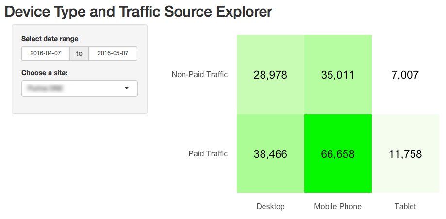
(This post has a lengthy preamble. If you want to dive right in, skip down to Step 1.)

R is like a bicycle. Or, rather, learning R is like learning  to ride a bicycle.

Someone once pointed out to me how hard it is to explain to someone how to ride a bicycle once you’ve learned to ride yourself.  That observation has stuck with me for years, as it applies to many learned skills in life. It can be incredibly frustrating (but then rewarding) to get from “not riding” to “riding.” But, then, once you’re riding, it’s incredibly hard to articulate exactly what clicked that made it happen so that you can teach someone else how to ride.

(I really don’t want you to get distracted from the core topic of this post, but if you haven’t watched the Backwards Bicycle video on YouTube… hold that out as an 8-minute diversion to avail yourself of should you find yourself frustrated and needing a break midway through the steps in this post.)

I’m starting to think, for digital analysts who didn’t come from a development background, learning R can be a lot like riding a bike: plenty of non-dev-background analysts have done it…but they’ve largely transitioned to dev-speak once they’ve made that leap, and that makes it challenging for them to help other analysts hop on the R bicycle.

This post is an attempt to get from “your parents just came home with your first bike” to “you pedaled, unassisted, for 50 feet in a straight line” as quickly as possible when it comes to R. My hope is that, within an hour or two, with this post as your guide, you can see your Google Analytics data inside of RStudio. If you do, you’ll actually be through a bunch of the one-time stuff, and you can start tinkering with the tool to actually put it to applied use. This post is written as five steps, and Step 1 and Step 2 are totally one-time things. Step 3 is possibly one-time, too, depending on how many sites you work on.

Why Mess with R, Anyway?

Before we hop on the R bike, it’s worth just a few thoughts on why that’s a bike worth learning to ride in the first place. Why not just stick with Excel, or simply hop over to Tableau and call it a day? I’m a horrible prognosticator, but, to me, it seems like R opens up some possibilities that the digital analysts of the future will absolutely need:

  • It’s a tool designed to handle very granular/atomic data, and to handle it fairly efficiently.
  • It’s shareable/replicable — rather than needing to document how you exported the data, then how you adjusted it and cleaned it, you actually have the steps fully “scripted;” they can be reliably repeated week in and week out, and shared from analyst to analyst.
  • As an open source platform geared towards analytics, it has endless add-ons (“packages”) for performing complex and powerful operations.
  • As a data visualization platform, it’s more flexible than Excel (and, it can do things like build a simple histogram with 7 bars from a million individual data points…without the intermediate aggregation that Excel would require).
  • It’s a platform that inherently supports pulling together diverse data sets fairly easily (via APIs or import).
  • It’s “scriptable” — so it can be “programmed” to quickly combine, clean, and visualize data from multiple sources in a highly repeatable manner.
  • It’s interactive — so it can also be used to manipulate and explore data on the fly.

That list, I realize, is awfully “feature”-oriented. But, as I look at how the role of analytics in organizations is evolving, these seem like features that we increasingly need at our disposal. The data we’re dealing with is getting larger and more complex, which means it both opens up new opportunities for what we can do with it, and it requires more care in how the fruits of that labor get visualized and presented.

If you need more convincing, check out Episode #019 of the Digital Analytics Power Hour podcast with Eric Goldsmith — that discussion was the single biggest motivator for why I spent a good chunk of the holiday lull digging back into R.

A Quick Note About My Current R Expertise

At this point, I’m still pretty wobbly on my R “bike.” I can pedal on my own. I can even make it around the neighborhood…as long as there aren’t sharp curves or steep inclines…or any need to move particularly quickly. As such, I’ve had a couple of people weigh in (heavily — there are some explanations in this post that they wrote out entirely… and I learned a few things as a result!):

Jason and Tom are both cruising pretty comfortably around town on their R bikes and will even try an occasional wheelie. Their vetting and input shored up the content in this post considerably.

So, remember:

    1. This is an attempt to be the bare minimum for someone to get their own Google Analytics data coming into RStudio via the Google Analytics API.
    2. It’s got bare minimum explanations of what’s going on at each step (partly to keep from tangents; partly because I’m not equipped to go into a ton of detail).
If you’re trying to go from “got the bike” (and R and RStudio are free, so they’re giving bikes away) to that first unassisted trip down the street, and you use this post to do so, please leave a comment as to if/where you got tripped up. I’ll be monitoring the comments and revising the post as warranted to make it better for the next analyst.

I’m by no means the first person to attempt this (see this post by Kushan Shah and this post by Richard Fergie and  this post by Google… and now this page on dartistics.com and this page on the googleAnalyticsR site). I’m penning this post as my own entry in that particular canon.

Step 1: Download and Install R and RStudio

This is a two-step process, but it’s the most one-time of any part of this:

  1. Install R — this is, well, R. Ya’ gotta have it.
  2. Install RStudio (desktop version) — this is one of the most commonly used IDEs (“integrated development environments”); basically, this is the program in which we’ll do our R development work — editing and running our code, as well as viewing the output. (If you’ve ever dabbled with HTML, you know that, while you can simply edit it in a plain text editor, it’s much easier to work with it in an environment that color-codes and indents your code while providing tips and assists along the way.)

Now, if you’ve made it this far and are literally starting from scratch, you will have noticed something: there are a lot of text descriptions in this world! How long has it been since you’ve needed to download and install something? And…wow!… there are a lot of options for exactly which is the right one to install! That’s a glimpse into the world we’re diving into here. You won’t need to be making platform choices right and left — the R script that I write using my Mac is going to run just fine on your Windows machine* — but the world of R (the world of development) sure has a lot of text, and a lot of that text sometimes looks like it’s in a pseudo-language. Hang in there!

* This isn’t entirely true…but it’s true enough for now.

Step 2: Get a Google API Client ID and Client Secret

[February 2017 Update: I’ve actually deleted this entire section after much angst and hand-wringing. One of the nice things about googleAnalyticsR — the “package” we’ll be using here shortly — is that the authorization process is much easier. The big caveat is that, for that to work without creating your own Google Developer Project API client ID and client secret is that you will be using the defaults for those. That’s okay — you’re not putting any of your data at risk, as you will have to log in to your Google account a web browser when your script runs. But, there’s a chance that, at some point, the default app will hit the limit of daily Google API calls, at which point you’ll need your own app and credentials. See the Using Your Own Google Developer Project API Key and Secret section on the googleAnalyticsR Setup page for a bit more detail.]

Step 3: Get the View ID for the Google Analytics View

If the previous step is our way to enable R to actually prompt you to authenticate, this step is actually about pointing R to the specific Google Analytics view we’re going to use.

There are many ways to do this, but a key here is that the view ID is not the Google Analytics Property ID.

I like to just use the Google Analytics Query Explorer. If, for some reason, you’re not already logged into Google, you’ll have to authenticate first. Once you have been authenticated, you will see the screen shown below. You just need to drill down from Account to Property to View with the top three dropdowns to get to the view you want to use for this bike ride. The ID you want will be listed as the first query parameter:

5_2_queryExplorer

You’ll need to record this ID somewhere (or, again, just leave the browser tab open while you’re building your script in a couple of steps).

Step 4: Launch RStudio and Get Clear on a Couple of Basic-Basic Concepts

Go ahead and launch RStudio (the specifics of launching it will vary by platform, obviously). You should get a screen that looks pretty close to the following (click to enlarge):

6_rstudio

It’s worth hitting on each of these four panes briefly as a way to get a super-basic understanding of some things that are unique when it comes to working with R. For each of the four areas described below, you can insert, “…and much, much more” at the end.

Sticking to the basics:

  • Pane 1: Source (this pane might not actually appear — Pane 2 may be full height; don’t worry about that; we’ll have Pane 1 soon enough!) — this is an area where you can both view data and, more importantly (for now), view and edit files. There’s lots that happens (or can happen) here, but the way we’re going to use it in this post is to work on an R script that we can edit, run, and save. We’ll also use it to view a table of our data.
  • Pane 2: Console — this is, essentially, the “what’s happening now” view. But, it is also where we can actually enter R commands one by one. We’ll get to that at the very end of this post.
  • Pane 3: Environment/Workspace/History — this keeps a running log of the variables and values that are currently “in memory.” That can wind up being a lot of stuff. It’s handy for some aspects of debugging, and we’ll use it to view our data when we pull it. Basically, RStudio persists data structures, plots, and a running history of your console output into a collection called a “Project.”  This makes organizing working projects and switching between them very simple (once you’ve gotten comfortable with the construct).  It also supports code editing, in that you can work on a dataset in memory without continually rerunning the code to pull that data in.
  • Pane 4: Files/Plots/Packages/Help — this is where we’re actually going to plot our data. But, it’s also where help content shows up, and it’s where you can manually load/unload various “packages” (which we’ll also get to in a bit).

There is a more in-depth description of the RStudio panes here, which is worth taking a look into once you start digging into the platform more. For now, let’s stay focused.

Key Concept #1: R is interesting in that there is a seamless interplay between “the command prompt” (Pane 2) and “executable script files” (Pane 1). In some sense, this is analogous to entering jQuery commands on the fly in the developer console versus having an included .js file (or JavaScript written directly in the source code). If you don’t mess with jQuery and JavaScript much, though, that’s a worthless analogy. To put it in Excel terms, it’s sort of like the distinction between “entering a formula in a cell” and “running a macro that enters a formula in a cell.” Those are two quite different things in Excel, although you can record a macro of you entering a formula in a cell, and you can then run that macro whenever you want to have that formula entered. R has a more fluid — but similar — relationship between working in the command prompt and working in a script file. For instance:

  • If you enter three consecutive commands in the console, and that does what you want, you can simply copy and paste those three lines from the console into a file, and you’re set to re-run them whenever you want.
  • Semi-conversely, when working with a file (Pane 1), it’s not an “all or nothing” execution. You can simply highlight the portion of the code you want to run, and that is all that runs. So, in essence, you’re entering a sequence of commands in the console.

Still confusing? File it away for now. The seed has been planted.

Key Concept #2: Packages. Packages are where R goes from “a generic, data-oriented, platform” to “a platform where I can quickly pull Google Analytics data.” Packages are the add-ons to R that various members of the R community have developed and maintained to do specific things. The main package we’re going to use is called googleAnalyticsR (as in “R for Google Analytics”). (There’s a package for Adobe Analytics, too: RSiteCatalyst.)

The nice thing about packages is that they tend to be available through the CRAN repository…which means you don’t have to go and find them and download and install them. You can simply download/load them with simple commands in your R script! It will even install any packages that are required by the package you’re asking for if you don’t have those dependencies already (many packages actually rely on other packages as building blocks, which makes sense — that capability enables the developer of a new package to stand on the shoulders of those who have come before, which winds up making for some extremely powerful packages). VERY handy.

One other note about packages. We’re going to use the standard visualization functions built into R’s core in this post. You’ll quickly find that most people use the ‘ggplot2’ package once they get into heavy visualization. Tom Miller actually wrote a follow-on post to this blog post where he does some additional visualizations of the data set with ggplot2. I’m nowhere near cracking that nut, so we’re going to stick with the basics here. 

Step 5: Finally! Let’s Do Some R!

First, we need to install the googleAnalyticsR package. We do this in the console (Pane 2):

  1. In the console, type: install.packages("googleAnalyticsR")
  2. Press Enter. You should see a message that is telling you that the package is being downloaded and installed:

That’s largely a one-time operation. That package will stay installed. You can also install packages from within a script… but there’s no need to keep re-installing it. So, at most, down the road, you may want to have a separate script that just installs the various packages you use that you can run if/when you ever have a need to re-install.

We’re getting close!

The last thing we need to do is actually get a script and run it. If analyticsdemystified.com wasn’t embarrassingly/frustratingly restricted when it comes to including code snippets, I could drop the script code into a nice little window that you could just copy and paste from. Don’t judge (I’ve taken care of that for you). Still, it’s just a few simple steps:

  1. Go to this page on Github, highlight the 23 lines of code and then copy it with <Ctrl>-C or <Cmd>-C.
  2. Inside RStudio, select File >> New File >> R Script, and then paste the code you just copied into the script pane (Pane 1 from the diagram above). You should see something that looks like the screen below (except for the red box — that will say “[view ID]”).
  3. Replace the and [view ID] with the view ID you’d found earlier..
  4. Throw some salt over your left shoulder.
  5. Cross your fingers.
  6. Say a brief prayer to any Higher Power with which you have a relationship.
  7. Click on the word Source at the top right of the Pane 1 (or press <Ctrl>-<Shift>-<Enter>) to execute the code.
  8. With luck, you’ll be popped over to your web browser and requested to allow access to your Google Analytics data. Allow it! This is just allowing access to the script you’re running locally on your computer — nothing else!

If everything went smoothly, then, in pane 4 (bottom right), you should see something that looks like this (actual data will vary!):

If you got an error…then you need to troubleshoot. Leave a comment and we’ll build up a little string of what sorts of errors can happen and how to address them.

One other thing to take a look at is the data itself. Keep in mind that you ran the script, so the data got created and is actually sitting in memory. It’s actually sitting in a “data frame” called ga_data. So, let’s hop over to Pane 3 and click on ga_data in the Environment tab. Voila! A data table of our query shows up in Pane 1 in a new tab!

A brief word on data frames: The data frame is one of the most important data structure within R. Think of data frames as being database tables. A lot of the work in R is manipulating data within data frames, and some of the most popular R packages were made to help R users manage data in data frames. The good news is that R has a lot of baked-in “syntactic sugar” made to make this data manipulation easier once you’re comfortable with it. Remember, R was written by data geeks, for data geeks!

How Does It Work?

I’m actually not going to dig into the details here as to how the code actually works. I commented the script file pretty extensively (a “#” at the beginning of a line is a comment — those lines aren’t for the code to execute). I’ve tried to make it as simple as possible, which then sets you up to start fiddling around with little settings here and there to get comfortable with the basics. To fiddle around with the get_ga() settings, you’ll likely want to refer to the multitude of Google Analytics dimensions and metrics that are available through the core reporting API.

A Few Notes on Said Fiddling…

Running a script isn’t an all-or nothing thing. You can run specific portions of the script simply by highlighting the portion you want to run. In the example below, I changed the data call to pull the last 21 days rather than the last 7 days (can you find where I did that?) and then wanted to just run the code to query the data. I knew I didn’t need to re-load the library or re-authorize (this is a silly example, but you get the idea):

Then, you can click the Run button at the top of the script to re-run it (or press <Ctrl>-<Enter>).

There’s one other thing you should definitely try, and that has to do with Key Concept #1 under Step 4 earlier in this post. So far, we’ve just “run a script from a file.” But, you can also go back and forth with doing things in the console (Pane 2). That’s actually what we did to install the R package. But, let’s plot pageviews rather than sessions using the console:

  1. Highlight and copy the last line (row 23) in the script.
  2. Paste it next to the “>” in the console.
  3. Change the two occurrences of “sessions” to be “pageviews”.
  4. Press <Enter>.

The plot in Pane 4 should now show pageviews instead of sessions.

In the console, you can actually read up on the plot() function by typing ?plot. The Help tab in Pane 4 will open up with the function’s help file. You can also get to the same help information by pressing F1 in either the source (Pane 1) or console (Pane 2) panes. This will pull up help for whatever function your cursor is currently on. If not from the embedded help, then from Googling, you can experiment with the plot — adding a title, changing the labels, changing the color of the line, adding markers for each data point. All of this can be done in the console. When you’ve got a plot you like, you can copy and paste it back into the script file in Pane 1 and save the file!

Final Thoughts, and Where to Go from Here

My goal here was to give analysts who want to get a small taste of R that very taste. Hopefully, this has taken you less than an hour or two to get through, and you’re looking at a (fairly ugly) plot of your data. Maybe you’ve even changed it to plot the last 30 days. Or you’ve specified a start and end date. Or changed the metrics. Or changed the visualization. This exercise just barely scratched the surface of R. I’m not going to pretend that I’m qualified to recommend a bunch of resources, but I’ve include Tom’s and Jason’s recommendations below, as well as culled through the r-and-statistics channel on the #measure Slack (Did I mention that you can join that here?! It’s another place you can find Jason and Tom…and many other people who will be happy to help you along! Mark Edmondson — the author of the googleAnalyticsR package — is there quite a bit, too!). I took an R course on Coursera a year-and-a-half ago and, in hindsight, don’t think that was the best place to start. So, here are some crowdsourced recommendations:

And, please…PLEASE… take a minute or two to leave a comment here. If you got tripped up, and you got yourself untripped (or didn’t), a comment will help others. I’ll be keeping an eye on the comments and will update the post as warranted, as well as will chime in — or get someone more knowledgeable than I am to chime in — to help you out.

Photo credit: Flickr / jonny2love

Analytics Strategy, Featured

Best-In-Class Digital Analytics Capabilities

I don’t believe in maturity models, yet as we roll into 2016, I’ve recognized a widespread need for organizations to identify their digital analytics programs in contrast to their peers. Almost every executive wants to know how their organization stacks up against the competition, and it’s a valid inquiry. Instead of answering this question in terms of maturity, I offer a contrasting perspective of assessing analytics capabilities and competencies. In this post, we’ll address the capability, which is the extent of someone’s or something’s ability. In other words, it’s the power to accomplish tasks, which is far more telling in digital analytics. We are after all seeking the ability to take action on our data…Aren’t we?

In my experience with digital analytics, there’s typically a lot to get done. Most organizations aspire to have the capability to collect good data and use it for highly intelligent marketing purposes. Yet, in many cases, the foundational components of digital analytics capabilities have gaps or straight-out holes where critical elements are missing. It is imperative for organizations to think about the capabilities they need to accomplish their digital objectives and begin amassing both the technology and talent to deliver.

Analytics Capabilities_v2

While there are likely many more capabilities and nuances to best-in-class digital analytics than the ones I will lay out here, I offer the following seven capabilities as the foundational building blocks of any successful digital analytics program. Keep in mind that these are ordered by difficulty and business value, but organizations don’t necessarily acquire these capabilities in order. In some cases, technology can enable a company or team within a company to expedite their capability and skip a step or two along the way.

It’s also worth noting that capabilities are related to each other in different ways and that some are symbiotic with preceding capabilities. For example, Data Collection and Data Integration are related (as indicated by the similar shading in Figure 1) because how you integrate data will vary based on your data collection methods. Similarly, A/B Testing, Customer Experience Optimization, and Automated Marketing are all related and will build off of each other as each capability grows. Testing will feed optimization and marketing as these capabilities are put into practice, which will generate more test hypotheses and ideas.


Data Collection

While it should be obvious that data collection is the most basic capability, I’m continuously amazed at how much bad data exist out there. This certainly keeps my Partners busy, but there’s nothing like a poor implementation with bad data coming out to undermine the credibility of an analytics program. Starting out with a strategic Solution Design for data collection will mean the difference between just collecting data to have it and actually collecting data with purpose. Clean it up and start off with a well documented solution design and reporting that meets stakeholder needs.

Reporting & Performance Measurement

Reporting is a by-product of data collection and should provide the visual cues to your organization about how your business is performing. The vital statistics if you will. Reports will often contain lots and lots of metrics, but all too often we see companies that are drowning in automated reports that go unused and unloved all for the sake of checking the we-got-a-report-for-that box. Instead of report-blasting to your colleagues, we advocate performance measurement which purposefully aligns data with desired outcomes. This enables you to report on the three to five big bold numbers that are going to be in your face every week, that the company is going to rally around. It’s amazing the mileage we see when companies take this approach. Try it.

Ad Hoc Analysis

Analysis is the capability that takes you beyond the report and deep into the data. But don’t be confused, ad hoc analysis is not “ad hoc data pulls”. That’s not meaningful analysis. Put your brain into it by conducting analysis that follows two simple criteria: 1) Are my analysis tied to clearly articulated hypotheses? and 2) Does this analysis lead to action? While every hypothesis may not lead to action, (you may prove some wrong) by taking the time to think about what you will do (or will recommend) as a result of your analysis is critical for being a productive analyst. Encourage your stakeholders to bring you hypotheses that you can research and prove out using data. Or better yet, lead by example and ferret out what’s most important to them and show how data can prove out a hypotheses you heard them articulate.

A/B Testing

Many organizations find the greatest incremental gains from their testing programs because inherently, the results prove value. This is what makes testing such a fabulous capability! Companies also often fast-track testing because it is one capability that can be easily acquired with technology. But don’t get hoodwinked by that silver-tongued salesman…testing programs require skilled operators to administrate, execute, and evaluate results. Often times, A/B testing programs that stand-up too quickly don’t have necessary buy-in from stakeholders, which makes pushing winning tests and ideas a challenge. This capability is dependent upon having unwavering faith in your data to go forward with what the data says, instead of relying on intuition, gut, or experience.

Customer Experience Optimization

This capability relies on segmenting customer data to get beyond the basic testing of subject lines, navigational components, and checkout processes. It requires optimizing for different profiles, across numerous customer types, at different points throughout their lifecycles. Experience optimization taps into more than one data stream to reveal the “why” of analytics that can be illuminating for marketing purposes. Best-in-class organizations use Customer Experience Optimization as a method to tap into the propensity for behavior using data cues and analytical processes.

Automated Marketing

The pinnacle of data utilization is automated marketing. Again, many technologies can assist with automated marketing, but none are worth a tweet unless built from a solid foundation of reliable data – from multiple systems – with thoughtful analysis baked in. Machine learning is a beautiful thing, but you cannot get there unless you know your business and know your customers. The capabilities that precede automated marketing help organizations to arrive at automated marketing by building confidence in data, having a means to conduct strategic analysis, experimenting and optimizing digital assets and using all information available. This is a best-in-class capability that all desire, but very few attain.


So there you have it…my seven Digital Analytics Capabilities. I’d love to hear what you think and if your organization has managed to attain best-in-class by acquiring these capabilities, if you did it some other way, or if you’re stuck at any point in the process. Leave a comment and let me know.

Adobe Analytics, Featured

When to Tweak Report Suites and When to Start Anew

As someone who has made a living auditing, fixing and improving Adobe Analytics implementations, there are a few questions related to this that I receive all of the time. One of these questions, is whether a company doing a cleanup/re-implementation of their Adobe Analytics implementation should make changes to their existing report suite(s) or start over with brand new report suites. As you would expect, there is no one right answer to this, but I thought I would share some of the things I consider when making this decision.

Auditing What You Have

The first step of the cleanup process for an Adobe Analytics implementation is doing a thorough audit or review of what you have today. I can’t tell you how many companies I have worked with who hired me to do a “quick” review of their implementation and had no idea how inaccurate or bad it really was in its current state. Too often, I see companies that don’t question the data they are collecting and assume it is useful and that the data is correct. Trust me when I tell you that, more often than not, it isn’t!  I’d say that most of the companies I start with have scores around 60% – 70% out of 100% when it comes to their Success Events, eVars and sProps functioning properly. If you are unsure, I suggest you read this white paper that I wrote in partnership with Adobe (and if you think you may have some issues or want an objective validation that your implementation is in good shape, check out this page which describes my service in this area).

As you audit your existing implementation, you will want to make sure to look at the following:

  1. How many report suites do you have and which are actively being used (and which can be hidden in the Admin Console)?  How consistent are these report suites?  If you select all of them in the Admin Console, how often do you see “Multiple” values?  The more you do, the more you may be in trouble.
  2. How good is your data? If you have incomplete or inaccurate data, what is the value of sticking with your old report suites that are filled wth garbage?
  3. How important to your business is year over year data? Some organizations live and die by YoY data, while others focus more on recent periods, especially if they have recently undergone a website re-design.

The answers so these types of questions will have impacts on the ultimate decision as I will dive into below.

Old Report Suites or New Ones?

So getting back to the original question – if you are going to re-implement, should you use existing report suites or new ones? The only way I can explain this is to show you the scenarios that I see most often.

Report Suite Inconsistency

If in the audit process above, you find that you have lots of report suites, and that the variable assignments in each of them are pretty different, the odds are that you should start from scratch with new report suites and, this time, make sure that they are set-up consistently. As mentioned above, the easiest way to see this is to select all of your active suites, choose a variable type (i.e. Events, eVars or sProps) and view the settings like this:

Screen Shot 2015-12-03 at 3.27.25 PM

If you see this when selecting multiple report suites, the odds are you are in trouble, unless you manage lots of different websites that have absolutely nothing in common across them. I tend to see this issue most in the following situations:

  1. Different sites are implemented by different parts of the business and no communication exists between them or there is no centralized analytics “Center of Excellence”
  2. One business is acquired and both used the same analytics tool, but the implementations were done while the companies were separate
  3. Two businesses or business units with different websites/products had implemented separately and, only later, decide they want to combine their data
  4. A mobile team goes rogue and creates new report suites and tags all mobile sites/apps with a brand new set of variables without talking to the desktop group

Regardless of how you got there, the reason report suite inconsistency is so bad, is that salvaging it requires a massive variable reconciliation if you want to use your existing report suites and, even then, all but one suite is going to have different data in it than it did in the past. For example, let’s say that event 1 above is “Internal Searches” for two report suites and for the eight other suites has a different definition.  That means you have nine different definitions for event 1 across ten report suites. Even if you lay down the law and say that after your re-implementation, event 1 will always be “Internal Searches,” you will still have numbers that are not Internal Searches in eight out of 10 of your report suites historically. Thus, if someone looks at one of the suites that historically didn’t have event 1 as Internal Searches, for a long period of time, it will not actually be Internal Search data. Personally, I’d rather have no historical data than potentially misleading data. In addition, I think it is easier to start anew and tell the developers from all of your disparate sites that they must move their data from wherever they have it now to the new standard variable assignment list, rather than trying to map existing data to new variables using Processing Rules, DTM, VISTA Rules or other work-arounds.  Doing the latter just creates Band-Aids that will eventually break and corrupt your data once again in the future.

Here is an example of the eVars for one of my clients:

Screen Shot 2015-12-04 at 5.39.19 PM

In this case, I only compared five different report suites out of more than fifty that they have in total. As you can see, reconciling this to ultimately have a global report suite or to send all data into one suite would be quite a challenge!

Conversely, if it turns out that all of your suites have pretty good variable definition consistency, then you can move the data from the incorrect variable slots to the correct ones in your lower priority report suites and continue using your existing report suites. For example, if you have one main report suite and then a bunch of other less significant report suites (like micro-sites), you may decide that you want to keep the main suite the way it is and force all of the other suites to change and adhere to the variable definitions of the main suite. This is a totally acceptable solution and will allow you to have year over year data for your main suite at least.

However, if you go down this path, I would suggest that if there are variables that the non-main report suite uses, that they be added to the main report suite in new variable slots so that eventually all of your report suites are consistent. For example, let’s say that one of the lesser important suites has a success event #1 that is registrations, but there is no registrations event in the main suite that you want to persist. In this case, you should move event 1 in the non-main suite to the next available event number (say event 51) and then add this event 51 to the main report suite as well. If you will never have registrations in your main suite, it is still ok to label event 51 as registrations, simply disable it in the admin console. This way, you avoid any variable definition conflicts in the future. For example, if the main report suite needs a new success event they would use event 52 instead of event 51 since they now know that event 51 is taken elsewhere. The only time this gets tricky is when it comes to eVars, since they are limited to 100 for most customers, but conserving eVars is a topic for another day!

Regardless of what you find, looking at the consistency of your variable definitions is an important first step in the process.

Data Quality

As mentioned above, if the data quality for your existing implementation isn’t very good, then there are fewer reasons to not start fresh. Therefore, another step I take in the process is to determine what percent of my Success Events, eVars and sProps in my current implementation I trust. As described in this old post, data quality is paramount when it comes to digital analytics and if you aren’t willing to put your name on the line for your data, then it might as well be wrong. Even if your report suites are pretty consistent (per the previous section), there may be benefits to starting over with new report suites if you feel that the data you have is wrong or could be misleading.

When I joined Salesforce.com many years ago to manage their Omniture implementation, I had very little faith in the data that existed at the time. When doing my QA checks, it seemed like most metrics came with a list of asterisks associated with them, such that presentation slides looked like bibliographies! While I hated the idea of starting over, I decided to do it because it was the lesser of two evils. It caused some temporary pain, but in the end, helped us shed a lot of baggage and move forward in a positive direction (you can read a lot more about how we did this in this white paper). For this reason, I suggest you make data quality one of your deciding factors in the new vs. old report suite decision.

Year over Year Data

Finally, there is the issue of year over year data. As mentioned above, if your variable definitions are completely inconsistent and/or your data quality is terrible, you may not have many options other than starting with new suites for some or all of your report suites. Moreover, if your data quality is poor, having year over year flawed data isn’t much of an improvement over having no year over year data in my opinion. The only real data that you would lose if your data quality is bad is Page Views, Visits and Unique Visitors (which are pretty hard to mess up!). In most cases, I try to avoid having year over year data be the driving force in this decision. It is a factor, but I feel that the previous two items are much more important.

Sometimes, I advise my clients to use Adobe ReportBuilder as a workaround to year over year data issues. If you decide to move to new report suites, you can build an Excel report using ReportBuilder that combines two separate data blocks into one large Excel data table that can be graphed continuously. In this case, one data block contains data for a variable in the old report suite and the other data block contains data for the same data point in a different variable slot in the new report suite. But to an end user of the Excel sheet, all they see is one large table that updates when they refresh the spreadsheet.

For example, let’s imagine that you have two report suites and one has internal searches in event 1 and the other has internal searches in event 5. Then you decide to create a brand new suite that puts all internal searches into event 1 as of January 1st. In ReportBuilder (Excel), you can create one data block that has event 1 data for suite #1 for dates prior to January 1st, another data block that has event 5 data for suite #2 for dates prior to January 1st and a third data block that has event 1 data for January 1st and beyond in the new report suite. Then you simply use a formula to add the data from event1 and event 5 in the data blocks that precede January 1st and then put that data block directly next to the final data block that contains event 1 data starting January first (in the new suite). The result will be a multi-year view of internal search data that spans all three report suites. A year later, your new report suite will have its own year over year data in the new combined event 1, so eventually, you can abandon the Excel workaround and just use normal Adobe Analytics reporting to see year over year data.

While this approach may take some work, it is a reasonable workaround for the few major data points that you need to report on year over year while you are making this transition to a newer, cleaner Adobe Analytics implementation.

Justification

Sometimes, telling your boss or co-workers that that you need to re-implement or start over with new report suites can be a difficult thing to do.  In many respects, it is like admitting failure. However, if you do your homework as described above, you should have few issues justifying what you are doing as a good long-term strategy. My advice is to document your findings above and share them with those who may complain about the initiative. There will always be people who complain, but at the end of the day, you need to instill faith in your analytics data and if this is a necessary step, I suggest you do it. I heave learned over the years that the perception of your organization’s analytics team is one of the most critical things and something you should safeguard as much as you can. In our line of work, you are asking people to make changes to websites and mobile apps, partly based upon the data you are providing. That demands a high level of trust and once that trust is broken it is difficult to repair.

I also find that many folks I work with were not around when the existing implementation was done. This is mainly due to the high turnover rate in our industry, which, in turn, is due to the high demand for our skills. If you are new to the analytics implementation that you now manage, I recommend that you perform an audit to make sure what you inherited is in good shape. As described in books like this, you have a narrow window of time that is ideal for cleaning things up and asking for money if needed. But if you wait too long, the current implementation soon becomes “your problem” and then it is harder to ask for money to do a thorough review or make wholesale changes. Plus, when you first start, you can say things like “You guys were the ones who screwed this up, so don’t complain to me if we have to start it over and lose YoY data…You should have thought of that before you implemented it incorrectly or with shoddy data quality!” (You can choose to make that sound less antagonistic if you’d like!)

Avoiding a Repeat in the Future

One last point related to this topic. If you are lucky enough to be able to clean things up, reconfigure your report suites and improve your data quality, please make sure that you don’t ever have to do that again! As you will see, it is a lot of work. Therefore, afterwards, you want to put processes in place to ensure you don’t have to do it again in a few years! To do this, I suggest that you reduce the number of Adobe Analytics Administrators to only 1-2 people, even if you are part of a large organization. Adding new variables to your implementation should be a somewhat rare occurrence and by limiting administration access to a select few, you can be sure that all new variables are added to the correct variable slots. I recommend doing this through a digital analytics “center of excellence,” the setup of which is another one of the services that I provide for my clients. As they say, “an ounce of prevention is worth a pound of cure!”

Adobe Analytics, Featured

Cart Conversion by Product Price

Back in 2010, I wrote about a way to see how much money website visitors were adding to the shopping cart so that amount could be compared to the amount that was actually purchased. The post also showed how you could see this “money left on the table” by product and product category. Recently, however, I had a client ask a similar question, but one focused on whether the product price was possibly a barrier to cart conversion. Specifically, the question was asked whether visitors who add products to the cart that are between $50 and $100 end up purchasing more or less than those adding products valued at a different price range. While there are some ways to get to this information using the implementation approach I blogged about in the preceding post, in this post, I will share a more straightforward way to answer this question.

Capturing Add to Cart Value

In the preceding post, to see money left on the table, I suggested that the amount of the product being added to the cart be passed to a new currency Success Event. But to answer our new question, you will want to augment that by passing the dollar amount to a Product Syntax Merchandising eVar when visitors add a product to the cart. For example, if a visitor adds product # 111 to the cart and its price is $100, the syntax would look like this:

s.events="scAdd,event10";
s.products=";111;;;event10=100;evar30=100";

In this case, the $100 cart value is being passed to both the currency Success Event and the Merchandising eVar (I suggest rounding the dollar amount to the nearest dollar to minimize SAINT Classifications later). Both of these amounts are “bound” to the product number (111 in this example).

Once this is done and repeated for all of your visitors, you can use the new Merchandising eVar to see Cart Additions by price of item added to cart using a report like this:

Screen Shot 2015-11-26 at 12.46.00 PM

Since the new Merchandising eVar has been bound to the product added to the shopping cart, if the visitor purchases the product prior to the eVar’s expiration (normally purchase event), the eVar value will be applied to the purchase event as well for those products ultimately purchased. Therefore, when orders and revenue are set on the order summary page, each order will be “bound” to the product price value such that you can see a report that looks like this:

Screen Shot 2015-11-26 at 12.50.46 PM

Using this report, you can see how each price point performs with respect to cart to order conversion. Since you will have many price points, you will likely want to use SAINT Classifications to group your price points into larger buckets or ranges to make the data more readable:

Screen Shot 2015-11-26 at 12.55.23 PM

Once you have this, you can switch to the trended view of the report and see how each price range converts over time. Of course, you can break this down by product or external campaign code to see what factors result in the conversion rate being higher or lower than your standard cart conversion rate (Orders/Cart Additions). This analysis can be used in conjunction with my competitor pricing concept to see which products you should emphasize and de-emphasize on your online store. You can also use this new eVar in segments if you ever want to isolate cases in which a specific product price range was added to the cart or purchased.

As you can see, there are lots of handy uses for this implementation concept, so if you have a shopping cart, you may want to try it out and see what creative ways you can exploit it to further your analysis capabilities.

Adobe Analytics, Featured

Average Internal Search Position Clicked

A few years ago, I wrote an extensive post describing how to track internal search position clicks to see which internal search positions visitors tend to click on. That post showed how to track impressions and clicks for internal search positions and how to view this by search phrase. Recently, however, I had a client ask for something tangentially related to this. This client was interested in seeing the overall average search position clicked when visitors search on their website and for each search term. While the preceding post provides a way to see the distribution of clicks on internal search spots, it didn’t provide a straightforward way to calculate the overall average. Therefore in this post, I will share a way to do this for those who want to see a trended view of how far down the search results list your visitors are going.

Calculating the Average Internal Search Position Clicked

The key difference in calculating the average internal search position clicked from what I described in my previous post, is that you need to switch from using a dimension (eVar) to using a metric (Success Event). To compute the average search position, the formula we eventually need is one that divides the summation of the position numbers clicked by the number of total internal searches. For example, if I conduct a search and click on the 10th result and then another search and click on the 5th result, I have clicked on an aggregate of 15 internal search positions (10+5) and had 2 search clicks. When I divide these two elements, I can see that my average search position clicked is 7.5 (15/2). Hence, if you apply the same approach for all of your visitors, you will be able to calculate the overall average internal search position.

From an implementation standpoint, this is relatively easy. If you have internal search on your site, you are probably already setting a metric (Success Event) on the search results page to determine how often searches are taking place. If you followed my advice in this post, you would also be setting a second metric when visitors click on a result in your search result list. Therefore, the only piece you are missing is a metric that quantifies the position number clicked. To do this in Adobe Analytics you would set a new Numeric (or Counter if on latest code) Success Event with the number value of the position clicked (let’s call this Search Position). For example, if a visitor conducts a search and clicks on the 5th position, you would pass a value of “5” to the new success event. This will create the numerator needed to calculate the average search position.

Once you have done this, you have the two metrics you need to calculate the average – search position numbers and the number of search clicks. Simply create a new Calculated Metric that divides the Search Position by the # of Search Clicks to compute the average as shown here:

Screen Shot 2015-12-04 at 9.26.18 AM

This will produce a metric repost like this:

Screen Shot 2015-11-25 at 10.42.47 AM

Average Search Position by Search Phrase

Since you are most likely already capturing the search phrase when visitors search, you can also view this new Calculated Metric by search phases, by simply adding it to the dimension (eVar) report:

Screen Shot 2015-12-04 at 9.24.21 AM

This report and the preceding ones can be used to watch your search result clicks overall and by search phrase. This may help you determine if your search results are meeting the needs of your users and whether you even need to have pages and pages of search results.

One fun way I have used this type of analysis is to take my top search phrases and hand-pick specific links that I want them to go to for the top search phrases (recommended links). Then you can see if your users prefer the organic results or the ones you have picked for them (using a new eVar!). Another way to use this analysis is to see if changes made to your internal search makes the average search position clicked go up or down. Regardless of how you use it, if you are going to use internal search on your site, you may as well track it appropriately. Enjoy!

Adobe Analytics, Featured

Using Cohort Analysis in Adobe Analytics

With the latest release of Adobe Analytics, the Analysis Workspace interface now provides a way to conduct cohort analyses. The new Cohort Analysis borrows from an existing one that Adobe had previously made available for mobile implementations, but now it is available for use everywhere and with everything that you have in your Adobe Analytics implementation. In this post, I will provide a quick “how to” since I have been surprised by how few of my Adobe customers are aware of this new functionality.

Cohort Analysis Revisited

A cohort analysis is used when you want to isolate a specific event and then see how often the same folks completing that event go on to complete a future event. In the recent decade, cohort analyses became popular due to social networking tools when they were used to judge the “stickiness” of these new tools.  For example, in the early days of Twitter, people would look to see how often users who tweeted in January were still tweeting in February. In this case, the number of people who tweeted in February was a separate number from those who tweeted in January and then in February, with the latter being “cohorts.”  For more information on this topic, check out the wikipedia page here.

New Cohort Analysis Visualization

Once you are comfortable with cohort analysis as a concept, let’s look at how you can create cohort analyses in the new Adobe Analytics interface. To start, use the left navigation to access the Analysis Workspace feature of the product (note that if you are on an older version of Adobe Analytics, you may not have Analysis Workspace enabled):

Screen Shot 2015-11-16 at 4.52.36 PM

In the Analysis Workspace area, you will click the visualizations tab to see all of the potential visualizations:

Screen Shot 2015-11-16 at 4.53.40 PM

From here, you will drag the “Cohort Table” visualization over to your reporting canvas and should see this:

Screen Shot 2015-11-16 at 4.55.51 PM

At this point, you need to select your timeframe/granularity (i.e. Month, Week, Day) using the drop-down box and then drag over the metric you want visitors to have performed to be included in the cohort. This is done by clicking on the components tab at the top-left:

Screen Shot 2015-11-16 at 5.00.06 PM

Keep in mind that you cannot use calculated metrics and some other out-of-box metrics as inclusion metrics, but you can use any of your raw success events. Also, if you click on the “Metrics” link, you can see all metrics and do a search filter, which is very handy. When contemplating your inclusion metric, think about what actions you want visitors to take to be included in the cohort. For example, if you are looking for people who have ordered, you would use the Orders metric, but if you are interested in people who have viewed content on your site, you may use a Content Views success event. As an example, let’s use the latter and build a cohort of visitors who have viewed content on the site and see how many of those visitors come back to the website within x number of days. To do this, we would change the granularity to days, add a Content Views metric as the inclusion metric and then add the Visits metric as the return metric so the cohort analysis looks like this:

Screen Shot 2015-11-16 at 5.06.46 PM

You may also notice that you have the option to increase the number of times each metric has to occur before people would be be added to the inclusion or return portion of the cohort. By default the number is one, meaning that the above cohort is looking for cases in which one or more Content Views took place and then one or more return Visits took place. To narrow down the cohort, we could easily increase these numbers to force visitors to have viewed more content to be included in the cohort or returned to the site more than once to be included. But in this example, we’ll keep these set to one and run the report to see this:

Screen Shot 2015-11-16 at 5.10.43 PM

Here we can see that on November 3rd, we had 6,964 unique visitors who had Content Views and that of those who viewed content on that day, 13% (892 Visitors) returned to the site within one day (had a return Visit). Keep in mind that all numbers shown in cohort analyses are unique visitor counts. The color shading shows the intensity of the cohort relative to the other cohort cells. By looking horizontally, you can see the drop-off by day for each cohort starting date and as you look vertically, the days will follow a cascading pattern with the newest starting dates having the fewest return dates like this:

Screen Shot 2015-11-16 at 5.17.03 PM

Changing the granularity from Day to Week, would work the same way, but have far fewer cohorts unless you extend your timeframe:

Screen Shot 2015-11-16 at 5.23.53 PM

Here is an example in which I have made both the inclusion and return metric the same thing (Content Views), but made viewing two pieces of content required to be eligible for the return cohort:

Screen Shot 2015-11-16 at 5.25.40 PM

Here you will notice that requiring two return content views reduced the first (Nov 3rd) cohort from 13% down to 9%. You can use these settings to identify interesting patterns. Since you can also make as many cohorts as you want using all of your success events, the amount of information you can glean is enormous.

Putting Cohorts To Use

Once you learn how to generate cohort analyses, you may ask yourself “Ok, now what do I do with these?” That is a valid question. While a blog post isn’t the best venue for sharing all you can do with cohort analyses, let me share a couple ways I would suggest you use them. The first way is to apply segments to your cohorts. For example, you may want to determine if visitors from a specific region perform better than another, or if those using your responsive design pages are more likely to return. Here is an example in which the previous cohort is segmented for Microsoft browsers to see if that makes the cohort better or worse:

Screen Shot 2015-11-16 at 5.35.19 PM

In this case, our Nov 3rd cohort went from 13% to 8% just based upon browser. Since you probably have many segments, this provides more ways you can slice and dice these cohorts and adding a segment is as easy as dropping it into the top of your Analysis Workspace page like this:

Screen Shot 2015-11-16 at 5.37.29 PM

Keep in mind that any segment you apply will be applied to both the inclusion and return criteria. So in the preceding scenario, by adding a Microsoft Browser segment, the inclusion visitor count only includes those visitors who had a Content View event and used a Microsoft browser and the return visits also had to be from a Microsoft browser.

But my favorite use for cohorts is using a semi-hidden feature in the report. If you have a particular cohort cell (or multiple cells) that you are interested in, you can right-click on it and create a brand new segment just for that cohort! For example, let’s say we look at our original content to return visit cohort:

Screen Shot 2015-11-16 at 5.10.43 PM

Now, let’s say something looks suspicious about the Nov 3rd – Day 4 cohort, which is at 3% (top-right cell). We can right-click on it to see this:

Screen Shot 2015-11-16 at 5.45.25 PM

Then clicking will show us the following pre-defined segment in the segment builder:

Screen Shot 2015-11-16 at 5.46.24 PM

Now you can name and save this segment and use it in any analysis that you may need in the future!  You can also make changes to it if you desire before saving.

While there is much more you can do with cohorts, this should be enough for you to get started and begin playing around with them. Enjoy!

Adobe Analytics, Featured

Sharing Calculated Metrics in Adobe Analytics

Over the past year, Adobe Analytics users have noticed that the product has moved to a different model for accessing/editing/creating analytics components such as Calculated Metrics, Segments, etc… In this post, I want to touch upon one aspect that has changed a bit – the sharing of calculated metrics.


Sharing Calculated Metrics – The Old Way

In the older interface of Adobe Analytics (pre version 15.x), it was common to create a calculated metric, then select multiple report suites and apply that calculated metric to multiple suites. For example, if you wanted to create a Null Search ratio, you would create the formula and then select your report suites and save it. Here is an example in which a few calculated metrics have been applied to thirteen report suites:

Screen Shot 2015-11-16 at 9.08.44 AM

This approach would save you the work of creating the metric thirteen separate times, which could be a real pain, especially if you had hundreds of report suites.

However, employing this [old] preferred approach of sharing calculated metrics can actually make things a bit confusing when you switch over to the new version of Adobe Analytics. When using the new Calculated Metrics manager, the old approach will  cause you to see the same calculated metric multiple times, since it shows all calculated metrics for all report suites in the same window. Here is how the same calculated metric looks in the more updated version:

Screen Shot 2015-11-16 at 8.59.08 AM

In this case, you would see the same metric for as many report suites as it was associated with in your implementation. While you could keep all of these different versions, doing so presents the following potential risks:

  1. It can be confusing to novice end-users
  2. If someone makes a change to one of the calculated metrics (in one report suite), it can deviate from the others, so that you lose integrity of the metric across your implementation/organization
  3. If you want to make a change to a calculated metric in the future, you have to do it multiple times

In addition to these risks, in the newest version of Adobe Analytics, there are some cool new ways to share metrics that don’t require this duplication of the same metric hundreds of times.

Sharing Calculated Metrics – The New Way

If you were to make a new calculated metric now, using the latest version of Adobe Analytics, you could create the metric once and simply share it to all users or groups of users. Once you have created your metric, you use the share feature and select “All” as shown here:

Screen Shot 2015-11-16 at 9.23.00 AM

Doing this allows you to see the calculated metric in every report suite, without having multiple versions of it. As shown here, you will still see the calculated metric when you click “Show Metrics” from within the Adobe Analytics interface:

Test

Therefore, if you have twenty calculated metrics across fifty report suites, you would have twenty rows in your calculated metric manager instead of one thousand! This makes your life as an administrator much easier in the future.

Moving From The Old to the New

So what if you already have a lot of metrics and they are shown multiple times in your calculated metrics manager? If you decide you want to trim things down and go to the newer approach, you would want to do the following:

  1. I suggest creating a corporate login as outlined in this blog post. This is a centralized admin login that the core analytics team maintains
  2. Review all of your shared bookmarks and dashboards to find all cases in which calculated metrics you are about to remove are used
  3. Copy each of the existing calculated metrics using the corporate login ID (described in step 1) and share it across all or designated users
  4. Once this is done, you can delete all of the duplicate versions of the calculated metric
  5. Go back to the shared bookmarks and dashboards using the old version of calculated metrics and replace them with the newly created shared version

While this may take some time, it will free up time in the future, since it will minimize the number of calculated metrics you have to maintain in the long run. I also find that it is beneficial to periodically review all of your shared reports and calculated metrics and do a clean-up. This process forces you to do this and you may be amazed how many you have, how many you can remove and how many are wrong!

Adobe Analytics, Featured

Creating Weighted Metrics Using the Percentile Function

When using Adobe Analytics, one of the things that has been a bit annoying historically is that when you sort by a calculated metric, you often see really high percentages for rows that have very little data. For example, if you create a click-through rate metric or a bounce rate metric and sort by it, you may see items of 100% float to the top, but when looking at the raw instances, the volume is so low that it is insignificant. Here is an example of a case where you may be capturing onsite searches by term (search criteria) and clicks on search results for the same term (as outlined in this post):

Screen Shot 2015-10-24 at 12.51.07 PM

In this case, it is interesting to see that certain terms have a highly disproportionate number of clicks per search, but if each is searched only once, it isn’t that statistically relevant. To get around this, Adobe Analytics customers have had to export all data to Microsoft Excel, re-create the calculated metrics, delete all rows with fewer than x items (searches in this case) and then sorted by the click-through rate. What a pain! That is a lot of extra steps!

But now, thanks to the new Derived Metrics feature of Adobe Analytics, this is no longer required. It is now possible to use more complex functions and formulas to narrow down your data such that you can sort by a calculated metric and only see the cases where you have a higher volume of instances. In this post, I will demonstrate exactly how this is done.

Using the Percentile Function

The key to sorting on a calculated metric is the use of the new PERCENTILE function in Adobe Analytics. This function allows you to choose a percentile within a list of values and use that in a formula. To illustrate this, I will continue the onsite search example from above. While the click-through rate formula used above is accurate, we want to create a report that only shows the click-through rate when search criteria have at least x number of searches. However, since the number of unique search criteria will vary greatly, we cannot simply pick a number (like 50 or more), because we don’t know how many searches will be performed for the chosen date range. For example, one of your users may choose one day, in which greater than 5o searches is unlikely, but another user may choose a full year, which will make greater than 50 a huge number of items with a very long tail. To deal with all scenarios, you can use the PERCENTILE function, which will look at all of the rows for the selected date range and allow you to calculate the xth percentile of that list. Hence, the threshold is relative to the date range chosen with respect to the number of instances that have to take place for it to show up in the calculated metric. Since this can be a bit confusing, let’s look at an example:

To start, you can build a new calculated metric that shows you what the PERCENTILE formula will return at a specific percentile. To do this, open the Calculated Metrics builder and make the following formula:

Screen Shot 2015-10-24 at 1.04.27 PM

Since there may be a LOT of unique values for search criteria, I am starting off with a very high percentile (99.5%) to see how many searches it takes to be in the 99.5% percentile. This is done by selecting the core metric (Searches in this case) and then making the “k” value 99.5 (Note: You can also figure out the correct “k” value by using the PERCENTILE function in Microsoft Excel with the same data if you find that easier). Once you are done, save this formula and add it to your search criteria report so you see this:

Screen Shot 2015-10-24 at 1.08.04 PM

This formula will have the same value for every row, but this is ok since we are only using it temporarily to figure out if 99.5% is the right value. In this case, what we see is that at a 99.5% percentile, anything with over 18 searches will show us the search click-through rate and anything below 18 searches will not. Now it is up to you to make your judgement call. Is 18 too high in this case?  Too low? If you want to raise, it, simply raise the “k” value in the formula to 99.8 or something similar.

While doing this, keep in mind, that changing your date range (say choosing just one day), will change the results as well. The above report is for 30 days of data, but look what happens when we change this to just one day of data:

Screen Shot 2015-10-24 at 1.13.14 PM

As you can see, the threshold changed from 18 to 6, but the number of overall searches also went down, so the 99.5% percentile seems to be doing its job!

Once you have determine what your ideal percentile “k” value is, it is now time to use this formula in the overall click-through rate formula. To do this, you need to create an IF statement and use a GREATER THAN function as well. The goal is to tell Adobe Analytics that you want it to show you the search click-through rate only in cases where the number of searches is greater than the 99.5% percentile. In other cases, you want to set the value to “0” so that when you sort in descending order, you don’t have crazy percentages showing up at the top, even though there are low values. Here is what the formula will look like:

Screen Shot 2015-10-24 at 1.18.22 PM

While this may look a bit intimidating at first, if you look at its individual components, all it is really doing is calculating a click-through rate only when the number of searches is above our chosen threshold. Now you can add this metric to your report and see the results:

Screen Shot 2015-10-24 at 1.22.26 PM

As you can see, this new calculated metric is no different from the existing one in cases where the number of searches is greater than the 99.5% threshold. But look what happens when we sort by this new Weighted Click-Through Rate metric:

Screen Shot 2015-10-24 at 1.24.22 PM

Unlike the report shown at the beginning of this post, we don’t see super high percentages for items with low numbers of searches. All of the results are above the threshold, which makes this report much more actionable. If you want, you can verify this by paging down to the point where our new weighted metric is 0% (in this case when searches are under 18):

Screen Shot 2015-10-24 at 1.28.11 PM

Here you can see that searches are less than 18 and that the previous click-through rate metric is still calculating, but our new metric has hard-coded these values to “0” for sorting purposes.

Final Thoughts

As you can see, using the PERCENTILE function can be a real time-saver. While this example is related to onsite search, the same concept can be applied to any calculated metric you have in your Adobe Analytics implementation. In fact, Adobe has created a similar metric for Weighted Bounce Rate that is publicly available for all customers to use for marketing campaigns. So any time you want to sort by a calculated metric and not see rows with low numbers of data, consider using this technique.


Excel Tips, Featured

The Power of Combining Number Formatting and Conditional Formatting in Excel

I build a lot of dashboards in Excel, and I’m a bit of a stickler when it comes to data visualization. This post walks through some of the ways that I use custom number formatting in conjunction with conditional formatting and named ranges to add small — but powerful — visual cues to enhance the “at-a-glance” readability of numbers in a dashboard:

  • Adding an up or down arrow if (and only if) the % change exceeds a specified threshold
  • Adding green/red color-coding to indicate positive or negative if (and only if) the change exceeds the specified threshold
  • Including a “+” symbol on positive % changes (which I think is helpful when displaying a change)

You can download the sample file that is the result of everything described in this post. It’s entirely artificial, but I’ve tried to call out in the post how things would work a little differently in a real-world situation.

Step 1: Set Up Positive/Negative Thresholds

I always-always-always set up two named ranges for an “up” threshold and a “down” threshold. That’s because, usually, it’s silly to declare something a positive change if it increased, say, 0.1% week-over-week. It’s a bit of a pet peeve, actually. I don’t want to deliver a dashboard that is going to look like a Christmas tree because no metric stayed exactly flat from one period to another, so every metric is colored red or green. (Red/green should never be the sole indicator of a change, as that is not something that can be perceived by a non-trivial percent of the population that has red-green colorblindness. But, it is a nice supplemental visual cue for everyone else.)

Typically, I put these threshold cells on their own tab — a Settings worksheet that I ultimately hide. But, for the sake of simplicity, I’m putting it proximate to the other data below for this example. I like to put the name I used for the cell in a “label” cell next to the value, but this isn’t strictly necessary. The key is to actually have the call named, which is what the arrow below illustrates:

format1

(One other aside: Sometimes, I have a separate set of thresholds for “basis point” comparisons — if I’ve showing the change in conversion rate, for instance, it often makes more sense to represent these as basis points rather than as “percent changes of a percent.”)

Step 2: Set Up Our Test Area

This is the massively artificial part of this exercise. Cell C6 below is the number we’ll play around with, while cells C7 and C8 are simply set to be equal to C6 and will show a couple of different ways that that value can be represented with better formatting. In the real world, there would just be one cell with whatever formula/reference makes sense and the most appropriate formatting for the situation used.

format2

For Formatted value 1, we’re going to put a +/- indicator before the value, and an up or down graphical indicator after it. We’re also going to turn the cell text green if the number is positive and exceeds our specified threshold, and we’re going to turn it red if the number is negative and exceeds that threshold.

For Formatted value 2, we’re going to add the +/- indicator, one decimal place, and have the up/down arrow in the cell right next to the number. That arrow will only show up if the positive/negative value exceeds the threshold, and it will be colored green or red as appropriate.

Basically…this:

format13

You would never use both Formatted value 1 and Formatted value 2, but they both have their place (and you could even do various hybrids of the two).

Step 3: Add a Custom Number Format

Let’s start with Formatted value 1. Right-click on cell C6 and select Format cells…. On the Number tab, select Custom and enter the criteria below (I usually wind up opening Character Map to grab the up/down arrows — these are available in Arial and other non-symbol fonts):

format3

Custom number formats are crazy powerful. If you’re not familiar/comfortable with using them, Jon Peltier wrote an excellent post years ago that digs into the nitty-gritty. But, the format shown above, in a nutshell:

  • Adds a “+” sign before positive numbers
  • Adds up/down indicators after positive/negative numbers
  • Adds no indicator if the value is zero

Note that I’m not using the “[color]” notation here because I only want the values to appear red/green if the specified thresholds are exceeded.

Step 4: Add Color with Conditional Formatting

We now need to add conditional formatting to Formatted value 1 so that it will appear as red or green based on the specified thresholds. Below is the rule for adding green. (By default, Excel tries to make cell values in conditional formatting absolute cell references — e.g., $C$7. If you want this rule to apply to multiple cells, you need to change it to a relative reference or a hybrid. Conditional formatting is extraordinarily confusing every since Excel 2007…but then it totally makes sense once you “get it.” It’s worth putting in the effort to “get.”)


format4

(The “,FALSE” in the formula above is not strictly necessary, but my OCD requires that I include it).

With that rule, we then click Format and set the font color to green:

format5

We then need to repeat the process for negative values, using z_threshDown instead of z_threshUp, and setting the font color to red when this condition is true:

format6

That’s really it for Formatted value 1.

Below is how that value looks if the number is negative but does not exceed the z_threshDown threshold:

format7

Below is how the value appears if we do exceed the threshold with a negative number:

format8

The same process works for positive values, but how many screen caps do we actually want in this post? Try it out yourself!

Step 5: Adding an Indicator in a Separate Cell

Another approach I sometimes use is an indicator in its own cell, and only showing the indicator if the specified thresholds are exceeded. That’s what we’re going to do with Formatted value 2.

For this, we add an IF() formula in cell D8 that uses z_threshUp and z_threshDown to determine if and which indicator to display:

format9

We’ll want to add the same conditional formatting to cell D8 that we added to cell C7 to get the arrows to appear as red or green as appropriate.

Step 6: A Slightly Different Custom Number Format

This is very similar to Step 3, but, in this case, we’ve decided we want to include one value after the decimal, and, of course, we don’t need the up/down indicator within the cell itself:


format10

With these updates, we now have something that looks like this:

format12

Or, if the value exceeds the negative threshold, like this:

format13

Step 7: Checking for Errors

We’ve already covered all the basics, but it’s worth adding one more tip: how to prevent errors (#N/A or #REF or #DIV/0) from ever showing up in your dashboard. If the dashboard is dynamically pulling data from other systems, it’s hard to know if and when a 0 value or a missing value will crop up that breaks a formula.

In our artificial example below, I’ve entered an error-generating formula in cell C6. The result in our Formatted value cells is NOT pretty:


format14

There is a super-simple fix for this: wrap every value in an IFERROR() function:

format15

I love IFERROR(). No matter how long the underlying formula is, I simply add IFERROR() as the outer-most function and specify what I want to appear if my formula resolves to an error. Sometimes, I make this be a hyphen (“-“), but, in this example, I’m just going to leave the cell blank (“”):

format16

Now, if my value resolves to an error, the Formatted value values don’t expose that error to the recipient of the report:

format17

In Summary…

Recurring dashboards and reports should be as automated as possible. When they are, it’s impossible to know which specific values should be the “focus” from report to report. Conditional formatting and custom number formatting can automatically make the most dramatically changed (from a previous period or from a target) values “pop.” The recipients of your reports will love you for adding the sort of capabilities described here, even if they don’t realize that’s why they love you!

And, remember, you can download the sample file and play around with the thresholds and values to see all the different ways that the Formatted values will display!

And a Final Note about TEXT()

The TEXT() function is a cousin of custom number formatting. It actually uses the exact same syntax as custom number formatting. I try not to use it if I’m simply putting a value in a cell, because it actually converts the cell value to be a text string, which means I can’t actually treat the value of the cell as a number (which is a problem for conditional formatting, and is a problem if I want to use that cell’s value in conjunction with other values on the spreadsheet).

But, occasionally, I’ll want to put a formatted value in a string of text. The best example of this is a footnote that explains when I have red/green values or arrows appearing. As described in this post, I base that logic on z_threshUp and z_threshDown, but my audience doesn’t know that. So, I’ll add a footnote that uses TEXT() to dynamically insert the current threshold values — well-formatted — into a statement, such as:

="The up arrow appears if the % change exceeds "&TEXT(z_threshUp,"+0%;-0%")&"."

Nifty, huh? What do you think?

Adobe Analytics, Featured

Product Finding Methods

Product Finding Methods, is a topic that I have touched upon briefly in past blog posts, but not in great detail. Some others have also talked about it, but in a quick Google search, the most relevant post I found on the subject was this post from back in 2008. Therefore, in this post, I thought I would explore the topic and how it can be applied to both eCommerce and non-eCommerce sites.

What is Product Finding Methods?

I define Product Finding Methods as the way that website/app visitors use to find products that they ultimately purchase. For example, if a visitor comes to your website and conducts a search and then finds a product they like, then search would be the Product Finding Method that should be associated with that product. Most websites have about 5-10 different Product Finding Methods, such as:

  • Internal Search
  • Navigation/Browsing
  • Internal Campaigns/Promos
  • Wishlist/Favorites/Registries
  • Collections
  • Cross-Sell
  • Campaign Landing Pages

These are usually the main tools that you use to drive visitors to products, with the goal of getting them to add items to their online shopping cart. Having a Product Finding Methods report is useful when you want to see a holistic view of how visitors are getting to your products, but it can also be used to see how each product or product category is found. In most cases, the KPI that you care about for Product Finding Methods is Orders or Revenue because, while it may be interesting to see which methods get visitors to add items to the shopping cart, you make money when they order products and pay you!

Why Implement Product Finding Methods?

So why should you care about Product Finding Methods? Most organizations implementing this do so to identify which method is most successful at driving revenue. Since websites can be tweaked to push visitors to one finding method over another, if you have one that works better than another, you can work with your design team to either fix the lagging one or push people to the better one. For example, if your internal search functionality rarely produces orders, there may be something inherently wrong with it. Even if you track the internal search click-through rate and that is ok, without the Product Finding Methods report, you may not know that those clicking on results are not ultimately buying. The same may be true for your internal promotions and other methods. I once had a client that devoted large swaths of their product pages to product cross-sell, but never had a Product Finding Methods report to show them that cross-sell wasn’t working and that they were just wasting space.

Another use of Product Finding Methods is to see if there are specific products or product categories that lend themselves to specific finding methods. For example, you may have products that are “impulse” buys that do very well when spotlighted in a promotion on the home page, but don’t do so well when found in search results (or vice versa). Having this information allows you to be more strategic in what you display in internal promotions. By creating a “Look to Book” Calculated Metric (Orders/Product Views) within a Product Finding Methods report, it is easy to see which products do well/poorly for each finding method.

Finally, once you have implemented Product Finding Methods, you can use them in Segments. If you have a need to see all visits or visitors who have used both Internal Search and a Registry to find products, you can do this easily by selecting those two methods in the Segment builder. Without Product Finding Methods being implemented, creating a viable segment would be very cumbersome, likely involving  a massive amount of Page-based containers.

How Do You Implement Product Finding Methods?

So let’s say that you are intrigued and want to see how visitors are finding your products. How would you implement this in Adobe Analytics?

Obviously, if you are looking to breakdown Orders and Revenue (which are Success Events) by a dimension, you are going to need a Conversion Variable (eVar). This eVar would capture the most recent Product Finding Method that the user interacted with, regardless of whether that Finding Method led directly or indirectly to a product. To do this, you would work with your developers to identify all of your Product Finding Methods and determine when each should be passed to the Product Finding Methods eVar. For example, the “Internal Search” product finding method would always be set on the search results page.

However, before we go any further, we need to talk about Product Merchandising. If you are not familiar with the Product Merchandising feature of Adobe Analytics, I suggest that you read my post on that now. So why can we not use a traditional eVar to capture the Product Finding Method? The following example will illustrate why. Imagine that Joe visits our site and clicks on a home page promotional campaign and you have your developer set the Product Finding Methods eVar with a value of “Internal Campaign.” Then Joe finds a great product and adds it to the shopping cart. Next Joe does a search on our site, so you have your developer set the Product Finding Methods eVar with a value of “Internal Search.” Joe proceeds to add another product to the shopping cart and then checks out and purchases both products. In this scenario, which Product Finding Method will get credit for each product? If you said “Internal Search” you would be correct because it was the “most recent” value prior to the Purchase Success Event firing. Unfortunately, that is not correct. In this scenario, product #1 should have “Internal Campaign” as its finding method and product #2 should have “Internal Search” as the finding method. Because we need each product to have its own eVar value, we need to use the Product Merchandising feature, which allows us to do that.

For Product Finding Methods, it is common to use the “Conversion Syntax” methodology of Product Merchandising since we often don’t know when the visitor will ultimately get to a product or which product it will be. By using the “Conversion Syntax” method, we can simply set the value when the Product Finding Method occurs and have it persist until the visitor engages in some action that tells us which product they are interested in (the “binding” Success Events). Normally, I recommend that you “bind” (or associate the Product Finding Method with the product) when visitors view the Product Detail Page, perform a Cart Addition, engage with a Product Quick View or other similar product-related actions. These can be configured in the Administration Console as needed.

Once you have navigated the murky waters of Product Merchandising, set-up your Product Finding Methods eVar and worked with your developers to pass the values to the eVar, you will see a report that looks something like this:

Product Finding Method


From this report, you can then use breakdowns to breakdown each Product Finding Method by Product ID:

Product Finding Methods Breakdown

If you have SAINT Classifications setup for your Products Variable, you can see the same reports for things like Product Category, Product Name, Product Type, etc… All of these reports are bi-directional, so if you wanted to see the most popular Product Finding Methods for a specific product, all you would do is open the Products report and then break it down by the Product Finding Method eVar.

What About Deep-Links?

One question you may be asking yourself is: “What happens if visitors deep-link directly to a product page on my website and there is no Product Finding Method?” Great question! If you don’t account for this scenario, you would see a “None” row in the Product Finding Methods eVar report for those situations. In that case, the “None” row can be explained as “No Product Finding Method.” But one tip that I will share with you is that you can set a default value of the referring marketing channel in your Product Finding Methods eVar on the first page of the visit. If you can identify the marketing channel (Paid Search, SEO, E-mail, etc…) from which visitors arrive to your site, you can pass that channel to the Product Finding Methods eVar when the visit begins. Doing so will establish a default value so that if a product “binding” event takes place before any of your onsite product finding methods are activated, those products will be bound to your external marketing channel. This gives you more information than the “None” row, but still allows you to quantify what percent of your products have an internal vs. external product finding method. Obviously, to use this tip, you have to be able to identify the external marketing channel of each visit so that it can be passed to the eVar. I tend to do this by some basic rules in JavaScript that analyze the referrer and any campaign tracking codes I am already using. You can see a version of this by looking at the first report above in row five labeled “external campaign referral,” and notice that no “None” row exists in that report.

Non-eCommerce Uses

So what if you don’t sell products on your website? Does that mean you cannot use Product Finding Methods? Of course not! Even if you don’t sell stuff, there are likely uses for the above implementation. For example, if you manage a research site, you probably have visitors looking for content. In that case, your content is your product and you may be storing your content ID’s in the Products variable. This means that you can capture the different methods that your visitors use to find your content and assign each Content ID with the correct Product Finding Method.

If you manage a B2B website, you have product pages, but you may not sell the actual product online. In this case, the implementation for eCommerce will work the same way, but instead of Orders and Revenue, you may make the final Success Event Leads Completed. You can also see how visitors find your product videos, pricing sheets, etc…

Similar approaches can be employed for non-profit sites, government sites and so on. If you work with a non-eCommerce site, you may just have to think a bit more creatively about what your finding methods might be, what your “products” are and which binding events make sense. As long as you understand the general concept: Figuring out how visitors make their way to the stuff you care about, you will be able to find a way to use Product Finding Methods in your implementation.

If you have questions or other approaches related to this topic, feel free to leave a comment here or ping me at @adamgreco. Thanks!

Adobe Analytics, Reporting

Sharing Analytics Reports Internally

As a web analyst, one of your job functions is to share reports and data with your internal stakeholders. There are obviously many different ways to do this. Ideally, you are able to meet with stakeholders in person, share your insights (possibly using some of the great techniques espoused in this new podcast!) and make change happen. However, the reality of our profession is that there are always going to be the dreaded “scheduled reports” that either you are sending or maybe receiving on a daily, weekly or monthly basis. I recall when I worked at Salesforce.com, I often looked at the Adobe Analytics logs and saw hundreds of reports being sent to various stakeholders all the time. Unfortunately, most of these reports are sent via e-mail and end up in a virtual black hole of data. If you are like me and receive these scheduled reports, you may use e-mail rules and filters to stick them into a folder/label and never even open them! Randomly sending recurring reports is not a good thing in web analytics and a bad habit to get into.

So how do you avoid this problem? Too much data has the ability to get your users to tune out of stuff all together, which will hurt your analytics program in the long-run. Too little data and your analytics program may lose momentum. While there is no perfect answer, I will share some of the things that I have seen work and some ideas I am contemplating for the future. For these, I will use Adobe Analytics examples, but most should be agnostic of web analytics tool.

Option #1 – Be A Report Traffic Cop

One approach is to manually manage how much information your stakeholders are receiving.  To do this, you would use your analytics tool to see just how many and which reports are actually being sent by your users. In Adobe Analytics, Administrators can see all scheduled reports under the “Components” area as shown here:

Report List

Here we can see that there are a lot of reports being sent (though this is less than many other companies I have seen!). You can also see that many of them have errors, so those may be ones to address immediately. In many cases, report errors will be due to people leaving your company. Some of these issues can be addressed in Adobe by using Publishing Lists, which allow you to easily update e-mail addresses when people leave and new people are hired, without having to manually edit the report-specific distribution list.

Depending upon your relationship with your users, you may now be in a position to talk to the folks sending these reports to verify that that are still needed. I often find that a lot of these can be easily removed, since they were scheduled a long time ago and the area they address is no longer relevant.

Another suggestion is to consider creating a report catalog. I have worked with some companies to create an Excel matrix of who at the company is receiving each  recurring report, which provides a sense on how often your key stakeholders are being bombarded. If you head up the analytics program, you may want to limit how many reports your key stakeholders are getting to those that are more critical so you maximize the time they spend looking at your data. This is similar to how e-mail marketers try to limit how many e-mails the same person receives from the entire organization.

Option #2 – Use Collaboration Tools Instead of E-mail

Unless you have been under a rock lately, you may have heard that intra-company collaboration tools are making a big comeback. While Lotus Notes may have been the Groupware king of the ’90s, tools like Chatter, Yammer, HipChat and Slack are changing the way people communicate within organizations. Instead of receiving silo’d e-mails, more and more organizations are moving to a shared model where information flows into a central repository and you subscribe or are notified when content you are interested in appears. Those of you who read my “thesis” on the Slack product know, I am bullish on that technology in particular (since we use it at Analytics Demystified).

So how can you leverage these newer technologies in the area of web analytics? It is pretty easy actually. Most of these tools have hooks into other applications. This means that you can either directly or indirectly share data and reports with these collaboration tools in a way that is similar to e-mail. Instead of sending a report to Bill, Steve and Jill, you would instead send the report to a central location where Bill, Steve and Jill have access and already go to get information and collaborate with each other. The benefit of doing this is that you avoid long threaded e-mail conversations that waste time and are very linear. The newer collaboration tools are more dynamic and allow folks to jump in and comment and have a more tangible discussion. Instead of reports going to a black hole, they become a temporary focal point for an internal discussion board, which brings with it the possibility (no guarantee) of real collaboration.

Let’s look at how this might work. Let’s assume your organization uses a collaboration tool like Slack. You would begin by creating a new “channel” for analytics reports or you could simply use an existing one that your desired audience is already using. In this example, I will create a new one, just for illustration purposes:

New Channel

Next, you would enable this new channel to receive e-mails into it from external systems. Here is an example of creating an e-mail alias to the above channel:

Alias


Next, instead of sending e-mails to individuals from your analytics tool, you can send them to this shared space using the above e-mail address alias:

Screen Shot 2015-08-27 at 9.40.28 AM

The next time this report is scheduled, it will post to the shared group:

Posted

Now you and your peers can [hopefully] collaborate on the report, add context and take action:

Reaction

Final Thoughts

These are just a few ideas/tips to consider when it comes to sharing recurring/scheduled reports with your internal stakeholders. I am sure there are many other creative best practices out there. At the end of the day, the key is to minimize how often you are overwhelming your constituents with these types of repetitive reports, since the fun part of analytics is when you get to actually interpret the data and provide insights directly.

Adobe Analytics, Excel Tips, Featured

Working with Variable-Row-Count Adobe Report Builder Queries

I use Adobe Report Builder a lot. It’s getting to the point where I have to periodically reassure my wife that my relationship with the tool is purely platonic.

One of the situations I often run into with the tool is that I have a query built that will have a variable number of rows, and I then want to have a pivot table that references the data returned from that query. For instance, if I want to put start/end dates for the query in a couple of cells in Excel, and then plot time-series data, the number of rows returned will vary based on the specific start and end dates returned. This can present some challenges when it comes to getting from a raw query to a clean visualization of the returned data. Fortunately, with some crafty use of COUNTA(), pivot tables, and named ranges, none of these challenges are insurmountable.

The example I’m walking through below gets fairly involved, in that it works from a single Report Builder query all the way through the visualization of multiple sparklines (trends) and totals. I chose this example for that reason, even though there are many situations that only use one or two of the techniques described below. As noted at the end of the post, this entire exercise takes less than 10 minutes once you are comfortable with the approach, and the various techniques described are useful in their own right — just steroid-boosted when used in conjunction with each other.

The Example: Channel Breakdown of Orders

Let’s say that we want to look at a channel breakdown of orders (it would be easy enough to have this be a channel breakdown of visits, orders, revenue, and other metrics and still work with a single Report Builder query, but this post gets crazy enough with just a single metric). Our requirements:

  • The user (with Report Builder installed) can specify start and end dates for the report; OR the start and end dates are dynamically calculated so that the report can be scheduled and sent from within Report Builder
  • For each of the top 4 channels (by orders), we want a sparkline that shows the daily order amount
  • We want to call out the maximum and minimum daily values for orders during the period
  • We want to show the total orders (per channel) for the period

Basically, we want to show something that looks like this, but which will update correctly and cleanly regardless of the start and end data, and regardless of which channels wind up as the top 4 channels:

Final Visualization

So, how do we do that?

A Single Report Builder Query

The Report Builder query for this is pretty easy. We just want to use Day and Last Touch Channel as dimensions and Orders as a metric. For the dates, we’ll use cells on the worksheet (not shown) designated as the start and end dates for the query. Pretty basic stuff, but it returns data that looks something like this:

Basic Report Builder Query

This query goes on a worksheet that gets hidden (or even xlVeryHidden if you want to get fancy).

A Dynamic Named Range that Covers the Results

We’re going to want to make a pivot table from the results of the query. The wrinkle is that the query will have a variable number of rows depending on the start/end dates specified. So, we can’t simply highlight the range and create a pivot table. That may work with the initial range of data, but it will not cover the full set of data if the query gets updated to return more rows (and, if the query returns fewer rows, we’ll wind up with a “(blank)” value in our pivot table, which is messy).

To work around this is a two-step process:

  1. Use the COUNTA() function to dynamically determine the number of rows in the query
  2. Define a named range that uses that dynamic value to vary the scope of the cells included

For the first step, simply enter the following formula in a cell (this can also be entered in a named range directly, but that requires including the sheet name in the column reference):

=COUNTA($A:$A)

The COUNTA() function counts the number of non-blank cells in a range. By referring to $A:$A (or, really, A:A, would work in this case), we will get a count of the number of rows in the Report Builder query. If the query gets refreshed and the number of rows changes, the value in this cell will automatically update.

Now, let’s name that cell rowCount, because we’re going to want to refer to that cell when we make our main data range.

rowData Named Cell

Now, here’s where the magic really starts to happen:

  1. Select Formula >> Name Manager
  2. Click New
  3. Let’s name the new named range rawData
  4. Enter the following formula:
    =OFFSET(Sheet1!$A$1,0,0,rowCount,3)
  5. Click OK. If you click in the formula box of the newly created range, you should see a dashed line light up around your Report Builder query.

rawData Named Range

Do you see what we did here? The OFFSET() function specifies the top left corner of the query (which will always be fixed), tells Excel to  start with that cell (the “0,0” says to not move any rows or columns from that point), then specifies a height for the range equal to our count of the rows (rowCount), and a width of the range of 3, since that, too, will not vary unless we update the Report Builder query definition to add more dimensions or metrics.

IMPORTANT: Be sure to use $s to make the first parameter in the OFFSET() formula an absolute reference. There is a bug in most versions of Excel such that, if you use a non-absolute reference (i.e., Sheet1!A1), that “A1” value will pretty quickly change to some whackadoo number that is nowhere near the Report Builder data.

Make Two Pivot Tables from the Named Range

The next step is to make a couple of pivot tables using our rawData named range:

  1. Select Insert >> Pivot Table
  2. Enter rawData for the Table/Range
  3. Specify where you want the pivot table to be located (if you’re working with multiple queries, you may want to put the pivot tables on a separate worksheet, but, for this example, we’re just going to put it next to the query results)
  4. Click OK

You should now have a blank pivot table:

Blank pivot table

We’re just going to use this first pivot table to sort the channels in descending order (if you want to specify the order of the channels in a fixed manner, you can skip this step), so let’s just use Last Touch Marketing Channel for the rows and Orders for the values. We can then sort the pivot table descending by Sum of Orders. This sort criteria will persist with future refreshes of the the table. Go ahead and remove the Grand Total while you’re at it, and, if you agree that Excel’s default pivot table is hideous…go ahead and change the style. Mine now looks like this:

Base Pivot Table

Tip: If your report is going to be scheduled in Report Builder, then you want to make sure the pivot table gets refreshed after the Report Builder query runs. We can (sort of) do this by right-clicking on the pivot table and select Pivot Table Options. Then, click on the Data tab and check the box next to Refresh data when opening the file.

Now, there are lots of different ways to tackle things from here on out. We’ve covered the basics of what prompted this post, but then I figured I might as well carry it all the way through to the visualization.

For the way I like to do this, we want another pivot table:

  1. Select the initial pivot table and copy it
  2. Paste the pivot table a few cells to the right of the initial pivot table
  3. Add Days as an additional row value, which should make the new pivot table now look something like this:

Pivot Table

This second pivot table is where we’ll be getting our data in the next step. In a lot of ways, it looks really similar to the initial raw data, but, by having it in a pivot table, we can now start using the power of GETPIVOTDATA() to dynamically access specific values.

Build a Clean Set of Data for Trending

So, we know the order we want our channels to appear in (descending by total orders). And, let’s say we just want to show the top 4 channels in our report. So, we know we want a “table” (not a true Excel table in this case) that is 5 columns wide (a Date column plus one column for each included channel). We don’t know exactly how many rows we’ll want in it, though, which introduces a little bit of messiness. Here’s one approach:

  1. To the right of our second pivot table, click in a cell and enter Date. This is the heading for the first column.
  2. In the cell immediately to the right of the Data column, enter a cell reference for the first row in the first pivot table we created. If you simply enter “=” and then click in that cell, depending on your version of Excel, a GETPIVOTDATA() formula will appear, which we don’t want. I sometimes just click in the cell immediately to the left of the cell I actually want, and then change the cell reference manually.
  3. Repeat this for three additional columns. Ultimately, you will have something that looks like this:

Column Headings

Are you clear on what we’re doing here? We could just enter column headings for each channel manually, but, with this approach, if the top channels changes in a future run of the report, these headings (and the data — more to come on that) will automatically update such that the four channels included are the top 4 — in descending order — by total orders from the channel.

Now, let’s enter our dates. IF the spreadsheet is such that there is a cell with the start date specified, then enter a reference to that cell in the cell immediately below the Date heading. If not, though, then we can use a similar trick to what we did with COUNTA() at the beginning of this post. That’s the approach described below:

  1. In the cell immediately below the Date heading, enter the following formula
    =MIN($A:$A)

    This formula finds the earliest date returned from the Report Builder query. If a 5-digit number gets displayed, simply select the entire column and change it to a date format.

  2. Now, in the cell immediately below that cell, enter the following formula:
    =IF(OR(N3="",N3>=MAX($A:$A)),"",N3+1)

    The N3 in this formula refers to the cell immediately above the one where the formula is being entered. Essentially, this formula just says, “Add one to the date above and put that date here,” and the OR() statement makes sure that a value is returned only if the date that would be entered is within the range of the available data.

  3. Drag the formula entered in step 2 down for as many rows as you might allow in the query. The cells the formula get added to will be blank after the date range hits the maximum date in the raw data. This is, admittedly, a little messy, as you have to determine a “max dates allowed” when deciding how many rows to drag this formula down on.

At this point, you should have a table that looks something like the following:

Date cells

Now, we want to fill in the data for each of the channels. This simply requires getting one formula set up correctly, and then extending it across rows and columns:

  1. Click in the first cell under the first channel heading and enter an “=”
  2. Click on any (non-subtotal) value in the second pivot table created earlier. A GETPIVOTDATA() formula will appear (in Windows Excel — that won’t happen for Mac Excel, which just means you need to decipher GETPIVOTDATA() a bit, or use the formula example below and modify accordingly) that looks something like this:
    =GETPIVOTDATA("Orders",$K$2,"Day",DATE(2015,8,13),"Last Touch Marketing Channel","Direct")
  3. That’s messy! But, if you look at it, you’ll realize that all we need to do is replace the DATE() section with a reference to the Date cell for that row, and the “Direct” value with a reference to the column heading. The trick is to lock the column with a “$” for the Date reference, and lock the row for the channel reference. That will get us something like this:
    =GETPIVOTDATA("Orders",$K$2,"Day",$N3,"Last Touch Marketing Channel",O$2)

    GETPIVOTDATA

  4. Now, we only want this formula to evaluate if there’s actually data for that day, so let’s wrap it in an IF() statement that checks the Date column for a value and only performs the GETPIVOTDATA() if a date exists:
    =IF($N3="","",GETPIVOTDATA("Orders",$K$2,"Day",DATE(2015,8,13),"Last Touch Marketing Channel","Direct"))
  5. And, finally, just to be safe (and, this will come in handy if there’s a date where there is no data for the channel), let’s wrap the entire formula in an IFERROR() such that the cell will be blank if there is an error anywhere in the formula:
    =IFERROR(IF($N3="","",GETPIVOTDATA("Orders",$K$2,"Day",DATE(2015,8,13),"Last Touch Marketing Channel","Direct")),"")
  6. Now, we’ve got a formula that we can simply extend to cover all four channel columns and all of the possible date rows:

Top Channels by Day

One More Set of Named Ranges

We’re getting close to having everything we need for a dynamically updating visualization of this data. But, the last thin we need to do is define dynamic named ranges for the channel data itself.

First, we’ll need to calculate how many rows of data are in the table we built in the last step. We can calculate this based on the start and end dates that were entered in our worksheet (if that’s how it was set up), or, we can use the same approach that we took to figure out the number of rows in our main query. For the latter, we can simply count the number of number cells in the Date column using the COUNT() function (COUNTA will not work here, because it will count the cells that look blank, but that actually have a formula in them):

Calculating Trend Length

Again, we could simply put this formula in as the definition for trendLength rather than putting the value in a cell, but it’s easier to trace it when it’s in a cell.

For the last set of named ranges, we want to define a named range for each of the four channels we’re including. Because the specific channel may vary as data refreshes, it makes sense to simply call these something like: channel1_trend, channel2_trend, channel3_trend, channel4_trend.

We again use the OFFSET() function — this time in conjunction with the trendLength value we just calculated. For each range, we know where the first cell will always be — we know the column and where the first row is — and then the OFFSET() function will let us define how tall the range is:

  1. Select Formulas >> Name Manager
  2. Click New
  3. Enter the name for the range (channel1_trend, channel2_trend, etc.)
  4. Enter a formula like the following:
    =OFFSET(Sheet1!$O$3,0,0,trendLength,1)

    Named Ranges for Trends
    The “1” at the end is the width of the range, which is only one column. This is a little different from the first range we created, which was 3 columns wide.

  5. Click OK
  6. Repeat steps 2 through 5 for each of the four channels, simply updating the cell reference in the OFFSET() function for each range ($P:$3, $Q:$3, etc.) (named ranges can be created with a macro; depending on how many and how involved I need to create, I sometimes write a macro rather than creating these one-by-one; but, even creating them one-by-one is worth it, in my experience).


Now, we’re ready to actually create our visualization of the data.

The Easy Part: Creating the Visualization

On a new worksheet, set up a basic structure (typically, I would actually have many width=1 columns, as described in this post, but, for the sake of keeping things simple here, I’m using variable-width columns).

Base Visualization

Then, it’s just a matter of filling in the rows:

  1. For the channel, enter a formula that references the first pivot table (similar to how we created the column headings for the last table we created on the background sheet)
  2. For the sparkline, select Insert >> Line and enter channel1_trend, channel2_trend, etc.
  3. For the total, use GETPIVOTDATA() to look up the total for the channel from the first pivot table — similar to what we did when looking up the daily detail for each channel:
    =GETPIVOTDATA("Orders",Sheet1!$H$2,"Last Touch Marketing Channel",B3)

    The B3 reference points to the cell with the channel name in it. Slick, right?

  4. For the maximum value, simply use the MAX() function with channel1_trend, channel2_trend, etc.:
    =MAX(channel1_trend)
  5. For the minimum value, simply use the MIN() function with channel1_trend, channel2_trend, etc.:
    =MIN(channel2_trend)

When you’re done, you should have a visual that looks something like this:

Final Visualization

Obviously, the MIN() and MAX() are just two possibilities, you could also use AVERAGE() or STDEV() or any of a range of other functions. And, there’s no requirement that the trend be a sparkline. It could just as easily be a single chart with all channels on it, or individual charts for each channel.

More importantly, whenever you refresh the Report Builder query, a simple Data >> Refresh All (or a re-opening of the workbook) will refresh the visualization.

Some Parting Thoughts

Hopefully, this doesn’t seem overwhelming. Once you’re well-versed in the underlying mechanics, creating something like this — or something similar — can be done in less than 10 minutes. It’s robust, and is a one-time setup that can then not only let the basic visualization (report, dashboard, etc.) be fully automated, but also provides an underlying structure that can be extended to quickly augment the initial report. For instance, adding an average for each channel, or even providing how the last point in the range compares to the average.

A consolidated list of the Excel functionality and concepts that were applied in this post:

  • Dynamic named ranges using COUNTA, COUNT, and OFFSET()
  • Using named ranges as the source for both pivot tables and sparklines
  • Using GETPIVOTDATA() with the “$” to quickly populate an entire table of data
  • Using IF() and IFERROR() to ensure values that should remain blank do remain blank

Each of these concepts is powerful in its own right. They become triply so when combined with each other!

Adobe Analytics, Featured

What Does 1,000 Success Events Really Mean?

In the last year, Adobe Analytics introduced the ability to have over 1,000 Success Events. That was a pretty big jump from 100 previously. As I work with clients I see some who struggle with what having this many Success Events really means. Does it mean you can now track more stuff? At a more granular level? Should you track more? Etc… Therefore, in this post, I am going to share some of my thoughts and opinions on what having 1,000 Success Events means and doesn’t mean for your Adobe Analytics implementation.

Knee Jerk Reaction

For most companies, I am seeing what I call a “knee jerk reaction” when it comes to all of the new Success Events. This reaction is to immediately track more things. But as my partner Tim Wilson blogged about, more is not necessarily better. Just because you can track something, doesn’t mean you should. But let’s take a step back and consider why Adobe enabled more Success Events. While I cannot be 100% certain, since I am not an Adobe Analytics Product Manager, it is my hunch that the additional Success Events were added for the following reasons:

  1. It is easier to increase Success Events than other variables (like eVars) due to the processing that happens behind the scenes
  2. Success Events are key to Data Connector integrations and more clients are connecting more non web-analytics data into the Adobe Marketing Cloud
  3. Some of the Adobe product-to-product integrations use additional Success Events
  4. Having more Success Events allows you to push more metrics into the Adobe Marketing Cloud

I don’t think that Adobe was saying to itself, “our clients can now only track 100 metrics related to their websites/apps and they need to be able to track up to 1,000.”

This gets to my first big point related to the 1,000 Success Events. I don’t think that companies should track additional things in Adobe Analytics just because they have more Success Events. If the data you want to collect, has business benefit, then you should track it, but if you ever say to yourself, “we have 1,0000 Success Events, so why not use them?” there is a good chance you are going down a bad path. For example, if you have thirty links on a page and you want to know how often each link gets clicked, I would not advocate assigning a Success Event to each of the thirty links. If you wouldn’t do it when you had 100 Success Events, I would not suggest doing it just because you have more.

But there will be legitimate reasons to use these new Success Events. If your organization is doing many Data Connector integrations, the amount of Success Events required can grow rapidly. If you have a global organization with 300 different sites and each wants to have a set of Success Events that they can use for their own purposes, you may decide to allocate a set of Success Events to each site (though you can also double-up on Success Events and not send those to the Global report suite as well). In general, my advice is to not have a “knee jerk reaction” and change your implementation approach just because you have more Success Events.

Use Multiple Success Events vs. an eVar

Another thing that I have seen with my clients is the idea of replacing or augmenting eVars with multiple versions of Success Events. This is a bit complex, so let me try and illustrate this with an example. Imagine that one of your website KPI’s is Orders and that your stakeholder wants to see Orders by Product Category. In the past, you would set an Order (using the Purchase Event) and then use an eVar to break those Orders down by Product Category. But with 1,000 Success Events, it is theoretically possible for you to set a different Success Event for each Product Category. In this example, that would mean setting the Orders metric and at the same time setting a new custom Success Event named Electronics Orders (or Apparel Orders depending upon what is purchased). The latter would be a trend of all Electronics Orders and would not require using an eVar to generate a trend by Product Category. If you have fifty Product Categories, you could use fifty of your 1,000 Success Events to see fifty trends.

This raises the question, is doing what I just described a good thing or a bad thing? I am sure many different people will have different opinions on that. Here are the pros and cons of this approach from my point of view:

Pros

  1. While I would not recommend removing the Product Category eVar, in theory, you could get rid of it since you have its core value represented in fifty separate Success Events. This could help companies that are running out of eVars, but still not something I would advocate because you can lose the great attribution benefits of eVars (especially across multiple visits).
  2. Today, it is only possible to view one metric in a trended report, so if you want to see more than just Orders for a specific Product Category (say Orders, Revenue and Units for Electronics), you can’t do so using an eVar report. But if each of these metrics were tied to a separate Product Category event, you could use the Key Metrics report to get up to five metrics trended for a particular Product Category. But keep in mind that you would need fifty Success Events for each metric you want to see together, which can make this a bit un-scalable. Also keep in mind that you can trend as many metrics as you want using the Adobe ReportBuilder tool.
  3. You can create some cool Calculated Metrics if you have all of these additional Success Events, such as Electronics Orders divided by (Electronics Orders + Apparel Orders) that may be more difficult to produce in Adobe Analytics proper without using Derived Metrics or Adobe ReportBuilder.
  4. Having additional metrics allows you to have Participation enabled on each, which can provide more granular Participation analysis. For example, if you enable Participation on the Orders event, you can see which pages lead to Orders. But if you enable Participation on a new Electronics Orders event, you will be able to see which pages lead to orders of Electronics products. The latter is something that isn’t possible (easily) without having a separate Electronics Orders Success Event.
  5. If you want to pass Adobe Analytics data to another back-end system using a Data Feed, there could be some advantage to having a different metric (in this example for each Product Category) vs. one metric and an eVar in terms of mapping data to an external database.

Cons

  1. Setting so many Success Events can be a nightmare for your developers and a pain to maintain in the Administration Console. It may require extra time, logic, TMS data mappings and so on. In the preceding example, developers may have to write additional code to check for fifty product categories. In some cases, developers may only know the Product ID and not the category (which they had planned on being a SAINT Classification), but setting the additional Success Events forces them to write more code to get the product category. If visitors purchase products from multiple product categories, developers have to start defining rules that makes things more complex than originally anticipated. And if product categories change (new ones are added or old ones are removed), that can mean more development work vs. simply passing in different values to an eVar. While using a Tag Management System can make some of this easier, it still creates a lot more work for developers, who are normally already stretched to their limits!
  2. Having different versions of the same Success Events can be confusing to your end-users (i.e. Orders vs. Electronics Orders) and can make your entire implementation a bit more confusing
  3. Employing this approach too often can force you to eventually run out of Success Events, even with the increased number available. For example, if you set Orders, Revenue, Units and Cart Additions for each Product Category, you are already looking at 200 Success Events. Setting these same events for a different dimension (eVar), would require another 200 Success Events!

While I can see some merits in the benefits listed above, my opinion is that blowing out different Success Events instead of using an eVar is something that can have value in some targeted situations, but is not for everyone. Call me old fashioned, but I like having a finite number of metrics and dimensions (eVars) that break them down. If there is a short list of metrics that are super critical to be seen together in the Key Metrics report and the number of times they would have to be duplicated by dimension is relatively small, then perhaps I would consider adding an extra 10-20 Success Events for each dimension value. But I see this as a bit of a slippery slope and wouldn’t advocate going crazy with this concept. Perhaps my opinion will change in the future, but for now, this is where I land on the subject.

Derived Metrics

Tangentially related to this topic is the concept of Derived Metrics. Derived Metrics are the new version of Calculated Metrics in which you can add advanced formulas, functions and segments. The reason I bring these up is that Derived Metrics can be used to create multiple versions of metrics by segmenting on eVar or sProp values. For example, instead of creating fifty versions of the Orders metric as described above, you could have one Orders metric and then create fifty “Derived” metrics that use the Orders metric in combination with a segment based upon a Product Category eVar. This requires no extra development effort and can be done by any Adobe Analytics user. The end result would be similar to having fifty separate Success Events as each can be trended and up to five can be added to the Key Metrics report. The downsides of this approach is that these Derived Metrics will not be easily fed into a data feed if you want to send data directly to an external database and won’t have Participation metrics associated with them.

It is somewhat ironic that shortly after Adobe provided 1,000 Success Events, it also provided a great Derived Metrics tool that actually reduces the need for Success Events if used strategically with Segments! My advice would be to start with using the Derived Metrics and if you later find that you have reasons to need a native stream of data for each version of the event (i.e. Data Feed) or Participation, then you can hit up your developers and consider creating separate events.

Final Thoughts

So there you have some of my thoughts around the usage of 1,000 Success Events. While I think there can be some great use cases for taking advantage of this new functionality, I caution you to not let it change your approach to tracking what is valuable to your stakeholders. I am all for Adobe adding more variables (I wish the additional eVars didn’t cost more $$$!), but remember that everything should be driven by business requirements (to learn more about this check out my Adobe white paper: http://apps.enterprise.adobe.com/go/701a0000002IvLHAA0).

If you have a different opinion or approach, please leave a comment here.  Thanks!

Adobe Analytics, Featured, Technical/Implementation

Engagement Scoring + Adobe Analytics Derived Metrics

Recently, I was listening to an episode of the Digital Analytics Power Hour that discussed analytics for sites that have no clear conversion goals. In this podcast, the guys brought up one of the most loaded topics in digital analytics – engagement scoring. Called by many different names like Visitor Engagement, Visitor Scoring, Engagement Scoring, the general idea of this topic is that you can apply a weighted score to website/app visits by determining what you want your visitors to do and assigning a point value to that action. The goal is to see a trend over time of how your website/app is performing with these weights applied and/or assign these scores to visitors to see how score impacts your KPI’s (similar to Marketing Automation tools). I have always been interested in this topic, so I thought I’d delve into it a bit while it was fresh in my mind. And if you stick around until the end of this post, I will even show how you can do visitor scoring without doing any tagging at all using Adobe Analytics Derived Metrics!

Why Use Visitor Scoring?

If you have a website that is focused on selling things or lead generation, it is pretty easy to determine what your KPI’s should be. But if you don’t, driving engagement could actually be your main KPI. I would argue that even if you do have commerce or lead generation, engagement scoring can still be important and complement your other KPI’s. My rationale is simple. When you build a website/app, there are things you want people to do. If you are a B2B site, you want them to find your products, look at them, maybe watch videos about them, download PDF’s about them and fill out a lead form to talk to someone. Each of these actions is likely already tracked in your analytics tool, but what if you believe that some of these actions are more important than others? Is viewing a product detail page as valuable as watching a five minute product video? If you had two visitors and each did both of these actions, which would you prefer? Which do you think is more likely to be a qualified lead? Now mix in ALL of the actions you deem to be important and you can begin to see how all visitors are not created equal. And since all of these actions are taking place on the website/app, why would you NOT want to quantify and track this, regardless of what type of site you manage?

In my experience, most people do not undertake engagement scoring for one of the following reasons:

  • They don’t believe in the concept
  • They can’t (or don’t have the energy to) come up with the scoring model
  • They don’t know how to do it

In my opinion, these are bad reasons to not at least try visitor scoring. In this post, I’ll try to mitigate some of these. As always, I will show examples in Adobe Analytics (for those who don’t know me, this is why), but you should be able to leverage a lot of this in other tools as well.

The Concept

Since I am by no means the ultimate expert in visitor scoring, I am not in a position to extol all of its benefits. I have seen/heard arguments for it and against it over the years. If you Google the topic, you will find many great resources on the subject, so I encourage you to do that. For the sake of this post, my advice is to try it and see what you think. As I will show, there are some really easy ways to implement this in analytics tools, so there is not a huge risk in giving it a try.

The Model

I will admit right off the bat that there are many out there much more advanced in statistics than me. I am sure there are folks out there that can come up with many different visitor scoring models that will make mine look childish, but in the interest of trying to help, I will share a model that I have used with some success. The truth is, that you can create whatever model you want to use is fine, since it is for YOUR organization and not one to be compared to others. There is no universal formula that you will benchmark against. You can make yours as simple or complex as you want.

I like to use the Fibonacci-like approach when I do visitor scoring (while not truly Fibonacci, my goal is to use integers that are somewhat spaced out to draw out the differences between actions as you will see below). I start by making a list of the actions visitors can take on my website/app and narrow it down to the ones that I truly care about and want to include in my model. Next I sort them from least valuable to most valuable. In this example, let’s assume that my sorted list is as follows:

  1. View Product Page
  2. View at least 50% of Product Video
  3. View Pricing Tab for Product
  4. Complete Lead Generation Form

Next, I will assign “1” point to the least important item on the list (in this case View Product Page). Then I will work with my team to determine how many Product Page Views they feel is equivalent to the next item on the list (in this case 50% view of Product Video). When I say equivalent, what I mean is that if we had two website visitors and one viewed at least 50% of a product video and the other just viewed a bunch of product detail pages, at what point would they consider them to be almost equal in terms of scoring? Is it four product page views or only two? Somehow, you need to get consensus on this and pick a number. If your team says that three product page views is about the same as one long product video view, then you would assign “3” points each time a product video view hist at least 50%. Next you would move on to the third item (Pricing Page in this example) and follow the same process (how many video views would you take for one video view?). Let’s say when we are done, the list looks like this:

  1. View Product Page (1 Point)
  2. View at least 50% of Product Video (3 Points)
  3. View Pricing Tab for Product (6 Points)
  4. Complete Lead Generation Form (15 Points)

Now you have a model that you can apply to your website/app visitors. Will it be perfect? No, but is it better than treating each action equally? If you believe in your scores, then it should be. For now, I wouldn’t over-think it. You can adjust it later if you want, but I would give it a go under the theory that “these are the main things we want people to do, and we agreed on which were more/less important than the others, so if the overall score rises, then we should be happy and if it declines, we should be concerned.”

How To Implement It

Implementing visitor scoring in Adobe Analytics is relatively painless. Once you have identified your actions and associated scores in the previous step, all you need to do is write some code or do some fancy manipulation of your Tag Management System. For example, if you are already setting success events 13, 14, 15, 16 for the actions listed above, all you need to do is pass the designated points to a numeric Success Event. This event will aggregate the scores from all visitors into one metric that you later divide by either Visits or Visitors to normalize (for varying amounts of Visits and Visitors to your site/app). This approach is well documented in this great blog post by Ben Gaines from Adobe.

Here is what a Calculated Metric report might look like when you are done:

Website Engagement

Using Derived Metrics

If you don’t have development resources or you want to test out this concept before bugging your developers, I have come up with a new way that you can try this out without any development. This new approach uses the new Derived Metrics concept in Adobe Analytics. Derived Metrics are Calculated Metrics on steroids! You can do much more complex formulas than in the past and apply segments to some or all of your Calculated Metric formula. Using Derived Metrics, you can create a model like the one we discussed above, but without any tagging. Here’s how it might work:

First, we recall that we already have success events for the four key actions we care about:

Screen Shot 2015-09-03 at 3.57.27 PM


Now we can create our new “Derived” Calculated Metric for Visitor Score. To do this, we create a formula that multiplies each action by its weight score and then sums them (it may take you some time to master the embedding of containers!). In this case, we want to multiply the number of Product Page Views by 1, the number of Video Views by 3, etc. Then we divide the sum by Visits so the entire formula looks like this:

Formula


Once you save this formula, you can view it in the Calculated Metrics area to see how your site is performing. The cool part of this approach is that this new Visitor Score Calculated Metric will work historically as long as you have data for the four events (in this case) that are used in the formula. The other cool part is that if you change the formula, it will change it historically as well (which can also be a bad thing, so if you want to lock in your scores historically, use Ben’s approach of setting a new event). This allows you to play with the scores and see the impact of those changes.

But Wait…There’s More!

Here is one other bonus tip. Since you can now apply segments and advanced formulas to Derived Metrics, you can customize your Visitor Score metric even further. Let’s say that your team decides that if the visitor is a return visitor, that all of the above scores should be multiplied by 1.5. You can use an advanced formula (in this case an IF Statement) and a Segment (1st Time Visits) to modify the formula above and make it more complex. In this case, we want to first check if the visit is a 1st time visit and if so, use our normal scores, but if it isn’t change the scores to be 1.5x the original scores. To do this, we add an IF statement and a segment such that when we are done, the formula might look like this (warning: this is for demo purposes only and I haven’t tested this!):

Advanced Formula

If you had more patience than I do, you could probably figure out a way to multiply the Visit Number by the static numbers to exponentially give credit if you so desired. The advanced formulas in the Derived Metric builder allow you to do almost anything you can do in Microsoft Excel, so the sky is pretty much the limit when it comes to making your Visitor Score Metric as complex as you want. Tim Elleston shows some much cooler engagement metric formulas in his post here: http://www.digitalbalance.com.au/our-blog/how-to-use-derived-metrics/

Final Thoughts

So there you have it. Some thoughts on why you may want to try visitor scoring, a few tips on how to create scores and some information on how to implement visitor scoring via tags or derived metrics. If you have any thoughts or comments, let me know at @adamgreco.

Analysis, Conferences/Community, google analytics, Presentation

Advanced Training for the Digital Analyst

In today’s competitive business environments, the expectations placed on the digital analysts are extremely high. Not only do they need to be masters of the web analytics tools necessary for slicing data, creating segments, and extracting insights from fragmented bits of information…but they’re also expected to have fabulous relationships with their business stakeholders; to interpret poorly articulated business needs; to become expert storytellers; and to use the latest data visualization techniques to communicate complex data in simple business terms. It’s no short order and most businesses are challenged to find the staff with the broad set of skills required to deliver insights and recommendations at the speed of business today.

In response to these challenges, Analytics Demystified has developed specific training courses and workshops designed to educate and inform the digital analyst on how to manage the high expectations placed on their job roles. Starting with Requirements Gathering the Demystified Way, we’ll teach you how to work with business stakeholders to establish measurement plans that answer burning business questions with clear and actionable data. Then in Advanced Google Analytics & Google Tag Manager, we’ll teach you or your teams how to get the most from your digital analytics tools. And finally in our workshops for digital analysts, attendees can learn about Data Visualization and Expert Presentation to put all their skills together and communicate data in a visually compelling way. Each of these courses is offered in our two day training session on October 13th & 14th. If any of these courses are of interest…read on:


Requirements Gathering the Demystified Way

Every business with a website goes through changes. Sometimes, it’s a wholesale website redesign, other times a new microsite emerges, or maybe it’s small tweaks to navigation, but features change, and sites evolve always. This workshop led by Analytics Demystified Senior Partner, John Lovett will teach you how to strategically measure new efforts coming from your digital teams. The workshop helps analysts to collaborate with stakeholders, agencies, and other partners using our proven method to understand the goals and objectives of any new initiative. Once we understand the purpose, audience and intent, we teach analysts how to develop a measurement plan capable of quantifying success. Backed with process and documentation templates analysts will learn how to translate business questions into events and variables that produce data. But we don’t stop there…gaining user acceptance is critical to our methodology so that requirements are done right. During this workshop, we’ll not only teach analysts how to collect requirements and what to expect from stakeholders, we we also have exercises to jumpstart the process and send analyst’s back to their desk with a gameplan for improving the requirements gathering process.  


Advanced Google Analytics & Google Tag Manager

Getting the most out of Google Analytics isn’t just about a quick copy-paste of JavaScript. In this half-day training, you will learn how to leverage Google Analytics as a powerful enterprise tool. This session sets the foundation with basic implementation, but delves deeper into more advanced features in both Google Analytics and Google Tag Manager. We will also cover reporting and analysis capabilities and new features, including discussion of some exclusive Premium features. This session is suitable for users of both Classic and Universal Analytics, both Standard and Premium.


Data Visualization and Expert Presentation

The best digital analysis in the world is ineffective without successful communication of the results. In this half-day class, Web Analytics Demystified Senior Partners Michele Kiss and Tim Wilson share their advice for successfully presenting data to all audiences, including communication of numbers, data visualization, dashboard best practices and effective storytelling and presentation.


At Analytics Demystified we believe that people are the single most valuable asset in any digital analytics program. While process and technology are essential ingredients in the mix as well, without people your program will not function. This is why we encourage our clients, colleagues, and peers to invest in digital analytics education. We believe that the program we’re offering will help any Digital Analyst become a more valuable member of their team. Reach out to us at partners@analyticsdemystified.com to learn more, or if we’ve already convinced you, sign up to attend this year’s training on October 13th & 14th in San Francisco today!

Adobe Analytics

Adobe Analytics Tips & Tricks (White Paper)

Analytics has the potential to be incredibly powerful for businesses. However, companies sometimes don’t know where to start, or how to take advantage of the capabilities of their digital analytics solutions.

From just getting started with the basics, through advanced segmentation, mobile, attribution, predictive analytics and data visualization, here are a few of my favorite tips for how to do more with your digital analytics program.

2015-07-15_11-18-45

Click to download my free Analytics “Tips and Tricks” whitepaper (sponsored by Adobe.) 

Digital Analytics Community, Featured

Eight years of Analytics Demystified …

Eight years … eight amazing years since I told my wife I was quitting my job as a Vice President of Strategic Consulting at Visual Sciences (by that time owned by WebSideStory) and going it alone as a consultant. At the time it seemed like a somewhat risky proposition — walking away from a great salary, benefits, and team in the hopes that I could leverage the success of Web Analytics Demystified to find enough clients to pay for insurance and at least the most important bills while my daughter was still small and my son still in diapers …

The early days of Web Analytics Demystified, Inc. were surely interesting.  Those of you long in the industry will recall that I was never one to shy away from an argument — web analytics is “easy” and all that nonsense. Part of me misses the spirited debate and agreement to disagree, but as I age I have become content to manage this rapidly growing consultancy and allow others to poke the bear.

I built a company on reputation, thought-leadership, and the willingness to push the boundaries of what we thought we knew about “web analytics.”  Key performance indicators? Process and governance? Measuring engagement? Established hierarchies for analytical output? The need for people as a critical input? The list goes on and on and on …

Eight years is a long time.

When I started Web Analytics Demystified I honestly believed it would just be me, a solo consultant, plunging away from job to job trying to make a name for myself. I never envisioned having seven Senior Partners, especially not the caliber of John, Adam, Brian, Kevin, Josh, Michele, and Tim. I also never imagined expanding the company to include the likes of Elizabeth, Tim, Nancy, Lea, Laura, Lauren, Nicole, Leonard, Nico, and Jonas on Team Demystified, many working side-by-side with the Partners to the benefit of our growing list of Enterprise-class clients.

And, yes, I never imagined the “web” would become an anachronism in our trade …

To that end, and by now you have likely noticed, we are simply calling the company “Analytics Demystified.” So much of our work transcends the “web” of eight years ago — from big screens to small, phones to watches, and across the Internet of Things into the realm of big data, optimization, and personalization — the extended team at Analytics Demystified is working with more clients and more senior stakeholders on more interesting projects than ever before … certainly more than I ever envisioned possible.

The new web site is an extension of what we do at Analytics Demystified. Built around the collective experience of the Analytics Demystified Partners via our blogs, and laser focused on helping clients, prospects, and even our nominal competitors continue to push the boundaries of what is possible with analytics technology today. In the coming weeks we will be rolling in additional content from our Team Demystified members, further documenting the work we do to delight clients around the world.

As always I welcome your feedback and commentary.

Analytics Strategy

A Framework for Digital Analytics Process

Digital Analytics process can be used to accomplish many things. Yet, in it’s most valuable form, process should be viewed as a means to familiarize business users with data that is potentially available to them and to create efficiency around how that data is collected, analyzed, and provided back to the business.

Most organizations have organic processes that grew out of necessity, but in my experience few have developed formal process for taking in analytics requests, for data quality management, or for new tagging requests. While each of these activities usually happens at organizations today, they are largely handled through ad hoc processes that fail to provide consistency or efficient delivery. As such, Analytics Demystified recommends that companies implement a process framework that will address each of these critical components.

Note that the introduction of a new process into a business environment requires a change in habits and routines. While our process recommendations seek to minimize disruption to everyday operations, some new ways of collaborating will be required. Analytics Demystified’s recommended processes are designed to be minimally invasive, but we recognize that change management may be required to introduce new process to the business and to illustrate the business benefits of using process to expedite analytics.

Digital Analytics New Request Tagging & QA Process

This process is designed using a Scrum methodology, which can easily fit within most companies development cycles. At the conceptual level, the Analytics Tagging & QA Process provides a method for business users to communicate their data needs, which are then used to: 1) Define requirements, 2) Create a Solution Design, 3) Develop Analytics Code, 4) Conduct QA, and 5) Launch new tracking functionality (see diagram below).

Analytics Process

Tagging & QA Process — Starting Point:

The tagging and QA Process is one that is typically used by organizations multiple times throughout website redesigns, feature/function improvements, and general updates. It is intended to be a scalable process so that it can be used for all future feature and development projects that require analytics as well as digital analytics analysis requests.

The starting point for this process includes a “Digital Analytics Brief” that will be used to identify goals, measurement objectives, and specific elements that need to be tracked with analytics. We recommend using a simple Word, Excel or Google Doc document to capture information such as: Requestor, Request Date, Due Date, Priority: (Low, Medium, High), Overview: (brief description of request), Primary Objective: (What are you trying to achieve?), Desired Outcome: (How do we know if we’re successful?), and Additional Comments. Using a brief will force business users to think through what they’re asking for and to clearly define the objectives and desired outcomes. These two components are critical to determining success factors and formulating KPIs.  

A Digital Analytics Brief can be expanded over time or developed as an online questionnaire that feeds a centralized management tool as companies increase their sophistication with the Tagging & QA Process. Yet, either simplistic or automated, using this a Brief format as the first step in the data collection process will enable the digital analytics team to assign resources to projects and prioritize them accordingly. This will also serve to get business users accustomed to thinking about tracking and analytics early in their development projects to ensure tagging will be incorporated into development cycles.

Step 1: Defining Business Requirements

With the Digital Analytics Brief in hand, the business analyst should have pertinent information necessary to begin the process of defining  business requirements. Depending on the scope of the project, this part of the process should take between one and five hours to complete with the Digital Analyst leading the effort and stakeholders collaborating with details. Demystified recommends using a template for collecting business requirements that captures each requirement as a business question. (See Bulletproof Business Requirements for more details).

One of the things that we’ve learned in our years of experience working with digital analytics, is that business-users are rarely able to articulate their analytics requirements in a manner that can be easily translated into measuring website effectiveness. Simply asking these users what data they need leads to insufficient information and gaps in most web analytics deployments. As such, Analytics Demystified developed a process designed to gather information necessary to consistently evaluate the effectiveness of our clients fixed web, mobile sites, mobile apps and other digital assets.

By using a similar process, you too can effectively identify requirements and document them using a format ready for translation into a Solution Design document.

BusinessRequirements_screenshot

Example Business Requirements Documentation

Step 2: Creating A Solution Design

Often one of the most important yet overlooked aspects of digital analytics is documentation. Documentation provides an organization the ability to clearly define and record key components of its digital analytics implementation. At Analytics Demystified, we recommend starting the documentation using Excel as the format and expanding with additional worksheets as the requirements, Solution Design, and other components (e.g., QA processes) evolve.

Companies can rely on internal resources to generate documentation, or if using an agency or consulting partner, ask them to provide documentation  that should serve as the foundation for your analytics implementation. At Analytics Demystified we typically generate a Solution Design as part of our engagements and require that employees on the Digital Analytics team intimately familiar with this document because it will serve to answer all questions about data availability from the analytics platform.

Solution_Design_screenshot

Example Solution Design Documentation

Step 3: Developing Code

Unlike traditional development, digital analytics (especially Adobe Analytics) requires its own specific code base that includes events, eVars, and sProps to work properly. Most often we see clients outsourcing the development of code to external consultants who are experts in these specific technologies as this technical component of the job is often lacking within an organization’s core competency. However, in the long-term employing a Technical Digital Analyst with experience developing code for SiteCatalyst would position the company for self sufficiency.

Also, in the event that Tag Management Solutions are employed, a Data Layer is required to make appropriate information available to the digital analytics solution, which should also be addressed during the coding stage.

Step 4: QA

As with all development projects, digital analytics requires QA testing to ensure that tags are implemented correctly and that data appears within the interface as expected. At Analytics Demystified, we have developed our own processes for administering QA on digital analytics tags. Because QA requires input from technical analysts and IT developers, the process is typically managed via shared documentation (we use Google Docs) that can be accessed and modified by multiple parties.

Beginning with a QA Overview, companies should identify QA environments and Build environments with associated details on the platform (e.g., desktop, mobile, etc) as well as the number of variables to be tested. It is also helpful to develop a QA schedule to ensure that all testing is completed within development cycles and that both Technical Analysts and IT Developers are aware of the timelines for QA testing. Additionally, using a ticketing system will help Technical Analysts to manage what needs to be addressed and where issues are encountered during the QA process. The very nature of QA requires back-and-forth between parties and managing these interactions using a shared spreadsheet enables all parties to remain in synch and for work to get assigned and accomplished as planned.

Step 5: User Acceptance & Launch

Once the code has been QA’ed by the technical analytics team, it moves through the process workflow back to the business user who requested the tagging for final approval. While this part of the process should be managed by the Analytics Technical staff, it’s incumbent upon the business user to sign off on the tagging such that the data they will receive will help them not only measure the digital asset, but also make decisions on how to improve and optimize the asset.

A best practice at this stage would be for the digital analytics team to provide example reports so that the business user knows exactly what data they will receive and in what format. However, due to time constraints with development projects this isn’t always possible. In these cases, simply showcasing the prioritized requirements and the expected output should be sufficient to showcase what the data will look like in the production environment.

In closing, there are many different processes that can (and should) be applied to digital analytics. By building process around mission critical tasks, businesses can create efficiency in the way they work and bring new levels of standards and accountability to staff. By creating a process for new analytics requests, we’ve witnessed that organizations become more skilled at deploying tagging and reports in a timely manner with fewer defects.

Now it’s your turn…do you use a process for analytics? I’d love to hear how yours works.

Analysis, Analytics Strategy, Featured

Two (Only Two!) Reasons for Analysis: Opportunities and Problem Areas

A common — and seemingly innocuous — question that analysts get asked all the time, in one form or another:

“Can you do some analysis tell us where you think we can improve our results?”

Seemingly innocuous…but what does it really mean? All too often, it seems like we have a tendency to just analyze for the sake of analyzing — without really having a clear purpose in mind. We tell ourselves that we should be doing better, without really thinking about the type of “better” that we’re trying too achieve.

I was having this discussion with a client recently who was challenging me to explain how to approach analysis work. I found myself pointing out that there are really only two scenarios where analysis (or optimization) makes sense:

  • When there is a problem
  • When there is a potential opportunity

It really breaks down – conceptually – pretty simply:

Problems vs. Opportunities

Some examples:

  • I send an email newsletter once a month, which accounts for a pretty small percentage of traffic to my site (Level of Activity = Low), but that channel delivers the highest conversion rate of any channel (Results Being Delivered = High). On the one hand, that’s expected. On the other hand, is this an OPPORTUNITY? Can I send email more frequently and increase the level of activity without killing the results being delivered? Basically…can I move it into the NO ANALYSIS REQUIRED zone with some analysis and action?
  • Or, flip it around to another classic: I have a high volume of traffic (Level of Activity = High) from Display going to a campaign landing page, and that traffic is converting at a very low rate (Results Being Delivered = Low). That’s a PROBLEM AREA that warrants some analysis. Should media spend be scaled back while I try to figure out what’s going on? Is it the page (should I optimize the landing page experience with A/B testing?) or is it the traffic quality (should the media targeting and/or banner ad creative be adjusted)? Again, the goal is to get that segment of traffic into the NO ANALYSIS REQUIRED zone.
  • Finally, I’ve dug into my mobile traffic from new visitors from organic search. It’s performing dramatically below other segments (Results Being Delivered = Low). But, it also represents a tiny fraction of traffic to my site (Level of Activity = Low). How much effort should I put into trying to figure out why this traffic is performing poorly? “But, maybe, if you figure out why it’s performing poorly with the existing traffic, you’ll also get more traffic from it!!! You can’t ignore it. You need to try to make it better!” you exclaim. To which I respond: “Maybe.” What is the opportunity cost of chasing this particular set of traffic? What traffic is already in the PROBLEM AREA or OPPORTUNITY zone? Isn’t it more likely that I’ll be able to address one of these dimensions rather than hoping my analysis addresses both of them simultaneously?

This diagram is nothing more than a mental construct – a way to assess a request for analysis to try to hone in on why you’re doing it and what you’re trying to achieve.

What do you think?

General

Is On-Demand Radio the Next Big Digital Channel?

The title of this post is really two questions:

  • Is on-demand radio the next big channel?
  • Is using “on-demand radio” instead of “podcast” in the title really just a sleezy linkbait move?

I’ll answer the second question first: “Maybe.”

Now, moving on to the first question. This post is in two parts: the first part is digital marketing prognostication, which isn’t tied directly to analytics. The second part is what the first part could mean for analysts.

The Second Life of Podcasts

No, I’m not referring to SecondLife (which, BTW, is still around and, apparently, still has life in it). I’m referring to the fact that podcasts just turned ten, and there are a lot of signs that they might be one of the “next big things” in digital. Earlier this year, when I wrote a post announcing the launch of the Digital Analytics Power Hour podcast, I listed three examples as to how  it seemed like podcasts were making a comeback:

The fact that I felt like podcasts were experiencing a resurgence should have been a death knell for the medium — predicting the future of technology has never been my forte (I distinctly remember proclaiming with certainty that SaaS-based CRM would never work when Salesforce.com launched! I said the same thing about SaaS-based web analytics!).

But, this past week brought another bullet for my list: The Slate Group launched Panoply, a podcast network where they’re partnering with Big Names In Media (think Huffington PostThe New York Times Magazine, HBO, Popular Science…) to produce high quality podcasts. Slate feels like they bring their experience (producers) and the technology (studio setups, audio mixing chops)to produce high quality podcasts. Many of the organizations who are joining the platform have a strong background in journalism, print, and digital publishing, but don’t necessarily have podcasting expertise. This seems like big news.

Here’s my list of why it makes sense to me that professionally-produced podcasts are poised for dramatic growth:

  • On-demand TV has definitely gone mainstream with Hulu, Netflix, and Amazon Instant Video — while it’s odd to think that “radio” would lag behind “television” when it comes to innovation, TV seemed to be what had more advertiser focus (I don’t have a source to back that up), and the fact that it was video reasonably made it more attractive to startups/innovators; but, now that consumers are watching their television shows when and where (not just on a TV!) they want, it seems like they’re primed to forego the commercial-laden, live stream of traditional radio
  • According to Andy Bowers (the long-time executive producer of all of Slate’s podcasts, and the main guy overseeing Panoply), the cost-per-user to reach a podcast listener with an ad is higher than even a Super Bowl ad; admittedly, it’s still a much smaller audience, but advertisers are starting to go in for podcasts, so media producers are picking up on that and looking to fill the space with advertising-worthy content
  • Why are advertisers keen on the space? For now, at least, it’s a fairly captive audience. I’ll be the first to admit that I hit the “jump 15/30 seconds ahead” button when I hit the ads on many of the podcasts I listen to (although I also happily have paid to be a Slate+ member to avoid the ads on their podcasts), it’s still hard to miss the repetition of messages there. I wound up as a Carbonite subscriber for several years, and I became aware of them solely through podcast advertising. MailChimp is a perpetual advertiser, and these days, Cone, the “thinking music player,” seems to be betting on the medium.
  • Not only are podcast listeners a reasonably captive audience, they can generally be reached on a consistent basis (like appointment TV viewing of days past), and, I suspect, are starting to fall into a pretty dreamy demographic for a lot of advertisers
  • What’s in it for consumers? We’re getting more and more accustomed to a constant bombardment by media that has been algorithm-tailored or explicitly controlled by us to deliver information we want to see or read. Yet, when we get into the car or step out to mow the lawn (or shovel the driveway!), our vision is off-limits as a sense. The radio is the easiest stimulus to access that is an auditory-only experience…and that experience can often be pretty lousy. Podcasts give the consumer a much more self-tailored experience.

I get it. Being a podcast junkie myself, I have some inherent bias. But, the launch of Gimlet Media and Panoply has me thinking that it’s not just me.

So, What This Could Mean for Analysts

This, unfortunately, is going to be brief…and not particularly optimistic. The kicker with podcasts is that they are, fundamentally, powered with pretty crude technology:

  • The podcaster creates an audio file and is responsible for hosting it somewhere (iTunes does not actually host podcasts — they maintain a library of pointers to the podcast audio files that are hosted wherever the podcaster has put them; Soundcloud actually hosts and delivers podcasts…but I agree with this skeptic about Soundcloud as a good platform for that)
  • The podcaster updates an RSS feed — that’s right…RSS — that includes some basic meta data about the episode, including a link to the audio file
  • Podcast hosting services get that updated feed and pass it through to the podcast platforms that their users use (the iTunes podcast app, Stitcher, TuneIn, etc.)
  • The user’s local device gets that updated feed and downloads the audio file
  • The user may or may not ever listen to the file, but it’s just an audio file — there is no universal mechanism to provide any data back to the podcaster about the number of times the podcast was actually listened to, much less how much of the podcast was listened to
  • There is no universal concept of a “subscriber.” That’s something that is actually managed by the podcasting application. As such, any count of “subscribers” is, inherently, just an estimate

This explanation is just a way of saying, “This is why most podcasting advertisers harken back to direct mail by providing an ‘enter the offer code XYZ when you go to the site to get a special discount’ call-to-action.” There simply is not good data available as to the actual reach of any given podcast at any point in time.

I’m sure this is part of the reason that, occasionally, someone proposes that a fundamentally new technology should be introduced for podcasts. So far, though, that hasn’t happened. Yet, publishers are charging ahead with new content, anyway.

As analysts, we’re going to stuck with, essentially, three imperfect measurement tools:

  • Download-counting — this isn’t bad, but it’s analogous to counting “hits” on the web (or, really, page views — it’s not quite as bad as the days of “hits” of any and all assets on a web page); it gives us a general sense of scale of the reach of the content, and it can provide some basic level of “who” based on the details included in the header of the request for the content.
  • Offer redemptions — as I noted above, if the advertiser has a good CTA they can use where the listener will be incentivized to implicitly tell the advertiser “what prompted me to buy,” then there is a pretty strong link from a podcast listen to a purchase; unfortunately, the number of organizations where there would make any sense, while large, is by no means universal.
  • Asking — several podcasts I listen to periodically embed a CTA in an occasional episode to go fill out a survey. I’m a fan of the voice of the customer, so I’m totally cool with that. But it requires reaching a sufficient volume of listeners to where a meaningful set of data can be collected that way. And, of course, there is a major self-selection bias risk — the listeners who are most likely to take the time to go to a link and fill out a survey are their most loyal listeners, rather than a representative sample of all of their listeners.

I predict this will be an interesting space to watch over the next few years. As a rabid podcast listener, I’m excited about the possibilities for the medium. As an analyst, I’m afraid I’ll be feeling deja vu when marketers first get serious about wanting to measure the impact of their investments in the medium.

What do you think?

Photo Credit: Patrick Breitenbach (Flickr)

Excel Tips

Using Excel to Count Text Occurrences

[UPDATE 1/19/2015: A couple of comments have pointed out that COUNTIF would address this scenario in a single formula. That’s a great point…and one that had not occurred to me. The overall scenario here is pretty straightforward, so there are likely other equally efficient (or more efficient) ways to address the task. I’m leaving the post as is, because I think it’s a useful exercise on how nested Excel formulas can be used to parse text. And I’m also curious what other solutions might get proposed in the comments.]

I had this come up a couple of weeks ago with a client, and I realized it was something I’d done dozens of times…but had never written down the “how” on doing. So, here we go. This is a post about one very specific application of Excel, but it is also implicitly a post about how, with an intermediate level of knowledge of Excel, with a little bit of creativity, and a strong aversion to manually parsing/copying/pasting anything, a spreadsheet can accomplish a lot! And very quickly!

The Use Case

The use case where I’ve used this approach most often is with social media exports — most often, with Twitter. In the most recent situation, my client had an export of all tweets that used a specific conference hashtag. Her organization was trying to introduce a secondary (relevant) topic to the conversation around the conference, and they had a separate hashtag. So, she was looking to identify, from the 16,000 tweets at the event, what percent of them also included the hashtag that her organization was interested in? That’s a simple and reasonable ask, and, if the tweet volume is reasonable (let’s say less than 500,000), easy enough to do in under 2 minutes in Excel.

The Example

Obviously, I’m not going to use my client’s data here. But, it turns out that my own tweets are a reasonable proxy. I tweet sporadically, but I know that a decent chunk of my tweets use the “#measure” hashtag. So, how many of my tweets use that hashtag? Thanks to http://analytics.twitter.com, it’s easy enough for me to get an export of my tweets. I just exported the default, which was 1,356 tweets going back to early October 2013. Opening the .csv in Excel, it looks like this:

Excel Text Extract - Raw Data

Simple enough. I just want to go through and add a flag to identify every row where column C contains the word “#measure.”

Step 1: Make It a Table and Add a Column for the Flag

This step isn’t strictly necessary, but Excel tables make soooooo many things more easy, that I’m including it here. If you’re, like, “What are you talking about? Isn’t data in rows and columns in a spreadsheet a ‘table’ already?” well… stop reading this post and go read this one. It’s two clicks to make the data into a table, so do that…and add a column where we’re going to put our flag:

Excel Text Extract - Table

Simple enough. I just want to go through and add a flag to identify every row where column C contains the word “#measure.”

Step 2: Use FIND() to Look for ‘#measure’

This is the core formula. All we need to do is add the FIND() formula to the rows in the first column to search column D (“[@[Tweet text]]”) for occurrences of “#measure:”

Excel Text Extract - Base Formula

Once we add that formula to cell A2, it will autofill for all rows in the table and the table will now look like this:

Excel Text Extract - Base Formula Table

That’s kind of ugly, isn’t it? But we now know that rows 7, 8, 12, and 19 all included the word “#measure,” because the FIND() formula tells us where in the cell the word started. All of the other rows didn’t include the word “#measure,” so they returned a #VALUE error.

The bulk of the work is done…but we’re not quite there yet, because we don’t yet have a pure “flag.”

Step 3: Use ISERROR() to Make a Flag

We can nest our original FIND() formula inside an ISERROR() formula. If we do that, then all of the #VALUE values will instead show as “TRUE,” and all of the situations where the FIND() formula returns an actual number will show as “FALSE.”

Excel Text Extract - ISERROR

The resulting table:

Excel Text Extract - ISERROR

<Whew> Isn’t that cleaner? Now, every value is either “TRUE” or “FALSE,” so we now have a true “flag.” But, this flag is a little confusing, because it’s “FALSE” whenever the tweet contains the hashtag “#measure.” That may be fine if we can just keep that straight and jump straight to step 5, but why not make it a bit more intuitive with one additional update to the formula?

Step 4: Use IF() to Flip the Flag

Since our ISERROR() is going to return a TRUE/FALSE response, we can nest the whole formula in an IF() statement to make those flags into a Yes/No flag that makes more intuitive sense:

Excel Text Extract - Add ISERROR

The IF returns “Yes” instead of “FALSE” and returns “No” instead of “TRUE.” Not necessary for this exercise, but I went ahead and added a little conditional formatting to highlight the rows that include ‘#measure’ (based on whether the Column A value is “Yes”):

Excel Text Extract - Added ISERROR

Step 5: A Case-Sensitivity Precaution

In this example, all of the tweets are my own, and I always use an all-lowercase “#measure.” But “FIND” is case-sensitive, so, what if I had used “#Measure” a few times? Or “#MEASURE?” Those would be mis-flagged using the above approach. So, it’s worth one more tweak to the formula to force the entire tweet to be all-lowercase before running the FIND() formula on it:

Excel Text Extract - Add LOWER

Note how the LOWER() addition is inside the FIND() function. Since Excel uses parentheses like plain old math does, the innermost parentheses (functions) will get evaluated first, and the first thing we want to do is make the tweet text all lowercase.

Step 6: Summarize with a Pivot Table

There are lots of ways this data could be summarized. You could just sort the table descending by the first column and see what row the last “Yes” occurs on. You could have used “1” and “0” rather than “Yes” and “No” in the formula and then just summed column A.

But, I’m never one to miss an opportunity to apply a pivot table. In a handful of clicks, we get our summary:

Excel Text Extract - Pivot Table

Voila! 14% of the tweets in the data set included the string “#measure” (regardless of case usage).

In Reality: Six Steps Were Three

When I most recently did this for a client, it wasn’t really six steps. It was three: 1) create the table, 2) plug in a formula, 3) generate a pivot table. But, I realize that just throwing out =IF(ISERROR(FIND(“#measure”,”LOWER([@[Tweet text]]))),”No”,”Yes”)  can be a little intimidating. I do regularly iterate “from the inside out” when building formulas. The result can look messy, but not as messy as manually inspecting tweets!

Now…chime in with the other 10 ways this exercise could have been approached entirely differently!


Conferences/Community, General

Happy New Year from Web Analytics and Team Demystified

Happy belated new year to everyone reading this blog — on behalf of everyone at Analytics Demystified and Team Demystified I sincerely hope you had a wonderful and relaxing holiday season and that you’re ready to wade back into the analytical and optimization fray! Since I last wrote a few cool things have happened:

  • Michele Kiss has been promoted to Senior Partner in the firm. Michele, as you likely know, is amazing and has more than earned her promotion by virtue of her dedication, enthusiasm, and general tolerance of “the boys” … please help me congratulate Michele on, as she says, “teh Twittahs” @michelejkiss
  • We continue to expand our Team Demystified program. Team Demystified has exceeded everyone’s expectations and has positively transformed how Analytics Demystified is able to provide service to our clients. I am more than happy to discuss how the program works, and we are actively looking for resources in Northern California if you’d like to talk about joining our Team.
  • Web Analytics Wednesday is in the process of being “freed.” As you likely know Web Analytics Wednesday has been a phenomenally popular social networking event since 2005 when June Dershewitz came up with the idea and I provided some support for execution. That said, all good things must come to an end, and so as of January 1st we are no longer supporting or facilitating WAW events.

Regarding the “freeing” of Web Analytics Wednesday, basically with the DAA and other local efforts that are now reasonably well established we have decided it doesn’t make sense for us to be the gateway to WAW events anymore. We also aren’t going to be able to sponsor/help pay for events any longer … the analytics world is changing and we are changing with it!

We will gladly link to local event web sites/meetup pages/etc. so send them to wednesday@analyticsdemystified.com or comment them below.

On our Team Demystified program, one thing we all hope to do in the New Year is to provide our Team members an opportunity to have their voice heard. The following is a post from one of our rock-stars, Nancy Koons. Please feel free to respond to Nancy via this blog post or you can find her in Twitter @nancyskoons.


5 Tips for Onboarding a new Analyst to your Team

Nancy Koons, Team Demystified

The New Year may bring new resources to your organization. Hurray! Beyond the typical on-boarding tasks like securing a desk, computer, and systems access, here are Five Tips for ensuring a new analyst is set up for success.

1)   Introductions: Try to facilitate personal, face-to-face introductions to everyone they will be supporting. An analyst needs to build relationships with many people- ensuring they have met their stakeholders face to face is a great way to help get those relationships off to a solid start.

2)   Prioritize your Data: Train a new analyst on when, where & why data is collected with the goal of introducing the priority of your organization’s data.  Yes, you may be collecting 99 pieces of information from every web visit, but most likely there’s a much shorter list of core metrics that are critical. The sooner your analyst understands which metrics are most important, the better she will be able to field requests and advise stakeholders successfully.

3)   Embed to Learn: Discuss a plan to “embed” the analyst with the team(s) they will be supporting most closely – go beyond basic introductions with the goal being to get your analyst as knowledgeable about that team and their function as possible.  This could include attending goal-planning meetings, 1-on-1 time with key individuals learning about the team, or regular status meetings for a span of time. A strong analyst is able to provide better support when he is knowledgeable about what a team does, and it’s overall goals and objectives.

4)   Train on Process, not just Technology: Walking a new analyst through your solution design document and tagging framework is important- but equally important is making sure they know HOW to get things done. Who do they talk to when things break? How and when are requests for implementation queued up and prioritized? Who will be looking for reports first thing on Monday?

5)   Ongoing Support: Plan on providing support to your analyst for several months.  The larger and more complex the organization, the more your analyst needs to learn about overall business climate, seasonality, diverse sets of teams, and the people, processes and tools used within the organization. All of these can take several weeks or months to internalize and process.

Congratulations on adding a new resource, and best of luck to you as your team grows!


Thanks Nancy! As always we welcome your comments and feedback.

Analysis

Every Analyst Should Follow fivethirtyeight.com

I’ll admit it: I’m a Nate Silver fanboy. That fandom is rooted in my political junky-ism and dates back to the first iteration of fivethirtyeight.com back in 2008. Since then, Silver joined the New York Times, so fivethirtyeight.com migrated to be part of that media behemoth, and, more recently, Silver left the New York Times for ESPN — another media behemoth. This bouncing around has been driven by Silver’s passion for various places where data is abundant and underutilized: starting with online poker, then baseball analytics, and then a sharp turn to political polling (the original fivethirtyeight.com), which then went even more deeply into politics (the Times iteration of fivethirtyeight.com), which then went broadly into data across many subjects (his book), and which then stayed fairly broad…but with a return to some heavier sports (with the ESPN iteration of fivethirtyeight.com).

Silver talks a lot about what data can and cannot do and how it gets mis-used, and he often dives into details of statistical analysis that I really can’t quite follow. But, he also has a whole other aspect of what he (and his team) does really, really well that I haven’t seen him talking about much. These are twofold:

  1. Picking the questions that are worth answering
  2. Effectively visualizing that data

These are both key to his success, but they’re also key to any analyst’s ability to deliver value within their organizations.

Picking Questions Worth Answering

Silver originally picked questions that simply intrigued him (winning at online poker, better analyzing baseball players, predicting election outcomes), and those wound up getting him to questions that had mass appeal. Now, as a media site, the questions his team picks, I assume, have a heavy component of “will this drive traffic?” The questions have a pretty diverse range:

  • In the wake of the Sandy Hook shootings, what happened with media coverage and public opinion about gun control? [Article]
  • Will the recent moves to add calorie counts to fast food menus actually change consumer consumption behavior? [Article]
  • Would lifting the ban that prevents gay men from donating blood meaningfully move the needle on blood donations? [Article]

These questions  are often driven by current events and, clearly, would be of interest to a sufficiently large number of potential readers.

“But I’m not trying to drive impressions with my analyses! I just want to drive my business forward!” you exclaim! “How does this relate to me?!”

I’ll claim that it does, but I’ll admit it’s a somewhat meta argument. The dream for most analysts is to find something that gets widely shared internally, because the work reveals something that is surprising and actionable. It’s sooooo easy to lose sight day-in and day-out of the need to be tackling questions that will be most likely to lead to dissemination and action. fivethirtyeight.com — any media site, really — has to focus on content that will be “popular” (in some definition of the word). As an analyst, shouldn’t we constantly be going beyond reacting to the questions that fall in our lap and seeking out meaningful questions to answer? 

For me, every time I read an article on fivethirtyeight.com and think, “Aw, man! That author is so lucky to have gotten to dig into that!” I try to remind myself that I do have some control over what I dig into with most of my clients, and I should constantly be seeking questions that would have broad and actionable appeal (and pushing them to identify those questions themselves).

Effectively Visualizing that Data

This second aspect of the content on fivethirtyeight.com is more tangible and directly applicable. It’s not that every article nails it, but most of the articles include visualized data, and most of those visualizations are very well thought through — neither picking a “standard” visualization, nor getting fancy for fanciness’s sake.

I’m a casual college football fan, at best, but it’s been interesting to watch Silver struggle with predicting who would be in the first “final four” with the change to the championship system that went into place this year. One of his approaches was to run simulations based on what clues he could find about how the selection committee would act, combined with predictions for the results of as-yet-unplayed games. This resulted in a chart like the one below.

Although the one below didn’t actually get the final four “right,” in that TCU dropped out and Ohio State was in…this was something that was almost impossible to accurately predict (between the wildcard of the selection committee’s process, and the fact that Ohio State surprised everyone by blowing out Wisconsin in the Big Ten championship game that occurred several days after he ran this simulation). But, the visualization works on two levels: 1) at a glance, it’s clear which teams his analysis show as being in contention for a final four spot, and 2) the use of the heatmap and dividing lines provides a second level of detail as to the skewing and variability that the model predicted for each team:

College Football Predictions

 Are you not a “sportsball” (<– Michele Kiss hat tip) fan? Let’s look at an example from politics!

When Jeb Bush took an offical pre-pre-pre-pre-“I’m running for U.S. President” step, Silver asked the question: “Is Jeb Bush Too Liberal To Win the Republican Nomination in 2016?”  To tackle this, he pulled third party data from three different sources that all used different techniques to quantify where various political figures fall on the liberal-conservative spectrum. The result? Another exceedingly well-presented visualization!

Again, the visualization works on two levels: 1) at a glance, it shows that Bush appears to skew to the left side of the conservative spectrum, but he’s not extremely so, and 2) the second layer of detail shows where current (potential) and past Republican candidates fall relative to each other, how consistent each of 2 or 3 different measurement systems aligned  when making that assessment (see Rand Paul!), and even how the times they have a’ changed as to the “average” for the party (for Congress):

Political Conservatives Relative Conservatism

The great visualizations aren’t limited to sports and politics, nor are they limited to Silver’s posts. One final example is, in one sense, “just” a simple histogram, but it’s a histogram that has had some real care put into by Mona Chalabi. She tried to answer the question: “How Common Is It For A Man To Be Shorter Than His Partner?” She was limited to secondary data (which was quite limiting!), and she noted at the outset that, for a range of reasons, the results weren’t all that surprising. But, in the histogram below, look at how much care was put into adding clear labels (“Woman taller.” “Man taller”), using color to emphasize the “answer to the original question,” and even the addition of a simple vertical line to represent “equal height.”

How Common Is It for a Man to Be Shorter Than His Partner?

I absolutely love the level of care that fivethirtyeight.com puts into their visualizations. They clearly have a well-defined style guide when it comes to the palette, fonts, and font size. But, as with any good style guide, those constraints enable a high level of creativity to then determine what the truly best way to visualize the information is.

fivethirtyeight.com is my newest most favorite site. As I opened with, much of the underlying content is actually on topics I care about, but I’m going to justify my on-going consumption of that content by claiming that it is also a source of inspiration and motivation for improving my work as an analyst!

Adobe Analytics, Analytics Strategy, General, google analytics

How Google and Adobe Identify Your Web Visitors

A few weeks ago I wrote about cookies and how they are used in web analytics. I also wrote about the browser feature called local storage, and why it’s unlikely to replace cookies as the primary way for identifying visitors among analytics tools. Those 2 concepts really set the stage for something that is likely to be far more interesting to the average analyst: how tools like Google Analytics and Adobe Analytics uniquely identify website visitors. So let’s take a look at each, starting with Google.

Google Analytics

Classic GA

The classic Google Analytics tool uses a series of cookies to identify visitors. Each of these cookies is set and maintained by GA’s JavaScript tracking library (ga.js), and has a name that starts with __utm (a remnant from the days before Google acquired Urchin and rebranded its product). GA also allows you to specify the scope of the cookie, but by default it will be for the top-level domain, meaning the same cookie will be used on all subdomains of your site as well.

  • __utma identifies a visitor and a visit. It has a 2-year expiration that will be updated on every request to GA.
  • __utmb determines new sessions and visits. It has 30-minute expiration (same as the standard amount of time before a visit “times out” in GA) that will be updated on every request to GA.
  • __utmz stores all GA traffic source information (i.e. how the visitor found your site). If you look closely at its value, you’ll be able to spot campaign query parameters or search engine referring domains, or at the very least the identifier of a “direct” visit. It has an expiration of 6 months that is updated on every request to GA.
  • __utmv stores GA’s custom variable data (visitor-level only). It has an expiration of 2 years that is updated on every request to GA.

ga

That was a mouthful – you might want to read through it again to make sure you didn’t miss anything! There are even a few cookies I didn’t list because GA sets them but they don’t contribute at all to visitor identification. If that looks like a lot of data sitting in cookies to you, you’re exactly right – and it helps explain why classic GA offers a much smaller set of reports than some of the other tools on the market. While I’m sure GA does a lot of work on the back-end, with all those cookies storing traffic source and custom variable data, there’s definitely a lot more burden being placed on the browser to keep a visitor’s “profile” up-to-date than on other analytics tools I’ve used. Understanding how classic GA used cookies is important to understanding just what an advancement Google’s Universal Analytics product really is.

Universal Analytics

Of all the improvements Google Universal Analytics has introduced, perhaps none is as important as the way it identifies visitors to your website. Now, instead of using a set of 4 cookies to identify visitors, maintain visit state, and store traffic source and custom variable data, GA uses just one, called _ga, with a 2-year expiration, and the same default scope as with Classic GA (top-level domain). That single cookie is set by the Universal Analytics JavaScript library (analytics.js) and used to uniquely identify a visitor. It contains a value that is relatively short compared to everything Classic GA packed into its 4 cookies. Universal Analytics then uses that one ID to maintain both visitor and visit state inside its own system, rather than in the browser. This reduces the amount of cookies being stored on the visitor’s computer, and opens up all kinds of new possibilities in reporting.

ua

One final note about GA’s cookies – and this applies to both Classic and Universal – is that there is code that can be used to pass cookie values from one domain to another. This code passes GA’s cookie values through the query string onto the next page, for cases where your site spans multiple domains, allowing you to preserve your visitor identification across sites. I won’t get into the details of that code here, but it’s useful to know that feature exists.

Many of the new features introduced with Universal Analytics – including additional custom dimensions (formerly variables) and metrics, enhanced e-commerce tracking, attribution, etc. – are either dependent upon or made much easier by that simpler approach to cookies. And the ability to identify your own visitors with your own unique identifier – part of the new “Measurement Protocol” introduced with Universal Analytics – would have fallen somewhere between downright impossible and horribly painful with Classic GA.

This one change to visitor identification put GA on a much more level playing field with its competitors – one of whom we’re about to cover next.

Adobe Analytics

Over the 8 years or so that I’ve been implementing Adobe Analytics (and its Omniture SiteCatalyst predecessor), Adobe’s best-practices approach to visitor identification has changed many times. We’ll look at 4 different iterations – but note that with each one, Adobe has always used a single ID to identify visitors, and then maintained visitor and visit information on its servers (like GA now does with Universal Analytics).

Third-party cookie (s_vi)

Originally, all Adobe customers implemented a third-party cookie. This is because rather than creating its visitor identifier in JavaScript, Adobe has historically created this identifier on its own servers. Setting the cookie server-side allows them to offer additional security and a greater guarantee of uniqueness. Because the cookie is set on Adobe’s server, and not on your server or in the browser, it is scoped to an Adobe subdomain, usually something like companyname.112.2o7.net or companyname.dc1.omtrdc.net, and is third-party to your site.

This cookie, called s_vi, has an expiration of 2 years, and is made up of 2 hexadecimal values, surrounded by [CS] and [CE]. On Adobe’s servers, these 2 values are converted to a more common base-10 value. But using hexadecimal keeps the values in the cookie smaller.

First-party cookie (s_vi)

You may remember from an earlier post that third-party cookies have a less-than-glowing reputation, and almost all the reasons for this are valid. Because third-party cookies are much more likely to be blocked, several years ago, Adobe started offering customers the ability to create a first-party cookie instead. The cookie is still set on Adobe’s servers – but using this approach, you actually allow Adobe to manage a subdomain to your site (usually metrics.companyname.com) for you. All Adobe requests are sent to this subdomain, which looks like part of your site – but it actually still just belongs to Adobe. It’s a little sneaky, but it gets the job done, and allows your Adobe tracking cookie to be first-party.

s_vi

First-party cookie (s_fid)

In most cases, using the standard cookie (either first- or third-party) works just fine. But what if you’re using a third-party cookie and you find that a lot of your visitors have browser settings that reject it? Or what if you’re using a first-party cookie, but you have multiple websites on completely different domains? Do you have to set up subdomains for first-party cookies for every single one of them? What a hassle!

To solve for this problem where companies are worried about third-party cookies – but can’t set up a first-party cookie for all their different websites – a few years ago Adobe began offering yet another alternative. This approach uses the standard cookie, but offers a fallback method when that cookie gets rejected. This cookie is called s_fid, and it is set with JavaScript and has a 2-year expiration. Whenever the traditional s_vi cookie cannot be set (either because it’s the basic Adobe third-party cookie, or you have multiple domains and don’t have first-party cookies set up for all of them), Adobe will use s_fid to identify your visitors. Note that the value (2 hexadecimal values separated by a dash) looks very similar to the value you’d find in s_vi. It’s a nice approach for companies that just can’t set up first-party cookies for every website they own.

Adobe Marketing Cloud ID

The current iteration of Adobe’s visitor identification is a brand-new ID that allows for a single ID across Adobe’s entire suite of products (called the “Marketing Cloud”). That means if you use Adobe Analytics and Adobe Target, they can now both identify your visitors the exact same way. It must sound crazy that Adobe has owned both tools for over 6 years and that functionality is only now built right into the product – but it’s true!

amc

This new Marketing Cloud ID works a little differently than any approach we’ve looked at so far. A request will be made to Adobe’s server, but the cookie won’t be set there. Instead, an ID is created and returned to the page as a snippet of JavaScript code. That code can then be used to write the ID to a first-party cookie by Adobe’s JavaScript library. That cookie will have the name of AMCV_, followed by your company’s unique organization ID at Adobe, and it has an expiration of 2 years. The value is much more complex than with either s_vi or s_fid, but I’ll save more details about the Marketing Cloud ID until next time. It offers a lot of new functionality and has some unique quirks that probably deserve their own post. We’ve covered a lot of ground already – so check back soon and we’ll take a much more in-depth look at Adobe’s Marketing Cloud!

Analytics Strategy

Demystified’s Data Governance Principles

In digital analytics, “Governance” is a term that is used casually to mean many different things. In our experience at Analytics Demystified, every organization inherently recognizes that governance is an important component of their data strategy, yet every company has a different interpretation of what it means to govern their data. In an effort to dispel the misconceptions surrounding what it means to truly steward digital data, Analytics Demystified has developed seven data governance principles that all organizations collecting and using digital data should adhere to. These principles constitute a thorough consideration of stewardship of digital data throughout its lifecycle. Organizations that adopt and apply Analytics Demystified’s Data Governance Principles can operate with the assurance that they have a solid program in place for managing digital data.

The following principles constitute a responsible data governance program:

1. Collection

– All organizations collecting data across digital platforms must be aware of exactly what data they are collecting and how they are attaining that information either directly, through user agents, or via third parties. Data collection methods should be cataloged and documented to identify any data that is extrapolated, passively collected, or explicitly collected on web pages, mobile sites, apps, and other owned digital media assets. Further, this documentation needs to include information specific to the technologies employed such as log file processors, web analytics tools, panel based trackers, tag management systems, and other solutions used to collect all types of digital data.

2. Quality

– Data quality is critically important when governing data for business use. The first component of ensuring data quality is to audit data collection agents to ensure that data collected is in fact what an organization believes that they are collecting. In our experience, we’ve recognized that most web analytics implementations devolve over time. This often leaves organizations with data elements that do not align with business requirements, do not function as designed, or those that have been obfuscated by technology without any clear indication of what the data represent. We advise companies verify data collection implementations and to regularly audit their data to ensure data collection tags (if used) are firing properly and that existing tags are not producing duplicative data. Further, we advocate for routine data quality checks to validate ongoing data collection and to alert organizations to potential data collection errors.

3. Access

– As companies implement data collection methods and provision access to employees and potentially contractors, agencies, and technology partners, access to an organization’s data becomes an increasing concern. The first line of defense for governing data access is to only provision access to email accounts of corporate employees or trusted agency partners (i.e., no personal or gmail accounts). This is an easily administered best practice that reduces the risk of a former employee gaining access to your businesses’ data. A more challenging aspect of data access that you need to govern is when technology partners share data with others. Often this is aggregated, non-identifiable data, yet organizations must be aware of instances of data sharing by third parties, data aggregators, ad servers, targeting technologies and other solutions that potentially compromise restricted access to your digital data.

4. Security

– Data security is often coupled with data access, but we at Analytics Demystified believe that data security goes beyond merely provisioning access to qualified analysts, but that it includes a business’ ability to safeguard its data stores. Most data collection solutions today are amassing large volumes of data and have opted for cloud-based storage solutions. While nearly all of these solutions fortify their security with multiple layers of redundant measures, the onus of understanding where and how any data is transferred from these solutions to other technologies falls upon the business. An area of concern is data “leakage” that could occur when data is inadvertently (or unknowingly) shared with external parties. Companies should minimize this risk by clearly understanding and documenting how their data is stored, shared, and secured across all data collection agents.

5. Privacy

– For any business that is collecting consumer data, privacy is a critical concern. It is the responsibility of the business to inform consumers what data is being collected and how that data will be used. Numerous best practices exist around divulging this information within published privacy policies, but the best guidance that we can offer is to deliver a clear and concise data usage/privacy policy that offers an opt-out for consumers who do not wish to be tracked. Businesses should also be aware of and classify data that is anonymous, segment identifiable, and personally identifiable and treat each independently. This classification element of data governance should be governed at the technology level because it extends beyond web analytics technology into business intelligence, enterprise marketing management, and customer relationship management solutions.

6. Integrity

– Governing data integrity is predicated on the fact that many data collection technologies today leverage processed data in their outputs. In web analytics tools, this might equate to a series of actions that constitute a “user session”, or a “path” the leads to a conversion event. In other technologies like IBM Tealeaf, multiple online activities can be associated with a single session that provides the necessary context for the data output. This data often requires that it is presented in processed form such that it reveals the true nature of what happened in a digital environment. Many businesses have the temptation to disaggregate processed data for inclusion in an enterprise data warehouse as “raw” data that can be analyzed at a later date. However, there are inherent risks in doing this because it could lead to inflated activity counts, incongruous data, or simply incomprehensible data. For these reasons, data integrity is an important principle of governance to ensure that data is utilized and analyzed in its intended form.

7. Presentation

– In digital analytics, there is an old adage that by “torturing” your data you can make it say anything you want. Responsible stewards of digital data are cognizant of this fact and strive to present data in proper context. While some organizations attempt to assign gatekeepers to assure data is presented in proper context, this becomes increasingly difficult as data sets accrue to petabytes in scale and access is granted to numerous individuals. Rather than restrict access to a responsible few, Analytics Demystified recommends companies to train their employees to recognize what data is being collected and what outputs are appropriate for specific data types. This level of education minimizes improper data interpretation and is the foundation for solid presentation and delivery of digital data assets.

It’s important to note that these Data Governance Principles are merely a starting point for developing your own data governance program. In our extensive experience consulting with organizations of all sizes, each presents their own data governance challenges. By adopting these seven principles and institutionalizing a process around each, companies can operate in today’s increasingly digital world with the confidence that they are responsible stewards of digital data and that they have taken precaution to safeguard their data according to industry best practices.

To learn more about any of Analytics Demystified’s Data Governance Principles, please reach out to us at Partners@analyticsdemystified.com, we’d love to help launch your data governance program or to learn how you’re currently governing your digital data.

Technical/Implementation

Slack Demystified

Those of you who follow my blog have come to know that when I learn a product (like Adobe SiteCatalyst), I really get to know it and evangelize it. Back in the 90’s I learned the Lotus Notes enterprise collaboration software and soon became one of the most proficient Lotus Notes developers in the world, building most of Arthur Andersen’s global internal Lotus Notes apps. In the 2000’s, I came across Omniture SiteCatalyst, and after a while had published hundreds of blog posts on Omniture’s (Adobe’s) website and my own and eventually a book! One of my favorite pastimes is finding creative ways to apply a technology to solve everyday problems or to make life easier.

That being said, this post has to do with my new favorite technology – Slack. Admittedly, this post has very little to do with web analytics or Adobe Analytics, so if that is what you are interested in, you can stop reading now. But I suggest that you continue reading, as it may give you a heads-up on one of the most interesting technologies I have seen in a while, and maybe you will get as addicted to it as I am…

What is Slack?

If you have not yet heard of Slack – you will soon. It is one of the hottest technologies out there right now (started almost by accident), and has the potential to change the way business gets done. Slack is a tool that allows teams to collaborate around pre-defined topics (channels) and private groups. It also provides direct messaging between team members and integrations with other technologies. I think of it as a team message board, instant messaging, a file repository and private group discussions all in one place. That sounds deceptively simple (like its interface), but it is extremely powerful. Most people work with a finite number of folks on a daily basis. Those interactions take place in face-to-face meetings, e-mails, file sharing on dropbox, phone calls and often times instant message interactions. Unfortunately, this means that you have to constantly jump between your phone, your e-mail client, your IM client, your dropbox account, etc… Sometimes you may feel like you spend a good chunk of your day just looking for stuff instead of doing real work! The beauty of Slack is that you can push almost all of these interactions and content into one centralized tool and that tool can be accessed from a webpage, a [great] mobile app or a desktop app (I use the Mac client). In addition the integrations Slack provides with other tools like Dropbox, WordPress, Twitter ZenDesk, etc… allow you to push even more things into the Slack interface so you have even fewer places to go and find stuff.

At our consultancy, we have seen a massive adoption of Slack and our use of e-mail has decreased by at least 75%. If you have kids like mine, who never bother to open an e-mail, but live for text messages, you can imagine that this trend will only continue as the younger generation enters the workforce. The business world moves too fast these days and I think the millennials will flock to tools like Slack in the future. So…in this post, I am going to do what I always do – share cool ways to use technology and share what I have done with it. Please bear with me as I put web analytics on hold for one post!

Channels

The first way our firm uses Slack is by taking advantage of the “channel” feature. Channels are like bulletin boards with a pre-defined topic. For example, some people at our firm are interested in Adobe Analytics products, while others are interested in Google Analytics products (or both). By creating a channel for each of these, anyone can post an article, share a file, ask a question or share something they learned in the appropriate channel. Everyone within the team has the choice as to whether they want to “join” the channel. If you join the channel, you can see all of the stuff posted there and set your notifications accordingly (determine if you want desktop or mobile notifications- more on this later). You can leave a channel at any time and re-join at any time, and there are no limits on the number of channels you can create (as far as I know).

As an example, here you can see some questions posed within our Adobe channel and how easy it was for our team members to get answers that might have otherwise sat buried in e-mail:

Keep in mind that in addition to text replies, users could have inserted images, files, links or videos into the above thread. Also remember that some of these replies could have come from the mobile app while folks are on the road.

Private Groups

If you want to have a private channel, with just a few folks, you can create a Private Group. Private Groups are like group instant message threads, but can also contain files, images, etc. We use Private Groups for client projects in which multiple team members are involved. In the Private Group, any questions or updates related to THAT client are shared with only those team members who are involved in the project (instead of everyone publicly). Just the other day, we had a client encounter a minor emergency, and immediately our team began discussing options on Slack, came to a resolution and implemented some patch code to fix the client issue. In the past, it would have taken us hours to schedule a meeting, review the issue and figure out a solution, but with Slack the entire process was done in under ten minutes and the client was blown away!

Another great use for Private Groups is tele-conference calls. We use this as a “backchannel” when on client calls to chat with each other during calls to make sure we are all on the same page with our responses.

File Sharing

Many of us spend our lives making and editing files. Whether they be spreadsheets, presentations, etc… To store these files, many companies use Dropbox or something similar. As you would expect, Slack has a tight integration with these tools. Since we use Dropbox, I’ll use that as an example. I have connected my Dropbox account to Slack so when I choose to import a file, I see Dropbox as one of the options:

From there, I find the file I am looking for…

…and then I add it to Slack:

This process only takes a few seconds, but the cool part is that the entire document I have uploaded will be indexed and be searchable from now on:

Another thing that has frustrated me in the past related to file sharing, is not knowing when my co-workers are creating great new documents. Unless you are continuously reviewing Dropbox notifications (which are way to numerous), a lot of this activity can slip through the cracks. Luckily, there is another cool feature in Slack that can come to the rescue! This feature is found within the Notifications area. Within this area there is a “Highlight Words” box that allows you to list out specific phrases that you want to be alerted about. In this example, I have listed three specific words for which I want Slack to notify me about whenever they occur within a document, channel discussion or private group that I have access to see:

As you can see below, my designated words are highlighted and I will see an unread count for any items that match my criteria:

In addition to highlighting keywords, you can also use one of my favorites tools – IFTTT (or Zapier) to be alerted when a new file has hit your file tool of choice. Hopefully you are already familiar with these great tools that allow you to connect different technologies. But Slack + IFTTT/Zapier = 🙂 in my opinion! Let’s look at one practical example. Imagine that I want to know anytime one of my partners has created a new proposal and added it to our shared dropbox folder. Since they may not have remembered that they should always include my services in their proposal, I like to gently remind them! To do this, I can have IFTTT/Zapier monitor our “Proposal” dropbox folder for new files and post a link to new proposals to a Private Group or Public Channel so we are all aware of each other’s proposals. For example, let’s say that I see a new proposal come in from one of my partners for XYZ Company and I know the CIO there. Having visibility into this activity allows me to help and takes no extra work for my partner. Here is an example of the Zapier recipe I might use:

This recipe will automatically post any new files in the proposals dropbox folder to the “proposals” channel, which any of my co-workers can follow if they choose:

As you can see, there are tons of ways to share files and be alerted when your co-workers are adding files that might be of interest to you and most of them integrate into Slack automatically.

Slack – Twitter Integration

If you are into Twitter, you probably spend time tweeting, following people or monitoring hashtags. To do this, you may use the Twitter site or App (old Tweetdeck app). For me, there are only a few things I really care about when it comes to Twitter:

  • Is someone talking about me or re-tweeting my stuff?
  • Are my business partners tweeting?
  • Is there anything going on in the hashtags I care about (though these are becoming SPAM so I care less about this these days!)?

The good news is that I can now monitor all of this in Slack, again using IFTTT (or Zapier). So let’s see how this integration would be setup. First, let’s get all of my Twitter mentions into Slack. To do this, I would simply create a recipe in IFTTT that connects Twitter to Slack using the following:


In this case, I have decided to post my Twitter mentions to a private channel called “adam-twitter-mentions” that only I see. I could have alternatively posted them to my personal “Slackbot” area (which is like your own personal notepad within Slack), but I didn’t want to clutter that with Twitter mentions (since I have some cool uses for that coming later). Once this rule is active, any time I am mentioned on Twitter, a copy of the Tweet will be automatically imported into my private Slack group and I will see a new “unread” item as seen here:

Next, I want to know if any of my co-workers are tweeting, since I may want to be a good partner and re-tweet their stuff to my personal network. To do this, I create a different IFTTT recipe that looks for their Twitter handles. I am lucky to work with a small group of folks, but you can add as many of your co-workers as you want and also include your company’s Twitter account as well:

This recipe will run every fifteen minutes or so and push tweets from these accounts to a public “tweets-demystified” channel. My co-workers then have the option to subscribe to this channel or not:

Finally, if I want to follow a specific Twitter hashtag, I can create a recipe for that. As an example, if I want to follow the #Measure hashtag (used by the web analytics industry), I can push in all of those tweets into Slack using this recipe:

In this example, I am pushing #Measure tweets to my personal “Slackbot” just for illustrative purposes, but in reality, I would probably create a private group or channel for this given that a LOT of data will end up here:

As you can see, I now have the things I care the most about in Twitter in the same tool that I am using to collaborate with my co-workers, clients and conduct instant messages. This helps me by reducing the number of tools I have to interact with, but there are other reasons to do this as well. First, The tweets in Slack can be commented on by my partners, which can lead to fun and interesting discussions. But my favorite reason for doing this is that everything imported into Slack is 100% searchable. In this case, this means that I can search amongst all of my tweets and my co-workers’ tweets from today on, and don’t have to go to different tools to do it. Let’s say I am doing some research on “Visitor Engagement” for a client. I can now go to Slack and search for “Visitor Engagement,” and know that I will find any discussions, files and tweets that mention “Visitor Engagement” within my company (and if I include the hashtag tweets, I can also see if anyone else in the world has written about it!). That is extremely powerful!

Slack – Blog Integration

Another thing I may want to be aware of, is when my co-workers release new blog posts. Our firm uses both WordPress and Tumblr, which can both be integrated with Slack. This integration is pretty straight-forward in that it simply posts a link to Slack whenever each of us posts something new. To do this, we created a blog channel and I created an IFTTT rule to push new posts into the channel using this recipe:

This will result in the following in Slack:

Slack – Pocket Integration

While on the subject of sharing blog posts, another one of my favorite Slack integrations uses Pocket to move blogs and articles into Slack. If you are not familiar with Pocket, it is a handy tool that allows you to save web pages that you want to read later and apply tags to them. For example, if I see an article on Twitter that I like and want to read later or share with a co-worker, I can save it to my Pocket list and then retrieve it in the future through the Pocket mobile app or website. But using Pocket with Slack takes this to a new level. In IFTTT, I have created a series of recipes that map Pocket tags to channels in our Slack implementation. For example, if I want to share a blog post I liked with my co-workers, all I need to do is save it to Pocket and tag it with the tag “blog” and within fifteen minutes, a link to it will be posted in the previously shown “industry-news-blogs” channel. Here is what the recipe looks like:

Once again, my partners can comment on it and the article text is fully searchable from now on. In my case, I have set-up several of these recipes, such that if I find a good article about Adobe technology, it will be posted to our “Adobe” channel and likewise for Google.

Slack – Email Integration

Another type of content that I may want to push into Slack is e-mail. While Slack does reduce e-mail usage, e-mail will probably never go away. The Slack pricing page states that more e-mail to Slack functionality is coming soon, but in the meantime, I found another way to use IFTTT to send specific e-mails into Slack. Before I show how to do this, let’s consider why sending e-mails into Slack could be worthwhile. In general, I wouldn’t want to clutter my Slack implementation with ALL of my e-mail, but there are times when an important e-mail comes through that may be useful in the future. Perhaps it is a key project status update or approval from your client or boss that you want to save in case the s#%t hits the fan one day! Another reason might be to take advantage of the full-text searching capabilities of Slack so that future searches will include key e-mail messages.

Regardless of your reason, here is an example of how I push e-mails from my work Gmail account into Slack. First, I create a Gmail label that I will use to tell IFTTT which e-mails should be sent. In my case, I simply made a label named “Slack” (keep in mind it is case-sensitive) using normal Gmail label functionality. Next, I created the following recipe in IFTTT:

Once this is active, all I need to do is apply the label of “Slack” to any e-mail and it will be sent to Slack:

In this case, I am pushing e-mails to my personal “Slackbot” since I don’t plan to do this very often and it is an easy, private place to keep these messages. Of course, I could have just as easily pushed these e-mails into a private group, but for now Slackbot will meet my needs.

Slack – Task Management Integration

If your company uses a task/work management tool like Asana, Wunderlist, etc., you can push new task starts and completions into project channels. This allows all team members to see progress being made and to ask questions about tasks via the reply feature in Slack:

Guest & Restrictred Access

If you work in a business where you need to share discussions and files with people outside of your organization, you use the paid version of Slack to create special accounts that allow you to grant limited Slack access to external users:

We use this feature to add clients to private groups for projects. This gives is a direct line to our clients and an easy way for them to post project questions and files. Instead of sending an e-mail and copying tons of people, clients can post a query to the Slack group and know that one of the team members will get back to them in short order. This feature also helps us get around limitations associated with sending large files over e-mail or the need to send secure messages via Dropbox.

Notifications

Through Slack’s highly customizable notifications area, you can determine how often you want Slack to bug you about activity in each of your channels and groups. For example, you can see below, that while I am working during the day, I have notifications turned off on my desktop for many of my channels. This means that my Mac won’t pop-up stuff and distract me from my work, but I can still tab over to Slack anytime I want and see how much new activity is there. But if something is posted in the “all-demystified” channel, I will get a mobile alert, since that tends to be more important stuff (per our internal policy). I often get many questions in the “Adobe” channel, so if my name is mentioned there, I will also get alerted on my mobile device:

Summary

As you can see, I have had a lot of fun using Slack at our company and pushing all sorts of content into it so it becomes our primary focal point for communication. Unfortunately, due to client restrictions, I can’t show some of the coolest ways we have used the tool, but my hope is that this post helps you see how a seemingly simple tool can do many powerful things when thought of as a central repository for knowledge for yourself and your company. Since Slack is a young company, I am sure that more features and integrations will be forthcoming, but I highly recommend that you check it out (this link includes a $100 credit in case you ever want the paid version) by finding a group of people at your company who need to collaborate on a regular basis or on a specific project. The best part is that you can start with Slack for free and then graduate to the paid version once you are as addicted as I am!

If you want to stay up to date on the latest Slack features and enhancements, subscribe to this IFTTT recipe…

…and this recipe which shares periodic tips:

Internally, I have created a public channel for both of these items so our team can learn more about Slack

Finally, if you are a Slack user and have found other super-cool things you can do with it, please share those here…Thanks!

Adobe Analytics, Technical/Implementation

Profile Website Visitors via Campaign Codes and More

One of the things customers ask me about is the ability to profile website visitors. Unfortunately, most visitors to websites are anonymous, so you don’t know if they are young, old, rich, poor, etc. If you are lucky enough to have authentication or a login on your website, you may have some of this information, but for most of my clients the “known” percentage is relatively low. In this post, I’ll share some things you can do to increase your visitor profiling by using advertising campaigns and other tools.

Advertising Campaign Tracking Codes

If you have been using Adobe Analytics (or Google Analytics) for any length of time, you are probably already capturing campaign tracking codes when visitors reach your website. In Adobe Analytics, this is done via the s.campaigns variable. While this data is valuable to see which campaign codes are working to get you conversions, it can also be used to profile your visitors if used strategically.

Let’s look at an example. Imagine that your advertising team is looking to reach 18-21 year old males. To do this, they can work with an agency to identify the most likely places to reach this audience through publishers like Facebook or display advertising targeted at sites geared towards this demographic. If you embed campaign tracking codes in those sites that have a high probability of targeting 18-21 males, you can assume that many visits to your website from these campaign codes will be from this demographic. Therefore, you can use SAINT Classifications to classify these codes into a segment profile. If the following tracking codes all came from this targeted campaign, you might classify it like this:

Once you have classified the codes by demographic, you can use segmentation to isolate Visits (and Visitors) who came from these codes. While this may not be a large population, you can segment the data and treat it as a sample size to see how that demographic is performing vs. your general population or other demographics. Keep in mind that you may get some false positives since ad targeting isn’t an exact science, but if your advertising is well targeted, you should have a decent amount of confidence in your segment. In fact, there may be cases in which the sole purpose of spending a small amount on advertising is to test out how a different target demographic uses your website.

Business to Business via Demandbase

If you work for a Business to Business (B2B) company, in addition to using campaign codes to profile visitors, you can also use tools like Demandbase to identify anonymous visitors (companies) to your website. I have used this in the past when I worked for Salesforce.com and in my current role at B2B clients. It is amazing how much information you can gather at the company level including Company, Industry, Size, etc. This information can be embedded into your web analytics implementation so that you can segment on it along with your other eVars and sProps:

This allows you to build segments on this data:

And you can see reports like this:

Here is a brief video I did a few years back on this integration:

Summary

As you can see, whether you are a B2C or B2B company, there are some quick wins you can achieve by adding meta-data to campaign tracking codes and using other technologies to identify anonymous visitors. These short-term solutions can be augmented by more robust tools offered by Adobe, Google and others, but these ideas may be a way to get started and build a case for more advanced visitor profiling. If you have other techniques you have used, feel free to leave a comment here.

Excel Tips

Excel Dropdowns Done Right

Do you used in-cell dropdowns in your spreadsheets? I used them all the time. It’s both an ease-of-use and a data quality maneuver: clicking a dropdown is faster than typing a value, and it’s really hard to mis-type a value when you’re not actually typing!

I use in-cell dropdowns a lot when I’m making a list of things and I want to classify the values in the list. For instance:

  • Prioritizing the items: high / medium / low
  • Assigning a person (submitter or owner of a task, for instance, if that’s a finite list)
  • Assigning a status: open / in work / completed / on hold / cancelled
  • Assessing whether each item meets some sort of criteria: yes / no / unknown

If each of these criteria uses a dropdown list that is well-built, then I’m just a few clicks away from List Analysis Nirvana Via Pivot Tables (LANVPT!).

I also use in-cell dropdowns when I’m giving the recipients of the spreadsheet some simple controls over what is displayed and how. For instance:

  • Selecting a start date or end data (or both) for the displayed data
  • Selecting which metric to display or to sort values by
  • Selecting the granularity of trends being displayed (daily / weekly / monthly)

I’ve actually counted the number of ways in-cell dropdowns can be used and arrived at a number: oodles.

Now, while Excel form controls can be used to create dropdowns, I always-always-always use Excel’s “data validation” capability to create these (unfortunately, data validation in Google spreadsheets blows like a tuba player in the Boston Philharmonic…but I use it there, too, to the extent possible).

The technique I use is simple, fast (don’t be turned off by the length of this post – it takes less than 2 minutes to set up once you’ve done it a couple of times!), and flexible, and it allows easily updating a bunch of cells that need to have the same set of values in their dropdown. It relies on four main features of Excel:

  • Data validation (obviously)
  • Hidden sheets
  • Tables
  • The INDIRECT() function

“Enough with the lengthy preamble!” you exclaim. “I’m sold! Get on with it!”

Setting the Stage: The Example We’ll work from

Let’s say I have a spreadsheet that lists a bunch of different ideas for how I could try to take better pictures (this is a silly example, obviously – clearly, I just need to more liberally apply Instagram filters!).

Let’s say my initial list looks something like this:

dropdowns_image

Over time, I know I’m going to be adding to the list, and I’d really love to be able to select the value in the second column from a dropdown:

dropdowns_image

That’s really all we’re looking to do (but I’m going to add a small twist later in the example).

The Wrong Way: Entering the List of Values

The obvious way (if you know to search for “data validation”…which ain’t exactly “obvious,” IMHO), to create these dropdowns is to highlight all the cells where you want the dropdown to appear, click on Data >> Data Validation, and then enter the list of values you want to use:

dropdowns_image

That seems like a good way to go about things, but it is a fragile and risky approach indeed, as we’ll discuss later (spoiler: it has to do with updating that list over time).

There is a better way, and it doesn’t take much more time to set up than the painting-yourself-into-a-corner approach I just described.

Step 1: A Table on a Hidden Worksheet

In my last post – about Excel-based dashboards – one of my tips was to always create a Settings sheet. If you have one of those, use it. If not, make a new worksheet called Lookups (or Settings or Tim Is Awesome…the name of the worksheet doesn’t really matter).

On that worksheet, make a list (with a heading) of the values you want in your dropdown:

dropdowns_image

You may wind up with multiple lists on this sheet. You can arrange them any way that makes sense. Ultimately, we’ll hide this sheet, anyway.

Tip: In practice, when I’m creating high/medium/low-type lists, I often wind up adding a number to them: 1 – High / 2 – Medium / 3 – Low. That makes the list more easily sortable. Alas! In English, an alphabetical sort of these three words does not put them in a reasonable order!

After making the initial list, turn it into an Excel table:

  1. Select any cell in the list
  2. Select Insert >> Table

The result, if you’re using the default Excel sheet, looks something like this:

dropdowns_image

You can adjust the table style if you like (I usually do), but that’s not strictly necessary.

Then, for built-in documentation purposes, give the table a name by clicking on Design under Table Tools and entering a name:

dropdowns_image

I like to prepend these tables with some sort of consistent prefix – “tbl_,” “lookup_,” or even simply “t_.” That way , if I use a lot of named ranges, all of my lookup tables will show up in one group in the Name Manager.

Step 2: Figure Out How to Reference Those Cells

Ultimately, we want the dropdown list to be “the first column in this (simple, 1-column) table.” But, the specific syntax for referencing table components can get a little confusing, so we can cheat to figure out exactly how to reference the cells.

First, make an unused cell active and put an equal sign in it:

dropdowns_image

Then, move the cursor over the heading of the table until a black down arrow appears. Click in that spot, and just the data in the column (not the whole column, and not the heading for the column) gets highlighted. And, in our blank cell, we now have the proper syntax for referencing that column:

dropdowns_image

All we have to do is cut the value in that blank cell (omitting the equal sign, so just “lookup_cost[Cost]” in this example) so we have it on the clipboard.

In theory, we can now hide this worksheet. In practice, we’ll leave it unhidden until we’ve got everything built out and the spreadsheet is ready for distribution. At that point, we might even go beyond hiding it and set its property to xlVeryHidden (overachievers reading this post who do not know how to do that already: feel free to open a new tab and start Googling).

Step 3: Create the Data Validation

Now, we go back to the sheet where we want to use this list for our dropdown. The first thing we do is exactly what I described in the “Wrong Way” section earlier: we highlight the cells we want the dropdowns in and select Data >> Data Validation.

But, then, rather than manually entering a list of values for the dropdown, we actually enter a formula:

dropdowns_image

“Whoaaaaaa, Nellie! Where did this ‘INDIRECT’ nonsense come from?!!!” you ask! Well…that’s the teensiest of wrinkles: Excel, for some inexplicable reason, just doesn’t quite play nice with normal cell references when it comes to data validation. So, logically, this should work:

=lookup_cost[Cost]

In practice, we have to drop that reference inside the INDIRECT() function (inside quotation marks!) for it to actually work:

=INDIRECT(“lookup_cost[Cost]”)

‘tis a trifle to do!

That’s it! You’re done!

But…the Reason for Doing It This Way?!

In the example we’re using here, what happens if we realize that our list is incomplete? What happens if we suddenly realize we really need a “Very High” option in the dropdown and we need an “Unknown” value in the dropdown? (In a more realistic example, we may realize that our task status dropdowns of Open / In Work / Complete are missing two values: Cancelled and On Hold).

In our “Wrong Way” approach (entering the list values manually in the Data Validation dialog box), it’s still no big deal: we simply re-highlight the cells, select Data >> Data Validation again, and update our list.

That’s a little clunky, but maybe not too bad. BUT, imagine what happens if we actually have multiple lists: in addition to this worksheet, we have another worksheet where we’ve listed ways I can become a better guitar player, and yet another worksheet where we’ve listed ways I can become a better analyst? If we want to update the possible values on all three worksheets, we have to go worksheet by worksheet selecting all the cells with dropdowns in them and update the list values. Ick!

That’s where the beauty of the approach described in this post comes in. By using a table on a hidden worksheet, all we have to do is update a single table! And, tables have the nice feature of autoexpanding when you enter something in the cell that abuts the table. So, when we enter “Very High” like this:

dropdowns_image

Once we press Enter, the table expands to include the new value:

dropdowns_image

We can also insert a new row in the table and add a new value anywhere in the list (in this case, “Unknown” as the first entry):

dropdowns_image

This won’t change any of the values already selected in our existing dropdowns, but, now, all of the dropdowns that reference that table will have an updated list of values to choose from:

dropdowns_image

Easy, peasy, no?

Extending the Usage a Bit

While “updating a bunch of cells that have the same dropdown list values” is the most compelling use case (in my mind) for this technique, there are some other ways it can come in handy.

Example 1: Say we have a date selector dropdown that updates what gets displayed on a bunch of charts. As we add data to the spreadsheet, there are more possible dates that could be selected. But, we want the dropdown to be manageable, so we only want to give the user a list of the most recent 12 weeks to choose from.

The solution? A 12-row table where we dynamically figure out what the most recent available data is (with a formula), and we put that in the top row. Then, with a simple formula ([the cell above this one] – 7), we populate the next 11 values in the table. If we use data validation to reference that table, we always have a compact, timely list!

Example 2: Say we want to assign numeric values to Unknown / Low / Medium / High / Very High in our original example so we can estimate total costs. We can simply add another column to the lookup_cost table and populate a value for each option (if you’re using Adobe Analytics, think of this as Classifications; if you’re using Google Analytics, think of it as dimension-widening; if you’re not a web analyst, skip this entire parenthetical comment). Now, with a simple VLOOKUP, we can grab a numeric value for each entry, and we know the VLOOKUP will always return a value, because the list of options in the dropdown comes from the same table where each of those options has an assigned value:

dropdowns_image

Note that, even though we added a column to the table, the original reference to the first column — lookup_cost[Cost] — is still valid. We haven’t affected the dropdown functionality itself at all.

Slicker than greased baby poop, ain’t it?

What other tips do you have for creating dropdowns in Excel? I’d love to hear ‘em!


Adobe Analytics

Creating Conversion Funnels via Segmentation

Regardless of what type of website you manage, it is bound to have some sort of conversion funnel. If you are an online retailer, your funnel may consist of people looking at products, selecting products, and then buying products. If you are a B2B company, your funnel may be higher-level like acquisition, research, trial and then form completion. Many of my clients want to model their conversion funnels in Adobe Analytics (SiteCatalyst) so they can se where visitors fall, in what percentages and how these buckets change over time. Unfortunately, this isn’t one of Adobe Analytics’ strong suits. In this post, I will share why the out-of-box conversion funnels are not ideal and how you can use segmentation to help build your conversion funnels.

Conversion Funnel Report

As I described in my old blog post on Conversion Funnels, the Conversion Funnel report is merely a graphical representation of whatever Success Events you happen to add to the report. This works if you have discrete Success Events related to each of your conversion funnel steps, but it does not show you what percent of your population is currently at each step of the funnel. For example, if I visit an online retail website, view a product, then add a product to cart (Cart Add Success Event is set) and then order a product (Purchase Success Event is set), the conversion funnel would have a value of “1” for me in each of the rows of this conversion funnel report:

While this may be useful in the context of seeing what percent of visitors make it through each step of the funnel, what if my question is “What percent of my population reached a specific step in the overall conversion funnel this week or month versus last week or month?” In this situation, the out-of-the box conversion funnel report can show you a time-based comparison, but as I will show later, this doesn’t give you the full picture:

In the next section, I will show you how segmentation can be used to improve upon this…

Using Segments to Create Funnel Populations

To address the aforementioned questions in Adobe Analytics, it is best to use the segmentation features of the product. Using segmentation, you can place each website visit (or visitor) into one of your high-level conversion funnel buckets and then create a different type of funnel in Excel using the ReportBuilder tool. First, you have to identify what criteria you are going to use to determine if a visit is in bucket #1, #2, etc. In this case, let’s imagine that you work for a B2B company and that your first bucket is “Awareness” and it is defined as people who have come to your website, but never seen a product, attempted to download a trial of it or purchased it. The second conversion funnel bucket is “Researchers” and this includes visits where people have looked at one or more products (or clicked on demos/videos and other product-related actions), but have not added a product to the cart or purchased (or filled out a lead form if online purchase is not possible). The third conversion funnel bucket is “Interested” and this includes visits in which people have either added to cart of filled out a lead form, but have not purchased (if available online). Our last conversion funnel buckets is our “Buyers” who have successfully purchased a product or committed to the product in some way (if purchase is not available online).

With these four conversion funnel buckets in mind, your next step is to subdivide all of your visits (or visitors) into one of these four buckets. While this may seem easy, it is actually a bit tricky, because you have to make sure that the same visit is not present in more than one bucket. Doing this requires some fancy Adobe Analytics segmentation skills. To create the first conversion funnel bucket, you would want to create a Visit segment that excluded any visitors who had viewed products, added products to the cart or purchased:

Next, we want to create our Researchers segment for visits that viewed products (you can also add other research events here with an “OR” clause), but excluding visits where a cart addition or order took place:

Next, we want to create our Interested segment for visits that added products to cart (you can also add things like lead form completions here), but excluding visits where an order took place:

Finally, we have our Buyers segment to see visits where visitors completed an order:

If you add up the various Visit counts in the above segments, you can see that they are mutually exclusive and add up to the total 40,089,255 showing in the segment preview area. This is a quick way to verify that you have built your segments correctly.

Applying Conversion Funnel Segments

Now that you have your conversion funnel segments defined, there are many ways you can use them. First, you can apply each segment to see any report for visits at that stage of the conversion funnel. For example, you could look at what internal search phrases are used by Researchers vs. Awareness folks. You could view the different pathing behaviors by conversion funnel segment or see what campaign codes drove each type. But the most interesting thing you can do (in my opinion) is to create a conversion funnel report in Microsoft Excel using ReportBuilder. For example, if you were to build a Visits data block with the “Awareness” segment applied, you would be looking at Awareness visits for the specified date range. Then you could do the same thing for the other three segments and then trend the percentages over time. Once you have separate data blocks, you can use formulas to combine them into a percentage-based conversion funnel and see the progression over time like this:

In the preceding example, there is not much of a spread when it comes to the last two funnel steps, but if we use some different [fake] data, let’s see how cool the reporting of this might look:

What I like about this type of analysis, is that it provides an opportunity to see where YOUR website problems lie. Every website is different. Some websites are great at getting top of funnel visitors to get to stage three or four of the funnel, but then they struggle to get them across the finish line. Others are the opposite in that they don’t get many people to stage two or three, but when they do, they convert very well. Knowing where your website’s problems lie, allows you to identify practical ways to improve your funnel. This can be done by focusing your testing and design efforts in the right places, instead of wasting time in areas where your website is doing well. As you can see, this is a different type of approach to conversion funnel analysis, but one that I think can help your organization better understand how visitors are flowing through your conversion path at a high level and provide benchmarks of this over time. If you already have most of your key conversion funnel KPI’s set, then this solution requires no tagging, just the creation of some new segments, so there is no reason to not give it a try!

Excel Tips

10 Tips for Building a Dashboard in Excel

This post has an unintentionally link bait-y post title, I realize. But, I did a quick thought experiment a few weeks ago after walking a client through the structure of a dashboard I’d built for them to see if I could come up with ten discrete tips that I’d put to use when I built it. Turns out…I can! I struggled to figure out the best order to put them in, loosely tried to make it from an early-to-late in the process thing, and then threw my hands up and just started writing.

Pre-Tip: Skip the “Insights”

This is more of a soapbox than a tactical tip, so I’m sneaking it in before we get into the meat of the content:

Do NOT leave a place for text-based insights or recommendations.

I’ll leave it at that. If you care to hear (or argue with) my rationale…I’ve written a whole post on it.

Tip #1: Plan First

This should go without saying, but massive overhauls after a dashboard are built can be tough. So, start by getting s solid set of requirements that includes:

  • What metrics will be included
  • Which of these metrics are KPIs versus just supporting/contextual information
  • Which views of each metric will be included: a trend (and, if so, its granularity: daily, weekly, monthly, etc.), a total, a comparison to a target or a prior period, etc.

I often even do a little sketching of the dashboard — quick thoughts on how I can organize the information based on what I’m planning to include. It’s a lot faster to quickly scrawl boxes on a piece of paper than doing wholesale rearrangements of the information in Excel.

I’ve never had my plan be a 100% match with the final product. But, if I get it 80% figured out up front, I’ll have more time to figure out how to best cover what I discover along the way as I build it out.

Tip #2: Stick to One Page (One Screen)

This is a neuroscience-based tip. As Stephen Few puts it:

“…information that belongs together should never be fragmented into multiple dashboards, and scrolling should not be required to see it all. Once the information is no longer visible, unless it is one of the [3 or 4] chunks stored in working memory, it is no longer available.”

Since the point of a dashboard is to provide an at-a-glance view of performance, and since we want to see it all at once, the dashboard should be limited to one screen.

This doesn’t mean that there can’t be additional screens of drilldown information, but this should be wholly contained subsets of data. The main dashboard should be one screen and one screen only.

Tip #3: Figure Out Some “Widgets”

Based on the planning that you did, you’ll likely have 1-3 different types of metric displays. Figure out how you’re going to display them. Maybe, for some of the metrics, you need to show a total, a comparison to target (because they’re KPIs), a comparison to a prior period, and a trend. For others, you may just need to show the total and a comparison to a prior period. I like to design “widgets” for each type of metric display that I’m going to include. Some examples:

widgets

It’s worth putting some care into the design of your widgets. Figuring out the font size (I like to really bump my KPIs up by a lot), the palette (match your corporate one!), and how multiples of the widgets will fit next to or above/below each other (in the widgets above, you can see where there are labels outside of the widget and can imagine how those labels don’t need to be repeated when the widget is reused for additional metrics).

Tip #4: Make Narrow Columns

While Excel is way better than any of the major web analytics tools when it comes to layout flexibility, it’s still, inherently, a grid. For years, I would try to figure out what the ideal configuration of column sizes was to support the layout that I wanted. A year or two ago, I got tired of inadvertently painting myself into corners with that approach and started just making all of my columns (for the presentation layer sheet — not for all sheets! More on this in Tip #6) the same width and narrow:

narrowcolumns

It looks a little odd (but users never need to see it; see Tip #10), and it then requires merging cells as you build out the layout, but it’s worth it. And, this is one of the benefits of using widgets: once you do the requisite cell-merging to build the widget, that entire widget can be copied and pasted for each new metric.

Tip #5: Design for Printability

This goes for more than just dashboards. I’m amazed how often I see spreadsheets that someone might want to print out — to review offline, to take with them to a meeting, or even to mark up — that aren’t readily printable. Go ahead and define the Print Area (this lets you leave a little extra white space at the top and left of the spreadsheet — a blank row and a blank column — without impacting printing; exclude those from the Print Area). Adjust your layout, as well as the orientation, margins, and header/footer, to make sure that someone can easily print the dashboard.

Note: It’s tempting to just use the “Fit to Page” feature. I try to avoid that, because it’s then easy for the dashboard to start scaling drastically — 60% or 50% — to the point of unreadability when printing. Better to just add a little care and testing to the setup of the dashboard itself.

Tip #6: Be Organized

This is a “dashboard architecture” tip. But, over the years, I’ve found myself consistently using different worksheets for different distinct purposes:

  • Presentation Layer — this is the dashboard itself; there is no data directly housed in this worksheet. I usually name this tab “Dashboard.” If I have drilldown sheets, then those also are considered Presentation Layer sheets. The data shown on these worksheets come from either the Data sheets or the Transformation sheets (or some combination)
  • Transformation — this type of worksheet is not always needed. It depends on the structure of the raw data and the complexity of the dashboard. But, this is one or more sheets where I put pivot tables or lookup tables that grab data from the Data sheets and put it into an aggregated (pivot table) form, and/or grabs only a subset of the data (for instance, the data for only the selected report period).
  • Data — this is the worksheet(s) where the raw data for the dashboard actually goes. Be it Report Builder queries, Facebook Insights exports, or anything in between, the key is for these sheets to be structured as close to the structure of the raw data as possible. If the data is automated (see Tip #9), then the structure will have to match the raw data exactly!
  • Settings — this is always a single worksheet, and it includes the various constants and lookup tables that the dashboard needs. Examples of constants include: the % below target a metric has to fall before I display a red indicator next to it on the dashboard, how many periods I want to include in my sparkline trends, formulas to calculate the start and end dates for different metric displays based on the selected report date (see Tip #8), and so on. I always store these values in named cells, as they get referenced extensively by the Transformation and Presentation Layer sheets. Examples of lookups include mapping a “pretty name” to raw identifiers that are included in raw data exports. Or, the values that need to be shown in the date selection dropdown (see Tip #8).

Most of these worksheets ultimately get hidden, but they make for a clean overall architecture for maintaining and documenting (Tip #7) the ins and outs of the file.

Tip #7: Document, Document, Document!

Just as it’s important to document the specifics of where the data came from and how it was pulled when doing an analysis, I use comments and ancillary cells in the Data and Settings worksheets to provide in-context documentation. The closer this goes to the actual data, and the more complete it is, the better! There will come a time when the dashboard needs to be updated or an underlying data source changes (Facebook Insights, anyone?), and having in-context information of exactly what the data is and where it came from is an enormous time-saver.

There is also some documentation that needs to go on the Presentation Layer (Tip #6): the date / date range for the report, definitions for any included metrics that are not clear to the casual user, and any important caveats/clarifications about the data. Much of this “on the dashboard” documentation can be included in footnotes, but a dashboard is a failure if one of the recipients has questions about what the data actually is.

Random personal background anecdote: I spent several years as a technical writer early in my career, which included writing online help for the software my company developed. That experience has likely contributed to my stickler-ness on the clarity-and-completeness-of-documentation front.

Tip #8: Dropdowns…Even If Only You Use Them

At a minimum, every dashboard I develop that is not fully automated (read: “scheduled and published through Report Builder“) has at least one dropdown on the dashboard itself: a selector to choose the date to display. That single cell (as a named cell!) should be the key by which all of the displayed data gets updated. I rely heavily on dynamic named ranges to make that happen, but it means I never-ever-ever manually update the chart or cells that display the final data.

Depending on the dashboard, I use in-cell dropdowns to enable additional control of what gets displayed on the dashboard. For example:

  • Controlling whether the dashboard is a weekly, monthly, or quarterly display of the data
  • Controlling how many periods to include in historical trends (sparklines or charts) on the dashboard
  • Controlling which metric is used to sort any “Top X” lists of values on the dashboard, as well as whether the metric is sorted ascending or descending

The possibilities are endless. Obviously, the more control you put in a dropdown, the more logic you have to build into the Transformation sheets (Tip #6), and that requires something of a cost/benefit assessment. An Excel dashboard cannot be a standalone in-depth analysis tool, but it can provide a first-level dive into the data as a jumping off point for deeper analysis.

Note: I’ve found the best Excel feature to use for making in-cell dropdowns is the Data Validation feature. I generally wind up using the INDIRECT (see step #3 in this post)  function to reference named ranges for this — often named ranges that reference cells or tables on the Settings tab (Tip #6).

Tip #9: Automate! (Or Quasi-Automate!)

This tip should probably go without saying, but I regularly run into recurring dashboards or reports that are not as automated as reasonably possible. Several of the tips I’ve already listed help with automation or near-automation, but, the better you know Excel, and the better you develop a good overall dashboard structure (Tip #7), the more automated your dashboard can be.

The biggest challenge with automation is usually getting the raw data out of its home system and into Excel. Depending on the data source(s) needed, the platform itself may have an Excel automation tool already (Adobe Analytics has Report Builder, of course, and Google Analytics has a number of third-party tools to do the same thing; my three favorites: Shufflepoint, Analysis Engine, and Supermetrics).

In the absence of an Excel integration, most platforms offer exports in Excel or comma-delimited text (or both). Figure out which export gives you as much of the data as you need in a single flat table, and then use that as one of your Data worksheets (Tip #6). For Facebook data, I always use the .csv export option, but there are so many columns, and the specific order of the columns can change, so I actually have a macro I use to clean up that export. This is an example of quasi-automation: I still have to go to Facebook Insights and export a file, but I then have a macro that takes 5 seconds to turn that file into the raw data that I drop into a dashboard to update the data.

Tip #10: Hide the Unnecessary

I once sat in a meeting with the CMO of a $4 billion company where we reviewed an Excel dashboard I’d built. One of his top VPs asked, “Will I be able to view this dashboard on my phone or my iPad? Does the software support that?” The only real clue she would have had that the dashboard was actually just a spreadsheet was the little green icon in the top left of the window, and that was the subtlest of clues. At the same time, the dashboard had some basic interactivity (using the techniques described in earlier tips) and, while she probably wouldn’t have much luck with it on her phone, her organization’s incremental licensing fee for the dashboard was: $0.

So, what to hide? It doesn’t take much:

  • All the worksheets that aren’t the Presentation Layer (I sometimes use the xlVeryHidden property for this; that’s a good way to bury the sheet one level deeper than the basic Hide feature without using a password that you will then have to keep track of; if someone knows enough to change the property back to Visible, they probably know their way around Excel enough that it’s okay for them to poke around in that content)
  • The column headings — because I make a bunch of narrow columns, the headings can be very distracting; this is a simple checkbox in the View group in Excel:

dashboard_headings

  • The formula bar — this is also a checkbox on the toolbar
  • Sometimes…I hide the actual worksheet tabs at the bottom of the screen, too.

If the dashboard is something that I have to manually update, I often record a simple macro that does all of my hiding (as well as one that does the unhiding) for me. I don’t like to distribute workbooks with macros in them — they have a pesky habit of giving the recipients a scary warning when they open them — so I sometimes put these macros in a separate workbook that only I use when working on the dashboard.

<whew!> I Didn’t Promise “Quick Tips”

Hopefully, there’s a nugget or two here that you can apply in your day-to-day work. Some of the tips I considered are more “Excel tips” than “dashboard tips,” but (go figure!) I actually covered a number of those a while back in this post.

What’s missing? What are some of your tips and techniques for getting more power out of Excel as a dashboard delivery platform?

Excel Tips, Social Media

Exploring Optimal Post Timing…Redux

Back in 2012, I developed an Excel worksheet that would take post-level data exported from Facebook Insights and do a little pivot tabling on it to generate some simple heat maps that would provide a visual way to explore when, for a given page, the optimal times of day and days of the week are for posting.

Facebook being Facebook, both the metrics used for that and the structure of the exports evolved to the point that that spreadsheet no longer works. I’ve updated it, and, with the assistance of Annette Penney, even done a little testing to confirm that it works. The workbook is linked to at the end of this post.

The spreadsheet is intended as a high-level exploration of three things:

  • When (weekday and time of day) a page posts
  • Which of those time slots appear to generate the highest organic reach for posts
  • Which of those time slots appear to generate the highest engagement (engaged users / post reach) for posts

I initially added in some slicers to filter the heatmaps by post type, but then ran into the harsh reminder that Excel for Macs doesn’t support slicers (Booooo!). Maybe I’ll get around to posting that version at some point — leave a comment if you want it.

What It Looks Like

The spreadsheet takes a simple export of post-level data from Facebook Insights (the .xls format) and generates three basic charts.

The first chart simply shows the number of posts in each time slot and each day of week — this answers the question, “When have I not even really tried posting?”

fbposts_frequency

In this example, the page does most of their posting between 9:00 and noon, and then again from 3:00 to 6:00 PM (the spreadsheet lets you set the timezone you want to use, as well as what you want to use for time blocks). In my experience — for operational/process reasons as much as for data-driven reasons — brands tend to get into something of a rut as to when they post. The example above actually shows a healthy sprinkling of posts outside of the “dominant” windows, and shows that Thursday didn’t follow the normal pattern (they had a unique promotion during the analysis period that drove them to post earlier than normal on Thursdays).

The next two charts are crude heatmaps of a couple of metrics, but they both use the same grid as above, and they use a pretty simple white-to-green spectrum to show which slots performed best/worst relative to the other slots:

fbposts_legend

The first of these charts looks at the average organic reach (the number of unique users of Facebook who were exposed to the post not through Facebook advertising) of the updates that were posted in each time slot:

Organic Reach

In the example above, while the brand posts most often from 9:00 AM to noon, it appears that earlier posts are actually reaching more users organically. Digging in, the earlier morning posts on Thursdays, at least, were for a unique campaign, so it’s not possible to know if it was the nature of the campaign/content, the timing of the posting, or some combination. But, the results certainly indicate that some experimentation with posting earlier in the day — with “normal” posts — garner the same results.

The next chart shows the average engagement rate of the posts, defined as the number of engaged users divided by the total reach of the post. This is a pretty straightforward measure of the content quality: did the post drive the users who saw it to take some action to engage with the content? Arguably, the propensity for a user to engage is less impacted by the time of day and day of week, but, who knows?

fbposts_engagementrate

In this example, those earlier-in-the-day Thursday posts again stand out as being more engaging. And, the 9:00 to noon slot, as well as Fridays, appear to be some of the less engaging times for the page to post.

How to Use This for Your Own Page

If you want to try this out for your page(s), simply download the Excel file and follow the instructions embedded in the worksheet. You will need to export post-level Facebook Insights data for your page, which means you will have to have, at a minimum, Analyst-level admin access to the page. Use the settings shown in the screen cap below for that export:

fbposts_insightsexport

Then, just follow the instructions in the spreadsheet and drop me a note if you run into any issues!

Some Notes on the Shortcomings

This approach isn’t perfect, and, if you have ideas for improving it, please leave a comment and I’ll be happy to iterate on the tool. Specifically:

  • This approach measures all updates against the other posts for the same page — there is no external benchmarking. This doesn’t bother me, as I’m a proponent of focusing on driving continuous improvement in your performance by starting where you are. Certainly, this analysis should be complemented by performance measurement that tracks the actual values of these metrics over time.
  • The overall visualization could be better. It’s not ideal that you need to jump back and forth between three different visualizations to draw conclusions about what days/times are really “good” or “bad”…including factoring in the sample size. I’ve toyed with making more of a weighted score and then doing the same  grid, but, then, you’d be looking at a true abstraction of the performance, so I didn’t go that route. Suggestions?
  • Facebook Advertising introduces a wrinkle into this whole process. While the “reach” metric looks at organic reach only — attempting to remove the impact of paid media — the engagement rate grid uses total engaged users and total reach. In my experience, posts that have heavy Facebook promotion tend to get less engagement as a percent of total reach. So, it’s important to dig into the numbers a bit.

And One Final Note

This spreadsheet isn’t “the answer,” and is not intended to be. If anything, it’s Step 1 in an analysis of optimizing the timing of your posts. The goal is almost certainly not to post only once a week in one time slot, but, if you’re going to post 10 times a week, it makes sense to make those 10 times the best 10 times possible. To really figure out when those sweet spots are requires more than just an analysis of historical data. It requires experimentation — posting in slots you haven’t tried or that the historical analysis indicates might be good slots to try. It requires a close collaboration between the analyst and the community manager to apply the requisite structure to that testing. And, sadly, “the answer,” even when you get one, will likely change as Facebook continuously evolves their algorithms for which users see what and when.

Please do weigh in with how you would change this. I’m happy to rev it based on input!

Analytics Strategy

What I Love: Adobe and Google Analytics*

While in Atlanta last week for ACCELERATE, I got into the age-old discussion of “Adobe Analytics vs. Google Analytics.” I’m up to my elbows in both of them, and they’re both gunning for each other, so this list is a lot shorter than it would have been a couple of years ago. To wit:

  • Cross-session segments are in both!
  • Both enable multi-suite/property/view tracking!
  • Sequential segments are in both!
  • Custom dimensions/variables and custom metrics/events are plentiful (not that users won’t always pine for more)!
  • Classifications/dimension widening is in both!
  • They both have reasonably robust eCommerce tracking, including a native concept of “product” and “cart” (yeah…that’s a new one for one of these guys)!

Are these features identical in both platforms? Of course not! Does one platform handle any of these capabilities in an empirically better way? Perhaps…but the comment trolls and platform homers will take over the comments if we let ourselves stray down such a path. Let’s just say that they both provide these capabilities and accept that personal preference and “the-tool-I-learned-first” quickly enter the picture and make such a debate subjective. Let’s call it close enough to binary parity and move on.

Other historical knocks against one platform or the other are rapidly going away, too:

  • Sampling is becoming less and less frequent an occurrence in Google Analytics
  • Correlations and subrelations are increasingly available between any two props/evars in Adobe
  • Google Analytics has gently eased its terms of service as Universal Analytics continues to get broadened so that user-level tracking is allowed (as long as reasonable privacy lines aren’t crossed)
  • Adobe has drastically simplified their product/pricing model so that users just get many of the most powerful features that used to require additional expense

Right?! Convergence ruuuuullllles!

loveallthetools

Nonetheless, I made a bold claim last week that I could write a brief post that hits my highlights — geared towards analysts, and avoiding topics that are more religio-philosophical than fact-based — as to the capabilities of each tool that, to me, are meaningful differentiators between the platforms. And, this is my attempt to back that claim up, listing these capabilities as positives of what each tool has that stands out, rather than as them’s-fightin’-words-type criticisms of either platform.

(As it turns out, I was wrong when I claimed I could write a brief post. I circulated the initial draft internally among the Demystified partners and Team Demystified…and the end result is a much more complete — not as…er…”brief” — and clear work.)

Things I Love That Google Analytics Does

Here’s my list of some features I use all the time in Google Analytics that might be lacking in another platform:

  • Multiple Segments — applying up to 5 segments to a view in the tool’s web interface (I almost never use 5…but THREE is a magic number!). “In the web interface” is the operative phrase here — more on that in the next section.
  • Retaining Segments — when multiple segments are applied in the tool’s web interface, Google Analytics is really good about retaining those applied segments no matter how you click around among reports; you’re stuck with them until you click to remove them!
  • Segment and Report Template Sharing — sharing segment and custom report templates (“templates” is the operative word) with a simple emailed URL (read it again: sharing templates for segments and reports; not the segments and reports themselves).
  • There Is a “Free” Version — yes, “free” is in quotes, because I’m just talking about the licensing fees. But, for a company on a tight budget that is looking to get off a dying platform or that, somehow, doesn’t have web analytics on the site yet, the availability of a free platform removes one barrier to getting internal backing for the effort. Plus, from a talent pool perspective, the existence of a free option means lots of analysts and marketers can get their hands dirty with the platform on small sites and be able to hit the ground running faster with analytics for larger, more complex sites.
  • Automatic Adwords (and DoubleClick) integration — Google owns these products, of course, and the very existence of Google Analytics is driven by that fact, but that doesn’t change the fact that it reduces the need to implement campaign tracking variables for a, generally, significant traffic source.
  • Google Spreadsheet Integration for Free — there’s a handy Google spreadsheet extension that lets you pull data straight into a Google spreadsheet.
  • Captures the URL and hostname of the Page by Default — URLs still matter, so having the URL (with gratuitous parameters stripped appropriately in the configuration) readily available is super handy. And the hostname is useful to be able to easily get to for multi-domain/subdomain sites and to figure out if another site (and which site) has inadvertently hijacked your tag.

Things I Love That Adobe Analytics Does

Here’s my short list of some features I use all the time in Adobe Analytics that might be lacking in another platform:

  • Ad Hoc Analysis / Discover — this has to be at the top of the list. I go for days without getting into Reports & Analytics, and that’s as it should be. Slicing and drilling, comparing different segments side by side, quickly trending a specific item that I’ve drilled down to, and so on. I’ve said it before, and I’ll say it again, if you are an analyst using Adobe Analytics and you spend more time in Reports & Analytics (SiteCatalyst) than Ad Hoc Analysis (Discover), you really, really should be kicking yourself. If you match this description, and you’re at eMetrics in Boston and are willing to sign a waiver, I’ll happily deliver the appropriate kick in the pants for your poor judgment. (Business users heads still spin when they dive into Discover, so I don’t think Reports & Analytics can go away…even as I hanker for extending its capabilities).
  • Hit Containers —  It took me a while to fully grasp the robustness of the Hit/Visit/Visitor segment paradigm in Adobe Analytics when it was rolled out, but I find myself using all three container types all the time! Hit (page view) containers, in particular, stand out as being a unique plus to Adobe Analytics.
  • Calculated Metrics — These can be created by individuals for their own temporary (even throwaway) use, or they can be deployed to all users. Very handy!
  • Segment / Dashboard / Bookmark Management — Being able to actually share these items (rather than templates of these items) comes in extraordinarily handy. And, giving the user the option to either copy or simply link to dashboards…is genius.
  • Segment Stacking — the ability to apply multiple segments at once (“I want to see only the visits who are First-Time Visitors — one segment — and who did not purchase — another segment — without building a whole new segment.”) This used to be an Ad Hoc Analysis-only thing, but it’s now available in Reports & Analytics and Report Builder. Woot!
  • Pathing on any traffic variable — because Adobe Analytics has a long-standing history of extensive custom variables, the ability to do pathing on those variables pops up as being super handy when you’d least expect it.
  • Excel Integration for Free — Adobe Analytics comes with Report Builder, which enables a high level of control over what data gets pulled into Excel, when, and how (and enables scheduling of well-formatted results).
  • “Page Names” decoupled from “URLs” — a page is a page is a page…and being able to build a meaningful taxonomy for your pages that makes that core unit neither too granular nor too broad is pretty powerful flexibility.

The Thing I Would Love but Am Unable To

I’ve got to put one item on the list that doesn’t exist in any web analytics platform: better data visualization. Choosing from a 2×2 or 2×3 grid (or even from a longer list of limited layouts) and then dropping in widgets where I can control substantially less of the presentation of the data than I could manage with Excel 95 is embarrassing. Especially since there are oodles of third-party visualization platforms that are built to be embedded in products. I don’t get it. I’m forced to pull data into third-party tools (for me, that’s generally Excel, but plenty of people use Tableau for the same reason — and good on ya’, Adobe, for supporting that with the Tableau export format!) if I want to deliver recurring reports to business users that can actually be meaningfully understood. I need better control of:

  • The layout of widgets — not necessarily pixel-level granularity, but give me a grid that is at least 25 columns wide
  • Labels and dividers — grouping and organizing of content
  • Trending of data — chart size and style, axis label display and formatting, line/bar color
  • Sorting control — for lists of numbers…and let me decide if I want to include a gratuitous “% of total”
  • And much, much more…

I’ve bought a copy of Stephen Fews’s Information Dashboard Design for a web analytics product manager before, and I’ll happily do it again. Let me know if that’s your role and you’re interested.

So, Clearly, the Better Tool Is…

…really? Surely, you didn’t think I was going to bite on that, did you? I’ll even stop short of, “It depends on your needs.” I’d hazard that, north of 75% of the time, a company could flip a coin between these two platforms and then invest all the time they were planning to put into an exhaustive RFP process, instead, into finding people who really know the platform inside and out to implement, maintain, and use the tool. And, they’d come out ahead of the company that obsesses about which of these platforms is “right” for them (they’re both right, and they’re both wrong!).

As Adam Greco says in his Top Gun training classes, “It doesn’t matter what tool you’re using if you’re only using 20-30% of its capabilities. Make sure you have the people and the commitment to not only learn and apply the full power of the tool now, but to stay current on new capabilities as competing platforms chase each other.” Competition is stressful for the vendors…but it’s a boon for analysts!

* This post doesn’t attempt to cover all web analytics platforms. There is no mention…except in this footnote… of Webtrends, IBM Coremetrics, Mixpanel, AT Internet, KISSmetrics, Piwik, or any of the other potential dozens of vendors who may comment here about their particular platforms. I’m sticking with what I know and what we see with our current client base. It’s in the post title.

Image Source: Flickr / Klearchos Kapoutsis

Conferences/Community

Got a burning Digital Analytics question? #AskDemystified before next week’s ACCELERATE!

Since ACCELERATE started in 2011, the Partners at Analytics Demystified have kept our ‘thinking caps’ on about what else we could offer that would make the content more helpful for attendees and the community generally.

This year, we are introducing the opportunity for the community to ask us anything. The last session of the day will address your questions, so send them our way by tweeting using the #AskDemystified hashtag. (Not a ‘Twitter-er’? Email your questions to AskDemystified@analyticsdemystified.com.)

What’s more, the best question we receive will win the opportunity to attend any upcoming Analytics Demystified training you want, for free. What are you waiting for?

askdemystifiedtweetscreenshot

About ACCELERATE: Join us Thursday, 18 September in Atlanta, GA for ACCELERATE. You’ll hear from speakers at brands like Google, Nestle, Home Depot and Lenovo, covering everything from from strategy to implementation, analysis and optimization. Our twenty-minute “Ten Tips” format leaves no time for boredom to set in, and the low $99 price tag is unheard of in the analytics industry. Register now!


Analytics Strategy

Bulletproof Business Requirements

As a digital analytics professional, you’ve probably been tasked with collecting business requirements for measuring a new website/app/feature/etc. This seems like a task that’s easy enough, but all too often people get wrapped around the axle and fail to capture what’s truly important from a business users’ perspective. The result is typically a great deal of wasted time, frustrated business users, and a deep-seated distrust for analytics data. All of these problems can be avoided by following a few simple rules for collecting and validating business requirements.

Rule #1: Set Proper Expectations for What’s Really Worth Measuring

You’ve heard the saying from Albert Einstein…Not everything that can be counted counts, and not everything that counts can be counted. Well, Einstein was ahead of his time when it comes to digital analytics. There is an understandable tendency to measure everything, but this certainly doesn’t help when it comes to sifting through data to determine the effectiveness of your digital efforts. In many cases, less is more. Remember that collecting business requirements creates the foundation for developing KPIs to gauge effectiveness of your digital efforts. And, if you’re reading my colleague Tim Wilson’s blog, you know that the “K” in “KPI” is not for “1,000”!

So, the first rule in gathering effective business requirements is sitting down with your business user counterparts and explaining to them that their new digital asset should be measured on the merits of what it’s designed to accomplish with as few metrics as possible. In plain english, you should ask the question, What is this new thing of yours supposed to do? Once you have the answer to that question, you can start digging into the real meat of what’s needed in terms of measuring its performance. Most business users don’t want to spend hours analyzing and interpreting data, so this rule allows you to set the expectation that you can save them time and headaches by distilling the metrics down into the most salient measures.

In my experience I’ve found that asking your stakeholders to do a little homework prior to meeting will help these conversations go much more smoothly. By prompting them with probing questions about which elements of their digital asset are critical and setting expectations about what digital analytics can do well, you will have a much more productive requirements gathering session.

Rule #2: Break Requirements Down into Manageable Categories

When asked which specific things a business user wants to measure on their shiny new digital asset, the conversation usually goes something like this…

      Analyst:

What data would you like to collect about your new website/app/feature/etc…?

      Business User:

I don’t know, what do you have?

      Analyst:

Well, we can collect anything you want, if you just tell me what it is that you want to know.

      Business User:

Okay, I want to know everything…

      Analyst:

So, everything is important?

      Business User:

Yep.

      Analyst:

Grrrrrr…

      Business User:

WTH?

Asking business users what they want to measure — or what data they need — is truly a difficult question to answer. As an analyst, you have to put yourself in their shoes and lead them into data collection conversation with some guidance. I recommend the approach of breaking your measurement requirements down into categories that can be addressed one at a time. In many cases, there will be different stakeholders who want to know different things about their digital asset and the category approach helps you to generate a comprehensive list of requirements while considering everyone’s feedback. The table below illustrates a handful of requirement categories and corresponding questions that a business user might want to know.

The exact categories and business questions will vary based on the digital asset you’re measuring so be sure to customize the categories to take into consideration when you’re measuring a mobile app, checkout feature, or entire website.

Rule #3: Verify Requirements and Provide Example Reports

My third rule for verifying requirements is often overlooked by analysts because it is both time consuming and labor intensive. But, if you do take the time to do this, you’ll not only ensure that you have the right requirements, but that you may also save yourself a lot of work in the long run.

Once you’ve solicited requirements from all stakeholders, go through the exercise of prioritizing and de-duping your list so that you can identify what’s really important. Once you receive stakeholder approval for your list, you should then take the next step of providing an example of the reports that business users will receive once you’re live with data collection. This helps because while you may have a solid understanding of how the data will be represented, you’re typically working with users who aren’t equipped to visualize the output of your requirements. As such, providing a mock-up of an analytics report that shows the key data points you will collect helps to validate that you’ve got the right information. Use this process to also ask stakeholders if they will be able to make decisions about their digital asset given the reports you’re providing. If the answer is no, then you need to keep working on the requirements.

By taking this extra step, you’re not only ensuring that you understood the business requirements, but also providing the opportunity to refine your metrics to capture critical decision-making data. Not only will you impress your stakeholders with your proactive approach, but you’ll also avoid having to go back and implement tracking on something that they may have overlooked during your discovery process.

In summary, collecting business requirements for digital analytics is no easy task. It takes a process to illicit good information and it takes some analytical foresight to visualize the results. These are skills that take time to master, but once you get them right, you’ll be on your way to providing the most useful and pertinent data to your business colleagues.

If you’d like to learn more about gathering bulletproof business requirements, please send me an email. Or better yet, join me for a half-day workshop on Requirements Gathering the Demystified Way in Atlanta prior to Analytics Demystified’s ACCELERATE conference, where I will go into detail about what it takes to gather requirements and teach you all the tips and tricks of the trade.

Analytics Strategy, General, Social Media

Top 5 Metrics You're Measuring Incorrectly … or Not

Last night as I was casually perusing the days digital analytics news — yes, yes I really do that — I came across a headline and article that got my attention. While the article’s title (“Top 5 Metrics You’re Measuring Incorrectly”) is the sort I am used to seeing in our Buzzfeed-ified world of pithy “made you click” headlines, it was the article’s author that got my attention. Whereas these pieces are usually authored by well-meaning startups trying to “hack growth” … this one was written and published by Jodi McDermot, a Vice President at comScore and the current President of the Digital Analytics Association.

I have known Jodi for many years and we were co-workers at Visual Sciences back in the day. I have tremendous respect for Jodi and the work she has done, both at comScore and in the industry in general. That said, her blog post is the kind of vendor-centric FUD that, at least when published by a credible source like comScore, creates unnecessary consternation within Enterprise leadership that has the potential to trickle down to the very analysts she is the champion for at the DAA.

Gross.

Jodi does not mince words in her post, opening with the following (emphasis mine):

“With the availability of numerous devices offering web access, daily usage trends, and multi-device ownership by individual consumers, traditional analytics are not only misleading, but often flat out wrong.”

While open to interpretation, it is not unreasonable to believe that Jodi is saying that companies who have invested heavily in analytics platforms from Adobe, Google, Webtrends, IBM, etc. are just wasting money and, worse, the analysts they pay good salaries to are somehow allowing this to happen. She goes on to detail a handful of metrics that are negatively impacted by the multi-platform issue, essentially creating fear, uncertainty, and doubt about the data that we all recognize is core to any digital analytics effort in the Enterprise.

Now, at this point it is worth pointing out that I don’t fundamentally disagree with Jodi’s main thesis; multi-device fragmentation is happening, and if not addressed, does have the potential to impact your digital analytics reporting and analysis efforts. But making the jump from “potential” to “traditional analytics are not only misleading, but often flat out wrong” is a mistake for several reasons:

  1. Assuming analysts aren’t already taking device fragmentation into account is likely wrong. It’s not as if multi-device fragmentation is a new problem … we have been talking about issues related to the use of multiple computers/browsers/devices for a very, very long time. Jodi’s post seems to imply that digital analysts (and DAA members) are ignoring the issue and simply puking data into reports.
  2. Assuming consumers are doing the same thing on different devices is likely wrong. This is a more gray area since it does depend on what the site is designed to do, but when Jodi says that “conversion rate metrics must follow the user, not the device” she is making the assumption that consumers are just as likely to make a purchase on a small screen as a large one. I am sure there is more recent data, but a quick Google search finds that less than 10% of the e-commerce market was happening on mobile devices in Q2 2013.
  3. Assuming the technology exists to get a “perfect” picture of cross-device behavior is flat-out wrong. This is my main beef with Jodi’s post; while she never comes out and says “comScore Digital Analytix is the solution to all of these problems” you don’t have to read between the lines very much to get to that conclusion. The problem is that, while many companies are working on this issue from an analytical perspective (e.g., Google, Adobe, Facebook, etc.), the consensus is that a universal solution has yet to emerge and, if you’re an old, jaded guy like me, is unlikely to emerge anytime soon.

I don’t fault Jodi for being a fangirl for comScore — that is her job — but implying that all other technology is broken and (by extension) analysts not using comScore technology are misleading their business partners is either unfair, irresponsible, or both. The reality is, at least within our client base, this is a known issue that is being addressed in multiple ways. Through sampling, segmentation, the use of technologies like Digital Analytix, and good old fashioned data analysis, our clients have largely been able to reconcile the issues Jodi describes such that the available data is treated as gospel within the digital business.

What’s more, while comScore data can be useful for very large sites, in my experience sites that don’t have massive traffic volumes (and thusly representation in the comScore panel) often fail the basic “sniff” test for data quality at the site-level. I do admit, however, that as a firm we don’t see Digital Analytix all that often among our Enterprise-class clients, so perhaps there are updates we are not privy to that address this issue.

What do you think? Are you an analyst who lays awake at night, sweating and stressing over multi-device consumers? Do you dread producing analysis knowing that the data you are about to present is “misleading and flat out wrong?” Or have you taken consumer behavior into account and continue to monitor said behavior for other potential business and analysis opportunities?

Comments are always welcome. Or, if you want to debate this in person, meet me in person at ACCELERATE 2014 in Atlanta, Georgia on September 18th.

Analytics Strategy, Conferences/Community, General

Welcome to Team Demystified: Nancy Koons and Elizabeth Eckels!

I am delighted to announce that our Team Demystified business unit is continuing to expand with the addition of Nancy Koons and Elizabeth “Smalls” Eckels.

  • Nancy has been working in digital analytics for over a decade, most recently at Vail Resorts, and has been a long-time contributor to Analytics Demystified’s Analysis Exchange effort. Nancy is also a three time finalist for the DAA’s prestigious “Practitioner of the Year Award” and a frequent presenter at industry conferences. You can find Nancy in Twitter @nancyskoons.
  • Elizabeth has been working in the industry for half-a-dozen years but has  managed to “punch above her weight class” and has established herself as a rising star in the digital analytics industry through her participation in local Columbus events, national conferences, and on Twitter. Elizabeth was the recipient of the DAA’s “Rising Star” award in 2013 and, like Nancy, is a long-time contributor to the Analysis Exchange. You can find Elizabeth in Twitter @smallsmeasures.

Our Team Demystified efforts are exceeding all expectation and are allowing Analytics Demystified to provide truly world-class services to our Enterprise-class clients at an entirely new scale.

And did we mention that our Team members get to have fun?  Yeah, @iamchrisle is pretty into the work he is doing for an “anonymous” global client …

We believe that being able to focus 100% on a single client while maintaining direct access to Adam, John, Brian, and the rest of the Analytics Demystified Partners and Senior Partners creates a unique value proposition for the analytics practitioner. The addition of industry rock-stars like Nancy and Elizabeth validate that, as does the rate at which we continue to sign up new clients who are leveraging our Team Demystified resources.

Elizabeth, Nancy, Chris, and the entire Team Demystified group will be at ACCELERATE in Atlanta on September 18th. Register using our “Meet the Team” discount code and save 25% off conference registration!

Welcome Nancy and Elizabeth!

Adobe Analytics

When to Use Variables vs SAINT in Adobe Analytics

In one of my recent Adobe SiteCatalyst (Analytics) “Top Gun” training classes, a student asked me the following question:

When should you use a variable (i.e. eVar or sProp) vs. using SAINT Classifications?

This is an interesting question that comes up often, so I thought I would share my thoughts on this and my rules of thumb on the topic.

Background Information

As a refresher, SiteCatalyst variables like eVars and sProps are used to store values that break down Success Events and Traffic Metrics respectively. For example, if you have a metric for onsite searches, you should be setting a Success Event and if you want to see that Success Event broken down by onsite search phrase, you might use an eVar to see the number of onsite searches by search phrase. SAINT Classifications allow you to apply meta-data to eVars and sProps so you can collect additional data or group data values into buckets. For example, you might use SAINT Classifications to group onsite search phrases into buckets like “Product-related terms” or “SKU # terms,” etc…

However, there are many cases in which you have a choice to capture data in a variable (eVar or sProp) or to use a SAINT Classification. Let’s look at an example to illustrate this. Imagine that you have a website and many of your customers have a Login ID that they use prior to ordering products. You are passing the Login ID value to an eVar so you can see all of your Success Events (i.e. Searches, Orders, Revenue) by Login ID in your SiteCatalyst reports. One day your boss approaches you and says that she wants to see your website KPI’s by the City visitors live in and that City is one of the attributes your back-end folks have related to each Login ID. At this point, you have two choices, one is to have your IT folks pass in the City to a new eVar using the Login ID value (if they can’t do this in real-time you could also pass this to SiteCatalyst via DB VISTA). The other option is to upload the City value for each Login ID as a SAINT Classification of the existing Login ID eVar. Both of these options would meet the objective of your boss, but which one is the right approach?

If I were a betting man, I would guess that most of you mentally chose option#2 which treats City as a SAINT attribute of the Login ID eVar. Does that sound right? Why not? It saves you tagging work and helps you avoid working with IT, which usually has delays associated with it. However, would it surprise you to know that I would NOT choose option #2 in this case, and instead would pass the City to a new eVar? Before I tell you why, let me review some of the things I consider when making a decision like this:

Advantages of SAINT Classifications

  • Conserves Variables – One of the key advantages of using SAINT Classifications is that they allow you conserve variables, especially eVars, which tend to run out before any others
  • No Tagging Required – SAINT Classifications don’t require additional tagging
  • Retroactive – SAINT Classifications are retroactive so if you mess up when assigning a value, you can always fix it later by simply updating the SAINT data or fixing your rules if using the SAINT Rule Builder. For example, if you incorrectly assign a campaign tracking code to a Campaign Name, you can easily updated this after the fact. If you had passed the campaign name to an eVar, there wouldn’t be much you could do to fix historical data. However, the retroactive nature of SAINT Classifications can also be a negative at times (more on this later)

Advantages of Variables

  • Data Stored Forever – Once you pass data into a variable (eVar or sProp), it is there forever (for better or worse). This is useful if you want to forever document the value at the time a KPI took place
  • sProp Pathing – If you are passing data to an sProp, you can enable Pathing on the variable to see the sequence in which values were collected. Unfortunately, Pathing is not available on SAINT Classifications in Adobe Analytics (though it is in Discover, now known as Ad Hoc Analysis)
  • Data Feeds – Many companies use Data Feeds to export Adobe SiteCatalyst data to other data warehouses and Data Feeds only contain data that is organically passed into SiteCatalyst, which excludes SAINT data

As you can see, there is more than meets the eye when it comes to deciding which approach you should use when collecting data. Do you need data in a Data Feed? Do you need Pathing? Do you need to be able to update values after the fact? For each situation, I find the preceding items to be a useful checklist to keep handy.

And Now Back To Our Story…

So now that you have seen my list of considerations, can you see why I suggested using a new eVar for City in our scenario? In this case, the item I focused on was the retroactive nature of SAINT Classifications. In this case, if you were to treat City as a SAINT Classification of Login ID, things would probably work out ok initially, but might have issues in the long run. Let’s say that Adam Greco visits your site, logs-in using ID#12345 and then completes an order for $200. At some point you have uploaded a SAINT file that correctly associates Adam’s Login ID with the city of Chicago. At this point, you can use the SAINT Classification “City” report to pivot the data and see an order of $200 for the city of Chicago. However, now let’s imagine that Adam decides to move to San Francisco (something I have done twice in my life!). Your back-end data would at some point learn that Adam has changed cities, and the next time you upload your SAINT file, Adam’s Login ID will be associated with San Francisco. Since SAINT Classifications are retroactive, this will have the impact of changing all activity associated with Adam’s Login ID to look like Adam has always lived in San Francisco, even though all of his KPI’s to date were done in Chicago. This means that your “City” report is inaccurate since it is inflating metrics for San Francisco and deflating metrics for Chicago (and for those who say that the answer is to use Date-Enabled SAINT Classifications, I wish you luck as I have never seen a company have the time to keep those updated!).

This scenario shows why it is so important to review my list of considerations above. While it is a shame to have to waste an eVar for City, in this case when you can make an association between Login ID and City, using a new variable may be the right thing to do if you want to see what City the Login ID was associated with at the time that the KPI took place and lock that value in forever. In my experience, the retroactive issue is the one that I see companies make the most mistakes with and many don’t even know that they have made a mistake until I point it out to them. Therefore, I will share another rule of thumb I have learned over the years:

Consider whether the data attribute is inherent to the eVar/sProp value or whether it can change. If meta-data is inherent to the value being classified or it can change and it won’t disrupt your data, use SAINT Classifications. Otherwise, use a new variable. When I say “inherent,” I mean that it will most likely not change. For example, if one attribute you have for Login ID is “Gender,” there is a strong likelihood that this can be a SAINT Classification, since it is unlikely that this value will change for each Login ID (outside of a very complicated surgical procedure!). Another example might be birth date which will never change for each Login ID. However, if you have a loyally program and treat different Login ID’s as Basic, Gold or Silver members, that can easily change over time, so that would be a candidate for a new variable so you are documenting their status at the time that the KPI took place.

As you think about how many attributes you may currently be incorrectly storing via SAINT (it happens to the best of us), you may wonder how you will have enough variables to capture all of these attributes. Keep in mind that just because I am suggesting that you set variables instead of using SAINT for data that is affected by retroactivity, it doesn’t mean that you need to store each of these data points in their own variable. For example, if you decide to capture Member Status, City and Zip Code as variables instead of SAINT Classifications of Login ID, if they are all available on the same page (server call), you can concatenate them into one eVar (i.e. Gold Member|Chicago|60603) and then apply SAINT Classifications to that eVar. In this case, you are still capturing the actual value you need to make sure you are not burned by the retroactive nature of SAINT Classifications, but you can conserve eVars by capturing multiple values in one eVar and splitting out the data using SAINT later. In fact, if you capture the data in a methodical manner, you can even use RegEx in the SAINT Classification Rule Builder to do this automatically.

Final Thoughts

So there you have it. Some things that you should consider when deciding whether you should use a new variable or SAINT Classifications when collecting new data attributes in your Adobe SiteCatalyst (Analytics) implementation. If you would like to learn more tips like this about Adobe SiteCatalyst, consider attending my Adobe SiteCatalyst “Top Gun” training class. Thanks!

General

5 Tips for #ACCELERATE Exceptionalism

Next month’s ACCELERATE conference in Atlanta on September 18th will be the fifth — FIFTH!!! — one. I wish I could say I’d attended every one, but, sadly, I missed Boston due to a recent job change at the time. I was there in San Francisco in 2010, I made a day trip to Chicago in 2011, and I personally scheduled fantastic weather for Columbus in 2013.

This will be my second ACCELERATE as a partner at Analytics Demystified, and I’m really looking forward to it, so I thought I’d take a run at 5 tips for making the conference as fruitful and memorable as possible — the most non-subtle of homages to the “10 Tips in 20 Minutes” format of the event.

Tip 1: Register!

Obviously, you can’t really help make the event fantastic if you’re not there. It’s $99, for Pete’s sake! Did you know that the first ACCELERATE was actually free? What Eric, John, and Adam learned with that was that “free” meant people would register without even checking their calendars for availability. So, they went the “nominal fee” route to ensure registrants had the teensiest bit of skin in the game. You can actually read more about the philosophy behind the event pricing here — it goes to what makes the conference different from other analytics conferences! For fun, I’ve actually finagled a nominal discount on that nominal fee. Use the promo code “gilligan” when you register and you’ll get a little discount. It was going to be an amount that matches the last two digits of the year I graduated from high school…but then we got crazy and decided to make it match the year I finished second grade.

Tip 2: Set a Conversion Rate Target

We’ve got 10 speakers each providing 10 tips. You can check out the speakers and topics here (scroll down after clicking through the link). That’s 100 tips! We’re not brazen enough to claim that every one of those tips is going to knock your socks off. The fact that you’re getting out there and reading blog posts and attending industry events means you’re already in the mode of learning from your peers. That’s great! Take a look at the topics that we’ll be covering. How many tips are you aiming to pick up that you can take back and apply immediately when you get back to the office? Set a target. Leave a comment here with what it is. Tweet it with the #ACCELERATE hashtag. Then, let me know how you did!

Tip 3: Identify Your Biggest Analytics Challenge

Between the speakers, the Demystified team, and the several hundred of your peers who will be attending, you have a great resource to tap into during the breaks at the conference. Whether you seek out a specific person who you know will be there, or whether you will just be mingling with a random mix of people, tee up in your head the thing you’re struggling with the most. Toss it out for discussion and see if you can track down a bonus tip or two that is specific to your circumstance. You’re allowed to count any tips you pick up that way as conversions, too!

Tip 4: Be Social

Dust off your Twitter account and get ready to help us capture the essence of the event and the most popular takeaways. We’ll be tracking the tweets that use the #ACCELERATE, and so will many of the attendees. Tweet the tips that you find the most useful (this is also an easy way for you to tally up your conversion rate after the event — just review your own feed). Tweet your additions/enhancements to the tips. Tweet when you disagree with a tip or a tweet, or when you have an amusing, related anecdote. It’s not about volume, and it’s not a competition. Well…maybe it is a little about competition. There is definitely a bit of cachet that goes with being the author of one of the most retweeted tweets of the event. Either Michele Kiss or I will certainly tweet out the most RT’d tweets of the day at the end of the event.

Tip 5: Be Sociable

This is the countervailing tip to Tip 4. This is a one-day conference. Set your out-of-office message that you are out for the day. One. DAY! Email can wait for the flight back. Set a goal to know not only the names of everyone at your table, but where they work, what they do, and what their biggest challenges are (see Tip 3). Introduce yourself to the person in front of or behind you in line at lunch. Sidle up to a small group and join the conversation.

I’m looking forward to what I know is going to be another great event. I hope to see you there!