Analysis, Reporting

I’ve Become Aware that Awareness Is a #measure Bugaboo

A Big Question that social and digital media marketers grapple with constantly, whether they realize it or not:

Is “awareness” a valid objective for marketing activity?

I’ve gotten into more than a few heated debates that, at their core, center around this question. Some of those debates have been with myself (those are the ones where I most need a skilled moderator!).

The Arguments For/Against Awareness

Here’s the absolutist argument against awareness:

“There is no direct business value in driving ‘Awareness.’ It’s a hope and a prayer that increasing awareness of your brand/product will eventually lead to increased sales, but, if you’re not actually making that link with data, then you might as well admit that you’re trying to live in the Mad Men era of Marketing.”

Here’s the absolutist argument for awareness:

“While ‘the funnel’ has been completely blown up by the introduction of digital and the increasingly fragmented consumer experience, it’s impossible for a consumer to make a purchase of a consumer brand without being aware that the brand exists. Logically, then, if and until we know that 100% of our target consumers are aware that we exist (and even what we stand for — awareness is more than just ‘recognize the brand’ and, when I [the absolutist] say ‘awareness’ I mean that consumers have some knowledge of the brand, and that knowledge gives them a favorable impression!). But, between that fragmented experience and the fact that it’s totally reasonable to expect a time delay between achieving ‘awareness’ and a consumer actually making a purchase, we just have to accept that we won’t reasonably be able to tie directly to sales as easily as direct response activity can!”

Obviously, any time an argument gets framed with “absolutist” viewpoints, the blogger thinks the reality is somewhere in between the two extremes.

And I do.

But I’m much closer to the absolutist-for-awareness position. I wouldn’t possibly be considering pre-ordering a WhistleGPS if I wasn’t at least aware that the product exists. At the same time, I am only vaguely aware of when it crept into my consciousness as existing. Now, many of the impressions that led to my awareness are trackable, and, if and when I pre-order, those impressions (the digital ones, at least, but I think all of my exposure has been digital) can be linked to me as a purchaser. But, the conversion lag will be several months at that time — even when trackable, that’s not “real-time” conversion data that could have been used to optimize their sponsored posts or remarketing campaigns. So, whether I’m being included in a media mix model or an attribution management exercise, I’m posing some big challenges.

But That Doesn’t Mean I’m Happy with Awareness

The against-awareness absolutists have a valid point, in that “hope and a prayer” is really not a valid measurement approach. And, neither is “impressions,” which is what marketers often use as their KPI for awareness. Impressions is a readily available and easily understood measure, but it’s a measure of exposure rather than awareness.

IMPRESSIONS = EXPOSURE <> AWARENESS

So, the question for marketers is: “Is your goal to just increase brand exposure, or do you really care about increasing brand awareness?”

“Well, gee, Tim. You have to increase exposure of the brand — impressions! — in order to increase awareness. And, you can’t truly measure ‘awareness,’ can you?”

Oh, how I would kill to actually have that discussion. Because you can measure awareness in many cases. And, that can be extended to be both unaided or aided awareness, as well as brand affinity and even purchase intent!

I’m actually appalled at how often digital media agencies don’t more effectively measure the impact “awareness-driving” campaigns! It’s easy to resort to “impressions.” Is it laziness, or is it that they’re terrified that measuring awareness may be a much less compelling story than a “millions of impressions!!!” story?

Measuring Awareness

There is one more nuance here. We don’t actually want to measure awareness in absolute terms. Rather, we want to measure the increase or lift in awareness resulting from a particular campaign. And that is doable. Even macro-level — quarterly or annual — brand awareness surveys are more interested in if they have increased awareness since the prior study and, if so, by how much.

This is in not an endorsement of a specific product or service, but it would be disingenuous for me to describe one such methodology without crediting where I first saw and learned about it, which was through Vizu (the image below is from their home page):

vizulift

This is for measuring the lift in awareness for a display ad campaign. The concept is fairly simple:

  1. Track which users have been exposed to display ads and which ones haven’t.
  2. Use a small portion of the ad buy to actually serve an in-banner survey to both groups to gauge awareness (or preference or intent or whatever attitudinal data you want).
  3. Compare the “not exposed” group’s responses (your control) to the “exposed” group’s responses. The delta is the lift that the display campaign delivered.

This can — and generally needs to — measure the lift from multiple exposures to an ad. Repetition does matter. But, a technique like this can help you find the sweet spot for when you start reaching diminishing returns for incremental repeated impressions.

And, depending on the size of the media buy, a simple lift study like this can often be included as a value-add service. And it can be used to optimize the creative and placements against something much closer to “business impact” than clickthroughs or viewthroughs.

Vizu is actually part of Nielsen, which has other services for measuring awareness, and Dynamic Logic (part of Millward Brown) also offers solutions for measuring “brand” rather than simply measuring exposure.

My Advice? Be Precise.

At the end of the day, if you’re fine with measuring impressions then be clear that you really care more about exposure than actual awareness, affinity, or purchase intent. If you do care about true brand impact, then do some research and find a tool or service that enables you to measure that impact more appropriately.

Adobe Analytics

Advanced Conversion Syntax Merchandising

As I have mentioned in the past, one of the Adobe SiteCatalyst (Analytics) topics I loathe talking about is Product Merchandising. Product Merchandising is complicated and often leaves people scratching their heads in my “Top Gun” training classes. However, many people have mentioned to me that my previous post on Product Merchandising eVars helped them a lot so I am going to continue sharing information on this topic. In this post, I will delve into some more advanced concepts related to Product Merchandising. If you have not read my other Product Merchandising post, I suggest you do that before attempting to digest this one!

eVar Allocation

When it comes to Conversion Syntax Merchandising eVars, I see many clients make mistakes with allocation. As a refresher, allocation is an Admin Console setting in which you tell SiteCatalyst if the eVar should use the first value it receives or the most recent value it receives, if multiple values are present prior to a success event taking place. For traditional eVars, it is common to use “Most Recent” allocation as a way to ensure that the most recent value passed gets credit for all future success. However, Conversion Syntax Merchandising eVars are a bit different in that this allocation is set at the product level when the Merchandising eVar value is “bound” to the product at the specified binding event(s) dictated in the Admin Console. This means that the Allocation setting is not actually for the current eVar value, but rather, for the eVar value and product combination.

Since that can be confusing, let’s look at an example. Suppose that a visitor comes to your website and conducts an internal search for “books.” You have an internal search phrase Merchandising eVar so you can see which phrases lead to each product being purchased. So in this scenario, the visitor has searched for “books” and adds Product #100 to the cart. Now, if the same visitor searches for “novels” and adds a different product to the cart (say Product #200), it doesn’t really matter if you use “Original Value (First)” allocation or “Most Recent (Last)” allocation for the Conversion Syntax Merchandising eVar since there are two different products involved and allocation is tied to the binding event of products and eVar values. However, in the unique case in which the same visitor searches for “novels” and finds the same product #100 and decides to add it to the cart a second time, you have to tell SiteCatalyst which eVar value (“books” or “novels”) should be “bound” to Product #100. In this scenario (which admittedly may not happen too often), most clients have indicated that they would like to attribute success to the first search term for product #100 vs. the second search term that led to the same product, since it was the original way they discovered the product. The allocation setting you make (Original or Most Recent), will determine which eVar value gets credit for if the same product is used more than once (product #100 in this example). Therefore, most people decide to use “Original Value (First)” as the allocation method for Conversion Syntax Merchandising eVars.

Fake Products

The next tricky thing about Conversion Syntax Merchandising eVars has to do with non-Order/Revenue success events. As you would expect, since it is their primary purpose, Conversion Syntax Merchandising eVars do a great job of making sure that each product has its own eVar value when it comes time for the purchase event such that each eVar value is correctly associated with the right product. However, there are cases in which you will want to use eVars for more than just the purchase event (Orders, Revenue, Units). For example, if you think back to the preceding example of internal search, besides storing the internal search phrases to associate with products upon purchase, you may also want to see something more basic, like how many internal searches took place for each search phrase. In that case, you would set a success event each time an internal search takes place, and you would already be setting the Conversion Syntax Merchandising eVar with the search phrase (i.e. “books”). Naturally, you would expect that if you add the internal searches success event to the internal search phrase Merchandising eVar report, you would see the number of searches taking place by phrase. Unfortunately, you would be wrong. What you may not know, is that Conversion Syntax Merchandising eVars only associate values with success events when the Products Variable is set or when binding has already occurred. Of course, you can set the Merchandising eVar anytime you want, and it will store a value, but it will not associate that value with success events unless a product value is passed to the Products Variable. I believe the reasoning here was that Merchandising was meant for products, so the two go hand-in-hand.

So what do you do if you want to use the same Conversion Syntax Merchandising eVar to both associate eVar values to products and as a way to breakdown custom success events by its values (like a traditional eVar)? You have two choices. The first option is to set two eVars – one with Merchandising and one without. In this example, you would have two internal search phrase eVars and just have to label them correctly (i.e. Internal Search Phrases-Merchandising & Internal Search Phrases). The other option is to set what I call a “fake” product. By passing in a “fake” product when setting a custom success event, you can trick Adobe SiteCatalyst into associating an eVar value with the custom success event. The process of setting a “fake” product is not very difficult and can be automated using some basic JavaScript code. The key is to increment the fake product by one each time it is set, so that SiteCatalyst doesn’t see the same product twice for the same visitor.

This is best illustrated via an example. Let’s continue with our internal search example, only this time, in addition to seeing how many times each internal search phrase leads to orders & revenue, you want to have a custom internal searches success event and be able to break it down by internal search phrase. The way most companies attempt to accomplish this is by using a success event and eVar code like this:


However, doing this will yield some undesirable results. Here is what a report of this eVar might look like in SiteCatalyst:

You will notice an abnormally high “None” percent in this report, which represents cases in which there was no association between the eVar value and the Internal Searches success event. Since it should be impossible to have an internal search event with no internal search phrase, you would expect to have no values in the “None” row for the internal searches success event (since most companies will still populate a value of [blank search] or something similar if users search with no phrase). The “None” value for Orders is fine, since that represents cases in which no search phrase was used prior to the order.

To rectify this, you would add the “fake” product to your code so it looks like this:


Setting this “fake” product allows SiteCatalyst to set the Conversion Syntax Merchandising eVar value at the same time that event 10 (Internal Searches) is fired, so you can see one internal search for “books,” while still keeping the Merchandising eVar5 value ready to bind to a “real” product at the time of your selected binding events (normally Cart Addition and Product View). Using this code results in a more accurate report when viewed with the custom success event, which in this case is the internal searches success event:

You may also notice that the “fake” product used is a value and then a number. You can make the “fake” product any value you’d like, but most people tend to label it in a way that indicates what event was taking place. In this case, I named it “intsearch1” since the “fake” product had to do with internal search. If the “fake” product had been done as a result of an internal campaign eVar, I might have named it “intcampaign1” instead. However, it is important to note that you need to increment the “fake” product value (i.e. intsearch2, intsearch3, etc…) so that the same value is not used more than once by the same visitor. Using the same “fake” product value for all cases (every search term in this example) would negate the power of Merchandising, which is designed to attribute different values to different products. The only exception to this is a scenario in which the visitor intentionally uses the same value (i.e. searches on the same search keyword in this scenario), and in that case you would want to re-use the same “fake” product value whether the duplicate value happened sequentially or after another “fake” value has been passed. It is also important to remember to add the success event that you want to use this eVar with to the list of “Binding Events” in the Administration Console. In this case, you would add the Internal Search success event to the previous list of Binding Events (i.e. Cart Addition and Product View).

Note that this “fake” product workaround only has to be used when all of the following conditions are true:

  1. You are using a Conversion Syntax Merchandising eVar
  2. You want to see that Merchandising eVar’s value associated with a success event other than Orders, Revenue, Units
  3. You are not setting the Products variable with a value at the time the success event is being set (this is why none of this applies to Product Syntax Merchandising eVars)

This means that you only really need to worry about this in cases where you want the Conversion Syntax eVar to do double-duty. I have found that the following situations are the main times I need this work-around:

  • Internal Search Phrase eVar and Internal Searches success event
  • Navigation Element Clicked eVar and Navigation Link Clicks success event
  • Internal Campaign eVar and Internal Campaign Clicks success event
  • Product Filter Element eVar and Product Filter Clicks

Final Thoughts

As I mentioned at the outset, Product Merchandising is a bit tricky and the detailed items here around Conversion Syntax can be even trickier. I have learned that there are some things that you just have to memorize when it comes to Adobe SiteCatalyst and this post covers a few of them.

Do you want Adam Greco to review your company’s Adobe Analytics implementation and show you how to get the most out of the product?  Many companies are only using a fraction of the functionality offered by Adobe and/or have major flaws in their implementation.  Click here to learn more about having Adam audit your Adobe Analytics implementation.

Analytics Strategy, General

Team Demystified Update from Wendy Greco

(The following is a guest post from Wendy Greco, General Manager of our Team Demystified business unit. You can meet Wendy and learn more about Team Demystified at our ACCELERATE conference in Atlanta, Georgia on September 18th — learn more about ACCELERATE and register today!)

When Eric Peterson asked me to lead Team Demystified a year ago, I couldn’t say no! Having seen how hard all of the Analytics Demystified partners work and that they are still not able to keep up with the demand of clients for their services, it made sense for Analytics Demystified to find another way to scale their services. Since the Demystified team knows all of the best people in our industry and has tons of great clients, it is not surprising that our new Team Demystified venture has taken off as quickly as it has. As a reminder, the purpose of “Team Demystified is for Analytics Demystified to help its clients add web analysis and technical resources to current Analytics Demystified projects by employing qualified and proven independent contractors known to the Demystified partners.

So far, our clients have loved working with Team Demystified. They get the opportunity to accelerate projects by adding additional qualified resources who they can trust due to the oversight of Analytics Demystified partners.  Team Demystified resources are currently managing global Adobe Analytics rollouts at leading brands, helping interpret Google Analytics and Adobe Analytics data for top retailers and helping implement web analytics and tag management tools across large enterprises.

At the same time that our clients are loving our Team Demystified resources, our team members are also benefiting from being part of the Analytics Demystified family. First and foremost, our Team Demystified resources get to work with the partners at Analytics Demystified. Whether it is learning SiteCatalyst from Adam Greco, testing tools from Brian Hawkins or web analysis strategies from Michele Kiss and Tim Wilson, Team Demystifiers get to learn from the best in the business on a daily basis. In addition, all Team Demystifiers were given an all expense paid trip to Portland, Oregon where they attended a full two day training from many of the Analytics Demystified partners so they could build up and round out their web analysis skills.

In addition to classroom training, Team Demystified members participate in a weekly Google hangout in which they get to learn from each other and share tips and best practices. On a monthly basis, we provide a special “brown-bag” lunch and learn Google hangout in which Analytics Demystified partners or Team Demystifiers can present a topic that relates to their expertise. We also have an internal collaboration tool that allows Team Demystifiers to post any questions they have and get answers from other team members and/or Analytics Demystified partners. Finally, all of our Team Demystifiers are receiving an all-expense paid trip to Atlanta to attend our upcoming ACCELERATE conference and some are even presenting at the conference!

As you can see, we are investing heavily in Team Demystified and believe that it is both great for our clients and for the contractors who join us as well. In fact, we don’t think there is any other opportunity in the web analytics field that compares to Team Demystified for those who want to learn as much as possible about the web analytics industry, while also having the freedom and flexibility that comes with working as an independent contractor.

Our model has been so successful with our clients that our biggest roadblock is finding more qualified contractors to join our team. Therefore, if you would like to learn more, we are actively looking for US-based talent in the following areas:

  • Front-End Developers who are well-familiar with analytics tags, tag management, and popular coding platforms
  • Analysts and Senior Analysts, skilled with either Google Analytics, Adobe Analytics, or both
  • Analytics Managers, with demonstrated experience growing analytics teams of their own

If you fit this role, even if you are not actively looking now, I would love to talk to you. You can contact me directly via email (wendy@analyticsdemystified.com) and I can explain more about how Team Demystified works.  Thanks!


Adobe Analytics, Featured

SiteCatalyst Unannounced Features

Lately, Adobe has been sneaking in some cool new features into the SiteCatalyst product and doing it without much fanfare. While I am sure these are buried somewhere in release notes, I thought I’d call out two of them that I really like, so you know that they are there.

Search Within Add Metrics Dialog Window

You can now use a search filter within the Add Metrics window to easily find the metrics you want to add to a conversion or traffic report. Simply enter the search area and begin typing:

Weekdays & Weekends in Metric Reports

A few years ago, Adobe added the ability to filter metric reports by Mondays, Tuesdays, etc. This allowed you to look at the same day (i.e. Monday) over the last few months to see how a metric changed on each subsequent day of the week. However, one gap that remained was the ability to filter by weekdays or weekends. I am pleased to report that Adobe has now added these as valid filters in metric reports as shown here:


Create Segment From Fallout Report

When Adobe added sequential segmentation to the Analytics product, another “unannounced” feature emerged related to the Fallout report. Now when you launch a Fallout report, you have the option (shown in red below) to generate a new sequential segment using the items currently in the Fallout report.

When you click on the link shown above, you will be taken to a screen that looks like this:

From here, all you need to do is make tweaks or save the segment.

I am guessing that there are a few more unknown new features so if you spot one, please leave a comment here so we can all enjoy! Thanks!

Analysis

Hello. I’m a Radical Analytics Pragmatist

I was reading a post last week by one of the Big Names in web analytics…and it royally pissed me off. I started to comment and then thought, “Why pick a fight?” We’ve had more than enough of those for our little industry over the past few years. So I let it go.

Except I didn’t let it go.

Source: Flickr / Adrian Tombu

I was still fuming about it later that day.

And the next day.

And now…almost a week later. Still fuming.

I went back to the post to see if any of the commenters had called out the blather for what it was (I’d initially read the post shortly after it was published, so there were no comments at the time). Several dozen comments…and they were all fawning over the content: “This is brilliant! I’m totally going to start doing what this recommends.”

Here’s the issue: what the post recommended, in my mind, was wrong. And, thus…

I am radical

There it is — in all of it digital pixel clarity from Merriam-by-gawd-Webster:

radical

If a Big Name writes a post that I read as some of the worst possible advice ever gets glowingly praised by his acolytes (many of whom are my industry peers)…am I radical or an idiot? Is a radical just an idiot with delusions of grandeur (see Act Three from this recently rebroadcast This American Life episode)?

Sometimes, certainly. But, as I get older, spend more and more time in the analytics profession (I passed the decade mark several years ago), and continue to work with client after client that has approached their analytics work by trying to apply clichés that have been (mis)interpreted as best practices, I’m becoming increasingly entrenched in my belief that, while I may have some radical and contrarian views…these views are right.*

Some of my favorites (most hated) of these clichés:

  • “Good dashboards don’t just show what happened. They show why it happened.” Wrong!
  • “Dashboards are only useful if they include insights and recommendations.” Poppycock!!!
  • “Good analysts dig into the data after a campaign and find insights from that data.” I hate this one because it’s insidious — good analysts do do exactly this, but, when an analyst or marketer makes this statement, they’re generally making it as a way to ignore what needs to happen before the analyst digs in in order to make this an efficient reality.
  • “Google Analytics Intelligence Events and Adobe Analytics Anomaly Detection are the wave of the future — ‘the technology’ is finally telling analysts where they should start their analysis!” For the love of all things dimensional and metrical, please remove your tool-centric cranium from your rectum. NO!!!
  • “If the marketer hasn’t articulated what questions they want to answer, the analyst should know the business well enough to come up with those questions — hypotheses — on their own and should dig into the data and answer them.” This is another insidious one — analysts wayyyy too willing to ignore the marketer’s experience and brain as a critical part of the team.
  • “Designers shy away from analytics. They know it will stunt their ability to be creative.” I’m not a violent man, but I’ve wanted to punch more than one analyst in the face when I’ve heard this “statement of fact.”

Occasionally, I’ve taken some of these clichés head-on and ripped out a blog post, like this one about why I don’t include text-based commentary on dashboards. In other cases, I’ve bitten my tongue (I have permanent teethmarks on it to prove it. I’ve had to bite pretty hard).

But, these supposed truisms get my goat every time I come across them in a post or in my work. Just because a lot of people have said something, and it seems to make sense and be easy to comprehend, doesn’t make it true.

So, I’ll give myself the radical label — it’s easier to spell than contrarian.

That’s the easy part. What is the internet if not a forum for individuals to criticize and complain? (Well, it’s a place for people to post and view cat videos…but criticizing and complaining is easily in the Top 5.) That brings me to…

I am a pragmatist

I am a firm believer in the maxim:

“If you aren’t trying to change it, don’t complain about it.”

I can document that, in one way or another, I’ve spent well over half of my career trying to “change it.” I’ve tried out different approaches when I’ve seen “truisms” not work. I’ve refined how I approach different situations, and I’ve spent countless hours (well, in theory, they’re countable…but I haven’t always tracked my time at that level — poor data capture, I guess) developing and refining different ways to counter these industry myths.

At the core of that work is one word: pragmatism. I’ve never proposed an approach that isn’t workable in practice:

  • I’ve distilled each “radical” approach to its essence — to the point where I’m terrified that what I’m stating is so clear and obvious that my audience won’t realize that it’s a radical departure from how they have actually been operating. I tried to summarize the essence of these ideas as aphorisms in a post last year (not a complete list, but a start).
  • I’ve built tools and templates that take these pragmatic concepts and make them directly applicable. Many of those tools are posted here, but I also regularly post downloadable templates in individual blog posts.

And I still fail. But I’m working on it. It’s why I’m now a consultant — I want to spend as much time with as many different analysts and marketers who realize “something isn’t working with this analytics stuff” at as many companies as possible to try to “change it.”


* I am an analyst to the core and am wired with the fairly common trait therein of rampant insecurity. I’ve spent most of my professional life assuming that everyone else knows a lot more than me, and it’s only a matter of time until I’m found out and revealed as an utter fraud. It takes a lot for me to make the bold statement: “I am right.”

Photo credit: Flickr / Adrian Tombu

Adobe Analytics

Competitor Pricing Analysis

One of my newest clients is in a highly competitive business in which they sell similar products as other retailers. These days, many online retailers have a hunch that they are being “Amazon-ed,” which they define as visitors finding products on their website and then going to see if they can get it cheaper/faster on Amazon.com. This client was attempting to use time spent on page as a way to tell if/when visitors were leaving their site to go price shopping. Unfortunately, I am not a huge fan of time spent on page, since a page could have wide varieties of time spent on page due to many other reasons other than price shopping (i.e. working, going to the bathroom, yelling at kids-in my case, etc.). Because of this, I wanted to come up with an alternative way to see if price was a potential reason for lost business. However, before I share my idea, I want to add a disclaimer that there is no [legal] way to really know if people are leaving your site to buy something elsewhere due to price, but the technique I will show may shed some light on how pricing impacts your conversion rates.

Competitor Pricing – Step 1

The first part of my competitive pricing solution requires that for some or all of your products (SKU’s), you have detailed competitor pricing. Many of my clients have teams that are constantly monitoring competitive websites and documenting the current prices for some or all of their products. If your organization doesn’t have this, my solution will not work (so you can stop reading now!). If you do have this information, you will need to create a spreadsheet that has your product ID’s (values passed to the Products Variable) and your competitors’ price in the next column. If you have multiple competitors, you can add a new column for each one:

Next, you will have to talk with your Adobe Account Manager to create a new DB Vista Rule. As a refresher, a DB Vista Rule allows you to populate SiteCatalyst variables with values from a database lookup table stored on Adobe’s secure servers. This will allow you to pass in the competitor price for each product viewed and added to cart on your website via a server-side lookup. The Adobe Engineering Services team can walk you through how to upload the competitor prices to DB Vista and how to updated it over time. Keep in mind that you will need to have a process in place that updates competitors’ prices as they change, preferably within the hour so your data is accurate. This is often done by FTP’ing changes on an hourly basis. Creating a DB Vista Rule will cost you a one-time fee of a few thousand dollars, but that you can maintain it yourself thereafter. If you want to save some money, you can ask your internal developers if they can ping a similar competitor cost table in real-time as visitors are on your site, but in my experience, the work effort around that is much more than the cost of the DB Vista Rule.

Competitor Pricing – Step 2

Once you have a way to send competitor prices (by Product ID) into SiteCatalyst, where should it go? What I propose is that you pass the Product ID, your price and your competitors’ price, concatenated in a string to a new Conversion Variable (eVar). Since your visitors may view multiple products, you will also want to make this a Merchandising eVar using Product Syntax. I recommend that the data be passed when visitors view the product detail page or add a product to the shopping cart. For example, if a visitor views SKU # 10010100 and your price is $30.00 and your competitors’ price is $29.50, you would pass this:


In this case, the product ID is available on the page, as is your current price. The only data point you don’t have is your competitors’ price, which can be added to the string via the DB Vista Rule. This allows you to capture all of the key elements needed to do analysis. For example, if you add the Product Views success event to this new eVar report and filter for the above product ID, you will see all of the different pricing permutations between you and your competitor for the selected date range:

Next, you can add Cart Additions or Orders to the report to see how often each product converted with the given pricing spread:

In this fictitious example, you can see that Orders per Product View was up significantly when pricing was the same or better than the competitor for the product in question.

But there is even more information you can glean when we apply SAINT Classifications. For example, you can classify the product with just the pricing range difference to boil this data down to a finite number of rows in a way that is a tad easier to interpret:

Taking this concept one step further, you can apply another SAINT Classification that takes the Product ID out of the equation to see how the pricing spread impacts all products:

For those that really need things spelled out for them, you can use SAINT to create the highest level view of your pricing by boiling the data down to cases where you were higher, lower or the same with respect to pricing:

Obviously, the last few reports can still be viewed by Product by simply using the Products variable breakdown, but I think they show a good high-level view of pricing impact. Keep in mind that each of these rows can be trended over time in SiteCatalyst or ReportBuilder to see a long-term effect.

Product Margin

For those of you who like to kick things up a notch, you can also use the same DB Vista Rule to incorporate your product margin to the new eVar. If you upload your product costs to the DB Vista table, you can have the rule calculate the difference between your price and your cost and add the result as another parameter to the eVar. Then, via SAINT Classifications, you can split this out and see cases where your price is higher than your competitor broken down by your margin:

In this case, the product in question has a cost of $26.00 so the difference is passed as the last parameter to the eVar so we can include it in our analysis. This allows us to create new SAINT Classification where we can see Orders/Product View (or Cart Addition) for all products by the product margin amount:

Since all SAINT Classifications can be broken down by each other, this also allows us to see our conversion rates by price difference broken down by product margin amount:

Keep in mind that all SAINT Classifications are eligible for use in Segmentation, which means that you can now build a segment using pricing differential to competitors and product margin as criteria when doing web analysis! Also, if you want to learn how to add product costs as a new metric with which you can calculate product margin as a KPI, check out my old blog post from 2008 on how to do that.

Final Thoughts

As I stated early on, there is no way to make a direct connection between people looking at your site and then price shopping on another site, but my theory is that if you consistently under-perform when you are priced higher than your known competitor(s), this approach may give you some data to validate your theories. Obviously, there are other factors such as shipping, taxes, etc. that can have a major factor, but some of those can be included in this solution as well by simply adding additional parameters to the eVar shown above. Other ways to do similar competitive analysis include using Voice of Customer surveys to ask your visitors if they are price shopping, or moving all SiteCatalyst and competitive data into Adobe’s Data Workbench product. Either way, if you like the concept, you can give it a try or contact me if you want some assistance. If you have other ways to do this, feel free to leave a comment here. Thanks!


Analysis, Analytics Strategy

How to Deliver Better Recommendations: Forecast the Impact!

One of the most valuable ways to be sure your recommendations are heard is to forecast the impact of your proposal.

Consider what is more likely to be heard:

“I think we should do X…”

vs

“I think we should do X, and with a 2% increase in conversion, that would drive a $1MM increase in revenue”

The benefits of modeling out the impact of your recommendations include:

  1. It forces you to think through your recommendation. Is this really going to drive revenue? If so, how? What are the behaviours that will change that will drive the growth?
  2. A solid revenue estimate will help you “sell” your idea
  3. Comparing the revenue impact estimate of a number of initiatives can help the business to prioritise

There are a few basic steps to putting together an impact estimate:

  • Clarify your idea
  • Detail how it will have an impact
  • Collect any existing data that will help you model that impact
  • Build your model, with the ability to adjust assumptions
  • Using your current data, and assumed impact, calculate your revenue estimate
  • Discuss your proposal with stakeholders and fine-tune the model and its assumptions

Example 1: Adding videos to an ecommerce product page

Sample Revenue Model: Videos on the Product Page

View model

This model forecasts the revenue impact of adding videos to an ecommerce site’s product pages. This model makes a few assumptions about how this project will drive revenue:

  1. It assumes some product page visits will view a video, where those visits would not have previously engaged with photo details
  2. It assumes that conversion from product page to cart page will be improved because of users who were viewing photos being further convinced by video
    • Note: This assumption could be more general, or more specific. In the model we have assumed that conversion will be better for users who view photos or videos. The model could also simplify, and assume a generic lift, without taking in to account whether users view the video or click photos.

It does not assume there will be an impact on:

  1. Migration to the product pages (since users won’t even know there are videos until they get there)
  2. Conversion from cart to purchase
  3. Average Order Value

However, for #2 and #3, placeholders are there to allow the business to adjust those if there is a good reason to.

There are a lot of other levers that could be added, if appropriate:

  • Increase in order size
  • Cross-sell
  • Increase in migration to the product page, if videos were widely advertised elsewhere on the site

So you will see it’s a matter of thinking through the project and how it’s expected to affect behaviour (and subsequently, revenue) in choosing what assumptions to adjust.

Example 2: Adding a new ad unit to the home page

Sample Revenue Model: Ad Unit on Home Page

View model

This is a non-ecommerce example, for a website monetised via advertising. The recommendation is to add a third advertising unit to the home page, a large expanding unit above the nav.

The assumptions made are:

  1. The new ad unit will have high sell through and high CPM. This is because we are proposing a “high visibility” unit that we think can sell well.
  2. The existing Ad Unit 1 will suffer a small decrease in sell through, but retain its CPM
  3. The existing Ad Unit 2, as the cheaper ad unit, will not be affected as those advertisers would not invest in the new, expensive unit

There are of course other levers that could be adjusted:

  • We could factor in the impact to click-through rate for the existing ads, and assume a decrease in CPM for both ads due to lower performance.
  • We could take into account the impact on down-stream ad impressions, as the new ad unit generates clicks off site. For users to click the ad, we would lose revenue from the ads they would have otherwise seen later in their visit.
  • We could, as a business, consider only selling the new ad unit half the time (to avoid such a high-visibility ad being “in user’s faces” all the time), and adjust the sell through rate down accordingly.

Five Tips to Success

  1. Keep the model as simple as possible, while accounting for necessary assumptions and adjustments. The simpler the model, the easier it will be for stakeholders to follow your logic (a critical ingredient for their support!)
  2. Be clear on your assumptions. Why did you assume certain things? And why didn’t you assume others?
  3. Encourage stakeholder collaboration. You want your stakeholders to weigh in on what they think the impact can be. Getting them involved is key to getting them on board. Make it easy for them to adjust assumptions and have the model re-calculate. (A user experience tip: On the example models, you’ll see that I used colour coding: yellow fill with blue text means this is an “adjustable assumption.” Using that same formatting repeatedly will help train stakeholders how to easily adjust assumptions.)
  4. Be cautious. If in doubt, be conservative in your assumptions. If you’re not sure, consider providing a range – a conservative estimate and an aggressive estimate. E.g. With a 1% lift in conversion, we’ll see X, with a 10% lift we’ll see Y.
  5. Track your success. If a project gets implemented, compare the revenue generated to your model, and consider why the model was / was not in line with the final results. This will help fine-tune future models.

Bonus tip: Remember this an estimate. While the model may calculate “$1,927,382.11”, don’t confuse being precise with being accurate. When going back to the business, consider presenting “$1.8-2.0MM” as the final estimate.

What tips would you add?

Share your experiences in the comments!

Conferences/Community

ACCELERATE 2014 "Advanced Analytics Education" Classes Posted

I am delighted to share the news that our 2014 “Advanced Analytics Education” classes have been posted and are available for registration. We expanded our offering this year and will be offering four concurrent analytics and optimization training sessions from all of the Analytics Demystified Partners and Senior Partners on September 16th and 17th at the Cobb Gallaria in Atlanta, Georgia.

Here is a snapshot of the class offerings in 2014:

  • Adam Greco will be offering his Adobe Analytics “Top Gun” class
  • John Lovett is offering a new class on requirements gathering as well as his class on social media analytics
  • John is also joining Michele Kiss and Tim Wilson in offering a class on people, process, and governance
  • Brian Hawkins is offering his class on testing with a focus on Adobe Target
  • Kevin Willeitner is offering his classes on Adobe ReportBuilder and Adobe Discover
  • Josh West is offering a class on tag management systems
  • Michele Kiss and Tim Wilson are offering a class on data visualization and presentation

We are also offering a “technical deep dive” led by Josh West and Kevin Willeitner to allow attendees an opportunity to explore specific issues with Demystified’s best technicians.

Class space is limited so if you are planning to join us in Atlanta I encourage you to sign up soon!

Sign up for Analytics Demystified’s Advanced Analytics Education classes today!

Adobe Analytics

Product Cart Addition Sequence

In working with a client recently, an interesting question arose around cart additions. This client wanted to know the order in which visitors were adding products to the shopping cart. Which products tended to be added first, second third, etc.? They also wanted to know which products were added after a specific product was added to the cart (i.e. if a visitor adds product A, what is the next product they tend to add?). Finally, they wondered which cart add product combinations most often lead to orders.

I had to admit that I was surprised that no one had asked me these questions in the past (a rarity for an old-timer like me!). However, I love getting new questions since it allows me to come up with cool ways to answer them. Therefore, in this post, I will share some of the ideas that I am proposing to this client in case your organization has similar questions.

Product Cart Order Sequence

To tackle the question of which products are added to the cart first, second, third, my first instinct was to try out the cool new sequential segmentation in Adobe Reports & Analytics (SiteCatalyst). This feature has been around in Ad Hoc Analysis (Discover) for a while, but is new to Adobe Reports and Analytics. However, the more I thought about this, the more I realized that sequential segmentation wouldn’t help very much. The only scenario in which I think it might help, is if you want to know exactly how often Product A was followed by Product B and then Product C and an order took place thereafter. If you know the sequence you are looking for, you can isolate it and look at any report (i.e. Visits, Orders) using sequential segmentation.

But my client is looking to do more exploration and find out which products are added first, second, third, etc. Therefore, my thoughts turned to my old friend Pathing. Pathing is a great way to see a sequence of anything happening on a website/app. In this case, the sequence I am looking to see is products added to cart. Therefore, a cool way to answer this question would be to create a new Traffic Variable (sProp) and pass the Product ID’s (or Names) of each product added to the shopping cart to the variable when a Cart Addition takes place. Once this is done, you can enable Pathing on this new “Products Added to Cart” sProp so you can see all of the available pathing reports. For example, you can open the Full Paths report to see the most popular product combinations added to the shopping cart. Obviously, the first batch of entries in this report will be cases with just one product added:

However, when you get deeper into the results, you will start to see multi-product combinations:

Of course, you can narrow these paths to a specific product in this report using the “Showing Paths containing” feature:

Or you could also use the next page flow report to see products added after a specific product (in this case an Exit means that no other products were added to the cart in the same visit):


Or you could see similar information using Pathfinder:


As you can see, by simply passing product ID’s (or names) to a new sProp, you can gain insight into which products are added the most and in which combinations.

If you have a Product Category SAINT Classifications for your Products variable, you can also see all of the above sports by Product Category in Discover (Ad Hoc Analysis) by using pathing on classifications. Or you could always pass in the Product Category to another sProp if it is known at the time as suggested in the comments by Jan Exner.

But What About Orders?

While the preceding concept may be interesting, it falls short of the original goal because it doesn’t show which of these cart addition sequences leads to orders. While you could segment on visits with an order and then look at the remaining paths, I prefer to visualize the actual paths and see exactly when the order took place. Therefore, to add this component, I suggest that you pass the phrase “order” to the same new traffic variable on the order confirmation page. By including this one new value, it will be included in the pathing reports and can be used in any of the reports above or the fall-out report. You can also use the previous page flow report beginning with the “order” value to see the most common cart addition product sequences (paths) that lead to success:

This is probably best done in Ad Hoc Analysis (Discover) where you can have unlimited branches in the report, but you can still extract value from this in Adobe Reports & Analytics.

Other Pathing Reports

While I haven’t had much time to play with this concept, I would imagine that you could also extract some useful information from the additional pathing reports that are enabled when you turn on pathing for this new “Products Added to Cart” sProp. For example, if you want the “411” on a particular product being added to the cart, you can open the Summary report:

You could also see how often each product was the only product added to the cart or abandoned in the cart by using an Exit Rate formula (Exits/Visits). Keep in mind that if a visitor adds another product to the cart, the product in question will no longer be an “exit” as far as this report is concerned, so the exit rate below is the combination of single carts + abandons per visit:

You may even be able to use the “Page Depth” (even though they really aren’t pages!) to see how often a particular product was the first one added to cart, second, etc… I say may, because this is what I think this report is showing, but I need Ben Gaines to verify this for me!

Lastly, if you care about Cart Removals (which is not something I normally care about since many people simply exit instead of removing products), you could also include them in this approach. To do this, you’d have to change the values you pass to the sProp to be “Add:[Product ID or Name]” and then use “Remove:[Product ID or Name]” instead of just passing in the product ID or name.

Final Thoughts

As those of you who have read my posts in the past know, sometimes, I come up with crazy ideas like this and they work out, but other times they don’t. If you think this concept is interesting, feel free to give it a try, but keep in mind that this is just a concept for now until I get some clients to do more experimentation…Enjoy!

Presentation

Making Tables of Numbers Comprehensible

I’m always amazed (read: dismayed) when I see the results of an analysis presented with a key set of the results delivered as a raw table of numbers. It is impossible to instantly comprehend a data table that has more than 3 or 4 rows and 3 or 4 columns. And, “instant comprehension” should be the goal of any presentation of information — it’s the hook that gets your audience’s brain wrapped around the material and ready to ponder it more deeply. Below are two different ways to use conditional formatting to convey information rather than data.

Heatmaps

An industry analyst report was released recently that summarized the scores from the analyst’s evaluation of multiple platforms across a number of dimensions. You may recognize the table below (although I’ve doctored the results enough that I’m not giving away any of the analyst’s intellectual property):

Original Comparison Table

This is a barely-dressed-up Excel spreadsheet. It takes some real staring at the table, including scanning and re-scanning the numbers, to realize that “Jupiter” is rated as the strongest offering. “Neptune” — the fourth vendor listed — appears to be the second strongest. To be fair, a high-level summary of these results is presented in a separate chart, but that chart is really high level.

Some things that, when I tried to wrap my own head around the table, seemed extraneous:

  • 2 decimal places — these scores were the roll-ups of dozens and dozens of individual scores that were, inherently, somewhat subjective. Two decimal places implies a precision that simply does not exist.
  • The actual component scores — in an evaluation like this, the reader really primarily cares about relative strength across each row rather than the absolute scores.
  • The weightings — the weighting matters…but it’s just a factor in the formulas that get to the overall scores — it’s not actually part of the results

With that in mind, just to get a better understanding of the data myself, I grabbed the data and reformatted it using a heatmap. Each row is graduated separately based on the high/low values in that row:

Comparison Table Heatmap

I eliminated the actual display of the numbers for the components for each group, and I shifted the weighting off to the right (and lightened it and made it a smaller font). When I looked at this, I realized that the order of the vendors was simply alphabetical. While that is a logical order, and it may seem like a good way to “let the data speak for itself,” alphabetization is entirely arbitrary in this context. Why not arrange the platforms from overall strongest to weakest?

Comparison Table Heatmap

As it turns out, “Jupiter” happened to be first alphabetically and had the highest overall score. But, with this arrangement, we can quickly see where the different platforms stand out. For instance, “Mercury” is rated relatively lower on all dimensions except for “Employees,” where they were scored high relative to the other platforms. “Saturn” has only 3 areas where they are not the absolute weakest of the entire group.

Now, is the heatmap approach above the only way to present it? Do I think you have to omit the numbers from all of the cells? Of course not! But, it hardly seems arguable that the heatmap is much easier to digest than the raw data table.

Chartless Bars

A different type of data table is shown below. This one is a case where multiple metrics are shown across a single dimension (in this case, traffic source):

Table of Metrics

This is a reasonably formatted table of numbers, but reading and interpreting a bunch of numbers at a glance isn’t something we do well. Interestingly, the first “read” of this data actually comes from the number of digits in each metric rather than the numbers themselves. For instance, the higher conversion rate for email jumps out because it’s a longer number, rather than because it is numerically larger. As a matter of fact, the first three metrics actually each have a bit of a bar chart nature to them just because they have varying numbers of digits.

Understanding that that length is a much faster/easier visual input than numerical digits, we can use conditional formatting to capitalize on that fact:

Table of Numbers with Conditional Bars

Or, if you have the room to allow a slightly wider chart, add a column for each metric so that the value and the bars don’t overlap:

Table of Numbers - Conditional Bars

In either case, it then becomes much easier to grasp which metrics for which rows are anomalous. For instance, the conversion rate for email — noted earlier — but also the visits from paid search.

Always More Than “Just The Numbers”

Hopefully, the examples here, more than prescribing exactly how to plague-ishly avoid raw tables of numbers, show how much more readily comprehensible tables of numbers can be with some quick visualizations of the data. What do you think? Do you have techniques you use to make data tables more readily digestible?

Excel Tips, Social Media

Automating the Cleanup of Facebook Insights Exports

This post (the download, really — it’s not much of a post) is about dealing with exports from Facebook Insights. If that’s not something you do, skip it. Go back to Facebook and watch some cat videos.

If you are in a situation where you get data about your Facebook page by exporting .csv or .xls files from the Facebook Insights web interface, then you probably sometimes think you need a 52” monitor to manage the horizontal scrolling. Facebook includes a lot of data in those exports, and a lot of it is useful. Unfortunately, depending on the size of your audience, a page-level export can easily have 1,500 to 2,000 columns of data. It’s unlikely that you are using more than a fraction of them. But, the Facebook Insights interface doesn’t let you specify which ones to include in your export, so you’re stuck with the full data dump.

To add a level of messiness to this, the order and placement of the columns in the export can and will vary based on the timeframe that is exported, and based on what new data Facebook has added to the Facebook Insights export. Over the past few years, I’ve built — twice — simple macros so that “getting just the data I want” from one of these exports is relatively painless. All it takes is a one-time setup to specify the columns you want to keep, what order you want them in, and what you want to label them (because the .csv export — which is nice because it’s a simple flat file and has a single row with the metric names/descriptions — has sometimes long, and yet occasionally still unclear, headings). After that, you just run a quick macro each time you do an export, and you get a worksheet with just the data you want!

You can download the Excel file here — detailed instructions are on the first tab.

Analytics Strategy, General

The Recent Forrester Wave on Web Analytics … is Wrong

Having worked as an industry analyst back in the day I still find myself interested in what the analyst community has to say about web analytics, especially when it comes to vendor evaluation. The evaluations are interesting because of the sheer amount of work that goes into them in an attempt to distill entire companies down into simple infographics, tables, and single paragraph summaries. Huge spreadsheets of data, long written answers, and multiple calls and product demos … all munged down into a single visualization designed to tell the large Enterprise which vendors to call and which to avoid.

In the early days of web analytics having access to these evaluations could be a huge time-saver. At the time there were dozens of vendors all embroiled in a battle for market-share, and so the vendor summary provided an “at a glance” view of the landscape that had the potential to save the Enterprise time and money. Plus, during the early growth period in web analytics, no one vendor had hegemony over the market and so any errors or inconsistencies in the results could easily be swept under the rug based on this being “an emerging market …”

Today, however, the web analytics market is functionally mature, and two vendors have emerged as “market leaders” based on their particular strengths and business models. I don’t even have to tell you who these vendors are; if you work in this industry or you are paying any level of attention to the technology landscape, you already know who they are … and who they are not … which brings me to the main topic I wanted to discuss:

The most recently published Forrester Wave on Web Analytics (Q2 2014) authored by James McCormick is wrong.

You can get a free copy of this report from Adobe, and I would encourage you to have a look yourself, but based on hundreds of implementations, vendor evaluations, RFP processes, and thousands of hours of work on our part, the Partners at Analytics Demystified and I can assure you that only one of the vendors dubbed a “leader” in this document is truly leading in the market today. Additionally, another vendor labeled a “strong performer” has consistently demonstrated more leadership and commitment to digital analytics than any of the vendors evaluated.

[At this point you may be asking yourself “why isn’t he naming names?” … which is a fair question. The old me was kind of a dick; the new me is trying to be less of a dick. I suspect that I am doing a poor job at that, but I am trying …]

I would encourage you, if you are interested, to review the scoring for the Wave reported in Figure 3 on page 9 … and ask yourself “do these results and, more importantly, these weightings, make sense?” For example:

  • A zero weighting for “Market Presence” … despite the fact that two vendors have an increasing lock on the market in 2014, especially when you look at wins and losses in the last twelve months.
  • The “Product” and “Corporate” strategy … which to me seem arbitrary at best, reporting that Google’s product and corporate strategy is “average” while that of a company that is on their third CEO and umpteenth head of Marketing is second only to A) a true market leader who is tied with B) a behemoth who is buying great companies but struggling to retain key employes who truly understand the market.
  • “Application usability and administration” … reporting that again Google is behind a vendor who has not updated their core analytics application for an estimated ten years.
  • The inclusion in the report of not one but two vendors whose names have not come up in Enterprise web analytics circles for years …

Take a look when you have a chance and see what you think. Maybe I’m the one who is wrong, and perhaps after 100+ collective years in this industry it is my Partners and I who have completely lost our connection to the web analytics vendor landscape …

At Analytics Demystified we rather enjoy the mature technology market we are working in today. With our clients increasingly standardizing on one, the other, or both of the true market leaders, our ability to move beyond the technology to how the technology is used effectively and efficiently in the business context is made that much easier. When analytics is put to use properly … good things happen.

I welcome your comments and feedback.

Presentation

Funnel Visualizations That Make Sense

It happened last week: reviewing a client’s weekly report that I inherited, and I just couldn’t take it any more:

funnel_sourceTweet

That prompted some Twitter back-and-forth with Todd Belcher and Alyson Murphy, which led to me popping off that I’d write a post showing some of my preferred alternatives. And…this is that post.

First, a Word on Funnel Atrociousness

Funnels, as a concept, make some sense (although someone once made a good argument that they make no sense, since, when the concept is applied by marketers, the funnel is really more a “very, very leaky funnel,” which would be a worthless funnel — real-world funnels get all of a liquid from a wide opening through a smaller spout; but, let’s not quibble). Major web analytics platforms, though, simply use a static image to represent the concept of a funnel, which, as it turns out, is a pretty horrible thing to do:

  1. Consumers of funnel visualizations are humans
  2. Humans process graphical elements much more readily than they process raw numbers
  3. Ergo, a statically proportioned funnel with real numbers on it obfuscates the actual information, Q.E.D.

So as not to pick on specific web analytics vendors (but ones that start with “A” and “G” are both guilty of this), below is a generic version of a “typical” funnel visualization:

Typical Awful Funnel

For some reason, analysts like to build this sort of thing in Excel. They also tend to do a fairly lousy job of availing themselves of the various alignment and spacing capabilities of Excel, so the funnel segments don’t quite line up. And, sometimes, they even introduce a 3D effect by adding some additional ovals and curved lines. The multi-coloring is just silly…but it happens.

With the image above, what is your eye drawn to? The labels of each step? Nope! The numbers inside each step? Again…nope! They’re drawn to the big (and static) trapezoids that make up the funnel. Now, imagine if you removed the labels and the numbers and only had the funnel (since we just determined that was the strongest visual element in the image). Would it tell you anything of use? No!!!

A Better Way: A Horizontal Bar Chart

I’ve got a host of alternate ways to represent this information. The most elaborate — but still a “build once and then just update the data” option — is to use a horizontal bar chart with two series in it:

funnel_chart

This is a “stairstep funnel,” but it’s still clearly a funnel, and the lengths of each bar are accurate representations of the values in each step. I’ve created this sort of visualization using data from “static” funnels in the past and immediately seen crazy/weird data that required a lot of scrutiny when just looking at the raw numbers on a static image. In the example above, I took a page from Adobe Analytics fallout reports (many users treat Adobe’s conversion funnels as fallout reports…although they’re quite different) and added “conversion from start” and “conversion from previous step” values. I also added in-cell conditional formatting for the “conversion from previous step” — it jumps out that the biggest falloff points are from viewing cart to starting checkout, and from entering payment info to completing the order. These values could also use color-coded conditional formatting, and those same steps would show as “red.”

To build the bar chart itself, I added two columns of data to split the total into a “negative half” and a “positive half.” These additional calculations can be somewhere off the printable area and hidden, but are shown right next to the base data below for illustrative purposes:

Data Table

It’s simply a matter of plotting two series on a horizontal bar chart (“-Half” and “+Half”), changing the series properties (for either series) to an “Overlap” of 100%, and setting both series to use the same fill color.

Compact Options: Conditional Formatting

The examples above are for situations when the funnel is a Big Deal in the overall set of data being presented. That is sometimes the case, but it’s not always the case. One way to provide a more compact view — a mini-funnel — is to use in-cell conditional formatting. I sometimes only show a “half funnel” this way:

To get the bars at the right, I added a simple formula to those cells to set the value equal to the value for that step. Then, I added conditional formatting with bars and selected the option to “Show data bar only.”

That, of course, doesn’t have to be a one-sided funnel. It’s not a perfect funnel, but using the same “split values” option described in the previous section, this can also be a symmetrical funnel:

If the white gap down the middle offends your OCD, you can always manually add boxes to fill that in.

Kick it Old School with REPT

If you’re using an old version of Excel — a version that doesn’t have the conditional formatting options introduced in Excel 2010 — then the REPT function is a handy way to get a similar effect. I used to do this all the time:

funnel_reptOneside

All this does is repeat the “|” symbol an appropriate number of times. The one wrinkle is that you have to divide your base number by some constant. Otherwise, you’d be trying to repeat the “|” 151,131 times for the first step, which wouldn’t work! In the example above, “151,131” is in cell C5. The formula in D5 is:  =REPT(“|”,C5/10000). Make sense?

To do a symmetrical funnel, you can actually use the identical format from above, but put a right-justified column next to a left-justified one:

funnel_reptTwoside

I like to think of this approach as the hipster option — the intentionally less crisp and clean way to achieve something that modern Excel already provides.

Are You Convinced?

These are just a few options. They’re all based on the same premise: humans process relative lengths much more easily than they process raw numbers. And, effective data visualization is all about removing friction from the cognitive funnel!

Adobe Analytics, Technical/Implementation

New or Old Report Suite When Re-implementing?

In the recent white paper I wrote in partnership with Adobe, I discuss ways to re-energize your web analytics implementation. Often times, this involves re-assessing your business requirements and rolling out a more updated web analytics implementation. However, if you decide to make changes to your implementation in a tool like Adobe Analytics (SiteCatalyst), at some point you will have to make a decision as to whether you should pass new data into the existing report suite or begin fresh with a new report suite. This can be a tough decision, and I thought I would use this blog post to share some things to consider to help you make the best choice for your organization.

Advantages of Using The Existing Report Suite

To begin, let’s look at the benefits of using the same report suite when you re-implement. The main one that comes to mind is the ability to see historical trends of your data. In web analytics, this is important, since seeing a trend of Visits or Orders gives you a better context from which to analyze your data. In SiteCatalyst, you get the added benefit of seeing monthly and yearly trend lines in reports to show you month over month and year over year activity. Obviously, if you decide to start fresh with a new report suite, your users will only see data from the date you re-implement in the SiteCatalyst interface.

Another benefit of continuing with your existing report suite is that you will retain unique visitors for those that have visited your site in the past and have not deleted their cookies. When you begin with a new report suite, all visitors will be new unique visitors so you will be starting your unique visitor counts over from the day you re-implement. Starting with a new report suite will also result in some recency reports(i.e. Visit Number, Returning Visitors and Customer Loyalty) being negatively impacted. Additionally, using an existing report suite allows you to retain any values currently persisting in Conversion Variables (eVars). Often times you have eVar values that are meant to persist until a KPI takes place or until a specific timeframe occurs. If you create a new report suite, all eVars will start over since they are tied to the SiteCatalyst cookie ID.

Another area to consider is Segmentation. It is common to use a Visitor container within a SiteCatalyst segment to look for visitors who have performed an action at some point in the past. This segment will rely on the cookie ID so if you begin with a new report suite, you will lose visitors in your desired segment. For example, let’s say you have a segment that looks for visitors who have come from an e-mail at some point in the past and ordered in today’s visit. If you create a new report suite, you will lose all data from people who may have come from an e-mail prior to the new report suite being created.

If your end-users have dashboards, bookmarks and alerts setup, using the existing report suite will avoid the need to re-create them in the new report suite for variables that remain unchanged. Depending upon how active your users are, this can have a significant impact, as re-creating these can result in a lot of re-work.

There are many other items to consider, but these are the ones that I have seen come up most often as advantages of keeping the existing report suite when re-implementing.

Advantages of Using A New Report Suite

So now that I have scared you off of using a new report suite when re-implementing, let me take the counter-arguement. Despite all of the advantages listed above, there are many cases in which I recommend starting with a brand new report suite. The most obvious is when the current implementation is proven to be grossly incorrect or misaligned. I often encounter situations in which the current implementation hasn’t been updated for years and not at all related to what is currently on the website (or mobile app). If what you have doesn’t answer the relevant business questions, all of the advantages listed above become obsolete. In this situation, seeing historical trends of irrelevant data points, losing eVar values or report bookmarks isn’t a big deal. You may still lose out your historical unique visitor counts since that is out-of-the-box functionality, but I don’t think this justifies not starting with a clean slate. If you are not sure if your current implementation is aligned with your latest business goals, I highly recommend that you perform an implementation audit. This will help you understand how good or bad your implementation is, which is a key component of making the new vs. existing report suite decision.

The next situation is one in which the current implementation is using many of the allotted SiteCatalyst variables, but the new implementation has so much data to collect that it has to re-use the same variables going forward. This gets messy since it is easy to re-name existing variables, but you cannot remove historical data from them. Therefore, if you convert event 1 from “Internal Searches” to “Leads,” because you no longer have a search function and are out of success events, you can get into trouble when your end-users view a trend of leads for this month and see that they are a fraction of what they were last year! Your users may not understand that the data they are seeing from last year is “Internal Searches” and not “Leads,” and may sound off alarms indicating that the website is broken and conversion has fallen off the cliff! While you can do your best to annotate SiteCatalyst reports and educate people, the re-use of existing variables is always a risk, whereas using a new report suite does not require the re-use of existing variables and can avoid this confusion. Where possible, I suggest that you use previously unused variables for your new implementation so this historical data issue doesn’t affect you. Obviously, this requires that your existing implementation isn’t using most or all of your available SiteCatalyst variables. Hence, one key factor when deciding whether to use an existing report suite or create a new one is counting the number of incremental variables you will need variable slots for and determining whether you have enough to avoid having to re-use old variables for new data. If you have enough, that may tip the scale to re-use, but if you don’t, it may make you lean towards a new report suite.

When it comes to historical trends, one thing to keep in mind is that even if you choose to create a new report suite, it is still possible to see historical trends for data that the new and old report suites have in common. This can be done by importing data into the new suite using Data Sources. This is most effective when the data you are uploading are success events (numbers) and a bit more difficult for eVar and sProp data. The main benefit of this approach is that it allows your SiteCatalyst users to see the data from within the SiteCatalyst interface. Another option is to use Adobe ReportBuilder. Within Excel, you can build a data block for the data in the old report suite and then another data block for the same data in the new report suite and then merge the two together in a graph using two data ranges. Doing this allows you to create charts and graphs that span the old and the new, but these are only available in Excel and not in the SiteCatalyst interface.

Another justification for starting with a new report suite is that your current suite has data that is untrustworthy. I often talk to companies who say that they simply do not trust that the data in SiteCatalyst is correct. As I mention in the white paper, trust is an easy thing to lose and a hard thing to earn back. Your SiteCatalyst reports can be correct nine times out of ten, but people will focus on the one time it was wrong. When this happens too often, it may be time to start with a new report suite and make sure that anything added to this new suite is validated and trusted. This can help you create a new perception and help you re-build the trust that is so essential to web analytics.

Final Thoughts

As you can see, there are many things to consider when it comes to re-implementation and report suites. The current state of your implementation and its data will be the biggest decision points, but every situation is different. Hopefully this helps provide a framework for making the decision and allows you to weigh the pros and cons of each approach.

Conferences/Community

Registration for ACCELERATE 2014 is now open

I am excited to announce that registration for ACCELERATE 2014 on September 18th in Atlanta, Georgia is now open. You can learn more about the event and our unique “Ten Tips in Twenty Minutes” format on our ACCELERATE mini-site, and we plan to have registration open for our Advanced Analytics Education pre-ACCELERATE training sessions in the coming weeks.

Holding true to our “analytics for everyone”, and thanks to our generous 2014 sponsors Adobe, Tealium, and ObservepointACCELERATE registrations are still only $99 USD.

» Register for ACCELERATE 2014 today!

We will be announcing this year’s speakers over time, and if you have any questions about the event don’t hesitate to ask.

Technical/Implementation

Reenergizing Your Web Analytics Program & Implementation

Those of you who have read my blog posts (and book) over the years, know that I have lots of opinions when it comes to web analytics, web analytics implementations and especially those using Adobe Analytics. Whenever possible, I try to impart lessons I have learned during my web analytics career so you can improve things at your organization. However, much of what I have written in the past has been product-related, covering features, functions and implementation tips. Obviously, there is much more than that involved when it comes to success in web analytics.

As some of you may know, the last role I held when I worked at Omniture (prior to Adobe acquisition) was one in which I was tasked with “saving” accounts that had gone astray. I encountered many accounts that had either a dysfunctional web analytics program or implementation. One way or another, they were not getting the desired value from their investment in SiteCatalyst. In my time serving this role, I came to see many common characteristics of those who were having problems and identified specific ways to address them to get clients back on track. After I left Omniture, I joined Salesforce.com as the head of web analytics. In that role, I encountered similar issues, as the Salesforce.com implementation and program had many of the same problems I had seen while at Omniture. Over the next few years, I had the opportunity to test out my “client-saving” techniques in a real life setting and had some great success in turning around the web analytics program at Salesforce.com.

While at Analytics Demystified for the past three years, I have continued my mission to help ailing web analytics programs and had the good fortune to work with some great clients. These clients have entrusted me to show them how to bring their web analytics programs back from the abyss or to improve good things they are already doing. Working with the great partners at Analytics Demystified, I have been able to learn and improve upon things I have done in the past. Last year at the Chicago eMetrics conference, I documented my lessons learned into a forty-five minute presentation entitled “Bringing your Web Analytics Program Back from the Dead!” I was a bit worried that no one would actually show up to my session, since coming was an implicit admission that things weren’t going so well. But to my surprise, there was standing room only! Jim Sterne informed me that I had about 95% of all attendees in my breakout session! I was excited to share my experiences and afterwards, received a great response from the crowd, as well as a rush of people attacking me at the stage with follow-up questions. Apparently, I had hit some sort of nerve with the topic (Note: This summer I will be presenting a follow-up session at Chicago eMetrics on the topic)!

Since then, I wondered how I could share this information with more folks who may be interested in improving or re-energizing their web analytics programs and/or implementations. I considered writing a book on the topic, but having recently written a book, I knew that this was a massive undertaking and that my busy schedule wouldn’t allow it. Instead, I decided to partner with my old friends at Adobe to create a new white paper on the topic. In this white paper, I have tried to get down to the core tenants of my approach to reenergizing web analytics programs and synthesized it to under twenty pages of content. While most of the concepts in the paper were learned working with Adobe clients, I believe that the principles will apply to any web analytics technology or program. In fact, I believe that the white paper would also apply to non-web analytics programs, as much of it goes back years to by time working at Arthur Andersen in the nineties.

Therefore, without any more preamble, I am pleased to announce the immediate availability of this new Adobe-sponsored white-paper entitled “Reenergizing Your Web Analytics Program.” I hope that you will take the time to read it and take advantage of some of the lessons and techniques I have learned over the past 10+ years so that you and your organization can improve your program/implementation. As a young industry, I think it is the responsibility of us “old-timers” to pass on what we have learned so others don’t have to “reinvent the wheel.”

Click here to download white paper

A big thanks goes out to my friends at Adobe for sponsoring this white paper and making it happen. Enjoy!

Adobe Analytics, Analytics Strategy, Conferences/Community, General

The Reinvention of Your Analytics Skills!

Last week, myself and 7,000+ of my friends attended Adobe’s Summit 2014 in Salt Lake City. The overarching theme of the event was “the reinvention of marketing”, which got me thinking about how digital analytics professionals can continue to reinvent themselves and their skills.

Digital analytics is a rapidly evolving field, progressing swiftly from log files, to basic page tagging, to cross-device tracking. The “web analysts” of just a few years ago have progressed from pulling basic reports to advanced segmentation, optimisation and personalisation and modeling in R.

So as technology continues to develop, how can analysts and marketers stay up to date on their skills?

1. Attend trainings and conferences like Adobe Summit. These events are a great opportunity to learn how other companies are leveraging technologies, and spark creative ideas. If you struggle to justify budget, propose attending low cost events like DAA Symposiums or our ACCELERATE, or consider submitting a speaking submission to share your own insights (as speaking normally earns you a free conference pass.)

2. Read up! There is no shortage of blogs and articles that discuss new trends in digital. Try to carve out a small amount of time each day or week to read a few.

3. Network and discuss. Local events like DAA Symposiums, Web Analytics Wednesdays and Meet Ups are great places to meet people and discuss trends and challenges.

4. Join the social conversation. If you can’t attend local events (or, not as often as you would like) use social media as another source of inspiration and conversation. Twitter, Linked In groups or the new DAA forums are great places to start.

5. Online courses. Lots of vendors offer free webinars that can help you stay up to date with your skills. Or, consider taking a Coursera, Khan Academy or similar online course to learn something new.

6. Experiment. Playing can be learning! If you hear of a new tool, social channel or technology, try getting your hands on it to see how it works.

What other tips do you have for keeping skills fresh? Share them in the comments!

Adobe Analytics, Conferences/Community

Adobe Summit Bound (2014)

It seems impossible to believe that twelve months has passed already. But here I am, Salt Lake City-bound for another Adobe Digital Marketing Summit.

For the past couple of years, I have been lucky enough to be invited to Adobe Summit as a “Summit Insider.” Being a Summit Insider gives me a chance to not only enjoy the education, networking and entertainment at Summit, but also an opportunity to share the experience with those who might not be able to make it. I’m super excited to be back, so thanks to the Adobe team for inviting me!

What am I looking forward to?

Like a kid in a candy store, I eagerly perused the Summit Agenda and have carefully selected breakout sessions on topics like predictive analytics, social analytics, data communication and storytelling, and building cross-department co-operation and a culture of analytics.

And even though I am the totally clueless person who never knows the bands, I’m definitely looking forward to the Summit Bash and musical acts Vampire Weekend and Walk The Moon. (Don’t worry, I created a Spotify playlist to brush up on my “new cool music” knowledge.)

Come say hi!

Are you planning on attending Summit? Come say hi! I’ll be there with my fellow Summit Insiders, Travis Wright, Toby Bloomberg and Elisabeth Osmeloski, as well as my partners at Analytics Demystified.

Keep up to date

Don’t forget to follow #AdobeSummit on Twitter via the official Twitter account (@AdobeSummit) and your Summit Insiders.

In town a little early?

Come check out Un-Summit on Monday afternoon. Un-Summit is a great chance to catch up with friends before the conference craziness kicks off, and hear from some great speakers.

General

A Guide to Segment Sharing in Adobe Analytics

Update 5/23/2014: This post should now be unnecessary and no longer accurate as of the May 2014 Adobe Analytics release. See this post by Ben Gaines for details on the segmentation feature updates released then.

Update 3/27/2014: Following the Sneaks session at the 2014 Adobe Summit in Salt Lake City, this post is going to have a very short half-life. Segments are getting much more shareable! I’ll get this updated once I’ve got my hands on the update and can speak to it accurately.

In honor of Adobe Summit 2014 coming up next week, I’ve got an Adobe-related tactical post!

Over the past year, I’ve run into situations multiple times where I wanted an Adobe Analytics segment to be available in multiple Adobe Analytics platforms. It turns out…that’s not as easy as it sounds. I actually went multiple rounds with Client Care once trying to get it figured out. And, I’ve found “the answer” on more than one occasion, only to later realize that that answer was a bit misguided.

To be fair, there is actually a tall order for Adobe here: three fairly distinct data reporting/analysis/extraction platforms (Reports & Analytics, Data Warehouse, and Ad Hoc Analysis), and an ideal state where all three can be used for segment creation such that any of the other two can then use that segment! Some analysts are (inexplicably) still clinging to Reports & Analytics (SiteCatalyst) as their primary analysis platform, which is a little silly, given the increased speed and flexibility of Ad Hoc Analysis (Discover). But, I get that the Discover interface has a steeper learning curve, so Reports & Analytics is probably not going anywhere any time soon (although…who knows what will be announced next week? I don’t!).

Anyway, I finally sat down a few weeks ago and created a grid of all the different places a segment could be created, and then where that segment would be available. I ran that past a few people and got some feedback. It’s not going to be a surprise to anyone who is interested in this post that Adam Greco was the biggest contributor of that feedback.

Here are the main highlights (unpleasant ones, unfortunately) from this investigation:

  • Segments created in the Reports & Analytics (SiteCatalyst) Admin Console are not available in Ad Hoc Analysis (Discover)
  • Segments created in Ad Hoc Analysis (Discover), even if saved in a Shared Folder, are not available in Data Warehouse

A Google spreadsheet with more detail (the grid shown below) is located at http://bit.ly/segmentSharing or by clicking on the image below:

Adobe Analytics Segment Sharing


This grid represents a work in progress, but Adobe has done a great job in the last year or two trying to get parity between the different tools and I expect that it will keep getting better. It may yet have some inaccuracies (although one of my Adobe heroes has blessed it since I initially published it), so, if you spot any, please let me know and I’ll do some further testing and validation!

Adobe Analytics

Current Order Value [Adobe SiteCatalyst]

I recently had a client pose an interesting question related to their shopping cart. They wanted to know the distribution of money its visitors were bringing with them to each step of the shopping cart funnel. For example, what percent of visitors have between $25 and $50 in their cart when they reach the “Billing” step of the conversion funnel? Does this percentage remain constant throughout the funnel or are there significant drop-offs? Unfortunately, this is not something that can be easily derived in SiteCatalyst, but with a bit of creativity, I will show you how you can add this data to your implementation.

Calculating Current Order Value

The first step in this process is to work with your developers to create a new Counter eVar that will hold the current order value. As soon as a visitor adds an item to the cart, pass the dollar amount associated with that cart addition to the Counter eVar (in addition to passing it to a currency event as prescribed in my “Money Left On Table” blog post). This value will be bound to the Cart Addition success event and future cart events unless it is modified. If the visitor adds more products to the cart, pass in those amounts and if the visitor removes an item from the cart, subtract it from the Counter eVar value (remember you pass values to Counter eVars using the “+” or “-” sign). I would expire the Counter eVar at the Purchase or Visit (if your site doesn’t have a persistent cart).

By having these values in the Counter eVar, you will end up with many different dollar amounts when you open the eVar report with one of your cart events. Here is an example of what the eVar report might look like:

Obviously, this report is not that readable, so the next step is to classify it into meaningful groupings, such as Under $20, $21-$35, $36-$50, etc… This will allow you to analyze the data in buckets and look for insights. Which groupings you choose are up to you and you can use SAINT to have multiple groups, such as every five dollars, every ten dollars, etc… Here is what it might look like after the SAINT Classification:

This general concept is similar to one that I described in my Revenue Bands post, but in that scenario, we were just passing the final order amount to a regular text eVar. The difference here is that we are using the Counter eVar to adjust the order value up or down as it progresses through the cart process.

Viewing Distribution

Once we have the current order values tied to each stage of the cart funnel and have grouped them accordingly using SAINT, our next challenge is to compare the distributions. There are a few different comparisons you can make with this data, so I will touch upon each of them. The first one you might want to see is whether the various percent distributions are steady or going up/down over time. In this case, you may not care about the actual raw numbers that are associated with each order value range, but rather, are most likely more interested in the percent of the total. For example, it may not be that interesting that 2,500 checkouts fell into the range of $15-$25, but it may be interesting to know that this dollar range represented 15% of all visits to the checkout step of the funnel. If you could see this percentage, then you could trend it over time and see if that $15-$25 bucket is increasing, decreasing or steady over time.

To see these percentages, you have two options, the first is to download data to Excel and create formulas to calculate the percent and trend it over time. If you want to use the SiteCatalyst interface, the best way to do this is to employ the “Total Metrics” feature. This feature allows you to create a calculated metric that divides the row value by the total at the bottom of the report. For example, if you wanted to calculate the percent of each dollar band while at the Checkout step, you would divide Checkouts by Total Checkouts using a formula like the one shown here:

This formula moves the percent shown in the regular eVar report front and center so it is the actual metric of the report. To visualize this better, let’s look at the previously shown report with this new metric column added:

As you can see, the percentages that were previously on the right side of the column (more as an FYI), are now present by themselves as a real metric in SiteCatalyst. Now you can use this percentage as a true metric, meaning that you can trend it over time and see its historical performance:

This allows you to see how each dollar amount band does and do some hard-core web analysis!

Another analysis you may want to do with this data is to see the drop-off between the dollars amount percentages added to cart, the percentages making it to checkout, etc… This is a bit more complex because you are looking at one dollar amount grouping, but seeing how it changes as visitors get further in the cart process. Unfortunately, there is no great SiteCatalyst report for comparing different percentages over time, so this analysis will have to be done in Excel.

To begin, you will want to create additional “Total” metrics like the one shown above for the other cart steps that you care about. In SiteCatalyst, this is what a report might look like, though it is limited in its use. In this case, the client has a customization step in the funnel, a billing page step and then a checkout step. Using the “Total” metrics, you can compare the changes in dollar amounts at the various steps of the funnel:

In this case, we are looking to see how consistent the percentages are across each row and seeing if we can identify any problem areas. However, to do analysis on this, Excel might be a better tool since it is easier to compare the percentages between different columns. Also keep in mind that you can break this report down by Product or Product Category to see how these percentages change by Product.

Final Thoughts

If your website has discrete steps in its funnel and if you are curious to see how much money visitors have at each step of the cart, the preceding is one way to do this. In addition to what I have shown here, having this information can be useful in other ways. For example, if you want to build a segment of all cases in which a visitor had more than $100 at the checkout step, but did not purchase, the eVar described here can be used as part of your segment criteria. I am sure there are many other ways to use this data as well, but hopefully this gives you some food for thought.


Adobe Analytics

Currencies & Exchange Rates [Adobe SiteCatalyst]

If your web analytics work covers websites or apps that span different countries, there are some important aspects of Adobe SiteCatalyst (Analytics) that you must know. In this post, I will share some of the things I have learned over the years related to currencies and exchange rates in SiteCatalyst.

Implementation

When you work for a multi-national organization, the first decision you have to make is whether you plan to have a different report suite for each country website or whether you will combine all data into one report suite and use segmentation for day-to-day analysis. For the pros and cons of this decision, I suggest you refer to this old post that covers multi-suite tagging vs. segmentation. As noted in that post, one of the downsides of using one report suite and segmentation is that you cannot have a different currency for each country. I find this very limiting, so let’s assume that you have a different report suite for each country site in your organization. When implementing each report suite, you will assign a currency that the report suite will use. For example, if the report suite is for Japan, in the Administration Console, you will make the currency Japanese Yen:

Once you do this, you just need to make sure that when you pass Revenue and currency success events that you set the s.currencyCode variable to the appropriate currency code for that country (i.e. JPY). This will tell SiteCatalyst that the numbers you are passing should be stored as Japanese Yen. If you are using multi-suite tagging and sending a second copy of data to a global report suite, then Revenue and currency success events will be translated into the currency of the global report suite (i.e. US Dollars) using the currency exchange rates found on xe.com. This allows your users in one country to see data in their own local currency, while letting executives see data rolled-up in a master suite in one unified currency.

One-Report Suite Only

As mentioned above, if you don’t have a separate report suite for each country site, either having just one report suite for the entire organization or a report suite for a region that contains multiple currencies, you cannot take advantage of the preceding currency translation feature. In this case, you have two choices. Your first choice is to use the same currency for all countries and pass data in that currency at the time of data collection. For example, if you have a European report suite, you may choose to use Euro as the primary currency and translate British Pounds and other non-Euro currencies into Euros at the time data is passed into SiteCatalyst. The second option is to pass currency amounts into a Numeric Success Event in a way that is currency agnostic. In this approach, you would not use the out-of-box Revenue event and instead would create a custom Numeric success event and pass in the raw numbers in the currency of that country. For example, if a 200 Euro order takes place in Germany, you would pass in a value of 200 and if a 300 British Pound order takes place, you would pass in a value of 300 to the Numeric success event. At the same time, you should pass in the currency the order took place in to an eVar. Once you have the raw transaction amount and the currency type, you can download the data to Excel using Adobe ReportBuilder and translate the raw Numeric success event numbers into the appropriate currency using a lookup table and referencing the eVar that indicates the currency. While this will not provide a way to see local currencies within the native SiteCatalyst interface, you can at least have your Excel dashboards show local currencies. Obviously you can use both of these approaches concurrently, using a master currency for the region and then providing local currencies in an Excel dashboard.

Pegged Exchange Rates

Over the years, I have worked with several clients that use “pegged” exchange rates. In this scenario, their organization uses one set of currency exchange rates for the entire fiscal year instead of using the daily exchange rates. This causes a problem for Adobe SiteCatalyst, since its default behavior is to use the daily exchange rates found on xe.com. Keep in mind that the local currencies in country-specific report suites will be fine since they are not being translated into a master currency. In this scenario, the only figure that is negatively affected is the currency amount in your global report suite, since that is when currency translation occurs. For example, if you collect an order for 300 Euro in Germany and the German report suite is set to Euros, everything will be fine. However, when that 300 Euro order is sent to the global report suite (let’s assume it is a US-based organization), it will be translated into US Dollars by default using today’s exchange rate instead of your pegged exchange rate (which can be quite different).

Unfortunately, there isn’t a way to override this default behavior, so I recommend using a DB VISTA rule to have SiteCatalyst lookup the pegged exchange rates published by your organization. As currency data is collected, you can use DB VISTA to bypass or overwrite the exchange rate translation done by SiteCatalyst with the rates approved by your organization. Unfortunately, DB VISTA rules cost a few thousand dollars, but in this case, it is probably worth it to have your global currency figures reflected correctly.

Interface Currency Setting

The last area related to currencies I want to cover is the currency setting found within the SiteCatalyst interface itself. I call this out because it can be very dangerous if you do not understand it. In the Report Settings area of the left navigation, there is a way to change the currency that you see when using SiteCatalyst. Here is what it looks like:

From this screen you can change the currency setting you use. Here is an example of me changing it from US Dollars to Euros:

Doing this will now show currency reports in Euros:

The dangerous part of this feature is that it seems like it does more than it actually does. How awesome is it that we instantaneously converted all of our data from US Dollars to Euros? Unfortunately, this is a mirage. Using this feature simply translates all historical data into the new currency (Euros in this case) using the current exchange rate. This means that historical data is not converted using the exchange rate that was present at the time the data was collected. Therefore, if the exchange rate has changed significantly, our data will be off. This is why it is important that you educate your users about this feature before they start using it and present inaccurate data to people in your organization.Once you understand how this feature works, you may re-think using this feature and proactively discourage its use!


Analysis

Attribution Management Takes More than Technology

I’ll admit it: I’m something of a late joiner to the attribution management bandwagon. Over the last year or so, though, I’ve come around, and I attribute that (pun totally intended) to some great clients and some vigorous discussions with both platform providers and practitioners.

What I’ve seen — and was a victim of myself — was confusion about what true and meaningful attribution actually is. While it’s widely understood (and pined for!) that attribution management is intended to get beyond the “last click” — factoring in the contribution of each of multiple consumer touchpoints that lead up to a conversion — there are fundamentally two different approaches to actually achieving that goal…and one of them has some pretty major flaws.

There seems to be limited awareness and very little acknowledgment or discussion of these two different approaches, which is a problem. Marketers know what they want — accurate and meaningful attribution of credit to each of their channels and initiatives — but the conversation gets murky in a hurry when it comes to how to best achieve that goal.

Basic Attribution Is Flawed

Basic attribution is the approach that web analytics vendors tend to promote as “attribution management.” It’s more about cross-session visitor tracking — tracking which channels drove a visitor to the web site over time, and then enabling the marketer or analyst to choose how they want to distribute the credit among those channels (e.g., 40% to the first touchpoint, 40% to the last touchpoint, and the remaining 20% distributed between all touches that occurred in between). This is attribution, but it’s attribution with a couple of non-trivial shortcomings:

  1. In most cases, this attribution is limited to “clickthrough” traffic — it tends to ignore the impact of impressions, because impression data is not something that is readily available within many web analytics implementations
  2. The marketer has to choose how to distribute credit among the tracked channels based on their own opinion and instincts. This is reminiscent of medieval medicine: “We believe this disease is caused by an excess of blood, so we’re going to bleed the patient. If he still dies, we either didn’t bleed him early enough, or we didn’t bleed him enough” is really not all that different from, “We believe that the last touchpoint contributes 3 times as much to the ultimate conversion as all prior touchpoints combined (a ‘last touch = 75%’ model).” In modern times, marketers don’t inadvertently kill consumers with misguided attribution, but the scenarios are similar in that they start with non-fact-based assumptions.

Both of these gaps are troubling. In some cases, various platforms — including web analytics platforms — tackle the first issue through integration with DSPs or other media-based data sources, but the second issue almost always remains.

Advanced Attribution

Advanced attribution, almost by definition, addresses the first issue above. Advanced attribution providers use various techniques for data capture beyond the data available when a visitor clicks through to the site. It’s the second issue, and how advanced attribution can address it, that gets really interesting. True advanced attribution removes “assumption” and “instinct” (i.e., “picking an attribution model”) as the starting point.

One approach to do this is, in a sense, multivariate testing in the absence of the ability to define a control group at the outset. As a simplistic example, think of a series of marketing touchpoints (impressions and clickthroughs) you are tracking at the user level: A, B, C, and D. If you have a group of users for whom you tracked their touches as “A –> B –> C –> D –> <conversion>,” and another group of users for whom you tracked their touches as “A –> B –> D –> <conversion>” then, without choosing how much proportional credit any individual step should get, you can assign (attribute) the value delivered by “C” in this sequence: it’s the incremental lift between the first sequence and the second.

Obviously, this has to be done for hundreds (or thousands) of touchpoint-series. But, even without fully understanding the math and modeling that goes into that, this is obviously a more robust approach to the problem.

And…It’s Not Just Technology

Shifting gears a bit, there’s another wrinkle when it comes to successfully implementing an advanced attribution management program: the technology is just one part of the equation. In this sense, attribution management is no different than web analytics, a data warehouse, or a CRM platform: if you overly rely on the technical implementation on its own to deliver results, you’re liable to stumble on multiple process, communication, and organizational hurdles along the way. With luck, you will be able to recover, but why not eliminate those hurdles altogether? It’s doable, but it requires flexing your soft skills throughout the course of the implementation: establishing realistic and clear measures of program success up front, ensuring your stakeholders understand what advanced attribution is (and isn’t), involving IT early and often to minimize last-minute technical surprises, and developing and rehearsing your process for converting results from the program into action.

I’ve been fortunate to get to partner with Adometry (now Google) to write a white paper on this very subject: “10 Tactics for Building an Effective Attribution Management Program.”


Adobe Analytics

Linking Authenticated Visitors Across Devices [Adobe SiteCatalyst]

In the last few years, people have become accustomed to using multiple digital devices simultaneously. While watching the recent winter Olympics, consumers might be on the Olympics website, while also using native mobile or tablet apps. As a result, some of my clients have asked me whether it is possible to link visits and paths across these devices so they can see cross-device paths and other behaviors. This type of linking has long been available using advanced tools like Adobe Data Workbench (formerly known as Visual Sciences or Discover on Premise or Adobe Insight), but in this post I wanted to share some things you can do in SiteCatalyst (Adobe Reports & Analytics) as well.

Authenticated Visitors Only

The first thing to note, is that it is not easy to link visitors hitting your website and native apps if they are not authenticated via some sort of identifier (ID). As you probably know, visitors have different SiteCatalyst Visitor ID’s on each device, so it is hard to know which ID’s represent the same person. However, if your website/native app allows visitors to login using a customer ID or loyalty ID, you have more options available to you. Adobe has one approach called “visitor stitching” that you can read about here, but I have not seen many clients use that successfully. The reason I don’t see this working is that it requires a large change to your SIteCatalyst implementation involving replacing the out-of-the-box Visitor ID with your own Visitor ID. This can have some major ramifications (i.e. distorted unique visitor counts) and many of my clients aren’t ready for that type of risk.

However, this solution can be modified a bit to be a bit more useful and that is what I am going to discuss here. Instead of replacing the Visitor ID on your main report suite, I advocate creating a new “Authenticated Only” report suite in SiteCatalyst in which you send only authenticated traffic. This new report suite would most likely be populated using a VISTA Rule. When data is sent to this new report suite, the s.visitorID would be set to your own authenticated ID so it matches up across any device.

Let’s look at an example. Imagine that Joe Smith visits your website and views a few pages as an anonymous (non logged-in) visitor. Then on the fifth page of the visit, he authenticates. From that point on, you can send all of his traffic to a multi-suite tagged Authenticated Only report suite as a secondary server call. Next, let’s assume that Joe takes a break from your website and begins using one of your native mobile apps. Upon using the native app, he authenticates so all of his data also goes to the Authenticated Only report suite as a secondary server call. Since both of these actions are time-stamped, in the Authenticated Only report suite, you would see activity from both of Joe’s sessions, and in the order they took place. For example, in a path report you might see a series of pages Joe viewed while on the website and then in the next page flow report, see a path from a page on the website to a page found in the native app. Obviously, there is no direct link between these pages, but by passing both data elements to the same report suite, SiteCatalyst sees them as being consecutive. This can provide insights into when people are moving between different devices and what content they view on each. When it comes to pathing, you might want to consider setting a new version of the page name variable in which you pre-pend the digital channel to the page name (i.e. web:home page vs. app:home page) so when you see pages in pathing reports, you know which device the visitor was on when they viewed the page:

Seeing paths across multiple devices is cool, but that is only the tip of the iceberg! Since data coming from both platforms have the same Visitor ID, all eVars that you set will retain their values across devices since eVar values are tied to the Visitor ID. For example, if a visitors’ City is passed to eVar4 on the website, its value will persist for all actions taking place on the native app. This means that any Success Events set on the native app can be attributed to the visitor’s City, even though they never input the city within the mobile app! The same is true in reverse, as eVars captured in the native app will be available to the website. This eVar persistence can be very powerful when you think about things like Campaign Tracking Codes, which can be collected in either platform and extended to the other.

Another cool aspect of this solution is that you can do cross-device Segmentation. For example, you might want to build a “Visit” segment in which visitors viewed more than one device and XYZ actions took place. This would now be possible using the Authenticated Only report suite since the behavior on both devices looks to SIteCatalyst as if it all took place in one session (which it did!).

Another bonus of this solution is the ability to use the SiteCatalyst feature of Participation. Participation is only visit-based, so you can only see which pages within the visit led to Success Events (i.e. Orders). But when visitors switch devices, they are creating a new visit, which breaks Participation. But with this solution, any pages viewed on one device would show as having contributed (Participated) to success taking place on the other device, since both devices are included in the same visit!

Caveats

As always, there are a few caveats to any solution. The following are a few things to keep in mind before getting overly excited:

  • Sending traffic to another report suite will use additional secondary server calls which has a cost implication. To estimate how much this solution would cost, look at how many page views you have for authenticated pages (pages viewed by people who are logged in) and you will get a good approximation of how many additional server calls you will have to pay for
  • VISTA Rules also cost a few thousand dollars so that is another cost you would have to incur
  • Using this solution assumes that all of your report suites are set-up consistently, meaning that the same Success Events, eVars and sProps are used for your website and native app suites. You should be doing this as a best practice anyway for creating global report suites, but in case you are not, be sure to only pass in the variables that are common to both via the VISTA rule or you will get different numbers or values in the Authenticated Only report suite. Keep in mind that you can use VISTA rules to change the Event/eVar/sProp numbers on the fly if it is too difficult for you to sync up your implementations right away (though I don’t recommend doing this in VISTA as a long-term solution since it can be easily broken)
  • Any pages view before visitors authenticate will not be captured in the new Authenticated Only report suite. This means that you will not be getting the full picture of the visit in this new report suite. For example, you may not get the accurate entry page or miss the passing of some campaign tracking codes, but there are some more advanced techniques you can use to store this information and pass it on the first authenticated page
  • Using this approach with native mobile apps that store offline data is not recommended since the offline data timestamps can mess up your data collection and eVar attributions

Outside of these few caveats, if you want to see cross-device behavior, this is a relatively simple (and cheap) solution. Obviously, if you want to get much deeper into cross-channel behavior, you may want to investigate Adobe’s Data Workbench or tools like Causata (now owned by NICE). If you are interested in seeing how your visitors float between your digital channels/devices, feel free to give this approach a try…

Analytics Strategy, General

The 80/20 Rule for Analytics Teams

I had the pleasure last week of visiting with one of Analytics Demystified’s longest-standing and, at least from a digital analytical perspective, most successful clients. The team has grown tremendously over the years in terms of size and, more importantly, stature within the broader multi-channel business and has become one of the most productive and mature digital analytics groups that I personally am aware of across the industry. Their leader has the attention of senior-most stakeholders, all the way up to the company’s CEO, and her evangelism has led to the widespread acceptance of the inherent value of digitally collected data to the broader business, both online and off.

A true success story … but not one that came easily.

While much has been said about “maturity” in the digital analytics industry, my Partners and I have long been skeptical about this term and it’s application. That isn’t to say we don’t believe that maturation happens … but rather that it isn’t something that can be forced. Yes, companies can make better or worse decisions about where to invest their time and money when it comes to analytics and optimization, and yes, having a written plan governing this decision making process is a tremendous help, but nearly all of our experience over the past fifteen years — including the past five in partnership with the aforementioned client — leads us to believe that certain milestones simply need to happen over time and cannot be avoided, accelerated, or otherwise forced.

Why do we believe this? Experience.

In the past three years we have seen amazing things. We have watched an organization, largely recognized as being “the best of the best” in analytics crumble under it’s own weight; we have worked with one of the best recognized software companies in the world to make fundamental (even simple) analytical decisions; we have helped billion dollar digital organizations add hundreds of millions of incremental dollars through testing … and watched other, similarly sized companies fail to take advantage of even the most rudimentary analysis solutions.

Through all of this work — and trust me, with nearly 100 clients worldwide, the previous list only touches the tip of the iceberg — three things have stood out:

  1. Leadership counts. Perhaps the single most clear differentiator between “the best” and “all the rest” has been the quality, character, and experience of the day-to-day leader of a company’s analytical efforts. This differentiator cuts across dozens of dimensions — hiring and team development, evangelism up and down in the org, critical examination of analytical output, you name it … your organization is going to be massively more successful with digital analytics if you have an experienced resource that leadership trusts to produce insights and recommendations (as opposed to data and information.)
  2. You need to have a plan. While cynics will accuse me of being self-serving in this regard given that I have built a multi-million dollar consultancy based almost exclusively on the creation and adherence to a strategic plan for analytics, the proof is clear. Our clients (and other companies) that approach analytics and optimization armed with a clear and concise plan to drive understanding, adoption, and use of digital insights are far more successful than those who still incorrectly believe that “web analytics is easy” and that analysis will simply happen if the tools are provided.
  3. Your analysts are your greatest asset. Even if you have an amazing plan and a great leader for analytics, if you aren’t able to hire, train, and retain great analysts you will still be dead in the water. Tons has been written about the advantage that bright, articulate, passionate analysts and optimization specialists confer to the Enterprise, and the importance of finding the right talent has become so paramount that Analytics Demystified has started actively helping our clients hire digital analytics and optimization specialists. We have long said that web analytics is about “people, process, and technology” … and there is a reason we mention “people” first.

The last point brings me back around to the title of my post: the 80/20 Rule for Analytics Teams.

Great analysts, unsurprisingly, love to analyze data. I am honored to know some of the best analysts in the industry, and I can say with absolute certainty that few work-related things please them more than having the time to hunker down and leverage the available data to produce impactful recommendations. Yes, they will produce reports; yes, they will explain the Adobe Analytics UI for the umpteenth time; and yes, they will drop what they are doing to get you that “one number” you need for a presentation due to your boss … in an hour. But that is not what they love to do, and that is not their passion.

Their passion is analysis.

The problem with this fairly obvious: within most companies there simply aren’t enough analysts to meet the ever-expanding data and information needs of the business. Even in companies that are well-staffed, while great analysis and recommendations are frequently produced, more often than not the output is constrained by either time, specific business need, technology limitations, or all of the above. So we are closer … but we are not there yet.

In thinking about this I was reminded of a program that Google has or had: their “20% time.” Basically the opportunity for programmers to spend twenty percent of their time — a day a week — working on whatever they thought might be good for the business. I’m not sure how much value this effort delivered back to Google and their share-holders, the idea that staff could be trusted to take initiative and focus on opportunities that they believed could be valuable is brilliant (and the program certainly gathered press and accolades for Google.)

What if you gave your analysts the same trust and freedom that Google gave their engineers, only with a few more parameters … what do you think would happen? What if you told your Senior Analysts and Analytics Managers that they were free to spend 20% of their time producing analysis that they thought could benefit the business? And what if you gave them a venue to present this information so that, if their analysis was robust and their recommendations solid, the analysis would make its way up the ranks?

Think about that for a minute.

While not easy to pull off both from a logistical and resource-allocation perspective, I personally think that giving analysts “20% time” has potential that is three-fold:

  1. It would create very happy, engaged, and loyal analysts. Remember: analysts love to produce analysis. By taking the constraints of time, business need, and technology off the table and simply saying “provide analysis that you believe can practically and reasonably help drive the business forward” you are turning your team loose to do the thing they love (and potentially helping the business at the same time.) Happy analysts, in turn, help with recruiting and retention — both of which are challenging to say the least.
  2. It would further reinforce the value of digital data to the broader business. Readers are well aware of the value that digitally-collected data has to their companies, both online and off, but the same cannot be said for the majority of most companies. Especially in multi-channel and traditional offline organizations, web data is new, confusing, and often suspect. By giving your best analysts additional opportunities to use said data to help improve the overall business you logically increase the visibility and awareness of digital analytics across the Enterprise in it’s “most valuable” form (e.g., insights and recommendations.)
  3. It would provide a unique, data informed view of the business. Analysts usually have a very unique perspective on how the business is run given that A) they don’t typically “belong” to a single business unit and B) they are trained to be objective whenever possible. Over the years I have seen amazing analyses produced by digital analysts who aren’t constrained by programs that have been planned, monies that have been committed, or “the way we have always done things.” By giving your analysts the opportunity to take a step back and leverage their knowledge of the business informed by the available data … you might be surprised by what you learn.

Now yes, the devil is in the details. Carving out one day per week and having your analysts work on “whatever” has the potential to slow down projects and further strain resources, giving analysts carte blanche to suggest changes to infrastructure and long-term business plans has the potential to backfire, and given that the analysis would not originate with the business, serious thought would need to be given to the way the insights were socialized.  Still:

  • By carving out time for analysis … you are further reinforcing the need to create valuable work product (versus the “spreadsheets and data” output that is so common …)
  • By removing barriers … you are increasing the odds of finding insights that have the potential to truly move the needle (versus small, incremental wins and losses …)
  • By creating new venues to present analysis … you are both further demonstrating the value of digital analytics and giving your analysts additional experience presenting to leaders

Honestly this isn’t that radical of an idea; it is likely your best analysts have been producing independent analysis all along … they just haven’t had any formal way to share what they have learned with the rest of the business.

So what do you think?

As always I welcome your thoughts and comments. Have you tried something like this in the past? Are you an analyst who doesn’t get nearly enough time to produce recommendations and insights? Do you think this idea is great or simply awful?

Adobe Analytics

Onsite Search Term Exit Rates [Adobe SiteCatalyst]

Recently, I have had a few clients ask me the following question:

How can I determine which onsite search terms have the highest exit rate on the search results page?

This question also appeared on the Adobe Analytics message board. While it is easy to see how often visitors exit from your search results page, that analysis won’t show you which specific onsite search terms had higher or lower exit rates. Of course, you could pick one specific onsite search term and segment on that to see exit rates from the search results page for that term, but that is a non-scalable approach if you want to see this for multiple search terms or for all of them in descending order. So I thought I’d share some ideas on how you can tackle this type of analysis in Adobe SiteCatalyst.

Option #1 – Search Term Exit sProp

The first thing that comes to my mind to solve this problem is Pathing. Once pathing is enabled on an sProp, you can see entries and exits. In this case, you can pass in the onsite search term to a new Traffic Variable (sProp) on the search results page. You are probably already storing onsite search terms in an sProp so you can see search term pathing (seeing search terms used before and after other search terms). However, this sProp will be a bit different. For this sProp, all you want to know is whether they exited or not. To accomplish this, have your developers pass a value of “[did not bounce]” to the sProp if the visitor reaches any page on your website after the search results page. By passing this “dummy” value, you are ensuring that SiteCatalyst won’t see an exit if they reached a page beyond the search results page.

Once this is done, you can open this new sProp and add the Exits metric and see a list of search terms with the most exits in descending order:

If you see the “[did not bounce]” item, you can simply exclude that from the report using a search filter.

Option #2 – Pages After Search Terms

There may be cases in which you also want to see where visitors went after seeing search results for a specific onsite search term if they did continue their path. There are a few ways to do this. One way is to build a segment that isolates visits in which the onsite search term you care about was used and then look at the path reports for that segment. A downside of this approach is that it will include paths taking place before and after the search term was used unless you use Discover (Ad Hoc Analysis). Therefore, the way I would approach this is to continue building upon the concept above, but tweak it a bit.

The tweak you will make is to not pass the “[did not bounce]” value on the page after the search results page, but rather, to pass the s.pagename value to the new Search Term Exit sProp described above. Since this can be confusing, here is a recap of the tagging steps you’d want to tell your developer. On each page of the site except for the search results page, pass the value being passed to s.pagename to your new Search Term Exit sProp. When visitors are on the search results page, have your developer pass the onsite search term to the new sProp (I recommend inserting the phrase “term:” to make it clear which items in the new sProp are search terms and which are page names). Believe it or not, that is it! For example, if a visitor is on the Greco Inc. home page and then searches for “boots” and then goes back to the home page, here are the three values that you would pass to the new Search Term Exit sProp respectively:

grecoinc:home:homepage
term:boots
grecoinc:home:homepage

By doing this, your end-users can open the Next Page Flow report for this new sProp, choose the onsite search term (“term:boots” in this case) and then see the path flows after the search term. The way pathing works, it will only show paths taking place after “term:boots” and the exit percent will be people who exited right from the search results page. Here is what the report might look like:

In SiteCatalyst, you can only see two levels of paths from the onsite search term, but if you have access to Discover (Ad Hoc Analysis), you can see an unlimited number of paths emanating from the onsite search term. As you can see, this version of the solution provides everything that option one provided, but also shows you the specific pages visitors viewed after each onsite search term. It is up to you to decide how much analysis you want to do and what questions you want to answer.

Another side-benefit of this approach is that you can take advantage of fall-out pathing reports. Let’s say that you want to know how often visitors searching for “boots” make it to the shopping cart or to the order confirmation page. To do this, you can create a fall-out report that starts with “boots” and then add your cart and order confirmation pages to the fall-out report as checkpoints.

In Discover, you can even group onsite search terms into buckets using the grouping feature and do a similar fall-out report from a group of terms leading to carts or orders!

I am sure there are many more ways to answer these types of questions, but for those focusing mainly on SiteCatalyst, I hope that this is helpful.

Excel Tips

10 Things You Should ALWAYS Do (or Not Do) in Excel

It was a fairly innocuous vent-via-Twitter tweet last week that inspired this post:

Excel Gridlines Tweet

I was surprised by the Twitter conversation it started, with several people noting that they had no idea you could simple turn off the gridlines. There was only one vigorous defender of the all-white fill: Michele Kiss pointed out that, for both Windows and Mac, if you launch a New Window for your spreadsheet (so that you have two or more windows to allow viewing multiple worksheets in the same workbook at the same time), that the gridlines return. She’s right. And, no amount of changing of Excel’s settings or saving default book.xlt and sheet.xlt files seems to get around that. It would be pretty easy to put a macro in your personal workbook to toggle gridlines from a hotkey…but I don’t use New Windows all that often, so I didn’t pursue it.

That’s all somewhat beside the point. During the ensuing exchanges from that initial tweet, Alyson Murphy nudged me to see if I could make a quick blog post of other little things like this in Excel. I jotted down a list and had ten things before I knew it, so here goes! They’re numbered…but they’re in no particular order.

No. 1 – Turn Off Gridlines

The tip/opinion that spawned the post. I won’t belabor it. Just know that there’s a checkbox under the View >> Show group in Windows and under Layout >> View on the Mac. Deselect it, and the gridlines go away.

No. 2 – Vertical Align: Top

Definitely on the top 10 list of asinine Excel default settings is the bottom-alignment for cells. It looks unnatural. It’s not how the human brain wants to read a multi-line row. Once text starts wrapping in a cell and rows go to multi-line heights, you’re going to want the single-line contents to be top-aligned. Sometimes, you may want it middle-aligned, but never-never-never bottom-aligned. That’s just silly.

No. 3 – Default Workbooks, Worksheets, and Charts

Excel has so many atrocious defaults that, if you start from the defaults with every new workbook, you could easily spend 2-10 minutes just undoing their ickiness. That should only be necessary when you’re passed some sort of default-heavy abomination from someone else. For your new workbooks, you can save a default workbook and a default worksheet into the xlstart folder. Turn off gridlines, vertical align all the cells, cut the number of worksheets from 3 to 1, even change the font from Calibri to something else. Do what you want and save it as a workbook and worksheet template.

You can also save charts as templates: turn off drop shadow, switch to non-default colors, remove tick marks, lighten up gridlines, adjust font sizes, etc. Then…save it for future use!

I’d love to say I also regularly customize themes so that I have different palettes to choose from that I’ve truly customized, rather than manually setting chart and table colors as I go. I occasionally do that, but I always have to go re-remind myself how. But, if you’re bothered by the default Office theme, and none of the other ones that are pre-created suit your fancy, you can totally make a palette that matches your company’s color scheme. If you do that, take the time to track down the actual RGB colors — don’t just eyeball them. There are a half-dozen different easy ways to do that…but that’s a topic for another post.

No. 4 – Building Error Checking into Your Formulas

There is no need for your workbooks to ever show #DIV/0, #N/A, #REF, #NAME?, #NUM!, or #NULL!. If you’re distributing a workbook to other users, these are jarring values to see, and they can cause a momentary hesitation as to the veracity of the entire workbook.

I have a standard formula structure that I use any time I’m building a workbook that will be distributed for any cell that, over time, may result in one of the above errors. These errors can be totally legitimate…but I want them handled more elegantly. For instance, say I have a workbook that shows revenue by search keyword and also compares that revenue to the revenue for the same keyword the previous month. Each month, I’ll import new data, and that list of keywords will be updated. So, what happens when I have a keyword that generates NO revenue one month? The next month, when I try to calculate the % change in revenue, I’m going to get a #DIV/0 error:

excel_error1

With a slightly more complicated formula (but, trust me, you get used to this structure really quickly and learn how to copy and paste even more elaborate base formulas into the structure), I can permanently eliminate that error display.

Essentially, here’s the logic I build into the formulas:

  1. Evaluate the formula
  2. If it returns an error, then put something clean in the cell rather than an Excel error
  3. If it does not return an error, then put the result of the formula in the cell

[The next paragraph and image were updated based on Alyson Murphy’s note in the comments. I was aware of IFERROR, but I’d always misinterpreted how it worked. I’ve now replaced what was originally in the following paragraphy — IF(ISERROR(<formula>,”-“,<formula>) — with the simplified IFERROR() function shown below.]

I (now) use the IFERROR() function for this, which is the broadest error-checking function in Excel (if you’re curious, you can read up on ISERR() and ISNA()). So, rather than the formula shown above, I put the formula inside an IFERROR() function:

IFERROR Example

The error result doesn’t have to be “-“. It can be null (“”) or 0 or even a cleaner error message (“N/A”, “Unknown”).

This isn’t just for aesthetics. It can also be used when you’re running formulas on a column of evaluated values. Depending on the formula, a single error value may cause the aggregating formula to error out as well!

I use this structure all the time!

No. 5 – Print Preview Is Your Friend

95% of the time, your workbooks are viewed online. And, sometimes, there are so many columns that printing isn’t even feasible. But, it drives me nuts when I get a workbook that should be printable…but the analyst clearly hasn’t spent two minutes making that easy to do cleanly.

Use print preview to check printability. I almost always reduce the page margins to 0.5″ to help out. But, I also, rather than simply clicking the “fit to page” checkbox, do a little massaging of column widths in the base document so that the aspect ratio of the viewable content is printer-friendly.

And, of course, don’t forget to:

  1. Select rows to repeat on every page if the document has column headings that should appear on every page
  2. Add a footer with a page number and other useful information

There’s something of a minor art to support printability, but, if someone is trying to print out the workbook, it’s worth giving them a file that supports that!

No. 6 – Absolute and Relative Cell References

This may be a no-brainer, but I’m regularly surprised when I see formulas that don’t appropriately use “$” in the cell references to support dragging formulas down rows and over columns.

No. 7 – Named Cells and Named Ranges

I might have an unhealthy adoration of named cells and ranges. But, related to the previous tip, if I’ve got a cell or a range of cells that I know I’m going to be keying off throughout the workbook (i.e., the report date), I make it a named cell. All it takes is selecting the cell and then clicking in the box at the top left of the workbook and giving it an intuitive name. Then, I can use that name rather than a cell reference anywhere in the workbook.

Named ranges can be a huge timesaver when it comes to charting — let them do the heavy lifting of adjusting the timeframe to display. Hands-down my most popular blog post ever was this one on using dynamic named ranges for charting.

No. 8 – Excel Tables — A Special Kind of Named Range

I also have something of an obsession with Excel tables. But, that’s only because they’re so freakin’ awesome! I’ve written an entire blog post on that front.

No. 9 – Dropdown Selectors…Using Tables

I always use tables in conjunction with data validation to make in-cell dropdown selectors. It requires using the INDIRECT() function, which is an inexplicable, but minor, Excel quirk. Details are in the same blog post I referenced in the prior tip. Just scroll down to the “Referencing Tables and Parts of Tables” section.

No. 10 – Tricks within a Cell

I’m doubling up on this one, because they’re both related to entering stuff inside of cells:

  • To force Excel to display the contents of a cell exactly as you entered it — not converting something that looks like a date to a date, not removing leading zeros (although this can be done with a custom text format as well), or something else — precede the contents of the cell with an apostrophe. Annie Cushing wrote a recent post where she lays out how to use the apostrophe to “save” a complex formula mid-stream (since Excel won’t let you enter a “broken” formula).
  • Line breaks are doable within a cell. Sometimes, you want to make a mini-list inside a single cell, for instance. Other times, you want to put two paragraphs. In Windows, simply press <Alt>-<Enter> for a line break. On the Mac, press <Alt>-<Cmd>-<Enter>

And, of course, custom cell formats are super-super handy (Do you want a “+” displayed in front of positive numbers AND a “-” displayed in front of negative numbers? There are cases where you do, and custom formats are your friend!). Jon Peltier wrote a great post explaining the ins and outs of custom formats, and I regularly find myself returning to that post for a refresher.

And That’s It! Except…it’s not…

This post hasn’t included, I realized as I wrote it, some of my other favorites:  pivot tables and the GETPIVOTDATA() function, the TEXT() function (when concatenating strings to have a cell say something like, “Visits increased by 20,135 (8% growth) over the prior week” or “Report Dates: January 1, 2014 to January 8, 2014”); conditional formatting for in-cell bar charts for quick and condensed visualization of a list of numbers; the xlVeryHidden worksheet property; worksheet and cell protection; the triple thread of INDEX(), MATCH(), and OFFSET(); and on and on…

But, I have to stop somewhere!

What are your favorite tips / underused Excel capabilities?


Social Media

A Useful Framework for Social Media "Engagements"

Whether you have a single toe dipped in the waters of social media analytics or are fully submerged and drowning, you’ve almost certainly grappled with “engagement.” This post isn’t going to answer the question “Is engagement ROI?” Nor is it going to answer the question, “How do I make the link from engagement to ROI?” (although it’s doable, in my mind, through some causal modeling that gets validated over time…but that’s fancy talk, and I’m not going to get into it now).

Interact!

This post is just going to share something that I picked up in a discussion with Anna O’Brien of Sprinklr earlier this week. 48 hours after the chat, my mind keeps coming back to it, so it seemed worth publicly noting!

One thing I often struggle with is capturing the full spectrum of “engagements.” A Facebook like takes no more than a click of a button — it’s low effort and, consequently, a lighter engagement than, say, a comment on a post. Viewing a photo is an “engagement,” too, although it’s not a “story-generating” one (for that matter, liking a post is a SINO engagement — Story-generating In Name Only). Start listing the different types of engagements across the many different social platforms, and things get overwhelming in a hurry: likes (Facebook, Instagram, Pinterest), shares (Facebook or YouTube), comments (Facebook, Instagram, or Tumblr), replies (Twitter), mentions (Facebook or Twitter), retweets, reblogs (Tumblr), Favorites (YouTube or Tumblr), user posts (Facebook), link clicks (Facebook, Twitter, Pinterest), photo views (Facebook), video plays (Facebook or YouTube), etc.

Yowza!

Here’s the framework Anna laid out for me. It’s platform agnostic, and I’m sure there’s a corner case or two where some sort of engagement doesn’t cleanly and obviously fit into one of these four buckets, but it’s damn solid:

  • Proactive engagements — interactions where a consumer, unprompted, interacts with a brand. Think Twitter mentions, Facebook user posts, and (I think) general brand mentions/conversation (listening platform territory)
  • Reactive engagements — interactions where a consumer is responding to a brand’s content. Think Twitter replies, retweets, and favorites; Facebook and YouTube likes, comments, and shares; Instagram likes and comments; etc.
  • Private engagements — interactions directly between a consumer and the brand. Think Twitter direct messages and Facebook messages (which I don’t think can occur between a Facebook page and a consumer)
  • Consumptions — tubercular connotations aside, these are engagements where the consumer, well, consumes brand content. Think Twitter link clicks and Facebook photo views, video plays, and link clicks (and “other post clicks”…whatever the hell THOSE actually are!).

All of these are legitimate engagements. They’re all behavioral proof of at least a momentary “top of mind” status for the brand. But, they’re not all created equally. And, yes, when it comes to reactive engagements, a “like” is not equal to a “comment.” That’s true, but, from an overall framing, they are both reactions to a piece of content, and it’s useful to group them separately from the other types of engagements.

As an analyst, my job is to provide meaningful information that can be effectively consumed and acted upon. A clear, high-level organization for engagements helps with that.

What do you think? Is this a useful way to think about the myriad types of actions and interactions that can occur in social media?

Photo courtesy of David Shankbone

Analysis

The Dirtiest Word in Analytics Is Interesting

There are few sentence openers that set off analytics alarm bells for me more than:

“It would be interesting to see…”

That phrase gives me a 15-minute cardio workout without needing to get up from my chair. Really. (Well. Almost. I definitely have developed a physiological reaction to the phrase — elevated heart rate, burning sensation in my ears, etc.)

The curse of the analyst is how often we find ourselves producing results that fall into the dastardly void of “interesting but not actionable.” The real kicker is that, if we let ourselves be guided by “interesting”-based requests, and we repeatedly deliver analyses that scratch those curiosity itches, then, over time, we wind up with the worst possible feedback:

“The reports you deliver have a lot of interesting information…but they don’t have insights. They don’t make recommendations. They don’t tell me what I should do.”

In other words, the reports and analyses we’ve been delivering are exactly what was requested, but seldom produce actionable insights and, ultimately, lead to nothing more than a big, fat, depressing, “So, what?”

The root cause of this vicious and soul-sucking ritual goes back to the initial request: a lack of discipline regarding the intake of the request itself. The “So what?” test can be applied much more cheaply at the point of intake rather than waiting until a full-blown analysis has been conducted and presented!

In a perfect world, where egos do not have to be protected and where organizational pecking orders are not part of the identification and qualification of requests for analysis, it’s simple (the request below is essentially verbatim from an email, just with masked/bracketed details — the subsequent exchange is idealized and fictitious):

Executive: I woke this morning thinking about an interesting impact metric for our website.  To what extent does a blip in twitter result in a blip on our website.  For example, I suspect that something related to [cultural topic] was trending on [date].  Did we also see an increase in traffic on our website?  We could play around with the metric and use  our website analytics to see where people were going.

Analyst: That’s a pretty broad ask. Can you help me understand what we would do with that data?

Executive: We’d have a better understanding of, when a relevant topic spikes in social media, how people behave on our site.

Analyst: Okay. But, wouldn’t you expect that to change depending on the topic? And, I’m trying to envision what the results of such an analysis might look like where you would easily be able to act on the information.

Executive: Well…er…hmmm. That’s a good question. I guess it would…well…no…maybe not. Um. Wow. I really hadn’t thought this through. Now that you’re asking me to…I don’t think this would actually be all that useful. And, you would probably have to spend a lot of time to respond to the request. Thanks for probing a bit rather than just running off and spinning your wheels on my behalf!

We don’t live in a perfect world. Vague requests are going to get floated. Organizational hierarchies and relationship-building realities mean that, as analysts, we do have to chase “interesting” requests that lead nowhere. But, that doesn’t mean we shouldn’t recognize and strive to minimize how often that happens. Here’s how you can do that:

  • Condition yourself to go to full alert whenever the word “interesting” is used (as well as “understand,” as in, “I want to understand…<some sort of behavior>;” and, heck, let’s throw in, from the example above: “play around!”)
  • When you’re on full alert, probe for clarification as much as you can without being an ass — be delicate!
  • Even if you are not able to probe very much, ask yourself the “So what?” question repeatedly — frame the specific questions that you might try to answer based on the request, envision a possible answer, and then apply the litmus test: “So what? If that was the answer, what would we do differently than we’re doing now?”

These tips are all pre-analysis, but they focus your analysis and the way the results get delivered.

Adobe Analytics, Analytics Strategy

Black Friday Analytics

So it’s that time of year again when commercialism runs rampant, people spend with reckless abandon, and at any moment there could be fisticuffs at your local Wal-Mart. But alas, this is Holiday Season in America, so be joyous about it!

I’ve been watching online spending trends for the past decade and most recently tying to discern what impact mobile and social media plays in all that glitters online. All signs indicate that 2013 is door-busting records with all time highs for online sales, yet depending on which data you believe in, there’s different stories to be told.

Two analytics leaders, IBM and Adobe routinely benchmark holiday shopping. And while their methodologies differ, so too does their data. Here’s a snapshot of some of their published findings thus far:

Show me the Money

IBM’s Digital Analytics Benchmark reports a +18.9% increase from 2012 in Black Friday sales during this year’s holiday season. Average Order Value (AOV) was $135 with on average 3.8 items per order.

Adobe’s Digital Index reported slightly higher profits with a 39% increase from 2012 for a whopping $1.93 Billion in online sales. Adobe reported a similar AOV at $139 and also revealed that the peak shopping time on Black Friday was between 11AM and noon ET, when retailers accrued $150 Million during this single profitable hour.

While both companies reported lift on 2013 online sales during these two days of shopping, each indicates substantial lift in Thanksgiving Day sales, which may have cannibalized some of Friday’s profits. And while Cyber Monday numbers are still being tallied, all signs point to the biggest online shopping day yet, which likely has retailers grinning from ear to ear early on in this short 2013 holiday shopping season.

Mobile Madness

Both indices show mobile as a significant driver in online sales. Adobe reported that on Thanksgiving and Black Friday, nearly one out of every four sales was made via mobile device. IOS devices and in particular, iPads were the device of choice in both company’s findings. Adobe reported that a total of $417 Million was recognized in just two days (Thanksgiving and Black Friday) via iPad sales by businesses within their index.

This should come as no surprise to those of us following the data, but mobile now represents nearly 40% of all Black Friday traffic. That’s a trend that retailers just cannot ignore. And as a consumer, you probably can’t ignore it either. Tactics reported by IBM indicate that retailers sent 37% more push notifications via alerts and popup messages on installed apps during these two heavy online shopping days.

Where in the World?

The biggest discrepancy between the two online shopping benchmarks comes from the geographic perspective. Keep in mind here, that IBM’s Digital Analytics Benchmark is comprised of data from 800 US Retail websites; and the Adobe Digital Index data represents a wholly different set of US retailers that accrued 3 billion online visits during the Thanksgiving to Cyber Monday shopping spree. (Note that exact comparable data isn’t provided in publicly available information.)

Yet, Adobe’s data reflects the majority of online shopping on Black Friday coming from 1) Vermont, 2) Wyoming, 3) South Dakota, 4) North Dakota, and 5) Alaska. They cite weather and rural locations as rationale for these states topping the list. IBM on the other hand, indicates that on Black Friday 2013, the highest spending states from their benchmark include: 1) New York, California, Texas, Florida, and Georgia. It’s not atypical to see variances in data sets, yet keep in mind when interpreting results for yourself, it’s all about the data collection method. Results will vary based on who is in your benchmark and how you’re slicing the data.

Social Influence

While IBM’s early data cited in an article by All Things Digital made the outlook for social appear dreary,
Adobe weighed in with a contradictory and uplifting perspective on social. IBM did not report on social sales for Black Friday in 2013 apparently because the findings weren’t “interesting”, but their report from 2012 showed that directly attributable revenue from social media (last click) was a dismal .34% of Black Friday sales. By my math that equates to a paltry $3.5 Million total online dollars via social media sales for Black Friday. The AllThingsD reporter managed to eek out of Jay Henderson, IBM’s Strategy Director, that social sales were flat again this year. Moreover, the article quotes Henderson as saying “I don’t think the implication is that social isn’t important, but so far it hasn’t proven effective to driving traffic to the site or directly causing people to convert.” Hmm…

However, this year Adobe is telling a slightly different story. According to their Cyber Monday blog post, social media has referred a whopping $150 million in sales in just five days from Thanksgiving to Cyber Monday. While, it’s not clear if they’re tracking using a last- or first-click perspective, this data indicates that social is pulling its share of the holiday sled this 2013 season. Well, at least social is pulling about 2% of the sled based on a total of $7.4 billion in total online sales from Thanksgiving through Cyber Monday.

Whichever metrics you choose to believe, counting dollars in social media ROI is never an easy task and it usually doesn’t lead to riches. I’m about to publish a white paper on this very topic, so if you’d like to learn more about quantifying the impact of social, email me for more info.

The Bottom Line

This holiday season is shaping up to be the biggest yet for retailers of all sizes. Remember when just a few years ago people were afraid to buy ***anything*** online? Well, it certainly appears that those days are gone. So, as the days before Christmas (or whichever holiday you celebrate) wind down, and the free shipping deals get sweeter, and the door-busters swing closed until next year, take a close look at your data to see what the digital data trends leave for you.

Analysis, General

What Marketing/Analytics Can Learn from Mythbusters

Earlier this month, I gave a presentation at the Columbus Web Group meetup that I titled Mythbusters: Analytics Edition. The more I worked on the presentation — beating the same drums and mounting the same soapboxes I’ve mounted for years — the more I realized that the Discovery Channel show is actually a pretty useful analog for effective digital analytics. And, since I’m always on the lookout for new and better ways to talk to analysts and marketers about how to break out of the soul-sucking and money-wasting approaches that businesses have developed for barfing data and gnashing teeth about the dearth of “actionable insights,” this one seemed worth trying to write down.

Note: If you’re not familiar with the show…you can just bail on this post now. It’s written with the assumption that the reader actually knows the basic structure and format of the program.

Mythbusters - Analytics Edition

First, a Mythbusters Episode Produced by a Typical Business

When I do a thought experiment of putting an all-too-typical digital marketer and their analytics team in charge of producing a Mythbusters episode, here’s what happens:

mythbusters_jamie_armorThe show’s opening credits roll. Jamie and Adam stand in their workshop and survey the tools they have: welding equipment, explosives, old cars, Buster, ruggedized laptops, high-speed cameras, heavy ropes and chain, sheet metal, plexiglass, remote control triggers, and so on. They chat about which ones seem would be the most fun to do stuff with, and then they head their separate ways to build something cool and interesting.

[Commercial break]

Jamie and Adam are now out in a big open space. They have a crane with an old car suspended above it. They have an explosive device constructed with dynamite, wire, and a bunch of welded metal. They have a pole near the apparatus with measurements marked on it. They have a makeshift bomb shelter. They have high-speed cameras pointed at the whole apparatus. They get behind the bomb shelter, trigger the crane to drop the car and, right as it lands on the explosive device, the device goes off and blows the car up into the air.

[Commercial break]

Jamie and Adam are now reviewing the footage of the whole exercise. They play and replay videos in slow motion from different angles. They freeze-frame the video at the peak of the old car’s trajectory and note how high it went. Then, the following dialogue ensues:

Adam: “That was soooooo cool.”

Jamie: “Yeah. It was. What did we learn?”

Adam: “Well, the car was raised 7’2″ into the air.”

Jamie: “Right. So, how are we going to judge this myth? Busted, plausible, or confirmed?”

Adam: “Um… what was the myth we were trying to bust?”

Jamie: “Oh. I guess we didn’t actually identify one. We just came up with something cool and did it.”

Adam: “And we measured it!”

Jamie: “That’s right! We measured it! So… busted, plausible, or confirmed?!”

Adam: “Hmmm. I don’t know. I don’t think how high the car went really tells us anything. How loud do you think the explosion was?”

Jamie: “It was pretty loud. Did we measure the sound?”

Adam: “No. We probably should have done that. But…man…that was a bright flash when it blew up! I had to shield my eyes!”

Jamie: “Aha! We have software that will measure the brightness of the flashes from the video footage! Let’s do that!”

[They measure the brightness.]

Adam: “Wow. That’s pretty bright.”

Jamie: “Yeah. So, have we now done enough analysis to call the myth busted, plausible, or confirmed?”

Adam: “Well…we still don’t know what ‘it’ is. What’s the myth?”

Jamie: “Oh, yeah. I forgot about that.” [turns to the camera] “Well, we’re about out of time. We’ll be back next week! You know the format, folks! We’ll do this again next week — although we’ll come up with something else we think is cool to build and blow up. Hopefully, we’ll be able to make a busted, plausible, or confirmed call on that episode!”

[Credits roll]

This is how we’ve somehow managed to train ourselves to treat digital analytics!!!

We produce weekly or monthly reports and expect them to include “analysis and insights.” Yet, like the wrongheaded Mythbusters thought experiment above, we don’t actually ask questions that we want answered.

Sure, We Can Find Stuff Just by Looking

Keeping with the Mythbusters theme and, actually, lifting a slide straight from the presentation I did, what happens — in reality — when we simply point a web analyst to the web analytics platform and tell them to do some analysis and provide some insights for a monthly report? Poking around, clicking into reports, correlating data, even automatically detecting anomalies, we can turn up all sorts of things that don’t help the marketer one whit:

mythbusters_anomaly

To be clear, the marketer (Jamie) is complicit here. He is the one who expects the analyst to simply dig into the data and “find insights.” But, week in and week out, month in and month out, he gets the report, the report includes “analysis” of the anomalies in the data and other scattershot true-but-not-immediately-relevant findings, but he doesn’t get information that he can immediately and directly act on. (At which point we invoke Einstein’s definition of insanity: “doing the same thing over and over again and expecting different results.”)

“Insights” that are found this way, more often than not, have a perfectly logical and non-actionable explanation. This is what analysis becomes when the analyst is told to simply dig into the data and produce a monthly report with “analysis and insights.”

The Real Mythbusters Actually Gets It Right

Let’s look at how the real Mythbusters show runs:

  1. A well-known (or obscure) belief, urban legend, or myth is identified.
  2. The Mythbusters team develops a plan for testing that myth in a safe, yet scientifically valid, way.
  3. They experiment/construct/iterate as they implement the plan.
  4. They conclude with a one-word and unequivocal assessment of the result: “Confirmed,” “Plausible,” or “Busted.”

Granted, the myths they’re testing aren’t ones that lead to future action (just because they demonstrate that a lawn chair with a person on it can be lifted by balloons if you tie enough of them on doesn’t mean they’re going to start promoting a new form of air travel). But, aside from that, the structure of their approach is exactly where marketers could get the most value. It is nothing more and nothing less than a basic application of the scientific method.

Sadly, it’s not an approach that marketers intuitively follow (they’re conditioned not to by the legacy of bloated recurring reports). And, even worse, it’s not an approach that many analysts embrace and push themselves.

Outlining those same exact steps, but in marketing analytics terms:

  1. A marketer has an idea about some aspect of their site that, if they’re right, would lead them to make a change. (This is a hypothesis, but without the fancy label.)
  2. The analyst assesses the idea and figures out the best option for testing it, either through digging into historical web analytics or voice of the customer data or by conducting an A/B test.
  3. The analyst does the analysis or conducts the test
  4. The analyst clearly and concisely communicates the results of the analysis back to the marketer, who then takes action (or doesn’t, as appropriate)

So clear. So obvious. Yet…so NOT the mainstream reality that I see. I have a lot of theories as to why this is, and it’s becoming a personal mission to change that reality. Are you on board to help? It will be the most mundane revolution, ever…but, who knows? Maybe we’ll at least come up with a cool T-shirt.

Jamie armor photo courtesy of TenSafeFrogs

Excel Tips, General, Presentation

Excel: Charting Averages without Adding Columns

I was recently building out a pretty involved dashboard where, ultimately, I had about 50 different metrics that were available through various drilldowns in Excel. Beyond just the number of metrics (from multiple data sources), I wanted users of the dashboard to be able to select the report timeframe, whether to display the data trended weekly or monthly, and how many periods they wanted in the historical trend of the data. So, there was already some pretty serious dynamic named range action going on. But, I realized it would also be useful to include an average line on the metric charts to illustrate the mean (a target line is a related use case for this — that’s equally applicable and addressed at the end of the post). Basically, getting to a chart like this:

Chart Average

Now, the classic way to do this is to add a new column to the underlying data, put a formula in that column to calculate the average and repeat it in every cell. Then, simply add that data to the chart (a clustered column chart), select the average column and change the chart series type to be a line and “Voila!” there is the chart.

Plotting an Average - The Usual Way

But…50 metrics…built on multiple tabs of underlying data from different sources…that were relying on pivot tables and clever formula-age to change the timeframe, data granularity, and trend length… and my head started spinning. That was going to get messy! So, I figured out a way to accomplish the same thing without taking up any additional cells in the spreadsheet.

In a nutshell, there are just three steps to pull this off:

  1. Make the core data that is being plotted a named range (I was doing this already)
  2. Make a new named range that calculates the average of that named range and repeats it a many times as the original named range has it
  3. Add that new named range to the chart as a line

It’s the second step that is either a brilliant piece of baling wire or a shiny piece of duct tape, but no amount of Googling turned up a better approach, so I ran with it. If you know a better way, please comment!

Let’s break it down to a bit more detail.

Make the Data a Named Range

Okay, this is the easy part, and, in this example, it’s just a dumb, static range. But, more often than not, this would be a slicker — at least a column of a table or a dynamic named range of one flavor or another. But, that’s not really the point of this post, so let’s go with a simple named range called WidgetsSold:

Static Named Range

Make a New Named Range that Is the Average Line

Now, here’s where the fun happens. I made a second named range called “WidgetsSold_AverageLine” that looks like this:

Chart Average Named Range


See what that does? Let’s break it down:

  • WidgetsSold*0 — since WidgetsSold is a multicell range, it’s, essentially, an array. Multiplying that range by 0 makes an array of the same length with zeros for all of the values (whether it’s really an array in Excel-land, I don’t know — I tried to actually insert array formulas in the definition of the named range with no luck). Think of it as being an array that looks like this: {0,0,0,0,0,0,0,0,0,0,0,0}
  • +AVERAGE(WidgetsSold) — this actually takes the average of the WidgetsSold range and adds that to each of the zero values, so now we have a list/array/range where each value is the average of the original named range: {15493,15493,15493,15493,15493,15493,15493,15493,15493,15493,15493,15493}

Make sense? Cool, right?

Add that Line to the Chart

Now, it’s just a matter of adding a new data series to the chart referencing that named range. Remember that you have to include the name of your workbook in the Series values box:

Adding the Average Line to the Chart

And, there you have it!

A Few More Notes about This Approach

This post didn’t cover the step-by-step details on how to actually get the chart to play nice, but there are scads of posts that go into that. Heck, there are scads of posts on Jon Peltier’s site alone (like this one). But, here are a couple of other thoughts on this approach:

  • Because the average line named range is based solely off of the named range for the chart itself, it’s pretty robust — no matter how complex and dynamic you make the base named range, the formula for the average line named range stays exactly the same.
  • Having said that, in my dashboard, I actually made the formula a bit more complex, because I didn’t want to include the last period in the charted range in average (e.g., if I was viewing data for October and had data trended from June to October, I only wanted the average to be for June through September). That’s a pretty straightforward adjustment, but this post is already long enough!
  • This example was for the average, but, what if, instead, you wanted to plot a target line, where the target for the data was a fixed number? The same approach applies, and you’re not stuck duplicating your target data across multiple cells.

What do you think? Do you have a simpler way?

[Update] And…a (Brief) Case Cautioning Against this Approach

Jon Peltier pointed out that, while named ranges, when used to refer to ranges of data, make a lot of sense, named formulas like the one described in this post have some downsides. Compiling the multi-part tweet where he described these:

You can used named formulas (“Names”) in Excel worksheets and charts. Named formulas are clever, dynamic, and flexible. Names are also hidden, “magical.” and hard to create, modify, understand, and maintain. In 6 months, try to recall how your Name works. Or someone else’s. Try to explain Names to the Sarbox auditors. Using worksheet space (“helper” columns) is cheap, fast, visible, traceable, easy to work with. Whenever possible, limit use of Names to those that reference regions of the worksheet.

Excellent points!


Adobe Analytics, Conferences/Community

Advanced Analytics Education Dates Announced

Based on the very successful roll-out of our Advanced Analytics Education offering at ACCELERATE 2013 Analytics Demystified is delighted to announce our “Adobe Intensive” sessions in Portland, Oregon April 23rd and 24th, 2014. We will be packing decades of knowledge into two days of Adobe-centric training and covering Adobe SiteCatalyst, Adobe ReportBuilder, Adobe Discover, and Adobe Target, all for one low price.

Instructors include Adam Greco, Senior Partner at Analytics Demystified and the author of The Adobe SiteCatalyst Handbook: An Insider’s Guide and Demystified Partners Kevin Willeitner and Brian Hawkins. Class sizes will be small by design, and so we believe our Adobe Intensive provides an incredible opportunity to learn these technologies directly from the master’s themselves.

Learn more about our Adobe Intensive and register today!

General

DAA SF Symposium Presentation Now Available

My presentation from the Digital Analytics Association San Francisco Symposium is now available on SlideShare:

What the ‘Quantified Self’ movement and really, really personal data means for marketing, analytics and privacy?

At the intersection of fitness, analytics and social media, a new trend of “self-quantification” is emerging. Devices and applications like Jawbone UP, Fitbit, Runkeeper, Foursquare and more make it possible for individuals to collect tremendous detail about their lives, creating a wealth of incredibly personal data. What does this intersection of “”big data”” and very small, very personal data teach us about the practice of analytics? And what cautions must marketers heed with respect to targeting and privacy in trying to seize upon this trend?

View on Slideshare.

Adobe Analytics, Analytics Strategy, General

The problem with "Big Data" …

A lot has been written about “big data” in the past two or three years — some say too much — and it is clear that the idea has taken hold in the corner offices and boardrooms of corporate America. Unfortunately, in far too many cases, “big data” projects are failing to meet expectations due to the sheer complexity of the challenge, lack of over-arching strategy, and a failure to “start small” and expand based on demonstrated results.

At Analytics Demystified we have been counseling our clients to think differently about this opportunity, encouraging the expanding use of integrated data and increasingly complex systems via an incremental approach based initially on digitally collected information.  We refer to the approach, somewhat tongue-in-cheek, as “little big data” and recently had an opportunity to write a full-length white paper on the subject (sponsored by Tealium.)

You can download the white paper freely from Tealium:

Free White Paper: Digital Data Distribution Platforms in Action

The central thesis of the paper is that through careful and considered digital data integration — in this case powered by emerging Digital Data Distribution (D3P) platforms like Tealium’s AudienceStream — the Enterprise is able to develop the skills and processes necessary for true “big data” projects on reasonably sized and integrated data sets (hence, “little” big data.) The same types of complex, integrated analyses are possible using the same systems and data storage platforms, but by simplifying the process of collection and integration via D3P companies can focus on generating results and proving value … rather than spinning their wheels creating massive data sets.

I will be delivering a webcast with Tealium on this white paper and subject on Wednesday, October 16th at 10 AM Pacific / 1 PM Eastern if you’re interested in learning more:

Free Webinar: Digital Data Distribution Platforms in Action

If you are struggling with “big data” or are interested in how D3P might help your business better understand the integrated, multi-channel consumer, please join us.

Analysis

An Aspirational Report Structure

The life of an analyst invariably includes responsibility for some set of recurring reports: daily, weekly, monthly, and even quarterly. I hate reports. Or, to be more precise, I have come to hate the term “report.” (I’ve also developed something of an aversion to the term “analysis,” but that’s a topic for another day.)

To make a bold claim: corporate cultures force employees to develop cognitive dissonance when it comes to recurring reports:

  • We believe we need to get them, that they’re supposed to be lengthy, that emailing them as PowerPoint presentations makes sense, and that we’re supposed to use them to drive the business forward
  • We often don’t actually look at them when they arrive in our inboxes, and, when we do, we simply scroll through each slide, look at it long enough to know what it’s saying, and then close the file and get on with our lives

It’s cognitive dissonance because we believe we need something…even though, in practice, it’s not something we get much value out of.

Occasionally, this cognitive dissonance actually bubbles up into our consciousness — unrecognized for what it is — and results in a conversation with the analyst or the analytics manager that is, essentially, a single statement:

“I get this report each month, and it has the data I asked for in it, but it doesn’t include any meaningful insights or recommendations that actually help me drive the business.”

I’ve seen or heard a statement to this effect more times than I can count. I’ve also seen the typical reaction: the report gets longer! Analysts are pleasers by nature. If we hear “the report isn’t working,” and that’s articulated as a, “it’s missing something” (insights, recommendations) critique, then the “obvious” way to fix it is to “add the missing stuff.”

In my mind, I look like this when this happens (apologies to any kiddos reading this who don’t get the Susan Powter reference):

susan-powter

Performance Measurement vs. Hypothesis Validation

I’ve been beating a fairly persistent drum over the past few years that is a pretty simple rhythm. But, it’s also an, apparently, somewhat radical departure from long-established corporate norms that have not evolved, even though the tools we have for analytics have advanced dramatically.

This tune I’ve been pounding out has an easy, if not particularly melodic, claim as its chorus: there are fundamentally two (and only two) ways that analytics can actually be used to drive a business forward: performance measurement and hypothesis validation:

Two Uses of Data

There’s a temptation to look at the above image and make the leap that “performance measurement” is “reporting” and that “hypothesis validation” is “analysis.” I’d be fine with that leap…if that’s how most businesspeople actually defined the words. And they don’t.

Consider the following requests or statements made every day in businesses around the world:

  • “Be sure to include insights and recommendations in the monthly report!”
  • “The report must include analysis of what happened.”
  • “Can you analyze the results of the recent campaign and tell me if it was successful?”
  • “I need a weekly insights report for the web site.”

Ick. Ugh. And phooey! These all represent a conflation of performance measurement and hypothesis validation. I hate the fact that both “hypothesis” and “validation” are four-syllable, fancy-pants-sounding words, but it’s hard to argue that they’re not more descriptive and precise than “analysis.”

My Dreamy-Dream State of Information Delivery

Let me wave my magic wand to how I believe analytics stuff should be delivered. It’s pretty simple:

  • The only recurring reports are: single-screen dashboards with KPIs (with targets) organized under clearly worded business goals. They are automated or semi-automated and are pushed out to stakeholders with minimal latency on whatever schedule makes sense. If it’s a weekly report that runs Sunday through Saturday, and the recipient actively uses email, it hits their inbox (embedded in the email body — NOT as an attachment) on Sunday morning at 12:01 AM. It’s got clear indicators for each KPI as to whether the metric is on track or not. It does not include any qualitative commentary, insights, or recommendations (see my last post).
  • Additional information is delivered in an ad hoc fashion and is driven entirely by what hypotheses were prioritized for validation, when they were validated, and who actually cares about the results. The core “results” are delivered on no more than five slides or pages (and, ideally, fit on 1 or 2). When appropriate, there is a supplemental appendix, a separate detailed writeup that goes into the methodology and detailed results, and/or a reasonably cleanly formatted spreadsheet with the deeper data.

“OMG, Tim! Are you actually saying that the only regularly scheduled reporting we should be doing are 1-page dashboards? And, are you saying that we should never be presenting more than 5 slides of information when we present analysis results?”

Yup. That’s my dreamy dream world.

But, sadly, although common sense says that makes sense — both from saving analysts time and preventing narcolepsy-by-PowerPoint — that is a too-radical shift for most companies.

So…

A Recurring Report Structure that Deviously Moves in This Direction

Let’s get a little pragmatic. Harry Potter had less trouble taking out Voldemort than he would have had if he’d tried to drastically curtail the volume and length of corporate monthly reports.

Drowning in Paper

Photo by Christian Guthier

So, let’s accept that monthly reports are here to stay for the foreseeable future. How can we make them better? Well, we have to combine performance measurement and hypothesis validation. So, first, I still say we do a low-latency, one-page, automated or quasi-automated distribution of the performance measurement dashboard. The intro to that email is pretty simple:

“Below is the performance measurement dashboard for X for <timeframe>. We are in the process of developing the full report. Let us know if you have any specific questions or comments based on the dashboard itself.”

dashboardexample

That’s it. It’s in the stakeholders’ inboxes on the first day of the month. Everyone knows at a glance if anything has gone awry performance-wise. If something in that limited set of data is unexpected, the recipients are asked to quickly respond. In many cases, someone on the distribution list will already know what the root cause is, (“Oh. Yeah. We turned off paid search 3 weeks into the month. We forgot to let everyone know we’d done that.”) In other cases, a KPI’s miss of its target will be cause for immediate concern, and the root cause is not immediately known. That’s good! Better to have the alarm raised on Day 1 rather than on Day 9 when a “full report” is finally made available! The more people hypothesizing early about the root cause, the better!

So, then, what does the “full report” that goes out several days or a week later look like? Like this:

  1. Title slide
  2. Dashboard — the exact same one that was sent out on the first of the month
  3. A slide listing all of the questions (hypotheses — in plain English!) that were tackled during the previous month and an indicator as to whether each question was definitively answered or not (some of these may have been spawned by the initial dashboard — trying to get to the root cause of a problem that manifested itself there), and an indicator if there is action that should be taken for each question. It’s a simple table.
  4. One slide for each question that was definitively answered — the title of the slide is the question. Big, bold text underneath provides the answer. Big, bold text that summarizes the recommended action (“No action warranted” is an acceptable recommended action, as long as there is a different potential answer to the question that would have led to actual action). The body of the slide is a clean and clear set of context (including a chart or two as warranted) providing the essence of why the answer is what it is.
  5. A single slide of “(Preliminary) questions to be addressed this month.” Some of the questions that were not definitively answered (from slide 3) may be included here if additional work will likely support answering them.

That’s it. It’s still pretty radical, but it can safely be labeled a “monthly report” because it has a defined structure and has multiple pages!

The last slide is “Preliminary” because, if the report is presented to stakeholders, this is the opportunity to look ahead from an analytics perspective. You have your audience’s attention (because you’ve delivered such useful information in an easy-to-consume way), and you want to now collaborate with them to make sure that you are spending your time as efficiently as possible. It quickly becomes clear that the last slide in this month’s report is the basis for the third slide in next month’s report (other questions will come in over the course of the month that will adjust the final list of questions answered), and it will help stakeholders learn that analysis isn’t merely an after-the-fact (after the end of the month) exercise — it starts by looking ahead to what the business wants to learn!

A note on one-time reports

Sometimes, a campaign runs for a short enough period of time that there is only a single “report” rather than a recurring weekly or monthly report. In these situations, the structure is still very similar. But, the “questions” in the last slide are limited to “questions to be answered through future campaigns.” Otherwise, the structure is identical.

Still too radical?

What do you think? Would this report structure work in your organization (it’s not a theoretical construct — I’ve used it with multiple clients and it’s a direction I try to subtly evolve any report where I inherit some other report structure)?

Analytics Strategy, General

Announcing "Team Demystified" Analytics Staffing Services

Last week at our annual ACCELERATE conference Analytics Demystified announced our new “Team Demystified” web analytics and optimization staffing and contractor services offering. In a nutshell, “Team Demystified” is a response to the profound unmet need for experienced analytical professionals within our client base, a need that we have repeatedly been asked to help fulfill. And while this need is nothing new — staffing is one of the oldest problems in the digital measurement and optimization space — Analytics Demystified has patiently waited to help resolve the challenge until we were confident that we had a value-added way to do it.

When we asked our clients why it was so difficult to hire we consistently heard two things:

  1. Internal HR departments didn’t have the knowledge, time, and depth of network to find truly qualified individuals
  2. External recruiting firms had lists of individuals who look good on paper but often lack real experience in the field

Based on this we realized that we already had the solution in place:

  • We have the world’s largest network of analytics and optimization professionals thanks to our longstanding investment in Web Analytics Wednesday, Analysis Exchange, the Digital Analytics Association, ACCELERATE, and the Web Analytics Forum at Yahoo! Groups
  • We don’t lack for qualification when it comes to carefully vetting talent, thanks to the experience of the Demystified Partners and Senior Partners

Still, just knowing people and being able to carefully vet them didn’t seem like enough … and so we put our thinking caps back on and worked out figure out an approach that would truly differentiate our staffing efforts.

“Team Demystified”

At the end of the day we determined that we didn’t really have an appetite for creating another “find ’em and forget ’em” FTE placement and contractor model — the norm in the industry today where follow-up contact with placed resources is little more than “call me when you’re ready for a new gig so I can make some more money off of you.” Instead we set out to create a program that continually created value for both our clients and “Team Demystified” associates … the result includes:

  • The ability to work side-by-side with Analytics Demystified Partners and Senior Partners at amazing clients
  • Ongoing communication with Analytics Demystified Senior Partners to ensure quality work and analyst development
  • Weekly check-ins with Demystified staff to continually monitor for focus, adherence to detail, and overall excellence
  • Monthly face-to-face’s with Demystified Senior Partners to continue to develop Team resources capabilities and competencies
  • Invitations to our annual ACCELERATE conference and a special annual “Team Demystified” education day
  • Invitations to many more special opportunities Analytics Demystified has access to in the industry

In short, the “Team Demystified” effort allows us to find the best talent in the industry, place them with our already great clients, and have them work side-by-side with Analytics Demystified on forward-thinking analytics and optimization projects. We believe this approach is truly unique and we love that we can deliver value to both sides of the equation simultaneously.

You can learn more about Team Demystified on the new Analytics Demystified web site.

Adobe Analytics

Shipping, Discounts & Taxes [SiteCatalyst]

If you are an online retailer, it is likely that your orders that contain shipping, discounts and/or taxes. Over the years I have seen some good and bad ways to track shipping, discounts and taxes in SiteCatalyst so I thought I would share some tips that I have found helpful.

The Basics

To start, let’s talk about why you might want to track shipping, discounts and taxes in SiteCatalyst. If you sell products in retail stores and online, your customers have an opportunity cost associated with shipping. Customers can often save money by coming to your physical store to get a product, but there may be a convenience factor associated with having products shipped. By tracking the total shipping dollars associated with each product, it’s possible to see which products are commonly shipped and the associated dollars. You can also look at shipping dollars as a standalone metric to see if shipping dollars per order are going up or down over time. The same concept applies to product discounts. You may have co-workers who want to see which products have been discounted and the amounts of the discounts. Tax amounts tend to be less meaningful from a web analytics perspective, but I will demonstrate how to track them in case your organization needs to track them for some reason.

The general method of tracking shipping is to use a Currency Success Event to store the amount the visitor spends on Shipping and the Products variable to connect that shipping amount to the Product ID. This is done through the product string syntax and might look like this:

s.events="purchase,event30";
s.products=";111;1;400;event30=5"

In this case, you have a scenario in which a visitor has purchased one unit of product ID#111 for $400 and is paying $5 in shipping. The latter is stored in success event 30 and can be viewed trended or broken down by Product.

If you also want to track discounts associated with the purchase, you can dedicate another currency success event to discounts. Discounts would work the same way as shipping in that it would be set in the products string using another currency success event. If there was a $10 discount for the product shown above, the syntax might look like this:

s.events="purchase,event30,event31";
s.products=";111;1;400;event30=5|event31=10"

Tax amounts are tracked in a similar manner. The syntax you might use if the preceding order had a tax amount of $32 is as follows:

s.events="purchase,event30,event31,event32";
s.products=";111;1;400;event30=5|event31=10|event32=32"

When this is done, if the preceding order were the only one to take place on your website, you would end up with a report that looks like this:

As you can see, tracking shipping, discounts and taxes is not that difficult and only involves using three new currency success events and the products string. However, things can get a bit trickier as I will show in the next section.

Fake Products?

One strange thing I have seen over the years related to tracking shipping, discounts and taxes is treating these as separate products. I am not quite sure why companies do this, but I am not a fan of this approach. This method adds a fake product called “shipping” or “taxes” to each applicable order and attributes the full shipping or tax amount to these fake products. Here is what the syntax might look like:

s.events="purchase,event30";
s.products=";111;1;400,;shipping;;event30=5.5"

This results in a Products report that looks like this:

As you can see, all shipping dollars are associated with the fake product of “shipping” instead of the products that drove shipping.

This approach can also wreak havoc on reports that use the Orders metric, like Merchandising reports, which will often show greater than 100% due to these fake products. Here is an example:

If you break down the above report by Product, you can see that the culprits are these fake products:

For all of the above reasons, I am not a fan of this “fake product” approach.

Multiple Products

Tracking shipping, discounts and taxes gets more difficult when visitors purchase multiple products concurrently. For example, there may be cases in which a visitor purchases three products and two have a shipping cost or discount, but the third product does not. I have a feeling that the multiple product scenario is what causes people to implement the preceding “fake product” method, but I think this is a lazy approach.

The more precise way to track shipping and discounts for multiple products is to associate the exact dollar amounts for each to each of the products being purchased as shown in the first examples above. If multiple products are purchased and we cared about tracking shipping and discounts, the resulting syntax might look like this:

s.events="purchase,event30,event31";
s.products=";111;1;400;event30=5|event31=10,;222;1;200;event30=2|event31=5"

In this example, two products were purchased and each has its own shipping and discount amount, correctly lined with the the product that drove these amounts.

However, there may be cases in which you cannot identify the exact amounts by product. In this case, you have a few options. The first (and preferred) option is to proportionally allocate shipping/discount amount based upon the purchase prices. For example, if someone purchases three products of amounts equal to $250, $100 and $50 and the shipping is $40, you could assign shipping amounts of $25, $10, $5 respectively. The same proportional approach would apply to discounts and taxes. While this isn’t perfect, it may be the best that you can do without working with IT to get the exact amounts per product. It is also something that can be done with some fancy JavaScript so you don’t have to get time with your IT folks. Another approach I have seen used is to simply put all shipping into the product with the largest revenue amount, but this will make your shipping data pretty inaccurate.

To summarize, tracking shipping, discounts and taxes is something you should consider for your SiteCatalyst implementation if you sell products online. However, the approach you take may depend upon what data you can get from your IT folks. Hopefully this post help outline some of the choices you have so you can determine which approach is the best for you.

Analysis, Reporting

Why I Don’t Put Recommendations on Dashboards

WARNING: Gilligan contrarianism alert! The following post posits a thesis that runs contrary to popular opinion in the analytics community.

Many companies these days rely on some form of internal dashboard(s). That’s a good thing. Even better is when those companies have actually automated these dashboards – pulling data from multiple data sources, structuring it in a way that directly maps to business objectives, and delivering the information in a clean, easy-to-digest format. That’s nirvana.

dashboard

Reality, often, is that the dashboards can only be partially automated. They wind up being something an analyst needs to at least lightly touch to bridge inevitable API gaps before delivering them on some sort of recurring schedule: through email, through an intranet, or even in person in a regularly scheduled meeting.

So, what is the purpose of these dashboards? Here’s where a lack of clarity — clearly communicated — becomes a slippery slope faster than Miley Cyrus can trigger a TV viewer’s gag reflex. Dashboards are, first and foremost, performance measurement tools. They are a mechanism for quickly (at a glance!) answering a single question:

“Are we achieving the goals we set out to achieve?”

They can provide some minimal context around performance, but everything beyond answering that question is a distant second purpose-wise.

It’s easy enough to wax sophomoric on this. It doesn’t change the fact, though, that one of the top complaints dashboard-delivering analysts hear is: “I get the [weekly/monthly/quarterly] dashboard from the analyst, but it doesn’t have recommendations on it. It’s just data!”

I get it. And, my response? When that complaint is leveled, it’s a failure on the part of the analyst to educate (communicate), and a failure of process — a failure to have mechanisms in place to deliver actionable analytical results in a timely and effective manner.

But…here…I’m just going to lay out the various reasons that dashboards are not the place to expect to deliver recommendations, because, in my experience, analysts hear that complaint and respond by trying to introduce recommendations to their dashboards. Why shouldn’t they? I can give four reasons!

Reason No. 1: Dashboards Can’t Wait

Another complaint analysts often hear is that dashboards aren’t delivered quickly enough at the end of the reporting period. Well, no one, as far as I know, has found a way to stop time. It marches on inexorably, with every second taking exactly one second, every minute having a duration of 60 seconds, and every hour having a duration of 60 minutes (crappy Adam Sandler movies — pardon the adjectival redundancy — notwithstanding).

timeflies
Source: aussiegal

Given that, let’s step back and plot out a timeline for what it takes in an “insights and recommendations delivered with the dashboard” scenario for a dashboard that gets delivered monthly:

  1. Pull data (can’t happen until the end of the previous month)
  2. Consolidate data to get it into the dashboard
  3. Review the data — look at KPIs that missed targets and supporting metrics that moved unexpectedly
  4. Dig in to do analysis to try to figure out why those anomalies appeared
  5. IF the root cause is determined, assess whether this is something that needs “fixing” and posit ways that it might be fixable
  6. Summarize the results — the explanation for why those anomalies appeared and what might be done to remedy them going forward (if the root cause was something that requires a near-term change)
  7. Add the results to the dashboard
  8. Deliver the dashboard
  9. [Recipient] Review the dashboard and the results
  10. [Recipient] Decide whether to take action
  11. [Recipient] If action will be taken, then take the action

Seems like a long list, right? I didn’t write it trying to split out separate steps and make it needlessly long. What’s interesting is that steps 1 and 2 can (and should!) be shortened through automation. Aside from systems that are delayed in making their data available, there is no reason that steps 1 and 2 can’t be done within hours (or a day) of the end of the reporting period.

Steps 3 through 7, though, are time-consuming. And, often, they require conversations and discussion — not to mention time to actually conduct analysis. Despite vendor-perpetuated myths that “the tool” can generate recommendations… tools really suck at doing so (outside of highly operationalized processes).

Here’s the other kicker, though: steps 9 through 11 take time, too! So, realistically, let’s say that steps 1 and 2 take a day, steps 3 through 8 take a week, steps 9 and 10 takes 3 days (because the recipient doesn’t drop everything to review the dashboard when it arrives), and then step 11 takes a week (because “action” actually requires marshalling resources and getting something done). That means — best case — we’re 2.5 weeks into the month before action gets taken.

So, what happens at the end of the month? The process repeats, but there was only 1.5 weeks of the change actually being in place… which could easily get dwarfed by the 2.5 weeks of the status quo!!!

Let’s look at how a “dashboard without insights” process can work:

  1. Pull data (can’t happen until the end of the previous month)
  2. Consolidate data to get it into the dashboard
  3. Deliver the dashboard (possibly calling out any anomalies or missed targets)
  4. [Recipient] Review the dashboard and hones in on anything that looks troubling that she cannot immediately explain (more on that in the next section)
  5. The analyst and the recipient identify what, if any, trouble spots require deeper analysis and jointly develop actionable hypotheses to dig in
  6. The analyst conducts a very focused analysis (or, in some cases, proposes an A/B test) and delivers the results.
  7. [Recipient] If action is warranted, takes action

Time doesn’t stop for this process, either. But, it gets the information into the business’s hand inside of 2 days. The analyst doesn’t waste time discovering root causes that the business owner already knows (see the next section). The analysis that gets conducted is focused and actionable, and the business owner is already primed to take action, because she participated in determining what analyses made the most sense.

Reason No. 2: Analysts Aren’t Omniscient

I alluded to this twice in the prior paragraph. Let’s look at a generic and simplistic (but based on oft-observed real-world experience) example:

  1. The analyst compiles the dashboard and sees that traffic is down
  2. The analyst digs into the traffic sources and sees that paid search traffic is down dramatically
  3. The analyst digs in further and sees that paid search traffic went to zero on the 14th of the month and stayed there
  4. The analyst fires off an urgent email to the business that paid search traffic went to zero mid-month and that something must be wrong with the site’s SEM!
  5. The business responds that SEM was halted mid-month due to budget adjustments, and they’ve been meaning to ask what impact that has had

What’s wrong with this picture? Steps 2 through 4 are largely wasted time and effort! There is very real analysis to be done… but it doesn’t come until step 5, when the business provides some context and is ready for a discussion.

This happens all the time. It’s one of the reasons that it is imperative that analysts build strong relationships with their marketing stakeholders, and one of the reasons that a sign of a strong analytics organization is one where members of the team are embedded – literally or virtually – in the teams they support.

But, even with a strong relationship, co-location with the supported team, regular attendance at the team’s recurring meetings, and a spot on the team’s email distribution list, analysts are seldom aware of every activity that might result in an explainable anomaly in the results delivered in a dashboard.

This gets to a data source that gets ignored all too often: the minds and memories of the marketing team. There is nothing at all wrong with an analyst making the statement: “Something unexpected happened here, and, after I did some cursory digging, I’m not sure why. Do you have any ideas as to what might have caused this?” There are three possible responses from the marketer who is asked this question:

  • “I know exactly what’s going on. It’s almost certainly the result of X.”
  • “I’m not sure what might have caused that, but it’s something that we should get to the bottom of. Can you do some more digging to see if you can figure it out?”
  • “I’m not sure what might have caused that, but I don’t really care, either. It’s not important.”

These are quick answers to an easy question that can direct the analyst’s next steps. And, two of the three possible answers lead to a next step of moving onto a value-adding analysis — not pursuing a root cause that will lead to no action! Powerful stuff!

Reason No. 3: Insights Don’t have a Predictable and Consistent Length

I see it all the time: a standard dashboard format that, appropriately, has a consistent set of KPIs and supporting metrics carefully laid out in a very tightly designed structure. Somewhere in that design is a small box – at the top of the dashboard, at the bottom right of the dashboard, somewhere – that has room for a handful of bullet points or a short paragraph. This  area of the dashboard often has an ambitious heading: “Insights,” “Recommendations,” “Executive Summary.”

The idea – conceived either on a whiteboard with the initial design of the dashboard, or, more likely, added the first time the dashboard was produced – is that this is where the analysts real value will be manifested. THIS is where the analyst will place the Golden Nuggets of Wisdom that have been gleaned from the data.

Here’s the problem: some of these nuggets are a flake of dust, and some are full-on gold bars. Expecting insights to fit into a consistent, finite space week in and week out or month in and month out is naïve. Sometimes, the analyst has half a tweet’s worth of prose-worthy material to include, which makes for a largely empty box, leaving the analyst and the recipient to wonder if the analyst is slacking. At other times, the analyst has a handful of useful nuggets to impart…but then has to figure out how to distill a WordPress-sized set of information into a few tweet-sized statements.

Now, if you buy into my first two reasons as to why recommendations shouldn’t be included with the dashboard in the first place, then this whole section becomes moot. But, if not — if you or your stakeholders still insist that performance measurement include recommendations — then don’t constrain the space to include that information to a fixed box on the dashboard.

Reason No. 4: Insights Can’t Be Scheduled

A scene from The Marketer and the Analyst (it’s a gripping — if entirely fictitious — play):

Marketer: “This monthly dashboard is good. It’s showing me how we’re doing. But, it doesn’t include any insights based on the performance for the month. I need insights to take action!”

Analyst: “Well, what did you do differently this month from previous months?”

Marketer: “What do you mean?”

Analyst: “Did you make any changes to the site?”

Marketer: “Not really.”

Analyst: “Did you change your SEM investment or strategy?”

Marketer: “No.”

Analyst: “Did you launch any new campaigns?”

Marketer: “No.”

Analyst: “Were there any specific questions you were trying to answer about the site this month?”

Marketer: “No.”

Analyst: ???!

Raise your hand if this approximates an exchange you’ve had. It’s symptomatic of a completely ass-backward perception of analytics: that the data is a vast reserve of dirt and rock with various veins of golden insights threaded throughout. And, that the analyst merely needs to find one or more of those veins, tap into it, and then produce a monthly basket of new and valuable ingots from the effort.

The fact is, insights come from analyses, and analyses come from hypotheses. Some analyses are small and quick. Some are large and require gathering data – through an A/B or multivariate test, for instance, or through a new custom question on a site survey. Confusing “regularly scheduled performance measurement” with “hypothesis-driven analysis” has become the norm, and that is a mistake.

While it is absolutely fine to measure the volume and value of analyses completed, it is a recipe for failure to expect a fixed number of insights to be driven from and delivered with a scheduled dashboard.

A Final Word: Dashboards vs. Reports

Throughout this post, I’ve discussed “dashboards.” I’ve steered clear of the word “report,” because it’s a word that has become pretty ambiguous. Should a report include insights? It depends on how you define a report:

  • If the report is the means by which, on a regularly scheduled basis, the performance of a [site/campaign/channel/initiative] is performing, then my answer is: “No.” Reasons 1, 2, and 4 explain why.
  • If the report is the term used to deliver the results of a hypothesis-driven analysis (or set of hypothesis-driven analyses), then my answer is, “Perhaps.” But…why not call it “Analysis Results” to remove the ambiguity in what it is?
  • If the report is intended to be a combination of both of the above, then you will likely be delivering a 25+ deck of rambling slides that — despite your adoration for the content within — is going to struggle to hold your audience’s attention and is going to do a poor job of both measuring performance and of delivering clearly actionable analysis results.

We live in a real-time world. Consumers — all marketers have come to accept — have short attention spans and consume content in bite-sized chunks. An effective analyst delivers information that is super-timely and is easily digestible.

So. Please. Don’t spend 3 weeks developing insights and recommendations to include on a 20-page document labeled “dashboard.”

Adobe Analytics

Campaigns & The None Row [SiteCatalyst]

The “None” row in SiteCatalyst. You either love it or hate it. It is amazing how far I have seen some companies go to avoid it and banish it from their reports. Personally, I love the “None” row and often try to explain to people its uses. In this post, I will review what the “None” row is and explain why not using it for Campaign Tracking can hurt your SiteCatalyst implementation.

The “None” Row Re-Visited

Way back in 2008, I explained the “None” row (apparently before images were allowed in blog posts ;-)) as part of my explanation of Conversion Variables (eVars). For those unfamiliar, eVars store values that are collected along the way and when a Success Event takes place, the current value of each eVar gets credit for the Success Event. For example, if eVar 1 captures the zip code of 60035 and a form completion Success Event takes place, that form completion would be attributed to the zip code 60035. But what if no zip code had been passed to eVar 1? In that case, the Success Event would be attributed to the “None” row so that the total of the rows in the eVar report matches the total of form completions for the same time period. That is really all the “None” row is used for in SIteCatalyst. However, in the next section, I will show you the most common “None” row mistake I see and how to avoid it.

“None” Rows Gone Bad – Campaigns

The tracking of marketing campaigns is one of the most important uses of the “None” row. When visitors come to your website, it is customary to track their arrival with a marketing campaign tracking code. This might be a paid search keyword identifier, a friendly URL name or a tracking code associated with a social media campaign. More advanced companies (a.k.a. my clients) go even further and pass unpaid referrals a tracking code for things like SEO or external websites. Therefore, in the Campaigns (s.campaigns) SiteCatalyst report, the “None” row either represents the unpaid visits to your site or, if you are tracking paid and unpaid referrals, it represents your “Typed/Bookmarked” traffic.

So let’s imagine that in your implementation, you have tracking codes for all paid and unpaid referrals to your website and that the “None” row truly represents traffic that is typed/bookmarked. Let’s also suppose that you decide to have two versions of your Campaigns report in which the Campaigns variable (s.campaigns) expires at the Visit and another custom Campaign eVar expires after 30 days. The latter is common as many marketers want to see if the same visitor who came to the website from a specific tracking code comes back in the next 30 days and if so, to attribute success to that tracking code.

However, now let’s say that your new mean boss tells you that he/she doesn’t like seeing the “None” row in the two Campaign reports. They say to you:”If it represents Typed/Bookmarked, why don’t we just pass that into SiteCatalyst so it is easily understood by everyone” (Since executives are great at simplifying things right?). So you have your developer write some code that passes in “Typed/Bookmarked” in the s.campaigns and the custom eVar variable if no known referrer is found. There is no more “None” row and everybody is happy.

Unfortunately, I have seen this scenario play out too many times. If you do what I just described, you have just ruined your Campaign eVar that has a 30 day expiration. By passing in a catch-all value of “Typed/Bookmarked” in the 30 day expiration eVar, you have forced SiteCatalyst to replace its current value with a new value of “Typed/Bookmarked.” In the previous example, if the visitor who came from the paid search keyword comes back a week later and types in your company’s URL, the paid search keyword will be overwritten. This means that you are taking away credit from paid campaigns and punishing them in cases where visitors actually remember your brand and come back to you a second time (and decide not to cost you money both times!). Passing in a catch-all value of “Typed/Bookmarked” turns your 30 day expiration into a Visit expiration. In this scenario, we already had a Campaign variable that had Visit expiration, but thanks to your boss, who doesn’t understand SiteCatalyst, you now have two of them!

This example illustrates the magic of the “None” row. It provides a way to see what percent of your success can be attributed to a specific value and what percent cannot. In the case of marketing campaigns, the “None” row represents the Typed/Bookmarked segment, and since no value is being passed, it has the added benefit of allowing your Campaign eVars that expire beyond the Visit to attribute success as intended. The same principle applies to all other eVars, but I find that Campaigns is the area in which my clients make this mistake most often. Therefore, my advice is to not be afraid of the “None” row, but rather, to embrace it and bask in its glory!

If Your Boss Really Hates The “None” Row

Lastly, if for some reason, you cannot convince your boss to live with the “None” row, there is one more trick I can show you to appease them. Unbeknownst to many SiteCatalyst users, it is possible to classify the “None” row. When building a SAINT file, if you use the value “~none~” as shown here, you can put whatever value you’d like for the “None” row in the classification report. Here I am showing renaming the “none” row with “Typed-Bookmarked” in a Marketing Channel classification of the Campaign variable.

However if you really wanted to, you could create a new “Cleaned Campaign Code” classification of the Campaigns report and assign a different value to the “None” row. Personally, I think this is cumbersome and would never do it, but it is technically possible if you really need to have a version of your low level camapign codes and don’t want to see a “None” row.

Hopefully this post will help those who may have inadvertently fallen into the trap described above, or at the very least, help others avoid it in the future. If you have any questions or comments, feel free to leave a comment below. Thanks!

Conferences/Community, General

ACCELERATE your analysis skills in Columbus OH!

It’s no secret that ours is a new and rapidly evolving industry. Skills are often acquired on-the-job, and training is critical to building a successful analytics practice and career.

That’s why I’m so excited about ACCELERATE in Columbus, OH. Even before I joined Demystified, ACCELERATE was my favourite event of the year. As my prodigious use of Twitter would suggest, I have been accused of having a short (140-character!) attention span, and ACCELERATE is the perfect format for delivering rapid-fire insights without even a split second to get bored. On top of that, ACCELERATE has hosted some fantastic speakers, many who don’t typically speak at analytics conferences, giving us a fresh perspective.

This year however, ACCELERATE raises the bar, with two days of training preceding the event. With specific trainings on testing & optimisation, social analytics, analysis practice and career development, Adobe SiteCatalyst, Discover, ReportBuilder and Advanced Google Analytics, there’s a training to help you grow, no matter your level.

I’m personally pretty excited to get a chance to discuss analysis and analytics career development. Here’s a little sneak peak of what you can expect to hear about in my analysis practice training:

  • A guide to using analytics for performance measurement, whether it be on-going performance or for a specific initiative
  • A guide to ad-hoc analysis for hypothesis testing
  • Communication tips and tricks
  • Best practices for communicating analytics results, including:
    • Tailoring to different learning styles
    • Tips for data visualisation
  • What a career in analytics can look like, and how to choose your path
  • How to successfully recruit for analytics
  • How to grow and retain your analysts

And shhhhh: Don’t tell Eric, but I snuck you all a discount. Use the code blog-michele (or just click through that link) for 10% off ACCELERATE trainings and the event itself.

For more information, check out analyticsdemystified.com/accelerate/. Or, just go ahead and sign up now. You know you want to.

Analysis, Reporting

Analytics Aphorisms — Gilligan-Style

Last week, I had the pleasure of presenting at a SEER Interactive conference titled “Marketing Analytics: Proving and Improving Online Performance.” The conference was at SEER’s main office, which is an old church (“old” as in “built in 1850” and “church” as in “yes…a church”) in the Northern Liberties part of Philadelphia. The space itself is, possibly, the most unique that I’ve presented in to date (photo courtesy of @mgcandelori — click to view the larger version…that’s real stained glass!):

IMG_0965

As luck would have it, Michele Kiss attended the conference, which meant all of the speakers got a pretty nice set of 140-character notes on the highlights of what they’d said.

Reviewing the stream of tweets afterwards, I realized I’ve developed quite a list of aphorisms that I tend to employ time and again in analytics-oriented conversations. I’m sufficiently self-aware that I’ll often preface them with, “So, this is soapbox #23,” but, perhaps, not self-aware enough to not actually spout them!

The occasion of standing on an actual altar (SEER maintained much of the the space’s original layout) seemed like a good time to put together a partial catalog of my go-to one-liners. Enjoy!

Being data-driven requires People AND Process AND Technology

I beat this drum fairly often. It’s not enough to have a pristine and robust technology stack. Nor is it sufficient to have great data platforms and great analysts. I believe — firmly — that successful companies have to have a solid analytics process, too. Otherwise, those wildly-in-demand analysts sifting through exponentially growing volumes of data don’t have a prayer. Effective analytics has to be efficient analytics, and efficiency comes from a properly managed process for identifying what to test and analyze.

peopleprocesstech

Identifying KPIs is nothing more than answering two question: 1) What are we trying to achieve? and 2) How will we know if we’ve done that?

I’ve got to credit former colleague Matt Coen for the clarity of these. I like to think I’ve done a little more than just brand them “the two magic questions,” but it’s possible that I haven’t! The point here is that business-speak is, possibly, more vile than Newspeak. “Goals” vs. “strategies” vs. “objectives” vs. “tactics” — these are all words that different people define in different ways. I actually have witnessed — on multiple occasions — debates between smart people as to whether something is an “objective” or a “strategy.”

As soon as we use the phrase “key performance indicator,” the acronym “KPI,” or the phrase “success measure,” we’re asking for trouble. So, whether I verbally articulate the two questions above, or whether I simply ask them of myself and try to answer them, I try to avoid business-speak:

  1. What are we trying to achieve? Answer that question without data. It’s nothing more than the elevator pitch for an executive who, while making conversation while traveling from the ground floor to the 8th floor, asks, “What’s the purpose of <insert whatever you’re working on>?”
  2. How will we know if we’ve done that? This question sometimes gets asked…but it skips the first question and invites spouting of a lengthy list of data points. As a plain English follow-on to the first question, though, it invites focus!

The K in KPI stands for “Key” — not for 1,000.

This one is a newer one for me, but I’ll be using it for a lonnnng time. All too often, “KPI” gets treated as a fancy-pants way to say “data” or “metrics” or “measures.” Sure, we feel like we’re business sophisticates when we can use fancy language…but that doesn’t mean that we should be using fancy language poorly! I covered this one in more detail in my last post…but I’m going to repeat the picture I used there, anyway, because it cracks me up:

Barfing Metrics


A KPI is not a KPI if it doesn’t have a target.

“Visits” is not a KPI. Nor is “conversion rate.” Or “customer satisfaction.” A KPI is not a KPI without a target. Setting targets is an inexact science and is often an uncomfortable exercise. But…it’s not as hard as it often gets made out to be.

Human nature is to think, “If I set a target and I miss it…then I will be viewed as having FAILED!” In reality, that’s the wrong view of targets. If you work for a manager, a company, or a client where that is the de facto response…then you need to find a new job.

Targets set up a clear and objective way to: 1) ensure alignment on expectations at the outset of an effort, and 2) objectively determine whether you were able to meet those expectations. If you wildly miss a very-hard-to-set target, then you will have learned a lot more and will be better equipped to set expectations (targets) the next time.

This all leads into another of my favorites…

You’re never more objective about what you *might* accomplish than before you set out to achieve it.

“I have no idea and no expectations!” is almost always an unintentional lie. Somebody decided that time and energy would be spent on the campaign/channel/initiative/project. That means there was some expectation that it would be worthwhile to do so. And “worthwhile” means somethingIt’s really, really hard to, at the end of a 6-month redesign where lots of people pulled lots of long hours to hit the launch date, stand up and say, “This didn’t do as well as we’d hoped.” In the absence of targets, that never happens. The business owner or project manager or analyst automatically starts looking for ways to illustrate to the project team and to the budget owner that the effort paid off.

But, that’s short-sighted. For starters, without a target set up front, just about any reporting of success will carry with it a whiff of disingenuousness (“You’re telling me that’s good…but this is the first I’m hearing that we knew what ‘good’ would look like!”). And, the after-the-fact-looking-for-success means effort is spent looking backwards rather than minimal effort to look backwards so that real effort can go into looking forward: “Based on how we performed against our expectations (targets), what should we do next, and what do we expect to achieve?”

Any meaningful analysis is based on a hypothesis or set of hypotheses.

I’ve had the debate many times over the years as to whether there are cases where “data mining” means “just poking around in the data to see what patterns emerge.” In some cases, the person is truly misguided and believes that, with a sufficiently large data set and sufficiently powerful analytical tools, that is truly all that is needed: data + tools = patterns –> actionable insights. That’s just wrongheaded.

More often, though, the debate is an illustration that a lot of analysts don’t realize that, in reality, they and their stakeholders are actually testing hypotheses. Great analysts may subconsciously be doing that…but it’s happening. The more we recognize that that’s what we’re doing, the more focused and efficient we can be with our analyses!

Actionable hypotheses come from filling in the blanks on two questions: 1) I believe _______, and 2) If I’m right, I will ______.

Having railed against fancy business-speak…it’s really not all that cool of me to be floating the word “hypothesis” now, is it? In day-to-day practice…I don’t! Rather, I try to complete these two statements (in order) before diving into any hypothesis:

  1. I believe [some idea]  — this actually is the hypothesis. A hypothesis is an assumption, an idea, a guess, a hunch, or a belief. Note that this isn’t “I know…” and it’s not even “I strongly believe…” It’s the lowest level of conviction possible, so we should be fine learning (quickly, and with data) when the belief is untrue!
  2. If I am right, I will [take some action] — this isn’t actually part of the hypothesis. Rather, it’s a way to qualify the hypothesis by ensuring that it is sufficiently focused that, if the belief holds up, action could be taken. In my experience, taking one broad belief and breaking it down into multiple focused hypotheses leads to much more efficient and actionable analysis.

Like the two magic questions, I don’t necessarily force my clients to use this terminology. I’ll certainly introduce it when the opportunity arises, but, as an analyst, I always try to put requests into this structure. It helps not only focus the analysis (and, often, promote some probing and clarification before I dig into the time-intensive work of pulling and analyzing the data), but focus the output of the analysis in a way that makes it more actionable.

Do you have favorite analytics aphorisms?

I’d love to grow my list of meaningful analytics one-liners. Do you have any you use or have heard that you really like?

Analytics Strategy, General

Want to be part of Analytics Demystified?

Likely you have noticed that Analytics Demystified has grown significantly in the past twelve months, adding Kevin, Michele, Josh, and Tim to the team … and we’re ready to grow our resources again. We have a handful of clients who need help — both technical and analytical — and so we are actively looking for talented individuals who would like to work side-by-side with our team at some of the most amazing brands on the planet.

Immediate needs include:

  • Front-End Developers who are well-familiar with analytics tags, tag management, and popular coding platforms
  • Analysts and Senior Analysts, skilled with either Google Analytics, Adobe Analytics, or both
  • Analytics Managers, with demonstrated experience growing analytics teams of their own

Plusses include the obvious: Excel skills, presentation chops, experience with testing and optimization platforms, and at least three years of hands-on work in the analytics industry. Willingness to travel is a big plus … but not a hard-and-fast requirement for several of the opportunities we have.

Compensation is commensurate with experience. Benefits include regular contact with the entire Analytics Demystified team, discounts to ACCELERATE and other conferences, and more!

If you are interested — or you know someone who is — please have them email me directly. All conversations will be treated as highly confidential.

Adobe Analytics, Tag Management

Adobe acquires Satellite – what next?

The Twitterverse was buzzing this morning about Adobe acquiring Satellite from SearchDiscovery, and while neither side has yet to make a public announcement, I have gotten confirmation of the big news. Suddenly, my post from a few days ago feels a bit dated! Time will tell how large the ripple effect from this acquisition turns out to be, but it definitely has the potential to shake up a young, dynamic market. I haven’t had as much experience using Satellite as I’d like, but I expect that to change quickly. I’m really intrigued by this move, because I feel like both companies bring exactly what the other needs:

  • Adobe provides tag management at the best possible price (free to clients) but has struggled to gain much traction with its own tag manager, largely due to the heavy focus on Adobe technology.
  • Satellite has a fresh UI and a really innovating approach to tagging – but so far, heavily funded start-ups like BrightTag, Ensighten, and Tealium have been playing with a bit of an advantage. This move can really help Satellite expand its reach.

Clearly with this acquisition the team at Satellite will greatly benefit from Adobe’s position with the enterprise. Adobe now has a unique opportunity to take Satellite’s core offering and add real value to it. And it definitely fits with Adobe’s strategy of acquiring smaller, up-and-coming firms (Neolane is the most recent example) and give them a bit of extra “juice” to take that next step.

Congrats to both companies! I look forward to seeing your growth together, and also to see where this takes the rest of the industry.

Adobe Analytics

Product Cross-Sell [SiteCatalyst]

Editor’s Note: Despite the fact that Adobe is retiring the name “SiteCatalyst,” it will take me a while to adjust to that change so I will continue to refer to the product as such.

If you sell products on your website, there is a good chance that you try to cross-sell products. Made famous by Amazon.com, the concept of “People who like this product also like these products…” is forever ingrained in our heads. While SiteCatalyst isn’t a merchandising or recommendations tool in of itself (Adobe and others have products that specialize in that), it can be used to see how well each product is cross-selling other products. This type of cross-sell reporting can be useful from a web analysis perspective to answer the following questions:

  • How often does cross-sell occur (in general)?
  • Which products are added to the cart via cross-sell?
  • Which products cross-sell each other?
  • Which product categories cross-sell each other?

In this post, I will share some ways you can answer these questions using SiteCatalyst.

Tracking Cross-Sell During Cart Addition

The first step in tracking product cross-sell is to set-up your implementation in a way that can report upon Cross-Sell Cart Additions and capture which products are being cross-sold. To do this, let’s go through an example. Let’s imagine you work for AVG. As shown below, a visitor has just added the AVG Security 2013 product to the shopping cart. While there, the visitor sees a cross-sell for the Backup DVD product. If the visitor clicks the Add to Cart button for the Backup DVD product, it should be counted as a Cross-Sell Cart Addition. We would also want to capture which product drove the DVD Backup Cross-Sell Cart Addition.

To capture this in SiteCatalyst, when the visitor clicks on the blue “Add to Cart” button for the Backup DVD product, in addition to the normal Cart Addition success event for the DVD Backup product, you can pass the product ID of the referring product to a Merchandising eVar. The syntax might look something like this:

Using this syntax, we are telling SiteCatalyst that a Cart Addition took place for the Backup DVD product, and that it was driven by the Security 2013 product through eVar 10, which might be named in the Administration Console something like “Cross-Sell Product.” Keep in mind that in this sample code I am using actual product names only because it is easier to explain, but that in reality, you would want to pass product ID’s to the Products variable and eVar 10 instead and then use SAINT Classifications to add the friendly product names, category, etc…

So now let’s see what this ends up looking like in SiteCatalyst reports. If we were to open the Products report and add Orders and Revenue, we can see how often each product was purchased. But if we break this report down by our new Cross-Sell Product Merchandising eVar, we can see how often each product was purchased as a result of a Cross-Sell and even which product cross-sold it:

In the report above, we can see that the Backup DVD was sold without cross-sell approximately 95% of the time. For the remaining 5%, we can see which products drove its addition to the cart and ultimately its purchase. Here we can see that the AVG Security 2013 product is the top cross-seller of the Backup DVD product. Obviously, we can view the converse of this report by opening the Cross-Sell Product report and breaking it down by product to see what other products the AVG Security 2013 product cross-sold.

Another thing you may notice is that I set an additional success event (event30) in the above syntax. I did this so that I can have a metric that captures how often Cross-Sell Cart Additions took place. The scAdd success event captures all Cart Additions, but you would only set event 30 when the Cart Addition is the result of a Cross-Sell. This event 30 allows you to trend Cross-Sell Cart Additions and you can add it to the Cross-Sell Product eVar report to see how often each product drove visitors to click the Cross-Sell button. This can then be compared to Orders to see Cross-Sell conversion by product.

You can also use this additional Cross-Sell Cart Additions success event is to create a Calculated Metric to quantify what percent of all Cart Additions are Cross-Sell Cart Additions (Cross-Sell Cart Additions/Cart Additions). This is easily trended and you might have merchandisers set internal targets or goals to increase this via Test&Target or other tools.

You can also add both the Cart Additions and Cross-Sell Cart Additions success event to the Products report to see Cross-Sell Cart Addition % by Product:

If desired, you can also see cross-sell of product categories. If you are a good SiteCatalyst administrator, you should already be using SAINT Classifications to group products into product categories. If you are doing this, then you can view the above product cross-sell report by product category to see how well one product category is doing at cross-selling another product category. Using the example above, if we classified the AVG Security 2013 product into the Security product category and the Backup DVD product was classified into the Backup product category, we could see how often the Security Category cross-sells the Backup Category.

As an aside, if you are using a Merchandising variable to capture “Finding Methods” (capturing the method that visitors used to find products they ultimately purchase), you want to be sure that when the Cross-Sell Cart Addition Click success event you set a value of “Cross-Sell” to the Finding Methods eVar. This will allow you to bind each product driven by cross-sell appropriately.

So there you have it. Some ideas of you to ponder as you think about product cross-sell on your website. If you have any questions or additions, feel free to leave a comment here. Thanks!

Analysis

Avoiding Analytics Data-Wandering

It’s something of a given that any efficient and meaningful analysis will be driven by a clear hypothesis or set of hypotheses. Yet…it’s rare for analysts or marketers to actually think or speak in terms of hypotheses. That’s a problem, in my mind. It leads to gross inefficiency on the part of the analyst (casting about semi-aimlessly in various analytics platforms), and it leads to often non-actionable results (because the results answer questions that can’t lead to action).

Having said that, the word “hypothesis” itself can be intimidating. And, the fact is that, for marketers, we not only need to be working with clearly articulated hypotheses, but we need to be sure that the results of validating those hypotheses will actually be actionable!

To avoid intimidating language while also ensuring actionability, I’ve started using a pretty simple two-sentence construct when it comes to approaching almost any analysis:

  1. I believe… [some idea about the site or channel]
  2. If I am right, we will… [take some specific action]

The first statement is nothing more than the articulation of a hypothesis. The second statement ensures that the hypothesis is sufficiently specific to be validated, and it ensures that there is the possibility of taking real action based on the results of the analysis.

I wrote up some additional thoughts on this approach in a recent article on Practical eCommerce, and it is a core part of the presentation I will be giving at eMetrics in Boston in early October.

Conferences/Community, Featured, General

ACCELERATE 2013 is better than ever!

Now that Summer is here I personally am getting increasingly excited about Analytics Demystified’s upcoming ACCELERATE event in Columbus, Ohio September 26th. This year we will be at Columbus’s Center for Science and Industry (COSI) and have what I believe is our “best ever” lineup of speakers including Matt Jauchis, Chief Marketing Officer at Nationwide Insurance, and representatives from Google, Nestle Purina, Home Depot, Best Buy, Experian, FedEx, and many, many more.

» You can see our current lineup at the ACCELERATE site.

One small change this year is that we are charging a nominal fee for ACCELERATE ($99 USD). We decided to do this for one simple reason — our analysis of past events revealed that attendees who paid even a small fee were far more likely to attend the event! We set the fee low so that nobody would be excluded, and if you’d like to attend and really cannot pay please let me know and we will work something out.

As with years past we have limited seating at ACCELERATE so I would encourage you to visit EventBrite and sign up today!

» Sign up to attend ACCELERATE 2013!

What’s more, we have added two days of special “Advanced Analytics Education” on September 24th and 25th — classes taught by the Analytics Demystified staff. These half- and full-day sessions are provided at our best possible rate and promise to be intimate opportunities to learn from and get to know the Analytics Demystified team. Course descriptions are provided below and you can learn more and sign up for classes via our ACCELERATE Advanced Analytics Education page.

If you have questions about the conference please let us know via email or comments below. We look forward to seeing you in Columbus!

Advanced Analytics Education Class Descriptions for ACCELERATE 2013

If you have any questions about our classes or would like to register via phone please contact Analytics Demystified directly. We do offer discounts for multiple registrations.

Adam Greco’s “Adobe SiteCatalyst Top Gun”
Full-day class offered on September 24th and 25th

Adobe SiteCatalyst, while being an extremely powerful web analytics tool, can be challenging to master. It is not uncommon for organizations using SiteCatalyst to only take advantage of 30%-40% of its functionality. If you would like your organization to get the most out its investment in Adobe SiteCatalyst, this “Top Gun” training class is for you. Unlike other training classes that cover the basics about how to configure Adobe SiteCatalyst, this one-day advanced class digs deeper into features you already know and also covers many features that you may not have used.

Michele Kiss and Tim Wilson “Building Analytics Teams”
Half-day class offered September 24th

During this half-day session, Analytics Demystified Partner Michele Kiss will share best practices for developing a world-class analytics practice, including recruiting, training and structuring a team, communication and presentation methods and hands-on tips and tricks. If you are challenged with developing, hiring, and managing web analytics teams of any size, this class if for you!

Key topics will include:

  • Team structure and career path for digital analytics teams
  • Optimizing digital analytics recruiting
  • Strategies for training, up-skilling and analyst development
  • Communication and presentation best practices
  • Digital analytics in practice: tips and tricks

Brian Hawkins “Testing Demystified”
Half-day class offered September 24th

Brian Hawkins will cover the full range of requirements for testing, optimization, and personalization in the Enterprise.  Everything from the basics (implementation), approaches to test design, profiling, segmentation, and targeting will be covered.  Integrations with third party tool sets will also be covered.

Participants in this course will receive optimization best practices that they can apply to organization no matter what testing platform is being used.  Participants will walk away with a list of action items that will allow them to make a big impact on their optimization efforts.

Kevin Willeitner “Adobe Discover Secrets”
Half-day class offered September 24th and September 25th

Kevin Willeitner has worked with Discover for 6 years, acted as the Discover Subject Matter Expert at Adobe, and has presented on Discover at conferences. During this training students will gain hands-on experience with Discover and will learn how your company can super-charge their analysis capabilities beyond SiteCatalyst. This session will give you a practical understanding of how Discover works and you will learn the tricks necessary to get the most out of the tool.

During this session we will cover the following topics and more:

  • Basic and advanced segmentation scenarios
  • Proficiency with table builder for scalable analysis
  • Advanced segmented metrics
  • Discover-specific reports and metrics
  • Report types and what goes beyond SiteCatalyst
  • Managing analysis assets
  • Comparison methodology
  • Scenario-based exercises

Kevin Willeitner “Adobe ReportBuilder Secrets”
Half-day class offered September 24th and September 25th

Kevin Willeitner has long been recognized as a Report Builder expert and wrote the Report Builder chapter of Adam Greco’s book The Adobe SiteCatalyst Handbook. This ReportBuilder training will provide attendees an intimate knowledge of ReportBuilder’s functionality as well as the Excel skills needed to take full advantage of Report Builder’s most advanced features.

During this training students will gain a working experience in how to:

  • Fully utilize all of Report Builder’s features
  • Create scalable reports
  • Learn the tips to creating reports more quickly
  • Apply Excel techniques to make more dynamic and impressive dashboards
  • Learn approaches for creating analytics tools (not just reports)
  • Leverage publishing lists for sophisticated report distribution

Josh West and Michele Kiss “Advanced Google Analytics”
Half-day class offered September 25th

The team at Analytics Demystified is helping some of the best-known companies on the Internet get the most out of Google Analytics and we will be sharing our tips-and-tricks at ACCELERATE 2013. Josh West and Michele Kiss will be leading this half-day class covering:

  • Basic and advanced implementation tips
  • The use of cookies in Google and Universal Analytics
  • Event tracking
  • Debugging and the use of modern debuggers
  • Custom Google Analytics features
  • Google Analytics and Google Tag Manager together

John Lovett “Advanced Social Analytics”
Half-day class offered September 25th

During this half-day session, Analytics Demystified Senior Partner John Lovett will share his tested secrets for developing a social media measurement program that aligns corporate goals with social analytics measures of success. If your organization is participating in social media today, this is a must-attend workshop for quantifying the success of your social initiatives. All workshop attendees will receive a copy of John’s book Social Media Metrics Secrets.

Key topics will include:

  • Strategic alignment of corporate objectives and social success
  • Social media metrics that matter to your business
  • Recommendations for social media data collection and analysis
  • Business user training on the value of measuring social
  • Developing a scalable social analytics framework
Analytics Strategy, General, Technical/Implementation

Five Tips to Help Speed Up Adoption of your Analytics Tool

New technologies are easier bought than adopted…

All too often, expensive “simple, click of a button” analytics tools are purchased with the best of intentions, but end up a niche solution used by a select few. If you think about this on a “cost per user” basis, or (better yet) a “cost per decision” basis, suddenly your return on investment doesn’t seem as good as the mass-adopted, enterprise-wide solution you were hoping for.

So what can you do to better disseminate information and encourage use of your analytics investments? Here are five quick tips to help adoption in your organisation.

1. Familiarity breeds content

I am the first to admit that I can be pedantic about data visualization and information presentation. However, where possible (aka, where it will adequately convey the point) I will intentionally use the available visualisations in the analytics “system of record” when sharing information with business users. While I could often generate better custom visuals, seeing charts, tables and visualisations from their analytics tool can help increase users’ comfort level with the system, and ultimately help adoption. When users later log in for themselves, things look “familiar” and they feel more equipped to explore the information in front of them.

2. Coax them in

Just as standard visualisations don’t always float my boat in many analytics tools, I am often underwhelmed by custom reporting and dashboarding capabilities. Yet despite limitations, they do have inherent value: they get users to log in.

So while it can be tempting to exclusively leverage Excel plugins or APIs or connections to Tableau to deliver information outside of the primary reporting tool, don’t overlook the value of building dashboards within your analytics solution. Making it clear that your analytics solution is the home of critical information can help with adoption, by getting users to log in to view results pertinent to them.

3. Measure your measurement

If you want to drive adoption, you need to be measuring adoption! A lot of analytics tools will give administrators visibility into who is using the tool, how recently and how often. Keep an eye on this, and be on the lookout for users who might benefit from a little extra attention and help. For example, users who never log in, yet always ask for basic information from your analytics team.

If your solution doesn’t offer this kind of insight, there are still things you can do to understand usage. Consider sending out a user survey to help you understand what people use and don’t use, and why. Do you have an intranet or other internal network for sharing analytics findings? Even though this won’t reflect tool usage, consider implementing web analytics tracking to understand engagement with analytics content more generally. (If you post all this information via intranet and no one ever views it, it’s likely they don’t log in to your analytics tool either!)

Want to take it a step further? Set an adoption rate goal for your team, and a reward if it’s met. (Perhaps a fun off-site activity, or happy hour or lunch as a team.)

4. Training, training, training

Holding (and repeating!) regular trainings is critical for adoption. Even very basic training can help users feel comfortable logging in to their analytics solution (where perhaps they would have been otherwise tempted to just “ask Analytics.”)

But don’t just make this a one-time thing. Repeat your trainings, and consider recording them for “on-demand” access. After all, new team members join all the time, and existing employees often need a “refresher.”

Don’t be afraid to get creative with your training delivery methods! “Learn in the Loo” signs in bathrooms can be a sneaky way to grab available attention.

5. Pique their interest

While as analysts we absolutely need to be focused on actionable data, sometimes “fun facts” can intrigue business users and get them to engage with your analytics tool. Consider sharing interesting tidbits, including links to more details in your analytics solution. Quick soundbytes (“Guess what, we saw a 15% lift in visits driven by this Tumblr post!”) can be shared via internal social networks, intranet, email, or even signs posted around the office.

What are some of your tips for helping grow adoption?

General

5 Reasons Columbus is Great for ACCELERATE

I’m closing in on six full years since I moved from Austin to Columbus. Because I’m a native Texan, I’ll never truly “go native” in Columbus (there’s a Natural Law of Hillbilliness that dictates that), but, with ACCELERATE 2013 rapidly approaching, it seemed like a good time to rattle off why the town is a great place to be for digital analytics.

The town itself, like me, has long-struggled with a bit of an inferiority complex:

  • On more than one occasion, a long-time local has pointed out to me that, when talking to people from other large cities, the city name itself suffices: LA, Houston, San Francisco, New York, Chicago, Cleveland, Cincinnati. But, Columbus residents always feel like they have to provide a little more detail: “Columbus, Ohio” (it’s true!).
  • A first-time visitor to the town recently flew in from Austin and assumed he was just flying over an “actual Ohio city” as he descended into Columbus: “It’s a real city! Bigger than I expected!”

So, with my tongue occasionally inserted into my cheek as I type, below are five reasons that Columbus is actually a great town for digital analytics!

#1: Birthplace of Presidents…and Digital Analytics?

Virginia is the “Mother of Presidents,” in that 8 U.S. Presidents were born there. That makes sense — it was a hotbed of colonial activism. 4 of the first 5 presidents, actually, were from Virginia. After that, though things tapered off a bit for the state. Ohio, though, wasn’t even a colony, and, yet, is the birthplace of 7 presidents. Not bad!

On the digital analytics front, did you know that:

  • Eric Peterson was born in Ohio, just like those 7 presidents (well, presumably, not “just like,” as some of them were born when medical techniques were more primitive).
  • Avinash Kaushik got his MBA at The Ohio State University, so he spent some seriously formative business years in the town
  • Jim Sterne put his wife through law school selling lots of software to GE and Wright Patterson AFB in Ohio.

Super-compelling anecdotes like this can’t be sheer coincidences, can they? (Don’t answer that.)

#2: Big Brands with <groan>Big Data</groan>

A number of major brands were founded in Columbus (and stayed), relocated to Columbus as they grew, or have a major presence here. Those companies have a wealth of consumer and digital data…and they rely on sharp analysts to help them put that data to profitable use.

Some logos you might recognize of brands that were founded and continue to be based here (or have been headquartered here long enough that they might as well have been):

Columbus Brand Logos

That doesn’t include the fact that JPMorgan Chase has a massive presence in Columbus, as does Abbott Labs. And Thirty-One Gifts is now based here and growing like a weed. And P&G is just down the road…

You get the idea.

#3: Same Right Size as Austin… but Definitely Cooler

Austin and Columbus are just about the same size. They’re both easily in the top 20 cities in the U.S. by population. Everyone thinks of Austin as being a cool town — hipsters abound, keepin’ it weird, and so on. And it is a cool town. It just turns out that Columbus is cooler:

2012 Max Temps - Austin vs. Columbus

At the same time, the frigidness of Columbus in the winter tends to be exaggerated. Notice in the chart above that the temperature didn’t drop below freezing and just stay there for a long period of time. Columbus is in central Ohio, which means it’s far enough from Lake Erie that the “lake effect” that dumps snow early and often on cities like Cleveland and Detroit actually tapers out before getting down to Columbus.

Climate-wise, it’s actually pretty mild.

And, no, this doesn’t really directly have anything to do with digital analytics…but it did include a chart with real data (courtesy of NOAA)!

#4: When Big Blue Does <groan…again>Big Data</groan…again> They Do It In Columbus

IBM. Ever heard of ’em? Well, let me tell you a little story: when they decided to open a client center devoted to advanced analytics, they looked high, then they looked low, then someone said, “Why don’t you look in Ohio?” In the end, they landed in Columbus. The combination of talent, brands, and local government support made it a no-brainer (whether or not it being cooler than Austin may or may not have factored in).

#5: Our Analysts Like to Hang Out and Drink Beer

Digital analysts in Columbus get together about once a month to hang out, eat good food, drink good beer (except for Liz Smalls — she drinks Budweiser), and swap tips and ideas at Web Analytics Wednesday. We’ve had over 50 WAWs in Columbus in the last 5 years, and those will keep on keeping on!

So, what are you waiting for?

Seriously. What are you waiting for? Sign up now for ACCELERATE 2013 so you can check out a bit of this analytically awesome spot!


General

EXACTLY Where I've Wanted to Be

Ask a career coach how to land your dream job and they’ll tell you: 1) figure out what your dream job is, and 2) develop a plan to get there.* I never consciously did either one, but I realized several years ago that I have the most fun when I’m helping companies figure out how to “do” digital analytics effectively.  I even caught myself with a pretty tight description of what that looked like in my ideal form: it looked like what Eric, John, and Adam (just the three of them at the time) were doing over at Analytics Demystified. The fact that I got to know them personally, both at conferences and through social media, as well as the rest of the stellar crew of talent they’ve added since then, did nothing but reinforce my beliefs.

And now…I’ll be joining that team in a couple of weeks! As someone that Eric Peterson once referred to as “The Grandmaster of Grump,” I’ve been dealing with an unfamiliar emotion: giddiness. I’m looking forward to joining a fantastic and talented team, including having them all in my adopted home town of Columbus in a few months for ACCELERATE!


* I’ve never actually had a career coach. I tried to read What Color Is Your Parachute?  years ago and didn’t make it past the second chapter.

Conferences/Community, General

Help me welcome our newest Demystifier, Tim Wilson!


I am delighted to announce that Analytics Demystified has grown our analysis group again, this time adding a long-time friend of the firm and extraordinary Web Analytics Wednesday coordinator, Tim Wilson. Tim will be working with Michele Kiss to build out our analysis and analyst mentoring practice, focusing on helping clients establish internal best practices, governance, and recruiting strategies to build Enterprise-class digital analytics teams. He will be officially on-board and ready to work with clients in July of this year — and of course a big part of September’s ACCELERATE event in Columbus, Ohio — so let me know if you’d like to discuss how Tim can help you accelerate your use of analytics!

In case you don’t already know Tim, here is a little bit about him:

“Tim Wilson has been working in digital analytics for over 12 years in a diverse range of environments and with a wide range of analytics platforms. He has been a consistent contributor of pragmatic thinking on digital analytics topics for almost six years through his highly regarded blog at gilliganondata.com, and, for the past year, as a monthly contributor to practicalecommerce.com. He has become a regular and sought after speaker at industry events, including ACCELERATE, eMetrics, and Digital Analytics Association (DAA) Symposiums, and he started and continues to run monthly Web Analytics Wednesdays in Columbus, Ohio, one of the country’s most active and engaged analytics social networks.

Tim has also worked client side, both at Nationwide Insurance and at National Instruments, a high tech B2B company, where he led the Business Intelligence group and was the business owner and lead analyst for the web analytics platform (Webtrends). He holds a B.S. in Architecture from the Massachusetts Institute of Technology and an M.B.A. from The University of Texas at Austin.”

Those of you who are paying attention will likely note that Analytics Demystified is growing like crazy. I’m proud to say that Adam, John, and I have managed this growth fully in the spirit of the firm — only hiring the best, most qualified individuals who provide our clients access to a depth of experience unmatched in the digital analytics space. At last count we were eight Partners with over 150 clients, poised to author our sixth and seventh books, and helping our clients deliver hundreds of millions of incremental dollars annually though great analysis and optimization.

Tim is on Twitter as @tgwilson so I hope you will help me welcome him to Team Demystified! His blog will be online soon, and I suspect if you visit him over at gilliganondata.com he will have something to say.

Excel Tips

Excel Dynamic Named Ranges (w/ Tables) = Chart Automation

The single post on this blog that has, for several years now, consistently driven the most traffic to this site, is this one that I wrote almost three years ago. Apparently, through sheer volume of content on the page and some dumb luck with the post title, I consistently do well for searches for “Excel dynamic named ranges” (long live the long tail of SEO!).

The kicker is that I wrote that post before I’d discovered the awesomeness of Excel tables, and before Excel 2010 had really gone mainstream. I’ve been meaning to redo the original post with an example that uses tables, because it simplifies things a bit.

This is that post — 100% plagiarized from the original when it makes sense to do so. The content was created in Excel 2010 for Windows. However, it should work fine on Excel 2007 for Windows, too. Macs are a bit of a crap shoot, unfortunately (but you can always run Parallels, so I hear, and use Excel for Windows!).


This post describes (and includes a downloadable file of the example) a technique that I’ve used extensively to make short work of updating recurring reports. Here are the criteria I was working against when I initially implemented this approach:

  • User-selectable report date
  • User-selectable range of data to include in the chart
  • Single date/range selection to update multiple charts at once
  • No need to touch the chart itself
  • Reporting of the most recent value (think sparklines, where you want to show the last x data values in a small chart, and then report the last value explicitly as a number)
  • No use of third-party plug-ins
  • No macros — I don’t have anything against macros, but they introduce privacy concerns, version compatibility, odd little warnings, and, in this case, aren’t needed

The example shown here is pretty basic, but the approach scales really well.

Sound like fun?

Setting Up the Basics

One key here is to separate the presentation layer from the data layer. I like to just have the first worksheet as the presentation layer — let’s name it Dashboard — and the second worksheets as the data layer — let’s call that Data. (Note: I abhor many, many things about Excel’s default settings, but, to keep the example as familiar as possible, I’m going to leave those alone. This basic approach is one of the core components in the dashboards I work on every day, and it can be applied to a much more robust visualization of data than is represented here.

Data Tab Setup — Part 1

This is a slightly iterative process that starts with the setup of the Data tab. On that worksheet, we’ll use the first column to list our dates — these could be days, weeks, months, whatever (they can be changed at any time and the whole approach still works). For the purposes of this example, we’ll go with months. Let’s leave the first row alone — this is where we will populate the “current value,” which we’ll get to later. I like to use a simple shading schema to clearly denote which cells will get updated with data and which ones never really need to be touched. And, in this example, let’s say we’ve got three different metrics that we’re updating: Revenue, Orders, and Web Visits. This approach can be scaled to include dozens of metrics, but three should illustrate the point. That leaves us with a Data tab that looks like this:

Base Data Table

Now, turn that range of data into a table by selecting the area from A2 to D19 and choosing Insert » Table. Then, click over to the Table Tools / Design group and change the table name from “Table1” to “Main_Data” (this isn’t required, but I always like to give my tables somewhat descriptive names). The sheet should now look like this:

Creating and Renaming the Table

Because this is now a table, as you add data in additional rows, as long as they are on the rows immediately below the table, the table will automatically expand (and that new data will be included in references to Main_Data, which is critical to this whole exercise).

While we’re on this tab, we should go ahead and defined some named cells and some named ranges. We’ll name the cells in the first row of each metric column (the row labeled “Current–>” as the “current” value for that metric (the cells don’t have to be named cells, but it makes for easier, safer updating of the dashboard as the complexity grows). Name each cell by clicking on the cell, then clicking in the cell address at the top left and typing in the cell name. It’s important to have consistent naming conventions, so we’ll go with <metric>_Current for this (it works out to have the metric identified first, with the qualifier/type after — just trust me!). The screen capture below shows this being done for the cell where the current value for Orders will go, but this needs to be done for Revenue and Web Traffic as well (I just remove the space for Web Traffic — WebTraffic_Current).

Naming a Cell

And, of course, we’ll actually need data — this would come later, but I’ve gone ahead and dropped some fictitious stuff in there:

Populated Data

That’s it for the Data tab for now…but we’ll be back!

Dashboard Tab Setup — Part 1

Now we jump over to the Dashboard worksheet and set up a couple of dropdowns — one is the report period selector, and the other is the report range (how many months to include in the chart) selector. Start by setting up some labels with dropdowns (I normally put these off to the side and outside the print range…but that doesn’t sit nice with the screen resolution I like to work with on this blog):

Then, set up the dropdowns using Excel data validation:

First, the report period. Click in cell C1, select Data » Data Validation, choose List, and then reference the first column in the Main_Data table (see the “Referencing Tables and Parts of Tables” section in this post for an explanation of the specific syntax used here, including the use of the  INDIRECT function):

Date Selector

When you click OK, you will have a dropdown in cell C1 that contains all of the available months. This is a critical cell — it’s what we’ll use to select the date we want to key off of for reporting, and it’s what we’ll use to look up the data. So, we need to make it a named cell — ReportPeriod:

Now, let’s do a similar operation for the report range — this tells the spreadsheet how many months to include in each chart. Click in cell C3, select Data » Data Validation, choose List, and then enter the different values you want as options (I’ve used 3, 6, 9, and 12 here, but any list of integers will work):

And, let’s name that cell ReportRange:

Does this seem like a lot of work? It can be a bit of a hassle on the initial setup, but it will pay huge dividends as the report gets updated each day, week, or month. Trust me!

Before we leave this tab, go ahead and select a value in each dropdown — this will make it easier to check the formulas in the next step.

Values Selected

Data Tab Setup — Part 2

Now is where the fun begins. We’re going to go back over to the Data worksheet and start setting up some additional named ranges. We’ve got Main_Data, which is the table that includes the full range of data. We want to look at the currently selected Report Period (a named range called ReportPeriod) and find the value for each metric that is in the same row as that report period. That will give us the “Current” value for each metric. All you need to do is put the exact same formula in each of the three “Current” cells:

=VLOOKUP(ReportPeriod,Main_Data,COLUMN())

In this example, these are the values for each of the three arguments:

  • ReportPeriod — Jul-12, the value we selected on the Dashboard tab
  • Main_Data — this is the full table of data
  • COLUMN() — this is 2, the column that the current metric is listed in (this function resolves to “3” for Orders and to “4” for Web Traffic (Note: If you have additional columns in your data sheet, you may have to make this “COLUMN()-<some fixed value>.” If, for instance, you have a blank column A before the table starts to provide some space, you would use “COLUMN()-1.” This applies to other uses of COLUMN() throughout this post.)

So, the formula simply takes the currently selected month, finds the row with that value in the data array, and then moves over to the column that matches the current column of the formula:

VLOOKUP Explained

Slick, huh? And, because the ReportPeriod data validation dropdown on the Dashboard worksheet is referencing the first column of the data table on the Data tab, the VLOOKUP will always be able to find a matching value. (Read that last sentence again if it didn’t sink in — it’s a nifty little way of ensuring the robustness of the report)

This little bit of cleverness is really just a setup for the next step, which is setting up the data ranges that we’re going to chart. Conceptually, it’s very similar to what we did to find the current metric value, but we want to select the range of data that ends with that value and goes backwards by the number of months specified by ReportRange. So, in the values we selected above, Jul-09 and “6,” we basically want to be able to chart the following range of data:

Target Range

We’ll do this by defining a named range called Revenue_Range (note how this has a similar naming convention to Revenue_Current, the name we gave the cell with the single value — this comes in handy for keeping track of things when setting up the dashboard). We can’t use VLOOKUP, because that function doesn’t really work with arrays and ranges of data. Instead, we’ll use a combination of the MATCH function (which is sort of like VLOOKUP on steroids) and the INDEX function (which is a handy way to grab a range of cells). Pull your hat down and fasten your seatbelt, as this one gets a little scary. Ultimately, the formula looks like this:

=INDEX(Main_Data,MATCH(ReportPeriod,Main_Data[Report Period])-ReportRange+1, COLUMN(Revenue_Current)):INDEX(Main_Data, MATCH(ReportPeriod,Main_Data[Report Period]), COLUMN(Revenue_Current))

It’s really not that bad when you break it down. I promise!

Working from the outside in, you’ve got a couple of INDEX() functions. Think of those as being INDEX(First Cell) and INDEX(Last Cell).

First and Last Indexes

The range is defined, in pseudocode, as simply:

=INDEX(First Cell):INDEX(Last Cell)

The Last Cell calculation is slightly simpler to understand. As a matter of fact, this is really just trying to identify the cell location (not the value in the cell) of the current value for revenue — very similar to what we did with the VLOOKUP function earlier. The INDEX function has three arguments: INDEX(array,row_num,column_num). Here’s how those are getting populated:

  • array — this is simply set to Main_Data, the full data table
  • row_num — this is the row number within the array that we want to use; we’ll come back to that in just a minute
  • column_num — we use a similar trick that we used on the Revenue_Current function, in that we use the COLUMN() formula; but, since we set up this range simply as a named range (as opposed to being a value in a cell), we can’t leave the value of the function blank; so, we populate the function with the argument of Revenue_Current — we want to grab the column that is the same column as where the current revenue value is populated in the top row.

Now, back to how we determine the row_num value. We do this using the MATCH function, which we need to use on a 1-dimensional array rather than a 2-dimensional array (Main_Data is a multi-column table, which makes it a  2-dimensional array). All we want this function to return is the number of the row in the Main_Data table for the currently selected report period, which, as it turns out, is the same row as the currently selected report period in the first column (“Report Period”). The formula is pretty simple:

MATCH(ReportPeriod,Main_Data[Report Period])

Explanation of MATCH

The formula looks in the first column of the Main_Data table for the ReportPeriod value and finds it…in the seventh row of the table. So, row_num is set to 7.

INDEX(First Cell) is almost identical to INDEX(Last Cell), except the row_num value needs to be set to 2 instead of 7 — that will make the full range match the ReportRange value of 6. So, row_num is calculated as:

MATCH(ReportPeriod,Main_Data[Report Period])-ReportRange+1

(The “+1” is needed because we want the total number of cells included in the range to be ReportRange inclusive.)

Now, that’s not all that scary, is it? We just need to drop the full formula into a named range called Revenue_Range by selecting Formulas » Name Manager » New, naming the range Revenue_Range, and inserting the formula:

=INDEX(Main_Data,MATCH(ReportPeriod,Main_Data[Report Period])-ReportRange+1, COLUMN(Revenue_Current)):INDEX(Main_Data, MATCH(ReportPeriod,Main_Data[Report Period]), COLUMN(Revenue_Current))

Creating a Named Range

The whole formula is there, even if you can’t see it!

Repeat this last step to create two more named ranges with slightly different formulas (the differences are in bold):

  • Orders_Range: =INDEX(Main_Data,MATCH(ReportPeriod,Main_Data[Report Period])-ReportRange+1, COLUMN(Orders_Current)):INDEX(Main_Data, MATCH(ReportPeriod,Main_Data[Report Period]), COLUMN(Orders_Current))
  • WebTraffic_Range: =INDEX(Main_Data,MATCH(ReportPeriod,Main_Data[Report Period])-ReportRange+1, COLUMN(WebTraffic_Current)):INDEX(Main_Data, MATCH(ReportPeriod,Main_Data[Report Period]), COLUMN(WebTraffic_Current))

Tip: After creating one of these named ranges, while still in the Name Manager, you can select the range and click into the formula box, and the current range of cells defined by the formula will show up with a blinking dotted line around them.

You’re getting sooooooo close, so hang in there! In order for the chart labels to show up correctly, we need to make one more named range. We’ll call it Date_Range and define it with the following formula (this is just like the earlier _Range formulas, but we know we want to pull the dates from the first column, so, rather than using the COLUMN() formula, we simply use a constant, “1”:

=INDEX(Main_Data,MATCH(ReportPeriod,Main_Data[Report Period])-ReportRange+1,1):INDEX(Main_Data, MATCH(ReportPeriod,Main_Data[Report Period]),1)

If you want, you can fiddle around with the different settings on the Dashboard tab and watch how both the “Current” values and (if you get into Name Manager) the _Range areas change.

OR…you can move on to the final step, where it all comes together!

Dashboard Tab Setup — Part 2 (the final step)

It’s back over to the Dashboard worksheet to wrap things up.

Insert a 2-D Line chart and resize it to be less than totally obnoxious. It will just be a blank box initially:

Right-click on the chart and select Select Data. Click to Add a new series and enter “Revenue” (without the quotes — Excel will add those for you) as the series name and the following formula for the series values:

=DynamicChartsWithTables_Example.xlsx!Revenue_Range

(Change the name of the workbook if that’s not what your workbook is named)

Initial Chart Setup

Click to edit the axis labels and enter a similar formula:

=DynamicChartsWithTables_Example.xlsx!Date_Range

You will now have an absolutely horrid looking chart (thank you, Excel!):

Tighten it up with some level of formatting (if you just can’t stand to wait, you can go ahead and start flipping the dropdowns to different settings), drop “=ReportPeriod” into cell E6 and “=Revenue_Current” into cell E7, and you will wind up with something that looks like this:

Okay, so that still looks pretty horrid…but this isn’t a post about data visualization, and I’m trying to make the example as illustrative as possible. In practice, we use this technique to populate a slew of sparklines (no x-axis labels) and a couple of bar charts, as well as some additional calculated values for each metric.

To add charts for orders and web traffic is a little easier than creating the initial chart. Just copy the Revenue chart a couple of times (if you hold down <Ctrl>-<Shift> and then click and drag the chart it will make a copy and keep that copy aligned with the original chart).

Then, simply click on the data line in the chart and look up at the formula box. You will see a formula that looks something like this:

=SERIES(“Revenue“,DynamicChartsWithTables_Example.xlsx!Date_Range, DynamicCharts_ExampleWithTables.xlsx!Revenue_Range,1)

Change the bolded text, “Revenue,” to be “Orders” and the chart will update.

Repeat for a Web Traffic chart, and you’ll wind up with something like this:

And…for the magic…

<drum rollllllllllll>

Change the dropdowns and watch the charts update!

So, is it worth it? Not if you’re going to produce one report a couple of times and move on. But, if you’re in a situation where you have a lot of recurring, standardized reports (not as mindless report monkeys — these should be well-structured, well-validated, actionable performance measurement tools), then the payoff will hit pretty quickly. Updating the report is simply a matter of updating the data on the Data tab (some of which can even be done automatically, depending on the data source and the API availability), then the Report Period dropdown on the Dashboard tab can be changed to the new report period, and the charts get automatically updated! You can then spend your time analyzing and interpreting the results. Often, this means going back and digging for more data to supplement the report…but I’m teetering on the verge of much larger topic, so I’ll stop…

As an added bonus, you can hide the Data tab and distribute the spreadsheet itself, enabling your end users to flip back and forth between different date ranges — a poor man’s BI tool, if ever there was one (in practice, there will seldom be any real insight gleaned from this limited number of adjustable dropdowns, and that’s not the reason to set them up in the first place).

I was curious as to what it would take to create this example from scratch and document it as I went. As it’s turned out, this is a lonnnnnnngggg post. But, if you’ve skimmed it, get the gist, and want to start fiddling around with the example used here, feel free to download it!

Happy dynamic charting!

[Update] Troubleshooting Tip

A few people who have left comments have run into a snag where, for one reason or other, one of the named ranges has not been properly created. When that named range gets used in a chart, it either throws an error or doesn’t work. One way to check the named ranges is to open the named range manager, highlight the named range used in the chart, and then click in the formula box at the bottom of the window. A flickering/moving dashed line should then appear around the cells that the named range refers to:

highlightedCells

If this highlighting doesn’t occur, then there is something not right with the formula.

Adobe Analytics

Missing SAINT Classification Data [SiteCatalyst]

Recently, the Adobe SiteCatalyst product team “hit it out of the park” (to follow Ben’s analogy) with the latest SiteCatalyst point release! There are many awesome features that people like me have been waiting for. This release has things like segment comparisons, increased self-service capabilities via the Admin Console, Classifications on List Variables, Hourly Trending and improved test search filtering. Probably the biggest point release I have seen going back to version 9! Kudos to all involved!

However, the biggest feature enhancement was the SAINT Classification Rule Builder. This has been a long time coming and I am excited to start using it. I highly recommend you read more about this in the SiteCatalyst help section (login required). This new feature will go a long way towards helping clients maintain and clean up their SAINT Classifications. While I was giddy about the concept of SiteCatalyst customers having updated SAINT Classifications, I decided to share some other tips I have used to help clients minimize their missing SAINT data. When I work with clients to audit their Adobe SiteCatalyst implementations, one thing I review is how many of their eVars and sProps are missing SAINT classification data. Hopefully, these tips, combined with the new SAINT Classification Rule Builder, will lead you into SAINT Classification bliss!

The “None” Row in SAINT

In the past, I have explained how the “None” row in SiteCatalyst is annoying (at times), but actually a good thing, and not something to be feared. The “None” row can be extremely useful in Campaign reports and many others. If you see a “None” row in any eVar report, it simply means that when the chosen Success Events took place, there was no value for the current eVar. After a while, most SiteCatalyst users begin to understand this. Traffic variable (sProp) reports don’t have “None” rows since if there is no data, it just doesn’t show it instead of lumping the reminder into a “None” row.

However, when it comes to SAINT Classifications, for the most part, the “None” row tends to be a bad thing. The reason is that when you see a “None” row, it can mean one of two things:

  1. The root eVar variable that you are classifying did not have a value
  2. You are missing SAINT Classification data, causing unclassified data to appear in the “None” row for the eVar (or sProp) classification

To better illustrate this, let’s look at an example. Let’s say you work for a company that sells video games. You are passing Product ID’s to the Products variable and also have a few SAINT classifications of the Products variable including the one shown here (Game Genre):

As you can see, there is a significant percentage of Orders and Revenue appearing in the “None” row of this classification report. But how do you know if the cause is #1 or #2 above or a mixture of both? Did someone launch new products and forget to pass in a Product ID to the products variable and is that why there is no assigned Game Genre? Or do we have all of the Product ID’s correctly assigned to the Products variable, but forgot to add the Game Genre meta-data via SAINT? Unfortunately, it is difficult to know the answer to this question without doing some research.

Isolating the True “None” Row

If you are a SiteCatalyst guru, you probably know that the fastest way to figure this out is to do what I call the “breakdown by the root” trick. What I do is to click the breakdown icon next to the “None” row and choose to break that row down by the variable that it is a classification of (its root). In this case, you would break down the Game Genre “None” row by the Products variable to see if there are any product ID’s that show up. If you see Product ID’s in the breakdown report, you know that you are missing SAINT classification data. If you only see a “None” value, then you have done all that you can do via SAINT and have to figure out why such a high percentage of Orders and Revenue are not being associated with a Product ID. The latter is often a tagging issue.

In this example, when you create this breakdown, you can see that both problems exist. About 4% of the Orders taking place are missing a Product ID in the Products variable, which means that we have no way of knowing which Game Genre they would fall into. However, the rest of the items appearing in the breakdown report have Product ID’s. This means that they are simply unclassified. Therefore, if we were to successfully classify all of these Product ID’s, we could bring our overall percent of unclassified Orders down from 22.1% to 0.8% (1,095/128,916 Orders), which makes a huge difference! I have found that having large “None” rows for classifications can confuse your users and lead to the perception that your data isn’t sound. To stay on top of this, another trick I suggest is that you schedule the preceding breakdown report to be mailed to you weekly for your most important variable classifications.

Using a “Dummy Value”

Next is what I call the “dummy value” trick. There are sometimes cases in which you know that you will be missing meta-data. For example, in the gaming scenario above, there could be a case in which you know the Product ID, but for some reason don’t yet have the Game Genre right away. Looking at the second report above, there may be a legitimate reason why Product ID 7777 and 7767 don’t yet have a Genre assigned. If that is the case, my suggestion is that you set a “dummy value” in your SAINT file to act as a placeholder for the actual value that will be coming later. To do this, simply add the “dummy value” in any blank spots of your SAINT file. For example, let’s say that you download your products SAINT file and it looks like this:

All you have to do is fill in the blanks with a “dummy value.” I like to put “dummy” values in all caps and/or brackets so they are easy to identify and filter out of reports if needed. The preceding SAINT file would now look like this:

Once this file has been uploaded and processed, you can re-open the first report shown above and see this:

Obviously, not much has changed since all we did was move most of the “None” values to a new “dummy” row. However, we now can see that the actual “None” row is only about 0.8% and more importantly, this report communicates to SiteCatalyst users that it is known that 21.3% of the Game Genre’s are currently missing (so don’t call and pester us!). You can put any message you want in the brackets such as “[GAME GENRE COMING SOON…]” or whatever you think makes sense to your users. Additionally, it is easy to see this report without the “dummy value” by simply using a search filter to remove anything with a “[” or “]” symbol, which is easier than removing the “None” row from reports.

Final Thoughts

If you have to deal with SAINT classifications on a regular basis, knowing how to do the following can make your life a lot easier:

  • Isolate the true “None” values from those missing SAINT classifications
  • Get a report of those SAINT items that are missing meta-data through scheduled reports
  • Communicate which SAINT values are known to be missing vs. ones that are true “None” values through a “dummy value”

Together these tips should save you some time and headaches when it comes to SAINT. If you have any questions on these tips or additional ones, feel free to leave a comment here.

Analysis, Featured

Sequential Segmentation in Adobe Discover

The segment builder for Adobe Discover had some great features added during last week’s release. To celebrate, I thought I would put out a short video explaining the new layout and sequential segmentation. I was planning on a video that would be just a few minutes in length but it turned into a half hour mini-training! I split it up into the three videos below so you can bite off a piece at a time. Hopefully these basic examples give you a good start. I will likely add more examples depending on the response to these videos and the questions I get. If you want more comprehensive training feel free to contact us to take advantage of our full Discover, SiteCatalyst, ReportBuilder, and Testing training courses. If you are attending our ACCELERATE conference in September you can also take a Discover class or one of our other great classes.

Part 1 – Intro to the New Discover Segment Builder

Part 2 – Sequential Segmentation

Part 3 – Sequential Segmentation with Time Intervals


Lastly, here is the example data used in the videos for your reference:

Analysis, Analytics Strategy

Some (Practical) eCommerce Google Analytics Tips

A short, partially self-promotional post — two links and one, “Hey…look out for…” note about sampling.

Post No. 1: Feras Alhlou’s 3 Key GA Reports

Feras Alhlou of E-Nor recently wrote an article for Practical eCommerce that describes three Google Analytics reports with which he recommends eCommerce site owners become familiar. The third one in his list — Funnel Segments — is particularly intriguing (breaking down your funnels by Medium).

Post No. 2: (Log Rolling) 5 Custom Events for eCommerce Sites

I also recently published a Practical eCommerce article with some handy (I claim) tips for eCommerce site owners running Google Analytics that describes five of my favorite custom events for eCommerce sites.

“Hey…look out for…sampling (with conversion rates)”

Sampling in Google Analytics is one of those weird things that people either totally freak out about (especially people who currently or previously worked for the green-themed-vendor-that-has-been-red-for-a-few-years-now) or totally poo-poo as not a big deal at all. Once Google Analytics Premium came out, Google actually started talking about sampling more…because its impact diminishes with Premium.

I actually fell in the “poo-poo” camp for years. The fact was, every time I dug into a metric in a sampled report — when I jumped through hoops to get unsampled data — the result was similar enough for the difference to be immaterial. I patted myself on the back for being a sharp enough analyst to know that an appropriately chosen sample of data can provide a pretty accurate estimate of the total population.

And that’s true.

But, if you start segmenting your traffic and have segments that represent a relatively small percentage of your site’s overall traffic, and if you combine that with a metric like Ecommerce conversion rate (which is a fraction that relies on two metrics: Visits and Transactions), things can start to get pretty wonky. Ryan at Blast Analytics wrote a post that I found really helpful when I was digging into this on behalf of a client a couple of months back.

Obviously, if you’re running the free Google Analytics and you never see the yellow “your data is sampled” box, then this isn’t an issue. Even if you do see the box, you may be able to slide the sampling slider all the way to the right and get unsampled data. If that doesn’t work, you may want to pull your data using shorter timeframes to remove sampling (which throws Unique Visitors out the window as a metric you can use, of course).

Be aware of sampling! It can take a nice hunk of meat out of your tush if you blithely disregard it.

Analysis

QA: It's for Analysts, Too (and I'm not talking about tagging)

There is not an analyst on the planet with more than a couple of weeks of experience who has not delivered an analysis that is flawed due to a mistake he made in pulling or analyzing the data. I’m not talking about messy or incomplete data. I’m talking about that sinking feeling when, following your delivery of analysis results, someone-somewhere-somehow points out that you made a mistake.

Now, it’s been a while since I experienced that feeling for something I had produced. <Hold on for a second while I find a piece of wood to knock on… Okay. I’m back.> I think that’s because it’s an ugly enough feeling that I’ve developed techniques to minimize the chance that I experience it!

As a blogger…I now feel compelled to write those down.

I get it. There is a strong urge to skip QA’ing your analysis!

No one truly enjoys quality assurance work. Just look at the number of bugs that QA teams find that would have easily been caught in proper unit testing by the developer. Or, for that matter, look at the number of typos that occur in blog posts (proofreading is a form of QA).

Analysis QA isn’t sexy or exciting work (although it can be mildly stimulating), and, when under the gun to “get an answer,” it can be tempting to hasten to the finish by skipping past a step of QA, but it’s not a wise step to skip.<

I mean it.  Skipping Analysis QA is bad, bad, BAD!

9 times out of 10, QA’ing my own analysis yields “nothing” – the data I pulled and the way I crunched it holds up to a second level of scrutiny. But, that’s a “nothing” in quotes because “9 times everything checked out” is the wrong perspective. That one time in ten when I catch something pays for itself and the other nine analyses many times over.

You see, there are two costs of pushing out the results of an analysis that have errors in them:

doh

  1. It can lead to a bad business decision. And, once an analysis is presented or delivered, it is almost impossible to truly “take it back.” Especially if that (flawed) analysis represents something wonderful and exciting, or if it makes a strong case for a particular viewpoint, it will not go away. It will sit in inboxes, on shared drives, and in printouts just waiting to be erroneously presented as a truth days and weeks after the error was discovered and the analysis was retracted.
  2. It undermines the credibility of the analyst (or, even worse, the entire analytics team). It takes 20 pristine analyses* that hold up to rigorous scrutiny to recover the trust lost when a single erroneous analysis is delivered. This is fair! If the marketer makes a decision  (or advocates for a decision) based on bad data from the analyst, they wind up taking bullets on your behalf.

Analysis QA is important!

With that lengthy preamble, below are my four strategies for QA’ing my own analysis work before it goes out the door.

1. Plausibility Check

Like it or not, most analyses don’t turn up wildly surprising and dramatic insights. When they do – or, when they appear to – my immediate reaction is one of deep suspicion.

My favorite anecdote on this front goes back almost a decade, when a product marcom who had been digging into SEO and making tweaks to his product line’s main landing page, popped his head into my cubicle one day and asked me if I’d seen “what he’d done.” He’d been making minor — and appropriate — updates to his product line’s main landing page to try to improve the SEO. When he looked at a traffic report for the page, he saw a sudden and dramatic increase in visits starting one day in the middle of the prior month. He immediately took a printout of the traffic chart and told everyone he could find — including the VP of marketing — that he’d achieved a massive and dramatic success by updating some meta data and page copy!

Of course…he hadn’t.

I dug into the data and pretty quickly found that a Gomez (uptime/load time monitoring software) user agent was the source of the increased traffic. It turned out that Gomez was pitching my company’s web admins, and they’d turned on a couple of monitors to have data to show to the people in the company to whom they were pitching. (The way their monitors worked, each check of the site recorded a new visit, and none of those monitors were filtered out as bots…until I discovered the issue and updated our bots configuration.)
In other words, “Doh!!!”

That’s a dramatic example, but, to adjust the “if it seems too good to be true…” axiom:

If the data looks too surprising or too counter intuitive to be true…it probably is!

Considering the plausibility of the results is not, in and of itself, actual QA, but it’s a way to get the hairs on your back standing up to help you focus on the other QA strategies!

2. Proofread

Proofreading is tedious in writing, and it’s not much less tedious in analytics. But, it’s valuable!

looklfet

Here’s how I proofread my analyses for QA purposes:

  • I pull up each query and segment in the tool I created it in and literally walk back through what’s included.
  • I re-pull the data using those queries/segments and do a spot-check comparison with wherever I wound up putting the data to do the analysis
  • I actually proofread the analysis report – no need to have poor grammar, typos, or inadvertently backwards labeling.

That’s really all there is to it for proofreading. It takes some conscious thought and focus, but it’s worth the effort.

3. Triangulation

This is one of my favorite – and most reliable – techniques. When it comes to digital data and the increasing flexibility of digital analytics platforms, there are almost always multiple ways to come at any given analysis. Some examples:

  • In Google Analytics, you looked at the Ecommerce tab in an events report to check the Ecommerce conversion rate for visits that fired a specific event. To check the data, build a quick segment for visits based on that event and check the overall Ecommerce conversion rate for that segment. It should be pretty close!
  • In SiteCatalyst, you have a prop and an eVar populated with the same value, and you are looking at products ordered by subrelating the eVar with Products and using Orders as the metric. For a few of the eVar values, build a Visit-container-based segment using the prop value and then look at the Products report. The numbers should be pretty close.
  • If you’ve used the eCommerce conversion rate for a certain timeframe in your analysis, pull the visits by day and the orders by day for that timeframe, add them both up, and divide to see if you get the same conversion rate.
  • Use flow visualization (Google Analytics) or pathing (SiteCatalyst) to compare results that you see in a funnel or fallout report – they won’t match, but you should be able to easily explain why when the steps when they differ.
  • Pull up a clickmap to see what it reports when you’ve got a specific link tracked as an event (GA) or a custom link (SiteCatalyst).
  • If you have a specific internal link tracked as an event or custom link, compare the totals for that event to the value from the Previous Page report for the page it links to.

You get the idea. These are all web analytics examples, but the same approach applies for other types of digital analysis as well (if your Twitter analytics platform says there were 247 tweets yesterday that included a certain keyword, go to search.twitter.com, search for the term, and see how many tweets you get back).

triangulation

Quite often, the initial triangulation will turn up wildly different results. That will force you to stop and think about why, which, most of the time, will result in you realizing why that wasn’t the primary way you chose to access the data. The more ass-backwards of a triangulation that you can come up with to get to a similar result, the more confidence you will have that your data is solid (and, when a business user decides to pull the data themselves to check your work and gets wildly different results, you may already be armed to explain exactly why…because that was your triangulation technique!).

4. Phone a friend

Granted, for this one, you have to tap into other resources. But, a fresh set of eyes is invaluable (there’s a reason that development teams generally split developers out from the QA team, and there’s a reason that even professional writers have an editor review their work).

phone a friend

When phoning a friend, you actually can request any or all of the three prior tips:

  • Ask them if the results you are seeing pass the “sniff test” – do they seem plausible?
  • Ask them to look at the actual segment or query definitions you used – get them to proofread your work.
  • Ask them to spot-check your work by trying to recreate the results – this may or may not be triangulation (even if they approach the question exactly as you did, they’re still checking your work).

To be clear, you’re not asking that they completely replicate your analysis. Rather, you’re handing them a proverbial napkin and asking them to quickly and messily put a pen to that napkin to see if anything emerges that calls your analysis into question.

This Is Not As Time-Consuming As It Sounds

I positively cringe when someone excitedly tells me that they “just looked at the data and saw something really interesting!”

  • If it’s a business user, I shake my head and gently probe for details (“Really? That’s interesting. Let me see if I’m seeing the same thing. How is it that you got this data?…”)
  • If it’s an analyst, I say a silent prayer that they really have found something really interesting that holds up as interesting under deeper scrutiny. The more surprising and powerful the result, the stronger I push for a deep breath and a second look.

So, obviously, there is a lot of judgment involved when it comes to determining the extent of QA to perform. The more complex the project, and the more surprising the results, the more time it’s worth investing in QA. The more you get used to doing QA, the earlier in the analysis you will be thinking about it (and doing it), and the less incremental time it takes.

And it’s worth it.

Photos courtesy of, in order, hobvias sudoneighm, Terry Whalebone, Nate Steiner, and Bùi Linh Ngân.

*Yup. I totally made that number up…but it feels about right based on my own experience.


General

A Glimpse of the Future at IBM’s Global Smarter Commerce Summit

This week I was one of 3,500 people from 26 countries to attend IBM’s Global Smarter Commerce Summit in Nashville Tennessee. While I also enjoy attending more specialised, analytics-focused conferences, I find events like Smarter Commerce a fantastic opportunity to take a step back and look at the big picture.

After all, IBM is in the process of building out an enormous picture. In the marketing and analytics space alone, acquisitions like Coremetrics, Unica, SPSS, Tealeaf, DemandTech and Netezza are being brought together for integrated marketing and business success, not to mention integration with the entire spectrum of IBM products.

The interesting thing to me is always the themes that emerge from events like these. For those who did not have an opportunity to attend, let me recap a few.

Big Data … use

I know what you’re thinking – “big data, haven’t heard of that before…</sarcasm>” But what I found interesting about the discussion of big data at Smarter Commerce was that the discussion has evolved. No ifs, ands or buts about it – big data isn’t just coming, it’s already here and already being used. It’s no longer being touted as “the next big thing” or useful in and of itself. Rather, the conversation is moving to the application of insights from this data. Data is the way in which we can get to know our customers, and to delight customers we must first know them. (-Best Buy) (And for some enjoyable irony: consider the fact that we are using massive volumes of data to treat people as more than a number. (-Jay Baer))

Companies are not the only ones to be leveraging larger data sets. The power has moved from the boardroom to the living room (-Porter Gale) and this new era of the informed customer has consumers looking at more data than ever. In 2010, consumers used an average of 5.3 sources of information to make a decision. One short year later, that was already at 10.4. Why? Because the more information that is available, the more information is considered necessary for consumers to feel they have conducted a thorough review. (-Jay Baer)

Marketing as a Service

What data and technology allow us to do is to provide “Youtility”: Marketing so helpful that people would pay for it. (-Jay Baer) After all, we all know what bad marketing looks like. But good marketing is seamless – you don’t even know it’s happening. (-John Lovett.) What enables that is integrated efforts across channels, with the right message to the right person at the right time in the right way. It comes at the intersection of data and action across channels.

Omnichannel

Not only are there a plethora of channels within digital, there is the physical side of the world to consider. (Look out your window – it’s still there!) It’s not enough for companies to think of physical or digital – it’s about digital and physical. (-Jay Baer) For the consumer, the physical and digital experiences are not separate, and companies need to exploit the convergence of these. (-Paul Papas)

The reality is, the world is forever changed by the rapid adoption of digital technology. Digital has created a new consumer and a new mindset. However, this is an opportunity! In retail, digital is often viewed as the enemy, or the downfall of the physical. (Think of concerns such as showrooming and the impact on mobile on price competition.) However, while mobile is often rumoured to be the “death” of physical stores, mobile is in fact an asset – it is a bridge between the physical and digital worlds. (-Philip McKoy, Target)

Opportunity in Chaos

Companies have two choices in our new hyper-connected world: They can be fearful of change, or embrace it and re-invent their approach. Companies that take smart risks in the new world will thrive. (-Philip McKoy, Target)

And much as this is a new world, this isn’t truly new, nor the first time this has happened! Massive brands like IBM, Disney, CNN, Apple, Fed Ex and more were formed by seizing opportunities during difficult economic times. (-Jeremy Gutsche) Industries have been re-invented over and over again throughout history.

In the end, it is about seizing upon the opportunities our changing world provides, and focusing on the customer. As Sir Terry Leahy, former CEO of Tesco, said, “When I learned to follow the customer, I stopped having to look for growth.”

Brave New World

Events like Smarter Commerce are great previews of the future of marketing and technology. Craig Hayman spoke of the evolution of computing technology, from tabulating to programmable to cognitive. Cognitive technology like IBM’s Watson is in itself an evolutionary step: cognitive technology learns, so it gains value over time rather than becoming quickly outdated. (-Craig Hayman.) Innovations like Watson, Jaguar/LandRover’s virtual vehicle experience or IBM’s augmented location services are just a hint of the amazing things to come, and I for one am excited.

Analysis

Tiger Woods Is Batting .260 Lifetime

Tiger Woods won his 78th career PGA event on Sunday at The Players Championship. The commentators were tireless in their mentions of the fact that his was Woods’s 300th PGA event start.

I’m a bad golfer and a worse baseball player, but I found myself wanting to combine the two sports by calculating Woods’s “batting average” for PGA tour events. This required two major definitional leaps:

  • An “at bat” was a tournament
  • A “hit” was a win

This is a whopper of a stretch, I realize, but stick with me, anyway. 🙂

The batting average math is now simply: with Woods’s win, his career batting average in tour events was 78/300, or .260! In baseball, a “good” hitter bats over .300. Of course, for my definitions to hold up, in real baseball, a player would only get credited with a hit if he hit a game-winning walkoff home run every time he got a hit!

This led me to wonder what Woods’s batting average over his career to date has been. So, using data from Woods’ profile on pgatour.com, I plotted it out (even though Woods was an amateur until 1996, the tournaments he played in before that still counted as PGA tour starts):

Tiger Woods Cumulative Win Percentage

His batting average peaked in 2009, just a couple of months before he had his worst Thanksgiving ever.

As the end of the chart shows, it does look like he is on his way back. Keep in mind that, like a real batting average, the fewer tournaments he’d played in, the more a win would increase his cumulative average and the less a non-win would drop it. That’s one reason that, in baseball, there is more focus on the batting average for the season than on the career batting average.

So, that got me wondering how this tour season compares to Woods’s past seasons. The gray in the chart below shows his average as of the end of each season:

Tiger Woods Cumulative and Yearly Win Percentage

To date, this is his highest win percentage of any year other than 2008, which was severely shortened by a knee injury. In 2008, he won 4 out of 6 PGA events before his season ended. In 2013, he has won 4 out of 7 so far!

Idle fun with Excel and online data!


Adobe Analytics, General, Technical/Implementation

Big vs. Little Implementations [SiteCatalyst]

Over the years, I have worked on Adobe SiteCatalyst implementations for the largest of companies and the smallest of companies. In that time, I have learned that you have to have a different mindset when it comes to each type of implementation. Implementing both the same way can lead to issues. Big implementations (which can be either large due to complexity or traffic volume) are not inherently better or worse, just different. For example, an implementation at a company like Expedia is going to be very different than an implementation at a small retail website. Personally, I find things that excite me about both types. When working with a large website, the volume of traffic can be amazing and your opportunities to improve conversion are enormous. One cool insight that improves conversion by a small percentage, can mean millions of dollars! Conversely, when working with a smaller website, you usually have a smaller development team, which means that you can be very agile and implement things almost immediately.

Hence, there are pros and cons with each type of website and these are important things to consider when approaching an implementation or possibly when considering what type of company you want to work for as a web analyst. The following will outline some of the distinctions I have found over the years in case you find them to be helpful.

Implementation Differences

The following are some of the SiteCatalyst areas that I have found to be most impacted by the size of the implementation:


Multi-suite Tagging
Most large websites have multiple locations, sites or brands and use multi-suite tagging. When you bring together data from multiple websites into one “global” suite, you have to be sure that all of the variables line up amongst the different child report suites. Failure to do this will result in data collisions that will taint Success Event metrics or combine disparate eVar/sProp values. If you have 10+ report suites, it almost becomes a full-time job to manage these, making sure that renegade developers don’t start populating variables without your knowledge. If you use multi-suite tagging and have a global report suite, my suggestion is to keep every report suite as standardized as possible. This may sound draconian, but it works.

For example, let’s say you have five report suites that are using eVars 1-45 and a few other report suites that require some new eVars. Even if the latter report suites don’t intend to use eVars 1-45 (which I doubt), I would still recommend that you use eVars 46 on for the new eVars for the additional report suites. This will ensure that you don’t encounter data conflicts. Taking this a step further, I would label eVars 1-45 as they are in the initial report suites using the Administration Console. I would also label eVars 46 on with the new variable names in the original set of report suites. At the end of the day, when you highlight all report suites in the Admin Console and choose to see your eVars, you should strive to see no “Multiple” values. That means you have a clean implementation and no variable conflicts. Otherwise, you will encounter what I call “Multiple Madness” (shown here).

If you really have a need for each website to track its own site-specific data points, one best practice is to save the last few Success Events, eVars and sProps for site-specific variables. For example, you may reserve Success Events 95-100 and eVars 70-75 to be different in each report suite. That will provide some flexibility to site owners. You just have to recognize that those Success Events and eVars should be hidden (or disabled) in the global report suite so there is no confusion. Another exception to the rule might be sites that are dramatically different than the core websites. For example, you may have a mobile app or intranet site that you are tracking with SiteCatalyst. This mobile app or intranet site may be so drastically different from your other sites that you want to have it in its own separate report suite that will never merge with your other report suites. In this case, you can either create a separate Company Login or just keep that one report suite separate from the others and use any variables you want for it. Keep in mind that the Administration Console allows you to create “groups” of report suites so you can group common ones together and use that group to make sure you don’t have any “multiple” issues. You can also use the Menu Customization feature to hide variables in report suites where they are not applicable. Even if you don’t currently have a global report suite, I still recommend following the preceding approach. You never know when you might later decide to bring multiple report suites together, and using my approach makes doing so a breeze (simply changing the s_account variable) versus having to re-implement variables and move them to open slots at a later date. The latter will cause you to lose historical trends, modify reports and dashboards and confuse your end-users.

When you have a smaller implementation, it is common to have just one production report suite. This avoids the preceding multi-suite tagging issues and makes your life a lot easier!

Variable Conservation
As if coordinating variables across multiple report suites isn’t hard enough, this issue is compounded by the fact that multi-suite tagging means that you only have ~110 success events, ~78 eVars and ~78 sProps to use for all sites together vs. being able to use ~250 variables differently for each website. This means that most large implementations inevitably run out of variables (eVars are usually the first type of variable to run out). Therefore, large implementations have to be very aggressive on conserving variables, which can handcuff them at times. As a web analyst, you can often make a case for tracking almost anything, since the more data you have the more analyses you can produce and the more items you can add to your segments. Unfortunately, when dealing with a large implementation, for the reasons cited above, you may need to prioritize which data elements are the most important to track lest you run out of variables. This isn’t necessarily a bad thing as it helps your organization focus on what is really important across the entire business and tracking more isn’t always better.

If you contrast this with a smaller implementation that has no multi-suite tagging and no global report suite, the smaller implementation is free to use all variables for the one site being tracked. This provides ~250 variables to use as you desire. That should be plenty for any smaller site, so variable conservation isn’t as high of a priority. A few times, in my SiteCatalyst training classes, I have had both large and small companies sitting next to each other, and have witnessed the big company drooling over the fact that the smaller company was only using 20 of their eVars (wishing they could borrow some)! While it may sound strange, there are many cases in which I would tell a smaller organization to set success events and eVars that I would conversely tell a large organization not to set. For example, if I were working with a small organization that had only one workflow process (i.e. credit card application) and they wanted to track all six steps with success events, I might say “go for it!” But if that same scenario arose for a large website (i.e. American Express), I would encourage them to only set success events for the key milestone workflow steps to conserve success events. This is just one example of why I tend to approach large and small implementations differently.

One final note related to variable conservation. Keep in mind that you can use concatenation combined with SAINT Classifications to conserve variables. For example, instead of storing Time of Day, Day of Week and Weekday/Weekend in three separate eVars, you can concatenate those together into one and apply SAINT Classifications. This will save a few eVars and a similar process can be replicated for things like e-mail attributes, product attributes, etc.

Uniques Issues
If you have a large website, there is an increased chance you will have issues with “uniques.” Most eVar and sProp reports have a limit of 500,000 unique values per month. I have many large clients that try to track onsite search phrases or external search keywords and exceed the unique threshold by the 10th day of the month. This makes some key reports less useful and often results in data being exported via a data feed or DataWarehouse report to back-end tools for more robust analysis. For some large implementations, since the data points can’t be used regularly in the SiteCatalyst user interface due to unique limits, I sometimes have clients pass data to an sProp to conserve eVars, since in DataWarehouse, Discover and Segmentation, having values in an sProp is similar to having it in an eVar.

Smaller implementations normally only hit uniques issues if they are storing session ID’s (i.e. ClickTale, Tealeaf) or customer ID’s.

Large # of Page & Product Names
Many large websites have so many pages on their site (i.e. one page per product and over 100,000 products) that having an individual page name for each page is virtually impossible. In these cases, you often have to take page names up a level and start at a page category level. The same concept can apply to individual product names or ID’s as well.

Smaller implementations rarely have these issues since they tend to have fewer pages and numbers of products.

Page Naming Conventions
Another area where I see those running large implementations make mistakes is related to page naming across multiple websites. If you are managing a smaller implementation, you can name your pages anything you’d like. For example, while I don’t recommend it, if you want to call your website home page, “Home Page,” you will be ok. However, this approach won’t always work with a large implementation. If you have five report suites and one global report suite and you named the home page of each “Home Page,” in the global report suite, you would see data from all five report suites merged into one page name called “Home Page.” While there may be reasons to do this, you will probably also want to have a way to see things like Pathing and Participation for each of the home pages from each site individually in the global report suite. In this post, I show how you can have both (“have your cake and eat it too!”), but this example highlights the complexity that can arise when dealing with larger implementations.

SAINT Classifications
Large websites can often have a variable with more than a million SAINT classification values. Updating SAINT tables can take days or weeks unless you are methodical about your approach. Smaller sites with lower numbers of SAINT values can often re-upload their entire SAINT file daily or weekly to make sure all values are classified. Large implementations don’t have this luxury. They have to monitor which values are new or missing SAINT values so they can only upload the new or changed items so it doesn’t take weeks for SAINT tables to be updated. If you work with a large implementation, keep in mind that you can update SAINT Classifications for multiple report suites with one upload if you use the FTP method vs. browser uploads.

Time to Implement
In general, large implementations tend to move slower than smaller ones. While tag management systems are helping to remedy this, I still find that adding new variables or fixing broken variables takes much longer with large implementations (often due to corporate politics!). This means that you have to be sure that your tagging specifications are right the first time, since getting changes in after a release may be difficult.

Conversely, with smaller websites, you can be much more nimble and update SiteCatalyst tagging on the fly. For example, you may doing a specific analysis and realize that it would be helpful for you to have the Zip Code associated with a form. If you work with a smaller site, you may be able to use a SiteCatalyst Processing Rule or call your developer and have them add Zip Code to eVar30 and have data the same day!

Globally Shared Metrics, Dashboards, Reports, etc.
When you work with a small implementation, you may have a few calculated metrics, dashboards or reports that you share out to your users. This is a great way to collaborate and enforce some standards or consistency related to your implementation. However, when you have a large implementation, sometimes with 300+ SiteCatalyst users having logins, this type of sharing can easily get out of control. Imagine each SiteCatalyst user sharing five reports or dashboards. The shared area of the interface becomes a mess and you are not sure which reports/dashboards you should be using. Therefore, when you are working with a large implementation, it is common to have to implement some processes in which reports and dashboards are sent to the core web analytics team who can then share them out to others. This allows the SiteCatalyst user community to know which reports/dashboards are “approved” by the organization. You can learn more about centralizing reports and dashboards by reading this blog post.

Final Thoughts

As I mentioned in the beginning of this post, bigger isn’t always better. As shown from the items above, I often find that bigger implementations lead to more headaches and more limitations. However, keep in mind that with great volume, comes conversion improvement opportunities that often dwarf smaller sites.

One over-arching piece of advice I would give you, regardless of whether you work with a large or small implementation, is to review your implementation every six months (or at least yearly) and determine if you are still using all of your variables. It is better to get rid of what you no longer need periodically than to have to do a massive overhaul one day in the future.

While this post covers just a few of the differences between large and small implementations, they are the ones that I tend to see people mess up the most. If you have other tips for readers, feel free to leave a comment here. Thanks!

General

#eMetrics Reflection: Privacy Is Getting More Tangible

I’m chunking up my reflections on last month’s eMetrics conference in San Francisco into several posts. I had a list of eight possible topics, and this is the fourth and (probably) final one that I’ll actually get to.

I’ve attended the “privacy” session at a number of recent eMetrics, and the San Francisco one represented a big step forward in terms of specificity. “Privacy” seems to be a powerful word in the #measure industry — it’s a single word that seems to magically turn many people and companies into ostriches! It’s not that we want to avoid the topic, but there is so much complexity and uncertainty that putting our heads in the sand and kicking the can down the road (everyone loves a good mixed metaphor, right?) seems to be the default course of action.

In the session sardonically titled “Attend this Session or Pay €1 Million,” René Dechamps Otamendi of Mind Your Privacy covered European privacy regulations and Joanne McNabb of the California Department of Justice covered California and US privacy regulations.

When Pop Culture Picks It Up…

I was a West Wing fan, but had no memory of this clip that René shared:

When you’ve got mainstream network television referencing a topic, it’s a topic that is at least on the periphery of the mainstream.

“Fundamental Right” vs. “Business/Consumer Negotiation”

René pointed out that many Americans miss the point when it comes to the European privacy regulations — in typical America-centric fashion, we ignore history. We see privacy as a topic that is up for debate — how do we protect consumers with minimal regulation so that businesses can capitalize on as much personal data as possible.

In Europe…there was the Holocaust. René described how, in The Netherlands prior to WWII, the  government maintained detailed and accurate records on every citizen. When the Nazis invaded, this data made it very easy for them to identify and persecute Jews. Of the 140,000 Jews who lived in The Netherlands prior to 1940, only 30,000 survived the war, and historians point to the availability of this data as one of the main reasons for this. Yikes! For many Europeans, this sort of history is both deeply embedded and strongly linked to the topic of personal and online privacy.

Thinking of privacy as an undisputed as a fundamental right is somewhat eye-opening.

It Doesn’t Matter Where Your Company Is Based

This isn’t exactly news, but it seems to be one of the excuses marketers use for burying their heads in the sand: “We’re based in Ohio — not California or Europe. So, how much do we have to worry about privacy regulations there?”

The answer comes down to where your customers are. The European Directive, as well as California regulations, do not care where a company is based. They’re focused on where the consumers interacting with those companies are. Pull up your visitor geography reports in your web analytics platform and look at where your traffic is coming from — anywhere that has a non-miniscule percentage of traffic is likely somewhere that you need to understand privacy-regulation-wise.

Why California instead of “the U.S.?”

Joanne pointed out that California is clearly in the forefront when it comes to developing, implementing, and enforcing privacy regulations in the U.S. The California Online Protection and Privacy Act (CalOPPA) has been in effect since 2004 (although not widely understood for the first few years). That’s closing in on a decade!

To me, this sounded a lot like fuel economy standards in the auto industry — California is a large enough market that businesses can’t afford to ignore the state’s residents. At the same time, other states, and the federal government (because the U.S. has a long — and checkered — history of using the states as laboratories for testing ideas), are watching California to see what they figure out. There is a very good chance that what works for California will be a basis for other states and for federal regulations.

Is California the Same As Europe?

Yes and no. They’re the same in that they have a similar orientation towards “individuals’ rights.” They’re the same in that they are increasingly starting to enforce their regulations (with very real fines levied on companies).

They’re different…in that the U.S. and Europe are different — both culturally and structurally.

They follow developments in each others’ worlds, but they’re not actively marching towards a single, unified regulation.

So, Where Should Companies Start?

Step 1: Check your privacy policy. Really. Read it. Read it for your country-specific sites (simply translating your U.S. privacy policy into German doesn’t work!). If you give it a really close read, are you even complying with what you say you are?

Step 2: Learn some details. For Europe, reach out to René at the email address in the image below. He’s got a document that explains the ins and outs of EU privacy regulations (if the number “27” doesn’t mean anything to you, you haven’t learned enough):

euprivacy27dpas Rene's email

For California, one resource is the California Attorney General’s site for online privacy. Unfortunately, it is a bureaucratically built site, so be ready for some heavy document-wading.

Step 3: Educate your company. This one is no small task, because, when asked who to include in that discussion, it seemed like a simpler answer would have come if the question was who not to include. The web team, marketing, legal, and IT are a good start. The best hook is “We could be fined 1,000,000 euros…”

In Short: It’s Still Messy, but Things Are Getting Clearer

The heading says it all. “We” all need to take our heads out of the sand and get smarter on this. If a regulatory agency comes calling, the worst response is, “Tell me who you are again?” The best (but not currently possible) response is, “We’re totally compliant.” A good response is, “We’re working on it, here’s what we’ve done, and here’s our roadmap to do more.”

Presentation

#eMetrics Reflection: Data Visualization (Still!) Matters

I’m chunking up my reflections on last week’s eMetrics conference in San Francisco into several posts. I’ve got a list of eight possible topics, but I seriously doubt I’ll managed to cover all of them.

On Tuesday, I attended Ian Lurie’s presentation: “Data That Persuades: How to Prove Your Point.” This session was a “fist pumper” for me, as Ian is as frustrated by crappy data visualization as I am (he led off the presentation by showing a mouth guard, sharing that he wears one at night because he grinds his teeth, and then noting that the stress of seeing data poorly presented was a big source of the stress driving that grinding!).

One of the ways Ian illustrated the importance of putting care into the way data gets presented was with this image:

Read, React, Respond

think it’s fair to say this a representation of the three types of memory:

  • The “lizard brain” represents iconic memory — the “visual sensory register.” It’s where preattentive cognitive processing occurs. If we don’t put something forth that is clear and instantaneously perceptible, then the information won’t get past the lizard brain.
  • The “ape brain” represents short-term memory — where conscious thought and basic processing occurs. The initial, “Do I care?” question gets asked and answered.
  • The “human brain” represents longer-term memory — where we actually need to digest the information and develop and implement a response.

Ian also spent a lot of time on Tufte’s data-ink ratio — imploring the audience to be heavily reductionist in the visualization of data by removing extraneous words, lines, tick marks, etc. so that “the data” really comes through.

Otherwise, the recipients of the data will be like screaming goats:

Screaming Goat

Analysis, Analytics Strategy

#eMetrics Reflection: Self-Service Analysis in 2 Minutes or Less

I’m chunking up my reflections on last week’s eMetrics conference in San Francisco into several posts. I’ve got a list of eight possible topics, but I seriously doubt I’ll managed to cover all of them.

The closing keynote at eMetrics was Matt Wilson and Andrew Janis talking about how they’ve been evolving the role of digital (including social) analytics at General Mills.

Almost as a throwaway aside, Matt noted that one of the ways he has gone about increasing the use of their web analytics platform by internal users is with video:

  1. He keeps a running list of common use cases (types of data requests)
  2. He periodically makes 2-minute (or less) videos of how to complete these use cases

Specifically:

  • He uses Snagit Pro to do a video capture of his screen while he records a voiceover
  • If a video lasts more than 120 seconds, he scraps it and starts over

Outside of basic screen caps with annotations, the “video with a voiceover” is my favorite use of Snagit. When I need to “show several people what is happening,” it’s a lot more efficient than trying to find a time for everyone to jump into GoToMeeting or a Google Hangout. I just record my screen with my voiceover, push the resulting video to YouTube (in a non-public way — usually “anyone with the link” mode), and shoot off an email.

I’ve never tried this with analytics demos — as a way to efficiently build a catalog of accessible tutorials — but I suspect I’m going to start!

Analysis, Analytics Strategy

#eMetrics Reflection: Visits / Visitors / Cohorts / Lifetime Value

I’m chunking up my reflections on last week’s eMetrics conference in San Francisco into several posts. I’ve got a list of eight possible topics, but I seriously doubt I’ll managed to cover all of them.

One of the first sessions I attended at last week’s eMetrics was Jim Novo’s session titled “The Evolution of an Attribution Resolution.” We’ll (maybe) get to the “attribution” piece in a separate post (because Jim turned on a light bulb for me there), but, for now, we’ll set that aside and focus on a sub-theme of his talk.

Later at the conference, Jennifer Veesenmeyer from Merkle hooked me up with a teaser copy of an upcoming book that she co-authored with others at Merkle called It Only Looks Like Magic: The Power of Big Data and Customer-Centric Digital Analytics. (It wasn’t like I got some sort of super-special hookup. They had a table set up in the exhibit hall and were handing copies out to anyone who was interested. But I still made Jennifer sign my copy!) Due to timing and (lack of) internet availability on one of the legs of my trip, I managed to read the book before landing back in Columbus.

A Long-Coming Shift Is About to Hit

We’ve been talking about being “customer-centric” for years. It seems like eons, really. But, almost always, when I’ve hear marketers bandy about the phrase, they mean, “We need to stop thinking about ‘our campaigns’ and ‘our site’ and ‘our content’ and, instead, start focusing on the customer’s needs, interests, and experiences.” That’s all well and good. Lots of marketers still struggle to actually do this, but it’s a good start.

What I took away from Jim’s points, the book, and a number of experiences with clients over the past couple of years is this:

Customer-centricity can be made much more tangible…and much more tactically applicable when it comes to effective and business-impacting analytics.

This post covers a lot of concepts that, I think, are all different sides of the same coin.

Visitors Trump Visits

Cross-session tracking matters. A visitor who did nothing of apparent importance on their first visit to the site may do nothing of apparent importance across multiple visits over multiple weeks or months. But…that doesn’t mean what they do and when they do it isn’t leading to something of high value to the company.

Caveat (defended) to that:

Visitors Trump Visits

Does this means visits are dead? No. Really, unless you’re prepared to answer every new analytics question with, “I’ll have an answer in 3-6 months once I see how visitors play out,” you still need to look at intra-session results.

When I asked Jim about this, his response totally made sense. Paraphrasing heavily: “Answering a question with a visit-driven response is fine. But, if there’s a chance that things may play out differently from a visitor view, make sure you check back in later and see if your analysis still holds over the longer term.”

Cohort Analysis

Cohort analysis is nothing more than a visitor-based segment. Now, a crap-ton of marketers have been smoking the Lean Startup Hookah Pipe, and, in the feel-good haze that filled the room, have gotten pretty enamored with the concept. Many analysts, myself included, have asked, “Isn’t that just a cross-session segment?” But “cross-session segment” isn’t nearly as fun to say.

Cohort Analysis Tweet

Here’s the deal with cohort analysis:

  • It is nothing more than an analysis based around segments that span multiple sessions
  • It’s a visitor-based concept
  • It’s something that we should be doing more (because it’s more customer-centric!)

The problem? Mainstream web analytics tools capture visitors cross-session, and they report cross-session “unique visitors,” but this is only in aggregate. You can dig into Adobe Discover to get cross-session detail, or, I imagine, into Adobe Insight, but that is unsatisfactory. Google has been hinting that this is a fundamental pivot they’re making — to get more foundationally visitor-based in their interface. But, Jim asked the same question many analysts are:

Visitor Value Prediction

Having started using and recommending visitor-scope custom variables more and more often, I’m starting to salivate at the prospect of “visitor” criteria coming to GA segments!

Surely, You’ve Heard of “Customer Lifetime Value?”

“Customer Lifetime Value” is another topic that gets tossed around with reckless abandon. Successful retailers, actually, have tackled the data challenges behind this for years. Both Jim and the Merkle book brought the concept back to the forefront of my brain.

It’s part and parcel to everything else in this post: getting beyond, “What value did you (the customer) deliver to me today?” to “What value have you (or will you) deliver to me over the entire duration of our relationship” (with an eye to the time value of money so that we’re not just “hoping for a payoff wayyyy down the road” and congratulating ourselves on a win every time we get an eyeball).

Digital data is actually becoming more “lifetime-capable:”

  • Web traffic — web analytics platforms are evolving to be more visitor-based than visit-based, enabling cross-session tracking and analysis
  • Social media — we may not know much about a user (see the next section), but, on Twitter, we can watch a username’s activity over time, and even the most locked down Facebook account still exposes a Facebook ID (and, I think, a name)…which also allows tracking (available/public) behavior over time
  • Mobile — mobile devices have a fixed ID. There are privacy concerns (and regulations) with using this to actually track a user over time, but the data is there. So, with appropriate permissions, the trick is just handling the handoff when a user replaces their device

Intriguing, no?

And…Finally…Customer Data Integration

Another “something old is new again” is customer data integration — the “customer” angle of of the world of Master Data Management. In the Merkle book, the authors pointed out that the illusive “master key” that is the Achilles heel of many customer data integration efforts is getting both easier and more complicated to work around.

One obvious-once-I-read-it concept was that there are fundamentally two different classes of “user IDs:”

  • strong identifier is “specifically identifiable to a customer and is easily available for matching within the marketing database.”
  • weak identifier is “critical in linking online activity to the same user, although they cannot be used to directly identify the user.”

Cookie IDs are a great example of a weak identifier. As is a Twitter username. And a Facebook user ID.

The idea here is that a sophisticated map of IDs — strong identifiers augmented with a slew of weak identifiers — starts to get us to a much richer view of “the customer.” It holds the promise of enabling us to be more customer-centric. As an example:

  • An email or marketing automation system has a strong identifier for each user
  • Those platforms can attach a subscriber ID to every link back to the site in the emails they send
  • That subscriber ID can be picked up by the web analytics platform (as a weak identifier) and linked to the visitor ID (cookie-based — also a weak identifier)
  • Now, you have the ability to link the email database to on-site visitor behavior

This example is not a new concept by any means. But, in  my experience, the way each of the platforms involved in a scenario like this has preferred to work is that they set their own strong and weak identifiers. What I took away from the Merkle book is that we’re getting a lot closer to being able to have those identifiers flow between systems.

Again…privacy concerns cannot be ignored. They have to be faced head on, and permission has to be granted where permission would be expected.

Lotta’ Buzzwords…All the Same Thing?

Nothing in this post is really “new.” They’re not even “new to me.” The dots I hadn’t connected was that they are all largely the same thing.

That, I think, is exciting!


Analysis

A.D.A.P.T. to Act and Learn

I keep posting things elsewhere and forgetting to get a post here to reference them.

Last fall, I pitched a session topic to Jim Sterne for the eMetrics conference that occurred last week. At the time, I was just a few weeks into my job at Clearhead, and I figured that, by April 2013, I’d easily have a fully baked, deliverable-supporting process that I could use as the basis for the session.

You’re expecting this sentence — the one following that last paragraph — to say, “Boy…was I wrong!” The fact is…I was mostly right!

A handful of articles, posts, and content all came out of my effort to get spit and polish on the material in time for the session:

  • The eMetrics session itself, as well as the various downloadable templates that accompanied it, are posted at clearhead.me/emetrics
  • I did a high-level summary of the content and approach in a Practical eCommerce article that was published last week
  • My unified theory of analytics (requests) was an operational umbrella for the ADAPT to Act and Learn thinking
  • Thanks to Avinash, I sorta’ rediscovered Lean Analytics right as I was wrapping up the presentation

Lots of content. You be the judge if it’s good content. Or, if you’re reading this shortly after it got posted and you’re in central Ohio, come get an abbreviated version at this month’s Columbus Web Analytics Wednesday.

Analytics Strategy, General

Welcome Josh West, Adobe, and Google!

I am delighted to announce three big additions to the Analytics Demystified family today! The first is our newest Partner and lead for tag management, platforms, and technology, Mr. Josh West. Josh is an incredibly experienced developer and has been working in the digital measurement space for years, both at Omniture and more recently Salesforce.com. Josh adds additional depth to our expanding team, complimenting all of our work, and Josh will be working directly with Adam Greco, John Lovett, and I on a variety of custom analytics and integration projects. More importantly, Josh will be be the Demystified lead for tag management system (TMS) vendor selection and integration projects, adding capacity in what is one of the hottest and most active components of Demystified’s business.

We will be adding Josh’s blog and content to the web site in the coming days, and of course you will be able to meet Josh in person at the Analytics Demystified ACCELERATE event in September in Columbus, Ohio.

Secondly, we are excited to announce that we have become certified partners with both Adobe and Google, adding to our existing agreement with Webtrends. Both companies are giving us great access and insight into their analytics and optimization product families, and we are delighted to be formalizing such great, long-standing relationships. Additionally, we are joining Google’s Premium Analytics reseller program, allowing our firm to be even more creative in how we help Enterprise-class clients make the switch to Google’s most powerful analytics solutions.

You can read the press release about Josh West and our expanded partnerships here. If you have any questions about Josh or either partnership, please don’t hesitate to reach out to me directly.

Analysis, Reporting

Gilligan's Unified Theory of Analytics (Requests)

The bane of many analysts’ existence is that they find themselves in a world where the majority of their day is spent on the receiving end of a steady flow of vague, unfocused, and misguided requests:

“I don’t know what I don’t know, so can you just analyze the traffic to the site and summarize your insights?”

“Can I get a weekly report showing top pages?”

“I need a report from Google Analytics that tells me the gender breakdown for the site.”

“Can you break down all of our metrics by: new vs. returning visitors, weekend vs. weekday visitors, working hours vs. non-working hours visitors, and affiliate vs. display vs. paid search vs. organic search vs. email visitors? I think there might be something interesting there.”

“Can you do an analysis that tells me why the numbers I looked at were worse this month than last?”

“Can you pull some data to prove that we need to add cross-selling to our cart?”

“We rolled out a new campaign last week. Can you do some analysis to show the ROI we delivered with it?”

“What was traffic last month?”

“I need to get a weekly report with all of the data so I can do an analysis each week to find insights.”

The list goes on and on. And, in various ways, they’re all examples of well-intended requests that lead us down the Nefarious Path to Reporting Monkeydom. It’s not that the requests are inherently bad. The issue is that, while they are simple to state, they often lack context and lack focus as to what value fulfilling the request will deliver. That leads to the analyst spending time on requests that never should have been worked on at all, making risky assumptions as to the underlying need, and over-analyzing in an effort to cover all possible bases.

I’ve given this a lot of thought for a lot of years (I’m not exaggerating — see the first real post I wrote on this blog almost six years ago…and then look at the number of navel-gazing pingbacks to it in the comments). And, I’ve become increasingly convinced that there are two root causes for not-good requests being lobbed to the analytics team:

  • A misperception that “getting the data” is the first step in any analysis — a belief that surprising and actionable insights will pretty much emerge automagically once the raw data is obtained.
  • A lack of clarity on the different types and purposes of analytics requests — this is an education issue (and an education that has to be 80% “show” and 20% “tell”)

I think I’m getting close to some useful ways to address both of these issues in a consistent, process-driven way (meaning analysts spend more time applying their brainpower to delivering business value!).

Before You Say I’m Missing the Point Entirely…

The content in this post is, I hope, what this blog has apparently gotten a reputation for — it’s aimed at articulating ideas and thoughts that are directly applicable in practice. So, I’m not going to touch on any of the truths (which are true!) that are more philosophical than directly actionable:

  • Analysts need to build strong partnerships with their business stakeholders
  • Analysts have to focus on delivering business value rather than just delivering analysis
  • Analysts have to stop “presenting data” and, instead “effectively communicate actionable data-informed stories.”

All of these are 100% true! But, that’s a focus on how the analyst should develop their own skills, and this post is more of a process-oriented one.

With that, I’ll move on to the three types of analytics requests.

Hypothesis Testing: High Value and SEXY!

Hands-down, testing and validation of hypotheses is the sexiest and, if done well, highest value way for an analyst to contribute to their organization. Any analysis — regardless of whether it uses A/B or multivariate testing, web analytics, voice of the customer data, or even secondary research — is most effective when it is framed as an effort to disprove or fail to disprove a specific hypothesis. This is actually a topic I’m going to go into a lot of detail (with templates and tools) on during one of the eMetrics San Francisco sessions I’m presenting in a couple of weeks.

The bitch when it comes to getting really good hypotheses is that “hypothesis” is not a word that marketers jump up and down with excitement over. Here’s how I’m starting to work around that: by asking business users to frame their testing and analysis requests in two parts:

Part 1: “I believe…[some idea]”

Part 2: “If I am right, we will…[take some action]”

This construct does a couple of things:

  • It forces some clarity around the idea or question. Even if the requestor says, “Look. I really have NO IDEA if it’s ‘A’ or ‘B’!” you can respond with, “It doesn’t really matter. Pick one and articulate what you will do if that one is true. If you wouldn’t do anything different if that one is true, then pick the other one.”
  • It forces a little bit of thought on the part of the requestor as to the actionability of the analysis.

And…it does this in plain, non-scary English.

So, great. It’s a hypothesis. But, how do you decide which hypotheses to tackle first? Prioritization is messy. It always is and it always will be. Rather than falling back on the simplistic theory of “effort and expected impact” for the analysis, how about tackling it with a bit more sophistication:

  • What is the best approach to testing this hypothesis (web analytics, social media analysis, A/B testing, site survey data analysis, usability testing, …)? That will inform who in your organization would be best suited to conduct the analysis, and it will inform the level of effort required. 
  • What is the likelihood that the hypothesis will be shown to be true? Frankly, if someone is on a fishing expedition and has a hypothesis that making the background of the home page flash in contrasting colors…common sense would say, “That’s a dumb idea. Maybe we don’t need to prove it if we have hypotheses that our experience says are probably better ones to validate.”
  • What is the likelihood that we actually will take action if we validate the hypothesis? You’ve got a great hypothesis about shortening the length of your registration form…but the registration system is so ancient and fragile that any time a developer even tries to check the code out to work on it, the production code breaks. Or…political winds are blowing such that, even if you prove that always having an intrusive splash page pop up when someone comes to your home page is hurting the site…it’s not going to change.
  • What will be the effort (time and resources) to validate the hypothesis? Now, you damn well better have nailed down a basic approach before answering this. But, if it’s going to take an hour to test the hypothesis, even if it’s a bit of a flier, it may be worth doing. If it’s going to take 40 hours, it might not be.
  • What is the business value if this hypothesis gets validated (and acted upon)? This is the “impact” one, but I like “value” over “impact” because it’s a little looser.

I’ve had good results when taking criteria along these lines and building a simple scoring system — assigning High, Medium, Low, or Unknown for each one, and then plugging in some weighted scores for each value for each criteria. The formula won’t automatically prioritize the hypotheses, but it does give you a list that is sortable in a logical way, It, at least, reveals the “top candidates” and the “stinkers.”

Performance Measurement (think “Reporting”)

Analysts can provide a lot of value by setting up automated (or near-automated) performance measurement dashboards and reports. These are recurring (hypothesis testing is not — once you test a hypothesis, you don’t need to keep retesting it unless you make some change that makes sense to do so).

Any recurring report* should be goal- and KPI-oriented. KPIs and some basic contextual/supporting metrics should go on the dashboard, targets need to be set (and set up such that alerts are triggered when a KPI slips). Figuring out what should go on a well-designed dashboard comes down to answering two questions:

  1. What are we trying to achieve? (What are our business goals for this thing we will be reporting on?)
  2. How will we know that we’re doing that? (What are our KPIs?)

They need to get asked and answered in order, and that’s a messier exercise oftentimes than we’d like it to be. Analysts can play a strong role in getting these questions appropriately answered…but that’s a topic for another time.

Every other recurring report that is requested should be linkable back to a dashboard (“I have KPIs for my paid search performance, so I’d like to always get a list of the keywords and their individual performance so I have that as a quick reference if a KPI changes drastically.”)

Having said that, a lot of tools can be set up to automatically spit out all sorts of data on a recurring basis. I resist the temptation to say, “Hey…if it’s only going to take me 5 minutes to set it up, I shouldn’t waste my time trying to validate its value.” But, it can be hard to not appear obstructionist in those situations, so, sometimes, the fastest route is the best. Even if, deep down, you know you’re delivering something that will get looked at the first 2-3 times it goes out…and will never be viewed again.

Quick Data Requests — Very Risky Territory (but needed)

So, what’s left? That would be requests of the,. “What was traffic to the site last month?” ilk. There’s a gross misperception when it comes to “quick” requests that there is a strong correlation between the amount of time required to make the request and the amount of time required to fulfill the request. Whenever someone tells me they have a “quick question,” I playfully warn them that the length of the question tends to be inversely correlated to the time and effort required to provide an answer.

Here’s something I’ve only loosely tested when it comes to these sorts of requests. But, I’ve got evidence that I’m going to be embarking on a journey to formalize the intake and management of these in the very near future, so I’m going to go ahead and write them down here (please leave a comment with feedback!).

First, there is how the request should be structured — the information I try to grab as the request comes in:

  • The basics — who is making the request and when the data is needed; you can even include a “priority” field…the rest of the request info should help vet out if that priority is accurate.
  • A brief (255 characters or so) articulation of the request — if it can’t be articulated briefly, it probably falls into one of the other two categories above. OR…it’s actually a dozen “quick requests” trying to be lumped together into a single one. (Wag your finger. Say “Tsk, tsk!”
  • An identification of what the request will be used forthere are basically three options, and, behind the scenes, those options are an indication as to the value and priority of the request:
    • General information — Low Value (“I’m curious,” “It would be be interesting — but not necessarily actionable — to know…”)
    • To aid with hypothesis development — Medium Value (“I have an idea about SEO-driven visitors who reach our shopping cart, but I want to know how many visits fall into that segment before I flesh it out.”)
    • To make a specific decision — High Value
  • The timeframe to be included in the data — it’s funny how often requests come in that want some simple metric…but don’t say for when!
  • The actual data details — this can be a longer field; ideally, it would be in “dimensions and metrics” terminology…but that’s a bit much to ask for many requestors to understand.
  • Desired delivery format — a multi-select with several options:
    • Raw data in Excel
    • Visualized summary in Excel
    • Presentation-ready slides
    • Documentation on how to self-service similar data pulls in the future

The more options selected for the delivery format, obviously, the higher the effort required to fulfill the request.

All of this information can be collected with a pretty simple, clean, non-intimidating intake form. The goal isn’t to make it hard to make requests, but there is some value in forcing a little bit of thought rather than the requestor being able to simply dash off a quickly-written email and then wait for the analyst to fill in the many blanks in the request.

But that’s just the first step.

The next step is to actually assess the request. This is the sort of thing, generally, an analyst needs to do, and it covers two main areas:

  • Is the request clear? If not, then some follow-up with the requestor is required (ideally, a system that allows this to happen as comments or a discussion linked to the original request is ideal — Jira, Sharepoint, Lotus Notes, etc.)
  • What will the effort be to pull the data? This can be a simple High/Medium/Low with hours ranges assigned as they make sense to each classification.

At that point, there is still some level of traffic management. SLAs based on the priority and effort, perhaps, and a part of the organization oriented to cranking out those requests as efficiently as possible.

The key here is to be pretty clear that these are not analysis requests. Generally speaking, it’s a request for data for a valid reason, but, in order to conduct an analysis, a hypothesis is required, and that doesn’t fit in this bucket.

So, THEN…Your Analytics Program Investment

If the analytics and optimization organization is framed across these three main types of services, then conscious investment decisions can be made:

  • What is the maximum % of the analytics program cost that should be devoted to Quick Data Requests? Hopefully, not much (20-25%?).
  • How much to performance measurement? Also, hopefully, not much — this may require some investment in automation tools, but once smart analysts are involved in defining and designing the main dashboards and reports, that is work that should be automated. Analysts are too scarce for them to be doing weekly or monthly data exports and formatting.
  • How much investment will be made in hypothesis testing? This is the highest value

With a process in place to capture all three types of efforts in a discrete and trackable way enables reporting back out on the value delivered by the organization:

  • Hypothesis testing — reporting is the number of hypotheses tested and the business value delivered from what was learned
  • Performance measurement — reporting is the level of investment; this needs to be done…and it needs to be done efficiently
  • Quick data requests — reporting is output-based: number of requests received, average turnaround time. In a way, this reporting is highlighting that this work is “just pulling data” — accountability for that data delivering business value really falls to the requestors. Of course, you have to gently communicate that or you won’t look like much of a team player, now, will you?

Over time, shifting an organization to think it terms of actionable and testable hypotheses is the goal — more hypotheses, fewer quick data requests!

And, of course, this approach sets up the potentially to truly close the loop and follow through on any analysis/report/request delivered through a Digital Insight Management program (and, possibly, platform — like Sweetspot, which I haven’t used, personally, but which I love the concept of).

What Do You Think?

Does this make sense? It’s not exactly my opus, but, as I’ve hastily banged it out this evening, I realize that it includes many of the ways that I’ve had the most success in my analytics career, and it includes many of the structures that have helped me head off the many ways I’ve screwed up and had failures in my analytics career.

I’d love your thoughts!


*Of course, there are always valid exceptions.

Adobe Analytics

Revenue Bands [SiteCatalyst]

When it comes to tracking online purchases in SiteCatalyst, there are many different ways to report on Orders, Units and Revenue. There are the standard shopping cart metrics and an easy way to create calculated metrics using those cart metrics, such as Average Order Value (AOV). However, a question I get from time to time is related to looking at website data by how much money visitors spend in an Order. In this post, I will share some thoughts on how to add Revenue Bands to your SiteCatalyst implementation.

Revenue Bands

So what do I mean by Revenue Bands? I think of Revenue Bands as groupings of revenue amounts by which you can view any of your SiteCatalyst Success Events. For example, let’s say that your boss comes to you and wants to know what percent of Orders taking place last week were between $200 and $300. That seems like an easy question for SiteCatalyst to answer right? But how would you actually answer it? In the past, I have shown how you could use a Counter eVar to store and accrue Revenue to Date, but that answers a related, but different question than the one at hand.

One way to answer this question would be to use Segmentation. You could create a segment in which Orders were greater than $300 and less than $400 and then apply this to any SiteCatalyst report. However, you may get future questions asking for different amounts, such as Orders greater than $400 or greater than $500, etc. This would necessitate creating multiple different segments, which might be annoying after a while.

Another approach would be to classify your Order ID eVar report. As a best practice, you should be storing each unique Order ID an a custom eVar as described in this blog post. Once you are doing this, you could classify all Orders into buckets so items in each of the rows shown here would be grouped into the correct Revenue Band using SAINT Classifications:

However, this would be a pain to keep updated so I would steer away from this option.

So what would be the easiest way to see SiteCatalyst data by Revenue Bands? My advice is to simply identify the Revenue Bands that you care about, and use some tagging (or a processing rule) to pass these Revenue Bands to an eVar on the order confirmation page. For example, let’s say you want one Revenue Band for “Under $50,” another for $51-$100 and then after that for each one hundred dollar range. You can work with your developers to map this out and then set the appropriate value to an eVar on the order confirmation page. Regardless of how it is set, the end result is an eVar with various Revenue Bands such that you have a report like this:

Obviously, you can also capture the raw revenue amounts in an eVar and use SAINT Classifications to group into Revenue Bands. This would provide more flexibility, but also adds a bit more work. If you are set with your Revenue Bands, I would use the preceding approach, otherwise just pass in the raw Revenue Amounts. However, if passing in raw Revenue amounts, I highly suggest you remove the “cents” portion of the revenue amount so your SAINT Classifications are much easier!

Regardless of which approach you choose, by simply adding the Orders metric to the resulting report, you can see Order percentages for each Revenue Band. Since this is an eVar, we can also break this report down by any other eVar such as Visit number, Product or Marketing Channel. Conversely, we might want to take a report like Marketing Channel and break it down by this new Revenue Band eVar to see a report like this:

This new eVar can also be used for segmentation purposes and actually makes the building of segments a bit easier (in my opinion).

So there you have it. A simple way to add Revenue Bands to your SiteCatalyst reporting…Enjoy!

General

Will Chrome Solve our Multi-Device Problem?

Google recently launched a new television commercial that advertised their Chrome browser as a solution for your computer, tablet, and mobile device. For marketers and digital analytics pros of all types, this solution has real potential. Not because of the convenience of the solution, but because it potentially solves our problem of identifying visitors to our websites and mobile apps as they traverse from work computer, to mobile to tablet…throughout the day.

First check out the video:

Here’s why this solution has potential for consumers…

Errr…what’s my password again? In an increasingly password-protected web, users will find this unified browsing service valuable. How many times have you scratched your head and asked yourself…”What’s my password?” This unified browser resolves that issue with Chrome’s saved password feature. For those of you not using OS keychains or another solution for recalling your passwords, this is a sure-fire way to minimize the dreaded password reset.

Faster than a speeding search engine. Google’s search (while Bing is giving it a good run) is getting smarter. The Chrome “Omnibox” (you know it…it’s the address bar) will automatically predict what you’re typing (if you let it), which virtually tells you that Google is smarter than you are. Not only does this help get to the right stuff more quickly, but it also recalls where you’ve been previously. But if you’re not into that sort of thing, “Google only records a random two percent of this information received from all users and the information is anonymized within 24 hours. However, if you use Chrome Instant, your data can be kept up to two weeks before it’s deleted.”

Remember my Tabs? No, I’m not talking about the “Totally Artificial Beverage” soft drink (for those of us old enough to remember Tab cola), which was the predecessor to today’s ubiquitous Diet Coke. I’m talking about the tabbed browsing experience. Since most of us bounce between devices as a matter of habit, the ability to bookmark a tab on one device and pick up another to find the same page is becoming increasingly valuable. No more searching for that web page you found right before your boss walked into your cubicle. Simply tap the bookmark star and you’ve got it remembered on all of your Chrome-synched devices.

Here’s why this is a web analysts’ dream…

For us web analytics wonks, having Google Chrome Now Everywhere could help us solve the problem of identifying visitors across devices and sessions when they don’t log in. I cannot count the number of conferences, expert panels, and lobby bar conversations where I’ve heard the question asked: “How can we identify anonymous users across devices?” Well, Google could now potentially solve this problem for a subset of devoted Chrome users…if they choose to make this data available. That’s a big if…

Despite the fact that Google also announced Universal Analytics today, Google would have to make this cross-device data available to us #measure folks. Wouldn’t that be AWESOME? But who knows if they’ll open the kimono on this really valuable data? Perhaps, Google may be holistically trying to help marketers by someday tying products like Chrome and Google Analytics into a common perspective… But perhaps that’s just too progressive for the privacy pundits. I don’t know.

While no digital analytics solution is 100% accurate in its ability to understand user behaviors due to cookie deletion rates, missing data, and anonymous browsing. Chrome’s omni-device presence would certainly help identify with precision those users who opt in to use this solution because of the benefits that it offers. I’ve been saying this for years, but it’s all about the value exchange. And the value derived from having Chrome remember all of your passwords, favorite pages, and preferences is well worth it for many. Don’t be surprised if Safari, Firefox and others start riding GOOG’s coat tails on this one…

What about you? Do you think this will change #measure?

Analytics Strategy, Testing and Optimization

Web Analytics Is Just a Hammer

It’s funny how you never know which conversations or presentations will stick with you for years. One of mine, that I didn’t realize at the time, was when John Lovett keynoted at ForeSee‘s user conference several years ago. He had a simple diagram in his presentation (this was John pre-Prezi!) that talked about different types of data: behavioral, attitudinal, and observational. That really resonated with me, to the point that it’s become one of my favorite soapboxes.

That soapbox (although hopefully presented in a much less preachy way than “soapbox” connotes) is one of the core elements of one of the eMetrics sessions I’ll be leading next month. And, I also got to try to capture those thoughts in a recent Practical eCommerce article. The premise for the article comes from the cliché that, when all you have is a hammer, all the world looks like a nail. Not a week goes by when I don’t have a co-worker or client view their “main” analytics or optimization platform as a universal tool.

Web analytics tell you what visitors did. Site surveys tell you what they wanted to do and, to a certain extent, who they are. Testing platforms let you construct a parallel universe. You get the idea.

Read more in the article itself.

Adobe Analytics

How to Build a Cohort Analysis in Adobe ReportBuilder

As a follow-up to Adam’s Cohort Analysis post for SiteCatalyst I wanted to provide an example of how you can easily translate a standard output from Adobe ReportBuilder into the cohort view. I have seen some other posts on how to create a cohort analysis in Adobe ReportBuilder but they all seem to require a lot more work than you should have to put into a dashboard if you use a few more Excel tricks. The following dashboard shows you how you could create a cohort view without having to create a gazillion segments or a bunch of different ReportBuilder requests in the same workbook. Keep in mind you may still have to do some of that extra work if you aren’t implemented correctly but hopefully you have implemented in such a way that doing important analysis like this is easy for you.

What This Report Gives You

I think the coolest thing about this example, and the real value that the data provides, is that you can see the average attrition for each cohort over time. The cohort table below gives you the revenue attrition for each cohort for every month that cohort has been alive. However, I like to end it all with a simple output that is easy to understand. So you’ll notice that I stuck an Average Attrition column at the end which gives a single number representing the cohort’s performance over time. You can see in this example that the Feb-2012 cohort has had the most attrition (click for a larger view).

Once you have identified a bad or good cohort you can then investigate what kind of promotions or programs may have been in place for that group. Those may all contribute to the poor repeat business.

How to Make This Report

Before starting, keep in mind that there is a lot of date recognition going on in this example using custom American dates. The way Excel recognizes dates varies by local so you may have to adjust your classifications to work better for your region if it gives you trouble.

First, insert your ReportBuilder request. In Step 1 of ReportBuilder pick the Original Purchase Month classification and ensure that the time range encompasses all the data you want to look at.

On step 2 add the Month dimension from the “Dimensions” tab and include Revenue from the metrics tab. Insert the request into cell A5 of the worksheet. Notice that I also adjusted the report to include the“Top 1-10000” values. This is much more than I need but shouldn’t hurt if you have your date ranges correct.

With the ReportBuilder request inserted in the workbook and if you are using the same sort of data as shown in the example then that may be all you need to do. Continue reading, though, if you want to learn about the rest of the formulas.

  1. Start creating the table by setting up your start date in cell G6. This formula looks at all the dates under Original Purchase Month and takes the minimum date (the oldest date). This will establish the starting point of our table which will update automatically as you pull in different dates. Note that this is an array function which you have to press control+shift+enter to input. I’m using an array function here to evaluate every date individually otherwise the MIN function doesn’t work. If you are using a more standard date format for your classification you might not need the DATEVALUE in the array function.
  2. In cell G7 I use this formula to increment the month up for each row as it is copied downward.
  3. In cell H6 is where the real magic happens. This is another array function (remember to use control+shift+return) and it will match the Original Purchase Month on the same row with the Month that is X number of months ahead. X is determined by taking the column number that the cell is in and subtracting the column number at the beginning of the table. This is a good trick for making an auto-incrementor right in the formula. It will count up the months as you drag the formula over. The thing that really makes this an array function is the two MATCH criteria we have since we need to look for the right Original Purchase Month and Month.
  4. I hate doing manual work so I dragged the formula from cell H6 across the whole table. Then, to account for any cells that generate an error (because there is no data for that month) I applied conditional formatting to make the “#N/A” a super light gray so you know it is there but it isn’t in the way.
  5. The last part is the easiest part. You now make a similar table below (cell H22), calculate the change from month to month (see cell I22), stick an average on the end (column T), and apply some quick conditional formatting. As you apply the formatting be sure to apply separately to the body of the table and the averages since those are really different sets of data to evaluate.

Final Thoughts

This was an example around monthly time ranges. Keep in mind that you could do week or other granularities. Just make sure you have a classification in place that matched that granularity.

Another thing I would only do for this example is include the final table on the same sheet as the source data. For a real dashboard I would move the data and intermediate steps to a different tab and just show the final report on the first tab.

We’ll, there you have it…a workbook that easily translates a typical ReportBuilder output into a cohort table. Enjoy!

Analytics Strategy, General, Tag Management

New White Paper on Tag Management from Demystified!

Lately it seems like nearly every conversation I have with a client or prospect touches on Tag Management Systems (TMS). If it’s not a client or prospect, it’s a Venture Capitalist asking who they should throw money at, or it’s a new TMS firm pitching us on why they are the “easiest, fastest, most best-est TMS in the Universe …” Were I a less patient man I would probably stop answering the phone; were I more patient, I would probably author Tag Management Demystified …

Turns out I fall somewhere in the middle.

In the midst of spending hours every day talking about TMS with a variety of interested parties, and while helping our clients select and deploy a wide range of tag management solutions, I have somehow managed to find the time to do two really great things. The first was to attend the Ensighten Agility conference a few weeks back in San Francisco, the second, to assist Demystified Partner Brian Hawkins in authoring a great new white paper on Testing and Tag Management.

Ensighten Agility was a treat to attend. I had missed the event the last two years due to a variety of schedule constraints, but it was amazing to see how Ensighten’s presence, team, and customer base has grown in such a short amount of time. Josh Manion and his team are to be applauded for putting together such a wonderful event and for getting great speakers, ranging from my personal favorite Brandon Bunker (Sony) to the always popular Joe Stanhope (formerly of Forrester Research, now at SDL) and a very funny presenter from Microsoft who’s name I will omit since she shared perhaps a little more than her corporate handlers may have liked.

At Agility, Analytics Demystified Partner Brian Hawkins had the opportunity to speak and present a technical perspective on how TMS like Ensighten are being used to dramatically accelerate the testing and optimization process within the Enterprise. Brian is our lead for Testing, Optimization, and Personalization at Demystified, and his tactical chops were on full display during his speech. In a nutshell, if you’re not leveraging TMS for testing … you’re missing a HUGE opportunity.

Interested? You should be!

Fortunately for you, just in case you missed Agility, Brian has teamed up with Ensighten to author what we believe to be the definitive piece on testing and tag management. Even more fortunately, the nice guys at Ensighten are making the white paper freely available for download via their web site!

Download “Empowering Optimization with Tag Management Solutions” now from Ensighten

If you’re interested at all in tag management, especially if you’re interested in tag management and testing, reach out and let us know. We have a ton of experience with the former … and have more experience than anyone with the latter … and we’re always happy to help.

Conferences/Community

Inside Adobe Summit 2013

What else is in-flight wifi for, if not for reflecting on another awesome #AdobeSummit?

This year, I was lucky enough to return as a “Summit Insider“, together with Tim “Gilligan” Wilson. What is a Summit Insider? We’re there to give attendees (and those who can’t make it) an “inside look” at Summit through tweets, blogs and video.

Summit is a hectic, action packed couple of days, with a ton of information flying at you. So looking back, what were the top themes for 2013?

More, more, more

No, I’m not a petulent three year old. As Brad Rencher noted in the opening keynote, marketers are no longer being asked to do more with less, but rather, do more with more. More data, more channels, more technology (more silos – sadly.) We are trying to effectively utilise (and measure!) more channels every day: desktop, tablet, smartphone, “phablet”, even in-car digital experiences.

The last millisecond

Consumers are more impatient than ever (I think of Louis C.K. here: “Everything is amazing, and no one is happy!”) and future generations will only be more so. After all, we’re impressed by overnight shipping, while the next generation is wondering why it didn’t arrive today. Marketers and brands need to listen, predict what consumers want, pull it together and deliver … near-instantly. We not only need technology, but integrated technology. But success requires more than that – we need integrated teams and processes.

Want to hear what others thought of the keynote? Check out my Summit Insider video:

youtube-keynote

Or: catch up on the keynote.

It’s all about your team

I’m not going to lie – watching Felix Baumgartner’s Space Jump on the enormous Adobe Summit screens was pretty amazing. This certainly won’t fully capture it, but check it out:

youtube-felix

One of the things I love about Summit is how Adobe brings non-marketing speakers to the event, and yet it somehow resonates with the marketing world. Felix Baumgartner spoke of risk taking and managing risk. However, what stuck with me were his words on teamwork. His jump required five years of preparation (with only ten minutes of oxygen!) and in the end, success came down to his team. The number of people it takes to be successful and the importance of working together are lessons critical to digital marketing.

The importance of education

By far the most inspiring speaker of the event was Sal Khan from Khan Academy (so much so that that he got a standing ovation at the end of his keynote – first I’ve ever seen that happen at Summit, or any conference for that matter.) Not only is their mission to provide an amazing education to anyone, anywhere, but they’re actually doing it, with students in orphanages in Mongolia sending emails about how they’re learning with Khan Academy. In digital analytics, education is a cause I too feel passionate about (it’s the reason I love the Analysis Exchange), and it was great to hear not only such vision, but success.

Forget channels!

Discussions with Adam Bain of Twitter and Julie DeTraglia of NBC Universal made it clear just how fuzzy those artificial “channel” lines we put up are. The organic combination of Twitter and live television events and the switching from smartphone to tablet to desktop to television (by one consumer in one day!) just prove we need to stop thinking about channels and start thinking about people.

With that said – one channel, Twitter, was a huge part of Summit – or should I say, #AdobeSummit? Check out Summit by the Numbers. (Twitter numbers, that is.)

AdobeSummit Twitter by the Numbers

The power of prediction

It was great to see a discussion of the use of predictive analytics on digital data making its way into Summit. Check out some thoughts on predictive marketing from attendees and speakers:

youtube-pred

Control vs Empowerment

One theme that emerged clearly for digital analytics professionals is the interplay between control and empowerment of others. Analysts may want to keep control over a testing and optimisation program, or over access to analytics, and struggle to balance that with empowering people to confidently use data – which is critical to adoption!

Useful tips and tricks

One of the things I love about Summit is hearing about little tips and tricks that others are using. The Analytics Rock Stars session is normally a packed session full of good tips, and this year was no exception. Here are a few of my favourites:

  • We all know the value of using qualitative data with our digital analytics data, and site search is a frequently used source of insight. However, Nancy Koons from Vail Resorts had a great tip: Use internal search discover to find literal questions – searches that contain the words “Who” “What” “Where” “How” “Why”. You’ll get insight into long-tail searches like, “What time does the mountain open?” – results you are unlikely to have seen otherwise, since it’s rare for two people to type in the exact same question.
  • Experiment with how you share insights. Nancy’s team tried a infographic-style poster to present a long-term analysis, and found this helped with 1) Visibility, since people had it up in their cubicles, 2) Reach, as it got shared around departments and 3) Longevity, since people kept it up for so long rather than losing it in their inbox.
  • Cindy Lincks from Brooks Brothers talked about her successes in adoption of analytics within the organisation, and attributed it to two things: 1) Conducting regular trainings (for example, how to use Excel) – and not getting discouraged when people don’t show up at first and you have to keep re-running the same training! 2) Working with stakeholders and getting them to present the results of their projects. This allows them to share their successes, and stops Analytics being “that team that comes in and tells you everything you’re doing wrong.”

Final words

On top of the great keynotes, sessions and speakers, Summit is always a great time to meet new people and catch up with old friends. Thank you to Adobe for bringing us all together to geek out for a few days in SLC! I’m already looking forward to 2014’s.

General

#AdobeSummit Takeaways: My Regrets

I’ve written several posts with different reflections on my Adobe Summit 2013 experience. You can see a list of all of them by going to my Adobe Summit tag.

Just like the old adage that, if a vacation doesn’t end before you wish it did, then you stayed too long, one of my measures for a conference is how many thinks I didn’t get to do that I wish I had.

In the case of Summit, I had a pretty healthy list:

  • I didn’t get to see more of Adobe Social — Adobe has been all sorts of crazy hard at work on the product, and the glimpses I caught in keynotes show that there’s a lot going on with it.
  • I missed Unsummit — the unaffiliated, peer-driven conference on Tuesday. I didn’t actually know about Unsummit, which, I think, is pretty common with first-timers.
  • Microsoft Surface — Tuesday night, I had a conversation with some guys from MSN who indicated they all had Surfaces. I’ve never actually seen one up close, so I was fully expecting that I’d bump into one of those guys later in the conference and get a look. That’s not really related to analytics, but it’s a gadgethead’s regret.

Then, there was a list of people I regret not getting to hang out with or not getting to hang out with more:

  • Carmen Sutter – Carmen is one of the Adobe Social product managers who I met last fall shortly before she dived into that role. I got to see and meet a lot of people, but I really racked up the near misses with Carmen. I’m pretty sure she wasn’t actively avoiding me.
  • Ben Gaines – Ben’s an Adobe Analytics product manager, and I did manage to chat with him on Tuesday night for a bit, attend his “Sitecatalyst Tips” breakout, and swap a number of tweets. But, still, you really can’t get enough of Ben, and we didn’t get enough time to solve the world’s problems. I’ll just have to lobby to get him to Columbus for our April Web Analytics Wednesday. Cross your fingers if you’re in Columbus.
  • Gregory Ng — Chief Strategy Officer for Brooks Bell and guy-who-never-sleeps-as-he-pursues-a-gazillion-quirky-side-interests. We chatted for a bit at the welcoming reception and then failed to connect again. That’s one of the things about Summit — you get 10 minutes with a person and say, “Let’s catch up later,”…and then the conference is over!
  • Jason Thompson — even worse than Greg, I saw Jason right as I arrived at the hotel on Wednesday evening…and never saw him again (excluding tweets). Curses!

The list of things I don’t regret is wayyyyy longer — I saw some neat things, learned some good stuff, and got to hang out with some great people!

Analytics Strategy, Presentation

#AdobeSummit Takeaways: My Favorite Tips

I’ve written several posts with different reflections on my Adobe Summit 2013 experience. You can see a list of all of them by going to my Adobe Summit tag.

This post isn’t long, but I picked up a few real nuggets of brilliance that were very tactical tips that I’ll be exploring further in my day job in the next week or two.

Finding Questions in Site Search

Nancy Koons might be the nicest person on the planet (feel free to leave a comment if you think you know someone nicer) and also is the source of two of my favorite tips (neither of which is at all Adobe-specific).

I’m a fan of site search data (I even wrote a Practical eCommerce article on the subject last year). Nancy set up the tip by explaining why site search analytics makes sense, but then she gave this tip:

“Filter your site search terms report by the words: who, what, why, where, and how.”

Literally. Filter for those 5 words. What this will give you a list of results that are full questions people typed into your search box. These are all going to be unique — they’ll be wayyyy out on the long tail of the report. But, they’re also context-rich. They tell you exactly what the visitor was trying to do.

Cool, huh?

A Poster of Insights

This next tip is also completely to Nancy’s credit. The entire panel touched on the need to not just do analysis, but to effectively communicate their results. Nancy shared a situation where her team was doing a “year in review” and had a number of useful insights that they had turned up over the course of the year. The challenge they had was, “How to actually communicate them in a way that they wouldn’t be forgotten at the point when they would be most useful to apply in the coming year?”

The solution: a printed poster that captured the insights that would most be able to be applied in the coming year. The poster was heavily designed — almost infographic-level detail. The posters were good-sized — they looked to be 24-30″ wide and maybe 15″ tall — and were distributed to the marketers to put up in their offices. Brilliant! A constant reminder/reference of the most useful learning from the prior year!

Report Builder…

There were several tips that were geared towards “don’t present the data directly from within SiteCatalyst,” which meant Report Builder and Excel got some real love. Report Builder is a great way to get automated data updates into Excel, where the richer visualization options for the platform can be put to full use.

If you want to hone your Report Builder and Excel chops, consider Kevin Willeitner’s class this fall in Columbus (and stick around for #ACCELERATE).

Context Variables in SiteCatalyst

I’m not proud. I’ll admit that I totally missed context variables in the v15 release…until Ben Gaines explained them in his “10 tips” session. Basically, remove developer confusion over the difference between props, eVars, and event.

Did You Pick Up a Favorite Tip?

I got a number of other little nuggets and ideas, but these were the ones I most felt like I’d be putting to use almost immediately. What did you take back from Salt Lake City that you’ll be putting into action soon?


Analytics Strategy, Social Media

#AdobeSummit Takeaways: Adobe Puts on a GREAT Event

I’ve written several posts with different reflections on my Adobe Summit 2013 experience. You can see a list of all of them by going to my Adobe Summit tag.

This was my first Summit. I’ve wanted to attend for years, but the stars never quite managed to align to get me there. And…this experience had me regretting that I didn’t work harder to force some astronomic alignment!

The best way for me to capture the “GREAT” in the subject line is with a bulleted list:

  • Overall event organization — given the magnitude of the event, seemingly every detail was fully thought through with redundancies and contingencies in place. Pre-event communication, “no wait” registration, a great mobile app, people standing everywhere with “Have questions? Ask me.” signs, transportation to and from various venues, and food and drink stations well stocked and appropriately spread out for every meal. Perfection.
  • Speakers — the Adobe presenters, the keynote speakers, and the practitioners in breakout sessions were top notch. I actually found myself questioning how to rate the speakers — “Average” for Summit or “Average” for all presenters I’ve ever seen at conferences? I went with the latter, which meant I had a Lake Wobegone experience — all the speakers were (well!) Above Average.
  • Community Pavilion — the vendor exhibit hall was very well laid out, and the range of vendors on hand was a great mix.
  • Fostering the conversation — I was invited, along with Michele Kiss, to be a Summit Insider. We were given free rein to share our experiences via social media to try to foster the conversation. And, we got to do some video interviews of attendees, which was both nerve-wracking and fun. I honestly thought I was at least trying to take a little bit of the edge off my usual snarkiness…but two different people commented on my Twitter snarkiness on Thursday night. I guess we’ll see if I’m back next year in the same role if they do it again. I’d certainly love to!

What are your thoughts about the quality of the event? Did I miss a seedy underbelly somewhere, or did you think it was well done?

Analytics Strategy

#AdobeSummit Takeaways: Adobe Marketing Cloud

I’ve written several posts with different reflections on my Adobe Summit 2013 experience. You can see a list of all of them by going to my Adobe Summit tag.

Summit was Adobe’s opportunity to tell the Adobe Marketing Cloud story in multiple ways to a large and captive audience. They did a good job, including an ambitious “megademo” that followed a hypothetical scenario all the way across all five components of the full suite. I’m not going to try to explain the platform — Adobe has lots of content that does that well, and I’m not really qualified to comment on several of the major components. Rather, I’m going to cherrypick some specific observations.

Tackling “Collaboration”

The story behind Adobe Marketing Cloud includes a lot of “breaking down the silos” ambitions (between creative  and analytics, between analytics and marketers, between marketers and agencies, between analytics and testing, etc.). Those silos need to be broken down, so it’s great that Adobe is talking about that and evolving their products with that in mind. Having said that:

  • Adobe is a technology company — their bias towards “breaking down silos” is to lead with “tools” for that. That’s great! Rolling out single sign-on for all of their products and employing a common interface and “collaboration space” where users of the various tools can post/pin/share content from the different tools is an attempt to provide supporting technology for collaboration.
  • People and process are still key — it’s not that Adobe doesn’t acknowledge that. They do! But, I don’t think they’re thinking they will get into the business of helping companies with the “people” aspect of what’s needed here. And, my sense is that they somewhat see “the tools” as being “the process,” which it’s not. (One of the big reasons I joined Clearhead was that the vision for the company was heavily focused on the “people and process” aspect of analytics and optimization…so I’m not going to complain that Adobe is not diving full-bore into that space!)
  • How clients are managing collaboration now — in one of the optimization panels I attended, a member of the audience asked the panelists, “What tools do you use to manage the optimization process itself?” Very interestingly, Autodesk and Dell said they use Sharepoint, and Symantec said they use a heavily customized implementation of Jira.  All three panelists indicated these were clunky and imperfect solutions. Which brings me to…
  • Adobe…or someone else? — (at least) two exhibitors at Summit actually play in the collaboration space to some extent: SweetSpot Intelligence and Insight Rocket. Granted, these are focused on the “digital insight management” aspect of collaboration, which has a narrower focus than the full “Marketing Cloud” scope. But, there’s something to be said for focus! (And kudos to Adobe for having both vendors in their Community Pavilion — kudos for the event itself are the topic of a different post).

I absolutely love that this conversation is getting elevated.

How Integrated Marketing Cloud Components Will Be Is Unclear

Adobe has introduced single sign-on across the entire Marketing Cloud, which is an impressive technical feat, and a necessary first step in truly providing an integrated experience across the platform. I actually left unclear as to how deep that integrated experience currently goes. Each of the components of the Marketing Cloud has subcomponents, and each subcomponent, at one time, was a standalone product. So, we’re talking a massive effort to truly unify the user experience across the full platform:

  • Basic palette and visual elements — this would be a basic level of experience unification that would at least show that all products are “Adobe.” I don’t think this will be a trivial effort in and of itself, but it would be great to see it happen.
  • User experience consistency — this is the real whopper, because the different components/subcomponents are doing fundamentally and drastically different things. And, they’re not going to have a ton of users jumping across from, say, Adobe Analytics products to Experience Manager products. But, oh, man, if Adobe tackled that with “consistency of the interfaces to the full extent possible” on their 3-year roadmap…that would be pretty freakin’ admirable and cool!

Adobe Analytics — Simplification of Options

From some backchannel exchanges, Adobe thought they had clearly articulated this simplification in the opening keynote. But, also from the backchannel, non-Adobe employees were scratching their heads. I actually got a really clear explanation from an Adobe consultant I know late in the day on Thursday. And it’s simple (and fantastic):

  • Adobe Analytics Standard — includes SiteCatalyst, Data Warehouse, Discover, and Genesis (the connectors — NOT services to get them working , if needed)
  • Adobe Analytics Premium — same as Standard, but also includes Insight

Simple, right? I suspect that means the “base cost” for Adobe Analytics will go up a bit. But, clients will no longer stretch their budgets to get SiteCatalyst…and then realize 3 months later that they need Data Warehouse and Discover (and agency analysts will no longer be told by their clients: “Yes, we have Discover, but we only have 3 seats, so we don’t let agencies access is to answer the questions we’re asking them to answer.”).

Adobe: thankyouthankyouthankyouthankyou!

Adobe Social — Encouraging Progress

I actually didn’t get to attend any of the Adobe Social breakouts (I couldn’t justify it given the sessions they competed with). I’ll cover this again in my “regrets” post.

What I did see is that they’re continuing to be serious about “getting the data” (I’m sure the breakout sessions covered that they’re now part of the Gnip partner program, but I missed that in the keynotes) and integrating with Adobe Analytics, and they’re working hard to seamlessly incorporate Context Optional. They’re also, it seems, pushing themselves to figure out truly effective visualizations for the data they present. More on that in the next section.

Data Visualization — It Feels Like Adobe is “Half Pregnant”

Okay, so you can’t be “half pregnant.” I sorta’ feel like Adobe might be trying to, though, when it comes to information visualization.

The good news is that Adobe seems to be really be expecting to overhaul the user experience for their products. To be as polite as possible about it, I abhor the current SiteCatalyst interface, and it has pained me to watch very smart, long-time SiteCatalyst users (and Omniture/Adobe employees) defend it. It’s been a blind spot that has generated bulging veins on my forehead more than once. Specifically, the lack of flexibility in how data gets visualized (the SiteCatalyst dashboards allow some customization…but are still wayyyyyyyyy on the “rigid” end of the flexibility spectrum; this is the case for all web analytics platforms).

What is still really unclear is how much of a serious investment Adobe is making in truly giving their products the ability to natively visualize information.

It was super-telling (to me) that both the NFL and Vail Resorts panelists in the “Rock Stars” session had tips specifically about using Report Builder to actually build reporting and analysis deliverables. Doughnut charts kept popping up in various new feature demos, which, to me, say, “We know pie charts are bad, so we’re not using them.” Which, of course, completely misses the point of why pie charts are evil.

I’d love to have Adobe set their sites on Tableau Software as a company they treat as a competitor they need to take seriously — just tasking a few people with doing serious competitive research of Tableau would open some eyes on the product team (as would getting a few people to read Stephen Few’s Information Dashboard Design: The Effective Visual Communication of Data).

What Were Your Product Takeaways?

There is very little in this post that I can claim as an original observation — tweets and conversations with attendees certainly contributed (unfortunately, not directly and discretely enough that I can properly provide attribution). I’d love to pick up some other thoughts and observations from the “product” aspect of the conference in the comments below!

General

#AdobeSummit Top 5 (or 6) Tweets from Tuesday, March 5th

Summary: real-time marketing stat, tag management throwdown challenge, keynote livestream info, short people (tweeter and target), Adobe announcements.

Wait a Minute: Top 5 by WHAT?

Presumably, most people reading this are analysts, so there will be questions about the data itself. I kept it simple:

  • Data source: TweetReach by UnionMetrics  (bonus: they just rolled out the beta of their new tracker design!)
  • Filter: includes the #AdobeSummit hashtag (so, no Unsummit, and no direct inclusion of the myriad Adobe accounts — although many were, obviously, tweeting with the hashtag)
  • Criteria for “Top”: this is simply based on the number of retweets as recorded by TweetReach. I like this as a measure because it captures “tweets that got traction.” Obviously, users who have a gazillion followers (@charleneli, @Adobe) have an advantage here, because there are more first-level opportunities to garner a retweet…but they’ve got a gazillion followers for a reason, so I’m fine with that). In the case of ties, well, I just included 6 instead of 5 and that takes care of that.

Now, on to the tweets!

Real-Time Marketing Stat

#AdobeSummit Real-Time MarketingCharlene Li will be presenting in one of the general sessions today (and I’ll be on hand to grab people afterwards for some quick thoughts via video interview). In addition to this being a true social media thought leader, the specific stat is pretty interesting. It makes logical sense…but it also requires operational processes to back it up. I’m looking forward to hearing her thoughts in more depth later today!

Tag Management Throwdown Challenge

#AdobeSummit TMS Challenge

Click through on the image above (or here) to get to the actual tweet and retweet it yourself, if you’re intrigued.

Evan, I’m sure, has never been described as meek and unopinionated. On any topic. Ever. Lucky for the world of digital analytics, he’s also damn sharp, and he’s a vendor calling for a head-to-head comparison.  Doesn’t every practitioner wish there was more “head-to-head” and “face-to-face” when it comes to vendors (not just tag management — web analytics, voice of the customer, testing, etc.). This won’t happen (logistically, it’s tough to do a meaningful head-to-head…and most vendors don’t really want to see that happen)…but it’s fun to dream!

Later (much later) last night at the Gibson Girl bar, Evan shared that he’s got an “Attribution Management Manifesto.” As yet unpublished…and a topic for another post. But, I’m looking forward to seeing that! 

Keynote Livestream Info

#AdobeSummit Live StreamFun stuff. I’m looking forward to seeing it in person!

Short People (Tweeter and Target)

#AdobeSummit Small Smalls


My fellow Summit Insider — not a WNBA prospect in her own right — captured Kevin Willeitner’s first exposure to Liz Smalls.

(Note: I will almost certainly get in trouble for my description of that tweet from both @MicheleJKiss and — just because — @KristaSeiden).

Adobe Announcements

#AdobeSummit Announcements


If I were less of an analyst and more of a UX/experience guy…I might have something clever to say about CQ 5.6. Alas! I am not.

General

Badgeville Integration with SiteCatalyst – The New Engagement Score

Engagement scoring has been around in the web analytics industry for a long time. The idea behind this kind of score is to give visitors points based on actions they perform that are positive for the business. If a visitor does something important (like viewing certain content) then you give a few points. If a visitor does something very important (like contributing content) you might give them a lot of points. In the end, the goal is to come up with a final number that summarizes just how valuable that visitor has interacted with your site. The most valuable visitors should then be examined and compared with visitors at lower tiers to better understand how the groups differ and how you might encourage visitors to move to a higher score which provides more value to your business.

The rising trend of gamification introduces an interesting twist on engagement scoring. Gamification is the way that you make your site, intranet, or portal more engaging by using elements borrowed from games such as points, achievements, and missions. These intrinsic rewards encourage deep engagement without increasing the cost of the campaign. Previously, engagement scoring was a passive indicator that was often arbitrarily assigned. Now, however, it is a score that visitors to your site see and are interested in improving. As marketers, we can now not only observe engagement but actually be involved with the engagement as it is unfolding.

Introducing the Badgeville to SiteCatalyst Integration

To measure this new type of engagement Analytics Demystified and Badgeville have teamed up to bring you a new integration between Badgeville and SiteCatalyst. This is a Genesis integration that will help you bring your Badgeville gamification data directly into SiteCatalyst. You will then have the ability to see your Badgeville data in the context of your larger SiteCatalyst dataset. Additionally, you can use the powerful features of SiteCatalyst and other Adobe Marketing Cloud tools to analyze the data and even export the augmented data to other systems.

This is the first version of the integration which gives you a solid foundation in understanding the engagement of your visitors or “players” and how they are interacting with your gamified site. The integration currently offers the following reports:

  • Badgeville Player ID: The unique ID for each player. The web behavior associated with these IDs can be tied to your Badgeville and CRM information to create a rich and personalized dataset.
  • Badgeville Total Points: The lifetime value in points for a player. This report will give you the total sum of points a player has earned in its lifetime which is helpful in understanding the level of experience a visitor has had with your site.
  • Badgeville Total Point Groupings: This is similar to Total Points but combines many unique point levels into larger groupings which analysts will find easier to analyze and compare.
  • Badgeville Incremental Points: This is the number of marginal points awarded to the player from page to page as they interact with the site and play the game. This is a great indicator of the current level of activity and what is happening now on your site.
  • Badgeville Behaviors: As visitors perform actions on your site this will tell you just what it is they are doing (view a video, post a comment, read an article, etc) and how many times they are doing it.

We have created quite a bit of information around these reports which are in the Badgeville Integration Guide (see the Getting Started section below) and how you can use the data. One of the examples that you might find interesting is looking at the Badgeville Total Point Groupings and include other data points that may or may not be part of your game design. Here is an example of how players are combined into general point groupings for analysis. Below we see that the group of 1200-1299 points is amazingly active with the 4th highest number of Video Views. This is apparently a group that has had a history of being very engaged with the site and is still consuming a lot of video content.

All of the other groups at the top of this report are much “younger” groups as far as their total point value. Somehow, though, the 1200-1299 group is behaving very differently and you wouldn’t have even known that was happening before. You can now dig deeper to understand just why that group is so special and if you might be able to adjust your campaign to help improve the performance of the other groups.

On a negative note, we see that the video views per visit for the 400-499 group is lower than what we see in the other groups (red arrow). With this information you might be able to modify your game design by introducing a level or status to help bump that group to a higher Video Views/Visit number.

How to Get Started

If you are a SiteCatalyst and Badgeville customer you can get started with this integration right away. To enable the integration and to access all of the documentation log into SiteCatalyst and navigate to Genesis:

Once you are in Genesis, select Add Integration on the left. Then switch over to the Labs section of Genesis by modifying the dropdown as shown below. Labs is where Genesis places integrations that don’t have any professional services built in. This allows the integration to be completely free if you choose to rely solely on the documentation. If you would like expert assistance, you can contact me (kevin@analyticsdemystified.com).

Once you see the Badgeville icon you can drag the integration over to the Adobe Marketing Cloud on the right to start the configuration process. You will see a popup with instructions that contains links to access the integration documentation. This documentation thoroughly outlines all steps and technical considerations you will want to keep in mind with this integration. Additionally, the document provides many examples to get you started in analyzing the data.

Keep in mind that, as with any Genesis integration, you should thoroughly QA before committing anything to production.

Final Thoughts

I hope that you enjoy this integration and are able to quickly implement it on your site. There is documentation available to help you if you decide to do the integration on your own; however, if you would like assistance putting the integration in place please contact me (kevin@analyticsdemystified.com). I created the integration so you might find me useful in helping you set it up. We have consulting packages available should you need assistance.

There were other attributes and metrics that we considered including in this integration that will be saved for the next version. As you work with the integration please provide feedback to the Badgeville support team. This will then help to mold future enhancements to the integration.

General

PEOPLE are a Big Part of Conferences (Incl. #AdobeSummit)

I noted in my last post that I’m an Adobe Summit greenhorn. But, that doesn’t mean that I’m a conference neophyte. Over the past few years, I’ve gone to an increasing number of conferences…and I get a lot out of them! As my fellow Summit Insider, Michele Kiss, put it:

Conferences are definitely like Christmas for nerdy digital analysts – a chance to step outside of your work cocoon, get  a new perspective on your current challenges, meet and mingle and generally talk shop.

We can break that description down into three buckets of “value” from conferences:

  • Session content — People who like to gripe about conferences if they don’t get rich, actionable content out of every session they attend. It’s almost a sport to deride the sessions as being high on fluff and short on meat. I think that’s aiming too high for a range of reasons. But, I definitely always pick up a few nuggets or a nuanced perspective from the session content itself (sometimes, I vigorously disagree with the presenter…but that forces me to think about the topic nonetheless, which is valuable)
  • Technology and Tools — no analyst uses more than 1% of all of the digital analytics tools on the market. But, conferences are a great way to get a broader perspective of what is out there and not fall into the trap of “when all you have a hammer, everything looks like a nail.” Web analytics, click tracking, voice of the customer, A/B and multivariate testing, attribution management, real-time content targeting, search optimization, display ad optimization, marketing automation,… the list goes on and on. The broader our perspective of the universe of technologies, the more likely we will use the right type of tool for the job when a new analytics challenge presents itself.
  • Relationships — conferences are one big community of people who speak the same language and deal with many of the same challenges. It’s energizing to talk with like-minded people, certainly. But, every new relationship I make is a resource I have the potential to reach out to in the future — for help (“Hey…do you know anything about…?”), to help (“I know you’re interesting in X, and I just came across…”), and, honestly, for friendship.

I’ve actually been doing some pre-work on that last one thanks to my last post, Twitter, and a few side comments on phone calls and side notes in emails. If you’re working on your own list, check out this Twitter list that and Nick Barron is maintaining (Just @ him with a request to be added if you’re interested).

For me, I now have two distinct lists of people I’m planning to connect with in Salt Lake City:

List 1 — Names

My first list is people who I know will be there for one reason or another, and we’ve agreed we want to hook up:

  • Michele Kiss — I still kick myself that I could have met Michele at eMetrics in Washington, D.C. several years ago, but I didn’t actually meet her until the following spring in San Francisco. I’ve since hung out with her numerous times — in person and digitally — and I still haven’t convinced her that the letter “z” is not evil.
  • Aaron Maass — I borderline stalked Aaron for years, but I didn’t actually have a conversation with him (and that was a fleeting one), until a WAW in Philly last fall
  • Guy Fish — he was a client at one point in time, which meant I met him in person once and then got to know him much better through phone calls and Twitter
  • Sergio Maldonado — I had a fantastic conversation with Sergio at an eMetrics that actually led me to write a whole post on Digital Insight Management (which I still think analysts aren’t thinking about and owning enough)
  • Matt Coen — the guy who taught me more about Sitecatalyst than I wanted to know than anyone else before or since
  • Noe Garcia — the guy on this list I go back the farthest with (well over a decade)…although I didn’t meet him in person until 5 years ago. I am 90% sure that Noe is the first person who told me to accept that web analytics data is not (and never will be) pristine.
  • Michael Shear — we’ve been in the guts of Sitecatalyst together…and, yet, have never met in person
  • Jessica Vasbinder — one of those people who got some analytics responsibilities dropped in her lap…and embraced the challenge!
  • Gregory Ng — a guy I met very briefly in person…but whom, in the years since, I’ve become convinced never sleeps.
  • The Columbus Crew (WAW folk — not the MLS team) — Sasha Verbitsky, Liz Smalls, and Robb Winkle
  • The Satellite crewEvan, Michael, Rudi, and whomever else is around
  • Adobe peopleBen Gaines (of course!), Jarin Stevens, Paul Kronenberger, and Josh Teare; and, if I can track them down, Carmen Sutter and Laurie Wetzel

List 2 — Which I Can’t Write Out Just Yet

The second list is all the people I know I will meet or reconnect with…but I can’t possibly know who they are, specifically, until I get there! The conference offers a world of opportunities to mix and mingle and meet new people, and I certainly plan to do that every chance I get!

Are you making a list?

Adobe Analytics

Segmenting on Key Dates [SiteCatalyst]

Recently, while working with a client, I got into an interesting discussion about doing web analysis around key dates in their marketing program. There are many cases in which milestone marketing events take place on specific dates and clients ask me if there is an easy way in SiteCatalyst to slice and dice data by those key dates. What web analyst hasn’t had a situation where metrics spike up or down on a date or date range and you have no idea why! This is a topic I have dabbled with over the years, but this situation forced me to think about it a bit more deeply. The following will share some ideas I had related to this in case this is a question your organization has as well.

Key Date Reporting

As I thought about this scenario, it dawned on me that there is not a great way to report on key dates in SiteCatalyst. Obviously, you can look at any metric report and see spikes in website activity by date. For example, when I worked at Salesforce.com, around the time of our Dreamforce conference, we would see a tremendous spike in Form Completions around the conference dates that might look like this:

From this report, we can surmise that something happened around these dates. If you work in Marketing at Salesforce.com, I guarantee that you would know that these dates coincide with the Dreamforce conference, but what if the marketing event is something much smaller. A targeted e-mail blast or a social media campaign? What if there were only a modest increase in traffic and metrics on a specific date? I think back to how many times I was called into some executive’s office asking why a particular metric or conversion rate changed on a specific date. I also remember how many times we had to copy a SiteCatalyst chart to a PowerPoint presentation and annotate it with a bubble indicating why there was an increase or decrease. Eventually, SiteCatalyst began adding some ways that you could annotate charts in SiteCatalyst using the Calendar Events feature. This feature allows you to specify a date or date range and add a note to reports in that time period as shown here:

However, adding notes to reports doesn’t allow you to do much in terms of reporting data. Let’s say that you wanted to see the Average Order Value (AOV) for your website during the Black Friday period and compare it to the AOV during other key shopping periods (i.e. Valentine’s Day). Unfortunately, Calendar Events won’t help you very much. It isn’t even easy to compare conversion rates for two date ranges using Segmentation since it is difficult to create a segment on date ranges in SiteCatalyst (unlike Adobe Discover) and even if you could, there is no easy way to compare segments or compare date ranges for Success Events or Calculated Metrics in SiteCatalyst (can only be done for eVars and sProps). Your best bet would be to use Adobe ReportBuilder and pull a data block for the Valentine’s date range and a separate one for the Black Friday date range and compare the two. But what if you want to do this type of comparison natively within SiteCatalyst? Are you out of luck? Have no fear, Omni-Man is here to show you how to do this!

Key Date Segmentation

Back in 2011, I wrote a blog post recommending that each SiteCatalyst implementation have a Date Stamp eVar. The purpose of this eVar was to record the date that Success Events and eVars were set and its primary use was for segmenting on dates. At the time, I was using this eVar to look for actions that took place in the past within SiteCatalyst since only Discover provided the way to segment on dates natively. As I thought about the preceding key dates issue, the idea struck me that my client could leverage this Date eVar to enable additional web analysis for key dates. To do this, you can apply SAINT Classifications to the Date eVar and denote key marketing dates for items normally found in a marketing campaign calendar. Once these items have been uploaded to SAINT, you have an eVar value that can be used to segment data by date ranges of your choosing.

Let’s walk through the creation of this solution. First, you would set the current date to an eVar in each website visit as described in this post. Next, you would use the Administration Console to apply a SAINT Classification to this Date eVar. In this case, we will do just one classification and call it “Key Marketing Dates.” Next we will fill out the SAINT Classification file with some of our key marketing dates. Note that you can leave non-key dates blank or set a dummy value of “No Key Events” on dates having no key marketing events. Here is a sample SAINT file:

Once this SAINT file has been uploaded and propagated to the SiteCatalyst servers, you can open the classified report:

In this report, we now can see a row for each “Key Marketing Date” which is an aggregation of the specific dates associated with that key marketing date label. From here, we can add any metrics we’d like and can compare metrics for those dates. Keep in mind that these rows can contain one or multiple dates depending upon how you have classified the Date Stamp eVar. In addition to the above “ranked” report, you could switch to the trended view to see one metric trended by up to five Key Marketing Date values. It is also possible to break this report down by any other eVar report using Subrelations. For example, you might like to see the above report broken down by Products.

Another powerful use of this concept is the ability to filter Conversion Funnel reports for these key date ranges since it is now treated like any other eVar:

Finally, you can use these Key Date ranges as segmentation criteria since all SAINT Classifications can be used as segmentation criteria:

A Few Gotchas

As is often the case, no solution is perfect. If you have marketing campaigns or key dates that overlap, things get tricky. One way to address key date overlaps is to list both values in the classification value. Alternatively, you could also create more than one SAINT classification and have each SAINT column designated for a specific type of campaign. For example, the first column might be reserved for e-mail campaigns, the next column might be reserved for social media campaigns, etc. That would allow you to have multiple “Key Dates” for the same date stamp value. However, my hunch is that the above solution will work for most companies.

Another potential issues is that you will only see data in the Key Marketing Date report if the date range you have selected includes the dates that were classified using SAINT. Therefore, when running these types of reports, it would be advantageous to use a longer timeframe (i.e. year).

Well, there you have it. What do you think? Have you done something similar? If so, please share your ideas here as a comment…

Conferences/Community

Almost #AdobeSummit Time!

My Adobe Summit Insider partner in crime, Tim Wilson, said it best:

Conferences are definitely like Christmas for nerdy digital analysts – a chance to step outside of your work cocoon, get a new perspective on your current challenges, meet and mingle and generally talk shop. (And for me, it normally includes an annoyingly giddy countdown of the number of “sleeps”, too!)

Next week, I am heading to beautiful Salt Lake City for the Adobe Digital Marketing Summit. Last year’s event was a great from both an educational and networking point of view, with Arianna Huffington‘s keynote probably standing out as a high point for me. (If you want to catch up on Adobe Summit 2012, feel free to check out my old blog post.)

This year I’m most looking forward to attending sessions on attribution, optimisation and personalisation, the importance of storytelling with data (a story that never gets old!), econometrics and marketing, and of course, the keynotes. (C’mon, a BASE jumper is speaking. Admittedly, one of my favourite thing about the Adobe Summit keynotes is the seemingly random keynote speakers, who always end up teaching me something important about digital marketing.)

I’m also really excited to head back to Summit as a “Summit Insider” again this year, together with Tim “Gilligan” Wilson.

So what exactly is a Summit Insider? Well, we’re there to fill you in on the goings-on at Summit! Tim and I will be live tweeting from the keynotes and sessions we attend, blogging about the event, and generally making sure that anyone who wants to follow Summit can do so, even if they’re not able to attend.

But there’s more – we want to hear from you! While Tim and I will be sharing our perspective, please come find us – we want to hear what you thought of the keynote, what session really got you thinking and what you’re looking forward to learning. We’ll be kickin’ it paparazzi style, so don’t hesitate to tap us on the shoulder – we would love to her from you! Shy? Having a bad hair day? You can still tweet your favourite things about Summit to #AdobeSummit, and we’ll share your thoughts with the world.

You can find Tim and I on Twitter at @tgwilson and @michelejkiss, and follow Summit via the hashtag #AdobeSummit or @AdobeSummit.

Look forward to seeing you all there!

Want to chat to people much cooler than me? The entire Demystified team will be at Summit, so don’t hesitate to reach out to us if you want to talk.

And if you’re a little early arriving in Salt Lake, come check out #UnSummit from 1:00-5:00PM on Tuesday 3/5. UnSummit is a digital analytics peer gathering (think “mini-conference”) with crowd-sourced content. (Aka, attendees are the speakers and we all share knowledge and insights.) I will be speaking about Digital Analytics When Your Website isn’t ‘Top Dog’: How do we, as analysts, truly embrace the larger digital analytics ecosystem to deliver insight in a new world, where brands are increasingly focusing on social, mobile and other channels as their primary efforts, rather than their website. How do we define the right KPIs, rather than resting on “typical” website metrics, and how can we holistically measure campaigns span multiple channels, and even results in offline conversion? (And if that weren’t enough fun, there will be a heavy dose of puppy and kitten photos for all.)

General, Social Media

#AdobeSummit Is Next Week

Every year, it seems, I hit a point where every analyst I know is dropping the question, “Are you going to Summit?” (“Summit” of course, is industry shorthand for Adobe Digital Marketing Summit.) For years, my shoulders have sagged each time the question is asked as I’ve responded, “Not this year.”

But…this year…I’m actually responding in the affirmative. And, through a stroke of fantastic good fortune (and, I’m convinced, some anonymous string-pulling on my behalf, but I have only suspicions and no hard data), I’m actually going to be a Summit Insider.

Michele Kiss (@michelejkiss) and I will be roaming the conference as digital correspondents for the event — tweeting (of course), interviewing attendees and various Adobe muckity-mucks, and reflecting on our experiences. In other words…doing what we like to do at analytics conferences even when we haven’t been tasked with the responsibility!

My Pre-Summit Predictions

I’ve never been to Summit, but I’ve certainly read posts, listened to podcasts, and had discussions about it to the point that I’m comfortable making some predictions:

  • There will be some fantastic content (as I worked on my schedule, I was disappointed to find out that the Autoscheduler for the event was not able to open up rifts in the space-time continuum — I had three time slots where I desperately wanted to be in three sessions at once)
  • There will be nuggets of wisdom (real wisdom here, people — not just pap cliches) from keynoters that I will not see coming at all
  • Michele will out-tweet me by a ratio of at least 10:1 (It’s not a competition! But that’s what the loser always says, right?)
  • I will get to catch up with a lot of friends (and will get to meet some of them in person for the first time!)
  • I will be irked at least once by something someone at Adobe says (I’m generally a cranky person, so my irkedness is to be expected)
  • I will be exhausted — mentally and physically — by the time I make my way to the airport on Friday morning (to head to SXSW…oh…lord…score me a restful flight, because “stamina” is not something that has increased with age!)

If You’re Going to Be at Summit

Please, please, please track me down. I’m easy to find. Whether or not I wear my Gilligan hat will be determined by the level of peer pressure exerted, but I’ll be keeping a close eye on my Twitter account, and I’m going to be disappointed (pissed, really) if I don’t come away with a few good “connected via Twitter” stories from the event.

If there’s something you would like to see Michele or me do that would make your Summit experience more interesting, entertaining, or noteworthy, please let us know! We have the loosest of reins (think Zoe Barnes after she left The Washington Herald for Slugline), the power of the digital pen, and a penchant for stepping a bit off the reservation if it seems like it would be fun to do so. And we have Michele’s legions of followers.

If You’re Not Going to Be at Summit

Hey! Part of the reason Adobe asked us to do this is that they’d love to have the Summit experience extend in a small way to those analysts who are unable to attend. If you’re on the Twitter, there are lots of ways to follow along:

And, of course, you can get fancy and combine the above into various Twitter searches (my favorite reference on that front is this TweetReach blog post).

But, if there’s something you think I could do that would give you a better remote experience, let me know!

Stay Tuned!

I’m excited about the event (as is evident from the schoolgirl-quantity volume of exclamation points in this post) and look forward to trying to wrap my brain around the experience and capture my thoughts in the moment and afterwards.

Presentation

Why Data Visualization Matters: It's Funnel Optimization

One of the reasons I like to give presentations at conferences is because it forces me to really, really, really, crystallize my thoughts. When I’m writing a blog post, I’m generally just trying to get an idea into some sort of coherent form, but conference presentations, for me, have a much higher bar for clarity and concision.

Part of my presentation at the Austin DAA Symposium earlier this month focused on data visualization. It didn’t go very deep into the mechanics of effective data visualization, but I did try to  make a strong case that the topic really matters.

Driving Action

As analysts, our ultimate goal is to drive action that delivers business value. Stop and consider what is involved in “driving action:”

A person who is empowered to act must make a decision to act.

So, really, what we’re talking about here is impacting a decision by a human being, and, if we consider that:

A decision is made based on thoughts and ideas in the brain.

That means that, as analysts, it behooves us to understand a little bit about how the brain works.

Neuroscience says…

Two guys who have had a strong professional influence on me are Stephen Few and John Medina:

Both books provide descriptions of the different types of memory, and both provide various tips for getting information to long-term memory, which is where information needs to be in order for a person to decide to act (and then follow through on that decision).

Taking those concepts and morphing them a bit cheekily into the marketing vernacular of “the funnel,” we’re talking about memory looking like this:

The Memory Funnel

Ultimately, if we don’t get the key points of our analysis into long-term memory, then there is little hope of action being taken. Just as eCommerce sites have to optimize their purchase funnel, as analysts, we need to optimize the memory funnel when presenting results.

In the case of the memory funnel the steps are actually much more distinct than the awareness/consideration/preference/etc. steps in the marketing funnel. They’re distinct…but they have some unpleasant realities.:

  • Iconic memory — this is also called the “visual sensory register,” and it’s where “preattentive cognitive processing” occurs. We are constantly bombarded with information, and our iconic memory is the first point that we are aware — subconsciously aware — of every bit of information in our field of view. Instantaneously, we are making decisions as to what information we should actually pay attention. This means that, instantaneously, we are discarding most of what we see! If a chart is unclear, our iconic memory may very well shift focus to the clock on the wall or the ugly tie being worn by the fellow sitting next to the analyst. Iconic memory is fickle and fleeting!
  • Short-term memory — this is where we actually focus and “think about what we’re seeing.” It’s that thought that is going to decide whether or not the information gets passed along to long-term memory. But, here’s the real kicker when it comes to short-term memory: it can only hold 3 to 9 pieces of visual information at once. It’s our RAM…but it’s RAM circa 1992, in that it has very limited capacity. The more extraneous information we include in our analysis results, the more we risk a buffer overrun. And, if short-term memory can’t fully make sense of the information, then it’s going to fall out of the funnel then and there.

“Sight” is the sense that we are forced to heavily rely on to communicate the results of our analyses. There is a lot of visual clutter occurring in our audiences’ worlds that we can’t control, and we’re competing with that visual clutter any time we deliver the results of our work. It behooves us to compete as effectively as we possibly can by effectively visualizing the information we are communicating.

General

Are JavaScript-Based Trackers Still Relevant?

This is a question that we have had many clients ask recently. You can imagine, with the heavy usage of JavaScript in web analytics, the thought of a decreased acceptance of JavaScript would be a terrible thing. The reason this question keeps popping up is due to the following SiteCatalyst report which gives the breakdown of visitors that have JavaScript enabled or disabled. You can see in this example that the percentage of visitors that come with JavaScript disable is about 17%. You can find this report under Visitor Profile>Technology>JavaScript.
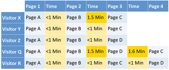
Well, not to worry! Your JavaScript implementation isn’t worthless even if you have a high amount listed here as disabled. This is just a reporting oddity. For some reason SiteCatalyst is counting all mobile visits as not accepting JavaScript. Obviously that is not correct. If you segment out mobile visits you can get a more accurate view for non-mobile devices. Here is an example of a segment you can use to get to non mobile.

With the segment applied you should see the percentage disabled drop to about 1% or less. Take comfort in knowing that non-mobile devices still love JavaScript.

But what about mobile devices? How are we going to tell what the acceptance rate is like in case we need to take a different implementation approach for mobile? Well, until this report changes, I would suggest looking at the devices in your mobile reports and compare them to the JavaScript information in DeivceAtlas. DeviceAtlas has a Device Data repository and they allow you to search for a particular device that you might be interested in. Once you look up the device you can check out the JavaScript section of the report for details on what is accepted. Here you can see that the iPhone 5 does accept JavaScript.

Now keep in mind that JavaScript settings are really an aspect of the phone’s browser and not the actual phone. A user can always modify their individual settings but this Device Atlas information gives you an idea of what the defaults are.

So, in the end, don’t worry about the JavaScript report in SiteCatalyst. JavaScript isn’t always the right thing to use with an implementation but in general it is still a very valid approach.

Analysis, Analytics Strategy, Presentation

Effectively Communicating Analysis Results

I was fortunate enough to not only get to attend the Austin DAA Symposium this week, but to get to deliver one of the keynotes. The event itself was fantastic — a half day that seemed to end pretty much as soon as it started, but in which I felt like I had a number of great conversations, learned a few things, and got to catch up with some great people whom I haven’t seen in a while.

The topic of my keynote was “Effectively Communicating Analysis Results,” and, as sometimes tends to happen between the writing of the description and the actual creation of the content, the scope morphed a bit by the time the symposium arrived.

My theme, ultimately, was that, as analysts, we have to play a lot of roles that aren’t “the person who does analysis” if we really want to be effective. I illustrated why that is the case…in a pie chart (I compensated by explaining that pie charts are evil later in the presentation). The pie chart was showing, figuratively, a breakdown of all of the factors that actually contribute to an analysis driving meaningful and positive action by the business:

What Goes Into Effective Analysis


The roles? Well:

  • Translator
  • Cartographer
  • Process Manager
  • Communicator
  • Neuroscientist
  • Knowledge Manager

I recorded one of my dry runs, which is available as a 38 minute video, and the slides themselves are available as well, over on the Clearhead blog.

It was a fun presentation to develop and deliver, and a fantastic event!

Analytics Strategy

Social media is like coffee …

Last week was an awesome week for digital measurement, especially if you were in San Francisco. The week started with a resurgent Webtrends, kicking off their Streams product at their annual Engage user conference, and ended with what is undoubtedly the largest gathering of tag management users and wonks in the industry at Ensighten Agility. Both were great events, exceptionally well run throughout, and my team and I were honored to be invited to present and participate in both.

While both conferences had great speakers, and I certainly learned a ton throughout the week, one of the most interesting presentations I saw was from Charlene Li of the Altimeter Group. I have never met Charlene but knowing a few of her analysts and her reputation I have a profound respect for both her knowledge and her business acumen. Demystified and Altimeter are alike in many ways — we even collaborated on a measurement piece a few years back — and so I find myself watching Mrs. Li and the growth of her firm for clues about what Demystified should do next.

One thing that Charlene said last week really stuck with me for a few days after her talk — the idea that “Social is like air”. I won’t do Charlene justice but you can read her thoughts in the Washington Times and the relevant piece is this (emphasis mine):

“I believe that in the future, social media will be like air – it will be anywhere and everywhere we want and need it to be. We’ve already seen the progression of this over the past five years, with Facebook Platform and APIs enabling social media features and content to be embedded in any application, in any mobile device application.”

Now I certainly don’t disagree that social media has and will continue to explode, becoming near ubiquitous from a platform perspective. Based on the past five years growth in social networks, and especially if you live in or near the Silicon Valley, one gets the sense that if you’re not investing like crazy in social that, well, something is simply wrong with you. So yes, I can definitely see how Mrs. Li would think that “social media will be like air” sometime in the coming future …

But for today, social media is like coffee.

Coffee? But that’s crazy, right? Not everyone likes coffee … some people drink tea, some prefer soda, some folks don’t drink anything but water. What’s more, coffee is an acquired taste, one that more often than not simply does not work for your palette, preference, or state of mind.

Exactly.

Social media is like coffee, which is to say that it’s great if you love it, but that social media is simply not for everyone. Nor every business.

Here I should point out that I do not disagree with Charlene or any other analyst, pundit, or business leader who believes that social media is A) transformational for business and B) tremendously important to our digital futures. At Analytics Demystified I have certainly seen (and more importantly, measured) amazing successes driven in large part by social media marketing and social campaigns; that said, I have also seen (and measured) an amazing amount of churn, thrash, and outright waste associated with “trying to leverage social media.”

For instance:

  • What if you are a marketer leading a Fortune 100 company whose primary focus is B2B … how should you leverage Twitter to drive leads?
  • What if you are a billion dollar hardware manufacturer whose name is virtually unknown to the public … do you need a Facebook page?
  • How about if you are a slow moving governmental organization … do you need a presence on YouTube?

The list goes on and on … and note that it will probably never include “retail, direct to consumer” anything as social has clearly (and measurably) transformed marketing in this sector, likely forever. But at the same time there is an awful lot of money being spent in the B2B and CPG space on “marketing” that is eying social media as if it is the only possible hope for the future …

… but it’s not, because companies can live without social media, just like you and I can live without coffee*.

The good news is this: You don’t have to take my or anyone’s word for it — go ahead and invest as much money as you want into social media. Buy traffic and followers on Twitter, build elaborate Facebook pages, and post “why Acme is great” videos to your YouTube channel to your heart’s content — so long as you have a clear, concise, and pre-agreed plan to A) measure the impact of your investment and B) determine whether said investment is “air” or “coffee” for your firm.

Yeah, you knew I’d bring it back to measurement, didn’t you?

I am confident in saying “social media is like coffee” because I have seen the proof. Social media is not for every business. Social media is not for every business plan. Social media is not the end-all-be-all that will save your company … neither is analytics for that matter. In much the same way that I eschew the silly notion of “data driven decision making” I encourage my clients to balance the things they hear with the things they know on the fulcrum of objective, trustworthy business analysis.

What do you think? Am I crazy? Am I missing something profoundly important or obvious? Am I just some redneck heretic from Oregon who doesn’t understand how Silicon Valley (or the Internet for that matter) works and thusly am doomed to failure? Or, like you, am I a business person and marketer who enjoys coffee profoundly …

… just not as much as air.

* Footnote: I cannot live without coffee, nor would I try … but I know some people who can.

Analytics Strategy, General

Why I am excited about Webtrends Streams

This morning we are very excited to announce that Analytics Demystified has partnered with Webtrends as a consulting and development partner on their recently announced Webtrends Streams platform. You can read all the details in the official Webtrends press release, and I contributed a lengthy post to the Webtrends blog that details why I am so excited about Streams and what we are able to do with it.

In a nutshell:

  • At Analytics Demystified we are increasingly seeing clients integrating disparate data as a rule, not an exception, in their reporting and analysis;
  • Because of the disparate and rapidly evolving nature of the connected world, this integration at times becomes complex to the point of being absurd;
  • Experience has shown that “traditional” analytics platforms do a reasonably poor job handling new data (e.g., mobile app data, social data, etc.);
  • I personally do not believe that this pace of change will abate — we will only have “more data” coming from “more devices” from this point forward.

Given all of this, for the past few years I have been on the lookout for a truly robust “generic” data collector — a device that would allow us to tag anything and that would deliver that data to us in a reasonably fast and programatic way. Essentially a log file for, well, everything digital … web sites, mobile apps, social interactions, geographic locations, in-game actions … even turning up the heat in your house or shutting off your lights when you’re not home.

I have seen many solutions that were close … some very close … but I think that Webtrends has solved the problem with Streams.

When you first see Webtrends Streams you’ll think “oh, yeah, real-time data … I have seen that before … it’s useless.” It turns out that the most interesting thing about the platform is not the real-time nature of Streams; that is really more of a “nice to have” than the core value proposition. Also, Webtrends Streams is not for everyone. If you’re not using the analytics you already have with any level of proficiency to create tangible business value … well, you’re probably better off focusing on that first.

But if you’re like an increasing number of Analytics Demystified clients, and if you’re ready to start really pushing the envelope with what you’re able to do with the multiple, disparate data your business is inevitably generating, we’d love to discuss Webtrends Streams.

(I will be in San Francisco later this month and if you’d like a live demonstration of the product email me directly and we can set up a time to meet.)

Excel Tips

Converting a Date in Excel to Week, Bi-Week, Month, and More

I often find myself getting data out of one system or another (or multiple systems, and then combining them) as “daily” data — a series of metrics by day for a sequence of days. Sometimes, I work with that data at a daily level, but, often, I want to roll the data up by week, by month, or by some other time period.

For instance, if I want to look at the data weekly, I’ll use either the last day of the week or the first day of the week and then use a formula in a new column to convert each actual day to the “week” in which it falls:

Excel Date Conversion

In the example above, 1/15/2013 is a Tuesday that falls in a week that ends on Saturday, 1/19/2013. The same holds true for Wednesday (1/16), Thursday (1/17), Friday (1/18), and Saturday (1/19). As soon as get to 1/20/2013 (Sunday), I’m in a new week — a week that ends on 1/26/2013. Make sense?

By adding this column, I can create a pivot table that can easily generate weekly data for whatever metrics are in the spreadsheet.

This approach works for a number of different ways you might need to roll up daily data, so I thought a post that walks through some of the more common ones and the formula to carry out each conversion was in order. I’ve put all of the examples in this post in a downloadable spreadsheet that you can check out and play around with.

Day of Week

The WEEKDAY() function returns a number — 1, 2, 3, 4, 5, 6, or 7. But, what if you actually want the day of the week in plain English?

Excel Dates: Weekdays

You can use the CHOOSE() function and hard code values. Or, you can make a separate table that maps a number to each weekday and use VLOOKUP to populate the values. I’m not going to discuss either of those approaches…because my preferred approach is to use the TEXT() function.

For the fully written out weekday (“$A3” is the cell with 1/15/2013 in it — you would just drag this formula down, or, if you’re using an Excel Table, it would autofill):

=TEXT($A3,”dddd”)

For the 3-letter weekday:

=TEXT($A3,”ddd”)

Easy-peasy, no?

Note: If you simply want the date to be displayed as the weekday, you don’t need a formula at all — you can simply change the cell formatting to a custom format of “dddd” (for the full weekday) or “ddd” (for the 3-letter weekday). If you do that, the display of the data will be as a weekday, but the underlying value will still be the actual date. This formula actually makes the value the weekday. Depending on what your needs are, one approach or the other will make more sense.

Convert to “Week Of”

The example I started this post with is converting each day to be the day that ends the week or the day that starts the week. To do this, you can use the WEEKDAY() function. The easiest way to understand how this works out is to write out (or put in Excel) a series of dates and then write the numbers 1 through 7 as you go down the dates. The farther you go into a week, the bigger the WEEKDAY() value is. So, if you subtract the WEEKDAY() value from the actual date, you will get the same value 7 days in a row, at which point the value will “jump” seven days. Make sense (it’s confusing…until it’s not)?

So, to convert a date to be the Saturday of the week the date falls in, use this formula (the “+7” just keeps the converted value from being the Saturday of the previous week):

=$A3-WEEKDAY($A3)+7

It’s the same idea if you wanted to use the first day of the week, with the week defined as starting on Sunday:

=$A3-WEEKDAY($A3)+1

Obviously, you can use this basic formula for whatever “week” criteria you want. You just have to either think about it really hard…or experiment until it’s doing what you want.

Convert to Bi-Weekly Date

Sometimes, a company operates on a bi-weekly cycle in some ways. For instance, a lot of companies pay their employees every two weeks. WEEKDAY() doesn’t work for this, because it doesn’t tell you which of the two weeks a day falls into.

In this case, I use MOD(). This function is, basically, a “remainder” function, and its main use is to calculate the remainder when one number is divided by another (for instance, “=MOD(14,4)” returns “2” because, when you divide 14 by 4, you get a remainder of 2).

Well, Excel dates are, under the hood, just numbers. You don’t really need to know exactly what number a date is (although you can change the cell formatting to “Number” when a date is displayed and you will see the number). But, if you think about it, if you divide a date by 14, it’s going to have a remainder between 1 and 13. Let’s say the remainder is “2.” So, what will the remainder be if you divide the next day by 14? It will be “3.” And so on until you get to 13, at which point the next day, if divided by 14, will have a remainder of 0. Hmmm. This seems like we’ve recreated the WEEKDAY() function used above…but with a 14-day long period instead of 7-day one, right? Exactly!

So, if we wanted to convert a date to be the Saturday at the end of the bi-week period, it would be one of these two formulas (depending on which Saturday is the cutoff and which is the mid-period point):

=$A3-MOD($A3-1,14)+13

or

=$A3-MOD($A3-8,14)+13

If you wanted to use the start of the period, with the week starting on Sunday, then it would be one of these two formulas:

=$A3-MOD($A3-1,14)

or

=$A3-MOD($A3-8,14)

Again, it takes some experimentation if you want to adjust to other dates, but the “14” will not change as long as you’re working on bi-weekly periods.

Convert to Bi-Monthly Date

Sometimes (again, company pay periods are a good example), rather than using a bi-weekly calendar, you want to use a bi-monthly calendar — every date from the 1st through the 14th should be converted to the first day of the month, and every day from the 15th through the end of the month should be coded as the 15th. To do this, we use the DATE() function with an IF() statement for the day value:

=DATE(YEAR($A3),MONTH($A3),IF(DAY($A3)<15,1,15))

We know the year is the YEAR() of the date being converted, and we know the month is the MONTH() of the date being converted. But, we need to look at the day of the month and check if it is less than 15. If it is, then we return a day value of “1,” and, otherwise, we return a day value of “15.”

Convert to Monthly Date

Monthly is almost as common, if not moreso, than weekly. To convert to the first day of the month is a straightforward use of the DATE() function. We pull the year using the YEAR() function on the date we’re converting, the month using the MONTH() function on the date we’re converting, and then simply hard code the “day” as “1:”

=DATE(YEAR($A3),MONTH($A3),1)

But, what if we want to use the last day of the month? We can’t hard code the “day” value because that day could be 28, 29 (leap year), 30, or 31. Curse you, Gregorian calendar!!!

Well, actually, this isn’t all that complicated, either. Why? Because the last day of the month is always the day before the first day of the next monthHuh? That’s right. That’s how we get the last day of the month: we use the DATE() function to figure out the first day of the next month (by adding 1 to the MONTH() value)… and then subtract 1:

=DATE(YEAR($A3),MONTH($A3)+1,1)-1

How do you like them apples?! [idiom ref.]

As an interesting aside, it would be understandable if this formula broke for the month of December. In that case, you’re actually telling Excel to calculate a date where the month is “13.” Luckily, Excel figures out what you mean and winds up returning January 1 of the following year (from which the formula then subtracts one to return December 31st).

But, What About…

I’ve just scratched the surface with possible date conversions in this post. Hopefully, the different approaches I described will trigger an idea or two for your specific situation. But, if you’ve got one that is stumping you, leave a comment here and I’ll take a crack at it!

And, all of the examples here are included in this downloadable spreadsheet. You can change the “start date” in cell A3 and all of the subsequent dates will automatically update. Happy date converting!

Analytics Strategy, Featured

Re-Examining Attribution

Attributing credit across a multitude of marketing efforts is one of those sticky problems in digital analytics that seems to generate a whole lot of controversy. This is a topic that comes up with nearly all of my clients and is one that both Eric T. Peterson and I have been researching and writing about for some time now. My latest findings on attribution will be published in a whitepaper sponsored by Teradata Aster, titled, Attribution Methods and Models: A Marketer’s Framework, but you can tune in to our webcast on January 16th, to get the high notes.

While some pundits will argue that attribution is not worth the trouble and that all attribution models are flawed, others contend that attribution simply requires a healthy dose of marketing science, which will enable marketer’s to reap benefits tenfold. At the risk of opening up a whole can of Marketing Attribution worms, I’ll offer my Marketer’s Framework for Attribution, which is a pragmatic approach to organizing, analyzing, and optimizing your marketing mix using data. But first, let’s define marketing attribution:

Analytics Demystified defines Marketing Attribution as:

The process of quantifying the impact of multiple marketing exposures and touchpoints preceding a desired outcome.

The first question that you need to ask yourself is whether or not you really even need to include attribution in your analytical mix of tools, tricks, and technologies. I offer this as a starting point because attribution isn’t easy and if you don’t really need it, then you can save yourself a whole lot of headaches by short-cutting the process and offering a data-informed validation of why you don’t want to mess with attribution.

The approach I offer is shamelessly ripped-off from Derek Tangren of Adobe, who blogged; Do we really need an advanced attribution marketing model? Derek encourages his readers to answer this question by looking at their existing data to determine what percentage of orders occur on a user’s first visit to your website vs. those that occur on multiple visits. I bastardized Derek’s idea and applied it to help marketers understand how many visits typically precede a conversion event. While Derek offers a way to do this using Adobe Omniture, I’ve created a custom report within Google Analytics that does virtually the same thing. I call it the Attribution Litmus Test.

My version is a quick sanity check for those of you running Google Analytics to determine the number of conversions that occur on the first visit versus those that occur on subsequent visits. To use this, you must have your conversion events tagged as Goals within Google Analytics (which you should be doing anyway!). If you’d like to run the Attribution Litmus Test on your own data within Google Analytics, you can add the Custom Report to your GA account by following this link: http://bit.ly/Attribution_litmus_test. Remember that you must have goals set up in Google Analytics for this report to generate properly.

So now that you’ve determined that Attribution is a worthwhile endeavor to pursue for your organization, let’s dive into the Framework. According to a study conducted by eConsultancy, only 19% of Marketers have a framework for analyzing the customer journey across online and offline touch points. Yet, the reality of consumer behavior today illustrates that multi-channel marketing exposures and multiple digital touch points are commonplace. As such, Marketers need a method for understanding their cross-channel customers in a systematic and reproducible way.

Step 1: Identify Your Data Sources

The first step in utilizing an Attribution Framework is to identify and input your data sources. Because advanced attribution requires understanding marketing effectiveness across all channels, it means that you must acquire data from each channel that potentially impacts the customer path to purchase. Typical digital channels may include: display advertising, search, email, affiliates, social media, and website activity.

Step 2: Sequence Your Time Frame

All attribution models must consider time to understand which marketing exposures occurred first, and also to discern the latent impact of exposure across channels. This requires that organizations sequence their data. While numerous data formats will likely go into the model, we’ve seen the greatest success when attribution data is stored and aggregated within a relational database.

Step 3: Apply Attribution Models

The actual attribution models will determine how you look at your data and make determinations about which marketing channels, campaigns, and touch points are effective in the context of your entire marketing mix. There are five models that are commonly used in the attribution world: First Click, Last Click, Uniform, Weighted, Exponential. To learn more about these models, tune into the webcast where I explain each in more detail.

Step 4: Conduct Statistical Analysis

After the data has been prepped, sequenced, and cleansed; this is typically where Data Scientists conduct general queries, apply business logic, and run what-if analyses against the model. At agencies that specialize in attribution modeling like Razorfish, they have an advanced analytics team comprised of data scientists that attack the data. They’re looking for correlations to identify if users are exposed to marketing assets A>B>C, are they likely to take action D?

Step 5: Optimize Marketing Mix

Of course, the ultimate goal in utilizing an attribution framework is to make decisions that impact your marketing efforts. These decisions can be strategic such as: deciding to invest in a new social media channel; discontinuing use of a non-performing affiliate partner; or reallocating budget to highly successful channels. But an attribution model can also play a major role in making daily life marketing decisions such as: which keywords to bid on during a specific campaign; who should receive an email promotion; or where to place that out of home billboard to attract the most attention.

In conclusion, Marketing Attribution continues to be an Achilles’ heel to many marketers. But, the good news is that approaching attribution with the right toolset and a framework for solving the attribution riddle is definitely the way to go. Throughout my latest research, I talked with companies like Barnes & Noble, LinkedIn, and the Gilt Groupe to learn how they’re using and applying Marketing Attribution models. I’ve also had the good fortune to demo some of the latest attribution tools from industry leading vendors like Teradata Aster and Visual IQ. Through this research, I learned that there is some truly innovative work going on with regard to attribution, but there is no single best way to do it. I’d love to hear how you’re solving for attribution. Please shoot me a note, tune into our webcast, or comment on how you’re re-examining attribution.

Adobe Analytics

Alternative Conversion Flows

Many online marketers have a desire to test out different conversion flows on their website. Whether those flows are for an alternative checkout process or a new application process, the overall desire is the same. By testing out an alternative conversion flow, you can see how website conversion differs and find opportunities to optimize your website and boost conversion. In this post, I will share how you can track these alternative conversion flows in Adobe SiteCatalyst.

Conversion Flow eVar

Luckily, tracking alternative conversion flows is easy in SiteCatalyst. As you probably already know, SiteCatalyst provides Conversion Variables (eVars) that area meant to be set and used to break down various website conversion events (Success Events). Therefore, eVars can be used to store the names of your various conversion flows. For example, let’s imagine that you work for a credit card company and have a standard 4 step application process, but want to test out a streamlined 3 step process. To do this, all you need to do is create a new “Conversion Flow” eVar and pass the appropriate value to it at the start of each process flow. If the current website visitor has been shown the 4 step process, you would pass in a value of “credit-card:4-step” and if the visitor was shown the 3 step process, you would pass a value of “credit-card:3-step” to the eVar. This simple action allows you to segment your website success events into two buckets and see how each conversion flow plays out with respect to conversion:

In this example, we can see that the 3-step process looks to be converting better than our default 4 step process. As always, this new conversion flow eVar can be broken down by other eVars (i.e. Campaigns) and can be used as part of a segment in SiteCatalyst. If you want the results of the test to be limited to one visit, you would set the eVar expiration to “Visit” but if you have cases where you want to retain which flow they were in beyond the visit, set the eVar expiration accordingly (i.e. Month).

Another thing to keep in mind when using this conversion flow eVar is that it can be used over and over again. Once you are done with the preceding conversion flow test, you can re-use the same eVar for other conversion flow tests. When re-using this eVar, you will just want to make sure that preceding tests are completed. I have seen some clients who try to cram too much into a conversion flow eVar and forget that subsequent values will overwrite preceding ones if values are passed to the same eVar.

Concurrent Flows or Tests

So what do you do if you have multiple conversion flow tests taking place simultaneously? For example, let’s say that in addition to the 3 vs. 4 step conversion flow test above, you are also testing landing page A vs. landing page B? This presents a real quandary, since SiteCatalyst does not have a great way to deal with this.

The easiest way to track multiple conversion flows or tests is to use multiple eVars. I suggest that you identify the general types of flows or tests you will have and assign an eVar to each. For example, if your website routinely does landing page tests and conversion flow tests, you might reserve one eVar for each. Each visitor would be assigned a value in both eVars and you can break one down by the other. For example, in the preceding example, if visitors were assigned a landing page value in an additional eVar, the above report might look like this when broken down:

Obviously, this approach has some limitations since, if you do a lot of different types of tests, you will use up many eVars, but this is probably the most straightforward approach.

The other approach, albeit one that I have not yet tried with a client, is using a List Var to store the various test values. As you may recall, SiteCatalyst provides three List Vars that allow you to store multiple values in one eVar. I don’t see why you could not use a comma-separated list of values and put all of the various tests that a visitor is part of in that eVar. However, since I have not yet tried this, there may be some unforeseen downsides to doing this. For example, there may be cases in which you need to remember which flows/tests visitors have been in and persist those values to the List Var to avoid a string of two or three test values being overwritten by a single test value deep within your website. If you are going to try this approach, I suggest you pre-pend each value with the type of test it relates to such as “landing:control” and “app-flow:4-step” so you can differentiate each in the List Var report. However, for now, I suggest that you begin with the multiple eVar approach.


Analytics Strategy, General

Happy New Year from Analytics Demystified

On behalf of the rapidly growing team at Analytics Demystified I wanted to wish all of my clients, readers, and friends a Happy New Year! I say rapidly growing because 2012 saw unprecedented growth for the Demystified team:

  • In February we added Brian Hawkins to the team to build out our Testing, Optimization, and Personalization practice. Testing has long been a fundamental component of our strategic client engagements, and adding Brian to the team has allowed us to take our support for optimization to entirely new levels. With nearly a year with Demystified under his belt, the one thing that strikes me as most impressive about Brian (and client’s clearly agree) is how he never runs out of great ideas for testing! Check out Brian’s blog to see what he is up to …
  • In September we added Kevin Willeitner to the team to build out our Implementation and Systems Integration practice. One of the most common requests we had from clients following our strategic work has been “can you help us implement your recommendations?” While we have worked in the past with a variety of third-parties and partners, at the end of the day what clients were saying was “can YOU help us …” — it turned out more than anything clients were looking for the seniority and stability that Analytics Demystified has long stood for in the analytics industry. When I realized this, I immediately went and hired the best systems integrator I knew, Kevin Willeitner, and not to brag, but Kevin recently helped one of our clients deploy Google Analytics Premium via Ensighten across nearly 50 brand, mobile, and social sites … all in less than 45 days. See what Kevin is thinking about these days …
  • In December, again responding to key strategic clients telling us they were tired of working with junior, unskilled, and inexperienced consultants who ended up creating as many problems as they solved, we added Michele Kiss to the Demystified team to build out our Analysis and Analyst Support practice. Michele is a certified analytics industry rock-star, often referred to as “the voice of analytics,” and has an amazing breadth of experience as an end-user client and consultant. Check out Michele’s blog and learn more about our newest Partner …

Adding Brian, Kevin, and Michele to the team, augmenting the amazing work that John, Adam, and I have long been doing for clients, really amounts to a shift in what Analytics Demystified is able to do for our clients. Whereas in the past we have had to rely on other firms, partners, and vendor resources … now clients are able to form a strategic partnership with Analytics Demystified and work with the most experienced consultants in the industry, exclusively. In the short span of 12 months we have gone from a largely strategic firm, providing oversight over dozens of moving parts, to a single-source provider of the deepest body of analytics expertise available in the industry today.

Pretty cool, at least for our clients.

I sincerely hope that your 2012 was as amazing, productive, and exciting as mine was, and that you are similarly excited about what 2013 will bring. If you have any questions about Brian, Kevin, or Michele, or how the entire Analytics Demystified team might be able to help you expand your use of analytics, don’t hesitate to reach out and we can set up a time to talk.


Analytics Strategy

Breaking in to the Digital Analytics Field

Over the past few years, I’ve been asked many times for advice on how to “get into digital analytics.” Without fail, these requests come from people who have gotten just enough of a taste of the field that they’re pondering a redirection of their career. After having written a long-ish email in response to one request…and then having forwarded that same email along multiple times in response to other requests…I realized I had this blog thing-y that might be more efficient than email forwards! This post is a (greatly) expanded update of that email.

But, Honestly, I’m Not the Best Person to Answer the Question…

Take anything in this post with a huge grain of salt, as it’s inherently a “Do as I say do…which only barely relates to what I did.” If you wanted to follow the Tim Wilson Digital Analytics Career Path Model, you would:

  1. Get a degree in architecture and start out your career drawing details of how drywall should be placed around windows in tilt-wall commercial building
  2. Change careers entirely within 3 years of getting that degree to become a technical writer
  3. Learn HTML while working on an intranet site for a group you supported as a technical writer
  4. Become the business owner of an online community at the same company where you taught yourself HTML (…because you’d taught yourself HTML)
  5. Inherent ownership of the web analytics tool because no one else wanted it
  6. Stumble into a web marcom manager role in the same company because a bunch of other people in the company changed jobs and they needed someone to backfill the marcom role…and take web analytics ownership with you
  7. Stumble (again) into a role in the BI department at that same company when you’d intended to simply transition web analytics ownership to them…

You get the idea. The steps in my career, while unique in detail, are similar to most of the people who have been working with web/digital analytics for a decade a more. We all started out doing something entirely different and only settled into digital analytics through the grace of random and fortuitous circumstance (semi-well-known trivia: Eric Peterson’s undergrad degree was in fungi — mycology!).

In short, I’m a lousy person to ask for a discrete set of steps — my own entry and development in the field has been much more of a drunken stagger than a measured march!

Read the rest of this post with that grain of salt tucked into your cheek, okay?

Most Important: Start Doing Analytics

On the one hand, getting paid to do digital analytics has the same Catch-22 as many professions: companies want even the “junior” people they hire to have at least some experience in the field. How do you get experience if you have to have experience?!

Luckily, with digital analytics, where there’s an interest, there’s a way. If one of the items on the list below isn’t a reasonable possibility for you, then stop reading this post and use your internet connection to contact someone to get you off of the remote desert island or distant planet where you must be stranded:

  • Get a login to your company’s web analytics account and start trying to answer questions about the visitors to your site. These don’t have to be actionable, earth-shattering questions by any means. Just ask questions and see if you can answer them. If there is a person or team who owns web analytics for the company, ask them what questions they get most often and see if you can answer them. Try to see how clearly you can explain where the data you’re seeing in the tool actually comes from.
  • Set up Google Analytics on a site where you can actually make changes to the site. The kicker here is that, ideally, you wouldn’t have to create a site from scratch to do this. It’s easy enough to set up a brand new site…but that site will have nearly zero traffic. That means nearly zero data. But, look around your personal network: which of your friends has a small business with a web site? Does your church have a site? What about your niece’s soccer league that your brother manages? As long as you promise that you won’t break the site (and it’s verrrrrrry low risk that you will), you can find someone who will let you implement Google Analytics and start doing some analysis for them.
  • Sign up as a Student for The Analysis Exchange.  This is an organization that connects non-profits with an analytics mentor (someone who has solid experience in the field) and a “student” (explicitly does not have to be someone who is formally in school — that’s a misperception they have to explain fairly often) to do a real project for a real organization. The projects are generally fairly short, so it’s not an inordinate amount of time. The challenge here is that it may take a while to get assigned to a project (if you find an organization and get the organization to sign up…you can, I think, ensure that the organization selects you as the student, though!).

Read a Book…Maybe

I’ve gotten the, “What’s a good book to read…?” question as part of the requests that spawned this post…and I always feel a little guilty when I recommend books that I haven’t actually read. I actually do quite a bit of industry-oriented reading, including books, but I tend to think what I’m reading isn’t necessarily a great fit for what the person who is asking is looking for.

The first book I read on web analytics was Jim Sterne’s Web Metrics: Proven Methods for Measuring Web Site Success. That book is now a decade old. Eric Peterson’s Analytics Demystified: A Marketer’s Guide to Understanding How Your Web Site Affects Your Business is only a couple of years younger. Both books absolutely nail both fundamental truisms and touch on aspects of “how the internet works (technically) from an analytics/data capture perspective.

But, the internet has evolved dramatically over the past decade. So, are those books still relevant? For chuckles, I grabbed Eric’s book and opened it to a random page (page 88) and read the first paragraph my eyes landed on. I’m not making this up. Here’s what it said:

Another important thing to keep in mind regarding campaign analysis is that there is no reason to limit your measurement to only online campaigns. For many successful businesses of reasonable size, online advertising is only part of the total marketing program. If you also run television spots, radio ads, print ads or create and distribute brochures, you can make a reasonable attempt at quantifying the effect each have at driving visitors to your Web site by creating unique, branded landing pages.

The only thing that is at all dated about this paragraph is that there is no mention of social media (the book was published the same year that Facebook was launched) or mobile devices.

A more recent book (2007) is Avinash Kaushik’s first book: Web Analytics: An Hour a Day. That’s a lengthier tome, but it’s designed to be consumable in bite-sized chunks. And, while I have a copy, I have only lightly skimmed it (see the note at the beginning of this post about taking my recommendations with a grain of salt), but the opinion of the industry is that it is a great resource.

There are some fantastic tool-specific books on Google Analytics (look for books by Brian Clifton, Justin Cutroni, and Caleb Whitmore) and Adobe Sitecatalyst (by Adam Greco), too.

In other words, if you’re a book-reader, there are books out there.

Read Some Blogs…Definitely

Get your blog reader of choice set up (I’m a Google Reader guy on my laptop and use Feedly on my iPad) and start subscribing to blogs. Rather than listing specific blogs — I’d inevitably include an inadvertent stinker or two, and I’d inevitably miss something — here are some places to start:

  • The web analytics topic on Alltop — it’s a “too short” list, but a great starting point
  • The various List.ly that Stéphane Hamel links to — Stéphane has long maintained various iterations of resources for the community, with List.ly being the latest repository for that work (so some of the lists in this link were set up by others)
  • My Measurement and Analytics Google Reader feed (RSS feed) — this has a heavier dose of data visualization and social media stuff with a few eclectic bloggers thrown in, so it is a “distant third” on this list

I also use Zite on my iPad for on-going content discovery by including Google Analytics, Web Analytics, and Analytics categories in the app.

Meet #measure

If you’re not active on Twitter — both consumption-wise and conversation-wise — then this won’t be a useful tip. But, if you are, then set up a stream for #measure. To be clear:

  • There WILL be a lot of extraneous junk in this stream
  • You do NOT need to read everything — dip in and browse regularly
  • You WILL start to identify specific accounts worth following more closely pretty quickly (and, if they have a blog — add them to your blog list)
  • You CAN (and SHOULD) engage with the tweets you find interesting or have questions about

If you’re on the fence about using Twitter to dig in, then you can read more in this post (by me) or this post (by Michele Kiss…who is a more credible Twitter resource on that front!).

Attend Events

Conferences can be expensive, especially if they’re occurring in a place that requires air travel to get to. But, keep an eye on the schedules for #ACCELERATE, eMetrics, and DAA Symposiums (at some point, you will want to join the Digital Analytics Association and become involved as well) and see if you can come up with a way to attend. You’ll get as much (or more) from the people you meet as you will from the content.

Check to see if there are Web Analytics Wednesdays in your area and attend those. Here’s a tip: if there is not a WAW schedule on the calendar, click on the “Global Event Locations” link to bring up a word cloud of locations that includes historical events. If your city is listed, click on it and contact the organizer(s) via email about any plans for upcoming events (offering to help with the planning is a great way to get a response!). WAWs are open to anyone who has an interest in digital analytics. Don’t worry that you shouldn’t attend because you’re not an experienced analyst. Everyone is welcome, and it’s a great way to make local contacts in the field.

And, Finally, Some Words of Wisdom from the Wise

The information and resources above are intended to truly be “how to get started” material. They’re inherently tactical and are geared towards getting a foot in the door and building some basic skills. It’s worth a read of two blog posts from two very highly regarded and successful digital analysts:

This List Is Incomplete

I consciously tried to make this post succinct and tactical. And it still got to be pretty long. AND it’s an incomplete list. If you’re an experienced analyst with ideas as to what is missing, or if you’re a newer analyst who has found great resources that aren’t listed here, please add the suggestions as a comment!

General

Michele Kiss joins the team at Analytics Demystified

I am both thrilled and humbled to announce I have joined the Analytics Demystified team as the newest partner, adding dedicated analyst services to enhance Demystified’s offerings to clients. I will be helping Demystified clients use analysis to proactively identify business opportunities, as well as developing the right skill sets and teams to generate insights internally. I truly love exploring data and finding hidden opportunities, as well as sharing my knowledge and developing others. I enjoy discussing, writing and speaking about digital marketing and analytics, including contributing to industry journals, podcasts and speaking at conferences.

Prior to Demystified, I worked as a client-side and agency practitioner across a variety of verticals, including automotive, telecommunications and technology, ecommerce, travel, restaurant and entertainment, and home building. I have had an opportunity to work in web, mobile, marketing and social analytics using market-leading solutions.

I am an avid contributor to the digital analytics community via my work with the Digital Analytics Association (I am currently the Co-Chair of the Membership Committee), the Analysis Exchange, where I help mentor budding analysts to provide (free!) consulting to non-profit organisations and of course, Twitter, where you can follow me at @michelejkiss.

On a personal note, I am originally an Aussie (though you wouldn’t know it from speaking to me – the accent is, sadly, long gone, though my stubborn adherence to Australian spelling has persisted), now living in Boston, MA. I am an avid technology and gadget fan, mainly of the Apple variety, and love to explore new digital trends. I am also a certified Les Mills instructor, so you might find me in the gym from time to time!

You can contact me on michele.kiss@analyticsdemystified.com or reach me via Twitter on @michelejkiss.

Analysis

Quotable Quotes from Nate Silver

It’s hard to be an analyst and not be a fan of Nate Silver. Actually, I think it might actually be the law — one of those “natural law” things, like gravity (“Obey gravity! It’s the law!”), rather than one of those legislated ones.

Not too long ago, I wrote a post that gave my take on one aspect of the post-election commentary about Silver’s work. In some of the Twitter exchanges around that post, Jim Cain suggested that I really should read Silver’s book, as the content of the post lined up well with some of the topics Silver covered. I’d planned to read the book over the holidays, anyway, but his nudge convinced me to go ahead and buy the Kindle edition and bump it up to the top of my list.

THAT was a great move (thank you, Twitter and Jim!). I’ve still got some digesting (and rereading) to do, but I thought I’d throw out some of my favorite quotes from the book as a blog post. In order of appearance…

The most elegant description of the why and what of having massive amounts of data at your disposal to tell whatever story you want:

The instinctual shortcut that we take when we have “too much information” is to engage with it selectively, picking out the parts we like and ignoring the remainder, making allies with those who have made the same choices and enemies with the rest.

On the role of the analyst and the necessity for thought behind the data:

The numbers have no way of speaking for themselves. We speak for them. We imbue them with meaning…Data-driven predictions can succeed–and they can fail. It is when we deny our role in the process that the odds of failure rise. Before we demand more of our data, we need to demand more of ourselves.

But…also recognizing that people are not machines (he spends a lot of time breaking down the evolution of chess-playing computers to articulate the strengths and weaknesses of computers and humans when it comes to prediction):

We can never make perfectly objective predictions. They will always be tainted by our subjective point of view.

Silver actually quotes John P. A. Ioannidis, author of a paper called “Why Most Published Research Findings Are False,” at length and then explains in simple terms the mathematical realities of digging into Big Data:

“In the last twenty years, with the exponential growth in the availability of information, genomics, and other technologies, we can measure millions and millions of potentially interesting variables,” Ioannidis told me. “The expectation is that we can use that information to make predictions work for us. I’m not saying that we haven’t made any progress. Taking into account that there are a couple of million papers, it would be a shame if there wasn’t. But there are obviously not a couple of million discoveries. Most are not really contributing much to generating knowledge.”

This is why our predictions may be more prone to failure in the era of Big Data. As there is an exponential increase in the amount of available information, there is likewise an exponential increase in the number of hypotheses to investigate. For instance, the U.S. government now publishes data on about 45,000 economic statistics. If you want to test for relationships between all combinations of two pairs of these statistics–is there a causal relationship between the bank prime loan rate and the unemployment rate in Alabama?–that gives you literally one billion hypotheses to test.

But the number of meaningful relationships in the data–those that speak to causality rather than correlation and testify to how the world really works–is orders of magnitude smaller. Nor is it likely to be increasing at nearly so fast a rate as the information itself; there isn’t any more truth in the world than there was before the internet or the printing press. Most of the data is just noise, as most of the universe is filled with empty space.

I have a whole slew of reading and understanding-deepening to do around Bayesian reasoning, Fisher’s statistical method, Frequentists, and all sorts of other data science-y topics spawned by the middle part of the book (so, my original plan to read this book has now been replaced by a plan to dig into Matt Gershoff’s list of data science and machine learning resources). Silver is a strong believer in what he calls “The Bayesian Path to Less Wrongness:”

…I’m of the view that we can never achieve perfect objectivity, rationality, or accuracy in our beliefs. Instead, we can strive to be less subjective, less irrational, and less wrong. Making predictions based on our beliefs is the best (and perhaps even only) way to test ourselves. If objectivity is the concern for a greater truth beyond our personal circumstances, and prediction is the best way to examine how closely aligned our personal perceptions are with that greater truth, the most objective among us are those who make the most accurate predictions.

And, more on the “art and science” of analytics — the need to not simply expect the numbers to give the right answer on their own:

It would be nice if we could just plug data into a statistical model, crunch the numbers, and take for granted that it was a good representation of the real world. Under some conditions, especially in data-rich fields like baseball, that assumption is fairly close to being correct. In many other cases, a failure to think carefully about causality will lead us up blind alleys.

As analysts, how often are we faced with stakeholders who have unrealistic expectations of getting a black-and-white answer? The reality:

In science, one rarely sees all the data point toward one precise conclusion. Real data is noisy–even if the theory is perfect, the strength of the signal will vary.

And, finally, a conclusion that wraps with a clever turn on Reinhold Niebuhr’s Serenity Prayer:

Prediction is difficult for us for the same reason that it is so important: it is where objective and subjective reality intersect. Distinguishing the signal from the noise requires both scientific knowledge and self-knowledge: the serenity to accept the things we cannot predict, the courage to predict the things we can, and the wisdom to know the difference.

These were a sample of some of the passages I highlighted throughout the book. They capture a degree of the concepts and ideas that the book covers. They don’t — at all — cover the deeply researched examples that Silver uses to illustrate these ideas. From poker to election prediction to weather forecasting (which has gotten much better in the past few decades) to earthquake and financial market prediction (that have barely improved at all when compared to weather forecasting) to predicting terrorism, the depth and breadth of his research is impressive!

I suspect I will be returning to specific aspects of his book in greater detail in the future, but this was a fun re-skim to remind me that the writing and ideas were both outstanding!

Adobe Analytics

Products & SKU’s

When I work with retailers who use Adobe SiteCatalyst, one topic that often emerges is the best way to handle the tracking Product ID’s and SKU’s. In this post, I will outline the challenges that exist and share some ways to handle product and SKU tracking in SiteCatalyst.

The Product vs. SKU Dilemma

The primary challenge that arises when it comes to Products and SKU’s is that there are often cases in which you have to set conversion Success Events at the point you know only the Product ID and other cases in which you know the Product ID and the detailed SKU. This is best illustrated by an example. Imagine that you are a retailer and one of the products you sell is a sweater. At the point that a website visitor views the product page for the sweater, you would want to set a Product View Success Event and the Products Variable (s.products). In this case, you most likely have a Product ID for the sweater being looked at by the visitor so you might pass that to the Products Variable such that your tagging looks like this:

s.events="prodView,event1";
s.products=";ProductID-111";

So far so good. However, now let’s assume the website visitor chooses a color for the sweater (i.e. blue) and adds it to the shopping cart. In this case, you probably still know the Product ID, but also have a more detailed SKU that represents the sweater with the color being “blue.” Now you have two tagging choices. During the Cart Addition (scAdd) Success Event, should you pass the Product ID # (ProductID-111) or the more detailed SKU as shown below?

s.events="scAdd";
s.products=";SKU-111_2";

The issue with the preceding code is that your Products report will be disjointed since Product Views will be tied to Product ID’s and Cart Additions (and presumably Orders and Revenue) will be tied to the SKU ID. Here is what a sample Products report would look like if the above visitor were the only visitor to the website:

This is clearly not ideal since you’d like to see a full funnel report for each Product or SKU. While we have the option of cleaning up this report by applying SAINT Classifications to roll it up by Product ID, this can be time consuming. Therefore, let’s look at a few ways to improve upon this reporting.

Solution #1 – Product ID Only

If our goal is to produce a clean Products report such that metrics are consistent for each Product ID, one approach is to only pass the higher-level Product ID to the Products variable for all shopping cart Success Events. In the preceding example, this would mean passing a value of “ProductID-111” with the Product View event and all other shopping cart events. This will allow you to see drop-off between these shopping cart Success Events by Product ID as shown here:

This is the most basic solution, but has one major drawback – it is not possible to see detail below the Product ID. Since you are only setting Product ID’s, there is no way for SiteCatalyst to magically allow you to breakdown the shopping cart Success Events by SKU since you haven’t provided the SKU. This approach works if your products don’t have detailed SKU’s, but if they do, you might find this option limiting and consider moving onto the next approach.

Solution #2 – SKU Merchandising

If your organization subdivides Products into SKU’s at the Cart Addition step, I suggest you use a different approach. In the past I have discussed Product Merchandising, which is a way in SiteCatalyst to associate an eVar value with a specific Products Variable value. Product Merchandising can be used in this situation to bind a SKU to each Product ID using a new SKU Merchandising eVar. In this case we will ask ClientCare to enable a new Merchandising eVar using the “Product Syntax” approach. Once this is done, we can pass the Product ID to the Products Variable as shown in the above solution, but additionally pass the SKU to a new Merchandising eVar whenever it is present:

During the Product View:

s.events="prodView, event1";
s.products=";ProductID-111";

During the Cart Addition:

s.events="scAdd";
s.products=";ProductID-111;;;;evar10=SKU-111_2";

Keep in mind that if we wanted, we could pass in the actual SKU value (i.e. “Blue” as the color) instead of using the SKU #, but passing the SKU# is ok since we can use SAINT to classify it later.

So far this may not seem to get us much further than we were previously, but as I will show, this set-up does make a big difference. First, you can see a complete funnel by Product ID as shown above by using the Products Variable. But now we have an additional eVar that can be used to see the conversion funnel by SKU. To do this, simply add shopping cart metrics to this new SKU eVar report and you can see everything except Product Views (since those don’t have a SKU):

Since you have two different variables, you can also use Conversion Subrelations to break the Product ID down by the new SKU eVar to see the Product ID metrics broken down by SKU for all shopping cart metrics except Product Views:

Final Thoughts

As always, there are many different approaches to things in SiteCatalyst, but hopefully the preceding gives you some things to consider when dealing with Products and SKU’s. If you have other cool approaches you have used, please leave them as a comment here. Thanks!

Analytics Strategy, Technical/Implementation

Adobe SiteCatalyst – ClickTale Integration

About a year ago, I wrote a blog post discussing ways that you could integrate Adobe SiteCatalyst and Tealeaf. In that post, I talked about some of the cool integration points between the two products. In this post, I’d like to talk about how the same integration would work with ClickTale and share some cool new things that are possible that go even beyond what is possible with Tealeaf.

What is ClickTale?

For those unfamiliar with ClickTale, it is an in-page analytics tool that allows you to record website sessions, filter them and play them back. It is often used to see heat maps of pages and to “watch” website visitors and includes even their mouse movements. It is pretty cool technology since often times the best way to get internal stakeholders to understand website issues is to have them watch real users encountering issues.

In a similar manner to what I described in my previous Tealeaf post (which I suggest you read before continuing with this post!), it is possible to pass a ClickTale ID to SiteCatalyst via an sProp or eVar:

Having this ClickTale ID in SiteCatalyst allows you to use the standard segmentation capabilities of SiteCatalyst to isolate visits or visitors who exhibit specific behaviors in which you are interested. For example, you might be interested in isolating visits where visitors reached checkout, but didn’t purchase:

Once you do this, it is possible to open the preceding ClickTale Session ID eVar and see a list of all of the ClickTale session ID’s that match this segment.

Adobe Genesis Extend (BETA) Integration

But as I noted in my preceding Tealeaf post, one of the frustrations of this type of integration is that once you isolate the session ID’s that you want to watch, you are stuck. You have to copy each one individually and then switch to the other application (i.e. Tealeaf) and then start the process of watching the session. My wishlist item in my previous post was that this process could be simplified so you can simply click and view the session, right from within SiteCatalyst. Believe it or not, doing this is now possible! Thanks to the creation of Genesis Extend (still in Beta), you can add a Genesis Chrome browser extension to your version of Chrome and get the ability to streamline this process for ClickTale (not Tealeaf unfortunately).

To do this, simply search for the Genesis Chrome browser extension and install it. When that is done, you will see a new icon in your Chrome browser which you can click to see the settings:

You will notice that there is a ClickTale box you can check (and also one for Twitter which allows you to see actual Tweets in referrer reports). From here you can enter your ClickTale authorization credentials and you are ready to go.


Back in SiteCatalyst, there is a free Genesis “labs” area you can visit to launch the wizard that helps you generate the code you need to capture the ClickTale ID in an eVar of your choice:

After you have completed the wizard and are collecting ClickTale recording ID’s in an eVar, you can open that report in SiteCatalyst, you will see a new link in each row…

…which allows you to click to view the actual recording in ClickTale:

It is also possible to use this new SiteCatalyst eVar to copy a list of ClickTale ID’s and paste them right into ClickTale to create a segment and look at heat maps for just those ID’s.

Final Thoughts

As you can see, this is a cool interface integration that is possible since both SiteCatalyst and ClickTale are “cloud” products. I would expect that you will see more of this in the future in more browsers or even natively as part of SiteCatalyst. If you are a ClickTale customer and use SiteCatalyst, you should definitely try this out!

Analysis, Testing and Optimization

Big Data without Digital Insight Management Is a Big Hot Mess

One of the many exciting aspects of joining a new company is the opportunity for reflection. The lead-up to the job change forced some introspection — what was it I really most enjoyed about my profession and what would a dream job look like that allowed me to spend as much of each day doing that as possible? And, as a new company, everyone has had to put their heads together to build out the processes needed to bring the vision for the company to life, which has required a different flavor of reflection: reflecting on what has and has not worked in our collective experience when it comes to enabling brands to be as data-informed as possible in their daily processes.

Shortly after joining Clearhead, I attended eMetrics in Boston. The conference, as always, was a great time. And, as often is the case, one of the conversations that stuck with me the most occurred where I didn’t expect it — in the exhibit hall during the sessions with a vendor I’d never heard of before the conference: Sweetspot Intelligence. Sergio Maldonado (@sergiomaldo) explained the vision for Sweetspot, gave me a brief product tour, and handed me a copy of the paper they sponsored Eric Peterson to write: Digital Insight Management: Ten Tips to Better Leverage Your Existing Investment in Digital Analytics and Optimization. The concept of “Digital Insight Management” is intriguing. And, luckily, it’s much more than an abstract idea — it’s real and, I believe, something that all analysts should be striving to implement.

Let’s Start with the Basics — Demystified’s Hierarchy of Analytical Needs

Early in the paper, Eric included Analytics Demystified‘s Hierarchy of Analytical Needs:

Experienced analysts look at this diagram and think, “Well…yeah. That’s a good depiction of the battle we fight every day.” Any sort of ho-hum response to the diagram is because we’ve been fighting the battle to move “up the pyramid” for a while, and we often feel undermined by the business environment in which we work. This is one of the more succinct and elegant depictions (not just the labels on the left — the assessment in the boxes on the right) that I’ve seen.

One Step Back Adds Another Element

When viewed through the lens of “what an analyst can do,” the hierarchy is complete. In some respects, the analyst can only lead the proverbial horse to water (clearly communicate a data-informed recommendation). The analyst can’t necessarily make the horse drink (take action). But, still, it’s worth recognizing that, if we take just one step back from this pyramid, we want to see one more level on the hierarchy:

Again, this is somewhat obvious. Yet, it’s where “we” (businesses) seem to so often stumble. There is so much “Data” now that marketers are now conditioned to prepend any mention of the word “data” with the word “big!” Few reports rely on data from a single source as analysts, and marketers work hard to place the data into meaningful context.  But, of course, the further up the pyramid we go, the easier and easier it is to get derailed. Ultimately…limited action.

Pivoting the Process

While the hierarchies above are unequivocally true, the actual process for meaningful analytics — analysis that drives relevant action — actually looks quite different:

Let’s break this down a bit:

  • Everything hinges on having clear objectives and measures of success — it’s scary how often marketers stumble on this, and, as analysts, it behooves us to be skilled in helping marketers get these nailed down (these are soft skills!)
  • Performance measurement is key…but it’s not the source of insights — performance measurement is the alerting system; it tracks the KPIs against targets, as well as some supporting and contextual metrics. But, the reports and dashboards themselves don’t yield insights — they surface problems that then need to be further explored.
  • All analysis starts with a business problem, business question, or business idea — the lefthand column is where th magic happens (or, all too often, doesn’t!).

It is impossible to attend any analytics-oriented conference these days without being hit over the head with how critical it is to develop and foster strong relationships with your business partners: regularly communicate, listen for the problems they’re having that your analytical skills can help with, learn how to communicate effectively, etc. That is a recurring theme because actually teasing out the right business questions and problems can be tricky!

Conversely, the back end of the process can be tricky, too. We’ve all had cases where we completed the right analysis and got actionable results…but action never occurred. As I understand it, that is where Sweetspot comes in: technology that supports communication and workflow related to getting actionable information to the people who can take action:

So…Will Tag Management Solve This?

(Blog authors get to crack themselves up with their headings…)

What Eric’s paper, and Sweetspot’s product, got me thinking about are a couple of gaps that, hopefully, I’ve covered in this post:

  • As analysts, we need to develop, implement, and own workable processes within our companies to make analytics truly gain and sustain traction
  • There is an opportunity for better technology to support these processes…and that is analytics technology that has nothing to do with the mechanics of capturing customer data

Is “Digital Insight Management” the next big thing? I think it is. Big Data is just a big hot mess without it.

Adobe Analytics, Reporting, Technical/Implementation

SiteCatalyst Tip: Corporate Logins & Labels

As you use Adobe SiteCatalyst, you will begin creating a vast array of bookmarked reports, dashboards, calculated metrics and so on. The good news is that SiteCatalyst makes it easy for you to publicly share these report bookmarks and dashboards amongst your user base. However, the bad news is that SiteCatalyst makes it easy for you to publicly share these report bookmarks and dashboards amongst your user base! What do I mean by this? It is very easy for your list of shared bookmarks, dashboards, targets and other items to get out of control. Eventually, you may not know which reports you can trust and trust is a huge part of success when it comes to web analytics. Therefore, in this post, I will share some tips on how you can increase trust by putting on your corporate hat…

Using a Corporate Login

One of the easiest ways to make sense of shared SiteCatalyst items at your organization is through the use of what I call a corporate login. I recommend that you create a new SiteCatalyst login that is owned by an administrator and use that login when sharing items that are sanctioned by the company. For example, if I owned SiteCatalyst at Greco, Inc., I might create the following login ID:

Once this new user ID is created, when you have bookmarks, dashboards or targets that are “blessed” by the company, you can create and share them using this ID. For example, here is what users might see when they look at shared bookmarks:

As you can see, in this case, there is a shared bookmark by “Adam Greco” and a shared bookmark by “Greco Inc.” While based upon his supreme prowess with SiteCatalyst, you might assume that Adam Greco’s bookmark is credible, that might not always be the case! Adam may have shared this bookmark a few years ago and it might no longer be valid. But if your administrator shares the second bookmark above while logged in as “Greco Inc.,” it can be used as a way to show users that the “Onsite Search Trend” report is sanctioned at the corporate level.

The same can be done for shared Dashboards:

In this case, Adam and David both have shared dashboards out there, but it is clear that the Key KPI’s dashboard is owned by Greco, Inc. as a whole. You can also apply the same concept to SiteCatalyst Targets:

If you have a large organization, you could even make a case for never letting anyone share bookmarks, dashboards or targets and only having this done via a corporate login. One process I work with clients on, is to have end-users suggest to the web analytics team reports and dashboards that they feel would benefit the entire company. If the corporate web analytics team likes the report/dashboard, they can login with the corporate ID and share it publicly. While this creates a bit of a bottleneck, I have seen that sometimes large organizations using SiteCatalyst require a bit of process to avoid chaos from breaking out!

Using a “CORP” Label

Another related technique that I have used is adjusting the naming of SiteCatalyst elements to communicate that an item is sanctioned by corporate. In the examples above, you may have noticed that I added the phrase “(CORP)” to the name of a Dashboard and a Target. While this may seem like a minor thing, when you are looking at many dashboards, bookmarks or targets, seeing an indicator of which items are approved by the core web analytics team can be invaluable. This can be redundant if you are using a corporate login as described above, but it doesn’t hurt to over communicate.

This concept becomes even more important when it comes to Calculated Metrics. It is not currently possible to manage calculated metrics and the sharing of them in the same manner as you can for bookmarks, dashboards and targets. The sharing of calculated metrics takes place in the Administration Console so there is no way to see which calculated metrics are sanctioned by the company using my corporate login method described above.

To make matters worse, it is possible for end users to create their own calculated metrics and name them anything they want. This can create some real issues. Look at the following screenshot from the Add Metrics window in SiteCatalyst:

In this case, there are two identical calculated metrics and there is no way to determine which one is the corporate version and which is the version the current logged in user had created. If both formulas are identical then there should be no issues, but what if they are not? This can also be very confusing to your end users. However, the simple act of adding a more descriptive name to the corporate metric (like “CORP” at the end of the name) can create a view like this:

This makes things much more clear and is an easy workaround for a shortcoming in the SiteCatalyst product.

Final Thoughts

Using a corporate login and corporate labels is not a significant undertaking, but these tips can save you a lot of time and heartache in the long run if used correctly. You will be amazed at how quickly SiteCatalyst implementations can get out of hand and these techniques will hopefully help you control the madness! If you have similar techniques, feel free to leave them as comments here…

Adobe Analytics

De-Duped Success Metrics

When working with SiteCatalyst clients, I often see them ask questions related to how often a particular Success Event takes place at least once during a visit. Examples of this might include the following questions:

  • In what percent of visits do visitors add an item to the shopping cart?
  • How often to visitors who add items to the cart reach checkout?
  • What percent of visits do visitors conduct an onsite search?

At first glance, these seem like easy questions to answer, but I see clients making mistakes with these questions. For example, let’s say that you want to answer the first question above and see the percent of all visits that add items to the shopping cart. Most clients would approach this question by creating a calculated metric that divides Cart Additions (scAdd) by Visits. While this seems logical, it will not give you the correct answer, since visitors can add multiple items to the shopping cart within the visit. If Visitor X adds three items to the cart in the visit, the formula in our calculated metric would be:

The issue is that since most people look at this metric for all visits, the individual Cart Addition numbers are obfuscated and you are often seeing an inflated percentage for Cart Add/Visit %. In fact, the same issue applies to all of the questions listed above. If you are looking to compare Cart Additions to Checkouts, multiple Cart Additions or Checkouts taking place in a visit could inflate your ratio.

So how would you resolve this issue? There are several ways in SiteCatalyst to accurately report on the preceding questions so I will share the various methods at your disposal.

Using De-Duped Success Metrics

The easiest way to resolve the preceding dilemma is to set an additional “de-duped” version of metrics that you want to see in calculated metrics like the ones above. Personally, I wish Adobe provided an easy way in SiteCatalyst to see a de-duped version of every Success Event, but that is not currently available. Therefore, you will have to create a second Success Event for those metrics that you want to use in these types of Calculated Metrics. Keep in mind that you are limited to around one hundred Success Events so you won’t want to do this for all of your Success Events, so use your best judgment.

In this case, let’s assume that you are interested in seeing an accurate percent of visits in which a Cart Addition took place. To do this, every time you set the normal Cart Addition Success Event (scAdd), you should set a second, custom Success Event and call it something like “Cart Adds (De-Duped).” For this second Success Event, you will want to apply Success Event serialization to prevent the event from being counted more than once in a visit. I would recommend using “Once per Visit” serialization since it requires less tagging and can be enabled by ClientCare. By setting this new Success Event, you will have a count of how often visitors add items to the cart, but it will only be counted once, regardless of how many times the visitor adds items to the shopping cart within the visit. When this is complete, you can create a calculated metric that divides this “Cart Adds (De-Duped)” metric by the Visits metric to see an accurate ratio for visits in which at least one Cart Addition took place:

To see the impact of this, let’s imagine that you had five website visitors that performed the following actions:

In this scenario, if we used a calculated metric that used Cart Additions and Visits, our ratio would be 120% for these five visitors. Obviously, this isn’t representative of what really happened. However, if we use our new “Cart Additions De-Duped” Success Event, we will only count one Cart Addition per Visit and see the following data:

Doing this provides a more accurate representation that 60% of visits contained at least one Cart Addition. And since you now have a Calculated Metric that is trustworthy, you can see the answer to this question trended over time using a report like the one shown here:

This Calculated Metric can be easily added to a SiteCatalyst Dashboard and can be used like any other Calculated Metric.

Note: Some companies implement the Carts (scOpen) Success Event at the first shopping cart addition and de-dup it using “Once per Visit” serialization. This is a similar approach, so if you are doing this, you can use the Carts Success Event divided by Visits to see the same cart rate.

As you can see, the addition of one more Success Event allows us to greatly improve our reporting for cases in which you want to see if something happened at least once in a website visit. If you look at the other questions posed above, you will see that the same concept can be applied. For example, if you want to see an accurate ratio of times that visitors do at least one Cart Addition and one Checkout, you might create a “De-Duplicated” version of Cart Additions and Checkouts and use those versions in your Calculated Metric.

Keep in mind that these new “De-Duplicated” metrics will not be accurate when used in Conversion Variable reports (i.e. Products Report, eVars, etc…) since they will only be counted the first time the Success Event takes place. This means that if a visitor adds three products to the shopping cart, only the first product will be associated with a value in the conversion variable (i.e. Product XYZ). These new “De-duplicated” metrics should only be used in global website calculated metrics and the normal metrics (i.e. Cart Additions) should be used in detailed Conversion Variable reports.

Segmentation Approach

If you are averse to using more Success Events to answer the questions above, it is possible to answer them using Segmentation. I think this method is more cumbersome, but will describe how to do it for educational purposes.

To use Segmentation to answer any “how often did X happen in a visit” question, you will have to create a Visit-based segment that isolates visits in which the Success Event in question took place. Using the preceding example, if you wanted to see how often visits contained a Cart Addition, you would create a Visit segment and add the Cart Addition Success Event to the segment as shown here:

Once you have this segment, you can open the Visits report and see how many Visits took place in the desired timeframe. For this example, let’s use the data for the five visitors we described above. In this case, three of the five visits would qualify to be included in the segment so our Visits report would show a total of three. Now you can write that number down and then remove the segment (go back to “All Visits”) and look at the same Visits report for the entire population. In this case, you would see a total of five visits, so you can divide the three Cart Addition visits by the total visits to get the same 60% we saw above. If this is something you will be doing on a recurring basis, you can automate this process using Adobe ReportBuilder. To do this, you would create two different data blocks in Excel – one for all Visits and one for Visits with the above segment applied. Then you can create a formula that divides the totals of these two data blocks and trend it over time using a custom graph.

As I mentioned previously, I think this approach is more time consuming, but it does save Success Events if that is a concern.

Page Name Approach

In theory, there is another way to answer these types of questions, though I don’t recommend it. This approach involves using Page Names. To do this, you can use Adobe ReportBuilder to isolate the specific page on which a Success Event takes place (i.e. Cart Addition page) and look at that pages’ Visit count and divide it by total Visits. However, since page names can be unreliable and it still requires work in Adobe ReportBuilder, I don’t recommend this approach.

Final Thoughts

If you ever have questions in which people ask you how often something took place at least once in a website visit, I hope that you will think about these concepts and make sure that you are accurately answering them for your organization. While some of these concepts are a bit complex, they can save you the embarrassment of reporting inflated conversion metrics to your organization.

Analytics Strategy

A Google Analytics Advanced Segment for Smartphones

“Mobile” is a tricky topic, if for no other reason than the fact that tablets are mobile devices and smartphones are mobile devices. And, when it comes to web sites, even ones that have brilliantly adaptive/responsive designs, the user experience (and, often, the user’s intent) can vary quite a bit depending on whether they’re visiting the site from their phone or from a tablet. That’s the first question I tackled in my most recent Practical eCommerce article, Analyzing Mobile Traffic in Google Analytics; 5 Questions.

Google Analytics has been a little slow on the uptake when it comes to their default segments on this front. First, they only had “Mobile Traffic,” which included both smartphones and tablets. More recently, they added a “Tablet Traffic” segment, so now, with a default segment, you can split out tablet traffic, too (but “Mobile Traffic” is inclusive of both smartphones and tablets):

Luckily, it’s easy enough to create a custom segment that is Smartphone Traffic only. The segment looks like this:

Create it yourself, or, if you want it pre-created, you can get it at http://bit.ly/ga_phone.

Happy segmenting!

Adobe Analytics, Technical/Implementation

SiteCatalyst Variable Naming Tips

One of the parts of Adobe SiteCatalyst implementations that is often overlooked is the actual naming of SiteCatalyst variables in the Administration Console. In this post, I’d like to share some tips that have helped me over the years in hopes that it will make your lives easier. If you are an administrator you can use these tips directly in the Administration Console. If you are an end-user, you can suggest these to your local SiteCatalyst administrator.

Use ALL CAPS For Impending Variables

There are often cases in which you will define SiteCatalyst variables with a name, but not yet have data contained within them. This may be due to an impending code release or you may have data being passed to the new variable, but it hasn’t yet been fully QA’d to the point that you are willing to let people use the data. Of course, you always have the option to use the menu customization tool to hide new variable reports until they are ready, but sometimes it is fun to let your users know what types of data are planned and coming soon. Anther reason to enter names into variable slots ahead of time is to make sure that your co-workers don’t re-use a specific variable slot for a different piece of data, which can mess up your multi-suite tagging architecture.

So now, let’s get to the first tip. If you have cases in which you have variables that are coming soon, I use the Administration Console to name these variables in ALL CAPS. This is an easy way to communicate to your users that these variables are coming soon, but not ready to be used. All you have to do is explain to your SiteCatalyst users what the ALL CAPS naming convention means. Below is an example of what this might look like in real life:


I have found that this simple trick can prevent many implementation issues. For example, I have seen many cases where SiteCatalyst clients open a variable report and either see no data or faulty data. This diminishes the credibility of your web analytics program and over time can turn people off with respect to using SiteCatalyst. By making sure that reports that are not in ALL CAPS (proper case) are dependable, you can build trust with your users. When you are sure that one of your new variables is ready for prime time, simply go to the Administration Console and rename the variable to remove the ALL CAPS and you will have let your end-users know that you have a new variable/report that they can dig into.

Some of my customers ask me why I wouldn’t simply use the user security feature of SiteCatalyst to only let administrators and testers see these soon to be deployed variables. That is a good question. It is possible to hand-pick which variables each SiteCatalyst user has access to using the Administration area. Unfortunately, you can only limit access to Success Events and Traffic Variables (sProps). For reasons unbeknownst to me, you cannot limit access to Conversion Variables (eVars), which are often the most important variables (I have requested the ability to limi access to eVars in the Idea Exchange if you want to vote for it!). But you can certainly use this approach to limit access to two out of the three variable types if desired. Another approach I have seen used is to to move all of these impending ALL CAPS variables to an “Admin” folder using the menu customizer.

Add Variable Identifiers to Variable Names

As you learn more about SiteCatalyst, you will eventually learn the differences between the different variable types (Success Events, eVars and sProps). I have even seen that some power users end up learning the numbers of the specific variables they use for a specific analysis, such as eVar10 or sProp12. While normally, only administrators and developers care about which specific variable numbers are used for each data element, I have found that there are benefits to sharing this information with end-users in a non-obtrusive manner.

For example, let’s say that you want to capture which onsite (internal) search terms are used by website visitors. You would want to capture that in a Conversion Variable (eVar) to see KPI success taking place after that search term is used, but you also might want to capture the phrases in a Traffic Variable (sProp) so you can enable Pathing and see the order in which terms are used. In this case, if you create an eVar and an sProp for “Internal Search Terms” and label them as such, it can be difficult for your SiteCatalyst users to distinguish between the eVar version of the variable and the sProp version of the variable (which is even more difficult if you customize your menus).


Therefore, my second variable naming tip is to add an identifier to the end of each variable so smart end-users know which variable they are looking at in the interface. As you can see in the screenshot above, I have added a “(v24)” to the Internal Search Terms eVar and “(c6) to the “Internal Search Term” sProp as well as identifiers for all other variables. This identifier doesn’t get in the way of end-users, but it adds some clarity for power users who now know that internal search phrases are contained within eVar 24 and sProp6. Being a bit “old school” when it comes to SIteCtaalyst, I use the old fashioned labels from older versions of the JavaScript Debugger as follows:

  • Success Events = (scAdd), (scCheckout), (e1), (e2), (e3), etc…
  • Conversion Variables = (v0) for s.campaigns, (v1), (v2), etc…
  • Traffic Variables = (s.channel), (c1), (c2), (c3), etc…

Obviously, you can choose any identifier that you’d like, but these have worked for me since they are short and make sense to those who have used SiteCatalyst for a while. Another side benefit of this approach is that if you ever need to find a report in a hurry and you know its variable number, you can simply enter this identifier in the report search box to access the report without having to figure out where it has been placed in the menu structure. Here is an example of this:


Front-Load Success Event Names

When you are naming SiteCatalyst variables, you should do your best to be as succinct as possible as having long variable names can have adverse effects on your menus and report column headings. However, there is one issue related to variable naming that is unique to Success Events I wanted to highlight. Let’s imagine that you have a multi-step credit card application process and you want to track a few of the steps in different Success Events. In this case, you might use the Administration Console and set-up variables as shown here:


In this case, the variable name is a bit lenghty, but more importantly, the key differentiator of the variable name occurs at the end of the name. So why does this matter? Well let’s take a look at how these Success Event names will look when we go to add them to a report in SiteCatalyst:


Uh, oh! Since the key aspects of these variable names are at the end, they are not visible when it comes to adding metrics to reports. This makes it difficult to know which Success Event is for step1, 2, 3, etc… You can hover over the variable name to see its full description, but this is much more time consuming. I have asked Adobe repeatedly to make the “Add Metrics” dialog box horizontal instead of vertical but have not had any success with this (you can vote for this!). In this case, I would suggest you change the names of these Success Events to something like this:


Which would then look like this when selecting metrics:


Keep in mind that there is no correlation between the length of the variable definition box in the Admin Console and when the Success Event name will get cut-off in the Add Metrics dialog box so don’t get tricked into believing that if it fits in the box you will be ok!

Final Thoughts

These are just a few variable naming tips that I would suggest you consider to make your life a bit easier. If you have other suggestions or ideas, please leave them here as comments so others can benefit from them. Thanks!