General

How Musings about Nate Silver are Misguided

I’m a Nate Silver fan. Make no mistake. His book is at the top of my holiday reading list. I have been an avid follower of both his predictive models and his musings for the past 4.5 years. And, when my sister picked me up at the Austin airport on Tuesday evening and we headed to an election watch party, we wound up in a rather heated discussion as to the degree to which the results of the Presidential election were in doubt (I claimed that, as of Tuesday at 7:30 PM Central…they weren’t).

By late Tuesday night, analysts everywhere — despite their political affiliation — rejoiced. Tuesday night was a clear victory for math. The visualization below by the folk at Simply Statistics isn’t the prettiest thing in the world, but it shows how Silver’s predictions compared to the actual vote %:

That’s all well and good. As I said, a victory for math. The Simply Statistics post made an accurate statement when they wrote:

While the pundits were claiming the race was a “dead heat”, the day before the election Nate gave Obama a 90% chance of winning. Several pundits attacked Nate (some attacks were personal) for his predictions and demonstrated their ignorance of Statistics.

This is true. Mainstream media of all political leanings were motivated to drive viewership — explaining the first statement. Joe Scarborough will go down as the pre-election poster child for the latter statement. And, the night of the election, Karl Rove delivered the most memorable video on that front.

But, somehow, this “Silver vs. pundits” thing has taken an interpretive turn off course, as this is now being hailed as being the death knell for the punditry profession:

Hold the phone there, Leroy!

From Google, a pundit is:

An expert in a particular subject or field who is frequently called on to give opinions about it to the public

Pundits do a lot more than simply predict election outcomes. Political pundits, certainly, weigh in on how elections might turn out. But, they also weigh in on interpreting the electorate’s behavior, explaining and debating economic/foreign/healthcare policy, and proposing and defending various political strategies and tactics.

Nate Silver’s intent is to predict the outcome of the election based on the data available at the point of the prediction. One of Silver’s main, front page visualizations actually illustrates how his predictions changed over time:

The closer to the election, the more the probabilities drifted towards 100%/0%. This makes sense (and gets us to the main point of this post). There are two — and only two — underlying factors in the accuracy of the prediction at any point in time:

  1. The mindset/preference of all voters at that point of time — this is measured, quite accurately, by the slew of polls conducted throughout the election cycle
  2. The amount of time between that point and time and the election — the opportunity for “something to happen” that changes the mindset/preference of voters

Either one of these factors can drive the confidence (dangerous word to use here — that’s not in strict statistical significance meaning of the word) of the prediction up.

Pundits — who, often, also double as partisan strategists — actually weigh in on the interpretation of both of these factors:

  • The polls represent facts…but the facts have to be interpreted. And, that interpretation is with an eye to action. Which is…
  • What can “we” (strategist hat) or “they” (pundit hat) do to cause “something to happen” between now and the election to change voter mindset?

Michael Gerson weighed in on this with an op-ed piece that, while I don’t agree with his main conclusion, I think makes this point very eloquently:

The most interesting and important thing about politics is not the measurement of opinion but the formation of opinion. Public opinion is the product — the outcome — of politics; it is not the substance of politics.

Now, let’s pivot from political predictive analytics to marketers and marketing analytics. If a CMO goes to the CEO on Day 1 of a new quarter and says, “Our data is showing that we’re losing market share, but we’ve been working on a major new campaign that is launching next week, and we think we will turn the corner by the end of the quarter,” then he is making a reasonable claim. If, however, that same statement is made on Day 89 of the quarter…it is clearly poppycock.

Analytics — and predictive analytics in particular — are based on historical and “now” data. Analysts can and should be presenting “the truth” as to how things stand. They should be identifying specific problem spots so that, in collaboration with marketers, they can look to do something that will “make something happen” that drives more favorable results.

“Analytics vs. Punditry” is a false debate, as is “Analytics vs. Strategy.”

Analytics Strategy

"Tag! You’re It!" One More Analyst’s Tag Management Thoughts

Unless you’re living in a cave (and, you’re clearly not, because you’re spending enough time trolling the interwebtubes to wind up on this blog), you’ve seen, heard, and felt the latest wave of news and excitement about tag management. Google announced Google Tag Manager last month, rumors are swirling that Adobe is going to begin providing their tag manager for free to all Sitecatalyst clients, and, most recently, Eric Peterson wrote a post trying to bring it all together. (Well…that was the most recent post when I started writing this, but Rudi Shumpert actually weighed in with a wish list for tag management systems, and his post is worth a read, too!).

My awareness of tag management dates back just over two years — back to Eric’s initial paper on the subject, which was sponsored by Ensighten; this coincided with Josh Manion’s “Tagolution” marketing stunt at the Washington, D.C. eMetrics in the fall of 2010. Since then:

  • I’ve had multiple discussions and demos from multiple enterprise tag management vendors (and even training from one!).
  • I’ve had one client that used Ensighten.
  • I hosted a recent Web Analytics Wednesday in Columbus that was co-sponsored by BrightTag, who also presented there
  • I’ve chatted with several local peers who either already have or are in the process of implementing tag management.
  • I’ve taken a crack at rolling out Google Tag Manager on this blog (I failed after an hour of fiddling — broke several things and couldn’t get Google Analytics working with it)

Along the way, of course, I’ve read posts, seen conference presentations, and chatted with a number of sharp analysts. I’ve also, apparently, derided the underlying need for tag management to Evan LaPointe of Satellite. This was over a year ago, and I don’t remember the conversation, but I am a cynic by nature, so I don’t doubt that I was somewhat skeptical.

My fear then, as it is now, is this:

Once again, we’re treating an emerging class of technology as a panacea. We’re letting vendors frame the conversation, and we’re putting our heads in the sand about some important realities.

Now, all told, I’ve had a lot of conversations and very little direct hands-on use of these platforms. On the one hand, since I love to tinker, that’s a symptom of some of what I’ll cover in this toast — tag management requires wayyyy more than “just dropping a single line of Javascript” to actually use. On the other hand, I may just be doing that blogging bloviation thing. You decide!

Tag Management Doesn’t Simplify the Underlying Tools

Example No. 1: In the spring of 2011, I got a demo — via Webex — of one of the leading enterprise tag management systems. The sales engineer who was demoing the product repeatedly confused Sitecatalyst and Google Analytics functionality in his demo. It was apparent that he had little familiarity with any web analytics tool, and questions that we asked to try to understand how the product worked got very vague and unsatisfactory answers. If the sales guy couldn’t clearly show and articulate how to accomplish some of our most common tagging challenges, we wondered, how could we believe him that his solution was, well, a solution?

Example No. 2: When it came to our client who used Ensighten, we were set up such that analysts at my agency developed the Sitecatalyst tagging requirements as part of our design and development work for the client, while an analytics consultancy — also under contract with the client — actually implemented what we specified through the TMS. Time and again, new content got pushed to production with incorrect or nonexistent tagging. And, time and again, we were told by the analytics consultancy that we needed to make adjustments to the site in order for them to be able to get the tags to fire as specified. Certainly, this was not all the fault of the tag management platform, as a tool is only as good as the people and processes that use it. But, the experience highlighted that tag management introduces complexity at the same time that it introduces flexibility.

Example No. 3: I had a discussion with a local analyst who works for a large retailer that is using BrightTag. When I asked how she liked it, she said the tool was fine, but, what no one had really thought through was that the “owner of the tool” inherently needed to be fairly well-versed in every tool the TMS was managing. In her case, she was an analyst well-versed in Sitecatalyst. She had BrightTag added to her plate of responsibilities. Overnight, she found herself needing to understand her companies implementations of ForeSee, Google Analytics, Brightcove, and a whole slew of media tracking technologies. In order to deploy a tag or tracking pixel correctly through the TMS, she actually needed to know what tags to deploy and how to deploy them in their own right.

Example No. 4: In my own experience with rolling out Google Tag Manager, I quickly realized how many different tags and tag customizations I’ve got on this blog. My documentation sucks, I admit, and over half of what is deployed is “for tinkering,” so, in that regard, my experience with this site isn’t a great example. On the other hand, sites that have been built up and evolved over years can’t simply “add tag management.” They have to ferret out where all of their tags are and how they’ve been tweaked and customized. Then, for each tagging technology, they need to get them completely un-deployed, and then redeploy them through the tag management system. That’s not a trivial task.

Putting all of these examples together is concerning, because there is a very real risk that, in an industry that is already facing a serious supply shortage, a significant number of very smart, multi-year-experienced analysts will find themselves spending 100% of their time as tool jockeys managing tags rather than analysts focused on solving business problems.

Tag Management Doesn’t Simplify User Experience

Completely separate from the discussions around tag management is the reality of the continuing evolution and fragmentation of the online consumer experience.

I recently completed a tagging spec for a client whose technology will be rolled out onto the sites of a number of their clients. As I navigated through the experience — widget-ized content augmentation our client’s clients’ sites — I was reminded anew how non-linear and non-“page”-based our online experiences have become. Developing tags that would enable the performance management and analysis that we scoped out in our measurement framework, that would be reasonably deployable and maintainable, and that would deliver data that would be interpretable by the casual business user while also having the underlying breadth and depth needed for the analyst, required many hours of thought and work.

And …the platform has pretty minimal designed integration with social media.

And …the platform does not yet have a robust mobile experience.

In other words, in some respects, this was a pretty simple tagging exercise…and it wasn’t simple!

The truth: Most of our customers and potential customers are now multi-device (phones, tablets, laptops, desktops, TV,…) and multi-channel (Facebook, Twitter, Pinterest, apps, web site,…). Tag management only works where “the tag” can be deployed, and it doesn’t inherently provide cross-device and cross-channel tracking. (For the record, neither does branding the next iteration of your platform as “Universal Analytics,” either…but that’s a topic for another day.)

Tag Management IS Another Failure Point

I’ve developed a reverse Pavlovian response to the phrases “single line of code” and “no IT involvement” — it’s a reverse response because, rather than drooling, I snarl. Tag management vendors are by no means the only platforms that laud their ease of deployment. And, there is truth in what they say — a single line of Javascript that includes a file with a bunch of code in it is a pretty clever way to minimize the technical level of effort to deploy a tool.

But, with the power of tag management comes some level of risk. I can deploy and update my Webtrends tags through a TMS. That means there are risks that:

  • I could misdeploy it and not be capturing data at all.
  • I could deploy it in a way that hangs up the loading of the entire site.
  • I could use my tag management system to implement some UI changes rather than waiting for IT’s deployment cycle…and break the UI for certain browsers.
  • I could implement code that will capture user data that violates my company’s privacy policy.

IT departments, as a whole, are risk averse. They are the ones whose cell phones ring in the middle of the night when the site crashes. They’re the ones who wind up in front of the CEO to explain why the site crashed on Black Friday. They are the ones who wind up in the corporate counsel’s office responding to a request to provide details on exactly what systems did what and when in response to lawsuits.

In other words, every time a TMS vendor proudly delivers their, “No IT involvement!” claim…I feel a little ill for two reasons:

  • The friction between IT and Marketing is real, but it needs to be addressed through communication rather than a technology solution.
  • The statement illustrates that the TMS vendor is not recognizing that site-wide updates of Javascript should be vetted through some sort of rigorous (not necessarily lengthy!) process (yes, many TMSs have workflow capabilities, but the fact that, “Oh, we have workflow and you can have it go through IT before being deployed…if you need to do that” is a response to a question rather than an up-front recognition is concerning).

I have a lot of empathy for the IT staff that gets cut out of TMS vendor discussions until after the contract has been signed and are then told to “just push out this one line of code.” That puts them in a difficult, delicate, and unfair spot!

Yet…Tag Management Is the Future

Do my concerns above mean that I think tag management is misguided or a mistake? Absolutely not! Tag management is an important step forward for the industry, but we can’t ignore the underlying realities. Tag management isn’t easy — no more than web analytics is easy or testing and optimization easy. The technology is a critical part of the whole formula, and I’m excited to see as many players as there are in the space — they’ll be innovating like crazy to survive! But, people (with knowledge) and processes (that cut across many systems) seem like they must be just as important to a successful TMS deployment as the TMS itself.
Analytics Strategy, Tag Management

The Evolving Tag Management Marketplace

Today started with a flurry of communication about Adobe’s intent to start giving their Tagmanager product away to all SiteCatalyst customers at no charge. I see this change as having significant impact on the larger tag management and digital analytics marketplace, so I figured it was worth writing about.

Adobe’s news, confirmed but still not official, follows the launch of Google’s free Google Tag Manager by just over a month. This timing may be a coincidence — stranger things have happened — but it is just as easy to imagine that someone in Adobe decided that it was better to shake up the tag management market than to try and compete head-to-head on more robust, less expensive, and more widely adopted solutions. Additionally it is worth noting that IBM/Coremetrics made a similar decision months ago, essentially to provide access to their Digital Data Exchange product at no charge to customers.

For those of you keeping score at home, from the perspective of the traditional web and digital measurement vendors, here is broadly how things look today:

Vendor TMS Strategy TMS Cost TMS Maturity
Adobe In-house Product Free Emerging Platform
IBM In-house Product Free Emerging Platform
Webtrends Third-Party Solutions $ to $$$$$ Varies by Vendor
Google In-house Product Free Emerging Platform
comScore Third-Party Solutions $ to $$$$$ Varies by Vendor

As you can see, three out of five of the market leaders as listed by Forrester Research in their Q4 2011 Web Analytics Wave report are currently providing their own in-house tag management product to customers at no charge. Only Webtrends and comScore at this point are left relying on third-parties, essentially forcing customers to either allocate budget, negotiate contracts, and manage another vendor or leverage Google’s tag management platform, a frightening prospect these days given Google’s continued push into Enterprise-class analytics.

What’s more, the real impact will likely be felt less in the halls at Webtrends, IBM, Google, and comScore and more at stand-alone tag management vendors like Ensighten, BrightTag, Tealium, TagMan, and others. This group, well summarized by Joe Stanhope in his recent report “Understanding Tag Management Tools and Technology”, breaks along two lines of maturity: Emerging and Mature.

By “Emerging” I mean simply platforms that are earlier-stage start-ups, built on open source code bases, or otherwise not a full-bore efforts on the part of leadership teams and investors. In this group I count Search Discovery’s Satellite product, UberTags, Tag Commander, and until recently SiteTagger (who were acquired by BrightTag this past August.) I also count the offerings from Adobe, IBM, and Google in this list — each are a great first-effort from their respective owners, but each have functional gaps relative to the mature platforms listed below.

The “Mature” platforms, at least in my mind, are BrightTag, Ensighten, Tealium, and TagMan. Each of these companies are growing, well funded, stable, and reasonably focused in their efforts to create value for the tag management market and their shareholders alike. And, while I admittedly don’t know the TagMan guys very well, the other three are all known to Analytics Demystified to have happy and satisfied Enterprise-class customers who are increasingly dependent on their platforms for their analytics and optimization strategies.

The challenge all of these companies now face is this: without regard to relative maturity or technical sophistication, the two biggest companies in the digital measurement space (Adobe and Google) are now giving away tag management. What’s more, Adobe’s solution is essentially already deployed as part of most SiteCatalyst customer’s existing deployments, giving Adobe PR the license to declare that “Tagmanager is the world’s most widely deployed tag management solution” if they wanted.

Touche, Adobe. Touche.

While without a doubt the usual platitudes about “rising tides” and “market education” will be brought up, as will the typical FUD about “fox in the henhouse” and “vendor lock-in”, I wanted to drill down a little and provide my personal perspective on who Adobe’s announcement helps and who it hurts. Feel free to disagree with me here in comments … I know not everyone will like what I’m about to say.

Who Adobe Giving Away Tag Management Helps …

In the short-term, Adobe’s announcement helps more or less every SiteCatalyst customer who has been wondering if tag management is right for their company. The pricing barrier is gone, the deployment barrier is gone (assuming you have the right code base deployed), and for the most part the decision barrier is gone. You don’t have to decide whether it’s right to send even more data to Google … you’re already in bed with Adobe so pull those covers up a little more and snuggle in for a long Winter’s, umm, adventure learning how to actually leverage tag management.

Okay, that analogy stunk. Sorry.

Once Adobe flips the switch, every company leveraging SiteCatalyst has the immediate green light to start to explore tag management. Keep in mind, as with everything else, it’s not the tool you use, it’s how you use it … and if you’d like help getting started with the actual process of tag management please let me know. Analytics Demystified is very experienced with the process of bringing TMS up within the Enterprise …

Adobe’s announcement (again, when they officially make it) will also have that “rising tide” effect I alluded to above, without a doubt. Especially considering the money that Adobe is spending on advertising and marketing lately, if Tagmanager is rolled into that it is likely that an even greater number of CEO/CIO/CTO types will be asking their analytics teams about tag management, thusly generating substantially more interest in the topic at vendors across the board.

Longer-term, Adobe and Google’s announcement will help all companies. Trust me here, tag management is the future of digital measurement, analysis, and optimization. Based on work with our clients in the past two years, tag management is Pandora’s box — once it’s opened you can never, ever return to the way things were. And while I certainly don’t want anyone reading this to think that “tag management is easy” — it’s not — with the right people, process, and technology in place, tag management is enabling a whole new type of digital analytics. Again, contact me directly if you’d like to learn more about how tag management might be able to transform your company.

Who Adobe Giving Away Tag Management Hurts …

Much the same as I opined in my Good Guy/Scumbag Google blog post on the same subject, the Adobe announcement is not all good news. While Adobe customers can certainly bask in the altruism of their vendor — regardless of the reason they decided to make Tagmanager free … free is free — not everyone can be happy about this.  Here are a few companies who I think are going to be hurt by Adobe’s decision:

  1. Adobe’s competitors in the digital measurement space. Within the Enterprise market I certainly consider Adobe the market leader. While they are certainly not perfect, post-acquisition I have seen a steady increase in the focus and commitment the company exhibits towards the analytics market and, while I can never be entirely sure if they are actually leading the way or just following very quickly, the result is the same and Adobe continues to log impressive wins in the market. Giving away tag management — even if they have been doing it all along as a practical matter — only makes them a stronger competitor in the RFP process up against the likes of IBM, Google, Webtrends, and comScore. Seemingly overnight, free tag management has become “table stakes” in the digital measurement arena.
  2. The Emerging tag management vendors. Here the pain is equally inflicted by Google and Adobe. To me it is not clear that companies will continue to pay for a solution that has, in the blink of an eye, moved from the hottest technology out there to a commodity market. Yes, Adobe and Google’s solutions are emerging themselves, and  yes, each has as many limitations as they do advantages, but the one thing that Google buying Urchin years ago has taught us is that “free” is very compelling, especially when the final value proposition from the change being considered is not 100% clear.
  3. The Mature tag management vendors. I suspect that today was one of those “ugh, f*ck” days at Ensighten, TagMan, Tealium, and BrightTag … a day that is sadly increasingly common. The competition among these four is fierce, and I suspect the last thing that any of the executives and investors at any of these firms wanted to see on the heels of a free Google entry was a widespread and automatic deployment of a no-cost tag management from the platform (Adobe) that, honestly, benefits the most from tag management in the first place. To be fair, each of these vendors has a technological and methodological advantage over both Adobe and Google — each in their own way — but again, I consider it likely that at a minimum sales cycles will lengthen, prices will be forced down, and future rounds of investment will be somewhat harder to come by.
  4. Tag management investors. Tag management vendors of all types have seen substantial investment from venture capitalists around the globe. Given my writing about tag management I have spent countless hours on the phone with investors considering getting into the sector and, on every call, I was inevitably asked “do you think Google or Adobe or IBM will get into the space?” Now we have our answer, and what’s more, each of these three companies see a greater advantage in having their code deployed than they do trying to use TMS to drive revenue. Unfortunately revenue and adoption is the name of the game for investors, and that game just changed.

I suspect that there is some argument to be made for “this decision by Adobe (and Google) hurts everyone” given that if I am right about points #1 through #4 above it is likely that innovation in the tag management space will slow. Here I am not so convinced — knowing the leaders at most of the Mature TMS vendors moderately well I rather expect them to respond to Adobe and Google by making even better, even more sophisticated, and even more compelling offerings for as long as the market will let them. These guys are a smart bunch, and not a one of them to my knowledge is a quitter, so I expect them all to put up a good fight … driving innovation.

Again, for at least as long as the market will let them.

What do you think? Are you using SiteCatalyst and ready to give Tagmanager a try? Are you more likely to consider SiteCatalyst because they’re giving tag management away? Or does Adobe’s decision not really change your approach towards TMS … and if not, why not?

As always I welcome your comments and thoughts.

Adobe Analytics

New Calculated Metrics in Adobe Discover

You have always been able to use segments and calculated metrics in Adobe Discover but now you can include segments WITHIN your calculated metrics! This greatly increases the flexibility of your metrics and will enable you to do more comparison work within Discover which historically has been very difficult.

As we walk through this feature let’s use an example. Assume that you are interested in understanding the mobile vs non-mobile breakdown of your campaigns. Previously you could segment to get the same data but now we can build out metrics that make this easier and help to differentiate mobile from everything else. This is useful since, by default, there is only one mobile-specific metric in Discover–mobile views.

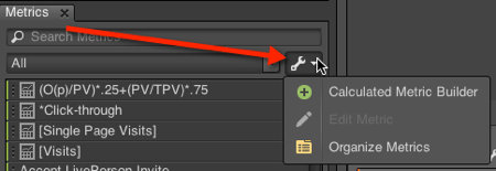
To start, access the new metric builder by going to the Metrics pane on the left-hand side, select the options icon, and then select “Calculated Metric Builder”:

You will then see the Metric Builder which allows you to drag metrics and operators over to the formula field. Below is how you would build a simple Order Conversion metric:

Adding Segments to Your Discover Metrics

Now we can make it really fun by adding segments to the mix. The segments are hiding behind the metric tab on the top left. For our mobile example, let’s say that we want to build a metric that gives us the percentage of visits that were from a mobile device. To do this you would drag over and divide two visits metrics, apply a “Visits from Mobile Devices” segment to the numerator (as shown in the screenshot below), and adjust your metric name and formatting as needed:

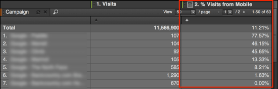
After you save this metric you can then include it in your campaigns report to see the percentage of the campaign that came from mobile. You can also sort by this metric to see what campaign has the highest percentage of mobile usage.

Include Calculated Metrics in Other Calculated Metrics

After you start building your calculated metrics you may want to include an existing calculation in another metric. The new builder lets you do that as well. Once you create a metric, as we did with our “% Visits from Mobile” metric it will appear in your metric list with a small chart-looking icon next to it. We will build on this to get the percentage of traffic NOT from mobile. We do this by entering a number field of “1” (red arrow in screenshot below) and then subtract the previously-created “% Visits from Mobile” metric as shown here.

Other metrics you could build for our mobile report may include:

Mobile Conversion 

Non Mobile Conversion (you have to make the Non Mobile segment first)

Tablet Visits as a percent of all Mobile Devices (you have to make the tablet segment first)

Return Mobile Visits as a percent of all Mobile Devices (you have to make the return mobile segment first)

You can go on an on but hopefully that gives you an idea of what you could do.

Comparisons using Metrics

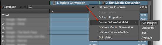
If you think about comparison, they are just an extension of the new formulas that we can now make. All you have to do is create a metric that compares the data points you are interested in. To make this easier, Discover lets you select two columns that are already in your report and you can right click on the column header to select some of the quick calculation options. I wish it had an (A-B)/B option in the list but for now we will use an A/B Percent comparison to quickly see the percentage change between our Mobile and Non-Mobile Conversion metrics. Here is where you select the option:

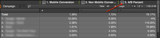
This will then give you a new column with the comparison as shown here:

That makes for an easy comparison. If you would like to tweak the comparison you can right click on the column header and select edit. I would then modify the comparison as follows to get an (A-B)/B comparison instead of just A/B.

Be careful to keep track of what is in your comparison and use meaningful names since the metric doesn’t dynamically reference the columns that it was built from. If you were to switch out one of the original metrics the comparison would not automatically update. That would be a cool feature, though.

Final Thoughts

While this functionality has been in tools like Adobe Insight for a long time I am happy to see it available in Discover. It provides much more flexibility in creating metrics and comparisons. I had a client once in the theme park business that liked to segment their orders by the many different checkout types they had. They could use this to create specific metrics for each type without having to burn up a lot of events. Hopefully this makes its way into SiteCatalyst.

Analytics Strategy

Beefing Up the Integration of Optimizely and Google Analytics

I’ve developed a pretty serious crush on Optimizely as an A/B and multivariate testing platform — it’s hard to beat the ease-of-deployment and ease-of-use. Just like any platform — web analytics, tag management, voice of the customer, testing, or otherwise — that is implemented with “just one line of Javascript,” there are some limitations as to what can be achieved without any additional tweaks to the code on your site. But, still, the emergence of “leveraging the DOM” has been a boon to the world of analytics and optimization. And, while, at Clearhead, we are platform-agnostic when it comes to testing technology, this post is about Optimizely, which we’ve found certainly shines in certain situations.

Coming from a web analytics background, I tend to want almost any technology that relates to my site to be hooked in to the site’s web analytics. It doesn’t matter what your testing platform is or what your web analytics platform is, you’ll almost certainly want to link them up (Exhibit 1: Bryan Hawkins just wrote a great post detailing how to push Adobe Test&Target data into Google Analytics.)

What’s the Point of Integrating?

First, let’s define “integration” in the context of this post:

Integration means passing information into your web analytics tool that tells the tool if a visitor was exposed to a certain test, and, if they were, to which variation of the test they were exposed.

By enabling this integration, you enable segmentation of your traffic based on the different test variations, and you can do side-by-side comparisons of visitor behavior and any metric based on which variation of the test the visitor experienced. This is similar, in some ways, why you put campaign tracking parameters on links from banner ads to your sites: you get powerful data to augment the impression, clickthrough, and conversion (if tracking pixels are implemented) metrics provided by the media server.

The depth of out-of-the-box integration is one of the selling points for using testing and web analytics solutions from the same company (Adobe, Google, or Webtrends), but it is always possible — and not all that difficult — to enable a link between any testing technology and any web analytics platform.

This Post Just Covers Optimizely –> Google Analytics

Recently, we had a client that was using Optimizely and Google Analytics…and we quickly ran into some limitations of the out-of-the-box integration, which is well-documented by Optimizely. What the integration does is populate a visit-scope Google Analytics custom variable: the variable key is the name of the experiment, and the variable value is the variation that was served to the visitor. (My favorite explanation of Google Analytics custom variables, including what “visit-scope” means and the implications therein, is the first one Justin Cutroni wrote on the subject).

One shortcoming to Optimizely’s documentation is that, when it comes to using the integration, it only details how to build an advanced segment based on the custom variable. Custom variables also have their own reporting, including many standard metrics, available under Audience » Custom » Custom Variables, and custom variables can be used in custom reports. So, the post stops short of providing sufficiently deep documentation on how to get to custom variable data within Google Analytics.

But…the bigger issue are two limitations of the integration itself.

First, there is the fact that the free version of Google Analytics only has five custom variables available. If you’re not already using custom variables, then that means you can run five Optimizely experiments concurrently…so you’re probably fine. But, if you are using custom variables (to track registered users, logged in users, returning customers, page type, or any of the slew of other valuable uses), well, you should be! (Justin actually has written multiple posts with specific suggestions on that front.) With Optimizely’s standard Google Analytics integration, you can only integrate as many concurrent experiments as you have available custom variables.

The other limitation is related to the “just one line of Javascript!” implementation of Optimizely. Yes, it is one line of Javascript, but, depending on your site and the conversion goal for your experiment, you may have to implement additional Javascript on your site to pass data back to Optimizely (for instance, if you want to track revenue by test variation, you have to implement Javascript on your order confirmation page to tell Optimizely how much revenue was in the order). In many cases, that information is data that is already being captured by Google Analytics!

In the case of this client, we were going to have to implement additional Javascript on the site in order to track orders, and we had only one available custom variable and three concurrent experiments. In short, we were effectively up a creek with a spork for a paddle!* Luckily, we also had a couple of passable analytics (me) and javascript (Ryan Garner) woodworkers and a plank of (digital) wood.

A More Flexible Integration Approach

The approach we took allows an unlimited number of experiments to be run concurrently (of course, the more experiments there are running at the same time, the more risk there is that experiments will overlap, which has implications for test duration and, in some cases, results interpretation for individual tests). We did this using:

  • Optimizely’s Global Javascript feature — the ability to implement a piece of Javascript across all pages in the experiment, including the original page and every variation; Optimizely has the capability documented, and even references in the documentation that its primary use is for integration with “analytics services.”
  • Google Analytics Non-Interaction Events — a way to pass test information into Google Analytics without affecting any web analytics metrics (more on non-interaction events can be found in the Google Analytics documentation for event tracking)

All we needed to do — and we admit we based this largely on the example in Optimizely’s documentation, was go to Options » Global Javascript in each Optimizely experiment and paste in the following code:

[Update: The original code snippet included in this post worked…but could occasionally cause the dreaded “flicker” when the page loaded. The snippet has been updated as of 30-Nov-2012 to both use some Optimizely special markup to force the code to evaluate immediately as soon as it loads, and it now checks for _gaq before using it so as to not cause any Javascript errors.]


/* _optimizely_evaluate=force */
setTimeout(function(){
experimentId = ;
if (typeof(optimizely) != "undefined" &&
optimizely.variationMap.hasOwnProperty(experimentId)) {
window._gaq = window._gaq || [];
_gaq.push(['_setAccount', '']);
_gaq.push(['_trackEvent', 'Optimizely', optimizely.data.experiments[experimentId].name, optimizely.variationNamesMap[experimentId], 1, true]);
}},1000);
/* _optimizely_evaluate=safe */

With this code, a non-interaction event gets sent to Google Analytics each time the experiment is displayed. That event has a Category of “Optimizely,” an Action that is the name of the experiment, and a Label that is the variation of the experiment that was displayed.

With the event values sent to Google Analytics, you can explore visitor behavior for each version of the test to which the visitor was exposed:

  • By building custom segments for each variation (use the Action and Label values to isolate visitors who were exposed to each variation of the experiment)
  • By drilling down on Content » Events » Top Events » Optimizely and analyzing site usage and/or Ecommerce metrics
  • By creating a custom report that breaks out the experiment variations as warranted with specific metrics of interest

Of course, before you go too nuts with your in-Google Analytics analysis, be sure to do a quick cross-reference with the Optimizely Results page for the experiment to make sure Google Analytics and Optimizely are within the same ballpark when it comes to how many times each variation of the test has been served (use the “Unique Events” or “Visits” metric in Google Analytics). They will never match, as they are capturing the test counts in very different ways, but they should be within spitting distance of each other. Be sure you have both Optimizely and Google Analytics set up to use the same timezone!

That’s all there is to it! Happy test analyzing!
*If you’re not familiar with the “up a creek” reference, see this link.


Excel Tips, General

Sorting with Formulas for Bounce Rate – Excel Tip

During my career I have developed a ton of Excel tricks that enabled me to mold data just the way I like it. It all began when I took an investment banking class and if you didn’t know enough hotkeys to get by without a mouse then you were shunned. During the years I was at Omniture/Adobe I was able to develop a reputation as being “Mr. Excel” which is a pretty high bar among a group of hundreds of consultants that use worksheets regularly. Users in general aren’t very good at Excel and many people don’t know all the creative things that are possible. With that in mind, this will be the beginning of many tips that help you use Excel better with web analytics so that you can spend less time gathering data and more time using data.

Automatic Sorting with Formulas

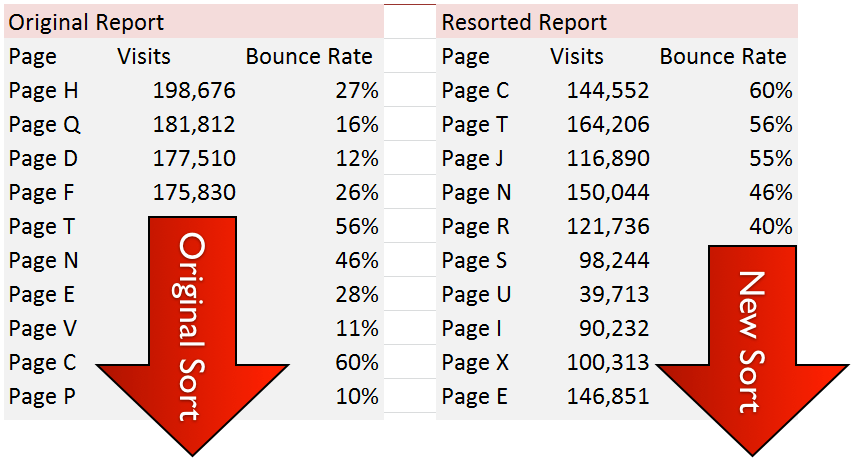
To start, let’s talk about sorting. Excel has built in ways to sort data using filter and sorting tools but they all require human interaction to make it happen. Through formulas, you can create sorting that is automatic, macro-free, and more user friendly. A great use case for this is bounce rate. In SiteCatalyst, if you were to look at the pages with the highest bounce rate you will most-likely be given some pages that have a 100% bounce rate. What a find! You now know of a bunch of pages that need to be fixed. Not so! If you look at the visits to those pages, chances are that just one person actually saw the page and bounced. Those pages probably are not worth your time fixing.

You can do quite a bit to calculate a weighted metric that takes into account volume and the rate. Another simple solution is to use a tool like ReportBuilder to automatically pull in the X most popular pages by visits and apply the formulas below to resort the data. When the report is delivered to the user, the formulas will automatically run and the user wont have to do a thing. This way you know which pages that have the worst bounce rate AND are still getting significant traffic.

Click here for an example workbook on sort with formulas and below are step-by-step instructions:

Simple Sort

After you have downloaded the workbook above follow these steps which walk through the example:

  1. (Column A:C) Insert your data into the workbook sorting on your popularity metric (Visits in this case)
  2. (Column G) Use the LARGE function to determine which bounce rate is the highest based on the Nth value. To calculate N I use the ROW function to get the current row number and minus the first row number. This is a good tip for creating an automatic counter so that N increases by 1 with each row.
  3. (Column E) Use a combination of INDEX and MATCH to get the page name for the sorted bounce rate numbers. This works like VLOOKUP but allows you more flexibility if your lookup values aren’t on the left of your lookup table.
  4. (Column F) Now that we have the page name we can just use VLOOKUP to get the rest of the metrics from the original report.

Advanced Sort

Keep in mind that the previous example works if all of your sort values are unique. In the example worksheet I have also included an advanced example where pages have duplicate bounce rate values. Not to worry! we can solve this with a few more steps:

  1. Do the same thing you did for steps 1 & 2 of the simple sort
  2. (Column M) Create an instance count for each value of your sort metric. Note how the beginning of the range is anchored but the end is relative. This formula lets us know how many duplicates of any given number there are as we move down the list. This count, along with the bounce rate value, creates a unique key that we can line everything up by.
  3. (Column O) This is the tricky part! It is very much like what we did for step 3 of the simple sort but it uses an array function which allows us to use the bounce values AND the instance count for the lookup. To enter this function don’t just press Enter! You need to press Control + Shift + Enter. This lets Excel know that you want to use the formula as an array function.
  4. (Column P) Use a VLOOKUP based on the page name to pull in the rest of your metrics.

Now you should have a beautifully resorted report. Hide the original report on some other worksheet where it is out of the way and just present the new report to the user.

Final Thoughts

This example was centered around bounce rate but it has many applications. For example, you may want to see which of your most-popular pages has the highest revenue participation per visit. Sorting is such a foundational aspect of using data that you will be able to apply this tip in many scenarios.

Let Me Know What You Think

I have been thinking about developing a class for Adobe ReportBuilder that would not only teach you the neat things you can do with that tool but would go beyond ReportBuilder to show you how to super-charge your workbook with Excel techniques that make the data much more useful. Let me know if you would be interested in such a class (kevin @ analyticsdemystified.com)

Presentation

How Communicating Analytics Is Like New York City

I joined a new company, Clearhead, at the beginning of September, and it’s been a fun-tiring-exciting ride thus far (unfortunately, it hasn’t been a particularly prolific one with respect to this site!). One of the core tenets of the company – something that we are all passionate about because we have all seen it go horribly awry – is that we will always deliver information in a way that is clear, concise, (as) simple (as possible), and elegant. There’s a reason I have Data Visualization as one of the categories for this blog – I’ve long believed that there is an inordinate amount of incomprehensible charts, graphs, and tables being emailed and presented by analysts and marketers. We. Need. To. Do. Better! (as an industry).

Same Idea, but From Another Angle

So…shift to my recent trip to New York City. I was with the co-founders of the company, Matt and Ryan, who were both long-time New York City residents before moving to Austin (Ryan is a San Antonio native and has an affinity for The Big Apple that I find both baffling and moderately traitorous…but I’m sure that is a phase that will pass in due time as he gets re-acquainted with Austin). The last apartment Ryan lived in before returning to the Lone Star State was at 21st and 1st.

That’s important, so I’m going to write it again (I could make it really big and bold, but it’s not that kind of important, so we’ll just go with italics): Ryan lived in an apartment at 21st and 1st.

Here’s what’s interesting about that statement: you just read it, and you will be able to place yourself in one – and only one – of the two following groups:

  • You immediately knew that he lived in Midtown Manhattan (Midtown East, even) and had a mental image, if not of the exact intersection, then of a street/building/intersection reasonably near by
  • You registered the location mentally as “somewhere in New York City.”

I’ve now been to that exact apartment – and to that intersection – several times…and I still fall in the latter category. That’s not because I’m particularly slow or non-observant. It’s because I’ve never lived in New York, have never spent more than 4 consecutive days there, and have only rarely needed to get around the the city on my own, rather than simply tagging along with a local.

In short, I don’t speak “areas of Manhattan” with any degree of fluency. I cognitively know that the “Lower East Side” is generally towards the bottom and to the right of a north-oriented map of the island. But, I can’t tell you the vibe and character of that area. I can’t tell you what the main landmarks are there. I can’t tell you what the main thoroughfares are that bisect the area.

Now, you have read the past couple of paragraphs and thought one of two things:

  • “Seriously? He knows nothing about the Lower East Side other than what the three words ‘lower,’’ east,’ and ‘side’ describe?”
  • “Why is Tim belaboring this? Obviously – he hasn’t spent a lot of time in the city, so he doesn’t really intuitively know what is where.”

What’s interesting (borderline fascinating, really, if you’re into brain stuff) is that one of the statements above made total sense to you, and the other one seemed totally foreign. It’s like listening to a couple of people having an animated conversation in a foreign (to you) language. They are clearly communicating without any effort whatsoever, and, yet, it is insanely difficult to actually imagine how what sounds like fast-paced gibberish to you could possibly be clearly transmitting very real information and ideas.

The key, in both cases, is that everyone’s brain is wired differently, and the synaptic paths that have been traversed hundreds of times with different visual and experiential reinforcement (the Lower East Side, daily conversation in German, etc.) by one person have barely been traveled at all by others.

And, Yes, I Have a Point to All of This

As analysts, when we discuss, visualize, or present data, we are often the equivalent of a native New Yorker coordinating a visit with someone raised in Sour Lake, Texas (such as yours truly). Just as Matt and Ryan quickly learned that they could not skip any steps in guiding me from JFK to 23rd and 3rd, as analysts, we have to work really hard to speak in the visual language of the people to whom we’re delivering information. We have to minimize “the data” that gets presented and maximize “the meaning.”

The next time you get a blank look from someone to whom you are delivering the results of an analysis, stop and ask yourself if it’s because you’re a native New Yorker talking to someone who only visits occasionally. It’s not a knock against that person at all – the onus is on the native to be a good host and to figure out the best way to present the information in a way that it can be quickly and simply received.

Analysis, Featured, Technical/Implementation

The T&T Plugin – Integrate T&T with Google Analytics

When Test&Target was being built back in the day and doing business as Offermatica, it was designed to be an open platform so that its data can be made available to any analytics platform.  While the integration with SiteCatalyst has since been productized, a very similar approach approach can be used to integrate your T&T test data with Google Analytics.  Let me explain how here.

The integration of SiteCatalyst leverages a feature of Test&Target called a “Plug-in”.  This plug-in concept allows you to specify code snippets that will be brought to the page upon certain conditions.  The SiteCatalyst integration is simply a push of a code snippet or plug-in to the page that tells SiteCatalyst key T&T info.

Having something like this can be incredibly helpful for all sorts of reasons such as integrating your optimization program with third party tools, or by allowing you to deliver code to the page via T&T which saves you from having IT make changes to the page code on the site.

To push your campaign or test data over to SiteCatalyst, you create a HTML offer in T&T that looks like this:

<script type=”text/javascript”>
if (typeof(s_tnt) == ‘undefined’) {
var s_tnt = ”;
}
s_tnt += ‘${campaign.id}:${campaign.recipe.id}:​${campaign.recipe.trafficType},’;
</script>

This code is simply taking the T&T profile values in red, which represent your test name and test experience names, and passes them to a variable called s_tnt for SiteCatalyst to pick up.  There is a back end classification process that takes place where these numerical values are translated into what you named them in T&T.  This is helpful to shorten the call being made to SiteCatalyst but not required unless the call to your SiteCatalyst has a relatively high character count.

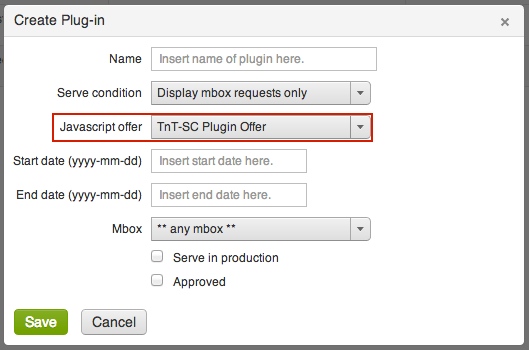
After you save this HTML offer in your T&T account, you then have to create the “Plug-in”.  You can do so by accessing the configuration area as seen here:

T&T plugin, SiteCatalyst, Google AnalyticsThen we simply configure the plug-in here:

T&T Plug-in ConfiguratorThe area surrounded by a red box is where you select the previously created HTML offer with your plug-in code.  You also have the option to specify when the code gets fired.  Typically you want it to only fire when a visitor becomes a member of a test or when test content (T&T offers) are being displayed and to do so, simply select, Display mbox requests only.   If you wanted to, you can have your code fire on all mbox requests as that can be need sometimes.  Additionally, you can limit the code firings to a particular mbox or even by certain date periods.

Pretty straightforward.  To do this for Google Analytics you use the code right below to create a HTML offer and configure the plug-in in the exact same manner.  Note that we are not passing Campaign or Recipe (Experience) ID’s but rather profile tokens that represent the exact name of the Campaign name and Experience name specified in your test setup.

<script type=”text/javascript”>
_gaq.push([‘_trackEvent’, ‘Test&Target’,’${campaign.name}’,’${campaign.recipe.name}’]);
</script>

And that is it.  Once that is in place, your T&T test data is being pushed to your Google Analytics account.

Before I show you what it looks like in Google Analytics, it is important to understand a key concept in Google Analytics.

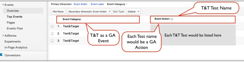
Test&Target is using the Custom Events capability of Google Analytics to populate the data.  Each Event has a Category, an Action, and a Label.  In this integration, the Google Analytics Event Category is simply Test&Target because that is our categorization of these Events.  The Google Analytics Action Event represents the Test&Target Test name.  And finally, the Event Label in Google Analytics represents the Test&Target Test Experience.  Here is a mapping to hopefully relate this easier:

Google Analytics EventsNow that we understand that, lets see what the integration gets you:

Google Analytics Test&TargetWhat we have here is a report of a specific Google Analytics Event Category, in this case the Test&Target Event.  Most of my clients have many Event Categories so it’s important to classify Test&Target as a separate Event and this plug-in code does that for you.

This is a very helpful report as we can get a macro view of the optimization efforts.  This report allows you to look at how ALL of your tests impact success events being tracked in Google Analytics at the SAME time.  Instead of looking at just a unique test as you might be used to when looking at test results in T&T, here we can see if Test A was more impactful then Test B – essentially comparing any and all tests against each other.  This is great if organizations have many groups running tests or if you want to see what particular test types impact a particular metric or combination of metrics.

Typically though, one likes to drill into a specific test and that is available by changing the Primary Dimension to Event Label which, as you know, represents the T&T Test Experience.  Here we are looking at Event Labels (Experiences) for a unique Event Action (Test):

Google Analytics Test ExperiencesHere we can look at how a unique test and its experiences impacted given success events captured in Google Analytics. Typically, most organizations include their key success events for analysis in T&T but this integration is helpful if you want to look at success events not included in your T&T account or if you want to see how your test experiences impacted engagement metrics like time on site, page views, etc….

So there you have it.  A quick and easy way to integrate your T&T account with Google Analytics.  While this can be incredibly helpful and FREE, it is important to also understand that statistical confidence is not communicated here in Google Analytics or any analytics platform that I know of, including SiteCatalyst.  It is important to leverage your testing platform for these calculations or offline calculators of statistical confidence before making any key decisions based on test data.

While this was fun to walk you through how to leverage the T&T plug-in to push data into Google Analytics please know that you can use the plug-in for a wide array of things.  I’ve helped clients leverage the plug-in capability to integrate T&T with MixPanel, CoreMetrics, and Webtrends.  You can also use this plug-in capability to integrate with other toolsets other then analytics.  For example, I have helped clients integrate T&T data into SFDC, ExactTarget, Responsys, Causata, internal CRM databases, Eloqua/Aprimo/Unica , Demdex (now DBA Audience Manager), and display retargeting toolsets.  Any platform that can accept a javascript call or pick up a javascript variable can make use of this plug-in concept.

I’ve also helped customers over the years leverage the plug-in to publish tags to the site.  Years before the abundance of Tag Management Platforms became available, there were T&T customers using the plug-in to publish Atlas, DoubleClick, and Analytic tags to the site.  In fact, if Adobe wanted to, they could make this plug-in capability into a pretty nice Tag Management Platform and one that would work much more efficiently with T&T then the current Tag Management tool they have on the market today.

General

The Adobe SiteCatalyst Handbook Now Available!


After months of writing, editing and re-editing, The Adobe SiteCatalyst Handbook: An Insider’s Guide is now available!

I have received many questions about the date it is available and formats. The book is available in both hardcopy and digitally from the Pearson publishing site using the preceding link. The book is also available on Amazon.com and in the iTunes Bookstore. You can check out the table of contents on the Pearson site as well as on these other sites.

To hear more about the making of the book, you can listen to Rudi and I discuss it on this podcast. If you have any questions, please leave them here as a comment. Thanks and enjoy the book!

Analysis, Reporting, Social Media

Analysts as Community Managers' Best Friends

I had a great time in Boston last week at eMetrics. The unintentional theme, according to my own general perception and the group messaging backchannel that I was on, was that tag management SOLVES ALL!!!.

My session…had nothing to do with tag management, but it seemed worth sharing nonetheless: “The Community Manager’s Best Friend: You.” The premise of the presentation was twofold:

  • Community managers plates are overly full as it is without them needing to spend extensive time digging into data and tools
  • Analysts have a slew of talents that are complementary to community managers’, and they can apply those talents to make for a fantastic partnership

Due to an unfortunate mishap with the power plug on my mixing board while I was out of town a few month ago, my audio recording options are a bit limited, so the audio quality in the 50-minute video (slides with voiceover) below isn’t great. But, it’s passable (put on some music in the background, and the “from the bottom of a deep well” audio effect in the recording won’t bug you too much):

I’ve also posted the slides on Slideshare, so you can quickly flip through them that way as well, if you’d rather:

As always, I’d love any any and all feedback! With luck, I’ll reprise the session at future conferences, and a reprise without refinement would be a damn shame!

Analytics Strategy

Good Guy Google …

The good guys at Google announced today that they are giving away their own Tag Management System, Google Tag Manager. Since I’m not at Emetrics (where the announcement was made) I have been watching the news and responses over Twitter and I have to say it has been quite interesting. Responses seem to fall into two broad camps — “Good Guy Google” and “Scumbag Google” (with respect to /r …) — and since we have been covering and supporting TMS deployments for the past few years I figured I would offer some thoughts on both.

Good Guy Google

In one camp we have, well, most of the companies around the globe who have been considering an investment in tag management. In one fell swoop, Google has made their lives easier by far, at least when it comes to cost-justifying an additional investment in analytics … by simply eliminating the cost all-together. Whereas Google could have brought Tag Manager to market as a revenue generating service similar to Google Analytics Enterprise, Good Guy Google (“GGG”) opted instead for rapid adoption via their tried and true “trade you for data” model which has served the analytics offering so well.

What’s more, Google made the “trade you for data” very transparent in the sign-up process, giving users an easy to identify checkbox that allows them to deny Google the ability to use their data as part of the exchange. How cool is that?

GGG is truly being good in this regard, and although they do indicate under their Terms of Service that they will be using Tag Manager data to improve the tag management service, they explicitly state they will not share collected data without the user’s consent.

Good Guy Google for thinking about our privacy!

While I am still exploring the service it is clear that A) this is a pretty good first effort and B) that Google Tag Manager is lacking much of the functionality and sophistication of the established market leaders in the space, Ensighten, Tealium, and BrightTag. Des Cahill, Vice President of Marketing at Ensighten, posted a nice welcome to Google and a brief summary of some of the limitations the Google product has relative to Ensighten and others that is worth a read if you have five minutes …

That said, given Google’s demonstrated history of rapid application evolution and their long-standing commitment to Google Analytics, I suspect that Google’s TMS will quickly evolve beyond a good “entry point” into tag management to the same type of business-viable solution that Google Analytics itself has become. If I’m right, and hell, even if I’m not, Good Guy Google has changed the adoption curve for tag management forever by putting TMS into everyone’s hands, not just those companies with enough pain or enough money to make the leap.

Scumbag Google

Inevitably not everyone is happy to see Google come into the Tag Management space. As Cahill points out in his post, the handful of tag management options out there that are targeting the lower-end of the market likely just got the wind taken completely out of their sails (or sales, FTW!) And while these very few companies will point to more mature products, better user interfaces, more well defined SLAs, and whatever other FUD they are able to think up, it is far more likely that these companies are about to undergo a “forced pivot” … which is never that much fun.

And that sucks. Scumbag Google.

What’s more, this potential pain isn’t limited to vendors targeting the lower-end of the market. The “big dogs” have taken in over $50,000,000 in venture funding in the past twelve months, and I suspect that most of that was predicated on an assumption of the continuation of the same type of hockey-stick like growth in adoption and revenue acquisition we have been reading about. Now, even if Google’s service doesn’t meet the requirements of an Enterprise-class offering, it is likely that the TMS buying process for a great number of companies just became as complicated as … well … paying for web analytics when their is a widely adopted, powerful, free solution provided by Good Guy Google.

Scumbag Google, indeed.

Good Guy or Scumbag … it Depends!

Whether you consider Google a Good Guy or a Scumbag really depends on where you work and what your vested interest are, and honestly it’s probably too soon to say for sure exactly what impact Google Tag Manager will have on the TMS space overall. Still, I have long commented that the evolution of the TMS sector is much like the web analytics sector, only much compressed, and Google’s announcement will only accelerate that compression.

Now, instead of having five to seven years to build a great company and work towards the kind of million (or billion) dollar exit appreciated by Omniture, Coremetrics, Unica, and Urchin, executives and investors at the marketing leading tag management firms need to be thinking about twelve to twenty-four month exit plans.  And, instead of having the luxury of time and a natural growth and adoption curve, the smaller, lower-end firms need to quickly evaluate their commitment to a sector that is about to be overwhelmed by Good Guy/Scumbag Google.

What do you think?

Do you think Google is a Good Guy for making TMS free? Or are you skeptical, thinking that this is the ultimate Scumbag move on their part? I welcome your comments, and to make weighing in even easier I have posted to comments below that you can up-vote or down-vote based on your own, anonymous feelings.

Conferences/Community

ACCELERATE: An Analytics Event for the 99%

Wow, I cannot believe that October is almost upon us and that the expanding team at Analytics Demystified is about to deliver another ACCELERATE event! We are pretty excited about what we have to offer this time:

Good stuff to be sure, but the thing I am most excited about is the generosity of our sponsors. Thanks to Ensighten, OpinionLab, ObservePoint, and Tealeaf/IBM we are able to present a jam-packed day of content in a way that is affordable to everyone. ACCELERATE is 100% free for everyone who attends!


In a day and age where conference costs seem to continually rise so that promoters can have the most lavish hotel, the most fancy meal, and the most incredible sunsets we at Analytics Demystified have opted to buck the trend. We have decided to put on a conference that is accessible to all, truly an analytics event for the 99%.

While others choose to differentiate on luxury and a “spare no expense” mentality, ACCELERATE differentiates on quality content, reasonable locations, and a price that everyone can afford. We do this because our excellent sponsors allow it, and, frankly, because we truly love what we do.

If you’re part of the 99% we hope you’ll join us in Boston on Wednesday, October 24th. Don’t bring your checkbook as we have nothing to sell you. Just bring your computer so you can share what you learn and our sponsors, our speakers, and the Analytics Demystified team will do the rest.

Registration is still open. Join us at ACCELERATE Boston!

General

Kevin Willeitner: The Latest Partner at Demystified

I am wildly excited by the opportunity to join the Demystified team. I look forward to contributing my own expertise to the deep knowledge of Eric, John, Adam, and Brian to provide even greater value to our clients. I work with clients to evolve their web analytics program and to build their digital solutions through system integrations. I enjoy measurement evaluations, solution design, implementation management, data quality evaluations, basic and advanced user trainings, testing, analysis feedback sessions, all things Excel, tool development, and executive presentations and communications.

Previously I worked at Adobe (through the Omniture acquisition) as Principal Consultant for Digital Analytics and Optimization. I had the pleasure of working with a lot of great people and technology. I certainly did not leave Adobe due to any level of dissatisfaction. I truly had a dream job at Adobe. Then Analytics Demystified came along and I saw it as a wonderful opportunity to advance my career and to continue doing what I love–helping companies use data and systems to provide impactful business results. It is almost as if I am now in a dream within a dream (Inception anyone?). I would like to give special thanks to the managers I worked with at Adobe along the way including Matt Belkin,Cameron Barnes, Josh Dahmer, Dave Kirschner, and James Hodges for the great opportunities they provided to me. Also a thanks to my many friends on the Adobe Consulting Services team that I worked with for many years.

Of the many successes I had at Adobe, the most…unique…was to win the 2011 Halloween costume contest. If you are at all familiar with the way that Adobe does Halloween in Utah then you know that there is an amazing amount of competition for this prize. I mostly mention this because it is funny, but I also think it is indicative of the creativity and quality of work I provide.

On a personal note, I am a husband to a beautiful wife and father to three beautiful little girls. I live in Utah.  I enjoy outdoors activities such as rock climbing, canyoneering, backpacking, and snowboarding. I’m also trying to get better at surfing but that has been difficult to do given my land-locked state. I volunteer as an Assistant Scout Master to help boys in the neighborhood get cool merit badges and build character.

If you need help with your digital solutions feel free to reach out to me by email (kevin AT analyticsdemystified.com) and you can follow me on Twitter (@willeitner). I look forward to working with all of you in the digital marketing community.

General

Balancing the Quantitative with Qualitative

This was originally published as the President’s Message in the August DAA Newsletter.

I’ve been spending a lot of time recently working with data. For some clients I’m helping to assemble data from multiple sources across their enterprise to answer business questions like how does clickstream behavior impact revenue. For other clients, I’m strategizing about using aggregate data to create new opportunities that provide added insights and actionable steps toward increasing profitability. And for fun, I’m slicing through data to gain greater understanding of events I’ve missed or simply things that I’m curious about.

This last effort is what got me typing today. As I sorted through Tweets and scoured the web for information about the recent DAA Symposium in San Francisco, I was heads down looking at data. I wanted to accomplish two very specific objectives: 1) to validate a new calculated metric that I’m working on, and 2) to simply find out how the event was and what type of knowledge was being shared.

So I turned to five different tools to try to find the answers that would satisfy my curiosity.

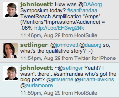
My research quickly yielded data that showed how many Tweets with @DAAorg and #SanFranDAA were flying; who the top contributors were; and in some cases how many impressions were created by these messages across the Web. As I researched more, I became more and more focused on the numbers and sought to find the story within the data that would tell me more. As I dug deeper, my tracking spreadsheet started to grow and I began to see that across the five tools, each had significant gaps in the data that they provided. While most were able to reveal the total volume of mentions for my specific keywords, there was a great deal of variation in what they found. Further, the data produced by these tools was often lacking metrics that I wanted to perform my calculations. But what really struck me was the fact that amid all this data I was looking at, very few of these tools told me anything about the content of what was being said. Sure, I could scroll through the individual Tweets and see the content, there were also lists of top keywords showing me what was mentioned most, and even in a few cases there were word clouds that highlighted commonly mentioned terms and their relationship to my search query. But through all of this data I still didn’t know what really happened at the DAA Symposium in San Francisco. I needed someone who was there to fill in this essential piece of information.

But I was still determined to produce something from my exercise in curiosity, so I sent out a Tweet with a quantitative perspective on what I had discovered. Almost immediately, I received a response that asked… “@johnlovett @DAAorg so what’s the qualitative story?” I too had this question in my mind and with the help of this one innocuous Tweet; I realized that every data exercise can benefit from both the quantitative and qualitative sides of the story. Either one alone is woefully insufficient. By digging into the data, there were things that I could see that helped me to understand what happened at the event, and I was even able to gain a better understanding of the awareness created by the event using my calculated metric. However, what I failed to capture in looking solely at the data alone was the qualitative message. Through all the Tweets and data I analyzed, I learned some very interesting things, but the results of my analysis were hollow without a first hand narrative to accompany them.

While this may be painfully obvious to many, all too often I see organizations lose sight of this fact. They expect digital analysts to amass data and crunch numbers to uncover revelations about the business. But in many cases, these analysts don’t have the benefit of understanding the strategy behind the numbers or the context of a story that they data can support. This makes their jobs incredibly more difficult and ultimately it leaves their analysis with a hollow void that is begging for a narrative. In my experience, I’ve found that this narrative comes from collaboration between analysts and business stakeholders who take both sides (the quantitative and the qualitative) to showcase results in a manner that is not only meaningful, but also leaves a lasting impression.

So the next time you’re itching to deliver that beautiful analysis you just created…or if you’re listening to an eager analyst share new data…ask yourself if the perspective you’re hearing considers both the quantitative and qualitative sides of the story. If not, ask for more.

What do you think?

Sincerely,
John Lovett DAA President

PS! Here’s links to blog posts from Krista Seiden’s (BloggerChica) and @AllaedinEzzedin’s Thanks!

Analytics Strategy, Reporting

Web Site Performance Measurement

It’s funny. Sometimes, we get so focused on the design and content aspects of how a web site performs that we forget about one of the more fundamental aspects of the site: how long it takes to load. That’s a fundamental aspect, but there are a lot of different aspects of “site loading” — both what affects it and how to measure and monitor it.

My most recent article on Practical eCommerce provides an overview of some of the main drivers of site performance, as well as the multiple (complementary) approaches for measuring and monitoring.

Testing and Optimization

Optimization Test Techniques – Part II of II

In my previous post, I highlighted how it is important to understand what optimization techniques are available in the market today because by knowing the techniques, you are much better armed to apply additional strategy to your optimization efforts.

This post is a continuation of my previous blog post in that I walk through the remaining five optimization test techniques available in Test&Target. So far, I have covered 1:1 Campaign, 1:1 Display Campaign, A/B Campaign, and Flash Campaign. Here I will cover Landing Page Test, Landing Page Campaign, Monitoring Campaign, Multivariate Test, and finally the Optimizing Campaign.

Landing Page Test/Landing Page Campaign

I’ve combined both the Landing Page Test and the Landing Page Campaign types here because they provide the same core test functionality. These types of test techniques are very different compared to an A/B test in that visitors can switch branches or experiences of a test. This technique is highly effective when your test strategy requires that visitors be able to change branches of a test versus the A/B approach where visitors are forced to maintain membership in a particular test branch.

A great example of such a test is around SEM reinforcement. Lets say you have two different ad campaigns taking place on Google where one ad campaign is promoting a particular product and the other campaign is promoting discount messaging. If you have a test running that is basically quantifying the value of message reinforcement associated with source, then you would have an A, B, C Campaign. Experience A would be the default content or what is currently running on the landing page. Experience B would be targeted to the first Google SEM messaging on product messaging and Experience C would be targeted to the second Google SEM ad around discount messaging.

To effectively run this type of scenario you would want to leverage the Landing Page Campaign in the event visitors happen to click through on both of the SEM ads. Using an A/B campaign with this type of test would reinforce the messaging of the first ad clicked on the landing page even if the visitor clicked the second ad because with the A/B campaign, you are stuck with the first Experience assigned for the life of the campaign. The Landing Page campaign would recognize the ad clicked on and switch you to the corresponding campaign experience even if that means switching branches.

The SEM reinforcement example is just one way the Landing Page technique can help add additional strategy. I often find this technique to also be helpful when targeting campaigns to particular behaviors on the site or when offline data is incorporated into your online optimization efforts.

The key difference between the Landing Page Test and The Landing Page Campaign is that a Landing Page Test is used for Multivariate testing where the strategy involves having the visitors change experiences within a Multivariate test design.

Monitoring Campaign

The monitoring campaign is an incredibly helpful asset for any organization that leverages Test&Target.

The monitoring campaign is typically used to collect data or to run concurrently with other campaigns to track results. The monitoring campaign is not typically used to display content, although it can if needed.

A great use case for using a monitoring campaign would be to set a baseline for conversion rates or revenue metrics like total sales, revenue per visitor, or average order value. I often recommend to customers that if they have the mboxes on the site but the alternative content isn’t ready, to start a monitoring campaign to not only see some metrics but also to familiarize yourself with the Test&Target platform.

The Monitoring Campaign was not designed to replace an organization’s analytics but many organizations soon find themselves using the Monitoring Campaign to provide data on certain behaviors defined in T&T or to even augment analytics with pathing reports. Another interesting use of Monitoring campaigns that I have seen helpful to organizations is using it to deploy tags to the site independent of T&T. Before tag management solutions became so popular, the mbox was a nice and easy way to get code to the page without having to bother IT if an mbox was already in place. Nowadays, T&T has a plugin functionality that can handle that without having to setup a Monitoring Campaign.

Multivariate or MVT Campaigns

Multivariate testing is a somewhat political topic in the testing world. There are many schools of thought when it comes to multivariate testing and there is also much debate about whether it is as beneficial as A/B testing. I will leave those topics for future blog posts but simply outline how the T&T platform approaches MVT testing here.

The default or productized MVT approach in the Test&Target platform is the Taguchi approach. This approach is a partial factorial approach in that not all possible combinations of elements and alternatives will be incorporated into the test design – only a portion of all possible will be. The key benefit T&T advocates here is that less time is needed to get results because less experiences require less traffic to the test.

Here is an example of the Taguchi approach: lets say you have 3 elements and 2 alternatives for each element. The elements are the Call to Action, the Color, and the Text. If you had two different iterations of each of these elements that would represent a 3X2 MVT design. If you mixed and matched each element and each alternative, all possible combinations would come to 3ˆ2 = 8. By applying the Taguchi approach, only 4 out of the 8 possible combinations will be tested. The 4 experiences that are tested are not a random four but rather the 4 according to the Taguchi model. T&T helps you with this as you go about creating your test within the platform. Here is an example of a test design created by T&T with a 3X2 MVT:

The Taguchi approach becomes especially handy when you have more then 3 elements. In the above example, testing 8 experiences versus the 4 wouldn’t present as much of a challenge as testing 7 elements with 2 alternatives. A 7X2 MVT with all possible combinations would require testing 128 experiences (2ˆ7) versus the Taguchi approach where only 8 experiences would be needed.

The reporting that comes along with a T&T Multivariate test is very similar to what you can expect from any other type of test technique with one exception. For MVT tests, T&T provides what is called an Element Contribution Report. This report is helpful for a number of things.

First, when you test only a subset of all possible test combinations you are only getting data on those tested experiences. This report presents to you what the “Predicted Best Experience” is based on data collected thus far. With a 7X2 MVT Taguchi test design, you are only testing 8 out of 128 possible experiences – this report tells you which experience would have been the best given the odds of you having it in your test design would be only 8/128.

Secondly, this report is helpful to understand how each element impacts the given success event, hence the name of the report being Element Contribution Report. This data is incredibly helpful because you can use it for other tests designs. For example, I have seen many Taguchi MVT Element Contribution reports infer that a certain Message Approach as a test alternative was incredibly impactful with high statistical confidence. Those organizations can now take that Message concept and incorporate it into A/B tests or even in offline Marketing efforts. This report essentially helps identify themes that can be incorporated into other Marketing efforts.

Here is an example of an Element Contribution Reprot where you can see each element and which alternative of that element was more successful, making up what would be the best test experience even if it wasn’t part of the test design. Additionally, you can see that the most influential element was the Submit Button :

element-contribution-report

Just because T&T’s default approach to MVT is the Taguchi approach, that doesn’t mean that you are limited to running partial factorial multivariate tests with this platform. I have worked with many clients over the years including one right now that is using T&T for full factorial MVT tests. To do this, you simply have to create your test design offline and set it up as an A/B test within T&T. The post test data is then analyzed offline as well to quantify interaction effects.

Optimizing Campaign

This type of campaign technique is surprisingly unique to the Test&Target platform given that it can be very helpful to any Optimization team within an Organization.

[Correction: SiteSpect also offers this automated optimizing test functionality.]

The Optimizing Campaign is not your typical test type. It isn’t designed for the type of learnings that you might be used to with running other types of tests where you are comparing different experiences across different visitor sets. It is designed to allow the testing platform automatically deliver the right experience at the right time.

Imagine if you will, five different pieces of content for testing. This content can be home page hero content, navigational elements, calls to action, email content….anything really that you wish to have tested as part of a test design. Typically you would approach this with either an A/B test technique or a Multivariate test so as to see which version versus the other led to increases in given success events. The Optimizing campaign test technique is designed to not maintain an equal distribution of test content to give you this data but rather it will automatically shift traffic to the better performing experience of all the possible experiences. If Experience C was consistently outperforming the other Experiences, the Optimizing Campaign will automatically shift more and more of that that visitor traffic to that test experience.

T&T takes the Optimizing Campaign to another level with how it leverages segments in this automation. If you include segments in this campaign setup, the Optimizing Campaign will provide its automation to those segments by automatically providing the most effective experience for that segment. Additionally, the reporting associated with this campaign type provides a report called “Insights” that shows what segments impacted what test offers and whether that impact was positive or negative. This is incredibly powerful because the tool is doing the discovery for you and you are then enabled to create a new campaign right from this report targeted to that discovered segment.

Here is a screen shot of an Insights report from T&T:

test&target optimizing campaign

I find that the Optimizing Campaign test technique is most effective for tests that are being run in email campaigns. Lets say you have an email blast that is going out to 200,000 email subscribers and you were running an A/B/C test of content within that email. The Optimizing Campaign has the potential to learn what experience within that test design was the most successful from the first sets of visitors that opened that email. If, for example, the first 2,000 visitors reacted much more favorably to Experience B, the Optimizing Campaign would shift more and more visitors to get Experience B if they haven’t opened the email yet. This approach allows organizations to immediately capitalize on test learnings for short marketing cycles like those in email campaigns.

Analysis

A Pragmatic Approach to "Test and Learn"

“We’re going to use a ‘test and learn’ approach” has become as common a buzzphrase as, “We’re going to be data-driven,” and “We’re going to derive actionable insights.” I’m not a fan of buzzphrases. Buzzphrases tend to originate as statements of an aspirational goal that then quickly morph to be treated as accepted reality. When someone like Eric Peterson steps up and delves into one of these buzzphrases, I do figurative backflips of joy.

The devil is in the details (which is not only a buzzphrase, but a full-on cliché…but it’s true!). And, the details come down to the right people with a valid process using capable tools. When it comes to “test and learn,” the gap between concept and actual implementation often seems to be a true chasm.

The concept: use a combination of A/B (and multivariate) testing and the analysis of historical data to test hypotheses. Based on the disproving or failure to disprove each hypothesis, take appropriate action to drive continuous improvement.

The actual implementation: HiPPOs, lack of clarity on what the KPIs are (without KPIs to optimize against, there can be no optimization), limited resources, over-focus on a specific technique or tool as “the answer,” inability to coordinate/align between marketers/designers/strategists/analysts, analyses resulting in “light gray or dark gray” conclusions rather than “black or white” ones, and so on.

On top of the challenges that have always existed, even in the “simple” world of a brand’s digital presence being primarily limited to their web site and the drivers of traffic to the site (SEO, SEM, banner ads, affiliate programs), we now operate in a world that includes social media. And, most of a brand’s social media activity cannot be A/B tested in a classical sense, so that tried-and-trued (but, alas, still too rare) technique is not available.

None of these challenges mean that “test and learn” is an unattainable ideal. But, it does mean that a strong process with a diligent steward (read: an analyst who is willing to expend some bandwidth as a project manager) is in order. For reasons we’ll cover at a later date, I’m working on codifying such a process, based on what has (and hasn’t) worked for me in past and current roles. Here we go!

Step 1: Develop a Structured, Living Learning List

Step 1 is key. When we talk about learning in a digital data context, we’re talking about a never-ending process. This isn’t “Algebra I,” where a syllabus can be developed once, locked down, and then pulled out semester after semester to each new set of incoming students. Rather, we’re talking about a list that will grow over time. Use Excel. Use MS Access. Use a spreadsheet in Google Drive. Or, get fancy, and use Sharepoint or Jive or any of a gazillion knowledge management platforms. It doesn’t really matter. But, having a centralized, living, taggable and trackable list of “learning possibilities” is critical. Otherwise, great ideas can be fleeting and temporal — lost to a tragedy of poor timing and imperfect human memory.

This list is a list of learning opportunities that any stakeholder (core or extended) proposed as being a useful target for testing and analysis. Here’s a start for what should be captured for each item on the list:

  • A title for the learning opportunity
  • The name of the person who submitted it
  • The date it was submitted
  • A description of the question being asked
  • The potential business impact (High/Medium/Low) that answering the question would enable

Those are “core” pieces of information that the person submitting the opportunity needs to provide. In addition, the list needs to include some other fields to be populated over time:

  • The status of the question (open, in work, cancelled/rejected, completed, etc.)
  • The date the question was cancelled or completed
  • What sort of testing or analysis would be required to answer the question (historical data analysis, secondary research, primary research, A/B or multivariate testing, in-market experimentation, etc.)
  • The level of effort / time estimated to answer the question
  • A summary of the results of the analysis (the “answer” to the question) and where the full analysis can be found

Once you’ve settled on where this list will live, who will maintain it, and exactly what fields it will contain, it’s time to move on to…

Step 2: Capture Ideas from Stakeholders

A fairly common delusion in business is that analysts have access to all of the data and have tools at their disposal that will crunch that data in a way such that insights will magically emerge. It doesn’t work that way. Analysis is an exercise in asking smart and valid business questions and then using the specifics of each question to frame and execute an analysis to get an answer.

Analysts are only ONE source for smart and valid business questions!

The reason we set up the list in Step 1 the way we did was so that we can capture more questions than we could possibly ever answer. That’s a fantastic situation in which to be, because it means you have a vast pool of learning opportunities to draw from, rather than scrambling around to find one or two things worth analyzing.

The idea is to make it very easy for any stakeholder who has an idea or a question to quickly and easily get it recorded and available for consideration for analysis: the developer who read a Mashable article that inspired a thought about the current web site, the designer who was torn between the treatment of the global navigation on the site, the marketer who knows an upcoming campaign will be a litmus test as to whether a particular channel is worth the company’s investment or not, etc.

This doesn’t mean this process is all about volume. The “input form” (the first bulleted list above) should force some basic consideration on the part of the submitter to qualify the idea. The fact is, it’s the people in the organization who are most interested in being data-informed, and the people who are most interested in moving the business forward, will be the people who engage in this quasi-crowdsourced learning process.

Step 3: Develop a Means of Prioritizing the Ideas

While Step 2 is intended to be as egalitarian as possible, the act of prioritizing the ideas is, by necessity, much less so. The HiPP  is the HiPP for a reason (I say HiPP here rather than HiPPO because we’re talking about the Highest Paid Person rather than her specific Opinions), and the person who is accountable for the budget that pays for the analyst deserves a greater say in where the analyst spends her time.

First, of course, there needs to be some set of agreed-to criteria for prioritizing the ideas. The specifics will vary, but these will likely include:

  • The likely impact to the business if the question is successfully answered (including how quickly the organization will be able to act on the results and the cost to the organization to do so)
  • The long-term applicability of the results of the exercise
  • The expected time and cost to conduct the analysis

An assessment of these criteria should be captured and recorded in the list developed in Step 1. But, they are inherently subjective assessments, so it still comes back to people-driven decision making as to what gets tested and analyzed and when. There are several ways to tackle this — the ones listed below are all ones that I have used with success in one form or another over the years, but I’m sure there are others:

  • Have a core team of stakeholders regularly review the list of questions and decide which ones to tackle and when (see Step 5)
  • Set up a way for everyone who submitted ideas to also vote on ideas — a “thumbs-up” for an idea moves it up the list such that the more people who give it a boost, the more likely it is to be a question that gets tackled
  • A modified combination of the above is to vary the voting weight of each person; I’ve been through exercises where everyone is given an amount of (fake) money that they get to “invest” in the questions they would like to see answered. They can invest in as few or as many questions as they like. With this approach, the key decision makers / budget owners can be given more money to invest

This is one of the trickier aspects of managing the program, because it requires that the right people are actively engaged with the process and available to participate on a recurring basis (see Step 5).

Step 4: Have a Clear Start/End for Each Analysis

Step 4 and Step 5 are all about process and rigor. Each accepted/approved learning opportunity should be treated as a mini-project and managed as such. In most cases, the analyst can also be the project manager. But, in some cases, the project management may be something that a professional project manager should take on. Key elements of project managing the analysis include:

  • Identifying all of the people who will be involved or impacted in some way (a RASCI matrix is handy for this)
  • Development of a work breakdown structure — a list of all of the steps that will be required to complete the test or analysis, as well as the sequence of that effort
  • Development of a project schedule — when each task on the work breakdown structure will be tackled (in some cases, there will be a “wait and see” period that needs to be built into the schedule; with social media, especially, it’s common to need to explicitly change a tactic for a period of time — a week or two — and then evaluate the results of that change; in these cases, there are periods of time when there is no actual analysis “work” being performed on the project)
  • Establishment and publication of key milestones
  • A plan for communication — who will be updated, when, and how
  • A commitment to regularly checking the project schedule against the actual work completed

“Egad!” you exclaim. “All of THAT is supposed to be done by the analyst?” Well, yes. It doesn’t have to be a huge deal. For many analyses, this can all be done in an Excel spreadsheet with a few recurring Outlook or Google Calendar reminders. In many cases, the test or analysis may be so small that the “schedule” is a single day. But, having the diligence to think through the what, the who, the how, and the when — and then managing the work to the results of that thinking — brings rigor to the work and credibility to the process. It prevents wheel-spinning, and, by feeding back to the list from Step 1, helps build an inventory of discrete, completed work over time that can then be used to assess the overall effectiveness of the analytics program and ensure that what has been learned in the past gets applied in the future.

Step 5: Develop a Fixed Cadence for Updates

As I noted at the beginning of Step 4, that step and this one are complementary. And, in some ways, they are in tension:

  • Step 4 — recognize that each analysis is different and unique and has it’s own schedule; that schedule may be a single day, it may be a week, it may be several months. Treat it as such and manage each effort as a small project
  • Step 5 — establish a fixed cadence for providing communication, updates, and assessment of the overall program

The fixed cadence may be daily (although I’ve never had a case where that is warranted, the Agile development methodology dictates daily stand-ups, so it may be that there are analytics programs where that is warranted), weekly, or even monthly. Having been at an agency for the last three years, monthly was often the most frequent cadence I could manage. This fixed cadence can include the delivery of recurring performance measurement results (KPI-driven dashboards) if those require an in-person review. But, the focus of these communications should be on the learning plan:

  • What questions from the list have been answered since the last update
  • What questions are currently being worked on and how (historical data analysis, A/B test, adjustment of digital tactics for a fixed period of time to measure results, etc.)
  • What new questions have come in for consideration

If this cadence includes a formal meeting with the stakeholders, which is ideal, then a discussion that generates new questions, as well as the prioritization of new questions, can also be part of this meeting.

“Test and Learn” Is the Core of Analysis

In addition to laying out a practical process for effectively driving continuous learning, I hope I have also illustrated that “testing” is inextricably bound with “analysis” and vice versa. We can’t treat testing as being limited to A/B and multivariate testing and analysis as being limited to historical data. To truly learn in a way that delivers business value, the focus has to be on the business questions. Depending on the question, the best way to answer the question should be selected from a comprehensive arsenal at the analyst’s disposal, and the overall process has to be rigorously managed.

Social Media

Fortune 500 CEOs Aren’t Social — Ummm…Thank You!

A new report debuted last week on CEO.com from the creators of DOMO, which citied findings about the social participation of Fortune 500 CEO’s. The report showcased the fact that only 7.6% of big company CEO’s are on Facebook; only 1.8% actually use Twitter; and that 70% of global CEO’s have no social media presence at all. To these numbers, I say…FANTASTIC!

Now, don’t get me wrong…I’m a huge proponent of social media and of measuring it methodically…I even wrote a book on this topic. Further, I corroborate the statements that social media has become a transformative force that’s changed the way individuals and businesses communicate. Of course, without a doubt! Yet, when CEO’s are called to task for not individually participating in social channels…well I for one think that they should be spending their time focusing on fiscal responsibility, shareholder value, and customer satisfaction with their products and services. These CEO’s should be lauded for focusing on what matters and for delegating a social presence to others within their organizations who are hired to interact with consumers and to keep touch with the pulse of their marketplace.

The downloadable report is accompanied by a slick video and jazzy infographic…that basically tell us that most CEO’s aren’t Twittering all day (Ummm…that’s good, right?).

While this report certainly doesn’t shed light on what CEO’s actually do spend their days doing, it proves that they aren’t looking to social media as an output channel. And thank goodness for that. While social media is undeniably valuable for communicating to consumers, marketing to them, and interacting in meaningful ways…last time I checked, that’s not the job of an officer in chief. Do they need to be aware of it…? ABSOLUTELY! Do they need to be open to consumer and employee interactions? Why Yes! But do they need to be a first-line responder? I think not. There are lots of ways for executives to stay informed and to communicate. Yet, bolstering a social media presence only to abandon it shortly thereafter, or allow it to die a slow unused death doesn’t help anyone’s credibility.

Maybe I’m alone, but in my opinion the underlying premise of this research missed the mark by a long-shot. Fortune 100 CEO’s shouldn’t be pandering to consumers on social media. Let’s allow the executives in chief the opportunity to focus on business and save the Twittering and Facebooking for the marketers.

Adobe Analytics, Analytics Strategy

eMetrics Chicago – Wrapup

Before too much time passes during these dog days of summer, I thought that I’d offer a recap of the eMetrics Marketing Optimization Summit that took place in Chicago recently. First of all, Chicago really digs analytics. Despite a smallish eMetrics crowd of around ~100 or so people, there was lots of energy, young talent and academic interest.

I had the privilege of sharing a few minutes of the opening keynote with Jim Sterne where I made a few announcements about the newly rebranded DAA (Digital Analytics Association). I proudly announced that we transitioned 25% of our Board of Directors by adding new members Eric Feinberg, Peter Fader and Terry Cohen to our diverse assembly of directors. I also took the stage in my new role as President of the DAA and shared my thoughts about the epic journey we’ve collectively embarked on in this industry that we call digital analytics. This is a theme that I reiterated during my closing presentation on The Evolution of Analytics, whereby I concluded, that the future state of evolution is up to each of us to determine.

But speaking of future success, I commend the local DAA Chicago Chapter for the great strides they’ve made in not only organizing our open industry meeting, but also in championing the cause for digital analytics in the windy city. The DAA has much better brand recognition and awareness in Chicago than I thought. But I suppose I shouldn’t be too surprised because after all, according to the DAA Compensation scan, Chicago is the second best place to live if your seeking a job in analytics.

Moving onto more details about the conference, Jim Sterne always encourages attendees to measure the value of eMetrics not just in the content, but also in the hallway conversations and the key tibits that you take back to your desk when all the sessions and lobby bar fun is over. In Chicago, for me the hallway conversations focused on several hot topics in analytics including: tag management, privacy and of course, the perennial analytics issues of people, process and technology.

On the privacy front, the controversial WSJ article about Orbitz’ targeting was a hot topic of conversation for me (and Scot Wheeler) during the conference. Despite the fact that the WSJ got the headline wrong…it reiterated the fact of how very little the average consumer knows about what we all do…

I also learned (privately) that Amazon is doing some crazy brilliant stuff, but it’s so good that they can’t even talk about it. The senior brass at the really good companies are very protective, but web analysts can still be plied (at least a little) with alcohol at a Web Analytics Wednesday.

And finally, people who do know what we do are struggling to pull together the pieces for making an analytics program work…finding staff, selecting tools, building process. These are perennial issues in digital analytics and why we’ve built our consulting practice here at Analytics Demystified to help solve these problems.

But as always at eMetrics, I was invigorated to speak with new entrants to digital analytics and the usual suspects as well. For me, I’ll be taking from this eMetrics something back to my desk and to my clients…and that is a fresh perspective.

Anyone who has been in this game for any length of time should recognize that it’s easy to become steeped in your own myopic view of digital analytics and continue to rehash the same perennial issues with the same examples over and over again. Yet, any good analysis – or method of teaching – needs to evolve to remain relevant. And thus, for me this eMetrics taught me that experience needs to be tempered with the fresh eyes of unbridled passion and enthusiasm. While we may hold the frameworks and fundamentals, it is they who hold the spark. I for one appreciate what the next generation of digital analyst is bringing to this industry and hope to learn as much from them as I can offer.

What do you think?

Analysis, Social Media

Smart Analytics (Sometimes) = Upset Consumers

The recent media coverage of Orbitz’s OS-based content targeting was intriguing, if not surprising. The Wall Street Journal broke the story about how Mac users were presented with higher priced hotel options than PC users on Orbitz’s site. This was NOT, mind you, a case of any actual difference in prices, but, rather, simply pricier hotels presented in search results. Within a few days, there was a minor social media backlash, with the facts of the situation being misrepresented and Orbitz being accused of nefarious behavior.

Orbitz did something that was smart, was right, and benefited consumers. Yet, because they did it by sniffing out easily detectable information — the operating system of visitors to their site — they were (unfairly) accused of bad behavior.

This is a case where, sadly, perception is reality, and sound bites are the full story. To read my complete thoughts on the subject, check out my post on the Resource Interactive blog.

Excel Tips

Excel Tables — Overlooked, Yet Awesome

Tables in Microsoft Excel are one of those features that you can be totally unaware of and get along without just fine. But, once you stumble across them, you wonder where they’ve been all of your R1C1 life! In a nutshell, they take some of the niftier aspects of named ranges and pivot tables and make the Excel user’s life a lot easier in a number of situations.

Chandoo wrote a great post several years ago that explained the basics of Excel tables and provided a number of tips and tricks related to them. I’m going to try to not be overly redundant with his post, but there are a few other points and references worth making, so here we go!

What Is an Excel Table?

Unlike a pivot table, a straight-up table doesn’t “pivot” any of the data. It’s just a flat set of rows and columns. Imagine we have a simple table of data:

If we click anywhere in this table of data and then select Insert » Table, the data is converted to an Excel table:

Whup-dee-do, right? It now has banded columns. Well, yes, and, as you might expect, you can change the style of the table, whether or not you want banded columns, etc.. That’s all covered in Chandoo’s post.

More importantly, though, that range of cells has become a named entity that has some very nifty capabilities. Onto the niftiness…

In the Name of a Table…

In the non-table set of data — the first image above — we certainly could have defined the range of cells A1:D7 as a named range and then used that named range in various formulas. By making the set of cells a table, though, this range of cells automatically became addressable by name.

In the Table Tools » Design » Properties ribbon, you can see the table was automatically named Table1.

Unlike with named ranges, where you have to open the Name Manager to change the name of a range, you can simply update the table name right there in the box (you can also rename it in the Name Manager). Let’s do that and call it “Fruit_Table:”

If you’re a heavy user of named cells and named ranges, you will know how convenient and useful this is. If not…well, trust me!

Calculated Cells that Auto-Extend to be Calculated Columns

In the non-table set of data — the first image in this post — we calculated the Total Fruit value as a two-step process. First, we entered the following formula in cell D2:

=B2+C2

Then, as a second step, we double-clicked on the little box at the lower right of cell D2 to auto-copy that formula down to the other rows in the data set. Two steps.

With a table, the same formula looks a lot messier, but the messiness gets put in by Excel if you click on the different cells as you build the formula:

=Fruit_Table[[#This Row],[Apples]]+Fruit_Table[[#This Row],[Oranges]]

Here’s the key, though: you can build this formula in any of the rows in Column D, and it will automatically fill in to all of the other rows. That may not seem all that handy in this simplistic example, but it saves scrolling and checking when you’ve got a table that has several thousand rows. And, it comes in very handy if you have multiple calculated columns and then get to the auto-expanding of the table, which, conveniently, is the next thing we’ll cover in this post.

Auto-Expansion

It’s really common to need to update an Excel spreadsheet with new data. In my world, that’s generally because time has passed, and I need to add data for the dates since the last time I used the spreadsheet.

In our example, suppose I had a separate file with some more recent data:

I copied the highlighted portion and pasted it directly below the table I had created — in cell A8. When I pasted it, the table automatically expanded to include the new rows in the table and went ahead and extended the Total Fruit cell calculation. The image belows shows the table immediately following the Paste action:

Very convenient with large tables and large data additions!

Referencing Tables and Parts of Tables

I’m not going to go into great depth with all of the ways tables can be “looked into” from outside the table, but the possibilities are fairly endless.

I wrote a post over a year ago on how to “do Excel dropdowns right” using data validation. That post needs to be completely overhauled (and shortened) thanks to a comment that Alex Lush made pointing out that Excel tables would work well to address the issues I was trying to address. In the example used in this post, I could make a dropdown that always had the list of all of the date values in the data table using this data validation formula (the need to use “INDIRECT” is a little quirk of Excel and data validation — typically, you can refer to sub-ranges of data in a table without the need for that):

I could make a separate dropdown of all of the header values just as easily:

Let’s actually create those dropdowns, name the cells where they exist, and then show how some clever (but really quite straightforward) use of INDEX, MATCH, and tables nomenclature yields an interactive lookup tool:

The shaded cells are dropdowns based on the data validation configurations described earlier. The formula in the “result” cell is this:

=INDEX(Fruit_Table,MATCH(DateSelect,Fruit_Table[Date],0),MATCH(ValueSelect,Fruit_Table[#Headers],0))

I know it looks a little intimidating, but it is really pretty straightforward. In pseudo-formula terms:

  1. We’re going to get the value in an array of data (that’s what the INDEX formula does)
  2. Start by looking at the main table of data: Fruit_Table
  3. Find which row in the table has the date that has been selected: MATCH(DateSelect,Fruit_Table[Date],0)
  4. Then, go over to the column that contains the specific value that has been selected from the Value dropdown: MATCH(ValueSelect,Fruit_Table[#Headers],0)
  5. Return that value

Pretty neat, huh? I could endlessly add new data for apples and oranges to the table over time. I could even add another column — for, say, peaches. Both the Date and Value dropdowns would automatically update with the full set of available values. And the Result cell would continue to return the appropriate value from the table. You can download a copy of the spreadsheet with this example here and play around with it.

This is a simple example, but you can imagine how it can be expanded to be ranges of values that get charted — similar to what is described in the most popular post on this blog: Excel Dynamic Named Ranges = Never Manually Updating Your Charts. But, that’s another blog post overhaul for another day!

The Trick for the Table-Referencing Syntax

There is no great trick for remembering the specifics of how to reference different aspects of a table. 🙂

One approach is to reference the Microsoft documentation on the subject. As their documentation is wont to be, it manages to be a bit unclear, somewhat useful, and organized only semi-logically. But, it’s there.

You can also sniff out how Excel references table components by starting to enter a formula in a cell with an “=” and then pointing to the entire column, row, header, etc. that you are trying to reference. I got the following value populated by hovering just above the word “Apple” until a down arrow appeared. When I clicked on it, the entire column lit up, and the value in the cell showed me how to reference that column:

This works for selecting other aspects of the table as well. You don’t actually need to return/enter the formula — just use the value populated in the larger formula you are building out.

Endless Possibilities

While perhaps not quite as life-changing as the discovery of pivot tables (I never claimed to have much of a life), Excel tables are intriguing, fun, and useful! Try them out!

Analysis, Reporting, Social Media

Imperfect Options: Social Media Impact for eCommerce Sites

I’m now writing a monthly piece for Practical eCommerce, and the experience has been refreshing. At ACCELERATE in Chicago earlier this year, April Wilson‘s winning Super ACCELERATE session focused on digital analytics for smaller companies. Her point was that a lot of the online conversation about “#measure” (or “#msure”) focuses on multi-billion dollar companies and the challenges they have with their Hadoop clusters, while there are millions of small- to medium-sized businesses who have very little time and very limited budgets who need some love from the digital analytics community. To that end, she proposed an #occupyanalytics movement — the “99%” of business owners who can get real value from digital analytics, but who can’t push work to a team of analysts they employ.

Practical eCommerce aims to provide useful information to small- to medium-sized businesses that have an eCommerce site. It’s refreshing to focus on that analytics for that target group!

My latest piece was an exploration of the different ways that managers of eCommerce sites running Google Analytics can start to get a sense of how much of their business can be linked to social media. It touches on some of the very basics — campaign tracking, referral traffic, and the like — but also dips into some of the new social media-oriented reporting in Google Analytics, as well as some of the basics of multi-channel funnels as they related to social media.And, of course, a nod to the value of voice of the customer data. Interested in more? You can read the full article on the Practical eCommerce site.

Social Media

Klout Is a Tool — not an Imperfect Holy Grail

Last week, I found my dander elevated as I read Harnessing the Power of Social Media with Mark Schaefer. Schaefer knows his stuff when it comes to “influence,” and he recognizes that it is a messy, nuanced, multi-faceted topic — so much to the point that he wrote a book on the subject. Unfortunately, Schaefer didn’t write this article that referenced him. Rather, it’s a summary by someone who, as best I can tell, simply attended an Awareness webinar where Schaefer was the presenter …and then clumsily tried to recap it. The article uses circular examples — offering proof that social media superstars are influencers simply based on the fact that brands have targeted them. That’s like saying that Rebecca Black has mad vocal chops because millions of people have viewed her music video.

Nate Riggs interviewed Schaefer directly a few months ago, and, during that discussion, Schaefer made the point that Klout is not truly a “measure of influence.” Rather, it is nothing more and nothing less than:

“How content moves through a system and how people react to it.”

That’s a brilliant and succinct statement. The hard work comes when trying to figure out what to do with that information. Marketers (as a broad generalization) hunger for simple answers where simple answers don’t exist: 1-to-1 marketing, “viral videos,” SEO shortcuts, and now “influencer identification and activation.” Marketing is squishy, imperfect, inexact, and messy — it always has been, and it always will be. Services like Klout and PeerIndex are useful, but they’re not The Marketing Holy Grail.

For more on my thoughts on Klout, PeerIndex, and the like, hop over to the post I wrote on the Resource Interactive blog last month: In Search of Influence, Authority, and Clout (or…Klout?).

Analytics Strategy

Site Search and Google Analytics = The Voice of the Customer

Thanks in large part to co-worker and Web PieRat Jill Kocher, I’m now writing a monthly article for Practical eCommerce, a site dedicated to providing small and medium-sized businesses with advice and tips for maximizing the value of their eCommerce presences. I kicked off my relationship there with one of those oft-overlooked opportunities for customer insight: the queries entered in a site’s on-site search.

Years ago, I had a co-worker who often and vigorously pointed out:

“Your site search is a gold mine of information. Rather than looking at where visitors to the site clicked and what they did, you’re hearing from them in their own words what it is they are looking for!”

That statement stuck with me, and it’s made the site search reporting in web analytics one of my go-to sources when getting familiar with a new site (if the site has no site survey deployed, it’s really the only voice of the customer data I have to work with!).

Read more details on the wherefore, the why, and the how of getting value out of your site search reports in the full article on the Practical eCommerce site.

Conferences/Community

Make an Even BIGGER Difference

(The following is a guest post from David Schuette, an active member of the Analysis Exchange. You can follow David on Twitter @TheCakeScraps or contact us if you’d like to reach David directly.)

The Analysis Exchange is a wonderful organization that I’m proud to be a member of. I’m sure you’re similarly excited about it if you are reading this blog! The fact that it is all volunteer driven makes each project so rewarding because you know the people want to be there. You can tell how much the end result of the project means to the individuals receiving it. And you can do it over and over again.

In fact, that is one of the best parts about the Analysis Exchange – there really isn’t a limit on what an individual student, mentor, or organization can get out of it. I’m extremely grateful so many individuals want to participate in this effort, but I know there are some of you out there that want to do even more. Good news: you can! And here’s how.

If you are already a Mentor, go find another coworker or friend that could be a Mentor as well. With so many new analysts entering the field there is a need for industry veterans to step up and guide this new wave of analysts. You’re already doing a great job by donating your time and you only have so much time to give. Life is busy and that’s totally understandable. The good news is that it doesn’t take up any additional time to have a conversation over lunch, mention your project on Twitter, or talk up the Exchange at the next conference you attend.

If you are a Student and are having a hard time getting a project, go local. And for that matter, if you’re a Mentor that wants to really help out the Exchange, go local. Wendy is great, but she can only do so much to bring in new organizations. Help her out; I did it and you can too! Earlier this year, after having some great conversations with the President of my local Ad Council, we worked out an opportunity for me to present digital analytics at a workshop.

The workshop was extremely basic – Digital Analytics 101. Many of the 40+ people in attendance didn’t even have Google Analytics running on their website. They didn’t know anything about it but they were excited to learn. We started with simple definitions and moved into some baseline reporting that Google Analytics could provide. The session went extremely well and I even had requests to do additional presentations! The grand finale was that they could get experienced professionals the help them through this, for free, with the Analysis Exchange. I couldn’t ask for a better set up.

My goal was simply to bring more organizations into the exchange, but if you really want to get in on a project, the best way to do it is bring in a local organization. I guarantee they’ll select you if you work with them to set it all up!

My final piece of advice is to pace yourself and set a personal goal relating to the Exchange. It is easy to keep putting off a project just as it is easy to do one after another and decide it takes up too much time. If you set a goal of 1 project every X months (whatever is right for you) you’ll find that you look forward to your next project because there’s a plan to do it and a plan to finish it. Scoping it out always makes it seem more manageable.

All of these are things you can do, outside of directly working on a project, that can provide a huge benefit to the Exchange and give you a satisfying feeling of accomplishment along the way. Take a moment to think if any of these sound right for you. Sure, it takes a bit of extra effort, but something tells me I’m talking to the right crowd.

Analytics Strategy

The Anatomy of a URL: Protocol, Hostname, Path, Parameters

Put this post in the “very tactical” bucket, covering some things I’ve found myself explaining off and on over the years. Just last week, I wound up digging into an “oops” on some client work that was partially triggered by someone’s limited understanding of how URLs work., and, as I did a quick Google search to see if I could find a clean explanation of what I was trying to explain…I failed. Thus, a blog post was born.

Why Analysts Should Understand URLs

URLs are fundamental to the internet. And, while web sites are having their digital dominance chipped away by social media and mobile apps, URLs remain a core component of the Language of Digital.

For analysts, there are two key reasons that a solid grasp of URLs matters:

  • Web analytics tools — Google Analytics, Adobe/Omniture Sitecatalyst, Coremetrics, Webtrends, and the like all pack a wheelbarrow’s worth of data into a customized URL every time a user takes a tracked action; you can see a 4-minute video on that subject or read a much more detailed explanation as to the mechanics of that process
  • Pages on the site (and hackery therein) — some web analytics platforms use the URL (or some part of the URL) as the core means for reporting “Pages” data (Google Analytics, for one); some don’t (Sitecatalyst); either way, understanding the different components of a URL and how that affects the data feeding into your analytics tool (and how you can occasionally tweak a URL to get some supplemental data without doing a single lick of development on your site), is important!

Lengthy preamble complete… Let’s dive in!

The Anatomy of a URL

Although each URL is a single string of numbers, letters, and special characters, each URL has four distinct components:

  • Protocol — always present
  • Hostname — always present
  • Path or Stem — always present…but sometimes is, basically, null
  • Parameters — optional (but this is where some of the real fun can happen)
  • Hash (or “hash bang”) — also optional (but a pretty common place for campaign tracking to get jacked)

Below is a fictitious URL with each of these components identified:

When a URL is “executed,” a couple of things happen:

  1. The magic of the internet occurs (browser mechanics, DNS resolution, etc.)  to actually get that request routed all the way through the interwebtubes to a web server somewhere; the mechanics of this are beyond the scope of this post.
  2. That web server interprets the request (the URL plus some other information that invisibly — and equally magically — comes along with it) and figures out what information needs to get sent back to the requestor

In that second step, the URL gets broken up into its four distinct components. And, if you actually start digging into web server logs, you will find that each of these components is stored in a separate “field” in each log entry. If you actually enjoy digging into web server logs, then, well, you’re not alone. You officially have one of the markers used to identify career digital analysts!

Component 1: The Protocol

The protocol is pretty fundamental, but it’s also the least interesting to a digital analyst. It’s simply an indication of what overarching framework is being used to transmit data back and forth:

  • Far and away the most common is http, which stands for (did you know this?) “Hyper Text Transfer Protocol.”
  • When people started buying stuff and accessing sensitive information over the internet years ago, a more “private” version of http came into being, which was https. What’s the “s” for? Well, “secure,” of course! When sites are accessed using https, it’s tougher to get at some data, but that protocol exists for a reason, so don’t start trying to hack your way around that. https was actually at the core of Google’s decision to start encrypting keyword search data for users who were logged into Google when they did searches, if you’ve been following or are affected by that kerfuffle.
  • FTP is another fairly common format, which is used more for “file”-related data; FTP stands for “file transfer protocol.”

That’s really all there is to the protocol. It’s good to know what it is, but it’s not super interesting.

Component 2: The Hostname

The hostname is a bit more interesting than the protocol, and is, basically, the “domain” to which the URL is referring. The main hostname for this site is “analyticsdemystified.com.” But, “www.analyticsdemystified.com” also works, and the fact that both exist for the same content is where things start to get a little interesting.

The hostname can actually be broken down into several parts:

  • .com (or .edu or .net or whatever) — this is actually the “TLD” or “top level domain.”
  • “analyticsdemystified.com” is often referred to as the “domain” for the site, but that is not, strictly speaking, correct. Technically, “analyticsdemystified.com” is a subdomain of “.com.” But, almost no one talks about sites that way, so let’s just say that the domain is “analyticsdemystified.com”
  • “www.analyticsdemystified.com” is actually a subdomain of “analyticsdemystified.com.” I could have multiple subdomains all hosted on different servers — search.analyticsdemystified.com, recipes.analyticsdemystified.com, etc. The “www” is something of a throwback convention and, usually, set up to work exactly the same as the base domain. BUT, every few months, I come across a site where <sitename>.com doesn’t load, but www.<sitename>.com does. This is purely a configuration miss on the part of the site owner that is easily fixed.

That last bullet was getting really long, wasn’t it? Subdomains do matter:

  • If you’re not careful, “www.<yoursite>.com/” will get treated as a different page than “<yoursite>.com/” by search engines and/or your web analytics tool. That’s not good.
  • If you have content hosted on a totally different system than your main site (a jobs board, a store locator, a discussion forum, etc.), a best practice is to create a new subdomain for that site but keep it under the same domain. This is usually very, very easy — do a Google search for “CNAME record” and you’ll be totally set on that front.
  • There are cookie (visit and visitor identification) implications when it comes to the domains and subdomains in use on a site, but this post is going to be long enough without me diving into those. Trust me. Fewer domains is better.

So, even though the hostname is a pretty small part of the overall URL, it’s important, and there is interesting stuff that goes on with that component.

Component 3: The Path

The path (or stem) in the URL is analogous to the file path for a file on your computer. It often has an inherent drilldown/tree structure that uses “/”s in some organizing fashion. The path includes the filename, if there is one: index.htm, products.php, about.html, etc.

The path is somewhat static. That doesn’t mean you can’t have a content management system (CMS) that generates new paths like crazy, but, typically, each unique path represents either a core “page” of content or a core content template (that then uses parameters — which we’ll get to next — to update the actual content).

For news sites and blogs (including this one), you will often see “date” data built into the path structure (that’s what the “/2012/05/22/” in the URL of this post is — it’s showing that the post was originally published on May 22, 2012). For any site that cares at least a half of a whit about search engine optimization, you will see keywords relevant to the content as part of the URL (thus “the-anatomy-of-a-url-protocol-hostname-path-and-parameters” being in the path of this post).

There is a lot of flexibility in the path component of the URL, but the path ends — and this is an always-always-ALWAYS statement — when a question mark appears in the URL. A “?” in the URL is a demarcation that denotes the end of the path and the beginning of…

Component 4: The Parameters

Not all URLs include parameters. And, for web analytics campaign tracking purposes, parameters often get added to URLs for pages that were developed without giving parameters a second thought. That’s what makes them fun!

Parameters are nothing more than a list of variables in the URL. There is no limit (well, there are overall URL length limits, but lets not go there) to the number of parameters that can be included in a URL. But, there are a few hard-and-fast rules about parameters:

  • They must be separated from the URL’s path using a “?”
  • They must be separated from each other (when there are multiple parameters involved) using a “&” (this “must” is a little squishy — you can put subparameters inside of a single parameter using a little developer legerdemain…but that, too, is beyond the scope of this post)
  • They must be structured as a “key-value pair.” The “key” is the name of the variable, while the “value” is the actual, well, value of the variable. The key goes on the left side of an “=” sign, and the value goes on the right side.

Key-value pairs are pretty simple to understand. You see them all the time as you browse the internet. Just look for “=” signs in URLs. All that the Google Analytics URL Builder for campaign tracking does is tack a series of key-value pairs on to the end of a protocol + hostname + path URL that you provide.

The order of parameters almost never matters!

Let’s say I had a URL that looked like this:

http://yoursite.com/index.htm?source=twitter&content=socialwelcome

We have two parameters in this URL: “source” and “content.”

This URL would generally produce the exact same resulting content for the visitor:

http://yoursite.com/index.htm?content=socialwelcome&source=twitter

All I did was change the order of the parameters. And, since they’re just a list of variables, sites typically won’t care about the order one whit.

Also (and I alluded to this earlier), you can generally add parameters to a URL without affecting the functionality of the page or what content gets displayed.

Let me repeat that, because it’s one of the keys to how web analytics tools capture traffic source data:

You can generally add parameters to a URL without affecting the functionality of the page or what content gets displayed.

When you add campaign tracking to a URL, you are doing something that the original developer of the content to which you are linking likely did not give a single thought. Try it on this page if you want to. Make up a key-value pair or two and tack them on the end of the URL for this page and see if the content changes. It won’t. Depending on what you tacked on, you’re probably introducing some squirrely data into my web analytics tools…but that’s okay. I’ll survive.

Parameters get used for lots of things:

  • For web analytics campaign tracking
  • To customize and personalize content that is presented to a visitor
  • To drastically update the content shown on a page by using a parameter value to give the key piece of information as to what content/products/information should be displayed (this used to be much more prevalent, but it tends to have undesired SEO ramifications)

A single URL can include parameters that get used for many different purposes. As I noted, the order doesn’t matter. And, as I implied, most sites simply ignore parameters that they don’t recognize.

One caveat: occasionally, I come across a site where a developer took a shortcut in the implementation of the site such that unrecognized parameters do break the page. To date, I have never tracked down any of the handful of developers who have done this, so my desire to flog them has gone unfulfilled. “Extraneous” parameters should never break a site.

One more note: web analytics packages handle parameters in different ways:

  • Sitecatalyst — since Sitecatalyst relies on pageNames rather than URLs, extra parameters don’t cause any web analytics issues
  • Webtrends — historically (this might have changed), Webtrends stripped ohf all parameters in URLs by default and just used the hostname and path to identify pages; usually, this works fine, but there can be cases where you find you need the parameter to distinguish between different unique pages, and Webtrends has the ability to add those parameters back in through the configuration of the profile
  • Google Analytics — by default, the only parameters that Google Analytics strips off of URLs are the Google Analytics campaign tracking parameters (utm_medium, utm_source, utm_campaign, etc.). But, you can go in and tell the tool to strip other parameters off as well.

Managing parameters effectively in your web analytics platform is one of those things that keeps your reports cleaner. If your site has, say, 300 basic pages, but your web analytics Pages report is maxxing out with 10s of thousands of rows, the chances are that you have a parameter management issue.

— when a question mark appears in the URL. A “?” in the URL is a demarcation that denotes the end of the path and the beginning of…

Bonus Component: #

I don’t know that I would consider the hash sign (or “fragment identifier”) as a core component of the URL, but it’s worth a mention. Hash signs — #s — at the end of URLs refer to locations within the main page. Most commonly, these get used as intra-page “bookmarks” of sorts. Both Wikipedia and FAQ pages tend to use these quite bit. For instance, if you view the source of this page, you will see the following in the HTML right at the beginning of this section:

<a name=”bonus_component”>…</a>

And, if you tack “#bonus_component” onto the end of the URL for this page, the page will load and jump right down to this section.

Key for campaign tracking: if you have both query parameters and a hash, then the hash should come after the query parameters — not before.

Pretty Simple, Right?

I hope you found this helpful. URLs are key to the workings of the internet, and understanding their component parts and how you can both decipher them and manipulate them is one of those things that comes in handy when you least expect it!

Analytics Strategy, General, Reporting

Site Performance and Digital Analytics

One of the issues we focus on in our consulting practice at Analytics Demystified is the relationship between page performance and key site metrics. Increasingly our business stakeholders are cognizant of this relationship and, given that awareness, interested in having clear visibility into the impact of page performance on engagement, conversion, and revenue. Historically speaking tying the two together has been arduous, and, when the integration has been completed, possible outcomes have been complicated by the fact that site performance is usually someone else’s job.

Fortunately both of these challenges are becoming less and less of an issue. Digital analytics providers are increasingly able to accept page performance data, either directly as in the case of Google Analytics “Site Speed” reports, or indirectly via APIs and other feeds from solutions like Keynote, Gomez, Tealeaf, and others allowing the most widely used digital analytics suites to meaningfully segment against this data on a per-visit and per-visitor basis.

Additionally, thanks to Web Performance Optimization and the recent emergence of solutions that allow for multivariate testing of different performance optimization techniques, business stakeholders and analysts are increasingly able to collaborate with IT/Operations to devise highly targeted performance solutions by geography, device, and audience segment. Recently I had the pleasure of working with the team at SiteSpect to describe these solutions in a free white paper titled “Five Tips for Optimizing Site Performance.”

You can download the white paper directly from SiteSpect (registration required) or get the link from our own white papers page here at Analytics Demystified. If you want a quick preview of what the paper covers I’d encourage you to give a listen to the brief webcast we created in support of the document.

If you’re thinking about how you can better measure and manage your site’s performance we’d love to hear from you. Drop us a line and we’ll walk you through how we’re helping clients around the globe get their arms around the issue.

Analysis, Analytics Strategy, Reporting, Social Media

Four Dimensions of Value from Measurement and Analytics

When I describe to someone how and where analytics delivers value, I break it down into four different areas. They’re each distinct, but they are also interrelated. A Venn diagram isn’t the perfect representation, but it’s as close as I can get: Earlier this year, I wrote about the three-legged stool of effective analytics: Plan, Measure, Analyze. The value areas covered in this post can be linked to that process, but this post is about the why, while that post was about the how.

Alignment

Properly conducted measurement adds value long before a single data point is captured. The process of identifying KPIs and targets is a fantastic tool for identifying when the appearance of alignment among the stakeholders hides an actual misalignment beneath the surface. “We are all in agreement that we should be investing in social media,” may be a true statement, but it lacks the specificity and clarity to ensure that the “all” who are in agreement are truly on the same page as to the goals and objectives for that investment. Collaboratively establishing KPIs and targets may require some uncomfortable and difficult discussions, but it’s a worthwhile exercise, because it forces the stakeholders to articulate and agree on quantifiable measures of success. For any of our client engagements, we spend time up front really nailing down what success looks like from a hard data perspective for this very reason. As a team begins to execute an initiative, being able to hold up a concise set of measures and targets helps everyone, regardless of their role, focus their efforts. And, of course, Alignment is a foundation for Performance Measurement.

Performance Measurement

The value of performance measurement is twofold:

  • During the execution of an initiative, it clearly identifies whether the initiative is delivering the intended results or not. It separates the metrics that matter from the metrics that do not (or the metrics that may be needed for deeper analysis, but which are not direct measures of performance). It signifies both when changes must be made to fix a problem, and it complements Optimization efforts by being the judge as to whether a change is delivering improved results.
  • Performance Measurement also quantifies the results and the degree to which an initiative added value to the business. It is a key tool in driving Internal Learning by answering the questions: “Did this work? Should we do something like this again? How well were we able to project the final results before we started the work?”

Performance Measurement is a foundational component of a solid analytics process, but it’s Optimization and Learning that really start to deliver incremental business value.

Optimization

Optimization is all about continuous improvement (when things are going well) and addressing identified issues (when KPIs are not hitting their targets). Obviously, it is linked to Performance Measurement, as described above, but it’s an analytics value area unto itself. Optimization includes A/B and multivariate testing, certainly, but it also includes straight-up analysis of historical data. In the case of social media, where A/B testing is often not possible and historical data may not be sufficiently available, optimization can be driven by focused experimentation. This is a broad area indeed! But, while reporting squirrels can operate with at least some success when it comes to Performance Measurement, they will fail miserably when it comes to delivering Optimization value, as this is an area that requires curiousity, creativity, and rigor rather than rote report repetition. Optimization is a “during the on-going execution of the initiative” value area, which is quite different (but, again, related) to Internal Learning.

Learning

While Optimization is focused on tuning the current process, Internal Learning is about identifying truths (which may change over time), best practices, and, “For the love of Pete, let’s not make the mistake of doing that again!” tactics. It pulls together the value from all three of the other analytics value areas in a more deliberative, forward-looking fashion. This is why it sits at the nexxus of the other three areas in the diagram at the beginning of this post. While, on the one hand, Learning seems like a, “No, duh!” thing to do, it actually can be challenging to do effectively:

  • Every initiative is different, so it can be tricky to tease out information that can be applied going forward from information that would only be useful if Doc Brown appeared with his Delorean
  • Capturing this sort of information is, ideally, managed through some sort of formal knowledge management process or program, and such programs are quite rare (consultancies excluded)
  • Even with a beautifully executed Performance Management process that demonstrates that an initiative had suboptimal results, it is still very tempting to start a subsequent initiative based on the skeleton of a previous one. Meaning, it can be very difficult to break the, “that’s how we’ve always done it” barrier to change (remember how long it took to get us to stop putting insanely long registration forms on our sites?)

Despite these challenges, it is absolutely worth finding ways to ensure that ongoing learning is part of the analytics program:

  • As part of the Performance Measurement post mortem for a project, formally ask (and document), what aspects, specifically, of the initiative’s results contain broader truths that can be carried forward.
  • As part of the Alignment exercise for any new initiative, consciously ask, “What have we done in the past that is relevant, and what did we learn that should be applied here?” (Ideally, this occurs simply by tapping into an exquisite knowledge management platform, but, in the real world, it requires reviewing the results of past projects and even reaching out and talking to people who were involved with those projects)
  • When Optimization work is successfully performed, do more than simply make the appropriate change for the current initiative — capture what change was made and why in a format that can be easily referenced in the future

This is a tough area that is often assumed to be something that just automatically occurs. To a certain extent, it does, but only at an individual level: I’m going to learn from every project I work on, and I will apply that learning to subsequent projects that I work on. But, the experience of “I” has no value to the guy who sits 10′ away if he is currently working on a project where my past experiences could be of use if he doesn’t: 1) know I’ve had those experiences, or 2) have a centralized mechanism or process for leveraging that knowledge.

What Else?

What do you say when someone asks you, “How does analytics add value?” Do you focus on one or more of the areas above, or do you approach the question from an entirely different perspective? I’d love to hear!

Analytics Strategy, Conferences/Community, General

Digital analytics is like basketball …

If you follow me you know I’m a huge fan of digital measurement, analysis, and optimization. I’ve written books about it, I’ve given talks about it all over the world, and for the last five years I have been building a rapidly growing company around it. The Analytics Demystified brand, at least according to Google, has become more or less synonymous with the subject, and for that my partners and I are grateful.

What you may not know is that I’m also a huge fan of basketball.

This time of the year, when the NBA playoffs are in full swing, is my favorite time of the year. Spring is coming in Oregon, summer vacation is approaching for my kids, and some of the greatest athletes in the world are hammer the boards and performing acts of acrobatic magic, all in an effort to get to the next round.

During last year’s playoffs I started thinking about how similar digital analytics is to basketball and running a championship NBA franchise. Both require great owners, leaders, and coaches. Both depend heavily on star talent. And both have the potential to become transformative for businesses, shareholders, and customers.

A few months back I went with that theme and put together a short presentation. I had the pleasure of giving that presentation at our recent ACCELERATE conference, and I have embedded it below for your viewing pleasure. It’s only about 20 minutes long, so just in case you’re not a fan of the Chicago Bulls and Michael Jordan, well, you only have to listen to me extol their greatness for 20 minutes …

//www.viddler.com/player/48b34f67/

If you agree with me and think that analytics is a lot like basketball, but if you struggle in your company to meet some of the criteria I outlined, go ahead and give me a call. I’m always happy to talk about analytics and basketball, and who knows, maybe my company can help yours!

By the way, we just published all of the ACCELERATE 2012 Chicago videos for your viewing pleasure. If you’re interested in how ACCELERATE is different go ahead and watch a few. If you like what you see, sign up to join us on October 24th in Boston (it’s free!)

Analytics Strategy

10 Tips for Web Analytics Wednesday Awesomeness

I’ve become enamored with the “10 tips” format for organizing information (thank you, ACCELERATE), and I’ve had a couple of recent situations where people I know have asked for my advice on getting rolling with or successfully sustaining Web Analytics Wednesdays. A couple of years ago, someone actually tried to get a group of WAW organizers around the world together to come up with a handy guide for WAW organizers, but, due to scheduling issues, that never came together. After a successful Columbus WAW last week (shown below), it seemed worthwhile to write up what I’ve learned about planning and running WAWs over the last four years.

Columbus Web Analytics Wednesday - April 2012

Some of these tips overlap with the FAQ posted on the WAW site, and I’ve also created a one-page Excel checklist that covers the various details that go into our events to supplement this post.

And now, onto the tips!

Tip No. 1: Start Small

In Columbus, we now have a WAW almost every month, and we have between 40 and 60 attendees at each on . It took us several years to get to that level of consistent turnout, and that, in my mind, was a good thing. The core group that met over the first year or so got to know each other really well, as there were only 8-15 us at each event, and we could actually have group discussions in which everyone participated. Those early participants are still regularly attendees. People came consistently because they enjoyed the people, and they were patient with logistical hiccups and not-so-great venues. They provided feedback and made suggestions that helped us refine the what, the how, and the where of future events.

The other benefit of starting small is that you don’t have to worry about paying for the event – the Web Analytics Wednesday Global Sponsors are insanely easy to tap into to cover the cost (more on that in Tip No. 9).

Tip No. 2: Location, Location, Location

Location matters. In Columbus, this was something that took us over a year to really nail down, and I wasn’t much help, as I had only recently moved to the area. Some things to look for in a venue:

  • Centrally located – most cities have some degree of sprawl, so there is no location that is perfect for everyone; but, what we’ve found is that, the closer we can get the venue to the main business district, the better
  • Separate meeting room – lots of restaurants have rooms that can be reserved for private parties; sometimes, they require a separate fee, but sometimes they just require a minimum total spend. All things are negotiable – you’re bringing business to them on a Wednesday night, so they are generally flexible.
  • Low-to-moderate noise level – if the venue has a separate room, this is less of an issue; if it doesn’t, the noise level is key. WAWs are, first and foremost, about people meeting and talking to other people, and no one wants to be hoarse on Thursday morning. Live music and happenin’ bar scenes are cool…but they don’t make for great WAWs
  • Presentation-friendly – at a minimum, having a room that has a layout that is conducive to a projector and screen is important if there will be any presenting (see Tip No. 7); some venues have screens, and some actually have projectors. But, if the room layout isn’t such that it will support a projector and screen, then make sure you’ve thought through how visual information will be shared in the absence (tip: large companies typically have projectors that employees can check out for meetings – we regularly tap into attendees who work at such companies to actually provide the projectors). Handouts work, too.

Nailing down a single good location is hard enough, but we actually now have 2-3 good locations. This allows us to mix things up so that the event doesn’t start to seem like it has fallen into a rut. And, it gives us options – if one venue is booked for the preferred WAW date, another one is likely to be open.

Tip No. 3: Be Consistent

The cadence of WAWs seems to matter. We aim for an event once per month and know that, occasionally, we won’t manage to have one. Having the events on a regular schedule adds credibility to the event overall (which helps with sponsors and attendees alike), and it really helps convert “networking acquaintances” into “professional friends.”

There is definitely a commitment required in order to follow this tip. From the get-go in Columbus, we had multiple co-organizers, and that group of organizers has grown. We split up the effort — one secured a venue each month, one person handled the emails to past attendees, another person handled finding new ways to promote the event — and have built a pretty solid and repeatable process.

It’s difficult to build momentum without a consistent and recurring schedule, so getting organized and making it a group effort is key (see Tip No. 10).

Tip No. 4: Build a WAW Database

From our first event onward, I started entering the name and email address of each person who registered for a Columbus WAW into a Google Spreadsheet (I now use ExactTarget for this). This requires a little bit of sleuthing, as the WAW registration form only collects an email address. But, 9 times out of 10, it’s pretty easy to figure out the person’s name (the internet being scary that way and all…) and company. This is a bit tedious, but it’s worth it, as it gives us an ever-growing “house list” to whom we can promote upcoming events.

We now have a sign-in sheet at every event to collect the name and email address of each attendee. To reduce the level of data entry and handwriting-deciphering required, I pre-print a list of all registrants for the sign-in sheet and just ask people to check a box next to their name to indicate they’ve arrived. That sheet has blank rows for people who registered late or didn’t register to write in their information.

Tip No. 5: Invite and Remind

Obviously, it’s not enough to just build and maintain a house list if it doesn’t get used. For every WAW, each person on that list gets sent at least two emails (but no more than three):

  • Notification / invitation – a couple of weeks out, we send an email to the entire list letting them know of the upcoming event
  • Second invitation – for anyone who has not registered a week out, we send a second invitation; the content is very similar to the first one, but we generally mix up the subject line and the body copy a bit
  • Reminder – for anyone who has registered, we send a reminder email 2-3 days before the event

We try to consistently hit some key information with each email:

  • The date and location for the event
  • Information as to the topic that will be presented (if we have a presentation)
  • A reminder that the event is free
  • A link to the event registration page on the WAW site

We’ve even done some A/B testing on the subject lines, but, with a list that is only several hundred people, that’s more because it’s a good way to experiment with the process for A/B testing in ExactTarget than because we’ve been able to learn anything of note about effective subject lines for WAW emails.

And, while we haven’t always been 100% CAN-SPAM compliant, we’ve always been clear in all communications as to how the recipient could opt out of future emails, and we honor any opt out requests we receive.

Tip No. 6: Multi-Channel Promotion

In addition to email, we consistently push out notifications through as many channels as possible:

We don’t actively maintain any of these channels for any purpose other than notifications of upcoming events. That may not be a social media best practice, but it works, in that participants can opt in to non-email communication through whatever channel they prefer.

One thing we did learn was that we shouldn’t just sit down on one night and send out the email and simultaneously update every social media channel. This just meant that users who were connected through multiple means got spammed with the same information all at one point in time, which reduced its effectiveness (and was a little annoying). We now spread out the updates over the course of several days.

Tip No. 7: Limited Formal Presentations / Plenty of Time for Networking

We tell our presenters to aim for 15-20 minutes and to avoid presentations that are simply sales pitches for their companies. With brief presentations on relevant topics (sometimes the sponsor presents, sometimes it’s simply one of the organizers or an attendee who has volunteered a topic), we tend to spend another 15-30 minutes in Q&A and discussion. The feedback we’ve consistently gotten is that attendees enjoy both the networking and having some formally presented content. So, we strive to keep a balance between the two. Two keys to that:

  • Very clear (polite, but firm) communication to the presenters ahead of time as to expectations regarding presentation length
  • Having one of the organizers prepared to manage the clock — be it signaling the presenter to wrap up or announcing “let’s do one more question” if things run long and the crowd starts to squirm (some day, I’ll live down cutting off Chris Grant after she traveled all the way down from Michigan for our WAW…)

The schedule we’ve followed for the past few years is:

  • 6:30 – 7:00 — sign-in and networking
  • 7:00 – 7:10-ish — find seats, welcome and announcements
  • 7:10 – 7:45-ish — presentation and Q&A
  • 7:45-ish – 8:30/9:00 — more networking

I’ve got the word “networking” in the title of this tip and a couple of times in the listed schedule above, but, honestly, “hanging out” is probably a better description. Like-minded people with food and beer… it’s fun!

Tip No. 8: Encourage Tweeting

We encourage tweeting at our WAWs for all of the same reasons tweeting is encouraged at conferences:

  • It publicizes the event and content out to the followers of the attendees
  • It fosters networking as people engage with each other during the presentation
  • It provides a nice way to have crowdsourced “notes” from the presentation

To promote tweeting, we have started printing out little cards that we put at all of the tables that include:

  • The Twitter usernames of the presenter(s)
  • The hashtag for the event (we use #cbuswaw)
  • The logos of our sponsors (nothing should get printed or emailed that doesn’t include a thank you to the sponsors)

Even if there are only a small number of attendees, and even if there is no formal presentation, tweets can help spread the word.

Tip No. 9: Free Drinks (and Food, if Possible)

We’re reaching the end of this list, but that doesn’t mean these tips are any less important! Free drinks are a must! While no one attends a WAW simply because they are burdened with an empty bank account and a drinking problem, by offering booze, the overall vibe and purpose gets communicated as a “fun event” more than a “professional obligation.”

Providing free drinks can get expensive…but it’s worth the effort to make sure it happens. Sub-tips on that front:

  • If you’re just getting started, and it’s a small event, tap into the Web Analytics Wednesday Global Sponsors. That’s what their sponsorship is there for!
  • Use drink tickets to manage the total outlay. I have yet to host an event at a bar or restaurant that doesn’t have drink tickets on hand for our use, and, by handing out 1-2 tickets (we usually do 2), you can ensure that your sponsors aren’t inadvertently funding a fraternity party
  • Seek out sponsors — the smaller the event, the smaller the ask; the larger the event, the more worthwhile it is for the sponsor. Use your and other attendees connections to the analytics vendors and services they use. Many of them have marketing funds available, and it’s a great way for them to make connections with prospective customers in their territory.

We almost always provide food at our events as well. To manage costs on that front, we typically go with a “heavy appetizer buffet” rather than a full-on meal. We typically order food to cover 15-20% fewer people than we actually expect to attend. Otherwise, we wind up with crazy amounts of leftovers

Tip No. 10: Ask for Help

As I put together the checklist to accompany this post, and as I wrote the post itself, I realized how many moving parts there are in our process. No single event will ever be perfect, and it doesn’t have to be. But, the more details that get consistently covered, the more likely the WAWs are to flourish and grow. The best way to cover those details is through organization and teamwork: ask for volunteers to help with future events at each of your events; pay attention to who seems to be most engaged and has useful ideas and suggestions for future events. Recruit!

What’s Missing?

The downloadable checklist is intended as a companion to these tips, and it’s organized based on the different aspects of managing a WAW. I hope you find it useful.

What else have you seen — either when organizing or attending a WAW — that works particularly well? I’d love to get some comments that give us some ideas for continuing to improve our events!

Adobe Analytics

Cart Persistence and Duration [SiteCatalyst]

I was recently working with a client who had some interesting questions. In general, he wanted to see different derivations of how long products had been in the shopping cart prior to being purchased. Some of his detailed questions included:

  1. Of all visitors hitting my website today, how many already have items in their Shopping Cart (which is persistent on this website)?
  2. For those visiting the site today, for how long have they had items in their Shopping Cart? (i.e. 1 Day, 10 Days, etc…)?
  3. At the time visitors purchase items, for how many days had they had items in the Shopping Cart?
  4. Is it possible to see cart duration by product?

While it is easy to see why this might be interesting to know, after some reflection, it turned out to not be a very straight-forward thing to understand/report upon using Adobe SiteCatalyst. I wrestled with a few different ways to answer these questions, but ran into a few roadblocks. In the end (and after bouncing some ideas off some friends), I settled on an approach that seemed to work (by no means the only one), so thought I would share it in case it is helpful to others out there with the same questions. If you have the Adobe Insight product, solving this question is much easier, but this post will deal with answering it for those of us who only have SiteCatalyst.

Establishing Cart Addition Date

The first challenge is to identify the date on which each visitor added items to the Shopping Cart. This is similar to an earlier post I had about Date Stamping, but with a twist. In the Date Stamping post, we just set the current date of each visit, but in this case, we want to set the date that a Product was added to the Shopping Cart (I suggest you use an eVar with original value, expiring at the Purchase event). Once you have done this and have data processing for a while, you can open the new Persistent Cart Date eVar report and add the Visits metric and see a report like this (in this example using the current date of 3/3/12):

Here we can see that we have answered our first question. By looking at the “None” row, we can see that approximately 92% of the time, Visits are from people that have not previously added items to their Shopping Cart (does not include those pesky cookie deleters!). If you broke this report down by the Products variable, you would be able to see the actual products that were associated with each date:

Identifying Duration in Cart

Our next challenge is to determine exactly how many days products have been in the shopping cart. As mentioned above, there are actually two flavors of this question. The first is to see how long ago products were added to the shopping cart at the time the current visit takes place, and the other is to see how long ago products were added to the shopping cart at the time a purchase takes place. We’ll start with the former.

With the preceding report and its breakdown by the Products variable, we have all of the key elements needed to figure out how long items have been in the shopping cart. However, to calculate this, it’s easier to use Microsoft Excel so I suggest you move the data to a spreadsheet using ReportBuilder or Data Extracts and then adding some formulas to break out the data as shown here (I have replaced the None row with the value “NO CART” in Excel):

Once this is done, you can create a pivot table to group like items together and build a report like this (for illustrative purposes, I only created a few rows but in reality there would be many more rows of dates in this report):

In this pivot table, we can still see our same 8% of Visits with no items in the shopping cart, but now we can see that our largest percentage is tied to cases where visits had items in the cart for 6 days. If you had more data, the next logical step would be to group the number of days into meaningful buckets using SAINT Classifications or directly in Excel. Also, note that instead of moving data to Excel, another way to create a report like the one shown here would be to create a SAINT Classification file that maps the current date to the number of days in the past (i.e. 3/2/12 = 1 Day), but we’d have to update the SAINT file each time to adjust for the current date which would be a pain!

Next, since we have the report data by product ID, we can also break down the above pivot table by product to see which products are associated with each # of Days in the cart:

Conversely, if your organization is more product-focused, you can flip the pivot table and look at Product ID’s by days in shopping cart like this (which will have more values per product ID when the data is real!):

You will note that these reports help us answer the first cart duration question which is how long products were in the shopping cart at the time a Visit took place, but the same process can be used to answer the second question which is how long products have been in the shopping cart at the time of purchase. To do this, all we need to do is modify our original SiteCatalyst report to show Orders instead of Visits like this:

Note that in this case, we should no longer see a “None” row since to complete an Order, something must have been added to the shopping cart prior to purchase. It’s likely that you will also see that the majority of the rows are for the current date (which in this case is 3/3/2012). Once you create this report, you export it to Excel and create the table and pivot table in the same manner described above. This might result in a report that looks something like this:

Product-Specific Cart Duration

The last question to be answered is related to the duration in cart of each product. In the examples above, we have set a date when products were added to cart, but this date was a general one or the date that the first product was added to the shopping cart. There will be cases when you want to get more granular and know the date for each product since visitors can add a product to the cart on 2/28/12 and then add different products to the cart on 3/1/12. If you desire this level of detail, in addition to setting the Persistent Cart eVar described above, you can set an additional Merchandising eVar (with “Original Value” allocation and expire at the “Purchase” event). This will “bind” the date to the specific product that is being added to the shopping cart. Since this is more complex, I won’t go into all of the intricacies here, but if you have questions, feel free to contact me.

Final Thoughts

As you can see, this is a somewhat complex solution, but should get you the answers you need. There may be other ways to answer these questions, so if you have tackled this, feel free to leave a comment here. Thanks!

Testing and Optimization

Optimization Test Techniques – Part I of II

As I talk to more and more companies that are using testing solutions, I find many of them are unaware of the test techniques that are available in their testing platform.  Testing solutions available today offer more then just A/B and multivariate testing capabilities.  There are different techniques around multivariate tests but there are also other test techniques available that offer additional strategy for your tests.  Familiarizing yourself with the different techniques available will allow you to get much more value out of your testing solution and your optimization program.

Here I will share what test techniques or types that are currently available in Adobe’s Test&Target (T&T) platform.

In T&T, tests types are referred to as campaigns and campaign types.  All the campaign types use the same core components such as the mbox and the offer.  The mbox, which is short for marketing box, does many things but for this topic, it is best to think of it as the area of real estate on the website that you wish to assign content as part of a test.  That content that you assign as part of the test is your offer. Campaigns are where you assign business rules to your mboxes and offers.


1:1 Campaign

The 1:1 campaign is a campaign type that is only available to those customers that have a Test&Target1:1 license.  Test&Target1:1 is the former Touch Clarity product acquired by Omniture and has since been incorporated into the Test&Target platform as a test type allowing users to leverage a shared profile and a single platform for their optimization efforts.

The 1:1 campaign is designed to leverage models to determine the right content to present to the individual vs. a segment of visitors.  These models are focussing on a single success event that you specify in the campaign setup.  These events can be anything that can happen in a session such as:  click through, form complete, purchase, revenue per visitor, etc…

There will be two branches of this type of test, similar to an A/B test.  The first branch serves as a control and is presented to 10% of traffic.  These visitors will randomly see any one of the offers you are using in the test.  The engine learns from this 10% of traffic by understanding how visitors react to the content and then correlating that reaction to the profile attributes of those visitors.

The other 90% of traffic benefits from this by receiving targeted content based off of the real time scoring the 1:1 engine provides.

I have seen this campaign type offer a ton of value to customers in highly trafficked pages such as the home page or main landing pages.  The big benefit here is the automation.  You set it up and let it do its thing with minor tweaking here and there.

This is what the summary report looks like in the 1:1 campaign type where you can see the two branches of the test:

test&target1:1

The other key value that this test type provides is what is called an “Insights” report.  Yep, Adobe has an Insight product for analytics and also a report in 1:1 called Insights.  This Insights report in 1:1 provides data on what profile attributes of visitors are offer a positive and negative propensity against a given offer.  In other words, this report discovers segments or profile attributes that are impactful.    Here you can learn things like people on their 3rd session and are from California respond positively to a particular offer – hence discovering this segment for you and providing a marketing insight that can be used in other tests or in offline marketing!

1:1 Campaign Display

This campaign type is the exact same at the 1:1 except that it is used in display ads versus a website.

A/B..N Campaign

This is by far the most popular of the campaign types and, as you can imagine, it is the test type that allows you to compare two different experiences.  You can have just two experiences competing against each other but you can also incorporate as many different experiences as your traffic and creative permits.  Here is what the architecture of a standard A/B test looks like with two different offers being assigned to two different mboxes:

campaign setupAn important thing to note regarding the A/B test is that whatever experience or branch of the test the visitor falls into, they are stuck with the experience for the life of the campaign.  That is, if they continue to visit the area that is being tested, they will continue to see that test content until they convert which is defined as the primary success event in T&T.
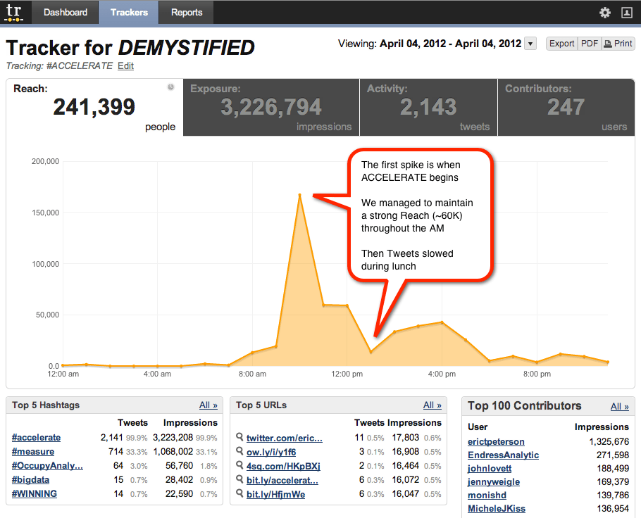
Flash Campaign

This campaign type is used when you wish to test content within flash files.  This is a great technique to use if you wish to apply optimization to your display ads.  Onsite profiles collected by T&T can be used for quick and easy targeting with this type of campaign.

Adobe’s CS5 of Flash has productized the integration with T&T in that within CS5 of Flash, you can leverage a Flash Extension to quickly “mbox” components of the flash asset to be used as part of a test in T&T.  In T&T then you select the Flash campaign and during the campaign setup, you either upload the “mboxed” flash file or point to where it lives in the network.  T&T then identified the “mboxed” components where you can assign alternative content to it as part of the test.

The flash campaign follows the same technique as an A/B test in that visitors are stuck with whatever experience they were originally provided.

In the follow up post, I will highlight the Monitoring Campaign, Multivariate Campaigns and the Optimizing Campaign.

Analysis, Analytics Strategy, Reporting

Digital Analytics: From Data to Stories and Communication

This will be a quick little post as I try to pull together what seems to be an emerging theme in the digital analytics space. In a post late last year, I wrote:

I haven’t attended a single conference in the last 18 months where one of the sub-themes of the conference wasn’t, “As analysts, we’ve got to get better at telling stories rather than simply presenting data.

Lately, though, it seems that the emphasis on “stories” has shifted to a more fundamental focus on “communication.” As evidence, I present the following:

A 4-Part Blog Series

Michele Kiss published a 4-part blog series over the course of last week titled “The Most Undervalued Analytics Tool: Communication.” The series covered communication within your analytics teamcommunication across departments, communication with executives and stakeholders, and communication with partners. Whether intentionally or not, the series highlighted how varied and intricate the many facets of “communication” really are (and she makes some excellent tips for addressing those different facets!).

A Data Scientist’s “Day to Day” Advice

Christopher Berry, VP of Marketing Science at Syncapsealso published a post last week that touched on the importance of communication. Paraphrasing (a bit), he advised:

  • Recognize that you’re going to have to repeat yourself — not because the people your communicating with are stupid, but because they’re not as wired to the world of data as you are
  • Communicate to both the visual and auditory senses — different people learn better through different channels (and neuroscience has shown that ideas stick better when they’re received through multiple sensory registers)
  • Use bullet points (be concise)

Christopher is one of those guys who could talk about the intricacies of shoe leather and have an audience spellbound…so his credibility on the communication front comes more from the fact that he’s a great communicator than from his position as a top brain in the world of data scientistry.

Repetition at ACCELERATE

During last Wednesday’s ACCELERATE conference in Chicago, I tweeted the following:

The tweet was mid-afternoon, and it was after a run of sessions — all very good — where the presenters directly spoke to the importance of communication when it come to a range of analytics responsibilities and challenges.

A Chat with Jim Sterne

At the Web Analytics Wednesday that followed the conference, I got my first chance (ever!) to have more than a 2-sentence conversation with Jim Sterne (I’m pretty sure the smile on his face all day was the smile of a man who was attending a conference as a mere attendee than as a host and organizer, and the plethora of attendant stresses of that role!).

During that discussion, Jim asked me the question, “What is it that you are doing now that is moving towards [where you want to be with your career].” We’ll leave the details of the bracketed part of my quote aside and focus on my answer, which I’d never really thought of in such explicit terms. My answer was that, being a digital analyst at an agency that was built over the course of 3 decades on a foundation of great design work and outstanding consumer research (as in: NOT on measurement and analytics), I have to keep honing my communication skills. In many, many ways I have a conversation every day where I am trying to communicate the same basics about digital analytics that I’ve been communicating for the past decade in different environments. But, I’m not just repeating myself. If I look back over my 2.5 years at the agency, I’ve added a new “tool” to my analytics communication toolbox every 2-3 months, be it a new diagram, a new analogy, a new picture, or a new anecdote. I’ve been working really hard (albeit not explicitly or even consciously) to become the most effective communicator I can be on the subject of digital analytics. Not every new tool sticks, and I try to discard them readily when I realize they’re not resonating.

It’s a work in progress. Are you consciously working on how you communicate as an analyst? What’s your best tip?

Adobe Analytics

ACCELERATE Chicago Debrief

I’m on the plane returning home from the second ever Analytics Demystified ACCELERATE Conference and I can’t help but smile as I think about what an incredible event this was. For starters, demand for this event maxed out the ~200 person capacity of our Chicago venue at the Gleacher Center, but we managed to comfortably squeeze in all of our registered guests as well as everyone who showed up on the waiting list into the room. Of course, Chicago was well represented but there was also a preponderance of Ohio Analysts in the house as well. The OHiO solidarity was reiterated with incessant demands for a Columbus, ACCELERATE sometime in the not too distant future…to which we say, Anything’s possible 😉

Once we kicked off, the room was electrified by Eric Peterson’s inspiring opening comments and you could definitely feel the energy in the air. We promised our attendees a fire hose of content and delivered by honing our “10 Tips in 20 Minutes” format to keep things going at a frenetic but well managed pace. Based on comments and feedback we received, I think it’s safe to say that anyone who was there will tell you that we over-delivered. You can check out the recent Tweets on #ACCELERATE yourself, but I’ll offer up a few notable comments:


medmonds: Very impressed with the #ACCELERATE conference – insightful tips & strategies for optimizing digital channels from industry leaders #MEASURE

Jonghee: Completely satisfied with #ACCELERATE. It’s quality is better than some of the expensive ones. Great job @erictpeterson and the team!

Ableds2: Few industries/professions strive for excellence like this group. I am honored to be surrounded by amazing people #ACCELERATE #measure


#ACCELERATE by the Numbers (April 4, 2012)

One of my responsibilities during ACCELERATE, beyond delivering my 10 Tips on Using a Social Media Measurement Framework was to track the Twitter stream to see what was coming in throughout the day of the conference and who the BIG Tweeters were. I thank TweetReach for providing access to their monitoring tool, which allowed me to conduct my analysis in near-real time as Tweets tagged with #ACCELERATE were flying across the Interwebs.


***Note: My TweetReach Tracker is set up for East Coast time, so this reflects a -1hr Time Zone delay.***

Exposure: (measured in Top Contributors by impressions) We did a pretty good job overall of sharing the love emanating from ACCELERATE on Twitter with 3.23 million impressions reaching an estimated 240k people on April 4, 2012. The 6 top contributors delivered 69% of the total impressions and they included: @EricTPeterson, @EndressAnalytic, @johnlovett, @jennyweigle, @monishd, and @MicheleJKiss (who wasn’t even there!). If you’re looking for folks to get the word out on Twitter, consider this your shortlist.

Velocity: (measured in ReTweets and total impressions) Overall the most re-Tweeted tweet for the 24-hr period was by Erica Chain, who garnered 10 RT’s on her 140 character missive about Joan King’s Crate & Barrel presentation. Note to the velocity Tweeters: pictures get more RT’s! I had a chance to talk with Erica and learned of her amazing story which was an added bonus. But, Monish Datta won our cash money prize for the most Retweeted Tweet as of 3PM. He attained 7 RT’s and over 16k impressions. Monish and team from Victoria’s Secret were well represented at ACCELERATE and they all added great value and velocity to the Tweet stream.

Penetration: (measured as the percentage of #Measure Tweets containing the #ACCELERATE hashtag) Over the course of the day, #ACCELERATE occupied 71.2% of all Tweets on the #Measure. Since we were delivering a fire hose of information during ACCELERATE, we encouraged attendees to Tweet out over our hashtag as well as the #Measure hashtag throughout the day. Apparently they listened because we dominated #Measure by sharing the free content delivered at ACCELERATE with anyone who cared to listen in, one tip at a time. One UK onlooker even commented that either it was lunchtime or Twitter had crashed as our activity came to an abrupt slowdown during our noshing hour.

Impact: (measured as the perceived value generated by ACCELERATE) The true impact of this event is best measured by the actions that attendees will take when they arrive back at their desks and apply their newfound insights into their daily work. While this is a real tough one to quantify, measuring impact on these types of things always is. For me and my Partners at Demystified, we gauge our success by the speaker feedback we receive, the generous donations to our Analysis Exchange scholarship fund, and through the comments that we get from individual attendees. By all measures, this was a smashing success.

In closing, I’d like to issue one last word of thanks to our generous sponsors: Ensighten, ObservePoint, OpinionLab and Tealeaf who made this event possible. And if you missed ACCELERATE Chicago, try to make it to Boston. We’ll be doing it again on October 24th, and we hope to see you there.

Adobe Analytics

Are Your Employees Wasting Your Marketing Budgets?

Every once in a while, especially when I am working with large clients, I ask them a simple question that befuddles them. The question I ask is this:

“Do you know much money you are spending each month on paid advertising that is being used by your own internal employees?”

After they pause for a moment, and realize that they don’t in fact know the answer to this, I sometimes see a spark of panic in their eyes. If I could read their minds it might go something tike this:

“Why is he asking this? Should I know that? I’m sure our employees are smart enough to not use paid advertising like paid Google keywords or display ads to get to our own website right? I hope so… But what if 10% of our ad spend is on lazy employees coming to our website through paid search? Urghhh!!!”

At this point, I assure them that they are probably not wasting a huge amount of their marketing budget on their own employees, but the reason I ask is that it is very easy to know and make sure that you don’t have an issue. Therefore, in this post, I thought I’d show you a simple way to quantify this.

Excluding Employee Traffic

The first step in seeing how much you are spending in advertising on your own employees is to isolate your own internal employee traffic. The good news is that this is something you should already be doing today. If you aren’t, you should start doing this right away. The easiest way to exclude employee traffic is to identify the corporate IP address ranges that your company uses. While this is not perfect, it should be close enough. Even if you have remote employees, hopefully they are using a secure VPN which will route their traffic through your corporate IP ranges (one hint for Adobe SiteCatalyst customers is that if you have IP ranges that change frequently I would suggest implementing a DB VISTA rule that has all of your IP address ranges since that will allow you to add/remove them as needed). Once you know these IP ranges, you can either move that traffic to a different data set (i.e. report suite for Adobe SiteCatalyst customers) or tag them as “employees” in a web analytics variable and build a segment to isolate this traffic. Regardless of how you do this, the ultimate goal is to have a data set or segment that you are pretty sure represents your employees.

External Campaign Reports

Once you have your employee traffic, the next step is to look at your campaigns report for this employee segment. If you are doing a good job with your external campaign reporting, you should have a way to see how many visits you are getting from each paid advertising element or from each marketing channel as a whole. For example, here is a sample SiteCatalyst report showing how many Paid Search (SEM) Visits took place as seen in a report suite that contains only employee traffic:

As we can see here, we’re getting a few hundred visits each week. Next we can compute an average cost for Paid Search advertising and get a rough estimate of how much money we are spending on employees for Paid Search. In this example, for the week of September 25th, we had 372 visits from Paid Search and if our average cost per ad was $3.50, our estimated cost would be $1,302 which annualized would be around $65,000. Depending upon the size of your advertising budgets, that could be good or bad. But let’s say that you work for American Express and have over 60,000 employees. It could be the case that you have 20,000 paid search visits from employees in a given month. If the average cost of paid search keywords were $.50, you could be spending $120,000 of your marketing budget on employees! That could get you a few extra web analysts on your team!

Also keep in mind that the same principle applies to display advertising and other marketing channels that cost you money. Finally, if you need to isolate the specific advertisements that are being used, you can do this by looking at the detailed tracking codes in your campaigns report. I have found that it is normally the branded advertisements that are the top culprits.

Next Steps

Hopefully, after doing this quick analysis, you’ll find out that you don’t have any major issues. But if you do find that your employees are being a bit lazy and eating up large portions of your marketing dollars, there are some simple ways to rectify this. I have found that at large companies, most of the time, employees aren’t aware that they are actually costing their employer money. While people like us live and breathe online marketing, your employees may have no concept of how online advertising works. By using the data you create in your analysis, you can spread the word through company newsletters or intranets and educate the company no how much money is being wasted and ask employees to use free tools like SEO links if they need to get to the website.

Besides saving your company a little bit (or a lot!) of money, this is a fun way to show executives at your company the power of web analytics. If the amount of money you save by doing this analysis is significant, feel free to use the data to get you some additional headcount or tools that you have been longing for!

Analysis, Analytics Strategy, Social Media

The Many Dimensions of Social Media Data

I’ve been thinking a bit of late about the different aspects of social media data. This was triggered by a few different things:

  • Paul Phillips of Causata spoke at eMetrics in San Francisco, and his talk was about leveraging data from customer touchpoints across multiple channels to provide better customer relationship management
  • I’ve been re-reading John Lovett’s Social Media Metrics Secrets book as part of an internal book group at Resource Interactive
  • We’ve had clients approaching us with some new and unique questions related to their social media efforts

What’s become clear is that “social media analytics” is a broad and deep topic, and discussions quickly run amok when there isn’t some clarity as to which aspect of social media analytics is being explored.

As I see it, there are four broad buckets of ways that social media data can be put to use by companies:

No company that is remotely serious about social media in 2012 can afford to ignore the top two boxes. The bottom two are much more complex and, therefore, require a substantial investment, both in people and technology.

Now, I could stop here and actually have a succinct post. But, why break a near-perfect (or consistently imperfect) streak? Let’s take a slightly deeper look at each bucket.

Operational Execution

(I almost labeled this bucket “Community Management,” but the variety of viewpoints in the industry on the scope of that role convinced me to leave that can of worms happily sealed for the purposes of this post.)

Social media requires a much more constant intake and rapid response/action based on data than web sites typically do. Having the appropriate tools, processes, and people in place to respond to conversations with appropriate (minimal) latency is key.

Key challenges to effectively managing this aspect of social media data include: determining a reasonable scope, being realistic about the available on-going people who will manage the process, and, to a lesser extent, selecting the appropriate set of tools. Tool selection is challenging because this is the area where the majority of social media platforms are choosing to play — from online listening platforms like Radian6, Sysomos, Alterian, and Syncapse; to “social relationship management” platforms like Vitrue, Buddy Media, Wildfire, (Adobe) Context Optional, and Shoutlet; and even to the low-cost platforms such as Hootsuite and TweetDeck. These platforms have a range of capabilities, and their pricing models vary dramatically.

Performance Measurement

Ahhh, performance measurement. When it comes to social media, it definitely falls in the “simple, but not easy” bucket. And, it’s an area where marketers are perpetually dissatisfied when they discover that there is no “value of a fan” formula, nor is there “the ROI of a tweet.” But, any marketer who has the patience to step back and consider where social media plays in his/her business can absolutely do effect performance measurement and report on meaningful business results!

Chapters 4 and 5 of John Lovett’s book, Social Media Metrics Secrets, get to the heart of social media performance measurement by laying out possible social media objectives and appropriate KPIs therein. High on my list is to make it through Olivier Blanchard’s Social Media ROI: Managing and Measuring Social Media Efforts in Your Organization, as I’m confident that his book is equally full of usable gems when it comes to quantifying the business value delivered from social media initiatives.

When it comes to technologies for social media performance measurement, we generally find ourselves stuck trying to make use of the Operational Execution platforms. They all tout their “powerful analytics,” but their product roadmaps have typically been driven more by “listenting” and “publishing” features than they have been driven by “metrics” capabilities. With Google’s recent announcement ofGoogle Analytics Social Reports, and with Adobe’s recent announcement of Adobe Social, this may be starting to change.

(Social-Enhanced) CRM

Leveraging social media data to improve customer relationship management is something that there has been lots of talk about…but that very few companies have successfully implemented. At its most intriguing, this means companies identifying — through explicit user permission or through mining the social web — which Twitter users, Facebook fans, Pinterest users, Google+ users, and so on can be linked to their internal systems. Then, by listening to the public conversations of those users and combining that information with internally-captured transactional data (online purchases, in-store purchases, loyalty program membership, email clickthroughs, etc.), getting a much more comprehensive view of their customers and prospects. That “more comprehensive view,” in theory, can be used to build much more robust predictive models that can let the brand know how, when, and with what content to engage individual customers to maximize the value of that relationship for the brand.

The challenges are twofold:

  • Consumer privacy concerns — even if a brand doesn’t do anything illegal, consumers and the press have a tendency to get alarmed when they realize how non-anonymous their relationship with the brand is (as Target learned…and they weren’t even using social media data!)
  • Complexity and cost — there is a grave tendency for marketers to confuse “freely available data” with “data that costs very little to gather and put to good use.” Companies’ customer data is data they have collected through controllable interactions with consumers — through a form they filled out on the web, through a credit card being run as part of a purchase, through a call into the service center, etc. Data that is pulled from social media platforms is at the whim of the platforms and the whim of the consumer who set up the account. No company (except Twitter) can go out to a Twitter account and, in an automated fashion, bring back the user’s email address, real name, gender, or even country of residence. It takes much more sophisticated data crawling, combined with probabilistic matching engines, to get this data.

Despite these challenges, this is an exciting opportunity for brands. And, the technology platforms are starting to emerge, with the three that spring the most quickly to my mind being Causata, iJento, and Quantivo.

Trend / Opportunity Prediction

This is another area that is really tough to pull off, but it’s an area that, admittedly, has great potential. It’s a “Big Data” play if ever there was one — along the lines of how the Department of Homeland Security supposedly harnesses the data in millions of communications streams to identify terrorist hot spots. It’s sifting through a haystack and not knowing whether your’re looking for a needle, a twig, a small piece of wire, or a paperclip, but knowing that, if you find any of them, you’ll be able to put it to good use.

The wistfully optimistic marketing strategist describes this area something like this: “I want to pick up on patterns and trends in the psychographic and attitudinal profile of my target consumers that emerge in a way that I can reasonably shift my activities. I want an ‘alert’ that tells me, ‘There’s something of interest here!'”

It’s a damn vague dream…but that doesn’t mean it’s unrealistic. It’s a multi-faceted challenge, though, because it requires the convergence of some rather sticky wickets:

  • Identifying conversations that are occurring amongst people who meet the profile of a brand’s target consumers (demographic, psychographic, or otherwise) — yet, social media profiles don’t come with a publicly available list of the user’s attitudes, beliefs, purchasing behavior, age, family income, educational level, etc.
  • Identifying topics within those conversations that might be relevant for the brand — we’re talking well beyond “they’re talking about what the brand sells” and are looking for content with a much, much fuzzier topical definition
  • Identifying a change in these topics — generally, what marketers want most is to pick up on an emerging trend rather than simply a long-held truism

To pull this off will require a significant investment in technology and infrastructure, a significant investment in a team of people with specialized skills, and a significant amount of patience. I chuckle every time I hear an anecdote about how a brand managed to pick up on some unexpected opportunity in real time and then quickly respond…without a recognition that the brand was spending an awful lot of time listening in real-time and picking up nothing of note!

This area, I think, is what a lot of the current buzz around Big Data is focused on. I’m hoping there are enough companies investing in trying to pull it off that we get there in the next few years, because it will be pretty damn cool. Maybe IBM can set Watson up with a Digital Marketing Optimization Suite login and see what he can do!

Adobe Analytics

My 2012 Summit SiteCatalyst Feature Wishlist [SiteCatalyst]

Each year at the Adobe (Omniture) Marketing Summit, customers are given an opportunity to “vote” for new product features while Brett Error reviews them (and cracks a few jokes!). From the rumor mill, it sounds like Brett may no longer be around (??), but even if he isn’t, hopefully the session will live on. Each year around the time of Summit, I like to look back at the past year and think about what SiteCatalyst features are not available that would have helped me and my clients the most. The SiteCatalyst product team is always swamped with great ideas from the Idea Exchange and have been doing a great job of pounding them out. Therefore, this list is not meant to mean that my requests are more important than others they are working on, but rather just ones that I have personally experienced pain for not having (some of them were on my last year list as well which you can read here). All of these ideas are in the Idea Exchange, so if you have experienced similar cases where they would help you out, please vote for them there (shortcut links to items in the Idea Exchange are provided for each) and possibly in the Summit session should they arise…

Segmentation Enhancements

In a recent post, I went through some of the reasons why companies might decide to abandon multi-suite tagging and just rely on v15 Segments instead. Currently, there are a few features holding me back from going “all in” on v15 Segmentation. These are:

  1. The ability to compare segments in reports (http://bit.ly/yERLbr). As I mentioned in my previous post, it is easy to compare the same report for two report suites or ASI slots, but it is not yet possible to do the same for two (or more) segments without using Discover.
  2. The ability to have security for segments so you can assign who can see data for a segment (http://bit.ly/yh0djM). As Ben Gaines astutely pointed out, many people use report suites for security reasons to determine who at an organization can see which data. It would be great if this could somehow be duplicated using segments. However, I think that this is not possible until my next feature request is addressed.
  3. The ability to lock down eVars like you can Success Events and sProps (http://bit.ly/wSMLU3). For years, I have asked the SiteCatalyst team to provide the ability to add User/Group security to eVars. Currently, it is possible to prevent a user or group from seeing a specific sProp or Success Event, but for some strange reason, you cannot do this with eVars. Once you can lock down eVars and you can lock down segments, you can truly secure your data set and cease to rely on multi-suite tagging or additional company logins to enforce security.
  4. One item that is unrelated to v15 segmentation and multi-suite tagging, but still related to segmentation, is the ability to segment on a path (http://bit.ly/xzkeTr). There are many cases in which you would want to isolate visitors or visits where visitors navigated in a certain way. Hence, it would be great if you could add a 3 or 4 step flow as a valid way to segment. Since Pathing is available on all sProps, my hope is that this functionality would work for any sProp that has Pathing enabled, not just Pages and Sections.

Multi-Session Enhancements

One of the limitations of SiteCatalyst is that there are many aspects that are only session based. In the future, I would like to see this restriction lifted. Here are a few examples of what I’d like to see:

  1. Ability to see multi-session Paths (http://bit.ly/zimT2O) so you can see how visitors navigated the website across multiple sessions.
  2. Ability to see multi-visit campaign code attribution (http://bit.ly/yzBTUE) in a way that is better than just first touch and last touch or the Cross Visit Participation plug-in. Even if the current option for “Linear” allocation worked cross-session, that would be a great step forward.

Report Sorting Enhancements

If you spend a lot of time in SiteCatalyst reports, you are familiar with the fact that you can only sort by metric columns. I would like to have the following sorting enhancements:

  1. The ability to do a weighted sort so you can easily filter only the top X number of rows before sorting (http://bit.ly/zsJNps). I am sure the following scenario has happened to you at some point. You add a calculated metric like Bounce Rate to a report and then you choose to sort. You end up getting items with a 100% bounce rate, but when you dig deeper you see they have only a few values. What you really want is the ability to filter the report for only the top 50 values and then to apply a sort (like Google Analytics provides). Currently, this has to be done in Excel, but should be native to SiteCatalyst.
  2. The ability to sort by the value column (http://bit.ly/ylULpS). There are some cases in which you would like to sort by the actual values passed into SiteCatalyst instead of by a metric column. Currently, you can work around this by using search filters, so this isn’t a super-high priority, but it would be nice to simply have the ability to sort by the value column for times it is advantageous.

Final Thoughts

Obviously, I could list many more, but the above list of items are the ones that I have run into the most. If you have others that you would like to see elevated in priority, feel free to list them here. Thanks!

Technical/Implementation

The Unknown and the Known

In the Demand Generation world it is all about the “Known” and “Unknown”.  Before visitors fill out a form they are considered to be “Unknown”.  After supplying their information on a form, they are considered “Known”.  Increasing the percentage of visitors that fill out these forms adds a significant amount of value to organizations.

If you are unfamiliar with Demand Generation tools, they are often used to capture information from prospects, score leads, and send targeted emails to prospects, among other things.

Focusing on optimization techniques will allow you to increase the progress of “Unknowns” to “Knowns”, and progress to true personalization; where you know exactly what to show to each person on your site. To start, using the traffic source, environmental variables, online behaviors and geographic variables to target content will help discover what is the most effective content to present to visitors.  These types of visitor profile attributes should serve as the foundation of your visitors’ marketing profiles.  Then, add to them with offline data and contextual data to determine content to present to visitors as part of an optimization.

Let me walk you through two examples that have allowed companies to extend the value of their Demand Generation Platform by integrating it with their Optimization Platform.

The architected solution that is shown here leverages Adobe’s Test&Target and can applied to Demand Generation tools such as Aprimo, Eloqua, and Unica.  This model can be adapted to other platforms and technologies; these are simply the ones that I have helped customers execute and see value with in the past.

This first example highlights ways to increase the percentage of visitors that complete these forms.  Here we are optimizing to the Unknowns.

Optimizing the Unknowns

Unknown Visitors Test&Target Demand Generation

1.  An Unknown contact comes to the website and we want to increase the likelihood of them filling out the form.  The areas on the website and in the email in light red represent mboxes, which is short for marketing box and is the Test&Target code that is placed on the page.  This mbox does two key things in this exercise:  it allows for injection of content to target this visitor and it sets a unique visitor ID.

In order to increase the likelihood of visitors filling out the form and becoming Known, we have to be relevant.  We can target different product promotions, messaging, or content that is relative to the referral messaging to find out what is the most relevant content that leads to increased form completes.  Optimization allows us to not only understand what is the most effective content for form completion for the general population as a whole but also across segments.  For example, we may learn that SEM traffic should be presented with promotional messaging and visitors who are on their third visit should be presented with branded messaging as that increases their likelihood to fill out the form and convert.

2.  In this step a visitor has completed completed the form.  They supplied information such as title, organizational department, company size, industry and personal information such as email, name and address.  All if this information is helpful for the Demand Generation tool to manage this particular lead.  There are two additional data points that should be communicated to the Demand Generation tool as well that only the Optimization Platform can provide.

The first is the information on what targeted content was presented to this individual.  Consider how helpful it would be for the Account Manager or the Sales Person if they knew if a visitor was presented with promotional content versus branded content.  In cases where the company is presenting differentiating products, having that data tied to this lead is even more valuable.

The second data point to be passed to the Demand Generation tool is the Test&Target unique visitor ID.  This ID, when coupled with Demand Generation unique ID, allows for augmentation of the visitor profile attributes with offline data – something I address in the second example.

This communication of optimization Attributes happens programmatically behind the scenes as part of the integration.

3.  At this point, the visitor has made the progression from an Unknown to a Known.  The Optimization Platform provided the ability to determine what content was relevant and would lead to a higher percentage of form completes.  The Demand Generation tool has an increased amount of leads to manage that also have the rich test information provided by the Optimization Platform.

Optimizing the Knowns

Test&Target target on offline profiles

1.  While optimizations are running targeting content to different segments of Unknown visitors, we can also simultaneously run optimizations to different segments of Known visitors.  Clients see incredible value doing this because they are continually being relevant by personalizing the site and email communication even after they have gotten the lead.

In step two in the first example, I pointed out that the optimization platform should communicate to the demand generation the Test&Target ID.  This ID is then coupled with the ID the Demand Generation tool manages.  As activity takes place offline such as phone calls or email communication, the profile of that lead gets richer.  Test&Target allows users to augment the online ID it creates with offline information such as sales cycle stage.  This is something that is accomplished programmatically when lead data is exported from the Demand Generation tool and then feed into Test&Target’s offline profile API.

2.  With all this rich information made available to the online profile, we now have the ability to target content in the same mboxes that were being used in the first example.  Using the Analytics Demystified’s website as an example, if this Known visitor came back to the site after filling out our form and then attending one of our ACCELERATE conferences, we may want to use the real estate in the mbox to promote our next ACCELERATE conference.  Anything that is known about this visitor can be used.  Another great example of the personalization capabilities here would be around targeting content based off of interest expressed offline.  Lets say a visitor came to the Demystified website and submitted their information for us to contact them.  During a phone call that we had with them, we found out that they were interested in the SiteCatalyst audits that Adam Greco provides.  We notate their interest in our Demand Generation tool.  That then gets pushed into their T&T profiles and upon subsequent visits to the site we can target content associated with Adam’s offerings that clients love.  This personalization or relevance can help progress this visitor into further engaging with Adam for his services.

3.  In this step, Test&Target is augmenting the Demand Generation tool’s profile by again communicating additional optimization data points as well as any recent website behavior.  This is very similar to Step two in the first example but in this case the visitor is already Known and may have visited other pages of the site or was presented with specific targeted content that is worth noting for the Sales Person or Account Executive.

So there you have it.  If you are using a Demand Generation tool and you are also using an optimization platform that supports the augmentation of the online ID with offline data, I highly recommend integrating the two.  There is incredible value in optimizing form completes and by continuing to be relevant to visitors even after they completed a form.  Because we are using an optimization tool to accomplish this, all the effort here is easily quantifiable to show the value and ROI.

Analytics Strategy, Conferences/Community

2012 WAA Award of Excellence

On Tuesday at the Emetrics Summit the Web Analytics Association membership awarded Analytics Demystified a 2012 Award for Excellence and dubbed us the “Most Influential Agency” in the digital measurement sector. We are incredibly honored by the award but there are a few folks I forgot to thank at the event that Adam, Brian, John, and I wanted to recognize:

  • Our wives and families, without whom we would not be able to do the work we do
  • Our clients, whose continued support keeps us participating in some amazing analytics around the world
  • Our partners, including Keystone Solutions, IQ Workforce, and eClerx, whose own leadership makes our work better
  • Our sponsors for Web Analytics Wednesday, Analysis Exchange, and ACCELERATE allow us to expand our footprint
  • Our friends throughout the digital measurement, analysis, and optimization community around the world, especially April Wilson who wrote a really nice nomination letter for us

While Analytics Demystified can be a facilitator and catalyst for great events, experiences, and engagements, we are only successful because we get such incredible help and support from the community. From each of us to all of you, thank you!

Conferences/Community

Can you help the Analysis Exchange?

A lot of the conversations I have been having with my peers lately have been about change in our industry. In a nutshell, things seem to be heating up dramatically, especially in the past twelve months. Perhaps due to economic recovery, maybe because of the current hype cycle around “big data”, or possibly because companies are really starting to wake up to the power and value of digital measurement, analysis, and optimization. Regardless of why, it’s delightful to be smack in the middle of what I suspect will in retrospect be a Golden Age for analytical practitioners, technologies, and consultants.

Some tangible evidence of the increased interest in analytics can be found in our efforts at The Analysis Exchange. Just three months ago I blogged about the effort’s momentum, noting that we had “nearly 1,700 members and nearly 200 completed projects.” As of this morning Wendy reported that our membership had grown to over 2,000 members worldwide!

Needless to say we are delighted and hugely grateful for the big push that Google Analytics gave us when they wrote about us back in January. On some level I suspect that the success of the Analysis Exchange is one of the reasons that Analytics Demystified is competing for a Web Analytics Association “Award for Excellence” in the “Most Influential Agency, Vendor, or Group” category (the category that Analysis Exchange won in last year!)

With growth comes opportunity, and boy howdy do we have opportunities for folks to help Analysis Exchange right now: We have over 20 open projects looking for mentors and students. If you have been waiting for an opportunity to help the Exchange, now is your chance!

What’s more, after announcing our Analysis Exchange Scholarship Fund back in January, we have decided that everyone who participates in Analysis Exchange in January, February, and March of this year who earns a great score for their effort is eligible to apply for the Scholarship money. You can use it to go to Emetrics, ACCELERATE, join the WAA, pay for UBC classes, buy books, … pretty much anything related to digital measurement, analysis, and optimization!

So we need your help. If you want some “hand’s on” experience with web analytics, or if you want to help some great non-profits while giving back to your own analytics community, lend a hand and join the over 2,000 people worldwide who are members of the Analysis Exchange!

Adobe Analytics

Uber Success Events [SiteCatalyst]

Every now and then, I run into a unique situation with a client that requires what I call an “Über” Success Event. It isn’t possible to define this easily, so in this post, I will illustrate what it is and when you might want to use it…

eVar Expiration Limitation

For those who faithfully read my SiteCatalyst blog posts, you will have heard me lament two major eVar expiration limitations. The first limitation is that you cannot expire an eVar at either a Success Event taking place OR a time frame (whichever comes first). This limitation can be rough, since there are some cases in which you’d like to expire an eVar when Success Event X takes place, but if it doesn’t take place after three months, you might want to clear out the existing eVar value. Not cleaning out this value could result in that eVar value receiving credit for a Success Event that takes place a year later when it really shouldn’t. I have suggested this change in the Idea Exchange (http://bit.ly/yXqtqS) so feel free to vote for it there.

However, this post is focused on the second eVar expiration limitation, which is that you cannot expire an eVar at one Success Event OR another Success Event. In this case, you basically want to tell SiteCatalyst to expire the eVar when Event X or Event Y or Event Z takes place. Unfortunately, this isn’t possible in the Admin Console, since you can only pick one expiration item (Event or Time Period) from the list. This may not sound like too much of a limitation, but the following example will illustrate how it can cause problems.

Let’s imagine that you are a B2B Lead Generation website that sells its products online or allows its visitors to fill out a form and work with a sales rep to complete the purchase. You have a standard conversion flow with three steps (Event 1, Event 2, Event 3). Each of these steps has an associated Success Event. So far, so good. However, when visitors reach the third step of the process, they can proceed to purchase on line (scCheckout, purchase) or view and submit a form (Event 4, Event 5) to have a sales rep call them and finish the sale.

In this situation, a website visitor can be viewed as successfully completing the conversion funnel two different ways. One way is to purchase online and the other is to submit a form. It’s as if there is a fork in the road, but both paths can lead to a successful conversion. Obviously we can track each of these steps using Success Events, but the following quirky situations arise as a result of this:

  1. It is easy to combine both of the final Success Events (Orders and Event 5 in this case) in a regular eVar report by creating a Calculated Metric that adds Orders to Lead Form Submissions (Event5 ).
  2. However, it is not possible to use a standard SiteCatalyst Conversion Funnel report since you cannot include Calculated Metrics in Funnel reports (to help me change this, vote for this: http://bit.ly/zl3bUs). There are also a host of other issues with Calculated Metrics that you can read about in the Idea Exchange (i.e. Not available in DW, Can’t segment on them, No Participation, Can’t see totals in reports, etc…) so they are not really meant for “heavy lifting,” so to speak.
  3. But the biggest issue is the one I raised earlier. What if we want to expire a bunch of eVars when the visitor Orders OR they submit a Lead Generation Form to a sales rep? We are pretty much out of luck since we can only pick one Event in the Admin Console to use for eVar expiration purposes. Bummer!

As I stated previously, this isn’t an everyday occurrence, but I have seen it wreak havoc on some clients so I wanted to share an easy workaround to solve this last point.

The “Über” Success Event

So now that we have framed the problem, here’s how you can solve it. In the scenario above, what we would want to do is set a new Success Event at the same time that we set both the Order (purchase event) and the Form Submission (Event5). This new Success Event (let’s say that it is Event 20), would be set with every Order and Form submission so it should add up to the total of both. Doing this one simple thing has some wonderful consequences:

  1. There is no need to create the Calculated Metric described previously since this new “Event 20” would add up to the same figure of Orders + Lead Generation Form Submissions
  2. Unlike the Calculated Metric, you would be able to use this new “Event 20” in a Conversion Funnel so you can have a funnel of Event 1, Event 2, Event 3 and then Event 20 which would represent ALL success (obviously we don’t know if the people filling out forms were truly successful, but for this scenario, let’s not worry about that an assume you know how to do this by reading this post!). This also removes all of the shortcomings of Calculated Metrics I mentioned earlier.
  3. But most importantly, if we wanted to expire any eVars when one of these two Success Events takes place, we now have a way to do that. All we have to do is to go to the Admin Console and set the eVars to expire at Event 20!

Hence, setting this extra Success Event that sits on top of the other two Success Events is what I affectionately call my “Über” Success Event! This is just one example of how you can use this concept, but I have seen many more. Enjoy!

Analytics Strategy, General

Web 3.0 and the Internet User's Bill of Rights

Back in 2007, on the subject of the evolution of the web analytics industry, I proffered that “If Web Analytics 1.0 was all about measuring page views to generate reports and define key performance indicators, and if Web Analytics 2.0 is about measuring events and integrating qualitative and quantitative data, then Web Analytics 3.0 is about measuring real people and optimizing the flow of information to individuals as they interact with the world around them.”

At the time I was thinking about the onset of digital ubiquity — an “always on” Internet that followed us everywhere we went and more or less knew where we were. Given the explosion of mobile devices and our near universal dependence on smartphones, location-based services, and digital personal assistants, the following comment seems almost quaint:

“Just think for a minute about how your browsing experience might change if the web sites you visited remembered you and delivered a tailored experience based on your demographic profile (theoretically available via your phone number), your browsing history (accurate because you’re not deleting your phone number) and your specific geographic location when you make the request?”

Essentially I envisioned a future where anonymous log files gave way to massive data stores that, given much of the data would be flowing from mobile devices that we kept on us at all times, would form a far more complete picture of each of us individually than Web Analytics 1.0 or 2.0 could ever hope to support. What’s more, when subject to enough processing power and computational wizardry, this data would support previously unimaginable levels of micro-targeting and content personalization, possibly knowing more about us than our own loved ones.

At the time I recall having conversations with one particularly smart individual who argued that this would never happen — that phone manufacturers and phone and Internet service providers would never allow this type of information to be used, much less in a commercial context. His argument was that this would be such an egregious violation of consumer privacy that, were this to happen, the government would inevitably step in and, fearing ham-fisted meddling by “luddite politicians” (his words, not mine), industry leaders would come together and attempt to offer at least some level of consumer protection, even if it would negatively impact their business models.

Turns out we were both right.

What I referred to as “Web Analytics 3.0” is clearly the collection, analysis, and use of what is more commonly referred to as “Big Data” — an incredibly powerful source of information about consumers that can be used in an almost endless number of ways to power our new data economy. And, thanks to some spectacular mis-steps on the part of organizations, groups, and companies who should know better, “Big Data” is increasingly subject to regulation.

In the past few days, the California Attorney General has announced that she has the agreement of six of the largest mobile platform providers — Google, Apple, Amazon, HP, RIM, and Microsoft — to begin enforcing a law that calls attention to the use of consumer data in mobile applications. And, even more amazingly, the Obama administration has delivered a “Digital Consumer’s Bill of Rights” that has the major browser manufactures agreeing to quickly begin to support “Do Not Track” functionality designed to limit the flow and use of even anonymous web usage data in some instances.

Clearly, both of these announcements are good for consumers, who will hopefully be better protected from bonehead moves like sending entire address books insecurely up to cloud-based servers. And clearly both of these announcements are good for legislators, who during an election year will have something positive to talk about, at least with the majority of their constituents.

But where does this leave you, the digital measurement, analysis, and optimization worker?

More or less in the same place we were back in December 2010 when this all first came up, on the brink of a sea-change in web analytics, but one that I’m confident that most of us can handle. While I still believe that web analytics is hard — perhaps more so than ever — I’m also confident that individuals who are truly invested in making informed decisions based on the available data will be just fine.

Still there are unknowns and subsequently risk coming down the pipe through the President’s “Bill of Rights.”  Some things that I am particularly interested in knowing include:

  • Who decides which technologies will be subjected to browser-based “Do Not Track” directives?
  • Will “blocked” technologies be universally blocked? Or, like in P3P, is their a continuum of requirements?
  • Will “blocked” technologies be blocked across all participating browsers? Or will browser vendors decide individually?
  • Will “blocked” sessions be identified as such? And if so, will some minimal data still be available?
  • How will the Bill of Rights “guarantee” data security, transparency, respect for context, etc. as outlined by the President?

I suspect the answers to most of these questions are still being discussed.  Still, the ramifications are important and there is an awful lot of conflict of interest inherent in the browser vendor’s participation.  For example, if you’re Google and have made a pretty significant investment into Google Analytics, what is your motivation to block analytics tracking in your Chrome browser? Or perhaps you’re Microsoft and you have multiple initiatives to improve the quality of search and display advertising — all of which depend on some level of data collected via the browser — are you willing to prevent all of that in Internet Explorer?

It will be interesting to watch this play out.

For what it’s worth, at Analytics Demystified we have been thinking about the explosion in digital data collection and consumer privacy for a pretty long time. Going all the way back to that 2007 post on Web 3.0, and rolling forward to our work on the Web Analyst’s Code of Ethics and more recently our GUARDS Audit (with BPA Worldwide), Analytics Demystified strongly believes that consumer data is a valuable asset, one that needs to be treated with the upmost respect.

To that end, if your legal team or senior leadership are asking you about the data you collect and how you might be exposed based on how that data is being secured and used, you might be interested in Analytics Demystified GUARDS. In a nutshell, GUARDS is a comprehensive audit of your digital data collection landscape performed by auditors from BPA Worldwide designed to help leadership understand what data is collected, where, why, and how that data is being secured and ultimately used.

Either way, my partners and I at Analytics Demystified will be keeping a careful eye on this Bill of Rights, changes in the mobile data collection landscape, and the application of Do Not Track across modern browsers. I welcome your comments and feedback.

General

Brian Hawkins, Demystified

I am extremely excited to be joining Adam, Eric, and John here at Analytics Demystified.  While at Offermatica, Omniture and then Adobe I witnessed first hand the value this firm brings to clients and I am incredibly proud to be working with them.

A bit about me

I’m originally from Chicago but moved to San Francisco not long after finishing Graduate School in 2004.  Soon after arriving I met the fine folks at Offermatica and started my optimization career servicing clients large and small and across every industry.  It was during these years I found out how to best help organizations scale their optimization programs and, more importantly, how to get the most value out of their optimization platform.

In the years that followed at Omniture and then at Adobe, I spent most of my time continuing to help clients build best of breed optimization teams and practices.

These practices included auditing implementation, training, campaign road mapping, and the ever important process of analysis and communicating results to other parts of the organization.

During those years I also architected solutions for clients that allowed them to get more value out of their personalization and optimization platforms by integrating those platforms with their Analytics, Demand Generation tools, tag management systems, Email service providers and with other tools that share data internally and externally.  I am a strong believer that optimization and personalization should span across all marketing efforts and not just on the website; and integrating internal and external tools enables this.

Going forward

At Analytics Demystified, my hope is to continue helping clients in this manner as I see the incredible value it brings them.  I want to show them how to get the most out of their optimization and personalization tools.  While my background has been heavily focused around the Adobe technologies such Test&Target, Test&Target1:1, and Recommendations, I am already branching out and applying my skill set to other vendor tools.

I really look forward to sharing my insights here on this blog and I hope to hear from all of you here as well.  If I can be of any help to your business or you would like to chat, do not hesitate to let me know.   I can be reached via this page or by email at brian.hawkins@analyticsdemystified.com.

Analysis, Reporting

3-Legged Stool of Effective Analytics: Plan, Measure, Analyze

Several weeks ago, Stéphane Hamel wrote a post that got me all re-smitten with his thought process. In the post, he postulated that there are three heads of online analytics. He covered three different skillsets needed to effectively conduct online analytics: business acumen, technical (tools) knowledge, and analysis. And, he made the claim that no one person will ever excel at all three, which led to his case for building out teams of “analysts” who have complementary strengths.

I’ve had several unrelated experiences with different clients and internal teams of late that have led me to try to capture, in a similar fashion, the three-legged stool of an online analytics program. Just as others have started tacking on additional components to Stéphane’s three skillsets, I’m sure my three-legged stool will quickly become a traditional chair…then some sort of six-legged oddity. But, I’d be thrilled if I could consistently communicate the basics to my non-analyst co-workers and clients:

I hold to a pretty strict distinction between “measurement and reporting” and “analysis,” and I firmly believe there is value in “reporting,” as long as that reporting is appropriately set up and applied.

Just as I believe that reporting should generally occur either as a one-time event (campaign wrap-up, for instance) or at regular intervals, I firmly believe that testing and analysis should not be forced into a recurring schedule. It’s fine (desirable) to be always conducting analysis, but the world of “present the results of your analysis — and your insights and recommendations therein — once/month on the first Wednesday of the month” is utterly asinine. Yet…it’s a mindset with which a depressing majority of companies operate.

Reporting Done Poorly…Which Is an Unfortunately Ubiquitous Habit

I’ve been client side. I’ve been agency side. I’ve done a decent amount of reading on human nature as it relates to organizational change. My sad conclusion:

The business world has conditioned itself to confuse “cumbersome decks of data” with “reporting done well.”

It happens again and again. And again. And…again! It goes like this:

  1. Someone asks for some data in a report
  2. Someone else pulls the data
  3. The data raises some additional questions, so the first person asks for more data.
  4. The analyst pulls more data
  5. The initial requestor finds this data useful, so he/she requests that the same data be pulled on a recurring schedule
  6. The analyst starts pulling and compiling the data on a regular schedule
  7. The requestor starts sharing the report with colleagues. The colleagues see that the report certainly should be useful, but they’re not quite sure that it’s telling them anything they can act on. They assume that it’s because there is not enough data, so they ask the analyst to add in yet more data to the report
  8. The report begins to grow.
  9. The recipients now have a very large report to flip through, and, frankly, they don’t have time month in and month out to go through it. They assume their colleagues are, though, so they keep their mouths shut so as to not advertise that the report isn’t actually helping them make decisions. Occasionally, they leaf through it until they see something that spikes or dips, and they casually comment on it. It shows that they’re reading the report!
  10. No one tells the analyst that the report has grown too cumbersome, because they all assume that the report must be driving action somewhere. After all, it takes two weeks of every month to produce, and no one else is speaking up that it is too much to manage or act on!
  11. The analyst (now a team of analysts) and the recipients gradually move on to other jobs at other companies. At this point, they’re conditioned that part of their job is to produce or receive cumbersome piles of data on a regular basis. Over time, it actually seems odd to not be receiving a large report. So, if someone steps up and asks the naked emperor question: “How are you using this report to actually make decisions and drive the business?”…well…that’s a threatening question indeed!

In the services industry, there is the concept of a “facilitated good.” If you’re selling brainpower and thought, the theory goes, and you’re billing out smart people at a hefty rate, then you damn well better leave behind a thick binder of something to demonstrate that all of that knowledge and consultation was more than mere ephemera!

And, on the client side, if the last 6 consultancies and agencies that you worked with all diligently delivered 40-slide PowerPoint decks or 80-page reports, then, by golly, you’re going to look askance at the consultant who shows up and aims for actionable concision!

Nonetheless, I will continue my quixotic quest to bring sanity to the world. So, onto the three legs of my analytics stool…

First, Plan (Dammit!!!)

Get a room full of experienced analysts together and ask them where any good analytics program or initiative starts, and you’ll get a unanimous response that it starts: 1) at the beginning of the initiative, and 2) with some form of rigorous planning.

The most critical question to answer during analytics planning is: “How are we going to know if we’re successful?” Of course, you can’t answer that question if you haven’t also answered the question: “What are we trying to accomplish?” Those are the two questions that I wrote about in this Getting to Great KPIs post.

Of course, there are other components of analytics planning:

  • Where will the data come from that we’ll use?
  • What other metrics — beyond the KPIs — will we need to capture?
  • What additional data considerations need to be factored into the effort to ensure that we are positioned for effective analysis and optimization down the road?
  • What (if any) special tagging, tracking, or monitoring do we need to put into place (and who/how will that happen)?
  • What are the known limitations of the data?
  • What are our assumptions about the effort?
  • …and more

In my experience both agency-side and client-side, this step regularly gets skipped like it’s a smooth round, rock in the hand of an adolescent male standing on the shore of a lake on a windless day.

An offshoot of the planning is the actual tagging/tracking/monitoring configuration…but I consider that an extension of the planning, as it may or may not be required, depending on the nature of the initiative.

Next, Measure and Report

Yup. Measurement’s important. That’s how you know if you’re performing at, above, or below your KPIs:

Here’s where I start to get into debates, both inside the analytics industry and outside. I strongly believe that it is perfectly acceptable to deliver reports without accompanying insights and analysis. Ideally, reports are automated. If they’re not automated, they’re produced damn quickly and efficiently.

Dashboards — the most popular form of reports — have a pretty simple purpose: provide an at-a-glance view of what has happened since the last update, and ensure that, at a glance, any anomalies jump out. More often than not, there won’t be anomalies, so there is nothing that needs to be analyzed based on the report! That’s okay!

I was discussing this concept with a co-worker recently, and, in response to my claim that reports should simply get delivered with minimal latency and, at best, a note that says, “Hey, I noticed this apparent anomaly that might be important. I’m going to look into it, but if you (recipient) have any ideas as to what might be going on, I’d love to get your thoughts,” she responded:

I think this makes sense, but wouldn’t we provide some analysis as to the “why” on the monthly reports?

I immediately went to the “dashboard in your car” analogy (I know — it breaks down on a lot of fronts, but it works here) with my response:

You don’t look at your fuel gauge when you get in the car every day and ask, “Why is the needle pointing where it is?” You take a quick look, make sure it’s not pegged on empty, and then go about your day.

That’s measurement. It may spawn analysis, but, often, it does not. And that’s to be expected!

Which Brings Us to Testing and Analysis

Analysis requires (or, at least, is much more likely to yield value in an efficient manner) having conducted some solid planning and having KPI-centric measurement in place. But, the timing of analysis shouldn’t be forced into a fixed schedule.

The bottom part of the figure above gets to the crux of the biscuit when it comes to timing: sometimes, the best way to answer a business question is through analyzing historical data. Sometimes, the best way to answer a question is through go-forward testing. Sometimes, it’s a combination of the two (develop a theory based on the historical data, but then test it by making a change in the future and monitoring the results). Sometimes the analysis can be conducted very quickly. Other times, the analysis requires a large chunk of analyst time and may take days or weeks to complete.

Facilitating the collaboration with the various stakeholders, managing the analysis projects (multiple analyses in flight at once — starting and concluding asynchronously based on each effort’s unique nature), can absolutely fall under the purview of the analyst (again referencing Stéphane’s post, this should be an analyst with a strong “head” for business acumen).

In Conclusion…(I promise!)

There is a fundamental flaw in any approach to using data that attempts to bundle scheduled reporting with analysis. It forces efforts to find “actionable insights” in a context where there may very well be none. And, it perpetuates an assumption that it’s simply a matter of pointing an analyst at data and waiting for him/her to find insights and make recommendations.

I’ve certainly run into business users who flee from any effort to engage directly when it comes to analytics. They hide behind their inboxes lobbing notes like, “You’re the analyst. YOU tell me what my business problem is and make recommendations from your analysis!” I’m sure some of these users had one too many (and one is “too many”) interactions with an analyst who wanted to explain the difference between a page view and a visit, or who wanted to collaboratively sift through a 50-page deck of charts and tables. That’s not good, and that analyst should be flogged (unless he/she is less than two years out of college and can claim to have not known any better). But, using data to effectively inform decisions is a collaborative effort. It needs to start early (planning), it needs to have clear, concise performance measurement (KPI-driven dashboards), and it needs to have flexibility to drive the timing and approach of analyses that deliver meaningful results.

Excel Tips, Social Media

Facebook Status Updates: Exploring Optimal Timing

NOTE: This post is no longer current. An updated version of the post, including an updated spreadsheet, is posted here.

Although Facebook has unofficially admitted that there seems to be little rhyme or reason these days when it comes to the time of day or day of week when a brand posts content on their page, it’s still worth doing a quick analysis to see if this is, indeed, the case for your page.

The challenge, it turns out, is that there are multiple aspects of what sounds like a pretty straightforward assessment:

  • What metric(s) actually make for a “successful” post?
  • How do you effectively consider time of day and day of week?
  • Have you actually posted on a sufficient variety of dates and times to have the data to do a meaningful analysis?

After scraping together some hasty cuts at this, I thought it would be worthwhile to try to knock out something that was easily shareable and reusable. The result is the downloadable spreadsheet at the end of this post.

What It Looks Like

The spreadsheet takes a simple export of post-level data from Facebook Insights (the .csv format) and generates three basic charts.

The first chart simply shows the number of posts in each time slot and each day of week — this answers the question of, “What spots have I not even really tried posting in?”

In this example, there have not been any posts from 9:00 PM to 6:00 AM, only one post between 6:00 AM and 9:00 AM, and only four posts on a Friday. Don’t worry if you don’t like the time windows — we’ll get to that in a bit.

The next two charts are crude heatmaps of a couple of metrics, but they both use the same grid as above, and they use a pretty simple green-to-red spectrum to show which spots performed best/worst relative to the other slots:

(I know, I know: red/green is not a colorblind-friendly palette selection. I’ll keep working on the visualization technique!)

The first of these charts looks at the average total reach of the updates that were posted in each time slot — the number of unique users of Facebook who were exposed to the post:

In the example above, Wednesdays looked to perform pretty well reach-wise, as did Saturday afternoon. If you have Facebook paid media running, these results may get skewed. It’s easy enough to update this chart to use Organic Reach rather than Total Reach, or, you can simply factor an awareness of what was running and when into your assessment of the results. Also, keep in mind that Facebook continues to fiddle with the EdgeRank/GraphRank algorithm, so there are aspects of a post’s reach that are beyond your control.

The next chart shows the average engagement rate of the posts, defined as the number of users who engaged with the post in some way (clicked on a link, posted a comment, liked the post, viewed a photo, etc.) divided by the total reach of the post. This is a pretty solid measure of the content quality — did the post drive the users who saw it to take some action to engage with the content? Now, arguably, the propensity for a user to engage is less impacted by the time of day and day of week, but, who knows?

In this example, Sundays and Thursdays were the days when posts appeared to get more engagement (although be leery of that Sunday, 6:00 PM to 9:00 PM, block — there was only a single post in the data set).

Timeframe Flexibility

Picking a set of timeframes is the most subjective aspect of this whole analysis, and it may be worth iterating through a few times to get to timeframes that are likely to be meaningful for the page given the target consumer. So, I’ve set up the worksheet to make it easy to customize these timeframes. For, instance, below is the same data set used above, but with only four windows of time:

The change look less than 60 seconds to implement (it’s all about VLOOKUPS, pivot tables, and conditional formatting!).

How to Use This for Your Own Page

If you want to try this out for your page(s), simply download the Excel file (this was created using Excel 2007, so it should work fine in both 2007 and 2010) and follow the instructions embedded in the worksheet. You will need to export post-level Facebook Insights data for your page, which may require several iterations (we’ve found that Facebook Insights is prone to hanging up if you try to export more than a couple of months of data at once):

Then, just follow the instructions in the spreadsheet and drop me a note if you run into any issues!

Some Notes on the Shortcomings

This approach isn’t perfect, and, if you have ideas for improving it, please leave a comment and I’ll be happy to iterate on the tool. Specifically:

  • This approach measures all updates against the other posts for the same page — there is no external benchmarking. This doesn’t bother me, as I’m a proponent of focusing on driving continuous improvement in your performance by starting where you are. Certainly, this analysis should be complemented by performance measurement that tracks the actual values of these metrics over time.
  • The overall visualization could be better. It’s not ideal that you need to jump back and forth between three different visualizations to draw conclusions about what days/times are really “good” or “bad”…including factoring in the sample size. I’ve toyed with making more of a weighted score and then doing the same color grid, but, then, you’d be looking at a true abstraction of the performance, so I didn’t go that route. Suggestions?
  • A red–>yellow–>green scale just isn’t good when it comes to supporting: 1) black-and-white printouts, and 2) certain forms of color blindness. A more iconographic approach might make more sense.

Please do weigh in with how you would change this. I’m happy to rev it based on input!

Analytics Strategy

Working Around Sampled Search Data in Google Analytics

I got into a discussion of sampling in Google Analytics  with SEO expert and Web PieRat Jill Kocher earlier this year, which led to some profile/filter noodling that seemed worth sharing. Specifically, Jill and I were discussing how, in the world of search engine optimization — where the long tail can be a handy thing to analyze — sampling in Google Analytics can be a real nuisance.

That got me thinking that a partial solution would be to have a Google Analytics profile that only includes organic search traffic. This isn’t a profile that you would use for cross-session analytics, but it’s one that would allow simplified segmentation, reduced cases of sampling, and, perhaps, a more complete data set.

As it turns out, it was pretty simple to set up, and it seems to do the trick.

Step 1: Make a New Profile

Create a new profile under the same web property that you’re using for your site and name it Organic Search Traffic Only:

There’s nothing magic about this. The key is that this is a profile that uses the same web property ID as the profile where you’re running into sampling issues with your SEO analysis. We’re just going to take that same feed of data coming in as visitors visit your site and carve out the subset of that data that is traffic from organic search referrals.

Step 2: Apply an Organic Search Filter

The next (and final) step is to create a filter and apply it to the profile such that only organic search traffic is included.

In the new profile you just created, select the Filters tab and then click New Filter:

From there:

  1. Give the filter a name like “Organic Search Referrals”
  2. Select Custom Filter as the Filter Type
  3. Set the filter as an Include filter
  4. Set the Filter Field to Campaign Medium
  5. Set the Filter Pattern to “organic”
  6. Save the filter

The screen below shows the filter settings:

Step 3: Sit Back and Let the Data Roll In

The profile is only going to include data from the point you set it up going forward. But, it will accurately reflect (to the extent that any web analytics package can accurately reflect this) new versus returning visitors for all time (well, since you initially implemented Google Analytics), because it’s getting that data from the cookie that already exists on users’ machines.

Initially, I saw some odd data on the unique visitors front, which I can semi-intuitively understand…but not quite explain.

Suffice it to say that, once you have the profile up and running for a week or so, you can select the Non-paid Search Traffic segment in your main profile and compare it to the All Visits segment in your new profile, and the numbers will be virtually identical. But, you can now do SEO analysis with a base set of data that only includes search traffic.

Is that handy?

Adobe Analytics

Product Page Tab Usage [SiteCatalyst]

If you sell products on your website, you will often find the need to provide detailed information to those browsing your products. For example, below you can see a product detail page for a Gas Grill. As you can see, there are tabs for Specifications, Ratings & Reviews, etc…

One of the things I have been asked by clients is to provide a way for them to see how often each of these pieces of information (usually in the form of tabs) is used. Specifically, I am usually asked the following questions:

  • Which tabs are used the most?
  • Which tabs are used the most for each product?
  • In what order are these tabs clicked in general and for each product?
  • Are there certain tabs that lead to conversion more than others?

Therefore, in this post, I will share some tips on how to answer these questions…

Tracking Tab Usage

To start, let’s focus on the easiest question – which tabs are being used most often. To do this, we need to capture the name of the tab each time it is accessed. While I normally use eVar variables over Traffic (sProp) variables, this is one case in which I prefer to use sProps for reasons you will see below. Therefore, when a visitor clicks on one of the tabs on a Product Detail Page (PDP), I like to pass the name of the tab and the product to which it is related to an sProp. For example, on the Product Detail Page shown above, if the visitor clicks on the “Ratings & Reviews” tab while on the “Kenmore 4-Burner LP Gas Grill,” I would pass the following:

s.prop60=”Kenmore 4-Burner Gas Grill:Ratings & Reviews”

By concatenating these values, I know that I had one instance of the combination of this particular product and the specific tab that was clicked. If the page doesn’t reload when the tab is clicked, you may have to use Custom Link tagging to set this sProp. In addition, it is important that you also capture the default tab item, which is normally some variation of “Overview.” In this case, when the Product Detail Page first loads, the value passed to the sProp would be “Kenmore 4-Burner Gas Grill:Overview.” By setting these values to an sProp, you can easily see how often each Product/tab combination is viewed and if you have unique visitors enabled for the sProp, you can see uniques for each combination as well:

Next, you can use SAINT Classifications to group all similar tabs together to see a rollup of use across all products. In the preceding example, we might want to group all cases of “Ratings & Reviews” across all products to see which types of tabs are getting the most action:

Product Tab Pathing

Now that we can see a general idea of which tabs are being used and which tabs are used for each product, the next question we want to answer is in which order are tabs being used. Whenever you want to see sequence in SiteCatalyst, you will want to use Pathing reports. This is the reason why I chose to use an sProp instead of an eVar for this setup since Pathing only works on sProps. In this case, once you have implemented the sProp described above, you can enable Pathing and you will be able to see the order in which tabs are used for each product like this:

However, this sProp and its Pathing capabilities will only allow you to see how visitors used tabs at the product level. What if you want to see a Pathing report that shows how tabs were used regardless of product? Unfortunately, this isn’t as easy as it should be. If you have the Discover product, you can see Pathing on the SAINT Classification we created above, but if you don’t have Discover, you will have to create a second sProp that captures only the tab name and also has Pathing enabled.

Product Tab Influence

Another question I get from clients related to Product Tabs has to do with the impact they have on conversion. For example, they want to know if visitors who view the Specifications tab are more likely to convert than those who do not. In SiteCatalyst, there are a few ways to accomplish this. First, once you have implemented the items above, you can create a Segment to filter sessions or people using specific tabs and see how that segment of visits/visitors compares to those who did not use the tabs. Keep in mind that you can segment on both detailed values (product+ tab) or the classified value (tab only) in the segment builder or Discover.

Another way to see the influence of tabs on KPI’s is to use Success Event Participation. By enabling Participation on the sProp described above for your key Success Events, you can see which ones have the most influence over time. For example, if we turn on Participation for the sProp shown above related to Orders, we can see a report like the one shown here:

In this report, we can see how many Orders each product/tab combination was in the flow of across weeks or months of visits. Then we can create a calculated metric which divides this Order Participation by the number of times each product/tab combination took place to see how influential it was as compared to other product tab combinations (since the numbers are small, in this example, I multiplied by 100 to make the differences easier to see). Obviously, the same principle can be applied to the sProp that does not contain the product as long as you are passing the values natively to an sProp and not creating it via a SAINT Classification. Finally, you could also pass the tab names to an eVar and set the allocation to Linear to spread credit across all tabs that are used, but since you may already be setting the sProp decried above for pathing purposes, Participation may be the logical way to go.

Final Thoughts

Keep in mind that the same principles described here can be applied to other items related to products – not just product detail page tabs. For example, you might have 360 degree views of products, product images, etc. that can all have an influence on conversion. You can treat these items the same as product tabs and capture them as shown above. Therefore, if you are curious about how website visitors are using tabs on your product detail pages or any other supplemental product information you provide, give the techniques shown here a try. If you have other tips on tracking this type of product content, leave a comment here.

General

Welcome Demystifier Brian Hawkins!

Adam, John, and I are incredibly excited to announce that industry veteran Brian Hawkins is joining Analytics Demystified to help us expand our offerings around testing, optimization, and personalization of all forms of digital communication. Brian is the most widely recognized expert in the field when it comes to Enterprise-class optimization and personalization technology, integration, and strategy. He comes to us from Offermatica by way of Omniture and Adobe, and we are delighted to build on our support for Adobe’s solutions, adding Brian’s expertise on Test&Target to Adam’s SiteCatalyst-related offerings.

Brian’s offerings at Demystified will look a lot like Adam’s — audits of current implementations, strategic planning for testing and optimization readiness, systems integration architecture and support, and planning support for the entire end-to-end process of site and application optimization in the Enterprise. While Brian’s technology expertise is strongest on Test&Target, his knowledge of what it takes from a teams, governance, and process perspective to be successful transcends platforms and I believe will incredibly valuable to any large business trying to become agile in their optimization efforts.

Brian is taking a little time off before getting started mid-month but I will be adding his blog, a description of his offerings, and more about him to the site very soon. Clients are welcome to contact us directly to set up time to meet Brian (and if you’re not a client you can call too, that is if you have any interest in testing, optimization, or personalization.)

Brian will be with us at Emetrics, Adobe’s Summit in Salt Lake City, and of course he will be presenting at our own ACCELERATE event in Chicago on April 4th. If you’re at any of these events and would like to meet or connect with Brian, please drop me a note.

We hope you will join us in welcoming Brian to the team.

Social Media

Facebook Engagement (aka, Facebook Rhetoric Facebook Reality)

Oh, Facebook.

Facebook, Facebook, Facebook.

Ours is a tumultuous relationship of unrequited frustration, is it not? I am an analyst, therefore (apparently), you scorn me. And, by “scorn,” I mean “ignore.”

You never responded to my letter last year. You don’t return my calls. (Well, that’s not entirely true: you put salespeople on my calls whose general response to any question is, “Buy Facebook media.” I get it. That’s their job, but they act like they’ve parachuted straight out of Mad Men and are pushing traditional mass-blast advertising. Ironic, no?)

Facebook, I’ve dug into the data. Your own documentation states:

Posting regularly with engaging content gets more people to talk about your business with their friends. As a result, you end up reaching more people overall.

Yet, the data you provide us tells a very different story. We debunked this particular claim — that getting people to talk about your content leads to greater reach — a month ago.

So, What Can We Debunk This Month?

Lately, I’ve been digging into a more basic mystery: you claim that, the more someone engages with a page’s content, the more likely that person is to get presented with more of that page’s content in the future. That seems pretty reasonable. Of course, you hedge at the same time:

No matter how engaging your Page posts are, not all of your fans will see them in their News Feed. In order to make sure that more of your fans see your posts, you should create a Page Post Ad

Can we quantify that “not all of your fans…” statement? AllFacebook.com did just that when they published a pretty alarming article last week based on Edgerank Checker data. Their study showed that, on average, across 4,000 pages, only 17% of total fans were being reached per individual post by the brand. “Zoiks!” were the cries that echoed through the halls of community managers the world over!

To be fair, not everyone is on Facebook all the time, and, while that number matches data we’re seeing overall, it also leaves out the fact that these don’t appear to be the same 17% day in and day out. When it comes to looking at the 28-Day Total Reach from Page Posts measure you provide, we see numbers that are more in the neighborhood of half of a page’s Lifetime Total Likes (when there is no Facebook media running — it’s much higher than that if that exposure is being purchased from Facebook).

Is 17% really all brands can expect, or is it all they can expect if they’re doing a lousy job posting content?

Are Brands Simply Not Publishing Engaging Content?

We’ve been working pretty hard to learn what kind of content our clients’ fans like, as well as how often and when to post. That put us in a good position to dig into the data to see how we were doing, especially in light of the drop we felt we were seeing in the Reach of posts across a range of our clients’ pages.

We looked at data from a half-dozen pages. These pages were all devoted to major consumer brands, had Lifetime Total Likes ranging from the low 100,000s to multiple millions, and cut across a range of different verticals. Is “6 pages” on the order of the “4,000 pages” from the Allfacebook.com study? Well, no, but we were working with over 600 status updates, and it quickly became apparent that we’d dug in enough to draw some pretty sound conclusions..

For the chart below, we removed the handful of posts that were clearly data anomalies (skewing both wildly high and wildly low) and then, for each post, took the Lifetime Engaged Users for the post (the number of unique people who clicked anywhere in the post within 28 days of it being posted, regardless of whether the click generated a story or not) and divided it by the Total Reach for the post.

It’s not the cleanest of graphs, but it seems pretty clear that, if anything, these pages are, overall, making some headway when it comes to producing more engaging content.

The idea here is that the only people a post has a chance of engaging are people that it reaches. So, we have Total Reach as the denominator. This is similar to the Post Virality calculation that you, Facebook, generate for me…but we’re looking at a lower level of engagement than “generated a story” — just looking to see if fans are interacting with the post in any way. Because, in theory, if they are, then you will be more likely to present them with subsequent posts from the same page.

So, Engagement Isn’t Dropping. Presumably, Reach Isn’t, Either?

In the post engagement chart, there’s nothing all that shocking. What does get alarming, though, is when we look at the average Organic Reach (unique users who saw the post directly as a result of the page posting it — not because a friend talked about it, and not because the brand ran paid media to extend the reach of the post). We divided that organic reach by the Lifetime Total Likes for the page to see what % of the total fans were reached by the post organically.

Again, outliers (high and low) were removed (this included locally-targeted posts, where the reach, obviously, was very low relative to the total likes for the page). Each point on the chart represents all of the status updates on that day from our sample:

Wow. I’m not a data scientist, so the above doesn’t have any true statistical rigor applied to it. Rather, it is an exercise in what a stats professor once preached to me: “Start off by plotting the data! That’s going to tell you a lot!”

It’s pretty conclusive, I think, that a Facebook algorithm change (and related UI changes — but the algorithms drove what content appears anywhere for a user, regardless of the UI) in late September gave brands a temporary ability to reach a higher proportion of their fans. That, undoubtedly, led to any number of community managers thinking they had been listening and learning and publishing more engaging content.

Then, (alas!) November arrived. And, suddenly, Reach plummeted.

WTF?

It’s not that I’m opposed to paying you for reach, Facebook. I’m totally okay with paid media being part of my social media mix. But, if I have to pay you each time I want to reach someone, the numbers start to get hard to justify. If someone likes my page, and then they engage with my content, why don’t they keep getting my content for some period of time?

Here’s what I think happened (and, frankly, I’d respect you a bit more in the morning if you just came out and admitted it):

  1. You put some sharp people in a room and told them to come up with a good EdgeRank/GraphRank algorithm
  2. While you have “a lot of data,” that algorithm still was largely driven by that team’s instincts around what weighting should be given to different factors
  3. There was a fair amount of teeth-gnashing, and the team even tried to do some testing of the algorithm before rolling it out. But, that’s a taller order than it sounds.
  4. The algorithm got rolled out.
  5. You had no idea what was going to happen. What looked good on paper looked, well, different in practice.
  6. For various reasons — none of which have been openly stated — the algorithm has been quietly tweaked a couple of times. In one case, it was related to the Timeline rollout, but, by this time, the algorithm had become the red-headed stepchild of Palo Alto. No one really wants to own it, because no one can really figure out what will make it “work.” After all…the algorithm-heads are all just down the street in Mountain View! (zing!)

How close am I with the above speculation? I don’t have inside knowledge (as noted earlier, you don’t call, you don’t write), but I’m not sure what other explanation makes sense.

Know that you’re killing us — the analysts who are trying to drive learning and optimization! At least set up some sort of open dialogue. We don’t need to see the full formula. But, we need to have useful information about how to do things better. And we need to know when you’re tinkering with the algorithm and what the likely result of that tinkering will be. Otherwise, we can’t trust the data, which means we can’t learn from it. Without data we can use, it’s hard to justify investment and action.

Analytics Strategy, Social Media

New Blog Design –> Responsive Design & Web Analytics Musings

If you’re reading this post on the site itself (as opposed to via RSS or email), and if you’ve been to the site much in the past, then you’ll notice the design of the site has been completely overhauled. This was one of my goals for my weeklong holiday break…and it’s a goal I entirely missed! Luckily, though, I wound up with a kid-free/spouse-free weekend a week-and-a-half ago, so I got to tackle the project.

So, Why a New Design?

I updated the design for two reasons:

  • The old design was starting to wear on me. There were a number of little alignment/layout/wrapping issues that I had never quite managed to fix, even as I tinkered with the blog functionality (for instance, my social icons never quite lined up well). I also figured out last fall that the nested table structure pretty much precluded me from getting the mix I wanted of fixed and liquid elements. In short, a redesign just seemed in order.
  • Responsive web design is here. This was more of the direct-tie-to-my-day-job reason for the overhaul. Various sharp people at Resource Interactive have started pushing responsive web design as something that should be actively considered for our clients. As I dug into the topic, I realized that: 1) this blog is a good candidate for a responsive design, and 2) there are some analytics implications to a responsive design, and I needed somewhere to experiment with them.

So, this site is now using a fully responsive WordPress theme.

What Is Responsive Design, Exactly?

As I understand it, responsive design is an “Aha!” that grew out of the increasing need for web sites to function across a wide range of screen sizes and experiences and platforms: laptop monitors, desktop monitors, tablets (iOS and Android), and smartphones (also iOS and Android). The idea is that, rather than having a “desktop site” and a “mobile-optimized site,” you can have “a site” that works effectively on a wide range of devices.

There are two keys to this:

  • The site needs to be viewable in different devices — 3 columns that display on a desktop monitor may need to become a single set of stacked content on a smartphone. Or, a list of links in the sidebar on the desktop may need to become a dropdown box at the top of the page on an iPhone.
  • The site needs to support the most likely use cases in different devices — this is a stickier wicket, because it forces some strategic thought (and possibly research and testing) to think through what a visitor to your site who is using an iPhone (for instance) is likely looking to do and how that differs from a visitor to your site who is using a desktop.

Both of these are questions that have always been asked when it comes to developing a “mobile-optimized version of the site,” but they’re a bit more nuanced given that responsive design isn’t a “separate site.”

Wow, Tim, I’m Impressed with Your Coding Skills!

Don’t be impressed with my coding skills.

I did a little research and then shelled out $35 to buy the Rising theme. That doesn’t mean there wasn’t a fair amount of tinkering (and more tinkering yet to be done — I certainly have not fallen prey to a need to have the perfect site designed before pushing it live!), but the end result is an improved site. And, more importantly, having a site that actually works well across devices (Try it! Just resize your browser window and watch the sidebar at the right. Or, fire up the site on your smartphone and compare it to your desktop.)

Now, of the “two keys” above, I really focused on the first one. This is a blog, after all. Regardless of what device you’re on, presumably, you’re here to consume blog post content.

I’m still working with the palette (too little contrast between the hyperlink color and the plain text color), the font selection (I’m not in love with it), and the header logo (pulling what strings I can to get a professional to contribute on that front), but I’m reasonably content with the change. Let me know if you have any tips for improving the design (I’m not proud!).

Where Does Analytics Come into All of This?

While I have access to tons of different web analytics accounts across a range of platforms through our various clients, I don’t actually have a great sandbox for trying things out (you would think our company’s site would be a good testbed, but the reality is that there are so many competing agendas for competing resources there that it’s seldom worth the effort). Luckily, this site has built up enough content and enough of a presence to get a few hundred visits a day, which is enough to actually do some tinkering and get some real data as a result.

Here’s my list of what I’ll be toying with over the coming weeks:

  • Responsive design analytics — we’ve had “screen resolution” and “device” reporting for years, but responsive design introduces a whole new twist, because it’s truly experience-centric. I’ve done a little digging online and haven’t found much in the way of thinking on this. While I don’t think it’s possible to directly pull CSS media query data into the web analytics platform, it should be possible to use Javascript to detect which responsive layout is being used for any given visitor and then pass that information to the web analytics platform (as a custom variable or a non-interaction event in Google Analytics). And, it should be possible to record when an onresize event occurs. In both cases, using this data to segment traffic to determine if a particular layout is performing poorly or well, as well as how visitors move through the site in these different experiences, seems like a promising thought.
  • Facebook Insights for Websites — I’ve had this running for a while, but, as part of another experiment, I switched over from using my Facebook user ID in the meta data to authenticate my ownership of the site to using a Facebook app ID. That’s a better way to go when it comes to “real” sites, and I’m now actually doing some tinkering on some client sites to fully validate what happens, so look for some thoughts on that front in the future.
  • Detecting the Facebook login status of visitors to the site — this is some experimentation that is actively in work. It’s the implementation of some code that Dennis Paagman came up with to use Facebook Connect and Google Analytics non-interaction events to detect (and then — my thinking — segment) visitors based on whether they’re logged into Facebook or not at the time of their visit to the site. This seems like it has intriguing possibilities when it comes to determining what types of social  interactions should be offered and how prominently. I’ve hit a minor snag on that front and am hoping Dennis will be able to help get to the bottom of it (see the comments on his blog post). But, if I get it figured out, I’ll share in a post down the road.
  • Site performance — anecdotally, it seems like this site is now loading more slowly than it did with the old design. The Google Analytics Site Speed report seems to indicate that is the case, but I don’t feel like I have enough data to be conclusive there just yet. I have signed up for a site24x7.com account, which is a platform we use with some of our clients for a couple of reasons: 1) to see what it reports relative to Google Analytics (it’s a fundamentally different data capture method, so I’m not going to be surprised if the results are wildly divergent), and 2) to get more reliable data if I start playing with changes to reduce the site load time. In hindsight, I wish I’d signed up a month or so ago so I had good pre- and post- data. If I had a nickel for every time I wanted to have had that, I’d be a wealthy man!

In a nutshell (a gargantuan, artificial nutshell, I’ll grant you), I’ve got a backlog of topics, some of which will require some additional experimentation. This blog post, I realize, is almost more of a “to do” list for me than it is a “how to” list for you! Oh, well. They can’t all be winners!

Analytics Strategy, Conferences/Community, General

Announcing the Analysis Exchange Scholarship

Continuing our long-standing efforts to support the broader digital measurement, analysis, and optimization community around the globe, I am incredibly happy to announce the creation of the Analysis Exchange Scholarship Fund. You can read the press release and learn more about the effort at the Analysis Exchange web site, but in an nutshell thanks to the generosity of ObservePoint and IQ Workforce we are now able to financially support Analysis Exchange member’s in their efforts to expand their web analytics horizons.

What’s more, as soon as Jim Sterne heard about our efforts, he and Matthew Finlay immediately donated three passes to the eMetrics Marketing Optimization Summit each year — how amazing is that! Tremendous thanks to Corry Prohens, Rob Seolas, Jim Sterne, and each of their teams for their support of our efforts at the Analysis Exchange.

Analysis Exchange members in good standing are encouraged to apply for scholarship funds. We are open to ideas but in general expect these funds to be used for things like:

  • Pay partial travel or registration fees for conferences like ACCELERATE and eMetrics
  • Pay annual membership fees for the Web Analytics Association or other professional groups
  • Pay partial tuition to the University of British Columbia’s Web Analytics courses
  • Pay partial costs for the Web Analytics Association’s certification
  • Pay for books, software licenses, and so on

Quarterly awards will be up to $500 USD per selected applicant and I imagine we will give two or three away each quarter depending on the quality of applications we get. You need to be a member of Analysis Exchange in good standing and have earned very good scores on projects to be eligible.

I hope you’ll take a minute to learn more about the Analysis Exchange Scholarship. I also hope you’ve been helping in the Analysis Exchange and you’re excited to apply for this funding!

If you have any questions about these funds please don’t hesitate to reach out to our Executive Director Wendy Greco directly. I am also happy to answer questions.

Thanks

Adobe Analytics

Internal Search Position Placement [SiteCatalyst]

When it comes to searching on the Internet, where a particular search result appears in the list of results can make an enormous difference. Companies pay big bucks to SEM and SEO experts to tell them how they can be ranked higher for specific search keywords. While you cannot control all that happens to you on Google or Bing, when it comes to your own website, you have more control over which internal search results you choose to show to your visitors. In the past, I have shown several ways to track what is happening with your internal search, but in this post, I will explore a new internal search topic – how to see if placement matters. After reading this post you will be able to see how each search result placement performs and even be able to break it down by internal search term.

Conversion By Placement

Let’s begin with some basic stuff. Imagine you have a website and internal search is a heavily used function. You should already be setting a Success Event for every internal search and capturing the internal search term used in an eVar (for more advanced internal search tips click here). Doing this might result in something like this:

However, as you can see, in this setup, it would be difficult to tell whether the visitor clicked on the first item in the list, the second, the third, etc.. Some of my customers want to know if it is worthwhile to have more than three or four search results at all. As you can see here, the visitor was presented with almost 38,000 search results, but how many went beyond the first five? Is less more?

To answer this question, we need to tell SiteCatalyst which position the link that is clicked was in. For example, if this visitor clicked on the second search result above (the one that goes to “www.salesforce.com/chatter”), that would be considered the second spot. What would be cool is if we could see how many Internal Searches contained a “Spot #2” and how many Internal Search Clicks took place for “Spot#2.” If we had that, we could use a Calculated Metric to see the conversion rate of each internal search result placement.

So here is how you would do this? First, you would set the Products Variable (or if you are using v15, possibly use a List eVar with expiration set to Page View or Internal Searches Success Event) value for all “spots” that took place on the search results page. For example, if there were ten internal search results shown, the Products Variable (or List eVar) would have ten values (spot1, spot2, spot3, etc…) and each would be associated with the Internal Search Success Event. Next, when a visitor clicks on a specific item in the internal search results list, you would pass the spot# to the Products variable (or List eVar) and set an Internal Search Results Clicks Success Event. Once you have done this, you now have a list of spot values and two Success Events that are associated with each. Then you create a Calculated Metric for the Click-Through Rate (Internal Search Clicks/Internal Searches) and add it to the List eVar like this:

In this fictitious example, we can see that the items with the top-most placement spot get clicked the most. However, the most interesting aspect of this report is that the first five internal search placement slots account for almost 60% of all search result clicks! If we use the 80/20 rule, we could probably get almost the same number of internal search result clicks by having seven results as if we had hundreds.

Also, keep in mind that you can add other Success Events to the above report such as Orders or Lead Forms Completed to see how internal search spot # impacts website success. For example, if you add Orders to the above report, you will be able to see how each internal search spot # converts by dividing Internal Search Clicks by Orders as shown in this mocked-up report:

Spots & Keywords

The next questions I get from clients when I show them this are related to the combinations of internal search keywords and search placements. For example, they want to know if a specific search phrase does better or worse based upon where it is in the internal search result list (which is often determined by algorithms). The good news is that seeing this is easy using an eVar Subrelations report (keep in mind that in SiteCatayst v15 all eVars have full subrelations!). You can breakdown the report above by internal search phrase or perform the converse by first opening the internal search phrase eVar report and breaking it down by the Internal Search placement eVar as shown here:

If you are not using SiteCatalyst v15 yet and don’t have any eVars left for which you can add Full Subrelations, you can also concatenate the search term and the spot # into an eVar to see similar information as long as you don’t have too many internal search terms.

Product ListCollection Pages

Keep in mind that this same principle can also be applied to product collection pages where you highlight a few key products on a landing page:

For example, you might see a page like the one above and want to know if items in the top-left perform better than those in the middle. Doing this is easy if you leverage the concepts above. In this case, the “spots” we discussed are not vertical, but rather go left to right and row by row. You can come up with any spot labeling system that makes sense to your organization (i.e. row1-spot1, row1-spot2, etc…).

In this case, instead of breaking down the preceding report by internal search term, you could break it down by the Products Variable to see this:

Final Thoughts

If internal search and/or product lists are important to your business, you might want to try this out and see if you can learn some good tidbits about how placement affects your conversion. If you have any questions, please leave a comment here…Thanks!

Analytics Strategy, Conferences/Community

Big News from Web Analytics Wednesday!

Just a quick note of thanks to OpinionLab, ObservePoint, and Splunk who have joined I.Q. Workforce as official sponsors of our global Web Analytics Wednesday series for 2012. Thanks to these very generous organizations, my partners and I are going to be able to continue to help Web Analytics Wednesday evolve and continue to be the gathering point for digital measurement practitioners and analysts around the globe.

What these added sponsors mean to all of you is bigger budgets for Web Analytics Wednesday which we hope will lead to bigger and better gatherings. Whereas we typically limited reimbursement from the Global Fund in the past to around $100 USD, we are now able to provide larger sums based on need and demonstrated commitment to the event.

More. Free. Money.

If you have any questions about hosting a Web Analytics Wednesday or how these funds can be used please email me directly. Otherwise I hope you will join me in thanking all four of these companies for their generous support of the entire digital measurement community.  You can tweet them at @corryprohens, @observepoint, @opinionlab, and @splunk or let them know you appreciate their efforts in the comments below.

General

10 Presentation Tips No. 10: Respect the Audience

This is the last post in a 10-post series on tips for effective presentations. For an explanation as to why I’m adding this series to a data-oriented blog, see the intro to the first post in the series. To view other tips in the series, click here.

Tip No. 10: Respect the Audience

This last tip is more of a perspective than a tip.

It’s last because it’s the tip that drives the reason for paying attention to all of the other tips.

It’s last because it’s a tip that is all too often flagrantly ignored.

It’s last because it can be a little scary.

The experience that prompted me to write this series was my participation in the inaugural #ACCELERATE conference in San Francisco last fall. As it turned out, I was the last presenter of the day — one of the 5-minute Super #ACCELERATE presentations.

Here’s one way I could have viewed my presentation:

It’s only 5 minutes, so I should try to do something pretty solid, but, if it falls flat, it’s only a small fraction of the overall conference.

Here’s how I actually viewed the presentation:

 It’s 5 minutes, but it’s 5 minutes in front of of 300 people, so that’s actually 1500 minutes, or 25 hours. If I swag that the fully loaded cost of the members of the audience is, on average, $50/hour, then I need to deliver a $1,250 presentation!

Okay, so it’s a little tough to really make this math work is a 5-minute presentation, but think about a 20-minute presentation ($5,000) or a 30-minute presentation ($7,500) or an hour-long presentation ($15,000). Change the hourly cost however you see fit, but do the mental exercise to consider the opportunity cost of the presentation — the total amount that is being invested by the audience members who could be doing something else rather than listening to you present. That is the amount of value you should fully commit to delivering with your presentation.

Each member of the audience is paying to watch your presentation, regardless of whether they had to pay a monetary fee to sit through it.

They’re paying with a finite and valuable commodity: their time.

Recognize that. Respect that. Do everything you can to make it a worthwhile investment on their part.

Photo by Eric T. Peterson

General

10 Presentation Tips No. 9: Personal, Descriptive, and Tangible

This is the ninth post in a 10-post series on tips for effective presentations. For an explanation as to why I’m adding this series to a data-oriented blog, see the intro to the first post in the series. To view other tips in the series, click here.

Tip No. 9: Make it Personal, Descriptive, and Tangible

Imagine someone you know giving a presentation about how to present effectively and saying the following:

“Studies have shown that the most effective presentations incorporate personal anecdotes and are descriptive and tangible. This increases the likelihood of the audience being engaged and, thus, actually paying attention to the content being presented. You should really try to come up with things that have happened to you or that you have done and relate those to the audience so that they are more interested in you, which means they are more likely to pay attention, which means they will be more likely to retain what you have presented. You should also avoid abstract examples — abstractions are harder for the brain to process, and it’s easy for the brain’s subconscious to simply give up and zone out.”

Now, imagine someone covering the same material, but doing it as follows:

“I once had to give a presentation to 300 co-workers at my company’s annual meeting. I had five minutes to talk about measurement and analytics, which I knew was a topic that wasn’t inherently of interest to the group. This was one of a series of five back-to-back presentations in a modified Pechu Kucha format — 15 slides, with the slides auto-advancing every 20 seconds. I came up with the idea to use my 5-month, 2,100-mile backpacking trip form Georgia to Maine on the Appalachian Trail as an underlying theme to stitch together the 2 points I was trying to drive home in my 5-minute talk. It turned out to be an incredibly effective presentation, which, almost 2 years later, people still remember and reference. You see, by incorporating a personal anecdote that I could relate to the topic I was covering, I actually made the content more engaging and, thus, more memorable.”

Which of the above presentations-about-presenting do you think would be more likely to “stick”?

In their book  Made to Stick: Why Some Ideas Survive and Others Die, Chip and Dan Heath work through an acronym — S.U.C.C.E.S. — as to what it takes to effectively convey ideas. While the book goes well beyond presentations, their mnemonic nails this tip pretty well:

  • Simple
  • Unexpected
  • Concrete
  • Credible
  • Emotional
  • Stories

Really, this tip is about concrete, credible, emotional, and stories. It’s totally, totally, totally fine to start developing your presentation using abstractions. That’s probably what you’re going to have written down when you come up with your answer to the question: “What do I want the audience to take away from my presentation?” (Tip No. 7). The trick is to identify every generality and abstraction in the flow of your presentation and try to come up with a way to make each one more tangible, either by adding in specific examples or by introducing an analogy (personal or otherwise). Not only will this make your presentation more memorable, it’s fun (and it can really help when it comes to tracking down meaningful images — Tip No. 3!).

Three examples (yeah, I damn well better include tangible examples, right?) of this tip in practice from the three guys at Analytics Demystified:

  • Eric Peterson presents on how he works with Best Buy to re-tool their analytics program: he co-presents with Best Buy (tangible example), and he uses a “house” analogy to illustrate, with pictures of ways houses can evolve (additions) as well as be rebuilt (when needing a new foundation or entirely new floor plan)
  • John Lovett talks about his history as a licensed skipper (personal anecdote) and then uses naval navigation as an analogy for developing social media metrics programs
  • Adam Greco uses a chess analogy to describe some of the key aspects of implementing a successful web analytics program…and relates that his younger son beat him at the game (both a personal anecdote…and one that he then ties back to web analytics)

As with all of the other tips in this series, the key to this one is that the goal isn’t simply “entertainment,” but, rather, relating examples and anecdotes that reinforce your key message.

Picture by Steve Snodgrass (modified by me to put the circle-slashon it, and, to be
clear, it’s making a point — I actually think the original piece is pretty cool)

General

10 Presentation Tips No. 8: We Have Five Senses. Use TWO!

This is the eighth post in a 10-post series on tips for effective presentations. For an explanation as to why I’m adding this series to a data-oriented blog, see the intro to the first post in the series. To view other tips in the series, click here.

Tip No. 8: We Have Five Senses. Use TWO!


One of the most interesting books I’ve read over the past few years is Brain Rules: 12 Principles for Surviving and Thriving at Work, Home, and School by John Medina. In easy-to-read prose, with lots of interesting examples, Medina lays out 12 “rules” of how the brain works — acknowledging up front that there is an infinite number of things we don’t yet understand about the brain, but that there actually are a number of things that we absolutely do know. The book focuses on the latter (for a slightly deeper read on my take on the book, jump over to this blog post from a couple of years ago).

Many of these the presentation tips in this series can be tied directly back to Medina’s brain rules, but this post is focused on three specific ones:

  • Rule #4: We don’t pay attention to boring things
  • Rule #9: Stimulate more of the senses
  • Rule #10: Vision trumps all other senses

Now, obviously, when it comes to presentations, you typically only have two senses to work with: sight and sound.

From Medina’s book:

We absorb information about an event through our senses, translate it into electrical signals (some for sight, others from sound, etc.), disperse those signals to separate parts of the brain, then reconstruct what happened, eventually perceiving the event as a whole.

What neuroscientists have figured out is that, by routing the same information through multiple senses, you have a better chance of making the information “stick.”

In a typical presentation environment, the senses of smell, taste, and touch are largely off the table, so you’re working with two senses. The good news is that sight is far and away the most dominant sense, but, “We learn and remember best through pictures, not written words.” (see Tip No. 3)

Here’s where presenters, even ones who intuitively know they need to be leveraging both sight and sound, often go awry. They approach their presentation with this mindset:

  • Sight = “what’s on my slides”
  • Hearing = “what I say”

This is a formula for under-utilizing these senses. In addition to the above, there are a number of other ways to play off these senses:

  • “Hearing” is not just what you say, but how you say it — changes in volume and tempo are a second layer of  “hearing”; avoid the monotone (and know that, even when you feel like you are dramatically changing your pitch and tone…it’s probably not coming across as nearly that dramatic. This is one of the reasons it makes sense to video some of your rehearsals).
  • “Sight” is not just the content on your slides, it’s the sight of you — your facial expressions and movement. Can you think of a presentation you’ve seen where the presenter literally seemed to bounce around the stage and or gesture dramatically with his/her hands? Chances are, you can. Now, can you remember what the presenter was talking about? Again, you probably can. This actually dips into Medina’s Rule #4 (we don’t pay attention to boring things), but my point here is that your audience is looking at you as much as they are looking at your slides. So, you need to be cognizant of that and use “the sight of you” to reinforce  your content and make it more memorable.

Two examples where this tip has been creatively applied to great effect:

  • At eMetrics in Washington, D.C., in 2010, Ensighten launched a campaign by starting a “tag revolution” —  a “tagolution” — that included the distribution of colonial wigs to all of the conference attendees. When Josh Manion got on stage to talk about Ensighten for 5 minutes, he delivered the presentation with one such wig on his own head. I don’t remember any other vendor that presented in that session. And, because the wig wasn’t simply a “be goofy” gag — because it actually tied directly to the point Josh was trying to convey — his presentation “stuck.” In essence, Ensighten actually leveraged a third sense — touch — by distributing wigs to the conference attendees. I got to plop a wig on my head (in the privacy of my hotel room!), so the point really, really, really “stuck.”
  • As another example, I teach an internal class at Resource Interactive that is focused on how to go about establishing clear objectives and KPIs up front in any engagement. The material was co-developed with Matt Coen, and one of the points he introduced was the classic play on “Ready, Aim, Fire,” and how digital marketers have this ugly tendency to instead go with “Ready (‘I need to do social media!’),” “Fire (‘I’m throwing up a Facebook page!’)”, “Aim (‘Did the Facebook page deliver results?’).” As we worked through the content, I found an image of someone firing a gun, and then introduced a simple build of three words on top of the image: “Ready” then “Fire” then “Aim.” Simple enough. I had imagery, it was a valid analogy to the point we were discussing, and the slide only had 3 big words on it. Then, I had the idea to introduce a sound effect — right as the word “Fire” appeared, a gunshot sound effect went off. Without fail, everyone in the class jumps, then sits up straight, then chuckles. It works.

I’m not saying that you should always include props in your presentations, nor that you should drop gratuitous sound effects throughout your deck. But, if you consciously think, “How can I maximize the impact of the senses of sight and sound,” you have a better shot at making your presentation — and its content — more memorable.

Photo by gabriel amadeus

General

10 Presentation Tips No. 7: Identify the Memory

This is the seventh post in a 10-post series on tips for effective presentations. For an explanation as to why I’m adding this series to a data-oriented blog, see the intro to the first post in the series. To view other tips in the series, click here.

Tip No. 7: Be Memorable By Identifying the Memory

This tip is really about simplicity and clarity. Accept at the outset that only a fraction of what you present is going to be retained by the audience, so it’s much better to have a small handful of key takeaways and then spend your time reinforcing those points.

The earlier in the development of your presentation that you clearly articulate for yourself what it is you want your audience to take away, the better off the presentation will be.

This is such an easy point to skip that, well, most presenters do!

The process that is required in order for information to get from a presenter’s mouth all the way to an audience member’s long-term memory requires multiple steps:

  1. The material first gets captured/absorbed by iconic memory, which has a sub-second retention time
  2. If the person is “paying attention,” the information will then be transferred into short-term memory, which lasts only a few seconds, but is where it can be consciously considered
  3. If the material that is in short-term memory is sufficiently repeated and reinforced by the audience member’s own cognitive processing, it will actually make it into long-term memory so that it can be recalled the next day, next week, or next month

Bringing focus to the presentation and not being overly ambitious about how much information you want to convey enables you to build a presentation that repeats and reinforces the key points sufficiently that they are more likely to make it to the long-term memory banks of your audience.

Over the past few years, almost every formal presentation I have developed has started with me jotting down in my notebook the question, “What do I want the audience to take away from the presentation?” I then take multiple stabs at answering the question clearly and succinctly in writing (often revisiting my answer over several days in brief spurts). It can be surprisingly difficult, but it’s an exercise well worth the effort!

The answer to this question becomes a recurring litmus test for everything that goes into the presentation:

  • Does content that is being considered speak directly to the desired takeaways?
  • If not, is the content critical supporting information for the takeaways?

I can point to cases where a picture, diagram, or point that was one of the first things I put into a slide for a presentation — and was an idea or concept that actually sparked the whole idea for the presentation — ultimately got dropped when I considered it against these questions. This can be really tough, as it can means dropping content that is clever or insightful…but that is ancillary and nonessential. Dropping this content is the right thing to do — otherwise, you risk having your audience completely miss (or fail to retain) the fundamental purpose of the presentation.

For an hour-long presentation, aiming for 2-3 key takeaways is about right. That may sound like an unduly small number, but it’s reality. Think about the last presentation you sat through and jot down the main points. How long is your list?

The more focused your presentation is, and the more clear you are on the key points that you want your audience to retain, the better your presentation will be.

General

10 Presentation Tips No. 6: Bring the Energy!

This is the sixth post in a 10-post series on tips for effective presentations. For an explanation as to why I’m adding this series to a data-oriented blog, see the intro to the first post in the series. To view other tips in the series, click here.

Tip No. 6: Bring the Energy of a Dinner or Bar Conversation

We’ve all seen it happen time and time again: someone who we personally know to be energetic, outspoken, and lively in 1-on-1 and small group conversations…speaks in the driest of monotones when delivering formally prepared presentations.

Few things kill a presentation’s impact more quickly than a nuclear blast of impassivity from the presenter

It’s understandable why this happens — it’s a chain reaction:

  1. Anxiety about the importance of getting the presentation “right” ups our caution level
  2. The natural way that humans react to caution is to be tentative
  3. In a public speaking situation, tentativeness manifests itself as a low voice with limited modulation, as well as minimal physical movement

Our brains say, “Tread carefully! You’re walking a tightrope and don’t want to do anything risky! One misstep and you will catastrophically plummet into the Presentation Disaster Chasm!”

Unfortunately, this is one of those cases where our natural instincts as to how to be “safe” actually lead to disaster. Think about when you were a kid and first learning to ride a bike. Because the bike was wobbly, your instinct was to go slow…which made the bike more wobbly, because the gyroscopic action of the wheels needed faster rotation to kick in and provide stability. Presenting is similar — if you force yourself to be “the animated you,” you will quickly reap the benefits:

  1. The energy you exhibit on stage will add energy to your audience
  2. The audience will make eye contact and “lean forward” to see what you are so energized about
  3. That energy from the audience will feed back to you, and you will be off and rolling!

I know this sounds a little hokey, but, if you take Tip No. 2 to heart and analyze presenters who are ineffective, consider them through the lens of this tip. How often is the person who is presenting noticeably less energized than you know that person to be?

The fact is, you are going to come across to your audience as being less energetic than you personally feel you are being. That’s because you are likely operating with a slight shot of adrenalin, so you feel more energy as you speak than you are necessarily showing.

There are several non-exclusive ways to apply this tip:

  • Be aware of it — most people don’t realize how passive and monotonal they are being when they are on stage
  • Rehearse, rehearse, rehearse! (see Tip No. 5) — as you gain confidence with the flow of your presentation and your content, it becomes infinitely easier to focus on your expressiveness
  • While you’re rehearsing, look for opportunities to use a hand gesture, a facial expression change, a change in the volume or tone of your voice, or other ways to alter your physical and audio presence to add emphasis
  • Video tape yourself rehearsing (I’ve never actually done that…but, as digital video becomes more and more accessible, I fully expect to start!)

This doesn’t mean go crazy and jump around all over the stage, nor does it mean to step wildly outside of your own natural character. But, a little bit of energy goes a long way, and, chances are, you’re not going to overdo it. Bring the energy!

Photo by Eustaquio Santimano


Analytics Strategy, Conferences/Community, General

My New Year's Resolutions, Demystified

Happy New Year everyone! I hope you had a relaxing and joyous Holiday season and are as excited as I am about what the coming year has in store. While I’m not much for making predictions I am a big fan of making resolutions, both personal and professional. Here are five high-level resolutions that Adam, John, and I have made for 2012:

We resolve to continue to provide great value to our clients.

A consulting business like ours is only as good as the value we provide on an ongoing basis. To that end, all of us are committed to working closely with all of our clients to ensure we deliver business insights and recommendations designed to make our key stakeholders look like heroes within their organizations. While we are intensely proud of the work our client Best Buy has done to become more analytically-minded, we want all of our clients to appreciate the same type of high-visibility wins.

We resolve to have Demystified to evolve with our industry.

You don’t need to be an analyst to see that the “web analytics” industry is changing. Increasingly the work our clients do is less about the “web” and more about the entire digital world, and the people, process, and technology required to analyze and optimize the digital world are different than those we have used in the past. We started thinking about this transformation back in 2009, but at Analytics Demystified we are committed to adding resources and knowledge to be the best guides possible as our clients begin to leverage digital business intelligence and data sciences.

We resolve to continue to provide great support to the measurement community.

Analytics Demystified is fortunate to be more than just a consultancy, we are part of the foundation of the entire digital measurement community around the world. Through our Web Analytics Wednesday event series, our Analysis Exchange educational efforts, our support for the Web Analytics Association, and now our ACCELERATE conference series we are able to connect with analysts around the world. In 2012 we resolve to do more for the community — watch our web site for news in the coming weeks about all of these efforts.

We resolve to provide more web analytics education in 2012 than ever before.

Our educational effort, Analysis Exchange, has succeeded beyond expectation since it’s inception in 2010, thanks largely to the efforts of Executive Director Wendy Greco. With nearly 1,700 members and nearly 200 completed projects, the Exchange has become the de facto source for hands-on web analytics education. But we believe we have found a way to do even more with the Exchange in 2012, creating more projects and opportunities for any individual motivated to break into this industry.

We resolve to make ACCELERATE the best small digital measurement conference in the world.

In 2011 we tried something new with the ACCELERATE conference. While mistakes were made, and an awful lot of nice people weren’t able to join us due to demand, we believe we are converging on an innovative conference format that will continue to be 100% free to attend. But we promise to not just stop when we find something that works — we are resolved to push ACCELERATE to be the most engaging, most fun, and most valuable small event in the industry.

How about you? What are you resolved to do in 2012?

General

10 Presentation Tips No. 5: Rehearse, Rehearse, Rehearse!

This is the fifth post in a 10-post series on tips for effective presentations. For an explanation as to why I’m adding this series to a data-oriented blog, see the intro to the first post in the series. To view other tips in the series, click here.

Tip No. 5: Rehearse, Rehearse, Rehearse. And then Rehearse Some More!

At the Web Analytics Wednesday in San Francisco the night before #ACCELERATE, June Dershewitz — one of the 20-minute session presenters — commented that her presentation was running right at 17 minutes. I was struck by the comment, because, like June, I knew that my 5-minute presentation was running right around 4:55, give or take 10 seconds.

Not surprisingly, June was relaxed as she spoke, the presentation flowed smoothly, and she ended comfortably on time. I followed up with her afterwards to confirm some of the details of her prep work, and she responded:

My presentation ran 17 minutes when I rehearsed it (which I did quite a few times). My friend and colleague Kuntal Goradia (one of the 5-minute speakers) and I practiced our speeches on each other – and anyone else who would listen – for about 2 weeks leading up to the conference. Our final rehearsal took place at 10:30pm the night before the conference, after we left WAW.

The point of rehearsal is by no means simply to ensure you will stay within any specified time limits. Rehearsal has a wealth of benefits:

  • It forces you to verbalize the material — you will be surprised how certain parts of your presentation have great visual support on the slide and are very clear in your head…but then come out of your mouth awkwardly.
  • It helps get you so familiar with the slides and the flow that you truly don’t need to glance at the presentation for a reference or reminder as to where you are
  • It helps you identify where the flow doesn’t quite work, where the visual material doesn’t quite support the spoken delivery, and where the core of a specific point actually needs to be altered — all of which lead to opportunities to adjust the slides themselves to support a more effective flow
  • It builds your confidence; once you know that you will be on time and you know when the key points are coming up and you know the flow…you can focus on engaging the audience rather than focusing on ancillary details
  • It enables you to practice “the physical” — where a slowing of the pace of the delivery, a simple (or dramatic hand gesture), a cock of the head, might really work

To be clear, the point of rehearsal is explicitly not to memorize your delivery verbatim. If you do that, then you will actually introduce more anxiety, as you will know that you will be “lost” if you forget a portion of the memorization. And, the delivery will likely come across as somewhat stilted, as the last half-dozen run-throughs will preclude any editing as you focus on rote memorization rather than polishing the content and delivery!

Obviously, rehearsals take time, and the longer the presentation, the longer it takes for a single run-through. For any presentation that is an hour or less, I recommend at least 6-10 “out loud” rehearsals. You don’t necessarily need a live audience for more than 1 or 2 of those (you do need to run through it in front of at least one person at least once — even better if you can get 2 or 3 people, ask them to take notes, and get their feedback), and you don’t necessarily need to be standing in a conference room with projected slides while you do it. I actually try to do run-throughs in a range of different situations — while driving (you can’t look at the slides when you’re looking at the road!), in a couple of different conference rooms, even sitting on a couch with my wife using my laptop as the “projector” (I have an awesome wife). By mixing up the environments, I’m conditioned to know that it’s the content that matters — not the specifics of the stage, projector, and seating configuration of the audience.

Still, a lot of my rehearsal occurs “in the gaps” — it’s almost impossible to carve out time in the middle of a busy work day to step away and rehearse, so I’ll often arrive at work a little early leading up to a big presentation and do a run-through before firing up my email. I’ll often mix that up with run-throughs at the end of the day just before I head home. It’s not that hard to find rehearsal time, in my experience, and it quickly becomes a habit — where you want to do another run-through because you’ve had a thought as to how you can clean up a bumpy spot or two.

Above all, though, rehearsal is about respect for the audience. No Broadway show — no high school play, for that matter — opens the doors for an audience on the first day the troupe gathers. There’s a reason for that, and that reason applies just as much to formal presentations as it does to plays — practice makes the delivery better.

For more tips on rehearsing for presentations, check out this post by Nancy Duarte.

Adobe Analytics, Analytics Strategy, Technical/Implementation

Integrating SiteCatalyst & Tealeaf

In the past, I have written about ways to integrate SiteCatalyst with other tools including Voice of Customer, CRM, etc… In this post, I will discuss how SiteCatalyst can be integrated with Tealeaf and how to implement the integration. This post was inspired and co-written by my friend Ryan Ekins who used to work at Omniture and now works at Tealeaf.

About Tealeaf

For those of you unfamiliar with Tealeaf, it is a software product in the Customer Experience Management space. One key feature that I will highlight in this post is that Tealeaf customers can use their set of products to record every minute detail that happens on the website and are then able to “replay” sessions at a later time to see how website visitors interacted with the website. While this “session replay” feature is just a portion of what you can do in Tealeaf, for the purposes of this post, that is the only feature I will focus on. In general, Tealeaf collects all data that is passed between the browser and the web/application servers, so when someone says, “Tealeaf collects everything” that is just about right. While there is some third party data that may need to be passed over in another way, for the most part, out of the box you get all communications between browser and server. Tealeaf clients use their products to improve the user experience, identify fraud or to simply learn how visitors use the website. Whereas tools like SiteCatalyst are primarily meant to look at aggregated trends in website data, Tealeaf is built to analyze data at the lowest possible level – the session. However, one of the challenges with having this much data, is that sometimes finding exactly what you are looking for is like looking for a needle in a haystack if you have an earlier version of Tealeaf (i.e. earlier than 8.x). While the Tealeaf UI has gotten better over the years and is used by business and technical users, it was not built to replace the need for a web analytical package. It is for this reason that an integration with web analytical packages such as SiteCatalyst makes so much sense.

SiteCatalyst Integration

Since SiteCatalyst is a tool that can be used by many folks at an organization, years ago, the folks at Omniture and Tealeaf decided to partner to create a Genesis integration that leverages the strengths of both products. The philosophy of the integration was as follows:

  • SiteCatalyst is an easy tool to use to segment website visits, but that it doesn’t have a lot of granular data
  • Tealeaf has tons of granular data, but isn’t built for many end-users to access it and build segments of visits on the fly
  • Establishing a “key” between the SiteCatalyst visit and the Tealeaf session identifier could bridge the gap between the two tools

Based upon this philosophy, the two companies were able to create a Genesis integration that is easy to implement and provides some very exciting benefits. When you sign up for the Tealeaf/SiteCatalyst Genesis integration, a piece of JavaScript is added to your SiteCatalyst code. This JavaScript merely takes the Tealeaf session identifier and places it into an sProp or eVar. That sProp or eVar then becomes the key across both products. Once the Tealeaf session identifier is passed into SiteCatalyst, it acts like any other value. This means that you can associate SiteCatalyst Success Events to Tealeaf ID’s, segment on them or even export these ID’s. However, if you go back to the original philosophy of the integration, you will recall that the primary objective of the integration is to combine SiteCatalyst’s segmentation capability with Tealeaf’s granular session replay capability. This is where you will find the most value as demonstrated in the following example.

Let’s say that you have an eCommerce website and that you have a high cart abandonment rate. In SiteCatalyst, it is easy to build a segment of website visits where a Cart Checkout Success Event took place, but no Purchase Success Event occurred:

Once you create this segment, you can use SiteCatalyst or Discover to see anything you want including Visit Number, Paths, Items in the Cart, Browser, etc… However, the one thing that is difficult to see in SiteCatalyst is the actual pages the visitor saw, how these pages looked, where the user entered data, the exact messages they saw, etc… As the old saying goes, “a picture is worth a thousand words” and sometimes simply “seeing” visitors use your site can open your eyes to ways you can improve the experience and make more money! However, watching every shopping cart session would be tedious. But by using the SiteCatalyst-Tealeaf integration, once you have built the segment shown above, you could isolate the exact Tealeaf session ID’s that match the criteria of the segment, which in this case are visits where a checkout event took place, but there was no purchase. To do this, simply apply this segment in SiteCatalyst v15, Discover or DataWarehouse and you can get a list of the exact Tealeaf session ID’s that are now stored in an sProp or eVar:

Once you have these Tealeaf ID’s, you can open Tealeaf and view session replays to see if you can find an issue that is common to many visits, such as a data validation error, a type of credit card that is causing issues, etc… Here is a screenshot of what you might see in Tealeaf:

It is easy to see how simply passing a unique Tealeaf session ID to a SiteCatalyst variable can establish a powerful connection between the two tools that can be exploited in many interesting ways. The above example is the primary method of leveraging the integration, but you could also upload meta-data from Tealeaf into SiteCatalyst using SAINT Classifications and many, many more.

One additional point to keep in mind is that for many clients, the number of unique Tealeaf session ID’s stored in SiteCatalyst will exceed the 500,000 monthly limit. As shown in the screenshot above, 96% of the values exceeded the monthly limit. This means that you may have to rely heavily on DataWarehouse, which can sometimes take a day or two to get data back. It also means that you may want to consider using an sProp instead of an eVar if you have a heavily trafficked site.

The Future

In the future, we’d like to see Adobe and Tealeaf build a deeper integration that allows SiteCatalyst users to simply click on a segment and automatically be taken into Tealeaf where they could have the same segment created in Tealeaf and begin replaying sessions. This functionality exists for OpinionLab, Google Analytics and others already. It would also be interesting if one day joint customers could use Tealeaf to assist with SiteCatalyst tagging itself. Since Tealeaf has all of the data anyway, why not use this, combined with SiteCatalyst API’s to populate data in SiteCatalyst instead of using lots of complex JavaScript? Currently, the cost of API tokens make this cost-prohibitive, but technically, there is no reason this cannot be done.

Final Thoughts

So there you have it. If you have both SiteCatalyst and Tealeaf, I recommend that you check-out this integration and think about the use cases that might make sense for you. Also keep in mind that similar integrations exist with other vendors that offer “session replay” features like ClickTale and RobotReplay (now part of Foresee). If you have any detailed questions about the Tealeaf integration, feel free to reach out to @solanalytics.

General

10 Presentation Tips No. 4: Go with a Flow

This is the fourth post in a 10-post series on tips for effective presentations. For an explanation as to why I’m adding this series to a data-oriented blog, see the intro to the first post in the series. To view other tips in the series, click here.

Tip No. 4: Go with A Flow

Avoid the temptation to make a big list of things you want to cover and then simply laying them out in a somewhat logical sequence. You will wind up with partial non-sequiturs, and each abrupt shift in topic will give your audience a golden opportunity to tune you out.

Be leery of a narrative that looks like this, though:

  1. We had this problem
  2. I set out to solve the problem by exploring a whole lot of things (that I’ll now list for you)
  3. I got to an answer
  4. Here is the answer

While, yes, that is a logical narrative, in that it uses the sequential flow of your personal history, and it seems somewhat cinematic, in that it builds to a climax (“Ta-DA!!! The. ANSWER!”)…it’s often a narrative flow that is disconnected from the interests of your audience.

This, I realize, is one of the tougher tips to put into practice, because it is so situational. But, I’ve had success with a few different approaches here:

  • Use a personal anecdote or experience as a unifying theme (more on this in Tip No. 9) — the key here is to make sure that the link between that experience and the topic at hand is real; typically, this will be through an analogy of some sort, so make sure the analogy holds to a reasonable extent
  • Different aspects of a single core point — in some cases, there is truly one core idea that you are trying to convey, and the presentation is simply exploring different aspects of the idea; in these situations, you can think of your presentation as a diagram with a single idea in a circle in the center with each aspect listed in a spoke coming out of the circle; you may even want to sketch  it out this way to think through what the logical sequence of those different aspects is
  • Along the same lines as the above, spending some time diagramming out your material in a non-outline format makes sense. Does it fit in a 2×2 matrix? A pyramid? A circular process? You may find that the diagram winds up as supporting imagery for the presentation, but that is by no means the goal — you’re simply looking to identify an optimal structure for the content so that, when you convert it to a linear model (because presentations happen in real time, and real time is linear), you have the best chance of doing that in a way that flows smoothly

Don’t be afraid to adjust the flow over time — you will find out as you rehearse (Tip No. 5) that there are hiccups in the flow, and adjusting the sequence of content and how you bridge from one point to another will very likely necessitate changing the order in which the material gets presented. That’s okay! The more a presentation flows, the easier it will be for the audience to focus, as they will not need to spend brain cycles simply adjusting from a jarring transition from one point to the next.

Photo by me

General

10 Presentation Tips No. 3: NO SLIDEUMENTS

This is the third post in a 10-post series on tips for effective presentations. For an explanation as to why I’m adding this series to a data-oriented blog, see the intro to the first post in the series. To view other tips in the series, click here.

Tip No. 3: NO SLIDEUMENTS (a Picture IS Worth 1,000 Words!)

Garr Reynolds (aka, “Presentation Zen”) coined the term “slideument” for a presentation that really was a prose document delivered in slide format. These are both terrible and the most common form of presentation that exists in today’s workplace.

It’s perfectly understandable! You start by trying to get your thoughts down on paper, and PowerPoint provides a nice mechanism for doing that. You then pour through the outline you’ve created and tweak and tune and add until you have all of your points laid out. Then (and this is the disastrous next step):

You start adding images or diagrams to make the presentation “less text-heavy.”

Aiming for being less text-heavy is great…but there are two ways to go about that:

  • The Wrong Way: add non-text elements
  • The Right Way: remove text!

Now, if you’ve been doing your work with Tip No. 2, you’ll realize that one of the presentation killers is a text-heavy slide. Evenif the presenter doesn’t just read the bullet points off, you can’t read and listen at the same time, so, at best, you do a half-ass job at both! There’s cognitive research to back me up on this (and I’m going to promptly fail to reference any specifics, other than saying that I’m pretty sure John Medina covers this in Brain Rules).

Here’s the technique I use when I’ve got text-heavy slides:

  1. I cut all the text and paste it into the notes
  2. I read through the text and try to envision what one or two keywords most sum up what they’re saying
  3. I go to http://flickr.com/creativecommons and start searching (and I search hard – I don’t just grab the first image that seems remotely relevant; I use the “Interesting” option to sort the search results and I look for pictures that are evocative in their own right while aligning with the point I want to make).
  4. I make the image take up the entire slide (without distorting it – learn to use the “crop” functionality in PowerPoint, people!)
  5. Sometimes I then overlay the image with a single 1-8 word phrase (in a high-contrast color so it’s easily readable)

Now, the objection I hear when I lobby for this approach is often, “But this presentation is going to get sent around and reviewed! I’ve got to have all of my points written out so that it works as a standalone document without me presenting it!” Two points on that:

  • If you’re printing it to give to someone, print it with the notes displayed. Voila! Objection muted!
  • If there really is a lot of detail that is core to the content, fire up MS Word and write it up that way! Then, circulate the Word document and use the presentation only when you are actually presenting the material in person.

Having laid out the absolutes in this tip, I’ll now back off a little bit and note that this approach should be the goal…but you will certainly find cases for deviating from it here and there. Be leery, though, of telling yourself that this tip simply doesn’t apply at all to your entire presentation.

Photo by dynamist

General

10 Presentation Tips No. 2: Pay Attention to What Doesn’t Work

This is the second post in a 10-post series on tips for effective presentations. For an explanation as to why I’m adding this series to a data-oriented blog, see the intro to the first post in the series. To view other tips in the series, click here.

Tip No. 2: Pay Attention to What Doesn’t Work

This tip is a direct complement to Tip No. 1. You simply cannot be a working professional in 2012 without being subjected to truly awful, uninspiring, fight-to-stay-awake presentations. As you mentally yawn, keep your eyelids open by asking yourself, “What, specifically, is making the presentation so bad?”

The sad truth is that the plethora of awful presentations have an insidious side effect:

They “teach” us how to present!

It’s unfortunate, but it’s reality. When the last five presentations you saw were all text-heavy, bullet-heavy, monotone-delivered snoozers and you fire up PowerPoint to start on your own presentation…you’ve been trained to start building an outline, dropping in bullets, developing a logical sequence, making sure everything you want to say is captured on a slide, and…BOOM!…you’ve just created your own snoozer.

Consciously critique the bad presentations you sit through. Vow to never, never, NEVER do the things that you identify as not working.

Does this critical view make you something of an elitist? Sadly, it does. But, if you’re truly doing it to improve your own presentation skills, that’s okay.

Photo by markhillary

General

10 Presentation Tips No. 1: Watch What Works

Rolling into the new year, I’m finally getting around to writing up some thoughts that I’ve been mulling over for a month or so on the subject of effective presenting. This is a bit off-topic for this blog, but I’ll tie it back to digital analytics in two ways:

  • A recurring theme in the analytics community is that analysts have to “tell stories with the data” rather than simply throw a bunch of charts into a presentation and expect business users to swoon. To tell stories with data you first have to be able to tell stories, and presentations are one form of storytelling.
  • The next #ACCELERATE event is coming up in Chicago in April…and what better way to lobby for a 20-minute slot than to post a public outline of what I could present?

While the second point is explicitly tongue-in-cheek, the inspiration for this series was the inaugural #ACCELERATE event where, in my view, the quality of the presentations was a little disappointing. Having crossed the 4-decade mark, and having both given and seen countless presentations, I’m going to wax pedantic for the next 10 days. Take it or leave it. There are professional presentation coaches (Nancy Duarte and Garr Reynolds being two of my favorites) who have studied the subject much more than I have, and those experts have written extensively on the subject…but I’m still going to take my shot at a “10 Tips” list. I’ll be publishing one tip per weekday because, after writing them all, I found myself in a similar boat as Ben Gaines found himself in after writing up Ten Things Your Vendor Wishes You Did Better — when you care about a topic and try to write up “10 tips”…it’s hard to be succinct! You can view the complete series of tips here.

Tip No. 1: Watch What Works

In his recap of #ACCELERATE, Corry Prohens noted that Craig Burgess had observed that the event had a secondary benefit, in that it allowed analysts to watch a slew of presentations and observe the styles and techniques that were most effective. To build on that, I say, watch some TED Talks. Next week, watch some more! And the following week, a few more! It really doesn’t matter which ones you watch. TED has so much prestige and the organizers do such a good job of putting on consistently high quality events that the presenters really put in the time to deliver polished material (more on that in subsequent tips). It’s really rare to see a stinker of a presentation. And, keep in mind:

Most of the presenters are people who don’t publicly present on a regular basis (just like you)!

Watch at least a half-dozen talks and note the range of topics and presentation styles that all “work.” Think about why those presentations are engaging. Take inspiration from them! You can really watch any of them, but, if you’re just itching for some specifics, I recommend:

If you get into it, you may also want to watch Nancy Duarte’s talk (from TEDxEast) on why great communicators’ presentations are riveting and then read her post about how she prepared. TED Talks are by no means the only place to look for inspiration. We all have the 2 or 3 people inside our company that everyone hopes speaks at internal meetings. You look forward to watching them present, so, the next time you have that opportunity, put on your critical thinking cap and try to figure out why their presentations are engaging and compelling. The same thing can be said for any conference or event that you attend — when you catch yourself leaning forward a bit and really hanging on a presenter’s every word, take a step back and ask yourself, “Why?” In the digital analytics industry, there are some great examples:

  • Eric Peterson exudes enthusiasm regardless of the topic or the format
  • Avinash Kaushik converts his playful and whimsical written style into his presentations…and then somehow successfully augments them with the liberal use of profanity
  • Jim Sterne leads off each eMetrics with a formal and polished talk…that stylistically will vary dramatically from one conference to the next

All three of these gentlemen have very different personalities, perspective, and presentation styles. Your goal is not to pick one of their styles and copy it, but, rather, to pick out stylistic details and techniques that resonate with you as possible tools for your own presentation toolkit. You absolutely want to develop a style that fits who you are, but that doesn’t mean you have to develop that style entirely from scratch. Most great chefs, after all, had formal training and/or studied under other chefs, and, yet, they developed a cooking style that was uniquely theirs.

Social Media

Facebook Insights — My Favorite KPIs (as of Dec-2011)

This is the last post in an informal 3-part series covering what Mike Amer, a fellow analyst at Resource Interactive, and I have arrived at when it comes to understanding and using the latest release of Facebook Insights. In this post, I’ll cover what metrics we’re generally gravitating towards as effective ways to measure the performance of a Facebook page.

As many, many, many people pointed out before the latest update to Facebook Insights, Page Likes (or “fan count”), while easy to measure, is not a particularly meaningful metric. As John Lovett would say, it is simply a “counting metric.”

Below are the metrics I’m gravitating to these days as KPIs for a page:

  • Reach and Impressions – pick one or the other, but, if one of your goals for Facebook is to gain exposure for your brand, these are much better measures of exposure than Page Likes. If you’re running Facebook media, you may want to use Organic Reach (or Impressions) to measure the exposure you’re generating through non-paid means while the ads or Sponsored Stories are running (this will undercount the overall exposure slightly, as some of your viral reach is from non-paid activity, but there simply is no way to really tease that out)
  • Engaged Users – if one of your goals for Facebook is to foster dialogue with users, then engaged users is a good measure, because it is a measure of how many people took any actual action related to your page (regardless of whether it “generated a story”); again, if you’re running paid media, you may want to adjust this metric by subtracting out New Page Likes from Ads.
  • Average Post Engagement Rate – this is a second potential KPI for the goal of fostering dialogue with users; you have to get this from the post-level data, but it is simply a matter of dividing the number of engaged users by the total reach of the post and then averaging this for all posts in the reporting period.  This metric does not need to be “adjusted” when paid media is running. It is also a metric for which a page owner really can take direct action to affect by analyzing the virality of the individual posts in the reporting period and developing hypotheses as to what made the posts with the highest/lowest engagement rates different from each other (type of post, time of day, day of week, content, etc.). Those  hypotheses can then be tested with subsequent posts to see if they are validated.
  • People Talking About or Stories Generated – if you are aiming for your users to spread the word about your page through their social graph, then these are KPIs to consider. Keep in mind that a person who generates a story by liking your page is producing a much broader reaching “story” than a person who simply comments on a page post. And, as with Engaged Users, subtracting out New Page Likes from Ads when you’re running paid media will give you a better picture of the non-paid results from the page in the same time period (although there will still be some spillover impact that is not currently possible to eliminate).
  • Average Post Virality – Facebook reports the “virality” of any single post as the number of people talking about the post divided by the reach of the post. It’s a good metric, if something of a misnomer, because “Virality” is really “potential virality but minimal real virality due to Facebook’s EdgeRank algorithms…unless the post is a Facebook Question.”

It’s pretty easy to engineer much more involved metrics by diving into the organic, viral, and paid breakouts…but then you wind up with metrics that are hard for the typical business user to understand.

That’s our take. What metrics are you finding most useful with the new Facebook Insights? What measures are you least able to get that you wish Facebook would add (for me, it’s the ability to break out “viral” metrics into “triggered by paid media” and “not triggered by paid media”)?

Social Media

Facebook Insights — “Viral” Measures and EdgeRank

In my last post, I provided an update as to how to interpret the primary measures and dimensions (organic/paid/viral) that are available in the latest iteration of Facebook Insights. While digging into those dimensions, my fellow Resource Interactive analyst, Mike Amer, stumbled across some mild unpleasantries that don’t quite square with how Facebook talks about brand pages in their formal documentation.

On the one hand, Facebook would have us thinking that it’s all about virality. That’s one of the reasons they’ve made “Friends of Fans” such a prominent (if laughable) metric!

To recap, the viral reach of a page or a post is the number of unique people who were exposed to content as a result of another user generating a story (“talking about” the page or post – liking, sharing, commenting, etc.). This differs from organic reach, which is the number of unique people who visited the page or saw an item in their news feed or ticker as a direct result of the page posting the content.

Here are a couple of dirty little clarifications and secrets about virality, though:

  • The most common type of viral reach is from someone liking your page despite Facebook’s insinuations that getting people to like and comment on your page posts will tap into that ginormous “friends of fans” number…those user actions tend to go nowhere. When someone likes your page, though, that generates a story that has a meaningful viral reach (unfortunately, that is a one-time viral exposure — that same user may comment on 10 page posts over the next week and the viral reach generated from those actions will be virtually nil).
  • A page’s virality is dramatically impacted by paid media – If a Facebook Ad for the page is run and a user is exposed to the ad, then that exposure counts as 1 person towards the page’s Paid Reach. If the person clicks the Like button, Facebook will record that as a Like Source of “ads” (why they don’t have that data field name capitalized bothers my OCD, FWIW). But, a good chunk of their friends are going to get an item in their ticker that the person liked the page. All of those friends being exposed get counted as viral reach and impressions.
  • Oh…yeah…and Facebook Questions – Facebook Questions are the single type of Facebook page post that appear to drive meaningful viral reach (presumably, because the Ask friends action is more valued by Facebook than other actions such as standard likes, comments, and shares). Questions are good for that! Unfortunately, we’ve seen several cases over the last month across different pages where the Organic Reach of Facebook Questions was reported as dramatically lower than the typical reach for a status update on the page. It’s unclear whether those lower numbers reflect reality or whether they are simply a Facebook Insights glitch

All this is to say that viral reach is messy (…and don’t take what Facebook espouses at face value).

In my last post in this unofficial series, I’ll provide a list of the KPIs we’ve been gravitating towards with our clients and why.

Analytics Strategy, Social Media

Counting ROI in Pennies with Social Media

“Goddam money. It always ends up making you blue as hell.” ~ Holden Caufield, The Catcher in the Rye

That is…if you let it.

During our webinar yesterday Activating Your Socially Connected Business, Lee Isensee (@OMLee) and I caused a minor flurry on Twitter when I Tweeted about the results Lee showed from the IBM/comScore social sales data from Cyber Monday. The findings revealed that $7 million dollars captured on Cyber Monday 2011 in online sales was directly attributable to social media. This makes up 0.56% of all online sales on Cyber Monday 2011.

The skeptics were quick to pounce on the paltry figure, with #WhoopDeeFrigginDo’s and “rounding error” rhetoric (see the Storify.com synopsis). And I agree, that half a percentage point, by anyone’s count isn’t a whole lot of impact. Even when it equates to $7 million bucks in a $1.25 billion dollar day of digital shopping. However folks, remember that all online sales last year represented just 7.2% of holiday cha-chingle in retailers’ pockets. According to comScore’s numbers that’s $32.6B in digital business over the 2010 holiday shopping season. Yet, how many of the total $453B in last year’s holiday sales…or this year’s forecasted $469B in holiday sales…were/will be ***influenced*** by online channels? The answer is a lot.

According to research firm NPD, 30% of all holiday shoppers plan to buy online this year, with the numbers even larger for high income households. Further, a full 50% of shoppers will turn to the Internet to research products prior to buying this year. And this that doesn’t include another 20% that will rely on consumer reviews and 4% who will turn to social media for their pre-buying intel. As we know, many of these shoppers will hit the stores with smartphones in hand, ready to get info or tap into their social networks as necessary.

My point is that if you’re so narrowly focused on social media that the only reason you’re in it is for the money…then you’re missing the point. Social media is today – and will be tomorrow – an enabler. It’s a method to engage with people on a meaningful level and to allow them to engage with one another. As a brand, if you can’t see this then you’re totally missing the point. It’s not all about the Benjamin’s. Social media ROI is important, but trying to pin everything down to bottom line metrics will have you “blue as hell” when it comes time to tally the numbers.

Instead, work to identify other Outcomes for your social media objectives that ***don’t have*** direct financial implications, but that ***do have*** business value. Demonstrating that your social channels reduce call center costs, elevate customer satisfaction, or simply drive awareness of your in-store promotions will deliver value deep within the business.

I’m all for generating ROI from social media activities and making direct revenue correlations when they exist. Yet, in today’s world, social media isn’t just about the bucks. It’s a means to deliver better experiences for the many people who turn to that channel.

If you’re interested in learning more about Activating Your Socially Connected Business, download Chapter 3 from Social Media Metrics Secrets, courtesy of IBM.

Social Media

Understanding Facebook Insights Terminology Redux

When the latest Facebook Insights was released, I quickly put up a post that both tried to explain the new metrics that became available and proposed some probable KPIs.

Well, a few months have passed, Facebook has quietly rolled out some changes to Facebook Insights, and we’ve gotten a chance to actually dive into some of these metrics. This post and the next two are the result of some digging that Mike Amer and I have done on behalf of Resource Interactive and our clients.

Note: This is minimally a post about the web-based Facebook Insights interface. Rather, it is focused on the slightly deeper data that is available behind that interface, which is available by exporting page-level and post-level data or through the Facebook API.

Understanding the Basics – Reach, Talking About, Engaged Users, Consumers

I get a little depressed when I think about the number of times I have read and re-read the same one-line Facebook Insights definitions for various metrics, which have the illusion of being crystal clear on an initial reading, and then get increasingly confusing with each subsequent cycle of trying to actually interpret the data.

I continue to think that the best way to understand the main new metrics is via a Venn diagram. But, the page-level Venn diagram has evolved a bit since my initial post, as Facebook quietly added a page-level Engaged Users metric, which is the union of People Talking About and Consumers. I also think that Facebook changed the definition of Consumers to include clicks that generated a story, but I haven’t tracked down old printouts to fully confirm.

Below is an updated Venn diagram for page-level Facebook metrics.

And, below is an (unchanged) Venn diagram for post-level metrics:

What About Paid/Organic/Viral (especially Viral!)?

At both the page level and the post level, Facebook breaks down a number of metrics by “paid,” “organic,” and “viral” Here’s how I’ve been describing these when it comes to page-level reach:

  • Organic – unique people who visited the page or saw an item published by the page in their news feed or ticker
  • Viral – unique people who were exposed to content as a result of another user generating a story (“talking about” the page – liking the page, sharing a post, etc.)
  • Paid – unique people who saw a Sponsored Story or Ad pointing to the page

A single user can be reached by multiple ways in a given time period (e.g., they saw a post from the page that they’re a fan of in their news feed – organic – and then saw that a friend of theirs responded to a question on the page in their ticker – viral – and then was exposed to a Facebook Ad – paid), so, when it comes to reach, the sum of organic reach plus viral reach plus paid reach is greater than the total reach. Reach measures are always de-duped to be a count of unique users.

When it comes to impressions, though, there is no de-duping, so the sum of the different types of impressions equals the total impressions.

In my next post, I’ll dig into “virality” a little deeper (it turns out to be a bit of a bugaboo metric, but it’s also one that turns out to reveal some sneaky little unpleasantries about Facebook’s EdgeRank algorithm).

Conferences/Community

The Evolution of Web Analytics Wednesday

I’ve been thinking a lot about some of the community events that my partners and I have had the opportunity to create over the years lately. While a lot of the focus recently has been on ACCELERATE — the web analytics industry’s first free conference series — our efforts more will turn back to Analysis Exchange and Web Analytics Wednesday as we roll into 2012.

I wanted to discuss the latter event.

Since co-founding the event with June Dershewitz in 2005, Web Analytics Wednesday has impacted web analytics practitioners, consultants, and vendors around the globe. Since January 1, 2009, over nearly 12,800 individuals around the globe have attended 524 different events … all free, almost all sponsored, and all designed to create local community value for web analytics professionals.

The best thing about Web Analytics Wednesday, at least in my opinion, is that nobody owns the event series! I get calls all the time from vendors asking about having an event in a city or on a date, and I have to admit I cannot really help them because we are only the brand steward for Web Analytics Wednesday, not the owners, and Web Analytics Wednesday ONLY HAPPENS because of the generosity and commitment of the broader web analytics community.

I think this is amazing.

Dozens of sponsors, hundreds of hosts, and thousands of participants, all coming together to make something happen. The list of hosts is too long to write out, but 99% of them are generous, selfless, and incredibly hard-working individuals who spent their free time organizing these events without any thought of compensation or recognition. When they could be with their families, they are working on behalf of the community. When they could be relaxing, they are organizing.

I think this is humbling.

Web Analytics Wednesday has become a nearly frictionless system, one that anyone, anywhere can help to make happen, and one that has helped people find jobs, find employees, find connections, and find new friends.

I think this is freaking awesome.

Sure, we have guidelines … we ask that hosts use our system for registration, we ask that events not charge money, and we ask that sponsors be treated fairly and appropriately at events, and we ask that when Global Funds are used that hosts take pictures for our Flickr Photo Group so that everyone can share in the fun. We expect Web Analytics Wednesday hosts to be cool, to be honest, and to do what they do for “the community.”

So few people have trouble with this model, the exceptions just become noise in the background.

What’s more, we have big plans for Web Analytics Wednesday in the coming year! Where markets have started to languish, Adam, John, and I have started stepping in and offering willing hosts help to reinvigorate their events. Where smaller events have started to grow, the Global Fund has been providing more and more money for reimbursement, and where we see synergies between our other efforts and those of associations and brands we respect and trust, we have been working to organize larger and more diverse events.

And we are just getting started.

If you’re new to Web Analytics Wednesday, here are the five most important things you should know about getting an event started in your town or community:

  1. Web Analytics Wednesday is FREE and OPEN. By design, Web Analytics Wednesday events are open to all practitioners of web analytics and related disciplines and, thanks to the generous support of IQ Workforce and dozens of other companies, always free!
  2. Web Analytics Wednesday belongs to everyone. We do not own Web Analytics Wednesday events, we are only shepherds of the brand, working to ensure consistency across a diverse global analytics community. Anyone willing to follow our very simple guidelines can establish a WAW chapter in their town.
  3. Web Analytics Wednesday is what you make it. Because everyone owns Web Analytics Wednesday, the event is whatever the local community wants it to be. In some cities, WAW happens over lunch. In others, in nightclubs. Sometimes there are presentations, sometimes not.
  4. Web Analytics Wednesday is a state of mind. These events are about local practitioners gathering together, not about a day of the week. Any day can be “Web Analytics Wednesday” … if you’re willing to put in the effort.
  5. Web Analytics Wednesday is a profitless system. Again by design, and with specific intent, nobody makes money off of Web Analytics Wednesday. Regardless of who buys the drinks, nobody — including Analytics Demystified — makes a single, solitary penny off of these events.

This last point is important — if only because some people simply don’t seem to understand.

Every year generous sponsors like IQ Workforce, Coremetrics/IBM, SiteSpect, and dozens more agree to help pay for Web Analytics Wednesday events around the world. And every year my firm (Analytics Demystified) contributes hundreds of hours to ensure that these events go off smoothly. Tens of thousands of dollars are spent to entertain web analysts in great cities like Boston, Chicago, San Francisco, Hong Kong, Sydney, London, and hundreds more. But nobody working on these events — from the mightiest sponsor to the most humble host — gets any compensation in return.

Why do we do this? Why give our money and time to something that won’t make us money? Why did we bother to help create an event series that wouldn’t line out pockets and pay our hourly consulting rate? Simple …

Because we truly care about the web analytics community.

We created Web Analytics Wednesday with June Dershewitz because there was a need back in 2005. We created Web Analytics Wednesday because our community was growing in a strangely fragmented way. We created Web Analytics Wednesday because we could.

I sincerely hope that all of you who have sponsored, hosted, and participated in a Web Analytics Wednesday over the last seven years will continue to do so for years to come. At Analytics Demystified, our commitment is to what is right and just when it comes to this event series and, more importantly, to continue to help evolve and improve Web Analytics Wednesday to ensure that analysts everywhere are able to enjoy and appreciate the same community spirit that we enjoy every time we attend one of these events.

I welcome your comments.

Adobe Analytics, Social Media

Google’s New Social Data Hub

Google’s Eric Schmidt appeared today at LeWeb 2011 and dropped some notable quotes during his interview with conference organizer Loic Le Meur (@loic), including this prescient perspective: “It’s reasonable to say that in the future, the majority of cars will be driverless or driving-assisted.” Foreshadowing perhaps? Could be…but closer to reality:

Google’s Executive Chairman also quipped, “It’s easier to start a revolution and more difficult to finish it.” Google should know. They’ve been revolutionizing the way in which consumers interact on the Web since their inception and news posted today following the LeWeb chat follows suit.

The news reveals a new initiative launching today called the Social Data Hub. What’s even more exciting is the Google Analytics Social Analytics reporting to appear sometime next year. While the details were somewhat vague, I got the inside scoop and what was published should be enough to incite a minor frenzy in the Social Analytics circles.

The “Social Data Hub” is a data platform that is based on open standards allowing Google to aggregate public social media posts, comments, tags, and a plethora of other activities using ActivityStream protocol and Pubsubhubbub hooks. (Yea, that’s a real thing…I had to look it up too.) Early partners in the initiative include social platforms such as Digg, Delicious, Reddit, Slashdot, TypePad, Vkontakte, and Gigya among others. Of course Google’s own social platforms, Google+, Blogger, and Google Groups are included as well. Noticeably absent from the list are social media moguls like Facebook, Twitter, and LinkedIn who have yet to buy into the new Googley idea of a Social Data Hub.

So What…?

If you’re scratching your head wondering how this is different than Google just trying to get more of the world’s data, you’re not alone. At first glance this may seem like yet another big enterprise ploy to get more data (and oh yeah, Don’t be evil). Well, I see this as a huge win for marketers, bloggers, publishers and anyone else trying to discern the impact of social media marketing across the multitude of channels and platforms available today. Currently, most marketers are forced to evaluate their social media activities through the lens that the platform (or their social monitoring tool) offers. Typically this yields low-hanging counting metrics which can be of some value, but more often than not end up as isolated bits of information that don’t provide business value.

Getting at this all important business value in many cases requires wrangling the metrics into another system, processing data and just generally working hard to gain some incremental insight. This is laborious work for the average marketer, so it’s no wonder that eConsultancy just reported that 41% of marketers surveyed had no idea what their return on investment was for social media spending in 2011. Yikes!

Google’s new Social Data Hub – coupled with Google’s Social Analytics reporting – has the potential to knock the socks off these unknowing marketers. By aggregating data from multiple social platforms into the Social Data Hub, they have the ability to make comparisons across platforms to show which channels are driving referrals, which are generating the most interactions, and which are potentially not worth investing in. It’s not that big of a stretch to imagine Google linking this information to data within their Google Analytics product such as Adwords, Goal completion rates and cool new flow visualizations. If/when Google applies the lens of their analytics tool to this new aggregated data set, look out marketers — you just hit the jackpot! Of course, I’m speculating here, but the possibilities are intriguing for a Social Analytics geek like me. That is of course, if platforms open their APIs to the Social Data Hub. A big if…

So Why Would a Platform buy into the Social Data Hub?

Well, it’s questionable if Facebook ever will opt in for this system so I wouldn’t hold your breath on that one. However for other social platforms, being part of the hub has some distinct advantages. They get to prove their value by partnering up with one of the only solutions on the Web that is capable of providing real comparative data on the performance of social channels.

This is a no-brainer for fledgling platforms that want to increase their visibility and even for established players, opting into Google Social Hub could mean the difference in gaining advertising dollars from skeptical marketers. While the big dogs in social media may take a while to come around, I see this new Hub as a potentially great equalizer for understanding the impact of social media as it relates to referrals for on-site activities which can ultimately lead to conversions and bottom line impact.

While today’s announcement may be just a small ripple in the social media pond, I see big waves building for Marketers. But that’s just my take on the disruptive and revolutionary force that is Google…

If you want in on the action, here’s a link to request access to the private beta for Google’s Social Analytics Reporting: https://services.google.com/fb/forms/socialpilot/

And here’s one to for platforms to join the Social Data Hub: http://code.google.com/apis/analytics/docs/socialData/socialOverview.html

Adobe Analytics

Date Stamp Variable [SiteCatalyst]

I was recently working with a client that had a unique situation arise. This client is well-versed in the usage of the Adobe Discover product and frequently takes advantage of its ability to segment by date. For those unfamiliar with this feature, you might use it to address the following scenario: “I’d like to build a segment of people who filled out a form in the third week of January 2011, but I want to see their behavior for the months of February, March and April.” Here is how this segment could be built using Discover:

This functionality is cool since you can use it to limit your population to folks who took some action in a specific time period and then observe their subsequent behavior across a future time period. Another example might be the desire to see purchase behavior of people in Q4 who looked at products in Q3.

However, the challenge facing this client is that very few people in the organization had access to Discover so they wanted to have the ability to apply this date-based segmentation to their SiteCatalyst reports to which everyone had access (and take advantage of the new v15 segmentation capabilities). I hadn’t thought about doing this in SiteCatalyst due to its segmentation limitations (see below), but after contemplating a bit, I came up with a cool trick that should allow SiteCatalyst users to take advantage of this Discover functionality. If this is of interest to you, please read on…

Date Stamp Variable

In order to build a segment that crosses multiple visits, the obvious starting point is the Visitor container within SiteCatalyst’s Segmentation tool. If you want to select a Visit in one time frame, but look at data for another time frame, you will need to use a Visitor container and nest a Visit container and/or Success Event container within it. In the preceding example, we would want to create a Visitor container, but nest a Visit container within it in which the visitor had a Visit where a Form was completed in a specific week of the month of January. Sounds easy right?

Unfortunately, it isn’t as easy as you’d think, because there is no way to segment on a date or month within SiteCatalyst like you can in Discover. Therefore, the trick is to pass the date to a SiteCatalyst variable within each Visit. I suggest you add one new eVar and one new sProp and set the date on every page. In addition, you can easily create a SAINT Classification for each date which rolls these dates up into weeks, months or years as needed.

Once we have set the date to a variable, let’s see an example of how we would create the aforementioned segment from within SiteCatalyst. First, we grab the Visitor container, then we nest a Visit container and within that Visit, we nest a Form Completion Success Event. To narrow down the Form Completion to a specific week in January, we can use our new Date Stamp variable (eVar or sProp version):

Of course, as I mentioned earlier, it may be easier to classify these variables and segment on them by week or month. This process would be identical to the segment shown above, but instead, would use a Classification of the Date Stamp variable. Here is an example of a SAINT Classification of the Date Stamp variable:

If you’ve read my past blog posts, you will soon realize that this trick is similar to the Time-Parting plug-in I described years ago. In fact, it is really just a variation on that, but without the time of the day. However, limiting the values to just the date makes the data much more manageable and more easily classified. The use of this, plus segmentation allows you to mimic what has been possible in Discover for a while so if you have lots of SiteCatalyst users, give this workaround a whirl…Enjoy!

Adobe Analytics, Reporting

v15 Segmentation vs. Multi-Suite Tagging [SiteCatalyst]

With the arrival of SiteCatalyst v15, one of the most intriguing questions is whether or not clients should take advantage of segmentation and replace the historic usage of multi-suite tagging. This is an interesting question so I thought I’d share some of the things to think about…

Multi-Suite Tagging Review

As a quick refresher, if you have multiple websites, it has traditionally been common to send data to more than one SiteCatalyst data set (known as report suites). The benefits of this multi-suite tagging were as follows:

  1. You could have different suites for each data set (i.e. see Spain data separately from Italy data)
  2. If you sent data to many sub-suites and one global (master) report suite, you could see de-duplicated unique visitors from all suites in the global report suite
  3. If you wanted to, you could see Pathing data across multiple sites in the global report suite to see how people navigate from one website to another
  4. You could create one dashboard and easily see the same dashboard for different data sets in SiteCatalyst or in Excel
  5. You want to see metrics at a sub-site level, but also roll them up to see company totals in the global report suite

As you can see, there are quite a few benefits of multi-suite tagging and most large websites tend to do this as a best practice. Of course, where there is value, there is usually a cost! Since you are storing twice as much data in SiteCatalyst, our friends at Omniture (Adobe) have always charged extra for doing this, but normally these “secondary server calls” are charged at a dramatically reduced rate.

Along Comes Instant Segmentation

However, once SiteCatalyst v15 came out, it brought with it the ability to instantly segment your data. Suddenly, you have the capability to narrow down your focus to a specific group of visitors. Therefore, many smart people started asking themselves the following question:

“If I track the website name on every page of every one of my websites, why can’t I just send all data to one global report suite and build a segment for each website instead of paying Omniture extra money to collect my data twice through multi-suite tagging?”

If you look at the list of multi-suite tagging benefits above, you can see that you can accomplish pretty much all of them by simply creating a website segment. For example, if you currently pass data to a global report suite and an Italy report suite, you could simply pass the phrase “Italy” or “it” on every page and build the following Italy segment:

Doing this would narrow the data to just Italy traffic and you don’t have to pay Omniture any extra money! Most clients I have spoken to are very interested in this concept since it will allow them to move some budget to other things they might need (like more analysts or A/B Testing). I think many companies are taking a “wait and see” attitude to this while they get comfortable with SiteCatalyst v15. However, I expect that in the next twelve months, many large enterprises will decide to go this route in order to save a little money and simplify their implementations (one can only dream about not having to keep 50-100 report suites consistent in the Admin Console!). To date, I have not heard Omniture’s stance on this, but I expect that they are not opposed to companies doing this, but will probably not broadcast this concept too loudly since they will lose some recurring revenue as a result.

Any Downsides?

While it is still early days for SiteCatalyst v15, I have tried to think about what, if any, the downsides might be from throwing away multi-suite tagging in favor of an instant segmentation approach. While I hate to rain on the parade of those who want to move forward with this, I have found a few potential downsides that I think you should consider. I don’t think any of these will dissuade you, but I like to present both sides of the story so you can make an informed decision!

The first downside I can see is that moving to one global report suite will make the creation and usage of segments inherently more difficult. For example, let’s say that you create an Italy segment as shown above. That works well if you are in Italy and want to see all Italy traffic. But what if you are in Italy and want to see all first time visitors from a specific list of keywords who have abandoned the shopping cart. That is a semi-complex segment and you have to be careful to include the Italy part of the segment at the same time! Creating segments is tricky enough, but if you use segments to split out countries (or brands), you have to build even more complex segments to take these into account. Should you use an AND clause, an OR clause, combine Visit containers, use a Visitor container, etc? These are tricky questions for everyday end-users, while having a separate report suite (data set) for each country allows you to simplify your segments and just segment within that report suite and not worry about the additional country container. For advanced SiteCatalyst users, this nuance shouldn’t be a showstopper, but it can definitely trip up novice users and is something that should be considered.

Another downside is a lack of security around your data. While you can add security controls to report suites, you cannot do the same when it comes to segments within one master report suite. This means that if you use the one-suite approach, anyone who has access to that suite can see any data within it. You can lock down success events and sProps in the Admin Console, but that is the limit of what you can do. Security remains one of the key reasons why companies continue to use multiple report suites.

Lastly, if you work for a multi-national company, individual report suites allow you to use a different currency type for each suite. This means that a german-based site can use Euros, while a British site can use Pounds. When you send data to a global report suite, these currencies are translated into the one used for the global report suite (i.e. US Dollars). However, if you use only one suite and segmentation, you lose the ability to see data in different currencies. You can use the report settings feature to translate what you see in the interface into your own native currency, but this is much different than seeing the data collected in a native currency. The former simply translates historical data using today’s exchange rate, while the latter uses the currency rates associated with the date that currency was collected. Obviously, the latter is the more accurate approach.

Final Thoughts

So there you have it. Some of my thoughts on this monumental decision that many large SiteCatalyst customers will have to make over the next year. What do you think? Will you take the plunge? Have you thought of any other benefits and/or downsides of making the switch? If so, leave a comment here…

Conferences/Community, General

Are you in Google+? We are!

Just a quick note at the end of the Thanksgiving holiday to encourage those of you who are still using Google+ to go and circle our new brand page for Analytics Demystified:

Circle Analytics Demystified in Google+

We have been sharing lots of information about our recent ACCELERATE conference in San Francisco. Moving forward we hope to share more “quick takes” and multimedia content in Google+ as well as hosting Hangouts with greater and greater regularity to discuss the key topics of the day.

Anyway, I hope if you’re in the U.S. you had a relaxing Thanksgiving and if you’re elsewhere in the world you enjoyed the quiet that happens when the U.S. goes offline.

Analytics Strategy, Social Media

Reflections on the Inaugural #ACCELERATE Conference


On Friday, November 19, 2011, the good folk over at Analytics Demystified experimented with a new format for a digital analytics conference, dubbed #ACCELERATE. The key features of the event:

  • It was entirely free to attendees (it was sponsored by TealeafOpinionLab, and Ensighten)
  • It lasted a single day
  • It had two distinct presentation formats — a 20-minute format and a 5-minute format

The 20-minute presentations were  in a “10 Tips in 20 Minutes” format on topics that the organizers selected and then recruited speakers to present. The 5-minute presentations were left entirely up to the presenter when it came to topic selection, but they were encouraged to bring a “Big Idea” and make it “FUN.”

I’ve actually found myself doing more reflection on the conference structure, format, and details than I’ve found myself mulling over the content itself. I’d find that troubling if it weren’t for the fact that I picked up a solid set of intriguing and re-usable nuggets from the content. And, I’ve seen a few blog posts already that do a great job of recapping the event:

  • Michele Hinojosa’s Top 10 Takeaways plays with the “list of 10” format of the event by listing three different sets of 10 takeaways (she left off her own session which provided one of the enduring images for me when she plotted the four different “types” of digital analytics jobs — industry, vendor, agency, consultant — on a 2×2 grid that illustrated how the experiences differ; it’s a handy graphical view of the career development guide she spearheaded for the WAA earlier this year)
  • Corry Prohens’s review of the event recaps the content session by session (but, of course, left out his own excellent session on how to go about recruiting and hiring the right digital analyst for the job).
  • Gabriele Endress recapped the event as well, including a “top 5 learnings” that are spot-on when it comes to the key realities of the dynamic world of digital analytics

I really don’t have much to add to those summaries. The content was great, and I’ve walked away with an array of actions/requests/hopes:

  • I’ve secured a copy of June Dershowitz’s presentation and the blog post that inspired it (top geek humor from the event: “?q=<3”)
  • I’ve prodded Michele to elaborate on her 2×2 grid
  • I’ve been mulling over the vendor-user relationship as described by Ben Gaines (while I have been critical of technology platforms, I also think most vendors with whom I’ve worked closely would put me at least marginally above average on the collaboration/partnership front)
  • I’ve re-cemented Justin Kistner in my brain as my go-to resource for all things Facebook
  • I’m looking forward to Chicago and fervently hoping that Ken Pendergast (or someone) takes another run at making the case for one of the enterprise web analytics vendors to offer a freemium option (I’ve heard that that’s been bandied about over the years at Adobiture, but it’s never been something they’ve been able to effectively justify)

That’s all of the stuff I’m not going to cover in this post. Instead, I’m going to cover more of a meta analysis of the event — a range of factors that made the event stand out and positioned it for on-going evolution and excellence.

Social Media Integration

Social media was heavily incorporated into the event:

  • Twitter-friendliness Part 1 — the event’s name itself — #ACCELERATE — was a ready-made Twitter hashtag. That was clever, as it meant that all Twitter references to the event automatically used Twitter conventions that made the content easy to find, follow, and amplify.
  • Twitter-friendliness Part 2 — throughout the day, Eric Peterson encouraged attendees to use both #ACCELERATE and #measure as they tweeted, and there were incentives for participants to tweet (with quality tweets) both before and during the event (with winners selected using Twitalyzer and TweetReach). This had the effect of #ACCELERATE dominating the #measure world for the day (at one point, TweetReach reported that over 70% of all #measure tweets for the day also included #ACCELERATE in the tweets). That meant that no one who is at least nominally following the #measure hashtag could fail to be aware of the event and aware of the fact that it was a very “socially active” conference.
  • Twitter-maybe-not-so-friendliness Qualifier — the slightly unfortunate side effect of the “10 tips” presentation format, combined with the tweet encouragement, was that it was really easy to simply tweet the title of each “tip,” which often really weren’t all that useful without listening and re-articulating the presenter’s explanation of the tip. A tweet I saw from a non-attendee asked a good question on that front:

“…most of the #measure tweets today were about #ACCELERATE… but was it always relevant?”

  • Post-event buzz bounty — Eric tacked on an incentive for conference attendees to write about (either publicly or privately in an email) their experiences at the event, with the Analytics Demystified team being the judges of the “best” write-up. I suspect that will result in a higher number of blog posts than would otherwise have occurred.

Overall, it was a big win on the Twitter front — I haven’t been to a conference that so actively leveraged the platform both for pre-event buzz generation and during-event content sharing (and further buzz generation). See the last section of Michele Hinojosa’s post for more detail on the Twitter activity.

Presentations Functioning on Two Levels

When it came to the presentation structure, the organizers bent over backwards to set the speakers up for success. In his recap of the event, Corry Prohens credited Craig Burgess with the following observation:

“The conference was also a study on presentation styles and techniques. How often do you get to see 26 presentations in a day? It is a rare opportunity to spot trends and take note of what works. In a field where we all have to present what we know (to clients, stakeholders, etc.) this was a big value-add to the digital measurement insights.”

This was an excellent point. Any conference is going to include sessions that stand out as being fantastic, as well as a few sessions that fall flat. One notable exception (qualifying full disclosure: it’s a conference I’ve never attended): TED.  Whether Eric and company consciously drew inspiration from TED or not, I don’t know, but there are two taglines on the TED home page that could easily be applied to the aspirations for #ACCELERATE:

“Ideas worth spreading”

“Riveting talks by remarkable people, free to the world”

By packing so many sessions into a single day and enforcing brevity (out of necessity), #ACCELERATE had a great pace and kept the attendees engaged for the entire event. Presenters were pushed to bring their “A” game to their sessions, both by repeated reminder-admonitions from Eric, as well as by the inclusion of audience-awarded $500 Best Buy gift cards for the top session of each format.

The presentations were set up to effectively convey useful and engaging content. At the same time, the presentations were set up to give the presenters a set of liberating constraints — establishing distinct guardrails for the content that then empowered the presenters to really focus in on the content and the way they communicated it. This benefited the presenters, certainly, by helping them hone the craft of presenting (that was my experience, at least), but it also benefited the audience by exposing them to a large number of presenters in a concentrated period. I hope everyone took away a few useful nuggets that they can incorporate into their own future presentations (internally or at conferences).

I haven’t attended a single conference in the last 18 months where one of the sub-themes of the conference wasn’t, “As analysts, we’ve got to get better at telling stories rather than simply presenting data.” There is real value in a conference that is designed to help analysts develop their storytelling chops.

Audience Participation

Having the audience directly vote for the winning presentation was another innovation from the event. While it is not at all unheard of to have audience-based voting on presentations, the fact that #ACCELERATE put this at the forefront was something new for digital analytics conferences, as far as I’m aware.

OpinionLab’s DialogCentral platform was leveraged to allow real-time voting and feedback on each session as it occurred. I saw a demo of DialogCentral over a year ago, found it intriguing, and then could never remember what it was called or what ever happened to it, so it was good to see it put into action. Any audience member who had a smartphone could quickly navigate to a mobile-optimized site and vote the presentation on a 5-point scale, leave an open-ended comment, and leave contact info if desired.

There were some glitches on that front, in that there were some participants who did not have smartphones (well, 2 or 3), and at least one attendee reported that the system did not work on her Blackberry. Overall, the voting occurred in smaller numbers than I think the organizers hoped, but it was a great idea and it worked perfectly adequately for a first-time attempt.

And…It Was Free

It’s easy to simply rattle off that “free is better” and leave it at that.  As a first-time event, I’m sure the fact that the event was fully sponsor-supported helped make it fill up quickly. The challenge with having a free event is that the registrants have no real skin in the game — it’s easy to sign up first and then figure out if you can actually attend. If you can’t, well, no worries, because it’s no money out of your pocket! Having co-organized Web Analytics Wednesdays in Columbus — also free events — for several years now, I’ve lived with this challenge firsthand. Trying to accurately predict the no-show rate is an art unto itself, which introduces a range of logistical headaches.

At the other extreme from “free,” the major established digital analytics conferences all have hefty price tags, which makes them cost-prohibitive for many potential attendees who are operating in organizations that have extremely limited training and conference budgets (not to mention the personal budgets for analysts who are in between jobs and could really benefit from the networking opportunities at conferences). That, I suspect, leads to misaligned speaker incentives — members of the industry desperately angling for speaking slots so they can reduce the cost of the overall conference attendance rather than because they have something unique and worthwhile to share.

I could totally see #ACCELERATE evolving to have a nominal registration fee — something like $100 would ensure there was a real commitment required by registrants, but it would also make it totally feasible for someone to attend without corporate backing (make it $25 for students, and, heck, provide bartered alternatives where people can blog about the event or get referral credits).

Overall, free is good, and that made the event right-sized — ~300 people was enough to keep a single track, provide plenty of opportunity for worthwhile networking, while also keeping the setting relatively intimate.

I’m looking forward to Chicago!

Analytics Strategy

Gilligan Meets Super #ACCELERATE — Recreated

I had a ball at the inaugural #ACCELERATE event last Friday, created and hosted by Analytics Demystified and sponsored by OpinionLab, Tealeaf, and Ensighten. I was lucky enough to snag one of the Super #ACCELERATE sessions — 12 presenters, 5 minutes each — that closed out the day.

The instructions we got from Eric Peterson for the Super #ACCELERATE sessions were simple and clear (and reinforced multiple times):

  1. NO MORE than 5 minutes
  2. One BIG IDEA
  3. Have FUN

With that, I noodled on a variety of topics and then decided to use the opportunity to try to bring together a couple of thoughts I’ve had over the past six months to see if I could coherently articulate how they could all play together in an envisioned future.

Several people asked for a reproduction of the presentation, so I’ve recorded it as a video with voiceover (you don’t get the added imagery of me standing behind a podium, but I don’t think that overly detracts from the experience). The video version below is 30 seconds longer than 5 minutes because I’ve added an intro slide and a set of credits that were not part of the actual presentation.

The slides themselves are also posted on SlideShare (no audio included).

I’ll have another post (or maybe two) of reflections on the event. I’ll also be eagerly looking forward to the next #ACCELERATE event slated for April in Chicago.

Analysis, Reporting, Social Media

Digital and Social Measurement Based on Causal Models

Working for an agency that does exclusively digital marketing work, with a heavy emphasis on emerging channels such as mobile and social media, I’m constantly trying to figure out the best way to measure the effectiveness of the work we do in a way that is sufficiently meaningful that we can analyze and optimize our efforts.

Fairly regularly, I’m drawn into work where the team has unrealistic expectations of the degree to which I can accurately quantify the impact of their initiatives on their top (or bottom) line. I’ve come at these discussions from a variety of angles:

This post is largely an evolution of the last link above. It’s something I’ve been exploring over the past six months, and which was strongly reinforced when I read John Lovett’s recent book. As I’ve been doing measurement planning (measurement strategy? marketing optimization planning?) with clients, it’s turned out to be quite useful when I have the opportunity to apply it.

Initially, I referred to this approach as developing a “logical model” (that’s even what I called it towards the end of my second post that referenced John’s book), but that was a bit bothersome, since “logical model” has a very specific meaning in the world of database design. Then, a couple of months ago, I stumbled on an old Harvard Business Review paper about using non-financial measures for performance measurement, and that paper introduced the same concept, but referred to it as a “causal model.” I like it!

How It Works

The concept is straightforward, it’s not particularly time-consuming, it’s a great exercise for ensuring everyone involved is aligned on why a particular initiative is being kicked off, it sets up meaningful optimization work as individual tactics and campaigns are implemented, and it positions you to be able to demonstrate a link (correlation) between marketing activities and business results.

This approach acknowledges that there is no existing master model that shows exactly how a brand’s target consumers interact and respond to brand activity. The process starts with more “art” than “science” — knowledge of the brand’s target consumers and their behaviors, knowledge of emerging channels and where they’re most suited (e.g., a QR code on a billboard on a busy highway…not typically a good match), and a hefty dose of strategic thought.

The exact structure of this sort of model varies widely from situation from situation, but I like to have my measurable objectives — what we think we’re going achieve through the initiative or program that we believe has underlying business value — listed on the left side of the page, and then build linkages from that to a more definitive business outcome on the right:

It should fit on a single page, and it requires input from multiple stakeholders. Ultimately, it can be a simple illustration of “why we’re doing this” for anyone to review and critique. If there are some pretty big leaps required, or if there are numerous steps along the way to get to tangible business value, then it begs the question: “Is this really worth doing?” It’s an easy litmus test as to whether an initiative makes sense.

What I’ve found is that this exercise can actually alter the original objectives in the planning stage, which is a much better time and place to alter them than once execution is well under way!

Once the model is agreed to, then you can focus on measuring and optimizing to the outputs from the base objectives — using KPIs that are appropriate for both the objective and the “next step” in the causal model.

And, over time, the performance of those KPIs can be correlated with the downstream components of the causal model to validate (and adjust) the model itself.

This all gets back to the key that measurement and analytics is a combination of art and science. Initially, it’s more art than science — the science is used to refine, validate, and inform the art.

Conferences/Community

First ever ACCELERATE is this happening TODAY!

It seems a long time coming but the moment is nearly here: Analytics Demystified’s first conference of our own happens TODAY, Friday, November 18th, in San Francisco. The prep work is largely done, the conference has been full for two months, and we have a 40 person wait list of folks hoping to be able to join us.

Amazing.

Thanks to the generosity of Tealeaf, Ensighten, and OpinionLab, plus our great Web Analytics Wednesday sponsors (iJento, ObservePoint, Causata, and Coremetrics/IBM) the party starts Thursday at 6:00 PM and the education and networking starts Friday at 9:00 AM. ACCELERATE is full, but there is still room to join us at Web Analytics Wednesday if you’re in town.

If you’re not able to join us here are a few ways you can participate virtually:

  1. We will be encouraging people to share insights via Twitter on both the #ACCELERATE and #measure hashtags. Set your favorite Twitter client to monitor these tags and watch the stream.
  2. We created a Twitter list of many of the participants Twitter handles. Follow this list and see what folks at the event are sharing.
  3. We will be trying to post content to our new Google+ page for Analytics Demystified. Admittedly, we don’t really use Google+ that much but since it allows for longer-form sharing and photos we’re going to try.

Those of you who couldn’t make it to San Francisco should pay attention to these streams later in the day if nothing else: we will be announcing the next ACCELERATE location for 2012 and opening up registration!

If you have any questions about the event now would be a really good time to ask them. Email us directly and we will do our best.

Analytics Strategy, General

Do You Trust Your Data?

A recurring theme in our strategy practice at Analytics Demystified is one of data quality and the businesses ability and willingness to trust web analytics data. Adam wrote about this back in 2009, I covered it again in 2010, and all three of us continue to support our client’s efforts to validate and improve on the foundation of their digital measurement efforts.

Not that I am surprised — far from it — given that the rate at which senior leadership and traditional business stakeholders have been calling us to help get their analytical house in order. It turns out management doesn’t want to “get over” gaps in data quality; they want reliable numbers they can trust to the best of the company’s ability to inform the broader, business-wide decision making process.

To this end, and thanks to the generosity of our friends at ObservePoint, I am happy to announce the availability of a free white paper Data Quality and  the Digital World. Following up on our 2010 report on page tagging and tag proliferation, this paper drills into the tactical changes that companies can make to work to ensure the best possible data for use across the Enterprise. In addition to providing ten “tips” to help you create trust in your online data, we provide examples from ObservePoint customers including Turner, TrendMicro, and DaveRamsey.com, each of whom have a great story to tell about data auditing and validation.

One surprise when doing the research for this document was that multiple companies cited examples of something we have coined “data leakage.” Data leakage happens when business users, agencies, and other digital stakeholders start deploying technology without approval and, more importantly, without a clear plan to manage access to that technology. Examples are myriad and almost always seem harmless — that is until something goes wrong and the wrong people have access to your web traffic, keyword, or transactional data.

The idea of data leakage is one of the reasons that we have teamed up with BPA Worldwide to create the Analytics Demystified GUARDS audit service, and unsurprisingly GUARDS audits include an ObservePoint analysis to help identify possible risks when it comes to consumer data privacy. You can learn more about the GUARDS consumer data privacy audit on our web site.

If you’re being asked about the accuracy and integrity of your web-collected data, if you know you cannot trust the data but aren’t sure what to do about it, or if you suspect your company may potentially be leaking data through tag-based technologies, I would strongly encourage you to download Data Quality and  the Digital World from the ObservePoint site. What’s more, if you need help reseting expectations about data and it’s usage across your business, don’t hesitate to give one of us a call.

Download Data Quality and the Digital World now!


Analysis, Analytics Strategy, Reporting

The Analyst Skills Gap: It's NOT Lack of Stats and Econometrics

I wrote the draft of this post back in August, but I never published it. With the upcoming #ACCELERATE event in San Francisco, and with what I hope is a Super Accelerate presentation by Michael Healy that will cover this topic (see his most recent blog post), it seemed like a good time to dust off the content and publish this. If it gives Michael fodder for a stronger takedown in his presentation, all the better! I’m looking forward to having my perspective challenged (and changed)!

A recent Wall Street Journal article titled Business Schools Plan Leap Into Data covered the recognition by business schools that they are sending their students out into the world ill-equipped to handle the data side of their roles:

Data analytics was once considered the purview of math, science and information-technology specialists. Now barraged with data from the Web and other sources, companies want employees who can both sift through the information and help solve business problems or strategize.

That article spawned a somewhat cranky line of thought. It’s been a standard part of presentations and training I’ve given for years that there is a gap in our business schools when it comes to teaching students how to actually use data. And, the article includes a quote from an administrator at the Fordham business school: “Historically, students go into marketing because they ‘don’t do numbers.'” That’s an accurate observation. But, what is “doing numbers?” In the world of digital analytics, it’s a broad swath of activities:

  • Consulting on the establishment of clear objectives and success measures (…and then developing appropriate dashboards and reports)
  • Providing regular performance measurement (okay, this should be fully automated through integrated dashboards…but that’s easier said than done)
  • Testing hypotheses that drive decisions and action using a range of analysis techniques
  • Building predictive models to enable testing of different potential courses of action to maximize business results
  • Managing on-going testing and optimization of campaigns and channels to maximize business results
  • Selecting/implementing/maintaining/governing data collection platforms and processes (web analytics, social analytics, customer data, etc.)
  • Assisting with the interpretation/explanation of “the data” — supporting well-intended marketers who have found “something interesting” that needs to be vetted

This list is neither comprehensive nor a set of discrete, non-overlapping activities. But, hopefully, it illustrates the point:

The “practice of data analytics” is an almost impossibly broad topic to be covered in a single college course.

What bothered me about the WSJ article are two things:

  • The total conflation of “statistics” with “understanding the numbers”
  • The lack of any recognition of how important it is to actually be planning the collection of the data — it doesn’t just automatically show up in a data warehouse

On the first issue, there is something of an on-going discussion as to what extent statistics and predictive modeling should be a core capability and a constantly applied tool in the analyst’s toolset. Michael Healy made a pretty compelling case on this front in a blog post earlier this year — making a case for statistics, econometrics, and linear algebra as must-have skills for the web analyst. As he put it:

If the most advanced procedure you are regularly using is the CORREL function in Excel, that isn’t enough.

I’ve…never used the CORREL function in Excel. It’s certainly possible that I’m a total, non-value-add reporting squirrel. Obviously, I’m not going to recognize myself as such if that’s the case. I’ve worked with (and had work for me) various analysts who have heavy statistics and modeling skills. And, I relied on those analysts when conditions warranted. Generally, this was when we were sifting through a slew of customer data — profile and behavioral — and looking for patterns that would inform the business. But this work accounted for a very small percentage of all of the work that analysts did.

I’m a performance measurement guy because, time and again, I come across companies and brands that are falling down on that front. They wait until after a new campaign has launched to start thinking about measurement. They expect someone to deliver an ROI formula after the fact that will demonstrate the value they delivered. They don’t have processes in place to monitor the right measures to trigger alarms if their efforts aren’t delivering the intended results.

Without the basics of performance measurement — clear objectives, KPIs, and regular reporting — there cannot be effective testing and optimization. In my experience, companies that have a well-functioning and on-going testing and optimization program in place are the exception rather than the rule. And, companies that lack the fundamentals of performance management that try to jump directly to testing and optimization find themselves bogged down when they realize they’re not entirely clear what it is they’re optimizing to.

Diving into statistics, econometrics, and predictive modeling in the absence of the fundamentals is a dangerous place to be. I get it — part of performance measurement and basic analysis is understanding that just because a number went “up” doesn’t mean that this wasn’t the result of noise in the system. Understanding that correlation is not causation is important — that’s an easy concept to overlook, but it doesn’t require a deep knowledge of statistics to sound an appropriately cautionary note on that front. 9 times out of 10, it simply requires critical thinking.

None of this is to say that these advanced skills aren’t important. They absolutely have their place. And the demand for people with these skills will continue to grow. But, implying that this is the sort of skill that business schools need to be imparting to their students is misguided. Marketers are failing to add value at a much more basic level, and that’s where business schools need to start.

Reporting, Social Media

The New Facebook Insights — One More Analyst's Take

Facebook released its latest version of Facebook Insights last week, and that’s kicked off a slew of chatter and posts about the newly available metrics. Count this as another one of those. It’s partly an effort to visually represent the new metrics (which highlights some of the subtleties that are a little unpleasant, although, in the end, not a big deal), and it’s partly an effort to push back against the holy-shit-Facebook-has-new-metrics-so-I’m-going-to-combine-the-new-ones-and-say-we’ve-now-achieved-measurement-nirvana-without-putting-some-rigorous-thought-into-it posts (not linked to here, because I don’t really want to pick a fight).

Basically…We’re Moving in a Good Direction!

At the core of the release is a shift away from “Likes” and “Impressions” and more to “exposed and engaged people.” There are now a slew of metrics available at both the page level and the individual post level that are “unique people” counts. That…is very fine indeed! It’s progress!

Visually Explaining the New Metrics

As I sifted through the new Facebook Page Insights product guide (kudos to Facebook for upping the quality of their documentation over the past year!) with some co-workers, it occurred to me that a visual representation of some of the new terms might be useful. I settled on a Venn diagram format, with one diagram for the main page-level metrics and one for the main post-level metrics.

Starting with page-level metrics:

Defining the different metrics — heavily cribbed from the Facebook documentation:

  • Page Likes — The number of unique people who have liked the page; this metric is publicly available (and always has been) on any brand’s Facebook page.
  • Total Reach — The number of unique people who have seen any content associated with a brand’s page. They don’t have to like the page for this, as they can see content from the page show up in their ticker or feed because one of their friends “talked about it” (see below).
  • People Talking About This — The number of unique people who have created a story about a page. Creating a story includes any action that generates a News Feed or Ticker post (i.e. shares, comments, Likes, answered questions, tagged the page in a post/photo/video). This number is publicly available (it’s the “unique people who have talked about this page in the last 7 days”) on any brand’s Facebook page.
  • Consumers — The number of unique people who clicked on any of your content without generating a story.

A couple of things to note here that are a little odd (and likely to be largely inconsequential), but which are based on a strict reading of the Facebook documentation:

  • A person can be counted in the Total Reach metric without being counted in the Page Likes metric (this one isn’t actually odd — it’s just important to recognize)
  • A person can be counted as Talking About This without being included in the Reach metric. As I understand it, if I tag a page in a status update or photo, I will be counted as “talking about” the page, and I can do that without being a fan of the page and without having been reached by any of the page’s content. In practice, this is probably pretty rare (or rare enough that it’s noise).
  • Consumers can also be counted as People Talking About This (the documentation is a little murky on this, but I’ve read it a dozen times: “The number of people who clicked on any of your content without generating a story.” Someone could certainly click on content — view a photo, say — and then move on about their business, which would absolutely make them a Consumer who did not Talk About the page. But, a person could also click on a photo and view it…and then like it (or share it, or comment on the page, etc.), in which case it appears they would be both a Consumer and a Person Talking About This.
  • A person cannot be Consumer without also being Reached…but they can be a Consumer without being a Page Like.

Okay, so that’s page-level metrics. Let’s look at a similar diagram for post-level metrics:

It’s a little simpler, because there isn’t the “overall Likes” concept (well…there is…but that’s just a subset of Talking About, so it’s conceptually a very, very different animal than the Page Likes metric).

Let’s run through the definitions:

  • Reach — The number of unique people who have seen the post
  • Talking About — The number of unique people who have created a story about the post by sharing, commenting, or liking it; this is publicly available for any post, as Facebook now shows total comments, total likes, and total shares for each post, and Talking About is simply the sum of those three numbers
  • Engaged Users — The number of unique people who clicked on anything in the post, regardless of whether it was a story-generating click

And, there is a separate metric called Virality which is a simple combination of two of the metrics above:

That’s not a bad metric at all, as it’s a measure of, for all the people who were exposed to the post, what percent of them actively engaged with it to the point that their interaction “generated a story.”

The Reach and Talking About metrics are direct parallels of each other between the page-level metrics and the post-level metrics. However (again, based on a close reading of the limited documentation), Consumers (page-level) and Engaged Users (post-level) are not analogous. At the post-level, Talking About is a subset of Engaged Users. It would have made sense, in my mind, if, at the page-level Talking About was a pure subset of Consumers…but that does not appear to be the case.

KPIs That I Think Will Likely “Matter” for a Brand

There have been several posts that have jumped on the new metrics and proposed that we can now measure “engagement” by dividing People Talking About by Page Likes. The nice thing about that is you can go to all of your competitors’ pages and get a snapshot of that metric, so it’s handy to benchmark against. I don’t think that’s a sufficiently good reason to recommend as an approach (but I’ll get back to it — stick with me to the end of this post!).

Below are what I think are some metrics that should be seriously considered (this is coming out of some internal discussion at my day job, but it isn’t by any means a full, company-approved recommendation at this point).

We’ll start with the easy one:

This is a metric that is directly available from Facebook Insights. It’s a drastic improvement over the old Active Users metric, but, essentially, that’s what it’s replacing. If you want to know how many unique people are receiving any sort of message spawned from your Facebook page, Total Reach is a pretty good crack at it. Oh, and, if you look on page 176 of John Lovett’s Social Media Metrics Secrets book…you’ll see Reach is one of his recommended KPIs for an objective of “gaining exposure” (I don’t quite follow his pseudo-formula for Reach, but maybe he’ll explain it to me one of these days and tell me if I’m putting erroneous words in his mouth by seeing the new Facebook measure as being a good match for his recommended Reach KPI).
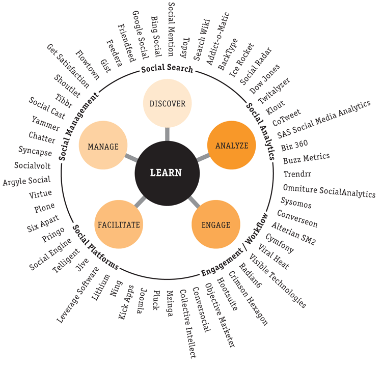
Another possible social media objective that John proposes is “fostering dialogue,” and one of his recommended KPIs for that is “Audience Engagement.” Adhering pretty closely to his formula there, we can now get at that measure for a Facebook page:

Now, I’m calling it Page Virality because, if you look up earlier in this post, you’ll see that Facebook has already defined a post-level metric called Virality that is this exact formula using the post-level metrics. The two are tightly, tightly related. If you increase your post Virality starting tomorrow by publishing more “engage-able” posts (posts that people who see it are more like to like, comment, or share), then your Page Virality will increase.

There’s a subtle (but important this time) reason for using Total Reach in the denominator rather than Page Likes. If you have a huge fan base, but you’ve done a poor job of engaging with those fans in the past, your EdgeRank is likely going to be pretty low on new posts in the near term, which means your Reach-to-Likes ratio is going to be low (keep reading…we’ll get to that). To measure the engage-ability of a post, you should only count against the number of people who saw the post (which is why Facebook got the Virality measure right), and the same holds true for the page.

Key Point: Page Virality can be impacted in the short-term; it’s a “speedboat measure” in that it is highly responsive to actions a brand takes with the content they publish

This is all a setup for another measure that I think is likely important (but which doesn’t have a reference in John’s book — it’s a pretty Facebook-centric measure, though, so I’m going to tell myself that’s okay):

I’m not in love with the name for this (feel free to recommend alternatives!). This metric is a measure (or a very, very close approximation — see the messy Venn diagram at the start of this post) of what percent of your “Facebook house list” (the people who like your page) are actually receiving messages from you when you post a status update. If this number is low, you’ve probably been doing a lousy job of providing engaging content in the past, and your EdgeRank is low for new posts.

Key Point: Reach Penetration will change more sluggishly than Page Virality; it’s an “aircraft carrier measure” in that it requires a series of more engaging posts to meaningfully impact it

(I should probably admit here that this is all in theory. It’s going to take some time to really see if things play out this way).

Those are the core metrics I like when it comes to gaining exposure and fostering dialogue. But, there’s one other slick little nuance…

Talking About / Page Likes

Remember Talking About / Page Likes? That’s the metric that is, effectively, publicly available (as a point in time) for any Facebook page. That makes it appealing. Well, two of the metrics I proposed above are, really, just deconstructing that metric:

This is tangentially reminiscent of doing a DuPont Analysis when breaking down a company’s ROE. In theory, two pages could have identical “Talking About / Page Likes” values…with two very fundamentally different drivers going on behind the scenes. One page could be reaching only a small percentage of its total fans (due to poor historical engagement), but has recently started publishing much more engaging content. The other page could have historically engaged pretty well (leading to higher reach penetration), but, of late, has slacked off (low page virality). Cool, huh?

What do you think? Off my rocker, or well-reasoned (if verbose)?

Analytics Strategy, Social Media

QR Codes — How They Work (at least…What Matters for Analytics)

I’ve had a couple of situations in the past few weeks where I’ve found myself explaining how QR codes work and what can/cannot be tracked under what situations. To whit, this post focuses on tracking considerations — not the what and why of QR codes themselves. This is an “…on data” blog, after all!

Nevertheless, the Most Basic of the Basics

A QR code contains data in a black-and-white pixelated pattern. That’s all there is to it. It can store lots of different types of data (only a finite amount, of course), but the most common data for that pattern to store is a URL. For instance, the QR code below stores the URL for this blog post:

Please, DON’T Do What I Just Did!

Here’s the key point to this whole post: the example above is a perfect example of how NOT to generate a QR code.

Two reasons:

  • It will not be possible to track the number of scans of the QR code
  • The QR code is needlessly complex, which requires a larger, more involved QR code

With the QR code above, the QR code reader on a person’s phone reads the underlying URL and routes the user to the target address:

The problem here is that, if you’re using QR codes in multiple places — printed circulars, product packaging, in-store displays, etc. — and they’re sending the user to the same destination URL, you won’t be able to distinguish which of the different physical placements is generating which traffic to that destination URL.

That’s a problem, because, inevitably, you’ll want to know whether your target users are even scanning the codes and, if so, which codes they’re scanning. It would be one thing if QR codes were inherently attractive and added to the aesthetics of analog collateral. But, like their barcode ancestors, they tend to lack visual appeal. If they’re not adding value and not being used, it’s best that they be removed!

Why, Yes, There IS a Better Way. I’m Glad You Asked.

The QR code below sends the user to the exact same destination (this post):

Notice anything different? For starters, the code itself is much, much smaller than the first example above. That’s nice — it takes up less room wherever it’s printed! Designers will hug you (well, they won’t exactly hug you — they’ll still blanch at your requirement to drop this pixelated box into an otherwise attractively designed piece of printed material…but they’ll gnash their teeth moderately less than if they were required to use the much larger QR code from above).

The trick? Well, this new QR code doesn’t include the full URL for this page. Rather it has a much simpler, much shorter, URL encoded in its pixels:

http://goo.gl/H104m.qr

It makes sense, doesn’t it, that a shorter URL like this one will require fewer black and white pixels to be represented in a QR code format? This URL, you see, was generated using http://goo.gl — a URL shortener. You can also generate QR codes using http://bit.ly. Both are free services and both have a reputation of high availability.

Using some flavor of URL shortener is one of those things consultants and tradesfolk refer to as a “best practice” for QR code generation. What’s going on is that the process relies on an intermediate server-side redirect (of which goo.gl and bit.ly are both examples) to route the user to the final destination URL. This alters the actual user flow slightly so that it looks something like the diagram below:

That adds a little bit of complexity to the process, and, depending on the user’s QR code reader and settings therein, he/she may actually see the intermediate URL before getting routed to the final destination. That’s really not the end of the world, as it’s a fairly innocuous step with a dramatic upside. (Technically, this approach introduces an additional potential failure point into the overall process, but that plays out as more of a theoretical concern than a practical one.)

Why Is This Marginally Convoluted Approach Better?

By introducing the shortened URL, you get two direct benefits:

  • A smaller, cleaner QR code (we covered that already)
  • The ability to count the number of scans of each unique QR code

This second one is the biggie. To be clear, this isn’t going to distinguish between each individual printout of the same underlying QR code, but it will enable you to, for instance, identify scans of a code that is printed on a particular batch of direct mail from scans that are printed in a newspaper circular.

How is it doing that, you ask? Well, exactly the same way that URL shorteners like goo.gl and bit.ly provide data on how many times URLs created using them were scanned: when the “URL Shortener Server” gets a request for the shortened URL, it not only redirects the user to the full destination URL, but it increments a count of how many times the URL was “clicked” (and, in the case of a QR code, “click” = “scanned”) in an internal database. You can then access that data using the URL shortener / QR code generator’s reporting system.

But Wait! There’s MORE!

Take another look at the full URL that the shortened URL (embedded in the QR code) is redirecting to:

http://www.gilliganondata.com/index.php/2011/10/12/qr-codes-how-they-work-at-least-for-analytics?utm_source=gilliganondata&utm_medium=qr_code&utm_campaign=oct_2011_blog

Notice how it has Google Analytics campaign tracking parameters tacked onto the end of it? That’s a second recommended best practice for QR codes that send the user to web sites that have campaign tracking capabilities. This is just like setting up a banner ad or some other form of off-site promotion or advertising: you control the URL, so you should include campaign tracking parameters on it! This will enable you to look at post-scan activity — did users who scanned the QR code from the product packaging convert at a higher rate on-site than users who scanned the in-store display QR code? You get the idea.

A Final Note on This — Where bit.ly and goo.gl Come Up Short

The upsides to goo.gl and bit.ly QR code generation is that they’re free and have decent click/scan analytics. The downside is that, once a short URL is generated, the target URL can’t be edited (they have their reasons).

Paid services such as the service offered by 3GVision i-nigma both offer solid analytics and allow QR codes to be edited after the short URLs (which the QR codes then represent) are created. This makes a lot of sense, because a printed QR code may stay in-market for a sustained period of time, while the digital content that supports the placement of that code may need to be updated. Or, say that someone creates a QR code and uses a target URL that is devoid of campaign tracking parameters — with a service like 3GVision’s, you can add the tracking parameters after the QR code has been generated and even after it has gone to print (any resemblance to actual situations where this has occurred is purely coincidental! …or so the blogger innocently claimed…). You can’t go backwards in time and add campaign tracking for scans that have already occurred, but you can at least “fix” the tracking going forward.

As is my modus operandi, this has been a pretty straightforward concept with a couple of tips and best practices…and I’ve turned it into a rather verbose and hyper-descriptive post. <sigh> I hope you found it informative.

Analytics Strategy, Conferences/Community, General

Finally! Standards come to Web Analytics

Last week I had the pleasure of traveling to Columbus, Ohio to participate in Web Analytics Wednesday, hosted by Resource Interactive’s Tim Wilson and generously sponsored by the fine folks at Foresee. We opted for an “open Q&A” format that turned out pretty well. Turns out the web analysts in Ohio are a pretty sharp bunch so all of the questions I fielded were of the “hardball” type.

One question in particular surprised me, and the answer I gave forced me to elucidate a point I have been pondering for some time but have never voiced in public. The question came from Elizabeth Smalls (@smallsmeasures, go follow her now) who asked, and I paraphrase, “How can we best explain the differences in the numbers we see between systems?” and “Is there any chance the web analytics industry will ever have ‘standards’?”

Long-time readers know I have followed the Web Analytics Associations’s efforts to establish standards closely over the years, helping to create awareness about the work and also pushing the Association to “put teeth” behind their definitions and encourage vendors to either move towards the “standard” definitions or, at worst, elucidate where they are compliant and where they differ from the WAA’s work.

Sadly the WAA’s “standards” never really caught on as a set of baseline definitions against which all systems could be compared to help explain some of the differences in the data. As a result practitioners around the globe still struggle when it comes time to explain these differences, especially when moving from one paid vendor to another.  But none of this matters anymore for one simple reason …

Google Analytics has become the de facto standard for web analytics.

Google has become the standard for web analytics by sheer force of might, persistence, and dedication. By every measure, Google Analytics is the world’s most popular and widely deployed web analytics solution. Hell, in our Analysis Exchange efforts we focus exclusively on the use of Google Analytics because A) we know that 99 times out of 100 we will find it already deployed and B) nearly all of our mentors have had enough exposure to Google Analytics to effectively teach it to our students.

What’s more, as Forrester’s Joe Stanhope opined the recently published Forrester Wave for Web Analytics, web analytics as we knew it doesn’t really exist anymore:

“Few web analytics vendors restrict their remit to pure on-site analytics. Most vendor road maps incorporate emerging media such as social and mobile channels, data agnostic integration and analysis features, usability for a broad array of analytics stakeholders, and scalability to handle the rising influx of data and activity.”

Joe says “few” vendors remained focused on on-site analytics, but it would be more precise to say “one” vendor — Google — has maintained interest in how site operators measure their efforts with any level of exclusivity and sincerity. In fact, I don’t think we need to call the industry “web analytics” anymore … it is probably more accurate to say we have “Google Analytics” and “Everything Else.”

Everything else is enterprise marketing platforms. Everything else is integrated online marketing suites. Everything else … is all of the stuff that has been layered on top of solutions we have historically considered “web analytics” as a response to an event that can only be accurately described as the single most important acquisition in our sector, period.

Google Analytics is the de facto standard for web analytics, and this is great news.

Assuming you take care with your Google Analytics implementation, whenever there is a question about the data you will have a fairly consistent[1] view for comparison. Switching from one vendor to another? Use Google Analytics to help explain the differences between the two systems! Worried that your paid vendor implementation is missing data? Compare it to Google Analytics to ensure that you have complete page coverage! Not sure if a vendor’s recent change in their use of cookies impacted their data accuracy? Yes, you guessed it, compare it to Google Analytics!

With Google Analytics you have a totally free standard against which all other data can be reconciled.

Now keep in mind, I am absolutely not saying that all you need is Google Analytics — nothing could be further from the truth. Despite a nice series of updates and the emergence of a paid solution that may be appropriate for some companies, I agree with Stanhope when he says that “Google Analytics Premium still lags enterprise competitors in several areas such as data integration, administration, and data processing …”

But that’s a debate for the lobby bar, not this blog post.

If you’re looking for a set of rules that can be universally applied when it comes to the most basic and fundamental definitions for the measures, metrics, and dimensions that our industry is built upon, you don’t have to look anymore. Google has solved that problem for the rest of us, and we should thank them. Now, thanks to Google, we can focus on some of the real problems facing our industry … which again, is a debate best left to the lobby bar.

What do you think? Are you running Google Analytics on your site? Do you use it when you see anomalies in data collected through other systems? Have you used it to validate a move from one paid vendor to another? Or do you believe that the WAA standards already provide the solution I am ascribing to Google?

As always I welcome your opinions and feedback.


[1] Yes, when Google changed the definition of a “session” that impacted their consistency, but once they corrected the bug they introduced it seems the number of complaints has gone down significantly. What’s more, the change made sense and in general we should be in favor of “improving on standards whenever possible” don’t you think?

Adobe Analytics

Purchases to Date – Part II [SiteCatalyst]

Last week I described a new way to track how much money visitors had spent on your site prior to their current visit. This week, I am going to expand on this topic and provide some other cool uses of this concept. If you haven’t read my last post, I suggest you do that before reading this one.

Revenue by Product Category

In the last post, you may recall that we were able to quantify how much money the visitor had purchased in the past and break down current reports by those amounts. In the scenario I described previously, we could only see the total revenue amount across all product categories (in the previous scenario the product categories we discussed were Electronics, Clothing and Furniture). However, there is no reason that you cannot create a separate Counter eVar for each product category (or your major product categories if you have too many!). Doing this will allow you to see how much visitors had spent on just Electronics, for example, prior to future Success Events like Cart Adds or Orders. This might be good for companies that have distinct teams focused on each product category. To do this, the code might look like this:

s.events=”purchase”
s.products=”;SKU111;1;300.00;; evar1=Electronics,;SKU222;1;400.00;; evar1=Clothing,;SKU333;1;200.00;;evar1=Furniture”
s.eVar40=+900
s.eVar41=”+300″
s.eVar42=”+400″
s.eVar43=”+200″

By doing this, there would be one Counter eVar which shows that the visitor in our example above had spent $300 (row five) in Electronics prior to his/her second visit which might result in a report like this:

You would then see a report like this for each product category, though I would still recommend one Counter eVar like the one first described, which combines revenue for all product categories combined. Keep in mind that you could also use Product Merchandising to see total previous revenue (eVar40 in our example) by product category, but since you only get two levels of breakdown in SiteCatalyst reports, splitting out each product category into its own Counter eVar provides one more level of breakdown…

Orders to Date

As long so you are going to go through the effort to see how much money the current visitor had spent on your site, why not also track how many Orders they had completed? Doing this is very similar, though it will use up more eVars. Here is how you would do it. First, set a new eVar in the Admin Console and set it to be a Counter eVar with an expiration of “Never” or possibly “1 Year” depending upon how long you want to keep the data. Once this is done, on the purchase thank you page, simply set the Order Counter eVar to “+1,” as you normally would set a Counter eVar like this:

s.events=”purchase”
s.products=”;SKU111;1;300.00,;SKU222;1;400.00,;SKU333;1;200.00″
s.eVar41=”+1″

Kind of anticlimactic huh? By doing this on every purchase thank you page, you can track how many orders each website visitor completed and can then use this in analysis efforts. Next time you want to see how many times people who have added items to the shopping cart today have ordered in the past, simply open this new “Previous Orders” Counter eVar and add the appropriate metric(s):

Here we can see that 21.13% of the Cart Additions that took place today were from visitors who had not ordered on our site in the past (ignoring those pesky cookie deleters!). If we wanted, we could also break this report down by Product to see which Products they had purchased. Also, keep in mind that this example shows Cart Additions, but that we could have just as easily added Orders, Revenue, Internal Searches or any other website metric we wanted to this report to see how many orders had taken place prior to that Success Event. If desired, we could also use SAINT Classifications to group this “Previous Orders” Counter eVar into logical buckets of say “1-2 Orders,” 3-5 Orders,” “5-10 Orders,” etc…

Final Thoughts

So there you have it! Between this post and the last one, hopefully you have some new ideas to try out on your website so you can leverage past purchase behavior when doing your web analyses. If you have any questions/comments, feel free to leave them here. Thanks!

Analytics Strategy

Monish Datta Gives #cbuswaw w/ Eric Peterson & ForeSee Thumbs-Up

We blew past our previous attendance record at the latest Columbus Web Analytics Wednesday, and the speaker did not disappoint! We were fortunate to have Eric Peterson in town and extremely lucky to have Foresee as our sponsor — covering the food and drink for a larger-than-initially-predicted turnout, as well as providing a copy of Larry Freed’s new book to each person who asked a question. All in all, the event got a figurative thumbs-up from many of the attendees, and I caught a literal thumbs up from Monish Datta as well:

WAW Columbus - October 2011

Eric played to a packed house, which he handled with ease:

WAW Columbus - October 2011

The evening’s format was simply a “Q&A with Eric Peterson.” Knowing our audience, I was confident that the questions would be good ones, and they were!

I’ve used Twitter as a crowdsourced note-taking tool in the past at events like 2011 eMetrics San Francisco, and it has worked out well. So, for this event, I made sure that our standard event hashtag — #cbuswaw — was included on notecards scattered around the room (along with the username for our speaker — @erictpeterson — and our sponsor — @foresee). I set up a TweetReach tracker ahead of the event based on the hashtag and then just sat back and let the “note taking” begin!

In the end, we had 179 tweets from 49 different people:

For a small networking event in central Ohio, that seemed like plenty of taking of notes! Several attendees were following the stream of tweets and retweeting as various thoughts caught their eyes (counting myself amongst that group), so it’s a reasonable leap, I think, that looking at the “most retweeted” tweets is a quick-and-dirty way to get a  read on what content was most resonant with the in-person audience.

The most retweeted tweets:

Social media was definitely one hot topic, for which Eric had some thoughts about overall maturity and challenges, but he also referred attendees to his partner, John Lovett’s, book on the subject.

There was also a discussion about “standards” for web analytics. Eric had some new and interesting thoughts on that front…but I found out later that he’d been tossing those around in his head for a while and has a draft blog post written on that subject. So, keep an eye on his blog to see if that gets fleshed out.

I honestly don’t remember if it was the social media question or the standards question that led to a discussion of “measuring engagement,” but John Hondroulis managed to dig up Eric’s post from 2007 on the subject and get that shared out to the crowd.

And, the inevitable privacy topic came up, which garnered a few tweets about the WAA’s Code of Ethics.

All in all, it was a fantastic event!

Analytics Strategy

How Google Analytics In-Page Analytics / Overlay Works

I’m starting to think that page overlays are the new page-level clickstream — they’re what well-meaning-but-inexperienced business users see in their minds’ eyes as a quick and clear path to deep insights when, generally, they are not. I’ve had a couple of clients over the last year ask for overlays (in one case, “provided weekly for all major pages of the microsite”), and the overlays were never an effective mechanism for helping them drive their businesses forward. (One request was for overlays from Sitecatalyst; the other was for overlays from Google Analytics.)

I seldom use overlays for reporting or analysis. The reason isn’t that they don’t have very real usefulness in certain situations, but, rather, because those certain situations are extremely rare in my day-to-day work. As the “page” paradigm — in its basic-HTML simplistic glory — goes the way of daytime soap operas, and as brands’ digital presences increasingly are intertwined combinations of their sites and social media platforms, the number of scenarios where an overlay provides a view of the page that is both reasonably complete and actually useful are few and far between.

That’s a bit broader of a topic than I was aiming to cover with this post, though.

I recently needed to explain to a client why it wasn’t simply a matter of “fixing” the Google Analytics implementation on his site to get the overlays to work properly. I did some digging for documentation that explained the underlying mechanics of GA’s in-page overlays (similar to what Ben Gaines wrote about Sitecatalyst ClickMap a couple of years ago when he was still at Omniture), and…I couldn’t find what I was looking for. This post is trying to be that documentation for the next person who is in the same situation. If you have deeper knowledge of the underlying mechanics of Google Analytics than I have, and I’ve misrepresented something here, please leave a comment to let me know!

Google Analytics <> Sitecatalyst <> ClickTale

There are different ways to capture/present clickmap and heatmap overlays. In order of increasing robustness/usefulness (I’m leaving out a number of vendors because I simply don’t have current knowledge of their specifics):

  • Google Analytics, at its core, uses some basic reverse-engineering of page view data to generate its in-page analytics (overlays). It looks nice in their video…but the video uses a very basic site, which doesn’t reflect the reality of most sites for medium-sized and large companies
  • Adobe Sitecatalyst gets a bit more sophisticated with its approach, which automatically closes some of the gaps in the GA approach while also allowing for working around a chunk of the challenges that are inherent with overlays; see Ben’s post that I referenced earlier if you want to really get into the details there!
  • ClickTale is a solution that was developed from the ground up to provide workable overlays and heatmaps. As such, it takes an even more robust approach — capturing both mouse movements and clicks. The “downside” (in quotes because this is a limitation in theory — not in practice) is that ClickTale does not track all sessions. It samples sessions — still collecting plenty of data to provide you with highly usable data, but business users inevitably get heartburn when they find out that they’re not capturing everything.

Make sense? The point is that there are different ways to skin the overlays cat. This post just covers Google Analytics.

How Google Analytics Figures Out Overlays

For each user session, Google Analytics gets a “hit” for each page viewed during the session, and it records a timestamp for each page view, so it knows the sequence in which pages were viewed in the session. Consider a simple, 3-page site, where the main page (page_A) has links to the other two pages.

 Now, let’s have three visitors come to the site (Visitor 1111, Visitor 2222, and Visitor 3333). All three enter the site on Page_A, but then:

  • Visitor 1111 clicks on the link to Page_B and then exits the site
  • Visitor 2222 clicks on the link to Page_C and then exits the site
  • Visitor 3333 clicks on the link to Page_B and then exits the site

Google Analytics would have captured a series of page views that looked something like this:

Visitor ID Timestamp Page Viewed
Visitor 1111 09:03:16 Page_A
Visitor 1111 09:03:24 Page_B
Visitor 2222 09:04:12 Page_A
Visitor 2222 09:04:53 Page_C
Visitor 3333 09:10:22 Page_A
Visitor 3333 09:10:54 Page_B

With a little sorting and counting and cross-referencing, Google Analytics can figure out that:

  • There were 3 visits to Page_A
  • The “next page” that two of those visitors went to from Page_A was Page_B
  • The “next page” that one of those visitors went to from Page_A was Page_C

That’s how Google Analytics generates the Next Page Path  area of the Navigation Summary report for a page (and, with the same basic technique, this is how the Previous Page Path is generated):

Make sense? Good. So, how does this become in-page analytics? In-page analytics, really, is just a visualization of the Next Page Path data. To do that:

  1. Google Analytics pulls up the current version of the page at the URL being analyzed with in-page analytics
  2. It compiles a list of all of the “next pages” that were visited (with the number of “next page” page views for each one)
  3. It scans the page for the URLs of those “next pages” and then labels each link that references one of those pages with the number of pageviews (and the % of total “next page” page views that the value represents)

Pretty simple, and pretty solid…except when various common situations occur, which we’ll get to next.

Oh, the Many Ways that In-Page Analytics Breaks Down

In-page analytics is problematic when any of the following situations occur on a page:

  • A link has a target URL that is not part of the current site (e.g., a link to the brand’s Facebook page or YouTube channel): Google Analytics doesn’t capture the “next page” viewed, so it can’t deduce how many times the link was clicked (Note: a best practice, obviously, is to have event tracking or social tracking implemented in these situations, so Google Analytics can report on how many times the link was clicked…but this doesn’t work it’s way back into in-page analytics overlays)
  • A link points to a PDF or file download: this is similar to the previous scenario, in that the “next page” doesn’t execute the Google Analytics page tag; again, even if a virtual page view is captured on the click, that is, technically, different from the actual target URL in the <a href=”…e> that points to the file, so Google Analytics doesn’t make the connection needed to render this on the overlay. In other words, the virtual page view will show up on the Navigation Summary in the Next Page Path list, but it won’t show up on the overlay.
  • Multiple links on the page point to the identical next page: because GA uses the URL of the “next pages,” it doesn’t inherently capture which link pointing to the specific next page is the one that was clicked. The standard workaround for this is to force the URLs to be unique by tacking on a junk parameter to the end of the second URL (e.g., have one link point to “Page_B.htm” and the second link point to “Page_B?link=2”). This will make the target URLs unique in GA’s view…but will also make base reporting for Page_B a bit trickier, as there will be two different rows in the Pages report for the same page (if your <title> tags are well-formed, you can work around this by using the Page Titles dimension in the Pages report)
  • Links are embedded in “hidden” content, such as Javascript menu dropdowns: this is simply a limitation of the overlay paradigm, in that it is often impossible to make all of the links on a page visible at once. With in-page analytics, as you mouse over areas that make the links appear, the in-page analytics data will appear as well, but it still requires moving all around the page to reveal all of the links to view all of the “next page” data
  • Links are embedded in Flash: in-page analytics simply can’t effectively add clicks to links that are embedded in Flash objects
  • Links appear to reference the same page: some implementation of DHTML that trigger overlays or other interactive in-page content wind up including something like “<a href=”#”…”, which looks to Google like a link back to the current page. This confuses GA mightily!
  • The link is removed from the page: say you run a promo for a week and then take the hyperlinked image off of the page. When you pull up in-page analytics for that week, GA will know that there were a lot of “next page” views to the target for that promo…but it only has the current page for use in generating an overlay, so it won’t know where to overlay the page views for that promo
  • The links on the page aren’t spaced far enough apart: this is a practical reality, in that I have never seen an overlay where there aren’t some overlay details that obscure the details for other links that are located in close proximity. Obviously, you’re not going to design your site to be overlay-friendly…so you just have to accept this limitation.

The kicker is that these are not obscure, corner-case scenarios. They’re common occurrences, and they lead to most overlays presenting an incomplete picture of activity that occurs on the page.

A Handful of Additional Thoughts

In-Page Analytics are seldom useful. To the best of my knowledge, this is neither an area in which Google is investing to make improvements, nor is it an area that seasoned web analysts are really clamoring for updates.

However, overlays have their place, I think. But, they need to be done right, which is something on which ClickTale is focused (Michele Hinojosa wrote a good overview of the platform last year if you want to read another analyst’s perspective).

Related to overlays, although not strictly overlay-ish, is a feature of Satellite by Search Discovery, whereby you can very easily enable tracking of all clicks on unlinked content (how many times have you been on a site where you think clicking on a product image will take you to the product’s page…and it doesn’t take you anywhere at all!). I think this is some ClickTale-ish like functionality, but that may be something of a stretch. It was a nifty concept, though.

So, that’s it on GA’s In-Page Analytics. Understand what it does and how it does it, and you will be able to identify the (extremely rare) situations when it will be useful.

Adobe Analytics

Purchases to Date – Part I [SiteCatalyst]

Website visits don’t occur in a vacuum. People who are on your site today may or may not have been there in the past and if they have been there, some have purchased items and some have not. But how do you know if the current reports you are looking at in SiteCatalyst reflect those who have purchased in the past or not? How do you look at SiteCatalyst reports by how much they have purchased in the past? Having this context can greatly improve the analysis you are doing so in this post, I will share some techniques which allow you to easily segment your visitors by how much they have spent in the past…

Why Do This?

Before diving into how to do this, let’s explore the rationale. Imagine that you are a retailer selling Electronics, Clothing and Furniture. One question you might ask is “I wonder how much money all of the people who are on my site today have spent in the past?” Wouldn’t it be cool to see that 25% of the people who bought something today had purchased $500 or more in prior visits? Do people who have purchased more than $700 in the past convert at higher rates than those who have only purchased $300? Do people who have bought $400 or more in Electronics tend to only buy and look at Electronics products? As you can see, there are an endless number of analytics questions that can be studied once you know how much money current visitors have previously spent.

Surprisingly, however, there is no easy way to see this in SiteCatalyst. One way to do this is to create Segments. However, since there are so many segments that could be built, this is not always an easy option. To answer the questions above, you’d have to create different segments for each dollar amount and product category (i.e. people who have spent $100, $200, $500, etc…). Plus, you’d have to pull the data using DataWarehouse or ASI. Of course, this becomes much easier in SiteCatalyst v15 (if you are lucky enough to have access to it!), but it still requires a lot of segments to be built. Therefore, I will share a different approach that you can consider to accomplish this using a Counter eVar. As a quick refresher, a Counter eVar is a type of eVar that you increment as needed and retains a numeric value for each website visitor. This counter can be incremented by “1” each time it is set, or it can be incremented by any other number as needed. In past posts, I have described using Counter eVars to track # of Pages Viewed and Ben Gaines described how to use Counter eVars to score visitors. If you want to learn more about Counter eVars, please review this old blog post.

The Solution

With the set-up and refresher out of the way, let’s dig in. As mentioned above, in this scenario, we are a retailer selling three main product categories and want to see how much money each visitor has spent prior to the current visit. To do this, in addition to setting the Products string during the purchase event, we would set a Counter eVar equal to the amount that is being purchased like this:

s.events=”purchase”
s.products=”;SKU111;1;300.00,;SKU222;1;400.00,;SKU333;1;200.00
s.eVar40=”+900″

Notice that we have added up the purchase amount and passed it to a new Counter eVar40. In the above example, if the current visitor hadn’t previously visited the site, the value in his/her Counter eVar after this purchase would be $900. Since Counter eVars don’t have a notion of currency, the value that will be stored in the Counter eVar report in this case would be “900.00” (I would suggest that you round numbers to the nearest dollar since having decimals will make applying SAINT Classifications difficult). Keep in mind that you should set the Counter eVar to be Most Recent (Last) Allocation and set expiration to “Never” (or something like 90 days) in the Admin Console. That is all of that we have to do from an implementation standpoint.

So now let’s see how we use this. If the above visitor comes back to the website next week and adds a few products to the shopping cart and we pause time for a second and were to look at the resulting SiteCatalyst report, we would see something like this:

As shown here, we can now answer the question of how much money visitors had spent in the past at the time they added items to the shopping cart today. In this case, it looks like about half (49%) of people adding items to the cart today had not purchased previously. The visitor mentioned above would fall into row five in this report as part of the 1.38% of people who had purchased $900 in a previous visit. The same principle would apply to Orders and Revenue, so you could see a report like this:

When you extrapolate this principle by thousands of website visitors, you can see some interesting trends about what percent of website visitors transacting today had purchased in the past and how much they had spent. Next we can make this report more readable by applying SAINT Classifications to the Counter eVar to bucket the dollar amounts spent into logical groupings:

Now we have a new report that was previously unavailable! Pretty cool, huh?

In addition, if we wanted to take things to the next level, we could break this report down by Products to see which Products made up the Revenue in past visits:


Final Thoughts
So that is one way to see how much visitors on your site have purchased previously so you can add that to your existing web analyses. Next week, I will continue with “Part II” of this topic and go into some additional ways you can apply this concept so stay tuned…Thanks!

Adobe Analytics

Merchandising eVars [SiteCatalyst]

After blogging about Omniture SiteCatalyst for a few years now, one of the topics I have always avoided discussing is Merchandising eVars (not to be confused with the separate Omniture Merchandising product). The reason for this, is that I find them to be very confusing and was sure that no matter how hard I tried to explain them, I would probably mess it up. For years, I have waited for someone to write about them, but seeing as no one has written extensively about them (at least according to a quick Google search!) and having been inspired by some other great blog posts I have read lately in which people have said that it is ok to not have all of the answers, I have decided to face my fears and go ahead and do my best to describe Merchandising eVars. My hope is that this post will serve as a first step in getting the SiteCatalyst community to understand these nuanced eVar and that it might spawn some good discussion and other blog posts by others who have spent a lot more time with them (like Kevin W.) so that one way or another, the topic will be adequately covered.

Why Merchandising eVars?

So why did Omniture make a special type of Merchandising eVar and why are they so complicated? If we go back in time to when I started using SiteCatalyst (version 9.x) and there were no Merchandising eVars, there were a few problems that existed. First was the Category parameter in the Products string. If you have been using SiteCatalyst for a while, someone has probably told you to NEVER use the first parameter (Category) in the Products string. They often don’t tell you why, but the reason is that if you do, the Product you pass will be forever tied to the Category in that string. That means that if you later decide to put the same product in a different product category, SiteCatalyst will ignore it and always use the first one it saw. If each of your products has only one product category and it will be that way forever, you can go ahead and use the Category parameter (or simply classify products using SAINT Classifications). But since most clients like to have products in more than one category, they asked for a way to assign the same product to different merchandising categories, hence, Merchandising eVars!

Let’s look at an example. Say that you have a retail site and that you sell ceiling fans, but those fans can be found by people going through “Lighting” or “Bedroom” product categories. Now let’s say that you would like to know how many Cart Adds or Purchases take place when people found ceiling fans through one of these product categories, but not the other. Sounds simple enough right? But it wasn’t in the past. If you had used the Products string to assign a specific ceiling fan to “Lighting,” it would always be bound to that product category. Instead, you would need a way to dynamically assign the specific product category for each product in each specific instance to get the data you were looking for. By doing this, you could see how often the ceiling fan was purchased via “Lighting” and how often it was purchased via “Bedroom.” Since then, there have been many different uses for Merchandising eVars, but I think it is important to understand the underlying problem that they were created to solve, as I find this helps to understand how they work and why they are different from traditional eVars. So when you think of Merchandising eVars just remember that their purpose is to assign a different eVar value to each product at the time Success Events take place.

Using Merchandising eVars

So now that we know a bit about how Merchandising eVars originated, let’s discuss how they are used. As you can imagine, connecting a different eVar value to each product is not a simple task. That is a lot of information for SiteCatalyst to keep straight! There would have to be some specific ways for you to implement this such that SiteCatalyst knows when you want each product to be tied to each Merchandising eVar value. Fortunately (or unfortunately!), SiteCatalyst has not one, but two methods of binding eVar values to products. One method is called Product Syntax and the other is called Conversion Variable Syntax.

Product Syntax
I find the Product Syntax method to be the most straightforward, and what I recommend most often, so I will start with that one. In this method, you use a special parameter slot within the Products string to declare which Merchandising Category you want to assign to each product. To do this, let’s re-visit the syntax for the Products string:

s.products=”category;product;quantity;price;event_incrementer;
merch_category1|merch_category2

As you can see, towards the end of the Products string, there is a slot reserved for setting Merchandising eVars. In fact, you can set more than one by using a “|” separator. Using this syntax, if a Cart Addition occurs, you can set your Cart Add Success Event and Merchandising eVars as shown in this example:

s.events=”scAdd”
s.products=”;Fan-11980;;;;evar1=Lighting”

Here we can see that we are manually assigning the product category of “Lighting” to the product “Fan-11980” at the time of Cart Addition. However, there are some back-end settings that also need to be made to allow for this to function properly. First, we need to call Omniture Client Care and ask that Merchandising be enabled for the appropriate eVar (eVar1 in this case). Once Merchandising has been enabled, we need to go to the Admin Console and select the Product Syntax option under the new Merchandising setting that will now be visible. When using Product Syntax, the second Merchandising setting (called Merchandising Binding Event) is disabled (but for some reason looks like you can use it!) so my advice is to just ignore that setting altogether. Here is what the settings should look like when you are done:

As with other eVars, you still have to decide what Allocation you’d like (First or Last) and how long the eVar should retain its value before it expires. But beyond that, you are good to go and the hardest part is making sure your developers are keeping track of which product categories should be associated with each product. If you know the value that you want to pass to the eVar for each product on the page (product category in the preceding example), I recommend you use the Product Syntax approach.

Conversion Syntax
The second approach to setting Merchandising eVars is the Conversion Variable Syntax. This approach is a bit more confusing and is normally used when you want to associate a different eVar value to each product, but the value you want to set in that eVar is only known prior to the Success Event taking place, instead of on the same page. The only way I can think of to explain this is through an example. Let’s imagine that your boss wants to know which internal search phrases were used prior to each product being purchased. Now, let’s pretend that a visitor comes to the website and searches on “ceiling fans,” finds Product 123 in the list and adds it to the cart. Next, the visitor searches for “bathroom vanities,” again scans the list, finds Product 789 and adds it to the cart. Then the visitor purchases both items a few pages later. In this example, if we were to use a traditional eVar (with Most Recent allocation), each Cart Addition would be correctly associated with the correct search phrase – “ceiling fans” = product 123 and “bathroom vanities” = product 789. So far so good. But when the visitor purchases both products, guess which internal search phrase would get the credit? If you said “bathroom vanities” you are correct! Since that was the last search phrase SiteCatalyst saw, it would get credit for both products. This is because a traditional eVar cannot associate a different value for each product.

However, by using the Conversion Syntax and Merchandising, in this scenario, each product would be associated with the specific search phrase that was used to find it for both the Cart Add and Purchase Success Events. So how do we configure this? First, we would work with Client Care to declare eVar1 to be a Merchandising eVar. Next, we would decide when we would like to have Omniture bind the internal search phrase to the eVar value. For most clients, the default is to bind at the Product View (prodView) event and the Cart Add (scAdd) event (though you can choose from any Success Events you’d like). By binding to the Product View and Cart Add, you are telling Omniture that if one of those two events happens, you want Omniture to bind the last value passed to the Merchandising eVar (internal search phrase in our example) with the product being viewed or added to cart. This is how these settings would look in the Admin Console:

Well…there you have it. My first attempt at facing my fears and explaining about Merchandising eVars. I have also written a more advanced post on Merchandising you can check out. Please comment here and I will do my best to get any question answered. Thanks!

Analytics Strategy

Moneyball Will Put Web Analytics on the Map

So, my prediction is that the movie Moneyball, set to release this Friday September 23rd, will add a level of awareness to Analytics that skyrockets our little cottage industry straight to household status.

For many of us in the analytics and optimization business, Michael Lewis’ book Moneyball is something of a bible. I know that when I first read it back in 2003, it made me want to become a web analyst. The book chronicles the unorthodox methods of one maverick baseball manager who was forced to break the traditional paradigm of scouting and recruiting big market baseball players to build a winning team that didn’t match his shoestring budget. The manager was Billy Beane, responsible for the 2002 Oakland A’s baseball club, who irrevocably changed the business of baseball using analytics.

Back in 2009, when Steven Soderberg was directing the film, the critics were calling this a niche movie with a purported $60M budget. But since then, with Bennett Miller taking the Director’s chair, this film is set to leap off movie screens across the country. This isn’t merely because they wrangled A-listers like Brad Pitt and Jonah Hill to star in the film, but because this movie has universal appeal. Baseball, business, and Brad Pitt. What brand doesn’t want to imagine themselves as the underdog who bucked the system and came out ahead of the game? Even the biggest brands will see the potential for doing more with less as depicted in the movie. And my guess is that many c-level executives will walk into their offices on Monday and ask who’s running their analytics. Brad Pitt is about to put the sexy into analytics. While, this parallels are somewhat different, I think that just like Pitt’s 1992 movie A River Runs Through It catapulted flyfishing to mainstream status, Moneyball will do the same thing for web analytics. While there may not be a flashmob at the next eMetrics event with newbies clamoring to become Certified Web Analysts, there will certainly be a widespread awakening to what we do.

The thing about Moneyball is that despite the fact that analytics enabled the team to recognize talent and even predict what/who was likely to be successful, it also reveals that running a business purely by the numbers doesn’t guarantee your win. This is akin to the debate ignited by my partner Eric T. Peterson about whether or not your business should be data-driven. While I agree with Eric’s argument on many levels, commentary from the other side of the argument penned by Brent Dykes makes a lot of sense too. I’ll go on record as saying that I do believe that both of these guys are trying to slice it too thin by getting into the semantics of analysis because they’re both right. What we do as analytics professionals requires a balance of data and experience. So the way I see it, both these guys are arguing for similar results. The Oakland A’s got the jump on most major league teams back in their day by using data for competitive advantage. But just like many of the stalwart directors and scouting veterans likely thought, it didn’t get them all the way to the world championship. In analytics too, we need to balance data with business acumen. Tipping the scales all the way toward managing by business experience and intuition won’t net big wins any more than managing purely by the numbers.

What we can take away from analytics and now thanks to the movie Moneyball is that data can gets us a whole lot closer to the answers. While Billy Beane’s character depicts a relentless pursuit of his goal using data, his visibly abrasive personality and callous nature of treating players reveals that balance is required. The fact is that analytics are everywhere in business today. In baseball, Billy Beane still works for the Oakland A’s and my beloved Redsox hired Bill James (another Sabermetrics guru), but many statistical sports pros” have built successful businesses using data and real-time analytics – not just in baseball, but other sports too. A quick look at NBA basketball teams reveals that numerous big leaguers are employing interns, analysts and consultants to study the numbers. And of course, businesses too. For every digital proprietor, business-to-business operation, or consumer facing brand selling today; using data to understand customers and to improve digital marketing has undeniable allure. So, have we finally made it to the mainstream? Well, I think we’re close and that this movie will certainly help.

So the next time you’re explaining to your neighbor – or grandmother – what it is that you do for work … Don’t be surprised when they say “Oh, it’s like that movie Moneyball!” Just smile and say, “Yep, it’s something like that.”

Analytics Strategy

Reflections from the Google Analytics Partner Summit

Having recently become a Google Analytics Certified Partner, we got to participate in our first Partner Summit out in Mountainview, California, last week. It was unfortunate that the conference conflicted with Semphonic’s XChange conference (There really aren’t that many digital analytics conferences, are there? Maybe I should publish a proposed schedule for 2013 for a non-conflicting master schedule?), but I’m looking forward to reading through the reflections from huddlers who were down in San Diego on the blogosphere in the coming weeks!

Onto my shareable takeaways from the Google Analytics summit…

CRAZY Coolness Is on the Way

<sigh> This is the stuff where I can’t provide any real detail. But, essentially, the first two hours of the summit were one live demo after another of very nifty enhancements to the platform, some of which are coming in the next few weeks, and some of which won’t be out until 2012. Some of the enhancements fall in the “well…the Sitecatalyst sales folk won’t be able to use that as a Google Analytics shortcoming when they’re a-bashing it” category, and some fall in the “where on earth did they come up with that — no one else is even talking about doing that” category.

Very cool stuff, and with a continuing emphasis on ease of implementation, ease of management, and a clean and usable UI. Clearly, when v5 rolled out and Google emphasized that the release was more about positioning the under-the-hood mechanics for more, better, and faster improvements in the future, they meant it. Agility and a constant stream of worthwhile enhancements are the order of the day.

I Don’t Know My Googlers

Two presenters — both spoke a couple of times, either formally or when called upon from the stage — really stood out. Maybe I’ve just been living in an oblivious world, but I wasn’t familiar with either one:

  • Phil Mui, Group Product Manager — Phil is apparently a regular favorite at the summit, and he got to run through a lot of the upcoming features; he’s a very engaging speaker, and he’s both excited about the platform while also in tune (for the most part) with how and where the upcoming enhancements will be able to be put to good use by users
  • Sagnik Nandy, Engineering Lead, Google Analytics Backend and Infrastructure — it was a pleasure to listen to Sagnik walk through all manners of how the platform works and what’s coming in the future; the backend is in good hands!

Both of these guys (all of the Googlers, actually) are genuine and excited about the platform. Avinash Kaushik’s passion and thoughtfulness (and healthy impatience with the industry) is alive and well…and entertaining as all get out!

Google Analytics Competitive Advantage

I owe Justin Cutroni for this one, but it was one of the more memorable epiphanies for me. As we chatted about GA relative to the other major web analytics players, he pointed out a fundamental difference (which I’m expanding/elaborating on here):

  • Adobe/Omniture, Webtrends, and IBM (Coremetrics and Unica) are all largely fighting on the same playing field — striving to develop products that have a better feature set at a better price than their competition. This is pretty basic stuff, but it requires pretty careful P&L management — R&D investment that, ultimately, pays a sufficient return through product revenue
  • Google is playing a different game — their products are geared towards driving revenue from their other products (Google Adwords, the Google Display Network, etc.). That actually makes for a very different model for them — much less of a need to manage their R&D investment against direct Google Analytics income (obviously), as well as a totally different marketing and selling model.

There is a certain inherent degree of commoditization of the web analytics space. With a relatively small number of players, R&D teams are focused as much on closing feature gaps that their competitors offer as they are on developing new and differentiating features. In a sense, Google is more focused on “making the web better” — raising the water level in the ocean — while the paid players are geared solely towards making their boats bigger and faster.

I fervently hope that Adobe, Webtrends, and IBM are able to remain relevant over the long term. Competition is good. But, it may very well be a very steep uphill battle for structural reasons.

Silly Me — I thought Tag Management Was a 2-Player Field

Several of the exhibitors at the conference offer some flavor of tag management. The conference was geared towards Google Analytics, so their focus was on GA, but all of them clearly had the “any tag, any Javascript” capability that Ensighten touts (TagMan is the other player I was aware of, but, due to crossed signals, I haven’t yet seen a demo of their product).

The most impressive of these tools that I saw was Satellite from Search Discovery, which Evan LaPointe presented during Wednesday night’s blitz “app integration” session, and which he showed me in more depth on Thursday morning. In his Wednesday night presentation, Evan made a pretty forceful point that, if we’re talking about “tag management,” we’re already admitting defeat. Rather, we should be thinking about data management — the data we need to support analyses — rather than about “the tag.”

Subtle semantic framing? Perhaps. But, it falls along the same lines of the “web analytics tools are fundamentally broken” post I wrote last month that set off a vigorous discussion, and which wound up being timed such that Evan’s post about web analytics douchiness had a nice tie-in.

In short, Analytics Engine is impressive for its rich feature set and polished UI. Equally, if not more, exciting is the mindset behind what the platform is trying to do — get analysts and marketers thinking about the data and information they need rather than the tags that will get it for them.

In Short, Not a Bad Couple of Days!

The nature of any conference is that there will be sessions and conversations that are either not informative or not relevant to the attendee. That’s just the way things go. If I walk away with a small handful of new ideas, a couple of newly established or deepened personal relationships with peers, and validation of some of my own recent thinking, I count the conference a success. The Partner Summit delivered against those criteria — there were a few sessions I could have lived without, at least one session that wildly under-delivered on its potential, and some looseness with the Day 2 schedule that made it difficult to bounce between tracks effectively. But, overall, it was a #winning event.


Adobe Analytics, Analytics Strategy, Conferences/Community

More seats opening for ACCELERATE 2011!

As I have mentioned a few times before, the initial response to our ACCELERATE event announcement caught us off guard — we honestly didn’t plan to be full after a single day of registrations. Because we hate to disappoint folks we set about figuring out how to increase our room capacity, and thanks to the generosity of our sponsors Tealeaf, Ensighten, and OpinionLab, I’m happy to announce we have succeeded!

Between today and October 1st we will be accepting more registrations for the event on Friday, November 18th in San Francisco. These registrations will still be provisional (e.g., on the “wait list”) but we are committed to having a final list by the first week in October so that folks can make travel plans, etc. If you are interested in joining us, I strongly recommend you go to the ACCELERATE site and register today.

Speaking of the ACCELERATE site, we have added information about many of the fine folks who will be presenting “Ten Tips in Twenty Minutes.” We are extremely honored to have great speakers including Bill Macaitis, VP of Online Marketing at Salesforce.com, Michael Gulmann, VP of Global Site Conversion at Expedia, and a half-dozen other brilliant analysts, practitioners, and vendors representing great companies like Sony Entertainment, AutoDesk, Symantec, and many more.

What’s more, we are honored to have ESPN’s Ben Gaines, formerly of Omniture/Adobe fame and the creator of the @OmnitureCare twitter account. Ben will be sharing tips on managing expectations in vendor relationships and I have to say we’re pretty excited to be hosting Ben’s first “non-vendor” appearance in the web analytics world.

We have also put up a registration for the big Web Analytics Wednesday event we will be holding on Thursday, November 17th, generously sponsored by Causata, Coremetrics/IBM, iJento, and ObservePoint. The location is still TBD but is looking like Roe in downtown San Francisco.

So, if you’re interested in joining us at ACCELERATE, your action items today are:

  1. Register on the expanded wait list at the ACCELERATE web site
  2. Register for the Web Analytics Wednesday event
  3. Tweet something like “I want to attend #ACCELERATE 2011! http://j.mp/accelerate2011 #measure”

(Okay, the last action item is more of a wish-list thing for us … 😉

Conferences/Community

Big San Francisco Web Analytics Wednesday event!

We just posted a Web Analytics Wednesday event in San Francisco in November that promises to be the event of the year in the Bay Area. Thanks to the generous sponsorship of Causata, Coremetrics/IBM, iJento, and ObservePoint we will be able to host several hundred folks — which is great news because our ACCELERATE 2011 event is the next day.

We will post location details soon but go to  the Web Analytics Wednesday site and sign up today if you want to be sure to be able to join us.

Sign up for Web Analytics Wednesday on Thursday, November 17th in San Francisco now!

Also, if you have a minute, go have a look at our sponsor’s web sites. With the exception of Coremetrics we believe each of our sponsors are companies you may not know much about but we think are exciting and have something unique to offer the web analytics community.

On behalf of Adam and John, we all hope to see you in San Francisco this November!

Analytics Strategy, Social Media

The Social Technology Spectrum

Social media technologies are massively confusing today. Not because they aren’t powerful or capable of substantially benefitting your organization, but because there are so many to choose from…

During my research while writing my book, Social Media Metrics Secrets (Wiley, 2011) and through countless interviews with social media practitioners and leading vendors in the industry, I developed a categorization schema for understanding social media technologies. I call this the Social Media Technology Spectrum. Across this spectrum, there are five primary functions that businesses can accomplish with social media technologies:

Discover > Analyze > Engage > Facilitate > Manage

While, I go into great detail about each category in the book, I’ll offer an overview here:

The Discovery Tools (Social Search) Discovery tools are social media solutions that effectively act as search engines for social media channels and platforms. Typically, Social Search technologies are freely available, but they don’t allow you to save search queries, download data or export results. Example Discover vendors include: SocialMentionIceRocketBacktweets, Topsy, and hundreds more.

The Analysis Technologies (Social Analytics) These tools are most commonly associated with listening platforms, but in my view, Social Analytics vendor requirements include: filters, segments, visualizations and ultimately analysis. Example Analyze vendors include: Alterian SM2, Omniture SocialAnalytics, Radian6, Sysomos, and many more.

The Engagement Platforms (Engagement/Workflow) Vendors in this category extend their Social Analytics capabilities to include workflow delegation and engagement capabilities from directly within the interface, it places more controls at the fingertips of your internal business users. Example Engage vendors include: Crimson Hexagon, Hootsuite, Objective Marketer, Collective Intellect, and many more.

The Hosting and Facilitation Tools (Social Platforms) If you need to offer your community a social media destination like a user group, a forum, or a designated social media website. That’s where the Social Facilitation technologies provide a platform that can facilitate the conversation, the dialogue and the learning experience. Example Facilitate vendors include: Mzinga, Pluck, Ning, Lithium, Jive, Telligent and many more.

The Management Solutions (Social Management) This group of technology offerings includes social customer relationship management tools, internal collaboration solutions, and social media aggregation services that enable businesses to manage their social media efforts in an orchestrated way. Example Manage vendors include: BatchBook, Flowtown, Salesforce Chatter, Yammer and many more.

As you can see, each category has associated vendors. While there is certainly some cross-over here, there is also a lot more depth to each of the categories. For each category, you can delve deeper by specific social media channel (i.e., there’s a whole cast of Social Analytics tools specifically for Twitter). Yet, in a technology environment that is so cluttered with options and new entrants, I feel that some categorization is merited.

But what do you think? … Am I on the right track here? Do you use technologies from multiple categories? …What did I miss?

Analysis, Reporting, Social Media

"Demystifying" the Formula for Social Media ROI (there isn't one)

I raved about John Lovett’s new book, Social Media Metrics Secrets in an earlier post, and, while I make my way through Marshall Sponder’s Social Media Analytics book that arrived on bookshelves at almost exactly the same time, I’ve also been working on putting some of Lovett’s ideas into action.

One of the more directly usable sections of the book is in Chapter 5, where Lovett lays out pseudo formulas for KPIs for various possible (probable) social media business objectives. This post started out to be about my experiences drilling down into some of those formulas…but then the content took a turn, and one of Lovett’s partners at Analytics Demystified wrote a provocative blog post…so I’ll save the formula exploration for a subsequent post.

Instead…Social Media ROI

Lovett explicitly notes in his book that there is no secret formula for social media ROI. In my mind, there never will be — just as there will never be unicorns, world peace, or delicious chocolate ice cream that is as healthy as a sprig of raw broccoli, no matter how much little girls and boys, rationale adults, or my waistline wish for them.

Yes, the breadth of social media data available is getting better by the day, but, at best, it’s barely keeping pace with the constant changes in consumer behavior and social media platforms. It’s not really gaining ground.

What Lovett proposes, instead of a universally standard social media ROI calculation, is that marketers be very clear as to what their business objectives are – a level down from “increase revenue,” “lower costs,”and “increase customer satisfaction” – and then work to measure against those business objectives.

The way I’ve described this basic approach over the past few years is using the phrase “logical model,” – as in, “You need to build a logical link from the activity you’re doing all the way to ultimate business benefit, even if you’re not able to track those links all the way along that chain. Then…measure progress on the activity.”

Unfortunately, “logical model” is a tricky term, as it already has a very specific meaning in the world of database design. But, if you squint and tilt you’re head just a bit, that’s okay. Just as a database logical model is a representation of how the data is linked and interrelated from a business perspective (as opposed to the “physical model,” which is how the data actually gets structured under the hood), building a logical model of how you expect your brand’s digital/social activities to ladder up to meaningful business outcomes is a perfectly valid  way to set up effective performance measurement in a messy, messy digital marketing world.

No Wonder These Guys Work Together

Right along the lines of Lovett’s approach comes one of the other partners at Analytics Demystified with, in my mind, highly complementary thinking. Eric Peterson’s post about The Myth of the “Data-Driven Business” postulates that there are pitfalls a-looming if the digital analytics industry continues to espouse “being totally data-driven” as the penultimate goal. He notes:

…I simply have not seen nearly enough evidence that eschewing the type of business acumen, experience, and awareness that is the very heart-and-soul of every successful business in favor of a “by the numbers” approach creates the type of result that the “data-driven” school seems to be evangelizing for.

What I do see in our best clients and those rare, transcendent organizations that truly understand the relationship between people, process, and technology — and are able to leverage that knowledge to inform their overarching business strategy — is a very healthy blend of data and business knowledge, each applied judiciously based on the challenge at hand. Smart business leaders leveraging insights and recommendations made by a trusted analytics organization — not automatons pulling levers based on a hit count, p-value, or conversion rate.

I agree 100% with his post, and he effectively counters the dissenting commenters (partial dissent, generally – no one has chimed in yet fully disagreeing with him). Peterson himself questions whether he is simply making a mountain out of a semantic molehill. He’s not. We’ve painted ourselves into corners semantically before (“web analyst” is too confining a label, anyone…?). The sooner we try to get out of this one, the better — it’s over-promising / over-selling / over-simplifying the realities of what data can do and what it can’t.

Which Gets Back to “Is It Easy?”

Both Lovett’s and Peterson’s ideas ultimately go back to the need for effective analysts to have a healthy blend of data-crunching skills and business acumen. And…storytelling! Let’s not forget that! It means we will have to be communicators and educators — figuring out the sound bites that get at the larger truths about the most effective ways to approach digital and social media measurement and analysis. Here’s my quick list of regularly (in the past…or going forward!) phrases:

  • There is no silver bullet for calculating social media ROI — the increasing fragmentation of the consumer experience and the increasing proliferation of communication channels makes it so
  • We’re talking about measuring people and their behavior and attitudes — not a manufacturing process; people are much, much messier than widgets on a production line in a controlled environment
  • While it’s certainly advisable to use data in business, it’s more about using that data to be “data-informed” rather than aiming to be “data-driven” — experience and smart thinking count!
  • Rather than looking to link each marketing activity all the way to the bottom line, focus on working through a logical model that fits each activity into the larger business context, and then find the measurement and analysis points that balance “nearness to the activity” with “nearness to the ultimate business outcome.”
  • Measurement and analytics really is a mix of art and science, and whether more “art” is required or more “science” is required varies based on the specific analytics problem you’re trying to solve

There’s my list — cobbled from my own experience and from the words of others!

Analytics Strategy, General

The Myth of the "Data-Driven" Business

You may have noticed I have been pretty quiet in my blog lately aside from sharing news about our ACCELERATE event in San Francisco in November. It’s partially because honestly I’ve been swamped with new clients, existing work, and the never-ending effort to be a good husband, dad, and friend in the midst of Demystifying web analytics …

But being busy is no excuse to stop sharing ideas and encouraging conversation so let’s dive into something that has increasingly become a pet-peeve of mine: the notion leveraging web analytics to create a “data-driven” business.

I’m sure I have used this phrase in the past in an effort to describe the transformation that companies need to go through in the digital world, relying less on “gut feel” and more on cold, hard data to guide business decision making. Hell, a lot of smart of people have, including Omniture’s Brent Dykes and Google Analytics Evangelist Avinash Kaushik who has gone so far as to describe creating a data-driven culture as the “holiest of holy grails.”

Becoming “data driven” is the way to silence the HIPPO and to more firmly establish the value of our collective investments in digital measurement, analysis, and optimization technology. It sounds great, except for one thing:

A “data-driven business” would be doomed to fail.

I think that perhaps what people mean when they talk about being “data-driven” is the need for a heightened awareness of the numerous source of data and information we have available in the digital world, enough so that we are able to take advantage of these sources to create insights and make recommendations. On this point I agree — better use of available data in the decision making process is an awesome thing indeed.

My concern arises from the idea that any business of even moderate size and complexity can be truly “driven” by data. I think the right word is “informed” and what we are collectively trying to create is “increasingly data-informed and data-aware businesses and business people” who integrate the wide array of knowledge we can generate about digital consumers into the traditional decisioning process. The end-goal of this integration is more agile, responsive, and intelligent businesses that are better able to compete in a rapidly changing business environment.

Perhaps this is mere semantics — you say “potato” I say “tuberous rhizome”  — but given the sheer number of consultants, vendors, and practitioners talking about creating, powering, and working in the mythical “data-driven business” I have started to worry that we’re about to shoot ourselves in the collective foot. We (meaning the web analytics industry as a whole) have done this before, first by claiming that web analytics was easy, then by insisting that cookies were harmless … and personally I’d prefer we avoid yet another self-imposed crisis of credibility if possible.

And while this may be semantics, I do disagree with Brent Dykes assertion that in the absence of carrot-and-stick accountability that web analytics breaks down and fails to create any benefit within the business, although I do understand fully where Mr. Dykes is coming from. I simply have not seen nearly enough evidence that eschewing the type of business acumen, experience, and awareness that is the very heart-and-soul of every successful business in favor of a “by the numbers” approach creates the type of result that the “data-driven” school seems to be evangelizing for.

What I do see in our best clients and those rare, transcendent organizations that truly understand the relationship between people, process, and technology — and are able to leverage that knowledge to inform their overarching business strategy — is a very healthy blend of data and business knowledge, each applied judiciously based on the challenge at hand. Smart business leaders leveraging insights and recommendations made by a trusted analytics organization — not automatons pulling levers based on a hit count, p-value, or conversion rate.

Kishore Swaminathan, Accenture’s chief scientist, in his discussion on “What the C-suite should know about analytics” outlines how an over-dependence on data can lead to “analysis-paralysis”, stating:

“Data is a double-edged sword. When properly used, it can lead to sound and well-informed decisions. When improperly used, the same data can lead not only to poor decisions but to poor decisions made with high confidence that, in turn, could lead to actions that could be erroneous and expensive.”

Success with web analytics and optimization requires a balance, and business leaders who will be successful analytical competitors in the future will need to develop a top-down strategy to govern how their businesses will leverage both digitally-generated insights and the collective know-how of their organizations. Conversely, being “driven” implies imbalance and over-correction — going out of your way to devalue experience, ignore process, and eschew established governance in favor of a new, entirely metrics-powered approach towards decision making.

You can do this, but to Swaminathan’s point, what if the numbers you’re using are wrong?

I think that creating a “data informed” business is a huge victory and for most companies a major step in the right direction. What’s more, working to create a “data informed” business shows respect for the hard work, commitment, and passion your employees have for their jobs and your company and products.

Rather than walk in and “embarrass the boss” with your profound and amazing knowledge of customer interactions, you can actively work with your management team by providing insights and recommendations that reflect your knowledge of how the entire business works, not just your amazing talent as web analytics implementer (or analyst, whatever …)

But I digress.

I’m interested in your collective thoughts here people. Am I over-reaching after a blogging hiatus and unnecessarily sniping in hopes of an early Fall dust-up in Google+? Or have you had the same thoughts and/or concerns, that by insisting that everyone needs to do exactly what the data tells them that we risk alienating (again) the very consumers of our efforts? Do you work at a truly “data driven” business and do what the numbers tell you each and every time? Or are you working to create a practice where otherwise smart, hard-working, and passionate marketers, merchandisers, and business leaders can benefit from the type of information and insights you are uniquely able to provide as a digital measurement, analysis, and optimization specialist?

While you consider your response I’ll leave you with a story that has shaped some of my thinking about web analytics over my career. Years ago my good friend Shari Cleary brought me into CBS News in New York to train her editorial team on Hitbox (yeah, Hitbox, I told you it was years ago!) Most of my clients at the time were “new school” but not these guys — they were hardcore news editors from the TV side of the business who had been tasked with making digital news work.

I talked and talked and talked about how powerful Hitbox was and how real-time analytics was going to power the content they put out there in the world. The editors were polite and showed real interest in the training until at one point the oldest and most grizzled of the group stopped me.

“Son, we’re not going to let the data make the decisions for us regarding editorial content,” he said with all sincerity. I was, of course, shocked to hear this — I mean, hell, that is what Hitbox was for! Figuring out which stories generated page views and which needed to be rolled off the page into obscurity.

“Umm, why is that?” I asked, figuring he’d lay into me about the inaccuracy of the system or how painful it was to use Hitbox …

“Because if we let the data drive editorial, all you will read about at CBS News is Paris Hilton’s breasts and Lindsay Lohan’s drinking problem.”

Needless to say, I stopped talking about real-time, data-driven changes to editorial content.

As always I welcome your comments, criticism, and feedback.

Reporting, Social Media

Have You Picked Up a Copy of "Social Media Metrics Secrets" Yet?

John Lovett’s Social Media Metrics Secrets hit the bookshelves (Kindle-shelves) earlier this month, and it’s a must-read for anyone who is grappling with the world of social media measurement. It’s a hefty tome as business books go, in that Lovett comes at each of the different topics he covers from multiple angles, including excerpting blog posts written by others and recapping conversations and interviews he conducted with a range of experts.

As such, it’s simply not practical to provide an effective recap of the entire book. Rather, I’ll give my take on the general topics the book tackles, and then likely have some subsequent posts diving in deeper as I try to put specific sections into action.

Part I

The first three chapters of the book are foundational material, in that they lay out a lot of the “why you should care about social media,” as well as set expectations for what isn’t possible with social media data (calculating a hard ROI for every activity) as well as what is possible (moving beyond “counting metrics” to “outcome metrics” to enable meaningful and actionable data usage). Early on, Lovett notes:

Analytics solutions and social media monitoring tools are often sold with the promise that “actionable information is just a click away,” a promise that an increasing number of companies have now realized is not usually the case.

That encapsulates, by extension, much of the theme of the first part of the book — that it requires that a range of emerging tools, skills, processes, and organizational structures to come together to make social media investments truly data-driven activities. In addition to the social analytics platforms that Lovett discusses in greater detail later in the book, he makes a case for data visualization as a key way to make reams of social media data comprehensible, and he paints a picture of a “social media virtual network operations center” — a social media command center that harnesses the right streams of near real-time social media data, presents that data in a way that is meaningful, and has the right people in place with effective processes for putting that information to use.

Part II

In Part II of the book, Lovett starts with some basics that will be very familiar to anyone who operates in the world of performance measurement — aligning key metrics to business objectives, using the SMART (Specific, Measurable, Attainable, Relevant, Times) methodology (although Lovett extends this to be “SMARTER” by adding “Evaluate” and “Reevaluate) for establishing meaningful goals and objectives, understanding the difference between accuracy and precision, and so on. This material is presented with a very specific eye towards social media, and then extended to provide a list common/likely business objectives for social media, which each objective drilled into to identify meaningful measures.

These objectives build directly on the work that Lovett did with Jeremiah Owyang of Altimeter Group in the spring of 2010 when they published their Social Marketing Analytics: A New Framework for Measuring Results in Social Media paper. In the book, Lovett substantially extends his thinking on that framework — broadening from four common social media objectives to six, laying out the “outcome measures” that apply for each objective, and then providing pseudo-formulas for getting to those measures (pseudo-formulas only because Lovett emphasizes the need for social media strategies to not be premised on a single channel such as Facebook or Twitter, and he also didn’t want the book to be wholly outdated by the time it was published — the formulas are explicitly not channel-specific, but anyone who is familiar with a given channel will be well-armed with the tools to develop specific formulas that ladder up to appropriate outcome measures). In short, Chapter 5 is one area that warrants a highlighter, a notepad, and multiple reads.

Part III

Part III of the book really covers three very different topics:

  • Actually demonstrating meaningful results — looking at how to get from the ask of “what’s the hard ROI?” to an answer that is satisfactory and useful, if not a “simple formula” that the requestor wishes for; Lovett devotes some time to explaining the now-generally-accepted realization that the classic marketing funnel no longer applies, and then extends that thinking to demonstrate what will/will not work when it comes to calculating social media ROI
  • Social analytics tools — while Lovett makes the point repeatedly that there are hundreds of tools out there, which can be overwhelming, he nonetheless managed to narrow down a list of seven leading platforms (Alterian SM2, Converseon, Cymfony, Lithium, Radian6, Sysomos, and Trendrr) and conducted an extensive evaluation of them. He includes how that evaluation was organized and the results of the analysis in Chapter 8. While the information is sufficiently detailed that a company could simply take his list and choose a platform, the evaluation is set up as an illustration of what should go into a selection process, so it’s a boon to anyone who has been handed the task of “picking the best tool (for our unique situation).”
  • Consumer privacy — this is a very hot topic, and it’s a messy area, so Lovett tries to lay out the different aspects of the situation and what needs to happen to get to some reasonably workable resolution over the next few years. It’s a portion of the book that I’ve already referenced and quoted internally, as it is very easy for marketers and vendors to get caught up in the cool ways they can make content more relevant…without thinking through whether consumers would be okay with those uses of the data

After reading the book once, I’ve already found myself flipping back to certain sections to the point that I’ve got Post Its coming out of it to mark specific pages. Overall, the book is sufficiently modular that individual chapters (and even portions of chapters) stand alone.

Buy it. Buy it now!


Adobe Analytics, Conferences/Community, Social Media

Are you a Super Accelerator?

When John, Adam, and I announced the ACCELERATE conference last week we really didn’t expect the response we got, much less that the seats we had planned for would fill in just over a day. Once we got over the initial shock we set about trying to figure out how to accommodate more of the over 300 people who have already registered for the event … and we’re getting closer every day to solving that problem.

We are continuing to take provisional registrations and being on this list is the most sure way to be able to join us in November. If you’re interested, please sign up for the ACCELERATE 2011 wait list.

In the interim we wanted to call your collective attention to our “Super Accelerator” session at the end of the day. Unlike our main speaking slots where brilliant practitioners from companies including Sony, Nike, Expedia, Autodesk, Symantec, Salesforce.com and more will be sharing “Ten Tips in Twenty Minutes”, the Super Accelerator is designed to allow up-and-comers in our community to share a single idea in five minutes or less.

Five minutes! How easy is that?

Just think about the amazing things you could share with ACCELERATE attendees in five minutes? Off the top of my head:

  • The Number One Reason You Should Join the Web Analytics Association
  • The Best Way to Get Your Manager to Think About Web Analytics Data
  • How to Make I.T. Your Friend (and How That Will Help You as an Analyst)
  • How to Take Advantage of Web Analytics Wednesday for Social Networking
  • The Most Important Hashtags Analysts Should Follow in Twitter
  • Why Strategy is Important to your Company’s Investment in Web Analytics

That list goes on and on and on, and I’m sure the best ideas are those that I’m not even thinking of!

We already have five people signed up for the dozen slots we have but we are looking for seven more folks who meet the following criteria:

  • Really want to attend ACCELERATE 2011 (since if you’re presenting, you have to be there)
  • Are willing to commit to creating and presenting a three-slide, five minute talk
  • Have a true passion for digital measurement, analysis, and optimization
  • Love to present, or want to learn to love presenting
  • Love awesome technology …

If the last criteria seems out-of-place, you need to know that the audience will be providing real-time feedback on each Super Accelerator session (thanks to our friends at OpinionLab) and the presenter who earns the best overall score will get a $500 gift card from Best Buy!

How cool is that? I know!

If you’re interested in joining us at ACCELERATE 2011 and being part of the Super Accelerator session I would encourage you to do the following RIGHT AWAY since we expect this session to fill up fast:

  1. Go to the ACCELERATE 2011 web site and REGISTER (you’ll be put on the wait list)
  2. Go to Twitter and tweet “I want to present at #ACCELERATE 2011 as a Super Accelerator! http://j.mp/accelerate2011 #measure”

We are watching the #ACCELERATE tag and will get back to you ASAP. These slots are filled on a first-come basis so DON’T DELAY and sign up today!


Analytics Strategy

Privacy Whitewashing, History Sniffing, and Zombie Cookies, Oh My…

This content originally posted on the ClickZ Marketing News & Expert Advice website with thoughtful comments and numerous reactions on August 11, 2011.

There’s a great deal of fear, uncertainty, and doubt (FUD) in the hearts and minds of consumers regarding their privacy online. While not totally unmerited, this FUD is fueled by mainstream media sources like The Wall Street Journal and USA Today, that typically paint the issues with a stark black and white perspective. Unfortunately, this perspective corrals all advertisers, website operators, and would-be digital trackers into a single category of shameful voyeurs.

While some tracking practices may indeed be dubious, other allegations are accused of slander. Both scenarios are reason enough to give conscientious consumers pause, thereby placing your online business and the way you track customers in jeopardy. The root of the problem is a fundamental communication breakdown.

What’s Really Going on Behind the Privacy Curtain?
The majority of first-party digital measurement (“first-party” data is obtained by the entity that owns and controls the domain) is designed to improve the user experience online by making processes easier, enabling faster access to relevant goods and services, as well as offering time-saving conveniences for everyday users. These practices have been going on since the dawn of consumerism, and for the most part are tolerated and even appreciated by consumers as long as they adhere to some semblance of consumers’ rights. However, consumers must retain the right to shop, browse, and otherwise interact online in an anonymous manner if they choose to do so. Thus, the opt-out policy. But technologies today have inadvertently enabled ways to circumvent the opt-out by regenerating cookies (dubbed “zombie cookies”) or embedding locally stored objects into users’ machines. These practices are wrong and deftly explained and criticized in Eric T. Peterson’s whitepaper, “Flash LSO’s: Is Your Privacy at Risk?” (registration required).

The flip-side to first-party tracking is third-party tracking, (“third-party” data is obtained from the first party and typically not reasonably known to the end user). This data is often employed by ad-serving technologies as a method for targeting consumers. The primary objection to third-party data is that it can be used to track visitors across multiple domains (“history sniffing” or “daisy-chaining”), thereby creating a history of multi-site browsing behavior that reveals aggregate details on consumer actions unbeknownst to the user.

Most third-party data sources still don’t know names, nor do they profit from selling any personally identifiable information. Instead, anonymous user data is brokered to a slew of third-party advertisers, ad exchanges, ad networks, ad platforms, data aggregators/exchanges, and market research companies who work to serve up relevant content based on the websites users visited. I hate to break it to folks, but that’s how most content websites work. Visitors get free content, hosts deliver ads. It’s a trade-off that most of us are willing to accept. It’s also this trade-off that’s sucking any remnants of serendipity out of the Internet, because things just don’t happen by coincidence today; they happen by marketing.

If They Want Out, Show Them the Door!
The fact is that if consumers don’t want to be tracked, then you must offer them a simple and permanent way out for the wary. Of course, browsers can do this today and consumers can take proactive steps to delete cookies, but it’s still the responsibility of the business to offer choice. Your primary responsibility as a vendor or business is to educate your users through effective communication. This is where most of the confusion festers because vendors don’t provide easy-to-understand guidelines about how their technologies are designed to be used; and businesses often don’t educate their customers about how they treat personal data. As a result, technologies are used inappropriately and consumers feel violated by targeted content and there’s typically a whole lot of fingerpointing going on to pass the blame.

If you’re a business, it’s your responsibility to understand how the technologies you use for digital tracking work, but also to give consumers a choice regarding their ability to remain anonymous and to opt out of all types of tracking. For first-party data collectors, this should be a relatively straightforward exercise; don’t retain customer information if they don’t want you to. If you need more guidance on the right thing to do as a practitioner or data collector, visit the Web Analytics Association’s (WAA) Code of Ethics that outlines the core tenets of ethical first-party, data-handing practices.

For third-party data collection, organizations like the Network Advertising Initiative (NAI) or the Digital Advertising Alliance (DAA) offer third-party opt-out choices for consumers. Consider joining one of these coalitions to join the ranks of the self-regulated. Alternatively, you can brush up on third-party data collection guidelines issued by organizations like TRUSTe, who act in the best interests of consumers by offering guidance on what to do and what not to do regarding digital data collection.

Create an Action Plan for Maintaining White-Hat Digital Tracking Practices
Finally, the best thing that you can do as a vendor, a marketer, or a business is to operate above the fray of privacy pundits by following a few key principles. Take these steps to use digital tracking in the way in which it was designed and to deliver value for your customers and your business:

1. Understand the technologies. While this sounds relatively basic, you must know what the technologies you build or deploy are capable of doing. While getting inside the minds of the devious shouldn’t consume all your time, vendors should issue guidance for utilization as well as educate constituents about how technologies function.

2. Keep PII safe, secure, and private. It should go without saying that keeping customer data safe and private is a top priority, but go beyond offering lip service and spell it out for consumers. Demonstrate how you protect and secure data by communicating to your audience about the measures you take to do so and instill confidence by provisioning multiple safeguards.

3. Divulge data usage practices. If your business is collecting and utilizing first- or third-party data, make it known by divulging your practices in clear and readable language. This requires keeping the legalese to a minimum and offering consumer-friendly policies and explanations for what you’re trying to accomplish. Transparency is the best practice here, so explain what you’re doing and how visitors benefit.

4. Empower consumers to opt out. This one bears repeating…give consumers a way out. And for crying out loud, don’t opt them back in if they don’t request it. This is potentially the biggest threat to online privacy today and as more and more organizations abide by consumer preferences, the ones who don’t will be outed and ultimately tarnish their reputations.

5. Spread the word. The Internet offers many incredible opportunities for networking, commerce, education, and entertainment, but collectively we must act as stewards of consumer data. Perhaps I’m naïve, but I believe that most data collectors are ethical and simply need to do a better job of describing what they’re up to and where the value exchange exists for consumers.

I personally applaud researchers like Ashkan Solanti and Jonathan Mayer for the work they do and for keeping vendors honest about the realities of their digital tracking applications. We need more education and we desperately need to voice the digital measurement side of the argument to crystallize the validity of what we do as analytics professionals.

The online privacy discussion won’t dissipate anytime soon, so the best we can do is communicate effectively, demonstrate value, and offer choice. Do you agree?

Adobe Analytics, Analytics Strategy, Conferences/Community

ACCELERATE 2011 is SOLD OUT

Yesterday we announced that Analytics Demystified was bringing an entirely new type of event to San Francisco in November: ACCELERATE!

Today I am chagrined to announce that ACCELERATE 2011 in San Francisco is SOLD OUT!

Suffice to say, we didn’t expect to sell out overnight, nor did we expect to have so many people traveling to the event from around the globe. We have registrations from as far away as London, Spain, Shangahi, and India; we have registrations from New York, Boston, Seattle, Portland, Phoenix, Boulder, and more!

We are still accepting provisional (“wait listed”) registrations but will likely stop doing that by the end of the week. If you want to join us I strongly recommend registering for the ACCELERATE 2011 wait list IMMEDIATELY.

Also, if you’re already on the list, you will help ensure your seat at the table by joining our “Super Accelerator” session at the end of the day. More details are available at the ACCELERATE mini-site under the “LEARN MORE” link.

As our clients, prospects, and friends complete their registrations we will develop a better sense of exactly how many we can accommodate. At that point we will email registrants directly and provide confirmation.

On behalf of John, Adam, our sponsors at Tealeaf, OpinionLab, and Ensighten, and especially myself we are grateful for the community’s response to ACCELERATE and will do everything possible to get as many folks to the table as we can.


Adobe Analytics

Thoughts On Our 1st G+ Foray

This week the Demystified Partners forfeited our weekly meeting to hang out with our fellow #measure peeps on Google+. We felt that the thread about web analytics technologies and where innovation would surface in our industry needed a deeper discussion. If you haven’t seen the original thread yet, make sure you go check it out. Also, if you need a G+ invite, let us know we’ve got plenty to share. But our exercise was as much about continuing the conversation as it was testing out a new social medium.

Before going live on G+, we practiced for about a half hour, where all of our browsers crashed and we experienced various video connection in’s and out’s as we tinkered with and tuned our machines. By showtime, we had a few stalwart veterans join, including Tim Wilson who was dialed in on a 4G connection while driving home with his wife from camping. As our discussion grew, We added up to nine people, which didn’t quite push the limits of G+ as we had hoped, but it was an all-star #measure cast including: @erictpeterson @adamgreco @mymo @Exxx @tgwilson @joestanhope @OMlee @keithburris and yours truly.

Our conversation began with quips from each of the participants about how we’re still grappling with digital measurement technologies. Despite most of us being in this web analytics industry for years, and in some cases decades. Time passed quickly as we debated from all sides of the vendor/consultant/practitioner perspective. After a brief privacy sidebar, we asked each other where innovation would emerge from in analytics and really why we were pursuing these digital data anyway? I think we edged the needle just a little bit by agreeing that what we do matters because we’re educating our employers and clients on the power of data; and just possibly making the Internet a slightly better place. Ok, when I chatted this in the G+ hangout mid discussion, I warned everyone not to throw up on their keyboards, so I’ll do the same for you. But as cheesy as that sounds, our quorum agreed that wasn’t such a bad goal. What do you think?

So, the technology of G+ did prove that it was up to the task of handling this type of group discussion. People could talk and share their ideas on video or contribute to the conversation using the chat functionality. But we’re curious to know if you’re interested in joining us for a future G+ hangout?

If you are and willing to hang out with us to discuss the hottest topics is digital analytics, let us know because we’ll plan another one soon. Heck, we’ll even make this a regular event if you’re interested. What do you all say?