Adobe Analytics, Featured

Tracking Every Link

Recently, I gave a presentation in which I posited that tracking every single hyperlink on a web page is not what digital analytics is all about. I argued that looking at every link on a page can create a lot of noise and distract from the big picture KPI’s that need to be analyzed. This led to a debate about the pros and cons of tracking every link, so I thought I would share some of my thoughts here and see if anyone had opinions on the topic.

Why Track Everything?

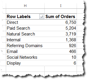
I have some clients who endeavor to track every link on their site. Most of these pass the hit level data to Hadoop or something similar and feel that the more data the better, since data storage is cheaper every day. For those using Adobe Analytics, these links are usually captured in an sProp and done through a query string parameter on the following page or a Custom Link. In Adobe Analytics, the sheer number of these links often hits the monthly unique value limit (low traffic), so the data is somewhat less useful in the browser-based reporting interface, but is fine in DataWarehouse and when data is fed to back-end databases.

But if you ask yourself what is the business goal of tracking every link on a page, here are the rationalizations I have heard:

  • We want to know how each link impacts conversion/success;
  • We want to see which links we can remove from the page;
  • If multiple links to the same page exist, we want to know which one is used more often;
  • We just want to track everything in case we need it later.

Let’s address these one at a time. For the first item, knowing how each link contributes to success is possible, but since many links will be used prior to conversion, several should get credit for success. In Adobe Analytics, you can assign this contribution using the Participation feature, but this becomes problematic if you have too many links tracked and exceed the monthly unique limit. This forces you to resort to DataWarehouse or other systems, which puts analysis out of the hands of most of your business users but is still possible by a centralized analytics team that is a bit more advanced. Instead of doing this, I would propose that instead of tracking every link, you pick specific areas of the website that you care about and track those links in an sProp (or an eVar). For example, if you have an area on your website that is a loan calculator, you can track all of the discrete links there in a custom variable. You can then turn on Participation and Pathing for that variable and get a good sense of what is and is not being used and not exceed any unique variable limits. I would also argue that once you learn what you have to learn, you can re-use the same variable for a different area of your website in the same way (i.e. loan application form pages). Hence, instead of tracking every link on the website, you are more prescriptive on what you are attempting to learn and can do so with greater accuracy. If you need to track several areas of the site concurrently, you can always use multiple variables.

For the second question – seeing which links can be removed from the page – I have found that very few analyses on links have actually resulted in links being dropped from pages. In general, most people look to see how often Page A leads to Page B or Page C and by the time they get to Page Z, the referral traffic is very low. If you truly want to remove extraneous links, you could start by finding the pages that people rarely go to from Page A and then remove the links to those pages on Page A. Doing this doesn’t require doing granular link tracking.

Next, there is the age-old question of which link, of multiple going to the same place, people use. I am not quite sure why people are so fascinated with these types of questions, but they are! In most cases, I find that even after conducting the analysis, people are loathed to remove the duplicative links for fear of negatively impacting conversion (just in case). Therefore, for cases like this, I would suggest using A/B testing to try out pages that have duplicate links removed. Testing can allow you to see what happens when secondary or tertiary links are removed, but for a subset of your audience. If the removal doesn’t negatively impact the site, then you can push it site-wide after the test is complete.

Lastly, there is the school of thought that believe they should track everything just in case it is ever needed. This has become easier over the years as data storage prices have fallen. I have seen many debates rage about whether time should be spent pre-identifying business requirements and tracking specific items desired by stakeholders or just tag everything and assume you may need it later. Personally, I prefer the former, but I don’t disparage those who believe in the latter. If your organization is super-advanced at data collection, has adequate database expertise and an easy way to analyze massive amounts of data, tracking everything may be the right choice for you. However, in my experience, most analytics teams struggle to do a great job with a handful of business questions asked by stakeholders and the addition of reams of link-level data could easily overwhelm them. For every new thing that you track, you need to provide QA, analysis and so on, so I would advise you to focus on the biggest questions your stakeholders have. If you ever get to the point where you have satisfied those and have processes in place to do so in an efficient manner, then you may want to try out “tracking everything” to see how much incremental value that brings. But I do not advise doing it the other way around.

Focus on KPI’s

The other complaint that I have about tracking every link is that it takes time away from your KPI’s. Most analytics teams are busy and strapped for resources. Therefore, focusing time on the most important metrics and analyses is critical. I have seen many companies get bogged down in detailed link tracking that results in nominal potential ROI increases (is the juice worth the squeeze?). Just outlining all of the links to be tracked can take time away from analysts doing analysis, not to mention the time spent analyzing all of the data. In addition, doing granular link tracking can sometimes require a lot of tagging and quality assurance, which takes developers away from other efforts. Developers’ time is usually at a premium, so you need to make the most of it when you have it.

Consider Other Tools

If you are truly interested in tracking every link, I would suggest that you consider some other analytics tools that may be better suited for this work (vs. Adobe Analytics). One set of tools to consider are heat map and session replay tools. I often find that when analytics customers want to track every link on the site, many times, they really want to understand how people are using the different areas of the site and are not aware that there are better tools suited to this function. While heat map tools are not perfect (after many years, even the Adobe Click Map tool takes extra work to make it functional), they can provide some good insights into which parts of pages visitors are viewing/clicking and answer some of the questions described above. I have even seen some clients use detailed link data in Adobe Analytics to create a “heat map” view of a page manually (usually in PowerPoint), which seems like a colossal waste of time to me! I suggest checking out tools like Crazy Egg and others in the heat mapping area.

Personally, I am a bigger fan of session replay tools like Decibel Insight (full disclosure: I am on the advisory board for Decibel), because these tools allow you to see people using your website. I have found that watching someone use an area of your website can often time be easier that analyzing rows and rows of link click data. Unfortunately, just as in engineering or construction, sometimes using the wrong tool can lead you down a path that is way more complicated than you need versus simply selecting the right tool for the job in the beginning. Most of these tools can also show you heat maps, which is nice as it reduces the number of disparate tools you need to work with and pay for.

Lastly, if tracking every link is absolutely essential, I would check out tools like Heap or Mixpanel, which is pre-built for this type of tracking. But in general, when you are in meetings where link-level tracking is discussed, keep these tools in mind before doing a knee-jerk reaction to use your traditional analytics tool.

Final Thoughts

There you have some of my thoughts on the topic of tracking every link on your site. I know that there will be some folks who insist that it is critical to track all links. On that, I may have to agree to disagree, but I would love to hear arguments in favor of that approach as I certainly don’t profess to know everything! I have just found that doing granular link tracking produces minimal insights, can create a lot of extra work, can detract time from core KPI’s and sometimes can be more effective using different toolsets. What say you?

Featured, google analytics

Exploring Site Search (with the help of R)

Last week, I wrote up 10 Arbitrary Takeaways from Superweek 2017 in Hungary. There was a specific non-arbitrary takeaway that wasn’t included in that list, but which I was pretty excited to try out. The last session before dinner on Wednesday evening of the conference was the “Golden Punchcard” competition. In that session, attendees are invited to share something they’ve done, and then the audience votes on the winner. The two finalists were Caleb Whitmore and Doug Hall, both of whom shared some cleverness centered around Google Tag Manager.  This post isn’t about either of those entries!

Rather, one of the entrants who went fairly deep in the competition was Sébastien Brodeur, who showed off some work he’d done with R’s text-mining capabilities to analyze site search terms. He went on to post the details of the approach, the rationale, and the code itself.

The main idea behind the approach is that, with any sort of user-entered text, there will be lots of variations in the specifics of what gets entered. So, looking at the standard Search Terms report in Google Analytics (or looking at whatever reports are set up in Adobe or any other tool for site search) can be frustrating and, worse, somewhat misleading. So, what Sébastien did was use R to break out each individual word in the search terms report and to convert them to their “stems.” That way, different variations of the same word could be collapsed into a single entry. From that, he made a word cloud.

I’ve now taken Sébastien’s code and extended it in a few ways (this is why open source is awesome!), including layering in an approach that I saw Nancy Koons talk about years ago, but which is still both clever and handy.

Something You Can Try without Coding

IF you are using Google Analytics, and IF you have site search configured for your site, then you can try out these approaches in ~2 minutes. The first/main thing I wanted to do with Sébastien’s code was web-enable it using Shiny. And, I’ve done that here. If you go to the site, you’ll see something that looks like this:

If you click Login with Google, you will be prompted to log in with your Google Account, at which point you can select an Account, Property, and View to use with the tool (none of this is being stored anywhere; it’s “temporal,” as fancy-talkers would say).

The Basics: Just a Google Analytics Report

Now, this gets a lot more fun with sites that have high traffic volumes, a lot of content, and a lot of searches going on. Trust me, I’ve got several of those sites as clients! But, I’m going to have to use a lamer data set for this post. I bet you can figure out what it is if you look closely!

For starters, we can just check the Raw Google Analytics Results tab. We’ll come back to this in a bit, but this is just a good way to see, essentially, the Search Terms report from within the Google Analytics interface:

<yawn>

This isn’t all that interesting, but it illustrates one of the issues with the standard report: the search terms are case-sensitive, so “web analytics demystified” is not the same as “Web Analytics Demystified.” This issue actually crops up in many different ways if you scroll through the results. But, for now, let’s just file away that this should match the Search Terms report exactly, should you choose to do the comparison.

Let’s Stem and Visualize!

The meat of Sébastien’s approach was to split out each individual word in the search terms, get its “stem,” and then make a word cloud. That’s what gets displayed on the Word Cloud tab:

You can quickly see that words like “analytics” get stemmed to “analyt,” and “demystified” becomes “demystifi.” These aren’t necessarily “real” words, but that’s okay, because the value they add from collapsing is handy.

Word Clouds Suck When an Uninteresting Word Dominates

It’s all well and good that, apparently, visitors to this mystery site (<wink-wink>) did a decent amount of searching for “web analytics demystified,” but that’s not particularly interesting to me. Unfortunately, those terms dominate the word cloud. So, I added a feature where I can selectively remove specific words from the word cloud and the frequency table (which is just a table view of what ultimately shows up in the word cloud):

As I enter the terms I’m not interested in, the word cloud regenerates with them removed:

Slick, right?

My Old Eyes Can’t See the Teensy Words!

The site also allows adjusting the cutoff for how many times a particular term has to appear before it gets included in the word cloud. That’s just a simple slider control — shown here after I moved it from the default setting of “3” to a new setting of “8:”

That, then, changes the word cloud to remove some of the lower-volume terms:

Now, we’re starting to get a sense of what terms are being used most often. If we want, we can hop over to the Raw Google Analytics Results tab and filter for one of the terms to see all of the raw searches that included it:

What QUESTIONS Do Visitors Have?

Shifting gears quite drastically, as I was putting this whole thing together, I remembered an approach that I saw Nancy Koons present at Adobe Summit some years back, which she has since blogged about, as well as posted about as an “analytics recipe” locked away in the DAA’s member area. With a little bit of clunky regEx, I was able to add the Questions in Search tab, which filters the raw results to just be search phrases that include the words: who, what, why, where, or how. Those are searches way out on the long tail, but they are truly the “voice of the customer” and can yield some interesting results:

Where Else Can This Go?

As you might have deduced, this exercise started out with a quick, “make it web-based and broadly usable” exercise, and it pretty quickly spiraled on me as I started adding features and capabilities that, as an analyst, helped me refine my investigation and look at the data from different angles. What struck me is how quickly I was adding “new features,” once I had the base code in place (and, since I was lifting the meat of the base code from Sébastien, that initial push only took me about an hour).

The code itself is posted on Github for anyone who wants to log a bug, grab it and use it for their own purposes, or extend it more broadly for the community at large. I doubt I’m finished with it myself, as, just as I’ve done with other projects, I suspect I’ll be porting it over to work with Adobe Analytics data. That won’t be as easy to have as a “log in and try it with your data” solution, though, as who knows which eVar(s) and events are appropriate for each implementation? But, there will be the added ability to go beyond looking at search volume and digging into search participation for things like cart additions, orders, and revenue. And, perhaps, even mining the stemmed terms for high volume / low outcome results!

As always, I’d love to hear what you think. How would you extend this approach if you had the time?

Or, what about if you had the skills to do this work with R yourself? This post wasn’t really written as a sales pitch, but, if you’re intrigued by the possibilities and interested in diving more deeply into R yourself, check out the 3-day training on R and statistics for the digital analyst that will be held in Columbus, Ohio, in June.

Conferences/Community, Featured

10 Arbitrary Takeaways from Superweek 2017 in Hungary

Last week, I attended the sixth annual Superweek conference outside Budapest, Hungary. I have not come away from a conference with my head buzzing as much as this since I attended a TDWI conference 15 years ago.

This isn’t going to be a recap post so much as an arbitrary list of ten things that have popped into my head as I’ve been reflecting on the week, in no particular order.

Google Analytics — Do We Even Need It?

During a discussion with Marco Petkovski of YogaGlo and Ophir Prusak of Rollout.io, Marco made a comment to the effect of, “So, analysts are starting to realize they don’t really need Google Analytics, right?” His point was that motivated analysts at sophisticated companies were surely already cobbling together their own ecosystem of tools that were best of breed and maximally configurable for their specific businesses. I wound up pulling out my phone to try to capture a list of what sorts of alternatives/supplements he was referring to. That list included Segment, Fullstory (which Ophir gushed about a bit as well), Tableau, Intercom, and a handful of other visualization and database technologies. I might not have those details quite right, but it was clear that Marco had been stitching together a robust and tailored platform, which allowed him to do things like take advantage of a best-of-breed recommendations API for delivering more targeted content on his company’s site.

One possible reaction: “Um. Sure. But will that solution scale?

It certainly seems like it already has, largely due to the efforts of a highly motivated analyst (although he admitted that there might be a bit more knowledge in his head than would be ideal should ownership need to transition elsewhere).

Frankly, this left me concerned that too many analysts aren’t motivated enough to be continually identifying gaps and filling them. The 2017 equivalent of, “Nobody ever got fired for buying IBM,” is, “Nobody ever got fired for buying Google or Adobe.” There are a lot of promising technologies out there, and the challenge is figuring out which ones are sufficiently differentiating and mature to warrant taking the risk that comes along with them having a relatively small market footprint.

A Venn Diagram of Tools

This discussion occurred before the one above, and it was with Gerasimos Nikolopoulos from Growth. In this brief, but intense, discussion (which occurred shortly after I presented on why analysts should become more data science-y), Gerasimos wound up verbally describing how he’s set up his agency when it comes to tools for doing stuff with the data (this is a subset of the last point, in that it had nothing to do with data capture). From his description, I saw it as something of a Venn diagram of tools:

Basically, he aimed to have a limited set of platforms (others — like R — had been part of the mix in the past, but had been discarded), each with their core use cases, but which all had some overlap. No one on his team is a super user of all three tools, but there is some level of cross-training. This felt very “right,” to me as a strategy. And, notice that no web analytics platform is, itself, treated as a core reporting or analysis tool (just the data from those platforms).

Reinforcement (and Machine) Learning

I spent a lot of time with Matt Gershoff from Conductrics over the course of the week. My most important takeaway there was that, no, there is no such thing as “too much Matt.” I’d always suspected as much. And, as tends to happen when I get time with him, I was smarter for the experience (I now can speak with some confidence about stationary vs. non-stationary data!), but I also realized I’ve got a lot more smarts to gain!

Matt gave a talk about reinforcement learning.

Do I fully get it yet? No.

Am I starting to get it? Maybe.

Is this a real thing that very likely will be applied more and more often in the space we refer to as “digital analytics?” I think that’s quite likely.

A lot of the discussion (both in Matt’s session and outside of it) was how this world of deep learning, machine learning, Q-learning, AI, etc. compares to “A/B and Multivariate testing.” Matt really brought this home (for me) when he showed this video of Google DeepMind’s Deep Q-learning learning to play Atari Breakout:

Matt pointed out that while, yes, it took hundreds of iterations for DeepMind to “learn” the optimal strategy of getting the ball up on top of the space and bouncing around, that was a fraction of the number of iterations that would have been required if the approach had simply been to “develop a bunch of scenarios and have the machine try them out.” The latter approach would be more along the lines of multivariate testing, and it would have been wildly inefficient!

My mind was a little blown by this…and I’m still not equipped to fully articulate my own, “Aha!” Stay tuned.

And…Tensorflow (which was Tahir Fayyaz from Google — not Matt. But, it falls in this same broad area).

Tactical Tips Still Rule

If the takeaway above is about the scary-exciting medium-term future, there are also lots of clever things to be done in the immediate here and now. Damion Brown from Data Runs Deep walked through various tricks for getting various types of helpful, supplemental data into Google Analytics using IFTTT, Zapier, and other low-cost options in his The Missing Automation Layer session. That reminded me of presentations that I’ve seen Jeff Sauer give in the past (Jeff wasn’t able to make the conference in Hungary this year, but he sent his regards). The specific tips were great (as was a session on dimension widening), but the larger point for me was the continued need to get smart with what we have on hand now.

Caleb Whitmore from Analytics Pros was the runner-up in the Golden Punchcard competition with a survey solution he built in Google Tag Manager — get feedback from your visitors and push it directly into Google Analytics! And, the winner of the Golden Punchcard was Doug Hall with his tip on how to get audience/segment data from Google Optimize into Google Tag Manager. Both of these walked that fine line between “really clever” and “a bit of a hack,” but I think they both fell firmly in the former camp. And, Caleb and Doug, obviously, have been around and doing stuff with web analytics for a long time…but really illustrated how their deep knowledge still leads to very practical applications. It motivated me to keep thinking, “AM I being as clever as I can with the tools already at my disposal?”

People and Personalities Matter

I am historically allergic to Myers-Briggs. Maybe I shouldn’t be. And maybe I should be more cognizant of my own risk tolerance and conflict avoidance. And the risk tolerance and conflict avoidance of others.

Maybe.

Isolation Can Be Great

Superweek Hungary is 1.5 hours outside of Budapest in a pretty remote location. It’s at a hotel/resort that the conference takes over for the week. The accommodations are great, the food is great, the views are spectacular. But, it is isolated. As a pretty long conference (4 days for the “main event,” plus a day of training before that), I wondered if I’d miss the ability to just duck out and “explore the city” or “meet up with a non-analytics friend” that is always tempting in San Francisco or Chicago or Boston.

I didn’t miss that opportunity at all.

With the format of the conference, I managed to have extended conversations and/or multiple conversations with people I’ve known well for years, others that I’ve long known only from afar, and sharp people I’d never known at all…but now do!

Podcasting FTW

The Digital Analytics Power Hour was inspired by the discussions that happen in the bars after the sessions are over at analytics conferences. Superweek has “Fireside Chats” each evening at 8:30, and Michael Helbling and I got to record an episode with a live audience with a roaring fire toasting our backsides and a delicious selection of bottled alcohol from around the world to lubricate the discussion. That was… awesome (the episode releases next week).

Data Studio Meets BigQuery Meets Analytics

In theory, someone could create the Acme Marketing sample report / template in Data Studio using BigQuery data rather than “standard” Google Analytics dimensions and metrics. Right? That would give the analyst a starting point where they could dive much deeper and get familiar with the BigQuery schema. I got two different small groups to nod and agree with this idea…but I couldn’t tell if they really agreed or, rather, if they just wanted me to shut the hell up.

Blockchains, Philosophy, and Kim Stanley Robinson

I’m going to make Astrid Illum be a general stand-in for “I love meeting and hanging out with digital analysts.” Over the course of the week, Astrid:

  • Posited that blockchains could potentially be a solution to privacy concerns for digital marketers — having tracking that is detailed, yet absolutely anonymized. Cool thought (give next week’s podcast a listen to hear her explanation).
  • Introduced me to Kim Stanley Robinson (to his writing — not to him, personally). I’m halfway through Aurora and enjoying it immensely. Does it have a direct link to digital analytics? Maybe not. But it’s a damn good read that’s making me think.
  • Proposed that, perhaps, part of the challenge we have with bringing new analysts into the industry is an ontology problem. It’s not easily solvable…but she may be right.

Astrid was also responsible for my first out loud laugh of the conference when, in a discussion about my inability to pronounce the “r” in her name in a non-American way, she quipped, “Well, we all know how you love R, Tim.” Zing!

I simply can’t count how many analysts made me think, laugh, and think some more in discussions over the course of the week.

Pálinka vs. Unicum

Pálinka wins.

I hope to find some in Ohio.

Adobe Analytics, Featured

Before/After Sequence Segmentation

One of the more difficult types of analyses to conduct in the digital world is an analysis that looks at what visitors did before or after actions on a website or within an app. For example, it’s easy to see what pages visitors view in the same visit that they added a product to the cart, but seeing what pages they viewed before or after they added something to the cart is more difficult. Since Adobe Analytics introduced Sequential Segmentation, it has been slightly easier, but being precise about before or after events or page sequences can still be tricky. Fortunately, Adobe Analytics recently released a product update that will make this much easier and in this post, I’ll explain how it works and provide some examples of how this new functionality can be used.

Why Should You Care?

So why should you care about seeing what visitors did before or after a sequence of events? Website visits and mobile app sessions can be sporadic or chaotic. If you try to follow every page path that visitors undertake, you can get lost in the details. For this reason, fallout reports have always been popular. With a fallout report, you can reduce the noise and view cases in which visitors viewed Page A, then eventually Page B and then eventually Page C. In this case, you don’t necessarily care if they went directly from Page A to Page B and Page C, but rather, that they performed that sequence. This concept of fallout was greatly expanded when Adobe Analytics began allowing you to add Success Events, eVars and segments to fallout reports as I described in this post.

But even with all of these improvements, there will still be times when you want to see what happened before a fallout sequence or after the sequence. For example, you may want to see:

  • What did website visitors do after they viewed a series of videos on your website?
  • What search phrases were used before they add items to the shopping cart?
  • What products are purchased after visitors come from an e-mail campaign and then a social media campaign?
  • What pages do people view before they complete all steps of a credit card application?

This is especially true when you take into account that the sequence can span multiple visits by using a Visitor container instead of a visit container. For example, a bank may want to see how often visitors use calculators in any visit prior to applying for a loan. And once you have the ability to segment analytics data based upon before and after sequences, you can then apply those new segments to all Adobe Analytics reports and increase your analytics opportunities.

Example

To illustrate this functionality, let’s look at an example. Let’s say that on the Demystified website, I want to see what pages visitors view before they view our main services page and then our Adobe Analytics services pages (in either the same visit or subsequent visit). The goal of this would be to see which pages are the most important for us in getting new business leads.

To start, I would create a simple fall-out report that defines the sequence I am interested in. In this case, the sequence is viewing our main services page and then viewing one of our two Adobe Analytics services (can be one or the other or both):

Once I have this fall-out report, I can right-click on the last portion of it and choose the “create segment from touchpoint” option as shown here:

This will open the segment builder and allow me to build the corresponding segment. If I want to limit my segment to people who did both actions in the same visit, I would select “Visit,” but in this case I want the sequence to include multi-session activity, so I have selected the “Visitor” option:

However, the segment above includes all cases in which visitors viewed the services page and then one of the Adobe Analytics services. This means that they could have viewed these pages before or after the sequence that I care about. While that is interesting, in this case, my objective is to only view data that occurred before they completed this sequence. This is where the new Adobe Analytics functionality I described earlier comes into play. While editing the above segment, you can now see a new option that says “Include Everyone” to the left of the gear icon (see above). Clicking on this item, brings up a new menu option shown below that lets you narrow the scope of your segment to behavior that occurred before or after the sequence. In the screenshot below, I am selecting the “before” option, since my goal is to see what visitors did before this fall-out sequence transpired:


Once I select this, I can save my segment as shown here:

Now I have a segment that can be applied to any Adobe Analytics report which limits data to only those cases that took place before visitors viewed the main services page and then viewed one of our Adobe Analytics services pages. This segment can be applied to any report in either the traditional Reports & Analytics interface or Analysis Workspace. If I want to see what pages visitors view before my sequence, I can add the segment to the Pages report in a freeform table as shown here:

In this report, I am comparing overall page views to pages with page views to pages taking place before my fall-out sequence. This shows me which pages on our website visitors are viewing prior to viewing the Adobe Analytics services, so I may want to make sure those pages look good!

If I wanted to take this concept further, I could also view which of my blog posts visitors viewed prior to the fall-out sequence (checking out our services and then our Adobe services). To do this, I can add a new Blog Post Views metric to the freeform table and then use another segment to limit this to “Adam Greco” blog posts like this:

Notice that I have applied the “Before Services & Adobe Services” segment to both Page Views and Blog Post Views, but only the “Adam Blog Posts” segment to the Blog Post Views metric. Lastly, I can sort by the Blog Post Views column to see the top “Adam Blog Posts” viewed before the sequence to see which ones may be helping me get new clients!

Final Thoughts

Hopefully you can see that there are many different use cases for this new functionality. I would recommend that you consider using this new feature anytime you get asked a question about what happens before or after a sequence of events on your website (or mobile app). Keep in mind that you can make your fall-out sequences as granular as you want by adding segments to any node of the fall-out report. This should provide ample flexibility when it comes to reporting what is happening before or after activity on your website.

To learn more about using this feature, check out this short video by Ben Gaines on the Adobe Analytics YouTube channel. There is also some additional documentation you can read about this functionality here.

Adobe Analytics, Analysis, Featured

R and Adobe Analytics: Did the Metric Move Significantly? Part 3 of 3

This is the third post in a three-post series. The earlier posts build up to this one, so you may want to go back and check them out before diving in here if you haven’t been following along:

  • Part 1 of 3: The overall approach, and a visualization of metrics in a heatmap format across two dimensions
  • Part 2 of 3: Recreating — and refining — the use of Adobe’s anomaly detection to get an at-a-glance view of which metrics moved “significantly” recently

The R scripts used for both of these, as well as what’s covered in this post, are posted on Github and available for download and re-use (open source FTW!).

Let’s Mash Parts 1 and 2 Together!

This final episode in the series answers the question:

Which of the metrics changed significantly over the past week within specific combinations of two different dimensions?

The visualization I used to answer this question is this one:

This, clearly, is not a business stakeholder-facing visualization. And, it’s not a color-blind friendly visualization (although the script can easily be updated to use a non-red/green palette).

Hopefully, even without reading the detailed description, the visualization above jumps out as saying, “Wow. Something pretty good looks to have happened for Segment E overall last week, and, specifically, Segment E traffic arriving from Channel #4.” That would be an accurate interpretation.

But, What Does It Really Mean?

If you followed the explanation in the last post, then, hopefully, the explanation is really simple. In the last post, the example I showed was this:

This example had three “good anomalies” (the three dots that are outside — and above — the prediction interval) in the last week. And, it had two “bad anomalies” (the two dots at the beginning of the week that are outside — and below — the prediction interval).

In addition to counting and showing “good” and “bad” anomalies, I can do one more simple calculation to get “net positive anomalies:”

[Good Anomalies] – [Bad Anomalies] = [Net Positive Anomalies]

In the example above, this would be:

[3 Good Anomalies] – [2 Bad Anomalies] = [1 Net Positive Anomaly]

If the script is set to look at the previous week, and if weekends are ignored (which is a configuration within the script), then that means the total possible range for net positive anomalies is -5 to +5. That’s a nice range to provide a spectrum for a heatmap!

A Heatmap, Though?

This is where the first two posts really get mashed together:

  • The heatmap structure lets me visualize results across two different dimensions (plus an overall filter to the data set, if desired)
  • The anomaly detection — the “outside the prediction interval of the forecast of the past” — lets me get a count of how many times in the period a metric looked “not as expected”

The heatmap represents the two dimensions pretty obviously. For each cell — each intersection of a value from each of the two dimensions — there are three pieces of information:

  • The number of good anomalies in the period (the top number)
  • The number of bad anomalies in the period (the bottom number)
  • The number of net positive anomalies (the color of the cell)

You can think of each cell as having a trendline with a forecast and prediction confidence band for the last period, but actually displaying all of those charts would be a lot of charts! With the heatmap shown above, there are 42 different slices represented for each metric (there is then one slide for each metric), and it’s quick to interpret the results once you know what they’re showing.

What Do You Think?

This whole exercise grew out of some very specific questions that I was finding myself asking each time I reviewed a weekly performance measurement dashboard. I realize that “counting anomalies by day,” is somewhat arbitrary. But, by putting some degree of rigor behind identifying anomalies (which, so far, relies heavily on Adobe to do the heavy lifting, but, as covered in the second post, I’ve got a pretty good understanding of how they’re doing that lifting, and it seems fairly replicable to do this directly in R), it seems useful to me. If and when a specific channel, customer segment, or combination of channel/segment takes a big spike or dip in a metric, I should be able to hone in on it with very little manual effort. And, I can then start asking, “Why? And, is this something we can or should act on?”

Almost equally importantly, the building blocks I’ve put in place, I think, provide a foundation that I (or anyone) can springboard off of to extend the capabilities in a number of different directions.

What do you think?

Adobe Analytics, Analysis, Featured

R and Adobe Analytics: Did the Metric Move Significantly? Part 2 of 3

In my last post, I laid out that I had been working on a bit of R code to answer three different questions in a way that was repeatable and extensible. This post covers the second question:

Did any of my key metrics change significantly over the past week (overall)?

One of the banes of the analyst’s existence, I think, is that business users rush to judge (any) “up” as “good” and (any) “down” as “bad.” This ignores the fact that, even in a strictly controlled manufacturing environment, it is an extreme rarity for any metric to stay perfectly flat from day to day or week to week.

So, how do we determine if a metric moved enough to know whether it warrants any deeper investigation as to the “why” it moved (up or down)? In the absence of an actual change to the site or promotions or environmental factors, most of the time (I contend), metrics don’t move enough in a short time period to actually matter. They move due to noise.

But, how do we say with some degree of certainty that, while visits (or any metric) were up over the previous week, they were or were not up enough to matter? If a metric increases 20%, it likely is not from noise. If it’s up 0.1%, it likely is just ordinary fluctuation (it’s essentially flat). But, where between 0.1% and 20% does it actually matter?

This is a question that has bothered me for years, and I’ve come at answering it from many different directions — most of them probably better than not making any attempt at all, but also likely an abomination in the eyes of a statistician.

My latest effort uses an approach that is illustrated in the visualization below:

In this case, something went a bit squirrely with conversion rate, and it warrants digging in farther.

Let’s dive in to the approach and rationale for this visualization as an at-a-glance way to determine whether the metric moved enough to matter.

Anomaly Detection = Forecasting the Past

The chart above uses Adobe’s anomaly detection algorithm. I’m pretty sure I could largely recreate the algorithm directly using R. As a matter of fact, that’s exactly what is outlined on the time-series page on dartistics.com. And, eventually, I’m going to give that a shot, as that would make it more easily repurposable across Google Analytics (and other time-series data platforms). And it will help me plug a couple of small holes in Adobe’s approach (although Adobe may plug those holes on their own, for all I know, if I read between the lines in some of their documentation).

But, let’s back up and talk about what I mean by “forecasting the past.” It’s one of those concepts that made me figuratively fall out of my chair when it clicked and, yet, I’ve struggled to explain it. A picture is worth a thousand words (and is less likely to put you to sleep), so let’s go with the equivalent of 6,000 words.

Typically, we think of forecasting as being “from now to the future:”

But, what if, instead, we’re actually not looking to the future, but are at today and are looking at the past? Let’s say our data looks like this:

Hmmm. My metric dropped in the last period. But, did it drop enough for me to care? It didn’t drop as much as it’s dropped in the past, but it’s definitely down? Is it down enough for me to freak out? Or, was that more likely a simple blip — the stars of “noise” aligning such that we dropped a bit? That’s where “forecasting the past” comes in.

Let’s start by chopping off the most recent data and pretend that the entirety of the data we have stops a few periods before today:

Now, from the last data we have (in this pretend world), let’s forecast what we’d expect to see from that point to now (we’ll get into how we’re doing that forecast in a bit — that’s key!):

This is a forecast, so we know it’s not going to be perfect. So, let’s make sure we calculated a prediction interval, and let’s add upper and lower bounds around that forecast value to represent that prediction interval:

Now, let’s add our actuals back into the chart:

Voila! What does this say? the next-to-last reporting period was below our forecast, but it was still inside our prediction interval. The most recent period, thought, was actually outside the prediction interval, which means it moved “enough” to likely be more than just noise. We should dig further.

Make sense? That’s  what I call “forecasting the past.” There may be a better term for this concept, but I’m not sure what it is! Leave a comment if I’m just being muddle-brained on that front.

Anomaly Detection in Adobe Analytics…Is This

Analysis Workspace has anomaly detection as an option in its visualizations and, given the explanation above, how they’re detecting “anomalies” may start to make more sense:

Now, in the case of Analysis Workspace, the forecast is created for the entire period that is selected, and then any anomalies that are detected are highlighted with a larger circle.

But, if you set up an Intelligent Alert, you’re actually doing the same thing as their Analysis Workspace anomaly visualization, with two tweaks:

  • Intelligent Alerts only look at the most recent time period — this makes sense, as you don’t want to be alerted about changes that occurred weeks or months ago!
  • Intelligent Alerts give you some control over how wide the prediction interval band is — in Analysis Workspace, it’s the 95% prediction interval that is represented; when setting up an alert, though, you can specify whether you want the band to be 90% (narrower), 95%, or 99% (wider)

Are you with me so far? What I’ve built in R is more like an Intelligent Alert than it is like the Analysis Workspace  representation. Or, really, it’s something of a hybrid. We’ll get to that in a bit.

Yeah…But ‘Splain Where the Forecast Came From!

The forecast methodology used is actually what’s called Holt-Winters. Adobe provides a bit more detail in their documentation. I started to get a little excited when I found this, because I’d come across Holt-Winters when working with some Google Analytics data with Mark Edmondson of IIH Nordic. It’s what Mark used in this forecasting example on dartistics.com. When I see the same thing cropping up from multiple different smart sources, I have a tendency to think there’s something there.

But, that doesn’t really explain how Holt-Winters works. At a super-high level, part of what Holt-Winters does is break down a time-series of data into a few components:

  • Seasonality — this can be the weekly cycle of “high during the week, low on the weekends,” monthly seasonality, both, or something else
  • Trend — with seasonality removed, how the data is trending (think rolling average, although that’s a bit of an oversimplification)
  • Base Level — the component that, if you add in the trend and seasonality to it will get you to the actual value

By breaking up the historical data, you get the ability to forecast with much more precision than simply dropping a trendline. This is worth digging into more to get a deeper understanding (IMHO), and it turns out there is a fantastic post by John Foreman that does just that: “Projecting Meth Demand Using Exponential Smoothing.” It’s tongue-in-cheek, but it’s worth downloading the spreadsheet at the beginning of the post and and walking through the forecasting exercise step-by-step. (Hat tip to Jules Stuifbergen for pointing me to that post!)

I don’t think the approach in Foreman’s post is exactly what Adobe has implemented, but it absolutely hits the key pieces. Analysis Workspace anomaly detection also factors in holidays (somehow, and not always very well, but it’s a tall order), which the Adobe Analytics API doesn’t yet do. And, Foreman winds up having Excel do some crunching with Solver to figure out the best weighting, while Adobe applies three different variations of Holt-Winters and then uses the one that fits the historical data the best.

I’m not equipped to pass any sort of judgment as to whether either approach is definitively “better.” Since Foreman’s post was purely pedagogical, and Adobe has some extremely sharp folks focused on digital analytics data, I’m inclined to think that Adobe’s approach is a great one.

Yet…You Still Built Something in R?!

Still reading? Good on ya’!

Yes. I wasn’t getting quite what I wanted from Adobe, so I got a lot from Adobe…but then tweaked it to be exactly what I wanted using R. The limitations I ran into with Analysis Workspace and Intelligent Alerts were:

  • I don’t care about anomalies on weekends (in this case — in my R script, it can be set to include weekends or not)
  • I only care about the most recent week…but I want to use the data up through the prior week for that; as I read Adobe’s documentation, their forecast is always based on the 35 days preceding the reporting period
  • do want to see a historical trend, though; I just want much of that data to be included in the data used to build the forecast
  • I want to extend this anomaly detection to an entirely different type of visualization…which is the third and final part in this series
  • Ultimately, I want to be able to apply this same approach to Google Analytics and other time-series data

Let’s take another look at what the script posted on Github generates:

Given the simplistic explanation provided earlier in this post, is this visual starting to make more sense? The nuances are:

  • The only “forecasted past” is the last week (this can be configured to be any period)
  • The data used to pull that forecast is the 35 days immediately preceding the period of interest — this is done by making two API calls: 1 to pull the period of interest, and another to pull “actuals only” data; the script then stitches the results together to show one continuous line of actuals
  • Anomalies are identified as “good” (above the 95% prediction interval) or “bad” (below the 95% prediction interval)

I had to play around a bit with time periods and metrics to show a period with anomalies, which is good! Most of the time, for most metrics, I wouldn’t expect to see anomalies.

There is an entirely separate weekly report — not shown here — that shows the total for each metric for the week, as well as a weekly line chart, how the metric changed week-over-week, and how it compared to the same week in the prior year. That’s the report that gets broadly disseminated. But, as an analyst, I have this separate report — the one I’ve described in this post — that I can quickly flip through to see if any metrics had anomalies on one or more days for the week.

Currently, the chart takes up a lot of real estate. Once the analysts (myself included) get comfortable with what the anomalies are, I expect to have a streamlined version that only lists the metrics that had an anomaly, and then provides a bit more detail.

Which may start to sound a lot like Adobe Analytics Intelligent Alerts! Except, so far, when Adobe’s alerts are triggered, it’s hard for me to actually get to a deeper view get more context. That may be coming, but, for now, I’ve got a base that I understand and can extend to other data sources and for other uses.

For details on how the script is structured and how to set it up for your own use, see the last post.

In the next post, I’ll take this “anomaly counting” concept and apply it to the heatmap concept that drills down into two dimensions. Sound intriguing? I hope so!

The Rest of the Series

If you’re feeling ambitious and want to go back or ahead and dive into the rest of the series:

Adobe Analytics, Analysis, Featured

R and Adobe Analytics: Two Dimensions, Many Metrics – Part 1 of 3

This is the first of three posts that all use the same base set of configuration to answer three different questions:

  1. How do my key metrics break out across two different dimensions?
  2. Did any of these metrics change significantly over the past week (overall)?
  3. Which of these metrics changed significantly over the past week within specific combinations of those two different dimensions?

Answering the first question looks something like this (one heatmap for each metric):

Answering the second question looks something like this (one chart for each metric):

Answering the third question — which uses the visualization from the first question and the logic from the second question — looks like this:

These were all created using R, and the code that was used to create them is available on Github. It’s one overall code set, but it’s set up so that any of these questions can be answered independently. They just share enough common ground on the configuration front that it made sense to build them in the same project (we’ll get to that in a bit).

This post goes into detail on the first question. The next one goes into detail on the second question. And, I own a T-shirt that says, “There are two types of people in this world: those who know how to extrapolate from incomplete information.” So, I’ll let you guess what the third post will cover.

The remainder of this post is almost certainly TL;DR for many folks. It gets into the details of the what, wherefore, and why of the actual rationale and methods employed. Bail now if you’re not interested!

Key Metrics? Two Dimensions?

Raise your hand if you’ve ever been asked a question like, “How does our traffic break down by channel? Oh…and how does it break down by device type?” That question-that-is-really-two-questions is easy enough to answer, right? But, when I get asked it, I often feel like it’s really one question, and answering it as two questions is actually a missed opportunity.

Recently, while working with a client, a version of this question came up regarding their last touch channels and their customer segments. So, that’s what the examples shown here are built around. But, it could just as easily have been device category and last touch channel, or device category and customer segment, or new/returning and device category, or… you get the idea.

When it comes to which metrics were of interest, it’s an eCommerce site, and revenue is the #1 metric. But, of course, revenue can be decomposed into its component parts:

[Visits] x [Conversion Rate] x [Average Order Value]

Or, since there are multiple lines per order, AOV can actually be broken down:

[Visits] x [Conversion Rate] x [Lines per Order] x [Revenue per Line]

Again, the specific metrics can and should vary based on the business, but I got to a pretty handy list in my example case simply by breaking down revenue into the sub-metrics that, mathematically, drive it.

The Flexibility of Scripting the Answer

Certainly, one way to tackle answering the question would be to use Ad Hoc Analysis or Analysis Workspace. But, the former doesn’t visualize heatmaps at all, and the latter…doesn’t visualize this sort of heatmap all that well. Report Builder was another option, and probably would have been the route I went…except there were other questions I wanted to explore along this two-dimensional construct that are not available through Report Builder.

So, I built “the answer” using R. That means I can continue to extend the basic work as needed:

  • Exploring additional metrics
  • Exploring different dimensions
  • Using the basic approach with other sites (or with specific segments for the current site — such as “just mobile traffic”)
  • Extending the code to do other explorations of the data itself (which I’ll get into with the next two posts)
  • Extending the approach to work with Google Analytics data

Key Aspects of R Put to Use

The first key to doing this work, of course, is to get the data out. This is done using the RSiteCatalyst package.

The second key was to break up the code into a handful of different files. Ultimately, the output was generated using RMarkdown, but I didn’t put all of the code in a single file. Rather, I had one script (.R) that was just for configurations (this is what you will do most of the work in if you download the code and put it to use for your own purposes), one script (.R) that had a few functions that were used in answering multiple questions, and then one actual RMarkdown file (.Rmd) for each question. The .Rmd files use read_chunk() to selectively pull in the configuration settings and functions needed. So, the actual individual files break down something like this:

This probably still isn’t as clean as it could be, but it gave me the flexibility (and, perhaps more importantly, the extensibility) that I was looking for, and it allowed me to universally tweak the style and formatting of the multi-slide presentations that each question generated.

The .Renviron file is a very simple text file with my credentials for Adobe Analytics. It’s handy, in that it only sits on my local machine; it never gets uploaded to Github.

How It Works (How You Can Put It to Use)

There is a moderate level of configuration required to run this, but I’ve done my best to thoroughly document those in the scripts themselves (primarily in config.R). But, summarizing those:

  • Date Range — you need to specify the start and end date. This can be statically defined, or it can be dynamically defined to be “the most recent full week,”  for instance. The one wrinkle on the date range is that I don’t think the script will work well if the start and end date cross a year boundary. The reason is documented in the script comments, so I won’t go into that here.
  • Metrics — for each metric you want to include, you need to include the metric ID (which can be something like “revenue” for the standard metrics or “event32” for events, but can also be something like “cm300000270_56cb944821d4775bd8841bdb” if it’s a calculated metric; you may have to use the GetMetrics() function to get the specific values here. Then, so that the visualization comes out nicely, for each metric, you have to give it a label (a “pretty name”), specify the type of metric it is (simple number, currency, percentage), and how many places after the decimal should be included (visits is a simple number that needs 0 places after the decimal, but, “Lines per Order” may be a simple number where 2 places after the decimal make sense).
  • One or more “master segments” — it seems reasonably common, in my experience, that there are one or two segments that almost always get applied to a site (excluding some ‘bad’ data that crept in, excluding a particular sub-site, etc.), and the script accommodates this. This can also be used to introduce a third layer to the results. If, for instance, you wanted to look at last touch channel and device category just for new visitors, then you can apply a master segment for new visitors, and that will then be applied to the entire report.
  • One Segment for Each Dimension Value — I went back and forth on this and, ultimately, went with the segments approach. In the example above, this was 13 total segments (one each for the seven channels, which included the “All Others” channel, and one each for each of the six customer segments, which was five customer segment values plus one “none specified” customer segment). I could have also simple pulled the “Top X” values for specific dimensions (which would have had me using a different RSiteCatalyst function), but this didn’t give me as much control as I wanted to ensure I was covering all of the traffic and was able to make an “All Others” catch-all for the low-volume noise areas (which I made with an Exclude segment). And, these were very simple segments (in this case, although many use cases would likely be equally simple). Using segments meant that each “cell” in the heatmap was a separate query to the Adobe Analytics API. On the one hand, that meant the script can take a while to run (~20 minutes for this site, which has a pretty high volume of traffic). But, it also means the queries are much less likely to time out. Below is what one of these segments looks like. Very simple, right?

  • Segment Meta Data — each segment needs to have a label (a “pretty name”) specified, just like the metrics. That’s a “feature!” It let me easily obfuscate the data in these examples a bit by renaming the segments “Channel #1,” “Channel #2,” etc. and “Segment A,” “Segment B,” etc. before generating the examples included here!
  • A logo — this isn’t in the configuration, but, rather, just means replacing the logo.png file in the images subdirectory.

Getting the segment IDs is a mild hassle, too, in that you likely will need to use the GetSegments() function to get the specific values.

This may seem like a lot of setup overall, but it’s largely a one-time deal (until you want to go back in and use other segments or other metrics, at which point you’re just doing minor adjustments).

Once this setup is done, the script just:

  • Cycles through each combination of the segments from each of the segment lists and pulls the totals for each of the specified metrics
  • For each [segment 1] + [segment 2] + [metric] combination, adds a row to a data frame. This results in a “tidy” data frame with all of the data needed for all of the heatmaps
  • For each metric, generates a heatmap using ggplot()
  • Generates an ioslides presentation that can then be shared as is or PDF’d for email distribution

Easy as pie, right?

What about Google Analytics?

This code would be fairly straightforward to repurpose to use googleAnalyticsR rather than RSiteCatalyst. That’s not the case when it comes to answering the questions covered in the next two posts (although it’s still absolutely doable for those, too — I just took a pretty big shortcut that I’ll get into in the next two posts). And, I may actually do that next. Leave a comment if you’d find that useful, and I’ll bump it up my list (it may happen anyway based on my client work).

The Rest of the Series

If you’re feeling ambitious and want to go ahead and dive into the rest of the series:

Adobe Analytics, Featured

Analysis Workspace – The Future is Here

One of the great things about Analysis Workspace is that it begs you to keep driving deeper and deeper into analysis in ways that the traditional Adobe Analytics reports do not. I have heard Ben Gaines talk about this as one of the reasons he loves Workspace so much and he is spot on. Ever since it burst onto the scenes, those who understand Adobe Analytics have realized that it represented the future of the product. The only thing holding it back was the fact that some key types of reports were unavailable, forcing users to continue to use the traditional Adobe Analytics reports.

However, this all changed yesterday. I believe that October 20th will go down in history (at least the history of Adobe Analytics geeks like me) as the day the world changed! On this day, a host of great new Analysis Workspace visualizations were released. These include:

While this may not seem like such a big deal, let me tell you why it is a huge deal. I believe that these additions represent the tipping point in which Adobe Analytics end-users give in and decide that Analysis Workspace is their primary reporting interface. While I have seen some of my clients dive head first into Analysis Workspace, I have also seen many of my clients “dip their toe in the water” with Analysis Workspace, but fall back to their comfort zone of traditional reports. It is my contention that this will no longer be possible and that Analysis Workspace will become the default going forward. Of course, this will take some time to learn the new interface, but the advantages are so compelling at this point, that those not making the shift will risk becoming Adobe Analytics dinosaurs.

To illustrate why I think this will happen, I am going to demonstrate the power of Analysis Workspace in the following section.

Stream of Consciousness

In my opinion, the intrinsic value of Analysis Workspace, like Discover before it, is the ability to come up with an analysis idea and be able to follow it through like a stream of consciousness. As an analyst, you want to be able to ask a question and then when you find the answer, ask a follow-up question and so on. In the traditional Adobe Analytics reports, there are a few cases in which you can break a report down by another, but it is somewhat limited. This limitation can break your train of thought and instead of asking the next question, you end up spending time thinking about how you need to work around the tool or, worse yet, add more implementation items to answer your follow-up question.

For example, let’s say that I want to see which products had the most orders this month. I can open the Products report and add the Orders metric. Then I want to see which campaigns drove the highest selling product, so I break the product down by campaign tracking code. Next I want to see the trend of that campaign code leading to orders of that product. At this point, I am a bit stuck since I need to build a segment and apply it to a Visits report. But to do this, I need to stop what I am doing, identify the correct segment definition, save it, open up a Visits report and apply the segment. Next I might want to see if there were any abnormal peaks or valleys in the data, so I might export the data to Excel and run a standard deviation formula against it for the last few months. This involves exporting data and making sure I have the formulas correct in Excel. What if I want to repeat this analysis on a weekly basis going forward? That means I need to open up Adobe ReportBuilder, make a data block, use formulas to apply the standard deviation and then schedule it to be sent weekly.

As you can see, there are a lot of manual steps involving Adobe Analytics, Excel, ReportBuilder, etc. At any point in this process, the phone could ring and I could get distracted and lose my train of thought. In the best case scenario, I am looking at a few hours to follow my concept through to analysis.

What Analysis Workspace does is two-fold. First, pretty much everything you need is built into the same tool so you don’t have to jump between different tools. Second, most of the things you need are one click away and can be done so fast that sometimes it feels like you are slowing down the tool instead of the other way around!

To illustrate this, I am going to build upon an example scenario that I blogged about last week. In that post, I described a situation in which I used the new Analysis Workspace Fallout report visualization to see what percent of visits to my website viewed my blog posts and of those how many found their way to some of my “sales pages. If you haven’t read that post, I suggest you take a few minutes and read that post now to have more context for what follows.

As described in the previous post, I have isolated a situation in which very few people are checking out my sales pages:

screen-shot-2016-10-21-at-3-23-58-pm

Upon seeing this, one question I might ask is where are visitors going who don’t go to my sales pages? I can easily see this by right-clicking on the sales page checkpoint item and selecting the fallout option like this:

screen-shot-2016-10-21-at-3-34-24-pm

This will result in a brand new report being populated that shows the answer to this question:

screen-shot-2016-10-21-at-3-36-03-pm

In addition, I may want to see which pages people who do eventually reach my sales pages also view. I can do this by again right-clicking on the sales pages checkpoint and then choosing fall-though like this:

screen-shot-2016-10-21-at-3-29-54-pm

This will create a brand new report showing where visitors went between the second to last and last steps like this:

screen-shot-2016-10-21-at-3-32-57-pm

Finally, I may want to see the general trend of visitors viewing my blog post and then reaching a sales page. To see this, I right-click on the last checkpoint and select the trend option to see a graph like this:

screen-shot-2016-10-21-at-3-40-11-pm

So in a matter of seconds, I can follow-up on my top queries and continue to dig deeper. In fact, when I see the graph above, Analysis Workspace shows me the statistical trend and the normal upper and lower bands of expected data. This provides context and negates my need to export data to Excel and do analysis there. In addition, I see two circles indicating cases in which my trend was outside of the norm via Adobe Analytics Anomaly Detection functionality. When I hover over either of these circles, I am given the opportunity to dig deeper into these data anomalies with one click:

screen-shot-2016-10-21-at-3-45-06-pm

Running this allows me to see what data is contributing to the data anomaly like this:

screen-shot-2016-10-21-at-3-50-56-pm

But another analysis I may be curious about is from which companies are visitors coming who do make it from my blog pages to my sales pages. Ideally, I’d like to build a segment of these folks and start marketing to them. Luckily, I can right-click on the final checkpoint and select the “create segment from touchpoint” option and see a brand new segment like this:

screen-shot-2016-10-21-at-3-55-12-pm

All I have to do is give this segment a name and I can use it in any report. So next, I will open a freeform table and add my DemandBase Company Name report with the Visits metric and then apply this new segment to the report like this:

screen-shot-2016-10-21-at-4-03-25-pm

Next I can right-click on the top prospect (row 2 above) and see the trend of them visiting my site:

screen-shot-2016-10-21-at-4-06-32-pm

Another way to analyze this might be to add a cohort table and see how often people who fall into my Blog to Sales segment visit my site and then return to it. I can do this by adding a cohort visualization, selecting Visits as the metrics and then applying my new auto-created segment to it like this:

screen-shot-2016-10-21-at-4-11-33-pm

here I might see that I have some people coming back in week one, two and three, so they might be serious about working with me. I can then right-click on the week three cell and create a new segment called “Really Interested in Adam” and add that back to my DemandBase Company Name freeform table:

screen-shot-2016-10-21-at-4-18-15-pm

Phew! Now, I purposely went a bit crazy there, but was to drive home the point. While you may not go through things exactly the way I just did, the cool part is that you can! You can easily keep adding visualizations and right-clicking to create sub-reports and segments (and I didn’t even hit all of the other visualizations that can be used as well!). At no point did I have to leave Adobe Analytics and use other tools and I was able to run all of these reports in under ten minutes!

This is why I think most Adobe Analytics users will make the leap to Analysis Workspace in the future. I encourage you to avoid digging your head into the sand and to get with the program. There are lots of blog posts and videos available to show you how to use Analysis Workspace and if you need more help, I offer training services as well 😉

Congrats to the Adobe Analytics product management team and their developers. Welcome to the future of Adobe Analytics…

Adobe Analytics, Featured

Analysis Workspace Fallout Reports

Yesterday, the Adobe Analytics team added a lot of cool new functionality related to Analysis Workspace. One of these additions was the addition of a Fallout visualization, which was previously available in the Ad Hoc Analysis product, but unavailable in Analysis Workspace. In this post, I will share some of my thoughts on this new visualization and how it can be used.

Fallout Report Refresher

Back in 2008, I blogged about how to use Fallout reports in SiteCatalyst, but a lot has changed since then! The concept of the Fallout report is that you add checkpoints to a report and Adobe Analytics will tell you what percent of your paths dropped off or continued from checkpoint A to B to C. Unfortunately, the traditional version of this report has many limitations:

  • Fallout is limited to a finite number of checkpoints (normally four unless you pay for more)
  • Fallout can only include values from one dimension. For example, if you are doing a fallout report for Pages, only pages can be used as checkpoints. Therefore, you cannot mix values from two different dimensions
  • Fallout reports could only be used for Traffic Variables (sProps), so this might cause you to track data you have in Conversion Variables (eVars) in an sProp as well, just to see fallout. This sProp limitation also means that you could not add metrics (Success Events) to Fallout reports
  • Checkpoint values in the Fallout report could not be grouped, so if you wanted to see a checkpoint in which either value A or value B was present, you would have to create a new sProp for that purpose, which creates a lot of unnecessary work
  • Fallout reports are limited to one visit

So as you can see, traditional Fallout reports were useful, but had a lot of limitations. Most people got around these limitations, by using Fallout reports in the Ad Hoc Analysis (formerly Discover) tool. That was helpful, but it required the installation of a Java client and understanding how to use a much more sophisticated tool, which didn’t always appeal to casual analytics users.

Welcome to the Future!

But now, Adobe has brought the best of the Ad Hoc Analysis Fallout reports to Analysis Workspace, the new reporting/visualization interface that works for both casual and advanced analytics users. As you probably know, Analysis Workspace works natively in the browser, but packs the same punch as the Java-based Ad Hoc Analysis product.

The new Fallout visualization removes all of the previously mentioned limitations so you can:

  • Have an unlimited number of checkpoints
  • Include Success Events, eVars or sProps and mix and match them in the same Fallout report
  • Group items together into one checkpoint
  • View fallout across multiple visits

To illustrate this, let’s go through an example. Imagine that I want to know how often people come to the Analytics Demystified website, read one of my blog posts and then proceed to view a few of the pages that pitch my consulting services. In a normal Fallout report, this would be difficult because I would need to have some sort of “Page Type” sProp that had one value for all of my blog posts (i.e. Adam Blog Posts) and another value for all of my sales pages (i.e. Adam Sales Pages). That would require some manual tagging effort, but if I did that, I could see a fallout from Adam Blog Posts to Adam Sales Pages, but within a visit only.

Let’s see how I could do this using the new Analysis Workspace visualization. First, I would add the Fallout visualization to the canvas. Then I would drag over my Blog Post Views Success Event as a checkpoint like this:

screen-shot-2016-10-21-at-12-24-52-pm

So now we can see that about 93% of our Visits have people who view blog posts. Next, I want to limit the second checkpoint to only those who read my blog posts. To do this, I can simply add a segment to the second checkpoint. This is another thing that has never been possible in traditional Fallout reports. So I will add my “Adam Blog Posts” segment to the second checkpoint by dragging it next to the Blog Post Views Success Event (you will see a black bar) so it looks like this:

screen-shot-2016-10-21-at-12-28-04-pm

Now I can see that about 16% of all visits find their way to one of my blog posts. Next, I want to see what percent of those folks make it to one of my sales pages. To do this, I use the left navigation of Analysis Workspace to find the Pages dimension, click the arrow next to it and then find the sales pages. Here is what the left navigation will look like before you click the arrow:

screen-shot-2016-10-21-at-12-30-40-pm

Once you click, you will see your pages and can search for the ones you want:

screen-shot-2016-10-21-at-12-32-16-pm

Once you find the pages you care about, you can drag them over one at a time (or select multiple using Command/Control) and drop them next to each other. Combining them creates an OR clause so if any of those pages is viewed, the Fallout report will count it. Here is what it looks like after I dragged over three different pages:

screen-shot-2016-10-21-at-12-21-27-pm

So now I can see that I am not getting a lot of folks reading my blog posts to view my consulting sales pages (darn freeloaders!). Since my percent is lower than I’d like, in this case, I am going to start adding a call to action for my sales pages to the bottom of my blog posts (see below) and then check in a few weeks to see if this helps decrease this large drop-off…

Additionally, there are some settings associated with this report that you can tweak. Using the “gear” icon, you can choose whether you want to include All Visits as the first checkpoint, or exclude that and start my fallout report with the first checkpoint.  You can also choose if you want to include Visits or Visitors in the report:

screen-shot-2016-10-21-at-12-37-44-pm

Here is what the report looks like if I uncheck the “All Visits” box:

screen-shot-2016-10-21-at-12-39-49-pm

Segmentation

But wait…there’s more. While we saw that we can add segments to checkpoints, there is much more you can do with segmentation and Fallout visualizations. First, you can add a segment to the entire workspace project which will impact all visualizations, including the Fallout report. For example, I can add my “Competitors” segment (which I get from DemandBase data) to the top of the project  and see my data change like this:

screen-shot-2016-10-21-at-1-05-35-pm

Now I can see that instead of 16% of visits viewing my blog posts, I have 44% of visits viewing them (not cool guys!) and that very few of them view my sales pages, which is understandable. But to make this easier to see, I can alternatively drag this segment next to the All Visits area at the top of the Fallout visualization and see the Fallout report separately for each segment like this:

screen-shot-2016-10-21-at-1-09-52-pm

This is a much easier way to see the differences. You can add up to three different versions to the Fallout report, so here is an example if I wanted to view All Visits, US Visits and Europe Visits together:

screen-shot-2016-10-21-at-1-11-29-pm

Additional Info

So that is a quick tutorial on the new Fallout visualization. I hope it helps you see some of the power that now exists. To see some more cool ways you can use this new functionality, check out this blog post by Antti Koski and watch this YouTube video from Adobe. Enjoy!

Analytics Strategy, Conferences/Community, Featured, General

I am the Luckiest Guy in Analytics!

Last week I had the rare opportunity to bring nearly 20 of the best minds in the Analytics industry to a private retreat in Maui, Hawaii. In between events and some well deserved R&R we discussed how our work, the field, and digital marketing as a whole have changed in the near decade since I founded Web Analytics Demystified.

Three things stood out for me after the conversation:

  1. This is not your father’s analytics industry. The analytics industry I entered in 2000 is gone — the conferences, the Yahoo! groups, the social gatherings — have all gone by the wayside. In the early days we had an analytics community, built largely around the Yahoo! group I founded but supported by the Emetrics Conference, Web Analytics Wednesday gatherings, and even an active conversation on Twitter. Today that community seems fragmented at best across increasingly niche conferences, #channels, and events … and it was not clear to me or anyone else in the room what we could or should do to bring the community back together.
  2. The more things change, the more they stay the same. Given the changes we see in the broader digital marketing industry one would rationally expect a general maturation of the overall use of analytics in the Enterprise. We see that, especially in our best clients, but I think we are all a little surprised to still see so many entry level questions and “worst of breed” uses of digital analytics out there. To be fair, as consultants we recognize this as job security, but it is still a little amazing that nearly 20 years into the practice of digital measurement we see the type of poorly planned and badly executed analytics implementations that seem to cross my desk on a weekly basis.
  3. I am the luckiest guy in the analytics industry! Personally the conversation reminded me that because of (or despite) my career in the industry I now find myself surrounded by many of the best minds digital analytics has to offer. Little did I imagine when we built our Team Demystified staff augmentation practice that it would bring the amazing individuals to our door that we have today, each contributing their collective experience and expertise to the broader footprint that Analytics Demystified has built and maintains.

On the last point, after realizing how much Team folks wanted to share, we have created an entirely new blog for our Team Demystified folks that you can subscribe to here:

http://analyticsdemystified.com/category/team-demystified/

With that I will remind you that if you are tired of your current job and want to explore  Team Demystified I am always open to the conversation. We wouldn’t be able to talk face-to-face on an awesome catamaran in the Pacific Ocean off of Maui … but you have to start somewhere, right?

img_1369

Adobe Analytics, Featured

Pricing State

If you are an online retailer, there are situations in which you will offer your products in various pricing states. For example, there may be some products that are on sale, some that have discounts based upon a discount code or some that are on clearance. In these cases, you may want to document the original price, the discounted price and see how the pricing state impacts conversion. In this post, I will show how to do this in Adobe Analytics and a few examples.

Capturing the Pricing State

The first thing you may want to see is whether pricing state has any conversion implications. This can be tracked in general and by product or product category. To do this, you will want to set an eVar with the current pricing state when visitors open each product page. For example, if a visitor opens Product A and it is a product priced at retail price, you may pass the phrase “retail price” to the eVar. But if a product is discounted, you would pass in the type of discount the visitor saw. Let’s imagine that your visitor viewed a product that had this pricing associated with it:

Screen Shot 2016-08-30 at 1.19.52 PM

In this case, the pricing state was “clearance” and it was discounted sixty-seven percent. There are a few ways to capture this, but to save eVars, I would probably capture this as “clearance:67” in the eVar to denote that the active pricing state was “clearance” and the percent off amount. Here is what the report might look like when viewed with the Product Views Success Event (with retail price value excluded):

Screen Shot 2016-08-30 at 2.01.41 PM

This report can be broken down by Product as needed or you can begin with the Products report and then break that down by Pricing State as needed. And if you have classified your Products into Product Categories, you can see the same information by Product Category.

Of course, those who have been reading my blog for a while may recognize that this new “Pricing State” eVar will require the use of Merchandising. This is due to the fact that your visitors may view multiple products, and Adobe Analytics needs to record the pricing state for each product viewed versus just storing the last pricing state and applying that to all products (as would be done with a non-Merchandising eVar). In this case, since we are setting the Pricing State eVar on the product page where we are already setting the Products variable, I would suggest using Product Syntax Merchandising.

Once you have set the eVar, each product viewed will have a its own Pricing State value and Adobe Analytics will wait and see which products are purchased in the visit or beyond (depending upon your eVar expiration). That means that you can add both the Product Views and Orders metrics to the Pricing State eVar report and create a calculated metric to see the conversion rate. The report may look something like this (again shown with retail pricing filtered out):

Screen Shot 2016-08-30 at 2.05.00 PM

This type of report will allow you to see if any combination of pricing state and discount percent performs better than others. You can use the search filter or segmentation to narrow down items as needed (i.e. just sale rows).

By capturing both the pricing state and the discount percent in the same eVar, you can later use the SAINT Classifications Rule Builder to group all items by pricing state (i.e. all “clearance” items together) and use REGEX to see a report by discount percent. That gets you three reports with only one eVar. You can switch to the pricing state type classification to see a higher-level view of conversion by pricing state as shown here:

Screen Shot 2016-08-30 at 2.10.17 PM

Or you can switch to the discount classification to see performance by discount amount, agnostic of pricing state as shown here:

Screen Shot 2016-08-30 at 2.15.56 PM

Pricing State Metrics

While conducting analysis related to Pricing State, keep in mind that it is also possible to capture the dollar amounts associated with Pricing States in currency Success Events. Since all of the amounts are present the product page, it is simply a matter of passing the correct amounts to the appropriate Success Events. Let’s look at this via an example. If a visitor views the product shown above, you know that the original price was $40 and the current price is $12.99. Therefore, if a visitor orders this product, $12.99 will be passed to the Revenue metric (using the Purchase event), but nothing will be done with the $40 amount.

But if desired, you could capture the original $40 price on the order confirmation page in a new metric called “Original Price.” This new metric would always capture the original price and can be compared to the Revenue amount by Product or Product Category. This can be done by creating a calculated metric that divides Revenue by this new Original Price metric. You can add this calculated to the Products report or the Product Category report to see which products and categories are selling the most/least at a discount as shown here:

Screen Shot 2016-08-30 at 2.30.30 PM

On its own, this new calculated metric will show you percent of discount across the entire site. This might be an interesting KPI to monitor or upon which to set alerts in Adobe Analytics:

Screen Shot 2016-08-30 at 2.31.22 PM

Another cool way you can use these metrics is in the Campaigns area. By opening the Campaigns report, you can see which campaigns lead to the most/least discounted sales (see below). This might help you shift marketing dollars to campaigns that are driving sales for non-discounted products.

Screen Shot 2016-08-30 at 2.36.59 PM

These are just some of the ways that you can augment your Adobe Analytics implementation by capturing data related to pricing state and discount amounts. Enjoy!

Adobe Analytics, Featured

Trending Path Reports

While using Adobe Analytics, there will be times when you want to see how often visitors go from Page A to Page B to Page C, etc. This is easy to do with Adobe Analytics Pathing reports. You can use the “Next Page” or the “Next Page Flow” report to see this. But when you run these reports, you are seeing only a one-time snapshot of the paths. For example, if you are looking at the month of August, you will see how often visitors in that month went from Page A to Page B, but not see if that behavior is trending up or down over time. There will be situations when you want to see the trend data, but the normal pathing reports don’t show this unless you know how to find it. Therefore, in this post, I will demonstrate how you can tweak the pathing reports in Adobe Analytics to see pathing trends and provide a few examples.

Trending the Next Page Report

To demonstrate how you can trend the paths between two pages, let’s imagine that you want to see how often visitors navigate from your home page to your blog page. To do this, you would open the Next Page Path report and at the top right, select the start page, which in this case is the “home” page. Once you do that, you will see a report like this:

TrendPage1

This report shows all of the times that visitors went from “home” to any other page. In this case, I am interested in those going directly to the “blog/” page, which looks to happen approximately 6% of the time. Next, you can click the “Trended” link near the top-left and view this report in the trended view. This is similar to other Adobe Analytics reports that you may have trended in the past. In this case, you will use the “Selected Items” area to manually select the “blog/” page as the one you want to see trended and when you are done, you would see a report that looks something like this:

TrendPage2

In this report, you are seeing the weekly trend of paths from “home” to “blog/” and can save, bookmark or email this report or add it to a dashboard. If you want to see the trend by day or month, you can change the settings in the calendar or by changing the “View By” setting near the top-left. So with a few clicks, you can trend paths between two pages. This is a feature that has always been in the product, but I am amazed how few people know that it is there.

But Wait…There’s More!

In addition to seeing trends of page paths, there is more you can do with this concept. As I have preached for years, Pathing in Adobe Analytics is one of the most under-utilized features. There are many times where you would like to see the sequence of events including KPI Pathing, Product Cart Addition Pathing, Page Type Pathing, etc. For all of these items, you can also see pathing trends as shown above.

For example, let’s say that you have a blog and want to see how often visitors view two posts in succession. In my case, I have a popular blog post on Merchandising and another more advanced follow-up post on the topic. If I pass the title of my blog posts to an sProp with Pathing enabled, I can choose the first Merchandising post and then see how often the next post viewed is the advanced follow-up post. To do this, I open the Next Page path report for the “Blog Post Title” sProp, choose the first post (Merchandising as shown below) and then view the subsequent posts.

TrendBlog1

Next, I switch to the trended view of the report and use the report settings to isolate the follow-up post as shown here:
Trend Blog2

Now I can see the trend between these two posts over time and see how they are doing. In this case, I don’t see a lot of follow-up blog post views. This is probably due to the fact that the follow-up post was created after the first one and there is no link tying the two together. I can then add a link to the bottom of the first post advertising the follow-up post (which I am going to do right now in fact!) and then watch the trend line to see if that results in an increase.

Using Sequential Segmentation

There is an alternative method of seeing the trends between two pages and it involves the use of the sequential segmentation feature. For those, not familiar with sequential segmentation, you can check out this video by my partner (even though it uses Discover, the concept is the same), but it is essentially segmenting on the order in which data is collected or events are set.

Let’s look at an example that shows how this is both similar and different from what we covered above. Let’s start by using the Next Page Path report like we did above to see a week trend of paths from the “home” page to the “blog/” page:

Screen Shot 2016-08-23 at 2.56.15 PM

Now, let’s create a sequential segment that isolates visits in which visitors saw the “home” page and then saw the “blog/” page. This is done by adding the Page dimension to a Visit container twice, defining each one with the appropriate page name and using the “Then” operator between them as shown here:

Segment

Once you have this segment defined, you can apply it to the Visits report and you should see similar trend data as we saw above. For example, if we look at the same week, here is the trend:

Screen Shot 2016-08-23 at 2.59.15 PM

However, as you may have noticed, the data is slightly different (31 vs. 38). This is due to a technical “gotcha” that you need to take into account when using sequential segmentation. The segment above includes all visits where people viewed the “home” page and eventually saw the “blog/” page. This doesn’t necessarily mean that they went directly from the “home” page to the “blog/” page like they did using the Next Page Path trend report. If you want to make sure that it was a direct path you have to define the “Then” operator further by constraining it to “within 1 Page View” as shown here:

Screen Shot 2016-08-23 at 3.01.29 PM

Once this more detailed segment is applied, the trend of Visits should be the same (or very close) to what was shown in the Next Page Path trend report as shown here:

Screen Shot 2016-08-23 at 3.09.39 PM

There are times when you may want to do more advanced analysis that goes beyond the Next Page Path trend report, so knowing how to see pathing trends both ways is advantageous.

So there you have it. A few ways to see trends of paths for you to add to your Adobe Analytics arsenal. If you have any questions, feel free to leave them as a comment here.

Adobe Analytics, Featured

Different Flavors of Success Events (Part 2)

Last week, I covered some of the cool new Success Event allocation features available in Adobe Analytics. These new allocations allow you to create different flavors of Success Events for Last Touch, Linear, Participation, etc. In this post, I will build on last week’s post and cover one of my favorite allocation additions – Reporting Window Participation. If you haven’t read the previous post, I recommend you do that first.

Expanding the Participation Window

In the last post, I demonstrated how you could create Visit-based Participation versions of any Success Event in your implementation. However, one of the six new allocation options is one that I can’t resist talking about because it is something I have been eagerly awaiting for years – “Reporting Window Participation.” While the Participation feature has been around for over a decade, it has always been limited to the session (Visit). This means that if you wanted to see which pages lead to orders, you could use Participation, but your data would be constrained to pages they viewed within a visit. That means if a visitor viewed ten pages, then came back tomorrow and viewed five pages and completed an order, only the last five pages would get credit, which can be very misleading.

But as you will notice, one of the new allocation options in the Calculated Metric Builder is called Reporting Window Participation and this allows you to see which items within the entire date range you are looking at led to the success event. So if you created an Orders Participation metric based upon the Reporting Window, all fifteen pages in the preceding example would get credit for the Order. This makes reporting more accurate and interesting.

Another great use for this is marketing campaigns. In the past, if you wanted to see which Orders or Leads were generated from each campaign code, your options were basically First Touch or Last Touch. But if you create a reporting window participation metric and view it in the campaign tracking code report, you can see which campaign codes, across multiple visits contributed to success. While this is still not true attribution (which divides credit as you desire), it does provide additional insights into cross-visit effectiveness of campaign codes.

To illustrate how the Reporting Window Participation feature works, let’s build upon the blog post example from my previous post. In this case, I want to do a similar analysis, but remove the Visit constraint from my analysis. To do this, I repeat the steps from the previous post to create a new Participation metric for Blog Post Views, but this time, change the Visit Participation to Reporting Window Participation like this:

Screen Shot 2016-08-25 at 3.03.55 PM

When this is added to the report (I am using a longer duration period of several months), I can now see the difference between Visit and Reporting Window Participation:

Screen Shot 2016-08-25 at 3.05.50 PM

As you can see, the Participation in the Reporting Window is much greater than the Visit. This means that visitors [who don’t delete cookies] are coming back and viewing multiple posts, just not always in the same session. If you want, you can create another calculated metric that divides the Reporting Window Participation by the original metric to see which post gets people to view the most other posts within the longer reporting window timeframe:

Screen Shot 2016-08-25 at 3.10.03 PM

In this report, you can see blog post pull-through for the visit or the reporting window and do some analysis to see how each post does in each scenario.

Finally, if you read my post on using Scatter Plots in Analysis Workspace, you can compare blog posts views and Participation (pull-through) to see which posts have the most pull-through, but lower amounts of views:

Screen Shot 2016-08-25 at 3.14.57 PM

Here you can see that I have some blog posts with a very high pull-through, but low views in the top-left quadrant. These may be ones that I want to publicize more since they seem to get people to read other posts afterwards in the same visit or a subsequent visit. Keep in mind, that this example is using blog posts, but the same type of analysis can be done to see which products on your site people view that lead them to view other products, categories lead to other categories, videos lead to other videos and so on.

One other note that has come to my attention is that Reporting Window Participation is, at times, based upon full months, such that selecting a mid-month date range might include data from the beginning of the month. You can learn more about that in this knowledge base article.

So between these two posts, you have a quick tutorial on how to find and use some of the new Success Event allocation options in Adobe Analytics. For more information, check out the Adobe documentation and there is also a video Ben Gaines created that you can view here.

Adobe Analytics, Featured

Different Flavors of Success Events (Part 1)

Recently, the Adobe Analytics product team made some enhancement to how metrics (Success Events) can be allocated using the Calculated Metric Builder. I have noticed that many people have not learned about this new update, so I am going to share a bit more information about it and some examples of how it can be used.

Allocation of Success Events

As I have explained in numerous past blog posts, when a Success Event fires in Adobe Analytics, that number (which can be a 1 or more) is bound to the current eVar value for each eVar report. For each eVar, you can choose if the metric is allocated as First Touch, Last Touch or Linearly (divided amongst values within the visit). It has been this way for years. However, those who have used the Ad-Hoc Analysis product (formerly Discover), have probably seen that each metric can be viewed as Last, Linear or as the Participation version (Participation gives credit to all values viewed) in each eVar report. That was a cool bonus of using Ad-Hoc – even if you choose First Touch for an eVar, in Ad-Hoc, you could see Last Touch as well and not have to waste more eVars.

Now, this same concept has been brought to the normal Adobe Analytics Reports (browser) interface through the Calculated Metric Builder. This means that you can see different flavors of Success Event metrics by Last, Linear and so on. There is even a great new one added that expands upon the use of Participation that I will cover in Part two of this post next week. To illustrate what has changed, let’s look at what is new in the Calculated Metric Builder:

Screen Shot 2016-08-25 at 2.19.58 PM

Here you will notice that there is a new/expanded Allocation drop-down box found within the gear icon of a Success Event that has been added to the Calculated Metric Builder. This drop-down allows you to choose which “flavor” of the Success Event you want to use in your calculated metric and you will notice both familiar and some new options. Unbeknownst to you, metrics added have always been using the “Default” option unless you manually changed it. But now there are additional options here, such as Linear, Visit Participation, Reporting Window Participation, Last Touch, etc. By selecting one of these and providing your metric with a new name, you can create a brand new metric.

Since this can be a bit confusing, let’s look at an example of how this new feature can be used. For this example, I will use the “Visit Participation” option within the Allocation drop-down. The scenario is that I have a blog and I have an eVar that captures the title of each of my posts. This is a Last Touch eVar and is commonly used with a Blog Post Views success event. Here is what a typical report looks like:

Screen Shot 2016-08-25 at 2.07.41 PM

Now, let’s say that I want to see which of my blog posts gets visitors to view the most other blog posts. To do this, I would normally go to the Admin Console and enable Participation on the Blog Post Views success event and then I would see a new metric called Blog Post Views Participation. This metric would give one “point” to each blog post title that is viewed and another point to each blog post for subsequent views of blog posts. For example, if someone viewed the Merchandising blog post and then viewed the Cohort Analysis post, the Merchandising post would receive two Participation points – one for itself and one for the Cohort post. Then I could divide the total Participation points by the total Blog Post Views to see which post had the most “pull-through.” This is something that has been done for years and you can read more about it here in my old Participation post (from 2009!).

But what has changed now, is that you no longer have to be an Adobe Analytics Administrator to do this. Traditionally, only Admins have been able to turn on Participation, so end-users were stuck until they could get help. But now, you can create a Participation version of any Success Event right in the Calculated Metric Builder. Here is how you do it:

  • To begin, simply open an eVar report and add the metric for which you want to see Participation like what you see in the report above (note that you can create the Participation metric outside of a report, but I will do it within the report context to simplify things)
  • From here, use your link of choice to bring up the metrics left-nav window and click “Add” to create a new metric
  • Next, drag over the metric for which you want Participation, which in this case is the Blog Post Views Success Event
  • Then, click the gear icon and then the Allocation dropdown to display the options. When you complete these steps, it should look something like this:

Screen Shot 2016-08-25 at 2.19.58 PM

In this scenario, you will select the “Visit Participation” option and provide an appropriate name for the metric until you have something that looks like this:

Screen Shot 2016-08-25 at 2.23.31 PM

When I save this and add it to my report, you’ll see this:

Screen Shot 2016-08-25 at 2.24.44 PM

This report is the same as you would have seen if your administrator has enabled Participation for the Blog Post View success event. The Participation numbers will be higher than the raw metric because each blog post gets a “1” for itself and then credit for subsequent posts viewed. The closer the numbers are in the two columns, the less the post drove views of other posts. If you want, you can even create a calculated metric that divides this new Participation metric by the original metric. The formula might look like this:

Screen Shot 2016-08-25 at 2.28.02 PM

Adding this new metric to the report would show us which blog posts are the best at pulling visitors into other blog posts as shown here:

Screen Shot 2016-08-25 at 2.29.16 PM

Using this report, you can easily see that the Merchandising post drives more posts than the Advanced Search Filters post. If you wanted, you could even re-sort to find the posts that have the most pull-through:

Screen Shot 2016-08-25 at 2.30.53 PM

In the end, the cool addition here is that any end-user can enable Participation for any metric without having to get any approvals or harass your Adobe Analytics administrator. But at a higher level, you can create six new flavors of each Success Event in your implementation without having to do any additional tagging! In this post, there isn’t time to cover all six of the options, but most should be self-explanatory and can be created using the same steps outlined above. Next week, I will continue this topic with one of my favorite new additions – the Reporting Window Participation feature!

Conferences/Community, Featured

Are You Part of the Measure Slack Community?

Last week was a particularly nice week for me in the Measure Slack team, and, while I tout it every time I speak and at the end of every episode of The Digital Analytics Power Hour, and it’s the first resource listed on our analysts resources page, I realized I’ve never blogged about it. Of course, as soon as I start to write something down, I find myself in the mental pursuit of multiple rabbit holes. But, I think I can keep this fairly brief.

There Used to Be Only One

(If you’re not a history buff, skip this section.)

Just like the digital channel itself, back in the day (“Listen up, you young whippersnapper!”) there was only one online community that had any real meat. That was the Yahoo! Web Analytics group, originally created by Eric Peterson, and then handed over to the (now) Digital Analytics Association. I was an active participant in that group. I credit it with: my initial exposure to Eric, the creation of Columbus Web Analytics Wednesdays (I connected with the two other co-founders of the group through the forum shortly after moving to Ohio in 2007), and much of my early education about web analytics.

If you actually clicked through on the link above, you likely saw a “no activity in the last 7 days.” According to this analysis, that group peaked in 2008.

But, even as the Yahoo! group declined, there really was still only one online community for web analysts: Twitter emerged. Initially, the hashtag we used was #wa, but then the state of Washington started using Twitter, and the hashtag of choice shifted to #measure. That was pretty awesome, too. I’m not even going to begin to try to list all the people I initially connected with through Twitter who have gone on to become good friends, colleagues, and collaborators.

But #measure on Twitter Jumped the Shark

The #measure hashtag on Twitter is still around, but it has become cluttered-cluttered:

  • The overall growth of Twitter has led to incidental use of the hashtag (no, I don’t want to “#measure my waistline…”)
  • As the volume of tweets has grown, brands and users who want to say something in the channel now tweet the same thing multiple times (which is a good strategy…but also just increases the torrent of tweets)
  • A lot of self-promotion and spam and advertising fills up the stream of #measure tweets

I still keep my Twitter app open most days, and I get good content when I scroll through that feed…but it takes some work to separate the wheat from the chaff.

And Now There Are Many Communities

No community for digital analysts is perfect. The main ones I’m aware of are:

Community Pros Cons
Twitter (#measure) Large community, readily accessed Increasingly cluttered with spam, self-promotion, and tweets not even intended for analysts
Adobe Analytics Forums Fairly active and monitored by Adobe staff The interface is clunky, and the search is…not awesome. And, of course, it’s content is limited to  Adobe Analytics.
Google Group for Certified Partners Very active, super-knowledgeable participants Content limited to Google Analytics…and…you have to be a GACP to participate.
DAA Community Topics are good and wide-ranging It’s not super-active (but there is daily activity on it…and the DAA is working to increase the activity); you have to be a member of the DAA to access it (and being a member is a good thing…but not for everyone).
Various LinkedIn Groups (I’m not sure.) I know they exist, but I’m not aware of any particular ones that are super active.
The Measure Slack Very active; organized into channels; very good search functionality; support for public groups (channels), private groups (which anyone can create — think “group chat”), and private messaging; overall great UX If you’re not already using Slack…it’s “another app” to have open or check in with periodically.

Nothing is perfect, but…

I Highly Recommend The Measure Slack

slackSidebarThe Measure Slack was created and is spearheaded by Lee Isensee. He’s got a handful of admins who help him out (full disclosure of non-disclosure: I’m not one of them, and they didn’t ask me to write this post), and their focus is on keeping the community community-driven and free of spam and self-promotion. I actually asked Lee about his philosophy (via Slack…in a private message) and he responded:

“Measure Slack is not a benefit by paying a membership fee to an association, nor a service that charges a membership itself. Measure Slack is a forum in which people in digital marketing are able to come together to discuss, hash out, and create shared solutions with those that are willing to contribute. To protect those users, unlike something like Twitter, Yahoo Message, or similar, each user is verified by a Measure Slack admin to avoid SPAM whenever possible.”

So, yes, you have to “apply for membership,” but no one is denied, and it’s free, and only egregious misbehavior gets disciplined (gentle chiding about using the appropriate channel, not cross-posting excessively, etc. is performed through private channels).

The image shown here is my sidebar. Because it’s Slack, it’s highly customizable, but, hopefully, if you’re not already in the platform, this list will give you a good sense of the diversity of the content. I pretty much live in the #r-and-statistics channel these days, and every day or two I click through the other channels that are showing unread messages. The depth and quality of the discussion can’t help but leave me with a sense of pride in our industry and the way that analysts inherently just want to solve problems — whether they’re their own or those of others — and are humble and gracious when hashing out ideas.

A Call to Action

If you’re still reading this, then choose the appropriate CTA below:

  • If you’re already an active Measure Slack participant, then spread the word.
  • If you’re a member, but you haven’t visited the team in a while, see if you can make a regular habit of it for a few weeks (which, I suspect, will get you hooked!)
  • If you’re not a member, then head over to http://join.measure.chat and sign up!

I hope to see you there!

Adobe Analytics, Featured

Scatter Plots in Analysis Workspace

Last week, I wrote about how to use the new Venn Diagram visualization in Analysis Workspace. Now I will discuss another new Analysis Workspace visualization – the Scatter Plot. This visualization should be familiar to those in the field and has been available in Microsoft Excel for years. The purpose of the scatter plot is to show two (or three) data points on an x/y axis so that you can visualize the differences between them. In this post, I will continue using my blog as an example of how the scatter plot can be leveraged.

Scatter Plot Visualization – Step by Step

The first step in creating a scatter plot visualization is to create a freeform data table. This normally means adding a dimension and a few metrics. I would recommend starting with two metrics that you want to see plotted against each other. Here you can see that I am looking at my blog posts sorted by popularity and also added Visit Time Spent:

Scatter1

Once I have this table the way I like it, I can drag over the scatter plot visualization and then highlight the two columns to see this:

Scatter2

In this case, I am seeing the views of each blog post on the “x” axis and the time spent on the “y” axis. Blog posts that have a lot of views will appear on the right side of the visualization, while those with fewer views will be on the left. At the same time, those with more time spent in the visit will be near the top and those with lower time spent will be near the bottom. Blog posts with the most views and the most time spent will be in the upper-right quadrant. You can hover your mouse over any of the scatter plot points to learn more about it. For example, if I want to see what the best item is at the top-right (in green), I can hover to see this:

Scatter3

In this case, my post on Merchandising eVars seems to be the one viewed the most and with the most time spent (probably because Merchandising is a tricky topic!).

Most web analysts use scatter plots to identify improvement opportunities. For example, if you are plotting products, cart additions and orders, you can see which products have a high number of cart additions, but a low number of orders and figure out ways to take action on that. In this case, I may look for blog posts that have a large amount of time spent (which may mean that they are engaged with the content), but a low number of views. In this example, I might hover over the purple circle and see this:

Scatter4

This may indicate that I need to promote this report suite tweaking blog post more to get it more views.

When using scatter plots, there are some ways you can customize what you see in the visualization. If you want to flip the x/y axis, you simply reverse the metric columns in your freeform data table. If you want to see percentages instead of raw numbers, you can do this in the settings as well. You can also choose whether or not you want to see a legend in the visualization.

Finally, if you want to plot an additional data point, you can add a third metric to your freeform data table and the scatter plot visualization will modify the size of the circles to reflect the size of the new data point. For example, if I add Average Page Depth to the freeform table, the circle size will reflect the average depth associated with each blog post. Now I can see that my Merchandising post seems to be more of a “one and done” reading versus other posts that appear to be viewed concurrently or with other website content.

Scatter5


Seamless Adobe Analytics Integration

One of the best parts of Analysis Workspace and its visualizations is how seamlessly it works with the other aspects of Adobe Analytics. Last week, I showed how you can apply segments to Venn Diagram visualizations and the same is true for scatter plots. But the integration doesn’t end there. Imagine that I look at some of the visualizations above and ask myself, “which types of blog posts do people view the most and spend the most time on?” While the above visualization helps me differentiate the different blog posts, I tend to write a lot of posts and that can make it difficult to see the big picture. To conduct this kind of analysis, I can use SAINT Classifications to associate a “Blog Post Type” with each blog post. In my case, my blog posts tend to be either about Adobe Analytics features, types of analyses you can do, implementation best practices, etc. So if I put each blog post into one category or type using SAINT, I can get a much higher level view of how my blog is performing. Here is a sample of what my SAINT file might look like:

Screen Shot 2016-08-23 at 9.00.28 AM

Once this is done, I can repeat the above steps to create a scatter plot, but this time, instead of using the Blog Post Title dimension, I will use the Blog Post Type dimension (classification of Blog Post Title) and re-build my scatter plot. This allows me to see fewer data points, since all of my blog posts have been grouped into a small number of types:

ScatterType

This new scatter plot allows me to see that blog posts focused on implementation best practices and analyses tend to get the most views and have the most time spent. Posts around product features are next, but have a drop-off in the time spent. I can also see that posts on Analysis Workspace have a low number of views and time spent, but I attribute that to the fact that those posts haven’t been around very long and I would expect that category to move closer to the pink circle (Adobe Analytics product feature posts) over time. Finally, I can see that my posts about training classes and my miscellaneous posts that are a bit different don’t seem to get as many views or time spent. This combination of SAINT Classifications and the scatter plot allows me to learn things that I could not have easily surmised by looking at the scatter plot of the individual blog posts above.

As you can see the combination of pre-existing Adobe Analytics features and the new Analysis workspace visualizations can be extremely powerful. Since they are easy to build, unlimited and have no additional cost, I suggest that you try them out with your implementation. Enjoy!

Adobe Analytics, Featured

Venn Diagram in Analysis Workspace

If you are an Adobe Analytics customer, you have probably noticed that they have been tearing it up lately when it comes to Analysis Workspace. There has been a lot of cool innovations and fun stuff for you to play around with in this new freeform interface. Being an “old fogey” myself, sometimes it takes me a while to play around with the new stuff, but I have started doing that lately and found it to be interesting. In this post, I will demonstrate how you can use the new Venn Diagram visualization to do analysis.

Venn Diagram Visualization

If you are in the analytics space, you probably already know what a Venn Diagram is, but just to be sure, it is a data visualization that allows you to see how much of an overlap there is between data elements. In Analysis Workspace, Adobe allows you to add up to three Segments to the Venn Diagram and then choose a metric for which you want to see the intersection. To illustrate this, let’s look at an example. Let’s say that I want to see what percent of visitors to the Analytics Demystified blog view my blog posts and I also want to see how often my competitors are reading my blog posts. The first part is relatively easy, since I can build a segment to see which visitors view at least one of my blog posts. The latter requires me to use a tool like DemandBase to identify the companies hitting my blog and then SAINT Classifications to pick out companies that I think might be competitors of mine (or at least offer similar services to mine).

Once I have these segments built, I can go to Analysis Workspace and add the Venn Diagram visualization to the canvas and add my segments and the desired metric:

Screen Shot 2016-08-16 at 4.59.11 PM

Once this is done and I click the “Build” button, I will see the Venn Diagram like this:

Screen Shot 2016-08-16 at 4.59.45 PM

Here I can see that I have 26,000 unique visitors that have viewed my blog and about 4,000 competitors who viewed our website. But if I want to see the intersection of these, I can hover over the overlapping area and see this:

Screen Shot 2016-08-16 at 4.59.55 PM

Now I can see that there are about 1,300 visitors (~5%) who have read my blog and are competitors.  I can also click the “Manage Data Source” area to see a tabular view of this data if desired:

Screen Shot 2016-08-16 at 5.05.21 PM

Next, I might want to do more research on the intersection of these two segments. To do this, I simply right-click on the overlapping area and create a brand new segment from the Venn Diagram overlap:

Screen Shot 2016-08-16 at 5.07.15 PM

This will take me to the segment builder, where the segment is already pre-populated and I can make any tweaks necessary and provide a name:

Screen Shot 2016-08-16 at 5.09.01 PM

Now that I have a brand new segment, I can use it like I would any other segment anywhere within Adobe Analytics. In this case, if I want to see the specific list of competitors reading my blog, I can add a new freeform table and add the DemandBase Company eVar, the Visitors metric and then apply this new segment to see the top competitors viewing my blog:

Demandbase

Of course, I can use the unlimited breakdown feature of Analysis Workspace to drill down as much as I want. For example, I can see exactly which blog posts a particular company is viewing, I can break that down by the Blog Post eVar and maybe even again by the Cities report:

Demandbase3

As if that weren’t cool enough, I can also apply additional segments to the entire workspace canvas and those segments will be applied to ALL elements on the workspace canvas. For example, I noticed in the table above that a lot of competitors reading my blog appear to be from overseas. If I want to limit all of this data to companies hitting my blog from the US only, I can create a US Only segment and apply that to the entire canvas by dropping it into the segment area at the top of the page:

Demandbase2

This will limit all of the canvas visualizations to US Only data and all of the tables and Venn Diagram will instantly update!

As you can see, the Venn Diagram visualization can be very powerful. Instead of creating hundreds of segments to identify interesting intersections, you can simply add them to the Venn Diagram visualization and then when you find the ones you like, create the segments right from there. These segments can contain visitors who viewed products from Category A and Category B or visitors who viewed a video and purchased. The possibilities are truly endless. I recommend that you pick some of your favorite segments and try it out. I think you will have a much fun as I have had seeing the intersections of your data.

Featured, Tag Management

Tag Management: It’s Not About the Tags Anymore

Last month I attended Tealium’s Digital Velocity conference – the only multi-day conference this year held by one of the major tag management vendors. Obviously, Adobe held its annual Summit conference – by far the largest event in the industry – but Adobe DTM is unlikely to ever receive as much attention as other products in the Marketing Cloud suite that Adobe is actively trying to monetize. Google will likely hold an event later in the year – but if the past few years are any indication, GTM will receive less attention than other parts of the Analytics 360 suite. Ensighten opted for a “roadshow” approach with several one-day stops in various cities. Signal never really had an event to begin with. I had wondered before heading off to San Diego what this change actually meant – but those 2 days made it pretty clear to me: the digital marketing industry – led by the vendors themselves – is moving on from tag management. In fact, I’m not even sure “tag management” is the right name for the space in the digital marketing industry occupied by these companies.

Don’t get me wrong – tags are still vitally important to a digital marketing organization. And the big 5 vendors – Adobe, Ensighten, Google, Signal, and Tealium – are all still making investments in their tag management solutions. But those solutions are really just a cog in a much larger digital marketing wheel. All of the vendors whose core offering started out as tag management seem to be emphasizing their other products – such as Ensighten’s Activate, Signal’s Fuse, and Tealium’s AudienceStream – at least as much as the original tools with which they entered the marketplace.

This is a fascinating development to watch – five years ago, most companies’ tags managed them – and not the other way around. It was still somewhat of a rarity for a company to use a tag management system. I remember sitting through demos while working at salesforce.com and wondering how many companies would actually benefit from paying for such a tool – because we had an extremely sophisticated tracking library of our own that we had developed internally that fed all of our tagging efforts. I quickly came to realize that most companies aren’t like that – tagging is often an afterthought. Developers are usually uninterested in the nuances of each vendor’s specific tag requirements, and marketers often lack the technical chops to deploy complex tags on their own. So it was natural that systems that offered a slick user experience and allowed marketers to add their own tags quickly, with far less IT involvement than before – even if sales people tended to oversell that particular advantage!

However, once it became possible to increase the speed at which tags hit the site, and to decrease the impact they had on page load time and user experience, it was only natural that a whole world of possibilities would open up to digital marketers. And it turns out that the tag management vendors have been working on ways to leverage those possibilities for their own benefit. Instead of focusing on tags, these vendors (some more than others) are starting to focus more on data than tags – because the data allows them to expand what they can offer their customers and justify the investment those customers are making. This development was probably inevitable, though it was sped up once Adobe acquired Satellite, and suddenly there were multiple “free” tools readily available in the market. It used to be that tags were the lifeblood of digital marketing – but not anymore. The data those tags represent is really the key – and vendors that realize that are finding themselves with a leg up on their competition. Vendors that emphasize the data layer and integrate it tightly into their products are much better positioned to help their customers succeed, because they can leverage that data in so many ways besides tags:

  • When your data is solid, you can seamlessly “unplug” a problem tag and replace it with a more promising vendor tag. A good data layer dramatically lowers switching costs.
  • Data – especially unique identifiers like a customer loyalty ID – can become a real-time connection between your websites and mobile apps and traditionally “offline” systems, allowing you to target website visitors with data that has historically only been available to your CRM or your email marketing system.
  • Data can make the connection between a web visitor and mobile app user, allowing you to reach the “holy grail” of marketing – people (instead of visitors or users).

The result of all these market changes is that tag management has reached a point in its lifecycle much faster than web analytics did. Web analytics tools had been around for nearly 10 years before Google bought Urchin, and nearly 15 before the acquisitions of Coremetrics and Omniture. It took about the same time for the vendors themselves to start diversifying their product suites and acquiring their competitors. It took half that time for Adobe to acquire Satellite, Ensighten to acquire TagMan, and products like AudienceStream and Fuse to be released.

The truly great part of tag management is how it has “democratized” digital marketing. Most of my clients have adopted more digital marketing products after implementing tag management because of the ease of deployment. But while they rely on a few key partners in their efforts, they tend to leverage their TMS as a quick and easy way to conduct “bake-offs” between prospective tools. I’ve also seen clients have more success because tag management tools have broken down walls not only between IT and marketing, but also between individual teams within marketing as well – because when you have a solid data layer, everyone can benefit from it. Ranking priorities between the analytics team and the display team, or between the social media team and the optimization team, no longer means the loser must wait months for their work to be completed. Everybody has always wanted the same data – they just didn’t know it. And now that they do, it’s much easier to get everyone what they want – and in a much more timely manner than ever before.

So tag management is no longer a novelty – I’m not really sure how any company can survive without it. But the name “tag management” actually seems a bit limiting to me – if that’s all you’re using your vendor for, you’ve missed the point. If you’re still relying on hundreds of one-off Floodlight tags, rather than pushing actual data from your website into Doubleclick to power much richer remarketing segments; or if you’re not using your data layer to quickly evaluate which vendor to partner with for a new display ad campaign; or if you haven’t yet realized that you can turn your tag management system into the equivalent of a first-party DMP, then it’s time to tap into the power of what these tools can really do. It’s not about the tags anymore, it’s about the data – and how to use that data to improve your customers’ experiences.

Photo Credit: Nate Shivar (Flickr)

Adobe Analytics, Featured

Using UTM Campaign Parameters in Adobe Analytics

One of the primary use cases for digital analytics tools like Adobe Analytics and Google Analytics (GA) is the ability to track external campaign referrals and see their impact on KPI’s. Way back in 2008 (yes, 8 years ago!), I blogged about how to track campaigns in Adobe Analytics (then called Omniture SiteCatalyst). Since then, a lot has changed in the online marketing landscape. With many digital marketers being exposed to Google Analytics, the way campaign tracking is done in GA has almost become the industry de facto standard. The most popular GA method uses a set of UTM parameters to identify the campaign source, medium, term, content and campaign (though there is a “utm_id” option similar to how Adobe does it). These parameters are normally passed in the URL and parsed by GA to populate the appropriate analytics reports. But as Adobe Analytics users know, Adobe uses one variable (s.campaigns) to track external campaigns. So what if you are running both Adobe Analytics and Google Analytics or you simply want to use the Google standard since that is what your advertising agencies are using? In this post, I will show how you can make the UTM campaign code tracking standard work in Adobe Analytics so your campaign data matches what is in GA.

Updating the Query String Parameter Code

Most Adobe Analytics clients are using something akin to http://www.mysite.com?cid=abc123 in their URL’s and having the GetQueryParameter JavaScript Plug-in pass the value after “cid=” to the s.campaigns variable. But in reality, you can pass any values you want to s.campaigns and the plug-in can be configured to look for any query string parameter. Therefore, if you want to use the UTM campaign parameters, you can adjust the plug-in to concatenate the values into one string with a separator and pass it to the s.campaigns variable. For example, if you view the URL below, you will see that I have used four out of the five UTM parameters in the URL:

Screen Shot 2016-05-04 at 12.08.56 PM

From here, the plug-in does the concatenation and as you can see in the JavaScript Debugger, here is what is passed to the s.campaigns variable in Adobe Analytics:

Debugger

If you want more details on the technical implementation of this, you can check out this article on the Adobe forum.

Reporting on UTM Campaign Codes

Once you have completed the above technical implementation and have campaign data populating into Adobe Analytics, here is what it might look like in the campaigns report:

Screen Shot 2016-05-04 at 12.38.50 PM

Now that you have the data in a consistent format, you can use SAINT Classifications to split out each of the parameters into separate reports. To do this, you would add a new SAINT Classification for each UTM parameter you used. This is done in the Administration Console and as shown below, I have added four new classifications (Source, Medium, Campaign Description and Campaign Owner):

Screen Shot 2016-05-04 at 12.47.15 PM

Once you have your classification reports created, you need to tell Adobe Analytics how to populate them. You could upload the meta-data manually, but the easiest way to do this is to use the SAINT Rule Builder, which allows you to automate the classifications using RegEx or other methods. In this scenario, RegEx is the most logical option since it can be used to parse out each parameter using the “:” as the separator. This is what the rule set would look like:

Screen Shot 2016-05-04 at 12.45.21 PM

Once this is activated, you can see your campaign data in each of these reports (Source report shown here as an example):

Screen Shot 2016-05-04 at 12.56.51 PM

Final Thoughts

It is up to each organization to decide how it wants to track its marketing campaigns. I have many clients who like to customize how assign campaign codes, so please don’t take this post as a recommendation for adopting the UTM approach. A similar process can be adopted no matter what naming convention you decide to use for your campaign codes. However, there are many benefits of adopting naming conventions once they become a standard, such as integration with 3rd party tools and data integration. It is my hope that this post simply educates you on how you can use the UTM campaign code approach in Adobe Analytics if needed. There is more discussion on this topic in Quora if you are interested in delving into the topic in more detail.


Adobe Analytics, Featured

Report Suite Inconsistency [Adobe Analytics]

In my last post about Virtual Report Suites, I discussed some of the pros and cons of consolidating an Adobe Analytics implementation with multiple report suites into one combined report suite and using Virtual Report Suites. However, one of the reasons why your organization might not be able to combine its report suites and leverage Virtual Report Suites, is the pervasive problem of report suite inconsistency. This is a topic I have ranted about periodically, most recently in this post about whether you should start over when re-implementing Adobe Analytics. In this post, I will review why report suite inconsistency is important, especially as you consider moving to an implementation with fewer report suites and more Virtual Report Suites.

Why Are Report Suites Inconsistent?

Most organizations implementing Adobe Analytics have the best intentions at the start. They want to implement one site and track the most important items. But after a while, things start to go downhill. A second site is implemented and it has some different needs, so different variables are used. Then maybe a different team implements a mobile app and yet another set of variables is used. This process continues until the organization has 5-10 report suites and very little is common amongst them. You know you have a problem when you see this in the Administration Console (with all of your report suites selected):

Screen Shot 2015-12-03 at 3.27.25 PM

It is so easy to fall into this trap, so I don’t mean to blame you if it has happened to your organization. Often times, it was done by your predecessors over a long timeframe. Unless you have strict policies and procedures to prevent this type of inconsistency, it is will happen more often than not.

Of course, there are specific cases where you want different report suites to be inconsistent and for which seeing a “multiple” above is expected. For example, you may decide that each report suite will have 5-10 variables that are unique to each suite and for those variable slots, any data they want can be collected. I have many clients who specify 20 eVars, 20 sProps and 50 Success Events to be “local” variables that are purposely not consistent across report suites. That is a valid approach and requires discipline and management to enforce. The report suite inconsistency I am talking about is the unintentional inconsistencies that occur in many Adobe Analytics implementations. This is what I hope to help you avoid.

Why Is Report Suite Inconsistency Bad?

There are several reasons why not having report suite consistency can hurt you. Here are some of the ones that I encounter the most:

Data in Global Data Set Can be Wrong

If you have different data points feeding into the same variable in different report suites, when you combine the dataset, you will have different values rolled up. For example, if you track Cities in eVar5 for one suite and Zip Codes in eVar5 for another, in the shared data set, you will see a mixture of Cities and Zip Codes. This is even worse if you think about Success Events. If you are tracking Leads in event1 in one suite and Onsite Searches in event1 for another suite and roll the data up, you will see a sum of Leads and Onsite Searches in the shared data set and have no way to know which is which! That can get you in a lot of trouble, especially if you label event1 as Leads in the shared data set and many of the numbers represent Onsite Searches!

Can’t Use Virtual Report Suites

As mentioned in my previous post, if you want to save money on secondary server calls and consolidate your report suites into one master suite (using Virtual Report Suites), you need to make your report suites consistent. This is due to the fact that having one master report suite necessitates having just one set of variable definitions.

Can’t Re-Use Reporting Templates

One of the greatest benefits of having consistent report suites is the re-use of reports and reporting templates. If you use the same variables across multiple report suites, you can easily jump from one Adobe Analytics report to the same report in another suite, by simply changing the suite in the top-right dropdown. Let’s say that you have configured a great report in Adobe Analytics with a dimension and a few metrics. With one click you can change the report suite and see the same report for the second report suite without any re-work. The same applies if you use dashboards or reporting templates in Adobe ReportBuilder. Adobe ReportBuilder is where report suite consistency pays off the most, since you may spend a lot of time getting your Excel reports/dashboards to work and formatted properly. But this time can be leveraged for multiple report suites by tying the report suite ID to a cell in Microsoft Excel and refreshing the data for a different suite. If your report suites aren’t consistent, you would have to have different data blocks for each report suite and lose out on one of the best features of Adobe ReportBuilder.

Can’t See Aggregated Pathing

If you having Pathing turned on for sProps, you can see paths before and after specific items, but only for paths within the site for which the report suite is configured. If you send data to a global (shared) report suite, you can see paths across multiple web properties as long as both have the same sProp and Pathing enabled. For example, let’s say that you have a search phrase sProp20 with Pathing enabled in your Brand A report suite, but for Brand B, you have the search phrase in sProp15. In both of these report suites, you can see the Pathing of search phrases, but if the same person visits both brand sites in the same session, you might want to see search phrases paths across both sites. Even if you have a global (shared) report suite, you cannot see this, since the data is being stored in two different sProps. But if you had used the same sProp in both suites, you could see all search phrase Pathing in the global (shared) report suite for the entire session.

Can’t Re-use Training and End-User Documentation

I always like to provide good end-user documentation and training for implementations I work on. This means having some sort of file or presentation that explains each business requirement, how it is tagged, what data is collected and how it can enable analysis. I also like to provide training on how to use Adobe Analytics and the key reports/dashboards that have been pre-built for end-users. When you have a consistent implementation across multiple sites, you can build these deliverables once and re-use them for all sites. But if you have an inconsistent implementation, you have to create these deliverables multiple times, which can use up a lot of unnecessary bandwidth.

Can’t Use Consistent Tagging/JS File/Tag Management Setup

Last, but certainly not least, having inconsistent variable definitions means that each site has to be implemented slightly differently. Instead of always passing search phrases to sProp20 (as in the preceding example), your developers have to know that for Brand B, they have to place that data in sProp15 instead. Even if you use a tag management system and a data layer, you still have to configure your TMS differently by report suite, which increases your odds of mistakes and data quality issues. In addition, documentation of your implementation becomes much more difficult and time-consuming.

How Do You Avoid Report Suite Inconsistency?

So, how do you avoid report suite inconsistency? That is often the million dollar question, but there is no perfect answer for this (unfortunately). In my experience, this comes down to process and coordination. When I ran the Adobe Analytics implementation at Salesforce.com, I ruled it with an iron glove. I was the only one with Admin access, so no one could add any variables to any report suites without going through me. But since that approach might not be practical at larger organizations, I recommend that you have a shared solution design document that is kept up to date and always in line with the settings in the Adobe Analytics administration console. You can do this by comparing the two at least once a month and by using the administration console to compare the variables across your report suites. I also recommend that you drive your analytics program by business requirements instead of variables, so that you are only adding variables when new business requirements arise. I explain more about that process in my Adobe white paper.

Final Thoughts

Having consistency in your analytics implementation is difficult, but a goal worth striving for (in my opinion). I hope this post helps you see why it is advantageous and why I encourage my clients to pursue this goal. While it may take a bit more planning and forethought in the beginning of the process, it definitely pays dividends down the road. If you have any thoughts, questions or comments, please let me know.  Thanks!

Adobe Analytics, Featured

Virtual Report Suites [Adobe Analytics]

Recently, Adobe provided an Adobe Analytics update that includes a cool new feature called “Virtual Report Suites.” Virtual Report Suites are an exciting new way to segment your Adobe Analytics data and control access to it. In this post, I will share some of my thoughts on this new feature and share some resources that Adobe has provided so you can learn more about it.

A Brief History Lesson

Before I get into Virtual Report Suites, I think it is worthwhile to go back in time to see how this feature evolved, and why it is so cool. Back in the early days of Omniture SiteCatalyst (I am dating myself!), it was not possible to segment data instantaneously. To see segmented data, you had to either run a DataWarehouse report or use the Discover product (now called Ad Hoc Analysis). But there was also another feature that wasn’t used very often called Advanced Segment Insight (ASI). ASI was a way that you could define a segment and then re-process all of your data for just that segment and it acted just like a new report suite. However, the data was usually about 24 hours in arrears, so it didn’t provide anything close to real-time segmentation.

With the advent of instant segmentation in v15 of Adobe Analytics, the entire game changed for Adobe Analytics customers. Suddenly, you could segment data in real-time! This meant that ASI was no longer needed, so that feature was phased out of the product (or at least hidden!). This new ability to instantly segment also brought with it some new Adobe Analytics architecture considerations. For example, people began wondering whether they still needed to have multiple report suites and pay for extra secondary server calls. Why not just throw all of your data into one massive report suite and use segmentation to narrow down your data set? This would save money and avoid having to deal with different report suites. As I outlined at the time in this blog post, some of the reasons to not go down to one report suite were as follows:

  • The complexity of segments your users might have to make when dealing with just one data set;
  • The fact that even though you could segment, you could not enforce security constraints, so everyone could see all data in the combined data set (i.e. users in the UK can see USA data and vice-versa);
  • You could not have different local currencies in the combined data set, so you’d have to pick just one currency.

For me, the most critical of these items was #2 – the one around security. But many companies over the last few years have decided to consolidate their implementations and trade segmentation complexity and data security control for implementation complexity and to save some money.

Virtual Report Suites

Now let’s chat about Virtual Report Suites. This new feature allows you to create a new report suite based upon a segment definition and have its data available in near real-time. When you create a Virtual Report Suite, it appears in the list of report suites with a blue dot to differentiate it. This is really what ASI should have always been if the technology would have allowed it! The cool part about Virtual Report suites is that they solve the #2 item about around security. With Virtual Report Suites, you can assign users to a security group and limit what data they can see. Here are some examples of how you can use this new security feature:

  • You have multiple brands as part of your company and want to track all data in one report suite, but only let marketers from each brand see their own data;
  • You have multiple country websites and want to track all data together, but only allow each country marketing team to see its own data;
  • You have an agency that you work with and want them to see campaign and some conversion data, but not all of your analytics data.

As you can see, the addition of security can tip the scales towards a consolidated report suite approach. For those clients of mine that were worried about security, they now have one less reason to not reduce the number of report suites they maintain.

Obviously, the main driver for consolidating your report suites into one combined one is to save money on your Adobe contract. Secondary server calls can add up quickly and money saved can be applied to more analysts or adding Adobe Target to your implementation. Combining report suites also avoids some of the inconsistency issues I find in client implementations described in this post.

However, there are still some “gotchas” you need to consider before you decide to consolidate all of your report suites into one suite and use Virtual Report Suites. Adobe has outlined these considerations in this great FAQ document. Here are the ones that jump out to me as being most important:

  • Unique Values – Sometimes combining data sets leads to variables exceeding the monthly unique value limits (normally 500,000). Exceeding this limit has negative ramifications when it comes to segments and SAINT Classifications;
  • Current Data – If you like seeing up to the minute data in your Adobe Analytics reports, you will only be able to see that in the normal report suite, not the Virtual Report Suites;
  • Non-Shared Variables – If you have different report suites for different sites, you can provide each site with its own set of non-shared variables. This means that Site A might use eVars 75-100 to track different things than Site B does. But if you combine your data sets, you cannot have different values in the same variable slots, so you you might have to allocate different variable slots (i.e. Site A gets eVars 75-85 and Site B gets eVars 86-100) to each site and might not have enough variables to go around;
  • Full Picture – One of the issues of using multiple report suites or Virtual Report suites is that sometimes your users don’t get the full picture when doing analysis. For example, if you have a segment that looks for visits that enter on a campaign landing page, when you look at the segmented reports, it will show a different story than the main report suite where visitors could have entered on any page. This means that paths, participation and eVar allocation are all different between the main suite and the multi-suite tagged or Virtual Report Suite.  That isn’t necessarily a bad thing, but it can be if the people doing analysis don’t realize or remember that they are not seeing the full picture. Here is a typical example. Imagine that a paid search campaign code drove lots of people to your website. You can see that clearly in your main report suite. But when you look at the Virtual Report suite, depending upon the segment used to create it, the primary entry pages may not be included, so the campaign variable isn’t populated. Therefore, when doing analysis in your Virtual Report Suite, you may find that most visits originate from “Typed/Bookmarked,” when, in fact, they were driven by a paid search campaign. This just takes some practice and education to make sure you don’t make bad business decisions due to your report suite architecture;
  • Currencies – As mentioned previously, if you deal with multinational sites, you may want to have a different currency for each site and Virtual Report Suites don’t currently support this.

These are the main things I would suggest you think about, but you can get more information in the Adobe FAQ document. You can also check out the short video that Ben Gaines created on Virtual report suites here.

Final Thoughts

The addition of Virtual Report Suites is an exciting development in the evolution of Adobe Analytics and one that will definitely have a long-term positive impact. It brings with it the opportunity to drastically change how you architect your analytics solution. But making the decision to change your Adobe Analytics report suite architecture is not something you do every day. Therefore, I would suggest that you do some due diligence before you make any drastic changes. There are still ways that you can use and get value from Virtual Report Suites, even if you don’t choose to move all of your data into one combined data set right away. If you have questions or want to bounce ideas off me as an objective 3rd party, feel free to contact me.  Thanks!

Adobe Analytics, Featured

Using Custom Variables vs. Segmentation [Adobe Analytics]

As I work with and train clients to use Adobe Analytics, sometimes I encounter confusion around custom variables and segmentation. Both of these Adobe Analytics features are used to segment data, but they do so in different ways. In this post, I am going to take a step back and discuss how to think of these different product features in the proper context when doing analysis.

Custom Variables

So what exactly are custom variables? In daily use, Adobe Analytics custom variables are dimensions, taking the form of conversion variables (eVars) and Traffic Variables (sProps). Each implementation gets a specific number of these custom variables in addition to the ones that are provided out-of-the-box. These variables are used to track specific data elements that are meaningful to your organization. For example, if you have visitors log into your website (or mobile app), you may decide to allocate an eVar to the User ID  and pass that ID upon login. By storing this value in an eVar, any activity from that point forward can be associated with a specific User ID. The choice to use an eVar vs. an sProp depends on a few factors including how long you want the value to persist, whether you need Pathing, etc. Additionally, you can use the various expiration settings to determine for how long the User ID will be retained in Adobe’s virtual cookie.

However, one downside of custom variables is that activity is only tied to their values from the time they are set and afterwards. For example, in the scenario above, it could be the case that a visitor viewed twenty pages on the website prior to logging in and providing their User ID to the eVar. In that case, all of the activity from the first twenty pages will not be associated to any User ID. Therefore, if various Success Events are set (i.e. Cart Add, File Download) during those initial twenty pages, they would appear in the “None” row of the User ID eVar report. Unfortunately, over the years, I have seen that many Adobe Analytics customers don’t understand this nuisance, which is pretty important.

Ideally, you set as many of your custom variables as early as you can in the visit, but there will always be cases in which Success Events occur prior to an eVar receiving a value. Let’s illustrate this with another common example. Imagine that a visitor visits a B2B software site, views a bunch of products and eventually views the pricing page for a CRM product. Based upon the fact that they ended up on the pricing page of the CRM product, your marketing team chooses to assign a value of “CRM Prospect” to a “Marketing Segment” eVar. Hence, from that point forward, you can see all website activity for “CRM Prospects” by using the “Marketing Segment” eVar, but what about all of the activity that these people did before they were assigned to this segment? Up until that point, they were anonymous as far as that eVar was concerned. For example, if you were to create a Conversion Funnel report in Adobe Analytics and filter it by the “Marketing Segment” eVar value of “CRM Prospect,” you would only see filtered Success Events that took place (were set) after the eVar had been populated with the value. This can create issues at times and lead to real confusion.

In all of these cases, the common theme is that custom variables are useful, but sometimes don’t show the complete picture. Next we’ll talk about how using Segmentation can help complete the picture.

Segmentation

As you hopefully know by now, the Segmentation feature within Adobe Analytics allows you to narrow down your data set to only those hits, visits or visitors that meet the specific criteria you have added to your segment definition. This feature allows you to instantly focus your web analysis on the exact population you care about. As you would expect, the segments you create can use out-of-the-box data elements or any of the aforementioned custom variables. However, the reason why Segmentation is so powerful is that when you use a Visit or Visitor based segment, you are able to include all of the data that took place within the session (or beyond if using a Visitor container) instead of just the data that took place after a value was set in a custom variable.

Since this can be confusing, let’s use one of our previous examples to illustrate this. Imagine that you are interested in seeing the internal search phrases (stored in an eVar) used by visitors in the “CRM Prospect” segment, which uses the “Marketing Segment” eVar describe above. If you were to open the “Marketing Segment” eVar and find the row for “CRM Prospect,” you could then break this row down by the internal search phrase eVar (possibly using the “Internal Searches” Success Event) and see all of the search phrases used by that group of people. However, as explained above, you would really only be seeing the search phrases that were used after people were identified as being in the “CRM Prospect” segment. It is possible that some of the folks who eventually got placed in to the “CRM Prospect” segment conducted searches for various phrases prior to them being added to the segment. Therefore, using the custom eVar may not give you the entire picture.

If you want to be more thorough, in addition to using the custom eVar, you can rely on Segmentation to get your answer. In this case, you could create a segment in which the Visit contained a “Marketing Segment” eVar value of “CRM Prospect.” This means that Adobe Analytics will look for any activity that took place in the entire visit in which the “CRM Prospect” value took place. This segment would include all of the activity after the eVar value was set and the activity that took place before it was set. Once you apply this segment, if you open the internal search phrase eVar, the values in the report will, by segment definition, include all of the search phrases conducted by people who at some point were added to the “CRM Prospect” segment [for the advanced folks, you can even use exclude containers to take out any other segments if you want to be exact]. Therefore, the data you will get back using the custom variable approach may not be as complete as you would get back using the segment approach. This becomes even more potent if you use a Visitor container in your segment since that will include data from all visits in which a visitor was placed into the “CRM Prospect” segment.

Final Thoughts

While this topic can be a bit confusing to novices, it is something that is important for your end-users to understand. I often find that end-users are not properly trained on how to use Segmentation to its fullest extent and, therefore, many end-users rely solely on custom variables. This sometimes means that they are not getting the full picture when it comes to data analysis. It is for this reason that I suggest you read this post a few times and teach your users how custom variables really work, including what happens before and after they are set and how using Segmentation differs. You will probably end up seeing a steep increase in the usage of Segmentation as a result!

Analytics Strategy, Featured

Best-In-Class Digital Analytics Capabilities

I don’t believe in maturity models, yet as we roll into 2016, I’ve recognized a widespread need for organizations to identify their digital analytics programs in contrast to their peers. Almost every executive wants to know how their organization stacks up against the competition, and it’s a valid inquiry. Instead of answering this question in terms of maturity, I offer a contrasting perspective of assessing analytics capabilities and competencies. In this post, we’ll address the capability, which is the extent of someone’s or something’s ability. In other words, it’s the power to accomplish tasks, which is far more telling in digital analytics. We are after all seeking the ability to take action on our data…Aren’t we?

In my experience with digital analytics, there’s typically a lot to get done. Most organizations aspire to have the capability to collect good data and use it for highly intelligent marketing purposes. Yet, in many cases, the foundational components of digital analytics capabilities have gaps or straight-out holes where critical elements are missing. It is imperative for organizations to think about the capabilities they need to accomplish their digital objectives and begin amassing both the technology and talent to deliver.

Analytics Capabilities_v2

While there are likely many more capabilities and nuances to best-in-class digital analytics than the ones I will lay out here, I offer the following seven capabilities as the foundational building blocks of any successful digital analytics program. Keep in mind that these are ordered by difficulty and business value, but organizations don’t necessarily acquire these capabilities in order. In some cases, technology can enable a company or team within a company to expedite their capability and skip a step or two along the way.

It’s also worth noting that capabilities are related to each other in different ways and that some are symbiotic with preceding capabilities. For example, Data Collection and Data Integration are related (as indicated by the similar shading in Figure 1) because how you integrate data will vary based on your data collection methods. Similarly, A/B Testing, Customer Experience Optimization, and Automated Marketing are all related and will build off of each other as each capability grows. Testing will feed optimization and marketing as these capabilities are put into practice, which will generate more test hypotheses and ideas.


Data Collection

While it should be obvious that data collection is the most basic capability, I’m continuously amazed at how much bad data exist out there. This certainly keeps my Partners busy, but there’s nothing like a poor implementation with bad data coming out to undermine the credibility of an analytics program. Starting out with a strategic Solution Design for data collection will mean the difference between just collecting data to have it and actually collecting data with purpose. Clean it up and start off with a well documented solution design and reporting that meets stakeholder needs.

Reporting & Performance Measurement

Reporting is a by-product of data collection and should provide the visual cues to your organization about how your business is performing. The vital statistics if you will. Reports will often contain lots and lots of metrics, but all too often we see companies that are drowning in automated reports that go unused and unloved all for the sake of checking the we-got-a-report-for-that box. Instead of report-blasting to your colleagues, we advocate performance measurement which purposefully aligns data with desired outcomes. This enables you to report on the three to five big bold numbers that are going to be in your face every week, that the company is going to rally around. It’s amazing the mileage we see when companies take this approach. Try it.

Ad Hoc Analysis

Analysis is the capability that takes you beyond the report and deep into the data. But don’t be confused, ad hoc analysis is not “ad hoc data pulls”. That’s not meaningful analysis. Put your brain into it by conducting analysis that follows two simple criteria: 1) Are my analysis tied to clearly articulated hypotheses? and 2) Does this analysis lead to action? While every hypothesis may not lead to action, (you may prove some wrong) by taking the time to think about what you will do (or will recommend) as a result of your analysis is critical for being a productive analyst. Encourage your stakeholders to bring you hypotheses that you can research and prove out using data. Or better yet, lead by example and ferret out what’s most important to them and show how data can prove out a hypotheses you heard them articulate.

A/B Testing

Many organizations find the greatest incremental gains from their testing programs because inherently, the results prove value. This is what makes testing such a fabulous capability! Companies also often fast-track testing because it is one capability that can be easily acquired with technology. But don’t get hoodwinked by that silver-tongued salesman…testing programs require skilled operators to administrate, execute, and evaluate results. Often times, A/B testing programs that stand-up too quickly don’t have necessary buy-in from stakeholders, which makes pushing winning tests and ideas a challenge. This capability is dependent upon having unwavering faith in your data to go forward with what the data says, instead of relying on intuition, gut, or experience.

Customer Experience Optimization

This capability relies on segmenting customer data to get beyond the basic testing of subject lines, navigational components, and checkout processes. It requires optimizing for different profiles, across numerous customer types, at different points throughout their lifecycles. Experience optimization taps into more than one data stream to reveal the “why” of analytics that can be illuminating for marketing purposes. Best-in-class organizations use Customer Experience Optimization as a method to tap into the propensity for behavior using data cues and analytical processes.

Automated Marketing

The pinnacle of data utilization is automated marketing. Again, many technologies can assist with automated marketing, but none are worth a tweet unless built from a solid foundation of reliable data – from multiple systems – with thoughtful analysis baked in. Machine learning is a beautiful thing, but you cannot get there unless you know your business and know your customers. The capabilities that precede automated marketing help organizations to arrive at automated marketing by building confidence in data, having a means to conduct strategic analysis, experimenting and optimizing digital assets and using all information available. This is a best-in-class capability that all desire, but very few attain.


So there you have it…my seven Digital Analytics Capabilities. I’d love to hear what you think and if your organization has managed to attain best-in-class by acquiring these capabilities, if you did it some other way, or if you’re stuck at any point in the process. Leave a comment and let me know.

Adobe Analytics, Featured

When to Tweak Report Suites and When to Start Anew

As someone who has made a living auditing, fixing and improving Adobe Analytics implementations, there are a few questions related to this that I receive all of the time. One of these questions, is whether a company doing a cleanup/re-implementation of their Adobe Analytics implementation should make changes to their existing report suite(s) or start over with brand new report suites. As you would expect, there is no one right answer to this, but I thought I would share some of the things I consider when making this decision.

Auditing What You Have

The first step of the cleanup process for an Adobe Analytics implementation is doing a thorough audit or review of what you have today. I can’t tell you how many companies I have worked with who hired me to do a “quick” review of their implementation and had no idea how inaccurate or bad it really was in its current state. Too often, I see companies that don’t question the data they are collecting and assume it is useful and that the data is correct. Trust me when I tell you that, more often than not, it isn’t!  I’d say that most of the companies I start with have scores around 60% – 70% out of 100% when it comes to their Success Events, eVars and sProps functioning properly. If you are unsure, I suggest you read this white paper that I wrote in partnership with Adobe (and if you think you may have some issues or want an objective validation that your implementation is in good shape, check out this page which describes my service in this area).

As you audit your existing implementation, you will want to make sure to look at the following:

  1. How many report suites do you have and which are actively being used (and which can be hidden in the Admin Console)?  How consistent are these report suites?  If you select all of them in the Admin Console, how often do you see “Multiple” values?  The more you do, the more you may be in trouble.
  2. How good is your data? If you have incomplete or inaccurate data, what is the value of sticking with your old report suites that are filled wth garbage?
  3. How important to your business is year over year data? Some organizations live and die by YoY data, while others focus more on recent periods, especially if they have recently undergone a website re-design.

The answers so these types of questions will have impacts on the ultimate decision as I will dive into below.

Old Report Suites or New Ones?

So getting back to the original question – if you are going to re-implement, should you use existing report suites or new ones? The only way I can explain this is to show you the scenarios that I see most often.

Report Suite Inconsistency

If in the audit process above, you find that you have lots of report suites, and that the variable assignments in each of them are pretty different, the odds are that you should start from scratch with new report suites and, this time, make sure that they are set-up consistently. As mentioned above, the easiest way to see this is to select all of your active suites, choose a variable type (i.e. Events, eVars or sProps) and view the settings like this:

Screen Shot 2015-12-03 at 3.27.25 PM

If you see this when selecting multiple report suites, the odds are you are in trouble, unless you manage lots of different websites that have absolutely nothing in common across them. I tend to see this issue most in the following situations:

  1. Different sites are implemented by different parts of the business and no communication exists between them or there is no centralized analytics “Center of Excellence”
  2. One business is acquired and both used the same analytics tool, but the implementations were done while the companies were separate
  3. Two businesses or business units with different websites/products had implemented separately and, only later, decide they want to combine their data
  4. A mobile team goes rogue and creates new report suites and tags all mobile sites/apps with a brand new set of variables without talking to the desktop group

Regardless of how you got there, the reason report suite inconsistency is so bad, is that salvaging it requires a massive variable reconciliation if you want to use your existing report suites and, even then, all but one suite is going to have different data in it than it did in the past. For example, let’s say that event 1 above is “Internal Searches” for two report suites and for the eight other suites has a different definition.  That means you have nine different definitions for event 1 across ten report suites. Even if you lay down the law and say that after your re-implementation, event 1 will always be “Internal Searches,” you will still have numbers that are not Internal Searches in eight out of 10 of your report suites historically. Thus, if someone looks at one of the suites that historically didn’t have event 1 as Internal Searches, for a long period of time, it will not actually be Internal Search data. Personally, I’d rather have no historical data than potentially misleading data. In addition, I think it is easier to start anew and tell the developers from all of your disparate sites that they must move their data from wherever they have it now to the new standard variable assignment list, rather than trying to map existing data to new variables using Processing Rules, DTM, VISTA Rules or other work-arounds.  Doing the latter just creates Band-Aids that will eventually break and corrupt your data once again in the future.

Here is an example of the eVars for one of my clients:

Screen Shot 2015-12-04 at 5.39.19 PM

In this case, I only compared five different report suites out of more than fifty that they have in total. As you can see, reconciling this to ultimately have a global report suite or to send all data into one suite would be quite a challenge!

Conversely, if it turns out that all of your suites have pretty good variable definition consistency, then you can move the data from the incorrect variable slots to the correct ones in your lower priority report suites and continue using your existing report suites. For example, if you have one main report suite and then a bunch of other less significant report suites (like micro-sites), you may decide that you want to keep the main suite the way it is and force all of the other suites to change and adhere to the variable definitions of the main suite. This is a totally acceptable solution and will allow you to have year over year data for your main suite at least.

However, if you go down this path, I would suggest that if there are variables that the non-main report suite uses, that they be added to the main report suite in new variable slots so that eventually all of your report suites are consistent. For example, let’s say that one of the lesser important suites has a success event #1 that is registrations, but there is no registrations event in the main suite that you want to persist. In this case, you should move event 1 in the non-main suite to the next available event number (say event 51) and then add this event 51 to the main report suite as well. If you will never have registrations in your main suite, it is still ok to label event 51 as registrations, simply disable it in the admin console. This way, you avoid any variable definition conflicts in the future. For example, if the main report suite needs a new success event they would use event 52 instead of event 51 since they now know that event 51 is taken elsewhere. The only time this gets tricky is when it comes to eVars, since they are limited to 100 for most customers, but conserving eVars is a topic for another day!

Regardless of what you find, looking at the consistency of your variable definitions is an important first step in the process.

Data Quality

As mentioned above, if the data quality for your existing implementation isn’t very good, then there are fewer reasons to not start fresh. Therefore, another step I take in the process is to determine what percent of my Success Events, eVars and sProps in my current implementation I trust. As described in this old post, data quality is paramount when it comes to digital analytics and if you aren’t willing to put your name on the line for your data, then it might as well be wrong. Even if your report suites are pretty consistent (per the previous section), there may be benefits to starting over with new report suites if you feel that the data you have is wrong or could be misleading.

When I joined Salesforce.com many years ago to manage their Omniture implementation, I had very little faith in the data that existed at the time. When doing my QA checks, it seemed like most metrics came with a list of asterisks associated with them, such that presentation slides looked like bibliographies! While I hated the idea of starting over, I decided to do it because it was the lesser of two evils. It caused some temporary pain, but in the end, helped us shed a lot of baggage and move forward in a positive direction (you can read a lot more about how we did this in this white paper). For this reason, I suggest you make data quality one of your deciding factors in the new vs. old report suite decision.

Year over Year Data

Finally, there is the issue of year over year data. As mentioned above, if your variable definitions are completely inconsistent and/or your data quality is terrible, you may not have many options other than starting with new suites for some or all of your report suites. Moreover, if your data quality is poor, having year over year flawed data isn’t much of an improvement over having no year over year data in my opinion. The only real data that you would lose if your data quality is bad is Page Views, Visits and Unique Visitors (which are pretty hard to mess up!). In most cases, I try to avoid having year over year data be the driving force in this decision. It is a factor, but I feel that the previous two items are much more important.

Sometimes, I advise my clients to use Adobe ReportBuilder as a workaround to year over year data issues. If you decide to move to new report suites, you can build an Excel report using ReportBuilder that combines two separate data blocks into one large Excel data table that can be graphed continuously. In this case, one data block contains data for a variable in the old report suite and the other data block contains data for the same data point in a different variable slot in the new report suite. But to an end user of the Excel sheet, all they see is one large table that updates when they refresh the spreadsheet.

For example, let’s imagine that you have two report suites and one has internal searches in event 1 and the other has internal searches in event 5. Then you decide to create a brand new suite that puts all internal searches into event 1 as of January 1st. In ReportBuilder (Excel), you can create one data block that has event 1 data for suite #1 for dates prior to January 1st, another data block that has event 5 data for suite #2 for dates prior to January 1st and a third data block that has event 1 data for January 1st and beyond in the new report suite. Then you simply use a formula to add the data from event1 and event 5 in the data blocks that precede January 1st and then put that data block directly next to the final data block that contains event 1 data starting January first (in the new suite). The result will be a multi-year view of internal search data that spans all three report suites. A year later, your new report suite will have its own year over year data in the new combined event 1, so eventually, you can abandon the Excel workaround and just use normal Adobe Analytics reporting to see year over year data.

While this approach may take some work, it is a reasonable workaround for the few major data points that you need to report on year over year while you are making this transition to a newer, cleaner Adobe Analytics implementation.

Justification

Sometimes, telling your boss or co-workers that that you need to re-implement or start over with new report suites can be a difficult thing to do.  In many respects, it is like admitting failure. However, if you do your homework as described above, you should have few issues justifying what you are doing as a good long-term strategy. My advice is to document your findings above and share them with those who may complain about the initiative. There will always be people who complain, but at the end of the day, you need to instill faith in your analytics data and if this is a necessary step, I suggest you do it. I heave learned over the years that the perception of your organization’s analytics team is one of the most critical things and something you should safeguard as much as you can. In our line of work, you are asking people to make changes to websites and mobile apps, partly based upon the data you are providing. That demands a high level of trust and once that trust is broken it is difficult to repair.

I also find that many folks I work with were not around when the existing implementation was done. This is mainly due to the high turnover rate in our industry, which, in turn, is due to the high demand for our skills. If you are new to the analytics implementation that you now manage, I recommend that you perform an audit to make sure what you inherited is in good shape. As described in books like this, you have a narrow window of time that is ideal for cleaning things up and asking for money if needed. But if you wait too long, the current implementation soon becomes “your problem” and then it is harder to ask for money to do a thorough review or make wholesale changes. Plus, when you first start, you can say things like “You guys were the ones who screwed this up, so don’t complain to me if we have to start it over and lose YoY data…You should have thought of that before you implemented it incorrectly or with shoddy data quality!” (You can choose to make that sound less antagonistic if you’d like!)

Avoiding a Repeat in the Future

One last point related to this topic. If you are lucky enough to be able to clean things up, reconfigure your report suites and improve your data quality, please make sure that you don’t ever have to do that again! As you will see, it is a lot of work. Therefore, afterwards, you want to put processes in place to ensure you don’t have to do it again in a few years! To do this, I suggest that you reduce the number of Adobe Analytics Administrators to only 1-2 people, even if you are part of a large organization. Adding new variables to your implementation should be a somewhat rare occurrence and by limiting administration access to a select few, you can be sure that all new variables are added to the correct variable slots. I recommend doing this through a digital analytics “center of excellence,” the setup of which is another one of the services that I provide for my clients. As they say, “an ounce of prevention is worth a pound of cure!”

Adobe Analytics, Featured

Cart Conversion by Product Price

Back in 2010, I wrote about a way to see how much money website visitors were adding to the shopping cart so that amount could be compared to the amount that was actually purchased. The post also showed how you could see this “money left on the table” by product and product category. Recently, however, I had a client ask a similar question, but one focused on whether the product price was possibly a barrier to cart conversion. Specifically, the question was asked whether visitors who add products to the cart that are between $50 and $100 end up purchasing more or less than those adding products valued at a different price range. While there are some ways to get to this information using the implementation approach I blogged about in the preceding post, in this post, I will share a more straightforward way to answer this question.

Capturing Add to Cart Value

In the preceding post, to see money left on the table, I suggested that the amount of the product being added to the cart be passed to a new currency Success Event. But to answer our new question, you will want to augment that by passing the dollar amount to a Product Syntax Merchandising eVar when visitors add a product to the cart. For example, if a visitor adds product # 111 to the cart and its price is $100, the syntax would look like this:

s.events="scAdd,event10";
s.products=";111;;;event10=100;evar30=100";

In this case, the $100 cart value is being passed to both the currency Success Event and the Merchandising eVar (I suggest rounding the dollar amount to the nearest dollar to minimize SAINT Classifications later). Both of these amounts are “bound” to the product number (111 in this example).

Once this is done and repeated for all of your visitors, you can use the new Merchandising eVar to see Cart Additions by price of item added to cart using a report like this:

Screen Shot 2015-11-26 at 12.46.00 PM

Since the new Merchandising eVar has been bound to the product added to the shopping cart, if the visitor purchases the product prior to the eVar’s expiration (normally purchase event), the eVar value will be applied to the purchase event as well for those products ultimately purchased. Therefore, when orders and revenue are set on the order summary page, each order will be “bound” to the product price value such that you can see a report that looks like this:

Screen Shot 2015-11-26 at 12.50.46 PM

Using this report, you can see how each price point performs with respect to cart to order conversion. Since you will have many price points, you will likely want to use SAINT Classifications to group your price points into larger buckets or ranges to make the data more readable:

Screen Shot 2015-11-26 at 12.55.23 PM

Once you have this, you can switch to the trended view of the report and see how each price range converts over time. Of course, you can break this down by product or external campaign code to see what factors result in the conversion rate being higher or lower than your standard cart conversion rate (Orders/Cart Additions). This analysis can be used in conjunction with my competitor pricing concept to see which products you should emphasize and de-emphasize on your online store. You can also use this new eVar in segments if you ever want to isolate cases in which a specific product price range was added to the cart or purchased.

As you can see, there are lots of handy uses for this implementation concept, so if you have a shopping cart, you may want to try it out and see what creative ways you can exploit it to further your analysis capabilities.

Adobe Analytics, Featured

Average Internal Search Position Clicked

A few years ago, I wrote an extensive post describing how to track internal search position clicks to see which internal search positions visitors tend to click on. That post showed how to track impressions and clicks for internal search positions and how to view this by search phrase. Recently, however, I had a client ask for something tangentially related to this. This client was interested in seeing the overall average search position clicked when visitors search on their website and for each search term. While the preceding post provides a way to see the distribution of clicks on internal search spots, it didn’t provide a straightforward way to calculate the overall average. Therefore in this post, I will share a way to do this for those who want to see a trended view of how far down the search results list your visitors are going.

Calculating the Average Internal Search Position Clicked

The key difference in calculating the average internal search position clicked from what I described in my previous post, is that you need to switch from using a dimension (eVar) to using a metric (Success Event). To compute the average search position, the formula we eventually need is one that divides the summation of the position numbers clicked by the number of total internal searches. For example, if I conduct a search and click on the 10th result and then another search and click on the 5th result, I have clicked on an aggregate of 15 internal search positions (10+5) and had 2 search clicks. When I divide these two elements, I can see that my average search position clicked is 7.5 (15/2). Hence, if you apply the same approach for all of your visitors, you will be able to calculate the overall average internal search position.

From an implementation standpoint, this is relatively easy. If you have internal search on your site, you are probably already setting a metric (Success Event) on the search results page to determine how often searches are taking place. If you followed my advice in this post, you would also be setting a second metric when visitors click on a result in your search result list. Therefore, the only piece you are missing is a metric that quantifies the position number clicked. To do this in Adobe Analytics you would set a new Numeric (or Counter if on latest code) Success Event with the number value of the position clicked (let’s call this Search Position). For example, if a visitor conducts a search and clicks on the 5th position, you would pass a value of “5” to the new success event. This will create the numerator needed to calculate the average search position.

Once you have done this, you have the two metrics you need to calculate the average – search position numbers and the number of search clicks. Simply create a new Calculated Metric that divides the Search Position by the # of Search Clicks to compute the average as shown here:

Screen Shot 2015-12-04 at 9.26.18 AM

This will produce a metric repost like this:

Screen Shot 2015-11-25 at 10.42.47 AM

Average Search Position by Search Phrase

Since you are most likely already capturing the search phrase when visitors search, you can also view this new Calculated Metric by search phases, by simply adding it to the dimension (eVar) report:

Screen Shot 2015-12-04 at 9.24.21 AM

This report and the preceding ones can be used to watch your search result clicks overall and by search phrase. This may help you determine if your search results are meeting the needs of your users and whether you even need to have pages and pages of search results.

One fun way I have used this type of analysis is to take my top search phrases and hand-pick specific links that I want them to go to for the top search phrases (recommended links). Then you can see if your users prefer the organic results or the ones you have picked for them (using a new eVar!). Another way to use this analysis is to see if changes made to your internal search makes the average search position clicked go up or down. Regardless of how you use it, if you are going to use internal search on your site, you may as well track it appropriately. Enjoy!

Adobe Analytics, Featured

Using Cohort Analysis in Adobe Analytics

With the latest release of Adobe Analytics, the Analysis Workspace interface now provides a way to conduct cohort analyses. The new Cohort Analysis borrows from an existing one that Adobe had previously made available for mobile implementations, but now it is available for use everywhere and with everything that you have in your Adobe Analytics implementation. In this post, I will provide a quick “how to” since I have been surprised by how few of my Adobe customers are aware of this new functionality.

Cohort Analysis Revisited

A cohort analysis is used when you want to isolate a specific event and then see how often the same folks completing that event go on to complete a future event. In the recent decade, cohort analyses became popular due to social networking tools when they were used to judge the “stickiness” of these new tools.  For example, in the early days of Twitter, people would look to see how often users who tweeted in January were still tweeting in February. In this case, the number of people who tweeted in February was a separate number from those who tweeted in January and then in February, with the latter being “cohorts.”  For more information on this topic, check out the wikipedia page here.

New Cohort Analysis Visualization

Once you are comfortable with cohort analysis as a concept, let’s look at how you can create cohort analyses in the new Adobe Analytics interface. To start, use the left navigation to access the Analysis Workspace feature of the product (note that if you are on an older version of Adobe Analytics, you may not have Analysis Workspace enabled):

Screen Shot 2015-11-16 at 4.52.36 PM

In the Analysis Workspace area, you will click the visualizations tab to see all of the potential visualizations:

Screen Shot 2015-11-16 at 4.53.40 PM

From here, you will drag the “Cohort Table” visualization over to your reporting canvas and should see this:

Screen Shot 2015-11-16 at 4.55.51 PM

At this point, you need to select your timeframe/granularity (i.e. Month, Week, Day) using the drop-down box and then drag over the metric you want visitors to have performed to be included in the cohort. This is done by clicking on the components tab at the top-left:

Screen Shot 2015-11-16 at 5.00.06 PM

Keep in mind that you cannot use calculated metrics and some other out-of-box metrics as inclusion metrics, but you can use any of your raw success events. Also, if you click on the “Metrics” link, you can see all metrics and do a search filter, which is very handy. When contemplating your inclusion metric, think about what actions you want visitors to take to be included in the cohort. For example, if you are looking for people who have ordered, you would use the Orders metric, but if you are interested in people who have viewed content on your site, you may use a Content Views success event. As an example, let’s use the latter and build a cohort of visitors who have viewed content on the site and see how many of those visitors come back to the website within x number of days. To do this, we would change the granularity to days, add a Content Views metric as the inclusion metric and then add the Visits metric as the return metric so the cohort analysis looks like this:

Screen Shot 2015-11-16 at 5.06.46 PM

You may also notice that you have the option to increase the number of times each metric has to occur before people would be be added to the inclusion or return portion of the cohort. By default the number is one, meaning that the above cohort is looking for cases in which one or more Content Views took place and then one or more return Visits took place. To narrow down the cohort, we could easily increase these numbers to force visitors to have viewed more content to be included in the cohort or returned to the site more than once to be included. But in this example, we’ll keep these set to one and run the report to see this:

Screen Shot 2015-11-16 at 5.10.43 PM

Here we can see that on November 3rd, we had 6,964 unique visitors who had Content Views and that of those who viewed content on that day, 13% (892 Visitors) returned to the site within one day (had a return Visit). Keep in mind that all numbers shown in cohort analyses are unique visitor counts. The color shading shows the intensity of the cohort relative to the other cohort cells. By looking horizontally, you can see the drop-off by day for each cohort starting date and as you look vertically, the days will follow a cascading pattern with the newest starting dates having the fewest return dates like this:

Screen Shot 2015-11-16 at 5.17.03 PM

Changing the granularity from Day to Week, would work the same way, but have far fewer cohorts unless you extend your timeframe:

Screen Shot 2015-11-16 at 5.23.53 PM

Here is an example in which I have made both the inclusion and return metric the same thing (Content Views), but made viewing two pieces of content required to be eligible for the return cohort:

Screen Shot 2015-11-16 at 5.25.40 PM

Here you will notice that requiring two return content views reduced the first (Nov 3rd) cohort from 13% down to 9%. You can use these settings to identify interesting patterns. Since you can also make as many cohorts as you want using all of your success events, the amount of information you can glean is enormous.

Putting Cohorts To Use

Once you learn how to generate cohort analyses, you may ask yourself “Ok, now what do I do with these?” That is a valid question. While a blog post isn’t the best venue for sharing all you can do with cohort analyses, let me share a couple ways I would suggest you use them. The first way is to apply segments to your cohorts. For example, you may want to determine if visitors from a specific region perform better than another, or if those using your responsive design pages are more likely to return. Here is an example in which the previous cohort is segmented for Microsoft browsers to see if that makes the cohort better or worse:

Screen Shot 2015-11-16 at 5.35.19 PM

In this case, our Nov 3rd cohort went from 13% to 8% just based upon browser. Since you probably have many segments, this provides more ways you can slice and dice these cohorts and adding a segment is as easy as dropping it into the top of your Analysis Workspace page like this:

Screen Shot 2015-11-16 at 5.37.29 PM

Keep in mind that any segment you apply will be applied to both the inclusion and return criteria. So in the preceding scenario, by adding a Microsoft Browser segment, the inclusion visitor count only includes those visitors who had a Content View event and used a Microsoft browser and the return visits also had to be from a Microsoft browser.

But my favorite use for cohorts is using a semi-hidden feature in the report. If you have a particular cohort cell (or multiple cells) that you are interested in, you can right-click on it and create a brand new segment just for that cohort! For example, let’s say we look at our original content to return visit cohort:

Screen Shot 2015-11-16 at 5.10.43 PM

Now, let’s say something looks suspicious about the Nov 3rd – Day 4 cohort, which is at 3% (top-right cell). We can right-click on it to see this:

Screen Shot 2015-11-16 at 5.45.25 PM

Then clicking will show us the following pre-defined segment in the segment builder:

Screen Shot 2015-11-16 at 5.46.24 PM

Now you can name and save this segment and use it in any analysis that you may need in the future!  You can also make changes to it if you desire before saving.

While there is much more you can do with cohorts, this should be enough for you to get started and begin playing around with them. Enjoy!

Adobe Analytics, Featured

Sharing Calculated Metrics in Adobe Analytics

Over the past year, Adobe Analytics users have noticed that the product has moved to a different model for accessing/editing/creating analytics components such as Calculated Metrics, Segments, etc… In this post, I want to touch upon one aspect that has changed a bit – the sharing of calculated metrics.


Sharing Calculated Metrics – The Old Way

In the older interface of Adobe Analytics (pre version 15.x), it was common to create a calculated metric, then select multiple report suites and apply that calculated metric to multiple suites. For example, if you wanted to create a Null Search ratio, you would create the formula and then select your report suites and save it. Here is an example in which a few calculated metrics have been applied to thirteen report suites:

Screen Shot 2015-11-16 at 9.08.44 AM

This approach would save you the work of creating the metric thirteen separate times, which could be a real pain, especially if you had hundreds of report suites.

However, employing this [old] preferred approach of sharing calculated metrics can actually make things a bit confusing when you switch over to the new version of Adobe Analytics. When using the new Calculated Metrics manager, the old approach will  cause you to see the same calculated metric multiple times, since it shows all calculated metrics for all report suites in the same window. Here is how the same calculated metric looks in the more updated version:

Screen Shot 2015-11-16 at 8.59.08 AM

In this case, you would see the same metric for as many report suites as it was associated with in your implementation. While you could keep all of these different versions, doing so presents the following potential risks:

  1. It can be confusing to novice end-users
  2. If someone makes a change to one of the calculated metrics (in one report suite), it can deviate from the others, so that you lose integrity of the metric across your implementation/organization
  3. If you want to make a change to a calculated metric in the future, you have to do it multiple times

In addition to these risks, in the newest version of Adobe Analytics, there are some cool new ways to share metrics that don’t require this duplication of the same metric hundreds of times.

Sharing Calculated Metrics – The New Way

If you were to make a new calculated metric now, using the latest version of Adobe Analytics, you could create the metric once and simply share it to all users or groups of users. Once you have created your metric, you use the share feature and select “All” as shown here:

Screen Shot 2015-11-16 at 9.23.00 AM

Doing this allows you to see the calculated metric in every report suite, without having multiple versions of it. As shown here, you will still see the calculated metric when you click “Show Metrics” from within the Adobe Analytics interface:

Test

Therefore, if you have twenty calculated metrics across fifty report suites, you would have twenty rows in your calculated metric manager instead of one thousand! This makes your life as an administrator much easier in the future.

Moving From The Old to the New

So what if you already have a lot of metrics and they are shown multiple times in your calculated metrics manager? If you decide you want to trim things down and go to the newer approach, you would want to do the following:

  1. I suggest creating a corporate login as outlined in this blog post. This is a centralized admin login that the core analytics team maintains
  2. Review all of your shared bookmarks and dashboards to find all cases in which calculated metrics you are about to remove are used
  3. Copy each of the existing calculated metrics using the corporate login ID (described in step 1) and share it across all or designated users
  4. Once this is done, you can delete all of the duplicate versions of the calculated metric
  5. Go back to the shared bookmarks and dashboards using the old version of calculated metrics and replace them with the newly created shared version

While this may take some time, it will free up time in the future, since it will minimize the number of calculated metrics you have to maintain in the long run. I also find that it is beneficial to periodically review all of your shared reports and calculated metrics and do a clean-up. This process forces you to do this and you may be amazed how many you have, how many you can remove and how many are wrong!

Adobe Analytics, Featured

Creating Weighted Metrics Using the Percentile Function

When using Adobe Analytics, one of the things that has been a bit annoying historically is that when you sort by a calculated metric, you often see really high percentages for rows that have very little data. For example, if you create a click-through rate metric or a bounce rate metric and sort by it, you may see items of 100% float to the top, but when looking at the raw instances, the volume is so low that it is insignificant. Here is an example of a case where you may be capturing onsite searches by term (search criteria) and clicks on search results for the same term (as outlined in this post):

Screen Shot 2015-10-24 at 12.51.07 PM

In this case, it is interesting to see that certain terms have a highly disproportionate number of clicks per search, but if each is searched only once, it isn’t that statistically relevant. To get around this, Adobe Analytics customers have had to export all data to Microsoft Excel, re-create the calculated metrics, delete all rows with fewer than x items (searches in this case) and then sorted by the click-through rate. What a pain! That is a lot of extra steps!

But now, thanks to the new Derived Metrics feature of Adobe Analytics, this is no longer required. It is now possible to use more complex functions and formulas to narrow down your data such that you can sort by a calculated metric and only see the cases where you have a higher volume of instances. In this post, I will demonstrate exactly how this is done.

Using the Percentile Function

The key to sorting on a calculated metric is the use of the new PERCENTILE function in Adobe Analytics. This function allows you to choose a percentile within a list of values and use that in a formula. To illustrate this, I will continue the onsite search example from above. While the click-through rate formula used above is accurate, we want to create a report that only shows the click-through rate when search criteria have at least x number of searches. However, since the number of unique search criteria will vary greatly, we cannot simply pick a number (like 50 or more), because we don’t know how many searches will be performed for the chosen date range. For example, one of your users may choose one day, in which greater than 5o searches is unlikely, but another user may choose a full year, which will make greater than 50 a huge number of items with a very long tail. To deal with all scenarios, you can use the PERCENTILE function, which will look at all of the rows for the selected date range and allow you to calculate the xth percentile of that list. Hence, the threshold is relative to the date range chosen with respect to the number of instances that have to take place for it to show up in the calculated metric. Since this can be a bit confusing, let’s look at an example:

To start, you can build a new calculated metric that shows you what the PERCENTILE formula will return at a specific percentile. To do this, open the Calculated Metrics builder and make the following formula:

Screen Shot 2015-10-24 at 1.04.27 PM

Since there may be a LOT of unique values for search criteria, I am starting off with a very high percentile (99.5%) to see how many searches it takes to be in the 99.5% percentile. This is done by selecting the core metric (Searches in this case) and then making the “k” value 99.5 (Note: You can also figure out the correct “k” value by using the PERCENTILE function in Microsoft Excel with the same data if you find that easier). Once you are done, save this formula and add it to your search criteria report so you see this:

Screen Shot 2015-10-24 at 1.08.04 PM

This formula will have the same value for every row, but this is ok since we are only using it temporarily to figure out if 99.5% is the right value. In this case, what we see is that at a 99.5% percentile, anything with over 18 searches will show us the search click-through rate and anything below 18 searches will not. Now it is up to you to make your judgement call. Is 18 too high in this case?  Too low? If you want to raise, it, simply raise the “k” value in the formula to 99.8 or something similar.

While doing this, keep in mind, that changing your date range (say choosing just one day), will change the results as well. The above report is for 30 days of data, but look what happens when we change this to just one day of data:

Screen Shot 2015-10-24 at 1.13.14 PM

As you can see, the threshold changed from 18 to 6, but the number of overall searches also went down, so the 99.5% percentile seems to be doing its job!

Once you have determine what your ideal percentile “k” value is, it is now time to use this formula in the overall click-through rate formula. To do this, you need to create an IF statement and use a GREATER THAN function as well. The goal is to tell Adobe Analytics that you want it to show you the search click-through rate only in cases where the number of searches is greater than the 99.5% percentile. In other cases, you want to set the value to “0” so that when you sort in descending order, you don’t have crazy percentages showing up at the top, even though there are low values. Here is what the formula will look like:

Screen Shot 2015-10-24 at 1.18.22 PM

While this may look a bit intimidating at first, if you look at its individual components, all it is really doing is calculating a click-through rate only when the number of searches is above our chosen threshold. Now you can add this metric to your report and see the results:

Screen Shot 2015-10-24 at 1.22.26 PM

As you can see, this new calculated metric is no different from the existing one in cases where the number of searches is greater than the 99.5% threshold. But look what happens when we sort by this new Weighted Click-Through Rate metric:

Screen Shot 2015-10-24 at 1.24.22 PM

Unlike the report shown at the beginning of this post, we don’t see super high percentages for items with low numbers of searches. All of the results are above the threshold, which makes this report much more actionable. If you want, you can verify this by paging down to the point where our new weighted metric is 0% (in this case when searches are under 18):

Screen Shot 2015-10-24 at 1.28.11 PM

Here you can see that searches are less than 18 and that the previous click-through rate metric is still calculating, but our new metric has hard-coded these values to “0” for sorting purposes.

Final Thoughts

As you can see, using the PERCENTILE function can be a real time-saver. While this example is related to onsite search, the same concept can be applied to any calculated metric you have in your Adobe Analytics implementation. In fact, Adobe has created a similar metric for Weighted Bounce Rate that is publicly available for all customers to use for marketing campaigns. So any time you want to sort by a calculated metric and not see rows with low numbers of data, consider using this technique.


Excel Tips, Featured

The Power of Combining Number Formatting and Conditional Formatting in Excel

I build a lot of dashboards in Excel, and I’m a bit of a stickler when it comes to data visualization. This post walks through some of the ways that I use custom number formatting in conjunction with conditional formatting and named ranges to add small — but powerful — visual cues to enhance the “at-a-glance” readability of numbers in a dashboard:

  • Adding an up or down arrow if (and only if) the % change exceeds a specified threshold
  • Adding green/red color-coding to indicate positive or negative if (and only if) the change exceeds the specified threshold
  • Including a “+” symbol on positive % changes (which I think is helpful when displaying a change)

You can download the sample file that is the result of everything described in this post. It’s entirely artificial, but I’ve tried to call out in the post how things would work a little differently in a real-world situation.

Step 1: Set Up Positive/Negative Thresholds

I always-always-always set up two named ranges for an “up” threshold and a “down” threshold. That’s because, usually, it’s silly to declare something a positive change if it increased, say, 0.1% week-over-week. It’s a bit of a pet peeve, actually. I don’t want to deliver a dashboard that is going to look like a Christmas tree because no metric stayed exactly flat from one period to another, so every metric is colored red or green. (Red/green should never be the sole indicator of a change, as that is not something that can be perceived by a non-trivial percent of the population that has red-green colorblindness. But, it is a nice supplemental visual cue for everyone else.)

Typically, I put these threshold cells on their own tab — a Settings worksheet that I ultimately hide. But, for the sake of simplicity, I’m putting it proximate to the other data below for this example. I like to put the name I used for the cell in a “label” cell next to the value, but this isn’t strictly necessary. The key is to actually have the call named, which is what the arrow below illustrates:

format1

(One other aside: Sometimes, I have a separate set of thresholds for “basis point” comparisons — if I’ve showing the change in conversion rate, for instance, it often makes more sense to represent these as basis points rather than as “percent changes of a percent.”)

Step 2: Set Up Our Test Area

This is the massively artificial part of this exercise. Cell C6 below is the number we’ll play around with, while cells C7 and C8 are simply set to be equal to C6 and will show a couple of different ways that that value can be represented with better formatting. In the real world, there would just be one cell with whatever formula/reference makes sense and the most appropriate formatting for the situation used.

format2

For Formatted value 1, we’re going to put a +/- indicator before the value, and an up or down graphical indicator after it. We’re also going to turn the cell text green if the number is positive and exceeds our specified threshold, and we’re going to turn it red if the number is negative and exceeds that threshold.

For Formatted value 2, we’re going to add the +/- indicator, one decimal place, and have the up/down arrow in the cell right next to the number. That arrow will only show up if the positive/negative value exceeds the threshold, and it will be colored green or red as appropriate.

Basically…this:

format13

You would never use both Formatted value 1 and Formatted value 2, but they both have their place (and you could even do various hybrids of the two).

Step 3: Add a Custom Number Format

Let’s start with Formatted value 1. Right-click on cell C6 and select Format cells…. On the Number tab, select Custom and enter the criteria below (I usually wind up opening Character Map to grab the up/down arrows — these are available in Arial and other non-symbol fonts):

format3

Custom number formats are crazy powerful. If you’re not familiar/comfortable with using them, Jon Peltier wrote an excellent post years ago that digs into the nitty-gritty. But, the format shown above, in a nutshell:

  • Adds a “+” sign before positive numbers
  • Adds up/down indicators after positive/negative numbers
  • Adds no indicator if the value is zero

Note that I’m not using the “[color]” notation here because I only want the values to appear red/green if the specified thresholds are exceeded.

Step 4: Add Color with Conditional Formatting

We now need to add conditional formatting to Formatted value 1 so that it will appear as red or green based on the specified thresholds. Below is the rule for adding green. (By default, Excel tries to make cell values in conditional formatting absolute cell references — e.g., $C$7. If you want this rule to apply to multiple cells, you need to change it to a relative reference or a hybrid. Conditional formatting is extraordinarily confusing every since Excel 2007…but then it totally makes sense once you “get it.” It’s worth putting in the effort to “get.”)


format4

(The “,FALSE” in the formula above is not strictly necessary, but my OCD requires that I include it).

With that rule, we then click Format and set the font color to green:

format5

We then need to repeat the process for negative values, using z_threshDown instead of z_threshUp, and setting the font color to red when this condition is true:

format6

That’s really it for Formatted value 1.

Below is how that value looks if the number is negative but does not exceed the z_threshDown threshold:

format7

Below is how the value appears if we do exceed the threshold with a negative number:

format8

The same process works for positive values, but how many screen caps do we actually want in this post? Try it out yourself!

Step 5: Adding an Indicator in a Separate Cell

Another approach I sometimes use is an indicator in its own cell, and only showing the indicator if the specified thresholds are exceeded. That’s what we’re going to do with Formatted value 2.

For this, we add an IF() formula in cell D8 that uses z_threshUp and z_threshDown to determine if and which indicator to display:

format9

We’ll want to add the same conditional formatting to cell D8 that we added to cell C7 to get the arrows to appear as red or green as appropriate.

Step 6: A Slightly Different Custom Number Format

This is very similar to Step 3, but, in this case, we’ve decided we want to include one value after the decimal, and, of course, we don’t need the up/down indicator within the cell itself:


format10

With these updates, we now have something that looks like this:

format12

Or, if the value exceeds the negative threshold, like this:

format13

Step 7: Checking for Errors

We’ve already covered all the basics, but it’s worth adding one more tip: how to prevent errors (#N/A or #REF or #DIV/0) from ever showing up in your dashboard. If the dashboard is dynamically pulling data from other systems, it’s hard to know if and when a 0 value or a missing value will crop up that breaks a formula.

In our artificial example below, I’ve entered an error-generating formula in cell C6. The result in our Formatted value cells is NOT pretty:


format14

There is a super-simple fix for this: wrap every value in an IFERROR() function:

format15

I love IFERROR(). No matter how long the underlying formula is, I simply add IFERROR() as the outer-most function and specify what I want to appear if my formula resolves to an error. Sometimes, I make this be a hyphen (“-“), but, in this example, I’m just going to leave the cell blank (“”):

format16

Now, if my value resolves to an error, the Formatted value values don’t expose that error to the recipient of the report:

format17

In Summary…

Recurring dashboards and reports should be as automated as possible. When they are, it’s impossible to know which specific values should be the “focus” from report to report. Conditional formatting and custom number formatting can automatically make the most dramatically changed (from a previous period or from a target) values “pop.” The recipients of your reports will love you for adding the sort of capabilities described here, even if they don’t realize that’s why they love you!

And, remember, you can download the sample file and play around with the thresholds and values to see all the different ways that the Formatted values will display!

And a Final Note about TEXT()

The TEXT() function is a cousin of custom number formatting. It actually uses the exact same syntax as custom number formatting. I try not to use it if I’m simply putting a value in a cell, because it actually converts the cell value to be a text string, which means I can’t actually treat the value of the cell as a number (which is a problem for conditional formatting, and is a problem if I want to use that cell’s value in conjunction with other values on the spreadsheet).

But, occasionally, I’ll want to put a formatted value in a string of text. The best example of this is a footnote that explains when I have red/green values or arrows appearing. As described in this post, I base that logic on z_threshUp and z_threshDown, but my audience doesn’t know that. So, I’ll add a footnote that uses TEXT() to dynamically insert the current threshold values — well-formatted — into a statement, such as:

="The up arrow appears if the % change exceeds "&TEXT(z_threshUp,"+0%;-0%")&"."

Nifty, huh? What do you think?

Adobe Analytics, Featured

Product Finding Methods

Product Finding Methods, is a topic that I have touched upon briefly in past blog posts, but not in great detail. Some others have also talked about it, but in a quick Google search, the most relevant post I found on the subject was this post from back in 2008. Therefore, in this post, I thought I would explore the topic and how it can be applied to both eCommerce and non-eCommerce sites.

What is Product Finding Methods?

I define Product Finding Methods as the way that website/app visitors use to find products that they ultimately purchase. For example, if a visitor comes to your website and conducts a search and then finds a product they like, then search would be the Product Finding Method that should be associated with that product. Most websites have about 5-10 different Product Finding Methods, such as:

  • Internal Search
  • Navigation/Browsing
  • Internal Campaigns/Promos
  • Wishlist/Favorites/Registries
  • Collections
  • Cross-Sell
  • Campaign Landing Pages

These are usually the main tools that you use to drive visitors to products, with the goal of getting them to add items to their online shopping cart. Having a Product Finding Methods report is useful when you want to see a holistic view of how visitors are getting to your products, but it can also be used to see how each product or product category is found. In most cases, the KPI that you care about for Product Finding Methods is Orders or Revenue because, while it may be interesting to see which methods get visitors to add items to the shopping cart, you make money when they order products and pay you!

Why Implement Product Finding Methods?

So why should you care about Product Finding Methods? Most organizations implementing this do so to identify which method is most successful at driving revenue. Since websites can be tweaked to push visitors to one finding method over another, if you have one that works better than another, you can work with your design team to either fix the lagging one or push people to the better one. For example, if your internal search functionality rarely produces orders, there may be something inherently wrong with it. Even if you track the internal search click-through rate and that is ok, without the Product Finding Methods report, you may not know that those clicking on results are not ultimately buying. The same may be true for your internal promotions and other methods. I once had a client that devoted large swaths of their product pages to product cross-sell, but never had a Product Finding Methods report to show them that cross-sell wasn’t working and that they were just wasting space.

Another use of Product Finding Methods is to see if there are specific products or product categories that lend themselves to specific finding methods. For example, you may have products that are “impulse” buys that do very well when spotlighted in a promotion on the home page, but don’t do so well when found in search results (or vice versa). Having this information allows you to be more strategic in what you display in internal promotions. By creating a “Look to Book” Calculated Metric (Orders/Product Views) within a Product Finding Methods report, it is easy to see which products do well/poorly for each finding method.

Finally, once you have implemented Product Finding Methods, you can use them in Segments. If you have a need to see all visits or visitors who have used both Internal Search and a Registry to find products, you can do this easily by selecting those two methods in the Segment builder. Without Product Finding Methods being implemented, creating a viable segment would be very cumbersome, likely involving  a massive amount of Page-based containers.

How Do You Implement Product Finding Methods?

So let’s say that you are intrigued and want to see how visitors are finding your products. How would you implement this in Adobe Analytics?

Obviously, if you are looking to breakdown Orders and Revenue (which are Success Events) by a dimension, you are going to need a Conversion Variable (eVar). This eVar would capture the most recent Product Finding Method that the user interacted with, regardless of whether that Finding Method led directly or indirectly to a product. To do this, you would work with your developers to identify all of your Product Finding Methods and determine when each should be passed to the Product Finding Methods eVar. For example, the “Internal Search” product finding method would always be set on the search results page.

However, before we go any further, we need to talk about Product Merchandising. If you are not familiar with the Product Merchandising feature of Adobe Analytics, I suggest that you read my post on that now. So why can we not use a traditional eVar to capture the Product Finding Method? The following example will illustrate why. Imagine that Joe visits our site and clicks on a home page promotional campaign and you have your developer set the Product Finding Methods eVar with a value of “Internal Campaign.” Then Joe finds a great product and adds it to the shopping cart. Next Joe does a search on our site, so you have your developer set the Product Finding Methods eVar with a value of “Internal Search.” Joe proceeds to add another product to the shopping cart and then checks out and purchases both products. In this scenario, which Product Finding Method will get credit for each product? If you said “Internal Search” you would be correct because it was the “most recent” value prior to the Purchase Success Event firing. Unfortunately, that is not correct. In this scenario, product #1 should have “Internal Campaign” as its finding method and product #2 should have “Internal Search” as the finding method. Because we need each product to have its own eVar value, we need to use the Product Merchandising feature, which allows us to do that.

For Product Finding Methods, it is common to use the “Conversion Syntax” methodology of Product Merchandising since we often don’t know when the visitor will ultimately get to a product or which product it will be. By using the “Conversion Syntax” method, we can simply set the value when the Product Finding Method occurs and have it persist until the visitor engages in some action that tells us which product they are interested in (the “binding” Success Events). Normally, I recommend that you “bind” (or associate the Product Finding Method with the product) when visitors view the Product Detail Page, perform a Cart Addition, engage with a Product Quick View or other similar product-related actions. These can be configured in the Administration Console as needed.

Once you have navigated the murky waters of Product Merchandising, set-up your Product Finding Methods eVar and worked with your developers to pass the values to the eVar, you will see a report that looks something like this:

Product Finding Method


From this report, you can then use breakdowns to breakdown each Product Finding Method by Product ID:

Product Finding Methods Breakdown

If you have SAINT Classifications setup for your Products Variable, you can see the same reports for things like Product Category, Product Name, Product Type, etc… All of these reports are bi-directional, so if you wanted to see the most popular Product Finding Methods for a specific product, all you would do is open the Products report and then break it down by the Product Finding Method eVar.

What About Deep-Links?

One question you may be asking yourself is: “What happens if visitors deep-link directly to a product page on my website and there is no Product Finding Method?” Great question! If you don’t account for this scenario, you would see a “None” row in the Product Finding Methods eVar report for those situations. In that case, the “None” row can be explained as “No Product Finding Method.” But one tip that I will share with you is that you can set a default value of the referring marketing channel in your Product Finding Methods eVar on the first page of the visit. If you can identify the marketing channel (Paid Search, SEO, E-mail, etc…) from which visitors arrive to your site, you can pass that channel to the Product Finding Methods eVar when the visit begins. Doing so will establish a default value so that if a product “binding” event takes place before any of your onsite product finding methods are activated, those products will be bound to your external marketing channel. This gives you more information than the “None” row, but still allows you to quantify what percent of your products have an internal vs. external product finding method. Obviously, to use this tip, you have to be able to identify the external marketing channel of each visit so that it can be passed to the eVar. I tend to do this by some basic rules in JavaScript that analyze the referrer and any campaign tracking codes I am already using. You can see a version of this by looking at the first report above in row five labeled “external campaign referral,” and notice that no “None” row exists in that report.

Non-eCommerce Uses

So what if you don’t sell products on your website? Does that mean you cannot use Product Finding Methods? Of course not! Even if you don’t sell stuff, there are likely uses for the above implementation. For example, if you manage a research site, you probably have visitors looking for content. In that case, your content is your product and you may be storing your content ID’s in the Products variable. This means that you can capture the different methods that your visitors use to find your content and assign each Content ID with the correct Product Finding Method.

If you manage a B2B website, you have product pages, but you may not sell the actual product online. In this case, the implementation for eCommerce will work the same way, but instead of Orders and Revenue, you may make the final Success Event Leads Completed. You can also see how visitors find your product videos, pricing sheets, etc…

Similar approaches can be employed for non-profit sites, government sites and so on. If you work with a non-eCommerce site, you may just have to think a bit more creatively about what your finding methods might be, what your “products” are and which binding events make sense. As long as you understand the general concept: Figuring out how visitors make their way to the stuff you care about, you will be able to find a way to use Product Finding Methods in your implementation.

If you have questions or other approaches related to this topic, feel free to leave a comment here or ping me at @adamgreco. Thanks!

Adobe Analytics, Excel Tips, Featured

Working with Variable-Row-Count Adobe Report Builder Queries

I use Adobe Report Builder a lot. It’s getting to the point where I have to periodically reassure my wife that my relationship with the tool is purely platonic.

One of the situations I often run into with the tool is that I have a query built that will have a variable number of rows, and I then want to have a pivot table that references the data returned from that query. For instance, if I want to put start/end dates for the query in a couple of cells in Excel, and then plot time-series data, the number of rows returned will vary based on the specific start and end dates returned. This can present some challenges when it comes to getting from a raw query to a clean visualization of the returned data. Fortunately, with some crafty use of COUNTA(), pivot tables, and named ranges, none of these challenges are insurmountable.

The example I’m walking through below gets fairly involved, in that it works from a single Report Builder query all the way through the visualization of multiple sparklines (trends) and totals. I chose this example for that reason, even though there are many situations that only use one or two of the techniques described below. As noted at the end of the post, this entire exercise takes less than 10 minutes once you are comfortable with the approach, and the various techniques described are useful in their own right — just steroid-boosted when used in conjunction with each other.

The Example: Channel Breakdown of Orders

Let’s say that we want to look at a channel breakdown of orders (it would be easy enough to have this be a channel breakdown of visits, orders, revenue, and other metrics and still work with a single Report Builder query, but this post gets crazy enough with just a single metric). Our requirements:

  • The user (with Report Builder installed) can specify start and end dates for the report; OR the start and end dates are dynamically calculated so that the report can be scheduled and sent from within Report Builder
  • For each of the top 4 channels (by orders), we want a sparkline that shows the daily order amount
  • We want to call out the maximum and minimum daily values for orders during the period
  • We want to show the total orders (per channel) for the period

Basically, we want to show something that looks like this, but which will update correctly and cleanly regardless of the start and end data, and regardless of which channels wind up as the top 4 channels:

Final Visualization

So, how do we do that?

A Single Report Builder Query

The Report Builder query for this is pretty easy. We just want to use Day and Last Touch Channel as dimensions and Orders as a metric. For the dates, we’ll use cells on the worksheet (not shown) designated as the start and end dates for the query. Pretty basic stuff, but it returns data that looks something like this:

Basic Report Builder Query

This query goes on a worksheet that gets hidden (or even xlVeryHidden if you want to get fancy).

A Dynamic Named Range that Covers the Results

We’re going to want to make a pivot table from the results of the query. The wrinkle is that the query will have a variable number of rows depending on the start/end dates specified. So, we can’t simply highlight the range and create a pivot table. That may work with the initial range of data, but it will not cover the full set of data if the query gets updated to return more rows (and, if the query returns fewer rows, we’ll wind up with a “(blank)” value in our pivot table, which is messy).

To work around this is a two-step process:

  1. Use the COUNTA() function to dynamically determine the number of rows in the query
  2. Define a named range that uses that dynamic value to vary the scope of the cells included

For the first step, simply enter the following formula in a cell (this can also be entered in a named range directly, but that requires including the sheet name in the column reference):

=COUNTA($A:$A)

The COUNTA() function counts the number of non-blank cells in a range. By referring to $A:$A (or, really, A:A, would work in this case), we will get a count of the number of rows in the Report Builder query. If the query gets refreshed and the number of rows changes, the value in this cell will automatically update.

Now, let’s name that cell rowCount, because we’re going to want to refer to that cell when we make our main data range.

rowData Named Cell

Now, here’s where the magic really starts to happen:

  1. Select Formula >> Name Manager
  2. Click New
  3. Let’s name the new named range rawData
  4. Enter the following formula:
    =OFFSET(Sheet1!$A$1,0,0,rowCount,3)
  5. Click OK. If you click in the formula box of the newly created range, you should see a dashed line light up around your Report Builder query.

rawData Named Range

Do you see what we did here? The OFFSET() function specifies the top left corner of the query (which will always be fixed), tells Excel to  start with that cell (the “0,0” says to not move any rows or columns from that point), then specifies a height for the range equal to our count of the rows (rowCount), and a width of the range of 3, since that, too, will not vary unless we update the Report Builder query definition to add more dimensions or metrics.

IMPORTANT: Be sure to use $s to make the first parameter in the OFFSET() formula an absolute reference. There is a bug in most versions of Excel such that, if you use a non-absolute reference (i.e., Sheet1!A1), that “A1” value will pretty quickly change to some whackadoo number that is nowhere near the Report Builder data.

Make Two Pivot Tables from the Named Range

The next step is to make a couple of pivot tables using our rawData named range:

  1. Select Insert >> Pivot Table
  2. Enter rawData for the Table/Range
  3. Specify where you want the pivot table to be located (if you’re working with multiple queries, you may want to put the pivot tables on a separate worksheet, but, for this example, we’re just going to put it next to the query results)
  4. Click OK

You should now have a blank pivot table:

Blank pivot table

We’re just going to use this first pivot table to sort the channels in descending order (if you want to specify the order of the channels in a fixed manner, you can skip this step), so let’s just use Last Touch Marketing Channel for the rows and Orders for the values. We can then sort the pivot table descending by Sum of Orders. This sort criteria will persist with future refreshes of the the table. Go ahead and remove the Grand Total while you’re at it, and, if you agree that Excel’s default pivot table is hideous…go ahead and change the style. Mine now looks like this:

Base Pivot Table

Tip: If your report is going to be scheduled in Report Builder, then you want to make sure the pivot table gets refreshed after the Report Builder query runs. We can (sort of) do this by right-clicking on the pivot table and select Pivot Table Options. Then, click on the Data tab and check the box next to Refresh data when opening the file.

Now, there are lots of different ways to tackle things from here on out. We’ve covered the basics of what prompted this post, but then I figured I might as well carry it all the way through to the visualization.

For the way I like to do this, we want another pivot table:

  1. Select the initial pivot table and copy it
  2. Paste the pivot table a few cells to the right of the initial pivot table
  3. Add Days as an additional row value, which should make the new pivot table now look something like this:

Pivot Table

This second pivot table is where we’ll be getting our data in the next step. In a lot of ways, it looks really similar to the initial raw data, but, by having it in a pivot table, we can now start using the power of GETPIVOTDATA() to dynamically access specific values.

Build a Clean Set of Data for Trending

So, we know the order we want our channels to appear in (descending by total orders). And, let’s say we just want to show the top 4 channels in our report. So, we know we want a “table” (not a true Excel table in this case) that is 5 columns wide (a Date column plus one column for each included channel). We don’t know exactly how many rows we’ll want in it, though, which introduces a little bit of messiness. Here’s one approach:

  1. To the right of our second pivot table, click in a cell and enter Date. This is the heading for the first column.
  2. In the cell immediately to the right of the Data column, enter a cell reference for the first row in the first pivot table we created. If you simply enter “=” and then click in that cell, depending on your version of Excel, a GETPIVOTDATA() formula will appear, which we don’t want. I sometimes just click in the cell immediately to the left of the cell I actually want, and then change the cell reference manually.
  3. Repeat this for three additional columns. Ultimately, you will have something that looks like this:

Column Headings

Are you clear on what we’re doing here? We could just enter column headings for each channel manually, but, with this approach, if the top channels changes in a future run of the report, these headings (and the data — more to come on that) will automatically update such that the four channels included are the top 4 — in descending order — by total orders from the channel.

Now, let’s enter our dates. IF the spreadsheet is such that there is a cell with the start date specified, then enter a reference to that cell in the cell immediately below the Date heading. If not, though, then we can use a similar trick to what we did with COUNTA() at the beginning of this post. That’s the approach described below:

  1. In the cell immediately below the Date heading, enter the following formula
    =MIN($A:$A)

    This formula finds the earliest date returned from the Report Builder query. If a 5-digit number gets displayed, simply select the entire column and change it to a date format.

  2. Now, in the cell immediately below that cell, enter the following formula:
    =IF(OR(N3="",N3>=MAX($A:$A)),"",N3+1)

    The N3 in this formula refers to the cell immediately above the one where the formula is being entered. Essentially, this formula just says, “Add one to the date above and put that date here,” and the OR() statement makes sure that a value is returned only if the date that would be entered is within the range of the available data.

  3. Drag the formula entered in step 2 down for as many rows as you might allow in the query. The cells the formula get added to will be blank after the date range hits the maximum date in the raw data. This is, admittedly, a little messy, as you have to determine a “max dates allowed” when deciding how many rows to drag this formula down on.

At this point, you should have a table that looks something like the following:

Date cells

Now, we want to fill in the data for each of the channels. This simply requires getting one formula set up correctly, and then extending it across rows and columns:

  1. Click in the first cell under the first channel heading and enter an “=”
  2. Click on any (non-subtotal) value in the second pivot table created earlier. A GETPIVOTDATA() formula will appear (in Windows Excel — that won’t happen for Mac Excel, which just means you need to decipher GETPIVOTDATA() a bit, or use the formula example below and modify accordingly) that looks something like this:
    =GETPIVOTDATA("Orders",$K$2,"Day",DATE(2015,8,13),"Last Touch Marketing Channel","Direct")
  3. That’s messy! But, if you look at it, you’ll realize that all we need to do is replace the DATE() section with a reference to the Date cell for that row, and the “Direct” value with a reference to the column heading. The trick is to lock the column with a “$” for the Date reference, and lock the row for the channel reference. That will get us something like this:
    =GETPIVOTDATA("Orders",$K$2,"Day",$N3,"Last Touch Marketing Channel",O$2)

    GETPIVOTDATA

  4. Now, we only want this formula to evaluate if there’s actually data for that day, so let’s wrap it in an IF() statement that checks the Date column for a value and only performs the GETPIVOTDATA() if a date exists:
    =IF($N3="","",GETPIVOTDATA("Orders",$K$2,"Day",DATE(2015,8,13),"Last Touch Marketing Channel","Direct"))
  5. And, finally, just to be safe (and, this will come in handy if there’s a date where there is no data for the channel), let’s wrap the entire formula in an IFERROR() such that the cell will be blank if there is an error anywhere in the formula:
    =IFERROR(IF($N3="","",GETPIVOTDATA("Orders",$K$2,"Day",DATE(2015,8,13),"Last Touch Marketing Channel","Direct")),"")
  6. Now, we’ve got a formula that we can simply extend to cover all four channel columns and all of the possible date rows:

Top Channels by Day

One More Set of Named Ranges

We’re getting close to having everything we need for a dynamically updating visualization of this data. But, the last thin we need to do is define dynamic named ranges for the channel data itself.

First, we’ll need to calculate how many rows of data are in the table we built in the last step. We can calculate this based on the start and end dates that were entered in our worksheet (if that’s how it was set up), or, we can use the same approach that we took to figure out the number of rows in our main query. For the latter, we can simply count the number of number cells in the Date column using the COUNT() function (COUNTA will not work here, because it will count the cells that look blank, but that actually have a formula in them):

Calculating Trend Length

Again, we could simply put this formula in as the definition for trendLength rather than putting the value in a cell, but it’s easier to trace it when it’s in a cell.

For the last set of named ranges, we want to define a named range for each of the four channels we’re including. Because the specific channel may vary as data refreshes, it makes sense to simply call these something like: channel1_trend, channel2_trend, channel3_trend, channel4_trend.

We again use the OFFSET() function — this time in conjunction with the trendLength value we just calculated. For each range, we know where the first cell will always be — we know the column and where the first row is — and then the OFFSET() function will let us define how tall the range is:

  1. Select Formulas >> Name Manager
  2. Click New
  3. Enter the name for the range (channel1_trend, channel2_trend, etc.)
  4. Enter a formula like the following:
    =OFFSET(Sheet1!$O$3,0,0,trendLength,1)

    Named Ranges for Trends
    The “1” at the end is the width of the range, which is only one column. This is a little different from the first range we created, which was 3 columns wide.

  5. Click OK
  6. Repeat steps 2 through 5 for each of the four channels, simply updating the cell reference in the OFFSET() function for each range ($P:$3, $Q:$3, etc.) (named ranges can be created with a macro; depending on how many and how involved I need to create, I sometimes write a macro rather than creating these one-by-one; but, even creating them one-by-one is worth it, in my experience).


Now, we’re ready to actually create our visualization of the data.

The Easy Part: Creating the Visualization

On a new worksheet, set up a basic structure (typically, I would actually have many width=1 columns, as described in this post, but, for the sake of keeping things simple here, I’m using variable-width columns).

Base Visualization

Then, it’s just a matter of filling in the rows:

  1. For the channel, enter a formula that references the first pivot table (similar to how we created the column headings for the last table we created on the background sheet)
  2. For the sparkline, select Insert >> Line and enter channel1_trend, channel2_trend, etc.
  3. For the total, use GETPIVOTDATA() to look up the total for the channel from the first pivot table — similar to what we did when looking up the daily detail for each channel:
    =GETPIVOTDATA("Orders",Sheet1!$H$2,"Last Touch Marketing Channel",B3)

    The B3 reference points to the cell with the channel name in it. Slick, right?

  4. For the maximum value, simply use the MAX() function with channel1_trend, channel2_trend, etc.:
    =MAX(channel1_trend)
  5. For the minimum value, simply use the MIN() function with channel1_trend, channel2_trend, etc.:
    =MIN(channel2_trend)

When you’re done, you should have a visual that looks something like this:

Final Visualization

Obviously, the MIN() and MAX() are just two possibilities, you could also use AVERAGE() or STDEV() or any of a range of other functions. And, there’s no requirement that the trend be a sparkline. It could just as easily be a single chart with all channels on it, or individual charts for each channel.

More importantly, whenever you refresh the Report Builder query, a simple Data >> Refresh All (or a re-opening of the workbook) will refresh the visualization.

Some Parting Thoughts

Hopefully, this doesn’t seem overwhelming. Once you’re well-versed in the underlying mechanics, creating something like this — or something similar — can be done in less than 10 minutes. It’s robust, and is a one-time setup that can then not only let the basic visualization (report, dashboard, etc.) be fully automated, but also provides an underlying structure that can be extended to quickly augment the initial report. For instance, adding an average for each channel, or even providing how the last point in the range compares to the average.

A consolidated list of the Excel functionality and concepts that were applied in this post:

  • Dynamic named ranges using COUNTA, COUNT, and OFFSET()
  • Using named ranges as the source for both pivot tables and sparklines
  • Using GETPIVOTDATA() with the “$” to quickly populate an entire table of data
  • Using IF() and IFERROR() to ensure values that should remain blank do remain blank

Each of these concepts is powerful in its own right. They become triply so when combined with each other!

Adobe Analytics, Featured

What Does 1,000 Success Events Really Mean?

In the last year, Adobe Analytics introduced the ability to have over 1,000 Success Events. That was a pretty big jump from 100 previously. As I work with clients I see some who struggle with what having this many Success Events really means. Does it mean you can now track more stuff? At a more granular level? Should you track more? Etc… Therefore, in this post, I am going to share some of my thoughts and opinions on what having 1,000 Success Events means and doesn’t mean for your Adobe Analytics implementation.

Knee Jerk Reaction

For most companies, I am seeing what I call a “knee jerk reaction” when it comes to all of the new Success Events. This reaction is to immediately track more things. But as my partner Tim Wilson blogged about, more is not necessarily better. Just because you can track something, doesn’t mean you should. But let’s take a step back and consider why Adobe enabled more Success Events. While I cannot be 100% certain, since I am not an Adobe Analytics Product Manager, it is my hunch that the additional Success Events were added for the following reasons:

  1. It is easier to increase Success Events than other variables (like eVars) due to the processing that happens behind the scenes
  2. Success Events are key to Data Connector integrations and more clients are connecting more non web-analytics data into the Adobe Marketing Cloud
  3. Some of the Adobe product-to-product integrations use additional Success Events
  4. Having more Success Events allows you to push more metrics into the Adobe Marketing Cloud

I don’t think that Adobe was saying to itself, “our clients can now only track 100 metrics related to their websites/apps and they need to be able to track up to 1,000.”

This gets to my first big point related to the 1,000 Success Events. I don’t think that companies should track additional things in Adobe Analytics just because they have more Success Events. If the data you want to collect, has business benefit, then you should track it, but if you ever say to yourself, “we have 1,0000 Success Events, so why not use them?” there is a good chance you are going down a bad path. For example, if you have thirty links on a page and you want to know how often each link gets clicked, I would not advocate assigning a Success Event to each of the thirty links. If you wouldn’t do it when you had 100 Success Events, I would not suggest doing it just because you have more.

But there will be legitimate reasons to use these new Success Events. If your organization is doing many Data Connector integrations, the amount of Success Events required can grow rapidly. If you have a global organization with 300 different sites and each wants to have a set of Success Events that they can use for their own purposes, you may decide to allocate a set of Success Events to each site (though you can also double-up on Success Events and not send those to the Global report suite as well). In general, my advice is to not have a “knee jerk reaction” and change your implementation approach just because you have more Success Events.

Use Multiple Success Events vs. an eVar

Another thing that I have seen with my clients is the idea of replacing or augmenting eVars with multiple versions of Success Events. This is a bit complex, so let me try and illustrate this with an example. Imagine that one of your website KPI’s is Orders and that your stakeholder wants to see Orders by Product Category. In the past, you would set an Order (using the Purchase Event) and then use an eVar to break those Orders down by Product Category. But with 1,000 Success Events, it is theoretically possible for you to set a different Success Event for each Product Category. In this example, that would mean setting the Orders metric and at the same time setting a new custom Success Event named Electronics Orders (or Apparel Orders depending upon what is purchased). The latter would be a trend of all Electronics Orders and would not require using an eVar to generate a trend by Product Category. If you have fifty Product Categories, you could use fifty of your 1,000 Success Events to see fifty trends.

This raises the question, is doing what I just described a good thing or a bad thing? I am sure many different people will have different opinions on that. Here are the pros and cons of this approach from my point of view:

Pros

  1. While I would not recommend removing the Product Category eVar, in theory, you could get rid of it since you have its core value represented in fifty separate Success Events. This could help companies that are running out of eVars, but still not something I would advocate because you can lose the great attribution benefits of eVars (especially across multiple visits).
  2. Today, it is only possible to view one metric in a trended report, so if you want to see more than just Orders for a specific Product Category (say Orders, Revenue and Units for Electronics), you can’t do so using an eVar report. But if each of these metrics were tied to a separate Product Category event, you could use the Key Metrics report to get up to five metrics trended for a particular Product Category. But keep in mind that you would need fifty Success Events for each metric you want to see together, which can make this a bit un-scalable. Also keep in mind that you can trend as many metrics as you want using the Adobe ReportBuilder tool.
  3. You can create some cool Calculated Metrics if you have all of these additional Success Events, such as Electronics Orders divided by (Electronics Orders + Apparel Orders) that may be more difficult to produce in Adobe Analytics proper without using Derived Metrics or Adobe ReportBuilder.
  4. Having additional metrics allows you to have Participation enabled on each, which can provide more granular Participation analysis. For example, if you enable Participation on the Orders event, you can see which pages lead to Orders. But if you enable Participation on a new Electronics Orders event, you will be able to see which pages lead to orders of Electronics products. The latter is something that isn’t possible (easily) without having a separate Electronics Orders Success Event.
  5. If you want to pass Adobe Analytics data to another back-end system using a Data Feed, there could be some advantage to having a different metric (in this example for each Product Category) vs. one metric and an eVar in terms of mapping data to an external database.

Cons

  1. Setting so many Success Events can be a nightmare for your developers and a pain to maintain in the Administration Console. It may require extra time, logic, TMS data mappings and so on. In the preceding example, developers may have to write additional code to check for fifty product categories. In some cases, developers may only know the Product ID and not the category (which they had planned on being a SAINT Classification), but setting the additional Success Events forces them to write more code to get the product category. If visitors purchase products from multiple product categories, developers have to start defining rules that makes things more complex than originally anticipated. And if product categories change (new ones are added or old ones are removed), that can mean more development work vs. simply passing in different values to an eVar. While using a Tag Management System can make some of this easier, it still creates a lot more work for developers, who are normally already stretched to their limits!
  2. Having different versions of the same Success Events can be confusing to your end-users (i.e. Orders vs. Electronics Orders) and can make your entire implementation a bit more confusing
  3. Employing this approach too often can force you to eventually run out of Success Events, even with the increased number available. For example, if you set Orders, Revenue, Units and Cart Additions for each Product Category, you are already looking at 200 Success Events. Setting these same events for a different dimension (eVar), would require another 200 Success Events!

While I can see some merits in the benefits listed above, my opinion is that blowing out different Success Events instead of using an eVar is something that can have value in some targeted situations, but is not for everyone. Call me old fashioned, but I like having a finite number of metrics and dimensions (eVars) that break them down. If there is a short list of metrics that are super critical to be seen together in the Key Metrics report and the number of times they would have to be duplicated by dimension is relatively small, then perhaps I would consider adding an extra 10-20 Success Events for each dimension value. But I see this as a bit of a slippery slope and wouldn’t advocate going crazy with this concept. Perhaps my opinion will change in the future, but for now, this is where I land on the subject.

Derived Metrics

Tangentially related to this topic is the concept of Derived Metrics. Derived Metrics are the new version of Calculated Metrics in which you can add advanced formulas, functions and segments. The reason I bring these up is that Derived Metrics can be used to create multiple versions of metrics by segmenting on eVar or sProp values. For example, instead of creating fifty versions of the Orders metric as described above, you could have one Orders metric and then create fifty “Derived” metrics that use the Orders metric in combination with a segment based upon a Product Category eVar. This requires no extra development effort and can be done by any Adobe Analytics user. The end result would be similar to having fifty separate Success Events as each can be trended and up to five can be added to the Key Metrics report. The downsides of this approach is that these Derived Metrics will not be easily fed into a data feed if you want to send data directly to an external database and won’t have Participation metrics associated with them.

It is somewhat ironic that shortly after Adobe provided 1,000 Success Events, it also provided a great Derived Metrics tool that actually reduces the need for Success Events if used strategically with Segments! My advice would be to start with using the Derived Metrics and if you later find that you have reasons to need a native stream of data for each version of the event (i.e. Data Feed) or Participation, then you can hit up your developers and consider creating separate events.

Final Thoughts

So there you have some of my thoughts around the usage of 1,000 Success Events. While I think there can be some great use cases for taking advantage of this new functionality, I caution you to not let it change your approach to tracking what is valuable to your stakeholders. I am all for Adobe adding more variables (I wish the additional eVars didn’t cost more $$$!), but remember that everything should be driven by business requirements (to learn more about this check out my Adobe white paper: http://apps.enterprise.adobe.com/go/701a0000002IvLHAA0).

If you have a different opinion or approach, please leave a comment here.  Thanks!

Adobe Analytics, Featured, Technical/Implementation

Engagement Scoring + Adobe Analytics Derived Metrics

Recently, I was listening to an episode of the Digital Analytics Power Hour that discussed analytics for sites that have no clear conversion goals. In this podcast, the guys brought up one of the most loaded topics in digital analytics – engagement scoring. Called by many different names like Visitor Engagement, Visitor Scoring, Engagement Scoring, the general idea of this topic is that you can apply a weighted score to website/app visits by determining what you want your visitors to do and assigning a point value to that action. The goal is to see a trend over time of how your website/app is performing with these weights applied and/or assign these scores to visitors to see how score impacts your KPI’s (similar to Marketing Automation tools). I have always been interested in this topic, so I thought I’d delve into it a bit while it was fresh in my mind. And if you stick around until the end of this post, I will even show how you can do visitor scoring without doing any tagging at all using Adobe Analytics Derived Metrics!

Why Use Visitor Scoring?

If you have a website that is focused on selling things or lead generation, it is pretty easy to determine what your KPI’s should be. But if you don’t, driving engagement could actually be your main KPI. I would argue that even if you do have commerce or lead generation, engagement scoring can still be important and complement your other KPI’s. My rationale is simple. When you build a website/app, there are things you want people to do. If you are a B2B site, you want them to find your products, look at them, maybe watch videos about them, download PDF’s about them and fill out a lead form to talk to someone. Each of these actions is likely already tracked in your analytics tool, but what if you believe that some of these actions are more important than others? Is viewing a product detail page as valuable as watching a five minute product video? If you had two visitors and each did both of these actions, which would you prefer? Which do you think is more likely to be a qualified lead? Now mix in ALL of the actions you deem to be important and you can begin to see how all visitors are not created equal. And since all of these actions are taking place on the website/app, why would you NOT want to quantify and track this, regardless of what type of site you manage?

In my experience, most people do not undertake engagement scoring for one of the following reasons:

  • They don’t believe in the concept
  • They can’t (or don’t have the energy to) come up with the scoring model
  • They don’t know how to do it

In my opinion, these are bad reasons to not at least try visitor scoring. In this post, I’ll try to mitigate some of these. As always, I will show examples in Adobe Analytics (for those who don’t know me, this is why), but you should be able to leverage a lot of this in other tools as well.

The Concept

Since I am by no means the ultimate expert in visitor scoring, I am not in a position to extol all of its benefits. I have seen/heard arguments for it and against it over the years. If you Google the topic, you will find many great resources on the subject, so I encourage you to do that. For the sake of this post, my advice is to try it and see what you think. As I will show, there are some really easy ways to implement this in analytics tools, so there is not a huge risk in giving it a try.

The Model

I will admit right off the bat that there are many out there much more advanced in statistics than me. I am sure there are folks out there that can come up with many different visitor scoring models that will make mine look childish, but in the interest of trying to help, I will share a model that I have used with some success. The truth is, that you can create whatever model you want to use is fine, since it is for YOUR organization and not one to be compared to others. There is no universal formula that you will benchmark against. You can make yours as simple or complex as you want.

I like to use the Fibonacci-like approach when I do visitor scoring (while not truly Fibonacci, my goal is to use integers that are somewhat spaced out to draw out the differences between actions as you will see below). I start by making a list of the actions visitors can take on my website/app and narrow it down to the ones that I truly care about and want to include in my model. Next I sort them from least valuable to most valuable. In this example, let’s assume that my sorted list is as follows:

  1. View Product Page
  2. View at least 50% of Product Video
  3. View Pricing Tab for Product
  4. Complete Lead Generation Form

Next, I will assign “1” point to the least important item on the list (in this case View Product Page). Then I will work with my team to determine how many Product Page Views they feel is equivalent to the next item on the list (in this case 50% view of Product Video). When I say equivalent, what I mean is that if we had two website visitors and one viewed at least 50% of a product video and the other just viewed a bunch of product detail pages, at what point would they consider them to be almost equal in terms of scoring? Is it four product page views or only two? Somehow, you need to get consensus on this and pick a number. If your team says that three product page views is about the same as one long product video view, then you would assign “3” points each time a product video view hist at least 50%. Next you would move on to the third item (Pricing Page in this example) and follow the same process (how many video views would you take for one video view?). Let’s say when we are done, the list looks like this:

  1. View Product Page (1 Point)
  2. View at least 50% of Product Video (3 Points)
  3. View Pricing Tab for Product (6 Points)
  4. Complete Lead Generation Form (15 Points)

Now you have a model that you can apply to your website/app visitors. Will it be perfect? No, but is it better than treating each action equally? If you believe in your scores, then it should be. For now, I wouldn’t over-think it. You can adjust it later if you want, but I would give it a go under the theory that “these are the main things we want people to do, and we agreed on which were more/less important than the others, so if the overall score rises, then we should be happy and if it declines, we should be concerned.”

How To Implement It

Implementing visitor scoring in Adobe Analytics is relatively painless. Once you have identified your actions and associated scores in the previous step, all you need to do is write some code or do some fancy manipulation of your Tag Management System. For example, if you are already setting success events 13, 14, 15, 16 for the actions listed above, all you need to do is pass the designated points to a numeric Success Event. This event will aggregate the scores from all visitors into one metric that you later divide by either Visits or Visitors to normalize (for varying amounts of Visits and Visitors to your site/app). This approach is well documented in this great blog post by Ben Gaines from Adobe.

Here is what a Calculated Metric report might look like when you are done:

Website Engagement

Using Derived Metrics

If you don’t have development resources or you want to test out this concept before bugging your developers, I have come up with a new way that you can try this out without any development. This new approach uses the new Derived Metrics concept in Adobe Analytics. Derived Metrics are Calculated Metrics on steroids! You can do much more complex formulas than in the past and apply segments to some or all of your Calculated Metric formula. Using Derived Metrics, you can create a model like the one we discussed above, but without any tagging. Here’s how it might work:

First, we recall that we already have success events for the four key actions we care about:

Screen Shot 2015-09-03 at 3.57.27 PM


Now we can create our new “Derived” Calculated Metric for Visitor Score. To do this, we create a formula that multiplies each action by its weight score and then sums them (it may take you some time to master the embedding of containers!). In this case, we want to multiply the number of Product Page Views by 1, the number of Video Views by 3, etc. Then we divide the sum by Visits so the entire formula looks like this:

Formula


Once you save this formula, you can view it in the Calculated Metrics area to see how your site is performing. The cool part of this approach is that this new Visitor Score Calculated Metric will work historically as long as you have data for the four events (in this case) that are used in the formula. The other cool part is that if you change the formula, it will change it historically as well (which can also be a bad thing, so if you want to lock in your scores historically, use Ben’s approach of setting a new event). This allows you to play with the scores and see the impact of those changes.

But Wait…There’s More!

Here is one other bonus tip. Since you can now apply segments and advanced formulas to Derived Metrics, you can customize your Visitor Score metric even further. Let’s say that your team decides that if the visitor is a return visitor, that all of the above scores should be multiplied by 1.5. You can use an advanced formula (in this case an IF Statement) and a Segment (1st Time Visits) to modify the formula above and make it more complex. In this case, we want to first check if the visit is a 1st time visit and if so, use our normal scores, but if it isn’t change the scores to be 1.5x the original scores. To do this, we add an IF statement and a segment such that when we are done, the formula might look like this (warning: this is for demo purposes only and I haven’t tested this!):

Advanced Formula

If you had more patience than I do, you could probably figure out a way to multiply the Visit Number by the static numbers to exponentially give credit if you so desired. The advanced formulas in the Derived Metric builder allow you to do almost anything you can do in Microsoft Excel, so the sky is pretty much the limit when it comes to making your Visitor Score Metric as complex as you want. Tim Elleston shows some much cooler engagement metric formulas in his post here: http://www.digitalbalance.com.au/our-blog/how-to-use-derived-metrics/

Final Thoughts

So there you have it. Some thoughts on why you may want to try visitor scoring, a few tips on how to create scores and some information on how to implement visitor scoring via tags or derived metrics. If you have any thoughts or comments, let me know at @adamgreco.

Featured, Tag Management, Technical/Implementation

A Developer’s Perspective on Features Every Tag Management System Should Offer

Almost 2 years ago I wrote a blog post on some of the major questions companies face when choosing a tag management system. I very carefully crafted a post that talked about the main trends in the industry and some of the strengths of the major products in the industry. I wasn’t prepared for the response that post received, though in hindsight I should have been: I heard from nearly all the major TMS companies, and each seemed to feel a lot more strongly about any perceived weaknesses I mentioned than about any of the strengths. But that post taught me an important lesson about the weight that a Demystified opinion can carry throughout the analytics community, and about the competitive nature of the tag management space.

Since then, I have chosen my words very carefully when mentioning any of the 5 leading tag management systems. I always preface my comments by saying that we have clients using all of them, and doing so quite successfully. I even refer to the companies by listing them in alphabetical order, and then explain the reason for the order I have chosen – lest anyone think it’s an unofficial ranking of my fondness for any of them (in this regard, DTM benefited a lot more from its acquisition by Adobe than Signal did by rebranding!).

However, seeing how I lead Demystified’s tag management practice, it’s probably time to dangle a toe back in treacherous water. I’d like to provide a list of what I call “essential features” that any tag management system should offer. In some cases, the feature is offered by all of them, and in others, by only one or two – but I will leave you to research that, rather than pointing it out for you. A few caveats before I get started:

  • You’ll find no mention at all of delivery network (100% client-side versus client/server hybrid). I find that both approaches offer such a dramatic improvement in page performance over traditional tagging that I have little interest in picking nits one way or the other.
  • I feel similarly about the synchronous/asynchronous argument as well. There are compelling reasons for both, but you can deploy any system either way (though it may go against the vendor’s best practices). Just remember to make it clear to each vendor you talk to if you plan on deploying synchronous tags (like an A/B testing tag) through their system, and find out whether such tags are supported, and any special considerations for implementing them.

Creating a list like this is a bit tricky because some of the tools are free. While it’s obviously much more palatable to forego a particular feature when you’re not paying for the tool, there are some features that are important enough to me that I’d have to have them whether the tool was free or not. Without further ado, here is my list of essential tag management features:

1. Support for versioning and rollbacks. This is the absolute most important feature any tag management system has to support. Any time you’re dealing with remotely hosted JavaScript, you must be able to remove a rogue vendor’s code at a moment’s notice. Don’t assume that an annoying error or warning icon in the corner of the browser is your worst-case scenario; a broken user experience or a cross-site scripting error could carry a huge cost to your business. The closer the system comes to the version control employed by IT teams, the better – the ability to stage changes, save them for a later release while still deploying new tags that are ready and tested, or revert to a previous version in production without completely losing those changes in your development environment are incredibly valuable features. I’ve seen people lose their jobs because the wrong content ended up on a website at the wrong time, and a company just couldn’t remove it fast enough.

2. Customizable integrations with your most common tags. If you’re new to tag management, you probably don’t realize what goes on under the hood when you implement a tag in the TMS. If the TMS offers a supported tag integration with a particular vendor (often called a template, tool, or app), that integration generates a block of JavaScript that represents what the “average” company uses to implement the vendor’s tag. Most of the time, that’s all you need – you just specify which pages the tag goes on, where to find the data the tag needs, and you’re done. But the ability to customize that code block when you need to is important – because every once in awhile, you’re bound to want to work with a vendor in a slightly different way than everyone else does – and the alternative to customizing the integration offered by the TMS is just to write your own completely. Isn’t that one of the main problems you were trying to solve in the first place.

3. The ability to handle frequent, repetitive tasks without a developer. The original promise of tag management was that you could add third-party tags to your site without a developer. The past few years have proven the fallacy of that idea – but it sure is nice to let your marketers make basic changes to tags. If you decide you want to capture the page title in an Adobe eVar, or that you need to pass the product name to Adwords or DFA, those are simple changes you shouldn’t have to send to a developer. It should be easy to get data you already have (and have already configured in your TMS) to other vendors that want it.

4. The ability to send the same data in a slightly different format with little effort. If you’ve spent even the slightest time looking at what data you’re actually sending to your tag vendors, you’ve seen some common threads. They all want the same things: which products a customer purchased, how much they paid, the unique ID generated to a web lead in your CRM, and so on. But they likely want this data in a different format: one vendor may want a list of products delimited by a comma, and another may want them delimited by a pipe. A good TMS has integrations that don’t require you to customize the format of all this common data – it will do it for you.

5. Support for events, interactions, and data that changes throughout a page’s lifecycle. We’re moving from the world of multi-page to single-page web apps. While your TMS likely offers you a way to track these interactions, look for one whose API most closely matches the model used by your IT team – whether it’s JavaScript you’ll have them add when interactions occur, or the ability to “listen” for events they’re already capturing. And make sure that as you configure data elements in the system, those elements can be updated throughout the page’s lifecycle – it’s incredibly annoying to have to develop a hack to something as common as that an unknown user authenticates on your site using Ajax, but your TMS doesn’t know because when the page first loaded the user was still anonymous. Your development team will be more supportive of tag management if they feel the tool supports them – rather than the other way around.

6. Consideration for tag optimization and caching. Besides decoupling your IT release process from your digital marketing and tagging effort, it’s possible that the greatest potential benefit in migrating to a tag management system is the improvement it provides to your website’s performance. But the TMS should allow you the flexibility to fine-tune that performance benefit by loading only the code and logic required for the tags on that page, rather than loading the code and logic that could be required for all tags used across your site. Even if all that logic is cached, it still needs to be run on page after page after page. In other words, there’s no reason for your homepage to load code that doesn’t actually need to run until it’s time to fire order confirmation tags. I also love it when a system allows you to cache code and reuse it throughout the site when you need the same basic tag throughout your site. If you load a Doubleclick tag on 50 pages on your site, and the only difference is the ‘type’ or ‘cat’ parameter, there’s no reason for the TMS to reload an uncached version of that logic on all 50 pages – load it once and have it run again and again from the browser cache. If the TMS allows you to manage those subtle differences in a single place rather than in 50 different tags, this also offers a huge benefit to the folks managing your tags, who now can support a single tag implementation instead of 50. Even small optimization features can make the end-users of your TMS and your website very happy.

So if you’re new to tag management, hopefully this list helps you choose the tool that will be the best fit with your organization. And if you adopted tag management earlier, hopefully it it helps you make sure you’ve got the right system in place – and the right processes to manage it. I’ve tried to come up with a list of features that will appeal to both developer and marketer end users, because both play an important part in a company’s digital marketing efforts. And in the end, that’s what tag management is really about – all these tags serve no useful purpose on your website if they’re not allowing you to run your online business more effectively.

Photo Credit: Bill Dickinson (Flickr)

Analysis, Featured

The Most Important ‘Benchmarks’ Are Your Own

Companies typically expend unnecessary energy worrying about comparing themselves to others. What analyst hasn’t been asked: “What’s a typical conversion rate?” Unfortunately, conversion rates can vary so dramatically—by vertical, by product, by purchase cycle, by site design—not to mention, the benchmark data available is typically so generic that it is essentially useless.

To explain how benchmarks fail to provide insight, let’s pretend instead of conversion rate we’re talking about a new runner.* Sarah is starting a “Couch to 5K.” In planning her training, Sarah might wonder, “What’s the average running pace?” It’s an understandable question – she wants to understand her progress in context. However, a runner’s pace depends on their level of fitness, physical attributes, terrain, distance, weather and more. In theory, there could be some value in a benchmark pace for a runner just like Sarah: age, size, fitness level, training schedule, terrain, even climate. Ideally, this data would be trended, so she could understand that in Week 4 of her training plan, most people “just like her” are running a 11:30 min/mile. By Week 8, she should be at 10:30.
2015-07-20_15-08-31

However, that’s not how benchmarks work. Benchmark data is typically highly aggregated, including professional runners through newbies, each running in such a wide variety of conditions that it’s essentially rendered useless. Why useless? Because the benchmark is only helpful if it’s truly comparable.

But let’s say Sarah had this (highly generic) ‘average pace’ available to her. How would it make any difference to her progress towards a 5K? If her starting pace was slower than the average, she would set goals to slowly increase it. But even if her starting pace was faster than the average, she wouldn’t pat herself on the back and stop training. She would still set goals to slowly increase it. Thus, her actions would be the same regardless of what the data told her.

That’s the issue with benchmarks. Knowing them makes no difference to the actions the business takes, and data is only useful if it drives action. Back to a business context: Let’s say your conversion rate is 3%, and the industry average is 2.5%. No business is going to stop trying to optimize just because they’re above a generic average.

Ultimately, the goal of a business is to drive maximum profit. This means continually optimizing for your KPIs, guided by your historic performance, and taking in to account your business model and users. So instead of getting sidetracked by benchmarks, help your stakeholders by focusing on progress against internal measures.

First set up a discussion to review the historical trends for your KPIs. Come armed with not only the historical data, but also explanations for any spikes or troughs. Be sure to call out:

  • Any major traffic acquisition efforts, especially lower-qualified paid efforts, because they might have negatively affect historical conversion rates.
  • Any previous site projects aimed at increasing conversion, and their impact.

With this information, you can work with stakeholders to set a tangible goal to track toward, and brainstorm marketing campaigns and optimization opportunities to get you there. For example, you might aim to increase the conversion rate by 0.5% each quarter, or set an end of year goal of 2.6%. Your historical review is critical to keep you honest in your goal setting. After all, doubling your conversion rate is a pretty unrealistic goal if you have barely moved the needle in two years!

Be sure to test and measure (and document!) your attempts to optimize this rate, to quantify the impact of changes. (For example, “Removing the phone number from our form increased the conversion rate by 5%.”) This will help you track what actually moves the needle as you progress toward your goal.

* Awesome fitness analogy courtesy of Tim Patten.

Digital Analytics Community, Featured

Eight years of Analytics Demystified …

Eight years … eight amazing years since I told my wife I was quitting my job as a Vice President of Strategic Consulting at Visual Sciences (by that time owned by WebSideStory) and going it alone as a consultant. At the time it seemed like a somewhat risky proposition — walking away from a great salary, benefits, and team in the hopes that I could leverage the success of Web Analytics Demystified to find enough clients to pay for insurance and at least the most important bills while my daughter was still small and my son still in diapers …

The early days of Web Analytics Demystified, Inc. were surely interesting.  Those of you long in the industry will recall that I was never one to shy away from an argument — web analytics is “easy” and all that nonsense. Part of me misses the spirited debate and agreement to disagree, but as I age I have become content to manage this rapidly growing consultancy and allow others to poke the bear.

I built a company on reputation, thought-leadership, and the willingness to push the boundaries of what we thought we knew about “web analytics.”  Key performance indicators? Process and governance? Measuring engagement? Established hierarchies for analytical output? The need for people as a critical input? The list goes on and on and on …

Eight years is a long time.

When I started Web Analytics Demystified I honestly believed it would just be me, a solo consultant, plunging away from job to job trying to make a name for myself. I never envisioned having seven Senior Partners, especially not the caliber of John, Adam, Brian, Kevin, Josh, Michele, and Tim. I also never imagined expanding the company to include the likes of Elizabeth, Tim, Nancy, Lea, Laura, Lauren, Nicole, Leonard, Nico, and Jonas on Team Demystified, many working side-by-side with the Partners to the benefit of our growing list of Enterprise-class clients.

And, yes, I never imagined the “web” would become an anachronism in our trade …

To that end, and by now you have likely noticed, we are simply calling the company “Analytics Demystified.” So much of our work transcends the “web” of eight years ago — from big screens to small, phones to watches, and across the Internet of Things into the realm of big data, optimization, and personalization — the extended team at Analytics Demystified is working with more clients and more senior stakeholders on more interesting projects than ever before … certainly more than I ever envisioned possible.

The new web site is an extension of what we do at Analytics Demystified. Built around the collective experience of the Analytics Demystified Partners via our blogs, and laser focused on helping clients, prospects, and even our nominal competitors continue to push the boundaries of what is possible with analytics technology today. In the coming weeks we will be rolling in additional content from our Team Demystified members, further documenting the work we do to delight clients around the world.

As always I welcome your feedback and commentary.

Adobe Analytics, Featured

Using Adobe Analytics New ‘Calculated Metrics’ to Fix Data Inaccuracies

Few features were more hotly anticipated following Adobe Summit than the arrival of the newly expanded calculated metrics to Adobe Analytics. Within one week of its release, it is already paying off big time for one of my clients. I’m going to share a use case for how these advanced calculated metrics fixed some pretty broken revenue data.

Our example for this case study is KittensSweaters.com*, an ecommerce business struggling with their Adobe Analytics data. Over the past few months, KittenSweaters has dealt with a number of issues with their revenue data, including:

  • “Outlier” orders where the revenue recorded was grossly inflated or even negative
  • A duplicate purchase event firing prior to the order confirmation page, that double counted revenue and
  • Donations to their fundraiser counting as sweaters revenue, instead of in a separate event

For example, here you can see the huge outliers and negative revenue numbers they saw in their data:

calc-metrics-bad-revenue-chart

Historically, this would require segmentation be layered upon all reports (and ensuring that all users knew to apply this segmentation before using the data!)

However, using the new Calculated Metrics in Adobe Analytics, KittenSweaters was able to create a corrected Revenue metric, and make it easily available to all users. Here’s how:

First, create a segment that is limited only to valid orders.

In the case of KittenSweaters, this segment only allows in orders where:

  1. The product category was “sweaters”; and
  2. The purchase was fired on the proper confirmation page; and
  3. The order was not one of the known “outlier” orders (identified by the Purchase ID)

calc-metrics-segment

You can test this segment by applying it on the current Revenue report and seeing if it fixes the issues. Historically, this would have been our only route to fix the revenue issues – layer our segment on top of the data. However, this requires all users to know about, and remember to apply, the segment.

So let’s go a step further and create our Calculated Metric (Components > Manage Calculated Metrics.)

Let’s call our new metric “Revenue (Corrected)”. To do so, drag your new segment of “Valid Sweater Orders” into the Definition of your metric, then drag the Revenue metric inside of the segment container. Now, the calculated metric will only report on Revenue where it matches that segment.

calc-metrics-calcmetricbuilder

Voila! A quick “Share” and this metric is available to all KittenSweaters.com employees.

You can use this new metric in any report by clicking “Show Metrics” and adding it to the metrics displayed:

calc-metrics-showmetrics

Now you’ll get to see the new Metrics Selector rather than the old, clunky pop-up. Select it from the list to populate your report. You can also select the default Revenue metric, to view the two side by side and see how your corrections have fixed the data.
calc-metrics-metricsselector

You can quickly see that our new Revenue metric removes the outliers and negative values we saw in the default one, by correcting the underlying data. (YAY!)

calc-metrics-revenuecomparisonchart

But why not make it even easier? Why make busy KittenSweaters employees have to manually add it to their reports? Under Admin Settings, we can update our corrected metric to be the default:
calc-metrics-setasdefault

You can even use these new calculated metrics in Report Builder! (Just be sure to download the newest version.)kitten-sweater

It’s a happy day in the KittenSweaters office! While this doesn’t replace the need for IT to fix the underlying data, this definitely helps us more easily provide the necessary reporting to our executive team and make sure people are looking at the most accurate data.

Keep in mind one potential ‘gotcha’: If the segment underlying the calculated metric is edited, this will affect the calculated metric. This makes life easier while you’re busy building and testing your segment and calculated metric, but could have consequences if someone unknowingly edits the segment and affects the metric.

Share your cool uses of the new calculated metrics in the comments! If you haven’t had a chance to play around with them yet, check out this series of videos to learn more.

* Obviously KittenSweaters.com isn’t actually my client, but how puuuurrfect would it be if they were?!

Adobe Analytics, Featured, google analytics, Technical/Implementation

The Hard Truth About Measuring Page Load Time

Page load performance should be every company’s #1 priority with regard to its website – if your website is slow, it will affect all the KPIs that outrank it. Several years ago, I worked on a project at salesforce.com to improve page load time, starting with the homepage and all the lead capture forms you could reach from the homepage. Over the course of several months, we refactored our server-side code to run and respond faster, but my primary responsibility was to optimize the front-end JavaScript on our pages. This was in the early days of tag management, and we weren’t ready to invest in such a solution – so I began sifting through templates, compiling lists of all the 3rd-party tags that had been ignored for years, talking to marketers to find out which of those tags they still needed, and then breaking them down to their nitty-gritty details to consolidate them and move them into a single JavaScript library that would do everything we needed from a single place, but do it much faster. In essence, it was a non-productized, “mini” tag management system.

Within 24 hours of pushing the entire project live, we realized it had been a massive success. The difference was so noticeable that we could tell the difference without having all the data to back it up – but the data eventually told us the exact same story. Our monitoring tool was telling us our homepage was loading nearly 50% faster than before, and even just looking in Adobe at our form completion rate (leads were our lifeblood), we could see a dramatic improvement. Our data proved everything we had told people – a faster website couldn’t help but get us more leads. We hadn’t added tags – we had removed them. We hadn’t engaged more vendors to help us generate traffic – we were working with exactly the same vendors as before. And in spite of some of the marketing folks being initially hesitant about taking on a project that didn’t seem to have a ton of business value, we probably did more to benefit the business than any single project during the 3 1/2 years I worked there.

Not every project will yield such dramatic results – our page load performance was poor enough that we had left ourselves a lot of low-hanging fruit. But the point is that every company should care about how their website performs. At some point, almost every client I work with asks me some variation of the following question: “How can I measure page load time with my analytics tool?” My response to this question – following a cringe – is almost always, “You really can’t – you should be using another tool for that type of analysis.” Before you stop reading because yet another tool is out of the question, note that later on in this post I’ll discuss how your analytics tool can help you with some of the basics. But I think it’s important to at least acknowledge that the basics are really all those tools are capable of.

Even after several years of hearing this question – and several enhancements both to browser technology and the analytics tools themselves – I still believe that additional tools are required for robust page load time measurement. Any company that relies on their website as a major source of revenue, leads, or even just brand awareness has to invest in the very best technologies to help that website be as efficient as possible. That means an investment not just in analytics and optimization tools, but performance and monitoring tools as well. At salesforce.com, we used Gomez – but there are plenty of other good services as well that can be used on a small or large scale. Gomez and Keynote both simulate traffic to your site using any several different test criteria like your users’ location, browser, and connection speed. Other tools like SOASTA actually involve real user testing along some of the same dimensions. Any of these tools are much more robust than some of the general insight you might glean from your web analytics tool – they provide waterfall breakdowns and allow you to isolate where your problems come from and not just that they exist. You may find that your page load troubles only occur at certain times of the day or in certain parts of the world, or that they are happening in a particular leg of the journey. Maybe it’s a specific third-party tag or a JavaScript error that you can easily fix. In any case, these are the types of problems your web analytics tool will struggle to help you solve. The data provided by these additional tools is just much more actionable and helpful in identifying and solving problems.

The biggest problem I’ve found in getting companies to adopt these types of tools is often more administrative than anything. Should marketing or IT manage the tool? Typically, IT is better positioned to make use of the data and act on it to make improvements, but marketing may have a larger budget. In a lot of ways, the struggles are similar to those many of my clients encounter when selecting and implementing a tag management system. So you might find that you can take the learnings you gleaned from similar “battles” to make it easier this time. Better yet, you might even find that one team within your company already has a license you can use, or that you can team up to share the cost. However, if your company isn’t quite ready yet to leverage a dedicated tool, or you’re sorting through red tape and business processes that are slowing things down, let’s discuss some things you can do to get some basic reporting on page load time using the tools you’re already familiar with.

Anything you do within your analytics tool will likely be based on the browser’s built-in “timing” object. I’m ashamed to admit that up until recently I didn’t even realize this existed – but most browsers provide a built-in object that provides timestamps of the key milestone events of just about every part of a page’s lifecycle. The object is simply called “performance.timing” and can be accessed from any browser’s console. Here are some of the useful milestones you can choose from:

  • redirectStart and redirectEnd: If your site uses a lot of redirects, it could definitely be useful to include that in your page load time calculation. I’ve only seen these values populated in rare cases – but they’re worth considering.
  • fetchStart: This marks the time when the browser first starts the process of loading the next page.
  • requestStart: This marks the time when the browser requests the next page, either from a remote server or from its local cache.
  • responseEnd: This marks the time when the browser downloads the last byte of the page, but before the page is actually loaded into the DOM for the user.
  • domLoading: This marks the time when the browser starts loading the page into the DOM.
  • domInteractive: This marks the time when enough of the page has loaded for the user to begin interacting with it.
  • domContentLoaded: This marks the time when all HTML and CSS are parsed into the DOM. If you’re familiar with jQuery, this is basically the same as jQuery’s “ready” event (“ready” does a bit more, but it’s close enough).
  • domComplete: This marks the time when all images, iframes, and other resources are loaded into the DOM.
  • loadEventStart and loadEventEnd: These mean that the window’s “onload” event has started (and completed), and indicate that the page is finally, officially loaded.

JavaScript timing object

There are many other timestamps available as part of the “performance” object – these are only the ones that you’re most likely to be interested in. But you can see how it’s important to know which of these timestamps correspond to the different reports you may have in your analytics tool, because they mean different things. If your page load time is measured by the “loadEventEnd” event, the data probably says your site loads at least a few hundred milliseconds slower than it actually appears to your users.

The major limitation to using JavaScript timing is exactly what you’d expect: cross-browser compatibility. While IE8 is (finally!) a dying browser, it has not historically been the only one to lack support – mobile Safari has been a laggard as well as well. However, as of late 2015, iOS now supports this feature. Since concern for page load time is even more important for mobile web traffic, and since iOS is still the leader in mobile traffic for most websites, this closes what has historically been a pretty big gap. When you do encounter an older browser, the only way to fill this gap accurately for browsers lacking timing support is to have your development team write its own timestamp as soon as the server starts building the page. Then you can create a second timestamp when your tags fire, subtract the difference, and get pretty close to what you’re looking for. This gets a bit tricky, though, if the server timezone is different than the browser timezone – you’ll need to make sure that both timestamps are always in the same timezone.

This functionality is actually the foundation of both Adobe Analytics’ getLoadTime plugin and Google Analytics’ Site Speed reports. Both have been available for years, and I’ve been suspicious of them since I first saw them. The data they provide is generally sound, but there are a few things to be aware of if you’re going to use them – beyond just the lack of browser support I described earlier.

Adobe’s getLoadTime Plugin

Adobe calculates the start time using the most accurate start time available: either the browser’s “requestStart” time or a timestamp they ask you to add to the top of the page for older browsers. This fallback timestamp is unfortunately not very accurate – it doesn’t indicate server time, it’s just the time when the browser got to that point in loading the page. That’s likely to be at least a second or two later than when the whole process started, and is going to make your page load time look artificially fast. The end time is when the tag loads – not when the DOM is ready or the page is ready for user interaction.

When the visitor’s browser is a modern one supporting built-in performance timing, the data provided by Adobe is presented as a series of numbers (in milliseconds) that the page took to “load.” That number can be classified into high-level groups, and it can be correlated to your Pages report to see which pages load fastest (or slowest). Or you can put that number into a custom event that can be used in calculated metrics to measure the average time a given page takes to load.

Adobe Analytics page load time report

Google’s Site Speed Reports

Google’s reports, on the other hand, don’t have any suspect handling of older browsers – the documentation specifically states that the reports only work for browsers that support the native performance timing object. But Google’s reports are averages based on a sampling pool of only 1% of your visitors (which can be increased) – but you can see how a single visitor making it into that small sample from a far-flung part of the world could have a dramatic impact on the data Google reports back to you. Google’s reports do have the bonus of taking into account many other timing metrics the browser collects besides just the very generic interpretation of load time that Adobe’s plugin offers.

Google Analytics page load time report

As you can see, neither tool is without its flaws – and neither is very flexible in giving you control over which time metrics their data is based on. If you’re using Adobe’s plugin, you might have some misgivings about their method of calculation – and if you’re using Google’s standard reports, that sampling has likely led you to cast a suspicious eye on those reports when you’ve used them in the past. So what do you do if you need more than that? The only real answer is to take matters into your own hands. But don’t worry – the actual code is relatively simple and can be implemented with minimal development effort, and it can be done right in your tag management system of choice. Below is a quick little code snippet you can use as a jumping-off point to capture the page load time on each page of your website using built-in JavaScript timing.

	function getPageLoadTime() {
		if (typeof(performance) !== 'undefined' && typeof(performance.timing) == 'object') {
			var timing = performance.timing;
			
			// fall back to less accurate milestones
			var startTime = performance.timing.redirectStart ||
					performance.timing.fetchStart ||
					performance.timing.requestStart;
			var endTime = performance.timing.domContentLoadedEventEnd ||
					performance.timing.domInteractive ||
					performance.timing.domComplete ||
					performance.timing.loadEventEnd;
			
			if (startTime && endTime && (startTime < endTime)) {
				return (endTime - startTime);
			}
		}
		
		return 'data not available';
	}

You don’t have to use this code exactly as I’ve written it – but hopefully it shows you that you have a lot of options to do some quick page load time analysis, and you can come up with a formula that works best for your own site. You (or your developers) can build on this code pretty quickly if you want to focus on different timing events or add in some basic support for browsers that don’t support this cool functionality. And it’s flexible enough to allow you to decide whether you’ll use a dimensions/variables or metrics/events to collect this data (I’d recommend both).

In conclusion, there are some amazing things you can do with modern browsers’ built-in JavaScript timing functionality, and you should do all you can to take advantage of what it offers – but always keep in mind that there are limitations to this approach. Even though additional tools that offer dedicated monitoring services carry an additional cost, they are equipped to encompass the entire page request lifespan and can provide much more actionable data. Analytics tools allow you to scratch the surface and identify that problems exist with your page load time – but they will always have a difficult time identifying what those problems are and how to solve them. The benefit of such tools can often be felt across many different groups within your organization – and sometimes the extra cost can be shared the same way. Page load time is an important part of any company’s digital measurement strategy – and it should involve multiple tools and collaboration within your organization.

Photo Credit: cod_gabriel (Flickr)

Analysis, Analytics Strategy, Featured

Two (Only Two!) Reasons for Analysis: Opportunities and Problem Areas

A common — and seemingly innocuous — question that analysts get asked all the time, in one form or another:

“Can you do some analysis tell us where you think we can improve our results?”

Seemingly innocuous…but what does it really mean? All too often, it seems like we have a tendency to just analyze for the sake of analyzing — without really having a clear purpose in mind. We tell ourselves that we should be doing better, without really thinking about the type of “better” that we’re trying too achieve.

I was having this discussion with a client recently who was challenging me to explain how to approach analysis work. I found myself pointing out that there are really only two scenarios where analysis (or optimization) makes sense:

  • When there is a problem
  • When there is a potential opportunity

It really breaks down – conceptually – pretty simply:

Problems vs. Opportunities

Some examples:

  • I send an email newsletter once a month, which accounts for a pretty small percentage of traffic to my site (Level of Activity = Low), but that channel delivers the highest conversion rate of any channel (Results Being Delivered = High). On the one hand, that’s expected. On the other hand, is this an OPPORTUNITY? Can I send email more frequently and increase the level of activity without killing the results being delivered? Basically…can I move it into the NO ANALYSIS REQUIRED zone with some analysis and action?
  • Or, flip it around to another classic: I have a high volume of traffic (Level of Activity = High) from Display going to a campaign landing page, and that traffic is converting at a very low rate (Results Being Delivered = Low). That’s a PROBLEM AREA that warrants some analysis. Should media spend be scaled back while I try to figure out what’s going on? Is it the page (should I optimize the landing page experience with A/B testing?) or is it the traffic quality (should the media targeting and/or banner ad creative be adjusted)? Again, the goal is to get that segment of traffic into the NO ANALYSIS REQUIRED zone.
  • Finally, I’ve dug into my mobile traffic from new visitors from organic search. It’s performing dramatically below other segments (Results Being Delivered = Low). But, it also represents a tiny fraction of traffic to my site (Level of Activity = Low). How much effort should I put into trying to figure out why this traffic is performing poorly? “But, maybe, if you figure out why it’s performing poorly with the existing traffic, you’ll also get more traffic from it!!! You can’t ignore it. You need to try to make it better!” you exclaim. To which I respond: “Maybe.” What is the opportunity cost of chasing this particular set of traffic? What traffic is already in the PROBLEM AREA or OPPORTUNITY zone? Isn’t it more likely that I’ll be able to address one of these dimensions rather than hoping my analysis addresses both of them simultaneously?

This diagram is nothing more than a mental construct – a way to assess a request for analysis to try to hone in on why you’re doing it and what you’re trying to achieve.

What do you think?

Analysis, Featured, General

The Curse of Bounce Rate and ‘Easy’ Metrics (And Why We Can Do Better)

One of the benefits of having a number of friends in the analytics industry is the spirited (read: nerdy) debates we get in to. In one such recent discussion, we went back and forth over the merits of “bounce rate.”

I am (often vehemently) against the use of “bounce rate.” However, when I stepped back, I realised you could summarise my argument against bounce rate quite simply:

Using metrics like ‘bounce rate’ is taking the easy way out, and we can do better

Bounce rate (at its simplest) is the percentage of visits that land on your site that don’t take a second action. (Don’t see a second page, don’t click the video on your home page, etc.)

My frustration: bounce rate is heavily dependent upon the way your site is built, and your analytics implementation (do you have events tracking that video? how are the events configured? is your next page a true page load?) Thus, bounce rate varies as to what exactly it represents. (Coupled with the fact that most business users don’t, of course, understand the nuances, so may misuse a metric they don’t understand.)

So let’s take a step back. What are we trying to answer with “bounce rate”?

Acquisition analysis (where bounce rate is commonly used) compares different traffic sources or landing pages by which do the best job of “hooking” the user and getting them to take some next action. You are ultimately trying to decide what does the best job of driving the next step towards business success.

Let’s use that!

Instead of bounce rate, what are the conversion goals for your website? What do you want users to do? Did they do it? Instead of stopping at “bounce rate”, compare your channels or landing pages on how they drive to actual business conversions. These can be early-stage (micro) conversions like viewing pricing, or more information, or final conversions like a lead or a purchase.

So, what is better than bounce rate?

  • Did they view more information or pricing? Download a brochure?
  • Did they navigate to the form? Submit the form?
  • Did they view product details? Add to cart? Add the item to a wish list?
  • Did they click related content? Share the article?

Using any of these will give you better insight into the quality of traffic or the landing pages you’re using, but in a way that truly considers your business goals.

But let’s not stop there…. what other “easy metrics” do we analysts fall back on?

What about impressions?

I frequently see impressions used as a measure of “awareness.” My partner, Tim Wilson, has already detailed a pretty persuasive rant on awareness and impressions that is well worth reading! I’m not going to rehash it here. However the crux of this is:

Impressions aren’t necessarily ‘bad’ – we can just do a better job of measuring awareness.

So what’s better than impressions?

  • At least narrow down to viewable impressions. If we are honest with ourselves, an impression below the fold that the user doesn’t even see does not affect their awareness of your brand!

  • Even measuring clicks or click-through is a step up, since the user at least took some action that tells you they truly “saw” your ad – enough to engage with it.

  • A number of vendors provide measures of true awareness lift based on exposure to ad impressions, by withholding and measuring against a control group. This is what you truly want to understand!

What about about page views per visit or time on site?

Page views per visit or time on site is commonly used in content sites as a measure of “engagement.” However (as I have ranted before) page views or time can be high if a user is highly engaged – but they can also be high if they’re lost on the site!

So what’s better than just measuring time or page views?

So why do we do this?

In short: Because it’s easy. Metrics like bounce rate, page views, time on site and impressions are basic, readily available data points provided in standard reports. They’re right there when you load a report! They are not inherently ‘bad’. They do have some appropriate use cases, and are certainly better than nothing, in the absence of richer data.

However, analysis is most valuable when it addresses how your actions affect your business goals. To do that, you want to focus on those business goals – not some generic data point that vendors include by default.

Thoughts? Leave them in the comments!

Analytics Strategy, Featured, General

A Primer on Cookies in Web Analytics, Part 2: What about Web Storage?

Last week I wrote about cookies, and how they are used in web analytics.  That post was really just the first in a series of posts I wanted to write about how cookies are used by web analytics tools to identify visitors to your site, and I’ll get to that shortly. But a few readers reached out to me and asked why I hadn’t mentioned web storage, so I wanted to mention it briefly before moving on.

Web storage is a feature built into modern browsers that allows a developer to store information in the browser about the site and the user, without using a cookie. This storage can be persistent (via the localStorage JavaScript object) or session-based (via the sessionStorage JavaScript object). It was included in the HTML5 spec by the W3C years ago, and any browser versions released in the last 5 years or so include it – even Internet Explorer 8, the current bane of web developers everywhere! Note that there are a few exceptions (like Compatibility Mode in IE8), but suffice to say that web storage has been available to developers for quite awhile. However, while it is an incredibly cool idea in theory, my experience has been that it is less widely used in practice – especially when it comes to web analytics. Why is this?

  1. Cookies are included with every HTTP request, but web storage is only available to the browser. So for tools that need to communicate with the server and give it access to client-side data (like many analytics tools), cookies are still the best solution – even though they clutter up the network as they get passed back and forth, and are limited to about 4KB of data.
  2. Cookies can be shared across subdomains of the same website, but web storage is subdomain-specific. That means that a cookie with scope of analyticsdemystified.com can be read by my blog or any of my partners – but a value stored in web storage is available only to my blog, josh.analyticsdemystified.com. For a company that operates many subdomains and tries to track their users across each one, this is a major limitation of web storage.

When I worked at salesforce.com, that second reason had a major impact on the reason we used a cookie to store all sorts of cool personalization data about our visitors, rather than local storage. In fact, at one point I was challenged by my manager with migrating that cookie to local storage – a really exciting project for me because I got to try out some really new technology. But after all our initial testing passed, I remember frantically having to revert all my code prior to our next code release because my own visitor history disappeared once I started browsing our staging site instead of our development site!

So keep that in mind when thinking about whether to use local storage or cookies. Web storage is much more considerate of your users, and much for forward thinking, since it’s utilizing the latest and greatest technology built into browsers. But there are some things it can’t do, so keep it in your toolbelt but remember that there are many times when cookies are still the best way to solve your analytics challenges.

Adobe Analytics, Featured

SiteCatalyst Unannounced Features

Lately, Adobe has been sneaking in some cool new features into the SiteCatalyst product and doing it without much fanfare. While I am sure these are buried somewhere in release notes, I thought I’d call out two of them that I really like, so you know that they are there.

Search Within Add Metrics Dialog Window

You can now use a search filter within the Add Metrics window to easily find the metrics you want to add to a conversion or traffic report. Simply enter the search area and begin typing:

Weekdays & Weekends in Metric Reports

A few years ago, Adobe added the ability to filter metric reports by Mondays, Tuesdays, etc. This allowed you to look at the same day (i.e. Monday) over the last few months to see how a metric changed on each subsequent day of the week. However, one gap that remained was the ability to filter by weekdays or weekends. I am pleased to report that Adobe has now added these as valid filters in metric reports as shown here:


Create Segment From Fallout Report

When Adobe added sequential segmentation to the Analytics product, another “unannounced” feature emerged related to the Fallout report. Now when you launch a Fallout report, you have the option (shown in red below) to generate a new sequential segment using the items currently in the Fallout report.

When you click on the link shown above, you will be taken to a screen that looks like this:

From here, all you need to do is make tweaks or save the segment.

I am guessing that there are a few more unknown new features so if you spot one, please leave a comment here so we can all enjoy! Thanks!

Conferences/Community, Featured, General

ACCELERATE 2013 is better than ever!

Now that Summer is here I personally am getting increasingly excited about Analytics Demystified’s upcoming ACCELERATE event in Columbus, Ohio September 26th. This year we will be at Columbus’s Center for Science and Industry (COSI) and have what I believe is our “best ever” lineup of speakers including Matt Jauchis, Chief Marketing Officer at Nationwide Insurance, and representatives from Google, Nestle Purina, Home Depot, Best Buy, Experian, FedEx, and many, many more.

» You can see our current lineup at the ACCELERATE site.

One small change this year is that we are charging a nominal fee for ACCELERATE ($99 USD). We decided to do this for one simple reason — our analysis of past events revealed that attendees who paid even a small fee were far more likely to attend the event! We set the fee low so that nobody would be excluded, and if you’d like to attend and really cannot pay please let me know and we will work something out.

As with years past we have limited seating at ACCELERATE so I would encourage you to visit EventBrite and sign up today!

» Sign up to attend ACCELERATE 2013!

What’s more, we have added two days of special “Advanced Analytics Education” on September 24th and 25th — classes taught by the Analytics Demystified staff. These half- and full-day sessions are provided at our best possible rate and promise to be intimate opportunities to learn from and get to know the Analytics Demystified team. Course descriptions are provided below and you can learn more and sign up for classes via our ACCELERATE Advanced Analytics Education page.

If you have questions about the conference please let us know via email or comments below. We look forward to seeing you in Columbus!

Advanced Analytics Education Class Descriptions for ACCELERATE 2013

If you have any questions about our classes or would like to register via phone please contact Analytics Demystified directly. We do offer discounts for multiple registrations.

Adam Greco’s “Adobe SiteCatalyst Top Gun”
Full-day class offered on September 24th and 25th

Adobe SiteCatalyst, while being an extremely powerful web analytics tool, can be challenging to master. It is not uncommon for organizations using SiteCatalyst to only take advantage of 30%-40% of its functionality. If you would like your organization to get the most out its investment in Adobe SiteCatalyst, this “Top Gun” training class is for you. Unlike other training classes that cover the basics about how to configure Adobe SiteCatalyst, this one-day advanced class digs deeper into features you already know and also covers many features that you may not have used.

Michele Kiss and Tim Wilson “Building Analytics Teams”
Half-day class offered September 24th

During this half-day session, Analytics Demystified Partner Michele Kiss will share best practices for developing a world-class analytics practice, including recruiting, training and structuring a team, communication and presentation methods and hands-on tips and tricks. If you are challenged with developing, hiring, and managing web analytics teams of any size, this class if for you!

Key topics will include:

  • Team structure and career path for digital analytics teams
  • Optimizing digital analytics recruiting
  • Strategies for training, up-skilling and analyst development
  • Communication and presentation best practices
  • Digital analytics in practice: tips and tricks

Brian Hawkins “Testing Demystified”
Half-day class offered September 24th

Brian Hawkins will cover the full range of requirements for testing, optimization, and personalization in the Enterprise.  Everything from the basics (implementation), approaches to test design, profiling, segmentation, and targeting will be covered.  Integrations with third party tool sets will also be covered.

Participants in this course will receive optimization best practices that they can apply to organization no matter what testing platform is being used.  Participants will walk away with a list of action items that will allow them to make a big impact on their optimization efforts.

Kevin Willeitner “Adobe Discover Secrets”
Half-day class offered September 24th and September 25th

Kevin Willeitner has worked with Discover for 6 years, acted as the Discover Subject Matter Expert at Adobe, and has presented on Discover at conferences. During this training students will gain hands-on experience with Discover and will learn how your company can super-charge their analysis capabilities beyond SiteCatalyst. This session will give you a practical understanding of how Discover works and you will learn the tricks necessary to get the most out of the tool.

During this session we will cover the following topics and more:

  • Basic and advanced segmentation scenarios
  • Proficiency with table builder for scalable analysis
  • Advanced segmented metrics
  • Discover-specific reports and metrics
  • Report types and what goes beyond SiteCatalyst
  • Managing analysis assets
  • Comparison methodology
  • Scenario-based exercises

Kevin Willeitner “Adobe ReportBuilder Secrets”
Half-day class offered September 24th and September 25th

Kevin Willeitner has long been recognized as a Report Builder expert and wrote the Report Builder chapter of Adam Greco’s book The Adobe SiteCatalyst Handbook. This ReportBuilder training will provide attendees an intimate knowledge of ReportBuilder’s functionality as well as the Excel skills needed to take full advantage of Report Builder’s most advanced features.

During this training students will gain a working experience in how to:

  • Fully utilize all of Report Builder’s features
  • Create scalable reports
  • Learn the tips to creating reports more quickly
  • Apply Excel techniques to make more dynamic and impressive dashboards
  • Learn approaches for creating analytics tools (not just reports)
  • Leverage publishing lists for sophisticated report distribution

Josh West and Michele Kiss “Advanced Google Analytics”
Half-day class offered September 25th

The team at Analytics Demystified is helping some of the best-known companies on the Internet get the most out of Google Analytics and we will be sharing our tips-and-tricks at ACCELERATE 2013. Josh West and Michele Kiss will be leading this half-day class covering:

  • Basic and advanced implementation tips
  • The use of cookies in Google and Universal Analytics
  • Event tracking
  • Debugging and the use of modern debuggers
  • Custom Google Analytics features
  • Google Analytics and Google Tag Manager together

John Lovett “Advanced Social Analytics”
Half-day class offered September 25th

During this half-day session, Analytics Demystified Senior Partner John Lovett will share his tested secrets for developing a social media measurement program that aligns corporate goals with social analytics measures of success. If your organization is participating in social media today, this is a must-attend workshop for quantifying the success of your social initiatives. All workshop attendees will receive a copy of John’s book Social Media Metrics Secrets.

Key topics will include:

  • Strategic alignment of corporate objectives and social success
  • Social media metrics that matter to your business
  • Recommendations for social media data collection and analysis
  • Business user training on the value of measuring social
  • Developing a scalable social analytics framework
Analysis, Featured

Sequential Segmentation in Adobe Discover

The segment builder for Adobe Discover had some great features added during last week’s release. To celebrate, I thought I would put out a short video explaining the new layout and sequential segmentation. I was planning on a video that would be just a few minutes in length but it turned into a half hour mini-training! I split it up into the three videos below so you can bite off a piece at a time. Hopefully these basic examples give you a good start. I will likely add more examples depending on the response to these videos and the questions I get. If you want more comprehensive training feel free to contact us to take advantage of our full Discover, SiteCatalyst, ReportBuilder, and Testing training courses. If you are attending our ACCELERATE conference in September you can also take a Discover class or one of our other great classes.

Part 1 – Intro to the New Discover Segment Builder

Part 2 – Sequential Segmentation

Part 3 – Sequential Segmentation with Time Intervals


Lastly, here is the example data used in the videos for your reference:

Analytics Strategy, Featured

Re-Examining Attribution

Attributing credit across a multitude of marketing efforts is one of those sticky problems in digital analytics that seems to generate a whole lot of controversy. This is a topic that comes up with nearly all of my clients and is one that both Eric T. Peterson and I have been researching and writing about for some time now. My latest findings on attribution will be published in a whitepaper sponsored by Teradata Aster, titled, Attribution Methods and Models: A Marketer’s Framework, but you can tune in to our webcast on January 16th, to get the high notes.

While some pundits will argue that attribution is not worth the trouble and that all attribution models are flawed, others contend that attribution simply requires a healthy dose of marketing science, which will enable marketer’s to reap benefits tenfold. At the risk of opening up a whole can of Marketing Attribution worms, I’ll offer my Marketer’s Framework for Attribution, which is a pragmatic approach to organizing, analyzing, and optimizing your marketing mix using data. But first, let’s define marketing attribution:

Analytics Demystified defines Marketing Attribution as:

The process of quantifying the impact of multiple marketing exposures and touchpoints preceding a desired outcome.

The first question that you need to ask yourself is whether or not you really even need to include attribution in your analytical mix of tools, tricks, and technologies. I offer this as a starting point because attribution isn’t easy and if you don’t really need it, then you can save yourself a whole lot of headaches by short-cutting the process and offering a data-informed validation of why you don’t want to mess with attribution.

The approach I offer is shamelessly ripped-off from Derek Tangren of Adobe, who blogged; Do we really need an advanced attribution marketing model? Derek encourages his readers to answer this question by looking at their existing data to determine what percentage of orders occur on a user’s first visit to your website vs. those that occur on multiple visits. I bastardized Derek’s idea and applied it to help marketers understand how many visits typically precede a conversion event. While Derek offers a way to do this using Adobe Omniture, I’ve created a custom report within Google Analytics that does virtually the same thing. I call it the Attribution Litmus Test.

My version is a quick sanity check for those of you running Google Analytics to determine the number of conversions that occur on the first visit versus those that occur on subsequent visits. To use this, you must have your conversion events tagged as Goals within Google Analytics (which you should be doing anyway!). If you’d like to run the Attribution Litmus Test on your own data within Google Analytics, you can add the Custom Report to your GA account by following this link: http://bit.ly/Attribution_litmus_test. Remember that you must have goals set up in Google Analytics for this report to generate properly.

So now that you’ve determined that Attribution is a worthwhile endeavor to pursue for your organization, let’s dive into the Framework. According to a study conducted by eConsultancy, only 19% of Marketers have a framework for analyzing the customer journey across online and offline touch points. Yet, the reality of consumer behavior today illustrates that multi-channel marketing exposures and multiple digital touch points are commonplace. As such, Marketers need a method for understanding their cross-channel customers in a systematic and reproducible way.

Step 1: Identify Your Data Sources

The first step in utilizing an Attribution Framework is to identify and input your data sources. Because advanced attribution requires understanding marketing effectiveness across all channels, it means that you must acquire data from each channel that potentially impacts the customer path to purchase. Typical digital channels may include: display advertising, search, email, affiliates, social media, and website activity.

Step 2: Sequence Your Time Frame

All attribution models must consider time to understand which marketing exposures occurred first, and also to discern the latent impact of exposure across channels. This requires that organizations sequence their data. While numerous data formats will likely go into the model, we’ve seen the greatest success when attribution data is stored and aggregated within a relational database.

Step 3: Apply Attribution Models

The actual attribution models will determine how you look at your data and make determinations about which marketing channels, campaigns, and touch points are effective in the context of your entire marketing mix. There are five models that are commonly used in the attribution world: First Click, Last Click, Uniform, Weighted, Exponential. To learn more about these models, tune into the webcast where I explain each in more detail.

Step 4: Conduct Statistical Analysis

After the data has been prepped, sequenced, and cleansed; this is typically where Data Scientists conduct general queries, apply business logic, and run what-if analyses against the model. At agencies that specialize in attribution modeling like Razorfish, they have an advanced analytics team comprised of data scientists that attack the data. They’re looking for correlations to identify if users are exposed to marketing assets A>B>C, are they likely to take action D?

Step 5: Optimize Marketing Mix

Of course, the ultimate goal in utilizing an attribution framework is to make decisions that impact your marketing efforts. These decisions can be strategic such as: deciding to invest in a new social media channel; discontinuing use of a non-performing affiliate partner; or reallocating budget to highly successful channels. But an attribution model can also play a major role in making daily life marketing decisions such as: which keywords to bid on during a specific campaign; who should receive an email promotion; or where to place that out of home billboard to attract the most attention.

In conclusion, Marketing Attribution continues to be an Achilles’ heel to many marketers. But, the good news is that approaching attribution with the right toolset and a framework for solving the attribution riddle is definitely the way to go. Throughout my latest research, I talked with companies like Barnes & Noble, LinkedIn, and the Gilt Groupe to learn how they’re using and applying Marketing Attribution models. I’ve also had the good fortune to demo some of the latest attribution tools from industry leading vendors like Teradata Aster and Visual IQ. Through this research, I learned that there is some truly innovative work going on with regard to attribution, but there is no single best way to do it. I’d love to hear how you’re solving for attribution. Please shoot me a note, tune into our webcast, or comment on how you’re re-examining attribution.

Analysis, Featured, Technical/Implementation

The T&T Plugin – Integrate T&T with Google Analytics

When Test&Target was being built back in the day and doing business as Offermatica, it was designed to be an open platform so that its data can be made available to any analytics platform.  While the integration with SiteCatalyst has since been productized, a very similar approach approach can be used to integrate your T&T test data with Google Analytics.  Let me explain how here.

The integration of SiteCatalyst leverages a feature of Test&Target called a “Plug-in”.  This plug-in concept allows you to specify code snippets that will be brought to the page upon certain conditions.  The SiteCatalyst integration is simply a push of a code snippet or plug-in to the page that tells SiteCatalyst key T&T info.

Having something like this can be incredibly helpful for all sorts of reasons such as integrating your optimization program with third party tools, or by allowing you to deliver code to the page via T&T which saves you from having IT make changes to the page code on the site.

To push your campaign or test data over to SiteCatalyst, you create a HTML offer in T&T that looks like this:

<script type=”text/javascript”>
if (typeof(s_tnt) == ‘undefined’) {
var s_tnt = ”;
}
s_tnt += ‘${campaign.id}:${campaign.recipe.id}:​${campaign.recipe.trafficType},’;
</script>

This code is simply taking the T&T profile values in red, which represent your test name and test experience names, and passes them to a variable called s_tnt for SiteCatalyst to pick up.  There is a back end classification process that takes place where these numerical values are translated into what you named them in T&T.  This is helpful to shorten the call being made to SiteCatalyst but not required unless the call to your SiteCatalyst has a relatively high character count.

After you save this HTML offer in your T&T account, you then have to create the “Plug-in”.  You can do so by accessing the configuration area as seen here:

T&T plugin, SiteCatalyst, Google AnalyticsThen we simply configure the plug-in here:

T&T Plug-in ConfiguratorThe area surrounded by a red box is where you select the previously created HTML offer with your plug-in code.  You also have the option to specify when the code gets fired.  Typically you want it to only fire when a visitor becomes a member of a test or when test content (T&T offers) are being displayed and to do so, simply select, Display mbox requests only.   If you wanted to, you can have your code fire on all mbox requests as that can be need sometimes.  Additionally, you can limit the code firings to a particular mbox or even by certain date periods.

Pretty straightforward.  To do this for Google Analytics you use the code right below to create a HTML offer and configure the plug-in in the exact same manner.  Note that we are not passing Campaign or Recipe (Experience) ID’s but rather profile tokens that represent the exact name of the Campaign name and Experience name specified in your test setup.

<script type=”text/javascript”>
_gaq.push([‘_trackEvent’, ‘Test&Target’,’${campaign.name}’,’${campaign.recipe.name}’]);
</script>

And that is it.  Once that is in place, your T&T test data is being pushed to your Google Analytics account.

Before I show you what it looks like in Google Analytics, it is important to understand a key concept in Google Analytics.

Test&Target is using the Custom Events capability of Google Analytics to populate the data.  Each Event has a Category, an Action, and a Label.  In this integration, the Google Analytics Event Category is simply Test&Target because that is our categorization of these Events.  The Google Analytics Action Event represents the Test&Target Test name.  And finally, the Event Label in Google Analytics represents the Test&Target Test Experience.  Here is a mapping to hopefully relate this easier:

Google Analytics EventsNow that we understand that, lets see what the integration gets you:

Google Analytics Test&TargetWhat we have here is a report of a specific Google Analytics Event Category, in this case the Test&Target Event.  Most of my clients have many Event Categories so it’s important to classify Test&Target as a separate Event and this plug-in code does that for you.

This is a very helpful report as we can get a macro view of the optimization efforts.  This report allows you to look at how ALL of your tests impact success events being tracked in Google Analytics at the SAME time.  Instead of looking at just a unique test as you might be used to when looking at test results in T&T, here we can see if Test A was more impactful then Test B – essentially comparing any and all tests against each other.  This is great if organizations have many groups running tests or if you want to see what particular test types impact a particular metric or combination of metrics.

Typically though, one likes to drill into a specific test and that is available by changing the Primary Dimension to Event Label which, as you know, represents the T&T Test Experience.  Here we are looking at Event Labels (Experiences) for a unique Event Action (Test):

Google Analytics Test ExperiencesHere we can look at how a unique test and its experiences impacted given success events captured in Google Analytics. Typically, most organizations include their key success events for analysis in T&T but this integration is helpful if you want to look at success events not included in your T&T account or if you want to see how your test experiences impacted engagement metrics like time on site, page views, etc….

So there you have it.  A quick and easy way to integrate your T&T account with Google Analytics.  While this can be incredibly helpful and FREE, it is important to also understand that statistical confidence is not communicated here in Google Analytics or any analytics platform that I know of, including SiteCatalyst.  It is important to leverage your testing platform for these calculations or offline calculators of statistical confidence before making any key decisions based on test data.

While this was fun to walk you through how to leverage the T&T plug-in to push data into Google Analytics please know that you can use the plug-in for a wide array of things.  I’ve helped clients leverage the plug-in capability to integrate T&T with MixPanel, CoreMetrics, and Webtrends.  You can also use this plug-in capability to integrate with other toolsets other then analytics.  For example, I have helped clients integrate T&T data into SFDC, ExactTarget, Responsys, Causata, internal CRM databases, Eloqua/Aprimo/Unica , Demdex (now DBA Audience Manager), and display retargeting toolsets.  Any platform that can accept a javascript call or pick up a javascript variable can make use of this plug-in concept.

I’ve also helped customers over the years leverage the plug-in to publish tags to the site.  Years before the abundance of Tag Management Platforms became available, there were T&T customers using the plug-in to publish Atlas, DoubleClick, and Analytic tags to the site.  In fact, if Adobe wanted to, they could make this plug-in capability into a pretty nice Tag Management Platform and one that would work much more efficiently with T&T then the current Tag Management tool they have on the market today.