The digital analytics community has come a long way — from the #measure hashtag on Twitter, to a 26,000-strong community called Measure Chat. Join the conversation at join.measure.chat
Want to learn about how Measure Chat came to exist, and enjoy some nerdy data about our fantastic community? Look no further!
Author: Michele Kiss
Adding Funnels in Google’s Looker Studio – NATIVELY!
Back in 2017, I lamented the lack of any option to create funnel visualizations in Data Studio (now known as Looker Studio.)
So many clients needed a way to visualize their customer’s behavior through key conversion paths on their site, that I found some clever workarounds to bring funnel-like visualizations to life.
In addition to the methods outlined in my old blog post (and the great posts of others), there were several Community Visualizations available.
I’m so excited to see that now, funnel visualizations are available natively in Looker Studio! So let’s check them out.
Under Add a chart, you’ll now see an option for funnel visualizations:

They are essentially the same three charts (same setup, etc) but just three different ways of viewing it:
- Sloped bar
- Stepped bar
- Inverted triangle (note that while this funnel style may be visually appealing, its size doesn’t really tell you about the actual conversion rate, meaning that your users will still need to read and digest the numbers to understand how users convert. Aka… it’s a data visualization, that doesn’t actually visualize the data…)

My personal favorite is probably the Stepped Bar, so I’ll use that for the following examples.
The setup is surprisingly simple (certainly, much simpler than the hoops I used to jump through to create these visualizations in 2017!)
You just need to specify one dimension and one metric.

For a dimension, you could use:
- Page Path and Query String
- Event Name
- A calculated field that takes some mix of different dimensions (based on a case statement.)
Obviously if you included every page, or every event, that “funnel” chart would not be terribly useful, as it would include every page/event, and not narrow it down to those that you actually consider to be a part of the funnel:

You’ll therefore want to use filters to narrow down to just the events or pages that actually form your funnel. For example, you could filter to just the specific events of view_item, add_to_cart, begin_checkout and purchase.

Another option would be to create a specific dimension for use in your funnels, that uses a combination of events and pages (and/or, collapses various values of a dimension into just those you want included.)
For example, let’s say you want to analyze a funnel including:
- Session on the site (tracked via an event)
- Viewed a page of your blog (tracked via a page_view event, but might have many different possible values, so we want to collapse them all into one)
- Submitted a lead form (tracked via an event)
You could create a CASE statement to combine all of those into one dimension, for easy use in a funnel:
CASE WHEN Event name="session_start" THEN "session_start"WHEN REGEXP_CONTAINS(Page path + query string, r"/blog") THEN "blog_view"WHEN Event name = "generate_lead" THEN "generate_lead"ELSE NULL END
(You would then exclude “dimension IS NULL” from your funnel.)
For your metrics, you could use something like Total Users, Sessions, etc.
Formatting options:
- You can choose to show the dimension value (or not)
- You can choose to show the funnel numbers as the raw number, the conversion percentage (from the very first step) or the conversion rate from the previous step. Warning: If you show the conversion rate from the previous step, the funnel visualization still shows the conversion rate from the start of the funnel, so this might be confusing for some users (unless you show both, via two charts.)

You can choose to “Color by” a single color (my recommendation, because this is garish and awful – I said what I said.)

Your funnel can include up to 10 steps (which is on par with funnel in Explore, and definitely better than the “create a blended data source” hack we used to use, that only allowed for 5 steps.)
Have you had a chance to play with the new funnel visualizations in Looker Studio yet? Share what you think in Measure Chat’s Looker Studio channel!
Data Studio (Random) Mini-Tip: Fixing “No Data” in Blends
I encountered a (maybe?) very random issue recently, with a nifty solution that I didn’t know about, so I wanted to share a quick tip.
The issue: I have two metrics, in two separate data sources, and I’d like to blend them so I can sum them. Easy… pretty basic use case, right?
The problem is that one of the metrics is currently zero in the original data source (but I expect it to have a value in the future.) So here’s what I’m working with:

So I take these two metrics, and I blend them. (I ensure that Metric 1, the one with a value, is in fact on the left, since Data Studio blends are a left join.)
And now I pull those same two metrics, but from the blend:

Metric 1 (the one with a value) is fine. Metric 2, on the other hand, is zero in my original data source, but “No data” in the blend.
When I try to create a calculation in the blend, the result is “No data”

GAH! I just want to add 121 + 0! This shouldn’t be complicated…
(Note that I tried two methods, both Metric1+Metric2, as well as SUM(Metric1)+SUM(Metric2) and neither worked. Basically… the “No data” caused the entire formula to render “No data”)
Voila… Rick Elliott to the rescue, who pointed me to a helpful community post, in which Nimantha provided this nifty solution.
Did you know about this formula? Because I didn’t:
NARY_MAX(Metric 1, 0) + NARY_MAX(Metric 2, 0)
Basically, it returns the max of two arguments. So in my case, it returns the max of either Metric1 or 0 (or Metric2 or 0.) So in the case where Metric2 is “No data”, it’ll return the zero. Now, when I sum those two, it works!
MAGIC!

This is a pretty random tip, but perhaps it will help someone who is desperately googling “Data Studio blend shows No Data instead of zero” 🙂
Using Multiple Date Selectors in Data Studio
Recently a question came up on Measure Chat asking about using multiple date selectors (or date range controls) in Data Studio. I’ve had a couple of instances in which I found this helpful, so I thought I’d take a few minutes to explain how I use multiple date selectors.
Date Range Controls in Data Studio can be used to control the timeframe on:
- The entire report;
- A single page; or
- Specific charts on a page that they are grouped with.
Sometimes though, it can be surprisingly useful to add more than one date selector, when you want to show multiple charts, showing different time periods.
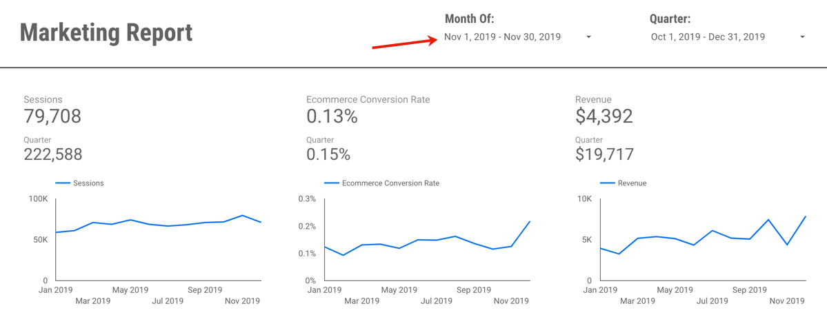
For example, this report which includes Last Month, Last Quarter (or you could do Quarter to Date) plus a Yearly trend:

You could manually set the timeframe for each widget (for example, for each scorecard and each chart, you could set the timeframe to Last Month/Quarter/Year, as appropriate.)

However, what if your report users want to engage with your report, or perhaps use it to look at a previous month?
For example, let’s say you send out an email summarizing and sharing December 2019’s report, but your end user realizes they’d like to see November’s report. If you have (essentially) “hard-coded” the date selector in to the charts, to pick another month, your end users would need to:
- Be report editors (eek!) to change the timeframe, and
- Very manually change the timeframe of individual charts.
This is clunky, cumbersome, and very prone to error (if a user forgets to change the timeframe of one of the charts.)
The solution? Using multiple date selectors, for the different time periods you want to show.
By grouping specific charts with different date selectors, you can set the timeframe for each group of widgets, but in a way that still allows the end user to make changes when they view the report.

In the example report, each chart is set to “Automatic” timeframe, and I actually have three date selectors: One set to Previous Month, that controls the top three scorecard metrics:

A second timeframe, set to “Last Quarter” controls the Quarterly numbers in the second row:

Wait, what about the final date selector? Well, that’s actually hiding off the page!

Why hide it off the page? A couple reasons…
- It’s very clear, from the axis, what time period the line charts are reporting on – so you don’t need the dates to be visible for clarity purposes.
- People are probably going to want to change the active month or quarter you are reporting on, but less likely to go back a full year…
- Adding yet another date to the report may end up causing confusion (without adding much value, since we don’t expect people are likely to use it.)
- Your report editors can still change the timeframe back to a prior year, if it’s needed, since they can access the information hidden off the margin of the report. (I do a lot of “hiding stuff off the side of the report” so it’s only viewable to editors! But that’s a topic for another post.)
The other benefit of using the date selectors in this way? It is very clearly displayed on your report exactly which month you are reporting on:

This makes your date selector both useful, and informative.
So when I now want to change my report to November 2019, it’s a quick and easy change:
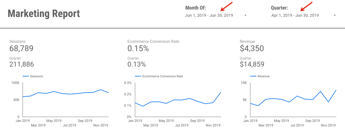
Or perhaps I want to change and view June and Q2:
If you’d like to save a little time, you can view (and create a copy of) the example report here. It’s using data from the Google Merchandise Store, a publicly available demo GA data set, so nothing secret there!
Questions? Comments? Other useful tips you’ve found?
If you want to be a part of this, and other Data Studio (and other analytics!) discussions, please join the conversion on Measure Chat.
Using Data Studio for Google Analytics Alerts
Ever since Data Studio released scheduling, I’ve found the feature very handy for the purpose of alerts and performance monitoring.
Prior to this feature, I mostly used the in-built Alerts feature of Google Analytics, but I find them to be pretty limiting, and lacking a lot of sophistication that would make these alerts truly useful.
Note that for the purpose the post, I am referring to the Alerts feature of Universal Google Analytics, not the newer “App+Web” Google Analytics. Alerts in App+Web are showing promise, with some improvements such as the ability to add alerts for “has anomaly”, or hourly alerts for web data.
Some of the challenges in using Google Analytics alerts include:
You can only set alerts based on a fixed number or percentage. For example, “alert me when sessions increase by +50%.”

The problem here is that if you set this threshold too low, the alerts will go off too often. As soon as that happens, people ignore them, because they’re constantly “false alarms.” However, if you set the threshold too high, you might not catch an important shift. For example, perhaps sessions dropped by -30% because of some major broken tracking, and it was a big deal, but your alert didn’t go off.
So, to set them at a “reasonable” level, you have to do a bunch of analysis to figure out what the normal variation in your data is, before you even set them up.
What would be more helpful? Intelligent alerts, such as “alert me when sessions shift by two standard deviations.” This would allow us to actually use the variation in historical data, to determine whether something is “alertable”!
Creating alerts is unnecessarily duplicative. If you want an alert for sessions increase or decrease by 50%, that’s two separate alerts you need to configure, share with the relevant users and manage on-going (if there are any changes.)
Only the alert-creator gets any kind of link through to the UI. You can set other users to be email recipients of your alerts, but they’re going to see a simple alert with no link to view more data. On the left, you’ll see what an added recipient of alerts sees. Compare to the right, which the creator of the alerts will see (with a link to the Google Analytics UI.)

The lack of any link to GA for report recipients means either 1) Every user needs to configure their own (c’mon, no one is going to do that) or 2) Only the report creator is ever likely to act on them or investigate further.
The automated alert emails in GA are also not very visual. You get a text-alert, basically, that says “your metric is up/down.” Nothing to show you (without going in to a GA report) if there’s just a decrease, or if something precipitously dropped off a cliff! For example, there’s a big difference between “sessions are down -50%” because it was Thanksgiving — versus sessions plummeting due to a major issue.
You also only know if your alert threshold was met, versus hugely exceeded. E.g. The same alert will trigger for “down -50%”, even if the actual value is down -300%. (Unless you’ve set up multiple, scaling alerts. Which… time consuming…!)
So, what have I been doing instead?
As soon as Data Studio added the ability to schedule emails, I created what I call an “Alerts Dashboard.” In my case, it contains a few topic metrics, for each of my clients using GA. (If you are client-side, it could, of course, be just those top metrics for your own site.) You’ll want to include, of course, all of your Key Performance Indicators. But if there are other metrics in particular that are prone to breaking on your site, you’d want to include those as well.
Why does this work? Well, because human beings are actually pretty good pattern detectors. As long as we’ve got the right metrics in there, a quick glance at a trended chart (and a little business knowledge) can normally tell us whether we should be panicking, or whether it was “just Thanksgiving.”
Now to be clear: It’s not really an alerts dashboard. It’s not triggering based on certain criteria. It’s just sending to me every day, regardless of what it says.
But, because it is 1) Visual and 2) Shows up in my email, I find I actually do look at it every day (unlike old school GA alerts.)
On top of that, I can also send it to other people and have them see the same visuals I’m seeing, and they can also click through to the report itself.
So what are you waiting for? Set yours up now.

Go From Zero to Analytics Hero using Data Studio
Over the past few years, I’ve had the opportunity to spend a lot of time in Google’s Data Studio product. It has allowed me to build intuitive, easy-to-use reporting, from a wide variety of data sources, that are highly interactive and empower my end-users to easily explore the data themselves… for FREE. (What?!) Needless to say, I’m a fan!
So when I had the chance to partner with the CXL Institute to teach an in-depth course on getting started with Data Studio, I was excited to help others draw the same value from the product that I have.
Perhaps you’re trying to do more with less time… Maybe you’re tearing your hair out with manual analysis work… Perhaps you’re trying to better communicate your data… Or maybe you set yourself a resolution to add a new tool to your analytics “toolbox” for 2020. Whatever your reasons, I hope these resources will get you started!
So without further adieu, check out my free 30 minute webinar with the CXL Institute team here, which will give you a 10-step guide to getting started with Data Studio.

And if you’re ready to really dive in, check out the entire hour online course here:

Digital Analytics Hacks for the Masses
There are never enough hours in an analyst’s day! In my session at Observe Point Validate yesterday, I shared a few random hacks and time-saving techniques, to help you maximize your day. These included cool uses of tools like GA or Adobe Analytics, spreadsheets, data viz solution, automation or SQL.
Hope you enjoy the tips, and I would love to hear any of yours! You can always reach me via Measure Chat, Twitter or email.
Page Summary Report in Workspace
While I spend 99% of the time I use Adobe Analytics in Analysis Workspace, there are still a few things that haven’t migrated over from the old interface. One of them is the Page Summary Report. While I can’t believe that I still use a report that was around in version 9.x, at times, it is handy to get an overview of a specific web page. Here is what it looks like:

As you can see, there is a lot of information packed into a small space and it offers links as launching off points for several key reports.
Unfortunately, there is really no equivalent to this report in Analysis Workspace. Therefore, I decided to see if I could re-create it. While I was able to do most of it, it wasn’t as straightforward as I thought it would be (though it did spawn a few Workspace feature requests!). While “the juice may not be worth the squeeze” in this case, in the name of science, the following will show you how I did it…
Creating the Page Summary Report in Workspace
The first step is to create a trended view of the page you want to focus on. To do this, you can create a table that shows Page Views and use Time components to view this month, last month and last year like this:

You will notice that I have six columns of data here instead of three. This is because you can look at the data for the current month or a past month. In this case, I am looking at May 2019 data but I am currently in the month of June. To view last’s month’s page summary data, I highlight the left three columns. If I were still in May, I would highlight the right three columns. Regardless of which month I am interested in, the next step would be to add a chart for the three highlighted columns like this:

Next, you can apply a page filter with a bunch of pages like this (remember to hold down the Shift key!):

Next, you can pick the page you want to focus on from the list and your table and chart will be filtered for that page:

Once you have this, you can hide the table that underlies the chart to save room in your project.
Next, we have to add a Flow visualization to see where people are going before and after the page of interest. Unfortunately, we can’t add a Flow visualization to our existing Workspace panel because that is being filtered for only hits where the Page equals our page of interest (the default nature of filters). Therefore, we need to add a new panel and add the Flow visualization to it and drag over the page we care about as the focus of the Flow visualization. In this case, that page is the Adobe Analytics Expert Council Page:

To view that we are on the right track, we can compare the old Page Summary Report to the Workspace one to see how we are doing so far…Here we can see that our chart looks pretty similar (the old page summary report shifts dates slightly to line up days of the week):

And we can see that our flow looks similar as well:

Next to tackle is a list of detailed metrics that the old Page Summary report provides that looks like this:

To replicate this, we need to make some summary metrics in Workspace, which means that we need a table that has the metrics we need with a filter for the page we are focused upon:

A few things I discovered when doing this include:
- Page Views and Occurrences are the same, so you can use whichever you prefer
- Single Page Visits only matches the old page summary report number if repeat instances are on for your Workspace project
- There is no “Clicks to Page” metric in Workspace, but I found that this is really just Average Page Depth. Therefore, you can use that or do what I have done and created a new Calculated Metric called Clicks to Page that has Average Page Depth as the formula.
- Workspace shows Time Spent in seconds vs. the minutes version shown on the old page summary report. You can create a new calculated metric to divide by 60 if you’d like as shown above. However, I am finding that the numbers for this metric don’t always match perfectly (but who really cares about time spent right?)
The only metric we are missing from the old page summary report is the percentage of all page views. This one is a bit tricky due to the fact that you cannot divide metrics from different Workspace tables by each other or divide Summary Metrics (please vote for this here!). To view this, we will create a new calculated metric that divides Page Views of our focus page by the total Page Views for the time period. To do this, we create a “derived” metric that looks like this:

This can all be done from within the calculated metric builder like this:

Once we have our new metric, we create a new table that looks like this:

From here we can add some Summary Numbers using the totals of the columns in our two new tables:

You will see that these numbers match what is found on the old Page Summary report:
As you can see, these numbers are spot on with the old page summary report.
Viewing Page Summary for Another Page
Unfortunately, when you want to focus on a different page, this Page Summary Workspace project will not auto-update by simply changing the page name in the top filter area. There are a few changes you need to make due to the fact that you cannot currently link segments/filters in Workspace projects (here is my idea suggestion on how to make this a bit easier). Until then, I have added a text box at the top of the project that explains the instructions for changing to a new page:

While this may seem cumbersome, here is a short video of me changing the entire project to use a new page (in under one minute!):

When this is done, the summary metrics look like this:

And the Page Summary report looks like this:

So other than the time spent metric being a bit off, the rest of the numbers are an exact match!
Finally, when you are finished, you can clean-up the project a bit by hiding data table and curating so the end result looks something like this:

That’s So Meta: Tracking Data Studio, in Data Studio
That’s So Meta: Tracking Data Studio, in Data Studio
In my eternal desire to track and analyze all.the.things, I’ve recently found it useful to track the usage of my Data Studio reports.
Viewing data about Data Studio, in Data Studio? So meta!

Step 1: Create a property
Create a new Google Analytics property, to house this data. (If you work with multiple clients, sites or business units, where you may want to be able to isolate data, then you may want to consider one property for each client/site/etc. You can always combine them in Data Studio to view all the info together, but it gives you more control over permissions, without messing around with View filters.)
Step 2: Add GA Tracking Code to your Data Studio reports
Data Studio makes this really easy. Under Report Settings, you can add a GA property ID. You can add Universal Analytics, or GA4.

You’ll need to add this to every report, and remember to add it when you create new reports, if you’d like them to be included in your report.
Step 3: Clean Up Dimension Values
Note: This blog post is based on Universal Analytics, but the same principles apply if you’re using GA4.
Once you have tracked some data, you’ll notice that the Page dimension in Google Analytics is a gibberish, useless URL. I suppose you could create a CASE formula and rewrite the URLs in to the title of the report…Hmmm… Wait, why would you do that, when there’s already an easier way?!
You’ll want to use the Page Title for the bulk of your reporting, as it has nice, readable, user-friendly values:

However, you’ll need to do some further transformation of Page Title. This is because reports with one page, versus multiple pages, will look different.
Reports with only one page have a page title of:
Report Name
Reports with more than one page have a page title of:
Report Name > Page Name

If you want to report on the popularity at a report level, we need to extract just the report name. Unfortunately, we can’t simply extract “everything before the ‘>’ sign” as the Report Name, since not all Page Titles will contain a “>” (if the report only has one page.)
I therefore use a formula to manipulate the Page Title:
REGEXP_EXTRACT(

(CASE
WHEN REGEXP_MATCH(Page Title,".*›.*")
THEN Page Title
ELSE CONCAT(Page Title," ›")
END)

,'(.*).*›.*')
Step 4: A quick “gotcha”
Please note that, on top of Google Analytics tracking when users actually view your report, Google Analytics will also fire and track a view when:
- Someone is loading the report in Edit mode. In the Page dimension, you will see these with /edit in the URL.
- If you have a report scheduled to send on a regular cadence via email, the process of rendering the PDF to attach to the email also counts as a load in Google Analytics. In the Page dimension, you will see these loads with /appview in the URL.

This means that if you or your team spend a lot of time in the report editing it, your tracking may be “inflated” as a result of all of those loads.
Similarly, if you schedule a report for email send, it will track in Google Analytics for every send (even if no one actually clicks through and views the report.)
If you want to exclude these from your data, you will want to filter out from your dashboard Pages that contain /edit and /appview.

Step 5: Build your report
Here’s an example of one I have created:

Which metrics should I use?
My general recommendation is to use either Users or Pageviews, not Sessions or Unique Pageviews.
Why? Sessions will only count if the report page was the first page viewed (aka, it’s basically “landing page”), and Unique Pageviews will consider two pages in one report “unique”, since they have different URLs and Page Titles. (It’s just confusing to call something “Unique” when there are so many caveats on how “unique” is defined, in this instance.) So, Users will be the best for de-duping, and Pageviews will be the best for a totals count.
What can I use these reports for?
I find it helpful to see which reports people are looking at the most, when they typically look at them (for example, at the end of the month, or quarter?) Perhaps you’re having a lot of ad hoc questions coming to your team, that are covered in your reports? You can check if people are even using them, and if not, direct them there before spending a bunch of ad hoc time! Or perhaps it’s time to hold another lunch & learn, to introduce people to the various reports available?
You can also include data filters in the report, to filter for a specific report, or other dimensions, such as device type, geolocation, date, etc. Perhaps a certain office location typically views your reports more than another?
Of course, you will not know which users are viewing your reports (since we definitely can’t track PII in Google Analytics) but you can at least understand if they’re being viewed at all!
Google Analytics Segmentation: A “Gotcha!” and a Hack
Google Analytics segments are a commonly used feature for analyzing subsets of your users. However, while they seem fairly simple at the outset, certain use cases may unearth hidden complexity, or downright surprising functionality – as happened to me today! This post will share a gotcha with user-based segments I just encountered, as well as two options for hit-based Google Analytics segmentation.
First, the gotcha.
One of these things is not like the other
Google Analytics allows you to create two kinds of segments: session-based, and user-based. A session-based segment requires that the behaviour happened within the same session (for example, watched a video and purchased.) A user-based segment requires that one user did those two things, but it does not need to be within the same session.
However, thanks to the help and collective wisdom of Measure Slack, Simo Ahava and Jules Stuifbergen (thank you both!), I stumbled upon a lesser-known fact about Google Analytics segmentation.
These two segmentation criteria “boxes” do not behave the same:

I know… they look identical, right? (Except for Session vs. User.)
What might the expected behaviour be? The first looks for sessions in which the page abc.html was seen, and the button was clicked in that same session. The second looks for users who did those two things (perhaps in different sessions.)
When I built a session-based segment and attempted to flip it to user-based, imagine my surprise to find… the session-based segment worked. The user-based segment, with the exact same criteria didn’t work. (Note: It’s logically impossible for sessions to exist in which two things were done, but no users have done those two things…) I will confess that I typically use session-based segmentation far more, as I’m often looking back more than 90 days, so it’s not something I’ve happened upon.
That’s when I found out that if two criteria in a Google Analytics user-based segment are in the same criteria “box”, they have to occur on the same hit. The same functionality and UI works differently depending on if you’re looking at a user- or session-based segment.
I know.

Note: There is some documented of this, within the segment builder, though not within the main segmentation documentation.
In summary:

If you want to create a User-based segment that looks for two events (or more) occurring for the same user, but not on the same hit? You need to use two separate criteria “boxes”, like this:

So, there you go.

This brings me to the quick hack:
Two Hacks for Hit-Level Segmentation
Once you know about the strange behaviour of User-based segments, you can actually use them to your advantage.
Analysts familiar with Adobe Analytics know that Adobe has three options for segmentation: hit, visit and visitor level. Google Analytics, however, only has session (visit) and user (visitor) level.
Why might you need hit-level segmentation?
Sometimes when doing analysis, we want to be very specific that certain criteria must have taken place on the same hit. For example, the video play on a specific page.
Since Google Analytics doesn’t have built-in hit-based segmentation, you can use one of two possible hacks:
1. User-segment hack: Use our method above: Create a user-based segment, and put your criteria in the same “box.” Voila! It’s a feature, not a bug!
2. Sequential segment hack: Another clever method brought to my attention by Charles Farina is to use a sequential segment. Sequential segments evaluate each “step” as a single hit, so this sequential segment is the equivalent of a hit-based segment:

Need convincing? Here are the two methods, compared. You’ll see the number of users is identical:

(Note that the number of sessions is different since, in the user-based segment, the segment of users who match that criteria might have had other sessions in which the criteria didn’t occur.)
So which hit-level segmentation method should you use? Personally I’d recommend sticking with Charles’ sequential segment methodology, since a major limitation of user-based segments is that they only look back 90 days. However, it may depend on your analysis question as to what’s more appropriate.
I hope this was helpful! If you have any similar “gotchas” or segmentation hacks you’ve found, please don’t hesitate to share them in the comments.
Understanding Marketing Channels in Google Analytics: The Good, The Bad – and a Toy Surprise!
Understanding the effectiveness of marketing efforts is a core use case for Google Analytics. While we may analyze our marketing at the level of an individual site, or ad network, typically we are also looking to understand performance at a higher channel level. (For example, how did my Display ads perform?)
In this post I’ll discuss two ways you can approach this, as well as the gotchas, and even offer a handy little tool you can use for yourself!
Option 1: Channel Groupings in GA
There are two relevant features here:
Default Channel Groupings
Default channel groupings are defined rules, that apply at the time the data is processed. So, they apply from the time you set them up, onwards. Note also that the rule set execute in order.

The default channel grouping dimension is available throughout Google Analytics, including for use in segments, as a secondary dimensions, in custom reports, Data Studio, Advanced Analysis and the API. (Note: They are not included in Big Query.)
Unfortunately, there are some real frustrations associated with this feature:
- The default channel groupings that come pre-setup aren’t typically applicable. By default, GA provides some default rules. However, in my experience, they rarely map well enough to marketing efforts. Which leads me to…
- You have to customize them. Makes sense – for your data to be useful, it should be customized to your business, right? I always end up editing the default grouping, to take into account the UTM and tracking standards we use. Unfortunately…
- The manual work in customizing them makes kittens cry. Why?
- You have to manually update them for every.single.view. Default Channel Groupings are a view level asset. So if your company has two views (or worse, twenty!) you need to manually set them up over. and over. again.
- (“I know! I’ll outsmart GA! I’ll set up the groupings then copy the view. Nope, sorry.) Unlike goals, any customizations made to your Default Channel Groupings don’t copy over when you copy a view, even if they were created before you copied it. You start from scratch, with the GA default. So you have to create them. Again.
- There is no way to create them programmatically. They can’t be edited or otherwise managed via the Management API.
- Personally, I consider this to be a huge limitation for feature use in an enterprise organization, as it requires an unnecessary level of manual work.
- They are not retroactive. This is a common complaint. Honestly, it’s the least of my issues with them. Yes, retroactive would be nice. But I’d take a solve of the issues in #3 any day.
“Okay… I’ll outsmart GA (again)! Let’s not use the default. Let’s just use the custom groupings!” Unfortunately, custom channel groupings aren’t a great substitute either.
Custom Channel Groupings
Custom Channel Groupings are a very similar feature. However, the custom groupings aren’t processed with the data, they’re a rule set applied on top of the data, after it’s processed.
The good:
- They can be easily copied and shared via a link! (Woot!)
- They are retroactive.
The bad:
- The custom grouping created is literally only available in one report. You can not use the dimensions they create in a segment, as a secondary dimension, via the API or Data Studio. So they have exceptionally limited value. (IMHO they’re only useful for checking a grouping before you set it as the default.)
So, as you may have grasped, the channel groupings features in Google Analytics are necessary… but incredibly cumbersome and manual.
<begging>
Dear GA product team,
For channel groupings to be a useful and more scalable enterprise feature, one of the following things needs to happen:
- The Default should be sharable as a configured link, the same way that a segment or a goal works. Create them once, share the link to apply them to other views; or
- The Default should be a shared asset throughout the Account (similar to View filters) allowing you to apply the same Default to multiple views; or
- The Default should be manageable via the Management API; or
- Custom Groupings need to be able to be “promoted” to the default; or
- Custom-created channels need to be accessible like any other dimension, for use in segmentation, reports and via the API and Data Studio.
Pretty please? Just one of them would help…
</begging>
So, what are the alternate options?
Option 2: Define Channels within Data Studio, instead of GA
The launch of Data Studio in 2016 created a new option that didn’t used to exist: use Data Studio to create your groupings, and don’t bother with the Default Channel Groupings at all.
You can use Data Studio’s CASE formula to recreate all the same rules as you would in the GA UI. For example, something like this:
CASE
WHEN REGEXP_MATCH (Medium, 'social') OR REGEXP_MATCH (Source, 'facebook|linkedin|youtube|plus|stack.(exc|ov)|twitter|reddit|quora|google.groups|disqus|slideshare|addthis|(^t.co$)|lnk.in') THEN 'Social'
WHEN REGEXP_MATCH (Medium, 'cpc') THEN 'Paid Search'
WHEN REGEXP_MATCH (Medium, 'display|video|cpm|gdn|doubleclick|streamads') THEN 'Display'
WHEN REGEXP_MATCH (Medium, '^organic
You can then use this newly created “Channel” dimension in Data Studio for your reports (instead of the default.)
Note, however, a few potential downsides:
- This field is only available in Data Studio (so, it is not accessible for segments, via the API, etc.)
- Depending on the complexity of your rules, you could bump up against a character limit for CASE formulas in Data Studio (2048 characters.) Don’t laugh… I have one set of incredibly complex channel rules where the CASE statement was 3438 characters…
Note: If you use BigQuery, you could then use a version of this channel definition in your queries, as well.
And a Toy Surprise!

Let’s say you do choose to use Default Channel Groupings (I do end up using them, I just grumble incessantly during the painful process of setting them up, or amending them.) You might put a lot of thought in to the rules, the order in which they execute, etc. But nonetheless, you’ll still need to check your results after you set them up, to make sure they’re correct.
To do this, I created a little Data Studio report, that you are welcome to copy and use for your own purposes. Basically, after you setup your default groupings and collect at least a (full) day’s data, the report allows you to flip through each channel, and see what Sources, Mediums and Campaigns are falling in to each channel, based on your rules.
mkiss.me/DefaultChannelGroupingCheck
Note: At first it will load with errors, since you don’t have access to my data set. You need to select a data set you have access to, and then the tables will load.

If you see something that seems miscategorized, you can then edit the rules in the GA admin settings. (Keeping in mind that your edits will only apply moving forward.)
I also recommend you keep documentation of your rules. I use something like this:

I also set up alerts for big increases in the “Other” channel, so that I can catch where the rules might need to be amended.
Thoughts? Comments?
I hope this is helpful! If there are other ways you do this, I would love to hear about it.
) OR REGEXP_MATCH(Source, 'duckduckgo') THEN 'Organic Search'
WHEN REGEXP_MATCH (Medium, '^blog
You can then use this newly created “Channel” dimension in Data Studio for your reports (instead of the default.)
Note, however, a few potential downsides:
- This field is only available in Data Studio (so, it is not accessible for segments, via the API, etc.)
- Depending on the complexity of your rules, you could bump up against a character limit for CASE formulas in Data Studio (2048 characters.) Don’t laugh… I have one set of incredibly complex channel rules where the CASE statement was 3438 characters…
Note: If you use BigQuery, you could then use a version of this channel definition in your queries, as well.
And a Toy Surprise!
Let’s say you do choose to use Default Channel Groupings (I do end up using them, I just grumble incessantly during the painful process of setting them up, or amending them.) You might put a lot of thought in to the rules, the order in which they execute, etc. But nonetheless, you’ll still need to check your results after you set them up, to make sure they’re correct.
To do this, I created a little Data Studio report, that you are welcome to copy and use for your own purposes. Basically, after you setup your default groupings and collect at least a (full) day’s data, the report allows you to flip through each channel, and see what Sources, Mediums and Campaigns are falling in to each channel, based on your rules.
mkiss.me/DefaultChannelGroupingCheck
Note: At first it will load with errors, since you don’t have access to my data set. You need to select a data set you have access to, and then the tables will load.
If you see something that seems miscategorized, you can then edit the rules in the GA admin settings. (Keeping in mind that your edits will only apply moving forward.)
I also recommend you keep documentation of your rules. I use something like this:
I also set up alerts for big increases in the “Other” channel, so that I can catch where the rules might need to be amended.
Thoughts? Comments?
I hope this is helpful! If there are other ways you do this, I would love to hear about it.
) THEN 'Blogs'
WHEN REGEXP_MATCH (Medium, 'email|edm|(^em$)') THEN 'Email'
WHEN REGEXP_MATCH (Medium, '^referral
You can then use this newly created “Channel” dimension in Data Studio for your reports (instead of the default.)
Note, however, a few potential downsides:
- This field is only available in Data Studio (so, it is not accessible for segments, via the API, etc.)
- Depending on the complexity of your rules, you could bump up against a character limit for CASE formulas in Data Studio (2048 characters.) Don’t laugh… I have one set of incredibly complex channel rules where the CASE statement was 3438 characters…
Note: If you use BigQuery, you could then use a version of this channel definition in your queries, as well.
And a Toy Surprise!
Let’s say you do choose to use Default Channel Groupings (I do end up using them, I just grumble incessantly during the painful process of setting them up, or amending them.) You might put a lot of thought in to the rules, the order in which they execute, etc. But nonetheless, you’ll still need to check your results after you set them up, to make sure they’re correct.
To do this, I created a little Data Studio report, that you are welcome to copy and use for your own purposes. Basically, after you setup your default groupings and collect at least a (full) day’s data, the report allows you to flip through each channel, and see what Sources, Mediums and Campaigns are falling in to each channel, based on your rules.
mkiss.me/DefaultChannelGroupingCheck
Note: At first it will load with errors, since you don’t have access to my data set. You need to select a data set you have access to, and then the tables will load.
If you see something that seems miscategorized, you can then edit the rules in the GA admin settings. (Keeping in mind that your edits will only apply moving forward.)
I also recommend you keep documentation of your rules. I use something like this:
I also set up alerts for big increases in the “Other” channel, so that I can catch where the rules might need to be amended.
Thoughts? Comments?
I hope this is helpful! If there are other ways you do this, I would love to hear about it.
) THEN 'Referral'
WHEN REGEXP_MATCH (Source, '(direct)') THEN 'Direct'
ELSE 'Other'
END
You can then use this newly created “Channel” dimension in Data Studio for your reports (instead of the default.)
Note, however, a few potential downsides:
- This field is only available in Data Studio (so, it is not accessible for segments, via the API, etc.)
- Depending on the complexity of your rules, you could bump up against a character limit for CASE formulas in Data Studio (2048 characters.) Don’t laugh… I have one set of incredibly complex channel rules where the CASE statement was 3438 characters…
Note: If you use BigQuery, you could then use a version of this channel definition in your queries, as well.
And a Toy Surprise!
Let’s say you do choose to use Default Channel Groupings (I do end up using them, I just grumble incessantly during the painful process of setting them up, or amending them.) You might put a lot of thought in to the rules, the order in which they execute, etc. But nonetheless, you’ll still need to check your results after you set them up, to make sure they’re correct.
To do this, I created a little Data Studio report, that you are welcome to copy and use for your own purposes. Basically, after you setup your default groupings and collect at least a (full) day’s data, the report allows you to flip through each channel, and see what Sources, Mediums and Campaigns are falling in to each channel, based on your rules.
mkiss.me/DefaultChannelGroupingCheck
Note: At first it will load with errors, since you don’t have access to my data set. You need to select a data set you have access to, and then the tables will load.
If you see something that seems miscategorized, you can then edit the rules in the GA admin settings. (Keeping in mind that your edits will only apply moving forward.)
I also recommend you keep documentation of your rules. I use something like this:
I also set up alerts for big increases in the “Other” channel, so that I can catch where the rules might need to be amended.
Thoughts? Comments?
I hope this is helpful! If there are other ways you do this, I would love to hear about it.
A Scalable Way To Add Annotations of Notable Events To Your Reports in Data Studio
Documenting and sharing important events that affected your business are key to an accurate interpretation of your data.
For example, perhaps your analytics tracking broke for a week last July, or you ran a huge promo in December. Or maybe you doubled paid search spend, or ran a huge A/B test. These events are always top of mind at the time, but memories fade quickly, and turnover happens, so documenting these events is key!
Within Google Analytics itself, there’s an available feature to add “Annotations” to your reports. These annotations show up as little markers on trend charts in all standard reports, and you can expand to read the details of a specific event.
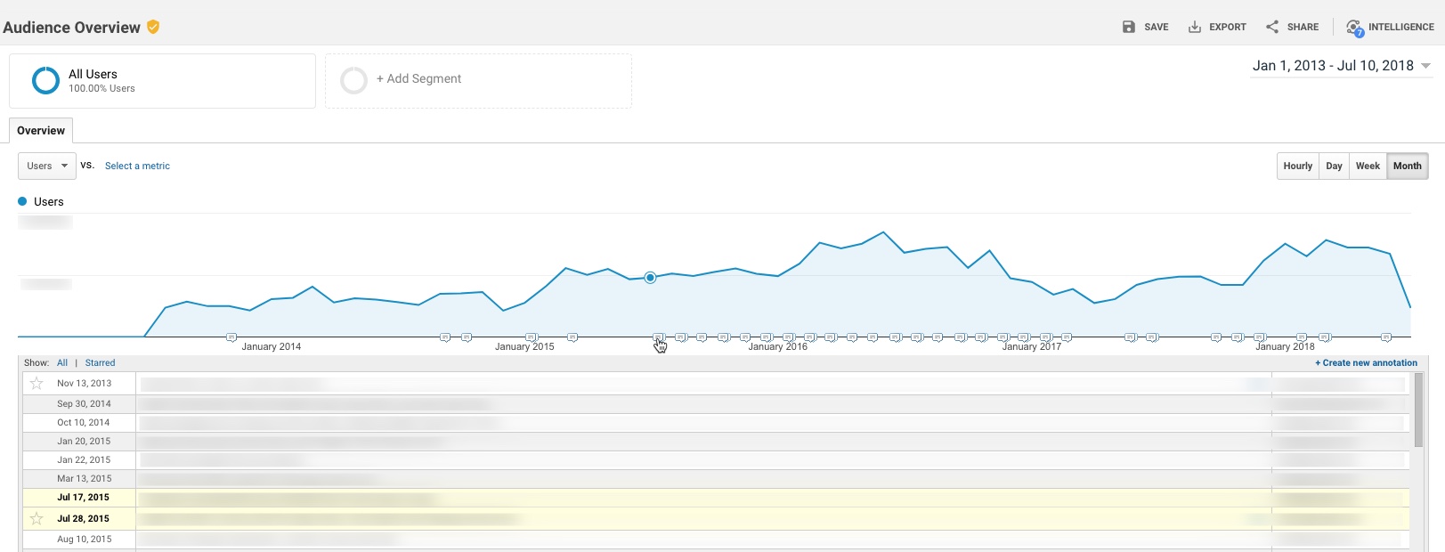
However, there is a major challenge with annotations as they exist today: They essentially live in a silo – they’re not accessible outside the standard GA reports. This means you can’t access these annotations in:
- Google Analytics flat-table custom reports
- Google Analytics API data requests
- Big Query data requests
- Data Studio reports
While I can’t solve All.The.Things, I do have a handy option to incorporate annotations in to Google Data Studio. Here’s a quick example:

Not too long ago, Data Studio added a new feature that essentially “unified” the idea of a date across multiple data sources. (Previously, a date selector would only affect the data source you had created it for.)
One nifty application of this feature is the ability to pull a list of important events from a Google Spreadsheet in to your Data Studio report, so that you have a very similar feature to Annotations.
To do this:
Prerequisite: Your report should really include a Date filter for this to work well. You don’t want all annotations (for all time) to show, as it may be overwhelming, depending on the timeframe.
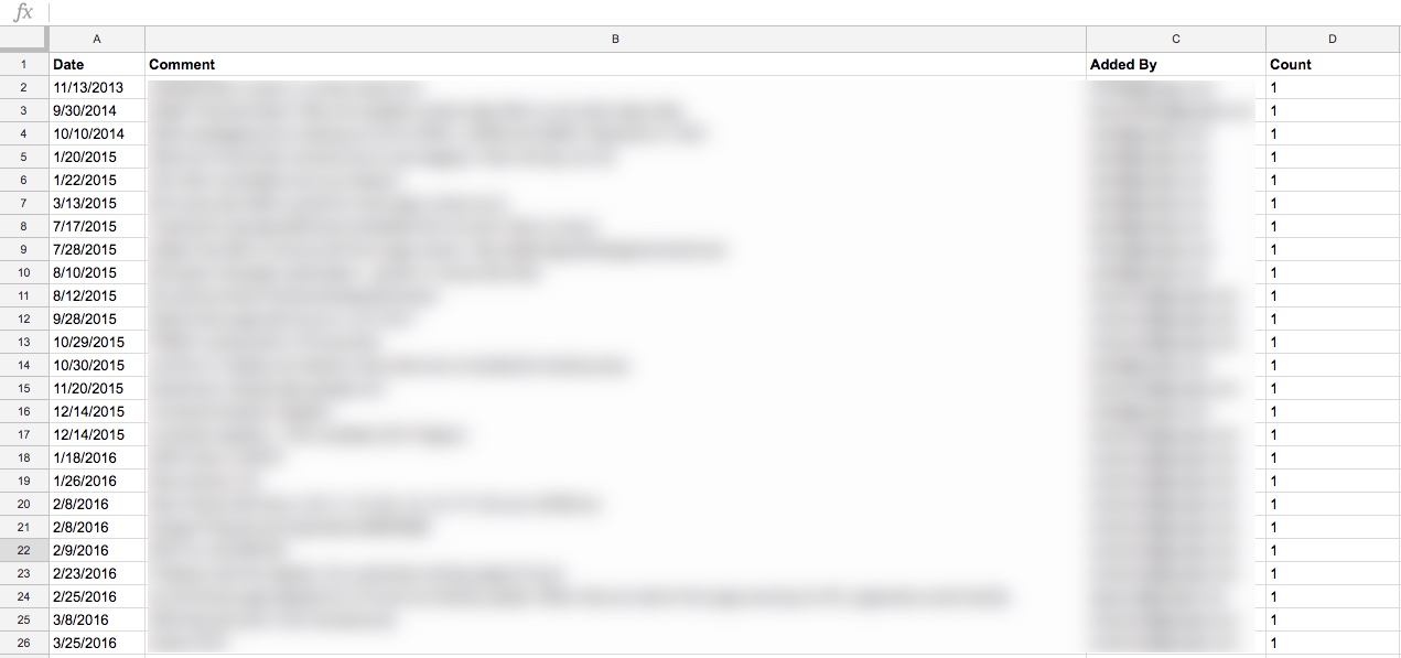
Step 1: Create a spreadsheet that contains all of your GA annotations. (Feel free to add any others, while you’re at it. Perhaps yours haven’t been kept very up to date…! You’re not alone.)
I did this simply, by just selecting the entire timeframe of my data set, and copy-pasting from the Annotations table in GA in to a spreadsheet
You’ll want to include these dimensions in your spreadsheet:
- Date
- The contents of the annotation itself
- Who added it (why not, might as well)
You’ll also want to add a “dummy metric”, which I just created as Count, which is 1 for each row. (Technically, I threw a formula in to put a one in that row as long as there’s a comment.)
Step 2: Add this as a Data Source in Data Studio
First, “Create New Data Source”
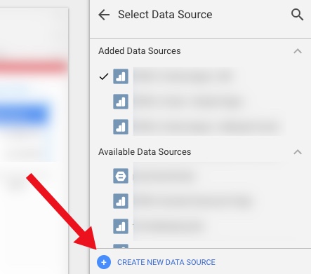
Then select your spreadsheet:

It should happen automatically, but just confirm that the date dimension is correct:

3. Create a data table
Now you create a data table that includes those annotations.
Here are the settings I used:
Data Settings:
- Dimensions:
- Date
- Comment
- (You could add the user who added it, or a contact person, if you so choose)
- Metric:
- Count (just because you need something there)
- Rows per Page:
- 5 (to conserve space)
- Sort:
- By Date (descending)
- Default Date Range:
- Auto (This is important – this is how the table of annotations will update whenever you use the date selector on the report!)

Style settings:
- Table Body:
- Wrap text (so they can read the entire annotation, even if it’s long)
- Table Footer:
- Show Pagination, and use Compact (so if there are more than 5 annotations during the timeframe the user is looking at, they can scroll through the rest of them)

Apart from that, a lot of the other choices are stylistic…
- I chose a lot of things based on the data/pixel ratio:
- I don’t show row numbers (unnecessary information)
- I don’t show any lines or borders on the table, or fill/background for the heading row
- I choose a small font, just since the data itself is the primary information I want the user to focus on
I also did a couple of hack-y things, like just covering over the Count column with a grey filled box. So fancy…!
Finally, I put my new “Notable Events” table at the very bottom of the page, and set it to show on all pages (Arrange > Make Report Level.)
You might choose to place it somewhere else, or display it differently, or only show it on some pages.
And that’s it…!
But, there’s more you could do
This is a really simple example. You can expand it out to make it even more useful. For example, your spreadsheet could include:
- Brand: Display (or allow filtering) of notable events by Brand, or for a specific Brand plus Global
- Site area: To filter based on events affecting the home page vs. product pages vs. checkout (etc)
- Type of Notable Event: For example, A/B test vs. Marketing Campaign vs. Site Issue vs. Analytics Issue vs. Data System Affected (e.g. GA vs. AdWords)
- Country…
- There are a wide range of possible use cases, depending on your business
Your spreadsheet can be collaborative, so that others in the organization can add their own events.
One other cool thing is that it’s very easy to just copy-paste rows in a spreadsheet. So let’s say you had an issue that started June 1 and ended June 7. You could easily add one row for each of those days in June, so that even if a user pulled say, June 6-10, they’d see the annotation noted for June 6 and June 7. That’s more cumbersome in Google Analytics, where you’d have to add an annotation for every day.
Limitations
It is, of course, a bit more leg work to maintain both this set of annotations, AND the default annotations in Google Analytics. (Assuming, of course, that you choose to maintain both, rather than just using this method.) But unless GA exposes the contents of the annotations in a way that we can pull in to Data Studio, the hack-y solution will need to be it!
Solving The.Other.Things
I won’t go in to it here, but I mentioned the challenge of the default GA annotations and both API data requests and Big Query. This solution doesn’t have to be limited to Data Studio: you could also use this table in Big Query by connecting the spreadsheet, and you could similarly pull this data into a report based on the GA API (for example, by using the spreadsheet as a data source in Tableau.)
Thoughts?
It’s a pretty small thing, but at least it’s a way to incorporate comments on the data within Data Studio, in a way that the comments are based on the timeframe the user is actually looking at.
Thoughts? Other cool ideas? Please leave them in the comments!
Google Data Studio “Mini Tip” – Set A “Sampled” Flag On Your Reports!
Google’s Data Studio is their answer to Tableau – a free, interactive data reporting, dashboarding and visualization tool. It has a ton of different automated “Google product” connectors, including Google Analytics, DoubleClick, AdWords, Attribution 360, Big Query and Google Spreadsheets, not to mention the newly announced community connectors (which adds the ability to connect third party data sources.)
One of my favourite things about Data Studio is the fact that it leverages an internal-only Google Analytics API, so it’s not subject to the sampling issues of the normal Google Analytics Core Reporting API.
For those who aren’t aware (and to take a quick, level-setting step back) Google Analytics will run its query on a sample of your data, if the conditions match these two circumstances:
- The query is a custom query, not a pre-aggregated table. (Basically, if you apply a secondary dimension, or a segment.)
- The number of sessions in your timeframe exceeds:
- GA Standard: 500K sessions
- GA 360: 100M sessions
(at the view level)
The Core Reporting API can be useful for automating reporting out of Google Analytics. However, it has one major limitation: the sample rate for the API is the same as Google Analytics Standard (500K sessions) … even if you’re a GA360 customer. (Note: Google has recently dealt with this by adding the option of a cost based API for 360 customers. And of course, 360 customers also have the option of BigQuery. But, like the Core Reporting API, Data Studio is FREE!)
Data Studio, however, follows the same sampling rules as the Google Analytics main interface. (Yay!) Which means for 360 customers, Data Studio will not sample until the selected timeframe is over 100M sessions.
As a quick summary…
Google Analytics Standard
- Google Analytics UI: 500,000 at the view level
- Google Analytics API: 500,000
- Data Studio: 500,000
Google Analytics 360
- Google Analytics UI: 100 million at the view level
- Google Analytics API: 500,000
- Data Studio: 100 million
But here’s the thing… In Google Analytics’ main UI, we see a little “sampling indicator” to tell us if our data is being sampled.

In Data Studio, historically there was nothing to tell you (or your users) if the data they are looking at is sampled or not. Data Studio “follows the same rules as the UI”, so technically, to know if something is sampled, you had to go request the same data via the UI and see if it’s sampled.
At the end of 2017, Data Studio offered a toggle to “Show Sampling”

The toggle won’t work in embedded reports though (so if you’re a big Sites user, or otherwise embed reports a lot, you’ll still want to go to the manual route), and adding your own flag gives you some control on how, where & how prominently any sampling is shown (plus, the ability to have it “always on” rather than requiring a user to toggle.)
What I have historically done is add a discreet “Sampling Flag” to reports and dashboards. Now, keep in mind – this will not tell you if your data is actually being sampled. (That depends on the nature of each query itself.) However, a simple Sampling Flag can at least alert you or your users to the possibility that your query might be sampled, so you can check the original (non-embedded) Data Studio report, or the GA UI, for confirmation.
To create this, I use a very simple CASE formula:
CASE WHEN (Sessions) >= 100000000 THEN 1 ELSE 0 END
(For a GA Standard client, adjust to 500,000)

I place this in the footer of my reports, but you could choose to display much more prominently if you wanted it to be called out to your users:

Keep in mind, if you have a report with multiple GA Views pulled together, you would need one Sampling Flag for each view (as it’s possible some views may have sampled data, while others may not.) If you’re using Data Studio within its main UI (aka, not embedded reports) the native sampling toggle may be more useful there.
I hope this is useful “mini tip”! Thoughts? Questions? Comments? Cool alternatives? Please add to the comments!
Foundational Psychology Experiments (And Why Analysts Should Know Them)
On Friday, I had an opportunity to speak at the Microsoft One Analyst conference in Seattle. For those who are interested, here is an annotated copy of the presentation. Please leave your thoughts or own experiences in the comments!

Foundational Social Psychology Experiments (And Why Analysts Should Know Them) – Part 5 of 5
Digital Analytics is a relatively new field, and as such, we can learn a lot from other disciplines. This post continues exploring classic studies from social psychology, and what we analysts can learn from them.
Jump to an individual topic:
- The Magic Number 7 (or, 7 +/- 2)
- When The Facts Don’t Matter
- Confirmation Bias
- Conformity to the Norm
- Primacy and Recency Effects
- The Halo Effect
- The Bystander Effect (or “Diffusion of Responsibility”)
- Selection Attention
- False Consensus
- Homogeneity of the Outgroup
- The Hawthorne Effect
False Consensus
Experiments have revealed that we tend to believe in a false consensus: that others would respond similarly to the way that we would. For example, Ross, Greene & House (1977) provided participants with a scenario, with two different possible ways of responding. Participants were asked to explain which option they would choose, and guess what other people would choose. Regardless of which option they actually chose, participants believed that other people would choose the same one.
Why this matters for analysts: As you are analyzing data, you are looking at the behaviour of real people. It’s easy to make assumptions about how they will react, or why they did what they did, based on what you would do. But our analysis will be far more valuable if we can be aware of those assumptions, and actively seek to understand why our actual customers did these things – without relying on assumptions.
Homogeneity of the Outgroup
There is a related effect here: the Homogeneity of the Outgroup. (Quattrone & Jones, 1980.) In short, we tend to view those who are different to us (the “outgroup”) as all being very similar, while those who are like us (the “ingroup”) are more diverse. For example, all women are chatty, but some men are talkative, some are quiet, some are stoic, some are more emotional, some are cautious, others are more risky… etc.
Why this matters for analysts: Similar to the False Consensus Effect, where we may analyse user behaviour assuming everyone thinks as we do, the Homogeneity of the Outgroup suggests that we may oversimplify the behaviour of customers who are different to us, and fail to fully appreciate the nuance of varied behaviour. This may seriously bias our analyses! For example, if we are a large global company, an analysis of customers in another region may be seriously flawed if we are assuming customers in the region are “all the same.” To overcome this tendency, we might consider leveraging local teams or local analysts to conduct or vet such analyses.
The Hawthorne Effect
In 1955, Henry Landsberger analyzed several studies conducted between 1924 and 1932 at the Hawthorne Works factory. These studies were examining the factors related to worker productivity, including whether the level of light within a building changed the productivity of workers. They found that, while the level of light changing appeared to be related to increased productivity, it was actually the fact that something changed that mattered. (For example, they saw an increase in productivity even in low light conditions, which should make work more difficult…)
However, this study has been the source of much criticism, and was referred to by Dr. Richard Nisbett as a “glorified anecdote.” Alternative explanations include that Orne’s “Demand Characteristics” were in fact at work (that the changes were due to the workers knowing they were a part of the experiment), or the fact that the changes were always made on a Sunday, and Mondays normally show increased productivity, due to employee’s having a day off. (Levitt & List, 2011.)
Why this matters for analysts: “Demand Characteristics” could mean that your data is subject to influence, if people know they are being observed. For example, in user testing, participants are very aware they are being studied, and may act differently. Your digital analytics data however, may be less impacted. (While people may technically know their website activity is being tracked, it may not be “top of mind” enough during the browsing experience to trigger this effect.) The Sunday vs. Monday explanation reminds us to consider other explanations or variables that may be at play, and be aware of when we are not fully in control of all the variables influencing our data, or our A/B test. However, the Hawthorne studies are also a good example where interpretations of the data may vary! There may be multiple explanations for what you’re seeing in the data, so it’s important to vet your findings with others.
Conclusion
What are your thoughts? Do these pivotal social psychology experiments help to explain some of the challenges you face with analyzing and presenting data? Are there any interesting studies you have heard of, that hold important lessons for analysts? Please share them in the comments!
Foundational Social Psychology Experiments (And Why Analysts Should Know Them) – Part 4 of 5
Digital Analytics is a relatively new field, and as such, we can learn a lot from other disciplines. This post continues exploring classic studies from social psychology, and what we analysts can learn from them.
Jump to an individual topic:
- The Magic Number 7 (or, 7 +/- 2)
- When The Facts Don’t Matter
- Confirmation Bias
- Conformity to the Norm
- Primacy and Recency Effects
- The Halo Effect
- The Bystander Effect (or “Diffusion of Responsibility”)
- Selection Attention
- False Consensus
- Homogeneity of the Outgroup
- The Hawthorne Effect
The Bystander Effect (or “Diffusion of Responsibility”)
In 1964 in New York City, a woman name Kitty Genovese was murdered. A newspaper report at the time claimed that 38 people had witnessed the attack (which lasted an hour) yet no one called the police. (Later reports suggested this was an exaggeration – that there had been fewer witnesses, and that some had, in fact, called the police.)
However, this event fascinated psychologists, and triggered several experiments. Darley & Latane (1968) manufactured a medical emergency, where one participant was allegedly having an epileptic seizure, and measured how long it took for participants to help. They found that the more participants, the longer it took to respond to the emergency.
This became known as the “Bystander Effect”, which proposes that the more bystanders that are present, the less likely it is that an individual will step in and help. (Based on this research, CPR training started instructing participants to tell a specific individual, “You! Go call 911” – because if they generally tell a group to call 911, there’s a good chance no one will do it.)
Why this matters for analysts: Think about how you present your analyses and recommendations. If you offer them to a large group, without specific responsibility to any individual to act upon them, you decrease the likelihood of any action being taken at all. So when you make a recommendation, be specific. Who should be taking action on this? If your recommendation is a generic “we should do X”, it’s far less likely to happen.
Selective Attention
Before you read the next part, watch this video and follow the instructions. Go ahead – I’ll wait here.
In 1999, Simons and Chabris conducted an experiment in awareness at Harvard University. Participants were asked to watch a video of basketball players, where one team was wearing white shirts, and the other team was wearing black shirts. In the video, the white team and black team respectively were passing the ball to each other. Participants were asked to count the number of passes between players of the white team. During the video, a man dressed as a gorilla walked into the middle of the court, faced the camera and thumps his chest, then leaves (spending a total of 9 seconds on the screen.) Amazingly? Half of the participants missed the gorilla entirely! Since then, this has been termed “the Invisible Gorilla” experiment.
Why this matters for analysts: As you are analyzing data, there can be huge, gaping issues that you may not even notice. When we focus on a particular task (for example, counting passes by the white-shirt players only, or analyzing one subset of our customers) we may overlook something significant. Take time before you finalize or present your analysis to think of what other possible explanations or variables there could be (what could you be missing?) or invite a colleague to poke holes in your work.
Stay tuned
More to come!
What are your thoughts? Do these pivotal social psychology experiments help to explain some of the challenges you face with analyzing and presenting data?
Foundational Social Psychology Experiments (And Why Analysts Should Know Them) – Part 3 of 5
Digital Analytics is a relatively new field, and as such, we can learn a lot from other disciplines. This post continues exploring classic studies from social psychology, and what we analysts can learn from them.
- The Magic Number 7 (or, 7 +/- 2)
- When The Facts Don’t Matter
- Confirmation Bias
- Conformity to the Norm
- Primacy and Recency Effects
- The Halo Effect
- The Bystander Effect (or “Diffusion of Responsibility”)
- Selection Attention
- False Consensus
- Homogeneity of the Outgroup
- The Hawthorne Effect
Primacy and Recency Effects
The serial position effect (so named by Ebbinghaus in 1913) finds that we are most likely to recall the first and last items in a list, and least likely to recall those in the middle. For example, let’s say you are asked to recall apple, orange, banana, watermelon and pear. The serial position effect suggests that individuals are more likely to remember apple (the first item; primacy effect) and pear (the final item; recency effect) and less likely to remember orange, banana and watermelon.
The explanation cited is that the first item/s in a list are the most likely to have made it to long-term memory, and benefit from being repeated multiple times. (For example, we may think to ourselves, “Okay, remember apple. Now, apple and orange. Now, apple, orange and banana.”) The primacy effect is reduced when items are presented in quick succession (probably because we don’t have time to do that rehearsal!) and is more prominent when items are presented more slowly. Longer lists tend to see a decrease in the primacy effect (Murdock, 1962.)
The recency effect, that we’re more likely to remember the last items, is explained because the most recent item/s are recalled, since they are still contained within our short-term memory (remember, 7 +/- 2!) However, the items in the middle of the list benefit from neither long, nor short, term memory, and therefore are forgotten.
This doesn’t just affect your recall of random lists of items. When participants are given a list of attributes of a person, their order appears to matter. For example, Asch (1964) found participants told “Steve is smart, diligent, critical, impulsive, and jealous” had a positive evaluation of Steve, whereas participants told “Steve is jealous, impulsive, critical, diligent, and smart” had a negative evaluation of Steve. Even though the adjectives are the exact same – only the order is different!
Why this matters for analysts: When you present information, your audience is unlikely to remember everything you tell them. So choose wisely. What do you lead with? What do you end with? And what do you prioritize lower, and save for the middle?
These findings may also affect the amount of information you provide at one time, and the cadence with which you do so. If you want more retained, you may wish to present smaller amounts of data more slowly, rather than rapid-firing with constant information. For example, rather than presenting twelve different “optimisation opportunities” at once, focusing on one may increase the likelihood that action is taken.
This is also an excellent argument against a 50-slide PowerPoint presentation – while you may have mentioned something in it, if it was 22 slides ago, the chance of your audience remembering are slim.
The Halo Effect
Psychologists have found that our positive impressions in one area (for example, looks) can “bleed over” to our perceptions in another, unrelated area (for example, intelligence.) This has been termed the “halo effect.”
In 1977, Nisbet and Wilson conducted an experiment with university students. The two students watched a video of the same lecturer deliver the same material, but one group saw a warm and friendly “version” of the lecturer, while the other saw the lecturer present in a cold and distant way. The group who saw the friendly version rated the lecturer as more attractive and likeable.
There are plenty of other examples of this. For example, “physically attractive” students have been found to receive higher grades and/or test scores than “unattractive” students at a variety of ages, including elementary school (Salvia, Algozzine, & Sheare, 1977; Zahr, 1985), high school (Felson, 1980) and college (Singer, 1964.) Thorndike (1920) found similar effects within the military, where a perception of a subordinate’s intelligence tended to lead to a perception of other positive characteristics such as loyalty or bravery.
Why this matters for analysts: The appearance of your reports/dashboards/analyses, the way you present to a group, your presentation style, even your appearance may affect how others judge your credibility and intelligence.
The Halo Effect can also influence the data you are analysing! It is common with surveys (especially in the case of lengthy surveys) that happy customers will simply respond “10/10” for everything, and unhappy customers will rate “1/10” for everything – even if parts of the experience differed from their overall perception. For example, if a customer had a poor shipping experience, they may extend that negative feeling about the interaction with the brand to all aspects of the interaction – even if only the last part was bad! (And note here: There’s a definite interplay between the Halo Effect and the Recency Effect!)
Stay tuned
More to come soon!
What are your thoughts? Do these pivotal social psychology experiments help to explain some of the challenges you face with analyzing and presenting data?
Ten Tips For Presenting Data from MeasureCamp SF #1
Yesterday I got to attend my first MeasureCamp in San Francisco. The “Unconference” format was a lot of fun, and there were some fantastic presentations and discussions.
For those who requested it, my presentation on Data Visualization is now up on SlideShare. Please leave any questions or comments below! Thanks to those who attended.

Foundational Social Psychology Experiments (And Why Analysts Should Know Them) – Part 2 of 5
Digital Analytics is a relatively new field, and as such, we can learn a lot from other disciplines. This post continues exploring classic studies from social psychology, and what we analysts can learn from them.
Jump to an individual topic:
- The Magic Number 7 (or, 7 +/- 2)
- When The Facts Don’t Matter
- Confirmation Bias
- Conformity to the Norm
- Primacy and Recency Effects
- The Halo Effect
- The Bystander Effect (or “Diffusion of Responsibility”)
- Selection Attention
- False Consensus
- Homogeneity of the Outgroup
- The Hawthorne Effect
Confirmation Bias
We know now that “the facts” may not persuade us, even when brought to our attention. However, Confirmation Bias tells us that we intentionally seek out information that continually reinforces our beliefs, rather than searching for all evidence and fully evaluating the possible explanations.
Wason (1960) conducted a study where participants were presented with a math problem: find the pattern in a series of numbers, such as “2-4-6.” Participants could create three subsequent sets of numbers to “test” their theory, and the researcher would confirm whether these sets followed the pattern or not. Rather than collecting a list of possible patterns, and using their three “guesses” to prove or disprove each possible pattern, Wason found that participants would come up with a single hypothesis, then seek to prove it. (For example, they might hypothesize that “the pattern is even numbers” and check whether “8-10-12”, “6-8-10” and “20-30-40” correctly matched the pattern. When it was confirmed their guesses matched the pattern, they simply stopped. However, the actual pattern was “increasing numbers” – their hypothesis was not correct at all!
Why this matters for analysts: When you start analyzing data, where do you start? With a hunch, that you seek to prove, then stop your analysis there? (For example, “I think our website traffic is down because our paid search spend decreased.”) Or with multiple hypotheses, which you seek to disprove one by one? A great approach used in government, and outlined by Moe Kiss for its applicability to digital analytics, is the Analysis of Competing Hypotheses.
Conformity to the Norm
In 1951, Asch found that we conform to the views of others, even when they are flat-out wrong, surprisingly often! He conducted an experiment where participants were seated in a group of eight others who were “in” on the experiment (“confederates.”) Participants were asked to judge whether a line was most similar in length to three other lines. The task was not particularly “grey area” – there was an obvious right and wrong answer.

Each person in the group gave their answer verbally, in turn. The confederates were instructed to give the incorrect answer, and the participant was the sixth of the group to answer.
Asch was surprised to find that 76% of people conformed to others’ (incorrect) conclusions at least once. 5% always conformed to the incorrect answer. Only 25% never once agreed with the group’s incorrect answers. (The overall conformity rate was 33%.)
In follow up experiments, Asch found that if participants wrote down their answers, instead of saying them aloud, the conformity rate was only 12.5%. However, Deutsch and Gerard (1955) found a 23% conformity rate, even in situations of anonymity.
Why this matters for analysts: As mentioned previously, if new findings contradict existing beliefs, it may take more than just presenting new data. However, these conformity studies suggest that efforts to do so may be further hampered if you are presenting information to a group. It is less likely that people will stand up for your new findings against the norm of the group. In this case, you may be better to discuss your findings slowly to individuals, and avoid putting people on the spot to agree/disagree within a group setting. Similarly, this argues against jumping straight to a “group brainstorming” session. Once in a group, Asch demonstrated that 76% of us will agree with the group (even if they’re wrong!) so we stand the best chance of getting more varied ideas and minimising “group think” by allowing for individual, uninhibited brainstorming and collection of all ideas first.
Stay tuned!
More to come next week.
What are your thoughts? Do these pivotal social psychology experiments help to explain some of the challenges you face with analyzing and presenting data?
Foundational Social Psychology Experiments (And Why Analysts Should Know Them) – Part 1 of 5
Digital Analytics is a relatively new field, and as such, we can learn a lot from other disciplines. This series of posts looks at some classic studies from social psychology, and what we analysts can learn from them.
Jump to an individual topic:
- The Magic Number 7 (or, 7 +/- 2)
- When The Facts Don’t Matter
- Confirmation Bias
- Conformity to the Norm
- Primacy and Recency Effects
- The Halo Effect
- The Bystander Effect (or “Diffusion of Responsibility”)
- Selection Attention
- False Consensus
- Homogeneity of the Outgroup
- The Hawthorne Effect
The Magic Number 7 (or, 7 +/- 2)
In 1956, George A. Miller conducted an experiment that found that the number of items a person can hold in working memory is seven, plus or minus two. However, all “items” are not created equal – our brain is able to “chunk” information to retain more. For example, if asked to remember seven words or even seven quotes, we can do so (we’re not limited to seven letters) because each word is an individual item or “chunk” of information. Similarly, we may be able to remember seven two-digit numbers, because each digit is not considered its own item.
Why this matters for analysts: This is critical to keep in mind as we are presenting data. Stephen Few argues that a dashboard must be confined to one page or screen. This is due to this limitation of working memory. You can’t expect people to look at a dashboard and draw conclusions about relationships between separate charts, tables, or numbers, while flipping back and forth constantly between pages, because this requires they retain too much information in working memory. Similarly, expecting stakeholders to recall and connect the dots between what you presented eleven slides ago is putting too great a pressure on working memory. We must work with people’s natural capabilities, and not against them.
When The Facts Don’t Matter
In 1957, Leon Festinger studied a Doomsday cult who believed that aliens would rescue them from a coming flood. Unsurprisingly, no flood (nor aliens) eventuated. In their book, When Prophecy Fails, Festinger et al commented, “A man with a conviction is a hard man to change. Tell him you disagree and he turns away. Show him facts or figures and he questions your sources. Appeal to logic and he fails to see your point … Suppose that he is presented with evidence, unequivocal and undeniable evidence, that his belief is wrong: what will happen? The individual will frequently emerge, not only unshaken, but even more convinced of the truth of his beliefs than ever before.”
In a 1967 study by Brock & Balloun, subjects listened to several messages, but the recording was staticky. However, the subjects could press a button to clear up the static. They found that people selectively chose to listen to the message that affirmed their existing beliefs. For example, smokers chose to listen more closely when the content disputed a smoking-cancer link.
However, Chanel, Luchini, Massoni, Vergnaud (2010) found that if we are given an opportunity to discuss the evidence and exchange arguments with someone (rather than just reading the evidence and pondering it alone) we are more likely to change our minds in the face of opposing facts.
Why this matters for analysts: Even if your data seems self-evident, if it goes against what the business has known, thought, or believed for some time, you may need more data to support your contrary viewpoint. You may also want to allow for plenty of time for discussion, rather than simply sending out your findings, as those discussions are critical to getting buy-in for this new viewpoint.
Stay tuned!
More to come tomorrow.
What are your thoughts? Do these pivotal social psychology experiments help to explain some of the challenges you face with analyzing and presenting data?
Your Guide to Understanding Conversion Funnels in Google Analytics
TL;DR: Here’s the cheatsheet.
Often I am asked by clients what their options are for understanding conversion through their on-site funnel, using Google Analytics. This approach can be used for any conversion funnel. For example:
- Lead Form > Lead Submit
- Blog Post > Whitepaper Download Form > Whitepaper Download Complete
- Signup Flow Step 1 > Signup Flow Step 2 > Complete
- Product Page > Add to Cart > Cart > Payment > Complete
- View Article > Click Share Button > Complete Social Share
Option 1: Goal Funnels
Goals is a fairly old feature in Google Analytics (in fact, it goes back to the Urchin days.) You can configure goals based on two things:*
- Page (“Destination” goal.) These can be “real” pages, or virtual pages.
- Events
*Technically four, but IMHO, goals based on duration or Pages/Session are a complete waste of time, and a waste of 1 in 20 goal slots.
Only a “Destination” (Page) goal allows you to create a funnel. So, this is an option if every step of your funnel is tracked via pageviews.
To set up a Goal Funnel, simply configure your goal as such:
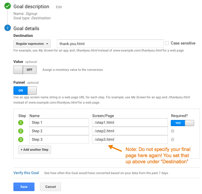
Pros:
- Easy to configure.
- Can point users to the funnel visualization report in Google Analytics main interface.
Cons:
- Goal data (including the funnel) is not retroactive. These will only start working after you create them.
- Note: A session-based segment with the exact same criteria as your goal is an easy way to get the historical data, but you would need to stitch them (together outside of GA.)
- Goal funnels are only available for page data; not for events (and definitely not for Custom Dimensions, since the feature far predates those.) So, let’s say you were tracking the following funnel in the following way:
- Clicked on the Trial Signup button (event)
- Trial Signup Form (page)
- Trial Signup Submit (event)
- Trial Signup Thank You Page (page)
- You would not be able to create a goal funnel, since it’s a mix of events and pages. The only funnel you could create would be the Form > Thank You Page, since those are defined by pages.
- Your funnel data is only available in one place: the “Funnel Visualization” report (Conversions > Goals > Funnel Visualization)
- Your funnel can not be segmented, so you can’t compare (for example) conversion through the funnel for paid search vs. display.
- The data for each step of your funnel is not accessible outside of that single Funnel Visualization report. So, you can’t pull in the data for each step via the API, nor in a Custom Report, nor use it for segmentation.
- The overall goal data (Conversion > Goals > Overview) and related reports ignores your funnel. So, if you have a mandatory first step, this step is only mandatory within the funnel report itself. In general goal reporting, it is essentially ignored. This is important. If you have two goals, with different funnels but an identical final step, the only place you will actually see the difference is in the Funnel Visualization. For example, if you had these two goals:
- Home Page > Lead Form > Thank You Page
- Product Page > Lead Form > Thank You Page
The total goal conversions for these goals would be the same in every report, except the Funnel Visualization. Case in point:
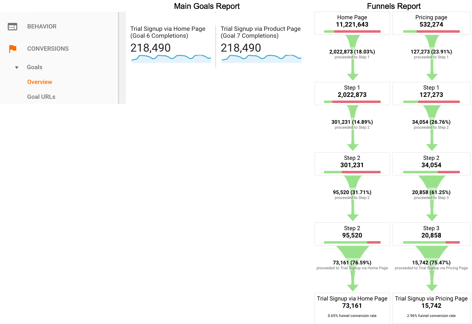
Option 2: Goals for Each Step
If you have a linear conversion flow you’re looking to measure, where the only way to get through from one step to the next is in one path, you can overcome some of the challenges of Goal Funnels, and just create a goal for every step. Since users have to go from one step to the next in order, this will work nicely.
For example, instead of creating a single goal for “Lead Thank You Page”, with a funnel of the previous steps, you would create one goal for “Clicked Request a Quote” another for the next step (“Saw Lead Form”), another for “Submitted Lead Form”, “Thank You Page” (etc.)
You can then use these numbers in a simple table format, including with other dimensions to understand the conversion difference. For example:
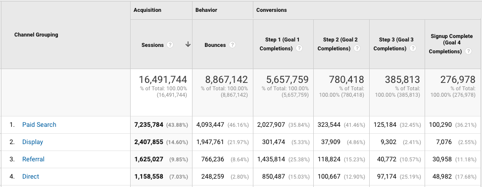
Or pull this information into a spreadsheet:
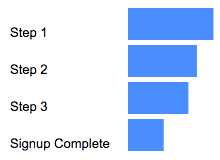
Pros:
- You can create these goals based on a page or an event, and if some of your steps are pages and some are events, it still works
- You can create calculated metrics based on these goals (for example, conversion from Step 1 to Step 2.) See how in Peter O’Neill’s great post.
- You can access this data through many different methods:
- Standard Reports
- Custom Reports
- Core Reporting API
- Create segments
Cons:
- Goal data is not retroactive. These will only start working after you create them.
- Note: A session-based segment with the exact same criteria as your goal is an easy way to get the historical data, but you would need to stitch them (together outside of GA.)
- This method won’t work if your flow is non-linear (e.g. lots of different paths, or orders in which the steps could be seen.)
- If your flow is non-linear, you could still use the Goal Flow report, however this report is heavily sampled (even in GA360) so it may not be of much benefit if you have a high traffic site.
- It requires your steps be tracked via events or pages. A custom dimension is not an option here.
- You are limited to 20 goals per Google Analytics view, and depending on the number of steps (one client of mine has 13!) that might not leave much room for other goals. (Note: You could create an additional view, purely to “house” funnel goals. But, that’s another view that you need to maintain.)
Option 3: Custom Funnels (GA360 only)
Custom Funnels is a relatively new (technically, it’s still in beta) feature, and only available in GA360 (the paid version.) It lives under Customization, and is actually one type of Custom Report.
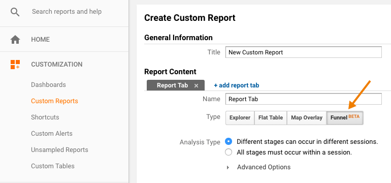
Custom Funnels actually goes a long way to solving some of the challenges of the “old” goal funnels.
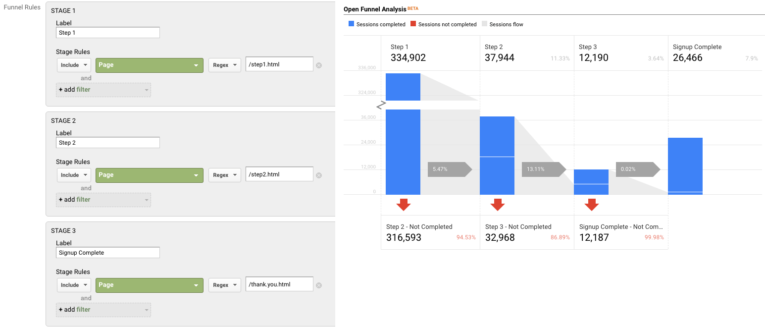
Pros:
- You can mix not only Pages and Events, but also include Custom Dimensions and Metrics (in fact, any dimension in Google Analytics.)
- You can get specific – do the steps need to happen immediately one after the other? Or “just eventually”? You can do this for the report as a whole, or at the individual step level.
- You can segment the custom funnel (YAY!) Now, you can do analysis on how funnel conversion is different by traffic source, by browser, by mobile device, etc.
Cons:
- You’re limited to five steps. (This may be a big issue, for some companies. If you have a longer flow, you will either need to selectively pick steps, or analyze it in parts. It is my desperate hope that GA allows for more steps in the future!)
- You’re limited to five conditions with each step. Depending on the complexity of how your steps are defined, this could prove challenging.
- For example, if you needed to specify a specific event (including Category, Action and Label) on a specific page, for a specific device or browser, that’s all five of your conditions used.
- But, there are normally creative ways to get around this, such as segmenting by browser, instead of adding it as criteria.
- Custom Reports (including Custom Funnels) are kind of painful to share…
- There is (currently) no such thing as “Making a Custom Report visible to everyone who has access to that GA View.” Aka, you can’t set it as “standard.”
- Rather, you need to share a link to the configuration, the user then has to choose the appropriate view, and add it to their own GA account. (If they add it to the wrong view, the data will be wrong or the report won’t work!)
- Once you do this, it “disconnects” it from your own Custom Report, so if you make changes, you’ll need to go through the sharing process all over again (and users will end up with multiple versions of the same report.)
Option 4: Segmentation
You can mimic Option 1 (Funnels) and Option 2 (Goals for each step) with segmentation.
You could easily create a segment, instead of a goal. You could do this in the simple way, by creating one segment for each step, or you can get more complicated and create multiple segments to reflect the path (using sequential segmentation.) For example:
One segment for each step
Segment 1: A
Segment 2: B
Segment 3: C
Segment 4: D
or
Multiple segments to reflect the path
Sequential Segment 1: A
Sequential Segment 2: A > B
Sequential Segment 3: A > B > C
Sequential Segment 4: A > B > C > D
Pros:
- Retroactive
- Allows you to get more complicated than just Pages and Events (e.g. You could take into account other dimensions, including Custom Dimensions)
- You can set a segment as visible to all users of the view (“Collaborators and I can apply/edit segment in this View”), making it easier for everyone in the organization to use your segments
Cons:
- You can only use four segments at one time in the UI, so while you aren’t limited to the number of “steps”, you’d only be able to look at four. (You could leverage the Core Reporting API to automate this.)
- The limit on the number of segments you can create is high (100 for shared segments and 1000 for individual segments) but let’s be honest – it’s pretty tedious to create multiple sequential segments for a lot of steps. So there may be a “practical limit” you’ll hit, out of sheer boredom!
- If you are using GA Free, you will hit sampling by using segments (which you won’t encounter when using goals.) THIS IS A BIG ISSUE… and may make this method a non-starter for GA Free customers (depending on their traffic.)
- Note: The Core Reporting API v3 (even for GA360 customers) currently follows the sampling rate of GA Free. So even 360 customers may experience sampling, if they’re attempting to use the segmentation method (and worse sampling than they see in the UI.)
Option 5: Advanced Analysis (NEW! GA360 only)
Introduced in mid-2018 (as a beta) Advanced Analysis offers one more way for GA360 customers to analyse conversion. Advanced Analysis is a separate analysis tool, which includes a “Funnel” option. You set up your steps, based on any number of criteria, and can even break down your results by another dimension to easily see the same funnel for, say, desktop vs. mobile vs. tablet.

Pros:
- Retroactive
- Allows you to get more complicated than just Pages and Events (e.g. You could take into account other dimensions, including Custom Dimensions)
- Easily sharable – much more easily than a custom report! (just click the little people icon on the right-hand side to set an Advanced Analysis to “shared”, then share the links to others with access to your Google Analytics view.)
- Up to 10 steps in your funnel
- You can even use a segment in a funnel step
- Can add a dimension as a breakdown
Cons:
- Advanced Analysis funnels are always closed, so users must come through the first step of the funnel to count.
- Funnels are always user-based; you do not have the option of a session-based funnel.
- Funnels are always “eventual conversion”; you can not control whether a step is “immediately followed by” the next step, or simply “followed by” the next step (as you can with Sequential Segments and Custom Funnels.)
Option 6: Custom Implementation
The first three options assume you’re using standard GA tracking for pages and events to define each step of your funnel. There is, of course, a fourth option, which is to specifically implement something to capture just your funnel data.
Options:
- Collect specific event data for the funnel. For example:
- Event Category: Lead Funnel
- Event Action: Step 01
- Event Label: Form View
- Then use event data to analyze your funnel.
- Use Custom Dimensions and Metrics.
Pros:
- You can specify and collect the data exactly how you want it. This may be especially helpful if you are trying to get the data back in a certain way (for example, to integrate into another data set.)
Cons:
- It’s one more GA call that needs to be set up, and that needs to remain intact and QA’ed during site and/or implementation changes. (Aka, one more thing to break.)
- For the Custom Dimensions route, it relies on using Custom Reports (which, as mentioned above, are painful to share.)
Personally, my preference is to use the built-in features and reports, unless what I need simply isn’t possible without custom implementation. However, there are definitely situations in which this would be the optimal route to go.
Hey look! A cheat sheet!
Is this too confusing? In the hopes of simplifying, here’s a handy cheat sheet!

Conclusion
So you might be wondering: Which do I use the most? In general, my approach is generally:
- If I’m doing an ad hoc, investigative analysis, I’ll typically defer to Advanced Analysis. That is, unless I need a session-based funnel, or control over immediate vs. eventual conversion, in which case I’ll use Custom Funnels.
- If it’s for on-going reporting, I will typically use Goal-based (or BigQuery-based) metrics, with Data Studio layered on top to create the funnel visualisation. (Note: This does require a clean, linear funnel.)
Are there any approaches I missed? What is your preferred method?
A Step-By-Step Guide To Creating Funnels in Google’s Data Studio
I’m so excited to report that this post is now obsolete! Funnels are now a native feature in Looker Studio, so check out the new post to read how to create them.
Old post, for posterity:
This is an update to a 2017 blog post, since there are a ton of new features in Data Studio that make some of the old methods unnecessary. If you really need the old post (I can’t fathom why) maybe try the Way Back Machine?
Given so many sites have some sort of conversion funnel (whether it’s a purchase flow, a “contact us” flow or even an informational newsletter signup flow), it’s a pretty common visualization to include in analytics reporting. For those using Google’s Data Studio, you may have noticed that a true “funnel” visualization is not among the default visualization types available. (Though you may choose to pursue a Community Visualization to help.)
The way I choose to visualize conversion funnels is by leveraging an horizontal bar chart:

To create this type of visualization, you will need:
- A linear flow, in which users have to go through the steps in a certain order
- A dimension with a single value* (I’ll explain below)
- A metric for each step. You could create this in several ways:
- Google Analytics Goal
- Custom Metric
- BigQuery metric
- Data Studio data blend (up to 5 steps)
- Data in spreadsheet
For example, here I am using Goal Completions:

A spreadsheet might be as simple as:

And here I am using a data blend (basically, Data Studio’s “join”), in what I’ll call a “self-join”. Basically, I’m taking filtered data from a Google Analytics view, then joining it with the same Google Analytics view, but a different metric or filter. This is what will allow you to build a funnel where, for example:
- Step 1 is a page (“home”)
- Step 2 is an event (“contact us”)
- Step 3 might be another page (“thank-you”)

But remember a blend will only work if you have five funnel steps or fewer.
* Why a dimension with a single value? For example, a dimension called “All Users” that only has one value, “All Users.”
Here’s what happens to your visualization if you try to use a dimension with multiple values:

Basically what you want is to create a bar chart, with no dimension. But since that’s not an option, we use a dimension with a single value to mimic this.
You can create one super fast in your Data Source in Data Studio, by creating a CASE statement similar to this:
CASE WHEN REGEXP_CONTAINS(DeviceCategory, ".*") then "All Users" ELSE "All Users" END
And don’t try to make your life easy by choosing “year”, thinking that “well it’ll only have one value, this year!” — when Jan 1 rolls around and all your funnels break, you’ll be annoyed you didn’t take the extra two seconds.
A step-by-step walkthrough:
Step 1: Create your bar chart
Our visualization is then a horizontal bar chart, with our “single value dimension” as the dimension, and our steps as the metrics.

2. Change the colors to be all the same color

3. Hide axes (both X and Y)

4. Add data labels

5. Remove legend and gridlines

6. Add text boxes, to label the steps

Voila! That’s your (raw numbers) funnel. But you probably want conversion rate too, right?
You’re going to want to create calculations for each step of the funnel:
Step 1%:
SUM(Step 1)/SUM(Step 1)
Step 2%:
SUM(Step 2)/SUM(Step 1)
Step 3%:
SUM(Step 3)/SUM(Step 1)
Purchase%:
SUM(Step 4)/SUM(Step 1)

This will give you the conversion rate from the first step of the funnel. (And yes, Step 1 % will be 100%, it’s supposed to be!)
Side note: I tend to put the % sign in the formula, so it makes it easy for me to search for it in the list of metrics later.
And make sure you format as a percentage, so you don’t have to constantly adjust it in the chart.

Note that you could also add a “Step-to-Step” conversion as well:
Step 1% s2s (This formula is actually the same, so I don’t bother creating another one)
SUM(Step 1)/SUM(Step 1)
Step 2% s2s (This formula is actually the same, so I don’t bother creating another one)
SUM(Step 2)/SUM(Step 1)
Step 3% s2s (This is a different formula to the one above)
SUM(Step 3)/SUM(Step 2)
Purchase% s2s (This is a different formula to the one above)
SUM(Step 4)/SUM(Step 3)
I use something like “s2s” to denote that that’s the formula with the previous step as the denominator, versus the formula with the first step as the denominator.
Now you’ll follow the steps again, but build a second bar chart with your conversion rate metrics, and/or your step-to-step conversion rates.
That’s it!
Voila! Look at your lovely funnel visualization:

The hardest part is getting your data into the right shape (e.g. having a metric for each step.)
And it used to be a lot harder, before some newer features of Data Studio! (In my day, we used to have to create funnels for three miles in the snow…)
If you have any questions, please don’t hesitate to reach out to me via Twitter, Linked In, email or Measure Chat.
How Often Should You Revisit Your KPIs?
The need to define your Key Performance Indicators is an old, tired concept. Been there, done that, we get it.*
But how many of us think about the need to revisit those KPIs? Perhaps you went through an extensive definition exercise. . . three years ago. Since then, you have redesigned your website, optimized via A/B testing, introduced a mobile app, and created the ability to sign up via phone. Do those thoroughly discussed KPIs still apply?
On the one hand, your true “Single Performance Indicator” should stand the test of time, since it measures your overall business success – which ultimately doesn’t change much. An ecommerce or B2B company still wants to drive sales, a content site wants ad revenue, a non-profit wants donations.
However, for the majority of businesses, digital does not encompass their entire customer interaction. It is common for digital KPIs be a leading indicators of overall business success. For example, submitting a lead or form, signing up for a trial, viewing pricing, downloading a coupon or comparing products can be online KPIs. They may not involve money directly changing hands (yet), but they are a crucial first step. These digital KPIs are even more likely to change as you add new site or mobile features.
So how often should you revisit your digital KPIs?
This can depend on two things:
- How fast your development is. If it takes you two years to redesign a website or launch an app, you can probably revisit your KPIs less frequently, since your action is generally slow moving. (If nothing has changed, then it’s unlikely your KPIs need updating.)
- Your customer purchase cycle. If you have a short, frequent buying cycle, you may want to revisit your KPIs more often. If you are a B2B company with a two-year buying cycle, this may be less critical.
My recommendation is to conduct a review of your KPIs and leading indicators at minimum, once a year. If nothing else, a review where nothing changes at least assures both the business and the analytics team that their efforts are appropriately directed.
If you have a short purchase cycle, and/or typically iterate quickly as a company, this might be better done every six months, and/or while planning for big projects that will may materially change your KPIs. For example, let’s say your signup process was previously all online. Now, a new project is introducing the ability for customer service representatives to help customers sign up via phone. A project like that could have a huge impact on your existing KPIs, and a reassessment is critical.
Now, keep in mind this applies to your overall business KPIs. Individual campaigns should still begin with consideration of what KPIs will be used to measure their success, every time.
Analytics is continually evolving, and performance measurement must assess your business against up-to-date objectives. However, KPIs are not only important for reporting, but also for analysis and optimization, which ultimately seeks to drive performance. By revisiting your KPIs, you can ensure that both the business and your analysts are focused on the right things.
* And still, it’s not always done. But that’s a topic for another day.
What Analysts Can Learn About Presentation From Group Fitness Instructors
In my (vast amounts of) free time, I am a Les Mills group fitness instructor for BodyPump (weight training), RPM (indoor cycling) and CXWORX (functional core training.) While analytics and group fitness might seem very different, there are some surprising similarities between teaching a group fitness class, and presenting on analytics. Both involve sharing complicated information (exercise science, digital data) and trying to make this accessible and easily understood.
When we are trained as instructors, part of our training involves education on how different people learn, and how to teach to all of them. This is directly applicable to analytics!
There are three types of learners:
Visual learners need to see it to understand.
- In group fitness, these participants need you to demonstrate a move, not explain it. You can talk till you’re blue in the face – it won’t make sense for them until you preview it.
- In analytics, this may mean visually displaying data, using diagrams, graphs and flow charts instead of data tables – and perhaps even hitting up the whiteboard from time to time.
Auditory learners need to hear it to process it.
- In group fitness, they require a verbal explanation of exactly what you’re doing. Visual demonstrations may be lost on them.
- In analytics, these are the people who need to hear your commentary and explanation of the analysis. Their eyes may glaze over at your slide deck, or charts, or reports, but if you talk to them, they can connect with that.
Kinesthetic learners need to feel it to understand, to experience what you’re talking about.
- In group fitness, they need to be guided in how a move should feel. (For example, a squat is “like you’re reaching your bottom back to sit in a chair, that keeps getting pulled away.”) Analogies work well with this group.
- In analytics, these are the people that need to be led through your logic, or guided through the user’s experience. It’s not enough to show them your findings, and to display the final results. They need a narrative, to walk through the experience, to understand it. (A good example: Have you ever attended a tool or technology training that went in one ear, and out the other, until you actually got some hands-on practice? That’s kinesthetic learning – you need to do it to retain it.)
Note: People are not necessarily 100% one style – they may be visual and kinesthetic, for example.
Now, here’s where it gets trickier. Whether you are teaching a group fitness class, or presenting an analysis, your audience won’t all be the same type of learner.
This means you need to explain the same thing in multiple ways, to ensure that your information resonates with every type of learner. For example, you might:
- Use a graph, flowchart or whiteboard to appeal to your visual learners;
- Talk through the explanation for your auditory learners; and
- Provide a “sample user experience” for your kinesthetic learners. (“Imagine Debbie arrives on our site. She navigates to the Product page, clicks on the Videos button, and encounters Error X.”)
Keep in mind that you too have your own learning style. Your analysis and presentation style will likely lean more towards your personal learning style, because that’s what makes sense to you. (If you are a visual learner, a visual presentation will come easy to you.) Therefore, you need to make a conscious effort to make sure you incorporate the learning styles you do not share.
Review your presentation through the lens of all three learners.
- If you didn’t say a word, could visual learners follow your report/slides to understand your point?
- If you had no slides, could your auditory learners follow you, just from your narrative?
- Does your story (or examples) guide kinesthetic learners well through the problem?
By appealing to all three learning styles, you stand the best chance of your analysis resonating, and driving action.
What do you think? How do you learn best? Leave your thoughts in the comments!
Republished based on a post from October 3, 2010
Six Rules for Nailing Digital Analytics
[Originally published at Inc.com]
It doesn’t matter if you are a small startup, or a large organization, these six tips will help you succeed with digital analytics, whether it be for your website, mobile app, marketing or social media data.
1. Nail the basics, before you try to get fancy
 At Analytics Demystified, many organizations come to us with lofty near-term goals. For example, wanting to implement comprehensive, cross-device tracking of their customers, that they can link to their personalized marketing data and point of sale system…. But they can’t even get basic digital analytics tracking correctly implemented on their website.
For example, a large travel company we worked with had aspirations of doing deep segmentation and customized content… but couldn’t get simple Order and Revenue tracking correct. Or, a global B2B company who wanted an integrated data warehouse, from anonymous website visit through to lead through to customer… but couldn’t even get accurate counts of the number of lead forms submitted on their site.
The corporate advantage from analytics absolutely comes from being able to get an integrated view of your customer. However, you have to nail the basics before you try to get fancy. The fundamentals are fundamental for a reason. If you don’t have a solid foundation, with accurate data collected across all your systems, your integrated data will be flawed, leading to poor decision making. Accept that your organization will take time to crawl, walk, then run.
2. Perfect is the enemy of progress
While you build your solid foundation and move towards more advanced analytics, don’t get discouraged because you can only do some of the things you want. There are still plenty of gains to be made from careful analysis of your web analytics data, or your email or social or mobile app data, before they are fully integrated with your other systems and CRM.
Just because you’re not at your dreamed end-state doesn’t mean you can’t gain valuable insight along the way.
3. There is no “right” and “wrong” way. There’s only “appropriate for your business.”
 Recently I attended a webinar, where the speaker was asked “What is the best report in Google Analytics?” He proceeded to name a specific report and why he felt it was so valuable.
My first thought? “Wrong! The best report is the one that answers the business question.” There is no “right” answer, no “one” report. Solid analytics comes from using data to answer a business question. So what reports you should be using, what data you should be collecting and what analysis you should be doing depends on your business requirements. There is no “one size fits all” approach, and “best practices” may not be best for your business at all.
4. People. Not Technology.
 Spending on people matters far more than buying shiny new tools. (But every vendor selling you on “shiny” will argue otherwise!) You can do far more with a smart team, and free or inexpensive tools, than with all the bells and whistles, but no team to use them properly.
Unfortunately, we commonly work with large enterprise organizations with little or even no analytics resources. (For example, a large, Fortune 100 company with twenty individual brands and no internal resources devoted to analytics!) Your chance of gaining anything valuable from analytics … without analysts? Slim to none.
Why is this so common? Unfortunately, in most organizations, it is easier to get budget for technology than additional headcount. It’s easier to get budget for agencies and consultants, than headcount! As consultants, we at Analytics Demystified certainly benefit from this. But ultimately, we see the greatest success from our clients when they invest in their internal resources, and we therefore arm clients with justification to build out their internal team.)
When does it become about the technology…? When your awesome team are breaking the limits of what can be done with inexpensive solutions.
5. The grass is not greener
Is your analytics not helping you? Is your data a mess, the subject of deep distrust, and your implementation a disaster?
“I know! The problem is Adobe Analytics / Google Analytics / [Insert Vendor Name here]! If we change to [Some Other Vendor] things will be perfect.”
At Analytics Demystified, we have seen countless clients with a poor analytics implementations of Adobe Analytics, who jump ship to Google Analytics (or vice versa) under the assumption that the problem is the vendor. (Normally, we see those clients again a few years later when they repeat the process and switch again…)
It’s easy to think that the grass is greener, and that a vendor switch will cure all your ills. However, what actually solves problems in a vendor switch is not the new vendor per se, but rather, the time you spend redesigning, tidying and correcting your implementation while you are in the process of implementing the new vendor.
A vendor switch is not a good fix, because in a year or two, your shiny panacea will be in as much disarray as its predecessor. After all, you still have the same technical resources, the same back-end systems, and the same processes (or lack thereof!) that led to the mess in the first place. You just will have wasted a lot of time and money… and will probably switch tools again and repeat the cycle.
Rather than starting from scratch with a new solution, go back to the foundation with what you have. Revisit and reimplement your current tools, and see if you can make them work before trading them out. And this time, address the systemic issues that brought you to this place, rather than being swayed by fancy demos.
6. “You can’t manage what you don’t measure.” But, don’t bother measuring if you’re not willing to manage it!
“I want to track every single link and button our site! This is critical. How else will we know what people did?”
Before requesting in-depth tracking of the minutiae of your website or your app, stop and ask yourself: “What action will I take based on this data?” And even more importantly: “How will that action affect the bottom line?”
A “let’s just track everything” approach can be indicative of a lazier approach to analytics, where stakeholders aren’t willing to separate what’s important from what’s nice to know. And while it can seem easier to track everything (“just in case we need it”) there is a high opportunity cost to doing so: your analysts are likely to spend more providing tracking instructions, QAing and monitoring data, and less of the valuable work: analysis!
That’s not to say more in-depth data can’t be valuable. A client of mine has multiple links to their trial signup flow. One in the global navigation, one in the body of the site, and one at the bottom of the page. They wanted to be able to differentiate trials coming from each button. Was this tracking worth implementing? Absolutely! Why? Because they actually use this data to optimize the placement of each button, the color and call to action, the number of buttons on the page (and more) via A/B and Multivariate testing.
If you want to track clicks to every button on your site, you had better be ready to move, or remove, calls to action based on their performance. You’d better be ready to look at the data frequently and put it to good use. After all, if you aren’t ready or willing to make a change based on what the data tells you, why bother having it at all? Data should enable decision making, not be merely informational.
What do you think?
What has been critical for your organization to draw value from your digital analytics? Leave your thoughts in the comments!
Avoiding PII in Google Analytics
Disclaimer: I am not a lawyer, and this blog post does not constitute legal advice. I recommend seeking advice from legal counsel to confirm the appropriate policies and steps for your organization.
With the launch of Google’s Universal Analytics a few years ago, companies were suddenly able to do more with GA than had been available previously. For example, upload demographic data, or track website or app behavior by a true customer ID. Previously, Google Analytics had been intended to track completely anonymous website behavior.
However, one thing remains strict: Google’s policy against storing Personally Identifiable Information (PII.) Google Analytics’ Terms of Service clearly states “You will not and will not assist or permit any third party to, pass information to Google that Google could use or recognize as personally identifiable information.”
Unfortunately, few companies seem to realize the potential consequences of breaching this. In short: If you are found with PII in your Google Analytics data, Google reserves the right to wipe all of your data during the timeframe that the PII was present. (If this is years worth of data, so be it!) I have, in fact, worked with a client for whom this happened, and spotted many sites who are collecting PII, and may not even be aware.
[Case in point: I am a wine club member at a Napa winery (who happen to be GA users.) This winery often sends me promotional emails. Upon clicking through an email, I noticed they were appending my email address (clear PII!) into the URL. I quickly contacted them and let them know that’s a no-no, and was rewarded with a magnum of a delicious wine for my troubles! It turned out it was their email vendor who was doing this. In truth, this makes me more nervous, since this vendor is likely doing the same thing with all their clients!]
Want to know more? Here are a few things worth noting:
Google defines PII quite broadly. The current TOS does not actually contain a definition of PII, however previous versions of the TOS included a (non-comprehensive) list of examples like “name, email address or billing information.” In discussions with senior executives on the GA team, I have been told that Google actually considers ZIP Code to be PII. This is because, in a few small rural areas in the United States, ZIP Code can literally identify a single house. So keep in mind that Google will likely have a pretty strict view of what constitutes “PII.” If you think there’s a chance that something is PII, assume it is and err on the safe side.
It doesn’t matter if it’s ‘your fault’. In the case of my client, whose data was wiped due to PII, it was not actually them sending the data to Google Analytics! A third party was sending traffic to their site, with query string parameters containing PII attached. (Grrrrr!) Query string parameters are the most common culprit for PII “slipping” in, which could include Source/Medium/Campaign query string parameters, or other, non-GA-specific query string parameters. Unfortunately, this can happen without any wrongdoing on your part, since you can’t control what parameters others append.
Now, technically, the TOS say, “You … will not assist or permit any third party to…” so a client would technically not be in breach of TOS if they were unaware of the third party’s actions. However, Google may still need to “deal” with the issue (aka, remove the PII) and thus, you can end up in the same position, facing data deletion. I argue it’s worth being vigilant about third party PII infiltration, to avoid suffering the consequences!
The wipe will be at the Property level. If PII is found, the data wipe is at the Property level. This means that all Views under that Property would be affected – even if an individual View didn’t actually contain the PII! For example: You have http://www.siteA.com and http://www.siteB.com, but you track them both in the same Property. If Site A is found to have PII, while Site B doesn’t, Site B will be affected too, since the entire property will be wiped.
Filters don’t help. Let’s say you have noticed PII in your data. Perhaps, email address in a query string. You think, “Oh that sucks. I’ll just add a filter to strip the email address and presto, problem fixed!” Not so fast… Google’s issue is with the fact that you ever sent it to their servers in the first place. The fact that you have filtered it out of the visible data doesn’t remove it from their servers, and thus, doesn’t fix the problem.
So what can you do?
1. Work with your legal team. Your legal counsel may already have rules in place for what your company does (and doesn’t do) with PII. It’s good to discuss the risks and safeguards you are using with respect to Google Analytics, and seek their advice wherever necessary.
2. Train your analysts, developers and marketers. To prevent intentionally passing PII, you’ll want to be sure that your marketers know what they can (and can not!) track in GA for their marketing campaigns. On top of that, your analysts and developers should also be well-versed in acceptable tracking, and be on the lookout for PII, to raise a red flag before it goes live.
3. Use a tag manager to prevent the PII breach. Ideally, no PII would ever make it into your implementation. However, mistakes do happen, and third parties can “slip” PII in to your GA data without you even knowing it. While view filters aren’t much help, a tag management system can save the day, by preventing the data ever being sent to Google in the first place.
You have several options of how to implement this.
First, you’ll want your tag manager rule(s) to look for common examples where PII could be passed. For example, looking for email addresses, digits the length of credit card numbers, words like “name” (to catch first name, last name, business name etc. being passed), ZIP codes, addresses, etc.
Since query string parameters (including utm_ parameters) are the most common culprits, you would definitely want to set up rules around Page, Source, Medium and Campaign dimensions, but you may want to be more diligent and consider other dimensions as well.
Next, you need to decide what to do if PII is found. There are a three main options:
- Use your tag manager to rewrite the data. (For example, to replace the query string email=michele@analyticsdemystified.com with email=REMOVED). However, correctly rewriting the data requires knowing exactly what format it will come to you in. Since we are also trying to avoid inadvertent PII slipping in, it’s unlikely you’ll know the exact format it could appear in. There’s a risk your rewrite could be unsuccessful, and not actually fix the issue.
- Prevent Google Analytics firing. This solves the problem of PII in GA, but at the cost of losing that data, and possibly not being aware that it ever happened. (After all, if GA doesn’t track it, how would you know?) It would be preferable to…
- Use your tag manager to send hits with suspected PII to a different Property ID. This keeps the PII from corrupting your main data set, and allows you to easily set alerts for whenever that Property receives traffic. Since any wipe would be at the Property level, it is safest to isolate even suspected PII from your main data until you can evaluate it. If it turns out to be a false alarm, you may need to refine your tag manager rules. If, however, it is actually PII, you can then figure out where it is coming from, and ideally stop it at the source. (Keep in mind, there is no way to move “false alarm” data back to your main data set, but at least this keeps the bulk of your data safe from deletion!)
4. Set alerts to look for PII. You will want to set alerts for your “PII Property”, but I would also recommend having the same alerts in place for your main Property also. Just in case something slips through the cracks.
An example alert could search Page Name for characters matching the email address format:
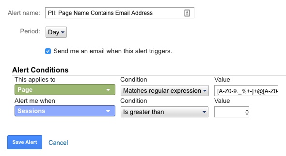
5. On top of your automated alerts, consider doing some manual checks from time to time. Unfortunately, once the PII is in your GA data set, there is no way to remove it. However, it is far better to catch it earlier. That way, if you did face a potential data wipe, at least the wipe would be for a shorter timeframe.
The above are just a few suggestions on how to deal with PII, to comply with Google Analytics TOS. However, there may be some other creative ideas folks have. Please feel free to add them in the comments!
What Happens When You Combine Analytics and Pregnancy?
What Happens When You Combine Analytics and Pregnancy?

Those of who know me might have noticed I have been suspiciously quiet. (Let’s be honest, that’s not the norm for me!) I wanted to explain a little about where I’ve been, and how I manage to make everything in my life about analytics.
If it wasn’t obvious from some of my previous posts and presentations, I have an interest in “quantified self” – essentially, tracking and applying analytics to every day life. So, when my partner and I were expecting a baby, of course I had to turn this in to an opportunity to analyze what happens to physical activity levels during pregnancy.
As background: I’m a pretty active person. I teach Les Mills group fitness classes (4-5 classes/week) and work out 6-7 days a week. Because I was so active before pregnancy, I was able to keep doing everything I had been doing, all the way up until the day I went in to labor. However, even with a focus on continued activity, I found there was still a “slow down” that happens in pregnancy.
I tracked my steps and “active time” (which includes any exercise, even if it’s not “steps based” – for example, this would include activities like swimming or yoga, that aren’t easily measured by “steps”) throughout pregnancy, as well as during the postpartum period. This gave me data I could use to examine the changes to activity levels at different stages of pregnancy, and after birth.
What I found
Here is what I found…
- Pregnancy definitely decreased my average daily step count, with the heaviest “hit” to my steps occurring in the third trimester.
- I went from 13,700 steps per day to 8,600 during pregnancy (a -37% drop.)
- The first trimester wasn’t a huge change. I was still taking 11,000 steps a day! (A -19% drop.) However, I was pretty lucky. I had an easy first trimester with no nausea. A lot of women are actually very inactive during the first trimester due to exhaustion and morning sickness.
- The second trimester I dropped to 9,000 steps per day. (Given the recommendation is 10,000 steps per day, 9,000 seemed pretty respectable for pregnancy, if you ask me!)
- The third trimester was my lowest, with 6,100 steps/day. If you look at the charts, you may notice a large drop around Week 35-37. That actually coincides with my partner heading out of town, to Adobe Summit. I was intentionally laying low to avoid going in to labor while he was gone! (I considered excluding this data as outlier, but decided to keep it in since it is accurate data.)
- However, the biggest drop was actually in the “post-partum” period immediately after birth, where I only took an average 6,000 steps/day (a -56% drop compared to before pregnancy.) For those who don’t know, you’re not supposed to do much of anything in the six weeks after birth. (It’s really boring.)
- The first five weeks after birth drove most of this, with only 3,400 steps/day.
- After six weeks I was able to return to teaching and a lot more activity, and am averaging back up at 8,600 (and continuing to trend up!)
- Pregnancy also decreased my “active time”, but not as significantly as my steps. Essentially, I was still staying active, but sometimes non-ambulatory activities like swimming, yoga, weight training etc were taking priority over activities like running (which I gave up towards the end of the second trimester.)
- While my steps decreased -37% in pregnancy, my active time only decreased -26%. So, I was keeping active, just in other ways.
- During the first trimester I was still managing an average of 2 hours of active time per day!
- This dropped to 1.7 hours in the second trimester, and 1.5 hours in the third.
- Similar to steps, the biggest drop was in the post-partum period, where I averaged only 1.2 hours of active time per day (a -48% drop.) The lowest of this was during Weeks 1-5 (only 0.7 hours/day), with 6 weeks post-partum seeing an increase in activity again – up to 1.8 hours/day and climbing!
In case you’re into charts:
How I tracked this
For years now I have used Jawbone UP products to record my step, activity and sleep data. I have IFTTT connected, which automatically sends my UP data to a Google Spreadsheet. That’s the data I used for this analysis.
Why no sleep analysis, you might wonder? Two reasons:
- The way Jawbone exports the sleep data is really unfriendly for analysis and would require so much data cleanup, I simply don’t have the time. (You’ve probably heard: babies can be time consuming!)
- Let’s be honest: Seeing how little sleep I’m getting, or how fragmented it is, would be a totally bummer. My partner is pretty awesome about sharing night duty 50/50, so I choose to not look to closely at my sleep, since I know it’s actually pretty darn good for a new parent!
 What’s next?
Yes, there is actually such a thing as a Quantified Baby. My partner and I use the Baby Tracker app to record our son’s sleep, feeds, medication etc, which gives us amazing little charts we can use to detect patterns and respond accordingly. For example, choosing an appropriate bed time based on the data of his sleep cycles. There’s probably not a post coming out of that, but yes, the tracking does continue on!
Thanks for tuning in!
I undertook this analysis mainly because I found it interesting (and I’m a nerd, and it’s what I do.) Pregnancy was such a unique experience, I wanted some way to quantify and understand the changes that take place. Most people probably won’t be too interested, but if you have any questions or want to discuss, please don’t hesitate to leave me a note in the comments!
Pairing Analytics with Qualitative Methods to Understand the WHY
Rudimentary analytics can be valuable to understand what your customers and prospects do. However, the true value from analytics comes from marrying that with the why – and more importantly, understanding how to overcome the why not.
At Analytics that Excite in Cincinnati this month, I spoke about qualitative methods that analysts can use to better understand people’s behavior and motivations. Check out the presentation on SlideShare.

The Most Important ‘Benchmarks’ Are Your Own
Companies typically expend unnecessary energy worrying about comparing themselves to others. What analyst hasn’t been asked: “What’s a typical conversion rate?” Unfortunately, conversion rates can vary so dramatically—by vertical, by product, by purchase cycle, by site design—not to mention, the benchmark data available is typically so generic that it is essentially useless.
To explain how benchmarks fail to provide insight, let’s pretend instead of conversion rate we’re talking about a new runner.* Sarah is starting a “Couch to 5K.” In planning her training, Sarah might wonder, “What’s the average running pace?” It’s an understandable question – she wants to understand her progress in context. However, a runner’s pace depends on their level of fitness, physical attributes, terrain, distance, weather and more. In theory, there could be some value in a benchmark pace for a runner just like Sarah: age, size, fitness level, training schedule, terrain, even climate. Ideally, this data would be trended, so she could understand that in Week 4 of her training plan, most people “just like her” are running a 11:30 min/mile. By Week 8, she should be at 10:30.

However, that’s not how benchmarks work. Benchmark data is typically highly aggregated, including professional runners through newbies, each running in such a wide variety of conditions that it’s essentially rendered useless. Why useless? Because the benchmark is only helpful if it’s truly comparable.
But let’s say Sarah had this (highly generic) ‘average pace’ available to her. How would it make any difference to her progress towards a 5K? If her starting pace was slower than the average, she would set goals to slowly increase it. But even if her starting pace was faster than the average, she wouldn’t pat herself on the back and stop training. She would still set goals to slowly increase it. Thus, her actions would be the same regardless of what the data told her.
That’s the issue with benchmarks. Knowing them makes no difference to the actions the business takes, and data is only useful if it drives action. Back to a business context: Let’s say your conversion rate is 3%, and the industry average is 2.5%. No business is going to stop trying to optimize just because they’re above a generic average.
Ultimately, the goal of a business is to drive maximum profit. This means continually optimizing for your KPIs, guided by your historic performance, and taking in to account your business model and users. So instead of getting sidetracked by benchmarks, help your stakeholders by focusing on progress against internal measures.
First set up a discussion to review the historical trends for your KPIs. Come armed with not only the historical data, but also explanations for any spikes or troughs. Be sure to call out:
- Any major traffic acquisition efforts, especially lower-qualified paid efforts, because they might have negatively affect historical conversion rates.
- Any previous site projects aimed at increasing conversion, and their impact.
With this information, you can work with stakeholders to set a tangible goal to track toward, and brainstorm marketing campaigns and optimization opportunities to get you there. For example, you might aim to increase the conversion rate by 0.5% each quarter, or set an end of year goal of 2.6%. Your historical review is critical to keep you honest in your goal setting. After all, doubling your conversion rate is a pretty unrealistic goal if you have barely moved the needle in two years!
Be sure to test and measure (and document!) your attempts to optimize this rate, to quantify the impact of changes. (For example, “Removing the phone number from our form increased the conversion rate by 5%.”) This will help you track what actually moves the needle as you progress toward your goal.
* Awesome fitness analogy courtesy of Tim Patten.
Using Adobe Analytics New ‘Calculated Metrics’ to Fix Data Inaccuracies
Few features were more hotly anticipated following Adobe Summit than the arrival of the newly expanded calculated metrics to Adobe Analytics. Within one week of its release, it is already paying off big time for one of my clients. I’m going to share a use case for how these advanced calculated metrics fixed some pretty broken revenue data.
Our example for this case study is KittensSweaters.com*, an ecommerce business struggling with their Adobe Analytics data. Over the past few months, KittenSweaters has dealt with a number of issues with their revenue data, including:
- “Outlier” orders where the revenue recorded was grossly inflated or even negative
- A duplicate purchase event firing prior to the order confirmation page, that double counted revenue and
- Donations to their fundraiser counting as sweaters revenue, instead of in a separate event
For example, here you can see the huge outliers and negative revenue numbers they saw in their data:

Historically, this would require segmentation be layered upon all reports (and ensuring that all users knew to apply this segmentation before using the data!)
However, using the new Calculated Metrics in Adobe Analytics, KittenSweaters was able to create a corrected Revenue metric, and make it easily available to all users. Here’s how:
First, create a segment that is limited only to valid orders.
In the case of KittenSweaters, this segment only allows in orders where:
- The product category was “sweaters”; and
- The purchase was fired on the proper confirmation page; and
- The order was not one of the known “outlier” orders (identified by the Purchase ID)

You can test this segment by applying it on the current Revenue report and seeing if it fixes the issues. Historically, this would have been our only route to fix the revenue issues – layer our segment on top of the data. However, this requires all users to know about, and remember to apply, the segment.
So let’s go a step further and create our Calculated Metric (Components > Manage Calculated Metrics.)
Let’s call our new metric “Revenue (Corrected)”. To do so, drag your new segment of “Valid Sweater Orders” into the Definition of your metric, then drag the Revenue metric inside of the segment container. Now, the calculated metric will only report on Revenue where it matches that segment.

Voila! A quick “Share” and this metric is available to all KittenSweaters.com employees.
You can use this new metric in any report by clicking “Show Metrics” and adding it to the metrics displayed:

Now you’ll get to see the new Metrics Selector rather than the old, clunky pop-up. Select it from the list to populate your report. You can also select the default Revenue metric, to view the two side by side and see how your corrections have fixed the data.

You can quickly see that our new Revenue metric removes the outliers and negative values we saw in the default one, by correcting the underlying data. (YAY!)

But why not make it even easier? Why make busy KittenSweaters employees have to manually add it to their reports? Under Admin Settings, we can update our corrected metric to be the default:
You can even use these new calculated metrics in Report Builder! (Just be sure to download the newest version.)
It’s a happy day in the KittenSweaters office! While this doesn’t replace the need for IT to fix the underlying data, this definitely helps us more easily provide the necessary reporting to our executive team and make sure people are looking at the most accurate data.
Keep in mind one potential ‘gotcha’: If the segment underlying the calculated metric is edited, this will affect the calculated metric. This makes life easier while you’re busy building and testing your segment and calculated metric, but could have consequences if someone unknowingly edits the segment and affects the metric.
Share your cool uses of the new calculated metrics in the comments! If you haven’t had a chance to play around with them yet, check out this series of videos to learn more.
* Obviously KittenSweaters.com isn’t actually my client, but how puuuurrfect would it be if they were?!
I Believe in Data*
* [Caveats to follow]
Articles about analytics tend to take two forms. One style exalts data as a cure-all panacea.
Another style implies that people put too much faith in the power of their data. That there are limitations to data. That data can’t tell you everything about how to build, run and optimize your business. I agree.
My name is Michele Kiss, I am an analytics professional, and I don’t believe that data solves everything.
I believe in the appropriate use of data. I don’t believe that clickstream data after you redesign your site can tell you if people “like” it. I believe that there are many forms of data, that ultimately it is all just information, and that you need to use the right information for the right purpose. I do not believe in torturing a data set to extract an answer it is simply not equipped to provide.
I believe in the informed use of data. Data is only valuable when its i) definitions and its ii) context are clearly understood. I believe there is no such thing as pointing an analyst to a mountain of data and magically extracting insights. (Sorry, companies out there hiring data scientists with that overblown expectation.)
When a nurse tells your doctor, “150” and “95” those numbers are only helpful because your doctor knows that i) That’s your blood pressure reading and ii) Has a discussion with you about your diet, exercise, lifestyle, stress, family/genetic history and more. That data is helpful because it’s definition is clear, and your doctor has the right contextual information to interpret it.
I believe that the people and processes around your data determine success more than the data itself. A limited data set used appropriately in an organization will be far more successful than a massive data set with no structure around its use.
I believe data doesn’t have to be perfect to be useful, but I also believe you must understand why imperfections exist, and their effect. Perfect data can’t tell you everything, but outright bad data can absolutely lead you astray!
I believe that data is powerful, when the right data is used in the right way. I believe it is dangerously powerful when misused, either due to inexperience, misunderstanding or malice. But I don’t believe data is all powerful. I believe data is a critical part of how businesses should make decisions. But it is one part. If used correctly, it should guide, not drive.
Data can be incredibly valuable. Use it wisely and appropriately, along with all the tools available to your business.
“There are more things in heaven and earth, Horatio,
Than are dreamt of in your [big data set].”
– Analytics Shakepeare
The Right Use for Real Time Data
Vendors commonly pitch the need for “real-time” data and insights, without due consideration for the process, tools and support needed to act upon it. So when is real-time an advantage for an organization, and when does it serve as a distraction? And how should analysts respond to requests for real-time data and dashboards?
There are two main considerations in deciding when real-time data is of benefit to your organization.
1. The cadence at which you make changes
The frequency with which you look at data should depend on your organization’s ability to act upon it. (Keep in mind – this may differ across departments!)
For example, let’s say your website release schedule is every two weeks. If, no matter what your real-time data reveals, you can’t push out changes any faster than two weeks, then real-time data is likely to distract the organization.
Let’s say real-time data revealed an alarming downward trend. The organization is suddenly up in arms… but can’t fix it for another two weeks. And then… it rights itself naturally. It was a temporary blip. No action was taken, but the panic likely sidetracked strategic plans. In this case, real-time served as a distraction, not an asset.
However, your social media team may post content in the morning, and re-post in the afternoon. Since they are in a position to act quickly, and real-time data may impact their subsequent posts, it may provide a business advantage for that team.
When deciding whether real-time data is appropriate, discuss with stakeholders what changes would be made in response to observed shifts in the data, how quickly those changes could be made, and what infrastructures exists to make the changes.
2. The technology you have in place to leverage it
Businesses seldom have the human resources needed to act upon trends in real-time data. However, perhaps you have technologies in place to act quickly. Common examples include real-time optimization of advertising, testing and optimization of article headlines, triggered marketing messages (for example, shopping cart abandonment) and on-site (within-visit) personalization of content.
If you have technology in place that will actually leverage the real-time data, it will absolutely provide your organization an advantage. Technology can spot real-time trends and make tweaks far more quickly than a human being can, and can be a great use of real-time information.
But if you have no such technology in place, and real-time is only so executives can see “how many people are checking out right now”, this is unlikely to prove successful for the business, and will draw resources away from making more valuable use of your full data set.
Consider specific, appropriate use cases
Real-time data is not an “all” or “nothing.” There may be specific instances where it will be advantageous for your organization, even if it’s not appropriate for all uses.
A QA or Troubleshooting Report (Otherwise known as the “Is the sky falling?!” report) can be an excellent use of real-time data. Such a report should look for site outages or issues, or breaks in analytics tracking, to allow quick detection and fixes of major problems. This may allow you to spot errors far sooner than during monthly reporting.
The real-time data can also inform automated alerts, to ensure you are notified of alarming shifts as soon as possible.
Definitions matter
When receiving a request for “more real-time” data, dashboards or analysis, be sure to define with stakeholders how they define “real-time.”
Real-time data can be defined as data appearing in your analytics tool within 1 minute of the event taking place. Vendors may consider within 15 minutes to be “real-time.” However, your business users may request “real-time” when all they really mean is “including today’s partial data.”
It’s also possible your stakeholders are looking for increased granularity of the data, rather than specifically real-time information. For example, perhaps the dashboards currently available to them are at a daily level, when they need access to hourly information for an upcoming launch.
Before you go down the rabbit hole of explaining where real-time is, and is not, valuable, make sure that you understand exactly the data they are looking for, as “real time” may not mean the same thing to them as it does to you.
The Curse of Bounce Rate and ‘Easy’ Metrics (And Why We Can Do Better)
One of the benefits of having a number of friends in the analytics industry is the spirited (read: nerdy) debates we get in to. In one such recent discussion, we went back and forth over the merits of “bounce rate.”
I am (often vehemently) against the use of “bounce rate.” However, when I stepped back, I realised you could summarise my argument against bounce rate quite simply:
Using metrics like ‘bounce rate’ is taking the easy way out, and we can do better
Bounce rate (at its simplest) is the percentage of visits that land on your site that don’t take a second action. (Don’t see a second page, don’t click the video on your home page, etc.)
My frustration: bounce rate is heavily dependent upon the way your site is built, and your analytics implementation (do you have events tracking that video? how are the events configured? is your next page a true page load?) Thus, bounce rate varies as to what exactly it represents. (Coupled with the fact that most business users don’t, of course, understand the nuances, so may misuse a metric they don’t understand.)
So let’s take a step back. What are we trying to answer with “bounce rate”?
Acquisition analysis (where bounce rate is commonly used) compares different traffic sources or landing pages by which do the best job of “hooking” the user and getting them to take some next action. You are ultimately trying to decide what does the best job of driving the next step towards business success.
Let’s use that!
Instead of bounce rate, what are the conversion goals for your website? What do you want users to do? Did they do it? Instead of stopping at “bounce rate”, compare your channels or landing pages on how they drive to actual business conversions. These can be early-stage (micro) conversions like viewing pricing, or more information, or final conversions like a lead or a purchase.
So, what is better than bounce rate?
- Did they view more information or pricing? Download a brochure?
- Did they navigate to the form? Submit the form?
- Did they view product details? Add to cart? Add the item to a wish list?
- Did they click related content? Share the article?
Using any of these will give you better insight into the quality of traffic or the landing pages you’re using, but in a way that truly considers your business goals.
But let’s not stop there…. what other “easy metrics” do we analysts fall back on?
What about impressions?
I frequently see impressions used as a measure of “awareness.” My partner, Tim Wilson, has already detailed a pretty persuasive rant on awareness and impressions that is well worth reading! I’m not going to rehash it here. However the crux of this is:
Impressions aren’t necessarily ‘bad’ – we can just do a better job of measuring awareness.
So what’s better than impressions?
-
At least narrow down to viewable impressions. If we are honest with ourselves, an impression below the fold that the user doesn’t even see does not affect their awareness of your brand!
-
Even measuring clicks or click-through is a step up, since the user at least took some action that tells you they truly “saw” your ad – enough to engage with it.
-
A number of vendors provide measures of true awareness lift based on exposure to ad impressions, by withholding and measuring against a control group. This is what you truly want to understand!
What about about page views per visit or time on site?
Page views per visit or time on site is commonly used in content sites as a measure of “engagement.” However (as I have ranted before) page views or time can be high if a user is highly engaged – but they can also be high if they’re lost on the site!
So what’s better than just measuring time or page views?
So why do we do this?
In short: Because it’s easy. Metrics like bounce rate, page views, time on site and impressions are basic, readily available data points provided in standard reports. They’re right there when you load a report! They are not inherently ‘bad’. They do have some appropriate use cases, and are certainly better than nothing, in the absence of richer data.
However, analysis is most valuable when it addresses how your actions affect your business goals. To do that, you want to focus on those business goals – not some generic data point that vendors include by default.
Thoughts? Leave them in the comments!
Three Foundational Tips to Successfully Recruit in Analytics
Hiring in the competitive analytics industry is no easy feat. In most organisations, it can be hard enough to get headcount – let alone actually find the right person! These three foundational tips are drawn from successful hiring processes in a variety of verticals and organisations.
1. Be honest about what you need
This includes being honest in job description, as well as when you talk to candidates. Be clear about what the person will actually do and what your needs are – not what you wish they would get to do!
I have seen highly qualified candidates promised exciting work and the chance to build a team, only to find out “Director” was an in-name-only title, and in reality, they were nothing more than a glorified reporting monkey. Unsurprisingly, these hires last just long enough to line up a better opportunity, and leave with a bad taste in their mouth (and a guarantee that they would never recommend the company to anyone.)
2. Separate ‘nice to have’s from ‘must have’s
A job description is not your wishlist for Santa, and unicorns don’t exist. You are not going to find someone with twenty years Adobe Analytics experience and a PhD in Statistics who is also a Javascript expert (and won a gold medal for basket weaving!) This may sound like a ridiculous example, but so are most of the supposed “requirements” for analytics roles these days.
Start by detailing the bare minimum skills someone would need to have to be effective in the role, and focus the role to address your greatest need. (Yes, I understand you “may not get another req for years!” But by refusing to prioritise, you guarantee that this req will 1) Take forever to fill, and 2) End up being filled by someone who may meet some of your requirements, but perhaps not your most critical!) Do you need someone technical? More business oriented? Devoted to testing? (Resist the urge to throw in the kitchen sink.)
Keep in mind, if candidates have other skills that makes them desirable, they will mention them during the interview process, and you can then factor them into your hiring decision.
Focusing on your most pressing needs will also make sure other interviewers besides yourself clearly understand what is necessary to succeed in the role. There is nothing worse than having another interview provide poor feedback about a candidate you love, because “They didn’t know R” – except that wasn’t something you truly needed!
3. Focus on relationships, not recruiting
Managers who hire well understand they are always recruiting. While you may not have an active req open, you should continue building relationships with others in the industry. This will allow you to move more quickly, with some great candidates in mind, when the time comes.
Managers who do this well are constantly on the lookout for, and evaluating, people they meet for a potential hiring fit. They take the time to catch up with contacts from time to time, whether it’s a quick phone call to check in, or catching up for lunch. They also openly discuss the possibility of one day working together! Be clear that you’re not hiring right now (you don’t want to lead anyone on) but talk through whether there’s even a fit in terms of skills and interests on both sides.
On the flip side, managers who struggle here tend to blow off connections until they need something (for example, they’re actively hiring.)
What do you think?
Please leave your thoughts or questions in the comments!
Five Proven Tips for Managing Analysts Like a Pro
In the analytics industry, it is common to progress through the ‘ranks’ from analyst to managing a team. Unfortunately, many companies do not provide much in the way of support or management training, to help these new managers learn how to effectively work with their team.
Improving your people management skills is no small task. It takes years, and you are never “done.” Here are just a few small tips, picked up over the years from some of my own managers:
1. Be a leader, not a boss. If you didn’t have the official title, would your team still come to your for assistance or guidance? Focus your efforts on being considered a leader, rather than just someone’s “supervisor” on an org chart.
2. Words matter. Using words like “subordinates” or descriptions like “Jane works for me” endears no one. The best managers don’t need to speak of team members as if they are below them. People look up to good leaders because there’s something to see, not because they’ve been pushed down.
3. We, not I. Many analytics managers are still in dual player-coach roles, meaning they still actively work on projects while managing a team. But when you discuss the team’s work and achievements, a little “we” can go a long way. Think about the difference in perception when you say: “We have been working on something really exciting” or “The team has been hard at work” versus “I have been working on X.” Even if the work you’re referencing is entirely your own project, give the team credit. A team attitude is contagious, and your example will help team members follow suit.
4. Use your experience to your team’s advantage. Analytics can be a complex field. While it is often resource constraints that keep managers active in day-to-day analytics tasks, most analysts enjoy the work and don’t want to be fully removed, as a pure people-manager. Use this to your team’s advantage! Keeping your hands dirty helps you understand the challenges your team faces, and keeps you realistic about what is reasonable, when negotiating with stakeholders.
5. Share the credit, take the blame. With leadership comes an obligation to share praise to your team, and take the rap when things go wrong. If you’re not willing to do this, don’t take on a leadership role. It’s that simple. Were there mistakes made in an analysis? Data integrity issues, or data loss? Being responsible for a team means having ultimate oversight, and being responsible when that fails.
To overcome a mistake without throwing your team under the bus, explain to affected parties:
- That an error occurred, and (generally) what it was
- The consequences for the information shared previously (for example, should they throw out all previous findings?)
- Where the breakdown in process was
- How you’ve already addressed the process failure, it to ensure it doesn’t happen again
(None of this requires mentioning specific individuals!)
Treat it as a learning opportunity, and encourage your team to do the same. Work with team members privately to enhance necessary skills and put in place process to ensure it doesn’t happen again.
BONUS! Aim to be rendered obsolete. Good leaders train and guide their team until they’re not even needed anymore. This is great news for your own career: it frees you up to take on a new challenge!
There are a million books and courses on leadership out there, but these are a few of my favourite lessons from some of the best leaders I’ve ever worked for. What are yours? Please share in the comments!
The Downfall of Tesco and the Omniscience of Analytics
Yesterday, an article in the Harvard Business Review provided food for thought for the analytics industry. In Tesco’s Downfall Is a Warning to Data-Driven Retailers, author Michael Schrage ponders how a darling of the “analytics as a competitive advantage” stories, British retailer Tesco, failed so spectacularly – despite a wealth of data and customer insight.
I make no claims to a completely unbiased opinion (I am, after all, in the analytic space.) However, from my vantage point, the true warning of Tesco lies in the unrealistic expectation (or, dare I say, hype) that ‘big data’ and predictive analytics can think for us.
It is all too common for companies to expect analytics to give them the answers, rather than providing the supporting material with which to make decisions. Analytics can not help you if you are not asking the right questions. After all, a compass can tell you where north is, but not that you should be going south. It is the reason we at Analytics Demystified prefer to think about being data informed, not data driven. Being ‘data driven’ removes the human responsibility to ask the right questions of, and take the right actions in response to, your data.
Ultimately, successful business decisions are an elusive combination of art and science. Tesco may have had the greatest analytics capabilities in the world, but without business sense to critically assess and appropriately act upon the data, it is a warning: considering analytics to have some kind of omniscience, rather than being a part of your business ‘tool box’, is to set it up to fail.
What do you think? Is Tesco’s downfall a failure of analytics? Leave your thoughts in the comments.
Wearable Tech, Quantified Self & Really Personal Data: eMetrics 2014
This week I had the pleasure of speaking at eMetrics Boston about a recent pet project of mine: what wearable and fitness technology (including consumer collection and use of data) means for analysts, marketers and privacy.
First, a little background… In April 2013, I was having a lot of trouble with sleep, so I purchased Jawbone UP to better understand how I was sleeping, and make improvements. This quickly became an exploration of the world of fitness and related wearable tech, as I explored my data, via devices and apps like Fitbit Force, Garmin Vivosmart, Whistle, Withings, Runkeeper, Strava, Map My Fitness, My Fitness Pal and Tom Tom Multisport. I leveraged IFTTT to connect this data, output raw data and even link to devices like Nest.

In the course of doing so, I noticed some striking similarities between the practice of “self quantification” and the practice of digital analytics, and started to think about 1) What opportunities these devices afford to marketers and 2) What the considerations and cautions we should be aware of, from a privacy perspective.
You can check out the presentation on Prezi if you are interested.

I would love to hear any thoughts, questions, or your own experiences in the comments!
7 Tips For Delivering Better Analytics Recommendations
As an analyst, your value is not just in the data you deliver, but in the insight and recommendations you can provide. But what is an analyst to do when those recommendations seem to fall on deaf ears?
1. Make sure they’re good
Too often, analysts’ “recommendations” are essentially just half-baked (or even downright meaningless) ideas. This is commonly due to poor process, and expectation setting between the business and analytics team. If the business expects “monthly recommendations”, analysts will feel pressured to just come up with something. But what ends up getting delivered is typically low value.
The best way to overcome this is to work with the business to clearly set expectations. Recommendations will not be delivered “on schedule”, but when there is a valuable recommendation to be made.
2. Make sure you mean it
Are you just throwing out ideas? Or do you truly believe they are an opportunity to drive revenue, or improve the experience? Product Managers have to stand by their recommendations, and be willing to answer to initiatives that don’t work. Make sure you would be willing to do the same!
3. Involve the business
Another good way to have your recommendations fall on deaf ears is if they 1) Aren’t in line with current goals / objectives; or 2) Have already been proposed (and possibly even discussed and dismissed!)
Before you just throw an idea out there, discuss it with the business. (We analysts are quick to fault the business for not involving us, but should remember this applies both ways!) This should be a collaborative process, involving both the business perspective and data to validate and quantify.
4. Let the data drive the recommendation
It is typically more powerful (and less political…!) to use language like, “The data suggests that…” rather than “I propose that…”
5. Consider your distribution method
The comments section of a dashboard or report is not the place for solid, well thought out recommendations. If the recommendation is valuable, reconsider your delivery methods. A short (or even informal) meeting or proposal is likely to get more attention than the footnote of a report.
6. Find the right receiver
Think strategically about who you present your idea to. The appropriate receiver depends on the idea, the organisation (and its politics…) and the personalities of the individuals! But don’t assume the only “right” person is at the top. Sometimes your manager, or a more hands-on, tactical stakeholder, may be better able to bring the recommendation into reality. Critically evaluate the appropriate audience is, before proposing it to just anyone.
Keep in mind too: Depending on who your idea gets presented to, you should vary the method and level of detail you present. You wouldn’t expect your CMO to walk through every data point and assumption of your model! But your hands-on marketer might want to go through and discuss (and adjust!) each and every assumption.
7. Provide an estimate of the potential revenue impact
In terms of importance, this could easily be Tip #1. However, it’s also important enough for an entire post! Stay tuned …
What about you?
What have you found effective in delivering recommendations? Share your tips in the comments!
Overcoming The Analyst Curse: DON’T Show Your Math!
If I could give one piece of advice to an aspiring analyst, it would be this: Stop showing your ‘math’. A tendency towards ‘TMI deliverables’ is common, especially in newer analysts. However, while analysts typically do this in an attempt to demonstrate credibility (“See? I used all the right data and methods!”) they do so at the expense of actually being heard.
The Cardinal Rule: Less is More
Digital measurement is not ninth grade math class. So by default, analysts should refrain from providing too much detail about how they arrived at their conclusions and calculations.
What should you show?
-
Your conclusions / findings
-
Any assumptions you had to make along the way (where these impact the conclusions)
-
Your recommendations
-
An estimated revenue impact
-
A very brief overview of your methodology (think: abstract in a science journal.) This should be enough for people to have necessary context, but not so much they could repeat your entire analysis step by step!
What shouldn’t you show?
-
Detailed methodology
-
Calculations or formulas used
-
Data sources
-
Props / vars / custom variables / events used
-
That’s not to say that this stuff isn’t important to document. But don’t present it to stakeholders.
But Of Course: “It Depends”
Because there is never one rule that applies to all situations, there are additional considerations.
How much ‘math’ you show will also depend on:
-
The level of your audience
-
Your manager should get more detail. After all, if your work is wrong, they are ultimately responsible.
-
Executives will typically want far less detail.
-
-
The individual
-
Some individuals need to see more detail to be confident in relying upon your work. For example, your CFO may need to see more math than your Creative Director. Get to know your stakeholders over time, and take note of who may need a little extra background to be persuaded.
-
Note: We commonly hear the argument “But my stakeholders really want more details!” Keep in mind there is a difference between them hearing you out, and truly wanting it. To test this, try presenting without the minutiae (though, have it handy) and see whether they actually ask for it.
-
-
Your findings
-
Are you confirming or refuting existing beliefs?
-
If what you are presenting comes as a surprise, you should be prepared to give more detail as to how you got to those findings.
-
In Your Back Pocket
Keep additional information handy, both for those who might want it, as well as to remind yourself of the details later. A tab in the back of a spreadsheet, an appendix in a presentation or a definitions/details section in a dashboard can all be a handy reference if the need arises now, or later.
[Credit: Thanks to Tim Wilson, Christopher Berry, Peter O’Neill and Tristan Bailey for the discussion on the topic!]
It’s not about “Big Data”, it’s about the “RIGHT data”
Unless you’ve been living under a rock, you have heard (and perhaps grown tired) of the buzzword “big data.” But in attempts to chase the “next shiny thing”, companies may focus too much on “big data” rather than the “right data.”
True, “big data” is absolutely “a thing.” There are certainly companies successfully crunching massive volumes of data to reveal actionable consumer insight. But there are (many) more that are buried in data, and wondering why they are endlessly digging when others have struck gold.
Unfortunately, “big data” discussions often lead to:
-
An assumption that more is better;
-
A tendency for companies to try to skip the natural maturation of analytics in their organisation, in attempt to jump straight to “big data science.”
The value of data is in guiding business success, and that does not necessarily require massive volumes of data.
So when is big data of value?
-
When a company has pushed the limits of what they were doing with their existing data;
-
When they have the people, process, governance and infrastructure to collect and analyse volumes of data; and
-
When they have the resources and support to optimise based on that data.
But to succeed at a more foundational level, companies should focus first on whether they have:
-
A culture that fully integrates data and analytics into its planning and decision making;
-
The right data to guide their strategy and tactics. This includes:
- Data that reveals whether initiatives have been successful, addressing the specific goals of the work;
- Data that provides insight into progress, including early indicators of the need to “course correct”; and
- Data that identifies new opportunities.
-
The resources and support to optimise based on findings from current data
While all businesses should be preparing for increased use and volume of data in the coming years, it is far easier to chase and hoard more and more and more data than it is to derive value from the data that already exists. However, the latter will drive far greater business value in the long term, and set up the right foundation to grow into using big data effectively.
Better ways to measure content engagement than time metrics
I spent five years responsible for web analytics for a major ad-monetised content site, so I’m not immune to the unique challenges of measuring a “content consumption” website. Unlike an eCommerce site (where there is a more clear “conversion event”) content sites have to struggle with how to measure nebulous concepts like “engagement.” It can be tempting to just fall back on measures like “time on site”, but these metrics have significant drawbacks. This post outlines those, as well as proposing alternatives to better measure your content site.
So … what’s wrong with relying on time metrics?
1. Most business users don’t understand what they really mean
The majority of business users, and perhaps even newer analysts, may not understand the nuance of time calculations in the typical web analytics tool.
In short, time is calculated from subtracting two time stamps. For example:
Time on Page A = (Time Stamp of Page B) – (Time Stamp of Page A)
So time on page is calculated by subtracting what time you saw the next page from what time you saw the page in question. Time on site works similarly:
Time on Site = (Time Stamp of last call) – (Time Stamp of first call)
A call is often a page view, but could be any kind of call – an event, ecommerce transaction, etc.
Can you spot the issue here? What if a user doesn’t see a Page B, or only sends one call to your web analytics tool? In short: those users do not count in time calculations.
So why does that skew your data?
Let’s take a page, or website, with a 90% bounce rate. Time metrics are only based on 10% of traffic. Aka, time metrics are based on traffic that has already self-selected as “more interested”, by virtue of the fact that they didn’t bounce!
2. They are too heavily influenced by implementation and technical factors unrelated to user behaviour
The way your web analytics solution is implemented can have a significant impact on time metrics.
Consider these two implementations and sets of behaviour:
- I arrive on a website and click to expand a menu. This click is not tracked as event. I then leave.
- I arrive on a website and click to expand a menu. This click is tracked as an event. I then leave.
In the first example, I only sent one call to analytics. I therefore count as a “bounce”, and my time on the website does not count in “Time on Site”. In the second example, I have two calls to analytics, one for the page view and one for the event. I no longer count as a bounce, and my time on the website counts as “Time on Site.” My behaviour is the same, but the website’s time metrics are different.
You have to truly understand your implementation, and the impact of changes made to it, before you can use time metrics.
However, it’s not even just your site’s implementation that can affect time metrics. Tabbed browsing – default behaviour for most browsers these days – can skew time, since a user who keeps a tab open will keep “ticking” until the session times out in 30 mins.
Even the time of day your customers choose to browse can also impact time on site, as many web analytics tools end visits automatically at midnight. This isn’t a problem for all demographics, but perhaps the TechCrunches and the Mashables of the world see a bigger impact due to “night owls”!
3. They are misleading
It’s easy to erroneously determine ‘good’ and ‘bad’ based on time on site. However, I may spend a lot of time on a website because I’m really interested in the content, but I can also spend a lot of time on a website because the navigation is terrible and I can’t find what I need. There is nothing about a time metric that tells you if the time spent was successful, yet companies too often consider “more time” to indicate a successful visit. Consider a support site: a short time spent on site, where the user immediately got the help they needed and left, is an incredibly successful visit, but this wouldn’t be reflected by relying on time measures.
So what should you use instead?
Rather than relying on “passive” measures to understand engagement with your website, consider how you can measure engagement via “active” measures: aka, measuring the user’s actions instead of time passing.
Some examples of “active” measures on a content site:
- Content page views per visit. A lot of my concerns about regarding time measures also apply to “page views per visit” as a measure. (Did I consume lots of page views because I’m interested, or because I couldn’t find what I was looking for?) For a better “page views per visit” measure of engagement, track content page views, and calculate consumption of those per visit. This would therefore exclude navigational and more “administrative” pages and reflect actual content consumption. You can also track what percentage of your traffic actually sees a true content page, vs. just navigational pages.
- Ad revenue per visit. While this is less a measure of “engagement”, businesses do like to get paid, so this is definitely an important measure for most content sites! It can often be difficult to measure via your analytics tool, since you need to not only take in to account the page views, but what kind of ad the user saw, whether the space was sold or not and what the CPM was. However, it’s okay to use informed estimates. For example:Click-through rate to other articles. A lot of websites will include links to “related articles” or “you also might be interested in….” Track clicks to these links and measure click rate. This will tell you that users not only read an article, but were interested enough to click to read another.
- I saw 2 financial articles during my visit. We sell financial article pages at an average $10CPM and have an estimated 80% sell through rate. My visit is therefore worth 2/1000*$10*80% = 1.6 cents. This can be a much more helpful measure than “page views per visit” since not all page views are created equal. Having insight in to content consumed and its value can help drive decisions like what to promote or share.
- Number of shares or share rate. If sharing is considered important to your business, clearly highlight this call to action, and measure whether users share content, and what they share. Sharing is a much stronger indicator of engagement than simply viewing. (You won’t be able to track all shares, for example, copy-and-pasting URLs won’t be tracked, but tracking shares will still give you valuable information about content sharing trends.)
- Download rate. For example, downloading PDFs.
- Poll participation rate or other engaging activities.
- Video Play rate. Even better, track completion rate and drop-off points.
- Sign up and/or Follow on social.
- Account creation and sign in.
If you’re already doing a lot of the above, consider taking it a step further and calculating visit scores. For example, you may decide that each view of a content article is 1 point, a share is 5 points, a video start is 2 points and a video complete is 3 points. This allows you to calculate a total visit score, and analyse your traffic by “high” vs “low” scoring visitors. What sources bring high scoring visitors to the site? What content topics do they view more? This is more helpful than “1:32min time on site”!
By using these active measures of user behaviour, you will get better insight than through passive measures like time, which will enable better content optimisation and monetisation.
Is there anything else you would add to the list? What key measures do you use to understand content consumption and behaviour?
Data Privacy: It’s not an all or nothing!
Recently I have been exploring the world of “self quantification”, using tools like Jawbone UP, Runkeeper, Withings and more to measure, well, myself. Living in a tech-y city like Boston, I’ve also had a chance to attend Quantified Self Meet Ups and discuss these topics with others.
In a recent post, I discussed the implications of a movement like self quantification on marketing and privacy. However, it’s easy for such conversations to to stay fairly simply, without necessarily addressing the fact that privacy is not an all or nothing: there are levels of privacy and individual permissions.
Let’s take self quantification as an example. On an on-going basis, the self quantification tools I use track:
- My every day movement (steps taken, as well as specific exercise activities)
- Additional details about running (distance, pace, elevation and more)
- Calorie intake and calorie burn
- Heart rate, both during exercise (via my Polar heart rate monitor or Tom Tom running watch) and standing resting heart rate (via my Withings scale)
- Weight, BMI and body fat
- Sleep (including duration and quality)
That’s a ton of data to create about myself every day!
Now think about the possible recipients of that data:
- Myself (private data)
- My social network (for example, my Jawbone UP “team” can see the majority of my data and comment or like activities, or I can share my running stats with my Facebook friends)
- Medical professionals like my primary care physician
- Researchers
- Corporations trying to market to me
It’s so easy to treat “privacy” as an all or nothing: I am either willing to share my data or I am not. However, consumers demand greater control over their privacy precisely because there are different things we’re willing to share with different groups, and even within a group, specific people or companies we’re willing to share with.
For example, I may be willing to share my data with my doctor, but not with corporations. Or I may be willing to share my data with Zappos and Nike, but not with other corporations. I may be willing to share my running routes with close friends but not my entire social network. I may be willing to share my data with researchers, but only if anonymised. I may be willing to share my activity and sleep data with my social network, but not my weight. (C’mon, I won’t even share that with the DMV!)
This isn’t a struggle just for self quantification data, but rather, a challenge the entire digital ecosystem is facing. The difficulty in dealing with privacy in our rapidly changing digital world is that we don’t just need to allow for a share/do not share model, but specific controls that address the nuance of privacy permissions. And the real challenge is managing to do so in a user-friendly way!
What should we do? While a comprehensive system to manage all digital privacy may be a ways off (if ever), companies can get ahead by at least allowing for customisation of privacy settings for their own interactions with consumers. For example, allowing users to opt out of certain kinds of emails, not just “subscribe or unsubscribe”, or providing feedback that which targeted display ads are unwelcome, or irrelevant. (And after you’ve built those customisation options, ask your dad or your grandma to use them to gauge complexity!)
Want to hear more? I have submitted to speak about these issues and more at SXSW next year. Voting closes EOD Sun 9/8, so if you’re interested in learning more, please vote for my session! http://bit.ly/mkiss-sxsw
Self-Quantification: Implications for marketing & privacy
At the intersection of fitness, analytics and social media, a new trend of “self-quantification” is emerging. Devices and Applications like Jawbone UP, Fitbit, Nike Fuel Band, Runkeeper and even Foursquare are making it possible for individuals to collect tremendous detail about their lives: every step, every venue visited, every bite, every snooze. What was niche, or reserved for professional athletes or the medically-monitored, has become mainstream, and is creating a wealth of incredibly personal data.
In my previous post, I discussed what this kind of tracking could teach us about the practice of analytics. Now, I’d like to consider what it means for marketing, targeting and the privacy debate.
Implications for marketing, personalisation & privacy
I have argued for some time that for consumers to become comfortable with this new data-centric world, they need to see the benefits of data use.
There are two sides to this:
1. Where a business is using consumers’ data, they need to provide the consumer a benefit in exchange. A great way is to actually share that data back to the consumer.
Some notable examples:
- Recommendations: “People who looked at Product X also looked at Product Y”, as seen on sites like Amazon.com.
- Valuation and forecasts: Websites like True Car, Kelley Blue Book and Zillow crunch data from thousands of transactions and provide back to consumers, to help them understand how the pricing they are looking at compares to the broader market.
- Credit scores: Companies like Credit Karma offer a wealth of data back to consumers to understand their credit and help them make better financial decisions.
- Ratings and Reviews: Companies like CNet inform customers via their editorial reviews, and a wealth of sites like Amazon and Newegg provide user ratings to help inform buying decisions.
2. Outside of business data, consumers’ own collection and use of data helps increase the public understanding of data. The more comfortable individuals get with data in general, the easier it is to explain data use by organisations. The coming generations will be as fluent with data as millennials today are fluent with social media and technology.
This type of data is a huge opportunity for marketers. Consider the potential for brands like Nike or Asics to deliver truly right-time marketing: “Congratulations on running 350 miles in the last quarter! Did you know that running shoes should be replaced every 300-400 miles? Use this coupon code for 10% off a new pair.” Or McDonalds to use food intake data to tell them that 1) The consumer hasn’t yet eaten lunch (and it’s 30mins past their usual lunch time), 2) The consumer has been following a healthy diet and 3) The consumer is on the road driving past a McDonalds, and promote new healthy items from their menu. These are amazing examples of truly personalised marketing to deliver the right offer at the right time to the right person.
However, it is also using incredibly personal data and raises even newer privacy concerns than simple online ad targeting. Even if a marketer could do all of that today, the truth is, it would probably be construed as “creepy” or, worse, a disturbing invasion of privacy. After all, we’re not even comfortable sharing our weight with the DMV. Can you imagine if you triggered a Weight Watchers ad in response to your latest Withings weigh-in?!
So how must marketers tread with respect to this “self-quantification” data and privacy?
1. We need to provide value. This might sound obvious – of course marketers need to provide value. However, I would argue that when consumers are trusting us with what amounts to every detail of their lives, we must deliver something that is of more value to the consumer than it is to us. This all comes down to the idea of marketing as a service: it should be so helpful you’d pay for it.
2. There has to be consent. This technology is too new, and there are too many concerns about abuse, for this to be anything but opt-in. (The idea of health insurance companies rejecting consumers based on lifestyle is a typical argument used here.) If marketers provide for (and respect) opt-in and -out, and truly deliver the right messaging, they’ll earn the right to broaden their reach.
3. It requires crystal-clear transparency. Personalisation and targeting today is already considered “creepy.” Use of this incredibly personal data requires absolutely transparency to the end user. For example, when being shown an offer, consumers should know exactly what they did to trigger it, and be able to give feedback on the targeted message.
This already exists in small forms. For example, the UP interface already gives you daily “Did you know?”s with fun facts about your data vs the UP community. Users can like or flag tips, to give feedback on whether they are helpful. There has to be this kind of functionality, or users only option to targeting will be to revoke access via privacy settings.
4. We need to speak English. No legalese privacy policies and no burying what we’re really doing on page 47 of a document we know no one will ever read. Consumers will be outraged that we didn’t tell them the truth about what you were doing, and we’ll never regain that trust.
5. We have to get it right. And by that, I mean, right by the consumer’s perspective. There will be no second chances with this kind of data. That requires careful planning and really mapping out what data we need, how we’ll get consent, how we’ll explain what we’re doing and ensuring the technology works flawlessly. Part of the planning process has to be dotting every i and crossing every t and truly vetting a plan for this data use. If marketers screw this up, we will never get that permission again.
This includes getting actual consumer feedback. A small beta release with significant qualitative feedback can help us discover whether what we’re doing is helpful or creepy.
6. Don’t get greedy. If marketers properly plan this out, we should be 100% clear on exactly what data we need, and not get greedy and over collect. Collecting information we don’t need will hurt opt-in. This may involve, for example, clearly explaining to consumers what data we collect for their use, and what we use for targeting.
7. Give users complete control. This will include control over what, of their data, is shared with the company, what is shared with other users, what is shared anonymously, what is used for targeting. There has to be an exhaustive (but user friendly) level of control to truly show respect for informed and control opt-in. This includes the ability to give feedback on the actual marketing. Without the ability to continually tell a business what’s creepy and not, we end up in a binary system of either “consenting” or “not”, rather than an on-going conversation between consumer and business about what is acceptable.
Think about the user reaction every time Facebook changes their privacy policy or controls. People feel incredible ownership over Facebook (it’s “their” social world!) even though logically we know Facebook is a business and does what suits their goals. The tools of the future are even more personal: we’re talking about tracking every minute of sleep, or tracking or precise location. This data is the quantification of who we are.
With opportunity comes responsibility
This technology is an amazing opportunity for marketers and consumers, if done well. However, marketers historically have a habit of “do first, ask permission later.” To be successful, we need to embark on this with consumers’ interests and concerns put first, or we’ll blow it before we even truly begin.
What Self-Quantification Teaches Us About Digital Analytics
At the intersection of fitness, analytics and social media, a new trend of “self-quantification” is emerging. Devices and Applications like Jawbone UP, Fitbit, Nike Fuel Band, Runkeeper and even Foursquare are making it possible for individuals to collect tremendous detail about their lives: every step, every venue visited, every bite, every snooze. What was niche, or reserved for professional athletes or the medically-monitored, has become mainstream, and is creating a wealth of incredibly personal data.
These aren’t the only areas that technology is creeping in to. You can buy smart phone controls for your home alarm system, or your heating/cooling system. “Smart” fridges are no longer a crazy futuristic concept. Technology is creeping in to every aspect of our lives. This can be wonderful for consumers, and a huge opportunity for marketers, but it has to be done right.
In this series of blog posts, I will explore what this proliferation of tools and data looks like, how it relates to analytics, and what it means for marketing, targeting and the privacy debate.
What Self-Quantification Teaches Us About Digital Analytics
Since April, myself and a surprising number of the digital analytics community have been exploring devices like Jawbone UP and Fitbit. Together with apps and tools like Runkeeper, Withings, My Fitness Pal, Foursquare and IFTTT, I have created a data set that tracks all my movements (including, often, the precise location and route), every workout, every bite and sip I’ve consumed, every minute of sleep, my mood and energy levels, and every venue I’ve visited.
Amidst the explosion of “big data”, this is a curious combination of “big data” (due to the sheer volume created from multiple users tracking these granular details) and “small data” (incredibly detailed, personal data tracking every nuance of our lives.)
Why would one go to all this trouble? Well, “self-quantifiers” are looking to do with their own “small data” exactly what we propose should be done with “big data”: be better informed, and use data to make more educated decisions. Over the past few months, I have found that my personal data use reveals surprisingly applicable learnings for analytics.
Learning 1: Like all data and analytics, this effort is only worthwhile and the data is only valuable if you use it to make better decisions.
Example: My original reason for trying Jawbone UP was for insight into my sleep patterns. Despite getting a reasonable amount of sleep, I struggled to wake up in the morning. A few weeks of UP sleep data told me that my current wakeup time was set right in the middle of a typical “deep sleep” phase. Moving my wakeup time one hour earlier, meant waking in a lighter phase of sleep and made getting up significantly easier. This sleep data wasn’t just “fun to know” – I literally used it to make decisions, with positive results.
Learning 2: Numbers without context are useless.
Using UP, I track my daily movements, using a proxy of “steps.” Every UP user sets a daily “step goal” (by default, 10,000 steps.) Without a goal, 8,978 would just be a number. With a goal, it means something (I am under my goal) and gives me an action to take (move more.)
Learning 3: Good decisions don’t always require perfect data
Steps is used as a proxy for all movement. It’s not a perfect system. After all, it struggles to measure activities like cycling, and doesn’t take into account things like heart rate. (Note though that these devices do typically give you a way to manually input activities like cycling, to take into account a broader spectrum of activity.)
However, while imperfect, this data certainly gives you insight: Have I moved more today than yesterday? How am I tracking towards my goal? Am I slowly increasing how active I am? Did I beat last week? Good decisions don’t always involve perfect data. Sometimes, good directional data and trends provide enough insight to allow you to confidently use the data.
Learning 4: Not all tools are created equal, and it’s important to use the right tool for the job
On top of Jawbone UP, I also heavily use Runkeeper, as well as a Polar heart rate monitor. While UP is great for monitoring my daily activity (walking to the store, taking the stairs instead of the escalator), Runkeeper gives me deeper insight into my running progress. (Is my pace increasing? How many miles did I clock this week? What was my strongest mile?) UP and Runkeeper are different but complementary tools, and each has a purpose. Which data set I use depends on the question at hand.
Learning 5: Integration is key
One of things I enjoy the most about UP is the ability to integrate other solutions. For example, Runkeeper pushes information about my runs to UP, including distance, pace, calorie burn and a map of the route. I have Foursquare integrated via IFTTT (If This Then That) to automatically push gym check-ins to UP. Others have their Withings scale or food journals integrated.
Depending on the question at hand, UP or Runkeeper might have the data I need to answer it. However, there’s huge value for me in having everything integrated into the UP interface, so I can view a summary of all my data in one place. One quick glance at my UP dashboard tells me whether I should rest and watch some TV, or go for an evening walk.
Learning 6: Data isn’t useful in a vacuum
The Jawbone UP data feed is not just about spitting numbers at you. They use customisable visualisations to help you discover patterns and trends in your own data.
For example, is there a correlation between how much deep sleep you get and how many steps you take? Does your active time align with time taken to fall asleep?
While your activity data, or sleep data, or food journal alone can give you great insight, taking a step back, and viewing detailed data as a part of a greater whole, is critical to informed analysis.
The bigger picture
In the end, data analysis is data analysis, no matter the subject of the data. However, where this “self-quantification” trend really shakes things up is in the implications for marketing. In my next post, I will examine what the proliferation of personal data means for targeting, personalisation and the privacy debate.

Digital Analytics “Down Under” – Key Takeaways from eMetrics Sydney
Though it might be eight thousand miles away from the continental United States, my takeaways from eMetrics Sydney reveal that Australia faces the same challenges as digital analytics in the United States, and has some similarly fantastic speakers with great advice and stories to share.
Like the United States (and everywhere, really) there is a definite skills shortage for analysts in Australia – and a market willing to compensate! The Institute of Analytics Professionals of Australia‘s annual survey revealed that while the median income in Australia is $57,000, the median income for analytics professionals is $110,000. What’s more, there’s such a shortage that (from my conversations) there’s a definite opportunity for foreigners to find great roles within Australian companies. (So if you’ve been interested in a new life experience, this seems like a great time to try Australia!)
There was no shortage of great advice at eMetrics Sydney. Here were a few of my favourite takeaways:
“The stone age was marked by man’s clever use of crude tools. The information age is marked by man’s crude use of clever tools.”
The value of analytics is to allow you to quantify what would otherwise merely be anecdotes. (Chris Thornton, RAMS.) This kind of knowledge and understanding of the customer living outside Sales is actually a fairly recent development. After all, historically Sales were the ones with direct contact with the customer, and the ones who could bring back stories of what was happening “out there.” Now, analysts are able to not only identify but also quantify the magnitude of problems and opportunities.
Curiosity may have killed the cat, but it made for awesome analysts and marketers. Chris Thornton from RAMS declared it a “sign of a highly functioning marketing team”: when marketers get curious about data, it can become addictive and contagious, leading to great things within the organisation. After all, hiring analysts is not about the tools they know how to use: creativity is key.
Common sources of analytics failure. While, sadly, these are not new, Steve Bennett (News Corp) discussed common sources of analytics failure, including:
- Measuring too many things
- Measuring the unimportant
- Not measuring the important
- Measurement is not mapped to what drives the business
- Asking the wrong business questions
- Delivering flawed insights
- Not acting on the insight
It’s all about action. The value in data analytics is in the decision an executive makes based on the insight, not the data itself. And while analysts often labour over data quality and trying to perfect data capture, keep in mind that if you wait for your data to be 100% accurate, you will never do anything. You need your data to be reliable, but that may not actually require 100% accuracy. An interesting piece of (very honest) advice from Steve Bennett from News Corp was to never ask for budget for data quality. (It will never be understood, appreciated or prioritised as important by those removed from it!) Rather, incorporate that work into other, bigger projects, that are easier for business stakeholders to understand the value of, where they can see tangible results. Bennett noted that you don’t need a $100 million dollar datawarehouse to see value from analytics: Do what you can with the data, resources and tools you have, and you will see value!
“Analytics stems from a need to do more with less. After all, if you had unlimited resources, you would not need to optimise your efforts!” –Jim Sterne
Data is like diamonds. One of my favourite sessions, and definitely my favourite analogy, was Rod Bryan from Deloitte, who likened data to diamonds, for a number of interesting reasons:
- Data, like diamonds, is typically not valuable in its raw form. Rather, it requires modeling and engineering to create something of value. The value of data comes from the interpretation, insight and communication, just as diamonds require specialised cutting to reveal their value.
- Data, like diamonds, are hard to get value out of.
- Data, like diamonds, is (over?)hyped. Diamonds are, after all, incredibly common. Data too is everywhere. So it’s not having data, but what you do with it that matters.
Importance of communication. Good communication is absolutely critical for a successful analytics program. After all, finding insights in data isn’t what matters: it’s being able to communicate them – and creating a process for doing so again and again. A person can have the greatest insight in the world, but if they can’t share it with other people, it doesn’t matter. For example, think about complex statistical models and algorithms. While they may be good predictors, business users won’t buy in to something they don’t understand. Black box or very complicated models are less likely to be successful than something the your stakeholders can understand.
“There is no such thing as information overload, just bad design.” -Edward Tufte
Data visualisation. Data visualisation is an excellent example of the importance of communication! Data visualisation is not itself about insight, but rather, about communicating insight. –Paul Hodge. Hodge’s session on data visualisation was fantastic not only for the content presented live, but for the enhanced content available via his live tweetstream! I definitely recommend checking out some of the additional resources.
Advice for growing analysts. Communication skills are likewise important for the growth of your career. Rod Bryan from Deloitte noted that the best analysts often make the worst leaders because they lead without understanding how people use information. In fact, being viewed as “analytical” may not be a good thing for your career, if it means you are perceived as not business-minded. (Gautam Bose, National Australia Bank.)
Rather than technical or tool skills, Steve Bennett from News Corp advised analysts to work on business, communication and political skills to succeed. Jim Sterne noted that while analysts often consider themselves independent arbitrators, the best thing an analyst can do is have an opinion. Your value comes from your opinion, coupled with the data and analysis to back it up!
“Do not use statistics as a drunk man uses lamp posts – for support rather than illumination.” –Jim Sterne
Organisational challenges. One of the challenges of working in analytics, and especially working on analytics projects with IT teams, is that analytics is inherently different from the typical IT process. IT projects typically require a definitive outcome, while analytics is about exploration.
This is a real struggle in analytics: Rigidity is the killer of good analytics, but analytics without discipline is a mess. Creating a culture that encourages “playing” with data is a big organisational challenge, but it’s also critical to success. Businesses easily understand “reporting.” What they often fail to understand is the opportunity of analytics.
“Some people make decisions like a bladder.” (Only make quick decisions when you have to!) – Steve Bennett, News Corp
Analytics is not a cure-all. There are some things that analytics doesn’t apply to! It is not a cure for all of society’s ills. There can be a danger of users drinking too much “kool-aid” and ignoring common sense. Analytics can’t fully replace the insights of a competent decision maker’s personal knowledge & experience. (-Steve Bennett, News Corp)
Conclusion. I’m admittedly a little biased (given I was born in Australia) but if you’ve never been, I highly recommend checking out not only eMetrics Sydney, but also Australia generally! It was a great experience and an opportunity to hear from some new voices in analytics.
eMetrics San Francisco 2013 Wrap-Up
This month the Analytics Demystified team travelled to San Francisco for the eMetrics Marketing & Optimisation Summit. Here are a few of the things that emerged for me from the event.
Communication is critical
When hiring: Communication is a truly critical skill for analysts. Balaji Bram from Walmart recommends looking for digital analytics talent that can recommend and influence others.
When communicating analytics results: Raise it up a level. Ask yourself – how would I tell my boss’s boss what we’re trying to achieve and what our results were? –Tim Wilson. As Ned Kumar put it, “Executives don’t care what you did [aka, your methodology.] They care about what they should do [what actions they should take.]” And perhaps putting it best: Ian Lurie – “Data no one understands is just ink. Ink gets FIRED.” And remember: “Being right without being understood is meaningless.”
With great power comes great responsibility: While analysts may feel they don’t have much power (after all, they may not be the ones who make or execute on decisions), Ian Lurie cautioned: “As the people who present data, we have a lot of power over the decisions other people make. Don’t cheat!”
The nature of social
For the last few years, social has been the “shiny object” marketers have gone after, without necessarily having concrete goals or even reasons. Finally it seems like we are starting to get it: “Don’t build a strategy around a social channel. Build a strategy, and see what channel fits with it.” –John Lovett
After all, social isn’t a channel, a platform, or even a toolset. It is a capability. It’s what allows us to act, but in and of itself, is not goal. Perhaps one of the most apt analogies: “Social is like a telephone. It’s not the end goal, it’s merely an enabler.” –John Lovett
On the client side, Vail Resorts has taken great strides in the past few years with their Epic Mix app, which incorporates in-mountain data with social media sharing. However, Vail hasn’t reinvited the wheel or forced a social experience. Rather, their customers have been telling stories of their trips for years. Social is what they have always done, and it’s just the channels and the integrations that have changed. –Nancy Koons
Working with stakeholders
One anecdote I loved was Nancy Koons‘, who shared Vail’s internal “tweet your face off” competition. Apart from a friendly competition to see who could refer the most traffic and reservations, a big benefit was that their marketers got really good at campaign tracking! After all, if you are incentivised based on a metric, there’s suddenly much more interest in measuring it properly!
In setting expectations, Tim Wilson recommends that rather than asking a client or stakeholder what their KPIs are, analysts need to ask the “magic questions” that lead to the KPIs. “What are we trying to do?” and “How will we know if we’ve done it?” When people are requesting data, don’t ask about dimensions and metrics, and don’t let them put requests in those terms. Ask them to put it in the following form: “I believe that … and if I’m right, I will …” This ensures they have 1) a hypothesis and 2) a plan for action based on the results.
There’s always more
It’s impossible to truly wrap up three days of great presentations in a short blog post, but these were certainly a few of the highlights for me.
The Twitter scene
In true geeky fashion, I took a look at the #eMetrics twitter feed to see what was going on there. Here is a little overview:

DAA Awards for Excellence: Thank You
 On Tuesday, April 16, (almost all) my partners and I were lucky enough to attend the DAA Awards for Excellence Gala, held in San Francisco during the eMetrics Digital Marketing & Optimisation Summit.
Apart from a lovely meal, a great keynote and a chance to network with industry colleagues, the Gala is also where the Digital Analytics Association presents the winners of the annual Awards for Excellence.
This year, I was honoured to be a finalist for Practitioner of the Year, joined by some amazing industry colleagues:
- Nancy Koons, Vail Resorts, Senior Web Analytics Manager
- Peter McRae, Symantec, Sr. Manager of Optimization
- Pradip Patel, FedEx, Manager Digital Marketing Analytics
- Balaji Ram, Walmart.com, Senior leader in Site Analytics & Optimization
We have some incredibly talented people in this industry, and I think this list is a wonderful example of that. These finalists are doing great things to push the boundaries of what we do, and move our industry forward. I feel honoured to just be a part of this group, and humbled to have been selected by the judges as Practitioner of the Year.
Congratulations to all the nominees, the finalists and the winners. Thank you to the kind person who nominated me. Thank you to the DAA members for your support in voting for me as a finalist – that alone is an honour. Thank you to the judges, who had to make such a difficult choice amongst such deserving finalists. And thank you to our community, for teaching me, supporting me, challenging me and inspiring me every day.
Handy Google Analytics Advanced Segments for any website
Advanced Segments are an incredibly useful feature of Google Analytics. They allow you to analyse subsets of your users, and compare and contrast behaviour. Google Analytics comes with a number of standard segments built in. (For example, New Visitors, Search Traffic, Direct Traffic.)
However, the real power comes from leveraging your unique data to create custom segments. Better yet, if you create a handy segment, it is easily shared with other users.
Sharing segments
To share segments, go to Admin:

and choose the profile you wish to view your segments for.
Choose Advanced Segments:

(Note: You can also chose “Share Assets” at the bottom. That will allow you to share any asset, including segments, custom reports and more.)
Find the segment you are interested in sharing, and click Share:

This will give you a URL that will share the segment.

Send this URL to the user you wish to share the segment with. They simply paste into their browser:

It will ask them which segment they would like to add the segment to:

Sharing segments does not share any data or permissions, so it’s safe to share with anyone.
Once a user adds a shared segment to their profile/s, it becomes theirs. (This means: If you make subsequent changes to the segment, they will not update for another user. But it also means the user can customise to their liking, if needed.)
Something to keep in mind
Sharing segments of course requires those segments to be applicable to the profile a user is adding them to. (For example, if you create an Advanced Segment where Custom Variable 1 is “Customer” and the segment is applied to a profile where no Custom Variables are configured, it won’t work.)
The good news: Free stuff!
The good news is there are a few super-handy segments you can apply to your profiles today that should apply to any Google Analytics account. (Unless you’ve made some super wacky modifications of standard dimensions!)
Here are a few segments I have found helpful across many Google Analytics accounts. Simply click the link and follow the process above to add to your own Google Analytics account.
Organic Search (not provided) traffic: Download segment
I find this a pretty helpful segment to monitor the percentage of (not provided) traffic for different clients.
Definition:
- Include Medium contains “organic” and
- Include Keyword contains “(not provided)”
Mobile (excluding Tablet): Download segment
The default Google Analytics Mobile segment includes tablets. However, since ease of use of a non-optimised website is much better on tablet than smartphone, it can be really helpful to parse non-tablet mobile traffic out and see how users on a smaller screen are behaving.
Definition:
- Include Mobile (Including Tablet) containing “Yes” and
- Exclude Tablet containing “Yes”
Desktop Traffic: Download segment
Definition:
- Include Operating System matching Regular Expression “windows|macintosh|linux|chrome.os|unix” and
- Exclude Mobile (Including Tablet) containing “Yes”
- Note: Why didn’t I just create the segment to exclude Mobile = Yes? Depending on your site, you may get traffic from non-mobile, non-desktop sources like gaming devices. This segment adds a little extra specificity, to try to narrow down to just computer traffic.
Major Social Networks Traffic: Download segment
Definition:
- Include Source matching Regular Expression “facebook|twitter|t.co|tweet|hootsuite|youtube|linkedin|pinterest|insta.*gram|plus.*.google”
Social Traffic: Download segment
Definition:
- Include Source matching Regular Expression “facebook|twitter|t.co|tweet|hootsuite|youtube|linkedin|pinterest|insta.*gram|plus.*.google|
bit.*ly|buffer|groups.(yahoo|google)|paper.li|digg|disqus|flickr|foursquare|glassdoor|
meetup|myspace|quora|reddit|slideshare|stumbleupon|tiny.*url|tumblr|yammer|yelp|posterous|
get.*glue|ow.*ly” - Include Medium containing “social”
- Note: Medium containing “social” will capture any additional social networks that might be relevant to your business, assuming you use utm_ campaign tracking and set medium as “social”.
- Note: Is there a social network relevant to your business that’s missing? Once you’ve added the segment, it’s yours to modify!
Apple Users (Desktop & Mobile): Download segment
Definition:
- Include Operating System matching Regular Expression “Macintosh|iOS”
They’re all yours now
Remember, once you add a shared segment, it becomes your personal Google Analytics asset. Therefore, if there are tweaks you want to make to any of these segments (for example, adding another social network that applies to your business) you can edit and tailor to what you need.
Let’s hear your favourites!
Do you have any favourite Advanced Segments you use across different sites? Share yours in the comments!
Three Things You Need To Move From Reporting To Analysis
Reporting is necessary but not sufficient. Don’t get me wrong – there will always be some need to see on-going status of key metrics with an organisation, and for business people to see numbers that trigger them to ask analysis questions. But if your analysts spend 40 hours a week providing you with report after report after report, you are failing to get value from analytics. Why? Because you’re not doing it.
So, what factors are critical to an increased focus on analysis?
1. Understand the difference
Reporting should be standardised, regular and raise alerts.
Standardised: You should be looking at the same key metrics each time.
Regular: Occurring on an agreed-upon schedule. For example, daily, weekly, monthly.
Alerts: If something does not change much over time, or dramatic shifts in “key” metrics are no big deal, you shouldn’t be monitoring them. It’s the “promoted” or “fired” test – if a KPI shifts dramatically and no one could be fired or promoted as a result, was it really that important? Okay, most of the time it’s not as dire as promoted/fired, but dramatic shifts should trigger action. A report may not answer every question, however it should alert you to changes that warrant further investigation. Reporting can inspire deeper analysis.
Analysis is ad-hoc and investigative, an exploration of the data. It may come from something observed in a report, an analyst’s curiosity or a business question, but it should aim to figure out something new.
Unfortunately, it’s far too common for what should be a one-time analysis to turn into an on-going report. After all, if it was useful once, it “must” be useful again, right?
2. The right (minded) people
Having the right analysts is critical to doing more than just reporting. Do you have an analyst who is bored to tears running reports? Good! That is a sign that you hired well. Ideally, reporting should be a “rite of passage” that new analysts go through, to teach them the basic concepts, how to use the tools, how to present data, what key metrics are important to the business and how to spot shifts that require extra investigation.
The right analysts are intellectually curious, interested in understanding the root cause of things. They are puzzle solvers who enjoy the process of discovery. The right analysts therefore thrive on, not surprisingly, analysis, not reporting.
That’s not to say that more seasoned analysts should have no role in reporting. They should be monitoring key reports and fully informed about trends and changes in the data. They just should be able to step back from the heavy lifting.
3. Trust
Analytics requires trust. The business needs to trust that the analytics team are monitoring trends in key metrics, that they know the business well enough and that they are focusing analyses on what really matters. This requires open dialogue and collaboration. Analytics has a far better success rate when tightly integrated with the business.
It’s easy to feel you’re getting “value for money” when you get tons of reports delivered to you, because you’re seeing output. But it’s also a sign that you don’t trust your analysts to find you the insights. And sadly, it’s the business that misses out on opportunities.
The first steps to action
If you are ready to start seeing the value of analytics, here are a few ways you can start:
- Limit reporting to what is necessary for the business. This may mean discontinuing reports of little or no value. This can be difficult! Perhaps propose “temporarily” discontinuing a number of reports. Once the “temporary” pause is over, and people realise they didn’t really miss those reports, it should be clear that they are no longer necessary.
- Review your resources. Make sure you have the right people focused on analysis and that they are suited to, and ready for, that kind of work.
- Allocate a certain percentage of analysts’ time to exploration of data and diving into ad hoc business questions. Don’t allow this to be “when they have time” work. (Hint: They’ll never “have time.”) It needs to be an integral part of their job that gets prioritised. The key to ensuring prioritisation is for analysis to be aligned with critical business questions, so stakeholders are anxiously awaiting the results.
- Introduce regular sharing and brainstorming sessions, to present and develop analyses. You don’t have to limit this to your analytics team! Invite your business stakeholders, to help collaboration between teams.
The hardest part will be getting started. Once you start seeing the findings of analysis, and getting much deeper insight that some standard report would provide you, it will be easy to see the benefits and continue to build this practice.
Getting comfortable with data sampling in the growing data world
“Big data” is today’s buzz word, just the latest of many. However, I think analytics professionals will agree: “Big data” is not necessarily better than “small data” unless you use it to make better decisions.
At a recent conference, I heard it proposed that “Real data is better than a representative sample.” With all due respect, I disagree. That kind of logic assumes that a “representative sample” is not, in fact, representative.
If the use of “representative” data would not accurately reflect the complete data set, and its use would lead to different conclusions, using “real” data is absolutely better. However, it’s not actually because “real” data is somehow superior, but rather because the representative sample itself is not serving its intended purpose.
On the flip side, let’s assume the representative sample does actually represent the complete data set, and would reveal the same results and lead to the same decisions. In this case, what are the benefits of leveraging the sample?
- Speed – sampling is typically used to speed up the process, since the analytics process doesn’t need to evaluate every collected record.
- Accuracy – if the sample is representative (the assumption we are making here) using the full or sampled data set should make no difference. Results will be just as accurate.
- Cost-savings – a smaller, sampled data set requires less effort to clean and analyse than the entire data set.
- Agility – by gaining time and freeing resources, digital analytics teams can become more agile and responsive to acting wisely on small (sampled) data.
There is no doubt that technology continues to develop rapidly. Storage and computing power that used to require floors of space now fits into my iPhone 5. However, the volume of data we leverage is growing at the same rate (or faster!) The bigger data gets, and the quicker we demand answers, the more sampling will become an accepted best practice. After all, statisticians and researchers in the scientific community have been satisfied with sampling for decades. Digital too will reach this level of comfort in time, and focus on decisions instead of data volume.
What do you think?
Digital Analytics Success Requires Crystal Clear Business Goals
Is your organisation struggling to see the value of digital analytics? Feel like there are a ton of numbers but no tie to business success? Before you throw out your vendors, your existing reports, or your analysts, stop and ask your leaders the following question:
“What makes our digital customer interactions successful?”
For example:
- What outcomes make a visit to our website “successful”? Or in other words: What do we want visitors to do?
- What interactions make a download of our app “successful”? How would we like users to engage with it? Do we want them to use it every day? Or do we want long periods of engagement, even if they are less frequently? Is there particular content we want them to use within the app?
- What objectives are we accomplishing with our Facebook page or Twitter account that make them “successful”? Why are we even engaging with customers on social media, and what do we want to get out of it?
That’s not to say there is only one behaviour that defines a success. In fact, there are many, and businesses that interact with all kinds of customers create the need for different measure of success.
In a B2B environment, a “successful visit” for a new customer might be one in which they submitted a contact request. For an existing customer, a “successful visit” might be one in which they found the answer to an issue in your support section. For a content site, a visit might be successful if they read or share a certain number of articles. A CPG business may want visitors to research and compare their products. A successful visit to a restaurant’s website might be one in which a visitor searches for a location.
So if your business is not yet measuring successful customer interactions, how can you start? First, gather your major stakeholders. In a working session, ask for their input on:
- Why does your website / mobile experience / social media presence / etc even exist?
- If we took down the website / our mobile app / stopped engaging in social tomorrow, what would we be losing? What could customers not do, that they can do today?
- If a visitor came in and performed only one behaviour on the site, what would you want it to be?
- If visitors suddenly stopped doing one thing on the site that spelled disaster, what would that be?
What you’re ultimately looking for is, “Why are we doing this, and what will make our business stakeholders happy?” Approaching it from this standpoint, rather than “What goals should we configure in Google Analytics?” allows for critical business input, without getting buried in the technical details of creating goals or setting success events. Once you have this, you have clear objectives for digital analytics to measure against.
Small Charts in Excel: Beyond Sparklines, Still Economical
I’m a fan of Stephen Few; pretty much, always have been, and, pretty much, always will be. When developing dashboards, reports, and analysis results, it’s not uncommon at all for me to consciously consider some Few-oriented data visualization principles.
One of those principles is “maximize the data-pixel ratio,” which is a derivation of Edward R. Tufte’s “data-ink ratio.” The concept is pretty simple: devote as much of the non-white space to actually representing data and as little as possible to decoration and structure. It’s a brilliant concept, and I’m closing in on five years since I dedicated an entire blog post to it.
Another Tufte-inspired technique that Few is a big fan of is the “sparkline.” Simply put, a sparkline is a chart that is nothing but the line of data:

In Few’s words (from his book, Information Dashboard Design: The Effective Visual Communication of Data):
Sparklines are not meant to provide the quantitative precision of a normal line graph. Their whole purpose is to provide a quick sense of historical context to enrich the meaning of the measure.
When Few designs (or critiques) a dashboard, he is a fan of sparklines. He believes (rightly), that dashboards need to fit on a single screen (for cognitive processing realities that are beyond the scope of this post), and sparklines are a great way to provide additional context about a metric in a very economical space.
Wow! Sparklines ROCK!
But, still…sparklines are easy to criticize. In different situations, the lack of the following aspects of “context” can be pretty limiting:
- What is the timeframe covered by the sparkline? Generally, a dashboard will cover a set time period that is displayed elsewhere on the dashboard. But, it can be unclear as to whether the sparkline is the variation of the metric within the report period (the last two weeks, for instance) or, rather, if it shows a much longer period so that the user has greater historical context.
- What is the granularity of the data? In other words, is each point on the sparkline a day? A week? A month?
- How much is the metric really varying over time? The full vertical range of a sparkline tends to be from the smallest number to the largest number in the included data. That means a metric that is varying +/-50% from the average value can have a sparkline that looks almost identical to one that is varying +/-2%.
- How has the metric compared to the target over time? The latest value for the metric may be separately shown as a fixed number with a comparison to a prior period. But, the sparkline doesn’t show how the metric has been trending relative to the target (Have we been consistently below target? Consistently above target? Inconsistent relative to target?).
So, sparklines aren’t a magic bullet.
So, What’s an Alternative?
While I do use sparklines, I’ve found myself also using “small charts” more often, especially when it comes to KPIs. A small chart, developed with a healthy layer of data-pixel ratio awareness, can be both data-rich and space-economical.
Let’s take the following data set, which is a fictitious set of data showing a site’s conversion rate by day over a two-week period , as well as the conversion rate for the two weeks prior:

If we just plot the data with Excel’s (utterly horrid) default line chart, it looks like this:

Right off the bat, we can make the chart smaller without losing any data clarity by moving the legend to the top, dropping the “.00” that is on every number in the y-axis, and removing the outer border:

The chart above still has an awful lot of “decoration” and not enough weight for the core data, so let’s drop the font size and color for the axis labels, remove the tick marks from both axes and the line itself from the y-axis, and lighten up the gridlines. And, to make it more clear which is the “main” data, and to make the chart more color-blind friendly in the process, let’s change the “2 Weeks Prior” line to be thinner and gray:

Now, if the fact that the dates are diagonal isn’t bugging you, you’re just not paying attention. Did you realize that you’re head is cocked ever so slightly to the left as you’re reading this post?
We could simply remove the dates entirely:

That certainly removes the diagonal text, and it lets us shrink the chart farther, but it’s a bit extreme — we’ve lost our ability to determine time range covered by the data, and, in the process, we’ve lost an easy way to tell the granularity of the data.
What if, instead, we simply provide the first and last date in the range? We get this:

Voila!
In this example, I’ve reduced the area of the chart by 60% and (I claim) improved the readability of the data! The “actual value” — either for the last data point or for the entire range — should also be included in the display (next to or above the chart). And, if a convention of the heavy line as the metric and the lighter gray line as the compare is used across the dashboard or the report, then the legend can be removed and the chart size can be farther reduced.
That’s Cool, but How Did You Do Just the First and Last Dates?
Excel doesn’t natively provide a “first and last date only” capability, but it’s still pretty easy to make the chart show up that way.
In this example, I simply added a “Chart Date” column and used the new column for the x-axis labels:

The real-world case that actually inspired this post actually allows the user to change the start and end date for the report, so the number of rows in the underlying data varied. So, rather than simply copying the dates over to that column, I put the following formula in cell D3 and then dragged it down to autofill a number of additional rows. That way, Excel automatically figured out where the “last date” value should be displayed:
=IF(AND(A3<>””,A4=””),A3,””)
What that formula does is look in the main date column, and, if the current row has a date and the next row has no date, then the current row must be the last row, so the date is displayed. Otherwise, the cell is left blank.
Neither a Sparkline Nor a Full Chart Replacement
To be clear, I’m not proposing that a small chart is a replacement for either sparklines or full-on charts. Even these small charts take up much more screen real estate than a sparkline, and small charts aren’t great for showing more than a couple of metrics at once or for including data labels with the actual data values.
But, they’re a nice in-between option that are reasonably high on information content while remaining reasonably tight on screen real estate.