Adobe Analytics, Featured

When to Tweak Report Suites and When to Start Anew

As someone who has made a living auditing, fixing and improving Adobe Analytics implementations, there are a few questions related to this that I receive all of the time. One of these questions, is whether a company doing a cleanup/re-implementation of their Adobe Analytics implementation should make changes to their existing report suite(s) or start over with brand new report suites. As you would expect, there is no one right answer to this, but I thought I would share some of the things I consider when making this decision.

Auditing What You Have

The first step of the cleanup process for an Adobe Analytics implementation is doing a thorough audit or review of what you have today. I can’t tell you how many companies I have worked with who hired me to do a “quick” review of their implementation and had no idea how inaccurate or bad it really was in its current state. Too often, I see companies that don’t question the data they are collecting and assume it is useful and that the data is correct. Trust me when I tell you that, more often than not, it isn’t!  I’d say that most of the companies I start with have scores around 60% – 70% out of 100% when it comes to their Success Events, eVars and sProps functioning properly. If you are unsure, I suggest you read this white paper that I wrote in partnership with Adobe (and if you think you may have some issues or want an objective validation that your implementation is in good shape, check out this page which describes my service in this area).

As you audit your existing implementation, you will want to make sure to look at the following:

  1. How many report suites do you have and which are actively being used (and which can be hidden in the Admin Console)?  How consistent are these report suites?  If you select all of them in the Admin Console, how often do you see “Multiple” values?  The more you do, the more you may be in trouble.
  2. How good is your data? If you have incomplete or inaccurate data, what is the value of sticking with your old report suites that are filled wth garbage?
  3. How important to your business is year over year data? Some organizations live and die by YoY data, while others focus more on recent periods, especially if they have recently undergone a website re-design.

The answers so these types of questions will have impacts on the ultimate decision as I will dive into below.

Old Report Suites or New Ones?

So getting back to the original question – if you are going to re-implement, should you use existing report suites or new ones? The only way I can explain this is to show you the scenarios that I see most often.

Report Suite Inconsistency

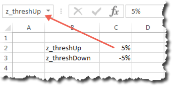
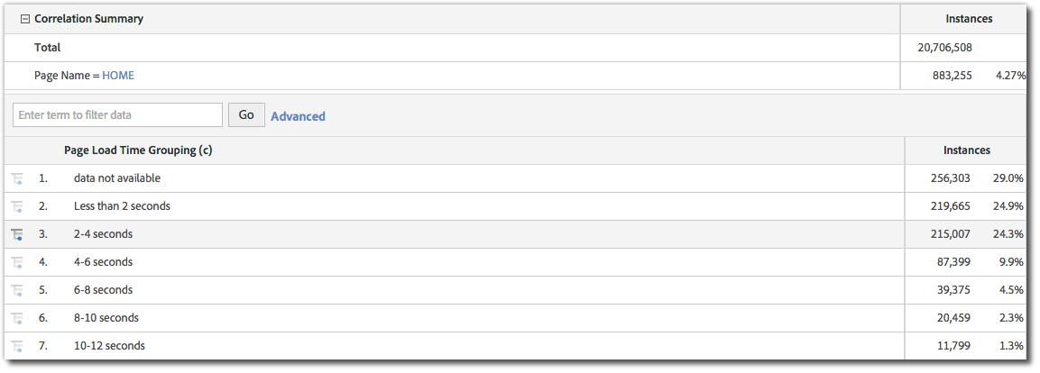
If in the audit process above, you find that you have lots of report suites, and that the variable assignments in each of them are pretty different, the odds are that you should start from scratch with new report suites and, this time, make sure that they are set-up consistently. As mentioned above, the easiest way to see this is to select all of your active suites, choose a variable type (i.e. Events, eVars or sProps) and view the settings like this:

Screen Shot 2015-12-03 at 3.27.25 PM

If you see this when selecting multiple report suites, the odds are you are in trouble, unless you manage lots of different websites that have absolutely nothing in common across them. I tend to see this issue most in the following situations:

  1. Different sites are implemented by different parts of the business and no communication exists between them or there is no centralized analytics “Center of Excellence”
  2. One business is acquired and both used the same analytics tool, but the implementations were done while the companies were separate
  3. Two businesses or business units with different websites/products had implemented separately and, only later, decide they want to combine their data
  4. A mobile team goes rogue and creates new report suites and tags all mobile sites/apps with a brand new set of variables without talking to the desktop group

Regardless of how you got there, the reason report suite inconsistency is so bad, is that salvaging it requires a massive variable reconciliation if you want to use your existing report suites and, even then, all but one suite is going to have different data in it than it did in the past. For example, let’s say that event 1 above is “Internal Searches” for two report suites and for the eight other suites has a different definition.  That means you have nine different definitions for event 1 across ten report suites. Even if you lay down the law and say that after your re-implementation, event 1 will always be “Internal Searches,” you will still have numbers that are not Internal Searches in eight out of 10 of your report suites historically. Thus, if someone looks at one of the suites that historically didn’t have event 1 as Internal Searches, for a long period of time, it will not actually be Internal Search data. Personally, I’d rather have no historical data than potentially misleading data. In addition, I think it is easier to start anew and tell the developers from all of your disparate sites that they must move their data from wherever they have it now to the new standard variable assignment list, rather than trying to map existing data to new variables using Processing Rules, DTM, VISTA Rules or other work-arounds.  Doing the latter just creates Band-Aids that will eventually break and corrupt your data once again in the future.

Here is an example of the eVars for one of my clients:

Screen Shot 2015-12-04 at 5.39.19 PM

In this case, I only compared five different report suites out of more than fifty that they have in total. As you can see, reconciling this to ultimately have a global report suite or to send all data into one suite would be quite a challenge!

Conversely, if it turns out that all of your suites have pretty good variable definition consistency, then you can move the data from the incorrect variable slots to the correct ones in your lower priority report suites and continue using your existing report suites. For example, if you have one main report suite and then a bunch of other less significant report suites (like micro-sites), you may decide that you want to keep the main suite the way it is and force all of the other suites to change and adhere to the variable definitions of the main suite. This is a totally acceptable solution and will allow you to have year over year data for your main suite at least.

However, if you go down this path, I would suggest that if there are variables that the non-main report suite uses, that they be added to the main report suite in new variable slots so that eventually all of your report suites are consistent. For example, let’s say that one of the lesser important suites has a success event #1 that is registrations, but there is no registrations event in the main suite that you want to persist. In this case, you should move event 1 in the non-main suite to the next available event number (say event 51) and then add this event 51 to the main report suite as well. If you will never have registrations in your main suite, it is still ok to label event 51 as registrations, simply disable it in the admin console. This way, you avoid any variable definition conflicts in the future. For example, if the main report suite needs a new success event they would use event 52 instead of event 51 since they now know that event 51 is taken elsewhere. The only time this gets tricky is when it comes to eVars, since they are limited to 100 for most customers, but conserving eVars is a topic for another day!

Regardless of what you find, looking at the consistency of your variable definitions is an important first step in the process.

Data Quality

As mentioned above, if the data quality for your existing implementation isn’t very good, then there are fewer reasons to not start fresh. Therefore, another step I take in the process is to determine what percent of my Success Events, eVars and sProps in my current implementation I trust. As described in this old post, data quality is paramount when it comes to digital analytics and if you aren’t willing to put your name on the line for your data, then it might as well be wrong. Even if your report suites are pretty consistent (per the previous section), there may be benefits to starting over with new report suites if you feel that the data you have is wrong or could be misleading.

When I joined Salesforce.com many years ago to manage their Omniture implementation, I had very little faith in the data that existed at the time. When doing my QA checks, it seemed like most metrics came with a list of asterisks associated with them, such that presentation slides looked like bibliographies! While I hated the idea of starting over, I decided to do it because it was the lesser of two evils. It caused some temporary pain, but in the end, helped us shed a lot of baggage and move forward in a positive direction (you can read a lot more about how we did this in this white paper). For this reason, I suggest you make data quality one of your deciding factors in the new vs. old report suite decision.

Year over Year Data

Finally, there is the issue of year over year data. As mentioned above, if your variable definitions are completely inconsistent and/or your data quality is terrible, you may not have many options other than starting with new suites for some or all of your report suites. Moreover, if your data quality is poor, having year over year flawed data isn’t much of an improvement over having no year over year data in my opinion. The only real data that you would lose if your data quality is bad is Page Views, Visits and Unique Visitors (which are pretty hard to mess up!). In most cases, I try to avoid having year over year data be the driving force in this decision. It is a factor, but I feel that the previous two items are much more important.

Sometimes, I advise my clients to use Adobe ReportBuilder as a workaround to year over year data issues. If you decide to move to new report suites, you can build an Excel report using ReportBuilder that combines two separate data blocks into one large Excel data table that can be graphed continuously. In this case, one data block contains data for a variable in the old report suite and the other data block contains data for the same data point in a different variable slot in the new report suite. But to an end user of the Excel sheet, all they see is one large table that updates when they refresh the spreadsheet.

For example, let’s imagine that you have two report suites and one has internal searches in event 1 and the other has internal searches in event 5. Then you decide to create a brand new suite that puts all internal searches into event 1 as of January 1st. In ReportBuilder (Excel), you can create one data block that has event 1 data for suite #1 for dates prior to January 1st, another data block that has event 5 data for suite #2 for dates prior to January 1st and a third data block that has event 1 data for January 1st and beyond in the new report suite. Then you simply use a formula to add the data from event1 and event 5 in the data blocks that precede January 1st and then put that data block directly next to the final data block that contains event 1 data starting January first (in the new suite). The result will be a multi-year view of internal search data that spans all three report suites. A year later, your new report suite will have its own year over year data in the new combined event 1, so eventually, you can abandon the Excel workaround and just use normal Adobe Analytics reporting to see year over year data.

While this approach may take some work, it is a reasonable workaround for the few major data points that you need to report on year over year while you are making this transition to a newer, cleaner Adobe Analytics implementation.

Justification

Sometimes, telling your boss or co-workers that that you need to re-implement or start over with new report suites can be a difficult thing to do.  In many respects, it is like admitting failure. However, if you do your homework as described above, you should have few issues justifying what you are doing as a good long-term strategy. My advice is to document your findings above and share them with those who may complain about the initiative. There will always be people who complain, but at the end of the day, you need to instill faith in your analytics data and if this is a necessary step, I suggest you do it. I heave learned over the years that the perception of your organization’s analytics team is one of the most critical things and something you should safeguard as much as you can. In our line of work, you are asking people to make changes to websites and mobile apps, partly based upon the data you are providing. That demands a high level of trust and once that trust is broken it is difficult to repair.

I also find that many folks I work with were not around when the existing implementation was done. This is mainly due to the high turnover rate in our industry, which, in turn, is due to the high demand for our skills. If you are new to the analytics implementation that you now manage, I recommend that you perform an audit to make sure what you inherited is in good shape. As described in books like this, you have a narrow window of time that is ideal for cleaning things up and asking for money if needed. But if you wait too long, the current implementation soon becomes “your problem” and then it is harder to ask for money to do a thorough review or make wholesale changes. Plus, when you first start, you can say things like “You guys were the ones who screwed this up, so don’t complain to me if we have to start it over and lose YoY data…You should have thought of that before you implemented it incorrectly or with shoddy data quality!” (You can choose to make that sound less antagonistic if you’d like!)

Avoiding a Repeat in the Future

One last point related to this topic. If you are lucky enough to be able to clean things up, reconfigure your report suites and improve your data quality, please make sure that you don’t ever have to do that again! As you will see, it is a lot of work. Therefore, afterwards, you want to put processes in place to ensure you don’t have to do it again in a few years! To do this, I suggest that you reduce the number of Adobe Analytics Administrators to only 1-2 people, even if you are part of a large organization. Adding new variables to your implementation should be a somewhat rare occurrence and by limiting administration access to a select few, you can be sure that all new variables are added to the correct variable slots. I recommend doing this through a digital analytics “center of excellence,” the setup of which is another one of the services that I provide for my clients. As they say, “an ounce of prevention is worth a pound of cure!”

Adobe Analytics, Featured

Cart Conversion by Product Price

Back in 2010, I wrote about a way to see how much money website visitors were adding to the shopping cart so that amount could be compared to the amount that was actually purchased. The post also showed how you could see this “money left on the table” by product and product category. Recently, however, I had a client ask a similar question, but one focused on whether the product price was possibly a barrier to cart conversion. Specifically, the question was asked whether visitors who add products to the cart that are between $50 and $100 end up purchasing more or less than those adding products valued at a different price range. While there are some ways to get to this information using the implementation approach I blogged about in the preceding post, in this post, I will share a more straightforward way to answer this question.

Capturing Add to Cart Value

In the preceding post, to see money left on the table, I suggested that the amount of the product being added to the cart be passed to a new currency Success Event. But to answer our new question, you will want to augment that by passing the dollar amount to a Product Syntax Merchandising eVar when visitors add a product to the cart. For example, if a visitor adds product # 111 to the cart and its price is $100, the syntax would look like this:

s.events="scAdd,event10";
s.products=";111;;;event10=100;evar30=100";

In this case, the $100 cart value is being passed to both the currency Success Event and the Merchandising eVar (I suggest rounding the dollar amount to the nearest dollar to minimize SAINT Classifications later). Both of these amounts are “bound” to the product number (111 in this example).

Once this is done and repeated for all of your visitors, you can use the new Merchandising eVar to see Cart Additions by price of item added to cart using a report like this:

Screen Shot 2015-11-26 at 12.46.00 PM

Since the new Merchandising eVar has been bound to the product added to the shopping cart, if the visitor purchases the product prior to the eVar’s expiration (normally purchase event), the eVar value will be applied to the purchase event as well for those products ultimately purchased. Therefore, when orders and revenue are set on the order summary page, each order will be “bound” to the product price value such that you can see a report that looks like this:

Screen Shot 2015-11-26 at 12.50.46 PM

Using this report, you can see how each price point performs with respect to cart to order conversion. Since you will have many price points, you will likely want to use SAINT Classifications to group your price points into larger buckets or ranges to make the data more readable:

Screen Shot 2015-11-26 at 12.55.23 PM

Once you have this, you can switch to the trended view of the report and see how each price range converts over time. Of course, you can break this down by product or external campaign code to see what factors result in the conversion rate being higher or lower than your standard cart conversion rate (Orders/Cart Additions). This analysis can be used in conjunction with my competitor pricing concept to see which products you should emphasize and de-emphasize on your online store. You can also use this new eVar in segments if you ever want to isolate cases in which a specific product price range was added to the cart or purchased.

As you can see, there are lots of handy uses for this implementation concept, so if you have a shopping cart, you may want to try it out and see what creative ways you can exploit it to further your analysis capabilities.

Adobe Analytics, Featured

Average Internal Search Position Clicked

A few years ago, I wrote an extensive post describing how to track internal search position clicks to see which internal search positions visitors tend to click on. That post showed how to track impressions and clicks for internal search positions and how to view this by search phrase. Recently, however, I had a client ask for something tangentially related to this. This client was interested in seeing the overall average search position clicked when visitors search on their website and for each search term. While the preceding post provides a way to see the distribution of clicks on internal search spots, it didn’t provide a straightforward way to calculate the overall average. Therefore in this post, I will share a way to do this for those who want to see a trended view of how far down the search results list your visitors are going.

Calculating the Average Internal Search Position Clicked

The key difference in calculating the average internal search position clicked from what I described in my previous post, is that you need to switch from using a dimension (eVar) to using a metric (Success Event). To compute the average search position, the formula we eventually need is one that divides the summation of the position numbers clicked by the number of total internal searches. For example, if I conduct a search and click on the 10th result and then another search and click on the 5th result, I have clicked on an aggregate of 15 internal search positions (10+5) and had 2 search clicks. When I divide these two elements, I can see that my average search position clicked is 7.5 (15/2). Hence, if you apply the same approach for all of your visitors, you will be able to calculate the overall average internal search position.

From an implementation standpoint, this is relatively easy. If you have internal search on your site, you are probably already setting a metric (Success Event) on the search results page to determine how often searches are taking place. If you followed my advice in this post, you would also be setting a second metric when visitors click on a result in your search result list. Therefore, the only piece you are missing is a metric that quantifies the position number clicked. To do this in Adobe Analytics you would set a new Numeric (or Counter if on latest code) Success Event with the number value of the position clicked (let’s call this Search Position). For example, if a visitor conducts a search and clicks on the 5th position, you would pass a value of “5” to the new success event. This will create the numerator needed to calculate the average search position.

Once you have done this, you have the two metrics you need to calculate the average – search position numbers and the number of search clicks. Simply create a new Calculated Metric that divides the Search Position by the # of Search Clicks to compute the average as shown here:

Screen Shot 2015-12-04 at 9.26.18 AM

This will produce a metric repost like this:

Screen Shot 2015-11-25 at 10.42.47 AM

Average Search Position by Search Phrase

Since you are most likely already capturing the search phrase when visitors search, you can also view this new Calculated Metric by search phases, by simply adding it to the dimension (eVar) report:

Screen Shot 2015-12-04 at 9.24.21 AM

This report and the preceding ones can be used to watch your search result clicks overall and by search phrase. This may help you determine if your search results are meeting the needs of your users and whether you even need to have pages and pages of search results.

One fun way I have used this type of analysis is to take my top search phrases and hand-pick specific links that I want them to go to for the top search phrases (recommended links). Then you can see if your users prefer the organic results or the ones you have picked for them (using a new eVar!). Another way to use this analysis is to see if changes made to your internal search makes the average search position clicked go up or down. Regardless of how you use it, if you are going to use internal search on your site, you may as well track it appropriately. Enjoy!

Adobe Analytics, Featured

Using Cohort Analysis in Adobe Analytics

With the latest release of Adobe Analytics, the Analysis Workspace interface now provides a way to conduct cohort analyses. The new Cohort Analysis borrows from an existing one that Adobe had previously made available for mobile implementations, but now it is available for use everywhere and with everything that you have in your Adobe Analytics implementation. In this post, I will provide a quick “how to” since I have been surprised by how few of my Adobe customers are aware of this new functionality.

Cohort Analysis Revisited

A cohort analysis is used when you want to isolate a specific event and then see how often the same folks completing that event go on to complete a future event. In the recent decade, cohort analyses became popular due to social networking tools when they were used to judge the “stickiness” of these new tools.  For example, in the early days of Twitter, people would look to see how often users who tweeted in January were still tweeting in February. In this case, the number of people who tweeted in February was a separate number from those who tweeted in January and then in February, with the latter being “cohorts.”  For more information on this topic, check out the wikipedia page here.

New Cohort Analysis Visualization

Once you are comfortable with cohort analysis as a concept, let’s look at how you can create cohort analyses in the new Adobe Analytics interface. To start, use the left navigation to access the Analysis Workspace feature of the product (note that if you are on an older version of Adobe Analytics, you may not have Analysis Workspace enabled):

Screen Shot 2015-11-16 at 4.52.36 PM

In the Analysis Workspace area, you will click the visualizations tab to see all of the potential visualizations:

Screen Shot 2015-11-16 at 4.53.40 PM

From here, you will drag the “Cohort Table” visualization over to your reporting canvas and should see this:

Screen Shot 2015-11-16 at 4.55.51 PM

At this point, you need to select your timeframe/granularity (i.e. Month, Week, Day) using the drop-down box and then drag over the metric you want visitors to have performed to be included in the cohort. This is done by clicking on the components tab at the top-left:

Screen Shot 2015-11-16 at 5.00.06 PM

Keep in mind that you cannot use calculated metrics and some other out-of-box metrics as inclusion metrics, but you can use any of your raw success events. Also, if you click on the “Metrics” link, you can see all metrics and do a search filter, which is very handy. When contemplating your inclusion metric, think about what actions you want visitors to take to be included in the cohort. For example, if you are looking for people who have ordered, you would use the Orders metric, but if you are interested in people who have viewed content on your site, you may use a Content Views success event. As an example, let’s use the latter and build a cohort of visitors who have viewed content on the site and see how many of those visitors come back to the website within x number of days. To do this, we would change the granularity to days, add a Content Views metric as the inclusion metric and then add the Visits metric as the return metric so the cohort analysis looks like this:

Screen Shot 2015-11-16 at 5.06.46 PM

You may also notice that you have the option to increase the number of times each metric has to occur before people would be be added to the inclusion or return portion of the cohort. By default the number is one, meaning that the above cohort is looking for cases in which one or more Content Views took place and then one or more return Visits took place. To narrow down the cohort, we could easily increase these numbers to force visitors to have viewed more content to be included in the cohort or returned to the site more than once to be included. But in this example, we’ll keep these set to one and run the report to see this:

Screen Shot 2015-11-16 at 5.10.43 PM

Here we can see that on November 3rd, we had 6,964 unique visitors who had Content Views and that of those who viewed content on that day, 13% (892 Visitors) returned to the site within one day (had a return Visit). Keep in mind that all numbers shown in cohort analyses are unique visitor counts. The color shading shows the intensity of the cohort relative to the other cohort cells. By looking horizontally, you can see the drop-off by day for each cohort starting date and as you look vertically, the days will follow a cascading pattern with the newest starting dates having the fewest return dates like this:

Screen Shot 2015-11-16 at 5.17.03 PM

Changing the granularity from Day to Week, would work the same way, but have far fewer cohorts unless you extend your timeframe:

Screen Shot 2015-11-16 at 5.23.53 PM

Here is an example in which I have made both the inclusion and return metric the same thing (Content Views), but made viewing two pieces of content required to be eligible for the return cohort:

Screen Shot 2015-11-16 at 5.25.40 PM

Here you will notice that requiring two return content views reduced the first (Nov 3rd) cohort from 13% down to 9%. You can use these settings to identify interesting patterns. Since you can also make as many cohorts as you want using all of your success events, the amount of information you can glean is enormous.

Putting Cohorts To Use

Once you learn how to generate cohort analyses, you may ask yourself “Ok, now what do I do with these?” That is a valid question. While a blog post isn’t the best venue for sharing all you can do with cohort analyses, let me share a couple ways I would suggest you use them. The first way is to apply segments to your cohorts. For example, you may want to determine if visitors from a specific region perform better than another, or if those using your responsive design pages are more likely to return. Here is an example in which the previous cohort is segmented for Microsoft browsers to see if that makes the cohort better or worse:

Screen Shot 2015-11-16 at 5.35.19 PM

In this case, our Nov 3rd cohort went from 13% to 8% just based upon browser. Since you probably have many segments, this provides more ways you can slice and dice these cohorts and adding a segment is as easy as dropping it into the top of your Analysis Workspace page like this:

Screen Shot 2015-11-16 at 5.37.29 PM

Keep in mind that any segment you apply will be applied to both the inclusion and return criteria. So in the preceding scenario, by adding a Microsoft Browser segment, the inclusion visitor count only includes those visitors who had a Content View event and used a Microsoft browser and the return visits also had to be from a Microsoft browser.

But my favorite use for cohorts is using a semi-hidden feature in the report. If you have a particular cohort cell (or multiple cells) that you are interested in, you can right-click on it and create a brand new segment just for that cohort! For example, let’s say we look at our original content to return visit cohort:

Screen Shot 2015-11-16 at 5.10.43 PM

Now, let’s say something looks suspicious about the Nov 3rd – Day 4 cohort, which is at 3% (top-right cell). We can right-click on it to see this:

Screen Shot 2015-11-16 at 5.45.25 PM

Then clicking will show us the following pre-defined segment in the segment builder:

Screen Shot 2015-11-16 at 5.46.24 PM

Now you can name and save this segment and use it in any analysis that you may need in the future!  You can also make changes to it if you desire before saving.

While there is much more you can do with cohorts, this should be enough for you to get started and begin playing around with them. Enjoy!

Adobe Analytics, Featured

Sharing Calculated Metrics in Adobe Analytics

Over the past year, Adobe Analytics users have noticed that the product has moved to a different model for accessing/editing/creating analytics components such as Calculated Metrics, Segments, etc… In this post, I want to touch upon one aspect that has changed a bit – the sharing of calculated metrics.


Sharing Calculated Metrics – The Old Way

In the older interface of Adobe Analytics (pre version 15.x), it was common to create a calculated metric, then select multiple report suites and apply that calculated metric to multiple suites. For example, if you wanted to create a Null Search ratio, you would create the formula and then select your report suites and save it. Here is an example in which a few calculated metrics have been applied to thirteen report suites:

Screen Shot 2015-11-16 at 9.08.44 AM

This approach would save you the work of creating the metric thirteen separate times, which could be a real pain, especially if you had hundreds of report suites.

However, employing this [old] preferred approach of sharing calculated metrics can actually make things a bit confusing when you switch over to the new version of Adobe Analytics. When using the new Calculated Metrics manager, the old approach will  cause you to see the same calculated metric multiple times, since it shows all calculated metrics for all report suites in the same window. Here is how the same calculated metric looks in the more updated version:

Screen Shot 2015-11-16 at 8.59.08 AM

In this case, you would see the same metric for as many report suites as it was associated with in your implementation. While you could keep all of these different versions, doing so presents the following potential risks:

  1. It can be confusing to novice end-users
  2. If someone makes a change to one of the calculated metrics (in one report suite), it can deviate from the others, so that you lose integrity of the metric across your implementation/organization
  3. If you want to make a change to a calculated metric in the future, you have to do it multiple times

In addition to these risks, in the newest version of Adobe Analytics, there are some cool new ways to share metrics that don’t require this duplication of the same metric hundreds of times.

Sharing Calculated Metrics – The New Way

If you were to make a new calculated metric now, using the latest version of Adobe Analytics, you could create the metric once and simply share it to all users or groups of users. Once you have created your metric, you use the share feature and select “All” as shown here:

Screen Shot 2015-11-16 at 9.23.00 AM

Doing this allows you to see the calculated metric in every report suite, without having multiple versions of it. As shown here, you will still see the calculated metric when you click “Show Metrics” from within the Adobe Analytics interface:

Test

Therefore, if you have twenty calculated metrics across fifty report suites, you would have twenty rows in your calculated metric manager instead of one thousand! This makes your life as an administrator much easier in the future.

Moving From The Old to the New

So what if you already have a lot of metrics and they are shown multiple times in your calculated metrics manager? If you decide you want to trim things down and go to the newer approach, you would want to do the following:

  1. I suggest creating a corporate login as outlined in this blog post. This is a centralized admin login that the core analytics team maintains
  2. Review all of your shared bookmarks and dashboards to find all cases in which calculated metrics you are about to remove are used
  3. Copy each of the existing calculated metrics using the corporate login ID (described in step 1) and share it across all or designated users
  4. Once this is done, you can delete all of the duplicate versions of the calculated metric
  5. Go back to the shared bookmarks and dashboards using the old version of calculated metrics and replace them with the newly created shared version

While this may take some time, it will free up time in the future, since it will minimize the number of calculated metrics you have to maintain in the long run. I also find that it is beneficial to periodically review all of your shared reports and calculated metrics and do a clean-up. This process forces you to do this and you may be amazed how many you have, how many you can remove and how many are wrong!

Analysis, Conferences/Community

Pairing Analytics with Qualitative Methods to Understand the WHY

Rudimentary analytics can be valuable to understand what your customers and prospects do. However, the true value from analytics comes from marrying that with the why – and more importantly, understanding how to overcome the why not.

At Analytics that Excite in Cincinnati this month, I spoke about qualitative methods that analysts can use to better understand people’s behavior and motivations. Check out the presentation on SlideShare.

analytics-and-qualitative-to-understand-why

Adobe Analytics, Featured

Creating Weighted Metrics Using the Percentile Function

When using Adobe Analytics, one of the things that has been a bit annoying historically is that when you sort by a calculated metric, you often see really high percentages for rows that have very little data. For example, if you create a click-through rate metric or a bounce rate metric and sort by it, you may see items of 100% float to the top, but when looking at the raw instances, the volume is so low that it is insignificant. Here is an example of a case where you may be capturing onsite searches by term (search criteria) and clicks on search results for the same term (as outlined in this post):

Screen Shot 2015-10-24 at 12.51.07 PM

In this case, it is interesting to see that certain terms have a highly disproportionate number of clicks per search, but if each is searched only once, it isn’t that statistically relevant. To get around this, Adobe Analytics customers have had to export all data to Microsoft Excel, re-create the calculated metrics, delete all rows with fewer than x items (searches in this case) and then sorted by the click-through rate. What a pain! That is a lot of extra steps!

But now, thanks to the new Derived Metrics feature of Adobe Analytics, this is no longer required. It is now possible to use more complex functions and formulas to narrow down your data such that you can sort by a calculated metric and only see the cases where you have a higher volume of instances. In this post, I will demonstrate exactly how this is done.

Using the Percentile Function

The key to sorting on a calculated metric is the use of the new PERCENTILE function in Adobe Analytics. This function allows you to choose a percentile within a list of values and use that in a formula. To illustrate this, I will continue the onsite search example from above. While the click-through rate formula used above is accurate, we want to create a report that only shows the click-through rate when search criteria have at least x number of searches. However, since the number of unique search criteria will vary greatly, we cannot simply pick a number (like 50 or more), because we don’t know how many searches will be performed for the chosen date range. For example, one of your users may choose one day, in which greater than 5o searches is unlikely, but another user may choose a full year, which will make greater than 50 a huge number of items with a very long tail. To deal with all scenarios, you can use the PERCENTILE function, which will look at all of the rows for the selected date range and allow you to calculate the xth percentile of that list. Hence, the threshold is relative to the date range chosen with respect to the number of instances that have to take place for it to show up in the calculated metric. Since this can be a bit confusing, let’s look at an example:

To start, you can build a new calculated metric that shows you what the PERCENTILE formula will return at a specific percentile. To do this, open the Calculated Metrics builder and make the following formula:

Screen Shot 2015-10-24 at 1.04.27 PM

Since there may be a LOT of unique values for search criteria, I am starting off with a very high percentile (99.5%) to see how many searches it takes to be in the 99.5% percentile. This is done by selecting the core metric (Searches in this case) and then making the “k” value 99.5 (Note: You can also figure out the correct “k” value by using the PERCENTILE function in Microsoft Excel with the same data if you find that easier). Once you are done, save this formula and add it to your search criteria report so you see this:

Screen Shot 2015-10-24 at 1.08.04 PM

This formula will have the same value for every row, but this is ok since we are only using it temporarily to figure out if 99.5% is the right value. In this case, what we see is that at a 99.5% percentile, anything with over 18 searches will show us the search click-through rate and anything below 18 searches will not. Now it is up to you to make your judgement call. Is 18 too high in this case?  Too low? If you want to raise, it, simply raise the “k” value in the formula to 99.8 or something similar.

While doing this, keep in mind, that changing your date range (say choosing just one day), will change the results as well. The above report is for 30 days of data, but look what happens when we change this to just one day of data:

Screen Shot 2015-10-24 at 1.13.14 PM

As you can see, the threshold changed from 18 to 6, but the number of overall searches also went down, so the 99.5% percentile seems to be doing its job!

Once you have determine what your ideal percentile “k” value is, it is now time to use this formula in the overall click-through rate formula. To do this, you need to create an IF statement and use a GREATER THAN function as well. The goal is to tell Adobe Analytics that you want it to show you the search click-through rate only in cases where the number of searches is greater than the 99.5% percentile. In other cases, you want to set the value to “0” so that when you sort in descending order, you don’t have crazy percentages showing up at the top, even though there are low values. Here is what the formula will look like:

Screen Shot 2015-10-24 at 1.18.22 PM

While this may look a bit intimidating at first, if you look at its individual components, all it is really doing is calculating a click-through rate only when the number of searches is above our chosen threshold. Now you can add this metric to your report and see the results:

Screen Shot 2015-10-24 at 1.22.26 PM

As you can see, this new calculated metric is no different from the existing one in cases where the number of searches is greater than the 99.5% threshold. But look what happens when we sort by this new Weighted Click-Through Rate metric:

Screen Shot 2015-10-24 at 1.24.22 PM

Unlike the report shown at the beginning of this post, we don’t see super high percentages for items with low numbers of searches. All of the results are above the threshold, which makes this report much more actionable. If you want, you can verify this by paging down to the point where our new weighted metric is 0% (in this case when searches are under 18):

Screen Shot 2015-10-24 at 1.28.11 PM

Here you can see that searches are less than 18 and that the previous click-through rate metric is still calculating, but our new metric has hard-coded these values to “0” for sorting purposes.

Final Thoughts

As you can see, using the PERCENTILE function can be a real time-saver. While this example is related to onsite search, the same concept can be applied to any calculated metric you have in your Adobe Analytics implementation. In fact, Adobe has created a similar metric for Weighted Bounce Rate that is publicly available for all customers to use for marketing campaigns. So any time you want to sort by a calculated metric and not see rows with low numbers of data, consider using this technique.


Excel Tips, Featured

The Power of Combining Number Formatting and Conditional Formatting in Excel

I build a lot of dashboards in Excel, and I’m a bit of a stickler when it comes to data visualization. This post walks through some of the ways that I use custom number formatting in conjunction with conditional formatting and named ranges to add small — but powerful — visual cues to enhance the “at-a-glance” readability of numbers in a dashboard:

  • Adding an up or down arrow if (and only if) the % change exceeds a specified threshold
  • Adding green/red color-coding to indicate positive or negative if (and only if) the change exceeds the specified threshold
  • Including a “+” symbol on positive % changes (which I think is helpful when displaying a change)

You can download the sample file that is the result of everything described in this post. It’s entirely artificial, but I’ve tried to call out in the post how things would work a little differently in a real-world situation.

Step 1: Set Up Positive/Negative Thresholds

I always-always-always set up two named ranges for an “up” threshold and a “down” threshold. That’s because, usually, it’s silly to declare something a positive change if it increased, say, 0.1% week-over-week. It’s a bit of a pet peeve, actually. I don’t want to deliver a dashboard that is going to look like a Christmas tree because no metric stayed exactly flat from one period to another, so every metric is colored red or green. (Red/green should never be the sole indicator of a change, as that is not something that can be perceived by a non-trivial percent of the population that has red-green colorblindness. But, it is a nice supplemental visual cue for everyone else.)

Typically, I put these threshold cells on their own tab — a Settings worksheet that I ultimately hide. But, for the sake of simplicity, I’m putting it proximate to the other data below for this example. I like to put the name I used for the cell in a “label” cell next to the value, but this isn’t strictly necessary. The key is to actually have the call named, which is what the arrow below illustrates:

format1

(One other aside: Sometimes, I have a separate set of thresholds for “basis point” comparisons — if I’ve showing the change in conversion rate, for instance, it often makes more sense to represent these as basis points rather than as “percent changes of a percent.”)

Step 2: Set Up Our Test Area

This is the massively artificial part of this exercise. Cell C6 below is the number we’ll play around with, while cells C7 and C8 are simply set to be equal to C6 and will show a couple of different ways that that value can be represented with better formatting. In the real world, there would just be one cell with whatever formula/reference makes sense and the most appropriate formatting for the situation used.

format2

For Formatted value 1, we’re going to put a +/- indicator before the value, and an up or down graphical indicator after it. We’re also going to turn the cell text green if the number is positive and exceeds our specified threshold, and we’re going to turn it red if the number is negative and exceeds that threshold.

For Formatted value 2, we’re going to add the +/- indicator, one decimal place, and have the up/down arrow in the cell right next to the number. That arrow will only show up if the positive/negative value exceeds the threshold, and it will be colored green or red as appropriate.

Basically…this:

format13

You would never use both Formatted value 1 and Formatted value 2, but they both have their place (and you could even do various hybrids of the two).

Step 3: Add a Custom Number Format

Let’s start with Formatted value 1. Right-click on cell C6 and select Format cells…. On the Number tab, select Custom and enter the criteria below (I usually wind up opening Character Map to grab the up/down arrows — these are available in Arial and other non-symbol fonts):

format3

Custom number formats are crazy powerful. If you’re not familiar/comfortable with using them, Jon Peltier wrote an excellent post years ago that digs into the nitty-gritty. But, the format shown above, in a nutshell:

  • Adds a “+” sign before positive numbers
  • Adds up/down indicators after positive/negative numbers
  • Adds no indicator if the value is zero

Note that I’m not using the “[color]” notation here because I only want the values to appear red/green if the specified thresholds are exceeded.

Step 4: Add Color with Conditional Formatting

We now need to add conditional formatting to Formatted value 1 so that it will appear as red or green based on the specified thresholds. Below is the rule for adding green. (By default, Excel tries to make cell values in conditional formatting absolute cell references — e.g., $C$7. If you want this rule to apply to multiple cells, you need to change it to a relative reference or a hybrid. Conditional formatting is extraordinarily confusing every since Excel 2007…but then it totally makes sense once you “get it.” It’s worth putting in the effort to “get.”)


format4

(The “,FALSE” in the formula above is not strictly necessary, but my OCD requires that I include it).

With that rule, we then click Format and set the font color to green:

format5

We then need to repeat the process for negative values, using z_threshDown instead of z_threshUp, and setting the font color to red when this condition is true:

format6

That’s really it for Formatted value 1.

Below is how that value looks if the number is negative but does not exceed the z_threshDown threshold:

format7

Below is how the value appears if we do exceed the threshold with a negative number:

format8

The same process works for positive values, but how many screen caps do we actually want in this post? Try it out yourself!

Step 5: Adding an Indicator in a Separate Cell

Another approach I sometimes use is an indicator in its own cell, and only showing the indicator if the specified thresholds are exceeded. That’s what we’re going to do with Formatted value 2.

For this, we add an IF() formula in cell D8 that uses z_threshUp and z_threshDown to determine if and which indicator to display:

format9

We’ll want to add the same conditional formatting to cell D8 that we added to cell C7 to get the arrows to appear as red or green as appropriate.

Step 6: A Slightly Different Custom Number Format

This is very similar to Step 3, but, in this case, we’ve decided we want to include one value after the decimal, and, of course, we don’t need the up/down indicator within the cell itself:


format10

With these updates, we now have something that looks like this:

format12

Or, if the value exceeds the negative threshold, like this:

format13

Step 7: Checking for Errors

We’ve already covered all the basics, but it’s worth adding one more tip: how to prevent errors (#N/A or #REF or #DIV/0) from ever showing up in your dashboard. If the dashboard is dynamically pulling data from other systems, it’s hard to know if and when a 0 value or a missing value will crop up that breaks a formula.

In our artificial example below, I’ve entered an error-generating formula in cell C6. The result in our Formatted value cells is NOT pretty:


format14

There is a super-simple fix for this: wrap every value in an IFERROR() function:

format15

I love IFERROR(). No matter how long the underlying formula is, I simply add IFERROR() as the outer-most function and specify what I want to appear if my formula resolves to an error. Sometimes, I make this be a hyphen (“-“), but, in this example, I’m just going to leave the cell blank (“”):

format16

Now, if my value resolves to an error, the Formatted value values don’t expose that error to the recipient of the report:

format17

In Summary…

Recurring dashboards and reports should be as automated as possible. When they are, it’s impossible to know which specific values should be the “focus” from report to report. Conditional formatting and custom number formatting can automatically make the most dramatically changed (from a previous period or from a target) values “pop.” The recipients of your reports will love you for adding the sort of capabilities described here, even if they don’t realize that’s why they love you!

And, remember, you can download the sample file and play around with the thresholds and values to see all the different ways that the Formatted values will display!

And a Final Note about TEXT()

The TEXT() function is a cousin of custom number formatting. It actually uses the exact same syntax as custom number formatting. I try not to use it if I’m simply putting a value in a cell, because it actually converts the cell value to be a text string, which means I can’t actually treat the value of the cell as a number (which is a problem for conditional formatting, and is a problem if I want to use that cell’s value in conjunction with other values on the spreadsheet).

But, occasionally, I’ll want to put a formatted value in a string of text. The best example of this is a footnote that explains when I have red/green values or arrows appearing. As described in this post, I base that logic on z_threshUp and z_threshDown, but my audience doesn’t know that. So, I’ll add a footnote that uses TEXT() to dynamically insert the current threshold values — well-formatted — into a statement, such as:

="The up arrow appears if the % change exceeds "&TEXT(z_threshUp,"+0%;-0%")&"."

Nifty, huh? What do you think?

Adobe Analytics, Featured

Product Finding Methods

Product Finding Methods, is a topic that I have touched upon briefly in past blog posts, but not in great detail. Some others have also talked about it, but in a quick Google search, the most relevant post I found on the subject was this post from back in 2008. Therefore, in this post, I thought I would explore the topic and how it can be applied to both eCommerce and non-eCommerce sites.

What is Product Finding Methods?

I define Product Finding Methods as the way that website/app visitors use to find products that they ultimately purchase. For example, if a visitor comes to your website and conducts a search and then finds a product they like, then search would be the Product Finding Method that should be associated with that product. Most websites have about 5-10 different Product Finding Methods, such as:

  • Internal Search
  • Navigation/Browsing
  • Internal Campaigns/Promos
  • Wishlist/Favorites/Registries
  • Collections
  • Cross-Sell
  • Campaign Landing Pages

These are usually the main tools that you use to drive visitors to products, with the goal of getting them to add items to their online shopping cart. Having a Product Finding Methods report is useful when you want to see a holistic view of how visitors are getting to your products, but it can also be used to see how each product or product category is found. In most cases, the KPI that you care about for Product Finding Methods is Orders or Revenue because, while it may be interesting to see which methods get visitors to add items to the shopping cart, you make money when they order products and pay you!

Why Implement Product Finding Methods?

So why should you care about Product Finding Methods? Most organizations implementing this do so to identify which method is most successful at driving revenue. Since websites can be tweaked to push visitors to one finding method over another, if you have one that works better than another, you can work with your design team to either fix the lagging one or push people to the better one. For example, if your internal search functionality rarely produces orders, there may be something inherently wrong with it. Even if you track the internal search click-through rate and that is ok, without the Product Finding Methods report, you may not know that those clicking on results are not ultimately buying. The same may be true for your internal promotions and other methods. I once had a client that devoted large swaths of their product pages to product cross-sell, but never had a Product Finding Methods report to show them that cross-sell wasn’t working and that they were just wasting space.

Another use of Product Finding Methods is to see if there are specific products or product categories that lend themselves to specific finding methods. For example, you may have products that are “impulse” buys that do very well when spotlighted in a promotion on the home page, but don’t do so well when found in search results (or vice versa). Having this information allows you to be more strategic in what you display in internal promotions. By creating a “Look to Book” Calculated Metric (Orders/Product Views) within a Product Finding Methods report, it is easy to see which products do well/poorly for each finding method.

Finally, once you have implemented Product Finding Methods, you can use them in Segments. If you have a need to see all visits or visitors who have used both Internal Search and a Registry to find products, you can do this easily by selecting those two methods in the Segment builder. Without Product Finding Methods being implemented, creating a viable segment would be very cumbersome, likely involving  a massive amount of Page-based containers.

How Do You Implement Product Finding Methods?

So let’s say that you are intrigued and want to see how visitors are finding your products. How would you implement this in Adobe Analytics?

Obviously, if you are looking to breakdown Orders and Revenue (which are Success Events) by a dimension, you are going to need a Conversion Variable (eVar). This eVar would capture the most recent Product Finding Method that the user interacted with, regardless of whether that Finding Method led directly or indirectly to a product. To do this, you would work with your developers to identify all of your Product Finding Methods and determine when each should be passed to the Product Finding Methods eVar. For example, the “Internal Search” product finding method would always be set on the search results page.

However, before we go any further, we need to talk about Product Merchandising. If you are not familiar with the Product Merchandising feature of Adobe Analytics, I suggest that you read my post on that now. So why can we not use a traditional eVar to capture the Product Finding Method? The following example will illustrate why. Imagine that Joe visits our site and clicks on a home page promotional campaign and you have your developer set the Product Finding Methods eVar with a value of “Internal Campaign.” Then Joe finds a great product and adds it to the shopping cart. Next Joe does a search on our site, so you have your developer set the Product Finding Methods eVar with a value of “Internal Search.” Joe proceeds to add another product to the shopping cart and then checks out and purchases both products. In this scenario, which Product Finding Method will get credit for each product? If you said “Internal Search” you would be correct because it was the “most recent” value prior to the Purchase Success Event firing. Unfortunately, that is not correct. In this scenario, product #1 should have “Internal Campaign” as its finding method and product #2 should have “Internal Search” as the finding method. Because we need each product to have its own eVar value, we need to use the Product Merchandising feature, which allows us to do that.

For Product Finding Methods, it is common to use the “Conversion Syntax” methodology of Product Merchandising since we often don’t know when the visitor will ultimately get to a product or which product it will be. By using the “Conversion Syntax” method, we can simply set the value when the Product Finding Method occurs and have it persist until the visitor engages in some action that tells us which product they are interested in (the “binding” Success Events). Normally, I recommend that you “bind” (or associate the Product Finding Method with the product) when visitors view the Product Detail Page, perform a Cart Addition, engage with a Product Quick View or other similar product-related actions. These can be configured in the Administration Console as needed.

Once you have navigated the murky waters of Product Merchandising, set-up your Product Finding Methods eVar and worked with your developers to pass the values to the eVar, you will see a report that looks something like this:

Product Finding Method


From this report, you can then use breakdowns to breakdown each Product Finding Method by Product ID:

Product Finding Methods Breakdown

If you have SAINT Classifications setup for your Products Variable, you can see the same reports for things like Product Category, Product Name, Product Type, etc… All of these reports are bi-directional, so if you wanted to see the most popular Product Finding Methods for a specific product, all you would do is open the Products report and then break it down by the Product Finding Method eVar.

What About Deep-Links?

One question you may be asking yourself is: “What happens if visitors deep-link directly to a product page on my website and there is no Product Finding Method?” Great question! If you don’t account for this scenario, you would see a “None” row in the Product Finding Methods eVar report for those situations. In that case, the “None” row can be explained as “No Product Finding Method.” But one tip that I will share with you is that you can set a default value of the referring marketing channel in your Product Finding Methods eVar on the first page of the visit. If you can identify the marketing channel (Paid Search, SEO, E-mail, etc…) from which visitors arrive to your site, you can pass that channel to the Product Finding Methods eVar when the visit begins. Doing so will establish a default value so that if a product “binding” event takes place before any of your onsite product finding methods are activated, those products will be bound to your external marketing channel. This gives you more information than the “None” row, but still allows you to quantify what percent of your products have an internal vs. external product finding method. Obviously, to use this tip, you have to be able to identify the external marketing channel of each visit so that it can be passed to the eVar. I tend to do this by some basic rules in JavaScript that analyze the referrer and any campaign tracking codes I am already using. You can see a version of this by looking at the first report above in row five labeled “external campaign referral,” and notice that no “None” row exists in that report.

Non-eCommerce Uses

So what if you don’t sell products on your website? Does that mean you cannot use Product Finding Methods? Of course not! Even if you don’t sell stuff, there are likely uses for the above implementation. For example, if you manage a research site, you probably have visitors looking for content. In that case, your content is your product and you may be storing your content ID’s in the Products variable. This means that you can capture the different methods that your visitors use to find your content and assign each Content ID with the correct Product Finding Method.

If you manage a B2B website, you have product pages, but you may not sell the actual product online. In this case, the implementation for eCommerce will work the same way, but instead of Orders and Revenue, you may make the final Success Event Leads Completed. You can also see how visitors find your product videos, pricing sheets, etc…

Similar approaches can be employed for non-profit sites, government sites and so on. If you work with a non-eCommerce site, you may just have to think a bit more creatively about what your finding methods might be, what your “products” are and which binding events make sense. As long as you understand the general concept: Figuring out how visitors make their way to the stuff you care about, you will be able to find a way to use Product Finding Methods in your implementation.

If you have questions or other approaches related to this topic, feel free to leave a comment here or ping me at @adamgreco. Thanks!

Adobe Analytics, Reporting

Sharing Analytics Reports Internally

As a web analyst, one of your job functions is to share reports and data with your internal stakeholders. There are obviously many different ways to do this. Ideally, you are able to meet with stakeholders in person, share your insights (possibly using some of the great techniques espoused in this new podcast!) and make change happen. However, the reality of our profession is that there are always going to be the dreaded “scheduled reports” that either you are sending or maybe receiving on a daily, weekly or monthly basis. I recall when I worked at Salesforce.com, I often looked at the Adobe Analytics logs and saw hundreds of reports being sent to various stakeholders all the time. Unfortunately, most of these reports are sent via e-mail and end up in a virtual black hole of data. If you are like me and receive these scheduled reports, you may use e-mail rules and filters to stick them into a folder/label and never even open them! Randomly sending recurring reports is not a good thing in web analytics and a bad habit to get into.

So how do you avoid this problem? Too much data has the ability to get your users to tune out of stuff all together, which will hurt your analytics program in the long-run. Too little data and your analytics program may lose momentum. While there is no perfect answer, I will share some of the things that I have seen work and some ideas I am contemplating for the future. For these, I will use Adobe Analytics examples, but most should be agnostic of web analytics tool.

Option #1 – Be A Report Traffic Cop

One approach is to manually manage how much information your stakeholders are receiving.  To do this, you would use your analytics tool to see just how many and which reports are actually being sent by your users. In Adobe Analytics, Administrators can see all scheduled reports under the “Components” area as shown here:

Report List

Here we can see that there are a lot of reports being sent (though this is less than many other companies I have seen!). You can also see that many of them have errors, so those may be ones to address immediately. In many cases, report errors will be due to people leaving your company. Some of these issues can be addressed in Adobe by using Publishing Lists, which allow you to easily update e-mail addresses when people leave and new people are hired, without having to manually edit the report-specific distribution list.

Depending upon your relationship with your users, you may now be in a position to talk to the folks sending these reports to verify that that are still needed. I often find that a lot of these can be easily removed, since they were scheduled a long time ago and the area they address is no longer relevant.

Another suggestion is to consider creating a report catalog. I have worked with some companies to create an Excel matrix of who at the company is receiving each  recurring report, which provides a sense on how often your key stakeholders are being bombarded. If you head up the analytics program, you may want to limit how many reports your key stakeholders are getting to those that are more critical so you maximize the time they spend looking at your data. This is similar to how e-mail marketers try to limit how many e-mails the same person receives from the entire organization.

Option #2 – Use Collaboration Tools Instead of E-mail

Unless you have been under a rock lately, you may have heard that intra-company collaboration tools are making a big comeback. While Lotus Notes may have been the Groupware king of the ’90s, tools like Chatter, Yammer, HipChat and Slack are changing the way people communicate within organizations. Instead of receiving silo’d e-mails, more and more organizations are moving to a shared model where information flows into a central repository and you subscribe or are notified when content you are interested in appears. Those of you who read my “thesis” on the Slack product know, I am bullish on that technology in particular (since we use it at Analytics Demystified).

So how can you leverage these newer technologies in the area of web analytics? It is pretty easy actually. Most of these tools have hooks into other applications. This means that you can either directly or indirectly share data and reports with these collaboration tools in a way that is similar to e-mail. Instead of sending a report to Bill, Steve and Jill, you would instead send the report to a central location where Bill, Steve and Jill have access and already go to get information and collaborate with each other. The benefit of doing this is that you avoid long threaded e-mail conversations that waste time and are very linear. The newer collaboration tools are more dynamic and allow folks to jump in and comment and have a more tangible discussion. Instead of reports going to a black hole, they become a temporary focal point for an internal discussion board, which brings with it the possibility (no guarantee) of real collaboration.

Let’s look at how this might work. Let’s assume your organization uses a collaboration tool like Slack. You would begin by creating a new “channel” for analytics reports or you could simply use an existing one that your desired audience is already using. In this example, I will create a new one, just for illustration purposes:

New Channel

Next, you would enable this new channel to receive e-mails into it from external systems. Here is an example of creating an e-mail alias to the above channel:

Alias


Next, instead of sending e-mails to individuals from your analytics tool, you can send them to this shared space using the above e-mail address alias:

Screen Shot 2015-08-27 at 9.40.28 AM

The next time this report is scheduled, it will post to the shared group:

Posted

Now you and your peers can [hopefully] collaborate on the report, add context and take action:

Reaction

Final Thoughts

These are just a few ideas/tips to consider when it comes to sharing recurring/scheduled reports with your internal stakeholders. I am sure there are many other creative best practices out there. At the end of the day, the key is to minimize how often you are overwhelming your constituents with these types of repetitive reports, since the fun part of analytics is when you get to actually interpret the data and provide insights directly.

Adobe Analytics, Excel Tips, Featured

Working with Variable-Row-Count Adobe Report Builder Queries

I use Adobe Report Builder a lot. It’s getting to the point where I have to periodically reassure my wife that my relationship with the tool is purely platonic.

One of the situations I often run into with the tool is that I have a query built that will have a variable number of rows, and I then want to have a pivot table that references the data returned from that query. For instance, if I want to put start/end dates for the query in a couple of cells in Excel, and then plot time-series data, the number of rows returned will vary based on the specific start and end dates returned. This can present some challenges when it comes to getting from a raw query to a clean visualization of the returned data. Fortunately, with some crafty use of COUNTA(), pivot tables, and named ranges, none of these challenges are insurmountable.

The example I’m walking through below gets fairly involved, in that it works from a single Report Builder query all the way through the visualization of multiple sparklines (trends) and totals. I chose this example for that reason, even though there are many situations that only use one or two of the techniques described below. As noted at the end of the post, this entire exercise takes less than 10 minutes once you are comfortable with the approach, and the various techniques described are useful in their own right — just steroid-boosted when used in conjunction with each other.

The Example: Channel Breakdown of Orders

Let’s say that we want to look at a channel breakdown of orders (it would be easy enough to have this be a channel breakdown of visits, orders, revenue, and other metrics and still work with a single Report Builder query, but this post gets crazy enough with just a single metric). Our requirements:

  • The user (with Report Builder installed) can specify start and end dates for the report; OR the start and end dates are dynamically calculated so that the report can be scheduled and sent from within Report Builder
  • For each of the top 4 channels (by orders), we want a sparkline that shows the daily order amount
  • We want to call out the maximum and minimum daily values for orders during the period
  • We want to show the total orders (per channel) for the period

Basically, we want to show something that looks like this, but which will update correctly and cleanly regardless of the start and end data, and regardless of which channels wind up as the top 4 channels:

Final Visualization

So, how do we do that?

A Single Report Builder Query

The Report Builder query for this is pretty easy. We just want to use Day and Last Touch Channel as dimensions and Orders as a metric. For the dates, we’ll use cells on the worksheet (not shown) designated as the start and end dates for the query. Pretty basic stuff, but it returns data that looks something like this:

Basic Report Builder Query

This query goes on a worksheet that gets hidden (or even xlVeryHidden if you want to get fancy).

A Dynamic Named Range that Covers the Results

We’re going to want to make a pivot table from the results of the query. The wrinkle is that the query will have a variable number of rows depending on the start/end dates specified. So, we can’t simply highlight the range and create a pivot table. That may work with the initial range of data, but it will not cover the full set of data if the query gets updated to return more rows (and, if the query returns fewer rows, we’ll wind up with a “(blank)” value in our pivot table, which is messy).

To work around this is a two-step process:

  1. Use the COUNTA() function to dynamically determine the number of rows in the query
  2. Define a named range that uses that dynamic value to vary the scope of the cells included

For the first step, simply enter the following formula in a cell (this can also be entered in a named range directly, but that requires including the sheet name in the column reference):

=COUNTA($A:$A)

The COUNTA() function counts the number of non-blank cells in a range. By referring to $A:$A (or, really, A:A, would work in this case), we will get a count of the number of rows in the Report Builder query. If the query gets refreshed and the number of rows changes, the value in this cell will automatically update.

Now, let’s name that cell rowCount, because we’re going to want to refer to that cell when we make our main data range.

rowData Named Cell

Now, here’s where the magic really starts to happen:

  1. Select Formula >> Name Manager
  2. Click New
  3. Let’s name the new named range rawData
  4. Enter the following formula:
    =OFFSET(Sheet1!$A$1,0,0,rowCount,3)
  5. Click OK. If you click in the formula box of the newly created range, you should see a dashed line light up around your Report Builder query.

rawData Named Range

Do you see what we did here? The OFFSET() function specifies the top left corner of the query (which will always be fixed), tells Excel to  start with that cell (the “0,0” says to not move any rows or columns from that point), then specifies a height for the range equal to our count of the rows (rowCount), and a width of the range of 3, since that, too, will not vary unless we update the Report Builder query definition to add more dimensions or metrics.

IMPORTANT: Be sure to use $s to make the first parameter in the OFFSET() formula an absolute reference. There is a bug in most versions of Excel such that, if you use a non-absolute reference (i.e., Sheet1!A1), that “A1” value will pretty quickly change to some whackadoo number that is nowhere near the Report Builder data.

Make Two Pivot Tables from the Named Range

The next step is to make a couple of pivot tables using our rawData named range:

  1. Select Insert >> Pivot Table
  2. Enter rawData for the Table/Range
  3. Specify where you want the pivot table to be located (if you’re working with multiple queries, you may want to put the pivot tables on a separate worksheet, but, for this example, we’re just going to put it next to the query results)
  4. Click OK

You should now have a blank pivot table:

Blank pivot table

We’re just going to use this first pivot table to sort the channels in descending order (if you want to specify the order of the channels in a fixed manner, you can skip this step), so let’s just use Last Touch Marketing Channel for the rows and Orders for the values. We can then sort the pivot table descending by Sum of Orders. This sort criteria will persist with future refreshes of the the table. Go ahead and remove the Grand Total while you’re at it, and, if you agree that Excel’s default pivot table is hideous…go ahead and change the style. Mine now looks like this:

Base Pivot Table

Tip: If your report is going to be scheduled in Report Builder, then you want to make sure the pivot table gets refreshed after the Report Builder query runs. We can (sort of) do this by right-clicking on the pivot table and select Pivot Table Options. Then, click on the Data tab and check the box next to Refresh data when opening the file.

Now, there are lots of different ways to tackle things from here on out. We’ve covered the basics of what prompted this post, but then I figured I might as well carry it all the way through to the visualization.

For the way I like to do this, we want another pivot table:

  1. Select the initial pivot table and copy it
  2. Paste the pivot table a few cells to the right of the initial pivot table
  3. Add Days as an additional row value, which should make the new pivot table now look something like this:

Pivot Table

This second pivot table is where we’ll be getting our data in the next step. In a lot of ways, it looks really similar to the initial raw data, but, by having it in a pivot table, we can now start using the power of GETPIVOTDATA() to dynamically access specific values.

Build a Clean Set of Data for Trending

So, we know the order we want our channels to appear in (descending by total orders). And, let’s say we just want to show the top 4 channels in our report. So, we know we want a “table” (not a true Excel table in this case) that is 5 columns wide (a Date column plus one column for each included channel). We don’t know exactly how many rows we’ll want in it, though, which introduces a little bit of messiness. Here’s one approach:

  1. To the right of our second pivot table, click in a cell and enter Date. This is the heading for the first column.
  2. In the cell immediately to the right of the Data column, enter a cell reference for the first row in the first pivot table we created. If you simply enter “=” and then click in that cell, depending on your version of Excel, a GETPIVOTDATA() formula will appear, which we don’t want. I sometimes just click in the cell immediately to the left of the cell I actually want, and then change the cell reference manually.
  3. Repeat this for three additional columns. Ultimately, you will have something that looks like this:

Column Headings

Are you clear on what we’re doing here? We could just enter column headings for each channel manually, but, with this approach, if the top channels changes in a future run of the report, these headings (and the data — more to come on that) will automatically update such that the four channels included are the top 4 — in descending order — by total orders from the channel.

Now, let’s enter our dates. IF the spreadsheet is such that there is a cell with the start date specified, then enter a reference to that cell in the cell immediately below the Date heading. If not, though, then we can use a similar trick to what we did with COUNTA() at the beginning of this post. That’s the approach described below:

  1. In the cell immediately below the Date heading, enter the following formula
    =MIN($A:$A)

    This formula finds the earliest date returned from the Report Builder query. If a 5-digit number gets displayed, simply select the entire column and change it to a date format.

  2. Now, in the cell immediately below that cell, enter the following formula:
    =IF(OR(N3="",N3>=MAX($A:$A)),"",N3+1)

    The N3 in this formula refers to the cell immediately above the one where the formula is being entered. Essentially, this formula just says, “Add one to the date above and put that date here,” and the OR() statement makes sure that a value is returned only if the date that would be entered is within the range of the available data.

  3. Drag the formula entered in step 2 down for as many rows as you might allow in the query. The cells the formula get added to will be blank after the date range hits the maximum date in the raw data. This is, admittedly, a little messy, as you have to determine a “max dates allowed” when deciding how many rows to drag this formula down on.

At this point, you should have a table that looks something like the following:

Date cells

Now, we want to fill in the data for each of the channels. This simply requires getting one formula set up correctly, and then extending it across rows and columns:

  1. Click in the first cell under the first channel heading and enter an “=”
  2. Click on any (non-subtotal) value in the second pivot table created earlier. A GETPIVOTDATA() formula will appear (in Windows Excel — that won’t happen for Mac Excel, which just means you need to decipher GETPIVOTDATA() a bit, or use the formula example below and modify accordingly) that looks something like this:
    =GETPIVOTDATA("Orders",$K$2,"Day",DATE(2015,8,13),"Last Touch Marketing Channel","Direct")
  3. That’s messy! But, if you look at it, you’ll realize that all we need to do is replace the DATE() section with a reference to the Date cell for that row, and the “Direct” value with a reference to the column heading. The trick is to lock the column with a “$” for the Date reference, and lock the row for the channel reference. That will get us something like this:
    =GETPIVOTDATA("Orders",$K$2,"Day",$N3,"Last Touch Marketing Channel",O$2)

    GETPIVOTDATA

  4. Now, we only want this formula to evaluate if there’s actually data for that day, so let’s wrap it in an IF() statement that checks the Date column for a value and only performs the GETPIVOTDATA() if a date exists:
    =IF($N3="","",GETPIVOTDATA("Orders",$K$2,"Day",DATE(2015,8,13),"Last Touch Marketing Channel","Direct"))
  5. And, finally, just to be safe (and, this will come in handy if there’s a date where there is no data for the channel), let’s wrap the entire formula in an IFERROR() such that the cell will be blank if there is an error anywhere in the formula:
    =IFERROR(IF($N3="","",GETPIVOTDATA("Orders",$K$2,"Day",DATE(2015,8,13),"Last Touch Marketing Channel","Direct")),"")
  6. Now, we’ve got a formula that we can simply extend to cover all four channel columns and all of the possible date rows:

Top Channels by Day

One More Set of Named Ranges

We’re getting close to having everything we need for a dynamically updating visualization of this data. But, the last thin we need to do is define dynamic named ranges for the channel data itself.

First, we’ll need to calculate how many rows of data are in the table we built in the last step. We can calculate this based on the start and end dates that were entered in our worksheet (if that’s how it was set up), or, we can use the same approach that we took to figure out the number of rows in our main query. For the latter, we can simply count the number of number cells in the Date column using the COUNT() function (COUNTA will not work here, because it will count the cells that look blank, but that actually have a formula in them):

Calculating Trend Length

Again, we could simply put this formula in as the definition for trendLength rather than putting the value in a cell, but it’s easier to trace it when it’s in a cell.

For the last set of named ranges, we want to define a named range for each of the four channels we’re including. Because the specific channel may vary as data refreshes, it makes sense to simply call these something like: channel1_trend, channel2_trend, channel3_trend, channel4_trend.

We again use the OFFSET() function — this time in conjunction with the trendLength value we just calculated. For each range, we know where the first cell will always be — we know the column and where the first row is — and then the OFFSET() function will let us define how tall the range is:

  1. Select Formulas >> Name Manager
  2. Click New
  3. Enter the name for the range (channel1_trend, channel2_trend, etc.)
  4. Enter a formula like the following:
    =OFFSET(Sheet1!$O$3,0,0,trendLength,1)

    Named Ranges for Trends
    The “1” at the end is the width of the range, which is only one column. This is a little different from the first range we created, which was 3 columns wide.

  5. Click OK
  6. Repeat steps 2 through 5 for each of the four channels, simply updating the cell reference in the OFFSET() function for each range ($P:$3, $Q:$3, etc.) (named ranges can be created with a macro; depending on how many and how involved I need to create, I sometimes write a macro rather than creating these one-by-one; but, even creating them one-by-one is worth it, in my experience).


Now, we’re ready to actually create our visualization of the data.

The Easy Part: Creating the Visualization

On a new worksheet, set up a basic structure (typically, I would actually have many width=1 columns, as described in this post, but, for the sake of keeping things simple here, I’m using variable-width columns).

Base Visualization

Then, it’s just a matter of filling in the rows:

  1. For the channel, enter a formula that references the first pivot table (similar to how we created the column headings for the last table we created on the background sheet)
  2. For the sparkline, select Insert >> Line and enter channel1_trend, channel2_trend, etc.
  3. For the total, use GETPIVOTDATA() to look up the total for the channel from the first pivot table — similar to what we did when looking up the daily detail for each channel:
    =GETPIVOTDATA("Orders",Sheet1!$H$2,"Last Touch Marketing Channel",B3)

    The B3 reference points to the cell with the channel name in it. Slick, right?

  4. For the maximum value, simply use the MAX() function with channel1_trend, channel2_trend, etc.:
    =MAX(channel1_trend)
  5. For the minimum value, simply use the MIN() function with channel1_trend, channel2_trend, etc.:
    =MIN(channel2_trend)

When you’re done, you should have a visual that looks something like this:

Final Visualization

Obviously, the MIN() and MAX() are just two possibilities, you could also use AVERAGE() or STDEV() or any of a range of other functions. And, there’s no requirement that the trend be a sparkline. It could just as easily be a single chart with all channels on it, or individual charts for each channel.

More importantly, whenever you refresh the Report Builder query, a simple Data >> Refresh All (or a re-opening of the workbook) will refresh the visualization.

Some Parting Thoughts

Hopefully, this doesn’t seem overwhelming. Once you’re well-versed in the underlying mechanics, creating something like this — or something similar — can be done in less than 10 minutes. It’s robust, and is a one-time setup that can then not only let the basic visualization (report, dashboard, etc.) be fully automated, but also provides an underlying structure that can be extended to quickly augment the initial report. For instance, adding an average for each channel, or even providing how the last point in the range compares to the average.

A consolidated list of the Excel functionality and concepts that were applied in this post:

  • Dynamic named ranges using COUNTA, COUNT, and OFFSET()
  • Using named ranges as the source for both pivot tables and sparklines
  • Using GETPIVOTDATA() with the “$” to quickly populate an entire table of data
  • Using IF() and IFERROR() to ensure values that should remain blank do remain blank

Each of these concepts is powerful in its own right. They become triply so when combined with each other!

Adobe Analytics, Featured

What Does 1,000 Success Events Really Mean?

In the last year, Adobe Analytics introduced the ability to have over 1,000 Success Events. That was a pretty big jump from 100 previously. As I work with clients I see some who struggle with what having this many Success Events really means. Does it mean you can now track more stuff? At a more granular level? Should you track more? Etc… Therefore, in this post, I am going to share some of my thoughts and opinions on what having 1,000 Success Events means and doesn’t mean for your Adobe Analytics implementation.

Knee Jerk Reaction

For most companies, I am seeing what I call a “knee jerk reaction” when it comes to all of the new Success Events. This reaction is to immediately track more things. But as my partner Tim Wilson blogged about, more is not necessarily better. Just because you can track something, doesn’t mean you should. But let’s take a step back and consider why Adobe enabled more Success Events. While I cannot be 100% certain, since I am not an Adobe Analytics Product Manager, it is my hunch that the additional Success Events were added for the following reasons:

  1. It is easier to increase Success Events than other variables (like eVars) due to the processing that happens behind the scenes
  2. Success Events are key to Data Connector integrations and more clients are connecting more non web-analytics data into the Adobe Marketing Cloud
  3. Some of the Adobe product-to-product integrations use additional Success Events
  4. Having more Success Events allows you to push more metrics into the Adobe Marketing Cloud

I don’t think that Adobe was saying to itself, “our clients can now only track 100 metrics related to their websites/apps and they need to be able to track up to 1,000.”

This gets to my first big point related to the 1,000 Success Events. I don’t think that companies should track additional things in Adobe Analytics just because they have more Success Events. If the data you want to collect, has business benefit, then you should track it, but if you ever say to yourself, “we have 1,0000 Success Events, so why not use them?” there is a good chance you are going down a bad path. For example, if you have thirty links on a page and you want to know how often each link gets clicked, I would not advocate assigning a Success Event to each of the thirty links. If you wouldn’t do it when you had 100 Success Events, I would not suggest doing it just because you have more.

But there will be legitimate reasons to use these new Success Events. If your organization is doing many Data Connector integrations, the amount of Success Events required can grow rapidly. If you have a global organization with 300 different sites and each wants to have a set of Success Events that they can use for their own purposes, you may decide to allocate a set of Success Events to each site (though you can also double-up on Success Events and not send those to the Global report suite as well). In general, my advice is to not have a “knee jerk reaction” and change your implementation approach just because you have more Success Events.

Use Multiple Success Events vs. an eVar

Another thing that I have seen with my clients is the idea of replacing or augmenting eVars with multiple versions of Success Events. This is a bit complex, so let me try and illustrate this with an example. Imagine that one of your website KPI’s is Orders and that your stakeholder wants to see Orders by Product Category. In the past, you would set an Order (using the Purchase Event) and then use an eVar to break those Orders down by Product Category. But with 1,000 Success Events, it is theoretically possible for you to set a different Success Event for each Product Category. In this example, that would mean setting the Orders metric and at the same time setting a new custom Success Event named Electronics Orders (or Apparel Orders depending upon what is purchased). The latter would be a trend of all Electronics Orders and would not require using an eVar to generate a trend by Product Category. If you have fifty Product Categories, you could use fifty of your 1,000 Success Events to see fifty trends.

This raises the question, is doing what I just described a good thing or a bad thing? I am sure many different people will have different opinions on that. Here are the pros and cons of this approach from my point of view:

Pros

  1. While I would not recommend removing the Product Category eVar, in theory, you could get rid of it since you have its core value represented in fifty separate Success Events. This could help companies that are running out of eVars, but still not something I would advocate because you can lose the great attribution benefits of eVars (especially across multiple visits).
  2. Today, it is only possible to view one metric in a trended report, so if you want to see more than just Orders for a specific Product Category (say Orders, Revenue and Units for Electronics), you can’t do so using an eVar report. But if each of these metrics were tied to a separate Product Category event, you could use the Key Metrics report to get up to five metrics trended for a particular Product Category. But keep in mind that you would need fifty Success Events for each metric you want to see together, which can make this a bit un-scalable. Also keep in mind that you can trend as many metrics as you want using the Adobe ReportBuilder tool.
  3. You can create some cool Calculated Metrics if you have all of these additional Success Events, such as Electronics Orders divided by (Electronics Orders + Apparel Orders) that may be more difficult to produce in Adobe Analytics proper without using Derived Metrics or Adobe ReportBuilder.
  4. Having additional metrics allows you to have Participation enabled on each, which can provide more granular Participation analysis. For example, if you enable Participation on the Orders event, you can see which pages lead to Orders. But if you enable Participation on a new Electronics Orders event, you will be able to see which pages lead to orders of Electronics products. The latter is something that isn’t possible (easily) without having a separate Electronics Orders Success Event.
  5. If you want to pass Adobe Analytics data to another back-end system using a Data Feed, there could be some advantage to having a different metric (in this example for each Product Category) vs. one metric and an eVar in terms of mapping data to an external database.

Cons

  1. Setting so many Success Events can be a nightmare for your developers and a pain to maintain in the Administration Console. It may require extra time, logic, TMS data mappings and so on. In the preceding example, developers may have to write additional code to check for fifty product categories. In some cases, developers may only know the Product ID and not the category (which they had planned on being a SAINT Classification), but setting the additional Success Events forces them to write more code to get the product category. If visitors purchase products from multiple product categories, developers have to start defining rules that makes things more complex than originally anticipated. And if product categories change (new ones are added or old ones are removed), that can mean more development work vs. simply passing in different values to an eVar. While using a Tag Management System can make some of this easier, it still creates a lot more work for developers, who are normally already stretched to their limits!
  2. Having different versions of the same Success Events can be confusing to your end-users (i.e. Orders vs. Electronics Orders) and can make your entire implementation a bit more confusing
  3. Employing this approach too often can force you to eventually run out of Success Events, even with the increased number available. For example, if you set Orders, Revenue, Units and Cart Additions for each Product Category, you are already looking at 200 Success Events. Setting these same events for a different dimension (eVar), would require another 200 Success Events!

While I can see some merits in the benefits listed above, my opinion is that blowing out different Success Events instead of using an eVar is something that can have value in some targeted situations, but is not for everyone. Call me old fashioned, but I like having a finite number of metrics and dimensions (eVars) that break them down. If there is a short list of metrics that are super critical to be seen together in the Key Metrics report and the number of times they would have to be duplicated by dimension is relatively small, then perhaps I would consider adding an extra 10-20 Success Events for each dimension value. But I see this as a bit of a slippery slope and wouldn’t advocate going crazy with this concept. Perhaps my opinion will change in the future, but for now, this is where I land on the subject.

Derived Metrics

Tangentially related to this topic is the concept of Derived Metrics. Derived Metrics are the new version of Calculated Metrics in which you can add advanced formulas, functions and segments. The reason I bring these up is that Derived Metrics can be used to create multiple versions of metrics by segmenting on eVar or sProp values. For example, instead of creating fifty versions of the Orders metric as described above, you could have one Orders metric and then create fifty “Derived” metrics that use the Orders metric in combination with a segment based upon a Product Category eVar. This requires no extra development effort and can be done by any Adobe Analytics user. The end result would be similar to having fifty separate Success Events as each can be trended and up to five can be added to the Key Metrics report. The downsides of this approach is that these Derived Metrics will not be easily fed into a data feed if you want to send data directly to an external database and won’t have Participation metrics associated with them.

It is somewhat ironic that shortly after Adobe provided 1,000 Success Events, it also provided a great Derived Metrics tool that actually reduces the need for Success Events if used strategically with Segments! My advice would be to start with using the Derived Metrics and if you later find that you have reasons to need a native stream of data for each version of the event (i.e. Data Feed) or Participation, then you can hit up your developers and consider creating separate events.

Final Thoughts

So there you have some of my thoughts around the usage of 1,000 Success Events. While I think there can be some great use cases for taking advantage of this new functionality, I caution you to not let it change your approach to tracking what is valuable to your stakeholders. I am all for Adobe adding more variables (I wish the additional eVars didn’t cost more $$$!), but remember that everything should be driven by business requirements (to learn more about this check out my Adobe white paper: http://apps.enterprise.adobe.com/go/701a0000002IvLHAA0).

If you have a different opinion or approach, please leave a comment here.  Thanks!

Adobe Analytics, Featured, Technical/Implementation

Engagement Scoring + Adobe Analytics Derived Metrics

Recently, I was listening to an episode of the Digital Analytics Power Hour that discussed analytics for sites that have no clear conversion goals. In this podcast, the guys brought up one of the most loaded topics in digital analytics – engagement scoring. Called by many different names like Visitor Engagement, Visitor Scoring, Engagement Scoring, the general idea of this topic is that you can apply a weighted score to website/app visits by determining what you want your visitors to do and assigning a point value to that action. The goal is to see a trend over time of how your website/app is performing with these weights applied and/or assign these scores to visitors to see how score impacts your KPI’s (similar to Marketing Automation tools). I have always been interested in this topic, so I thought I’d delve into it a bit while it was fresh in my mind. And if you stick around until the end of this post, I will even show how you can do visitor scoring without doing any tagging at all using Adobe Analytics Derived Metrics!

Why Use Visitor Scoring?

If you have a website that is focused on selling things or lead generation, it is pretty easy to determine what your KPI’s should be. But if you don’t, driving engagement could actually be your main KPI. I would argue that even if you do have commerce or lead generation, engagement scoring can still be important and complement your other KPI’s. My rationale is simple. When you build a website/app, there are things you want people to do. If you are a B2B site, you want them to find your products, look at them, maybe watch videos about them, download PDF’s about them and fill out a lead form to talk to someone. Each of these actions is likely already tracked in your analytics tool, but what if you believe that some of these actions are more important than others? Is viewing a product detail page as valuable as watching a five minute product video? If you had two visitors and each did both of these actions, which would you prefer? Which do you think is more likely to be a qualified lead? Now mix in ALL of the actions you deem to be important and you can begin to see how all visitors are not created equal. And since all of these actions are taking place on the website/app, why would you NOT want to quantify and track this, regardless of what type of site you manage?

In my experience, most people do not undertake engagement scoring for one of the following reasons:

  • They don’t believe in the concept
  • They can’t (or don’t have the energy to) come up with the scoring model
  • They don’t know how to do it

In my opinion, these are bad reasons to not at least try visitor scoring. In this post, I’ll try to mitigate some of these. As always, I will show examples in Adobe Analytics (for those who don’t know me, this is why), but you should be able to leverage a lot of this in other tools as well.

The Concept

Since I am by no means the ultimate expert in visitor scoring, I am not in a position to extol all of its benefits. I have seen/heard arguments for it and against it over the years. If you Google the topic, you will find many great resources on the subject, so I encourage you to do that. For the sake of this post, my advice is to try it and see what you think. As I will show, there are some really easy ways to implement this in analytics tools, so there is not a huge risk in giving it a try.

The Model

I will admit right off the bat that there are many out there much more advanced in statistics than me. I am sure there are folks out there that can come up with many different visitor scoring models that will make mine look childish, but in the interest of trying to help, I will share a model that I have used with some success. The truth is, that you can create whatever model you want to use is fine, since it is for YOUR organization and not one to be compared to others. There is no universal formula that you will benchmark against. You can make yours as simple or complex as you want.

I like to use the Fibonacci-like approach when I do visitor scoring (while not truly Fibonacci, my goal is to use integers that are somewhat spaced out to draw out the differences between actions as you will see below). I start by making a list of the actions visitors can take on my website/app and narrow it down to the ones that I truly care about and want to include in my model. Next I sort them from least valuable to most valuable. In this example, let’s assume that my sorted list is as follows:

  1. View Product Page
  2. View at least 50% of Product Video
  3. View Pricing Tab for Product
  4. Complete Lead Generation Form

Next, I will assign “1” point to the least important item on the list (in this case View Product Page). Then I will work with my team to determine how many Product Page Views they feel is equivalent to the next item on the list (in this case 50% view of Product Video). When I say equivalent, what I mean is that if we had two website visitors and one viewed at least 50% of a product video and the other just viewed a bunch of product detail pages, at what point would they consider them to be almost equal in terms of scoring? Is it four product page views or only two? Somehow, you need to get consensus on this and pick a number. If your team says that three product page views is about the same as one long product video view, then you would assign “3” points each time a product video view hist at least 50%. Next you would move on to the third item (Pricing Page in this example) and follow the same process (how many video views would you take for one video view?). Let’s say when we are done, the list looks like this:

  1. View Product Page (1 Point)
  2. View at least 50% of Product Video (3 Points)
  3. View Pricing Tab for Product (6 Points)
  4. Complete Lead Generation Form (15 Points)

Now you have a model that you can apply to your website/app visitors. Will it be perfect? No, but is it better than treating each action equally? If you believe in your scores, then it should be. For now, I wouldn’t over-think it. You can adjust it later if you want, but I would give it a go under the theory that “these are the main things we want people to do, and we agreed on which were more/less important than the others, so if the overall score rises, then we should be happy and if it declines, we should be concerned.”

How To Implement It

Implementing visitor scoring in Adobe Analytics is relatively painless. Once you have identified your actions and associated scores in the previous step, all you need to do is write some code or do some fancy manipulation of your Tag Management System. For example, if you are already setting success events 13, 14, 15, 16 for the actions listed above, all you need to do is pass the designated points to a numeric Success Event. This event will aggregate the scores from all visitors into one metric that you later divide by either Visits or Visitors to normalize (for varying amounts of Visits and Visitors to your site/app). This approach is well documented in this great blog post by Ben Gaines from Adobe.

Here is what a Calculated Metric report might look like when you are done:

Website Engagement

Using Derived Metrics

If you don’t have development resources or you want to test out this concept before bugging your developers, I have come up with a new way that you can try this out without any development. This new approach uses the new Derived Metrics concept in Adobe Analytics. Derived Metrics are Calculated Metrics on steroids! You can do much more complex formulas than in the past and apply segments to some or all of your Calculated Metric formula. Using Derived Metrics, you can create a model like the one we discussed above, but without any tagging. Here’s how it might work:

First, we recall that we already have success events for the four key actions we care about:

Screen Shot 2015-09-03 at 3.57.27 PM


Now we can create our new “Derived” Calculated Metric for Visitor Score. To do this, we create a formula that multiplies each action by its weight score and then sums them (it may take you some time to master the embedding of containers!). In this case, we want to multiply the number of Product Page Views by 1, the number of Video Views by 3, etc. Then we divide the sum by Visits so the entire formula looks like this:

Formula


Once you save this formula, you can view it in the Calculated Metrics area to see how your site is performing. The cool part of this approach is that this new Visitor Score Calculated Metric will work historically as long as you have data for the four events (in this case) that are used in the formula. The other cool part is that if you change the formula, it will change it historically as well (which can also be a bad thing, so if you want to lock in your scores historically, use Ben’s approach of setting a new event). This allows you to play with the scores and see the impact of those changes.

But Wait…There’s More!

Here is one other bonus tip. Since you can now apply segments and advanced formulas to Derived Metrics, you can customize your Visitor Score metric even further. Let’s say that your team decides that if the visitor is a return visitor, that all of the above scores should be multiplied by 1.5. You can use an advanced formula (in this case an IF Statement) and a Segment (1st Time Visits) to modify the formula above and make it more complex. In this case, we want to first check if the visit is a 1st time visit and if so, use our normal scores, but if it isn’t change the scores to be 1.5x the original scores. To do this, we add an IF statement and a segment such that when we are done, the formula might look like this (warning: this is for demo purposes only and I haven’t tested this!):

Advanced Formula

If you had more patience than I do, you could probably figure out a way to multiply the Visit Number by the static numbers to exponentially give credit if you so desired. The advanced formulas in the Derived Metric builder allow you to do almost anything you can do in Microsoft Excel, so the sky is pretty much the limit when it comes to making your Visitor Score Metric as complex as you want. Tim Elleston shows some much cooler engagement metric formulas in his post here: http://www.digitalbalance.com.au/our-blog/how-to-use-derived-metrics/

Final Thoughts

So there you have it. Some thoughts on why you may want to try visitor scoring, a few tips on how to create scores and some information on how to implement visitor scoring via tags or derived metrics. If you have any thoughts or comments, let me know at @adamgreco.

Featured, Tag Management, Technical/Implementation

A Developer’s Perspective on Features Every Tag Management System Should Offer

Almost 2 years ago I wrote a blog post on some of the major questions companies face when choosing a tag management system. I very carefully crafted a post that talked about the main trends in the industry and some of the strengths of the major products in the industry. I wasn’t prepared for the response that post received, though in hindsight I should have been: I heard from nearly all the major TMS companies, and each seemed to feel a lot more strongly about any perceived weaknesses I mentioned than about any of the strengths. But that post taught me an important lesson about the weight that a Demystified opinion can carry throughout the analytics community, and about the competitive nature of the tag management space.

Since then, I have chosen my words very carefully when mentioning any of the 5 leading tag management systems. I always preface my comments by saying that we have clients using all of them, and doing so quite successfully. I even refer to the companies by listing them in alphabetical order, and then explain the reason for the order I have chosen – lest anyone think it’s an unofficial ranking of my fondness for any of them (in this regard, DTM benefited a lot more from its acquisition by Adobe than Signal did by rebranding!).

However, seeing how I lead Demystified’s tag management practice, it’s probably time to dangle a toe back in treacherous water. I’d like to provide a list of what I call “essential features” that any tag management system should offer. In some cases, the feature is offered by all of them, and in others, by only one or two – but I will leave you to research that, rather than pointing it out for you. A few caveats before I get started:

  • You’ll find no mention at all of delivery network (100% client-side versus client/server hybrid). I find that both approaches offer such a dramatic improvement in page performance over traditional tagging that I have little interest in picking nits one way or the other.
  • I feel similarly about the synchronous/asynchronous argument as well. There are compelling reasons for both, but you can deploy any system either way (though it may go against the vendor’s best practices). Just remember to make it clear to each vendor you talk to if you plan on deploying synchronous tags (like an A/B testing tag) through their system, and find out whether such tags are supported, and any special considerations for implementing them.

Creating a list like this is a bit tricky because some of the tools are free. While it’s obviously much more palatable to forego a particular feature when you’re not paying for the tool, there are some features that are important enough to me that I’d have to have them whether the tool was free or not. Without further ado, here is my list of essential tag management features:

1. Support for versioning and rollbacks. This is the absolute most important feature any tag management system has to support. Any time you’re dealing with remotely hosted JavaScript, you must be able to remove a rogue vendor’s code at a moment’s notice. Don’t assume that an annoying error or warning icon in the corner of the browser is your worst-case scenario; a broken user experience or a cross-site scripting error could carry a huge cost to your business. The closer the system comes to the version control employed by IT teams, the better – the ability to stage changes, save them for a later release while still deploying new tags that are ready and tested, or revert to a previous version in production without completely losing those changes in your development environment are incredibly valuable features. I’ve seen people lose their jobs because the wrong content ended up on a website at the wrong time, and a company just couldn’t remove it fast enough.

2. Customizable integrations with your most common tags. If you’re new to tag management, you probably don’t realize what goes on under the hood when you implement a tag in the TMS. If the TMS offers a supported tag integration with a particular vendor (often called a template, tool, or app), that integration generates a block of JavaScript that represents what the “average” company uses to implement the vendor’s tag. Most of the time, that’s all you need – you just specify which pages the tag goes on, where to find the data the tag needs, and you’re done. But the ability to customize that code block when you need to is important – because every once in awhile, you’re bound to want to work with a vendor in a slightly different way than everyone else does – and the alternative to customizing the integration offered by the TMS is just to write your own completely. Isn’t that one of the main problems you were trying to solve in the first place.

3. The ability to handle frequent, repetitive tasks without a developer. The original promise of tag management was that you could add third-party tags to your site without a developer. The past few years have proven the fallacy of that idea – but it sure is nice to let your marketers make basic changes to tags. If you decide you want to capture the page title in an Adobe eVar, or that you need to pass the product name to Adwords or DFA, those are simple changes you shouldn’t have to send to a developer. It should be easy to get data you already have (and have already configured in your TMS) to other vendors that want it.

4. The ability to send the same data in a slightly different format with little effort. If you’ve spent even the slightest time looking at what data you’re actually sending to your tag vendors, you’ve seen some common threads. They all want the same things: which products a customer purchased, how much they paid, the unique ID generated to a web lead in your CRM, and so on. But they likely want this data in a different format: one vendor may want a list of products delimited by a comma, and another may want them delimited by a pipe. A good TMS has integrations that don’t require you to customize the format of all this common data – it will do it for you.

5. Support for events, interactions, and data that changes throughout a page’s lifecycle. We’re moving from the world of multi-page to single-page web apps. While your TMS likely offers you a way to track these interactions, look for one whose API most closely matches the model used by your IT team – whether it’s JavaScript you’ll have them add when interactions occur, or the ability to “listen” for events they’re already capturing. And make sure that as you configure data elements in the system, those elements can be updated throughout the page’s lifecycle – it’s incredibly annoying to have to develop a hack to something as common as that an unknown user authenticates on your site using Ajax, but your TMS doesn’t know because when the page first loaded the user was still anonymous. Your development team will be more supportive of tag management if they feel the tool supports them – rather than the other way around.

6. Consideration for tag optimization and caching. Besides decoupling your IT release process from your digital marketing and tagging effort, it’s possible that the greatest potential benefit in migrating to a tag management system is the improvement it provides to your website’s performance. But the TMS should allow you the flexibility to fine-tune that performance benefit by loading only the code and logic required for the tags on that page, rather than loading the code and logic that could be required for all tags used across your site. Even if all that logic is cached, it still needs to be run on page after page after page. In other words, there’s no reason for your homepage to load code that doesn’t actually need to run until it’s time to fire order confirmation tags. I also love it when a system allows you to cache code and reuse it throughout the site when you need the same basic tag throughout your site. If you load a Doubleclick tag on 50 pages on your site, and the only difference is the ‘type’ or ‘cat’ parameter, there’s no reason for the TMS to reload an uncached version of that logic on all 50 pages – load it once and have it run again and again from the browser cache. If the TMS allows you to manage those subtle differences in a single place rather than in 50 different tags, this also offers a huge benefit to the folks managing your tags, who now can support a single tag implementation instead of 50. Even small optimization features can make the end-users of your TMS and your website very happy.

So if you’re new to tag management, hopefully this list helps you choose the tool that will be the best fit with your organization. And if you adopted tag management earlier, hopefully it it helps you make sure you’ve got the right system in place – and the right processes to manage it. I’ve tried to come up with a list of features that will appeal to both developer and marketer end users, because both play an important part in a company’s digital marketing efforts. And in the end, that’s what tag management is really about – all these tags serve no useful purpose on your website if they’re not allowing you to run your online business more effectively.

Photo Credit: Bill Dickinson (Flickr)

Analysis, Conferences/Community, google analytics, Presentation

Advanced Training for the Digital Analyst

In today’s competitive business environments, the expectations placed on the digital analysts are extremely high. Not only do they need to be masters of the web analytics tools necessary for slicing data, creating segments, and extracting insights from fragmented bits of information…but they’re also expected to have fabulous relationships with their business stakeholders; to interpret poorly articulated business needs; to become expert storytellers; and to use the latest data visualization techniques to communicate complex data in simple business terms. It’s no short order and most businesses are challenged to find the staff with the broad set of skills required to deliver insights and recommendations at the speed of business today.

In response to these challenges, Analytics Demystified has developed specific training courses and workshops designed to educate and inform the digital analyst on how to manage the high expectations placed on their job roles. Starting with Requirements Gathering the Demystified Way, we’ll teach you how to work with business stakeholders to establish measurement plans that answer burning business questions with clear and actionable data. Then in Advanced Google Analytics & Google Tag Manager, we’ll teach you or your teams how to get the most from your digital analytics tools. And finally in our workshops for digital analysts, attendees can learn about Data Visualization and Expert Presentation to put all their skills together and communicate data in a visually compelling way. Each of these courses is offered in our two day training session on October 13th & 14th. If any of these courses are of interest…read on:


Requirements Gathering the Demystified Way

Every business with a website goes through changes. Sometimes, it’s a wholesale website redesign, other times a new microsite emerges, or maybe it’s small tweaks to navigation, but features change, and sites evolve always. This workshop led by Analytics Demystified Senior Partner, John Lovett will teach you how to strategically measure new efforts coming from your digital teams. The workshop helps analysts to collaborate with stakeholders, agencies, and other partners using our proven method to understand the goals and objectives of any new initiative. Once we understand the purpose, audience and intent, we teach analysts how to develop a measurement plan capable of quantifying success. Backed with process and documentation templates analysts will learn how to translate business questions into events and variables that produce data. But we don’t stop there…gaining user acceptance is critical to our methodology so that requirements are done right. During this workshop, we’ll not only teach analysts how to collect requirements and what to expect from stakeholders, we we also have exercises to jumpstart the process and send analyst’s back to their desk with a gameplan for improving the requirements gathering process.  


Advanced Google Analytics & Google Tag Manager

Getting the most out of Google Analytics isn’t just about a quick copy-paste of JavaScript. In this half-day training, you will learn how to leverage Google Analytics as a powerful enterprise tool. This session sets the foundation with basic implementation, but delves deeper into more advanced features in both Google Analytics and Google Tag Manager. We will also cover reporting and analysis capabilities and new features, including discussion of some exclusive Premium features. This session is suitable for users of both Classic and Universal Analytics, both Standard and Premium.


Data Visualization and Expert Presentation

The best digital analysis in the world is ineffective without successful communication of the results. In this half-day class, Web Analytics Demystified Senior Partners Michele Kiss and Tim Wilson share their advice for successfully presenting data to all audiences, including communication of numbers, data visualization, dashboard best practices and effective storytelling and presentation.


At Analytics Demystified we believe that people are the single most valuable asset in any digital analytics program. While process and technology are essential ingredients in the mix as well, without people your program will not function. This is why we encourage our clients, colleagues, and peers to invest in digital analytics education. We believe that the program we’re offering will help any Digital Analyst become a more valuable member of their team. Reach out to us at partners@analyticsdemystified.com to learn more, or if we’ve already convinced you, sign up to attend this year’s training on October 13th & 14th in San Francisco today!

Analysis, Featured

The Most Important ‘Benchmarks’ Are Your Own

Companies typically expend unnecessary energy worrying about comparing themselves to others. What analyst hasn’t been asked: “What’s a typical conversion rate?” Unfortunately, conversion rates can vary so dramatically—by vertical, by product, by purchase cycle, by site design—not to mention, the benchmark data available is typically so generic that it is essentially useless.

To explain how benchmarks fail to provide insight, let’s pretend instead of conversion rate we’re talking about a new runner.* Sarah is starting a “Couch to 5K.” In planning her training, Sarah might wonder, “What’s the average running pace?” It’s an understandable question – she wants to understand her progress in context. However, a runner’s pace depends on their level of fitness, physical attributes, terrain, distance, weather and more. In theory, there could be some value in a benchmark pace for a runner just like Sarah: age, size, fitness level, training schedule, terrain, even climate. Ideally, this data would be trended, so she could understand that in Week 4 of her training plan, most people “just like her” are running a 11:30 min/mile. By Week 8, she should be at 10:30.
2015-07-20_15-08-31

However, that’s not how benchmarks work. Benchmark data is typically highly aggregated, including professional runners through newbies, each running in such a wide variety of conditions that it’s essentially rendered useless. Why useless? Because the benchmark is only helpful if it’s truly comparable.

But let’s say Sarah had this (highly generic) ‘average pace’ available to her. How would it make any difference to her progress towards a 5K? If her starting pace was slower than the average, she would set goals to slowly increase it. But even if her starting pace was faster than the average, she wouldn’t pat herself on the back and stop training. She would still set goals to slowly increase it. Thus, her actions would be the same regardless of what the data told her.

That’s the issue with benchmarks. Knowing them makes no difference to the actions the business takes, and data is only useful if it drives action. Back to a business context: Let’s say your conversion rate is 3%, and the industry average is 2.5%. No business is going to stop trying to optimize just because they’re above a generic average.

Ultimately, the goal of a business is to drive maximum profit. This means continually optimizing for your KPIs, guided by your historic performance, and taking in to account your business model and users. So instead of getting sidetracked by benchmarks, help your stakeholders by focusing on progress against internal measures.

First set up a discussion to review the historical trends for your KPIs. Come armed with not only the historical data, but also explanations for any spikes or troughs. Be sure to call out:

  • Any major traffic acquisition efforts, especially lower-qualified paid efforts, because they might have negatively affect historical conversion rates.
  • Any previous site projects aimed at increasing conversion, and their impact.

With this information, you can work with stakeholders to set a tangible goal to track toward, and brainstorm marketing campaigns and optimization opportunities to get you there. For example, you might aim to increase the conversion rate by 0.5% each quarter, or set an end of year goal of 2.6%. Your historical review is critical to keep you honest in your goal setting. After all, doubling your conversion rate is a pretty unrealistic goal if you have barely moved the needle in two years!

Be sure to test and measure (and document!) your attempts to optimize this rate, to quantify the impact of changes. (For example, “Removing the phone number from our form increased the conversion rate by 5%.”) This will help you track what actually moves the needle as you progress toward your goal.

* Awesome fitness analogy courtesy of Tim Patten.

Adobe Analytics

Adobe Analytics Tips & Tricks (White Paper)

Analytics has the potential to be incredibly powerful for businesses. However, companies sometimes don’t know where to start, or how to take advantage of the capabilities of their digital analytics solutions.

From just getting started with the basics, through advanced segmentation, mobile, attribution, predictive analytics and data visualization, here are a few of my favorite tips for how to do more with your digital analytics program.

2015-07-15_11-18-45

Click to download my free Analytics “Tips and Tricks” whitepaper (sponsored by Adobe.) 

Digital Analytics Community, Featured

Eight years of Analytics Demystified …

Eight years … eight amazing years since I told my wife I was quitting my job as a Vice President of Strategic Consulting at Visual Sciences (by that time owned by WebSideStory) and going it alone as a consultant. At the time it seemed like a somewhat risky proposition — walking away from a great salary, benefits, and team in the hopes that I could leverage the success of Web Analytics Demystified to find enough clients to pay for insurance and at least the most important bills while my daughter was still small and my son still in diapers …

The early days of Web Analytics Demystified, Inc. were surely interesting.  Those of you long in the industry will recall that I was never one to shy away from an argument — web analytics is “easy” and all that nonsense. Part of me misses the spirited debate and agreement to disagree, but as I age I have become content to manage this rapidly growing consultancy and allow others to poke the bear.

I built a company on reputation, thought-leadership, and the willingness to push the boundaries of what we thought we knew about “web analytics.”  Key performance indicators? Process and governance? Measuring engagement? Established hierarchies for analytical output? The need for people as a critical input? The list goes on and on and on …

Eight years is a long time.

When I started Web Analytics Demystified I honestly believed it would just be me, a solo consultant, plunging away from job to job trying to make a name for myself. I never envisioned having seven Senior Partners, especially not the caliber of John, Adam, Brian, Kevin, Josh, Michele, and Tim. I also never imagined expanding the company to include the likes of Elizabeth, Tim, Nancy, Lea, Laura, Lauren, Nicole, Leonard, Nico, and Jonas on Team Demystified, many working side-by-side with the Partners to the benefit of our growing list of Enterprise-class clients.

And, yes, I never imagined the “web” would become an anachronism in our trade …

To that end, and by now you have likely noticed, we are simply calling the company “Analytics Demystified.” So much of our work transcends the “web” of eight years ago — from big screens to small, phones to watches, and across the Internet of Things into the realm of big data, optimization, and personalization — the extended team at Analytics Demystified is working with more clients and more senior stakeholders on more interesting projects than ever before … certainly more than I ever envisioned possible.

The new web site is an extension of what we do at Analytics Demystified. Built around the collective experience of the Analytics Demystified Partners via our blogs, and laser focused on helping clients, prospects, and even our nominal competitors continue to push the boundaries of what is possible with analytics technology today. In the coming weeks we will be rolling in additional content from our Team Demystified members, further documenting the work we do to delight clients around the world.

As always I welcome your feedback and commentary.

Adobe Analytics, Featured

Using Adobe Analytics New ‘Calculated Metrics’ to Fix Data Inaccuracies

Few features were more hotly anticipated following Adobe Summit than the arrival of the newly expanded calculated metrics to Adobe Analytics. Within one week of its release, it is already paying off big time for one of my clients. I’m going to share a use case for how these advanced calculated metrics fixed some pretty broken revenue data.

Our example for this case study is KittensSweaters.com*, an ecommerce business struggling with their Adobe Analytics data. Over the past few months, KittenSweaters has dealt with a number of issues with their revenue data, including:

  • “Outlier” orders where the revenue recorded was grossly inflated or even negative
  • A duplicate purchase event firing prior to the order confirmation page, that double counted revenue and
  • Donations to their fundraiser counting as sweaters revenue, instead of in a separate event

For example, here you can see the huge outliers and negative revenue numbers they saw in their data:

calc-metrics-bad-revenue-chart

Historically, this would require segmentation be layered upon all reports (and ensuring that all users knew to apply this segmentation before using the data!)

However, using the new Calculated Metrics in Adobe Analytics, KittenSweaters was able to create a corrected Revenue metric, and make it easily available to all users. Here’s how:

First, create a segment that is limited only to valid orders.

In the case of KittenSweaters, this segment only allows in orders where:

  1. The product category was “sweaters”; and
  2. The purchase was fired on the proper confirmation page; and
  3. The order was not one of the known “outlier” orders (identified by the Purchase ID)

calc-metrics-segment

You can test this segment by applying it on the current Revenue report and seeing if it fixes the issues. Historically, this would have been our only route to fix the revenue issues – layer our segment on top of the data. However, this requires all users to know about, and remember to apply, the segment.

So let’s go a step further and create our Calculated Metric (Components > Manage Calculated Metrics.)

Let’s call our new metric “Revenue (Corrected)”. To do so, drag your new segment of “Valid Sweater Orders” into the Definition of your metric, then drag the Revenue metric inside of the segment container. Now, the calculated metric will only report on Revenue where it matches that segment.

calc-metrics-calcmetricbuilder

Voila! A quick “Share” and this metric is available to all KittenSweaters.com employees.

You can use this new metric in any report by clicking “Show Metrics” and adding it to the metrics displayed:

calc-metrics-showmetrics

Now you’ll get to see the new Metrics Selector rather than the old, clunky pop-up. Select it from the list to populate your report. You can also select the default Revenue metric, to view the two side by side and see how your corrections have fixed the data.
calc-metrics-metricsselector

You can quickly see that our new Revenue metric removes the outliers and negative values we saw in the default one, by correcting the underlying data. (YAY!)

calc-metrics-revenuecomparisonchart

But why not make it even easier? Why make busy KittenSweaters employees have to manually add it to their reports? Under Admin Settings, we can update our corrected metric to be the default:
calc-metrics-setasdefault

You can even use these new calculated metrics in Report Builder! (Just be sure to download the newest version.)kitten-sweater

It’s a happy day in the KittenSweaters office! While this doesn’t replace the need for IT to fix the underlying data, this definitely helps us more easily provide the necessary reporting to our executive team and make sure people are looking at the most accurate data.

Keep in mind one potential ‘gotcha’: If the segment underlying the calculated metric is edited, this will affect the calculated metric. This makes life easier while you’re busy building and testing your segment and calculated metric, but could have consequences if someone unknowingly edits the segment and affects the metric.

Share your cool uses of the new calculated metrics in the comments! If you haven’t had a chance to play around with them yet, check out this series of videos to learn more.

* Obviously KittenSweaters.com isn’t actually my client, but how puuuurrfect would it be if they were?!

Analytics Strategy

A Framework for Digital Analytics Process

Digital Analytics process can be used to accomplish many things. Yet, in it’s most valuable form, process should be viewed as a means to familiarize business users with data that is potentially available to them and to create efficiency around how that data is collected, analyzed, and provided back to the business.

Most organizations have organic processes that grew out of necessity, but in my experience few have developed formal process for taking in analytics requests, for data quality management, or for new tagging requests. While each of these activities usually happens at organizations today, they are largely handled through ad hoc processes that fail to provide consistency or efficient delivery. As such, Analytics Demystified recommends that companies implement a process framework that will address each of these critical components.

Note that the introduction of a new process into a business environment requires a change in habits and routines. While our process recommendations seek to minimize disruption to everyday operations, some new ways of collaborating will be required. Analytics Demystified’s recommended processes are designed to be minimally invasive, but we recognize that change management may be required to introduce new process to the business and to illustrate the business benefits of using process to expedite analytics.

Digital Analytics New Request Tagging & QA Process

This process is designed using a Scrum methodology, which can easily fit within most companies development cycles. At the conceptual level, the Analytics Tagging & QA Process provides a method for business users to communicate their data needs, which are then used to: 1) Define requirements, 2) Create a Solution Design, 3) Develop Analytics Code, 4) Conduct QA, and 5) Launch new tracking functionality (see diagram below).

Analytics Process

Tagging & QA Process — Starting Point:

The tagging and QA Process is one that is typically used by organizations multiple times throughout website redesigns, feature/function improvements, and general updates. It is intended to be a scalable process so that it can be used for all future feature and development projects that require analytics as well as digital analytics analysis requests.

The starting point for this process includes a “Digital Analytics Brief” that will be used to identify goals, measurement objectives, and specific elements that need to be tracked with analytics. We recommend using a simple Word, Excel or Google Doc document to capture information such as: Requestor, Request Date, Due Date, Priority: (Low, Medium, High), Overview: (brief description of request), Primary Objective: (What are you trying to achieve?), Desired Outcome: (How do we know if we’re successful?), and Additional Comments. Using a brief will force business users to think through what they’re asking for and to clearly define the objectives and desired outcomes. These two components are critical to determining success factors and formulating KPIs.  

A Digital Analytics Brief can be expanded over time or developed as an online questionnaire that feeds a centralized management tool as companies increase their sophistication with the Tagging & QA Process. Yet, either simplistic or automated, using this a Brief format as the first step in the data collection process will enable the digital analytics team to assign resources to projects and prioritize them accordingly. This will also serve to get business users accustomed to thinking about tracking and analytics early in their development projects to ensure tagging will be incorporated into development cycles.

Step 1: Defining Business Requirements

With the Digital Analytics Brief in hand, the business analyst should have pertinent information necessary to begin the process of defining  business requirements. Depending on the scope of the project, this part of the process should take between one and five hours to complete with the Digital Analyst leading the effort and stakeholders collaborating with details. Demystified recommends using a template for collecting business requirements that captures each requirement as a business question. (See Bulletproof Business Requirements for more details).

One of the things that we’ve learned in our years of experience working with digital analytics, is that business-users are rarely able to articulate their analytics requirements in a manner that can be easily translated into measuring website effectiveness. Simply asking these users what data they need leads to insufficient information and gaps in most web analytics deployments. As such, Analytics Demystified developed a process designed to gather information necessary to consistently evaluate the effectiveness of our clients fixed web, mobile sites, mobile apps and other digital assets.

By using a similar process, you too can effectively identify requirements and document them using a format ready for translation into a Solution Design document.

BusinessRequirements_screenshot

Example Business Requirements Documentation

Step 2: Creating A Solution Design

Often one of the most important yet overlooked aspects of digital analytics is documentation. Documentation provides an organization the ability to clearly define and record key components of its digital analytics implementation. At Analytics Demystified, we recommend starting the documentation using Excel as the format and expanding with additional worksheets as the requirements, Solution Design, and other components (e.g., QA processes) evolve.

Companies can rely on internal resources to generate documentation, or if using an agency or consulting partner, ask them to provide documentation  that should serve as the foundation for your analytics implementation. At Analytics Demystified we typically generate a Solution Design as part of our engagements and require that employees on the Digital Analytics team intimately familiar with this document because it will serve to answer all questions about data availability from the analytics platform.

Solution_Design_screenshot

Example Solution Design Documentation

Step 3: Developing Code

Unlike traditional development, digital analytics (especially Adobe Analytics) requires its own specific code base that includes events, eVars, and sProps to work properly. Most often we see clients outsourcing the development of code to external consultants who are experts in these specific technologies as this technical component of the job is often lacking within an organization’s core competency. However, in the long-term employing a Technical Digital Analyst with experience developing code for SiteCatalyst would position the company for self sufficiency.

Also, in the event that Tag Management Solutions are employed, a Data Layer is required to make appropriate information available to the digital analytics solution, which should also be addressed during the coding stage.

Step 4: QA

As with all development projects, digital analytics requires QA testing to ensure that tags are implemented correctly and that data appears within the interface as expected. At Analytics Demystified, we have developed our own processes for administering QA on digital analytics tags. Because QA requires input from technical analysts and IT developers, the process is typically managed via shared documentation (we use Google Docs) that can be accessed and modified by multiple parties.

Beginning with a QA Overview, companies should identify QA environments and Build environments with associated details on the platform (e.g., desktop, mobile, etc) as well as the number of variables to be tested. It is also helpful to develop a QA schedule to ensure that all testing is completed within development cycles and that both Technical Analysts and IT Developers are aware of the timelines for QA testing. Additionally, using a ticketing system will help Technical Analysts to manage what needs to be addressed and where issues are encountered during the QA process. The very nature of QA requires back-and-forth between parties and managing these interactions using a shared spreadsheet enables all parties to remain in synch and for work to get assigned and accomplished as planned.

Step 5: User Acceptance & Launch

Once the code has been QA’ed by the technical analytics team, it moves through the process workflow back to the business user who requested the tagging for final approval. While this part of the process should be managed by the Analytics Technical staff, it’s incumbent upon the business user to sign off on the tagging such that the data they will receive will help them not only measure the digital asset, but also make decisions on how to improve and optimize the asset.

A best practice at this stage would be for the digital analytics team to provide example reports so that the business user knows exactly what data they will receive and in what format. However, due to time constraints with development projects this isn’t always possible. In these cases, simply showcasing the prioritized requirements and the expected output should be sufficient to showcase what the data will look like in the production environment.

In closing, there are many different processes that can (and should) be applied to digital analytics. By building process around mission critical tasks, businesses can create efficiency in the way they work and bring new levels of standards and accountability to staff. By creating a process for new analytics requests, we’ve witnessed that organizations become more skilled at deploying tagging and reports in a timely manner with fewer defects.

Now it’s your turn…do you use a process for analytics? I’d love to hear how yours works.

Adobe Analytics, Featured, google analytics, Technical/Implementation

The Hard Truth About Measuring Page Load Time

Page load performance should be every company’s #1 priority with regard to its website – if your website is slow, it will affect all the KPIs that outrank it. Several years ago, I worked on a project at salesforce.com to improve page load time, starting with the homepage and all the lead capture forms you could reach from the homepage. Over the course of several months, we refactored our server-side code to run and respond faster, but my primary responsibility was to optimize the front-end JavaScript on our pages. This was in the early days of tag management, and we weren’t ready to invest in such a solution – so I began sifting through templates, compiling lists of all the 3rd-party tags that had been ignored for years, talking to marketers to find out which of those tags they still needed, and then breaking them down to their nitty-gritty details to consolidate them and move them into a single JavaScript library that would do everything we needed from a single place, but do it much faster. In essence, it was a non-productized, “mini” tag management system.

Within 24 hours of pushing the entire project live, we realized it had been a massive success. The difference was so noticeable that we could tell the difference without having all the data to back it up – but the data eventually told us the exact same story. Our monitoring tool was telling us our homepage was loading nearly 50% faster than before, and even just looking in Adobe at our form completion rate (leads were our lifeblood), we could see a dramatic improvement. Our data proved everything we had told people – a faster website couldn’t help but get us more leads. We hadn’t added tags – we had removed them. We hadn’t engaged more vendors to help us generate traffic – we were working with exactly the same vendors as before. And in spite of some of the marketing folks being initially hesitant about taking on a project that didn’t seem to have a ton of business value, we probably did more to benefit the business than any single project during the 3 1/2 years I worked there.

Not every project will yield such dramatic results – our page load performance was poor enough that we had left ourselves a lot of low-hanging fruit. But the point is that every company should care about how their website performs. At some point, almost every client I work with asks me some variation of the following question: “How can I measure page load time with my analytics tool?” My response to this question – following a cringe – is almost always, “You really can’t – you should be using another tool for that type of analysis.” Before you stop reading because yet another tool is out of the question, note that later on in this post I’ll discuss how your analytics tool can help you with some of the basics. But I think it’s important to at least acknowledge that the basics are really all those tools are capable of.

Even after several years of hearing this question – and several enhancements both to browser technology and the analytics tools themselves – I still believe that additional tools are required for robust page load time measurement. Any company that relies on their website as a major source of revenue, leads, or even just brand awareness has to invest in the very best technologies to help that website be as efficient as possible. That means an investment not just in analytics and optimization tools, but performance and monitoring tools as well. At salesforce.com, we used Gomez – but there are plenty of other good services as well that can be used on a small or large scale. Gomez and Keynote both simulate traffic to your site using any several different test criteria like your users’ location, browser, and connection speed. Other tools like SOASTA actually involve real user testing along some of the same dimensions. Any of these tools are much more robust than some of the general insight you might glean from your web analytics tool – they provide waterfall breakdowns and allow you to isolate where your problems come from and not just that they exist. You may find that your page load troubles only occur at certain times of the day or in certain parts of the world, or that they are happening in a particular leg of the journey. Maybe it’s a specific third-party tag or a JavaScript error that you can easily fix. In any case, these are the types of problems your web analytics tool will struggle to help you solve. The data provided by these additional tools is just much more actionable and helpful in identifying and solving problems.

The biggest problem I’ve found in getting companies to adopt these types of tools is often more administrative than anything. Should marketing or IT manage the tool? Typically, IT is better positioned to make use of the data and act on it to make improvements, but marketing may have a larger budget. In a lot of ways, the struggles are similar to those many of my clients encounter when selecting and implementing a tag management system. So you might find that you can take the learnings you gleaned from similar “battles” to make it easier this time. Better yet, you might even find that one team within your company already has a license you can use, or that you can team up to share the cost. However, if your company isn’t quite ready yet to leverage a dedicated tool, or you’re sorting through red tape and business processes that are slowing things down, let’s discuss some things you can do to get some basic reporting on page load time using the tools you’re already familiar with.

Anything you do within your analytics tool will likely be based on the browser’s built-in “timing” object. I’m ashamed to admit that up until recently I didn’t even realize this existed – but most browsers provide a built-in object that provides timestamps of the key milestone events of just about every part of a page’s lifecycle. The object is simply called “performance.timing” and can be accessed from any browser’s console. Here are some of the useful milestones you can choose from:

  • redirectStart and redirectEnd: If your site uses a lot of redirects, it could definitely be useful to include that in your page load time calculation. I’ve only seen these values populated in rare cases – but they’re worth considering.
  • fetchStart: This marks the time when the browser first starts the process of loading the next page.
  • requestStart: This marks the time when the browser requests the next page, either from a remote server or from its local cache.
  • responseEnd: This marks the time when the browser downloads the last byte of the page, but before the page is actually loaded into the DOM for the user.
  • domLoading: This marks the time when the browser starts loading the page into the DOM.
  • domInteractive: This marks the time when enough of the page has loaded for the user to begin interacting with it.
  • domContentLoaded: This marks the time when all HTML and CSS are parsed into the DOM. If you’re familiar with jQuery, this is basically the same as jQuery’s “ready” event (“ready” does a bit more, but it’s close enough).
  • domComplete: This marks the time when all images, iframes, and other resources are loaded into the DOM.
  • loadEventStart and loadEventEnd: These mean that the window’s “onload” event has started (and completed), and indicate that the page is finally, officially loaded.

JavaScript timing object

There are many other timestamps available as part of the “performance” object – these are only the ones that you’re most likely to be interested in. But you can see how it’s important to know which of these timestamps correspond to the different reports you may have in your analytics tool, because they mean different things. If your page load time is measured by the “loadEventEnd” event, the data probably says your site loads at least a few hundred milliseconds slower than it actually appears to your users.

The major limitation to using JavaScript timing is exactly what you’d expect: cross-browser compatibility. While IE8 is (finally!) a dying browser, it has not historically been the only one to lack support – mobile Safari has been a laggard as well as well. However, as of late 2015, iOS now supports this feature. Since concern for page load time is even more important for mobile web traffic, and since iOS is still the leader in mobile traffic for most websites, this closes what has historically been a pretty big gap. When you do encounter an older browser, the only way to fill this gap accurately for browsers lacking timing support is to have your development team write its own timestamp as soon as the server starts building the page. Then you can create a second timestamp when your tags fire, subtract the difference, and get pretty close to what you’re looking for. This gets a bit tricky, though, if the server timezone is different than the browser timezone – you’ll need to make sure that both timestamps are always in the same timezone.

This functionality is actually the foundation of both Adobe Analytics’ getLoadTime plugin and Google Analytics’ Site Speed reports. Both have been available for years, and I’ve been suspicious of them since I first saw them. The data they provide is generally sound, but there are a few things to be aware of if you’re going to use them – beyond just the lack of browser support I described earlier.

Adobe’s getLoadTime Plugin

Adobe calculates the start time using the most accurate start time available: either the browser’s “requestStart” time or a timestamp they ask you to add to the top of the page for older browsers. This fallback timestamp is unfortunately not very accurate – it doesn’t indicate server time, it’s just the time when the browser got to that point in loading the page. That’s likely to be at least a second or two later than when the whole process started, and is going to make your page load time look artificially fast. The end time is when the tag loads – not when the DOM is ready or the page is ready for user interaction.

When the visitor’s browser is a modern one supporting built-in performance timing, the data provided by Adobe is presented as a series of numbers (in milliseconds) that the page took to “load.” That number can be classified into high-level groups, and it can be correlated to your Pages report to see which pages load fastest (or slowest). Or you can put that number into a custom event that can be used in calculated metrics to measure the average time a given page takes to load.

Adobe Analytics page load time report

Google’s Site Speed Reports

Google’s reports, on the other hand, don’t have any suspect handling of older browsers – the documentation specifically states that the reports only work for browsers that support the native performance timing object. But Google’s reports are averages based on a sampling pool of only 1% of your visitors (which can be increased) – but you can see how a single visitor making it into that small sample from a far-flung part of the world could have a dramatic impact on the data Google reports back to you. Google’s reports do have the bonus of taking into account many other timing metrics the browser collects besides just the very generic interpretation of load time that Adobe’s plugin offers.

Google Analytics page load time report

As you can see, neither tool is without its flaws – and neither is very flexible in giving you control over which time metrics their data is based on. If you’re using Adobe’s plugin, you might have some misgivings about their method of calculation – and if you’re using Google’s standard reports, that sampling has likely led you to cast a suspicious eye on those reports when you’ve used them in the past. So what do you do if you need more than that? The only real answer is to take matters into your own hands. But don’t worry – the actual code is relatively simple and can be implemented with minimal development effort, and it can be done right in your tag management system of choice. Below is a quick little code snippet you can use as a jumping-off point to capture the page load time on each page of your website using built-in JavaScript timing.

	function getPageLoadTime() {
		if (typeof(performance) !== 'undefined' && typeof(performance.timing) == 'object') {
			var timing = performance.timing;
			
			// fall back to less accurate milestones
			var startTime = performance.timing.redirectStart ||
					performance.timing.fetchStart ||
					performance.timing.requestStart;
			var endTime = performance.timing.domContentLoadedEventEnd ||
					performance.timing.domInteractive ||
					performance.timing.domComplete ||
					performance.timing.loadEventEnd;
			
			if (startTime && endTime && (startTime < endTime)) {
				return (endTime - startTime);
			}
		}
		
		return 'data not available';
	}

You don’t have to use this code exactly as I’ve written it – but hopefully it shows you that you have a lot of options to do some quick page load time analysis, and you can come up with a formula that works best for your own site. You (or your developers) can build on this code pretty quickly if you want to focus on different timing events or add in some basic support for browsers that don’t support this cool functionality. And it’s flexible enough to allow you to decide whether you’ll use a dimensions/variables or metrics/events to collect this data (I’d recommend both).

In conclusion, there are some amazing things you can do with modern browsers’ built-in JavaScript timing functionality, and you should do all you can to take advantage of what it offers – but always keep in mind that there are limitations to this approach. Even though additional tools that offer dedicated monitoring services carry an additional cost, they are equipped to encompass the entire page request lifespan and can provide much more actionable data. Analytics tools allow you to scratch the surface and identify that problems exist with your page load time – but they will always have a difficult time identifying what those problems are and how to solve them. The benefit of such tools can often be felt across many different groups within your organization – and sometimes the extra cost can be shared the same way. Page load time is an important part of any company’s digital measurement strategy – and it should involve multiple tools and collaboration within your organization.

Photo Credit: cod_gabriel (Flickr)

Analysis, Analytics Strategy, Featured

Two (Only Two!) Reasons for Analysis: Opportunities and Problem Areas

A common — and seemingly innocuous — question that analysts get asked all the time, in one form or another:

“Can you do some analysis tell us where you think we can improve our results?”

Seemingly innocuous…but what does it really mean? All too often, it seems like we have a tendency to just analyze for the sake of analyzing — without really having a clear purpose in mind. We tell ourselves that we should be doing better, without really thinking about the type of “better” that we’re trying too achieve.

I was having this discussion with a client recently who was challenging me to explain how to approach analysis work. I found myself pointing out that there are really only two scenarios where analysis (or optimization) makes sense:

  • When there is a problem
  • When there is a potential opportunity

It really breaks down – conceptually – pretty simply:

Problems vs. Opportunities

Some examples:

  • I send an email newsletter once a month, which accounts for a pretty small percentage of traffic to my site (Level of Activity = Low), but that channel delivers the highest conversion rate of any channel (Results Being Delivered = High). On the one hand, that’s expected. On the other hand, is this an OPPORTUNITY? Can I send email more frequently and increase the level of activity without killing the results being delivered? Basically…can I move it into the NO ANALYSIS REQUIRED zone with some analysis and action?
  • Or, flip it around to another classic: I have a high volume of traffic (Level of Activity = High) from Display going to a campaign landing page, and that traffic is converting at a very low rate (Results Being Delivered = Low). That’s a PROBLEM AREA that warrants some analysis. Should media spend be scaled back while I try to figure out what’s going on? Is it the page (should I optimize the landing page experience with A/B testing?) or is it the traffic quality (should the media targeting and/or banner ad creative be adjusted)? Again, the goal is to get that segment of traffic into the NO ANALYSIS REQUIRED zone.
  • Finally, I’ve dug into my mobile traffic from new visitors from organic search. It’s performing dramatically below other segments (Results Being Delivered = Low). But, it also represents a tiny fraction of traffic to my site (Level of Activity = Low). How much effort should I put into trying to figure out why this traffic is performing poorly? “But, maybe, if you figure out why it’s performing poorly with the existing traffic, you’ll also get more traffic from it!!! You can’t ignore it. You need to try to make it better!” you exclaim. To which I respond: “Maybe.” What is the opportunity cost of chasing this particular set of traffic? What traffic is already in the PROBLEM AREA or OPPORTUNITY zone? Isn’t it more likely that I’ll be able to address one of these dimensions rather than hoping my analysis addresses both of them simultaneously?

This diagram is nothing more than a mental construct – a way to assess a request for analysis to try to hone in on why you’re doing it and what you’re trying to achieve.

What do you think?

Adobe Analytics

Adobe’s new Marketing Cloud Visitor ID: How Does it Work?

A few months ago, I wrote a series of posts about cookies – how they are used in web analytics, and how Google and Adobe (historically) identify your web visitors. Those two topics set the stage for a discussion on Adobe’s current best practices approach for visitor identification.

You’ll remember that Adobe has historically used a cookie called “s_vi” to identify visitors to your site. This cookie is set by Adobe’s servers – meaning that by default it is third-party. Many Adobe customers have gone through the somewhat tedious process of allowing Adobe to set that cookie from one of their own subdomains, making it first-party. This is done by having your network operations team update its DNS settings to assign that subdomain to Adobe, and by purchasing (and annually maintaining) an SSL certificate for Adobe to use. If that sounds like a pain to you, you’re not alone. I remember having to go through the process when I worked at salesforce.com – because companies rightly take their websites, networks, and security seriously, what is essentially 5 minutes of actual work took almost 3 months!

So a few years back, Adobe came up with another alternative I discussed a few months ago – the “s_fid” cookie. This is a fallback visitor ID cookie set purely in JavaScript, used when a browser visiting a website still on third-party cookies rejected Adobe’s cookie. That was nice, but it wasn’t a very publicized change, and most analysts may not even know it exists. That may be because, at the time it happened, Adobe already had something better in the works.

The next change Adobe introduced – and, though it happened well over a year ago, only now am I starting to see major traction – was built on top of the Demdex product they acquired a few years ago, now known as Adobe Audience Manager (AAM). AAM is the backbone for identifying visitors using its new “Marketing Cloud” suite, and the Marketing Cloud Visitor ID service (AMCV) is the new best-practice for identifying visitors to your website. Note that you don’t need to be using Audience Manager to take advantage of the Visitor ID service – the service is available to all Adobe customers.

The really great thing about this new approach is that it represents something that Adobe customers have been hoping for for years – a single point of visitor identification. The biggest advantage a company gains in switching to this new approach is a way to finally, truly integrate some of Adobe’s most popular products. Notice that I didn’t say all Adobe products – but things are finally moving in that direction. The idea here is that if you implement the Marketing Cloud Visitor ID Service, and then upgrade to the latest code versions for tools like Analytics and Target, they’ll all be using the same visitor ID, which makes for a much smoother integration of your data, your visitor segments, and so on. One caveat is that while the AMCV has been around for almost 2 years, it’s been a slow ramp-up for companies to implement it. It’s a bit more challenging than a simple change to your s_code.js or mbox.js files. And even if you get that far, it’s then an additional challenge to migrate to the latest version of Target that is compatible with AMCV – a few of my clients that have tried doing it have hit some bumps in the road along the way. The good news is that it’s a major focus of Adobe’s product roadmap, which means those bumps in the road are getting smoothed out pretty quickly.

So, where to begin? Let’s start with the new cookie containing your Marketing Cloud Visitor ID. Unlike Adobe’s “s_vi” cookie, this cookie value is set with JavaScript and will always be first-party to your site. However, unlike Google’s visitor ID cookie, it’s not set exclusively with logic in the tracking JavaScript. When your browser loads that JavaScript, Adobe sends off an additional request to its AAM servers. What comes back is a bit of JavaScript that contains the new ID, which the browser can then use to set its own first-party cookie. But there is an extra request added in (at least on the first page load) that page-load time and performance fanatics will want to be aware of.

The other thing this extra request does is allow Adobe to set an additional third-party cookie with the same value, which it will do if the browser allows. This cookie can then be used if your site spans multiple domains, allowing you to use the same ID on each one of your sites. Adobe’s own documentation says this approach will only work if you’ve set up a first-party cookie subdomain with them (that painful process I discussed earlier). One of the reasons I’ve waited to write this post is that it took awhile for a large enough client, with enough different sites, to be ready to try this approach out. After a lot of testing, I can say that it does work – but that since it is based on that initial third-party cookie, it’s a bit fragile. It works best for brand-new visitors that have no Adobe cookies on any of your website. If you test it out, you’re likely to see most visits to your websites work just like you hoped – and a few where you still get a new ID, instead of the one stored in that third-party cookie. There’s a pretty crazy flow chart that covers the whole process here if you’re more of a visual learner.

Adobe has a lot of information available to help you migrate through this process successfully, and I don’t want to re-hash it here. But the basics are as follows:

  1. Request from Adobe that they enable your account for the Marketing Cloud, and send you your new “Org ID.” This uniquely identifies your company and ensures your visitors get identified correctly.
  2. If you’re using (or want to use) first-party cookies via a CNAME, make sure your DNS records point to Adobe’s latest regional data center (RDC) collection servers. You can read about the details here.
  3. If your migration is going to take time (like if you’re not using tag management or can’t update all your different implementations or sites at the same time), work with Adobe to configure a “grace period” for the transition process.
  4. Update your Analytics JavaScript code. You can use either AppMeasurement or H code – as long as you’re using the latest version.
  5. Deploy the new VisitorAPI JavaScript library. This can happen at the same time you deploy your Analytics code if you want.
  6. Test. And then test again. And just to be safe, test one more time – just to make sure the data being sent back to Adobe looks like you expect it to.

Once you finish, you’re going to see something like this in the Adobe Debugger:

adobe-debugger-amcv


There are two things to notice here. The first is a request for Adobe Audience Manager, and you should see your Marketing Cloud Org ID in it. The other is a new parameter in the Analytics request called “mid” that contains your new Marketing Cloud Visitor ID. Chances are, you’ll see both those. Easy, right? Unfortunately, there’s one more thing to test. After helping a dozen or so of my clients through this transition, I’ve seen a few “gotchas” pop up more than once. The Adobe debugger won’t tell you if everything worked right, so try another tool like Charles Proxy or Firebug, and find the request to “dpm.demdex.net.” The response should look something like this if it worked correctly:

charles-amcv-good

However, you may see something like this:

charles-amcv-bad

If you get the error message “Partner ID is not provisioned in AAM correctly,” stop your testing (hopefully you didn’t test in production!). You’ll need to work with Adobe to make sure your Marketing Cloud Org ID is ”provisioned” correctly. I have no idea how ClientCare does this, but I’ve seen this problem happen enough to know that not everyone at Adobe knows how to fix it, and it may take some time. But where my first 4-5 clients all had the problem the first time they tested, lately it’s been a much smoother process.

If you’ve made it this far, I’ve saved one little thing for last – because it has the potential to become a really big thing. One of the less-mentioned features that the new Marketing Cloud Visitor ID service offers you is the ability to set your own unique IDs. Here are a few examples:

  • The unique ID you give to customers in your loyalty program
  • The unique ID assigned by your lead generation system (like Eloqua, Marketo, or Salesforce)

You can read about how to implement these changes here, but they’re really simple. Right now, there’s not a ton you can do with this new functionality – Adobe doesn’t even store these IDs in its cookie yet, or do anything to link those IDs to its Marketing Cloud Visitor ID. But there’s a lot of potential for things it might do in the future. For example, very few tools I’ve worked with offer a great solution for visitor stitching – the idea that a visitor should look the same to the tool whether they’re visiting your full site, your mobile site, or using your mobile app. Tealium’s AudienceStream is a notable exception, but it has less reporting capability than Adobe or Google Analytics – and those tools still aren’t totally equipped to retroactively change a visitor’s unique ID. But creating an “ID exchange” is just one of many steps that would make visitor stitching a realistic possibility.

I’ve intentionally left out many technical details on this process. The code isn’t that hard to write, and the planning and coordination with deploying it is really where I’ve seen my clients tripped up. But the new Marketing Cloud Visitor ID service is pretty slick – and a lot of the new product integration Adobe is working on depends on it. So if you’re an Adobe customer and you’re not using it, you should investigate what it will take to migrate. And if you’ve already migrated, hopefully you’ve started taking advantage of some of the new features as well!

General

Is On-Demand Radio the Next Big Digital Channel?

The title of this post is really two questions:

  • Is on-demand radio the next big channel?
  • Is using “on-demand radio” instead of “podcast” in the title really just a sleezy linkbait move?

I’ll answer the second question first: “Maybe.”

Now, moving on to the first question. This post is in two parts: the first part is digital marketing prognostication, which isn’t tied directly to analytics. The second part is what the first part could mean for analysts.

The Second Life of Podcasts

No, I’m not referring to SecondLife (which, BTW, is still around and, apparently, still has life in it). I’m referring to the fact that podcasts just turned ten, and there are a lot of signs that they might be one of the “next big things” in digital. Earlier this year, when I wrote a post announcing the launch of the Digital Analytics Power Hour podcast, I listed three examples as to how  it seemed like podcasts were making a comeback:

The fact that I felt like podcasts were experiencing a resurgence should have been a death knell for the medium — predicting the future of technology has never been my forte (I distinctly remember proclaiming with certainty that SaaS-based CRM would never work when Salesforce.com launched! I said the same thing about SaaS-based web analytics!).

But, this past week brought another bullet for my list: The Slate Group launched Panoply, a podcast network where they’re partnering with Big Names In Media (think Huffington PostThe New York Times Magazine, HBO, Popular Science…) to produce high quality podcasts. Slate feels like they bring their experience (producers) and the technology (studio setups, audio mixing chops)to produce high quality podcasts. Many of the organizations who are joining the platform have a strong background in journalism, print, and digital publishing, but don’t necessarily have podcasting expertise. This seems like big news.

Here’s my list of why it makes sense to me that professionally-produced podcasts are poised for dramatic growth:

  • On-demand TV has definitely gone mainstream with Hulu, Netflix, and Amazon Instant Video — while it’s odd to think that “radio” would lag behind “television” when it comes to innovation, TV seemed to be what had more advertiser focus (I don’t have a source to back that up), and the fact that it was video reasonably made it more attractive to startups/innovators; but, now that consumers are watching their television shows when and where (not just on a TV!) they want, it seems like they’re primed to forego the commercial-laden, live stream of traditional radio
  • According to Andy Bowers (the long-time executive producer of all of Slate’s podcasts, and the main guy overseeing Panoply), the cost-per-user to reach a podcast listener with an ad is higher than even a Super Bowl ad; admittedly, it’s still a much smaller audience, but advertisers are starting to go in for podcasts, so media producers are picking up on that and looking to fill the space with advertising-worthy content
  • Why are advertisers keen on the space? For now, at least, it’s a fairly captive audience. I’ll be the first to admit that I hit the “jump 15/30 seconds ahead” button when I hit the ads on many of the podcasts I listen to (although I also happily have paid to be a Slate+ member to avoid the ads on their podcasts), it’s still hard to miss the repetition of messages there. I wound up as a Carbonite subscriber for several years, and I became aware of them solely through podcast advertising. MailChimp is a perpetual advertiser, and these days, Cone, the “thinking music player,” seems to be betting on the medium.
  • Not only are podcast listeners a reasonably captive audience, they can generally be reached on a consistent basis (like appointment TV viewing of days past), and, I suspect, are starting to fall into a pretty dreamy demographic for a lot of advertisers
  • What’s in it for consumers? We’re getting more and more accustomed to a constant bombardment by media that has been algorithm-tailored or explicitly controlled by us to deliver information we want to see or read. Yet, when we get into the car or step out to mow the lawn (or shovel the driveway!), our vision is off-limits as a sense. The radio is the easiest stimulus to access that is an auditory-only experience…and that experience can often be pretty lousy. Podcasts give the consumer a much more self-tailored experience.

I get it. Being a podcast junkie myself, I have some inherent bias. But, the launch of Gimlet Media and Panoply has me thinking that it’s not just me.

So, What This Could Mean for Analysts

This, unfortunately, is going to be brief…and not particularly optimistic. The kicker with podcasts is that they are, fundamentally, powered with pretty crude technology:

  • The podcaster creates an audio file and is responsible for hosting it somewhere (iTunes does not actually host podcasts — they maintain a library of pointers to the podcast audio files that are hosted wherever the podcaster has put them; Soundcloud actually hosts and delivers podcasts…but I agree with this skeptic about Soundcloud as a good platform for that)
  • The podcaster updates an RSS feed — that’s right…RSS — that includes some basic meta data about the episode, including a link to the audio file
  • Podcast hosting services get that updated feed and pass it through to the podcast platforms that their users use (the iTunes podcast app, Stitcher, TuneIn, etc.)
  • The user’s local device gets that updated feed and downloads the audio file
  • The user may or may not ever listen to the file, but it’s just an audio file — there is no universal mechanism to provide any data back to the podcaster about the number of times the podcast was actually listened to, much less how much of the podcast was listened to
  • There is no universal concept of a “subscriber.” That’s something that is actually managed by the podcasting application. As such, any count of “subscribers” is, inherently, just an estimate

This explanation is just a way of saying, “This is why most podcasting advertisers harken back to direct mail by providing an ‘enter the offer code XYZ when you go to the site to get a special discount’ call-to-action.” There simply is not good data available as to the actual reach of any given podcast at any point in time.

I’m sure this is part of the reason that, occasionally, someone proposes that a fundamentally new technology should be introduced for podcasts. So far, though, that hasn’t happened. Yet, publishers are charging ahead with new content, anyway.

As analysts, we’re going to stuck with, essentially, three imperfect measurement tools:

  • Download-counting — this isn’t bad, but it’s analogous to counting “hits” on the web (or, really, page views — it’s not quite as bad as the days of “hits” of any and all assets on a web page); it gives us a general sense of scale of the reach of the content, and it can provide some basic level of “who” based on the details included in the header of the request for the content.
  • Offer redemptions — as I noted above, if the advertiser has a good CTA they can use where the listener will be incentivized to implicitly tell the advertiser “what prompted me to buy,” then there is a pretty strong link from a podcast listen to a purchase; unfortunately, the number of organizations where there would make any sense, while large, is by no means universal.
  • Asking — several podcasts I listen to periodically embed a CTA in an occasional episode to go fill out a survey. I’m a fan of the voice of the customer, so I’m totally cool with that. But it requires reaching a sufficient volume of listeners to where a meaningful set of data can be collected that way. And, of course, there is a major self-selection bias risk — the listeners who are most likely to take the time to go to a link and fill out a survey are their most loyal listeners, rather than a representative sample of all of their listeners.

I predict this will be an interesting space to watch over the next few years. As a rabid podcast listener, I’m excited about the possibilities for the medium. As an analyst, I’m afraid I’ll be feeling deja vu when marketers first get serious about wanting to measure the impact of their investments in the medium.

What do you think?

Photo Credit: Patrick Breitenbach (Flickr)

Analysis, General

I Believe in Data*

* [Caveats to follow]

Articles about analytics tend to take two forms. One style exalts data as a cure-all panacea.

Another style implies that people put too much faith in the power of their data. That there are limitations to data. That data can’t tell you everything about how to build, run and optimize your business. I agree.

My name is Michele Kiss, I am an analytics professional, and I don’t believe that data solves everything.

I believe in the appropriate use of data. I don’t believe that clickstream data after you redesign your site can tell you if people “like” it. I believe that there are many forms of data, that ultimately it is all just information, and that you need to use the right information for the right purpose. I do not believe in torturing a data set to extract an answer it is simply not equipped to provide.

I believe in the informed use of data. Data is only valuable when its i) definitions and its ii) context are clearly understood. I believe there is no such thing as pointing an analyst to a mountain of data and magically extracting insights. (Sorry, companies out there hiring data scientists with that overblown expectation.)

When a nurse tells your doctor, “150” and “95” those numbers are only helpful because your doctor knows that i) That’s your blood pressure reading and ii) Has a discussion with you about your diet, exercise, lifestyle, stress, family/genetic history and more. That data is helpful because it’s definition is clear, and your doctor has the right contextual information to interpret it.

I believe that the people and processes around your data determine success more than the data itself. A limited data set used appropriately in an organization will be far more successful than a massive data set with no structure around its use.

I believe data doesn’t have to be perfect to be useful, but I also believe you must understand why imperfections exist, and their effect. Perfect data can’t tell you everything, but outright bad data can absolutely lead you astray!

I believe that data is powerful, when the right data is used in the right way. I believe it is dangerously powerful when misused, either due to inexperience, misunderstanding or malice. But I don’t believe data is all powerful. I believe data is a critical part of how businesses should make decisions. But it is one part. If used correctly, it should guide, not drive.

Data can be incredibly valuable. Use it wisely and appropriately, along with all the tools available to your business.

“There are more things in heaven and earth, Horatio,
Than are dreamt of in your [big data set].”
– Analytics Shakepeare

Adobe Analytics, General

The Right Use for Real Time Data

Vendors commonly pitch the need for “real-time” data and insights, without due consideration for the process, tools and support needed to act upon it. So when is real-time an advantage for an organization, and when does it serve as a distraction? And how should analysts respond to requests for real-time data and dashboards?

There are two main considerations in deciding when real-time data is of benefit to your organization.

1. The cadence at which you make changes

The frequency with which you look at data should depend on your organization’s ability to act upon it. (Keep in mind – this may differ across departments!)

For example, let’s say your website release schedule is every two weeks. If, no matter what your real-time data reveals, you can’t push out changes any faster than two weeks, then real-time data is likely to distract the organization.

Let’s say real-time data revealed an alarming downward trend. The organization is suddenly up in arms… but can’t fix it for another two weeks. And then… it rights itself naturally. It was a temporary blip. No action was taken, but the panic likely sidetracked strategic plans. In this case, real-time served as a distraction, not an asset.

However, your social media team may post content in the morning, and re-post in the afternoon. Since they are in a position to act quickly, and real-time data may impact their subsequent posts, it may provide a business advantage for that team.

When deciding whether real-time data is appropriate, discuss with stakeholders what changes would be made in response to observed shifts in the data, how quickly those changes could be made, and what infrastructures exists to make the changes.

2. The technology you have in place to leverage it

Businesses seldom have the human resources needed to act upon trends in real-time data. However, perhaps you have technologies in place to act quickly. Common examples include real-time optimization of advertising, testing and optimization of article headlines, triggered marketing messages (for example, shopping cart abandonment) and on-site (within-visit) personalization of content.

If you have technology in place that will actually leverage the real-time data, it will absolutely provide your organization an advantage. Technology can spot real-time trends and make tweaks far more quickly than a human being can, and can be a great use of real-time information.

But if you have no such technology in place, and real-time is only so executives can see “how many people are checking out right now”, this is unlikely to prove successful for the business, and will draw resources away from making more valuable use of your full data set.

Consider specific, appropriate use cases

Real-time data is not an “all” or “nothing.” There may be specific instances where it will be advantageous for your organization, even if it’s not appropriate for all uses.

A QA or Troubleshooting Report (Otherwise known as the “Is the sky falling?!” report) can be an excellent use of real-time data. Such a report should look for site outages or issues, or breaks in analytics tracking, to allow quick detection and fixes of major problems. This may allow you to spot errors far sooner than during monthly reporting.

The real-time data can also inform automated alerts, to ensure you are notified of alarming shifts as soon as possible.

Definitions matter

When receiving a request for “more real-time” data, dashboards or analysis, be sure to define with stakeholders how they define “real-time.”

Real-time data can be defined as data appearing in your analytics tool within 1 minute of the event taking place. Vendors may consider within 15 minutes to be “real-time.” However, your business users may request “real-time” when all they really mean is “including today’s partial data.”

It’s also possible your stakeholders are looking for increased granularity of the data, rather than specifically real-time information. For example, perhaps the dashboards currently available to them are at a daily level, when they need access to hourly information for an upcoming launch.

Before you go down the rabbit hole of explaining where real-time is, and is not, valuable, make sure that you understand exactly the data they are looking for, as “real time” may not mean the same thing to them as it does to you.

Excel Tips

Using Excel to Count Text Occurrences

[UPDATE 1/19/2015: A couple of comments have pointed out that COUNTIF would address this scenario in a single formula. That’s a great point…and one that had not occurred to me. The overall scenario here is pretty straightforward, so there are likely other equally efficient (or more efficient) ways to address the task. I’m leaving the post as is, because I think it’s a useful exercise on how nested Excel formulas can be used to parse text. And I’m also curious what other solutions might get proposed in the comments.]

I had this come up a couple of weeks ago with a client, and I realized it was something I’d done dozens of times…but had never written down the “how” on doing. So, here we go. This is a post about one very specific application of Excel, but it is also implicitly a post about how, with an intermediate level of knowledge of Excel, with a little bit of creativity, and a strong aversion to manually parsing/copying/pasting anything, a spreadsheet can accomplish a lot! And very quickly!

The Use Case

The use case where I’ve used this approach most often is with social media exports — most often, with Twitter. In the most recent situation, my client had an export of all tweets that used a specific conference hashtag. Her organization was trying to introduce a secondary (relevant) topic to the conversation around the conference, and they had a separate hashtag. So, she was looking to identify, from the 16,000 tweets at the event, what percent of them also included the hashtag that her organization was interested in? That’s a simple and reasonable ask, and, if the tweet volume is reasonable (let’s say less than 500,000), easy enough to do in under 2 minutes in Excel.

The Example

Obviously, I’m not going to use my client’s data here. But, it turns out that my own tweets are a reasonable proxy. I tweet sporadically, but I know that a decent chunk of my tweets use the “#measure” hashtag. So, how many of my tweets use that hashtag? Thanks to http://analytics.twitter.com, it’s easy enough for me to get an export of my tweets. I just exported the default, which was 1,356 tweets going back to early October 2013. Opening the .csv in Excel, it looks like this:

Excel Text Extract - Raw Data

Simple enough. I just want to go through and add a flag to identify every row where column C contains the word “#measure.”

Step 1: Make It a Table and Add a Column for the Flag

This step isn’t strictly necessary, but Excel tables make soooooo many things more easy, that I’m including it here. If you’re, like, “What are you talking about? Isn’t data in rows and columns in a spreadsheet a ‘table’ already?” well… stop reading this post and go read this one. It’s two clicks to make the data into a table, so do that…and add a column where we’re going to put our flag:

Excel Text Extract - Table

Simple enough. I just want to go through and add a flag to identify every row where column C contains the word “#measure.”

Step 2: Use FIND() to Look for ‘#measure’

This is the core formula. All we need to do is add the FIND() formula to the rows in the first column to search column D (“[@[Tweet text]]”) for occurrences of “#measure:”

Excel Text Extract - Base Formula

Once we add that formula to cell A2, it will autofill for all rows in the table and the table will now look like this:

Excel Text Extract - Base Formula Table

That’s kind of ugly, isn’t it? But we now know that rows 7, 8, 12, and 19 all included the word “#measure,” because the FIND() formula tells us where in the cell the word started. All of the other rows didn’t include the word “#measure,” so they returned a #VALUE error.

The bulk of the work is done…but we’re not quite there yet, because we don’t yet have a pure “flag.”

Step 3: Use ISERROR() to Make a Flag

We can nest our original FIND() formula inside an ISERROR() formula. If we do that, then all of the #VALUE values will instead show as “TRUE,” and all of the situations where the FIND() formula returns an actual number will show as “FALSE.”

Excel Text Extract - ISERROR

The resulting table:

Excel Text Extract - ISERROR

<Whew> Isn’t that cleaner? Now, every value is either “TRUE” or “FALSE,” so we now have a true “flag.” But, this flag is a little confusing, because it’s “FALSE” whenever the tweet contains the hashtag “#measure.” That may be fine if we can just keep that straight and jump straight to step 5, but why not make it a bit more intuitive with one additional update to the formula?

Step 4: Use IF() to Flip the Flag

Since our ISERROR() is going to return a TRUE/FALSE response, we can nest the whole formula in an IF() statement to make those flags into a Yes/No flag that makes more intuitive sense:

Excel Text Extract - Add ISERROR

The IF returns “Yes” instead of “FALSE” and returns “No” instead of “TRUE.” Not necessary for this exercise, but I went ahead and added a little conditional formatting to highlight the rows that include ‘#measure’ (based on whether the Column A value is “Yes”):

Excel Text Extract - Added ISERROR

Step 5: A Case-Sensitivity Precaution

In this example, all of the tweets are my own, and I always use an all-lowercase “#measure.” But “FIND” is case-sensitive, so, what if I had used “#Measure” a few times? Or “#MEASURE?” Those would be mis-flagged using the above approach. So, it’s worth one more tweak to the formula to force the entire tweet to be all-lowercase before running the FIND() formula on it:

Excel Text Extract - Add LOWER

Note how the LOWER() addition is inside the FIND() function. Since Excel uses parentheses like plain old math does, the innermost parentheses (functions) will get evaluated first, and the first thing we want to do is make the tweet text all lowercase.

Step 6: Summarize with a Pivot Table

There are lots of ways this data could be summarized. You could just sort the table descending by the first column and see what row the last “Yes” occurs on. You could have used “1” and “0” rather than “Yes” and “No” in the formula and then just summed column A.

But, I’m never one to miss an opportunity to apply a pivot table. In a handful of clicks, we get our summary:

Excel Text Extract - Pivot Table

Voila! 14% of the tweets in the data set included the string “#measure” (regardless of case usage).

In Reality: Six Steps Were Three

When I most recently did this for a client, it wasn’t really six steps. It was three: 1) create the table, 2) plug in a formula, 3) generate a pivot table. But, I realize that just throwing out =IF(ISERROR(FIND(“#measure”,”LOWER([@[Tweet text]]))),”No”,”Yes”)  can be a little intimidating. I do regularly iterate “from the inside out” when building formulas. The result can look messy, but not as messy as manually inspecting tweets!

Now…chime in with the other 10 ways this exercise could have been approached entirely differently!


Analysis, Featured, General

The Curse of Bounce Rate and ‘Easy’ Metrics (And Why We Can Do Better)

One of the benefits of having a number of friends in the analytics industry is the spirited (read: nerdy) debates we get in to. In one such recent discussion, we went back and forth over the merits of “bounce rate.”

I am (often vehemently) against the use of “bounce rate.” However, when I stepped back, I realised you could summarise my argument against bounce rate quite simply:

Using metrics like ‘bounce rate’ is taking the easy way out, and we can do better

Bounce rate (at its simplest) is the percentage of visits that land on your site that don’t take a second action. (Don’t see a second page, don’t click the video on your home page, etc.)

My frustration: bounce rate is heavily dependent upon the way your site is built, and your analytics implementation (do you have events tracking that video? how are the events configured? is your next page a true page load?) Thus, bounce rate varies as to what exactly it represents. (Coupled with the fact that most business users don’t, of course, understand the nuances, so may misuse a metric they don’t understand.)

So let’s take a step back. What are we trying to answer with “bounce rate”?

Acquisition analysis (where bounce rate is commonly used) compares different traffic sources or landing pages by which do the best job of “hooking” the user and getting them to take some next action. You are ultimately trying to decide what does the best job of driving the next step towards business success.

Let’s use that!

Instead of bounce rate, what are the conversion goals for your website? What do you want users to do? Did they do it? Instead of stopping at “bounce rate”, compare your channels or landing pages on how they drive to actual business conversions. These can be early-stage (micro) conversions like viewing pricing, or more information, or final conversions like a lead or a purchase.

So, what is better than bounce rate?

  • Did they view more information or pricing? Download a brochure?
  • Did they navigate to the form? Submit the form?
  • Did they view product details? Add to cart? Add the item to a wish list?
  • Did they click related content? Share the article?

Using any of these will give you better insight into the quality of traffic or the landing pages you’re using, but in a way that truly considers your business goals.

But let’s not stop there…. what other “easy metrics” do we analysts fall back on?

What about impressions?

I frequently see impressions used as a measure of “awareness.” My partner, Tim Wilson, has already detailed a pretty persuasive rant on awareness and impressions that is well worth reading! I’m not going to rehash it here. However the crux of this is:

Impressions aren’t necessarily ‘bad’ – we can just do a better job of measuring awareness.

So what’s better than impressions?

  • At least narrow down to viewable impressions. If we are honest with ourselves, an impression below the fold that the user doesn’t even see does not affect their awareness of your brand!

  • Even measuring clicks or click-through is a step up, since the user at least took some action that tells you they truly “saw” your ad – enough to engage with it.

  • A number of vendors provide measures of true awareness lift based on exposure to ad impressions, by withholding and measuring against a control group. This is what you truly want to understand!

What about about page views per visit or time on site?

Page views per visit or time on site is commonly used in content sites as a measure of “engagement.” However (as I have ranted before) page views or time can be high if a user is highly engaged – but they can also be high if they’re lost on the site!

So what’s better than just measuring time or page views?

So why do we do this?

In short: Because it’s easy. Metrics like bounce rate, page views, time on site and impressions are basic, readily available data points provided in standard reports. They’re right there when you load a report! They are not inherently ‘bad’. They do have some appropriate use cases, and are certainly better than nothing, in the absence of richer data.

However, analysis is most valuable when it addresses how your actions affect your business goals. To do that, you want to focus on those business goals – not some generic data point that vendors include by default.

Thoughts? Leave them in the comments!

Conferences/Community, General

Happy New Year from Web Analytics and Team Demystified

Happy belated new year to everyone reading this blog — on behalf of everyone at Analytics Demystified and Team Demystified I sincerely hope you had a wonderful and relaxing holiday season and that you’re ready to wade back into the analytical and optimization fray! Since I last wrote a few cool things have happened:

  • Michele Kiss has been promoted to Senior Partner in the firm. Michele, as you likely know, is amazing and has more than earned her promotion by virtue of her dedication, enthusiasm, and general tolerance of “the boys” … please help me congratulate Michele on, as she says, “teh Twittahs” @michelejkiss
  • We continue to expand our Team Demystified program. Team Demystified has exceeded everyone’s expectations and has positively transformed how Analytics Demystified is able to provide service to our clients. I am more than happy to discuss how the program works, and we are actively looking for resources in Northern California if you’d like to talk about joining our Team.
  • Web Analytics Wednesday is in the process of being “freed.” As you likely know Web Analytics Wednesday has been a phenomenally popular social networking event since 2005 when June Dershewitz came up with the idea and I provided some support for execution. That said, all good things must come to an end, and so as of January 1st we are no longer supporting or facilitating WAW events.

Regarding the “freeing” of Web Analytics Wednesday, basically with the DAA and other local efforts that are now reasonably well established we have decided it doesn’t make sense for us to be the gateway to WAW events anymore. We also aren’t going to be able to sponsor/help pay for events any longer … the analytics world is changing and we are changing with it!

We will gladly link to local event web sites/meetup pages/etc. so send them to wednesday@analyticsdemystified.com or comment them below.

On our Team Demystified program, one thing we all hope to do in the New Year is to provide our Team members an opportunity to have their voice heard. The following is a post from one of our rock-stars, Nancy Koons. Please feel free to respond to Nancy via this blog post or you can find her in Twitter @nancyskoons.


5 Tips for Onboarding a new Analyst to your Team

Nancy Koons, Team Demystified

The New Year may bring new resources to your organization. Hurray! Beyond the typical on-boarding tasks like securing a desk, computer, and systems access, here are Five Tips for ensuring a new analyst is set up for success.

1)   Introductions: Try to facilitate personal, face-to-face introductions to everyone they will be supporting. An analyst needs to build relationships with many people- ensuring they have met their stakeholders face to face is a great way to help get those relationships off to a solid start.

2)   Prioritize your Data: Train a new analyst on when, where & why data is collected with the goal of introducing the priority of your organization’s data.  Yes, you may be collecting 99 pieces of information from every web visit, but most likely there’s a much shorter list of core metrics that are critical. The sooner your analyst understands which metrics are most important, the better she will be able to field requests and advise stakeholders successfully.

3)   Embed to Learn: Discuss a plan to “embed” the analyst with the team(s) they will be supporting most closely – go beyond basic introductions with the goal being to get your analyst as knowledgeable about that team and their function as possible.  This could include attending goal-planning meetings, 1-on-1 time with key individuals learning about the team, or regular status meetings for a span of time. A strong analyst is able to provide better support when he is knowledgeable about what a team does, and it’s overall goals and objectives.

4)   Train on Process, not just Technology: Walking a new analyst through your solution design document and tagging framework is important- but equally important is making sure they know HOW to get things done. Who do they talk to when things break? How and when are requests for implementation queued up and prioritized? Who will be looking for reports first thing on Monday?

5)   Ongoing Support: Plan on providing support to your analyst for several months.  The larger and more complex the organization, the more your analyst needs to learn about overall business climate, seasonality, diverse sets of teams, and the people, processes and tools used within the organization. All of these can take several weeks or months to internalize and process.

Congratulations on adding a new resource, and best of luck to you as your team grows!


Thanks Nancy! As always we welcome your comments and feedback.