The single post on this blog that has, for several years now, consistently driven the most traffic to this site, is this one that I wrote almost three years ago. Apparently, through sheer volume of content on the page and some dumb luck with the post title, I consistently do well for searches for “Excel dynamic named ranges” (long live the long tail of SEO!).
The kicker is that I wrote that post before I’d discovered the awesomeness of Excel tables, and before Excel 2010 had really gone mainstream. I’ve been meaning to redo the original post with an example that uses tables, because it simplifies things a bit.
This is that post — 100% plagiarized from the original when it makes sense to do so. The content was created in Excel 2010 for Windows. However, it should work fine on Excel 2007 for Windows, too. Macs are a bit of a crap shoot, unfortunately (but you can always run Parallels, so I hear, and use Excel for Windows!).
This post describes (and includes a downloadable file of the example) a technique that I’ve used extensively to make short work of updating recurring reports. Here are the criteria I was working against when I initially implemented this approach:
- User-selectable report date
- User-selectable range of data to include in the chart
- Single date/range selection to update multiple charts at once
- No need to touch the chart itself
- Reporting of the most recent value (think sparklines, where you want to show the last x data values in a small chart, and then report the last value explicitly as a number)
- No use of third-party plug-ins
- No macros — I don’t have anything against macros, but they introduce privacy concerns, version compatibility, odd little warnings, and, in this case, aren’t needed
The example shown here is pretty basic, but the approach scales really well.
Sound like fun?
Setting Up the Basics
One key here is to separate the presentation layer from the data layer. I like to just have the first worksheet as the presentation layer — let’s name it Dashboard — and the second worksheets as the data layer — let’s call that Data. (Note: I abhor many, many things about Excel’s default settings, but, to keep the example as familiar as possible, I’m going to leave those alone. This basic approach is one of the core components in the dashboards I work on every day, and it can be applied to a much more robust visualization of data than is represented here.
Data Tab Setup — Part 1
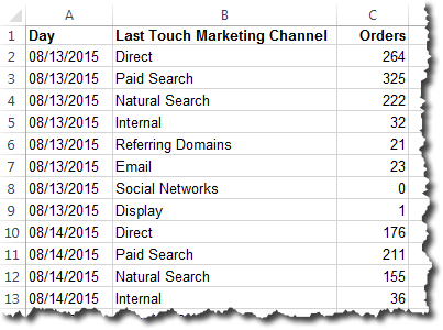
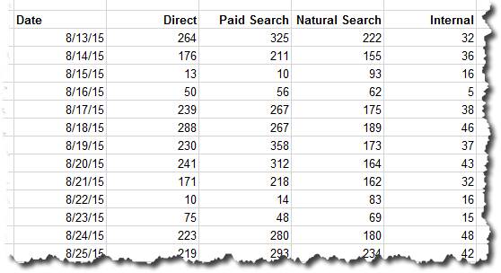
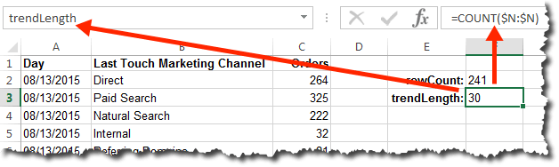
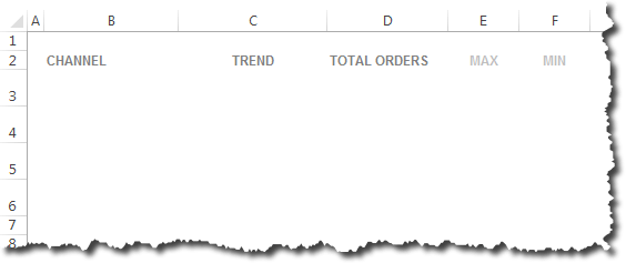
This is a slightly iterative process that starts with the setup of the Data tab. On that worksheet, we’ll use the first column to list our dates — these could be days, weeks, months, whatever (they can be changed at any time and the whole approach still works). For the purposes of this example, we’ll go with months. Let’s leave the first row alone — this is where we will populate the “current value,” which we’ll get to later. I like to use a simple shading schema to clearly denote which cells will get updated with data and which ones never really need to be touched. And, in this example, let’s say we’ve got three different metrics that we’re updating: Revenue, Orders, and Web Visits. This approach can be scaled to include dozens of metrics, but three should illustrate the point. That leaves us with a Data tab that looks like this:

Now, turn that range of data into a table by selecting the area from A2 to D19 and choosing Insert » Table. Then, click over to the Table Tools / Design group and change the table name from “Table1” to “Main_Data” (this isn’t required, but I always like to give my tables somewhat descriptive names). The sheet should now look like this:

Because this is now a table, as you add data in additional rows, as long as they are on the rows immediately below the table, the table will automatically expand (and that new data will be included in references to Main_Data, which is critical to this whole exercise).
While we’re on this tab, we should go ahead and defined some named cells and some named ranges. We’ll name the cells in the first row of each metric column (the row labeled “Current–>” as the “current” value for that metric (the cells don’t have to be named cells, but it makes for easier, safer updating of the dashboard as the complexity grows). Name each cell by clicking on the cell, then clicking in the cell address at the top left and typing in the cell name. It’s important to have consistent naming conventions, so we’ll go with <metric>_Current for this (it works out to have the metric identified first, with the qualifier/type after — just trust me!). The screen capture below shows this being done for the cell where the current value for Orders will go, but this needs to be done for Revenue and Web Traffic as well (I just remove the space for Web Traffic — WebTraffic_Current).

And, of course, we’ll actually need data — this would come later, but I’ve gone ahead and dropped some fictitious stuff in there:

That’s it for the Data tab for now…but we’ll be back!
Dashboard Tab Setup — Part 1
Now we jump over to the Dashboard worksheet and set up a couple of dropdowns — one is the report period selector, and the other is the report range (how many months to include in the chart) selector. Start by setting up some labels with dropdowns (I normally put these off to the side and outside the print range…but that doesn’t sit nice with the screen resolution I like to work with on this blog):

Then, set up the dropdowns using Excel data validation:
First, the report period. Click in cell C1, select Data » Data Validation, choose List, and then reference the first column in the Main_Data table (see the “Referencing Tables and Parts of Tables” section in this post for an explanation of the specific syntax used here, including the use of the INDIRECT function):

When you click OK, you will have a dropdown in cell C1 that contains all of the available months. This is a critical cell — it’s what we’ll use to select the date we want to key off of for reporting, and it’s what we’ll use to look up the data. So, we need to make it a named cell — ReportPeriod:

Now, let’s do a similar operation for the report range — this tells the spreadsheet how many months to include in each chart. Click in cell C3, select Data » Data Validation, choose List, and then enter the different values you want as options (I’ve used 3, 6, 9, and 12 here, but any list of integers will work):

And, let’s name that cell ReportRange:

Does this seem like a lot of work? It can be a bit of a hassle on the initial setup, but it will pay huge dividends as the report gets updated each day, week, or month. Trust me!
Before we leave this tab, go ahead and select a value in each dropdown — this will make it easier to check the formulas in the next step.

Data Tab Setup — Part 2
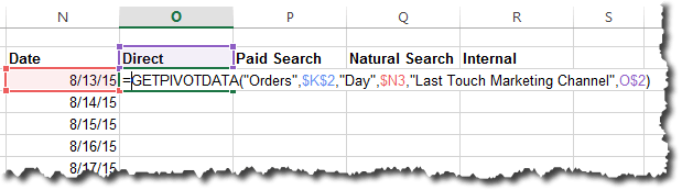
Now is where the fun begins. We’re going to go back over to the Data worksheet and start setting up some additional named ranges. We’ve got Main_Data, which is the table that includes the full range of data. We want to look at the currently selected Report Period (a named range called ReportPeriod) and find the value for each metric that is in the same row as that report period. That will give us the “Current” value for each metric. All you need to do is put the exact same formula in each of the three “Current” cells:
=VLOOKUP(ReportPeriod,Main_Data,COLUMN())
In this example, these are the values for each of the three arguments:
- ReportPeriod — Jul-12, the value we selected on the Dashboard tab
- Main_Data — this is the full table of data
- COLUMN() — this is 2, the column that the current metric is listed in (this function resolves to “3” for Orders and to “4” for Web Traffic (Note: If you have additional columns in your data sheet, you may have to make this “COLUMN()-<some fixed value>.” If, for instance, you have a blank column A before the table starts to provide some space, you would use “COLUMN()-1.” This applies to other uses of COLUMN() throughout this post.)
So, the formula simply takes the currently selected month, finds the row with that value in the data array, and then moves over to the column that matches the current column of the formula:

Slick, huh? And, because the ReportPeriod data validation dropdown on the Dashboard worksheet is referencing the first column of the data table on the Data tab, the VLOOKUP will always be able to find a matching value. (Read that last sentence again if it didn’t sink in — it’s a nifty little way of ensuring the robustness of the report)
This little bit of cleverness is really just a setup for the next step, which is setting up the data ranges that we’re going to chart. Conceptually, it’s very similar to what we did to find the current metric value, but we want to select the range of data that ends with that value and goes backwards by the number of months specified by ReportRange. So, in the values we selected above, Jul-09 and “6,” we basically want to be able to chart the following range of data:

We’ll do this by defining a named range called Revenue_Range (note how this has a similar naming convention to Revenue_Current, the name we gave the cell with the single value — this comes in handy for keeping track of things when setting up the dashboard). We can’t use VLOOKUP, because that function doesn’t really work with arrays and ranges of data. Instead, we’ll use a combination of the MATCH function (which is sort of like VLOOKUP on steroids) and the INDEX function (which is a handy way to grab a range of cells). Pull your hat down and fasten your seatbelt, as this one gets a little scary. Ultimately, the formula looks like this:
=INDEX(Main_Data,MATCH(ReportPeriod,Main_Data[Report Period])-ReportRange+1, COLUMN(Revenue_Current)):INDEX(Main_Data, MATCH(ReportPeriod,Main_Data[Report Period]), COLUMN(Revenue_Current))
It’s really not that bad when you break it down. I promise!
Working from the outside in, you’ve got a couple of INDEX() functions. Think of those as being INDEX(First Cell) and INDEX(Last Cell).

The range is defined, in pseudocode, as simply:
=INDEX(First Cell):INDEX(Last Cell)
The Last Cell calculation is slightly simpler to understand. As a matter of fact, this is really just trying to identify the cell location (not the value in the cell) of the current value for revenue — very similar to what we did with the VLOOKUP function earlier. The INDEX function has three arguments: INDEX(array,row_num,column_num). Here’s how those are getting populated:
- array — this is simply set to Main_Data, the full data table
- row_num — this is the row number within the array that we want to use; we’ll come back to that in just a minute
- column_num — we use a similar trick that we used on the Revenue_Current function, in that we use the COLUMN() formula; but, since we set up this range simply as a named range (as opposed to being a value in a cell), we can’t leave the value of the function blank; so, we populate the function with the argument of Revenue_Current — we want to grab the column that is the same column as where the current revenue value is populated in the top row.
Now, back to how we determine the row_num value. We do this using the MATCH function, which we need to use on a 1-dimensional array rather than a 2-dimensional array (Main_Data is a multi-column table, which makes it a 2-dimensional array). All we want this function to return is the number of the row in the Main_Data table for the currently selected report period, which, as it turns out, is the same row as the currently selected report period in the first column (“Report Period”). The formula is pretty simple:
MATCH(ReportPeriod,Main_Data[Report Period])

The formula looks in the first column of the Main_Data table for the ReportPeriod value and finds it…in the seventh row of the table. So, row_num is set to 7.
INDEX(First Cell) is almost identical to INDEX(Last Cell), except the row_num value needs to be set to 2 instead of 7 — that will make the full range match the ReportRange value of 6. So, row_num is calculated as:
MATCH(ReportPeriod,Main_Data[Report Period])-ReportRange+1
(The “+1” is needed because we want the total number of cells included in the range to be ReportRange inclusive.)
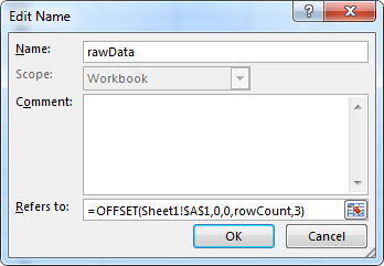
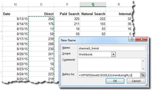
Now, that’s not all that scary, is it? We just need to drop the full formula into a named range called Revenue_Range by selecting Formulas » Name Manager » New, naming the range Revenue_Range, and inserting the formula:
=INDEX(Main_Data,MATCH(ReportPeriod,Main_Data[Report Period])-ReportRange+1, COLUMN(Revenue_Current)):INDEX(Main_Data, MATCH(ReportPeriod,Main_Data[Report Period]), COLUMN(Revenue_Current))

The whole formula is there, even if you can’t see it!
Repeat this last step to create two more named ranges with slightly different formulas (the differences are in bold):
- Orders_Range: =INDEX(Main_Data,MATCH(ReportPeriod,Main_Data[Report Period])-ReportRange+1, COLUMN(Orders_Current)):INDEX(Main_Data, MATCH(ReportPeriod,Main_Data[Report Period]), COLUMN(Orders_Current))
- WebTraffic_Range: =INDEX(Main_Data,MATCH(ReportPeriod,Main_Data[Report Period])-ReportRange+1, COLUMN(WebTraffic_Current)):INDEX(Main_Data, MATCH(ReportPeriod,Main_Data[Report Period]), COLUMN(WebTraffic_Current))
Tip: After creating one of these named ranges, while still in the Name Manager, you can select the range and click into the formula box, and the current range of cells defined by the formula will show up with a blinking dotted line around them.
You’re getting sooooooo close, so hang in there! In order for the chart labels to show up correctly, we need to make one more named range. We’ll call it Date_Range and define it with the following formula (this is just like the earlier _Range formulas, but we know we want to pull the dates from the first column, so, rather than using the COLUMN() formula, we simply use a constant, “1”:
=INDEX(Main_Data,MATCH(ReportPeriod,Main_Data[Report Period])-ReportRange+1,1):INDEX(Main_Data, MATCH(ReportPeriod,Main_Data[Report Period]),1)
If you want, you can fiddle around with the different settings on the Dashboard tab and watch how both the “Current” values and (if you get into Name Manager) the _Range areas change.
OR…you can move on to the final step, where it all comes together!
Dashboard Tab Setup — Part 2 (the final step)
It’s back over to the Dashboard worksheet to wrap things up.
Insert a 2-D Line chart and resize it to be less than totally obnoxious. It will just be a blank box initially:

Right-click on the chart and select Select Data. Click to Add a new series and enter “Revenue” (without the quotes — Excel will add those for you) as the series name and the following formula for the series values:
=DynamicChartsWithTables_Example.xlsx!Revenue_Range
(Change the name of the workbook if that’s not what your workbook is named)

Click to edit the axis labels and enter a similar formula:
=DynamicChartsWithTables_Example.xlsx!Date_Range
You will now have an absolutely horrid looking chart (thank you, Excel!):

Tighten it up with some level of formatting (if you just can’t stand to wait, you can go ahead and start flipping the dropdowns to different settings), drop “=ReportPeriod” into cell E6 and “=Revenue_Current” into cell E7, and you will wind up with something that looks like this:

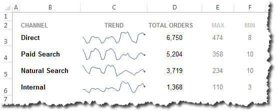
Okay, so that still looks pretty horrid…but this isn’t a post about data visualization, and I’m trying to make the example as illustrative as possible. In practice, we use this technique to populate a slew of sparklines (no x-axis labels) and a couple of bar charts, as well as some additional calculated values for each metric.
To add charts for orders and web traffic is a little easier than creating the initial chart. Just copy the Revenue chart a couple of times (if you hold down <Ctrl>-<Shift> and then click and drag the chart it will make a copy and keep that copy aligned with the original chart).
Then, simply click on the data line in the chart and look up at the formula box. You will see a formula that looks something like this:
=SERIES(“Revenue“,DynamicChartsWithTables_Example.xlsx!Date_Range, DynamicCharts_ExampleWithTables.xlsx!Revenue_Range,1)
Change the bolded text, “Revenue,” to be “Orders” and the chart will update.
Repeat for a Web Traffic chart, and you’ll wind up with something like this:

And…for the magic…
<drum rollllllllllll>
Change the dropdowns and watch the charts update!

So, is it worth it? Not if you’re going to produce one report a couple of times and move on. But, if you’re in a situation where you have a lot of recurring, standardized reports (not as mindless report monkeys — these should be well-structured, well-validated, actionable performance measurement tools), then the payoff will hit pretty quickly. Updating the report is simply a matter of updating the data on the Data tab (some of which can even be done automatically, depending on the data source and the API availability), then the Report Period dropdown on the Dashboard tab can be changed to the new report period, and the charts get automatically updated! You can then spend your time analyzing and interpreting the results. Often, this means going back and digging for more data to supplement the report…but I’m teetering on the verge of much larger topic, so I’ll stop…
As an added bonus, you can hide the Data tab and distribute the spreadsheet itself, enabling your end users to flip back and forth between different date ranges — a poor man’s BI tool, if ever there was one (in practice, there will seldom be any real insight gleaned from this limited number of adjustable dropdowns, and that’s not the reason to set them up in the first place).
I was curious as to what it would take to create this example from scratch and document it as I went. As it’s turned out, this is a lonnnnnnngggg post. But, if you’ve skimmed it, get the gist, and want to start fiddling around with the example used here, feel free to download it!
Happy dynamic charting!
[Update] Troubleshooting Tip
A few people who have left comments have run into a snag where, for one reason or other, one of the named ranges has not been properly created. When that named range gets used in a chart, it either throws an error or doesn’t work. One way to check the named ranges is to open the named range manager, highlight the named range used in the chart, and then click in the formula box at the bottom of the window. A flickering/moving dashed line should then appear around the cells that the named range refers to:

If this highlighting doesn’t occur, then there is something not right with the formula.


 This will have effectively expanded the named range by a cell. You can then either add the new value in the blank cell or copy and paste the “bottom” value (“Low” in this case) into the blank cell and then enter the new value into the bottom cell


