Adobe Analytics, Analysis, Featured, google analytics

Did that KPI Move Enough for Me to Care?

This post really… is just the setup for an embedded 6-minute video. But, it actually hits on quite a number of topics.

At the core:

  • Using a statistical method to objectively determine if movement in a KPI looks “real” or, rather, if it’s likely just due to noise
  • Providing a name for said statistical method: Holt-Winters forecasting
  • Illustrating time-series decomposition, which I have yet to find an analyst who, when first exposed to it, doesn’t feel like their mind is blown just a bit
  • Demonstrating that “moving enough to care” is also another way of saying “anomaly detection”
  • Calling out that this is actually what Adobe Analytics uses for anomaly detection and intelligent alerts.
  • (Conceptually, this is also a serviceable approach for pre/post analysis…but that’s not called out explicitly in the video.)

On top of the core, there’s a whole other level of somewhat intriguing aspects of the mechanics and tools that went into the making of the video:

  • It’s real data that was pulled and processed and visualized using R
  • The slides were actually generated with R, too… using RMarkdown
  • The video was generated using an R package called ari (Automated R Instructor)
  • That package, in turn, relies on Amazon Polly, a text-to-speech service from Amazon Web Services (AWS)
  • Thus… rather than my dopey-sounding voice, I used “Brian”… who is British!

Neat, right? Give it a watch!

https://youtu.be/eGB5x77qnco

If you want to see the code behind all of this — and maybe even download it and give it a go with your data — it’s available on Github.

Featured, google analytics

R You Interested in Auditing Your Google Analytics Data Collection?

One of the benefits of programming with data — with a platform like R — is being able to get a computer to run through mind-numbing and tedious, but useful, tasks. A use case I’ve run into on several occasions has to do with core customizations in Google Analytics:

  • Which custom dimensions, custom metrics, and goals exist, but are not recording any data, or are recording very little data?
  • Are there naming inconsistencies in the values populating the custom dimensions?

While custom metrics and goals are relatively easy to eyeball within the Google Analytics web interface, if you have a lot of custom dimensions, then, to truly assess them, you need to build one custom report for each custom dimension.

And, for all three of these, looking at more than a handful of views can get pretty mind-numbing and tedious.

R to the rescue! I developed a script that, as an input, takes a list of Google Analytics view IDs. The script then cycles through all of the views in the list and returns three things for each view:

  • A list of all of the active custom dimensions in the view, including the top 5 values based on hits
  • A list of all of the active custom metrics in the view and the total for each metric
  • A list of all of the active goals in the view and the number of conversions for the goal

The output is an Excel file:

  • A worksheet that lists all of the views included in the assessment
  • A worksheet that lists all of the values checked — custom dimensions, custom metrics, and goals across all views
  • A worksheet for each included view that lists just the custom dimensions, custom metrics, and goals for that view

The code is posted as an RNotebook and is reasonably well structured and commented (even the inefficiencies in it are pretty clearly called out in the comments). It’s available — along with instructions on how to use it — on github:

I actually developed a similar tool for Adobe Analytics a year ago, but that was still relatively early days for me R-wise. It works… but it’s now due for a pretty big overhaul/rewrite.

Happy scripting!

Analysis, Featured

The Trouble (My Troubles) with Statistics

Okay. I admit it. That’s a linkbait-y title. In my defense, though, the only audience that would be successfully baited by it, I think, are digital analysts, statisticians, and data scientists. And, that’s who I’m targeting, albeit for different reasons:

  • Digital analysts — if you’re reading this then, hopefully, it may help you get over an initial hump on the topic that I’ve been struggling mightily to clear myself.
  • Statisticians and data scientists — if you’re reading this, then, hopefully, it will help you understand why you often run into blank stares when trying to explain a t-test to a digital analyst.

If you are comfortably bridging both worlds, then you are a rare bird, and I beg you to weigh in in the comments as to whether what I describe rings true.

The Premise

I took a college-level class in statistics in 2001 and another one in 2010. Neither class was particularly difficult. They both covered similar ground. And, yet, I wasn’t able to apply a lick of content from either one to my work as a web/digital analyst.

Since early last year, as I’ve been learning R, I’ve also been trying to “become more data science-y,” and that’s involved taking another run at the world of statistics. That. Has. Been. HARD!

From many, many discussions with others in the field — on both the digital analytics side of things and the more data science and statistics side of things — I think I’ve started to identify why and where it’s easy to get tripped up. This post is an enumeration of those items!

As an aside, my eldest child, when applying for college, was told that the fact that he “didn’t take any math” his junior year in high school might raise a small red flag in the admissions department of the engineering school he’d applied to. He’d taken statistics that year (because the differential equations class he’d intended to take had fallen through). THAT was the first time I learned that, in most circles, statistics is not considered “math.” See how little I knew?!

Terminology: Dimensions and Metrics? Meet Variables!

Historically, web analysts have lived in a world of dimensions. We combine multiple dimensions (channel + device type, for instance) and then put one or more metrics against those dimensions (visits, page views, orders, revenue, etc.)

Statistical methods, on the other hand, work with “variables.” What is a variable? I’m not being facetious. It turns out it can be a bit a mind-bender if you come at it from a web analytics perspective:

  • Is device type a variable?
  • Or, is the number of visits by device type a variable?
  • OR, is the number of visits from mobile devices a variable?

The answer… is “Yes.” Depending on what question you are asking and what statistical method is being applied, defining what your variable(s) are, well, varies. Statisticians think of variables as having different types of scales: nominal, ordinal, interval, or ratio. And, in a related way, they think of data as being either “metric data” or “nonmetric data.” There’s a good write-up on the different types — with a digital analytics slant — in this post on dartistics.com.

It may seem like semantic navel-gazing, but it really isn’t: different statistical methods work with specific types of variables, so data has to be transformed appropriately before statistical operations are performed. Some day, I’ll write that magical post that provides a perfect link between these two fundamentally different lenses through which we think about our data… but today is not that day.

Atomic Data vs. Aggregated Counts

In R, when using ggplot to create a bar chart that uses underlying data that looks similar to how data would look in Excel, I have to include a parameter that is stat="identity". As it turns out, that is a symptom of the next mental jump required to move from the world of digital analytics to the world of statistics.

To illustrate, let’s think about how we view traffic by channel:

  • In web analytics, we think: “this is how many (a count) visitors to the site came from each of referring sites, paid search, organic search, etc.”
  • In statistics, typically, the framing would be: “here is a list (row) for each visitor to the site, and each visitor is identified as being visiting from referring sites, paid search, organic search, etc.” (or, possibly, “each visitor is flagged as being yes/no for each of: referring sites, paid search, organic search, etc.”… but that’s back to the discussion of “variables” covered above).

So, in my bar chart example above, R defaults to thinking that it’s making a bar chart out of a sea of data, where it’s aggregating a bunch of atomic observations into a summarized set of bars. The stat="identity" argument has to be included to tell R, “No, no. Not this time. I’ve already counted up the totals for you. I’m telling you the height of each bar with the data I’m sending you!”

When researching statistical methods, this comes up time and time again: statistical techniques often expect a data set to be a collection of atomic observations. Web analysts typically work with aggregated counts. Two things to call out on this front:

  • There are statistical methods (a cross tabulation with a Chi square test for independence is one good example) that work with aggregated counts. I realize that. But, there are many more that actually expect greater fidelity in the data.
  • Both Adobe Analytics (via data feeds, and, to a clunkier extent, Data Warehouse) and Google Analytics (via the GA360 integration with Google BigQuery) offer much more atomic level data than the data they provided historically through their primary interfaces; this is one reason data scientists are starting to dig into digital analytics data more!

The big, “Aha!” for me in this area is that we often want to introduce pseudo-granularity into our data. For instance, if we look at orders by channel for the last quarter, we may have 8-10 rows of data. But, if we pull orders by day for the last quarter, we have a much larger set of data. And, by introducing granularity, we can start looking at the variability of orders within each channel. That is useful! When performing a 1-way ANOVA, for instance, we need to compare the variability within channels to the variability across channels to draw conclusions about where the “real” differences are.

This actually starts to get a bit messy. We can’t just add dimensions to our data willy-nilly to artificially introduce granularity. That can be dangerous! But, in the absence of truly atomic data, some degree of added dimensionality is required to apply some types of statistical methods. <sigh>

Samples vs. Populations

The first definition for “statistics” I get from Google (emphasis added) is:

“the practice or science of collecting and analyzing numerical data in large quantities, especially for the purpose of inferring proportions in a whole from those in a representative sample.”

Web analysts often work with “the whole.” Unless we consider historical data the sample and the “whole” including future web traffic. But, if we view the world that way — by using time to determine our “sample” — then we’re not exactly getting a random (independent) sample!

We’ve also been conditioned to believe that sampling is bad! For years, Adobe/Omniture was able to beat up on Google Analytics because of GA’s “sampled data” conditions. And, Google has made any number of changes and product offerings (GA Premium -> GA 360) to allow their customers to avoid sampling. So, Google, too, has conditioned us to treat the word “sampled” as having a negative connotation.

To be clear: GA’s sampling is an issue. But, it turns out that working with “the entire population” with statistics can be an issue, too. If you’ve ever heard of the dangers of “overfitting the model,” or if you’ve heard, “if you have enough traffic, you’ll always find statistical significance,” then you’re at least vaguely aware of this!

So, on the one hand, we tend to drool over how much data we have (thank you, digital!). But, as web analysts, we’re conditioned to think “always use all the data!” Statisticians, when presented with a sufficiently large data set, like to pull a sample of that data, build a model, and then test the model with another sample of the data. As far as I know, neither Adobe nor Google have an, “Export a sample of the data” option available natively. And, frankly, I have yet to come across a data scientist working with digital analytics data who is doing this, either. But, several people have acknowledged this is something that should be done in some cases.

I think this is going to have to get addressed at some point. Maybe it already has been, and I just haven’t crossed paths with the folks who have done it!

Decision Under Uncertainty

I’ve saved the messiest (I think) for last. Everything on my list to this point has been, to some extent, mechanical. We should be able to just “figure it out” — make a few cheat sheets, draw a few diagrams, reach a conclusion, and be done with it.

But, this one… is different. This is an issue of fundamental understanding — a fundamental perspective on both data and the role of the analyst.

Several statistically-savvy analysts I have chatted with have said something along the lines of, “You know, really, to ‘get’ statistics, you have to start with probability theory.” One published illustration of this stance can be found in The Cartoon Guide to Statistics, which devotes an early chapter to the subject. It actually goes all the way back to the 1600s and an exchange between Blaise Pascal and Pierre de Fermat and proceeds to walk through a dice-throwing example of probability theory. Alas! This is where the book lost me (although I still have it and may give it another go).

Possibly related — although quite different — is something that Matt Gershoff of Conductrics and I have chatted about on multiple occasions across multiple continents. Matt posits that, really, one of the biggest challenges he sees traditional digital analysts facing when they try to dive into a more statistically-oriented mindset is understanding the scope (and limits!) of their role. As he put it to me once in a series of direct messages really boils down to:

  1. It’s about decision-making under uncertainty
  2. It’s about assessing how much uncertainty is reduced with additional data
  3. It must consider, “What is the value in that reduction of uncertainty?”
  4. And it must consider, “Is that value greater than the cost of the data/time/opportunity costs?”

The list looks pretty simple, but I think there is a deeper mindset/mentality-shift that it points to. And, it gets to a related challenge: even if the digital analyst views her role through this lens, do her stakeholders think this way? Methinks…almost certainly not! So, it opens up a whole new world of communication/education/relationship-management between the analyst and stakeholders!

For this area, I’ll just leave it at, “There are some deeper fundamentals that are either critical to understand or something that can be kicked down the road a bit.” I don’t know which it is!

What Do You Think?

It’s taken me over a year to slowly recognize that this list exists. Hopefully, whether you’re a digital analyst dipping your toe more deeply into statistics or a data scientist who is wondering why you garner blank stares from your digital analytics colleagues, there is a point or two in this post that made you think, “Ohhhhh! Yeah. THAT’s where the confusion is.”

If you’ve been trying to bridge this divide in some way yourself, I’d love to hear what of this post resonates, what doesn’t, and, perhaps, what’s missing!

Adobe Analytics, Analysis, Featured

R and Adobe Analytics: Did the Metric Move Significantly? Part 3 of 3

This is the third post in a three-post series. The earlier posts build up to this one, so you may want to go back and check them out before diving in here if you haven’t been following along:

  • Part 1 of 3: The overall approach, and a visualization of metrics in a heatmap format across two dimensions
  • Part 2 of 3: Recreating — and refining — the use of Adobe’s anomaly detection to get an at-a-glance view of which metrics moved “significantly” recently

The R scripts used for both of these, as well as what’s covered in this post, are posted on Github and available for download and re-use (open source FTW!).

Let’s Mash Parts 1 and 2 Together!

This final episode in the series answers the question:

Which of the metrics changed significantly over the past week within specific combinations of two different dimensions?

The visualization I used to answer this question is this one:

This, clearly, is not a business stakeholder-facing visualization. And, it’s not a color-blind friendly visualization (although the script can easily be updated to use a non-red/green palette).

Hopefully, even without reading the detailed description, the visualization above jumps out as saying, “Wow. Something pretty good looks to have happened for Segment E overall last week, and, specifically, Segment E traffic arriving from Channel #4.” That would be an accurate interpretation.

But, What Does It Really Mean?

If you followed the explanation in the last post, then, hopefully, the explanation is really simple. In the last post, the example I showed was this:

This example had three “good anomalies” (the three dots that are outside — and above — the prediction interval) in the last week. And, it had two “bad anomalies” (the two dots at the beginning of the week that are outside — and below — the prediction interval).

In addition to counting and showing “good” and “bad” anomalies, I can do one more simple calculation to get “net positive anomalies:”

[Good Anomalies] – [Bad Anomalies] = [Net Positive Anomalies]

In the example above, this would be:

[3 Good Anomalies] – [2 Bad Anomalies] = [1 Net Positive Anomaly]

If the script is set to look at the previous week, and if weekends are ignored (which is a configuration within the script), then that means the total possible range for net positive anomalies is -5 to +5. That’s a nice range to provide a spectrum for a heatmap!

A Heatmap, Though?

This is where the first two posts really get mashed together:

  • The heatmap structure lets me visualize results across two different dimensions (plus an overall filter to the data set, if desired)
  • The anomaly detection — the “outside the prediction interval of the forecast of the past” — lets me get a count of how many times in the period a metric looked “not as expected”

The heatmap represents the two dimensions pretty obviously. For each cell — each intersection of a value from each of the two dimensions — there are three pieces of information:

  • The number of good anomalies in the period (the top number)
  • The number of bad anomalies in the period (the bottom number)
  • The number of net positive anomalies (the color of the cell)

You can think of each cell as having a trendline with a forecast and prediction confidence band for the last period, but actually displaying all of those charts would be a lot of charts! With the heatmap shown above, there are 42 different slices represented for each metric (there is then one slide for each metric), and it’s quick to interpret the results once you know what they’re showing.

What Do You Think?

This whole exercise grew out of some very specific questions that I was finding myself asking each time I reviewed a weekly performance measurement dashboard. I realize that “counting anomalies by day,” is somewhat arbitrary. But, by putting some degree of rigor behind identifying anomalies (which, so far, relies heavily on Adobe to do the heavy lifting, but, as covered in the second post, I’ve got a pretty good understanding of how they’re doing that lifting, and it seems fairly replicable to do this directly in R), it seems useful to me. If and when a specific channel, customer segment, or combination of channel/segment takes a big spike or dip in a metric, I should be able to hone in on it with very little manual effort. And, I can then start asking, “Why? And, is this something we can or should act on?”

Almost equally importantly, the building blocks I’ve put in place, I think, provide a foundation that I (or anyone) can springboard off of to extend the capabilities in a number of different directions.

What do you think?

Adobe Analytics, Analysis, Featured

R and Adobe Analytics: Did the Metric Move Significantly? Part 2 of 3

In my last post, I laid out that I had been working on a bit of R code to answer three different questions in a way that was repeatable and extensible. This post covers the second question:

Did any of my key metrics change significantly over the past week (overall)?

One of the banes of the analyst’s existence, I think, is that business users rush to judge (any) “up” as “good” and (any) “down” as “bad.” This ignores the fact that, even in a strictly controlled manufacturing environment, it is an extreme rarity for any metric to stay perfectly flat from day to day or week to week.

So, how do we determine if a metric moved enough to know whether it warrants any deeper investigation as to the “why” it moved (up or down)? In the absence of an actual change to the site or promotions or environmental factors, most of the time (I contend), metrics don’t move enough in a short time period to actually matter. They move due to noise.

But, how do we say with some degree of certainty that, while visits (or any metric) were up over the previous week, they were or were not up enough to matter? If a metric increases 20%, it likely is not from noise. If it’s up 0.1%, it likely is just ordinary fluctuation (it’s essentially flat). But, where between 0.1% and 20% does it actually matter?

This is a question that has bothered me for years, and I’ve come at answering it from many different directions — most of them probably better than not making any attempt at all, but also likely an abomination in the eyes of a statistician.

My latest effort uses an approach that is illustrated in the visualization below:

In this case, something went a bit squirrely with conversion rate, and it warrants digging in farther.

Let’s dive in to the approach and rationale for this visualization as an at-a-glance way to determine whether the metric moved enough to matter.

Anomaly Detection = Forecasting the Past

The chart above uses Adobe’s anomaly detection algorithm. I’m pretty sure I could largely recreate the algorithm directly using R. As a matter of fact, that’s exactly what is outlined on the time-series page on dartistics.com. And, eventually, I’m going to give that a shot, as that would make it more easily repurposable across Google Analytics (and other time-series data platforms). And it will help me plug a couple of small holes in Adobe’s approach (although Adobe may plug those holes on their own, for all I know, if I read between the lines in some of their documentation).

But, let’s back up and talk about what I mean by “forecasting the past.” It’s one of those concepts that made me figuratively fall out of my chair when it clicked and, yet, I’ve struggled to explain it. A picture is worth a thousand words (and is less likely to put you to sleep), so let’s go with the equivalent of 6,000 words.

Typically, we think of forecasting as being “from now to the future:”

But, what if, instead, we’re actually not looking to the future, but are at today and are looking at the past? Let’s say our data looks like this:

Hmmm. My metric dropped in the last period. But, did it drop enough for me to care? It didn’t drop as much as it’s dropped in the past, but it’s definitely down? Is it down enough for me to freak out? Or, was that more likely a simple blip — the stars of “noise” aligning such that we dropped a bit? That’s where “forecasting the past” comes in.

Let’s start by chopping off the most recent data and pretend that the entirety of the data we have stops a few periods before today:

Now, from the last data we have (in this pretend world), let’s forecast what we’d expect to see from that point to now (we’ll get into how we’re doing that forecast in a bit — that’s key!):

This is a forecast, so we know it’s not going to be perfect. So, let’s make sure we calculated a prediction interval, and let’s add upper and lower bounds around that forecast value to represent that prediction interval:

Now, let’s add our actuals back into the chart:

Voila! What does this say? the next-to-last reporting period was below our forecast, but it was still inside our prediction interval. The most recent period, thought, was actually outside the prediction interval, which means it moved “enough” to likely be more than just noise. We should dig further.

Make sense? That’s  what I call “forecasting the past.” There may be a better term for this concept, but I’m not sure what it is! Leave a comment if I’m just being muddle-brained on that front.

Anomaly Detection in Adobe Analytics…Is This

Analysis Workspace has anomaly detection as an option in its visualizations and, given the explanation above, how they’re detecting “anomalies” may start to make more sense:

Now, in the case of Analysis Workspace, the forecast is created for the entire period that is selected, and then any anomalies that are detected are highlighted with a larger circle.

But, if you set up an Intelligent Alert, you’re actually doing the same thing as their Analysis Workspace anomaly visualization, with two tweaks:

  • Intelligent Alerts only look at the most recent time period — this makes sense, as you don’t want to be alerted about changes that occurred weeks or months ago!
  • Intelligent Alerts give you some control over how wide the prediction interval band is — in Analysis Workspace, it’s the 95% prediction interval that is represented; when setting up an alert, though, you can specify whether you want the band to be 90% (narrower), 95%, or 99% (wider)

Are you with me so far? What I’ve built in R is more like an Intelligent Alert than it is like the Analysis Workspace  representation. Or, really, it’s something of a hybrid. We’ll get to that in a bit.

Yeah…But ‘Splain Where the Forecast Came From!

The forecast methodology used is actually what’s called Holt-Winters. Adobe provides a bit more detail in their documentation. I started to get a little excited when I found this, because I’d come across Holt-Winters when working with some Google Analytics data with Mark Edmondson of IIH Nordic. It’s what Mark used in this forecasting example on dartistics.com. When I see the same thing cropping up from multiple different smart sources, I have a tendency to think there’s something there.

But, that doesn’t really explain how Holt-Winters works. At a super-high level, part of what Holt-Winters does is break down a time-series of data into a few components:

  • Seasonality — this can be the weekly cycle of “high during the week, low on the weekends,” monthly seasonality, both, or something else
  • Trend — with seasonality removed, how the data is trending (think rolling average, although that’s a bit of an oversimplification)
  • Base Level — the component that, if you add in the trend and seasonality to it will get you to the actual value

By breaking up the historical data, you get the ability to forecast with much more precision than simply dropping a trendline. This is worth digging into more to get a deeper understanding (IMHO), and it turns out there is a fantastic post by John Foreman that does just that: “Projecting Meth Demand Using Exponential Smoothing.” It’s tongue-in-cheek, but it’s worth downloading the spreadsheet at the beginning of the post and and walking through the forecasting exercise step-by-step. (Hat tip to Jules Stuifbergen for pointing me to that post!)

I don’t think the approach in Foreman’s post is exactly what Adobe has implemented, but it absolutely hits the key pieces. Analysis Workspace anomaly detection also factors in holidays (somehow, and not always very well, but it’s a tall order), which the Adobe Analytics API doesn’t yet do. And, Foreman winds up having Excel do some crunching with Solver to figure out the best weighting, while Adobe applies three different variations of Holt-Winters and then uses the one that fits the historical data the best.

I’m not equipped to pass any sort of judgment as to whether either approach is definitively “better.” Since Foreman’s post was purely pedagogical, and Adobe has some extremely sharp folks focused on digital analytics data, I’m inclined to think that Adobe’s approach is a great one.

Yet…You Still Built Something in R?!

Still reading? Good on ya’!

Yes. I wasn’t getting quite what I wanted from Adobe, so I got a lot from Adobe…but then tweaked it to be exactly what I wanted using R. The limitations I ran into with Analysis Workspace and Intelligent Alerts were:

  • I don’t care about anomalies on weekends (in this case — in my R script, it can be set to include weekends or not)
  • I only care about the most recent week…but I want to use the data up through the prior week for that; as I read Adobe’s documentation, their forecast is always based on the 35 days preceding the reporting period
  • do want to see a historical trend, though; I just want much of that data to be included in the data used to build the forecast
  • I want to extend this anomaly detection to an entirely different type of visualization…which is the third and final part in this series
  • Ultimately, I want to be able to apply this same approach to Google Analytics and other time-series data

Let’s take another look at what the script posted on Github generates:

Given the simplistic explanation provided earlier in this post, is this visual starting to make more sense? The nuances are:

  • The only “forecasted past” is the last week (this can be configured to be any period)
  • The data used to pull that forecast is the 35 days immediately preceding the period of interest — this is done by making two API calls: 1 to pull the period of interest, and another to pull “actuals only” data; the script then stitches the results together to show one continuous line of actuals
  • Anomalies are identified as “good” (above the 95% prediction interval) or “bad” (below the 95% prediction interval)

I had to play around a bit with time periods and metrics to show a period with anomalies, which is good! Most of the time, for most metrics, I wouldn’t expect to see anomalies.

There is an entirely separate weekly report — not shown here — that shows the total for each metric for the week, as well as a weekly line chart, how the metric changed week-over-week, and how it compared to the same week in the prior year. That’s the report that gets broadly disseminated. But, as an analyst, I have this separate report — the one I’ve described in this post — that I can quickly flip through to see if any metrics had anomalies on one or more days for the week.

Currently, the chart takes up a lot of real estate. Once the analysts (myself included) get comfortable with what the anomalies are, I expect to have a streamlined version that only lists the metrics that had an anomaly, and then provides a bit more detail.

Which may start to sound a lot like Adobe Analytics Intelligent Alerts! Except, so far, when Adobe’s alerts are triggered, it’s hard for me to actually get to a deeper view get more context. That may be coming, but, for now, I’ve got a base that I understand and can extend to other data sources and for other uses.

For details on how the script is structured and how to set it up for your own use, see the last post.

In the next post, I’ll take this “anomaly counting” concept and apply it to the heatmap concept that drills down into two dimensions. Sound intriguing? I hope so!

The Rest of the Series

If you’re feeling ambitious and want to go back or ahead and dive into the rest of the series:

Adobe Analytics, Analysis, Featured

R and Adobe Analytics: Two Dimensions, Many Metrics – Part 1 of 3

This is the first of three posts that all use the same base set of configuration to answer three different questions:

  1. How do my key metrics break out across two different dimensions?
  2. Did any of these metrics change significantly over the past week (overall)?
  3. Which of these metrics changed significantly over the past week within specific combinations of those two different dimensions?

Answering the first question looks something like this (one heatmap for each metric):

Answering the second question looks something like this (one chart for each metric):

Answering the third question — which uses the visualization from the first question and the logic from the second question — looks like this:

These were all created using R, and the code that was used to create them is available on Github. It’s one overall code set, but it’s set up so that any of these questions can be answered independently. They just share enough common ground on the configuration front that it made sense to build them in the same project (we’ll get to that in a bit).

This post goes into detail on the first question. The next one goes into detail on the second question. And, I own a T-shirt that says, “There are two types of people in this world: those who know how to extrapolate from incomplete information.” So, I’ll let you guess what the third post will cover.

The remainder of this post is almost certainly TL;DR for many folks. It gets into the details of the what, wherefore, and why of the actual rationale and methods employed. Bail now if you’re not interested!

Key Metrics? Two Dimensions?

Raise your hand if you’ve ever been asked a question like, “How does our traffic break down by channel? Oh…and how does it break down by device type?” That question-that-is-really-two-questions is easy enough to answer, right? But, when I get asked it, I often feel like it’s really one question, and answering it as two questions is actually a missed opportunity.

Recently, while working with a client, a version of this question came up regarding their last touch channels and their customer segments. So, that’s what the examples shown here are built around. But, it could just as easily have been device category and last touch channel, or device category and customer segment, or new/returning and device category, or… you get the idea.

When it comes to which metrics were of interest, it’s an eCommerce site, and revenue is the #1 metric. But, of course, revenue can be decomposed into its component parts:

[Visits] x [Conversion Rate] x [Average Order Value]

Or, since there are multiple lines per order, AOV can actually be broken down:

[Visits] x [Conversion Rate] x [Lines per Order] x [Revenue per Line]

Again, the specific metrics can and should vary based on the business, but I got to a pretty handy list in my example case simply by breaking down revenue into the sub-metrics that, mathematically, drive it.

The Flexibility of Scripting the Answer

Certainly, one way to tackle answering the question would be to use Ad Hoc Analysis or Analysis Workspace. But, the former doesn’t visualize heatmaps at all, and the latter…doesn’t visualize this sort of heatmap all that well. Report Builder was another option, and probably would have been the route I went…except there were other questions I wanted to explore along this two-dimensional construct that are not available through Report Builder.

So, I built “the answer” using R. That means I can continue to extend the basic work as needed:

  • Exploring additional metrics
  • Exploring different dimensions
  • Using the basic approach with other sites (or with specific segments for the current site — such as “just mobile traffic”)
  • Extending the code to do other explorations of the data itself (which I’ll get into with the next two posts)
  • Extending the approach to work with Google Analytics data

Key Aspects of R Put to Use

The first key to doing this work, of course, is to get the data out. This is done using the RSiteCatalyst package.

The second key was to break up the code into a handful of different files. Ultimately, the output was generated using RMarkdown, but I didn’t put all of the code in a single file. Rather, I had one script (.R) that was just for configurations (this is what you will do most of the work in if you download the code and put it to use for your own purposes), one script (.R) that had a few functions that were used in answering multiple questions, and then one actual RMarkdown file (.Rmd) for each question. The .Rmd files use read_chunk() to selectively pull in the configuration settings and functions needed. So, the actual individual files break down something like this:

This probably still isn’t as clean as it could be, but it gave me the flexibility (and, perhaps more importantly, the extensibility) that I was looking for, and it allowed me to universally tweak the style and formatting of the multi-slide presentations that each question generated.

The .Renviron file is a very simple text file with my credentials for Adobe Analytics. It’s handy, in that it only sits on my local machine; it never gets uploaded to Github.

How It Works (How You Can Put It to Use)

There is a moderate level of configuration required to run this, but I’ve done my best to thoroughly document those in the scripts themselves (primarily in config.R). But, summarizing those:

  • Date Range — you need to specify the start and end date. This can be statically defined, or it can be dynamically defined to be “the most recent full week,”  for instance. The one wrinkle on the date range is that I don’t think the script will work well if the start and end date cross a year boundary. The reason is documented in the script comments, so I won’t go into that here.
  • Metrics — for each metric you want to include, you need to include the metric ID (which can be something like “revenue” for the standard metrics or “event32” for events, but can also be something like “cm300000270_56cb944821d4775bd8841bdb” if it’s a calculated metric; you may have to use the GetMetrics() function to get the specific values here. Then, so that the visualization comes out nicely, for each metric, you have to give it a label (a “pretty name”), specify the type of metric it is (simple number, currency, percentage), and how many places after the decimal should be included (visits is a simple number that needs 0 places after the decimal, but, “Lines per Order” may be a simple number where 2 places after the decimal make sense).
  • One or more “master segments” — it seems reasonably common, in my experience, that there are one or two segments that almost always get applied to a site (excluding some ‘bad’ data that crept in, excluding a particular sub-site, etc.), and the script accommodates this. This can also be used to introduce a third layer to the results. If, for instance, you wanted to look at last touch channel and device category just for new visitors, then you can apply a master segment for new visitors, and that will then be applied to the entire report.
  • One Segment for Each Dimension Value — I went back and forth on this and, ultimately, went with the segments approach. In the example above, this was 13 total segments (one each for the seven channels, which included the “All Others” channel, and one each for each of the six customer segments, which was five customer segment values plus one “none specified” customer segment). I could have also simple pulled the “Top X” values for specific dimensions (which would have had me using a different RSiteCatalyst function), but this didn’t give me as much control as I wanted to ensure I was covering all of the traffic and was able to make an “All Others” catch-all for the low-volume noise areas (which I made with an Exclude segment). And, these were very simple segments (in this case, although many use cases would likely be equally simple). Using segments meant that each “cell” in the heatmap was a separate query to the Adobe Analytics API. On the one hand, that meant the script can take a while to run (~20 minutes for this site, which has a pretty high volume of traffic). But, it also means the queries are much less likely to time out. Below is what one of these segments looks like. Very simple, right?

  • Segment Meta Data — each segment needs to have a label (a “pretty name”) specified, just like the metrics. That’s a “feature!” It let me easily obfuscate the data in these examples a bit by renaming the segments “Channel #1,” “Channel #2,” etc. and “Segment A,” “Segment B,” etc. before generating the examples included here!
  • A logo — this isn’t in the configuration, but, rather, just means replacing the logo.png file in the images subdirectory.

Getting the segment IDs is a mild hassle, too, in that you likely will need to use the GetSegments() function to get the specific values.

This may seem like a lot of setup overall, but it’s largely a one-time deal (until you want to go back in and use other segments or other metrics, at which point you’re just doing minor adjustments).

Once this setup is done, the script just:

  • Cycles through each combination of the segments from each of the segment lists and pulls the totals for each of the specified metrics
  • For each [segment 1] + [segment 2] + [metric] combination, adds a row to a data frame. This results in a “tidy” data frame with all of the data needed for all of the heatmaps
  • For each metric, generates a heatmap using ggplot()
  • Generates an ioslides presentation that can then be shared as is or PDF’d for email distribution

Easy as pie, right?

What about Google Analytics?

This code would be fairly straightforward to repurpose to use googleAnalyticsR rather than RSiteCatalyst. That’s not the case when it comes to answering the questions covered in the next two posts (although it’s still absolutely doable for those, too — I just took a pretty big shortcut that I’ll get into in the next two posts). And, I may actually do that next. Leave a comment if you’d find that useful, and I’ll bump it up my list (it may happen anyway based on my client work).

The Rest of the Series

If you’re feeling ambitious and want to go ahead and dive into the rest of the series:

General

Comparing Adobe and Google Analytics (with R)

Raise your hand if you’re running Adobe Analytics on your site. Okay, now keep your hands up if you also are running Google Analytics. Wow. Not very many hands went down there!

There are lots of reasons that organizations find themselves running multiple web analytics platforms on their sites. Some are good. Many aren’t. Who’s to judge? It is what it is.

But, when two platforms are running on a site, it can be handy to know whether they’re comparably deployed and in general agreement on the basic metrics. (Even knowing they count some of those metrics a bit differently, and the two platforms may even be configured for different timezones, we’d still expect high-level metrics to be not only in the same ballpark, but possibly even in the infield!)

This is a good use case for R (although there are certainly other platforms that can do the same thing). Below is a (static) snapshot of part of the report I built using R and RMarkdown for the task (using RSiteCatalyst and googleAnalyticsR to get the data out of the relevant systems, and even leaning on dartistics.com a bit for reference):

aa-ga-compare

One of the great things about a platform like R is that it’s very easy to make that code shareable:

  • You can check out a full (and interactive) version of the report here.
  • You can see/download/use the R script used to generate the report from Github here.

The code is easily customizable to use different date ranges, as well as to add other metrics (like, say, orders or revenue — but the site this demo report uses isn’t an eCommerce site). It’s currently just a static report, as my initial need for it was a situation where we’ll only occasionally run it (it was actually requested as a one-time deal… but we know how that goes!). I know of at least one organization that checks this data daily, and even the report shown above shows some sort of hiccup on October 26th where the Google Analytics traffic dipped (or, in theory, the Adobe Analytics data spiked, but it looks more like a dip in a simple visual inspection). In that case, the same script could be used, but it would have to be scheduled (likely using a “cron job,”) and there would either need to be an email pushed out or, at the very least, the refresh of a web page. R is definitely extensible for that sort of thing, but I kept the scope more limited for the time being with this one.

What do you think? Does this look handy to you?

General

Digital Analytics: R and staTISTICS -> dartistics.com

Are you hearing more and more about R and wondering if you should give it a closer look? If so, there is a new resource in town: dartistics.com!

The site is the outgrowth of a one-day class that Mark Edmondson and I taught in Copenhagen last week and is geared specifically towards digital analysts. So, the examples and discussion, to the extent possible, are based on web analytics scenarios, and, in many cases, they are scenarios that you can follow along with using your own data.

A few highlights from the site:

Oh…and the site is built entirely using R (specifically, RMarkdown… and, yeah, there’s an intro to that, too, on the site), which, in and of itself, is kind of neat.

So, what are you still doing on this post? Hop over to dartistics.com and check it out!

General

Should Digital Analysts Become More Data Scientific-y?

The question asked in this post started out as a simpler (and more bold) question: “Is data science the future of digital analytics?”  It’s a question I’ve been asking a lot, it seems, and we even devoted an episode of the Digital Analytics Power Hour podcast to the subject. It turns out, it’s a controversial question to ask, and the immediate answers I’ve gotten to the question can be put into three buckets:

  • “No! There is a ton of valuable stuff that digital analysts can and should do that is not at all related to data science.”
  • “Yes! Anyone who calls themselves an analyst who isn’t using Python, R, SPSS, or SAS is a fraud. Our industry is, basically, a sham!”
  • “‘Data science’ is just a just buzzword. I don’t accept the fundamental premise of your question.”

I’m now at the point where I think the right answer is…all three.

What Is Data Science?

It turns out that “data science” is no more well-defined than “big data.” The Wikipedia entry seems like a good illustration of this, as the overview on the page opens with:

Data science employs techniques and theories drawn from many fields within the broad areas of mathematics, statistics, operations research, information science, and computer science, including signal processing, probability models, machine learning, statistical learning, data mining, database, data engineering, pattern recognition and learning, visualization, predictive analytics, uncertainty modeling, data warehousing, data compression, computer programming, artificial intelligence, and high performance computing.

Given that definition, I’ll insert my tongue deeply into my cheek and propose this alternative:

Data science is a field that is both broad and deep and is currently whatever you want it to be, as long as it involves doing complicated things with numbers or text.

In other words, the broad and squishy definition of the term itself means it’s dangerous to proclaim with certainty whether the discipline is or is not the future of anything, including digital analytics.

But Data Science Is Still a Useful Lens

One way to think about digital analytics is as a field with activity that falls across a spectrum of complexity and sophistication:

ds_1

I get that “Segmentation” is a gross oversimplification of “everything in the middle,” but it’s not a bad proxy. There are many, many analyses we do that, in the end, boil down to isolating some particular group of customers, visitors, or visits and then digging into their behavior, right? So, let’s just go with it as a simplistic representation of the range of work that analysts do.

Traditionally, web analysts have operated on the left and middle of the spectrum:

ds_2

We may not love the “Basic Metrics” work, but there is value in knowing how much traffic came to the site, what the conversion rate was, and what the top entry pages are. And, in the Early Days of Web Analytics, the web analysts were the ones who held the keys to that information. We had to get it into an email or a report of some sort to get that information out to the business.

Over the past, say, five years, though, business users and marketers have become much more digital-data savvy, the web analytics platforms have become more accessible, and digital analysts have increasingly built automated (and, often, interactive) reports and dashboards that land in marketers’ inboxes. The result? Business users have become increasingly self-service on the basics:

ds_3

So, what does that mean for the digital analyst? Well, it gives us two options:

  • Just do more of the stuff in “the middle” — this is a viable option. There is plenty of work to be done and value to be provided there. But, there is also a risk that the spectrum of work that the analyst does will continue to shrink as the self-service abilities of the marketers (combined with the increasing functionality of the analytics platforms) grow.
  • Start to expand/shift towards “data science — as I’ve already acknowledged, there are definitional challenges with this premise, but let’s go ahead and round out the visual to illustrate this option:

ds_4


So…You ARE Saying We Need to Become Data Scientists?

No. Well…not really. I’m claiming that there are aspects of what many people would say are aspects of data science where digital analysts should consider expanding their skills. Specifically:

  • Programming with Data — this is Python or R (or SPSS or SAS). We’re used to the “programming” side of analytics being on the data capture front — the tag management / jQuery / JavaScript / DOM side of things. Programming with data, though, means using text-based scripting and APIs to: 1) efficiently get richer data out of various systems (including web analytics systems), 2) combining that data with data from other systems when warranted, and 3) performing more powerful manipulations and analyses on that data. And…being more equipped to resuse, repurpose, and extend that work on future analytical efforts.
  • Statistics — moving beyond “% change” to variance, standard deviation, correlation, t tests (one-tailed and two-tailed), one-way ANOVA, factorial ANOVA, repeated-measures ANOVA (which, BTW, I think I understand to be a potentially powerful tool for pre-/post- analyses), regression, and so on. Yes, the analytics and optimization platforms employ these techniques and try to do the heavy lifting for us, but that’s always seemed a little scary to me. It’s like the destined-to-fail analyst who, 2-3 years into their role, still doesn’t understand the basics of how a page tag captures and records data. Those analysts are permanently limited in their ability to analyze the data, and my sense is that the same can be said for analysts who rattle off the confidence level provided by Adobe Target without an intuitive understanding of what that means from a statistical perspective.
  • (Interactive and Responsive) Data Visualization — programming (scripting) with data, provides rich capabilities for visualizations to react to the data that it is fed. A platform like R can take in raw (hit-level or user-level) data and determine how many “levels” a specific “factor” (dimension) has. If the data has a factor with four levels, that’s four values for a dimension of a visualization. If that factor gets refreshed and suddenly has 20 levels, then the same visualization — certainly much richer than anything available in Excel — can simply “react” and re-display with that updated data. I’m still struggling to articulate this aspect of data science and how it’s different from what many digital analysts do today, but I’m working on it.

So…You’re Saying I Need to Learn Python or R?

Yes. Either one. Or both. Your choice.

How’s That R Stuff Working Out for You in Practice?

I’ve now been actively working to build out my R skills since December 2015. The effort goes in fits and starts (and evenings and weekends), and it’s definitely a two-steps-forward-and-one-step-back process. But, it has definitely delivered value to my clients, even when they’re not explicitly aware that it has. Some examples:

  • Dynamic Segment Generation and Querying — I worked on an analysis project for a Google Analytics Premium client where we had a long list of hypotheses regarding site behavior, and each hypothesis, essentially, required a new segment of traffic. The wrinkle was that we also wanted to look at each of those segments by device category (mobile/tablet/desktop) and by high-level traffic source (paid traffic vs. non-paid traffic). By building dynamic segment fragments that I could programmatically swap in and out with each other, I used R to cycle through and do a sequence of data pulls for each hypothesis (six queries per hypothesis: mobile/paid, tablet/paid, desktop/paid, mobile/non-paid, etc.). Ultimately, I just had R build out a big, flat data table that I brought into Excel to pivot and visualize…because I wasn’t yet at the point of trying to visualize in R.
  • Interactive Traffic Exploration Tool — I actually wrote about that one, including posting a live demo. This wasn’t a client deliverable, but was a direct outgrowth of the work above.
  • Interactive Venn Diagrams — I built a little Venn Diagram that I can use when speaking to show an on-the-fly visualization. That demo is available, too, including the code used to build it. I also pivoted that demo to, instead, pull web analytics data to visually illustrate the overlap of visitors to two different areas of a web site. Live demo? Of course!
  • “Same Data” from 20 Views — this was also a Google Analytics project — or, string of projects, really — for a client that has 20+ brand sites, and each brand has it’s own Google Analytics property. All brands feed into a couple of “rollup” properties, too, but, there have been a succession of projects where the rollup views haven’t had the necessary data that we wanted to look at for by site for all sites. I have a list of the Google Analytics view IDs for all of those sites, so I’ve now had many cases where I’ve simply adjusted the specifics of what data I need for each site and then kicked off the script.
  • Adobe Analytics Documentation Template Builder — this is a script that was inspired by an example script that Randy Zwitch built to pull the configuration information out of Adobe Analytics and get it into a spreadsheet (using the RSitecatalyst package that Randy and Jowanza Joseph built). I wanted to extend that example to: 1) clean up the output a bit, and 2) to actually bring in data for the report suite IDs so that I could easily scan through and determine, not only which variables were enabled, but which ones had data and what did that data look like. I had an assist from Adam Greco as to what makes the most sense on the output there, and I’m confident the code is horrendously inefficient. But, it’s worked across three completely different clients, and it’s heavily commented and available for download (and mockery) on Github.
  • Adobe Analytics Anomaly Detection…with Twitter Horsepower — okay…so this one isn’t quite built to where I want it…yet. But, it’s getting there! And, it is (will be!), I think, a good illustration of how programming with data can give you a big leg up on your analysis. Imagine a three-person pyramid, and I’m standing on top with a tool that will look for anomalies in my events, as well as anomalies in specified eVar/event combinations I specify (e.g., “Campaigns / Orders”) to find odd blips that could signal either an implementation issue (the initial use case) or some expected or unexpected changes in key data. This…was what I think a lot of people expected from Adobe’s built-in Anomaly Detection when it rolled out a few years ago…but that requires specifying a subset of metrics of interest. Conceptually, though, I’m standing on top of a human pyramid and doing something similar. So, who am I standing on? Well, one foot is on the shoulder of RSitecatalyst (so, really, Randy and Jowanza), because I need that package to readily get the data that I want to use out of Adobe Analytics. My other foot is standing on…Twitter. The Twitter team built and published an R Anomaly Detection package that takes a series of time-series inputs and then identifies anomalies in that data (and returns them in a plot with those anomalies highlighted). That’s a lot of power! (I know…I’m cheating… I don’t have the publishable demo of this working yet.)

What Are Other People Doing with R?

The thing about everything that I listed above is that…I’m still producing pretty lousy code. Most of what I do in 100 lines of code, someone who knows their way around in R could often do in 10 lines. On the one hand, that’s not the end of the world — if the code works, I’m just making it a little slower and a bit harder to maintain. It is generally still much faster than doing the analysis through other means, and my computer has yet to complain about me feeding it inefficient code to run.

One of the reasons I suspect my code is inefficient is because more and more R-savvy analysts are posting their work online. For instance:

The list goes on and on, but you get the idea. And, of course, everything I listed above is for R, but there are similar examples for Python. Ultimately, I’d love to see a centralized resource for these (which analyticsplaybook.org may, ultimately become), but it’s still in its relatively early days.

And I had no idea this post would get this long (but I’m not sure I should be surprised, either). What do you think? Are you convinced?


General

Shiny Web Analytics with R

It’s been a a couple of months since I posted about my continued exploration of R. In part, that’s because I found myself using it primarily as a more-powerful-than-the-Google-Analytics-Chrome-extension access point for the Google Analytics API. While that was useful, it was a bit hard to write about, and there wasn’t much that I could easily show (“Look, Ma! I exported a .csv file that had data for a bunch of different segments in a flat table! …which I then brought into Excel to work with!”). And, overall, it’s only one little piece of where I think the value of the platform ultimately lies.

The Value of R Explored in This Post

goldbricksI’d love to say that the development of this app (if you’re impatient to get to the goodies, you can check it out here or watch a 3.5-minute demo here) was all driven up front by these value areas…but my nose would grow to the point that it might knock over my monitor if I actually wrote that. Still, these are the key aspects of R that I think this application illustrates:

  • Dynamically building API calls — with a little bit of up front thought, and with a little bit of knowledge of Google Analytics dynamic segments, R (or any scripting language) can be set up to quickly iterate through a wide range of data sets. The web interface for Google Analytics starts to quickly feel clunky and slow once you’re working with text-based API calls.
  • Customized data visualization — part of what I built came directly from something I’d done in Excel with conditional formatting. But, I was able to extend that visualization quite a bit using the ggplot2 package in R. That, I’m sure was 20X more challenging for me than it would have been in something like Tableau, but it’s hard for me to know how much of that challenge was from me still being far, far from grokking ggplot2 in full. And, this is an interactive data visualization that required zero out-of-pocket costs. So, there was no involvement of procurement or “expense pre-approval” required. I like that!
  • Web-based, interactive data access — I had to get over the hump of “reactive functions,” in Shiny (which Eric Goldsmith helped me out with!), but then it was surprisingly easy to stand up a web interface that actually seems to work pretty well. This specific app is posted publicly on a (free) hosted site, but, a Shiny server can be set up on an intranet or behind a registration wall, so it doesn’t have to be publicly accessible. (And, Shiny is by no means the only way to go. Check out this post by Jowanza Joseph for another R-based interactive visualization using an entirely different set of R features.)
  • Reusable/extensible scripting — I’m hoping to get some, “You should add…” or, “What about…?” feedback on this (from this post or from clients or from my own cogitation), as, for a fairly generic construct, there are many ways this basic setup could go. I also hope that a few readers will download the files (more complete instructions at the end of this post), try it out on their own data, and either get use from it directly or start tinkering and modifying it to suit their needs. This could be you! In theory, this app could be updated to work with Adobe Analytics data instead of Google Analytics data using the RSiteCatalyst (which also allows text-based “dynamic” segment construction…although I haven’t yet cracked the code on actually getting that to work).

Having said all of that, there are a few things that this example absolutely does not illustrate. But, with luck, I’ll have another post in a bit that covers some of those!

Where I Started, Where I Am Now

Nine days ago, I found myself with a free hour one night and decided to take my second run at Shiny, which is “a web application framework for R” from RStudio. Essentially, Shiny is a way to provide an interactive, web-based experience with R projects and their underlying data. Not only that, Shiny apps are “easy to write,” which is not only what their site says, but what one of my R mentors assured me when he first told me about Shiny. “Easy” is a relative term. I pretty handily flunked the Are you ready for shiny? quiz, but told myself that, since I mostly understood the answers once I read them, I’d give it a go. And, lo’ and behold, inside of an hour, I had the beginnings of a functioning app:

First Shiny App

This was inspired by some of that “just using R to access the API” work that I’d been doing with R — always starting out by slicing the traffic into the six buckets in this 3×2 matrix (with segments of specific user actions applied on top of that).

I was so excited that I’d gotten this initial pass completed, that my mind immediately raced to all of the enhancements to this base app that I was going to quickly roll out. I knew that I’d taken some shortcuts in the initial code, and I knew I needed to remedy those first. And I quickly hit a wall. After several hours of trying to get a “reactive function” working correctly, I threw up my hands and asked Eric Goldsmith to point me in the right direction, which he promptly and graciously did. From there, I was off to the races and, ultimately, wound up with an app that looks like this:

shiny2

This version cleaned up the visualizations (added labels of what metric was actually being used), added the sparkline blocks, and added percentages to the heatmap in addition to the raw numbers. And, more importantly, added a lot more user controls. Not counting the date ranges, I think this version has more than 1,000 possible configurations. You can try it yourself or watch a brief video of the app in action. I recommend the former, as you can do that without listening to my dopey voice, but you just do whatever feels right.

What’s Going On Behind the Scenes

What’s going on under the hood here isn’t exactly magic, and it’s not even something that is unique to R. I’m sure this exact same thing (or something very similar) could be done with Python — probably with some parts being easier/faster and other parts being more complex/slower. And, it’s even probably something that could be done with Tableau or Domo or Google Data Studio 360 or any number of other platforms. But, how it’s working here is as follows (and the full code is available on Github):

  • Data Access: I put my Google Analytics API client ID and client secret, as well as a list of GA view IDs into variables in the script
  • Dynamic Segments: I built a matrix where each row had the value that shows up in the dropdown, and then a separate row for each segment that goes into that group that has both the name of the segment (Mobile, Desktop, Tablet, New Visitors, etc.) and the dynamic segment syntax for that segment of traffic. This list can be added to at any time and the values then become available in the application.
  • Trendline Resolution: This is another list that simply provides the label (e.g., “By Day”) and the GA dimension name (e.g., “ga:date”); this could be modified, too, although I’m not sure what other values would make sense beyond the three included there currently.
  • Metrics: This is also a list — very similar to the one above — that includes the metric name and the GA API name for each metric. Additional metrics could be added easily (such as specific goals).
  • Linking the Setup to the Front End: This was another area where I got an Eric Goldsmith assist. The app is built so that, as values get added in the options above, they automatically get surfaced in the dropdowns.
  • “Reactive” Functions: One of the key concepts/aspects of Shiny is the ability to have the functions in the back end figure out when they need to run based on what is changed on the front end. (As I was writing this post, Donal Phipps pointed me to this tutorial on the subject; I’ll need to go through it another 8-10 times before it sinks in fully.)
  • Pull the Data with RGA’s get_ga() Function: Using the segment definitions, a couple of nested loops cycle through and, based on the selected values, pull the data for each heatmap “block” in the final output. This data gets pulled with whatever “date” dimension is selected. Basically, it pulls the data for the sparklines in the small multiples plot.
  • Plot the Data: I started with a quick refresher on ggplot2 from this post by Tom Miller. For the heatmap, the data gets “rolled up” to remove the date dimension. The heatmap uses a combination of geom_tile() and geom_text() plots from the ggplot2 pacakge. The small multiples at the bottom use a facet_grid() with geom_line().
  • Publish the App: I just signed up for a free shinyapps.io account and published the app, which went way more smoothly than I expected it to! (And I then promptly hit up Jason Packer with some questions about what I’d done.)

And that’s all there is to it. Well, that’s “all” there is to it. This actually took me ~17 hours to get working. But, keep in mind that this was my first Shiny app, and I’m still early on the R learning curve.

The Most Challenging Things Were Least Expected

If someone had told me this exercise would take me ~17 hours of work to complete, I would have believed it. But, as often is the case for me with R, I would have totally muffed any estimate of where I would spend that time. A few things that took me much longer to figure out than I’d expected were:

  1. (Not Shown) Getting the reactive functions and calls to those functions set up properly. As mentioned above, I spun my wheels on this until I had an outside helping hand point me in the right direction.
  2. Getting the y-axis for the two visualizations in the same order. This seems like it would be simple, but geom_tile() and facet_grid() are two very different beasts, it seems.
  3. Getting the number and the percentage to show up in the top boxes. Once I realized that I just needed to do two different geom_text() calls for the values and “nudge” one value up a bit and the other value down a bit, this worked out.
  4. Getting the x-axis labels above the plot. This turned out to be pretty easy for the small multiples at the bottom, but I ultimately gave up on getting them moved in the heatmap at the top (the third time I stumbled across this post when looking for a way to do this, I decided I could give up an inch or two on my pristine vision for the layout).
  5. Getting the “boxes” to line up column-wise. They still don’t line up! They’re close, though!

shiny3

The Least Challenging Things Were Delightful Surprises

On the flip side, there were some aspects of the effort that were super easy:

  • There is no hard-coding of “the grid.” The layout there is completely driven by the data. If I had an option that had 5 different breakouts, the grid — both the heatmap and the small multiples — would automatically update to have five buckets along the selected dimension.
  • The heatmap. Getting the initial heatmap was pretty easy (and there are lots of posts on the interwebs about doing this). scale_fill_gradient() FTW!
  • ggplot2 “base theme.” This was something I clicked to the last time I made a run at using ggplot2. Themes seem like a close cousin to CSS. So, I set up a “base theme” where I set out some of the basics I wanted for my visualizations, and then just selectively added to or overrode those for each visualization.
  • Experimentation with the page layout. This was super-easy. I actually started with the selection options along the left side, then I switched them to be across the top of the page, and then I switched them back. I really did very little fiddling with the front end (the ui.R file). It seems like there is a lot of customization through HTML styles that can be done there, but this seemed pretty clean as is.

Try it Yourself?

Absolutely, one of the things I think is most promising about R is the ability to re-purpose and extend scripts and apps. In theory, you can fairly easily set up this exact app for your site (you don’t have to publish it anywhere — you can just run it locally; that’s all I’d done until yesterday afternoon):

  1. Make sure you have a Google Analytics API client ID and client secret, as well as at least one view ID (see steps 1 through 3 in this post)
  2. Create a new project in RStudio as an RShiny project. This will create a ui.R and a server.R file
  3. Replace the contents of those files with the ui.R and server.R files posted in this Github repository.
  4. In the server.R file, add your client ID and client secret on rows 9 and 10
  5. Starting on row 18, add one or more view IDs
  6. Make sure you have all of the packages installed (install.packages(“[package name]”)) that are listed in the library() calls at the top of server.R.
  7. Run the app!
  8. Leave a comment here as to how it went!

Hopefully, although it may be inefficiently written, the code still makes it fairly clear as to how you can readily extend it. I’ve got refinements I already want to make, but I’m weighing that against my desire to test the hypothesis that the shareability of R holds a lot of promise for web analytics. Let me know what you think!

Or, if you want to go with a much, much more sophisticated implementation — including integrating your Google Analytics data with data from a MySQL database, check out this post by Mark Edmondson.

General

So, R We Ready for R with Adobe Analytics?

A couple of weeks ago, I published a tutorial on getting from “you haven’t touched R at all” to “a very basic line chart with Google Analytics data.” Since then, I’ve continued to explore the platform — trying like crazy to not get distracted by things like the free Watson Analytics tool (although I did get a little distracted by that; I threw part of the data set referenced in this post…which I pulled using R… at it!). All told, I’ve logged another 16 hours in various cracks between day job and family commitments on this little journey. Almost all of that time was spent not with Google Analytics data, but, instead, with Adobe Analytics data.

The end result? Well (for now) it is the pretty “meh” pseudo-heatmap shown below. It’s the beginning of something I think is pretty slick…but, for the moment, it has a slickness factor akin to 60 grit sandpaper.

What is it? It’s an anomaly detector — initially intended just to monitor for potential dropped tags:

  • 12 weeks of daily data
  • ~80 events and then total pageviews for three different segments
  • A comparison to the total for each metric for the most recent day to the median absolute deviation (MAD) for that event/pageviews for the same day over the previous 12 weeks
  • “White” means the event has no data. Green means that that day of the week looks “normal.” Red means that day of the week looks like an outlier that is below the typical total for that day. Yellow means that day of the week look like an outlier that is above the typical total for that day (yellow because it’s an anomaly…but unlikely to be a dropped tag).

r_anomalyDetection

On my most generous of days, I’d give this a “C” when it comes to the visualization. But, it’s really a first draft, and a final grade won’t be assessed until the end of the semester!

It’s been an interesting exercise so far. For starters, this is a less attractive, clunkier version of something I’ve already built in Excel with Report Builder. There is one structural difference between this version and the Excel version, in that the Excel version used the standard deviation for the metric (for the same day of week for the previous 12 weeks) to detect outliers. (MAD calculations in Excel require using array formulas that completely bogged down the spreadsheet.) I’m not really scholastically equipped to judge…but, from the research I’ve done, I think MAD is a better approach (which was why I decided to tackle this with R in the first place — I knew R could handle MAD calculations with ease).

What have I learned along the way (so far)? Well:

  • RSiteCatalyst is a kind of awesome package. Given the niche that Randy Zwitch developed it to serve, and given that I don’t think he’s actively maintaining it… I had data pulling into R inside of 30 minutes from installing the package. [Update 04-Feb-2016: See Randy’s comment below; he is actively maintaining the package!]
  • Adobe has fewer security hoops to get data than Google. I just had to make sure I had API access and then grab my “secret” from Adobe, and I was off and running with the example scripts.
  • ggplot2 is. A. Bear! This is the R package that is the de facto standard for visualizations. The visualization above was the second real visualization I tried with R (the first was with Google Analytics data and some horizontal bar charts), and I have yet to even grok it in part (much less grok it in full). From doing some research, the jury’s still a little out (for me) as to whether, once I’ve fully internalized themes and aes() and coord_flip and hundreds of other minutia, whether I’ll feel like that package (and various supplemental packages) really give me the visualization control that I’d want. Stay tuned.
  • Besides ggplot2, R, in general, has a lot of nuances that can be very, very confusing (“Why isn’t this working? Because it’s a factor? And it shouldn’t be a factor? Wha…? Oh. And what do you mean that number I’m looking at isn’t actually a number?!”). These nuances, clearly, make intuitive sense to a lot of people… so I’m continuing to work on my intuition.
  • Like any programming environment (and even like Excel…as I’ve learned from opening many spreadsheets created by others), there are grotesque and inefficient ways to do things in R. The plot above took me 199 lines of code (including blanks and extensive commenting). That’s really not that much, but I think I should be able to cut it down by 50% easily. If I gave it to someone who really knows R, they would likely cut it in half again. If it works as is, though, why would I want to do that? Well…
  • …because this approach has the promise of being super-reusable and extensible. To refresh the above, I click one button. The biggest lag is that I have to make 6 queries of Adobe (there’s a limit of 30 metrics per query). It’s set up such that I have a simple .csv where I list all of the events I want to include, and the script just grabs that and runs with it. That’s powerful when it comes to reusability. IF the visualization gets improved. And IF it’s truly reusable because the code is concise.

Clearly, I’m not done. My next steps:

  • Clean up the underlying code
  • Add some smarts that allow the user to adjust the sensitivity of the outlier detection
  • Improve the visualization — at a minimum, remove all of the rows that either have no data or no outliers, but the red/green/yellow paradigm doesn’t really work, and I’d love to be able to drop sparklines into the anomaly-detected cells to show the actual data trend for that day.
  • Web-enable the experience using Shiny (click through on that link… click the Get Inspired link. Does it inspire you? After playing with a visualization, check out how insanely brief the server.R and ui.R files are — that’s all there is for the code on those examples!)
  • Start hitting some of the educational resources to revisit the fundamentals of the platform. I’ve been muddling through with extensive trial and error and Googling, but it’s time to bolster my core knowledge.

And, partly inspired by my toying with Watson Analytics, as well as the discussion we had with Jim Sterne on the latest episode of the Digital Analytics Power Hour, I’ve got some ideas for other things to try that really wouldn’t be doable in Excel or Tableau or even Domo. Stay tuned. Maybe I’ll have an update in another couple of weeks.

google analytics

Tutorial: From 0 to R with Google Analytics

Update – February 2017: Since this post was originally written in January 2016, there have been a lot of developments in the world of R when it comes to Google Analytics. Most notably, the googleAnalyticsR package was released. That package makes a number of aspects of using R with Google Analytics quite a bit easier, and it takes advantage of the v4 API for Google Analytics. As such, this post has been updated to use this new package. In addition, in the fall of 2016, dartistics.com was created — a site dedicated to using R for digital analytics. The Google Analytics API page on that site is, in some ways, redundant with this post. I’ve updated this post to use the googleAnalyticsR package and, overall, to be a bit more streamlined.

bikeride(This post has a lengthy preamble. If you want to dive right in, skip down to Step 1.)

R is like a bicycle. Or, rather, learning R is like learning  to ride a bicycle.

Someone once pointed out to me how hard it is to explain to someone how to ride a bicycle once you’ve learned to ride yourself.  That observation has stuck with me for years, as it applies to many learned skills in life. It can be incredibly frustrating (but then rewarding) to get from “not riding” to “riding.” But, then, once you’re riding, it’s incredibly hard to articulate exactly what clicked that made it happen so that you can teach someone else how to ride.

(I really don’t want you to get distracted from the core topic of this post, but if you haven’t watched the Backwards Bicycle video on YouTube… hold that out as an 8-minute diversion to avail yourself of should you find yourself frustrated and needing a break midway through the steps in this post.)

I’m starting to think, for digital analysts who didn’t come from a development background, learning R can be a lot like riding a bike: plenty of non-dev-background analysts have done it…but they’ve largely transitioned to dev-speak once they’ve made that leap, and that makes it challenging for them to help other analysts hop on the R bicycle.

This post is an attempt to get from “your parents just came home with your first bike” to “you pedaled, unassisted, for 50 feet in a straight line” as quickly as possible when it comes to R. My hope is that, within an hour or two, with this post as your guide, you can see your Google Analytics data inside of RStudio. If you do, you’ll actually be through a bunch of the one-time stuff, and you can start tinkering with the tool to actually put it to applied use. This post is written as five steps, and Step 1 and Step 2 are totally one-time things. Step 3 is possibly one-time, too, depending on how many sites you work on.

Why Mess with R, Anyway?

Before we hop on the R bike, it’s worth just a few thoughts on why that’s a bike worth learning to ride in the first place. Why not just stick with Excel, or simply hop over to Tableau and call it a day? I’m a horrible prognosticator, but, to me, it seems like R opens up some possibilities that the digital analysts of the future will absolutely need:

  • It’s a tool designed to handle very granular/atomic data, and to handle it fairly efficiently.
  • It’s shareable/replicable — rather than needing to document how you exported the data, then how you adjusted it and cleaned it, you actually have the steps fully “scripted;” they can be reliably repeated week in and week out, and shared from analyst to analyst.
  • As an open source platform geared towards analytics, it has endless add-ons (“packages”) for performing complex and powerful operations.
  • As a data visualization platform, it’s more flexible than Excel (and, it can do things like build a simple histogram with 7 bars from a million individual data points…without the intermediate aggregation that Excel would require).
  • It’s a platform that inherently supports pulling together diverse data sets fairly easily (via APIs or import).
  • It’s “scriptable” — so it can be “programmed” to quickly combine, clean, and visualize data from multiple sources in a highly repeatable manner.
  • It’s interactive — so it can also be used to manipulate and explore data on the fly.

That list, I realize, is awfully “feature”-oriented. But, as I look at how the role of analytics in organizations is evolving, these seem like features that we increasingly need at our disposal. The data we’re dealing with is getting larger and more complex, which means it both opens up new opportunities for what we can do with it, and it requires more care in how the fruits of that labor get visualized and presented.

If you need more convincing, check out Episode #019 of the Digital Analytics Power Hour podcast with Eric Goldsmith — that discussion was the single biggest motivator for why I spent a good chunk of the holiday lull digging back into R.

A Quick Note About My Current R Expertise

At this point, I’m still pretty wobbly on my R “bike.” I can pedal on my own. I can even make it around the neighborhood…as long as there aren’t sharp curves or steep inclines…or any need to move particularly quickly. As such, I’ve had a couple of people weigh in (heavily — there are some explanations in this post that they wrote out entirely… and I learned a few things as a result!):

Jason and Tom are both cruising pretty comfortably around town on their R bikes and will even try an occasional wheelie. Their vetting and input shored up the content in this post considerably.

So, remember:

    1. This is an attempt to be the bare minimum for someone to get their own Google Analytics data coming into RStudio via the Google Analytics API.
    2. It’s got bare minimum explanations of what’s going on at each step (partly to keep from tangents; partly because I’m not equipped to go into a ton of detail).
If you’re trying to go from “got the bike” (and R and RStudio are free, so they’re giving bikes away) to that first unassisted trip down the street, and you use this post to do so, please leave a comment as to if/where you got tripped up. I’ll be monitoring the comments and revising the post as warranted to make it better for the next analyst.

I’m by no means the first person to attempt this (see this post by Kushan Shah and this post by Richard Fergie and  this post by Google… and now this page on dartistics.com and this page on the googleAnalyticsR site). I’m penning this post as my own entry in that particular canon.

Step 1: Download and Install R and RStudio

This is a two-step process, but it’s the most one-time of any part of this:

  1. Install R — this is, well, R. Ya’ gotta have it.
  2. Install RStudio (desktop version) — this is one of the most commonly used IDEs (“integrated development environments”); basically, this is the program in which we’ll do our R development work — editing and running our code, as well as viewing the output. (If you’ve ever dabbled with HTML, you know that, while you can simply edit it in a plain text editor, it’s much easier to work with it in an environment that color-codes and indents your code while providing tips and assists along the way.)

Now, if you’ve made it this far and are literally starting from scratch, you will have noticed something: there are a lot of text descriptions in this world! How long has it been since you’ve needed to download and install something? And…wow!… there are a lot of options for exactly which is the right one to install! That’s a glimpse into the world we’re diving into here. You won’t need to be making platform choices right and left — the R script that I write using my Mac is going to run just fine on your Windows machine* — but the world of R (the world of development) sure has a lot of text, and a lot of that text sometimes looks like it’s in a pseudo-language. Hang in there!

* This isn’t entirely true…but it’s true enough for now.

Step 2: Get a Google API Client ID and Client Secret

[February 2017 Update: I’ve actually deleted this entire section after much angst and hand-wringing. One of the nice things about googleAnalyticsR — the “package” we’ll be using here shortly — is that the authorization process is much easier. The big caveat is that, for that to work without creating your own Google Developer Project API client ID and client secret is that you will be using the defaults for those. That’s okay — you’re not putting any of your data at risk, as you will have to log in to your Google account a web browser when your script runs. But, there’s a chance that, at some point, the default app will hit the limit of daily Google API calls, at which point you’ll need your own app and credentials. See the Using Your Own Google Developer Project API Key and Secret section on the googleAnalyticsR Setup page for a bit more detail.]

Step 3: Get the View ID for the Google Analytics View

If the previous step is our way to enable R to actually prompt you to authenticate, this step is actually about pointing R to the specific Google Analytics view we’re going to use.

There are many ways to do this, but a key here is that the view ID is not the Google Analytics Property ID.

I like to just use the Google Analytics Query Explorer. If, for some reason, you’re not already logged into Google, you’ll have to authenticate first. Once you have been authenticated, you will see the screen shown below. You just need to drill down from Account to Property to View with the top three dropdowns to get to the view you want to use for this bike ride. The ID you want will be listed as the first query parameter:

5_2_queryExplorer

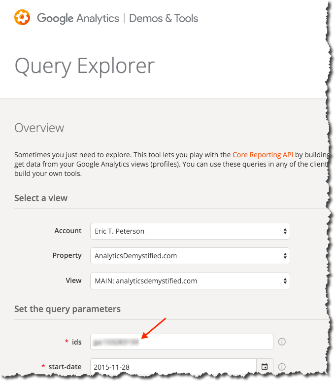
You’ll need to record this ID somewhere (or, again, just leave the browser tab open while you’re building your script in a couple of steps).

Step 4: Launch RStudio and Get Clear on a Couple of Basic-Basic Concepts

Go ahead and launch RStudio (the specifics of launching it will vary by platform, obviously). You should get a screen that looks pretty close to the following (click to enlarge):

6_rstudio

It’s worth hitting on each of these four panes briefly as a way to get a super-basic understanding of some things that are unique when it comes to working with R. For each of the four areas described below, you can insert, “…and much, much more” at the end.

Sticking to the basics:

  • Pane 1: Source (this pane might not actually appear — Pane 2 may be full height; don’t worry about that; we’ll have Pane 1 soon enough!) — this is an area where you can both view data and, more importantly (for now), view and edit files. There’s lots that happens (or can happen) here, but the way we’re going to use it in this post is to work on an R script that we can edit, run, and save. We’ll also use it to view a table of our data.
  • Pane 2: Console — this is, essentially, the “what’s happening now” view. But, it is also where we can actually enter R commands one by one. We’ll get to that at the very end of this post.
  • Pane 3: Environment/Workspace/History — this keeps a running log of the variables and values that are currently “in memory.” That can wind up being a lot of stuff. It’s handy for some aspects of debugging, and we’ll use it to view our data when we pull it. Basically, RStudio persists data structures, plots, and a running history of your console output into a collection called a “Project.”  This makes organizing working projects and switching between them very simple (once you’ve gotten comfortable with the construct).  It also supports code editing, in that you can work on a dataset in memory without continually rerunning the code to pull that data in.
  • Pane 4: Files/Plots/Packages/Help — this is where we’re actually going to plot our data. But, it’s also where help content shows up, and it’s where you can manually load/unload various “packages” (which we’ll also get to in a bit).

There is a more in-depth description of the RStudio panes here, which is worth taking a look into once you start digging into the platform more. For now, let’s stay focused.

Key Concept #1: R is interesting in that there is a seamless interplay between “the command prompt” (Pane 2) and “executable script files” (Pane 1). In some sense, this is analogous to entering jQuery commands on the fly in the developer console versus having an included .js file (or JavaScript written directly in the source code). If you don’t mess with jQuery and JavaScript much, though, that’s a worthless analogy. To put it in Excel terms, it’s sort of like the distinction between “entering a formula in a cell” and “running a macro that enters a formula in a cell.” Those are two quite different things in Excel, although you can record a macro of you entering a formula in a cell, and you can then run that macro whenever you want to have that formula entered. R has a more fluid — but similar — relationship between working in the command prompt and working in a script file. For instance:

  • If you enter three consecutive commands in the console, and that does what you want, you can simply copy and paste those three lines from the console into a file, and you’re set to re-run them whenever you want.
  • Semi-conversely, when working with a file (Pane 1), it’s not an “all or nothing” execution. You can simply highlight the portion of the code you want to run, and that is all that runs. So, in essence, you’re entering a sequence of commands in the console.

Still confusing? File it away for now. The seed has been planted.

Key Concept #2: Packages. Packages are where R goes from “a generic, data-oriented, platform” to “a platform where I can quickly pull Google Analytics data.” Packages are the add-ons to R that various members of the R community have developed and maintained to do specific things. The main package we’re going to use is called googleAnalyticsR (as in “R for Google Analytics”). (There’s a package for Adobe Analytics, too: RSiteCatalyst.)

The nice thing about packages is that they tend to be available through the CRAN repository…which means you don’t have to go and find them and download and install them. You can simply download/load them with simple commands in your R script! It will even install any packages that are required by the package you’re asking for if you don’t have those dependencies already (many packages actually rely on other packages as building blocks, which makes sense — that capability enables the developer of a new package to stand on the shoulders of those who have come before, which winds up making for some extremely powerful packages). VERY handy.

One other note about packages. We’re going to use the standard visualization functions built into R’s core in this post. You’ll quickly find that most people use the ‘ggplot2’ package once they get into heavy visualization. Tom Miller actually wrote a follow-on post to this blog post where he does some additional visualizations of the data set with ggplot2. I’m nowhere near cracking that nut, so we’re going to stick with the basics here. 

Step 5: Finally! Let’s Do Some R!

First, we need to install the googleAnalyticsR package. We do this in the console (Pane 2):

  1. In the console, type: install.packages("googleAnalyticsR")
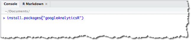
  2. Press Enter. You should see a message that is telling you that the package is being downloaded and installed:

That’s largely a one-time operation. That package will stay installed. You can also install packages from within a script… but there’s no need to keep re-installing it. So, at most, down the road, you may want to have a separate script that just installs the various packages you use that you can run if/when you ever have a need to re-install.

We’re getting close!

The last thing we need to do is actually get a script and run it. If analyticsdemystified.com wasn’t embarrassingly/frustratingly restricted when it comes to including code snippets, I could drop the script code into a nice little window that you could just copy and paste from. Don’t judge (I’ve taken care of that for you). Still, it’s just a few simple steps:

  1. Go to this page on Github, highlight the 23 lines of code and then copy it with <Ctrl>-C or <Cmd>-C.
  2. Inside RStudio, select File >> New File >> R Script, and then paste the code you just copied into the script pane (Pane 1 from the diagram above). You should see something that looks like the screen below (except for the red box — that will say “[view ID]”).
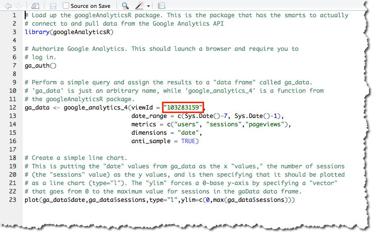
  3. Replace the and [view ID] with the view ID you’d found earlier..
  4. Throw some salt over your left shoulder.
  5. Cross your fingers.
  6. Say a brief prayer to any Higher Power with which you have a relationship.
  7. Click on the word Source at the top right of the Pane 1 (or press <Ctrl>-<Shift>-<Enter>) to execute the code.
  8. With luck, you’ll be popped over to your web browser and requested to allow access to your Google Analytics data. Allow it! This is just allowing access to the script you’re running locally on your computer — nothing else!

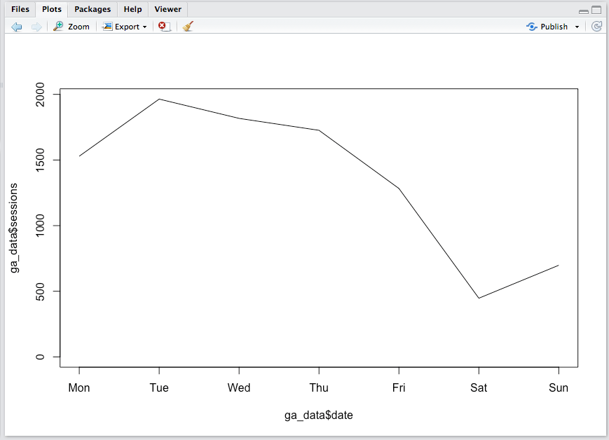
If everything went smoothly, then, in pane 4 (bottom right), you should see something that looks like this (actual data will vary!):

If you got an error…then you need to troubleshoot. Leave a comment and we’ll build up a little string of what sorts of errors can happen and how to address them.

One other thing to take a look at is the data itself. Keep in mind that you ran the script, so the data got created and is actually sitting in memory. It’s actually sitting in a “data frame” called ga_data. So, let’s hop over to Pane 3 and click on ga_data in the Environment tab. Voila! A data table of our query shows up in Pane 1 in a new tab!

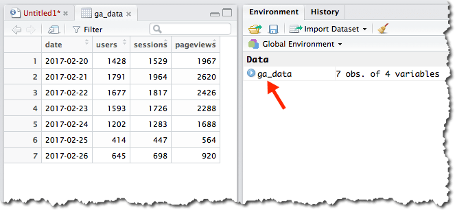
A brief word on data frames: The data frame is one of the most important data structure within R. Think of data frames as being database tables. A lot of the work in R is manipulating data within data frames, and some of the most popular R packages were made to help R users manage data in data frames. The good news is that R has a lot of baked-in “syntactic sugar” made to make this data manipulation easier once you’re comfortable with it. Remember, R was written by data geeks, for data geeks!

How Does It Work?

I’m actually not going to dig into the details here as to how the code actually works. I commented the script file pretty extensively (a “#” at the beginning of a line is a comment — those lines aren’t for the code to execute). I’ve tried to make it as simple as possible, which then sets you up to start fiddling around with little settings here and there to get comfortable with the basics. To fiddle around with the get_ga() settings, you’ll likely want to refer to the multitude of Google Analytics dimensions and metrics that are available through the core reporting API.

A Few Notes on Said Fiddling…

Running a script isn’t an all-or nothing thing. You can run specific portions of the script simply by highlighting the portion you want to run. In the example below, I changed the data call to pull the last 21 days rather than the last 7 days (can you find where I did that?) and then wanted to just run the code to query the data. I knew I didn’t need to re-load the library or re-authorize (this is a silly example, but you get the idea):

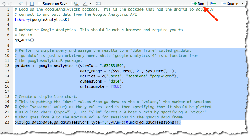
Then, you can click the Run button at the top of the script to re-run it (or press <Ctrl>-<Enter>).

There’s one other thing you should definitely try, and that has to do with Key Concept #1 under Step 4 earlier in this post. So far, we’ve just “run a script from a file.” But, you can also go back and forth with doing things in the console (Pane 2). That’s actually what we did to install the R package. But, let’s plot pageviews rather than sessions using the console:

  1. Highlight and copy the last line (row 23) in the script.
  2. Paste it next to the “>” in the console.
  3. Change the two occurrences of “sessions” to be “pageviews”.
  4. Press <Enter>.

The plot in Pane 4 should now show pageviews instead of sessions.

In the console, you can actually read up on the plot() function by typing ?plot. The Help tab in Pane 4 will open up with the function’s help file. You can also get to the same help information by pressing F1 in either the source (Pane 1) or console (Pane 2) panes. This will pull up help for whatever function your cursor is currently on. If not from the embedded help, then from Googling, you can experiment with the plot — adding a title, changing the labels, changing the color of the line, adding markers for each data point. All of this can be done in the console. When you’ve got a plot you like, you can copy and paste it back into the script file in Pane 1 and save the file!

Final Thoughts, and Where to Go from Here

My goal here was to give analysts who want to get a small taste of R that very taste. Hopefully, this has taken you less than an hour or two to get through, and you’re looking at a (fairly ugly) plot of your data. Maybe you’ve even changed it to plot the last 30 days. Or you’ve specified a start and end date. Or changed the metrics. Or changed the visualization. This exercise just barely scratched the surface of R. I’m not going to pretend that I’m qualified to recommend a bunch of resources, but I’ve include Tom’s and Jason’s recommendations below, as well as culled through the r-and-statistics channel on the #measure Slack (Did I mention that you can join that here?! It’s another place you can find Jason and Tom…and many other people who will be happy to help you along! Mark Edmondson — the author of the googleAnalyticsR package — is there quite a bit, too!). I took an R course on Coursera a year-and-a-half ago and, in hindsight, don’t think that was the best place to start. So, here are some crowdsourced recommendations:

And, please…PLEASE… take a minute or two to leave a comment here. If you got tripped up, and you got yourself untripped (or didn’t), a comment will help others. I’ll be keeping an eye on the comments and will update the post as warranted, as well as will chime in — or get someone more knowledgeable than I am to chime in — to help you out.

Photo credit: Flickr / jonny2love
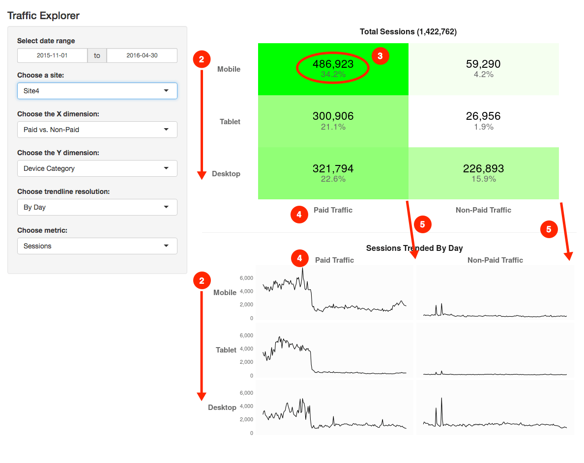