Analysis, Reporting

Adding Funnels in Google’s Looker Studio – NATIVELY!

Back in 2017, I lamented the lack of any option to create funnel visualizations in Data Studio (now known as Looker Studio.) 

So many clients needed a way to visualize their customer’s behavior through key conversion paths on their site, that I found some clever workarounds to bring funnel-like visualizations to life. 

In addition to the methods outlined in my old blog post (and the great posts of others), there were several Community Visualizations available. 

I’m so excited to see that now, funnel visualizations are available natively in Looker Studio! So let’s check them out. 

Under Add a chart, you’ll now see an option for funnel visualizations: 

They are essentially the same three charts (same setup, etc) but just three different ways of viewing it: 

  1. Sloped bar 
  2. Stepped bar
  3. Inverted triangle (note that while this funnel style may be visually appealing, its size doesn’t really tell you about the actual conversion rate, meaning that your users will still need to read and digest the numbers to understand how users convert. Aka… it’s a data visualization, that doesn’t actually visualize the data…) 

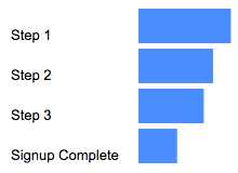
My personal favorite is probably the Stepped Bar, so I’ll use that for the following examples. 

The setup is surprisingly simple (certainly, much simpler than the hoops I used to jump through to create these visualizations in 2017!) 

You just need to specify one dimension and one metric

For a dimension, you could use: 

  • Page Path and Query String
  • Event Name 
  • A calculated field that takes some mix of different dimensions (based on a case statement.) 

Obviously if you included every page, or every event, that “funnel” chart would not be terribly useful, as it would include every page/event, and not narrow it down to those that you actually consider to be a part of the funnel: 

You’ll therefore want to use filters to narrow down to just the events or pages that actually form your funnel. For example, you could filter to just the specific events of view_item, add_to_cart, begin_checkout and purchase. 

Another option would be to create a specific dimension for use in your funnels, that uses a combination of events and pages (and/or, collapses various values of a dimension into just those you want included.) 

For example, let’s say you want to analyze a funnel including: 

  • Session on the site (tracked via an event)
  • Viewed a page of your blog (tracked via a page_view event, but might have many different possible values, so we want to collapse them all into one)
  • Submitted a lead form (tracked via an event) 

You could create a CASE statement to combine all of those into one dimension, for easy use in a funnel: 

CASE WHEN Event name="session_start" THEN "session_start"
WHEN REGEXP_CONTAINS(Page path + query string, r"/blog") THEN "blog_view"
WHEN Event name = "generate_lead" THEN "generate_lead"
ELSE NULL END 

(You would then exclude “dimension IS NULL” from your funnel.) 

For your metrics, you could use something like Total Users, Sessions, etc. 

Formatting options: 

  • You can choose to show the dimension value (or not) 
  • You can choose to show the funnel numbers as the raw number, the conversion percentage (from the very first step) or the conversion rate from the previous step. Warning: If you show the conversion rate from the previous step, the funnel visualization still shows the conversion rate from the start of the funnel, so this might be confusing for some users (unless you show both, via two charts.) 

You can choose to “Color by” a single color (my recommendation, because this is garish and awful – I said what I said.) 

Your funnel can include up to 10 steps (which is on par with funnel in Explore, and definitely better than the “create a blended data source” hack we used to use, that only allowed for 5 steps.) 

Have you had a chance to play with the new funnel visualizations in Looker Studio yet? Share what you think in Measure Chat’s Looker Studio channel! 

Featured, google analytics, Reporting

Your Guide to Understanding Conversion Funnels in Google Analytics

TL;DR: Here’s the cheatsheet.

Often I am asked by clients what their options are for understanding conversion through their on-site funnel, using Google Analytics. This approach can be used for any conversion funnel. For example:

  • Lead Form > Lead Submit
  • Blog Post > Whitepaper Download Form > Whitepaper Download Complete
  • Signup Flow Step 1 > Signup Flow Step 2 > Complete
  • Product Page > Add to Cart > Cart > Payment > Complete
  • View Article > Click Share Button > Complete Social Share

Option 1: Goal Funnels

Goals is a fairly old feature in Google Analytics (in fact, it goes back to the Urchin days.) You can configure goals based on two things:*

  1. Page (“Destination” goal.) These can be “real” pages, or virtual pages.
  2. Events

*Technically four, but IMHO, goals based on duration or Pages/Session are a complete waste of time, and a waste of 1 in 20 goal slots.

Only a “Destination” (Page) goal allows you to create a funnel. So, this is an option if every step of your funnel is tracked via pageviews.

To set up a Goal Funnel, simply configure your goal as such:

Pros:

  • Easy to configure.
  • Can point users to the funnel visualization report in Google Analytics main interface.

Cons:

  • Goal data (including the funnel) is not retroactive. These will only start working after you create them.
    • Note: A session-based segment with the exact same criteria as your goal is an easy way to get the historical data, but you would need to stitch them (together outside of GA.)
  • Goal funnels are only available for page data; not for events (and definitely not for Custom Dimensions, since the feature far predates those.) So, let’s say you were tracking the following funnel in the following way:
    • Clicked on the Trial Signup button (event)
    • Trial Signup Form (page)
    • Trial Signup Submit (event)
    • Trial Signup Thank You Page (page)
    • You would not be able to create a goal funnel, since it’s a mix of events and pages. The only funnel you could create would be the Form > Thank You Page, since those are defined by pages.
  • Your funnel data is only available in one place: the “Funnel Visualization” report (Conversions > Goals > Funnel Visualization)
  • Your funnel can not be segmented, so you can’t compare (for example) conversion through the funnel for paid search vs. display.
  • The data for each step of your funnel is not accessible outside of that single Funnel Visualization report. So, you can’t pull in the data for each step via the API, nor in a Custom Report, nor use it for segmentation.
  • The overall goal data (Conversion > Goals > Overview) and related reports ignores your funnel. So, if you have a mandatory first step, this step is only mandatory within the funnel report itself. In general goal reporting, it is essentially ignored. This is important. If you have two goals, with different funnels but an identical final step, the only place you will actually see the difference is in the Funnel Visualization. For example, if you had these two goals:
    • Home Page > Lead Form > Thank You Page
    • Product Page > Lead Form > Thank You Page

The total goal conversions for these goals would be the same in every report, except the Funnel Visualization. Case in point:

Option 2: Goals for Each Step

If you have a linear conversion flow you’re looking to measure, where the only way to get through from one step to the next is in one path, you can overcome some of the challenges of Goal Funnels, and just create a goal for every step. Since users have to go from one step to the next in order, this will work nicely.

For example, instead of creating a single goal for “Lead Thank You Page”, with a funnel of the previous steps, you would create one goal for “Clicked Request a Quote” another for the next step (“Saw Lead Form”), another for “Submitted Lead Form”, “Thank You Page” (etc.)

You can then use these numbers in a simple table format, including with other dimensions to understand the conversion difference. For example:

Or pull this information into a spreadsheet:

Pros:

  • You can create these goals based on a page or an event, and if some of your steps are pages and some are events, it still works
  • You can create calculated metrics based on these goals (for example, conversion from Step 1 to Step 2.) See how in Peter O’Neill’s great post.
  • You can access this data through many different methods:
    • Standard Reports
    • Custom Reports
    • Core Reporting API
    • Create segments

Cons:

  • Goal data is not retroactive. These will only start working after you create them.
    • Note: A session-based segment with the exact same criteria as your goal is an easy way to get the historical data, but you would need to stitch them (together outside of GA.)
  • This method won’t work if your flow is non-linear (e.g. lots of different paths, or orders in which the steps could be seen.)
    • If your flow is non-linear, you could still use the Goal Flow report, however this report is heavily sampled (even in GA360) so it may not be of much benefit if you have a high traffic site.
  • It requires your steps be tracked via events or pages. A custom dimension is not an option here.
  • You are limited to 20 goals per Google Analytics view, and depending on the number of steps (one client of mine has 13!) that might not leave much room for other goals. (Note: You could create an additional view, purely to “house” funnel goals. But, that’s another view that you need to maintain.)

Option 3: Custom Funnels (GA360 only)

Custom Funnels is a relatively new (technically, it’s still in beta) feature, and only available in GA360 (the paid version.) It lives under Customization, and is actually one type of Custom Report.

Custom Funnels actually goes a long way to solving some of the challenges of the “old” goal funnels.

Pros:

  • You can mix not only Pages and Events, but also include Custom Dimensions and Metrics (in fact, any dimension in Google Analytics.)
  • You can get specific – do the steps need to happen immediately one after the other? Or “just eventually”? You can do this for the report as a whole, or at the individual step level.
  • You can segment the custom funnel (YAY!) Now, you can do analysis on how funnel conversion is different by traffic source, by browser, by mobile device, etc.

Cons:

  • You’re limited to five steps. (This may be a big issue, for some companies. If you have a longer flow, you will either need to selectively pick steps, or analyze it in parts. It is my desperate hope that GA allows for more steps in the future!)
  • You’re limited to five conditions with each step. Depending on the complexity of how your steps are defined, this could prove challenging.
    • For example, if you needed to specify a specific event (including Category, Action and Label) on a specific page, for a specific device or browser, that’s all five of your conditions used.
    • But, there are normally creative ways to get around this, such as segmenting by browser, instead of adding it as criteria.
  • Custom Reports (including Custom Funnels) are kind of painful to share
    • There is (currently) no such thing as “Making a Custom Report visible to everyone who has access to that GA View.” Aka, you can’t set it as “standard.”
    • Rather, you need to share a link to the configuration, the user then has to choose the appropriate view, and add it to their own GA account. (If they add it to the wrong view, the data will be wrong or the report won’t work!)
    • Once you do this, it “disconnects” it from your own Custom Report, so if you make changes, you’ll need to go through the sharing process all over again (and users will end up with multiple versions of the same report.)

Option 4: Segmentation

You can mimic Option 1 (Funnels) and Option 2 (Goals for each step) with segmentation.

You could easily create a segment, instead of a goal. You could do this in the simple way, by creating one segment for each step, or you can get more complicated and create multiple segments to reflect the path (using sequential segmentation.) For example:

One segment for each step
Segment 1: A
Segment 2: B
Segment 3: C
Segment 4: D

or

Multiple segments to reflect the path
Sequential Segment 1: A
Sequential Segment 2: A > B
Sequential Segment 3: A > B > C
Sequential Segment 4: A > B > C > D

Pros:

  • Retroactive
  • Allows you to get more complicated than just Pages and Events (e.g. You could take into account other dimensions, including Custom Dimensions)
  • You can set a segment as visible to all users of the view (“Collaborators and I can apply/edit segment in this View”), making it easier for everyone in the organization to use your segments

Cons:

  • You can only use four segments at one time in the UI, so while you aren’t limited to the number of “steps”, you’d only be able to look at four. (You could leverage the Core Reporting API to automate this.)
  • The limit on the number of segments you can create is high (100 for shared segments and 1000 for individual segments) but let’s be honest – it’s pretty tedious to create multiple sequential segments for a lot of steps. So there may be a “practical limit” you’ll hit, out of sheer boredom!
  • If you are using GA Free, you will hit sampling by using segments (which you won’t encounter when using goals.) THIS IS A BIG ISSUE… and may make this method a non-starter for GA Free customers (depending on their traffic.) 
    • Note: The Core Reporting API v3 (even for GA360 customers) currently follows the sampling rate of GA Free. So even 360 customers may experience sampling, if they’re attempting to use the segmentation method (and worse sampling than they see in the UI.)

Option 5: Advanced Analysis (NEW! GA360 only)

Introduced in mid-2018 (as a beta) Advanced Analysis offers one more way for GA360 customers to analyse conversion. Advanced Analysis is a separate analysis tool, which includes a “Funnel” option. You set up your steps, based on any number of criteria, and can even break down your results by another dimension to easily see the same funnel for, say, desktop vs. mobile vs. tablet.

Pros:

  • Retroactive
  • Allows you to get more complicated than just Pages and Events (e.g. You could take into account other dimensions, including Custom Dimensions)
  • Easily sharable – much more easily than a custom report! (just click the little people icon on the right-hand side to set an Advanced Analysis to “shared”, then share the links to others with access to your Google Analytics view.)
  • Up to 10 steps in your funnel
  • You can even use a segment in a funnel step
  • Can add a dimension as a breakdown

Cons:

  • Advanced Analysis funnels are always closed, so users must come through the first step of the funnel to count.
  • Funnels are always user-based; you do not have the option of a session-based funnel.
  • Funnels are always “eventual conversion”; you can not control whether a step is “immediately followed by” the next step, or simply “followed by” the next step (as you can with Sequential Segments and Custom Funnels.)

Option 6: Custom Implementation

The first three options assume you’re using standard GA tracking for pages and events to define each step of your funnel. There is, of course, a fourth option, which is to specifically implement something to capture just your funnel data.

Options:

  • Collect specific event data for the funnel. For example:
    • Event Category: Lead Funnel
    • Event Action: Step 01
    • Event Label: Form View
  • Then use event data to analyze your funnel.
  • Use Custom Dimensions and Metrics.

Pros:

  • You can specify and collect the data exactly how you want it. This may be especially helpful if you are trying to get the data back in a certain way (for example, to integrate into another data set.)

Cons:

  • It’s one more GA call that needs to be set up, and that needs to remain intact and QA’ed during site and/or implementation changes. (Aka, one more thing to break.)
  • For the Custom Dimensions route, it relies on using Custom Reports (which, as mentioned above, are painful to share.)

Personally, my preference is to use the built-in features and reports, unless what I need simply isn’t possible without custom implementation. However, there are definitely situations in which this would be the optimal route to go.

Hey look! A cheat sheet!

Is this too confusing? In the hopes of simplifying, here’s a handy cheat sheet!

Conclusion

So you might be wondering: Which do I use the most? In general, my approach is generally:

  • If I’m doing an ad hoc, investigative analysis, I’ll typically defer to Advanced Analysis. That is, unless I need a session-based funnel, or control over immediate vs. eventual conversion, in which case I’ll use Custom Funnels.
  • If it’s for on-going reporting, I will typically use Goal-based (or BigQuery-based) metrics, with Data Studio layered on top to create the funnel visualisation. (Note: This does require a clean, linear funnel.)

Are there any approaches I missed? What is your preferred method? 

google analytics

A Step-By-Step Guide To Creating Funnels in Google’s Data Studio

I’m so excited to report that this post is now obsolete! Funnels are now a native feature in Looker Studio, so check out the new post to read how to create them.  

Old post, for posterity: 

This is an update to a 2017 blog post, since there are a ton of new features in Data Studio that make some of the old methods unnecessary. If you really need the old post (I can’t fathom why) maybe try the Way Back Machine

Given so many sites have some sort of conversion funnel (whether it’s a purchase flow, a “contact us” flow or even an informational newsletter signup flow), it’s a pretty common visualization to include in analytics reporting. For those using Google’s Data Studio, you may have noticed that a true “funnel” visualization is not among the default visualization types available. (Though you may choose to pursue a Community Visualization to help.) 

The way I choose to visualize conversion funnels is by leveraging an horizontal bar chart:

To create this type of visualization, you will need: 

  • A linear flow, in which users have to go through the steps in a certain order
  • A dimension with a single value* (I’ll explain below) 
  • A metric for each step. You could create this in several ways: 
    • Google Analytics Goal
    • Custom Metric
    • BigQuery metric
    • Data Studio data blend (up to 5 steps) 
    • Data in spreadsheet

For example, here I am using Goal Completions: 

A spreadsheet might be as simple as: 

And here I am using a data blend (basically, Data Studio’s “join”), in what I’ll call a “self-join”. Basically, I’m taking filtered data from a Google Analytics view, then joining it with the same Google Analytics view, but a different metric or filter. This is what will allow you to build a funnel where, for example: 

  • Step 1 is a page (“home”)
  • Step 2 is an event (“contact us”)
  • Step 3 might be another page (“thank-you”) 

But remember a blend will only work if you have five funnel steps or fewer. 

* Why a dimension with a single value? For example, a dimension called “All Users” that only has one value, “All Users.”

Here’s what happens to your visualization if you try to use a dimension with multiple values: 

Basically what you want is to create a bar chart, with no dimension. But since that’s not an option, we use a dimension with a single value to mimic this. 

You can create one super fast in your Data Source in Data Studio, by creating a CASE statement similar to this: 

CASE WHEN REGEXP_CONTAINS(DeviceCategory, ".*") then "All Users" ELSE "All Users" END

And don’t try to make your life easy by choosing “year”, thinking that “well it’ll only have one value, this year!” — when Jan 1 rolls around and all your funnels break, you’ll be annoyed you didn’t take the extra two seconds.

A step-by-step walkthrough:

Step 1: Create your bar chart

Our visualization is then a horizontal bar chart, with our “single value dimension” as the dimension, and our steps as the metrics. 

2. Change the colors to be all the same color

3. Hide axes (both X and Y)

4. Add data labels

5. Remove legend and gridlines

6. Add text boxes, to label the steps

Voila! That’s your (raw numbers) funnel. But you probably want conversion rate too, right? 

You’re going to want to create calculations for each step of the funnel: 

Step 1%:

SUM(Step 1)/SUM(Step 1)

Step 2%:

SUM(Step 2)/SUM(Step 1)

Step 3%:

SUM(Step 3)/SUM(Step 1)

Purchase%:

SUM(Step 4)/SUM(Step 1)

This will give you the conversion rate from the first step of the funnel. (And yes, Step 1 % will be 100%, it’s supposed to be!) 

Side note: I tend to put the % sign in the formula, so it makes it easy for me to search for it in the list of metrics later.

And make sure you format as a percentage, so you don’t have to constantly adjust it in the chart. 

Note that you could also add a “Step-to-Step” conversion as well: 

Step 1% s2s (This formula is actually the same, so I don’t bother creating another one) 

SUM(Step 1)/SUM(Step 1) 

Step 2% s2s (This formula is actually the same, so I don’t bother creating another one) 

SUM(Step 2)/SUM(Step 1) 

Step 3% s2s (This is a different formula to the one above)

SUM(Step 3)/SUM(Step 2) 

Purchase% s2s (This is a different formula to the one above)

SUM(Step 4)/SUM(Step 3) 

I use something like “s2s” to denote that that’s the formula with the previous step as the denominator, versus the formula with the first step as the denominator.

Now you’ll follow the steps again, but build a second bar chart with your conversion rate metrics, and/or your step-to-step conversion rates. 

That’s it!

Voila! Look at your lovely funnel visualization: 

The hardest part is getting your data into the right shape (e.g. having a metric for each step.)

And it used to be a lot harder, before some newer features of Data Studio! (In my day, we used to have to create funnels for three miles in the snow…) 

If you have any questions, please don’t hesitate to reach out to me via Twitter, Linked In, email or Measure Chat.