I build a lot of dashboards in Excel, and I’m a bit of a stickler when it comes to data visualization. This post walks through some of the ways that I use custom number formatting in conjunction with conditional formatting and named ranges to add small — but powerful — visual cues to enhance the “at-a-glance” readability of numbers in a dashboard:
- Adding an up or down arrow if (and only if) the % change exceeds a specified threshold
- Adding green/red color-coding to indicate positive or negative if (and only if) the change exceeds the specified threshold
- Including a “+” symbol on positive % changes (which I think is helpful when displaying a change)
You can download the sample file that is the result of everything described in this post. It’s entirely artificial, but I’ve tried to call out in the post how things would work a little differently in a real-world situation.
Step 1: Set Up Positive/Negative Thresholds
I always-always-always set up two named ranges for an “up” threshold and a “down” threshold. That’s because, usually, it’s silly to declare something a positive change if it increased, say, 0.1% week-over-week. It’s a bit of a pet peeve, actually. I don’t want to deliver a dashboard that is going to look like a Christmas tree because no metric stayed exactly flat from one period to another, so every metric is colored red or green. (Red/green should never be the sole indicator of a change, as that is not something that can be perceived by a non-trivial percent of the population that has red-green colorblindness. But, it is a nice supplemental visual cue for everyone else.)
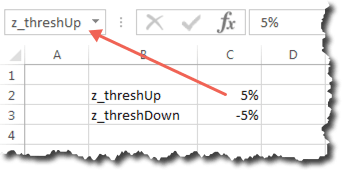
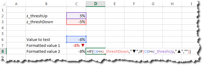
Typically, I put these threshold cells on their own tab — a Settings worksheet that I ultimately hide. But, for the sake of simplicity, I’m putting it proximate to the other data below for this example. I like to put the name I used for the cell in a “label” cell next to the value, but this isn’t strictly necessary. The key is to actually have the call named, which is what the arrow below illustrates:
(One other aside: Sometimes, I have a separate set of thresholds for “basis point” comparisons — if I’ve showing the change in conversion rate, for instance, it often makes more sense to represent these as basis points rather than as “percent changes of a percent.”)
Step 2: Set Up Our Test Area
This is the massively artificial part of this exercise. Cell C6 below is the number we’ll play around with, while cells C7 and C8 are simply set to be equal to C6 and will show a couple of different ways that that value can be represented with better formatting. In the real world, there would just be one cell with whatever formula/reference makes sense and the most appropriate formatting for the situation used.
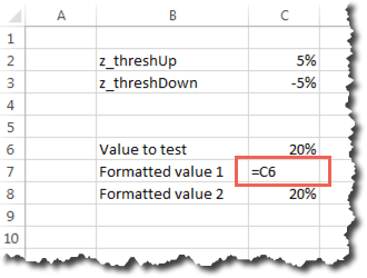
For Formatted value 1, we’re going to put a +/- indicator before the value, and an up or down graphical indicator after it. We’re also going to turn the cell text green if the number is positive and exceeds our specified threshold, and we’re going to turn it red if the number is negative and exceeds that threshold.
For Formatted value 2, we’re going to add the +/- indicator, one decimal place, and have the up/down arrow in the cell right next to the number. That arrow will only show up if the positive/negative value exceeds the threshold, and it will be colored green or red as appropriate.
Basically…this:
You would never use both Formatted value 1 and Formatted value 2, but they both have their place (and you could even do various hybrids of the two).
Step 3: Add a Custom Number Format
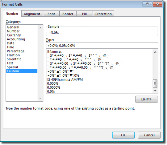
Let’s start with Formatted value 1. Right-click on cell C6 and select Format cells…. On the Number tab, select Custom and enter the criteria below (I usually wind up opening Character Map to grab the up/down arrows — these are available in Arial and other non-symbol fonts):

Custom number formats are crazy powerful. If you’re not familiar/comfortable with using them, Jon Peltier wrote an excellent post years ago that digs into the nitty-gritty. But, the format shown above, in a nutshell:
- Adds a “+” sign before positive numbers
- Adds up/down indicators after positive/negative numbers
- Adds no indicator if the value is zero
Note that I’m not using the “[color]” notation here because I only want the values to appear red/green if the specified thresholds are exceeded.
Step 4: Add Color with Conditional Formatting
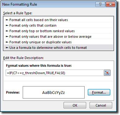
We now need to add conditional formatting to Formatted value 1 so that it will appear as red or green based on the specified thresholds. Below is the rule for adding green. (By default, Excel tries to make cell values in conditional formatting absolute cell references — e.g., $C$7. If you want this rule to apply to multiple cells, you need to change it to a relative reference or a hybrid. Conditional formatting is extraordinarily confusing every since Excel 2007…but then it totally makes sense once you “get it.” It’s worth putting in the effort to “get.”)
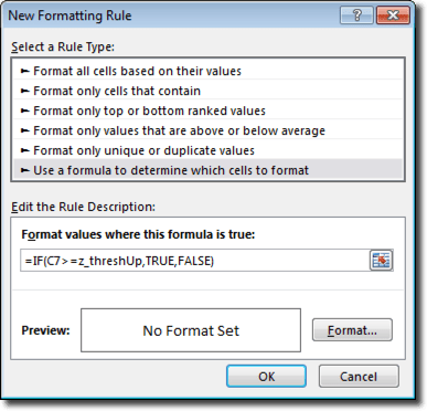
(The “,FALSE” in the formula above is not strictly necessary, but my OCD requires that I include it).
With that rule, we then click Format and set the font color to green:
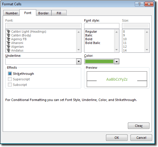
We then need to repeat the process for negative values, using z_threshDown instead of z_threshUp, and setting the font color to red when this condition is true:
That’s really it for Formatted value 1.
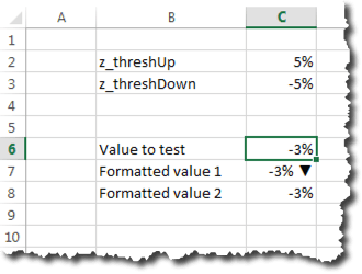
Below is how that value looks if the number is negative but does not exceed the z_threshDown threshold:
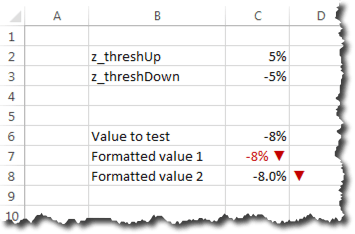
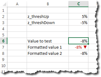
Below is how the value appears if we do exceed the threshold with a negative number:
The same process works for positive values, but how many screen caps do we actually want in this post? Try it out yourself!
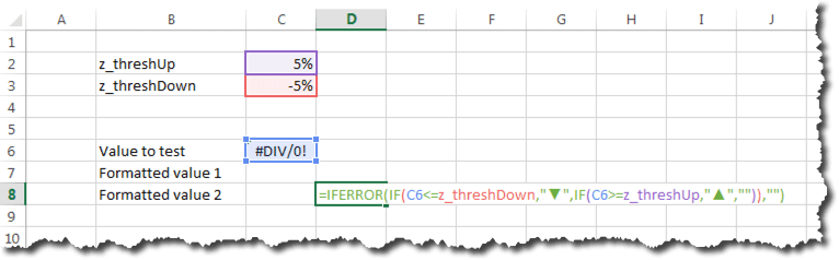
Step 5: Adding an Indicator in a Separate Cell
Another approach I sometimes use is an indicator in its own cell, and only showing the indicator if the specified thresholds are exceeded. That’s what we’re going to do with Formatted value 2.
For this, we add an IF() formula in cell D8 that uses z_threshUp and z_threshDown to determine if and which indicator to display:
We’ll want to add the same conditional formatting to cell D8 that we added to cell C7 to get the arrows to appear as red or green as appropriate.
Step 6: A Slightly Different Custom Number Format
This is very similar to Step 3, but, in this case, we’ve decided we want to include one value after the decimal, and, of course, we don’t need the up/down indicator within the cell itself:
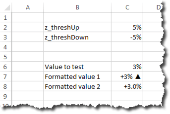
With these updates, we now have something that looks like this:
Or, if the value exceeds the negative threshold, like this:
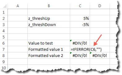
Step 7: Checking for Errors
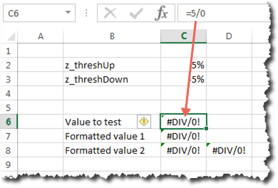
We’ve already covered all the basics, but it’s worth adding one more tip: how to prevent errors (#N/A or #REF or #DIV/0) from ever showing up in your dashboard. If the dashboard is dynamically pulling data from other systems, it’s hard to know if and when a 0 value or a missing value will crop up that breaks a formula.
In our artificial example below, I’ve entered an error-generating formula in cell C6. The result in our Formatted value cells is NOT pretty:
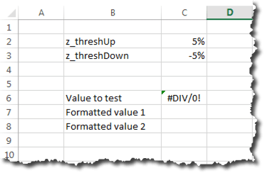
There is a super-simple fix for this: wrap every value in an IFERROR() function:
I love IFERROR(). No matter how long the underlying formula is, I simply add IFERROR() as the outer-most function and specify what I want to appear if my formula resolves to an error. Sometimes, I make this be a hyphen (“-“), but, in this example, I’m just going to leave the cell blank (“”):
Now, if my value resolves to an error, the Formatted value values don’t expose that error to the recipient of the report:
In Summary…
Recurring dashboards and reports should be as automated as possible. When they are, it’s impossible to know which specific values should be the “focus” from report to report. Conditional formatting and custom number formatting can automatically make the most dramatically changed (from a previous period or from a target) values “pop.” The recipients of your reports will love you for adding the sort of capabilities described here, even if they don’t realize that’s why they love you!
And, remember, you can download the sample file and play around with the thresholds and values to see all the different ways that the Formatted values will display!
And a Final Note about TEXT()
The TEXT() function is a cousin of custom number formatting. It actually uses the exact same syntax as custom number formatting. I try not to use it if I’m simply putting a value in a cell, because it actually converts the cell value to be a text string, which means I can’t actually treat the value of the cell as a number (which is a problem for conditional formatting, and is a problem if I want to use that cell’s value in conjunction with other values on the spreadsheet).
But, occasionally, I’ll want to put a formatted value in a string of text. The best example of this is a footnote that explains when I have red/green values or arrows appearing. As described in this post, I base that logic on z_threshUp and z_threshDown, but my audience doesn’t know that. So, I’ll add a footnote that uses TEXT() to dynamically insert the current threshold values — well-formatted — into a statement, such as:
="The up arrow appears if the % change exceeds "&TEXT(z_threshUp,"+0%;-0%")&"."
Nifty, huh? What do you think?